#majorstudy
Text
Major Study : Improvements
There are several things I would like to learn from and improve upon. I think some scenes in the film where I could explore an idea or a detailed motion came out quite well-animated. Others, however, I struggled with. One example is the walk cycle as the protagonist approaches the flight of stairs to go up to the protest breaking out. The motion looks slightly unnatural and could use some work. Another scene which I was excited about was the fight scene. Unfortunately, due to time constraints, I had to add a lot less animation than I would have loved to. Good time management and scheduling would have prevented this.
Sound design is something I developed an interest for while I worked on this film. Although it was probably not abysmal for a first attempt, I would definitely say that it is something I need to work on and develop as a skill - and something that I would love to!
I was very inspired watching The Batman (2022) due to its immaculately executed sound design. I will be making a forefront post about the film with that as the main topic of discussion.
0 notes
Text
The Visual Manual Update //
After finishing the video to a good standard we decided to show Becky who had set the brief to see her thoughts were. She wanted us to include some text so that the video was more informative, a step by step guide. As part of the brief she also wanted us to include some well know letterpress artist which we had yet done. Sam took on the job of re-editing the video and adding some typeface that works so well along with the motion of the press. Overall, it has worked out to be exactly what the brief asked for. Even thou this wasn't a massive brief I really enjoyed the collaborative aspect and input.
youtube
4 notes
·
View notes
Text
MODULE REFLECTION-

Where do I start? This module has been one of the most stressful, full on and all together hectic few weeks ever. We have all put 110% into creating projects that help to make our portfolios stand out and that define who we want to be as designers. This has been really useful and I now feel a lot more prepared to apply for jobs/internships than I ever have previously. I have become more confident in my ideas and am now more than ok with trusting my gut instinct when it comes to how I think something should look or on which idea is best.
The most rewarding projects for me this module have got to be the two D&AD briefs that I took on. I put a hell of a lot of time into making sure that these could be projects that not only would be different and hopefully stand out with the D&AD judges but also that would showcase my skills in advertising for my portfolio. I wanted to create 2 projects that were completely reliant upon the idea which is why I spent so long coming up with a concept for Burger King but also why we spent so many weeks perfecting our idea for Nationwide. Even though neither were selected I am really proud of the work that I put forward and they mark the first projects in my portfolio that I am actually happy with.
The thing that I have struggled with the most this module hasn't actually been anything to do with project work. It has been trying to keep up with the pressure of the third year in general and dealing with the unknown after uni is over. I feel that this is normal and from speaking to my friends I know that we are all in the same position but you can't help but feel a little anxious about where you're going to be this time next year. Throughout major study I have tried to forget about the fact that this is the last module as everytime I think about it started to stress me out, However I have managed to come to terms with the fact that I cant stay at uni forever and I am lucky enough to have lined up a number of placements starting in July for me to get my teeth stuck into.
Overall uni really has been a pleasure, I have really thrown myself into all challenges, experienced things that I never thought I would, grown in confidence, created a network of industry contacts and made lifelong friends. Seeing the work created this year in the grad show has tied everything up and I am really proud of what myself and my friends have produced. It's mad to look back on the work that I was creating this time 3 years ago and how much it has changed. I now have a clear direction and I know what I want to do which by far is the most exciting thing for me as a creative.
3 notes
·
View notes
Video
vimeo
A Week in New York
I always try to document my travels through photography and it wasn’t until my trip to Thailand in Second year that I ventured into making short films. By no means are they perfect or polished but they allow me to see key aspects of the trip.
This short video captures moments that gave me the urge to record. I didn't want to experience and see the city through the lense, which is why this is not your usual NYC vlog so to speak.
Highlights include- times square, the financial district, the world trade centre, the NY subway, Brooklyn/ Williamsburg & the highline.
Posted | Sunday 4th February 2018
1 note
·
View note
Photo
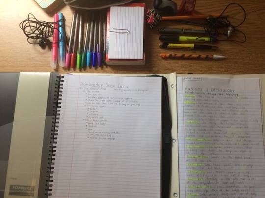
Library session with my pal @sabrina-studying :) Still taking anatomy and physiology notes in preparation for this year. I've also been looking into a degree in Medical Laboratory Science instead of biochemistry. Seems like a pretty good field, but who knows what I'll decide on. See you in the next post!
8 notes
·
View notes
Text
Major Study: Evaluation of Creative Decision-Making (500 Words)
Over the course of this module, I have noticed that my creative decisions gradually tend to change and adapt, as I get deeper into a project, and learn more skills. As I gain access to wider range of tools, as I pick up new inspirations and research, and as my project slowly starts to come together, my ideas change from my initial ones to reflect my current state of mind. Sometimes I may even realise from a technical limitation that a less complicated approach, might actually be more suitable for what I am trying to achieve. I think this is another factor that plays an important part in my creative decision-making, to consider what is more realistically do-able, but also more efficient; finding that correct balance.
For example, at an earlier stage in the project I planned to add the appearance of button prompts, and text in the game when the player walks by an ‘interactable’ object, because I felt this would make the experience more convenient and helpful for the player, by telling them what is or is not interactive. However, a few more weeks into the project, I realised that perhaps this could remove something from the experience, maybe that joy of discovering things by yourself, as a player; something that I really value about retro exploration games. I realised that maybe I instead, I could remove the player’s reliance on this to make my experience somewhat more unique, but also slightly more challenging. With this in mind, I continued to build the game around this style of approach, so that it actually works appropriately, as a whole. This shows how my creative decisions can gradually change during development when I am inspired, and I start to consider the consequences of a visual mechanic more closely.
This creative decision reinforces some of the themes that I am hoping to go for with this this game; discovery, uncertainty, and vulnerability. However, I also channel this to the player through other creative decisions in the gameplay, and the level design, by putting the player through narrow corridors, and by not giving them a means to fight for the larger portion of the game, but instead to run and hide. This, in addition to the boy’s visual design, which appears innocent and fragile, can also help make the player feel more vulnerable and keep the player on edge when exploring environments. The boy does not have a name because I wanted players to relate with more easily, and to maybe evoke some of their own memories of being young, and alone in the dark. From their child perspective, what sorts of things did they imagine could happen in the dark at night?
I felt that this game could have a more minimal, and visual style, without the use of much text or words that might interrupt the players’ immersion in the games’ world. I even tried to design the menu buttons, and tutorial prompts with visual communication in mind. I think this makes the experience feel somewhat more universal / global, and like the narrative is conveyed more through the medium and the actions of the player, rather than through text.
Through the sound design, I was aiming to achieve an eerily realistic atmosphere despite the game’s retro aesthetic, to kind of elevate that uncertainty and dream-like nature of the game. I think the sound effects work well at achieving a satisfying sense of responsiveness and interactivity with the environment, and the events happening around the player. The realistic sound effects in comparison to the pixel art, retro, and more light hearted feeling of the visuals, makes a nice a contrast that can build a sense of unease in the player, and make it stand out against other game experiences of its kind.
While covering each individual creative decision in this short evaluative post might exceed the allowed word count, I think my creative decision-making was well-considered and successful when it comes to this project, because the final result meets the experience that I was hoping to convey. I think it captures the spirit of an old-school exploration game, and that satisfying feeling of discovering environments and secrets by yourself.
1 note
·
View note
Text
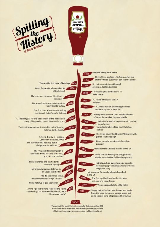
RESEARCH // THE EVOLUTION OF HEINZ
16.02.2019
1869 - The beginning Two young American businessmen, Henry J Heinz and L Clarence Noble, launched Heinz & Noble. Their first product was Henry's 'pure and superior' grated horseradish, bottled in clear glass to show its purity.
1876 - The world's first taste of ketchup Henry sets up business with two of his relations, launching F & J Heinz Company, with Henry as manager. In the US, they launched Heinz Tomato Ketchup followed by a launched in the UK in 1886.
1886 - Henry sells his first products 'seven varieties of our finest and newest goods' to London's Fortnum & Mason food store.
1896 - An historic train journey Riding the New York railway Henry saw a poster for a shoe company advertising its 21 styles of shoe. He is said to have been taken with the ad and raised up the number of products that his company produced, finally settling on 57 - although there were more. On that journey, Heinz 57 Varieties was born.
The 1920s - UK production starts Heinz is still exporting Baked Beans, Spaghetti and Tomato Ketchup to the UK from America and Canada. When production expands to the UK, 10,000 tonnes are produced here in the first year.
1951 - Royal approval The Royal Warrant is granted, and in 1954 granted again as Purveyors of Heinz Products to HM Queen Elizabeth II.
1955 - Heinz on TV 'Heinz 57' varieties was advertised on the new ITV channel. Colour posters were also produced. 1959 - Wigan factory built Heinz opens a Beans factory in Wigan on 21 May 1959, which used 1,000 tonnes of dry beans every week.
1967 - 'Beanz Meanz Heinz' is born The slogan was created in 1967, like a million housewives every day picked up a tin of beans.
1987 - Plastic bottles introduced The battle of banging the bottom of a glass bottle of ketchup ended when Heinz introduced a plastic bottle.
The 1990s - Heinz go east Heinz expanded its distribution to Russia and China. In total, it exported Heinz Beanz to 60 countries at that stage.
1999 - Top four Heinz becomes the world's fourth-largest food and drinks brand, behind Coca-Cola, McDonald's and Nescafe.
2000 - Royal visit In May the Queen and the Duke of Edinburgh visited the Heinz Beanz factory in Kitt Green near Wigan to mark the 50th Anniversary of the official opening of the factory.
https://www.telegraph.co.uk/finance/newsbysector/retailandconsumer/9870341/The-144-year-history-of-Heinz.html
0 notes
Text
Major Study
The biggest challenge that I faced during this module was time management and disciplining myself. It took me a while to learn how to make myself focus better but once I had, my efficiency improved massively and my enthusiasm was felt in my work, in my opinion.
Scheduling based on your personality and the way that you can reward and motivate yourself is essential in completing something in a timely manner, something which I learnt the hard way.
This will definitely be a lifesaver of a skill once I develop and cultivate it further.
0 notes
Text
Evaluating Project Success
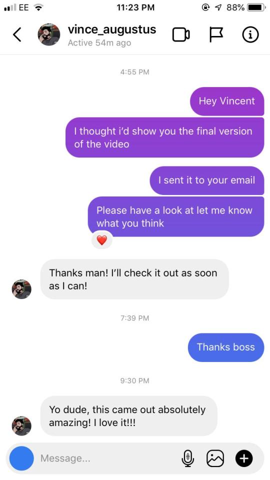
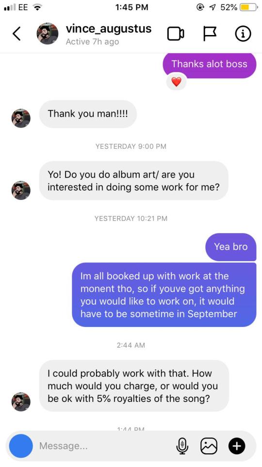
Since I am making a video for a musician, I believe the best way to judge the success of the project is the musician’s response to it. I treated the project like I would treat a commissioned job, by asking he artsist what the song was about and bouncing ideas of him. Two days ago upon the competition of the project, I showed Vincent Augustus and he seemed very happy. He went as far as offering a job to work with for his animated album art. So its safe to say Vincent Augustus liked the video and the project is a success.
0 notes
Text
Modular Reflection //
I can't quite believe I am saying this, but I think Im complete! It has been one very long and stressful modular to say the least. The beginning seems like a life time ago and the in-between seems like a blur.
I started this modular off by visit New York. It gave me such inspiration and a passion for designing to come in the Final Major Study. Equally, I also felt as a disadvantage from the time away. However, we were soon thrown in at the deep end. Rapidly I completed two D&AD projects. I can say throughout this modular they are by far, the work I am most proud of. It was hectic, with long hours and many tears but the outcome of working both independently and collaborative has given me a huge body of work. I think completing the both at the same time proved to me I could work effectively under such a stressful deadline.
Reflecting on the overall body of work from the modular, I have completed a lot of projects (more than I realised). I have said yes to every opportunity that has come my way - Gareth, Molly etc. Unintentionally I have completed a lot of little projects, extending them to my own personal advantage. I am glad I have took on such a variants of tasks, especially when compared to Negotiated. A lot of my time then was focused on my personal work. In Major I have branched into commercial and campaign. As much as I love political graphics and collage, I think its a dream to find a full time job in it. Mixing my style up and incorporating has been a good change.
Overall, this has by far been the most stressful modular I have ever completed at university. The obvious reason being the pressure. For me it has been the pressure of juggling everything. I have work commitments as well as univeristy and balancing the both has meant I have been non stop for the majority of the year. I think on reflection I am hugely proud that I have managed to maintain a job whilst also working towards my degree. The imminent idea of leaving into the unknown has also played a factor of stress. Because I have been so busy, it has taken my mind away from the situation. Three year of working inside univeristy and out has took its toll. However, I love being creative and with finishing univeristy I am going to solely focus on searching, networking and building my design career. The future is very exciting.
4 notes
·
View notes
Text
CREATING A POSTER FOR THE GRAD SHOW-

‘Go big! Get large! Graphics Poster Competition 2018!
We are looking for nine exciting and vibrant contemporary images for huge posters, to exhibit as part of this years degree show. The posters will be blown up to A0 and framed (see image).’
2 notes
·
View notes
Photo
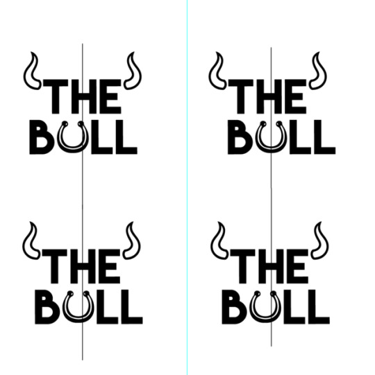
Logo Development/Experimentation
After the initial logo design I felt like more could be done or add to it which could make that difference even if it is a subtle change as it seemed pretty simple and plain especially compared to other beer logos. I then added the bull nose ring which as from my childhood I could remember watching so many cartoons which had bulls with nose rings in there, therefore I knew the ring had some sort of link with bulls. After adding the nose ring I still noticed the alignment didn’t seem right. The nose ring wasn’t central and the bottom of the part of the L in Bull seemed too long.
1 note
·
View note
Photo


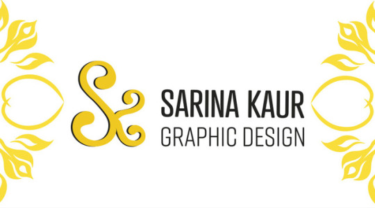
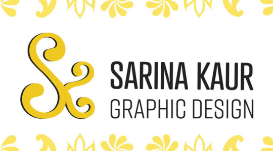


Personal Branding - Business card variations
The original layout of my logo design, which had the text beneath the initials did not suit the shape of the business card. With this in mind, I altered the logo slightly by placing the text on the right hand side of the piece. This allowed the logo to extend across the shape of the card, keeping the initials as the main focus and with the text in align with the ‘K’.
From the icons I illustrated, a range of designs have been made. The piece I would like to use as my business card is the first image in this collection. I have aligned the shapes with the hight of the ‘S’ so is does not over power the image. I also believe that the black within the icons compliments the typography.
Now the back of the business card with be designed and then placed onto mockups before I have them printed.
#Sarinakaurbcu#majorstudy#graphics#graphic design#design#art#business card#Sarina kaur#brand#branding#personal#intircate
1 note
·
View note
Photo


Anita Inverarity is an illustrator from Scotland. Through mutes tones she creates illustrations which are all based on a similar layout yet tell different stories through characters. I love the arching trees, common amongst her work, creating a border around the subject. In some cases, this arch way enclosed the subject and making them hunched over, appearing scared and in danger. A similar style for menu border would look nice, with some whimsical characters based on art pieces around the cafe such as a spider, a fairy or a whicker fisherman.
2 notes
·
View notes
Text
Grad Show Update
So after all groups pitched their ideas we were given feedback on whether or not our ideas we being chosen to use. As our idea was quite open (which is what we wanted, as we didn’t want the students to feel like they were being forced to go along with an idea so we created a concept that could be flexible to suit everyone) we found out that our “frame kit” concept was chosen and we received a lot of positive feedback... Yay! They also liked aspects of other groups pitches so it seems that we are putting a few of them together and making it more collaborative... which works better as that way its more of a compromise and it’ll be more interesting taking views from a lot of students.
1 note
·
View note
Photo


Here’s what you ordered.. info leaflet idea
Birchbox are a beauty brand and they include a little leaflet (above) in their packages to tell customers exactly what the products are in the delivery. Personally I believe it’s such a satisfying addition to a delivery - plus the brand need to provide information on each of the samples. I thought maybe I could do this with Nexa, create an info leaflet and personalise it in order to build a relationship with the customer.
0 notes
Last Seen Blogs

tiddy
🤡

hn8559com
无标题

umbrellainkart
Fanart And Whatnot
starlight-artbby
✨Starlight-Art✨

johnblakes550
My Mustang GT