#logo development
Note
This is a pretty random one, but how did you design the logo for Ingress?
Little did you know, I love to answer questions about ~design~.
The Ingress logo has gone through about 3 different official versions, but at least 50 different conceptual iterations. I'm a graphic designer by trade and profession, so I approached it any other way I would approach making a logo.
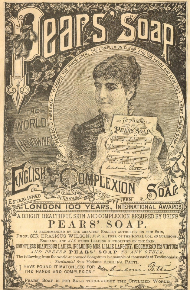
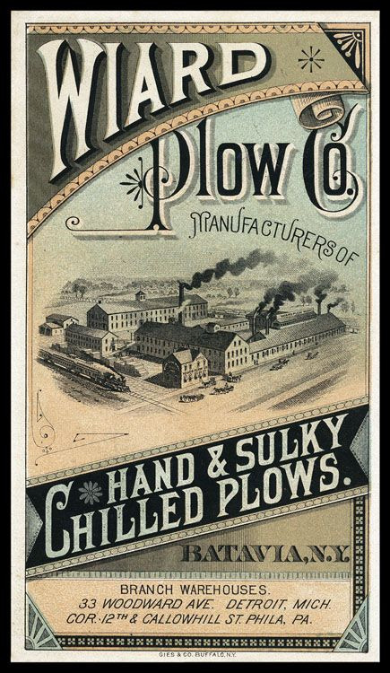
The first iteration of the logo I have less information on the development of, but I was looking at a lot of advertising from the late 1800s to early 1900s. For example, these advertisements have a lot flourishes on the text and warping letters, as was common in that era.
I took that concept and made the first iteration of the ingress logo at the comic's inception in 2017. My graphic design skills weren't as strong then, and I mostly just took a font I thought fit and slapped it around a little bit to try and get the look I wanted.
I wasn't particularly happy with how this one turned out, and it only ended up being used for a few months on the first version of the website and on a single printing of the first chapter of the comic, but I also didn't put a ton of time and energy into making this one. So, I went back to the drawing board soon after I made this first one.
The second iteration of the logo took a lot of inspiration from the same sources, but I first took a lot of time drawing out concepts in my sketchbook to try and get the right visual look for how the logo should be.
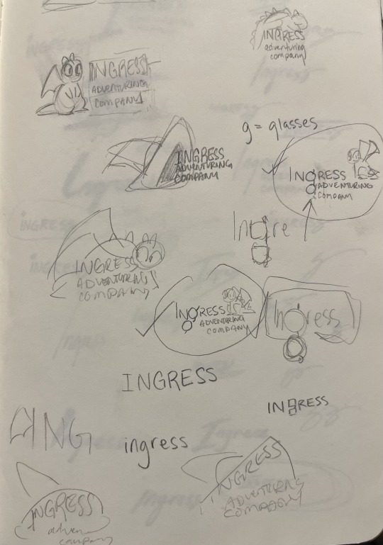
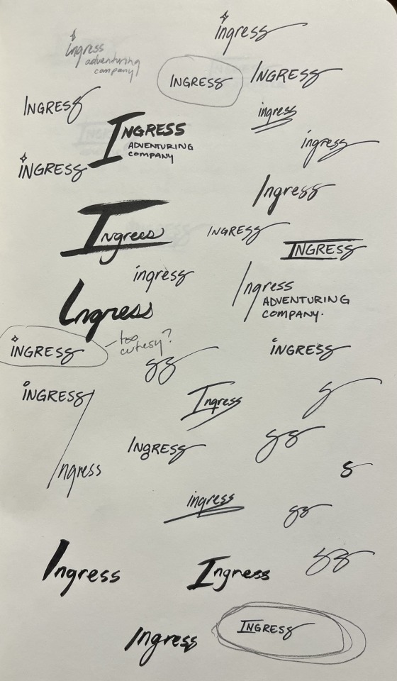
At first I played with the idea of including a little picture along with the logo. I thought maybe Toivo's glasses would be a good thing to try to include in the 'g' in Ingress, or that Rocky or Toivo's hat should appear in the logo. These were all discarded for cluttering up the logo, because the words themselves are all pretty long. Eventually, I started playing with the shape of the word itself, which very quickly lead to the last S becoming the signature swirl.
Next was iterating on this concept with fonts.
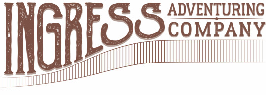
That lead to the second iteration of the logo, and the longest running version of it.
I chose a textured font to give it that "worn" feeling that was so popular in the design world in 2018. There were a ton of brands doing textured stuff to give their brand an edgy feel, but I did it to make it feel old and like it was from the late 1800s.
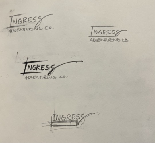
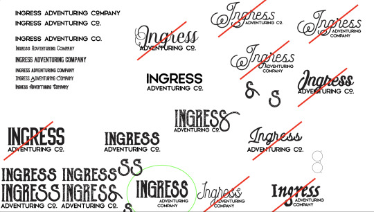
This would still be the logo today, but I ran into a problem: the font I used, Goldsmith Vintage, had a limitation on how long you could use their font for free and for printing. Fonts aren't particularly expensive, but if you want to use a font for publishing, you need a special license and those fees can rack up in price pretty quickly. It was unlikely that the people who made the font would come after me for using it, but I decided to not take that chance and instead refresh the logo one more time, this time putting more of my own hand in it.
This time, I took a different approach. I liked the old logo, but I was having a hard time finding a font that I really liked and would get the same feeling as the old logo... So instead, I decided to use calligraphy to draw it myself.
I rewrote the word Ingress Over and Over and Over, and specifically I rewrote the S's to try and get the perfect shape of it. Then, I picked out specific letters that I liked.
From those letters, I picked the ones I thought looked best, and smashed them together into one rough version of the logo that I liked.
And then from here, I made a digital version of the logo in Adobe Illustrator so I could get a nice crisp vector version. Also, I made rough versions of it, so I could keep doing the same 'old' look.
And... that's about it!
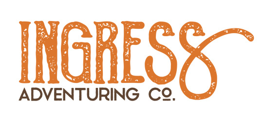
Ultimately, I think the new one is really fun, and I really like the fact that the latest one was made with my hand directly. Those aren't letters you can find in any font, they're my letters.
Maybe you can tell but, I have a lot of opinions on letter shapes.
Anyway, thanks for asking, and I hope this was as entertaining for you to read as it was for me to blather on about.
17 notes
·
View notes
Text

A handful of fantasy logo designs for shops I’d love to go to ˙𐃷˙
#my art#art#illustration#logo design#logo development#graphic design#digital illustration#fantasy art#fantasy illustration#dnd art#k#typography#lettering#design
18 notes
·
View notes
Text
Have you guys seen the new Detroit sign

Yeah, it kinda sucks ass
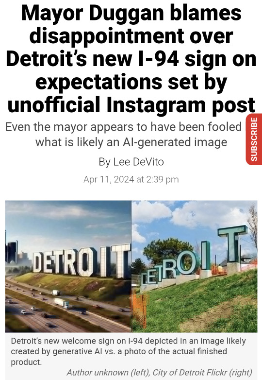
And no I'm not saying this because I saw the obviously AI generated image and my expectations were high, I'm saying this because I'm a graphic design student. Also, the first one still looks like shit and it lacks creativity. It's basically a copy of the Hollywood sign. Have the people who've seen the AI generated image seen what literally anything looks like? Are they stupid? Even the mayor is disappointed. Come the fuck on.
Not to worry, I've come up with a solution. I'm not saying this should be the final solution, but I think it's better than the one where you just use a masking tool to paint parts of the Detroit sports logos over the existing sign letters. I can't find a photo of it.
The solution? Random typography. Not many brands are bold enough to use it. The only one I can think of off the top of my head is the logo for CCS (College for Creative Studies), also in Detroit!
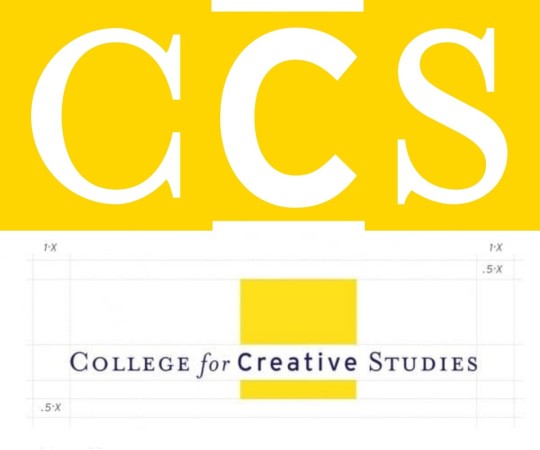
Top image is the acronym, bottom is the full logo. It even shows a grid system!
Maybe if we weren't such cowards, we could incorporate random typography into more brands. I'll be bold enough to take on that task.
You might wonder, how will you choose the typefaces? Using Detroit company logos and taking from those. But I won't do it randomly. In fact, I've done research on Detroit companies and when they were founded. Here are some that I've found.
Comerica: 1849
Carhartt: 1889
Ford: 1903
Faygo: 1907
Little Caesar's: 1959
DTE Energy: 1996
Oh yeah, those letters I filled in? They spell out "etroit." The D will be the Detroit sports logo used for the Lions and the Tigers.

Using some crude editing in Google Slides, I've managed to create this logo.

This uses the following:
The "D" in the Detroit lettermark
The "e" in the Comerica wordmark
A "t" in the Carhartt wordmark
A cursive "r" in the Ford wordmark
The "o" in the Faygo wordmark
The "i" in the Little Caesar's wordmark
The "T" in the DTE wordmark
Crazy? Yes. Maybe this is why most logos stick to just one typeface. But we're building a city sign, dammit! Why shouldn't we break the rules? This is certainly better than the Helvetica ass sign they have out there! There's been diss tracks made, that should be enough to convince the city to change the sign and get some real designers involved!
Also here's a better sign where all the letters are about the same size

I like this one better. There's even a consistent color palette of blue, black and orange, colors associated with the Lions and the Tigers. Where they are, however, is not very consistent. The tones are all different! Do we use all blue at this point? Maybe black? Maybe keep the D blue and also make "et" blue, then "ro" black, then "iT" orange? Or does it look fine like this?
Maybe later I'll find a way to 3D model this
9 notes
·
View notes
Text


ROK Army Recon 25 battalion
#roka#design#illustrator#vector#vector art#drawing#art#illustration#illust#patches#military#army#logo#logo design#logo development
2 notes
·
View notes
Text

Logo developement
#design#designer#anti instagram#art#my artwork#my work#my art#original my work#graphic design#art by me#content#unique content#content creator#logo development#logo design#business logo#development#multi talented#design illustration#illustrator#typographic#typography#gabber artist#logo
6 notes
·
View notes
Text

Napping bat artist. 🦇💤🎨
#pop art#logo design#logo development#logos#logo#bat#bats#cute bats#bat appreciation day#flying fox#flying foxes#vampire#vampire bat#bat cave#cute art#paint palette#murcielago#pollinators#nectar#pollen#die fledermaus#artist on tumblr#art commisions#art commissions open#folk art#basquiat#andy warhol#napping#nap time#upside down
3 notes
·
View notes
Text
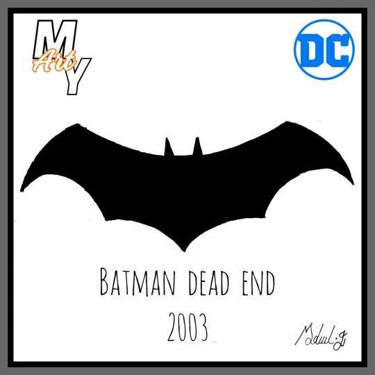

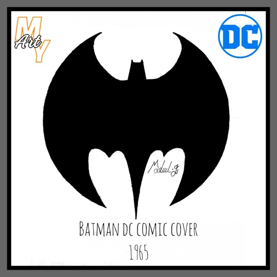
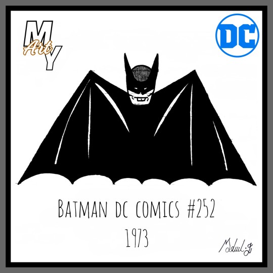

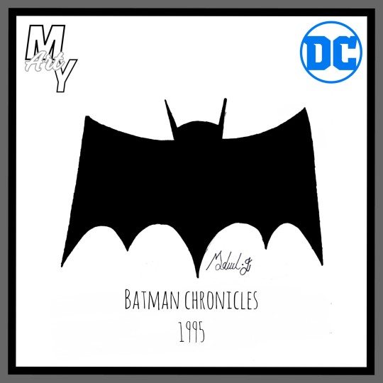
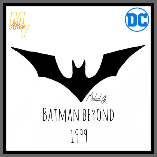
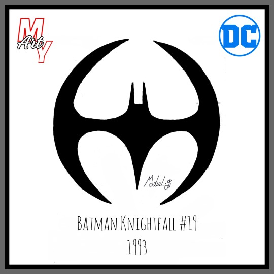

#batman#logo#logo design#dc comics#batman gotham adventures#gotham#arkham asylum#my draws#hand drawn#drawing#painting#paint#draw#logo development#design#batman games#arkham knight#handmade#comics#comic art#superman
3 notes
·
View notes
Text
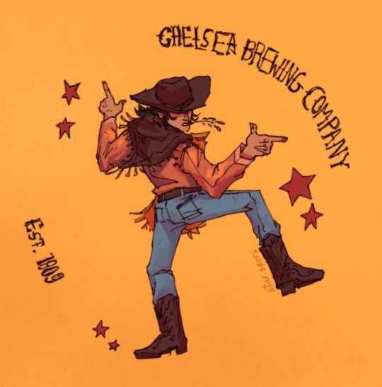
Chelsea brewing company
Concept logo design thing idk i made a while ago
#digital art#digital illustration#digital painting#digital sketch#digital artist#logo design#logo development#concept art#concept sketch#concept design#character concept#logo concept#illustrator#illustrative art#art student#art#drawing#sketch#art inspo#Wild West aesthetic#Wild West art#cowboy aesthetic#cowboy art#western aesthetic#western art
5 notes
·
View notes
Text
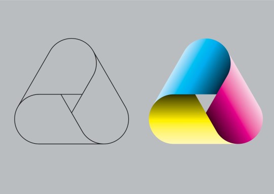
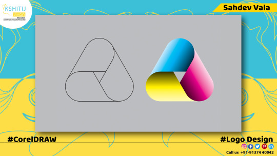
Gradient Logo Design
#CorelDRAW #Corel #Coreldrawvector #CDRFile #cdrfiles #coreldrawvector #coreldrawart #Coreldrawfile #coreldrawtutorial #coreldraw #illustration #vector #vectorart #graphicdesign #graphicdesigner #creative #creativegraphicdesigner #creativegraphic #creativedesigner #sahdevvala #valasahdev #kshitijvivan #kshitij_vivan #educationvala #educationcala.com #drawingandillustrations #vectorart #art #illustartiondrawing #basicsshape #pattern #flatlogo #flatlogodesign #flatvector #gradientlogodesign #logodesign
#CorelDRAW#Corel#Coreldrawvector#CDRFile#cdrfiles#coreldrawvector#coreldrawart#Coreldrawfile#coreldrawtutorial#coreldraw#gradient logo#gradient logo design#logo design#logo development#flat logo#brand logo#new logo
2 notes
·
View notes
Text


#logo
#logo development#logo creation#logo design#logo#logos#logo edit#logo generator#logo inspiration#logo keychain#logo maker
1 note
·
View note
Text
#brand style guide#line art logo design#modern logo design#graphic design#minimalist logo#business logo#modern minimalist logo#logo design#logotype#logo#modern logo#logo development#line art logo#line art#drawing#original art#traditional art
3 notes
·
View notes
Text

I will do 3d business logo design with free business card design
About this gig
Unique Minimal Logo or 3D Business Logo Design Gig
Hello there!
We are team of expert graphic designers having 6+ year of graphic industry experience. We have designed for various clients around the globe for past 6 years.
We worked with many known companies and organizations.
We have ability to look from the clients eye and understand their needs to provide them best logos that help them to achieve their companies goals.
What will you receive?
Unique minimal 3d business logo with multiple concepts
3D mockups
Logo Transparency
100% original Print ready vector
Social Media Designs
Unlimited free revisions
100% ownership rights
100% money back guarantee
File Formats PDF-JPEG- PNG -SVG -PSD EPS-AI
Why us?
No Stock Images/clip-arts
Express delivery
Extraordinary value for money
No Pixel or Quality Loss
Note: Don't place complex orders in basic package. Please come inbox first.
#logo inspiration#logo igd#graphic design#logo inserters#logo development#logo design#graphicdesigner#logotype#packaging#logo animation videos
3 notes
·
View notes
Text


2 notes
·
View notes
Text

Are you searching for web design agency for your project? If so Reactive Graphics is the most reputable. We are an award-winning London digital agency established for over 18 years. Our services include web design, brand identity design, online marketing, web site hosting and maintenance.
#webdesign#webdevelopment#web developers#web graphics#web hosting#branding#graphic design#logo development#website#webdesignagency#brand identity#logo#web maintenance#brand design#graphic designer#creative logo
3 notes
·
View notes
Text
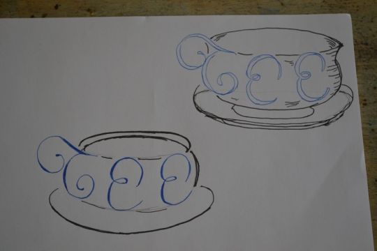
Tee sketching
#design#designer#anti instagram#art#my artwork#my work#my art#original my work#graphic design#art by me#nieuwe secession#gabber artist#sketchbook#sketch#sketching#logo development#logo designer#logo#hand drawing#tee
8 notes
·
View notes
Photo


Logo design by GHOST Graphics
...more about our work at www.ghostgraphics.eu
#logo#logo design#logo work#logo portfolio#logo designer#logo development#logo star#logo studio#logo type#logo maker#logo mark#identity#logoideas#corporateid#brandidentity#Branding#branddesign#graphic design#ghost graphics
9 notes
·
View notes
Last Seen Blogs
glittery-phonaesthemes
o wow neat
liz-is-thinking
Ha Anh Nguyen
ommeow-blog
I Am Buddha Cat
followmeproperty-blog
followmeproperty

youzenmaiden
it's a rozen maiden joke