#listen i started following a tutorial to colour this thing digitally
Text

For @mungroveweek day 4, prompt "The Camaro vs the van"
A doodle that got out of hand.
#mungrove#mungroveweek2023#billy hargrove#eddie munson#stranger things#listen i started following a tutorial to colour this thing digitally#but i did it with a mouse and I lost patience SO FAST lol#so watercolours it is#i had a lot of fun googling band logos#also: what is perspective? what are shadows? what are legs? what are feet? lol#fuck it i still like it
389 notes
·
View notes
Text
Task 6 | Volume + Proportion + Site II

ABOVE: Iteration 1
PROCESS
I have never used SketchUp before, but my background in Photoshop gave me a good base to start. As this was not entirely self-guided, I followed along with the class, learning about the basics. I first had to get my head around the x and y axis, and importantly object 'stickiness'. For my first iteration I got a bit distracted and made a composite volume out of pyramid and trapezoid like 3D shapes. I was playing around with stickiness at my own pace, grouping objects together, and colour and opacity. I was essentially just trying out the different tools and probably getting ahead of myself. Though it was good to get the cogs ticking with this new digital medium.
The second iteration is more sensible, and more feasible in reality. I got the 'feasibility' part mixed up with this task as the first iteration was meant to be feasible in reality and ruled my gravity. While I mixed it up, I still did both of the proses. The second iteration is comprised on cylindrical volumes emerging from the 2D plane. On top of these formations were more organically shaped cylindrical forms I made with the free form tool. Again I played with colour to give the impression of depth, mass and to create visual contrast to emphasise individual proportions between the forms. These look like they could be whimsically shaped fish tanks.
I tried a third iteration as I wanted to incorporate negative space with an imaginary installation, in an imaginary gallery room. I wanted to make a form that would be all encompassing in real life. I created a box and hollowed it out to create a room. I painted it black, then I punched through a cylindrical form through the roof and painted it pink, and once again but painted orange. This iteration was difficult because I got a bit lost trying to work out how to create hollow forms. I couldn't get it to do what I wanted but it was beneficial to try. My idea would be that a light source would be within the empty cylinder, emanating a warm light through the transparent pink and yellow planes. It would fill the dark room with a nurturing light, I love the feeling of walking into a dark room with a salt lamp on. While my imagination got away from me, I like the mass and form I was able to display through negative space.
DOCUMENTATION
ABOVE: Iteration 1
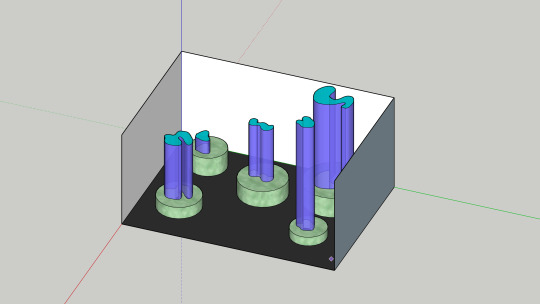
ABOVE: Iteration 2

ABOVE: Iteration 3
REFLECTION
I was able to familiarise myself with the basic SketchUp tools, so I can now continue my work with it at home. I felt I had the hang of it at the start, but when I tried my third iteration I think I got ahead of myself. If I slow down and watch tutorials I may be able to achieve that composition. I struggle to listen in class sometimes, I have a tendency to get distracted and do my own thing and I suspect this may have let me down in learning some key points, and probably why I got the iterations mixed up. I am happy with this task overall in reflection, though I will need to go slower with the next SketchUp tasks to get them right. This will be necessary if I want to try more sculptural visualisations like task 4.
ARTIST RESEARCH
FINN COSSAR

ABOVE: Cossar, F. (2022). Mineral Greed [stone and molten metal sculpture]. https://www.instagram.com/p/CgvUsm5BxFp/
A friend from primary school Finn Cossar, is a currently practicing sculpture artist local to the Sunshine Coast who works with metal and stone. Cossar's work is concerned specifically with global warming and the environment. Mineral greed (2022) is comprised of a stone with a warm light emanating form it's center, imitating the molten center of the Earth where minerals are formed. Spurting out of the stone mass is fluid, organic molten metal that appears to be bursting out of the heat. "This mineral rich stone is at breaking point, spewing out all that it has, both beautiful but unprofitable." (Cossar, 2022). Inside the molten metal are air bubble that create negative volumes within the formation, which is then completed with the positive volumes on the ground, scattered around the focal formations. Cossar's work has a deep connection to the earth through material. The great mass is intimidating, as much as the power the Earth has. I admire the creativity and innovation this piece displays, the proportions of each ingredient have a causal relationship and are uniquely tied together and emphasised with materiality.
ANDY GOLDSWORTHY

ABOVE: Goldsworthy, A. (1991-2003) Floodstones Cairn [stones stacked into a sculpture]. https://artincontext.org/andy-goldsworthy/
Andy Goldsworthy is an artist primarily working with land art but his practice traverses photography, installation and drawing. He also shares a deep connection to nature and the materials it provides up to create with. Goldsworthy's sculptures aren't just in nature but are a part of it. Goldsworthy's site specific work champions the intrinsic beauty of the natural materials he uses, which are nurtured by his organic and peaceful process (Art in Context, 2021). Floodstones Cairn is a great example of Goldsworthy's use of volume and site. The structure is composed of many large stones into a great cone shape, it is created from it's site. The presence of the form is unavoidable. unlike Finn's work that is built to last, Goldsworthy's work is ephemeral and reclaimed by nature over time.
REFERENCES
https://sculptureontheedge.com.au/artists/finn-cossar/
instagram
https://finncossar.com.au/
1 note
·
View note
Text
Got tagged by @ultkyu to answer some questions! Thank you dear, I'm so excited for this~🥺💞
1. If you were an animal, what animal would you be and why?
× I'd be a cat, 100%. Cats are my love and my life, I've always wanted to be one, tbh (not in a furry type of way, but I feel like life would be easier if I was a cat, lmao). I love how cats take no shit and do whatever they want. They're very independent and individual and I'm all here for that.
2. What two anime characters or kpop idols are your type?
× Can I do both anime characters and kpop idols??
× As for anime characters, Jaeha from Akatsuki no Yona and Kirito from Sword Art Online are totally my type!!😍
× And in terms of kpop idols... omg,, how am I supposed to *only* name two?? Hmm, thinking about it, I guess not all of my biases are my "type" per se... but there's two that come to mind right now hhhh. One of them is Kevin Moon from The Boyz, he really ticks off (almost) every bullet point in my list for my "ideal type" and honestly, this list is freaking contradictory and has vvv high standards but Kevin is THAT boi, basically my imaginative ideal boyfriend personified. :') And the second one who I'd say is totally my type is Hwang Hyunjin from Stray Kids. I've always loved drawing him the most of all kpop idols and I still do tbh (but I can't fill my feed on my insta art account with JUST Hyunjin drawings,, you know,,,). His fashion!! I'm so here for it and vibe with it so well. Plus,,,idk,,, I feel like I could connect to him in some ways so ajxjsjdjjs yeah. There's just something about him and Kevin that inspires me so much, I really love these two bois.
3. Are there any writers or artists (art or music) that inspire you? If so, list 5.
× YES. I decided to name a few artists because I realize I've never talked about the artists whose artworks inspire me the most. They're all on Instagram, so I'll be naming their @'s
a.) @/shooky_dough: I'm probably not the only one who knows Nikki, hehe, but her art is SO amazing. She's got this really distinct style which I'd put into the category of semirealism. Her kpop fanart is soooo good and I used her tutorials to learn how to get better at sketching. If you look at the sketches I've been posting for the past few months on my insta art account, you'll notice that they're highly inspires by Nikki's art. She's definitely the artist I'm looking at most in terms of inspiration and improving on my own art.^-^
b.) @/angelganev: His art is sooo pretty. He does semirealism and I've found him by browsing through pinterest to find some art inspiration/references/tutorials. He also does drawing contests in which his followers can draw one of his work he selects in their own style and he gives a shout out to the ones he liked best. It's always interesting!!
c.) @/melmadedooks: This man can draw about ANYTHING, he's so talented. He used to draw lots of his 'dooks' and I've found him through seeing some of his works on pinterest (again, lol). I've actually redrawn two of his 'dooks' and posted them to my art account AND HE LIKED BOTH OF THEM, I WAS SO HAPPY OMG!!! He used to draw his dooks using only one coloured pencil, so I've also started experimenting with that and instead of using a graphite pencil, I used coloured pencils for my sketches and those gave off very different vibes that I really liked!!
d.) @/rezajeez: Probably *the* kpop fanartist I've been following for the longest of times. They are AMAZING!! They mainly do huge photorealistic portraits with INSANE details. It's funny actually, because their work is the complete opposite to shooky_dough's work. While Reza draws photorealism on a big surface (probably A3? maybe more??) and draws very detailed, Nikki focuses more on sketches/more semirealistic and "simplistic" art and it's usually drawn quite small, so seeing these opposites really broadens my horizon, I think^^
e.) Last but nor least, @/rossdraws: In my opinion, he's the modern day Bob Ross! His art is so freaking stunning, have you checked out his digital art landscape series?? The amount of talent this man holds in his pinky finger is more than I've got in my whole body like- OOF a huge inspiration to me!!~
4. If you could play any instrument, which would you play?
× The guitar!! I really want to learn how to play it~
5. If you could choose one anime to live in, which one would you choose and why?
× Either Ouran High School Host Club or Your Lie In April. The first one is just so much fun and I'd love hanging out with the host club members and as for the latter,,, I just really want to be here for Kousei and help him through his anxiety because I know so well how it feels like and I also wish I could sing while he plays the piano, we'd be a great duo✊🏻😔 (I'm sorry, I couldn't choose one)
6. This is a bit of an old DeviantArt fic trend, but if you received an Android of your favourite character from any anime/show/etc., who would it be?
× Hmmm... that's a great question omg there's so many amazing choices I could make😭😭 But I think I'd go with Kirito, I just really really love him ahhhhh
7. Is there anything you would like to do but haven't because your friends/family didn't want to do it with you?
× There's actually a few things I could name... first, I really want to go bungee jumping (preferably from the Macau Tower, as it's the highest bungee jump in the world😍) but my fam and friends think I'm crazy for wanting to do this but I'm actually quite an adventurous person which probably not many people know about me, so I love doing stuff like that.✊🏻😂
× I would also really like to travel with friends... it's not that I dislike travelling with my mom and stepdad but whenever I can't take someone with me, I feel like such a child ??? idk,, never travelling (I wanted to say "without adults" but then I realized I AM an adult) on my own with friends and always tagging along with my parents kind of make me feel like I'm not independent or mature/grown-up for it. But I feel like none of my friends want to travel with me... most of them have a travel buddy already but I just... don't akdjsjs
× and last but not least, getting more specific, I really want to travel to Hawaii and South Korea, but so far, I haven't made it there yet :c
8. What's your favourite flower?
× Cherry Blossoms all the way💞 but all flowers are beautiful and I really like roses, too.
9. What are some of your hobbies?
× My hobbies include singing, drawing, dancing, writing, reading, researching astrology, studying Korean, watching youtube videos/netflix, listening to music and OF COURSE DAYDREAMING✊🏻😔
10. If you were going to be stranded on a deserted island with nothing but the clothes on your back and a bag, what would you put in the bag?
× I'd definitely put food and water in the bag, my phone, earphones, a portable solar charger with a USB cable (so that my phone won't die and I could chill for however long I want while watching kpop mv's and then also use my phone to call for someone to rescue me from this island once I start running low on resources), all the books I still want to read, my art supplies and a few sketch books, some towels that I could use to lay on or use as blankets, a pillow and my teddy bear, and obviously a toothbrush and toothpaste, a hairbrush and a few hair ties and bobby pins (you don't want long sweaty hair stuck to your skin during a hot summer ewww), some soap to wash myself and my clothes, sunscreen and also some insect spray to keep the bugs away!! (it's a big bag, okay)
~
Sorry for writing such an essay omg!!
Here are my 10 questions:
1. What compliment you've received meant the most to you?
2. Would you rather meet your favourite celebrity/group/bias and realize they're not at all how you imagined them to be like (maybe they're not as kind as you thought, for example) or never meeting them in person but it turning out that they're actually the amazing, kind, sweet, generous, etc. person that you thought they were? (I hope that makes sense hhhh I think the ethics of this question are really interesting)
3. What's your current favourite song you always use to get hyped up to or a song currently stuck in your head?
4. If you had to write the book of your life, what genre would it be and what would you choose as a title?
5. Name your top 5 musical artists and your favourite song of each of them?
6. If you were invited to a big humanitarian event and had to give a speech on a topic you'd want to bring about a huge change for the better, what topic would you choose to speak about and voice your opinions/ideas? (Assume public speaking is one of your strongest assets and you'll ace this no matter what)
7. What is something (a skill, personality trait, or something appearance related, it can be whatever) you wish you had and/or you really admire in other people?
8. What's your favourite anime/show/youtuber (you can answer whichever you got an answer for, it can be all three options of course :D)?
9. In kpop, are you more into vocalists, dancers, rappers, maknaes, leaders, or visuals (or maybe a mix of some/all :'))?
10. What's your most beautiful/favourite memory?
oof I hope these questions will be interesting to answer🥺 hmm, Imma tag @littlefallenrebel @jinniesmeow @softpastelmx @yeonki @hanstagrams @marculees @chrryjin and anyone else who'd like to do this~💞💞💞
11 notes
·
View notes
Text
The Salon Agency
Starting from the previous group’s project, I decided to develop it further and go deeper in the analysis of the meeting space concept by further researching some new topics like STORYTELLING, COMMUNICATION, CONVERSATION. After doing some more research about what do you actually need to run your own agency, I decided that the best way to convey this message would be to create an agency called SALON, whose purpose would be telling people’s stories. During my research process I came across this French word salon (in English saloon), which describes a gathering of people held by an inspiring host. During the gathering they amuse one another and increase their knowledge through conversation and exchange of ideas. Salons came alive between the 17th and the 18th century, and they were a very important place for the exchange of ideas. That period in fact has been labelled the 'age of conversation'. But, above all the salon was one of the long-established systems using oral tradition (of which storytelling is a form).
To make everything more accessible for people I decided to create the graphic interfaces of a hypothetical WEBSITE AND APP.
I decided to focus my attention just on a few of them such as the ABOUT PAGE, to make clear for people which would be the purpose of this agency.
Storytelling is at the base of human nature, is part of our DNA. Whatever you are doing or saying, you are telling a story, in every moment of your life.
Salon is a creative agency based in Manchester whose goal is to create unique cultural experiences for an unlimited audience all around the world, WITHIN FESTIVALS AND EVENTS.
We believe in stories and give people the chance to tell them in their own way.
WE LISTEN TO THOSE SAME STORIES AND BRING THEM TO LIFE, CREATING A PERFECT UNION BETWEEN TRADITION AND MODERNITY.
IN A WORLD CHARACTERIZED BY THE DIGITIZATION OF SPACE, WE COMBINE REALITY WITH TECHNOLOGY IN ORDER TO CREATE AN INTERACTIVE EXPERIENCE THAT ALLOWS PEOPLE TO COMMUNICATE IN A TOTALLY NEW WAY.
IN THIS WAY I CLEARLY DEFINED THE MESSAGE, THE AUDIENCE AND THE CONTEXT.
Then I created a PORTFOLIO SECTION, to make people aware about which kind of experiences this agency would create. One of these experiences would be the BLOOM EXPERIENCE. I decide to maintain the same name we used for our group project because, I still like the idea of these cubes “blooming” all around the world within festivals or events.
BY JOINING THE BLOOM EXPERIENCE, people would be able to become the author and tell their own stories to a wider audience.
At the same time the participants in these experiences would be the storytellers and the listeners of other people’s stories, creating this climate of storytelling, exchange, listening, conversation, interconnection.
The focal point of the entire experience would be a cube entirely made up of screens, both inside and outside. People would be able to share their own stories by projecting them on the cube’s surface.
MEANWHILE would be possible to take a sit inside and have some drinks and a chat.
I also did a further research on the meaning of the word BLOOM and I found out that it could also describe the glare caused by an object reflecting too much light into a television camera (related to the fact that the cube is made out of screens)
To join the experience people will simply scan a QR CODE which will lead them to the WEBSITE SECTION explaining the process to follow. They will be able to choose on which screen, inside or outside, they can share a TEXT, an IMAGE/PICTURE/PHOTO, or a VIDEO.
Apart from scanning the QR code, the screens on the outside bottom walls will also be touch screen, a keyboard will appear, and they will able to type in their favourite quotes or their own ones, by using their own language. In the inside they will find the QR CODE on each table t do the same thing. All the table will be TOUCH SCREEN as well, to let people, chat between tables
I came up to this idea after doing some research on the old internet cafés and on the new one cybercafé. As I said at the beginning the idea behind that is to merge the pure virtual conversation with the proper physical one and so create a totally new way to communicate.
I then create an ONLINE SHOPPING SECTION to let people buy all the SALON BRANDED PRODUCTS. I divided them in some main CATEGORIES, such as CLOTHES AND ACCESSORIES, STATIONERY AND CO., OTHERS…
The idea of using the graph paper emerged during the tutorials I had with Nichola as well as thinking about which product could be linked to the concept of CONVERSATION, this is why I also realized some postcards and even a writing paper.
People will also have the chance to see/buy the CATALOGUE, containing some VOUCHERS to get discounts and some more information about the agency, the experiences, and other things.
I have basically done the same with the MOBILE APP.
At this point I think it would be nice to explain you how I came up with the FINAL LOGO for the SALON AGENCY, by showing you the entire process. So, I basically started from the logo we created during the last groups project and played around with shapes.
I then decided that I wanted to make it simpler, be reducing the old logo to these two small black and white shapes.
Of the OLD LOGO I maintained the font and the colours.
Then I came up with this idea od the square shaped BUSINESS CARD and the idea of using the QR CODE rather than give to people all the information, they will HAVE TO scan the code which will lead them to the website/app download page.
Another process I would like to show you is the making of the POSTERS for ADVERTISING. I have basically played around with the small shapes of the LOGO, combining them in so different way. I also deconstructed my own selected text and played around with some words to create a sentence which could grab people’s attention: STORIES LIVE IN US FOREVER.
I thought that it would be nice to have also a MOVING POSTER, around the cities or even just outside the proper BLOOM EXPERIENCE CUBE, just to welcome people, without giving them to many information about what it will happen inside. If they want to know something, they can obviously scan the QR CODE which will lead them to the website!
0 notes
Text
Digital Walkthrough – Dragon Thrall
From April 2007. Nowadays I tend to completely work in Photoshop CS, but many of the techniques are the same no matter the software. This is a fairly rambly post as it's taken from notes I made while painting. This is NOT the way I work for client work!!!!! This was a personal face study that I built a painting around. I now plan things!
This painting was completely unplanned. It started out as a gothic vampire piece… ended up something completely different! These are some of the notes I posted to LiveJournal while painting, and subsequently featured in February 2008’s EMG-Zine.
Normally it’s a good idea to plan a painting. You should work out your composition details, color schemes, lighting sources and other technical details, but sometimes it’s more fun just to get in there and paint! Some of my best paintings have been the result spontaneity, experimentation and sheer desperation to fix a mistake! It started out as an exercise in skin tones, turned into a modern vampire piece and ended up having dragons! Hopefully you’ll learn a few things about why planning can be useful, as well as why it can also be fun to follow the rambling path your muse sets you on!
A few thoughts on digital art and painting software:
There is a plethora of information on digital art available online. This article isn’t a basic A+B=C tutorial. It’s more a discussion on the creative process I employ while painting digitally. For this article you will need a basic understanding of Adobe Photoshop or similar software and have access to a digital graphics tablet (or be really good with a mouse!). Access to Corel Painter would be handy too, however you can get similar effects in Photoshop with a bit of experimentation and practice.
I use Photoshop and Painter together. I’m not going to argue about which one’s better – because frankly it’s like comparing a banana with a pineapple! They’re both graphic software programs, however they’re designed for completely different purposes. Photoshop is an editing tool which you can paint with. Painter is purely designed for painting, with a few editing tools thrown in. With each new incarnation the blurring of these definitions decreases. I’m sure that if you experimented enough, you could probably get the result you want in either software.
Setting up the canvas
I started the painting as an exercise in skin tones. I hadn’t worked in Painter for a while and thought it was time to flex those painting muscles again. Unfortunately some versions of Painter can cause files to corrupt in native Painter file format (pre-version 5), so I recommend that you either create your file in Photoshop first, or save the files in Photoshop format (*.PSD extension)
Just like painting on paper or canvas, a blank canvas can be very intimidating. I always lay down a color of some type on the background layer just because it’s something to start with. When you plan a painting it’s a good idea to think about the lighting in regards to the background. If you are painting a scene which is sunny, then a warm yellow or warm blue might be a good choice. If you’re thinking about a night scene then start with a dark indigo or a cool blue. If it’s in a forest you may want to think about a green, while a snow-filled landscape may require a pale lavender-blue color.
As I said, this was a practice for skin tones so I decided on a dark maroon to pick up the dark tones in the hair (I’d planned on painting a redhead). Most of the time I apply a lighting filter, or a gradient to make it more interesting – kind of give it a focal point.
The first character I sketch on a separate layer to the background/ canvas. When painting directly onto the computer with a graphics tablet I generally start with a few lines to work out the placement of the head, eyes, mouth, nose and ears. I then work out a few ‘base’ colors that I will use for the skin. I place ‘dabs’ of the color I use regularly somewhere on the canvas:
A mid pinky-brown color – the base color
A pale yellow/ pink color for highlights
A redder tone of the base color used for cheeks and nose area
A purple version of the base color for shadowing
A darker brown-pink for the deep shadows
A light pink-purple (not shown) for blending in areas where the skin is fine and the veins show through.
In later versions of Painter you get a tool called a ‘mixer’ where you can place dabs of colour and create variants using the mixing tools. If you are having difficulties with colours try using the colour picker on real photographs and see what ‘real’ skin colours look like. You’ll probably be quite surprised!
Once I have the colours and some lines down I begin to paint. For this face I used Painter’s digital Airbrush set at about set at about 10% opacity, 100% Resat, 0% bleed and 0% jitter. I vary the brush size from about 150, right down to 2 or 3.
I spent about 2 hours to get to this stage.
A few notes on skin tones:
Every person has a different skin tone and texture – we’re not all a standard ‘flesh tone’, straight from the tube
Men and women also have slight variations in colouring
Different nationalities have different skin tones. Some have ruddy complexions, others a yellow undertone, while some have dark skin. Study photographs, place them next to each other and note the differences
Skin tones reflect the colours around them. If you are wearing a purple shirt, you will get some reflection under your chin depending on the lighting. If you are standing next to a yellow wall, the side facing the wall will reflect the yellow.
The colour of the lighting impacts on skin highlights and shadows. If you use a yellow light, the shadows of the skin are generally the complementary colour (in this case purple).
One thing I remember reading (Don Seegmiller in his book Digital Character Design and Painting) was the fact that the strip across the nose section of the face is pinker than the rest, while under the eyes should be purplish-blue as the skin is so delicate here. I recommend his book for color theory, regardless of the painting medium! In fantasy art, the ability to create convincing skin tones in important, particularly if painting something like a Drow, or even an alien with blue skin
Adding the hair
Hair is basically made from 4 colours which I vary the opacity and size of the bush. The illustration below shows the four colours and the way I build up the hair.
A mid tone
A light tone
A dark tone
A very light tone for the highlights
Why having no ‘theme’ for a painting can be a problem!
Like most sketches where I don’t think about anything much except picking up the ‘paintbrush’, I get to a point where I start wondering about things like ‘does she want straight or wavy hair’, ‘does she wear modern or old fashioned clothes?’, ‘what the heck do I do with the background?’.
At this point I was listening to rock music and it was about midnight so I decided it should be a vampire/ gothic piece. Originally it was just going to be a strapless dress but it ‘felt’ wrong. I added a leather jacket and a cameo choker. I planned on having a night sky, maybe the silhouette of a building. This means that dark blue is going to have to replace the maroon canvas colour. A guy is going to be behind her, all ‘vampy’ and hopefully pretty good looking! I took a break and came back to the painting after some food. I’d been working for about two or three hours and realised that I’d changed the angle of her torso mid painting which is why it is looking odd. This is why it’s a good idea to plan your painting before you begin! You can waste a lot of time working on something, only to realise there is an inherent flaw in the drawing. So I really had a think about where the painting was going… which was feeling like the great digital dustbin in the sky!
Unfortunately I only had a clear picture of the character’s faces so I was basically very aimless when painting. I get bored with details so I moved onto the male character. I knew I’d have to revisit the female character but something was really bothering me about her and I didn’t want to think about it too deeply. I spent about 2 hours working on the guy. Notice that his skin base is slightly more yellow. Guys’ faces are also more angular than females (generally) so I painted in a more aggressive manner, not blending as smoothly as for the female. I also added in some texturing with a ‘captured bristle’ brush.
A note on photo-references:
When I work from photo references I try to avoid working directly from one reference for copyright reasons. Each painting I’ll often work from at least half a dozen images (which I normally collect AFTER I’ve made the initial sketch). I also have a huge collection of images that I’ve harvested from the net, reference books/ CDs, personal photo references.
I also like working with greyscale images and using small images so I can’t rely upon them too heavily. This way I can make the colour up on the fly. I also find that it helps to practice sketching in greyscale. You focus on rendering the form rather than colours, which teaches you a lot about volume, lighting and texture.
Back to the painting
I spent another 2 hours on this (up to about 10-12 hours now). I kind of became obsessed with finishing his face. I put him in a leather jacket and white shirt and played around with where his arm should go, ultimately deleting it. I changed the background colour to a near black colour while I was playing with things. I’m still not convinced about what’s going on in the painting. But I’m happy to let my mood decide what’s going to happen. I enjoy these kinds of paintings because I just let the paintbrush take me where it wills. However it’s getting to the stage where I will need to decide if I’m going to do something with this painting, or just file it as an experiment.
I’ve got more details to do… tidying up his eyebrows, giving his skin some texture around the jaw line, finalising his nose and lips, and one of his eyes is slightly off (shadowing and shape’s wrong… but I’ll fix that up later.)
Vampire goes Renaissance?
I’m heavily influenced by music. When I paint I listen to a variety of music, and often it can influence what I paint. I stopped listening to my Dishwalla album and put on Medieaval Baebes… at which time I thought to myself ‘this is just two people standing together, there’s no fantasy here’. So the painting went Venetian 16th century!
I’ve obsessed over historical costume for as long as I can remember and one of my favourite paintings is Rafael’s La Donna Velata. I deleted the leather jacket and replaced it with a front-laced bodice over a creamy chemise. This costume was popular with working classes as it was comfortable and didn’t get caught up while working. I think it is important to think about the clothes you put your characters in… it is part of their story. It can suggest what they do and their status in society, it can also indicate if they’re light and fluffy, or rigidly straight-laced.
A few hours work went into the dress. It’s not finished yet. This is only the basic form. I’m debating about patterns and colours. The more elaborate fabrics tended to be used a few decades after this dress style was popular, and only by the wealthy, but it’s fantasy so I guess I can do what I like!
Working out the background:
I have decided a night sky doesn’t suit the lighting of the characters, so I’ll do a dawn/ dusk sky. I flicked through some reference shots of skies and started laying down some colours in Photoshop with a large airbrush tool. Not much I can say about skies except for the light will reflect on the characters, which is why it’s not a strong sunlit scene. In this low light there won’t be much reflection or shadow.
I’m still playing around with the idea of having a column behind the male character. The sky’s getting close to being completed. I’ll start looking at the lighting in the painting later on… normally that’s something I do in the planning stages for a *proper* painting. It’s up to about 200MB… time to save a new copy and collapse a few layers I think.
On a side note, I’m not happy with the poses or placement of the characters. They’re too rigid. There’s no connection between them, I need to bring them together somehow. I’ve started to realise the girl’s body looks too small and much too straight on for her head. I’m going to have to repaint whole chunks which will be a lot of extra work. You can do this with digital, however if I’d planned the painting I wouldn’t have to be ‘fixing mistakes’ at this late stage!
I added some columns and moved the characters closer together. Each character is on a separate layer and I often take a copy of a layer to do the modifications (in case I muck it up!) I also do iterative saves… I have 7 versions of this file from various ‘major’ points from within the painting.
I like the placement better than the previous version, but I know that I’m going to have difficulties with his arm placement. I also don’t like her headpiece. I haven’t spent much time on it, but it just looks wrong – far too elaborate. I’ve got a feeling that she’s not the kind of girl to wear masses of jewellery! The pose is still disjointed. Why is she moving away from him? It doesn’t exactly look like a comfortable pose. Is he trying to put on her cloak, take it off, or strangle her? When you paint, you have to think about how the painting could be interpreted.
The home stretch
Unfortunately I sat down and painted in one marathon session (without taking saves part ways through). Inspiration struck and all at once I knew exactly how the painting had to look. All the missing elements fell into place. I had the narrative that went with the painting, I knew why they were standing together. The pose was vital to the scene. I think it is important to know ‘why’ things are the way they are. Sometimes it can be as simple as ‘because it looked right’ or ‘because I want the viewer to feel scared’, but with more narrative pieces, the ones that work best tend to make every piece of the painting into something vital to understanding the whole piece… like clues in a mystery novel.
I ended up moving her directly under his chin and slightly curved into his body and moved his arm so he’s supporting her, rather than embracing her. The sky remained unchanged however the bottom needed a focal point – it was too empty. The forest and cliffs are a scene I’ve used in numerous paintings… they are like an old friend – something quick and easy.The lake came next, and the glow lights (which have no real meaning, but they ‘fit’ with the mood of ‘magic in the air’). It still was looking empty. In the story in my head the character’s connection is through dragons. I’d already planned on giving the female character a dragon necklace and the male character golden eyes, however I think a more ‘literal’ representation of the dragon was needed. The placement was deliberate in that I wanted the viewer to follow the motion from the dragon to the characters and back around.
Often when I’m working without reference (like I did for their poses, I try to work out their bodies in their entirety. Even though it still looks a little ‘wrong’, because of the angle of his body, his shoulder is right behind her hair. I tried extending his shoulder but it didn’t look right either.
I added an Overlay layer to do some lighting along the side of the girl’s head and the columns. There are 13 layers in the final version (after I collapsed the multiple character layers from the previous version).
I thought I was finished. I posted it online, added it to a few galleries, but something was still a little unrefined. So I stepped away from it for a week or two (see further down for the revised version).
Some notes on Composition
I like working with the Golden Mean (also called the Golden Section/ ratio/ proportion/ The Divine Proportion). It’s a way of dividing up a painting so that the image is artistically and geometrically pleasing. It’s based on mathematical principles and can be seen in nature in such shapes as nautilus shells. Below I’ve added guidelines in pale blue that divides the painting into thirds. Notice how the parts of the painting that your eyes are drawn to tend to fall along the lines, with the light in the forest being at a ‘focal point’, where the lines intersect.
The painting’s composition loosely fits into what is called the ‘L’ Composition
It could also fit in with ‘V’ or ‘triangular composition.
The trick is to try and get the viewer’s eye to follow the movement from one point of the painting to the next
Final Piece:
I went back and refined it a little… just added a few more details to the hair, fixed the column and tidied up the tree-line. There are still aspects I’m not entirely happy with, but I’ve spent enough time on this painting… I don’t want to overwork it.
So 20 or so hours later, here’s the final piece and the story that goes along with it:
Text I wrote to go with the painting
The dragon-thrall caught her, its silken threads binding her mind to the golden dragon completely. Kara and the great beast launched upwards as one, pushed from powerful back legs. Muscles flexed as the wings extended fully, capturing the wind and propelling them higher still. Freedom! She threw back her head and laughed, the rumble echoing from the surrounding cliffs. The sun and sky called to her, daring her to fly higher and faster than she could ever dream.
She wheeled to the right as she caught movement in the valley below. Ruby eyes fixed on the deer. Tucking her wings to her side, she dove towards the earth, pulling up just above the forest, the trees bending then snapping back in her wake. Kara could taste the hot, sweetness of the blood. She wanted it, lusted for it, she had to have it. It was a burning pain that drove her.
Something yanked at her. Whipping her head around in annoyance she couldn’t see a rider. Focusing on the deer again she snarled as the strong will commanded her to stop. The hunger tore at her, but still he cajoled her, coaxed her, and compelled her. Snarling and baring her teeth she snapped at the unseen force. Finally he dominated, wrestling control from her. Emotions flitted across her mind – fury, hatred, pain, desire. And then she was in her own body again.
Rhys caught Kara as the dragon-thrall released her. He’d been with her throughout the flight, his golden eyes seeing just as the dragon had.
“Now do you understand?” he murmured, his breathing still ragged from the clash of wills. She shuddered, glad to still be in his steadying embrace.
“It helped, but I don’t think I’ll ever understand them, not the way you do.”
Prints and products are available here from RedBubble , painting can be found in the Dragon Fae Oracle as the Lovers card.
1 note
·
View note
Text
Introduction to Digital Music Techniques: Final Assessment
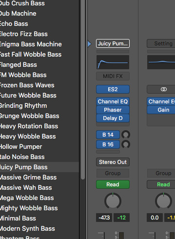
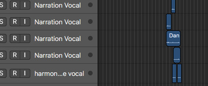
For the final assessment, I chose ‘option 3,’ that is, to extend my “cataplexy” inspired piece from the first assessment. I chose this because for the first assessment I was unable to sing (due to Laryngitis) and it forced me to explore a genre/style and techniques that I have never considered before whilst writing or recording my music. I found it really enjoyable to create something so different but still somewhat pleasant to take in (from my point of view). After making this decision I began binge listening to so many different sub-genres of EDM, ranging from deep house to Psychedelic trance. I listened to several tracks by Armin Van Burren, Bryan Kearney, Gorgon City, Above and Beyond and many more (EDM mixes). I did this not only to get some structural insight and understanding of contrast with smooth transitions but to listen out for techniques and effects that are prominent in EDM. Like the previous two assessments, I completed this piece using Logic Pro X in the Studios (1025) at the Sydney Conservatorium of Music.
INTENTION:
With my original piece I completed for the first assessment, I wanted the track to lean more toward the sub genre of ‘deep house’. But this time around I really didn’t want to be limited, as I was inspired by the wide range of EDM I had been consuming. But before even considering the ideas I had for the two new sections, the first thing I wanted to do was to rectify that which was suggested in the feedback for the first assessment.
SECTION B REVAMP:
I began with section b, adding a few cross-rhythms and slightly spicing up the MIDI drum track with a pitched rhythmic movement (MIDI sound called animated swirls which I looped playing two chords) to accompany it. This allowed me to create more interest whist still staying true to my ‘breakdown/simple drum’ vision for section b from the first time. I also added panning in the ‘breakdown,’ where the only thing that is present is the chords and hi-hat (build up). I then added a melody, hitting record once I completely improvised and just ran with it! I didn’t hesitate to quantise this though, I used several plugins and effects (shown below).I also added a dirty toned yet simple bass line which sort of stays true to the ‘deep house vibe’ whist the melody and chords are more true of house. Overall this section sounds so much more complete then my first attempt, the feedback was really helpful.
MIDI drum track:
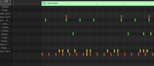
Melody:
Hi-hat panning:
Section A Revamp:
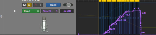
Oddly enough, I made slight alterations to this section after section b. Not too much was changed here besides the addition of a quick vocal phrase and a rhythmic MIDI melody added over the chords (with panning). I recorded myself singing the word “crossover” and then added a tape delay, increasing the feedback rate (progressively) to give a sort of ‘dreamy’ but ‘dark’ ambience. This is to reflect the ‘dreamy’ MIDI effect which the track begins with, followed by the dark simple bass line. After discovering the ‘touch’ feature in automation on logic, I was able to speed up the delay/feedback in real time to create a build in pitch/temp for anticipation.
vocal delay and automation:
VISION:
In terms of artistic vision, I really wanted this track to catalyse colourful imagery with the listener’s mind. Almost like a VR experience, from a dreamy colourful landscape to a dark alley and even some what of a rave in the last section. I guess the inspiration came from the feeling I experienced whilst listening to different types of EDM, so I wanted that to be the focus of this track. Section b almost reminds me of video game music, and that was intentional as I wanted this to be the sound track to an alternate place/experience, consistently travelling in somewhat of a trance. This also correlates with the ‘crossover’ theme.
NEW SECTIONS:
Section A returns
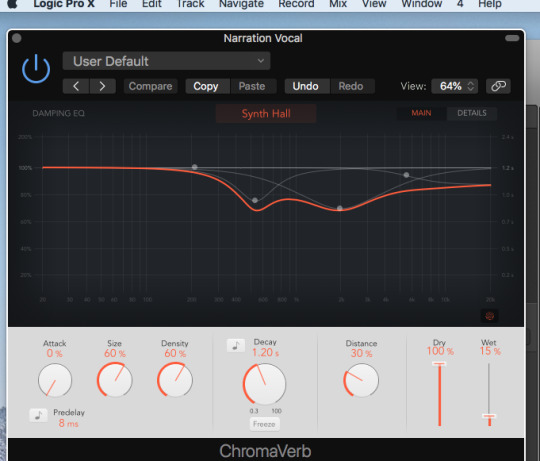
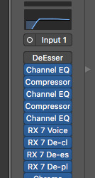
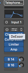
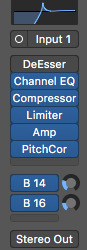
This time section A returns but rather than a synthesised rhythmic melody, a vocal melody takes hold. Before the ‘verse’ begins, I recorded myself taking a breath out and put a heavy tape delay over it, once again altering the delay in real time to create a build up. I again improvised the lyrics for this section, really wanting it to sound fun and catchy but still have relevance to both the title and previous sections. I double tracked my voice for the first half of the verse as I felt it gave more of a full effect to the section after the build up. I also did subtle harmonies over some words using the telephone vocal filter. I used various plugins under Izotope in Logic such as de-clip, de-click and de-ess to reduce noise as well as EQ and adequate trimming. I also used ‘Chroma’ reverb ever so slightly just to make the vocals sound a bit more warm.
Section C:
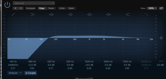
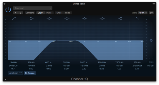
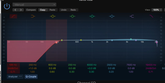
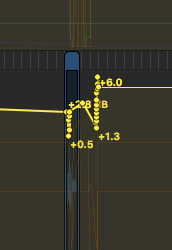
Unlike the previous sections, section c begins with a complete drop out of all drum tracks, only vocals and chords. The inspiration for this section came from the vocal phrase that I manipulated, I build the whole section around this phrase. This sort of happened by accident….I was trying to figure out how to automate reverb and came across the ‘real time’ feature under ‘read’ called ‘touch’ in automation which allows you to play with the EQ of a track in real time. This obviously led to the discovery of automating individual plugins rather than just the entire track which is selected. I realised I found something quite interesting and instantly got a ton of ideas, noticing the resemblance in the EDM I had been listening to. But this wasn’t so easy to achieve, it took a plethora of trial and error and some youtube Logic tutorials to get this done. In fact I nearly scraped it at one point out of frustration (and pain due to back issues) but felt persistent to finish what I had started. I trimmed one tiny vocal phrase from some improvised lyrics I recorded and copied and pasted them in line with the bar lines. I couldn’t loop the track as for some reason when I did it was out of time. I then began with the EQ on the far left (screenshots below) and slowly dragged the EQ, going from a muted to a clear sound. This seems to be ever so present in EDM music as it aids the build up. I then added a tape delay and reverb then individually automated these effects, altering feedback rate and delay time. Working on this took up more time than anything else for my piece ! But I think it sounds really cool and I’m glad I pushed through it and produced something different.This section also includes a simple kick that I recorded on the midi and looped but adjusted the EQ to make it sound sort of ‘muted’ and deep house like.
Chords:
VOCAL EDIT:
EQ gradual movement.

SECTION D: variation of section A
For this section, the chords in section A return but are varied, played both descending and ascending. The filter (MIDI sound) that is used for the section b melody returns but with just a long sustained chord for the entire section. But before this the ‘heavenly sound’ returns from the songs intro, contributing to the dreamy ambience. This MIDI chord paired with the muted kick give a sort of ‘club’ or ‘dark’ feel. I also included what I like to call a ‘trance cry,’ I recorded myself singing “ahhh” with some heavy delays again. Paired with the bass line it sounds both dark and dreamy (the vibe). It took time to get the delay/feedback in TIME with the rest of the piece ! I like that the kick remains for this section contributing to the trance-rave-dreamy sort of vibe. At the very end I recorded myself singing crossover a few times over ‘telephone vocal filter’ and in real time played with the EQ to make it sound muted at first then kind of robot like. I felt the end of the track needed this as it sort of addressed/revisits what happened in section one. (below)
vocal delay:

Telephone ending:
Throughout the ENTIRE track automation was CRUCIal so it was used a lot:
Overall I am satisfied with the completed track. I am really keen to understand and learn more techniques and skills in different DAWS as well.
https://soundcloud.com/jasmin-mourad-698719626
0 notes
Text
BA1b Summary: Week 3
Animated Sketchbook
We were briefed the project through an engaging lecture, in which we will be developing good sketchbook practice and explaining why gaining a ‘sketchbook habit’ is an important thing. For this project, we will be keeping a sketchbook containing a series of drawn outcomes based on primary resources. We are to not only draw, but write down thoughts, quotes or ideas to go along with it: it’s about recording from observations and imagination through marks and words. As animators, this is a core skill and crucially important to whichever animation technique or art form I intend to specialise in.
Our tutor explained how a sketchbook should be the line between imagination and observation: to juggle our own crazy concepts and ideas with real-world objects and places. The lecture explored how keeping a daily diary can be extremely helpful to us as animators, allowing us to focus more attention to our surroundings, details and allows our work to resonate with the audience we observe: sketchbooks often lead to profound or engaging small observations of human nature.
Our final drawing exercise explored the idea of studying a subject in motion, in which we drew a bear from video reference. Whilst this was an enjoyable activity, it was also challenging. In order to capture the bear’s form, I had to make very quick, loose marks in order to build up the form over time. The process left me with several unfinished ghost drawings, however I was developing my understanding of the subject through pose and posture.
Over the Christmas holiday, I will be completing a sketchbook using a range of drawing exercises, including diary comics, animal referencing, and finding characters in meaningless marks and ink splotches. I want to take this project as an opportunity to develop my drawing skills, understanding of animals whilst developing characters and plots in the process.
Digital Principles
This week in Digital Principles, my main goal was to produce a refined version of my pre-visualisation morphing animation, and begin experimenting in After Effects. Last week, I identified the weak points of my first attempt through peer feedback: suggesting that I should slow everything down. The main learning point was to allow the audience to see each prop for longer: to work on the timing of the sequence.
My final previs for this project shows a greater appreciation and understanding of my chosen film, Arrival, than my earlier experiments - and a successful response to peer feedback. Here, I’ve taken out the distracting rapid motions of my first test, and given the sequence time to breathe: allowing the audience to see both props before morphing into one another.
Our tutor had spoke about how creating 3D objects for this task is a challenge, but would result in a very exciting final outcome. I wanted to take this challenge, and set out to create a 3D Arrival ship in After Effects, following a series of video tutorials.
This proved to be a challenge, and whilst I was able to create a thin rotating disk in After Effects, initially I was not able to create a shape that followed my original turnaround animations. This week, whilst I wasn’t able to choose a colour palette, has been quite succeessful, I feel. I’ve taken the time to understand my film again, taken a new approach to the task and have been able to produce several iterations of previs sequences and challenged myself to make 3D animations in After Effects. As a suggestion from our tutor, I decided to immerse myself in the atmposhepre of my chosen film during the working process: listening to the Arrival soundtrack on repeat. This helped reduce any distractions, and allowed myself to get lost in the work. My only concern with this project is if I’ll be able to create an animation that is up to a exciting, professional standard given both the restrictions of the software and time. Whilst I’m extremely tempted to create it frame by frame in another software, I want to challenge myself to stick to the brief and produce it entirely in After Effects. Moving forward, I will continue to experiment and play around in After Effects, producing the morphing animation with 3D shape layers. I also want to decide on a colour palette, selected from the film itself.
Narrative Research
In this week’s narrative research session, we explored the fairy tale and the theories of Russian folklorist Vladmir Propp. To begin the lecture, discussed the learning outcomes of this unit, and looked at the history of fairy tales and their place in animation. This session is especially relevant to the second essay question, in which we are to make a Proppian analysis of an animated fairy tale, and explain animation’s particular suitability for telling fantastical stories.
The lecture explored how a fairytale is a story about whimsy, discovery and wonder with magical qualities, although the actual magical element can be rather minimal. Originally, fairy tales were once sensationalist, grisly tales of sex, violence and magic. Through adaptation and evolution, they. Have changed to engage an all-ages audience. These tales often resented the audience with a happy ending through grim justice, and we discussed how animation has been a brilliant platform for the fairy tale: the craft itself is endowed with a magic unrivalled by any other art form, and so here, subject and craft work together beautifully.
We also explored the theories of Russian folklorist and scholar Vladmir Propp, who broke down fairy tale narratives into 31 Functions, a breakthrough in the narratology scene. His approach reduces story down to it’s moving parts, allowing us to look at a beloved story wit fresh eyes. We explored how Propp identified seven character archetypes, each with their own role in the narrative called a ‘sphere of action’.
This week, I’ve begun to consider a direction for my essay: exploring the superhero story. On this blog, I’ve mentioned a few times how superhero movies are the new fairytales of cinema, and it’s an idea that really interests me. I want to tackle a film that allows me to discuss a range of topics, from Propp’s functions to a social and cultural impact beyond an appealing character design. Currently, I’m considering writing about either Mega Mind, or a more recent pick: Spider-Man: Into the Spider-Verse.
A film that’s still being talked about at the moment, Spider-Man offers the opportunity to discuss visual storytelling, a revolutionary visual style and cultural significance as Miles Morales picks up the mantle of the Web-Head, alongside it being an adaption of a comic book storyline. I’m clearly interested in this idea, and over the Christmas period, I want to begin looking at potential film choices for this essay. Ideally, I’d like to start with a few potential candidates and develop a question and final film choice from that selection, evidencing a few analytical directions before I begin writing.
0 notes
Photo


Omg i’m so sorry to everyone that I haven’t answered in the past few days! I’ve been really busy shipping out zines etc @_@ I figured rather than spamming everyone on my dash I’ll do a batch-answer.
1. For digital I use the watercolour and pen brushes in Fire Alpaca. For traditional the Koi waterbrush (medium tip).
2. Thank you that’s so nice of you to say!! <3
3. I know I’ve gained a good audience by posting frequently and interacting with other members of the community, and just in general trying to stay positive! Also remember to tag everything you post to make it searchable!
4. Aw thanks~ The asks aren’t annoying!! I appreciate every single one (well.. mostly. some are clearly jokes lol). Just use reference - I usually Google-image search! I also have some drawings/tips on hands here.
5. On your lineart layer select the box “Protect alpha” - this means that any colour you lay down will ONLY affect the pixels on your lineart. You can do this for any layer. It’s basically the same function as a clipping mask.
6. You’d have to go into your pen settings I imagine! For me it’s the Wacom Desktop Centre.
7. Fire Alpaca has a lot of help files on their website, but like everything in art, mastering something just takes a lot of practice! Things that took me a bit to figure out was the “Protect Alpha” option (which lets you lock pixels and colour JUST on them and nothing else), and how to use the “snap to gridlines” in perspective - so, setting up the vanishing points. I’m still getting used to that one. Just play around with each tool for a bit and look up what it does, and how best to use it!
8. I would highly encourage you to try developing your OWN style - one that you can uniquely say is yours. You can of course take inspiration from other artists (and here I encourage the plural). If it looks TOO similar, as you’re suggesting, then you might be accused of tracing, and the original owner of that style (and any of their followers) might be annoyed. Style comes organically with practice, and you should also embrace multiple styles - that’s what makes an artist versatile, and versatility in a competitive market is very crucial for success. Good luck!
9. I have a few tutorials here - but none for that specifically. This is a cool image I found on Google. When in doubt, box it out!! Basically every figure in existence can be planned out with boxes (or circles/ellipses).
10. Use reference.
11. Hmm, I don’t think so... I don’t usually link the pose reference image(s) I use. I will, however, link the reference if it’s from another artist. I mean, it’s always a good idea to link back to reference - that’s a good practice that I should do more.
12. You can drag around the different windows by holding your mouse down on the top of the window, and then you can snap that window into/beside/underneath other windows!
13. You can for sure look at my art for reference, but keep in mind, my anatomy skills are not as good as the real thing, so I would highly encourage you to use actual references of the real human body/whatever it is you’re drawing. Thanks for asking!!
14. Please browse through my digital art and drawing tablet tags!
15. Lol I would love to get snowed on all day :P Thanks for going through my tutorials ^_^ I hope they inspired you to want to start arting!
16. Yaaay I use an Intuos small on a Mac too! You should use Fire Alpaca it’s the best (and free). For tips, please browse through my digital art and drawing tablet tags! I don’t have the buttons set on my tablet right now actually haha - except for the top button on the pen is set as eyedropper.
17, 18, 19. You need to inform your parents that you have a friend who relies on your help via electronic devices! Also yes please do take a breather from life for a bit - sounds like you’re a bit overwhelmed! If you want to DM me you can and we can talk more :)
20. You can draw however you want! There is never any pressure to draw realistically, other than from yourself! Being able to render realistically is a useful skill - and my professors would argue that before you can accurately caricature anything you must know how it works realistically - but for sure you can branch out into cartoon-like style! I always encourage artists to adopt several styles (see answer #8 and these posts)
21. Sounds like you’re drawing at too small a resolution and/or canvas size! Try a canvas of at least 2000X2000 pixels set at 200DPI. Also I find the line quality much better in Fire Alpaca than in SAI (that’s mainly why I switched over). Good luck!
22. I DON’T have all the tools a human can have - that, in my eyes, is having a Wacom Cintiq, or a Cintiq companion. I literally just use watercolour paints+paper+koi brush, or my Mac+Fire Alpaca+Intuous. I also have markers and pencil crayons, which I used to use exclusively from 2004-2013 (I miss them actually) but yeah now I only use a few things. It’s not the tools that make the artist great, it’s knowing HOW to create art! Like wizards/witches and their wands - some tools do enhance your skill (obviously), but you must know the craft FIRST.
23. I own Canson brand sketch books! Mixed Media (90lb paper) and Watercolour (140lb cold press)
24. I used my smart phone camera, scanned it in and touched it up with Photoshop. The biggest edit I did was making the background around the drawings white. Here’s a tutorial about how to do it (with a different image)
25. Wahoo thanks for the follow and the compliment <3 GO CANADA!
26. YAAAAAAY OUR BABY HAS ARRIVED! I have shipped all the Canada ones out, and I shipped another 45 today to the US and other countries, and the rest should be out by the end of the week!! I’m so happy you got it, thanks so much for the support!!
27. Age difference doesn’t really matter THAT much, in the grand scheme - well, maybe it does for the teen years. If she has a partner currently, and she seems happy, then I would try to just stay her friend for now! You could maybe gradually drop hints that you like her, and gage her reaction?
28. Could it be acid reflux, or heart burn, or an accute respiratory condition maybe? I’m not really well-versed in medical things, and I don’t know anything about your level of fitness or health, so it’s difficult to answer... >.<
29. The print was drawn out by a friend who got them printed onto sweaters at a local print shop! We tried to find and buy it online but we couldn’t find it anywhere >.<
30. Prepare for it like any other interview - dress like you want to succeed (but also be comfortable). Know your portfolio really well, so that when they ask questions you won’t have to flip through it or hesitate. Be knowledgable about the job/thing you’re applying to as well, so you’re go to go for trivia about the interviewer. Smile and make an appropriate amount of eye contact (demonstrate active listening). Here is a good LinkedIn article about interviews.
31. Aw thanks~ yes yes most of my life is quite happy and I can’t complain ^_^ Have a good one!
32. Thank you!!!! I hope 2017 is super productive for me as well!! Graci and ciao~
WHEW! Feel free to DM me if you want to know more~
59 notes
·
View notes
Last Seen Blogs
okieapache70
Joni Kennedy

lewileoi
LEWI LEOI

blueprint-han
falling down, i'm falling down,
otgserenitycafe
On-The-Go Serenity Cafe'
norie123
It's a piece of cake