#ba1b:digitalprinciples
Photo


Overview
An intensive and productive week on the course, I wanted to put a focus on the narrative research essay task and balance this academic written nature of the project with the medium of stop motion animation. Additionally, I took the time to develop my skills within Maya: re-attempting the Flying Saucers task at home and playing around with the animation workspace. Whilst I was unable to make any significant progress on my digital metamorphosis project and the animated sketchbook assignment, I instead took the time to undertake extensive research into my chosen film of Into the Spider-Verse, alongside producing a range of stop motion iterations and preparations for the ‘box lift’ task.
As a result, I’ve been able to make a series of stop motion animations that go beyond the limitations of the brief, adding a sense of narrative and interaction between off-screen characters and am confident that I’ll be able to begin work on the first draft of my essay next week. With juggling several projects at a time, as I am now, it’s important to be able to focus on particular assignments. Splitting my time between these briefs has been difficult, but I feel like I’m working to strike a balance between my ambitions for each assignment and the limited time I have left.
Narrative Research
This week, I was able to decide on an analytical direction for my essay and gather a range of research sources in preparation for the drafting process. My initial idea was to analyse the plot of Into the Spider-Verse, exploring how the creators not only presented an updated take on the Hero’s Journey storyline, but also told a refreshing new version of the classic Peter Parker Spider-Man origin story we all know.
Despite this, I realised that the film’s use of this hero narrative is nothing ground-breaking or particularly new. Rather, what makes Into the Spider-Verse rather of academic study is the animation and visual language: an experimental, alternative approach to animated filmmaking, which is already making waves in the industry. Instead of taking a theoretical approach into my chosen film, I began researching into the comic-inspired aesthetic and crisp, stuttery style of CG animation.
The film represents a ‘break-through’ in animated storytelling, pilling compositional and aesthetic inspiration from it’s comic book source material, adapting dynamic storytelling poses and graphic printing techniques to the animation. In my research for this essay, I wanted to take a look behind the scenes and how this new visual language came to be. Looking through the Art of Into the Spider-Verse book, and trawling through countless interviews, online articles and really anything I could find on the process and film itself led me to the work of visionary Alberto Mielgo, the 2012 Disney experiment Paper Man and how the filmmakers created the signature ‘crunchy’ animation style.
Having completed this extensive research into my chosen film, I’ve reached a place where I’m ready to begin the drafting process. With my own question and a range of research sources ranging from the academic literature of Paul Wells to videos breaking down the animation process of Into the Spider-Verse, next week I will begin writing my essay. My aim is to have a completed draft ready for my individual tutorial, in which I will likely be reducing the word count.
Digital Principles
This week, I put a major focus on other projects - taking the time to produce iterations and further develop on the other tasks. As a result, I didn’t really have time to make any significant progress or development in this project.
Stop Motion
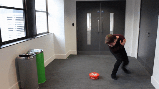
This week, we were given our second stop motion exercise: to animate a character lifting up a box. With this task, I’m considering all of the basic principles of animation: specifically timing, anticipation and follow through - additionally to staging the sequence properly.
To begin the week, I took the time to prepare for this week’s stop motion task in a depth I’ve never really done before. Producing my own reference footage and sketching from this has allowed my poses to have an authenticity to them, and I was able to act out a range of characters and situations in the process. Having this additional research and preparation in the filmed reference has given me a solid understanding of the action I will animate.
For my first attempt at this task, I experimented with working from this live-action reference. Whilst this allowed me to see the filmed reference poses directly in Dragon Frame, this method of working also posed several problems - and ultimately resulted in a lacking first iteration. The armature’s movement jolted from one pose to another, the staging of the sequence was ineffective and the timing of the motion was simply wrong.
My main take away from the initial attempt was to consider the posing of my armature more - take the time to make sure the pose is correct, and easily understood by the audience. A second idea was to exercise some restraint on the movement and timing: to take multiple frames with little movement, as stillness can be just as effective as motion. On the flip side of this, I also wanted to explore how to create a fast motion, considering making larger moves between frames to believably communicate a quick movement.
With this in mind, I hired out the Stop Motion Studio in my own time and developed on the task, producing two more attempts. In comparison, these were much more successful and interesting than my first test. Taking the time to develop upon the tasks set in the workshop has allowed me to produce stop motion outcomes of a far higher quality and ambition as it lifts the pressure of time off my shoulders. With my own schedule, I was able to really get lost in the work, and allow me to present a more ambitious attempt at character performance and begin to hint at a narrative beyond simply the action itself.
Next week, we will be exploring a more complex stop motion sequence: having a character walk on screen, and visibly change their expression and emotion. In preparation for this, I will begin recording my own live action reference to get a better understanding of the movements and posing and produce a few storyboard iterations of the sequence.
Animated Sketchbook
This week, I put a major focus on other projects - taking the time to produce iterations and further develop on the other tasks. As a result, I didn’t really have time to make any significant progress or development on this project.
Digital 3D
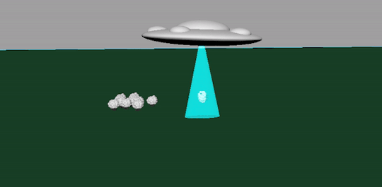
This week, I took it upon myself to develop upon the previous Flying Saucer task, downloading Maya to use at home and rebuilding the sequence from scratch, using a more planned-out approach. With a humorous direction (the sheep is too heavy for the UFO, which then crashes), I sketched out quick, loose ideas for the sequence. Alongside these preliminary sketches, I also explored Pixar’s approach to the task, Lifted, which also presents a light-hearted take on an alien abduction. With this, I knew I wanted to follow a comical direction that works to effectively subvert the audience’s expectations.
Overall, this represents a far more exciting and successful response to the task. Through iterative development and my own perseverance with Maya, I have been able to challenge myself to create an ‘engaging, successful’ CG animation that puts a new, comic spin on the farm animal abduction’ plot in this short sequence. Something I am going to put a focus on is iterative development on my practical exploration: this was the main point in the feedback of my previous unit, and it’s something I’m constantly considering moving forward. Here, iterations have allowed me to explore and further flesh out this simple CG sequence, and complete an animation (that, whilst simple in composition) demonstrates my new understanding of Maya as an animation and modelling program.
Additionally, we were also set a new task within Maya: taking the focus away from animation, were challenged to explore the modelling potential of the 3D software. Firstly, we were introduced to the Modelling workspace - as we explored the various tools to edit and change an existing shape. This provided us with a range of tools, allowing us to extrude, edit and bevel surfaces of shapes in order to create new, more exciting ones.
Initially, I struggled with this process: but after spending time trying to get to grips with the extrusion tool and asking for feedback, I was able to get a basic understanding of the modelling process and produced a pencil in response. It’s not exactly visually impressive or appealing, but I see the value in this task as a way to introduce the basic foundations of more complex 3D modelling.
The final task was a little more demanding: in the limited time remaining, we were to produce a 3D radio. After experiencing several technical difficulties with the program, I managed to create a basic box-radio following the steps described by our tutor. What I’m finding is the luxury of time with learning these processes: the sessions, whilst helpful, are ultimately too short and fast-paced for me to properly grasp an understanding of the Maya processes. I am somewhat struggling with the modelling side of things, however, I want to develop this understanding and take the opportunity to explore the digital learning world of Linkedin Learning, something our tutor suggested in the session.
In my own time, I managed to complete the radio and add some colour - adding life to the object that I couldn’t really see beforehand. I’m also interested in the potential of rendering this object and seeing how it could move too. Perhaps it squashes and stretches whilst listening to music? It’s a small motion, but I feel like it would be a good independent development of this session and a way for me to add an understanding of the basic principles to my Digital 3D work.
#ba1b:weeklysummary#ba1b:introtostopmotion#ba1b:introto3d#ba1b:narrativetheory#ba1b:animatedsketchbook#ba1b:digitalprinciples
1 note
·
View note
Photo
Overview
This week, I placed a major focus on completing the practical assignments in preparation for submission next week. Having to juggle several projects at a time has been a challenge, though I feel like I’ve used my time wisely and efficiently in these last few weeks. Having taken the opportunity to complete my narrative research assignment ahead of time, this left me with the week before hand-in to complete any outstanding practical work. This was mainly completing my Guess the Film animated piece, and completing the sketchbook task. Additionally, to this, I took the time to produce some more reference footage for the Mystery Box project, exploring a less dramatic and more personal, character-based approach in the form of a ‘peek a boo’ game. As a whole, it’ s been a productive, intensive week for me but in the process. I have been able to create a motion design piece that I’m actually happy with and created some helpful video reference in preparation for animation.
Mystery Box
This week, I took the time to produce some more reference footage for the Mystery Box project, exploring a less dramatic and more character-based approach through a father and son’s ‘peek-a-boo’ game. This allowed me to explore new, considered ideas in response to the brief and develop my understanding of key storytelling poses, appeal and timing before actually moving to the animation stage next week. With this, I’ve found an exciting and ambitious new approach to the Mystery Box project.
For this assignment, I want to challenge the preconceived standard ‘full-body shot’ of the brief and explore a more original and cinematic approach to the task, by effectively changing from a long shot to a medium shot through the character’s movements. My plan for the following week is to create a refined storyboard and animatic based on this reference and begin playing around with the animation workspace in Maya.
Animated Sketchbook
This week, I was able to put a major focus on completing the ‘animated sketchbook’ assignment ready for submission: not only completing the sketchbook with drawings but challenging myself to create observational studies alongside my more original and fantastical sketches. This resulted in interesting, quick sketches that simply serve to explore my study subjects: presenting a series of face and figure studies.
There are some successful drawings on these pages, experimenting with both a pencil and fineliner to achieve different qualities of line. Each of my sketches possess a loose, erratic and scratchy quality and aesthetic that really lends itself to animation, I feel. Looking at my sketches, I found it exciting how I could see some interesting narratives developing, and the use of continuous line provided an exciting challenge to standard sketching. Ultimately, this drawing session reminded me why observational drawing can be useful and fun as an animator: we are drawing from life for ideas, but quickly scribbling these moments down for future reference. These sketches represent a warehouse of ideas to return to, and I actually found some value in this.
Looking back, however, I wish that I had continued and developed upon the idea of a ‘diary comic’ for this task. As a fan of comics myself, I feel like this would have made the brief more enjoyable. As a whole, though, I feel like I managed to complete the project and create some interesting character concepts in the process. I’ve been able to develop a few sketchbook ‘habits’ and will continue this practice moving forward.
Narrative Research
Having completed this project last week, I spent the duration of this week focusing on my other two projects, readying each for submission.
Digital Principles
This week, I placed a major focus on completing my animated sequence for the Guess the Film task. Over the course of the week, I underwent an extensive iteration process, exploring several ideas and developing off each one - spontaneously coming up with new ideas within After Effects to evidence a natural, evolving workflow. With this, I managed to produce a single sequence that I’m happy to submit for the deadline next week.
For this brief, I wanted to take my approach beyond the requirements of the project and create an animated sequence that allowed me to explore the ideas of motion design as an industry: taking the time to plan out my sequence, develop appealing vector illustrations for the sequence and consider how I can make the piece visually exciting. This is a key element in motion graphics: fluid, exciting movement but also considered, appealing visuals.
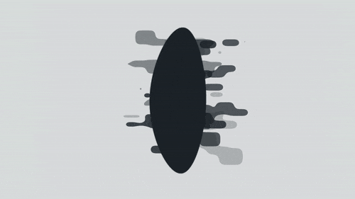
With the animation of the Alien Language, I wanted to exercise as many of the principles as I could: adding anticipation before each language forms, and follow through as the line over-shoots the swing. Before the ooze-like substance stretches out from the rings, I’ve made sure to add anticipation even in this small motion: to prepare the audience for what is going to happen. The ring itself isn’t static; it keeps squashing and stretching: this was an important idea to present to the audience, that this language isn’t a solid object and instead, a tangible, floating shape.
After showing the piece to my peers, I can see that the sequence has a visual appeal: my concentration on appealing design and aesthetic has resulted in a positive reaction from the audience. They enjoyed the simple, clean style to the illustrations and smooth movement. In particular, the geometric smoke garnered the most praise due to its ‘appealing, impressive fluidity’. There are a few particular frames that I feel are some of my most interesting design work to date, and work to not only represent my chosen film but be pleasing images and compositions of their own.
With this, I feel like I’ve been able to create an animated sequence that successfully demonstrates an understanding of the basic principles of animation, and presents a visually appealing metamorphosis sequence that is able to evoke the themes and visual imagery of my chosen film, Arrival. Whilst I have taken a more experimental, exciting approach to this task making use of virtual cameras and three-dimensional layers to add a sense of depth, I feel as if I have successfully met the requirements of the brief.
Despite this, I’m very interested in developing this piece further, beyond the limitations of the brief. After discussing with my peers and conducting my own research into the industry of motion graphics, one key element is the inclusion of texture: this adds to the visual appeal of each design and works to lend a hand-crafted warmth beyond the minimal, vector aesthetic. For elements such as the Window, and the Shell itself, I would like to explore this idea in more depth. I’ve really enjoyed this project, and as an independent development, I plan to explore the use of an animated grainy texture in my own time - further developing the piece, and embracing the practices of the industry.
#ba1b:narrativetheory#ba1b:digitalprinciples#ba1b:weeklysummary#ba1b:animatedsketchbook#ba1b:mysterybox
0 notes
Photo


Digital Principles - Final Week Review
This week, I placed a major focus on completing my animated sequence for the Guess the Film task. Over the course of the week, I underwent an extensive iteration process, exploring several ideas and developing off each one - spontaneously coming up with new ideas within After Effects to evidence a natural, evolving workflow. With this, I managed to produce a single sequence that I’m happy to submit for deadline next week.
For this brief, I wanted to take my approach beyond the requirements of the project and create an animated sequence that allowed me to explore the ideas of motion design as an industry: taking the time to plan out my sequence, develop appealing vector illustrations for the sequence and consider how I can make the piece visually exciting. This is a key element in motion graphics: fluid, exciting movement but also considered, appealing visuals. It’s this balance between animation and graphic design that compels me to explore motion design more as a career choice, something that I will be developing in my own time.
After watching a series of motion graphic pieces from studios such as Lobster, Motion Design School and others, I wanted to challenge the brief a little bit: presenting the idea of a metamorphosis in a much more cinematic and experimental direction: taking the ideas of camera trickery from Weird and incorporating these movements into my own design. In the process, I have been able to create a series of iterations, and I feel my first completed attempt is able to meet the requirements of the brief.
After discussing my idea with my tutor, I was given the go-ahead to present a more experimental take on this task - exploring ideas of physical metamorphosis but also in regards to more exciting camera movements. I wanted to experiment with the idea of a solid background colour by adding an introduction shot that instantly throws viewers into the world of Arrival through ideas of claustrophobia and slow camera movements. The metamorphosis comes from the breakdown of the Alien Language to smoke, which then erupts into the second prop - the alien ship, called the Shell. The sequence presents the potential for a seamless and endless loop, and I wanted to challenge myself to exercise all of the animation principles within this single piece.
This project, whilst exploring the theme of Guess the Film, ultimately asks us to produce an animated motion design sequence evidencing a clear understanding of the basic principles of animation. This is a ‘lifelong task’ for all animators, and as such, I wanted to briefly explore how I’ve included each in this review.
With the animation of the Alien Language, I wanted to exercise as many of the principles as I could: adding anticipation before each language forms, and follow through as the line over-shoots the swing. Before the ooze-like substance stretches out from the rings, I’ve made sure to add anticipation even in this small motion: to prepare the audience for what is going to happen. The ring itself isn’t static; it keeps squashing and stretching: this was an important idea to present to the audience, that this language isn’t a solid object and instead, a tangible, floating shape.
After showing the piece to my peers, I can see that the sequence has a visual appeal: my concentration on appealing design and aesthetic has resulted in a positive reaction from the audience. They enjoyed the simple, clean style to the illustrations and smooth movement. In particular, the geometric smoke garnered the most praise due to its ‘appealing, impressive fluidity’. There are a few particular frames that I feel are some of my most interesting design work to date, and work to not only represent my chosen film but be pleasing images and compositions of their own.
Interestingly, I was able to include both straight ahead and pose to pose techniques in this sequence: creating key frames for the metamorphosis, but animating the Shell turnaround frame by frame, creating new designs in Illustrator for each one. This has ultimately allowed my work to move in a variety of ways, embracing the fluid organic movement of the smoke, but also the more slow, stilted turnaround of the ship.
The principles of slow in and slow out can be seen throughout the sequence, as I applied the ‘Easy Ease’ function to all of the key frames, but can be seen the easiest once the ship rotates. Instead of simply adding the ease function, I delved into the motion chart workspace of After Effects and adjusted the motion curve myself to achieve a visually pleasing rotating movement with a real application of the slow in and slow out principle. If we compare this to my first attempt, I can see a considerable improvement in the appeal of the movement.
When re-watching the film a few times for this project, I noted down key ideas regarding its cinematography and film language: noting compositions, but also how the camera moves. There’s nothing exaggerated about it, it’s a slow, cinematic experience. With this in mind, I wanted to add this sense of slow build, but also contrast this with the fast-moving speed of a typical motion design sequence. I’ve managed to demonstrate an understanding of solid drawing with the Shell’s turnaround, and used the principle of arcs throughout my piece.
Developing on from this, I wanted to add some more elements to further evoke the feeling of the film. Something introduced in my early tests for this project was the inclusion of the iconic orange ‘Hazmat’ suits that, along with the Shell, occupy most of the film’s promotional material. This, I feel, makes the sequence more visually exciting and ‘adds a bit of contrast’ to my otherwise monochromatic colour palette. The inclusion of the hand also adds to the cinematic feel of my piece: this is one of the key images from the film, and I felt like I had to include it.
There is also secondary action throughout the piece, which adds life to the sequence through the constantly-shifting smoke, floating of the Alien Language and the moving camera which works to stage the sequence with considered compositions.
Something else to note is the inclusion of the Shell’s rotation: this was a movement taken directly from the film, a piece of motion that I noted whilst collecting research and works to further evoke the ideas of Arrival in a more subtle manner, through animation. There’s a pleasing grace to the rotation, which is reflective of the ship’s movements in the actual film. It was also important to add a blurry quality to the actual alien language, as the camera is moving through the ‘Window’ that houses the Aliens themselves and the language. In order to evoke the feeling of ‘looking through glass’, I explored a variety of blurred effects, before settling on the final outcome. Although a little touch, I’m quite pleased with the way this turned out - and it adds to the success of the sequence.
Looking at my peers’ work, I saw a clear focus on the shapes physically morphing over a considered design. However, in an initial lecture with industry professional Kris, he established to us the importance of visually pleasing design alongside animation within motion graphics. Whilst the actual animated elements of my piece are relatively simplistic (animating a line), I feel like the sequence benefits from this minimalism and simplicity.
With this sequence, I’ve practiced extensive iterative development: re-working my initial ideas, developing these into a hand-drawn previs and taking these ideas to explore in After Effects. A strength of my working practice during this project would be my determination to complete the sequence entirely in After Effects: creating the elements and props in the Adobe Package through Illustrator, but ultimately animating the sequence using the set program. After Effects is a standard in motion design, and I wanted to take this project as an opportunity to challenge myself to learn the program in more depth.
Despite this, I’m very interested in developing this piece further, beyond the limitations of the brief. After discussing with my peers and conducting my own research into the industry of motion graphics, one key element is the inclusion of texture: this adds to the visual appeal of each design and works to lend a hand-crafted warmth beyond the minimal, vector aesthetic. For elements such as the Window, and the Shell itself, I would like to explore this idea in more depth. I’ve really enjoyed this project, and as an independent development, I plan to explore the use of an animated grainy texture in my own time - further developing the piece, and embracing the practices of the industry. Without this, I feel the piece loses a sense of personality and the hand-made charm of other motion design works. I’ve presented an intial experiment into this idea, but I didn’t get time to fully explore this concept.
Looking at my piece from a critical perspective, I can’t help but feel like the smoke animation is too long in its duration: if I were to attempt this task again, I would pursue a somewhat faster motion: having the smoke burst out of the small black dot, rather than slowly bubble out of it. As it stands, I feel like whilst the piece is interesting, it lacks a snappy, punchy quality that I can see in some of my peers work. This was something I explored in my initial tests for this task, but decided to abandon after pursuing a more slow, cinematic direction.
A final criticism of the animation would be the orange hazmat characters: this was the final part of my vision, but I want to redesign the character to be more visually pleasing, with a range of shapes. Currently, the characters appear somewhat lifeless and uninteresting, something likely a result of the rushed production time given submission next week.
Finally, with my submission, I have also included a version of the animated sequence using the film’s iconic score. The use of the film’s soundtrack elevates the piece to be an animated ‘love letter’ to Arrival - and although it is not mentioned in the brief, this completes the sequence. Arrival is a film with a strong use of sound to evoke feelings of fear, anxiety and the unknown to powerful effect - and by including it within my piece, I’m able to present an animated sequence that successfully reflects my chosen film to a higher standard.
Over the course of this assignment, I’ve been able to really develop my abilities within the program and through a series of written analysis posts, my understanding of the basic principles of animation. This understanding, I feel, has allowed my final sequence to be a visually appealing representation of my chosen film, Arrival. Whilst I have taken a more experimental, exciting approach to this task making use of virtual cameras and three-dimensional layers to add a sense of depth, I feel as if I have successfully met the requirements of the brief.
1 note
·
View note
Photo
Overview
This week, I placed a large focus on completing my narrative research essay ready for completion and starting fresh on a new assignment: really delving into the independent research side of my new project brief, the ‘mystery box’. Taking the time to explore artist influences on my own has allowed me to explore the work of Marcel Marceau, Rowan Atikinson and of course, Charlie Chaplin. Whilst my initial ideas for the reference and storyboards were interesting, through in-depth reflections I found that these were ultimately too narrative driven and ambitious given the restrictions outlined in the project brief.
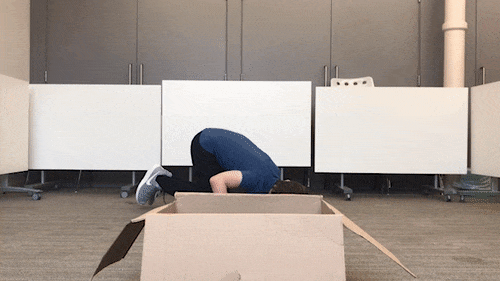
As a result, I’m not exactly happy with any of the practical work completed this week. It has value as an initial set of responses to the brief, but I’m ultimately going to develop alternative ideas in my own time. As identified in peer feedback, I need to take my ideas ‘down a notch’ and consider working with the requirements of the brief, rather than against them. I’m interested in the idea of a more simple narrative: the idea of a father playing a game of hide and seek with his child, only to find him in the box, has appeal to me. In the upcoming week of independent study, I am planning to find the time to record a series of reference videos, simply acting as a way for me to explore alternative ideas in my own time and develop a refined reference to then begin developing into a refined storyboard, in preparation for the animatic workshop held by Helen Schroder the following week.
Additionally to this, as I dedicated time to complete my essay ready for submission, I have not been able to make any progress on my other two projects: animated sketchbook or the digital metamorphosis task. Having completed my essay, next week I’m placing my complete focus on completing the other two projects ready for submission: delving back into my sketchbook, and completing the digital metamorphosis sequence.
Overall, it’s been a highly productive week for me, however I understand that the pressure is now on in the run up to submission, and will continue this level of intensity into independent study week and complete the remaining two assignments for submission the following week.
Mystery Box
In the first week of our ‘mystery box’ brief, we were given an introduction to the assignment and took this opportunity to delve into my own independent research sources to support my practical development in this project. Taking the time to explore artist influences on my own has allowed me to explore the work of Marcel Marceau, Rowan Atkinson and of course, Charlie Chaplin. Not only this, but I was able to gain an introduction to performance within animation from industry professional movement director Sarah Perry, and learn how to construct a proper critique of my own and other’s acting making reference to Laban movement, the five fundamental still-shape forms and the questions outlined by Constantin Stanislavsky.
Additionally to this, I was able to be inducted into the storyboarding process through a detailed and intensive three-hour ‘masterclass’ by industry professional Helen Schroeder who discussed the fundamentals of the art form and her own experience working in the industry. This was an invaluable experience, and although my storyboard was ultimately too complex, I found some real value in this workshop.
Whilst my initial ideas described in my reference footage and these storyboards were interesting, through a series of detailed reflections I have come to the conclusion that these attempts were ultimately too ‘cinematic’ and narrative driven - too ambitious considering the restrictions outlined in the project brief. What I’ve learned from my early storyboard approach was to take my ideas down a notch: instead of exploring a father who’s lost his son in a winter blizzard, why don’t we take the stakes down a bit? Explore the potential of a character who’s searching for something, and finds that thing in the box. Perhaps it’s a game of hide and seek?
In our next academic week, we will be picking this up again and creating an animatic for our animation. In preparation for this, there are a few key things I need to do: firstly, I need to to take the time to film myself acting out potential approaches to the task, simply getting a grasp on alternative ideas and producing a refined reference performance that presents a clear and successful understanding of storytelling posing, appeal, and timing. Instead of creating a rich narrative and world, my main focus for this task should be creating a successful and ambitious character performance, one that uses the ideas of exaggerated performance and mime to convey ideas and emotions to the audience in a clear manner. After completing some refined reference, I will then need to produce sketches based on this: complete a revised storyboard ready for the animatic masterclass.
Narrative Research
This week, I managed to complete my essay, considering my tutor’s feedback points of where to cut down the word count. Personally, I feel like cutting some of this did result in the essay losing some of its voice, but as an animator, I cannot be afraid to ‘kill my darlings’ as it were and be overly precious of my work. Over this week, I spent my time completing the essay: meeting the word count and adding key visual imagery from the film to support my analysis. My investigation explores how the film presents an experimental visual language and animation style inspired by comic printing techniques, and as such this analysis can be supported by the inclusion of visual examples to consolidate the points I’m making. Overall, I’m happy with my work and ethic on this essay: having taken the chance to complete the assignment ahead of time, has granted me the whole of next week to focus on finishing up the other two projects in preparation for submission in the following week.
In comparison to my first essay exploring the character of Mr Fox, I found this to be a more enjoyable process: whilst cutting down the word count was a challenge due to my extensive writing habits, the actual research journey I followed has given me a new-found appreciation for the film and the effort the creative team put into taking such a creative risk. Whilst I initially did write more than required, I am developing a skill in ‘cutting the fat’ and learning to write more cohesively and succinctly in the process. My writing style is slowly losing the journalistic tone in favour of a strictly academic writing style without any hyperbole or exaggeration.
Comparatively, I found the essay subject to be much more interesting to write about as I was delving into the details of the actual animation rather than presenting a conceptual analysis and I’m finding it easier to complete the Harvard referencing process. As a whole, I’m pleased with my work on this project, and will apply this further understanding of succinct and academic writing to my future written assignments.
Animated Sketchbook
This week, I put a major focus on completing my narrative research essay for submission and producing extensive independent research into other projects. As a result, I didn’t really have time to make any significant progress or development in this project. However, in the following week, I will be putting my sole focus on developing and completing this project.
Digital Principles
This week, I put a major focus on completing my narrative research essay for submission and producing extensive independent research into other projects. As a result, I didn’t really have time to make any significant progress or development in this project. However, in the following week, I will be putting my sole focus on developing and completing this project.
0 notes
Photo


Overview
As I did previously, I wanted to put a focus on specific projects this week. My main aim was to complete the first draft of my essay in preparation for our individual tutorial and focus on my stop motion developments. Fortunately, I was able to do just this: completing the first draft of my essay over the weekend and hiring out the stop motion studio in my own time to produce a few stop motion tests. Like last week, though, this did mean that I was not able to make any real progress on the digital metamorphosis and animated sketchbook assignment. This was to be expected, as it has allowed me to be ahead of the curve regarding the essay, and given me the opportunity to develop my own stop motion animation sequences beyond the expectations of the brief.
Having completed all of the Digital 3D and stop motion tasks, my priority next week will be on catching up with my other assignments. My plan is to have completed editing my essay, finished my digital metamorphosis task up to a point that I am happy with it and filled a single sketchbook by the end of next week. Given the fact that we will be briefed on our next project, explore acting through a performance workshop and a storyboarding masterclass - this may be a difficult balance. However, we also are given another week before hand in, which will be another opportunity to catch up with these two projects.
Something I am looking forward to, however, is our mid-unit review. An individual tutorial spanning around fifteen minutes, this is an opportunity to me to receive individual feedback on my work and an overall reflection of my progress so far. Personally, I feel like I am putting in more effort and work into both my practical responses and blog maintenance in comparison to the first unit - and it will be interesting to see if my tutors agree. This will allow me points to develop and improve upon, and receive a general critique of my current working practice.
Narrative Research
Having completed extensive research into my chosen film last week, this week I have been able to begin work on the drafting process. Over the span of two intensive days, I was able to complete a first draft of my essay in preparation for our individual tutorial. My initial draft, however, was ultimately too encompassing and broad: a five thousand word study into Spider-Man: Into the Spider-Verse, exploring both the theoretical and practical approaches the filmmakers took to complete the final film. This was collating all of the research I’d found in the process, and from here my focus was on cutting down the word count to the required limit of 1500 words.
In the process, I ended up cutting the plot analysis of the film and my investigation into the idea of Spider-Man as a character. As a choice, the film offers a range of analytical discussion opportunities, but it’s important to remember to decide on a singular line of inquiry for this essay. With all my research mainly exploring the film’s experimental approach to CG animation, I shifted the focus of my investigation to purely looking at how the film presents its plot: how the creators adapted an alternative approach to animated filmmaking through graphic printing techniques and adding a hand-rendered touch to every frame.
My independent tutorial suggested that my writing was successful and engaging, however, it is seriously over the word count and, like last time, I need to focus on a more academic way of writing. The strength of my essay comes from the depth of detail in the film’s animation and visual language process, and use of academic ideas such as the ‘carnivalesque’ and the various writings of Paul Wells. With terms such as ‘takes the concept and runs with it’, however, my writing nature is much more suited to that of journalism or sensationalist writing styles. This was an area that I needed to improve upon, and whilst it is less prevalent in my newest essay - it’s still a problem. With this in mind, I’ve continued to edit my essay and taken away any superfluous words, exaggerated phrases, and an invasive journalistic tone. A major element of this was my initial question, describing the film’s visual language as ‘entirely new’. On my tutor’s advice, this has now changed to ‘alternative and experimental’ taking the academic language from the original questions outlined in the brief and applying it to my own investigation.
Having completed a draft of the essay, next week I will begin work on the citation and reference process. My essay benefits from a range of sources, and I will need to reference each of these properly to fulfill the requirements of the brief. I’m expecting this to be a time-consuming task and will continue to cut the word count down in the process. As a whole, I’m at a good point in the project with my essay and hope to complete the assignment with plenty of time before the submission date.
Animated Sketchbook
This week, I put a major focus on other projects - taking the time to produce iterations and further develop on the other tasks. As a result, I didn’t really have time to make any significant progress or development in this project.
However, in the following two weeks, I will be putting a focus on developing and completing this project.
Digital Principles
This week, I put a major focus on other projects - taking the time to produce iterations and further develop on the other tasks. As a result, I didn’t really have time to make any significant progress or development in this project.
However, in the following two weeks, I will be putting a focus on developing and completing this assignment.
Stop Motion
In the last week of our stop motion exercises, we were asked to have a character walk on-screen, visibly change expression, and continue walking with this new emotion. Like last week, this began through an extensive preparation process, in which I produced a few storyboard iterations based on my own live-action reference of the task.
My first attempt at this stop motion exercise proved to be rather interesting, showing a successful and exaggerated change in emotion and expression through body language and timing. Where the character is walking with a fast, optimistic bounce to start with, the armature visibly holds a pose allowing the audience to understand that he’s seen something: a nasty surprise.
With this initial test being much more successful than my previous attempts, I was inspired to continue this task in my own time: developing a few more iterations of this final stop motion exercise. These iterative tests demonstrated clarity of movement through a clear line of action, and gave me the opportunity to experiment and explore character performance in more depth, evoking emotion purely through the use of strong, dynamic posing and body language. I also took this chance to be experimental with the shot composition, having my characters run and lunge towards the camera in these sequences.
In comparison to last week’s stop motion endeavours, however, I can visibly see improvement and better understanding of not only posing but timing within the stop motion process. This is something that I’ve continued to struggle with, however the purpose of these iterations was to intentionally challenge and work on this area. Although each example presents a unique approach to the task, they all include differences in locomotive speed and intention. This was a large focus of the task as a whole, to present a visible and consistent contrast between the two emotional states, and how this affects the character’s movements.
With this, I’ve completed the stop motion animation tasks described in the project brief. I’m happy to say that I’ve completed each task up to a standard that I’m happy with, working in my own time to produce a series of iterations that work to move beyond the requirements of the brief. Stop motion is an animation technique that I really do have a passion for, and would like to continue exploring as I progress in the course. Next week, we are given our next project brief, and I’m hoping to explore the medium of stop motion animation in response to this new assignment, additionally to working within Maya.
Digital 3D
In our final session introducing us to the basics of animation and modelling software Maya, we explored the ideas of 3D texturing: serving as an introduction to the UV editor and adding predefined 2D textures to 3D objects. To induct us into this process, our first task was to create a cereal box within the software. Using a simple cube, and editing it into the shape and size of a cereal box, the next step was to map the UV island to a flat map of a pre-made cereal box. After finding each face using the UV editor tools, I was able to create a 3D cereal box: with the correct design on each face.
This then allowed us to export the map as a flat PNG, to develop and edit in Photoshop. The process of texturing a 3D mapped object was more intuitive and straight-forward than I’d initially expected. I’ve somewhat struggled to keep up in the previous sessions, however this week proved to be much more enjoyable and simple in comparison. With this knowledge, I can now add my own textures to predefined 3D objects (such as cubes, spheres and cylinders).
Finally, our last task was to create and edit UV’s for a pre-made bird object, allowing us to project a 2D image to the 3D model’s surface for texture mapping. Whilst the actual process of creating and splitting the model into a series of separate UVs for each body part was time-consuming and difficult at first, I worked with a peer and we completed the task together. With the limited time remaining, I explored the use of painting within Maya. Whilst this is ultimately a limited function within the software, using the flood paint tool did allow me to block colour my model quickly. With this, I created a seagull design working within a limited monochrome palette.
With this, I’ve reached the end of our introductory Digital 3D sessions. Having covered some of the basics of Maya, it is now up to us to continue developing and working on our knowledge of the software independently. From these workshopped sessions, I’ve identified a range of animation potential to develop upon. For example, I’m interested in making the radio bounce to music, and explore the potential of animating this seagull model that I’ve painted in this session. It’s been somewhat of a struggle, but computer-generated animation is a technique that I want to continue to work on as an independent response to this brief.
#ba1b:weeklysummary#ba1b:introtostopmotion#ba1b:introto3d#ba1b:narrativetheory#ba1b:digitalprinciples
0 notes
Photo


Overview
This week, I wanted to take a break from my work in Digital Principles and focus on exploring the medium of stop motion in more depth. As a result, I haven’t been able to make that much progress in this Digital Principles project. However, I haven’t left the assignment altogether this week - I’ve been able to further explore After Effects and I’m closer to finishing the project for deadline.
Something I wasn’t expecting, however, was the added pressure of this week’s projects. Something that I feel that I have to mention is the amount of projects handed to us this week, and I feel like it will be a bit of a struggle to juggle them all. As someone who attempts to put real effort into their work, I’m beginning to feel the pressure of having five projects going on at the same time. I understand that this is largely my fault for continuing to work on the others after timetabled hours have stopped, but for this metamorphosis task I want to produce a piece of motion graphics work that I’m proud of; something that is of an Industry standard. I understand that this is a big task, but as an animator I need to be challenging myself to produce more exciting practical work and putting a focus on these projects.
I see the benefit of a project such as Animated Sketchbook, but with the amount of effort and energy I’m putting into the other projects I’m finding that I haven’t got time to indulge myself with simply filling a sketchbook with life drawings, creature studies or character designs. I’m working on a project brief Guess the Film, that truly engages and challenges my abilities as an animator, and thus of course I’ll be putting a focus on this project. What I’m learning throughout this course, though, is the importance of balance. Moving forward, I want to be working on striking a balance between multiple projects, and perhaps even lessening my ambitions for each assignment as a way to stay on top of everything I’m given.
Animated Sketchbook
This week, I’ve been largely focusing on other projects: specifically stop motion and digital principles. I’ve not been able to complete many pages, as this week I’ve put all my energy and effort into producing stop motion tests, writing about this these tests and further progressing with my Guess the Film animation assignment. I see the benefit of a project such as Animated Sketchbook, but with the amount of effort and energy I’m putting into the other projects, I’m finding that I haven’t got time to indulge myself with simply filling a sketchbook with life drawings, creature studies or character designs.
With my upcoming brief of stop motion, an assignment that explores the idea of physical objects and armatures moving, I feel like this approach to sketchbook will change: I’ll be sketching ideas, concepts and potential designs for these stop motion sequences - and I feel like that’s my personal challenge with this brief. Whilst it’s been fun to find characters out of ink blots, develop my understanding of animal structures and the like, it’s not FOR any specific brief - and that’s why I’m somewhat lacking here, I think.
Despite this, I am going to fill a sketchbook up for this project - and will re-continue working on the assignment next week. Next week, I want to pick up where I left off and begin sketching real-life animals and natural features as a way to insure my own fantastical and imagined creature designs, and developing my understanding of animal anatomy in the process.
Digital Principles
This week, I wanted to take a little break away from Digital Principles project and focus on an introduction to stop motion animation: taking the time to produce some stop motion tests independently, and refining my stop motion ball bounce. Despite this, I was still able to make some progress on my Guess the Film animation, developing my understanding of the software in the process of completing the final sequence.
The week began in my sketchbook, as I quickly explored potential ideas for a transitionary animation between my two Heptapod language illustrations, before transforming into the second prop, the Shell. Once I had an idea of the movement, I then jumped into After Effects and created a few tests of the sequence using the trim paths tools, before settling on a final sequence.
For this short motion, I wanted to add as many of the basic principles as I could: the direction is obviously in an arc shape, but I added easing to the motion via keyframe assistant tools in After Effects and played around with the offset with trim paths as a way to add a bit of anticipation to the final swing. The idea was to create a quick, fluid and graphic-orientated transition to the final Heptapod language illustration - something that I think I’ve been able to achieve here. The line swings round counter-clockwise to begin with, before finishing the illustration. The timing of the shot isn’t too fast to the point where the audience can’t see what’s going on: it’s a quick movement which stays clear due to anticipation.
Finally, I also was able to work on the transition animation between the Shell’s edge outline and the fully realised prop. After attempting to produce the sequence with the same ‘trim paths’ technique, I realised I wanted to take another, more visually exciting approach. I’ve discussed on this blog how the language is smoke like, and having designed flat 2D smoke already, I want to explore how I could have the language dissolve into black smoke, and then form into the Shell from this - whilst keeping with the simple, flat design aesthetic. It wouldn’t be ridiculously difficult - I’ve got most of the designs already created and thus would simply need to play around in After Effects and explore the potential of this idea there, creating in-betweens either via shape layers or jumping into Illustrator first. As an initial response to this idea, I feel like this will be the best approach to this task and importing the frames into After Effects.
This will be primary focus next week, animating the actual metamorphosis between the Heptapod language and the Shell, and the ship’s 2D turnaround within After Effects.
Narrative Research
In this week’s narrative research session, we explored the fundamentals of visual storytelling and the unique language of animation. Visual storytelling is one of the most important ideas central to my research into my chosen film of Spider-Man: Into the Spider-Verse, and as such, has arguably been one of the most interesting and helpful lectures of the project.
Visual storytelling is the act of communicating a narrative through purely visual means; through elements of the mis en scene, compositing, cinematography and performance. It’s what artists put in the frame to communicate an idea entirely through visuals. To exercise my understanding of this idea, I analysed a scene from Into the Spider-Verse and the hand-drawn animated film The Old Lady and the Pigeons. I also discussed the unique language of animation, and how a film’s medium can work hand-in-hand with the message.
With this final lecture, I’ve been able to establish all of the ideas and subjects needed for the essay task. Having covered all of the research material, I can now begin to construct my own essay question based on the idea of narrative analysis and begin analysing my research on the blog. I’ve been gathering research sources along the way, and I want to use a breadth of references from digital to print to evidence a considered response to this task.
At the moment, I’m considering exploring how Spider-Man: Into the Spider-Verse uses a Hero’s Journey narrative to perfectly encapsulate what Spider-Man represents: to both everyone in the audience, and the public on-screen. Additionally to this, I want to explore the cultural impact the film has had on the public: ‘anyone can wear the mask’. This is the ultimate takeaway and lesson from the film, and I feel like I should analyse how the narrative crafts this poignant message, in a way that doesn’t feel cheesy, tacked-on or hollow.
Next week, having completed all of the research lectures, I will begin writing up my research into the film and finally decide on an essay question. I feel like I’m reaching a point where my research is shaping my essay, and I will soon begin work on a first draft.
Stop Motion
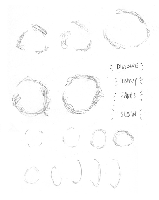
This week, we were set our first animation exercise from our new project, in which we are exploring the medium of stop motion animation. The task was to create a ball bounce animation, in which the ball stays in place and simply bounces on the spot. The ball bounce is one of the oldest animation exercises in the book, as established by legendary Disney animators Ollie Johnston and Frank Thomas.
As we were using pre-defined plasticine models for this task, the process brought a few new challenges that I didn’t encounter when animating with an armature. Firstly, I feel like the success of this task largely depends on our sculpting ability. This, unfortunately, is not one of my strong suits, and I found it quite difficult to sculpt the plasticine into my desired shapes. As a result, only a few of the animations have a visual polish when it comes to the actual squash and stretch of the ball - and it is also why I find the prospect of building a stop motion puppet from scratch to be quite daunting. Despite this, as I progressed through the session I feel like my outcomes became more successful - meaning I was learning and improving with each iteration.
The final ball bounce has a sense of life, but in retrospect I would have wanted to have the ball squash to more of an extreme position, before bouncing back up. After producing the refined squash and stretch ball bounce, I wanted to continue playing around with the task beyond what’s expected of the brief: and so looked at the idea of a ‘splash’ like effect using additional plasticine.
As a whole, though, I’m pleased with the amount of work I managed to produce for this task. Whilst it was a challenging process, I managed to develop my sculpting skills in between frames and have begun to develop an understanding of timing and spacing in the medium of stop motion animation.
Next week, I will be attempting to animate the Box Lift: in which a character attempts to lift a box, using a ball-and-socket armature. In preparation for this, I will be planning the sequence using a storyboard and creating live-action reference of myself to use as a guide for dynamic posing.
Digital 3D
This week, we were able to get an initial introduction to Maya, a powerful animation, modelling, simulation and rendering software. Maya is an application used to build 3D computer generated assets for film, television, game development and architecture, and is widely used in the visual entertainment industry. As animators, we will primarily be using the software for modelling and animation; building our own characters, props and sets in 3D space and learning how to animate these.
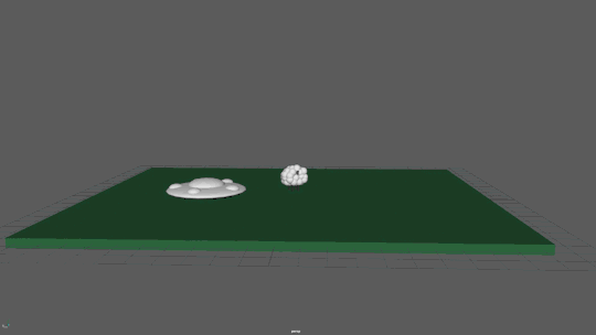
The purpose of this first week was to grasp the fundamentals of the software, learning how to use the basic tools and features to create and animate a scene featuring an alien abduction. For this, I created a UFO, sheep and grassland. We were tasked with animating a cow, but I wanted to challenge myself and work on something more visually pleasing: in this case, I chose a sheep. For this task, though, I wanted to limit myself purely to making use of the 3D predefined shape tools. Using a mixture of cubes and spheres, I was able to build a 3D sheep that my peers found to be visually quite appealing and ‘cuddly’ through a cartoon-like use of spheres to replicate wool and exaggerated proportions.
The animated test I was able to create has potential, but I ultimately ran out of time during the session. For a singular introduction, I found it a little difficult to work as fast as we were being shown, but after asking the tutor for more help after the demonstration, I was able to grasp an understanding of the program. As a review of the software, however, I really enjoyed playing around with Maya. Digital 3D animation is one technique of the medium that I’ve never had the opportunity to explore before, and I found it to be an interesting and engaging challenge here. Next week, I will be developing upon this task in my own time: downloading the program to use at home, and challenging myself to create an engaging 3D animation that puts a new spin on the ‘farm animal abduction’ plot in a short sequence.
#ba1b:weeklysummary#ba1b:narrativetheory#ba1b:introto3d#ba1b:introtostopmotion#ba1b:animatedsketchbook#ba1b:digitalprinciples
0 notes
Text
Digital Principles W6 Review
This week, I wanted to take a little break away from Digital Principles project and focus on an introduction to stop motion animation: taking the time to produce some stop motion tests independently, and refining my stop motion ball bounce. Despite this, I was still able to make some progress on my Guess the Film animation, developing my understanding of the software in the process of completing the final sequence.
The week started in my sketchbook: before jumping straight to a digital package like Illustrator or After Effects, I like to explore an idea on paper first. This is something that’s integral to the animation process, I think, and these sketches often form the basis of my digital developments. Here, I wanted to explore how the animation language could transform not only into the next icon, but the edge of the Shell too. Last week, I established how the language would revert to the line, and swing round forming the next - simply using the trim paths feature in After Effects. This was to keep with the shape-based flat design visual language I’ve already been using, and as an exercise in restraint too. So far during this course, I’ve found some of my ideas for these assignments to be a little ambitious - and if I want to balance my time between all projects, I may have to rein that in. Having the transition simply be with lines follows the requirements of the brief still, making use of shape layers and a physical metamorphosis, but it’s also a relatively simple visual that relies solely on the motion itself to engage the audience. Unlike the particle-heavy tests last week, this approach is much more minimal and the appeal of the transition would be a result of a smooth, arcing movement.
The main idea behind this quick animation is that it has a pleasing visual movement, and follows the established minimal design language of my sequence. Looking at the first transition, I feel like I’ve done this here.

For this short motion, I wanted to add as many of the basic principles as I could: the direction is obviously in an arc shape, but I added easing to the motion via keyframe assistant tools in After Effects and played around with the offset with trim paths as a way to add a bit of anticipation to the final swing. The idea was to create a quick, fluid and graphic-orientated transition to the final Heptapod language illustration - something that I think I’ve been able to achieve. The line swings round counter-clockwise to begin with, before finishing the illustration. The timing of the shot isn’t too fast to the point where the audience can’t see what’s going on: it’s a quick movement which stays clear due to the use of anticipation.
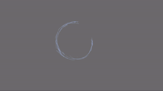
One final idea for this transition animation was to make sure the alien language, when formed, doesn’t remain a solid object. In the film, it’s a swirling, shape-shifting smoke-like substance. Whilst I have to take liberties with this idea given my graphic-based visual response, I wanted to suggest to the viewer that this language isn’t a solid ring through continuous floating and wiggling form. It’s not a perfect sequence by any means, though: I’m still tempted to explore the smoke-like approach to the language breaking away, though for this animation I’ve reached a point where I’m happy with it.
With this sequence complete, I wanted to begin some experiments on the morph from the animated language to the Shell. Following the ideas outlined in my previs, I was focusing mainly on the use of line (and thus the trim paths tool) to create the transition. My first approach to this was to simply animate the line by offsetting the paths, and having the shape’s path change from the circular language to the ovular Shell over a few keyframes.

The above sequence effectively represents how I’ve managed to balance my practical exploration and experimentation with a clear, solid foundational idea. Looking retrospectively at my work, I can see that, for the most part, I’ve been able to follow the original idea outlined in my previs. This is quite relieving, as whilst I’m fleshing out the sequence in After Effects, recently I’ve been a little cautious as to not divert too rapidly from my original idea.

Additionally to the trim paths animation, I also keyframes the thickness of the line through the transition as a way to make the Shell more visually appealing. As always, I was animating the arcs using slow in and out principles, to make the animation smooth. For this test sequence, I went through several iterations: however, due to the ‘delete keyframes and try again’ nature of After Effects, I forgot to export these tests! This idea of exporting my experiments and not simply the final piece is something I am now conscious of moving forward in the project. It’s important to evidence my iterative development, and so I will make an effort to export any real test or animation experiment I make in After Effects or a similar digital animation program.

With all of the motion in my morphing animation, I want the movement to be exciting and visually appealing: it’s important that the motion has a smoothness or a ‘snap’ as this makes the sequence fun to watch, and is the primary reason why motion graphics and designers are successful in the industry. The design has to be appealing, and the motion has to be attention-grabbing and slick.
Finally, I also began work on the Shell animation: exploring a few different approaches to how the outline becomes the full Shell. My refined previous shows the sequence being a liquid-like format, which envelopes the line in the same thick, inky substance that decorated the Heptapod language earlier on. Here, I’ve presented a few initial tests into the sequence.

My first test is following a somewhat simple approach to the task: like the Heptapod Language pieces before it, I’ve made a little ink-like movement to begin with, before the screen is taken up by a swirling mass of black. Whilst this looks lacking here, when I add the final Gausian blur adjustment layer, I feel the movement is actually quite interesting. It’s obviously not as fluid as a hand-drawn approach, but the movement swirls and breathes: and as a peer mentioned, its quite an interesting ‘absorbing’ motion. Personally, I feel like this approach has some potential as it moves away from the inky approach of the language - and towards something more intimidating and slow.
Having completed this test, I also produced an animation by altering the shape’s paths: having the thick ink-like substance move and breathe like an actual goo. Watching it back, I feel like this is too similar to the Heptapod language. We want to draw visual simulates to the ‘props’, but this seems too derivative of the first animation. The fluidity of the movement is enjoyable to watch, and successfully creates that goo-like texture I’m looking for, however.
Moving forward, then, I will be taking an alternative approach. Firstly, I want to continue the ‘ink spreading’ approach to this task, making sure each key frame has a visually pleasing ink covering with rounded shapes and spacing that follows my established flat design visual language. Additionally to this, though, I want to explore a more varied and animation-rich approach to the transition. I’ve discussed on this blog how the language is smoke-like, and having designed flat 2D smoke already, I want to explore how I could have the language dissolve into black smoke, and then form into the Shell from this - whilst keeping with the simple, flat design aesthetic. It wouldn’t be ridiculously difficult - I’ve got most of the designs already created and thus would simply need to play around in After Effects and explore the potential of this idea there, creating in-betweens either via shape layers or jumping into Illustrator first. As an initial response to this idea, I feel like this will be the best approach to this task and importing the frames into After Effects.
This week, I’ve been able to develop my understanding of Adobe After Effects and how I will be going about this digital metamorphosis task through problem solving and simply spending some time exploring the potential of the software. A real problem I was facing was how to import Illustrator designs into After Effects, and keep the vectorised format. The answer to this problem was much simpler than I’d initially thought: it’s simply a matter of saving the illustrator file and opening it as a file in my After Effects composition. Whilst I’m unable to edit the file’s path, I can still scale, rotate and animate the design and as such, it’s exactly what I needed. This new understanding has lifted a weight of my shoulders: and I can approach animating the Ship’s turnaround with much more confidence now.
This will be my primary focus next week: animating the Shell’s edge transforming into the Shell through a new, smoke-based approach, and the turnaround using my vectorised Illustrator designs. Importing files to work effectively as singular frames is something I’ve never attempted before, so I am planning to do a bit of research before I jump into animating the scene. From here, I would need to have a virtual camera zoom into the Shell, and return to the first shot as the camera enters the alien ship. This allows the sequence to loop, and from there it would be simply be a matter of adding secondary motions and design elements if I have the time, like smoke and texture.
0 notes
Text
BA1b Summary: Week 5
Animated Sketchbook
Whilst I’ve begun to put a focus on the Digital Metamorphosis project, I still managed to complete a few pages in my sketchbook - primarily working on the ideas of visual memory and imagination. Last week, I explored the use of black ink to create random marks, blots and smudges and then finding characters, scenes and creatures amongst the masses. This week, I wanted to develop on this process by adding colour: and exploring how this would affect my thought and imagination process when designing and ultimately ‘decoding’ these marks.
The week began by independently researching the idea of a ‘deliberate accident’ in art further, as a way to add some theory and context behind these pages. This led me to explore the work of Justinus Kerner, a doctor and poet who produced ink smudges on hand-written letters. Kerner would later transform these accidental blots into a ‘bestiary of grotesque creatures of chance’ in his published book Klecksographien. Kerner would illustrate demons and creatures from these random shapes; a collection of skeletons, winged monsters and terrifying creatures. Whilst my illustrations aren’t terrifying, they are beginning to explore the idea of creature design in particular: something that might be a result of the complex shapes in the ink blots. Traditionally, animated characters and heroes follow simple shape structure and thus that may be a reason behind my primarily creature-based designs.
For this task, I experimented with a range of coloured inks in order to evoke a range of emotions. Looking back, the red and dark pink pages were the most exciting, with some very interesting creature designs and character ideas based around repetitive brush techniques and blurry marks, something I felt evoked a strong sense of movement when drawing over them with a fine liner.
Finally, I wanted to experiment with mixing the inks and produced an earthy shade, which resulted in more mystical, calm deity-like beings. Interesting how my mind saw the red marks as more villainous and aggressive whilst the purple creatures seemed more morally ambiguous, and the earthy creations connoted more of a peaceful calm effect. To put it simply, this is colour theory in effect: how our mind reads colours as different meanings, picked up through our own personal life and the environment we’ve grown up in.
Next week, I want to move away from these ink blot creations and base my designs off existing sources, sketching real-life animals and natural features as a way to develop my understanding of animal anatomy and inspire my own more imagined and fantastical creature designs.
Narrative Theory
This week’s Narrative Research session introduced a range of new narrative concepts and theories, as we looked at Christopher Booker’s 7 Plot Types, experimental animation and delved into the psychological reasons in which humans tell (and consume) stories.
Whilst I’ve spoken about the purpose of stories before, I’ve never once looked into the concept at an academic level, such as the reasons established this week. Learning about the different plot types was interesting, and it was quite surprising just how many plots that I could think of which followed a specific plot perfectly. Despite this, I think it’s important for us, as animators and storytellers to challenge (at least one of) these narrative conventions. As an audience, we want to be entertained: not bored. Personally, I’ve always thought that subverting one area of a narrative structure almost ensures an engaging storyline. I consider storytelling a form of ‘edutainment; a way of educating our audience but sending them on a fun ride in the process. It’s these main reasons - to educate, inspire or entertain - that drive almost all stories today.
Additionally to this, I was able to further explore the steps of the Hero’s Journey, as described by writer Christopher Vogler. Writing about the steps in more detail has not only cemented my own understanding of the structure, but it’s inspired me to apply this narrative structure to my chosen film Spider-Man: Into the Spider-Verse. This week, I’ve also been able to write up my initial ideas for this project: exploring my potential films to explore and the subject material they offer before reaching the conclusion of Spider-Man: Into the Spider-Verse.
Alongside being a film that everyone’s talking about, Into the Spider-Verse offers a variety of subjects to discuss: visual storytelling, cultural significance as ‘more than once wears the mask’, alongside ideas of adaption and interpretation. When collecting research for the film, I’m going to be exploring all facets of the storyline and film itself before honing in on a specific area, evidencing more than one analytical directions before I start writing the first draft.
Over these last five weeks, I’ve been able to explore a range of narrative theories and concepts from character archetypes, fairytale functions and heroes journeys. As a way to begin my research and analysis into my chosen film, I plan to revisit all of these narrative ideas and concepts introduced on this blog and apply them to Spider-Man. Next week, I specifically want to break down the film’s plot using Vogler’s interpretation of the Hero’s Journey, a subject we explored just recently.
Next week, I will begin collecting research sources for my essay exploring Spider-Man: Into the Spider-Verse (through online videos, books and any other media of discussion) and decide on an essay question. It’s a little early to begin doing this, however I want to start work on this project ahead of time rather than leaving it till last minute. Whilst this wasn’t the case in the last unit, I did feel somewhat rushed, and want to begin writing a first draft for my self-proposed deadline of 29th January, in preparation for our tutorial.
Digital Principles
This week in Digital Principles, I’ve put a focus on practical development and experimentation: designing the main elements of the sequence in Illustrator and After Effects in the simple flat design aesthetic I’ve established so far. As a reflection of the week as a whole, I feel like I’m making good progress in this project and will (hopefully) be able to produce a final sequence I’m proud of.
The week began in Illustrator, as I created a series of Heptapod language icons for my animation. By simply using shape layers, my new illustration follows my design language; smooth with visually pleasing arcs created using bezier curves and the pen tool within After Effects. It’s much more visually appealing and consistent with my own sequence.
I’ve managed to complete a full iteration of my first sequence, in which we pan upwards through the alien ship. For this animation, I decided to take it upon myself to learn After Effects in more detail past simply playing around with shape layers, and watched a series of online tutorials to fully grasp the idea of a virtual camera within the software. This is something I briefly explored last week, and through iterative development, I’ve been able to complete the first sequence.
It’s not a perfect sequence, however. Whilst the camera motion is smooth, and the final zoom into the Alien Window is appropriately cinematic, I can definitely improve this first scene. Firstly, I’m very tempted to add Louise and Ian to the Window Room, in the form of small silhouettes in the iconic orange hazmat suits. This is an idea I explored initially in the project, and it’s something I’d like to include in this sequence.
To summarise, I’m really enjoying working on this brief. It’s the project I’ve devoted the most time to, and I’ve found a new approach to animation in the medium of motion graphics. What I like about my approach to this project is my experimentation with new software; rather than working directly from a hand-drawn reference, I’ve challenged myself to learn After Effects in detail.
Next week, I plan to continue the animation process: completing the heptapod language sequence using offset trim paths, and begin work on the actual transformation between the final heptapod icon and the Shell, using keyframes paths. I’ve written a plan for my final piece, and so at this point it’s simply a matter of completing the sequence through iterative development. As a whole, I’m happy with the amount of progress I’ve been able to make this week on the project, and look forward to the next.
0 notes
Text
BA1b Summary: Week 4
Animated Sketchbook
This week in Animated Sketchbook, I’ve begun developing on the drawing tasks introduced previously and introduced to the idea of spatial awareness in drawing. Last week, I established my interest in motion referencing (quickly sketching images from a video) in order to develop my understanding of a specific animal over time. I decided to tackle another animal this week: the snake.
The independent session began by completing some quick sketches of what I thought a snake looked like, going through a series of poses that I personally assigned to a snake. From this, I then watched some visual reference of various snakes through imagery and film, and quickly sketched from this. These sketches were much more successful, as I’m beginning to develop an understanding of the creature’s shape and form.
We also had the opportunity to visit the Norwich Castle, drawing on-location as a way to observe, record and study subjects and our environment. The session asked us to step out of comfort zone, drawing people and objects in public and acquiring visual experiences. This was the main takeaway from the session: not to go out and create a singular realistic drawing, but to explore a form through quick, explorative sketches.
When looking at an object, I should try and find any straight lines and effectively ‘box in’ my subject. This helps the brain and eye see it in a three dimensional space, and thus I can begin to sketch the object too. This idea of ‘thinking inside the box’ was actually a revolutionary idea for me, and I can completely see how it helps in perspective building. To complete the day, I created a few quick sketches observing a very interesting-looking bird, sketching from different angles in order to take in the entire form. These were more interesting, I feel, as I’m exploring a complex animal form.
In this session, I learned a quite interesting and novel idea: when drawing on location, and from observation, capture the subject, not the image. Through this project, I hope to challenge and work upon this idea, developing my drawing skills.
Digital Principles
This week in Digital Principles, my focus was on experimentation and colour. My main goal for the week was to experiment in the 3D workspace of After Effects, to begin putting things together for my morphing animation.
Through my experimentations this week, I was finally able to decide on a colour palette - pulling from the dark, deep tones from inside the Shell and reworking them for both the alien language and the ship itself. It’s a limited palette, almost entirely monochromatic, however I feel like this will work very nicely and allow the transitions of the morphing animations to be more easily understood and followed.
Following this, I decided to do some more visual research: looking back at the film, and most importantly, concept art. My research led me to exploring the work of Meinert Hansen, a concept artist who worked on the film in it’s early stages. It was mainly his Shell Interior concept art that I looked at, which presented the set with visual clarity, texture and a real depth. Looking at these artworks led me to take an entirely different approach to my opening sequence - one which challenges my skills in After Effects and Illustrator.
Whilst researching the industry of motion graphics, I found the work of Emanuael Colombo, an award winning motion designer based in Milan. I did a little bit of digging into the artist’s process, which starts in Illustrator to do most of the actual design work.
Whilst my initial approach to the first sequence was very minimal and geometric, I now wanted to produce two digital illustrations of the Shell’s interior, and have a digital camera pan through, in a paralaxxing motion. Although this is much more intensive, this week we were given a deadline extention: due to absences and other occurrences, we have been afforded the luxury of a later deadline for this (and the sketchbook) project. This means that I have a little bit more time working on the animation, (hopefully) allowing me to produce a final outcome that I’m happy with.
I’ve made two illustrations that adhere to the sleek, minimal and flat design language inspired by my motion graphics visual research, and challenged myself to move past a strictly linear and simple approach to this sequence.
Additionally, after playing around with a 3D replication of the Shell, I’ve decided to focus on a 2D approach to this project. Whilst experimenting in the 3D workspace has been exciting, I can’t help but feel like I’ve reached the extent of the extrusion 3D effects potential here.
Next week, I want to begin designing the props of the sequence in Illustrator using simple shape layers, a flat design aesthetic and my new colour palette.
Narrative Research
This week’s Narrative Research session took a step back from introducing new ideas and concepts, and instead asked us to develop our understanding of theory that we’ve already explored. In this case, it was applying our knowledge of the Seven Character Archetypes as described by writer Christopher Vogler and exploring how the character’s in Pixar’s Up fit these roles. The task was to produce a plot summary, and analyse how the cast fit the archetypes, in a written analysis.
We were shown the film in class, and I took this opportunity to begin writing my analysis straight after the ending credits began rolling. As the film is relatively short, we were afforded a bit of time before class ended, and I could complete my written analysis of the session. Not only was this an example of good time management on my part, it also allowed me to discuss the film and it’s application of Vogler’s theory with my peers. This ended up shaping my final written analysis, an amalgamation of my ideas and the concepts suggested by fellow students.
When writing up my initial plot synopsis, I decided I wanted to push this task further by analysing the narrative using Vogler’s modern adaptation of Joseph Campbell’s mono-myth, the Hero’s Journey. In doing this, I’m not only challenging myself, but developing my understanding of narrative theory beyond what’s expected in the session. It was interesting to see how easily the film followed the plot structure, but naturally. Pixar subverted the audience’s expectation of the mentor character in young Russel, the little boyscout who rekindles Carl’s liveliness. In an ordinary narrative, the mentor would typically be an old, wise man to a younger, plucky hero: however, when the hero is an old man, this concept is instantly flipped on it’s head. The plot is appealing, engaging and exciting: very much driven character-drive, and I find it hard to believe the talented writers at Pixar would have followed such a rigid stricture - hinting at the fact that the mono-myth may be intertwined with Western society and our idealism more intimately that previously thought.
This session was helpful to those considering exploring the Hero’s Journey as an essay question: a subject I’m heavily considering given my new-found choice of Spider-Man: Into the Spider-Verse as subject of study. The film centres around what it means to be a hero, and so analysing the film with this structure (and character archetypes from said structure) is something I will definitely be doing when gathering research and information on the film.
Despite this, I have considered a few animated films to analyse for this essay. Next, I will begin writing these notes up as a way to evidence more than one approach to the task, and how I reached the conclusion of Spider-Man: Into the Spider-Verse.
0 notes
Text
Digital Principles W4 Review
This week in Digital Principles, my focus was on experimentation and colour. My main goal for the week was to experiment in the 3D workspace of After Effects, to begin putting things together for my morphing animation. Prevously, I had found the process challenging but interesting - and that’s still the case now.
Firstly, however, I wanted to decide on a colour palette. Up until this point, I’d been working with a fairly monochrome selection of colours inspired by the film. This was for early design sheets, turnarounds and 3D experiments - to give me a vague idea of the colours I’ll be using in the final piece. Initially, I was exploring a dark palette with shades of orange for the hazmat helmet. However, after a few iterative tests and simply time to think about my work more - I’ve realised that this wasn’t necessary.
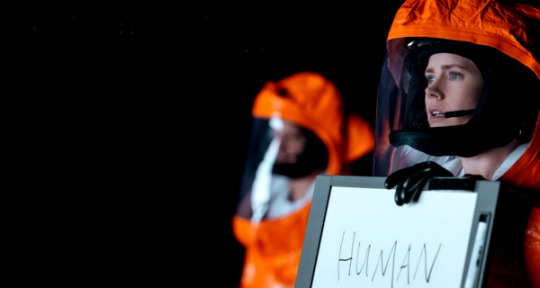
The hazmat suit is an iconic piece of imagery from the film Arrival, but it isn’t what the film is primarily known for.
Arrival’s promotional material effectively centered around the shape of the Alien ship, placed at inconvenient locations across the globe. The film’s tagline was ‘why are they here’, and the appeal was finding out this mystery. The ship is a smooth, rounded shape so that it doesn’t look especially violent: instead, it conveys an air of quiet intimidation. We don’t know why it’s there, only that it is, and that’s a terrifying concept. The film, and thus the promotional material, play on the audience’s fear of the unknown.
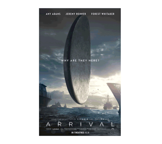
For this reason, I knew the Shell had to play an important role in the sequence. Aside from this, the film is known for it’s circular smoky alien language, which constantly shifts shape. With these two, I found I could follow a monochrome colour palette, with various shades of black and grey creating a minimalistic yet striking colour palette, capable of a visually-pleasing contrast. My initial concept for the colour, then, was a mixtures of dark greys and blacks. However, after looking back at my visual research into the film, I realised the inside of the ship was more of a dark and deep navy, rather than grey.

Through my experimentations this week, I was finally able to decide on a colour palette - pulling from the tones from inside the Shell and reworking them for both the alien language and the ship itself. It’s a limited palette, almost entirely monochromatic, however I feel like this will work very nicely and allow the transitions of the morphing animations to be more easily understood and followed.

Inspired by the opening sequence to Lobster Studio’s short film Weird, the week began with my first attempts at the introduction scene to my morphing animation: a slow rising into the alien ship, towards the iconic white smoke window. A similar effect was created in Weird through a simple use of geometric shapes, and I wanted to try this approach in After Effects.
Looking at my first test, I feel like it’s too slow. There’s no drama to the movement, and the whole sequence looks a little out of place. The rectangle isn’t centered, and so scales up in a way that’s actually visually quite awkward. I can see the idea is beginning to take form, however it hasn’t been realised here. With this knowledge and peer feedback, I created a second test, this time having the window be centre of the frame. I added an easing in and out effect to the sequence’s motion graph, resulting in a smooth and quite appealing movement. The final scaling up to screen is faster than the first, and that lends to the cinematic, exciting feeling of the film. I also took the opportunity to add lines as a way of suggesting the inside of the ship’s form, inspired by the geometric look of Weird.
Whilst this test is much more interesting than the first, it’s still lacking. As the first scene of the sequence, it should grab the audience’s attention with eye-catching, appealing design. At the moment, it’s too minimal. Watching the film, however, made me realise I shouldn’t follow the same visual language: the ship isn’t a geometric, linear form.
Following this, I decided to do some more visual research: looking back at the film, and most importantly, concept art. As the film is lit relatively darkly, it’s actually quite difficult to make out what the inside of the ship looks like - so I took to the internet to find some Arrival concept art, exploring not only the inside of the ship, but the Shell itself.
My research led me to exploring the work of Meinert Hansen, a concept artist who worked on the film in it’s early stages. Over the course of three months, he produced many variations for the designs for the ship and the aliens. Interestingly, the Shell was initially a sphere shape. It was mainly his Shell Interior concept art that I looked at, which presented the set with visual clarity, texture and a real depth. Looking at these artworks led me to take an entirely different approach to my opening sequence - one which challenges my skills in After Effects and Illustrator.
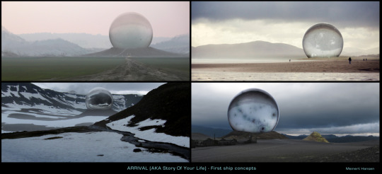
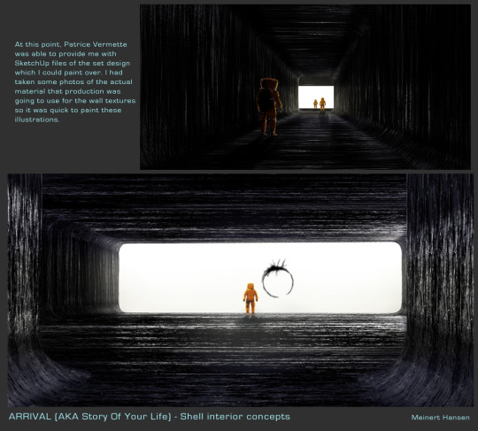
Concept art by Meinert Hansen from https://meinerthansen.com/2016/11/13/arrival-concept-art-part-1-the-shell/
Inspired by the ideas of motion graphic practice in the industry, I not only wanted to consider the animation of the piece, but also the design and aesthetic of the sequence. Looking at the work of Lobster Studios and the like, I’ve discovered my love of motion design. As a craft, it’s actually very appealing to me. Initially, I’d somewhat written it off in favour of digital animation and stop motion - however, looking at these examples of brilliant motion design work has inspired me to look into the industry more.

Lobster Studios. 2018.

Kurzegagt: In A Nutshell. 2019.
Our tutor mentioned how it’s a fairly lucrative industry, with there being a high demand for motion designers. It was also mentioned that with motion design, there’s more creative freedom than working on a big budget Hollywood animated picture; and we’re able to give the outcomes a higher standard of professional finish. Looking at these examples above, I loved the crisp, sharp and clean aesthetic of the animations. The minimal flat design look to motion graphics is something I find very effective, and I want to incorporate this aesthetic into my own morphing animation, inspired by Lobster Studios and Kurzegagt (all shown above).
Whilst researching the industry, I came across the work of Emanuael Colombo. An award winning motion designer based in Milan, Columbo produces colourful and visually appealing motion work featuring simple characters and a minimalist, flat design aesthetic that I find quite inspiring and refreshing. I did a little bit of digging into the artist’s process, which starts in Illustrator to do most of the actual design work. His animations feature rigged characters and objects, which begin as designed layers in Illustrator.

Emanuel Columbo. 2018.
With this discovery, I opened up Adobe Illustrator and began work on a fully illustrated version of the Shell’s interior. Whilst my initial approach to the first sequence was very minimal and geometric, I now wanted to produce two digital illustrations of the Shell’s interior, and have a digital camera pan through, in a paralaxxing motion. Although this is much more intensive, this week we were given a deadline extention: due to absences and other occurrences, we have been afforded the luxury of a later deadline for this (and the sketchbook) project. This meant that I have a little bit more time working on the animation, (hopefully) allowing me to produce a final outcome that I’m happy with.
This new approach to the sequence is heavily design focused, working on the soft, flat and minimalist design visual language of Lobster Studios, Kurzegagt and more. Whilst I’ve had the opportunity to work in Illustrator before, I’m nowhere near confident with the software, and this was a bit of a challenge. My goal was to produce two illustrations, one of the outer interior, and the Window Room, in which our heroes come in contact with the extraterrestrials. The animation would be on two separate planes, and the camera would pan forward - creating the illusion of depth in a flat digital 2D animation, which is known as paralaxxing.
Working from the concept art as reference, I started building the background using simple shape layers and the pen tool; creating soft, curved graphics that worked on the flat design visual language that I’ve found so inspiring. Creating these shapes turned out to be bit of a challenge, so the final outcomes were a result of many failed attempts.


Whilst these are visually much more successful and interesting than my first geometric attempts, I feel like the colours used aren’t accurate to the film. While there are greys in the movie, it’s more of a deep, dark navy and various shades of black, with white streaks illuminating the interior’s rippled texture. To create these, I initially used curved, circular lines. Whilst this is visually interesting, when I showed them to a fellow peer, they remarked that they’re ‘too big’, and distracted from the interior itself. Looking at my first attempts, I can definitely see this - and went back into Illustrator, experiemntig and finding a final colour palette, alongside shrinking the width of the white lines. The combination of these two factors resulted in two digital illustrations that I’m actually happy with.


Here, I’ve made two illustrations that adhere to the sleek, minimal and flat design language inspired by my motion graphics visual research, and challenged myself to move past a strictly linear and simple approach to this sequence. I feel they are quite visually appealing, and wanted to jump into After Effects straight away and make a quick animation test.

The above test is simply me experimenting around with the software, not in response to any tutorial. Whilst playing around with the 3D Ship, I found the option to add a virtual camera to the composition, and with a simple zooming keyframe animation, I was able to create an interesting first test. Moving forward, I want to continue developing this idea, exploring the potential of a paralaxxed motion to create a sense of false depth to my 2D illustrations.
Also during this week, I began work on bringing the alien language to life. For this sequence, I want the alien language to appear out of nowhere, morph into a couple of different ‘words’ from the film before transforming into the Shell. For this, I watched a couple videos on how to animate a path in After Effects, using the path of shape layers and trim path functions. From this, I then had the opportunity to help a peer - teaching them what I’d learned, which in turn cemented my knowledge further. I played around with this at first, effectively creating a loading screen-esque sequence and off-setting the keyframes so the arc effectively was playing catch up to the first action.

Working on the same flat, minimal design language of motion graphics, I wanted to experiment with a clean arc, which then transformed into the smoky, swirling Heptapod Language. In these examples, I also added the slow in and slow out principle with the Easy Ease function in After Effects, creating a smooth arcing motion. Here, I also began playing around with motion graphs, teaching myself how to use them in order to get a visually appealing sense of movement, and in the process learning a great deal about timing and spacing in a virtual workspace too. This is a key factor in computer generated animation works, and it seems quite interesting and intuitive to me so far.


An interesting feature of the alien language is that it isn’t static: after analysing the sequence, I’ve found that the language never stays still, and shifts from ‘word’ to ‘word’. It’s this idea of metamorphosis that drew me to choosing the film in the first place, and gives the language it’s smoke-like tangibility and texture.
Finally, I added a wiggle paths function to the circle, and created a minimalist interpretation to the alien language that looks similar to the film, but not quite where I want it to be for a finished product. Whilst the visual resemblance is there, and the random ‘wiggling’ of the paths is very appealing and somewhat similar to the symbiote-like language, there are still a few key things wrong with this design.


Although the language is circular, a key element of the design is it’s inky scarcity and thickness: it’s this contrast of thickness that gives the design it’s iconic appearance, and smoky liquid feeling. It’s a difficult object to attempt to replicate, but I want to challenge myself. Here, I’ve played around with a 3D turnaround of the language using convex extrusions and keyframe rotations, but I feel like the animation doesn’t create the desired mist-like effect. The animation here feels like a solid, physical object rather than a smoky mist.


Additionally, after playing around with a 3D replication of the Shell, I’ve decided to focus on a 2D approach to this project. Whilst experimenting in the 3D workspace has been exciting, I can’t help but feel like I’ve reached the extent of the extrusion 3D effects potential here.


After Effects is, without any expensive plug-ins, a primarily 2D software. The 3D tests I’ve created are interesting (and quite fun to make), I want to put my focus on producing a visually exciting and successful outcome. I want my morphing animation to be of an industry standard motion graphic, and a part of that is working with 2D layers and characters in order to achieve that clean, flat design aesthetic, inspired by the likes of Lobster Studios and the before-mentioned Emanuel Columbo. Instead of creating a virtual 3D object, the challenge instead will be on creating the illusion of depth to flat, 2D digital illustrations.
When working with 2D elements and layers, I feel like I’ll be able to have more control of the sequence’s design and moving parts: where the Shell wasn’t quite the right shape due it being a path-changing 3D object, now I have the opportunity to completely design the sequence from scratch, building the props in Illustrator beforehand to achieve an industry-standard flat design aesthetic.
Over the Christmas break, whilst I was unable to work on the morphing animation, I put a focus on the research side of this Metamorphosis project, exploring the basic principles of animation in a series of blog posts, in response to the requirements of the brief. Through a total of ten blog posts, I looked at a range of situations from both character-based animation and morphing motion graphics sequences that I’ve personally found inspiring to the Guess the Film task. In the process, I’ve been able to really develop and advance my understanding of the animation principles through discussing and analysing some successful pieces of animation - principles like arcs, slow in and slow out and appeal are ideas that I’ve discussed in my work in this very post, for instance.
Having completed this analysis (and learned a great deal from it), I can now put a real focus on practical exploration and iterative development, producing an exciting morning animation in After Effects and Illustrator, inspired by the film Arrival. This week, I’ve been able to decide on a colour palette too, so my next move is to begin designing the props of the sequence properly in Illustrator using simple shape layers.
Next week, I want to begin designing the props of the sequence in Illustrator using simple shape layers and my new colour palette. When doing this, I want to really push the limits of the brief, working directly from the source material and making each illustration visually appealing and possess that same flat design aesthetic discussed here.
0 notes
Text
Lilo and Stitch: Secondary Action
In this post, I’m looking at the animation principle of Secondary Action, and how we can use this idea to reveal more about our characters and their idiosyncrasies.
Now we arrive at one of the most interesting principles: secondary action. These are gestures that support the main action, and allow animators to bring out the little idiosyncrasies that work to individualise a character and make them memorable, and appealing. Adding secondary action to the main action gives a scene more life, and is a way to add visual interest whilst reflecting character through movement.
Unlike follow-through, however, these are independent actions - and not momentum based. These are movements not linked to physics (like a beard or tail) and more linked to attitude and personality; movements that reveal a little more to the audience about that character.
A great example of this principle in action would be Stitch’s big ears, from Lilo and Stich (2002). In this example, we can see how the ears give the audience a bit of insight into the little alien experiment’s thoughts and feelings. Stitch feels lost, out of place and more than a little melancholy.
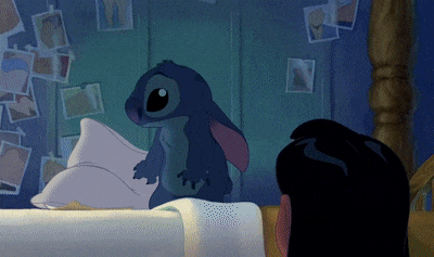
Where his ears once stood up with excitement or curled with fury, they now hang drooping. His ears are a good example of characterisation through secondary action because they move independently from the rest of is body. It’s a secondary piece of movement in the character, which shows the audience an aspect of their personality and demeanour. In a character like Stitch, this is especially useful given his restrictive communication capabilities.
In ordinary human characters, ears wouldn’t be classed as secondary action: our ears are more like lightweight accessories on our heads and would be described more as follow through, or overlapping action points. It’s only Stitch’s alien nature, the fact that his ears act and move independently of his body, that I can use it as an example. Just in this scene here, there’s a great deal of emotional resonance with the audience. A quick look under the comments section results in a flurry of ‘aw he’s so cute’ or confessions of crying over Experiment 626: from his large eyes, his cute and cuddly persona and stilted speech - it’s clear that the character has plenty of appeal.
Next, I will explore this principle in more detail through the character of the Kingpin in the recent (and excellent) Spider-Man: Into the Spider-Verse.
0 notes
Text
Wall-E: Ease In and Ease Out
In this post, I’m looking at the use of ease in and ease out in animation, and how this creates a natural movement.
This animation principle describes the spacing of the in-between drawings, between the extreme poses. This principle refers to how most movements start slowly, build speed, and then finish slowly. This is how most organic forms go about any form of movement or action, and without it, things begin to feel mechanical.
However, this can sometimes work in the animator’s favour: take this sequence from Pixar’s 2008 hit Wall-E. The film explores the life of little Wall- E, the last robot left on Earth. By taking the use of ease out of this sequence, the animators are able to create a believable and convincing animation of a robot moving. Unlike organic materials, robots move their parts at a constant speed. Animators often remove this principle for effect too: to make the action snappier or more comedic.
A good example of Ease in and Ease Out being applied can be seen in this hand drawn motion graphics sequence from Run With the Golden Wolf, an animation studio based in London. In this quick sequence for Nike, the studio present the comedic scene of a turkey running away from being eaten on Thanksgiving. It’s a charming hand drawn piece with a pleasing fluidity and personality.
The studio wanted a more traditional approach for this sequence, and have used the ease in and out method for comic purpose here: before speeding up, the turkey risks a look back and jolts upright, stretching and squashing in the process before sprinting away at full speed. The sequence begins slow, soft and natural - and after an intense burst of energy and fear - returns to that same speed. It’s the contrast between these two states, of calm and cartoonish terror that results in a funny animation and the balance in speed that results in smooth movement.
Next, I’m going to be exploring the principle of secondary action in animation, and how we can inflict personality and character through this.
References
Thomas, F. and Johnston, O. (1995) The illusion of life : Disney animation. New York : Hyperion, [1995].
Disney - The Magic of Animation. (2018). KaptainKristian. https://www.youtube.com/watch?v=EVQflnGcx4k
Slow In and Slow Out - 12 Principles of Animation. (2015). Alan Becker. https://www.youtube.com/watch?v=fQBFsTqbKhY&index=6&list=PL-bOh8btec4CXd2ya1NmSKpi92U_l6ZJd
Wall-E. (2008). Pixar.
0 notes
Text
Planet Tobler: Squash and Stretch & Solid Drawing
In this post, I’m exploring the principles of squash and stretch alongside solid drawing in Planet Tobler (2018).
Arguably, the most important principle is called squash and stretch: when an object is moved, the movement emphasises any rigidity in the object. In real life, only the most rigid shapes remain so during motion. Anything composed of living flesh, no matter how bony, will show considerable movement in it’s shape during an action. For example, a face whilst chewing or smiling is different to one resting, or asleep.
The most important rule to squash and stretch is that, no matter how squashed and stretched out a particular object gets, it’s volume remains the same. If an object was to squash down without it’s side stretching, it would appear to shrink.
Examples taken from The Illusion of Life by Frank Thomas and Ollie Johnston
A great example of squash and stretch can be found in Planet Tobler, an animated short film by Lobster Studios creative Aran Quinn. The film is an alien wildlife mockumentary set on a distant planet of Planet Tobler, inspired by the likes of wildlife documentaries narrated by the great David Attenborough. In particular, the film makes reference to Planet Earth, and is a charming and entertaining digitally hand-drawn animated wildlife documentary on acid.
The scene I’m looking at here is the hunt between the Zakis and the calf’s. After eating his kill, the creature looks as if it’s about to burst. A single tail is waggling, and the beast squashes down to the ground, stretching his abdomen in the process. The creature’s volume stays the same, before another animal rises out of the Zaki’s behind - stretching tall.
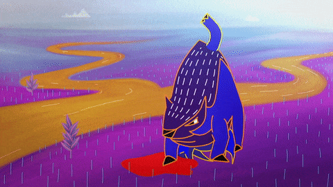
Planet Tobler is an interesting and contemporary pick for this principle analysis, with an engaging and exciting visual language. The short sequence I’ve analysed here is a successful example of squash and stretch, instantly giving the creature a real sense of weight and mass. It’s easy to see why the legendary Disney animators all considered Squash and Stretch to be the ‘most important principle’ - it instantly gives the subject a vitality and life.
However, I’m confident in saying that Quinn has displayed an understanding of all of the Basic Principles in this sequence. In particular, Planet Tobler features a successful example of solid drawing within a 2D animation. As a principle, I felt like I had to choose a 2D example: as solid drawing is essentially ‘a given’ in 3D digital animation.
Solid drawing describes the ability to draw a three-dimensional character in a two-dimensional space: giving the animation weight, depth and balance. In order to make an animation convincing, we should be able to render our characters from any angle. With solid drawing, forms should feel like they are in a three dimensional space, which requires a knowledge of three dimensional drawing.
‘Our characters distinguish themselves from the ones at other studios, because they have real bones and muscles’.
Milt Carl, Disney animator
Here, Quinn has used this principle in a few occasions: once as the Zaki tears into his kill, and the other featuring a Zephwap, a bird like creature.
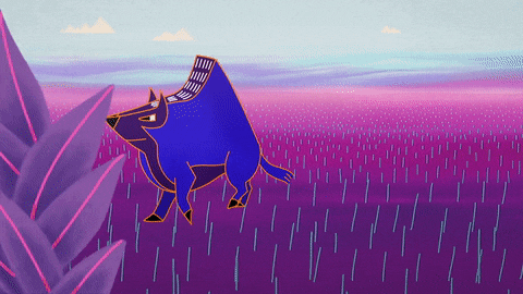
As the Zephwap lands, he begins admiring himself in a small body of water. The bird turns his head, and we see that the character is a solid form. The Zaki’s solidity is more clear, as it nuzzles it’s head from side to side. These are quick moments, but show how integral and built-in these principles are to successful animations: t’s not a conscious effort most of the time.
Here, I’ve continued my research into the Basic Principles of Animation. Next, I will continue to look all of the principles in depth, writing about at a chosen example and analysing the principle displayed in each one.
References
Thomas, F. and Johnston, O. (1995) The illusion of life : Disney animation. New York : Hyperion, [1995].
Disney - The Magic of Animation. (2018). KaptainKristian. https://www.youtube.com/watch?v=EVQflnGcx4k
Planet Tobler. (2018). Aran Quinn.
Solid Drawing - 12 Principles of Animation. (2015). Alan Becker. https://www.youtube.com/watch?v=7An0jukOkCI
0 notes
Text
Beauty and the Beast: Exaggeration
In this post, I’m exploring the animation principle of exaggeration, and how this can help convey an idea to the audience.

Exaggeration is used to do exactly what the name implies: exaggerate an action. This doesn’t mean a more pushed, stretched or distorted version of the character however: we aren’t physically exaggerating a character’s features. This principle is more about clarity in posing and convincing an idea to an audience. It is used to push the movement, pose or character design further: exaggeration can add more appeal to an action, pose or expression.
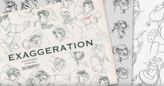
In animation, a caricature of an action will always read better than a direct replication of that action. Animation exaggerates life: it’s the illusion of life, not the illusion of reality. This principle is about making an idea clearer to the audience: if a person is happy, make them happier. If a character is scared, make them terrified.
A brilliant example of this would be the character of Gaston, from the 1991 Disney animated classic Beauty and the Beast. A prime example of toxic masculinity in the narrative, Gaston is the exaggerated image of what a man traditionally wants to be, in terms of looks, strength and confidence.
In this sequence, the townspeople begin singing a song in Gaston’s praises, which demonstrates a great deal of exaggeration: from the main character holding up a table with three women with one arm and flexing with the other, to his ridiculously chiselled jawline and highly exaggerated furious reaction to losing at a game of chess. Interestingly, this chess sequence also features mostly all of the animation principles in action: from the exaggerated anticipation, swinging arc of his arm to the quick turnaround. The animators at Disney established these principles, so it’s understandable each of their animated output would be ripe for principle analysis.
With our exaggerations, however, we need to execute them whilst remaining on model and proportionally and anatomically accurate. This brings us onto our next animation principle, which is solid drawing.
References
Thomas, F. and Johnston, O. (1995) The illusion of life : Disney animation. New York : Hyperion, [1995].
Disney - The Magic of Animation. (2018). KaptainKristian. https://www.youtube.com/watch?v=EVQflnGcx4k
Beauty and the Beast. (1991). Walt Disney Productions.
Principles of Animation - Exaggeration. (2016). Dsource Ekalpa India. https://www.youtube.com/watch?v=GRKqHBTYTws
0 notes
Text
Snow White and the Seven Dwarves: Timing
In this post, I’m looking at the animation principle of timing, and how this can tell the audience important information about a character.
If spacing is the distance in between frames, timing is the number of frames it takes for a character to complete an action, which subsequently dictates the speed of said action. To put it simply, more frames mean slower movement, and fewer frames results in a faster action. In animation, there are two main types of timing: physical and theatrical.
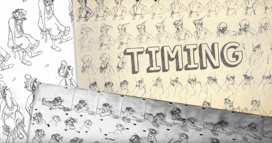
Physical timing describes a character’s weight and mass, telling the audience about the overall feel of the character or object. Theatrical timing, on the other hand, is behavioural, influenced by performance and the character’s emotions, thoughts and feelings.
A good way to visually demonstrate this principle is a scene from Disney’s Snow White and the Seven Dwarves, a magical hand-drawn classic of animation adapting an old fairytale. Here, the theatrical timing of the sequence tells the audience a few important things about each dwarf’s personality and character. As they all stick out the hands, we are able to get a grasp of each one’s individual character through the timing go the sequence - and their collective contrasting appeal.
Where Sleepy moves slowly and dazed, without a care in the world, Grumpy moves with a purpose: a direction. One is sleepily and softly bringing his hands out, whilst the other is sticking them out - and Grumpy isn’t happy about it either. We’re able to get a glimpse into these character’s personalities just through the timing of the sequence and exaggerated actions.
This brings us onto the next principle I’m going to discuss, exaggeration.
References
Snow White and the Seven Dwarves. (1937). Walt Disney Productions.
Thomas, F. and Johnston, O. (1995) The illusion of life : Disney animation. New York : Hyperion, [1995].
Disney - The Magic of Animation. (2018). KaptainKristian. https://www.youtube.com/watch?v=EVQflnGcx4k
0 notes
Text
Lobster Studios: Arcs
In this post, I’m exploring the principle of arcs in animation and how using this concept can result in smoother and more visually pleasing movements.

This principle is somewhat straight forward: simply put, if we want movements to flow, the visual path needs to follow an arched trajectory. Straight lines rarely, if ever, occur in nature. The alternative: curved and arced lines, are visually pleasing to the eye, and engaging to watch. An arced movement is fluid, smooth and most importantly, natural. This principle is used extensively in animation because they make the sequence more enjoyable to watch and less stiff. Without this principle applied, movements tend to look very mechanical.
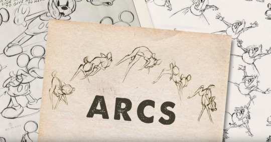
Animation studio Lobster Studio produces high quality, smooth and dynamic motion graphics and animated sequences that exemplify these principles. The studio make short commercial and creative animations with a clear focus on minimalist and appealing design, featuring fluid and exciting movement and actions. A great example of the arc principle can be seen in this short sequence, featuring a grim reaper playing golf. Not only is the idea entertaining, and the minimalist approach to design and colour visually appealing, but the swing of the scythe is very visually engaging and an example of a smooth arcing motion. It’s a very quick sequence, but an effective one too.
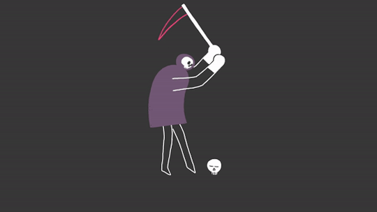
The hit is at a fast speed, and so the movement creates a dynamic, rapid spiralling arc. The motion leaves behind a motion blur and lines to indicate past movement: briefly creating a visible arc for the audience. It’s a snappy, blink-and-you’ll-miss-it sequence from the 2018 Showreel, but it’s also a piece of appealing and engaging animation worth discussing here.
Although the arc is a particularly good aspect of the animation here, it’s not the only principle that Lobster have applied in this piece. Apart from aesthetic choices that result in an appealing animation, and the easing in and out of the hit itself; it’s the rapid speed in which Reaper makes contact with the skull that results in such a fun and snappy animation.
Moving forward, I’m going to continue to discuss the 12 Basic Principles of Animation on this blog, looking at the impact of timing.
References
Thomas, F. and Johnston, O. (1995) The illusion of life : Disney animation. New York : Hyperion, [1995].
Reel 2018. (2018). Lobster Studios.
Disney - The Magic of Animation. (2018). KaptainKristian. https://www.youtube.com/watch?v=EVQflnGcx4k
0 notes
Last Seen Blogs

kidmograph
KIDMOGRAPH

zombiegab6
ZombieGab
imtryingmybest-imsad
/ᐠ。ꞈ。ᐟ\
starlitsecrets
what a wasted opportunity
pepsota
paps