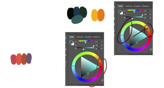
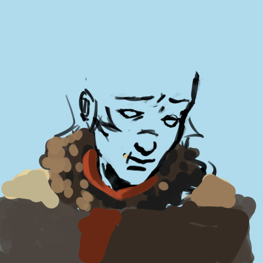
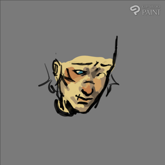
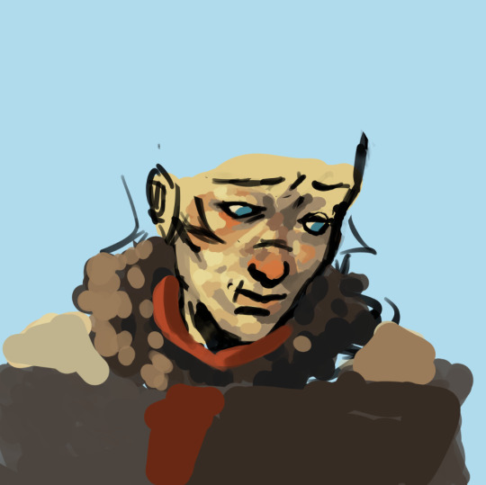
#learn clip studio and get a feel for different brushes
Text
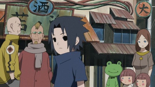
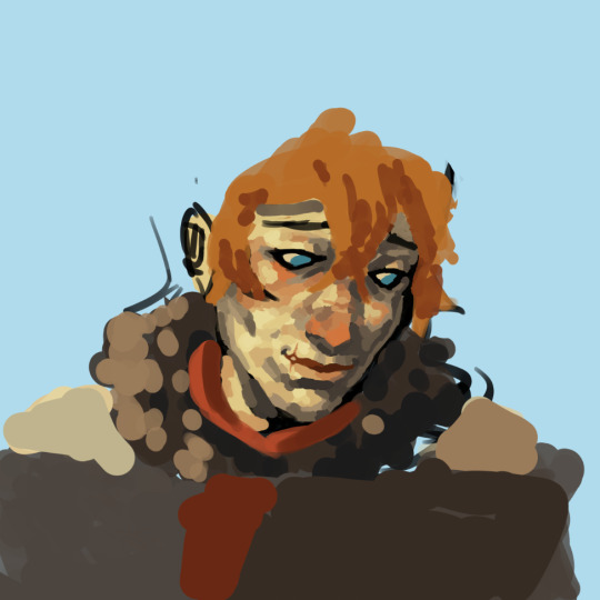
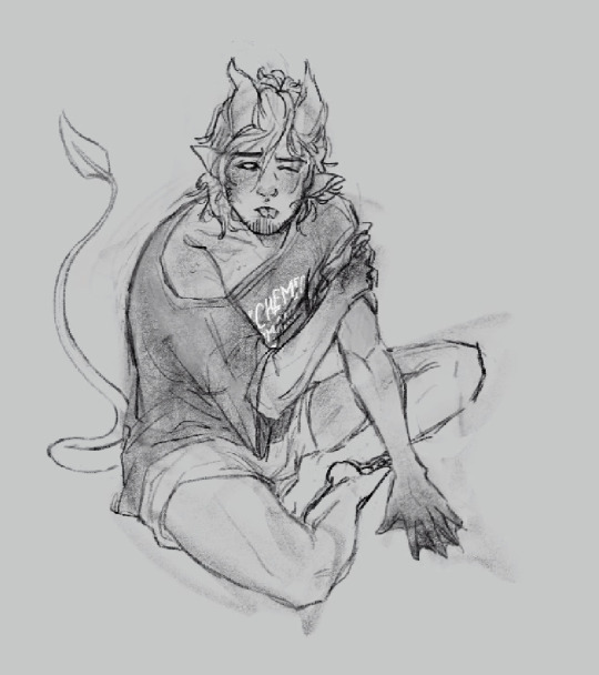
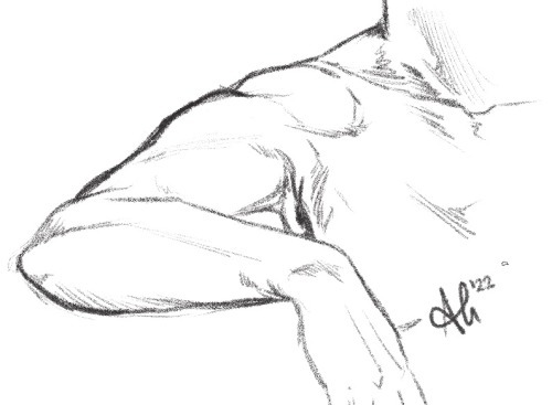
i need to sleep and deep clean my room tomorrow but im on this drawing train rn im so ❗ in love ❗❗with making art❗❗❗
ANYWAY send me some ronance drawing prompts 👍
#i am going to go sleep tomorrow but i think i might be fun to draw some more ronance stuff as a good way to#learn clip studio and get a feel for different brushes#stranger things#ronance#murmurings#did i say sleep tomorrow there??? i meant right now <3. my brain is not working my dyslexia is exploding
4 notes
·
View notes
Note
Hey, I was wondering if you have a brush recommendation for CSP brushes for Lineart with good line weight? I'm trying to improve the weight of my lines, but I'm having a hard time finding brushes with the flexibility I'm looking for
That's a good question. There are all sorts of ways line weight is used and the right brush is different for each genre and style of drawing, I'd say.
To start: A lot of my lineart brushes are adjusted with slightly LESS brush size dynamics because I always felt like the original default CSP brushes (like the Mapping Pen and G-Pen) gave an unrealistic and uncontrollable amount just based on the their pressure settings.
Some people do use them well for specific styles, so they're not inherently bad. But I definitely think they're not friendly to beginners or people who just wanna pick up a pen and go draw rather than obsess over the precise way they're pushing down on their pen.
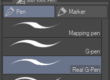
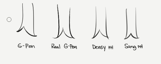
More recent versions of Clip Studio Paint actually came with some new default brushes, including "Real G-Pen", which had pressure settings that felt more right to me. But it's a little noisy so its uses are a bit more specific.
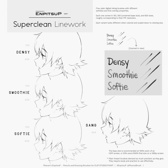
I have a brush set included with EnpitsuP called Superclean Linework. Those are the ones I designed as cleanup brushes for anime-ish looking art. They come in several flavors: Densy, Softie, Smoothy, Sang. I varied them based on how I saw different artists preferred their lines: a bit on the sharp side? Slightly blurry? With a little bit of opacity fade? A little more line variation? Among these, Sang has the largest amount of size response.
Ultimately, it may be a little bit of both a subjective experience and depend on what your hand/tablet/driver settings/style preferences are like. If you're having trouble finding a brush for this purpose, I think you should hone in on if you're not finding the right brush because every brush seemed too difficult to control, or you can't seem to get results you like, or you can't find one with a feel that matches the physical tool you're used to.
I think it's also worth noting that some artist's styles also rely a lot on them just changing their brush size setting depending on what part they're drawing. So you may end up needing a brush that has less pressure-size variation than you expect. My recommendation is always to look very closely when learning from someone else's linework example. Try to achieve it yourself side-by-side and see where it doesn't quite match up and ask yourself why. Or ask others why.
Of course, there are a bunch of other "lineweighty" brushes too outside of this genre of mostly-thin lineart.

#clip studio#clip studio paint#pharanbrush#clip studio brush#clipstudiopaint#clip studio paint brushes#EnpitsuP#KrupukP#csp brushes
71 notes
·
View notes
Note
hi Habs! :D i love your art and have seen ppl say they want to eat it and i would also like to partake lol. have you ever explained your methods of doing digital art? i love traditional but i would like to branch out into digital. i've tried different applications like krita, sketchbook, and sketch.io but i don't really vibe with them (if that makes sense). any tips?
Hello ! Haha thank you ! Totally get what you mean about vibes, I’ve used a few different programs, and I like paint tool sai and clip studio paint the most, and mostly use csp now !
Took me a long time to get into digital art, and the biggest breakthrough I had was that I didn’t have to do line art lol, now I only do it when necessary and 99% of my stuff is cleaned up sketches. Changing my process completely changed how I felt about my art for the better. It keeps my work dynamic, and also lessens feeling of the sketch looking better than the linework!
Generally my process is sketch, duplicate the layer and clean it (sometimes put the old layer on a low opacity so I can make sure I’m staying true to the sketch, so it’s like lineart with extra steps lol) then I block in one colour under the lines, either make a new layer with a clipping mask, or lock the opacity and colour on that layer.
For colouring, I usually use a single layer, I put down messy flats and shadows then clean it up and render it, add highlights and funky details and then I’m done. I’ve explained my colouring process here before, and I have a time lapse that shows my sketching/colouring process here.
I have shaky hands, so a lot of my brushes have stabilization turned up, usually I set it at 15 on csp brushes idk how that translates to other programs though.
For my sketches/clean up, I like using brushes that have little to no variation in brush size, and have varying density or opacity. Not for everyone but I like how it makes my work look and I end up liking my stuff a lot more like that. Usually I keep my sketches at the start really light and build up pressure as I clean
In general, I think the best thing to do is try a whole bunch of methods and figure out what works and what doesn’t! Lots of people have very different processes, so looking at how other artists work and trying out how they do stuff for yourself can be great for learning! Good luck with digital art!
97 notes
·
View notes
Note
hi tamelee!
I'm here to ask for a little bit of advice if that's okay (: about a month ago I bought a Wacom drawing pad so I could start experimenting with digital art. artists like you here on tumblr have really inspired me to start making art. but I feel kinda.. lost. I've been mostly drawing naruto manga caps and I'm getting better but I guess I don't know where to go from here. coloring and shading scares me lol. I'm using clip studio paint and it's just a little.. intimidating. I feel discouraged, like I won't be able to do it. how did you do it tamelee? did you watch a lot of tutorials, or did you experiment until you figured things out? any advice you'd have for a beginner artist I'd really appreciate.
thank you veryvery much for your time ^^
Hi Nonee! 🧡
Sure!
Oh I think that’s a very good place to start. As well as drawing subjects you like ^^!
Hmm, tbh I’ve just experimented a lot, but I don’t think my way of having done things was the most efficient. You might want to follow tutorials step by step? You can try coloring only with flat colors until you feel a bit more confident with that as well as cell-shading (toon-shading/non-realistic, like in anime) instead of rendering further as that can all be confusing at first. I personally never truly understood shading until I studied cell-shading and made my art a lot more readable. A lot of Anime uses this;
You see how there is a base color, a darker color for shadows and highlights? (Sometimes not even highlights.)
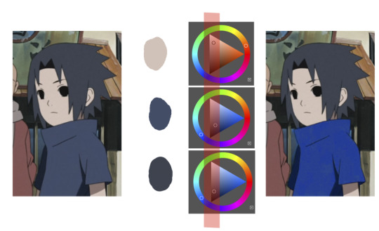
When you start to study it from existing work you’ll start to notice things like color always being in the same area of saturation and when you suddenly have a color that is way more saturated than the other it can look off. (See example.) But this is a guideline, not a rule. In your own art you can especially use saturation and brightness to help aid you to direct a viewer's focus and even tell a story.
I LOVE ‘How to train you dragon’ and ‘Kung Fu Panda’ for this because their coloring is so inspiring and if you truly want to learn from professionals... well those are the type of media to look for of course! I have an entire folder to inspire me just based on those.
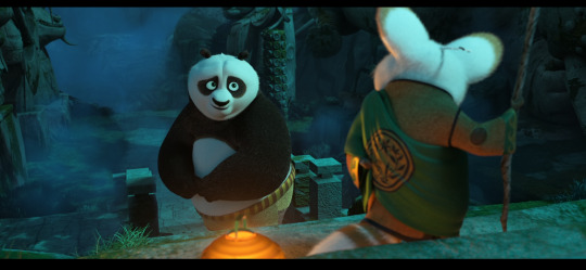
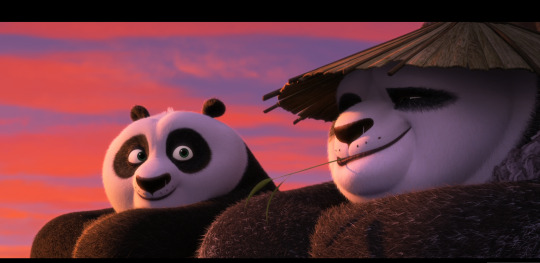
Do you see how calculated those color combo’s are?!?! Here you see both analogous and complementary schemes and it is actually through looking at the things I like that I learned it >< The orangey colors stand out and are bright which helps you to focus on that area whereas the complimentary scheme is used to bring characters together.
If drawing Manga-caps is something you love to do, then maybe for coloring you can study screen-caps from Anime or even other animated films. I’d recommend to take it step by step, though I haven’t really applied it myself, from the video’s I’ve seen and artists I’ve followed it is always advised to have an art-goal that you can work toward. Maybe you first want to focus on lineart and then laying down a base color where the colors are harmonious and next would be cell-shading maybe and then you can start adding another light-source etc- eventually you can decide to create more depth or practice with monochromatic coloring, maybe even greyscale to learn values. But right away that can all sound a bit intimidating doesn't it?
Find things that you like and then maybe you can open them in your program and just study. Find a brush you like, put on some music or a show on the background and for a moment play around with it without needing to create a finished piece. This is also how I learned how things like adjustment layers work or what all the different kinds of tools do. I have to agree with you, CSP is intimidating for me as well >< so this is kinda how I approach it as there are so many add-ons and additions within it but I try to only learn what I need for that moment so I don't overwhelm myself. I definitely try to find video’s that can help me with creating Manga though! ^^ There are plenty!
It'll get easier eventually, you'll learn the program and you start to recognize placements for shadows and you will get a feel for the coloring- no worries 💪 Learning something new will always stay intimidating, every time I open up a new document I feel it too. It's not easy at all, but you kinda have to allow yourself to experiment and even make mistakes because practice is never perfect.
I have some beginner tips written here- I hope any of this is somewhat helpful 🌷🫶
16 notes
·
View notes
Note
if youre comfortable sharing, whats your rendering process? what are some ways you learned? your art is very yummy
HSHSHHSHS hello!!!!!!!!!! first off omg,,,, thank you so much,,,,🤭🤭
secondly!!!! heres my attempt at a rendering process explanation. uhm. warning ive never really been asked to explain it before please bare with me
BUT. here goes. this'll probably be ungodly long apologies
so when i render my biggest rule is basically Do Not Blend Ever. what i do is do my sketch, then flats, then basic placement of blush/shadows+darkest parts/etc and then i go in and just colourpick the inbetweens+place them between colours in small strokes until the changes in colour don't look too sharp/jarring
here's some examples of the process;;;
(still a wip but HSHSHHS) so i work on 3 layers primarily (sometimes i do the hair+items that cover the face on another layer, too, though they might end up getting merged):
^ with just the sketch layer n flats / and then with the render layer added
i go in with a bigger brush to block in colour variation on the face on the flats layer and then paint over that, as well as over the sketch, with smaller strokes on a render layer- i never do lineart lol, and any "lineart" thats visible is just the sketch peeking through. I try to rely on colour and shadow to create shapes and boundaries instead of lines though this isn’t a hard and fast rule.
i also try to stick to the same pallette the entire drawing- once the flats and shadows are first roughly blocked in all the other tones/midshades/colours are basically just inbetweens picked directly from the drawing. Just me zooming in real close till I can see the pixels and colour picking where they sort of mix. (any smaller shifts in hue/tones are just colours with saturation slightly turned up or down, usually) im also not sure if this helps but i use the Sol brush from the clip studio assets store for literally everything from sketch to render, which is basically just a slightly soft opacity brush which ive deluded myself into thinking helps give my art a softer look. idfk if it does or not.:)
I like to use really saturated blush and for shadows I usually use two base colours; a warmer one and a colder one- a warmer one for smaller shadows and shadows near light and then colder ones for planes more in darkness. Also, usually, at the very end of the drawing I’ll add a layer that’s just fully yellow with colour burn or linear burn or multiply turned on and the opacity turned low just to make everything warmer.
(a little thing I like doing for shadows sometimes is never making them reach the edge of the plane; the actual edge is usually a slightly lighter shade and it sort of looks like stylised bounce light that would probably not be there but anyhoo)
but yeah,,,, Never Blend But Make It Look Almost Blended. I’ve been doing it forever,,,,,, and I really like the almost shiny feeling it gives things:)))
And where did I learn. Ough. A lot of what I do I figured out through trial and error and just drawing a bunch (IM SORRY THATS REALLY NOT HELPFUL) but some sources I looked towards were sinix design and bluebiscuits on YouTube!!!!! Sinix has a really good video on rendering skin which is where I sort of took my principles from and ran. And bluebiscuits was a huge inspiration for me when I started trying to render things beyond flats!!!!!!! They’re also where I found the sol brush, lol. Also just,,, the impressionist movement as a whole is a massive inspiration. The use of light and shapes to create form is just,,, omg. Especially Claude Monet in particular. (and for the basics of drawing I learnt from my aunt!)
and honestly, just observing people. A lot of the time when I’m watching a movie or on a walk or even just talking with someone I tend to start looking at their face, and the different planes, how light hits it and how shadow interacts with it, where the shadows are harsher/softer……….people are wild man
I really hope that made sense!!!!!! I’ve never tried explaining it before and honestly, I’m not even really sure how I do it. I just sorta. Switch off and start drawing, yk? BUT I HOPE IT HELPED!!!!🫶🫶💞💖
in case that was all utter nonsense here’s a speedpaint that’ll hopefully demonstrate my process;;
I also have straight up screen recordings of me drawing but. I don’t think anyone wants to sit though that
thank you for the ask!!!!!have a nice day/night and SORRY THAT ENDED UP THAT LONG
7 notes
·
View notes
Note
hello!! i just wanted to ask a few questions if that's fine
1) ur style is amazing!! i enjoy how soft it all looks - its not a question just wanted to say that
2) why do you like bkdk? not trying to be rude or anything! i'm really curious is all
3) what brushes/programs do you use, i've been curious about it for a while now
Whoa my first ask!
thank you so much!!! I'm glad you enjoy my style so much, it makes me happy to see people enjoy my art
I'll answer your third question first as that will be a much shorter response HA; I use Clip Studio Paint, as for my brushes I use all sorts of brushes that I've downloaded from the shop. But the brushes I've been using the most lately is one called 6B Pen! the content ID is: 1995920 if that helps :)
as for your second question... this will be a lengthy response! and a bit of spoilers too the further I talk (1.2k words! goddamn)
I've honestly loved both Deku and Bakugo since the beginning! Their dynamic is one of the most interesting dynamics I've seen in a while personally. I was really into MHA back in 2016-2017 (my irls that knew me then will know this as a fact) and I was a HUGE Deku fan. I remember when the panels of Bakugo getting kidnapped happened and that was WILD. I knew since the beginning that these two were not gonna just disappear from each other's lives, they were connected to each other.
Witnessing Bakugo's development made me root for him and love him. A lot of people want him to change his entire personality which doesn't make sense to me, like he wouldn't be Bakugo without the attitude. He's a flawed character who has changed for the better. I'm honestly glad it took him a while to apologize. You actually got to see the progression of him realizing that he fucked up and is genuinely sorry for what he’s done. If it had been done any sooner the apology wouldn’t have been as impactful. He wouldn’t have been as genuine otherwise. That’s HIGHLY important to him as a character. There’s so much I can say about him as a character as there’s quite a lot of depth to him that I heavily enjoy!
I’ll leave Bakugo with one final thing as I’ve said so much already gejdndn but!! I think one of the major things some people struggle with when it comes to change is that change doesn’t always mean changing every aspect of yourself. Changing every part of yourself can sometimes make you feel lost or like an impostor in your own skin. I think it’s important for Bakugo’s character to have the development to understand he isn’t invincible, that he can lose, he’s made mistakes and has been trying to make up for it, and it’s okay to feel. It’s okay to feel but you can no longer bottle it up like once before. Those days are over. But that doesn’t mean he has to change the core part of himself. He’s learned his own way of what it means to be a hero.
Yeah Bakugo is loud! He’s proud! He’s witty! He’s able to adapt to situations and he’s quick to think about what he needs to do to reach absolute victory! He’s learned the lesson that he doesn’t have to be nice, but he needs to be kind. Those are two very different things. He’s never gonna stop swearing and being a bit of a menace but you know you always got someone in your corner when you need it with him.
Deku to me is also an incredibly interesting character. In the beginning he wasn’t super confident about himself, he had to play catch-up to all of his peers when they’ve had their quirks since they were 4! That means he had to work harder, be smarter, to be adaptable as he wasn’t able to use OFA to its full potential. While everyone had years worth of practice when it came to trying to get into UA, he had less than a DAY. There was also a giant secret that was his responsibility to keep at such a young age.
A secret… that he immediately told Bakugo about.
Deku who wasn’t confident in himself, someone who was told he could never do it, a boy who had no power of his own, yet he had a soul/heart of a hero. He naturally wanted to save. The kicker is his first need to save came about because of Bakugo. Deku saw Bakugo and his body moved on it's own. There's so much to unpack with that alone! But Deku obviously had his development occur over the series.
He struggled with this idea that he had to do this alone. He was isolated from his peers due to having to keep this massive secret from them. You can see he got close to his friends, but he didn't really talk to them about himself. Yeah they were close! But he kept a lot of his guard up around them still.
He was friendly but he wasn't open.
It was interesting to witness this arc of his over time how he became more confident in himself and in his abilities to save. But there was also another set of developments that were occurring that has led us to his vigilante arc. This need to be a hero led him down isolation. He became fearful because Shigaraki figured out his weakness.
Deku doesn't want to admit to his own feelings.
Deku keeps it locked up.
And that to me is when shit gets real fascinating.
I said earlier that Bakugo has become more open over time. He's accepted his feelings and isn't trying to bottle it up any longer. Deku on the other hand who is seen having his heart on his sleeve never tells anyone what he is really thinking. Every once in a while does he actually say what's truly on his mind (“I could admire All Might from a distance, but you were right there. This amazing person in my life! That's why I always… I always… chased after you!” - Deku says this in chapter 119!) but other than that he keeps his cards rather close to his chest (“When the urge to win is stronger than the desire to save, I tend to run my mouth a little more without thinking. You'd think I'd hate myself for that, but…somewhere deep inside… It's because you're who I picture when I think of ‘victory.’” - Deku's thoughts in chapter 120!).
It wasn't until recently that we, as the readers - have been entirely closed off from what Deku is thinking. Yet there has been a new possibility that has just opened up: Bakugo's thoughts.
"Because for all of his triumphs, he was still just a damned nerd." (chapter 348!)
Holy fuck??
Everyone is pretty much certain at this point in time that Bakugo was the one narrating chapter 348. Deku closed his thought process off but Bakugo has opened up his. Quite the fucking development if I do say so myself. They somehow swapped! And I can talk for two hours about this (and I have actually! the power of neurodivergency is so real) but I should cut this much shorter HELP
This all adds up to why these guys are my favorite out of the whole series. Their separate development including how their arcs go with each other and bounce off one another is so fucking cool!! They're foils of each other and it just works. I've always been interested in characters and how they'll change over the course of time and these two have really made my brain rattle.
It's due to this that to me they just work overall. Shit you don't even have to see them in a romantic light if you really don't want to. But to me: they're partners in every sense of the word. Their relationship cannot be broken, they're always meant to have the other in their lives. And that's why I ship them.
Plus to me they're just so silly... how could you not love them???
THANK YOU IF YOU REACHED THIS FAR?? and thank you anon for asking!!!
#bkdk#bakudeku#aster's asks!#thank you anon!#aster talks#aster rambles#I HAD SO MUCH TO SAY#1.2k worth of words#goddamn im insane
24 notes
·
View notes
Photo
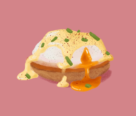
Eggtober 4
Eggs Benedict
Clip Studio Paint, Gouache Brush, Dry Gouache Brush, Freckle brush for the pepper, and airbrush for the cayenne because it does good solid speckling. 16 colors. 1 hour.
Tragic as it is when the egg arrives on your plate with the yolk already busted, I gotta admit that nothing beats the aesthetic of a yolk pouring out of a poached egg. I just prefer the satisfaction of biting into it myself and feeling the soft casing of cooked egg-white burst between my teeth and feel the warm fatty ooze of deliciously runny yolk engulf my tongue. Maybe that’s an overly erotic way to describe eating egg, but if any egg is like sex, it’s Eggs Benedict and I will die on that hill.
Learning to draw the shiny surface of runny yolk and hollandaise sauce was a challenge and I think it needs a little polish, but it’s a warm up, and I’m sure to improve little by little with every egg.
I was originally going to do a poached egg today and save Eggs Benedict for later, but someone drew a lovely poached egg the other day and I want to let them shine for a moment, especially since there are many ways to draw an egg, and if the base of this taught me anything, I should save a poached egg for a day where I have less time, because I got a very satisfying result drawing the egg on this one in just 10 minutes. (Not that I would mind posting the same sort of egg as someone else, I just like the challenge of drawing all different eggs and if I can let someone else shine for a day, then I will! It was a very lovely poached egg too!)
But yeah, Eggs Benedict slaps and I think it’s the best way to have an egg, other than a poached egg in ramen, which is honestly a tie for me. Soft-boiled is traditional for ramen eggs, but nothing beats a poached egg to me, and whether it’s a topping for ramen or the star of this little breakfast treat, I’ll take a poached egg any day, any way. If you’ve never tried Eggs Benedict before, it’s well worth it!
Honestly, thank you @quezify for organizing this little drawing challenge. Nothing like a daily warm up to get me in the mood for other drawing stuff I need to do, and eggs are just so nice to draw, and you can make them as easy or as challenging as you want for yourself and, no matter what, you still end up with a cute little bit of egg art at the end! I don’t know what it is about eggs, but I love them and I love art of them and they make me happy, so it’s lovely getting to see so many nice eggs from everyone, not just my favorite Egg Master.
#Eggtober 4#Eggtober#Eggtober 2022#Eggs Benedict#food#art#my art#I'm sorry if I talked too much I'm just very passionate about egg.
99 notes
·
View notes
Note
1, 2, 15, 30!
1. Art programs you have but don't use
I did get myself Clip Studio long ago but I never bothered to learn to use it. Overall, I feel that it's more for those who also paint their stuff. I've been using FireAlpaca for a small eternity and will continue, as I don't need any fancy tricks or 4560 different brushes - albeit you can easily make your own brushes in FA.
15. *Where* do you draw (don't drop your ip address this just means do you doodle at a park or smth)
On my sofa. When I'm at mom's, I draw on a bed.
Rest of the questions have been answered.
9 notes
·
View notes
Note
Hi! So I just got an iPad and Apple Pencil to start drawing with and I was wondering if you had any advice for someone just starting out? I just love your art so much. It can be about just drawing in general or drawing digitally. I've got Procreate on my iPad. Thank you for your time.
Oh hi!! I'd love to help! I've been drawing digitally for about 7+ years now but only started using procreate in August! Art is about continuous improvement!
I'll try to go as in depth as i can below the cut ⬇️⬇️
I would also like to make it clear that i am a mainly self taught artist with no formal art education!! So anything i say pertains to my OWN experience learning and what has personally helped me!! But it may be different for you depending on your level!
(this is a very long post sorry for ranting so much lol i just want to make sure you can actually take away some good lessons from this!!)
At first it was very confusing and frustrating because i was used to Clip Studio with a drawing tablet on my laptop, but what helped me get comfortable was doing lots of studies at first, nothing serious just kinda going through each brush, playing around a lot, drawing portraits of people and doing some life drawing exercises!
These are some of my first procreate drawings i did!! They were portrait studies where i was trying to get a feel for the program.
I do recommend doing lots of studies as soon as you can, do a mixture between drawing for your own personal amusement and also more serious studies, but mainly what has helped me is getting into a hyper fixation (lol it's funny but it's true)
The key to familiarity and improvement is consistency, draw A LOT!! Take notes every time you do something you think needs improvement then note it down and then practice that! but don't lock yourself into trying to be good at one thing only, If something is stressing you out, just leave it and work on something else.
As for drawing in general, it depends on what you want to improve.
I recommend if you want to improve on anatomy, what has helped me a lot is using resources online to practice how you would inside a classroom.
Watch videos on gesture and figure drawing, and google websites that give you life drawing poses (dm me if you need i can share some resources I've used before!) And then try to learn how to do that.
That's what's helped me most with poses, using a combination of gestural and structural drawing
However when it comes to anatomy, that gets more complicated, looking at real human bodies helps a lot, but you also don't need to study and memorize the 7000000th muscles of the body and how they attach to each bone. However, ART IS ABOUT OBSERVATION!!!
Look at yourself in the mirror and make note of how your body moves!! How do your muscles pull and stretch your chest when you lift your arm up? How does your body accomodate the extra skin on top of your shoulder when it's moved up? How does your ribcage stretch and your skin bunch up when you stretch your torso to one side? When you are sitting down how does your body accomodate? Looking at all these things taught me a lot more than trying to memorize the scientific name for the 3rd ribcage muscle that I've never had to name lmao, learning however the GROUPS of muscles can help!! Especially when drawing buff men 🥹👍 they have like 7 different muscle groups in the torso lmao, AND LETS NOT TALK ABOUT THE BACK MUSCLES CUZ DEAR GOD I HAVEN'T EVEN GOTTEN THAT FAR YET IT SCARES ME🧍🫶
I am also currently trying study more my value distillation when drawing (see picture), that's something i struggle a lot with when working with light and shadow!! So I'm trying to get better at it, (a good YouTube search on value distillation) will give you a good idea of what i mean.
There are very many good resources out there but i will say this!!!
Don't oversaturate yourself with knowledge because it will stress you out when you know all these academic terms and cannot apply them into your work.
Watching one video will give you some information on how a technique works, you can then rewatch it and try to work along with it, and then practice it a couple more times on your own, but don't expect to be good at it, or understand it immediately.
Drawing is about continuous improvement and you never really should stop learning and experimenting.
PLEASE!! if you ever need help with anything!! Do not hesitate to ask other artists!!
@coreyvoss has helped me figure out a couple things and i am sure neither he or i are opposed to trying to help you out finding some resources if you need! I am eternally grateful for Corey's expertise and encouragement!!
I am very proud of you for already taking initiative to want to learn and engage with the community, i am really honored to know that you like my work, it's the only thing i could ever ask for, and i wish you the best of luck in this journey!!! Digital art is a great tool for artists, but remember, you make the art not the other way around💖🫶
Sorry I'd there's any grammar mistakes, I wasn't expecting such a long post but i genuinely do hope you are able to take something helpful from it.

#raven rambles#raven helps with art#sorry for the long post lmao#i love helping begginers find resources because i didn't have a lot of help when i started out#my family is full of artists who always encouraged me but also never yreated me as a beginner lol#genuinely please don't hesitate to ask for help!! i may not be able to teach you but i can share what has helped me improve!
9 notes
·
View notes
Text
.art program breakdown
I kind of wanted to make a list for myself, but i also wanted to make it available for others to view if they wanted a pro and con list of different art programs! I'll start my lists with pro's and follow with con's. I will be focusing on desktop programs.

Paint Tool Sai v1/v2 :
A program i started off with, very simple to use. Between v1 and v2 there are minimal changes so i will be putting them together.
PRO
Brush engine is very 'plush'. This may be dependent on your tablet settings, but i have found through Sai that you dont need a lot of pressure to get a good result.
Great starter program. Is by no means overwhelming, and everything is clearly labelled. (Or with a small amount of exploring you will be able to find the use of each button/function.)
Many layer modes, a few are exclusive to Sai. (shade/shine specifically.)
Save states (Sai V2)
Perpetual License.
CON
Program is made by a singular person, so updates are few and far between.
No dark UI.
You cannot import ABR's.
Desktop only.
Given that the program is fairly minimal anyway, i feel like deducting 'points' from it for not having things like importing assets would be a bad idea. So for what its advertised as, id say its a solid 3 out of 5.
---

Clip Studio Paint :
I have used this program for a few years, and have used on iOS and Windows.
PRO
You can import ABR's
3D models and other importable objects.
In app brush/object/material marketplace.
In app storage for art files.
'Teams' ( You are able to save your works and share them with another CSP user for coop on things like webtoons/comics or other projects.)
QA community, learn and teach, and showcase available in app.
Many layer modes, gradient maps, rulers, and materials.
Animation timelines. (CSP PRO only allows for 24 frames per animation. If you need/want more allowance you will have to upgrade to EX.)
Webtoon / comic creating features.
Mobile app companion.
Adjustable UI shades. (light/medium/dark)
Save states.
Timelapses.
CON
Limited perpetual license.*
Mobile version does not have a perpetual license and is monthly p2u.
Brush engine is very rigid.
SUT are not able to be used anywhere else but CSP.
*While i cant think of many cons, as of August 2022 and their decision to 'remove' perpetual licenses im docking them quite a few 'points'. A TLDR version would be while they do still offer perpetual licenses for version 2.0 onward, you will no longer get updates unless you pay for an update pass yearly fee ALONG WITH your perpetual license cost. You can read the entire article here. While the program is decent and widely used, their recent rug pull left a bad taste in the mouths of many so i will give it a 3of 5 for that reason. Use at your own risk.
Krita :
PRO
Free.
Open source.
Save states.
Limited ABR importation.*
Animation timelines.
*While you can import ABR's, it only imports the brush tip. You have to recreate the brush from there and this can be tedious.
CON
'Clunky' UI
No help desk.
Desktop only.
Performance and lag issues regularly.
I dont think ive ever had a particularly good experience using Krita. One of the main reasons i gave it up back in the day was solely because i was having so many performance issues and it was crashing regularly. These may no longer be issues, but i feel its important to add that it was a good enough reason that many people stopped using it because of. I give a 2 of 5.


Open Canvas / Medibang / FireAlpaca :
These three will get honourable mentions. While open canvas is not free, medibang and firealpaca are. Their UI is pretty much the same, as well as their features.
The most i would be able to say about these three is they are super minimal and basic. (However, if you do decide to stick with any i know people like Jax Sheridan 'Clockbirds' was able to create masterpieces with medibang. They seem to have since moved to photoshop as of ~4yr ago.)
2 of 5!
Photoshop:
PRO
ABR that are widely used and easily accessible.
Many layer modes.
Ruler and grid tools.
In app marketplace.
Cloud storage.
Mobile app.
Save states.
Accessible help desk / forum support.
CON
Monthly subscription.
Open GL issues.
Sporadic performance issues.
While i know a ton of people dislike PS CC because theyve had the market cornered for so long, i feel like the program itself is one of the best. You can find addons for thins like animation timelines, different UI settings, etc. (While not always free as they are user made.) The monthly cost is $9.99 USD (this may change based on your own currency or country.) which is fairly low. (I pay more for netflix per month.) They have been using this subscription model since 2012 when they introduced CC. Personally, the cost of using the program pays itself, but i understand the issues people have with this.
4 of 5.

Paintstorm Studio :
PRO
Save states.
Timelapses.
ABR importing.
Many brush layers, grids, rulers.
Active forum community and responsive help desk.
Extremely customizable brushes.
Customizable UI. (colours AND dark/light.)
OPEN GL.
CON
Issues with integrated graphics.
Occassional performance issues.
Perpetual license cost.
While paintstorm is not free, its $20 price tag is incredibly justifiable for what you get. They are fairly transparent with their plans, issues, and updates for the program (even with things like including animation tools or fixes.). I personally had some performance issues with the program and had to email their support and was replied to PROMPTLY with all the willingness to help.
The closest comparison i can make is that paintstorm is a mix of sai and CSP. Ive considered dropping CSP for this program entirely. (I just need a bit more time to get more comfortable.)
3 of 5.
OTHER HONOURABLE MENTIONS :
While these programs are not getting their own column, if you want to expand and try them out i wish you luck! (I may have either not used it long enough to form a solid enough yay or nay opinion, or i just dont particularly care for it either way anyway.)
GIMP
Rebelle
Corel Painter
Sketchbook
Procreate (iOS only)
ArtRage

I may at some point append this list as I grow, but for now i just really wanted to share what ive learned over the years with others. These are generally my own personal opinions, so youre free to take them with a grain of salt! But hopefully it helps someone out :)
#art study#artist#art#artists on tumblr#art programs#krita#clip studio#photoshop#art resources#drawing tips#art tip#art tutorials
12 notes
·
View notes
Note
I really love your Octopath art and am trying to get better at digital art myself!
Do you have any brush recommendations or other art tips/tricks to share? Thanks!
Thank you, anon! I have more Octopath art in the works, but it's going to be another week or two before I can post them since they're still being worked on!
As for tips and tricks, my go-to advice is to always experiment and try new things! Sometimes as artists, we get too comfortable with what we already know and can draw, that we don't really branch out. I find it that when that happens, it feels like I'm stagnant in my process so I always try to do something different with each drawing to challenge myself, even if the results don't turn out how I imagined! That's all part of the journey, so don't be afraid of lackluster results because the biggest take-away is that you're learning!
If you're just starting out, I wouldn't worry too much about the brushes you use. After all, it's not the tool itself that makes good art - it's how you use it. Even for me, who has been drawing since I was 13, I always just rely on the default brushes for the bulk of the drawing, and then perhaps some Clip Studio effects brushes to add a bit more pizazz.
I hope that helps, anon!
4 notes
·
View notes
Text
OH ALSO as a fun little side project. ive been making a big google doc full of different artistic techniques by tearing apart clip studio paint’s settings to find niche opportunities and going on an odyssey through Youtube Search “Art Tutorial/Coloring Tutorial/How to Draw People/How to Draw Hair/How t”
It’s a passion project of mine, to make a collection of different methods of drawing because I realize a big plateau for artists is when they keep thinking “what do I want to draw” instead of “how do i want to draw.”
Honestly, it’s been pretty interesting so far! A couple tips that I’ve learned so far:
For watercolor (in clip studio paint), don’t rely on the brush’s watercolor edge. Seriously, you’ll get the edge every single time you make a brush stroke. INSTEAD go to layer settings -> border -> watercolor border so you can make a block of watercolor color and then adjust the border from there. You get much more control and can adjust blurriness, opacity, darkness, etc.
Holographic textures. I’m still looking into different ways of doing this, but gradient maps seem to be very popular. For those who dont know, gradient maps take a set greyscale tone and assign it a color (this color’s tone does not need to be equal to the grey tone).
Actually, on the topic of gradient maps. I only learned a few months ago that people color greyscale paintings using gradient maps, and that’s one of the methods used to make it not look god awfully muddy.
So I found this tutorial on Youtube about someone who shades by progressively making the shading change to a contrasting color and I. Am fascinated by that. Will get back to yall when I experiment with that. (For credit’s sake, the tutorial was made by @bluebescuits and can be found here, set to the beginning of that part of the video https://youtu.be/zZEF7SEh2S4?t=428)
COLOR JITTER. there are so many possibilities with this one. One thing I was doing back around artfight was selecting areas of light and using a HEAVILY color jittered brush to color it in. Then, select the shaded areas and do the same. Afterwards, I’d turn off the color jitter and just start rendering using whatever color I wanted. Usually, indigo/blue/purple colors would be used moreso for the darkest spots because they have a darker tone by default, and yellow/pink would be used for the lightest colors.
Because I’ve talked about color tone a few times, I feel like I need to include this Youtube tutorial, “HOW TO HYPERPOP (draw with saturated colors)”: https://youtu.be/NKV2VWWleBk It’s what originally inspired me to make this google doc, and absolutely exploits the tone-color relationship do make some REAL interesting art. I’d tag the creator, but I don’t think they have tumblr, but they’re badjaune on ig/twitter
ill get back to yall when i figure out how to do those parallel scribble/hatching painting look. i will crack the code on that one i want it so badly
ALSO this was the one i meant to add first and then almost forgot to add it. It’s fairly popular on tumblr but i don’t care it’s a very rad tutorial by @ratpunksdraw (found here https://www.tumblr.com/ratpunksdraw/689762046030577664/tutorial-under-cut-paper-textures-brushes?source=share ) which details how they make a quick frankly very good looking paper texture on their artwork + has image resources and i’ve tried this before for an artfight attack and it was fun as hell and not hard at all i would recommend this
#sketchmre tutorial#i GUESS#thats the tag now#for the 20 of my followers who draw#enjoy#i am investing way too much time into this#dwarfed only by the quite frankly embarrassing amount of time i spent researching stays and corsets so i could design undergarments for my d#nd party
8 notes
·
View notes
Note
Hi! I don't know if you answer this kind of questions and it's okay if you don't want to share, but I'm trying to learn how to paint (starting from copying existing images) and I got curious about your process, like... in your commission page you have examples and I was wondering for an image like your Captain Swan full body one, the one with Emma in white and they are on his ship, HOW do you come up with dress and poses? Do you have images to use as reference or do you just imagine it in your head and are able to draw and color it? Because I know I don't have that kind of ability (to imagine something I haven't seen) so I don't know if it's a thing lol Needless to say my paintings are nothing like yours but it just feels so... weirdly fun and cool to do them, so I want to learn more! But like I said, no problem if you want to keep your methods secret!
Not at all, my methods aren't secret! Sometimes weird and chaotic maybe, but not secret!
Copying from existing images is exactly how I started as well. At some point, I started getting a "feel" for things, so for example, if you copy enough references of curly hair you start figuring out some of the principles of how to get that effect. If you draw lots of faces from different angles, you'll start noticing patterns and get an idea of how perspective changes what a face looks like. So like, when you're copying a reference, really pay attention to it and try to see what's going on with it; like, in the painting below, look at Emma's hand and you'll see that it's wrapped around Hook's arm, away from the viewer; what makes it look like that? Look at your own hand, turn it this way and that and notice how the lines change and how you'd have to shorten the fingers or curve the knuckles when you're drawing it. A lot of it is learning to draw what you actually see, rather than what you know is there, and references are great for that.
So, the painting you're talking about is this one, I believe
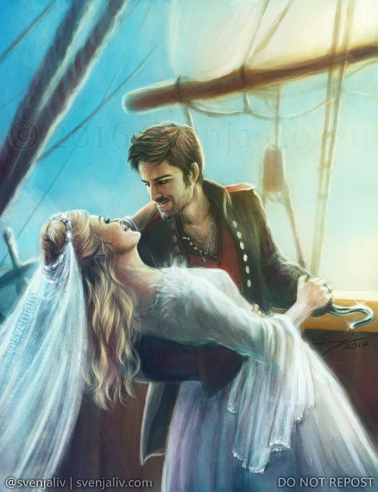
This was a combination of different references - one for Killian's face, another for the general pose, and then a few for Emma's dress. I can't remember if I had a specific reference for the pose, I think I did and just adapted it a bit to work with the hook and all that. The dress was mainly inspired by Elizabeth Swann's wedding dress from Pirates of the Caribbean, I got screenshots of it from various angles and then essentially tried to work out how it'd look from the angle I needed. The little feather tufts at her shoulders were inspired by the dress Emma wears in Charming's dream in s3. I think the veil I just made up but there really isn't a lot to it if you look at it, it's just some long brush strokes at low opacity to look like gauzy folds of fabric, and a circle of glitter at the top.
I combine references a lot, so like, I might look for photos where someone's face is at the right angle, a photo where a specific fabric folds in the right way, I've even looked up the direction in which body hair grows on a man.
I'm lucky in that I'm fairly good at imagining things in 3D, so like, mentally turning an object in my head to know what it looks like from a different angle. That's just something my brain does and I think that does help with somthing like this, taking a woman in a specific pose and imagining a different dress on her and adapting that dress to the figure and the perspective. Some of it is also practice and just knowing how perspective works from drawing so many different references. And even with that, I still use references all the time. The goal for me isn't to stop needing references, it's just to get better at making use of them, getting better at combining them and filling in the blanks.
If you're looking for help with poses, I'd recommend 1) stock photo makers like AdorkaStock (she's on Twitter and DeviantArt and she's lovely) and also 2) pose software like JustSketchMe, they have a pretty good free version so you can try it out. Clip Studio Paint also has a modeling feature (or add-on maybe?) that I know a lot of people use, I haven't tried it myself but I've heard good things about that. 3D models aren't perfect, but they are good for working out where things need to go - the other day I used it to help me paint a dragon because I just could not figure out how wings fold. :D
I hope that helps! I'm always happy to answer art-related questions, I've learned and still learn a lot from other artists myself and I think that's how it should be!
6 notes
·
View notes
Note
Hello!!! I have said this before and I'll say it again: I have always adored your art style
I had always had a talent for drawing, but I only ever drew by looking at a drawing and making an exact copy of the drawing. I never dared making my own art because I didn't want to fail. But you inspired me. I tried getting out of my comfort zone. I wanted to be like you. I wanted to be that artist on Tumblr that had the cute art style. I wanted to be the artist that loved drawing Tom's hair
I have been improving, and honestly, I'm not doing too bad. I'm ok in traditional art, but I've been trying digital
And I don't know how to do line art. HOW DO YOU TRACE???? It's a pain. :,) If you don't mind, could you give some tips?
But, what I wanted to say was: Thank you. You may not have been aware of it, but you had been great inspiration. You made me get up do it. And hey, who knows who else you've helped
Thank you <3
Hey there! (You asked a single question and I wrote practically an essay, I'm so sorry aaa)
First- Thank you so much gOSH :’0 That means SO SO SO much to me. Anyone considering me an inspiration is one of thee biggest compliments I could ever get. <33
There are a few art programs, but it seems most have a “Stabilizer” now. It helps smooth out lines when you draw, making more fluid looking lines. I sometimes have shaky hands due to medication and anxiety. So it really helps!! I'd look into it, but I personally use Clip Studio and it does have a stabilizer options under tool properties when a brush is selected.
This might help as well but- I wouldn’t think of doing line art as “tracing” you’re re-drawing the sketch on top of it. If you only consider the sketch’s lines and think of tracing the lines it will end up like those “the sketch” vs “the line art” memes. It’s hard to explain- sketches can be messier so your eye sees the thicker part of sketches and “fills in” what it considers to be right. So you're still drawing when you line art, still analyzing and correcting as you go.
Also have the sketch layer at much lower opacity. Don’t have it in a light color and at 100%, the chances of drawing on the wrong layer is higher that way. Some programs have a "lock" option for layers so you could even lock it so you don't do it on accident.
My OTHER advice is. You don’t HAVE to line art. You can clean up your sketch, leave it a little messy and consider it good enough. There’s nothing wrong with that! :)
Duplicate the layer and hide the original so you can always go back to that if you don't like how it's coming out. and SAVE SAVE SAVE.
And don’t even get me started on how much I love Tom’s hair and drawing it ; u; I love drawing fluffy hair so so much.
Another piece of advice I have is- similar to how you mentioned re-drawing other's art you can use that to study. Don't 'just' draw what you see, try to really look at it and think but why was it drawn that way? Then draw it yourself a few times using structure and guide lines. just REALLY study it and it could really help you learn. Just don't upload or claim it as yours obvi.
I allow anyone to study my art as long as it isn't uploaded. Technically you don't have to ask to do so if you stick to the "Study it and don't upload it" rule. And look into multiple artists! Experiment with different ideas and ways of doing stuff. When it comes to art styles don't worry about that too much. Don't feel bad if it seems inconsistent or keeps changing. That will always be apart of life. You learn, you gain more experience, you change and you grow.
Wishing you the best with everything!! <3
8 notes
·
View notes
Note
Heya thank you so much for the art advice earlier! I was wondering if you had any specific suggestions for programs and/or brushes (you know specifically for someone whose only fine art experience has been in pencil and charcoal 😭) .
I’m currently using iArtbook because it’s free. I know Procreate is probably the most popular program but I’m literally -$300+ in my bank account right now, so that isn’t a current option 😅.
However I do believe you can upload brushes to the iArtBook app, honestly I’m not sure, I haven’t tried but you can edit the brushes in a very similar fashion to Adobe Photoshop. So I’m assuming you can also download and upload brushes. I actually really like this program because it has a similar feel to Adobe programs and as a Photographer I’m very experienced with Adobe (I have an Adobe Cloud Account).
In all honesty I’ve never been a good illustrator (since my main focus in my fine arts education was always photography) , but I find the activity meditative and I’m ALWAYS looking to improve.
(Also I was gonna DM you but cant so sorry for the long question 😅)
Yo, it's all good. No apology necessary.
I can only suggest what I know. I've never used Procreate, and I've never even heard of iArtbook. I'm also one of those that absolutely will torrent my art program of choice. And have.
A long, long time ago (like probably thirteen years), I got a copy of Corel (Coral? Idek anymore) free with the purchase of my Wacom bamboo tablet. I didn't know what I was doing yet and I hated it. My laptop hated it. It was very heavy and lagged big time.
I switch to Gimp, which is legally free and open source. I used Gimp for years with zero problems. You can import a lot of Photoshop brushes into Gimp without issue. Compared to Photoshop and Paint Studio, it's incredibly underpowered. Looking back at the art I made, however, I was not poorly off.
From Gimp, wanting more, I then switched to Photoshop CS5. It was incredibly easy to find and install. Personally, I say screw Adobe, since their current model is subscription based. I hate that. I used PS for yearsssssss, up until last year, I believe. It wasn't too heavy for my laptop to handle unless I used too big of a brush. It allowed me to expand my knowledge of digital art programs. It has way more to offer than I'll ever use. But as i mentioned before, the natural art brushes are ... okay, and the blending tool is awful. I learned to NOT ever use the blending tool because of PS.
Throughout time in my PS years, I switched from a Wacom Bamboo tablet to a Huion pen tablet (three different ones) to a Huion Kamvas 16 Pro tablet. With my family's help, I put money towards improving my art by way of hardware, and each tablet became significantly better. A good tablet will help TREMENDOUSLY, but by no means does anyone *need* to splurge on a screen tablet like the Kamvas series. I recommend Huion. It's hard to go wrong with them. In case that ever tickles your fancy.
Like, I'm pulling examples of art I've done with these programs and tablets, specifically unshaded pieces, to show that the software and hardware doesn't necessarily make the piece.
Now, I'm using Clip Studio Paint because it comes with so many native traditional brushes. Again, the company switched or threatened to switch to a subscription pay, so I have no qualms in resorting to circumventing their purchase page.
I will say, I think I love Clip Studio more than I ever did Photoshop. The brushes are just ... perfect.
Like this. This isn't pencil and paper! It's the pencil brush that comes with Clip Studio. It draws JUST like a pencil and I feel like I'm in my natural element when I get to use it.
If you do decide to use PS, or a program that is PS brush compatible, I'll have to find that set of brushes that works similarly to these.
These pictures both used one of the pencil brushes from that set in PS. The horse was painted with a watercolor wash brush; the human with a chalk brush. It's nowhere near as versatile as what can be used in Clip, though.
But I'm sure you could find many brushes through dA and gumroad to use until you find the one that works for you, too!
4 notes
·
View notes
Note
Hey Fox!
Wondering if you have any advice for someone who only did traditional art as a kid (without a lot of formal training) and can't stop thinking about getting into digital art as an adult
Like, do you have any opinions about which starter tablets are good, pros and cons about different kinds? Any thoughts about what (hopefully free) art programs are the best for learning on in your opinion?
No pressure to respond, at all or quickly, just when/if you have the spoons to and you feel like it.
Cheers! Hope you have a nice day and also that you see a cool bug or a gnarly stick, or even both!
Hey!
I can try my very best to give advice
For tablets, if you want a real cheap starter one you can get a wacom intuos! myself and most other digital artists i know started with one of those! the only con is its not a screen tablet, so you'll have the tablet in your lap while you look at your pc screen to draw.
If you want a screen tablet tho i highly reccommend a Huion Kamvas! I currently use a Kamvas Pro 13 that i managed to get second hand pretty cheap! It's my first screen tablet so i don't have anything to compare it to but i cant really think of any cons!
As for programs, I've been using pain tool SAI (and sai 2) as my main art program for 8 years now, i got a cracked version but its made by one dev so i feel obligated to say ppl should support the dev and not to look for the free versions! (unless you want to bc im no cop lmao)
SAI 2 is my fav of all programs i use (procreate, abobe, clip studio) but i also highly reccommend Clip Studio! The only free art software i can think to reccomend would be Fire Alpaca! It's lacking a lil but it still has layers, pen/brush settings and all that important stuff!
#and thank you i hope you have a nice upcoming day too#i doubt i will bc the sun will kill me if i go outside atm
4 notes
·
View notes
Last Seen Blogs

partickleaccelerator
Who Let Me Back Here

neverhaveieverconfessions
Never Have I Ever Confessions

d4av1d117
Davi's

deniz-mehtap
gökyüzüne meftun...

bigdumbtickler03
stupid soft ler