#i would read it right now but something about the font literally won’t translate into actual words in my brain. and the content is weird too
Text
heads up it turns out a lot of the new jukebox the ghost is actually really great!!!! i was out here thinking their music had just gotten worse but it turns out just a couple songs happen to be terrible and the rest is good
#like i hate wasted. but i got a girl and brass band are both so rad#i had made my judgements on their new stuff based on getting older. for the record. but that was just a random low point in the middle of#good stuff. and it wasn’t even that bad of a song i just decided it meant i should keep only listening to the older album i like#anyway i’m seeing them in concert. tomorrow. as a christmas present from my sister she gave me aldi-brand oreos and concert tickets for us#and it’s tomorrow so i’m listening to their new stuff cause loving let live and let ghosts won’t carry me through blending in at a concert#anyway some of their new stuff is annoyingly overproduced and sanitized like it sounds like radio music. but that is not all the new music#and it’s really exciting to have made that revelation!!!! and in other news i have a doctor appointment a week from tomorrow#where i try to get a medical diagnosis to go along with my problems so that i have standing to apply for an elevator pass and stuff#and speaking of which i’m a little nervous about going to a standing room concert when i’ve been extra unwell lately?? but i should be okay#but yeah anyway i’m doing the closest thing to seeing tally hall that i can in this day and age. so wish me luck shdhdf#i’m scared but also excited. and i’m really enjoying the piano stuff on their newest EP#now starting their album from slightly earlier and not sure i feel about it yet but generally optimistic!!!!#in final news i have a socratic seminar next hour for a book that i hardly managed to read 20 pages of. so hopefully i can fake it/make it#i would read it right now but something about the font literally won’t translate into actual words in my brain. and the content is weird too#(the kingdom of this world by alejo carpentier i know it would be cool if i could process and pay attention but instead i’m just confused)#but so in conclusion. the new jukebox the ghost is actually pretty rad and i recommend at least giving it a chance#if you happen to be like me and had not gave it a chance shdhdf. anyway i should probably look at a spark notes#but yeah. life updates of: doctor appointment and concert and jukebox listening. i keep drafting and not posting#so here’s some words from me. hope everyone is well. maybe a call again sometime would be good#i guess in a few weeks when everybody is in the places where they live. anyway hi the rest of tumblr i’m secretly talking to wext shdhdf#hope the rest of tumblr is doing okay as well. okay i gotta go study now and stuff#but i got a girl and brass band are highlights of their new stuff so far#again hope everybody is doing okay!!!!#also ask to tag for whatever#me. my post. mine.#delete later
6 notes
·
View notes
Photo


Tagged by: @wilhelminafujita and @batgirl-87! Thanks, both of you!
Tagging: I was tagged by both of the people I would’ve tagged for HPHM, so I challenge anyone to do this, for any OC (or fan character in any fandom) they have if they want to! You might be surprised by how well it turns out. I sure was!
Original Template: (x)
I guess as a bit of a prelude I’m going to mention that I wanted to incorporate Jacob and Seren’s Siren heritage and their Animagus forms in equal measures, but I didn’t want them to just... have the same stuff in different colors, so I divided them up so that both get decent references to them.
Seren Aisling Dwyn
Hair: A darker brown than her dad’s, but lighter than her mom’s. Wavy when long, which translates to spikes that flare out and do whatever they want when short
Complexion: Pale as hell. “How are you not a vampire?” pale. No freckles, just Pale™
Wardrobe: I can only really describe her normal style as casual, comfortable, and shades of pop punk. Tends towards short-sleeved shirts with jackets on top. Has a mild thing for vests. If it’s simple to put on and comfortable, she’s wearing it. Doesn’t really try to coordinate nice outfits, but since all of her clothes tend towards “blues” and “neutrals,” they generally turn out fine. Her work clothes as an adult are more “goth and feathers” than anything
Element: Water. Besides the fact that she’s part-Siren, water is an element known for great change and adaptability. It can be a calm pool, unbreakable ice, or a storm and waves more dangerous than anything. I thought it fit her pretty well. Seren is usually pretty composed and accommodating, but is capable of becoming stubborn as ice or dangerously wild as a storm when pushed to it. There’s also water’s healing connotations, befitting someone who constantly goes out of her way to help others
Season: Winter. It’s a very quiet season. Understated, but like water it can be completely unforgiving if you find yourself on the wrong side of it. It’s a season of rest and sleep, which is the thing Seren probably looks forward to most about finding Jacob. And, most importantly, it always follows right behind Autumn, and finishes up the transitional work it started
Animal: Raven. It’s her Animagus form. A bird that’s far too clever for its own good. A scavenger that can take whatever it’s given and use it to survive. In some cultures it’s a trickster that doesn’t care for conventions. In most cultures it’s associated with death and ill-omens, befitting a girl who’s believed by many to be cursed, with danger following her every step. In Celtic mythology, ravens are a symbol of warfare and fate in battle, and Seren is very dangerous in combat. Ravens also tend to travel in pairs, so no one would bat an eye when she travels with Jacob (assuming they find each other)
Accessory: It’d be a mistake to not include Seren’s iconic scallop shell locket, inside of which is an enchanted photo of herself and Jacob from their childhood. She always wears it to keep him close to her heart. The scallop shell is because they grew up right next to the sea (and from a meta perspective, it’s a hint to their Siren heritage)
Texture: Feathers. She’s a bird. And also really likes birds (especially Augureys). They’re also soft to the touch, but much stronger than they appear. While most feathers can repel water, if the oil on them runs out they can get clogged up with it. Seren tries to just let problems go, but they always end up wearing her down and sticking to her
Home: I didn’t go with a specific home or anything, more just her kind of decorating style. She really likes having plants around and the fresher air they bring. She has a lot of things that she won’t get rid of, but it’s all organized and arranged with purpose. A big fan of having light-up objects in her room. Her sheets are chosen due to their Softness Quotient™ and I promise you that there’s a ridiculously thick pillow top on that mattress. Her interior decorating sense is where her Hufflepuff nature really shines through
Jacob Caradoc Dwyn
Hair: Got his mom’s dark brown, almost black, hair color, but the patented Dwyn unruly curls. He tends to keep it shorter in the back, but not short enough to be an undercut, and longer in the front
Complexion: Pale™. “Hello, Jacob, have you heard of this wonderful new invention? It’s called the sun”
Wardrobe: I was very tempted to go with his mid-Vault Hunting “couldn’t even be bothered to put his pants on the correct way” attire, but decided to just go with his general fashion sense. Like Seren, his casual wear mostly consists of things he finds comfortable, though he does put more effort into looking cool than she does. Hence, a leather jacket. Probably elaborate leather boots that take an eternity to put on. Would totally wear tighter shirts to show off his physique. The “goth and feathers” work clothes were 80% his idea
Element: Wind. A reference to his Animagus form being a bird, but also very suited to his personality. It does what it wants, when it wants. It can be fickle, much like how Jacob’s mind is always wandering around from place to place. Generally unassuming, but it’s easy to get swept up in its whirlwind of chaos when it really gets going. In some cultures it’s used as a symbol of discovery and uncovering the truth, much like the great detective he wants to be would do. And, like Jacob, wind can be there one moment and gone without a sound the next
Season: Autumn. It’s a season of constant, deliberate steps taken in preparation for one, ultimate goal, much like Jacob’s single-minded pursuit of his ambitions. It could be said that Autumn sets a lot of things up that it will never finish, since all of its preparations only get their payoff in Winter. Though, you could argue that whatever it does, it does so that Winter can do what it needs to do properly. And I couldn’t pass over the death connotations of the season since Jacob is, well... Jacob
Animal: Raven. It’s his Animagus form, just like his sister. And for the same reasons, too. He’s far too clever for his own good, and ridiculously resourceful. He’s much more of a trickster than Seren, and every bit as much of a bad omen to others, but he isn’t nearly as creative in a fight as she is. Trouble has always followed him around, and death has come to at least one person he was close to
Accessory: His partner to Seren’s locket is a pocket watch with a frame inside that has the same picture in it as her locket does. The watch is to keep him on task in class, where he could easily get distracted by the actual research that he’d prefer to be pursuing (but from a meta perspective it’s a symbol of his impatience). It only works because he’s constantly opening it to look at the picture inside. He’ll keep it in his breast pocket if he has one, to keep Seren close to his heart. If he doesn’t have it in his breast pocket, it’s in his jacket pocket
Texture: Fish scales, in reference to the fact that he’s part-Siren. They’re also just as tough as the feathers I picked for Seren, but scales can be smooth or rough depending on which way you touch them, just like Jacob will return the kindness or aggression of others depending on how they treat him. Water runs right off of them. Jacob is far better at shrugging his problems off than Seren is
Home: Like Seren, I went with something that symbolizes his decorating style more than any specific home he’s lived in. He likes low lighting, and everything is a mess literally always. I can guarantee you that there’s no such thing as an empty space in Jacob’s room. He’ll find something to put in there. Generally it’s a photo, one of the books he’s reading for research at the time, or a souvenir that he picked up from travel. It is his goal to travel the world, after all. In the same vein, his walls tend to be covered in photographs that he took. He had a pin board, but all of the space on it got used up so fast that he moved to just putting pictures on the bare walls. Now it’s basically pointless, but he’ll never take it down
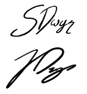
I know that typically people just use a font similar to their character’s handwriting, but I wanted Jacob’s signature to really show off the fact that his handwriting is a nigh-unreadable disaster, so I made both of their signatures myself. I signed their full names above just so that people could get a feel for their handwriting style, but personally I’d say that neither of them typically sign their full name unless it’s on legal documentation. Normally both of them sign things (First Initial) Dwyn. So their actual signatures tend to be more like this:
#harry potter series#harry potter hogwarts mystery#hogwarts mystery#hphm#hphm jacob#jacob's sibling#jacob dwyn#seren dwyn#the dwyn family#not to toot my own horn here but i think both of these own#i was so picky with my images and it was so worth it#i intentionally chose those raven pictures so that they'd be sideyeing each other across this post and i'm so glad it worked#yo the guy i picked for jacob's hairstyle would be the perfect faceclaim for him if he was clean shaven not gonna lie
9 notes
·
View notes
Text
Home Made Simple S01E03 - Chicken Party
We’re starting off with the exact same team as on episode 2: Host Lady, Chef Guy, Deco Guy and Wood guy. The episode centers around Caprisha, who just bought a house and is turning forty and wants to invite her friends to the party at her new place. Her bff is also there to help. Basically, they’re going to focus on the woman’s garden and turn it into a party location. I’m really bad with names, but I’ll keep referring to Caprisha by her name, because they say that name soooooo often in this episode and make songs and puns about it that I actually managed to remember.
My personal highlights:
We’re starting out with Deco Guy introducing a yellow color theme and Chef Guy deciding to make the party lemon themed, as there is a lemon tree in the backyard. I’m genuinely worried that Host Lady is going to lose her shit over the yellowness again, based on what we’ve seen from her previously, but she remains surprisingly calm.
Wood Guy suggests they could build a pergola and explains to the audience what that is with pictures and descriptions. I don’t know, maybe they just aren’t as common in the US? But for a brief moment I’m worried they might start explaining other basic building structures like garages or front doors or whatnot as well. Fortunately they don’t. But they do explain the pergola twice in the episode, because Caprisha and her bff also don’t know what it is, and the renovators have to fill them in as well. Anyway. Everybody is totally into the idea of building such a thing, except for Host Lady. Because, “A pergola is an enormous project.” No, no no no. No! “That’s too much!” So they say they’re scratching the idea, although it looks super fake.
I don’t really get what the big deal is, in the first place, because pergolas are very easy to build and it won’t take up a lot of time either, you just need to screw some wood pieces together and anchor them in the ground, for example by using iron bars. Definitely not more of a hassle than the storage benches from episode 2, but what do I know?
Chef Guy is extraordinarily camp in this episode, which, don’t get me wrong, is totally fine. It just takes me by surprise because I had to actually check if he’s the same Chef Guy as in the previous episodes, that’s how differently his personality comes across. Maybe it’s just the girl party theme of the episode that he’s feeling, though.
Anyway, they’re emptying lemons to use them as party food containers for granita later. Ooooh, I spot a Dawn Power Clean cameo while Caprisha is rinsing out the lemons. It’s like spotting the Stan Lee of home renovation. It’s a bit funny tbh, because Caprisha’s at the sink but her hands and the lemons are out of frame, instead you get the soap dead center and placed strategically right under her arm, so you can read the brand name without obstructions. I don’t even care anymore, I’m just glad they didn’t use the soap to rinse out the lemons.
Next, they’re standing in the dog run of Caprisha’s garden and it’s surrounded by high, smooth grey walls with barbwire on top. To be honest, it looks like a mix of a prison and a chicken coop. If I were doing anything to that backyard, I’d take the barbed wire down and paint the walls a different color. Instead, they’re talking about building a lounge inside it. Alright, you could do that too, I guess.
Deco Guy and the bff are now working on party invitations. The plan is to put the invitation inside a music CD, then put that in a fancy orange gift box, wrap it as a present and hand it out as an invitation. It’s actually a neat little gimmick, but quite expensive and time consuming just for an invitation, if you ask me, depending on how many friends you have. You could say, it’d be easier to build a pergola, but maybe that’s just me.
So, Deco Guy shows a simple invitation that he printed out from the show’s homepage, and… yeah, simple indeed. It’s literally a square with the most basic party info written inside. Like, in the most basic font, Arial or something, just black print on yellow paper. You could type that up in word quicker than searching for it on their website, but okay… Then he shows her how to cut out the paper, how to put it into the CD case and that into the box and how to wrap a ribbon around the box and make “a nice little bow”. All very important steps that you don’t wanna miss, or you’re not gonna be able to do this on your own. Hmm, he states that the invitation costs “literally pennies” and I am left to wonder how they managed to get the ten to twenty gift boxes and CDs for free.
Okay, now Wood Guy and the bff stand inside the “prison” part of the garden and are gonna build the lounge seating area. Cool, cool, cool. They got a lot of same sized wooden bars and are screwing them together to form squares. They stand the squares up and place them side by side in a row to later put a large sheet of wood on top to form a bench. Easy, simple concept. I actually do like it, but I can already tell that that base is going to be too high to sit on the lounge comfortably. Your feet won’t be able to reach the floor. Should have made rectangles to keep the benches lower, but maybe that was too complicated? They’re using an electric screw driver to put in the screws and you can totally see the wood break all the way through to the end of the bar, both when the bff and Wood Guy are doing it. It’s neither addressed nor fixed though. I guess the whole thing isn’t meant to last anyway, because they also don’t put any varnish on the construction, even though it’s meant for outside, so.
Meanwhile, Chef Guy shows Caprisha how to make some mousse for the party, and it’s an alright recipe too. It just cracks me up a little how Caprisha tries some and expresses, “It’s nice and light!” And Chef Guy totally jumps on the “light” aspect, even though the mousse is made of basically sugar, cornstarch and whipped cream.
We’re back in the garden and the benches are coming together. The seats are now at the hight of Wood Guy’s upper thigh without any cushions or padding yet. But I assume you could work around that. As I mentioned, it looks like a chicken scoop, so why not add some chicken ladders going up to the roost, right? They briefly show that they’re going to use more wood to make a backrest at an angle, and then we see the finished result, but we don’t get to see how they work around sharp edges or cracks. They also don’t mention that you should probably sand the wood so you won’t get any splinters. But I’m not an expert, so don’t listen to my layman’s opinion.
As a filling for the empty lemon cups, Chef Guy and Caprisha are preparing some the granita, which is basically frozen lemonade with sugar. I’m sensing a theme and it’s not the lemons. I wonder if there’s gonna be any non-sweet food at the party at all. Doesn’t look like it though. But it doesn’t matter, Chef Guy and Caprishado a little sexy victory dance in the kitchen, because freezing lemonade is hard and they deserve that. And then he gives her “the gift of cleaning”, which translates to filling up the dishwasher in front of a smartly placed bag of Cascade dishwater tabs, then gently taking a tab out and placing it into the slot before turning the machine on. Cameo #2. The gift that keeps on giving.
Back in the garden, Wood Guy and Deco guy are having a talk while sitting on the half-finished lounge and letting their feet dangle. I don’t wanna say that they look small on the too high bench, let’s say… youthful. But the truth is, they’re having a really deep conversation and heart to heart, because Wood Guy opens up about his love for pergolas and confesses that he can’t let go of the idea. Deco Guy is super supportive and they decide to tackle the obstacles. Have some respect for these men, for real though. Wood Guy admits, “I’ve never seen it done before.” And Deco Guy understands the pressure, “We’re going where no man has ever gone before.” And then they talk briefly about having to draw up the steps to build it because “it’s really simple.”
Now they gotta convince Host Lady. Instead of anchoring the wooden build in the ground they want to use deck pair footing inside plastic flower pots as floor weights. My idea would have been simpler, safer, cheaper and longer lasting, but I guess you could do that too. I still don’t know why they need the flower pots at all, but, on the plus side, Wood Guy drew little stick figures on his sketches so that Host Lady can understand what he’s talking about, and who cares about the flower pots anyway. She has to let them do it now, right? She does and Wood Guy gets “a gold star today.”
He actually deserves one, btw, because – for the first time ever on this show – we do actually see footage of him and the girls building the whole thing including all the steps he talked about before.
We’re back with Deco Guy, Caprisha and her bff inside the house. He’s teaching them how to sew straight lines to make a pillow. And that’s as complicated as it gets. He also shows them how to fix the fabric with pins and does it wrong (puts them in line with the sewing direction, which will get them stuck in either the sewing machine or your fingers, instead of pinning them sideways to the direction, so you can easily pull them out as you’re sewing). Fortunately, the two ladies don’t know how to sew and won’t even notice. And since they’re now “master sewers”, they get to sew a whole bunch of pillow cases overnight. Right before the party. Because why would the birthday girl need any sleep, am I right?
So, it’s the next day, and the pillows are done. Deco Guy is excited but criticizes the “fresh, out-of-the-fabric-store smell.“ Now, I don’t know where he bought the fabric, but all the fabric stores that I’ve ever been to smelled lovely. And new fabric usually doesn’t have any smell at all. Maybe that’s different where they are though, I assume. But, fear not, Deco Guy is a true hero because he brought some Febreze Fabric Refresher which will both freshen up the pillows and add to the ever growing family of product placements on this show. And, man, does it smell good. They all agree on that and we’re getting lots of footage of them spraying the pillows very elegantly with their new super weapon.
We’re now back in the kitchen with Chef Guy and Caprisha and he’s gonna show her how to make whipped cream out of cream and syrup, because clearly the other food they got doesn’t have enough sugar. They put it onto the previously made mousse and it looks like… chicken poop. Which started out as a joke on my end, but genuinely must be the unspoken theme of their party. I didn’t even plan this when I began writing this review. I genuinely edited the title just now.
Back out in the yard, Host Lady and Wood Guy are talking about building a fire pit in the center, and that sounds like a really cool idea, I have to admit. This is something that’s gonna last and will come in handy later whenever you wanna have a garden party. It’s great. However, instead of building a fire pit, they just drop sand and big pieces of gravel onto the floor and put an empty grill bowl on it, like a random makeshift beach bonfire. This is the most disappointed I have been so far on this show.
Host Lady then steps inside and suggests that she and Caprisha will decorate the inside of the house with lemons in case any guests come in and need to use the bathroom. The instructions are, “Make sure to have enough toilet paper, light some candles and hang out fresh hand towels.” I have no idea where the lemons actually come into play and they don’t show it either, we just see them step into another room and that’s it.
The final results of the “renovation” are now prepared and shown. Suddenly there are several big pink, yellow and orange tables and étageres standing around which serve as displays for the food. They are the biggest eye catcher in the whole garden. But all we got to see about how those came into play was in a brief overall work process montage (where amongst many other things Deco Guy was shown for about half a second, painting them). No idea if they built them themselves or bought them. It’s never addressed and they’re just there.
Host Lady goes to get the girls and loses her shit “bright yellow” style when she sees them. The pitch of her voice is higher than ever and she throws her hands up and screams, “You look gooooood , guuuurrrrlll!!!” and then puts her hands to her hips and screeches, “Woooooooooooooow!!!” , except it sounds more like a police siren. I mean, it’s a nice compliment. A bit super over the top and super loud, but… nice, I guess. Maybe they couldn’t take the barbed wire down because it belongs to the neighbors who put it up in fear of the weird Host Lady.
Anyway, back to the final look of the garden. The lounge benches are now painted, no idea when that happened, and they now have padding and cushions and pillows and are even higher than before. Sadly, no chicken ladders though. But Caprisha and her bff won’t have to use the bench anyway, because they get a couple of swinging chairs as a gift for under the pergola (which they need to remove for the party, but can keep afterwards). Yaaaaay!
2 notes
·
View notes
Note
6, 11, 15, and 19, please!
6: Which OC did you forget about?
If I could remember them, then they wouldn’t qualify forthis question, would they? Okay, but more seriously, in most cases, if I havean OC, and I’ve forgotten about them, I’ve also forgotten about the entirestory they’re in, so at least they’re not forgotten all alone, but are in thecompany of everyone else in that story. I don’t make characters just to makecharacters, and honestly I’m always a little surprised every time I rememberthat sometimes others do exactly that. However, interpreting this questionslightly differently, in the original fiction edited version of A Draught ofLight, I do have a character who’s actually pretty significant who kind of justvanishes near the end of the story. Presumably she went home, but like…withouteven saying goodbye, or without even commenting on all the crazy shit thathappened? I need to do another edit to give her a better exit.
11: Share the last paragraph you wrote.
Ah, this question comes at like the worst possible time,because the last full paragraph I wrote (as opposed to editing), I was thinkingas I wrote it, “I need to fix this later, this is a wall of text.” But here itis, anyway:
The doors opened onto a warmly-litspace that was bright enough to see everything up close, but dim enough thatthe brain ignored most of what was going on in the distance. A plush, velvetycarpet enveloped his bare feet, in a violet-red that immediately called to mindancient royalty. It drew away from him in a straight line and Pitch Black feltsure he knew what awaited him at the end. Because he knew this, he didn’t lifthis eyes right away.. Not straight ahead, at least. He wanted to get a bettersense of the room around him, first. Out of the corner of his eyes, the roomwas not so huge as he had first thought. Some of the walls were deeply polishedwood, and they reflected light from the chandeliers that have light to thewhole room. Pitch Black wasn’t going to stare at them too closely now, but hehad the impression that they were quite intricate. Along the walls, where therewasn’t polished wood, there were sections of stone, that seemed to glitter—no.The stone wasn’t glittering, those were pools and fountains. There seemed likean excessive amount of them, even if Sandy had a serious bath sex fetish (whichwouldn’t be bad, just surprising that it hadn’t been mentioned when so muchelse had) but then Cosmo supplied a more sensible answer. The pools andfountains were for everyone, and not necessarily for having sex in. Obviously,in a space where everyone was expecting to have as much sex as they wanted, itwould be a good idea to give people a chance to wash between partners or acts.And if Sandy had the money to buy him gold jewelry to wear for one night, itmade sense that he had enough money to put bath fixtures in that were luxuriousand fit the theme. The space in the rest of the room was taken up with beds andcouches, tables and chairs of many kinds, some curtains and screens providingmoderate separation between groupings. Opulent patterns and deep jewel tonesdefined almost everything in fabric. Off to the left, deep in the room, heglimpsed the gleam of wood and glassware that indicated a bar. All thisinformation about the things in the room he took in in an instant. He didn’tworry about it too much, either. What ought to draw his attention, and did,were the people. There were maybe twenty people there, maybe a few more, butnot a crowd. Which made sense, considering, well, the limits of humanendurance—and probably the management of group dynamics. Cosmo was suddenlystruck by the thought that Sandy just really liked friends with benefitsrelationships, and he also liked having a lot of friends.
15: How do you name settings/characters?
With settings, the thing that I keep in mind is that peoplearen’t really that creative when naming things. Is there a hill by the place?The place is going to be named after that, or maybe it’ll be named somethinglike “Hill in the language spoken when people first started living here” Hill.Is there a river? Is there a bay? Is there a certain type of tree really commonhere? A certain kind of weather? Is there a natural feature that looks like aneyeball/arm/leg/head/whatever? What’s the most memorable thing in the place’shistory? The place can be named after any of those kinds of things, and inalternate world stories I think of my naming as using a translation conventionso that the place names sound to the reader the same as they sound to the mainpoint of view character. The characters aren’t speaking English, but if theyhear the name of a place as, I don’t know, Redleaf, or something, then it’sgoing to be called Redleaf in the story.
Sometimes I do like to make up names for the sound, though,and for that, it depends utterly on the connotations I have of certain sounds.And that’s going to depend on…well,the entire history of English as well as my vocabulary and all my reading andreal life experiences. Also Tolkien, probably, because I read the Hobbit andLOTR as a kid, and JRR was much more serious about the development and sound oflanguage than I will ever be.
Oh, and in one of my settings, I name places by trying toimagine what a current place-name would sound like if it was used and garbledover a few thousand years.
Characters are a bit different. Sometimes I do go tobaby-naming websites if I have an idea of the sort of name I want, but moreoften I don’t, because looking up names isn’t furthering the story. If thesetting is on Earth, I’ll pick a name that I won’t mind writing or hearing inmy head for the whole story. Something I’ve heard or seen before. I likelearning random names in the hope that one of them will stick and I’ll be ableto find it when I’m trying to think up a name again.
Other things I have done to name characters: picked a wordthat has something to do with the character and run it through severaldifferent languages in a translator and changed it until it seemed more name-y;had a fantasy world where, for no reason but my whims, people’s names wereunusual, polysyllabic, but real, English words (I never finished that story butI had so much fun with the part I did write); and done the hideousaren’t-I-clever thing of naming my characters after other famous characters inthe English language literary canon. Hopefully I’ve given up this last.
Mainly, I try to choose ordinary names for characters thatcome from Earth, because I don’t really care for generational stories, sothere’s no way that the parents of a baby would know, when naming their baby,that the child would end up in any kind of adventure.
19: What does your editing/revising process look like?
For short things: I allow myself to write slowly, and then Ido one read through for both copyediting and content-level edits. This would bewhat I did for the stories for the kinkmeme prompts. I know it might sound alittle strange to characterize the writing of a story every two days as ‘slowwriting,’ but the stories were very short, of course.
And, honestly, for longer fics, it’s mostly the sameprocess, except chapter by chapter. For the novels that I really, really wantto be good, there’s at least two full editing rounds, as well as searches forwords that signal I used a weaker word than I could have (very, really, andothers).
But the process is just…reading everything slowly andcarefully, and changing what needs to be changed to make the story work betterand say what I want it to say. I don’t do things like printing everything outto make pen corrections by hand, I don’t change the size or font to literallysee the words differently, I don’t, Heaven forbid, just straight-up rewrite thewhole thing from scratch…I don’t do a lot of things.
Maybe I should, but no one’s called me out on my terribleediting yet.
Oh, and I also have a document where I can paste substantialsections or well-written, but irrelevant sentences that have been cut from thework to be published. That way I don’t have to feel bad about deleting stuffthat took me plenty of time and energy to produce, but I can still effectivelyget rid of it, while I know it’s still there if I need to put it back later. That’sprobably the closest thing to a Real Writing Tip here.
2 notes
·
View notes
Text
2001 English Liveblog
Almost a full week after the book arrived, here’s my liveblog!
Oh, the cover colors online were greener than this! This is more in line with the Japanese one.
"For the first time in my life, I smiled in the presence of someone else" Don't lie you melodramatic little rat you were a happy child. Though I always thought that referred to smiling for Elmer specifically--which would still be a retcon, most likely, given that in 1709 Monica doesn't know the details of Elmer's past and thinks Huey doesn't either.
まあいいや. This is 2001, where everything gets retconned from.
Nothing special done with 拙者, though that doesn't surprise me.
I suppose I'm required to have an opinion on "Let me just say this," huh? I was going to say it's unwieldy, but it's actually fewer syllables than あえて言おう is, isn't it? Other than that, I think I'll wait to form an opinion. Like I've said before, my only impression of the phrase comes from his how Nile uses it, so I don't really know what it sounds like to a Japanese ear.
If I&M don't meet Elmer I'm going to go to Narita's house and sing badly at him until he explains himself.
OK but how does Feldt know about radar
Sylvie is described as 16 or 17 here but about the same age as Niki in 1711 and Niki is described as the trio's age in 1705...
まあいいや
And see, these two aren't "Let me say this" but they're not あえていおう either! They're both variations. 👍 the toushindai seal of cautious approval.
"I saw something interesting on my way out" could u be... more specific
Good translation of 共喰い, that it specifies both directions. I think--given the way the rest of the volume plays out--you're meant to believe here that Elmer chose to be exempted from eating until the epilogue clears that up.
Hm... I thought there was something here in the fan translation that I disagreed with, but whatever it is, it didn't make it into here because now I can't remember what it was.
I love Fil. I love her however you spell her name. If you want someone angry about that one you'll have to go elsewhere because Fil is how I spelled it when I first read it, before I started interacting with the fandom.
Maiza is very ace. Or just immune to the wiles of his dead brother's girlfriend. Or both!
Why do the AA alchemists make such a hobby of declaring which of them is worst in various ways? Or is that just Sylvie's hobby mostly...
I know I'm on the record as being in favor of adding dialogue tags when the English is not as clear as the Japanese about who's speaking, but let's talk about how "said" is not a bad word
WHAT A GOOD FONT for Elmer's...whatever you call it
I feel like... guy doesn't belong in narration
There it is. The Elmer Description. The single Elmer Description for use every time he appears
Gorgeous
Girl you were not an alchemist tho
まあいいや
"You know nothing works when Elmer gets like this." He was a fucking menace on the ship, wasn't he.
It's time! For the rooftop conversation!!
......that thing about tigers and butter doesn't make any more sense when someone else translates it for me, does it.
Ahh, no, leave that as badgers in the same burrow? Elmer is totally the type to translate idioms literally と思うけど
Oh th ank god, I had this horrible feeling for some reason that 嘘じゃない would end up as "I promise!" and that would have been hella inconvenient for Mad Religion
Ahhhh I was hoping it wouldn't be "I ate Fermet"... I know most of y'all pronounce it without the final T but technically it should be there so this rhymes awkwardly. But we haven't been using devour, have we. So here we are.
[extremely retconned voice] fermet would never
まあいいや
What a good
[conspicuous lack of Firo]
"glamorous bombshells with hourglass figures"...Lucrezia
"Elmer's lips warped cheerfully" is such a good way to describe... him
Spruce... it up a bit
I see you there, pun
You're definitely a resident of Liar Town
Do we have "eyes swam" in English? In the sense of looking back and forth, I mean, not with tears.
Fil is so incredibly precious
I mean honestly was Maiza ever happy three hundred years ago?
Right, about Bilt, I never knew why it was Bild in the first place because the katakana definitely have the t sound, not the d sound.
I just remembered we don't technically know Victor at this point in time. ...We'll meet him in 2018, won't we! If YP's current pace turns out to be sustainable.
"You say that like it's easy" I mean you can literally call him on the phone. You can do it right now. And Elmer's aware of it.
"Somewhere in there, I learned about those things" It's nice of you to not tattle on your counterfeiting best friend but I am so completely convinced that it was Huey who had to explain the economy to you. I will not allow this thought to be taken from me.
"Inwardly, he somehow understood that this was Elmer's true nature." Only took you three hundred years.
Let's stop kidnapping Sylvie! No more kidnapping the women. I've decided.
Love how "gave the water to his own son" is "the worst possible outcome" and then... *glares at Huey*
Ten billion? Ten billion, sir? Maybe not ten billion.
Mr. Narita yes we understand that this particular book is inspired by video games. You can stop calling attention to it now.
Nn, there's really no easy way to get the tone of 君が死んだら、俺は笑うよ? right, is there? For the disconcerting casualness I wonder if it should be something like "Oh, I'll smile when you die!"...
Young husband?? I mean I guess that does say 青年... But he's like, 90 at this point.
Elmer, you should probably protect Fil from Huey tbh.
the Fils...
"How d'ya like them apples?!" oh my god I want Ronny to say this to Elmer please please please please I want it PLEASE
Yeah he's definitely thinking of Huey specifically. 苦笑だし。 I’m still so curious about whether Huey knows about this little deal, though, because like... yknow?
I’ve thought about that way too much.
"I took this chance to designate 'since I've got the opportunity' as a diabolical phrase." Oh my god... sir...
Didn't he say that about DRRR!!'s title actually...?
"In the future, I'll write more standalone volumes" You're a liar.
I forgot to say this when it first appeared but Nibiru is honestly a transliteration I don’t like. It looks very... fakey Japanese. The rest of the names, and “Let me just say this,” I’m relatively content with. Feldt I like a lot.
15 notes
·
View notes
Text
Telling the Story of Graphic Design
Let me just frame this for you: we're going to take a piece of production UI from a Sketch file, break it down into pieces of information and then build it up into a story we tell our friends. Our friends might be hearing, or seeing, or touching the story so we are going to interpret and translate the same information for different people. We're going to interpret the colors and the typography and even the sizes, and express them in different ways. And we really want everyone to pay attention. This story mustn't be boring or frustrating; it's got to be easy to follow, understand and remember. And it's got to, got to, make sense, from beginning to end.
I've asked my colleague Katie to choose a component she has designed in Sketch. I'll go through and mark it up (we mainly use SCSS, Twig and Craft but the templating language is not very important), then she will respond briefly. Hopefully I'll get most of it right, and then one or two things wrong, so we can look at how things get lost during handoff.
In white label or framework type front-end, the focus is on building pieces that are as flexible and adaptable as possible, as content and style-agnostic as possible (within the scope of the product), because you simply will never know where the code is going and for what, ultimately it is being used. But recently I moved to a web design agency, which has a complete inversion of this focus. It is particular. It is bespoke. It's all about really deeply engaging with the particular client you have and the particular clients they have, and designing something that suits them, as a tailor would.
Working so closely with a graphic designer like Katie, with highly finished pixel-spaced UI, instead of directly from wireframes or stories is an adjustment and an education, but there are still lots of things I can bring to the table. Chiefly: document design.
Document design, which admittedly is just the old semantic web with an accessibility hat on, is really looking at graphic design, engaging with it as a system of communication, and translating the underlying purpose of the colors/type/layout into an accessible, linearizable, and traversable DOM. It's HTML, kids. It's just HTML. You'd think we all knew it by now… but look around you. You'd be wrong!
Katie has slung me a Sketch file chock full of artboards, and she's pretty great at writing out what she wants so I don't have to think too hard:

Event card
First I look through the whole UI file and figure out what is actually a card on this site — it turns out there are six or seven components that use this paradigm. Let's make some observations:

Zoom out on section of artboards

Another card, classes this time.
A card is a block of meta data about a page on the site.
It has an image/media and metadata — it's a media object.
It's shown in a group of objects.
That group is always typed (there's no view where there are search results and news articles and classes are all mixed up).
Each object has a single link to a page and no other actions.
Each object has a call to action (Book, etc.).
Each object may have times, categories, badges, and calls to action.
Each object must have media, title, and link.
So a card is the major way my user is going to find their way around this site. They are going to be clicking through guided pathways where they get a set of cards they can choose from, based on top pages like "what's on" or "classes." They're not getting options on this card. It's not really an interactive element — it's a guide, an index card, that sets her onto her path: in this case a purchase path where she books a ticket for a show at this arts centre.
Before going on, let me just frame this for you:
Imagine you were looking at a flyer for a show and discussing it on the phone. If you actually wanted to go to this show in real life. What would you do? You wouldn't just read the flyer out, would you? That's the text. And it might have all kinds of random stuff on it if you started literally at the top. You wouldn't start with "Twentieth Century Fox" or "Buy Hot Dog Get Cola Free" or "Comedy Drama Musical Family Friendly." (I would actually hang up on you if you did!) And you wouldn't simply describe the color or fonts. That's the CSS. You'd talk through the information on the flyer. You'd say, "It's The Greatest Showman and it's on Tuesday, starts at 7:30. It's at the Odeon on Oxford Street by the tram." Right?
This is the document. Keep that person on the phone in your mind.
Count, group, and name
So let's say we'll deliver a card as the inside of a list item. We want a group and that group should be countable. We've already named the page with an <h1> so we'll introduce and describe the group with a heading, an <h2>. First we'll name it, then we'll deliver it, so someone using a screen reader can:
Get the list signaled in the headings overview.
Get a count up front of the number of items on a page.
Know they can skip to the next list item to get the next card.
Know they can skip the group at any point and go to the next page — the pagination is the very next element and it will be labelled as a landmark.
See the Pen
Cards delivered as a countable list with descriptive heading by limograf (@Sally_McGrath)
on CodePen.
Anchor
In this particular case, I'm gonna wrap this whole card in an anchor element (<a>). There's only one link on the card and I want to front load that information so someone can click as soon as they know it's the right card, instead of having to search forward for the action. A big clickable area is nice too, though of course that can be taken too far and make an interface a sort of booby trap! But these cards are not too enormous and I can see they have a nice gutter around them, so there's a rest space that will reduce accidental clicking for people with more limited dexterity.
Title

Event card "title" element
Then we'll jump down a heading level and mark up the name of each show as a heading, an <h3>. The designer has made this type the focus and we will too. Some people browse super fast by jumping to the next heading, then next heading, so I'm not going to put any important information before the heading — they'll jump right over it. I will put the image there, though, as I know in this case, I can't get meaningful image descriptions from the API so those images are hidden and have empty alt attributes. Now the user can guess (correctly in my case) that the developer is actually describing the content in some meaningful way and might flip back to headings overview (list headings level 3) and just get a list of the shows.
Now let's deliver our metadata. Let's list it:
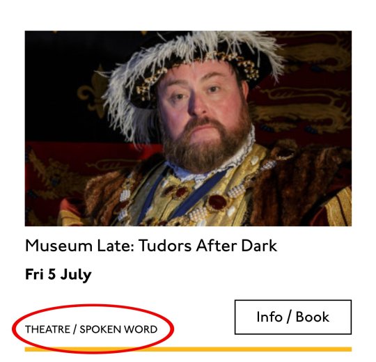
Badge
Date/Time
Categories
Badge

Event card "badge" element
This seems to be something the venue adds to a card to highlight it. As a developer, I can't immediately see why a user would look for this, but it's emphasized strongly by the designer, so I'll make sure it stays in. Katie has moved the badge up out of the flow, but I know that with a headings jump our user could miss it. So I'll just put the wording directly after the title, I think. I'll either put it first or last, so make it easier to account for in a non-visual browse and not be too crazy paving in a tabbing, visual browse.
<p class="c-card__badge"><abbr title="Harrow Arts Centre">HAC</abbr> Highlight.</p>
...But on second thought, I won't put an <abbr> after all. It's the brand color, so it's really a statement of ownership by this venue, and we've already said HAC a million times by now, so the user knows where they are.
<p class="c-card__badge">HAC Highlight </p>
See the Pen
Badge by limograf (@Sally_McGrath)
on CodePen.
A quick aside: the 'badging' is very specific to this organisation. They want to show people clearly and quickly which events they've programmed themselves, and which are run by other organizations who've hired their venue.
Date/Time

Event card "date/time" element
Now date and time. Katie is keying me in to this decision point by styling the dates in bold. Dates are important. I'm going to pop it in an <h4>, because I'm thinking it looks like someone might be quickly scanning a page of events looking for the matinee, for example, or looking for a news article published on a particular day. I don't always put dates into headings, especially if there are millions on a page, but I do always make sure they're in a <time> element with a complete value so the <time>Thu</time> or <time>Mon</time> Katie has specified is read out as comprehensible English words "Thursday" instead of garblage. I could also have used hidden completion or <abbr> with a title.
Categories/ Tags
Event card "categories/tags" element
Next come the categories, and I'm putting them after badge and date. This section is next in the visual order reading top-to-bottom, left-to-right, of course, but it also seems to be deprioritized: it's been pushed down on the left and the type is smaller. This works for our linear storytelling. As a rule, we don't want people to sit through repeated or more general content (cinema, cinema, cinema) to get to unique or more specific content (Monday, Tuesday, Wednesday). Remember, we are inside our card: we know it has already been sorted in a few general ways (news, show, class, etc), so it's likely to have a lot of repeated pieces. We want to ensure that the user will go from specific to general if we can.
There is a primary category that is sorted first and then some other categories sometimes. I won't deliver this as a countable list as there's mostly just one category, and loads of lists of one item is not much use. But I will put a little tag beforehand because otherwise, it's a slightly impenetrable announcement. MOVEMENT! SPOKEN WORD! (I mean, you can work it out retrospectively, but we always try to name things first and then show them, in linear order. This isn't Memento.) I used to use title="" fairly heavily but I've gotten complaints about the tooltip so I route around. Note the use of colon or full stop to give us a "breath." That's a nice bit of polish.
<p class="c-card__tags h-text--label> <span class="h-accessibility">Categories: </span> </p>
Also I'm hard-coding in my spaces to make sure the categories never run together into complete garblage even with text compression or spaceless rendering turned on somewhere down the pipeline. (This can happen with screen readers and spans and it's rather alarming!)
There's a piece of this design I will do in the CSS but haven't really pulled into the document design: the color-coding on primary category. I am not describing the color to the reader as it seems arbitrary, not evocative. If there were some subtextual element to the color coding beyond tagging categories (if horticultural classes were green, say), then I might bring it through, but in this case it's a non-verbal key to a category, so we don't want it in our verbal key.
I'm sorting the primary category to the front of the category paragraph, but I'm not labeling it as primary. This is because there's a sorting filter before this list that sorts on primary category, and it's my surmise that it would be easier and less annoying to select a category from that dropdown than to read through each card saying Categories Primary Category Music Secondary Categories Dance. I could be wrong about that! Striking a balance between useful and too much labeling is sometimes a bit tricky. You have to consider the page context. We may be building components but our user is on a page.
See the Pen
Dummies in page context by limograf (@Sally_McGrath)
on CodePen.
Action
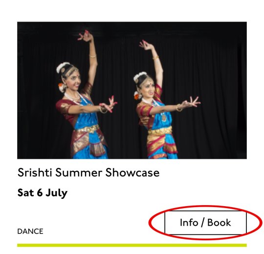
Event card "action" element
Last, the action. The direction to the user, to Book, or Learn More, or whatever it is, has been styled as a button. It's not actually a button, it's just a direction, so I'll mark it up as a span in this case. I definitely want this to come last in the linear document. It's a call to action and also a signal that we've reached the end of this card. The action is the exit point in both cases: if the user acts, we go to the target entry; if they do not, we go to the next card. We definitely never want any data to come after the action, as they might have left by then.
See the Pen
Card by limograf (@Sally_McGrath)
on CodePen.
My conclusion
This markup, which counts, groups, and names data, delivers linear and non-linear interactions. The page makes sense if you read it top to bottom, makes sense if you read parts of it out of context, and helps you jump around.
Katie, over to you...
Katie Parry, designer
What an ace article! Really interesting. (I particularly like that "Mon," "Tue," etc. on cards are read as "Monday," "Tuesday"... smart!)
One thing that struck me is that using assistive tech means users get information served to them in a "set" order that we've decided. So, unless there's a filter, someone browsing for dance events, for example, has to sit/tab through a title, badge, dates, and maybe several other categories to find out whether an event's for them or not. Bit tiresome. But that's not something you've got wrong — it's just how the internet works. Something for me to think about in the future.
Most of our clients are arts and cultural venues that need to sell tickets for events so I design a lot of event cards. They're one of the very first things I'll work on when designing a site. (Before even settling on a type hierarchy for the rest of the site.)
Thinking visually, here's how I'd describe the general conventions of an event card:
It must look like a list – so people understand how to use it.
It needs to provide enough information for folks to decide if they're interested or not. (The minimum information is likely an image, title, date, and link.)
It needs to include a clear call to action — usually a link to find out more information.
It needs to be easily scannable, visually.
Making information visually scannable is a pretty straightforward case of ensuring every information type (e.g. image, title, date, category, link) is sitting in the same place on every card and follows a clear hierarchy.
I focus a lot on typography in my work anyway but clearly: titles are styled to be highly prominent; dates are styled the same as each other but are different from titles; categories look different again – so that folks can easily pick-out the information they're interested in from simply scanning the page. I'm composing the card for the user, saying, "Hey, look here's the event's name, this is when it's on — and here's where you go to get your tickets!"
The type styles – and particularly the spacing between them – are doing a lot of work, so I will point out here that the spacings are not quite right in the code sample:

Spacing between the title and dates, dates and button, and button and piping don't match the design.
This is important. Users need to be able to scan information quickly as they aren't all looking for the same thing in order to make the decision to go to an event. Too much or too little space between elements can be distracting.
Here, let me tighten that up for you:
See the Pen
Card with accurate spacings by limograf (@Sally_McGrath)
on CodePen.
Perfect!
Some people just want a general mooch at what's coming up at their local venue. Others may have seen an advert for a specific show that tickles their fancy, and want to buy tickets. There are people who love music but don't care for theatre who just want a list of gigs; nothing else. And some folks who feel like going out at the weekend but aren't that fussed about what it is they go to. So, I design cards to be easy to scan — because most users aren't at all reading from top to bottom.
Despite the conventions I just laid out, cards certainly don't all look the same — or work in the same way — across projects.
There is always a tension in web design between making an interface familiar to the user and original to the client. Custom typefaces and color palettes do a lot here, but the other piece of it is through discovery.
I spend time reading-up about a client, including who their audience is by reading what they say on review sites and social media, as well as working directly with the client. Listening to people talk through how they work, what feedback they get from their audience/users often uncovers some interesting little nuggets which influence a design. Developers aren't typically involved much in discovery, which is something I'd like to change, but for now, I need to make it super-clear to Sally what's special about this event card for each new project. I write many, many (many) notes on Sketch files, but find they can tend to get lost, so sometimes we have a spreadsheet defining particular functionality.
And soon a data populator instead! :P
See the Pen
Cards in page context, scraped from production by limograf (@Sally_McGrath)
on CodePen.
The post Telling the Story of Graphic Design appeared first on CSS-Tricks.
Telling the Story of Graphic Design published first on https://deskbysnafu.tumblr.com/
0 notes
Text
BLING Magazine - Justice Interview [Documentation]

Yes, this is relevant.
First of all, the actual creation process.
What I like the most about this is that the text had its own background.

Post-cleanup preview. The three dark boxes at the left-hand side, followed by a little bit below the main heading, is where all text in this interview goes. (There’s the photographer credits at the right, too, I suppose.) And because of that, there actually wasn’t much to document in the first place. It was literally erase the text, paste new text on top, and hey presto - you have an interview translated at the ready!

I will say that picking the right colour for the text here was a bummer. I’m usually quite good at selecting colours by eye, but I had to resort to an image colour picker for this one. Not to mention that the translation there turned out a lot longer than the original text, by almost twice the length. That was bizarre, because this was not the case with the main text.

The yellow text here was easy to pick out by eye, though. And it had to be lighter than the heading. Took some trial and error to figure out the correct colour distribution in the interview.
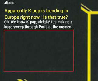
And that’s what I mean by the interview length - the red highlight is roughly how much of the second ‘box’ was left over by the time I was done. I can’t transfer a bit of the next section there because there’s not enough room, and because it just moves the problem to the next box over. Thankfully this box blends into the background enough that I don’t think this is too big a problem, but it always makes me wary about my textual and font face/size choices whenever this happens.

And the preview of the final piece!
But all of that isn’t actually the point of this documentation post. The BLING Magazine interview contains some references that are only obvious if you know quite a bit about Korea, or even the Korean Justice fandom. I’ll explain.
I guess the food is the simplest thing to go over. I think a lot of people know about kimchi, but yeah, basically: fermented spicy cabbage. Can be eaten as it is, or be used as an ingredient in stew. It’s a core Korean food and not the easiest texture/taste to get used to, so I’m honestly surprised they liked it.
The next thing is a little more cryptic. The original text quotes ‘Korean barbecue’, which I’ve kept in the in the translation, about halfway through, and I can think of two foods that that could correspond to.
The first is samgyeopsal (삼겹살). Take a look.
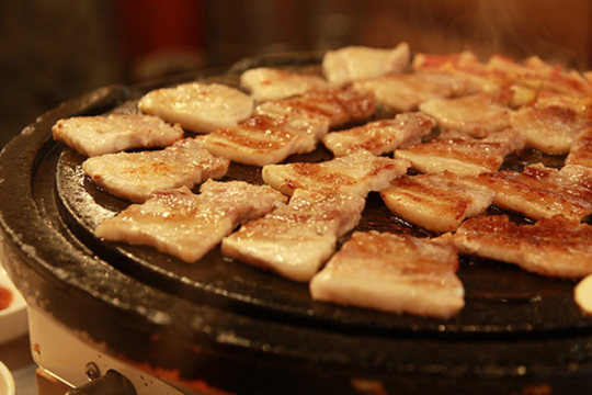
[ Image source: (x) ]
What usually gets made into bacon around those parts is grilled without seasoning or marinade in Korea and eaten straight off the grill, usually accompanied with lettuce leaves, rice, chili paste, and such. The Korean text goes straight for this interpretation, but me, I’m not so sure - I don’t get the impression that samgyeopsal is particularly heavy, or even that interesting in flavour, though I don’t doubt that they must have eaten it. It’s that common of a food in Korea. I will never know the backstory for what they said and how the magazine determined that it was samgyeopsal - if it turns out Justice actually meant that, well, boo to me - but I wonder if they might not have meant something closer to tteok bulgogi (떡불고기), which is what they’re shown to be eating in the title image. Look and compare:
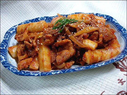
[ Image source: (x) ]
These white things (tteok) are rice cakes, which are also in the title image, and bulgogi does often come on a grill as well. It is a food that certainly fits the definition of a barbecue, as much as samgyeopsal does, is the thing - and I would consider it a heavier, more spicy food than the latter by spades. I’ll never know the truth, but there are my suggestions.
And makguli/makgeoli is just rice wine. It’s milky coloured, and goes very well with meat dishes in general, and sometimes you use it in ancestral rites. Again, I’m pretty happy that they like it. A bit of an acquired taste, that.
Now for the ‘military jacket’ thing. I actually devoted an entire post to this when I was posting in my older blog so that the reference could be explained, but it needs reiterating in more detailed terms. That military jacket isn’t a real military jacket in the fashion most people might be thinking of, but is closer to army underwear. It looks like this.

It’s like a snowsuit or a light parkha that you wear when the weather gets cold and it gives you some extra padding. There’s a bottom, too. It’s called 깔깔이 (’kkalkkari’).
Now why this got given to Justice in the first place has to do with a sect of the Korean Justice fandom. There’s a Korean site called DCInside, somewhat like reddit and somewhat like 4chan (in that there are subsections of the site devoted to various things, just that DCInside calls them ‘galleries’), and the ‘Electronica Gallery’ there follows the work of EDM artists everywhere. Think of it as like... r/EDM or something. A braver man than most of us got to meet Justice in person via a lottery-determined fan meeting when they came to South Korea for Global Gathering 2010 (mentioned also in the translation), and they were a poster in this gallery. (Apparently he even went to meet them at the airport, which shows his dedication.) During the meeting, they uh... handed them this.

Apparently called it ‘Korean army underwear’ too, when he was handing it over. There are no words. The text written on that kkalkkari is:
일갤
(’ElGal’ - short for ‘Electronic Gallery’)
라드
(’Rad’ - the fan’s DCI username)
젖티너무조아
(’I rly luv Justice’)
I can’t believe I’m writing this out in full. This is super immature language
I honestly don’t know if what happened next was the poster’s intention, or if the text was explained to Justice at all. If someone gave me clothing in a language I can’t read, I’d sure want to know what it says first so that I’m not offending anybody. But what we do know is that Justice then proceeded to make history in Korean Justice fandom by actually wearing the army underwear onstage.


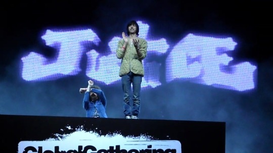

Again, I don’t know why this had to be on army underwear specifically.
But yeah. That was a thing that happened. Justice continues to be very popular in Korea and them wearing the kkalkkari became pretty memetic for a good long while, it really caused a stir. I really hope that Justice remember this incident as fondly as we do, for sure!
And that’s the end of the post. I hope you all enjoyed the interview and documentation - future interviews where things need to be explained via a translator’s note or several will do so via the documentation post. it won’t always be the adventures of me messing around with Illustrator layouts. It was great fun working on this!
Disclaimer: The original text of this interview, given by Justice and printed in BLING Magazine in 2012, is not copyrighted by this blog nor by the author of this post. Therefore, the original Korean text will not be distributed here. The author claims ownership of the wording of this translation, which does not deny nor seek to possess the existence of other translations. This translation may be subject to changes in the future. Images with defined copyright have been linked to the source.
#documentation#justice (band)#interview translations#luminatranslations#edmtranslations#bling magazine
28 notes
·
View notes
Text
Representation Matters. And recently, I learned that one of the characters in my books is having a real impact on real people.
For the sake of privacy, I’m not going to tag any specific individuals I spoke with in this post, but this is a true story about how a character with autism in my books has affected people with autism in the real world.
When I began writing Embassy back in 2013, as I’ve said many times, the story/plot were extremely different than they are now. Most of the characters were the same, but they had different roles, and I included many characters just for the sake of including them, as I still wasn’t completely serious nor as dedicated to this series as I am today, January 5th, exactly four years since I began writing Embassy.
But as I completed more drafts of Embassy, and as I experienced various changes in my life (my most life-changing events were yet to come), I came to realize I didn’t want Embassy to be the book it started out being. I wanted it to be something deeper, playing more to the emotions and personal journeys of the characters instead of the outside plots. My purpose for writing Embassy changed. Suddenly there was a dream behind it, a message that would carry on through the unintended sequel, Resonance, and now Perihelid, the final arc of Arman Lance’s emotional journey (and the conclusion of the main themes of the first three books in the series).
Even with this more-intentional purpose shining through all the way to publication, and through the writing and publication of Resonance, too, there were still elements and characters that began to become more and more relevant to the story overall. And, recently, it has been brought to my attention that one of the still-minor characters has been having an incredible effect on some readers of my books that I didn’t quite anticipate: John Mistin.
For anyone familiar with my books, John Mistin is the older brother of Ellin Mistin, and both of them were recruited to the Embassy Program at the same time as Arman Lance (the MC) from their hometown of Cornell, on the planet Undil.
John is a socially-awkward, overly-enthusiastic guy who will give you his unwavering friendship if you so much as let him speak to you. “Hi, I’m John!” followed by a hard handshake is his signature greeting to every new person he meets. He has a form of aphasia, which is sort of similar to dyslexia, but instead of messing up spellings and being unable to read certain words/fonts, he instead routinely confuses complicated words, and Ellin is constantly correcting his mistakes. He’s aware of his aphasia, and he touts his younger sister as “my favorite dictionary.”
John has an “eidetic memory,” that is, an incredible photographic memory that allows him to vividly recall visual-spatial patterns. His life’s dream in the Embassy Program is to become a cartographer and make maps of every city, asteroid field, and planet in the Program, even venturing out on long-duration deep-space missions to map the galaxy with the Undil Embassy’s Horizon Tower. He’s an extremely quick learner with the latest cartographic technology, and is pioneering mapmaking through neuro-optical holography, where he literally creates maps by picturing them in his head and translating them into a 3D space.
He is committed to friendship. His sister, Ellin, is his best friend, and when she’s hurting, all he wants to do is comfort her. He can’t really tell when other people are uncomfortable around him, though, as we see through Arman’s eyes, Arman is at first very apprehensive about being around John, because he just doesn’t know how to “handle” being around him. Fortunately, Ellin is usually there to calm John down when he gets too excited.
I’m describing all of this because yes, John is autistic.
He’s not a main character, and we haven’t seen too much of him yet (proportionately, at least), but he takes control of the scenes he’s in. He’s a very visible character.
This is so, so, so important.
The other day, one of my followers who has read my books messaged me asking if she could ask a question about a certain character. Her question was non-specific, simply, “I don’t know if this was intentional on your part, but what’s the deal with John?”
When I told her that he’s on the autism spectrum, she was thrilled. Like, absolutely thrilled. And she told me that that’s what she thought, but she wasn’t sure if I had meant to write him like that, because the thing with John is that he sticks out from the rest of the cast. And while I’ve written other, less-visible characters in the series, John is the one I’ve paid special attention to because his role in the rest of the series is incredibly important.
The follower went on to tell me that many of her siblings have autism, and that her brother was asking her about my book, particularly about John. And when she told her brother that John was indeed autistic, her brother got really excited, too. Here’s portions of her responses telling me all of this, verbatim:
“You have...no idea how incredibly happy I am right now. Holy shit. I’M- That’s literally exactly what I was- The fact that he is intentionally- AHH. It’s so rare for autistic people to be represented and then- This is something really important to me because most of my siblings are on the spectrum actually.......
“I’ve grown up surrounded by areas of the spectrum and so I recognized that behavior and the fact that it was intentional I’m so freaking happy. Also, Ellin and John’s dynamic reminded me a lot of my own with a lot of my siblings. SO ANYWAYS THAT WAS PROBABLY MORE THAN YOU WANTED TO KNOW BUT YOU HAVE NO IDEA HOW MUCH MY RESPECT FOR YOU JUST ROCKETED....
“You’ve got this utopian-ish universe and there’s characters who are autistic and bi and- It means a lot to me. But I’ve been planning on rereading Embassy and Resonance so I’ll make sure to try to pay more attention to those scenes!......
“And honestly, it’s so important to listen to anyone really, but especially someone with autism bc a lot of people will tell them to shut up instead(I’ll fight people I swear), but it’s also just-the excitement and happiness they get when talking about something they love and actually having someone listen- it’s so great. And yes! So many people look down at people with autism and it’s so- Like all of my siblings and anyone else I know are pretty high-functioning........I mean one brother, he has these intricate worlds in his head and, literally, he can put them all on paper exactly and is just-he’s so talented with art and he’s so passionate and his style is so specific to im and ahhh..........
“OH and I meant to tell you. Last night I was talking to one of my brothers and earlier someone had been telling him about how some people won’t let autistic people do things and he was really frustrated over people being ignorant and judgmental basically, and I told him about how there was a character [in Embassy and Resonance] who was autistic and is important to the series and how positive he is, and then mentioned something about how [you] had also mentioned [you’d] known someone in college who had autism who was really smart and basically he just had this really great smile on his face and it led onto this discussion about how proud he is of his own autism and the things autistic people can do, and while there are crappy people there are some really great people too and he just-the look on his face every time I talked about [John] was just really freaking good. So-thank you. :)”
When I read that last message from her, I cried. I was sitting on my couch and just let the tears flow. To hear that, to hear how your work, how a character you’ve had in your head for years, has affected someone who lives with autism... It’s such a powerful feeling. I was completely overcome, because that is so important.
Just yesterday, I was talking with another friend and we got into a discussion about John Mistin and how a follower on Tumblr told me her story about how John has impacted her and her brother, and my friend then told me that her own brother is on the spectrum, too. I’ve been hanging out with her family more and more recently, and she told me that ever since I’ve started coming over, he’s been calmer, and is interacting with them differently, and making goals for himself to follow through on, and that I’ve had a positive impact on him, too. Even just a few days ago, I showed him this book full of satellite imagery of the Earth, and he was absolutely fascinated by it, and he and I were just sitting at the table flipping through the pages, and he was telling me all these stories about stuff he loves doing and everything he’s interested in.
As she and I were having this discussion, I just started tearing-up right there. It’s just so overwhelming. I cannot express how important it is. I always say that my goal with my books is to inspire a love of space exploration and get people interested in the sciences, but never--NEVER--did I think that my stories would have this impact on the unsung-heroes, some of the best people you will ever meet if you just open yourself to them. Yes, it can sometimes be uncomfortable at first, but there is so much to discover, and so much to love about autism.
Even before my follower and my friend told me about their siblings, I’d already had John’s character-arc planned out. Yes, he has a big role as my books continue. Yes, you will see more of him, and you will continue seeing how good of a person he is, how devoted he is to his work, how genuine of a person he is. But now, even I am realizing how important John Mistin is outside of my books.
Representation matters. It matters because we are so numb to thinking that everyone is the same. That there are heroes and heroines and villains and friends and enemies.
We all have strengths and weaknesses, and none of us are magically good at everything. Sometimes the people we want to avoid at first are the best people we could ever meet. I didn’t write John because I needed diversity. I didn’t write John because I needed a stereotype “crazy” character. I wrote John because he is important to the story, because without him, my books literally would not be the same. And now I know he might be even more important to other people than he is to me.
#Autism#Representation matters#people with autism#books#characters#reading#writing#important#so important
112 notes
·
View notes
Text
How To Wear The Men’s Logo Fashion Trend
http://fashion-trendin.com/how-to-wear-the-mens-logo-fashion-trend/
How To Wear The Men’s Logo Fashion Trend
At the turn of the decade, a glut of opinion pieces decried the death of the subculture. Mostly white, middle-aged rock journos moaned that there were no proper ‘scenes’ anymore. That fast fashion and Spotify had killed youth movements. That everyone dressed the same, in some version of post-Libertines skinny jeans and tees. That individuality had died in the 1990s with Britpop.
Roll on eight years and the NME’s dead, the kids have never dressed more disparately and, like a renegade master, the nineties are back once again (if you get that reference, you’ve probably already got the look in your attic). Where once you needed some knowledge to pick your Blur fans from your Oasis fans, today’s style tribes come pre-branded.
By embracing logos in a way not seen since the days when Tommy Hilfiger sold in shops other than TK Maxx, it’s easy to pick the skatewear kids from the high-fashion set, the wannabe grime MCs from the Rafsessives.
All of which makes logomania at once a trend that anyone can jump on, and one that’s fraught with peril. Unlike in the nineties, when logos were a slightly less gauche way to flaunt your wealth than wearing a coat made of cash, this time around they embody a convoluted blend of irony, status, lack of status, in-joke and fashion knowledge. Get it wrong and you’re your dad in the Supreme queue. Get it right and you’re Jonah Hill in Palace, quietly breaking the internet.
Here are four key ways to be the latter.
Wear It Loud And Proud
The OG logo move, both back then and right now, is the branded tee. “Gucci kick-started this trend [in recent years] with its logo T-shirt,” says Luke McDonald, a stylist at online wardrobe service Thread. Though street- and sportswear brands have never abandoned their graphics, the luxury brands had steered more minimal since the noughties as customers preferred a subtler display of wealth.
“But that doesn’t translate well to Instagram,” McDonald says. “Logos do.” Gucci’s tee, while still nosebleed expensive, let consumers buy into the hottest brand in fashion without shelling out four figures. Plus, everyone could see what you’d bought and where it was from.
Labels high and low followed suit. “At the moment, you can’t have too much,” says Nick Eley, head of men’s design at ASOS. “There’s a real trend for all-over or huge, oversized logo prints.” These are not for wallflowers. You are, in essence, paying a brand to act as their advert, so make sure your go-to is more than a pretty picture. “You should pick a label that feels authentic to your style and lifestyle,” says McDonald.
Logo clashing is doable, but tricky. It’s better to give your chosen brand the spotlight unshared. “I would treat logos in the same way I treat prints,” says Chris Hobbs, menswear fashion editor at MatchesFashion.com. “One at a time, otherwise your outfit will start to wear you.” If you look like an F1 driver, dial back.
As A Subtle Wink
There are always ways to dip a toe into any fashion trend, even one that’s as look-at-me as this. On the high street, the approach tends to be OTT – the logos themselves have less clout, so their owners need to go big lest the punters go home. But among the labels with more cache, even those that have long been logo-shy have leaned into the trend. Albeit gently.
“The subtlest way to approach logos is to pick a label that doesn’t visibly brand their product,” says Eley,” but which has a particular sign-off or print that is immediately distinguishable.” Think Burberry’s check, recently reintroduced after being binned in the noughties because of its popularity among the less-well-heeled, and Margiela, with its signature stitches.
For a pocket-money take on that approach, look for either tonal logos – think a white-on-white Stan Smith, or black-on-black Nike swoosh – or stick to trousers, where the branding is subtler. Joggers in particular, with the logo relegated to the side stripe, tick off two trends at once.
“You can also restrain the impact of your logos with layering,” says McDonald. “Under a plain hoodie or an open shirt, you just get the flash of a logo on a tee.”
With A Healthy Dose Of Irony
Let’s make one thing clear: all logos have some sense of irony. Those worn in earnest are too thirsty to be tolerated; today, status is earned by not looking like you care about status at all. Confused? Good. Because that’s the headspace you need for Gucci’s self-inflicted bootlegging, by which the brand flogs price-of-a-suit T-shirts with the word ‘GUCCY’ written on them.
Fair cop. Your correspondent once purchased a Palace tee in which the enormous rear logo reads ‘Placae’. It seemed funny at the time, but is in reality obscene. Also, no one has ever noticed the typo. However, ridiculous as all this might seem, it does introduce the one thing that’s never been fashion’s strong suit. “Fun,” says Benns. “Gucci is having fun with its typography. And I think that’s interesting.”
For those without the bank balance for knock-off versions at luxury prices, the streetwear world offers the time-honoured logo flip. “It’s always been about democratising those brands and the things they represent,” says McDonald. “It makes them accessible and relevant to street culture.” Bowlcut Garms does a number of neat brand mashups and Sports Banger has reworked everything from Helly Hansen (as Hackney Hardcore) to the NHS and Nike logos.
In Your Pocket
Gucci doesn’t make its billions from the stuff in Jared Leto’s wardrobe. Rather, it’s the accessible, affordable products that let everyone else buy into the brand without a call to Wonga.
“That used to mean fragrances,” says McDonald. “But now, every brand has a range of lifestyle accessories, from phone cases to lighters to keychains, all of which have the logo front and centre.”
For the man looking to rep the logo trend without going all fanboy, it’s the gentlest way in. For the genuine fanboy, it’s the most affordable.
Key Brands To Wear For The Logo Trend
Luxury Brands
Gucci
The word Gucci is almost as heavily ingrained in the lexicon of fashion connoisseurs as the word fashion itself. It’s a name synonymous with luxury, glamour and style – which is probably why people are so keen to have it plastered all over their chests.
The respected Italian fashion house has been one of the key high-end labels spearheading the logo trend, and also the one having the most fun with it. Pick from printed tees, hoodies, bags, trainers and more, all boasting that big-ticket green and red branding.
Off-White
If the logo trend is all about irony, then no brand is a better example than Virgil Abloh’s acutely self-aware Off-White. Abloh’s imprint has received almost universal praise for its tongue-in-cheek use of branding, logos and labels – perhaps most notably recently in its collaborative effort with Nike, ‘The Ten’.
He must be doing something right. After all, you don’t get named creative director of one of the most esteemed high-fashion labels on the face of the earth – Louis Vuitton – for not having your finger on the pulse.
Balenciaga
There are few brands that can get away with flogging a pair of plain white socks emblazoned with their logo for just under £100. Balenciaga is one of them.
Ever since Vetements’ Demna Gvasalia – a man known for his love of bold logos – took the reins of the Spanish luxury label, not-so-subtle branding has become one of its calling cards. Think embroidered baseball caps that cost more than your rent, politically-themed pool sliders and plenty of nods to popular culture.
Mid-Priced Brands
Tommy Hilfiger
When you take the nineties resurgence into account, it’s hardly surprising that Tommy Hilfiger’s legendary flag logo is flying high once again. Tommy was a staple fixture in the world of fashion 20 years ago and with a little help from the vintage resellers of the social media generation, is now back in full force.
Block colours, bold fonts and nineties styling are what it’s all about. And at manageable price points, adding a dash of Hilfiger to your wardrobe won’t leave you living off super noodles until payday.
Calvin Klein
It’s always been about the logos at Calvin Klein. When that now-iconic branded waistband first peered over the top of a pair of jeans, a legend was born, cementing the Calvin Klein font as a symbol of style and sex for men all over the world.
Today it’s more than just nice underwear, though. The American label has taken that same typeface and applied it to tees, hoodies, outerwear and more, staking its claim as one of the leading brands in the logo trend.
Levi’s
With little more than a small red tab, sewn onto the back pocket of its jeans to denote where they came from, Levi’s has hardly been a brand renowned for its heavy use of logos. However, in recent years, that’s all changed.
Many of Levi’s casual offerings now feature the brand’s sportswear logo, which first made an appearance at the 1984 LA Olympics. Its T-shirts are quickly becoming as iconic as their denim siblings, making now as good a time as any to get involved.
Streetwear Brands
Palace
In less than a decade, London-based label Palace has gone from fledgling skate brand to fashion royalty. Its unique sense of humour and beautifully designed ‘triferg’ logo have made it the imprint of choice for clued-up skaters, streetwear connoisseurs and fashionistos alike.
The Palace logo and font face have become common sights in skate parks, at fashion weeks and on the shoulders of the hip-hop elite. And with seasonal drops that see the streets of Soho jammed up with hypebeasts from London and beyond, there’s only one other label that comes anywhere close…
Supreme
Undisputed king of logos, Supreme is well known for its unfaltering ability to slap a bogo (that’s ‘box logo’ for the uninitiated) on anything – like, literally anything – and have people dropping their life’s savings to get their hands on it.
That instantly recognisable white-on-scarlet trademark is one of the most famous logos in fashion, made all the more coveted by the amount of sheer dedication (and money) it requires to obtain.
Stussy
The logo thing may be what’s hot right now, but California-born street/surfwear originator Stussy has been on it since day dot. In fact, if it hadn’t been for Shawn Stussy’s eponymous label in the first place, we might not be sat here writing this at all.
Known for its graffiti-inspired script logo, Stussy was the brand that pioneered heavy branding and made it one of streetwear’s calling cards. Plus, unlike similar labels, clothes aren’t produced in deliberately limited runs, so getting your hands on a piece is actually an achievable feat.
Sportswear Brands
Adidas
When it comes to bold logos, the big-hitting sports brands have been doing it for longer than most. Adidas’ trefoil logo and three stripe trademark have become two of the most recognisable designs in the history of, well, design.
Worn as a badge of honour by hip-hop heroes such as Run DMC in the eighties, Britpop stars and terrace lads of the nineties, and pretty much everyone else since, the Adidas logo is one of the all-time greats, making it one of the easiest to wear, too.
Nike
Nike’s logo couldn’t really be any simpler, but therein lies its beauty. The Swoosh has permeated every part of the world and you’d be hard pushed to find anyone who doesn’t instantly know what it is. Because of this, it’s an obvious go-to when it comes to getting yourself involved in the logo trend.
The Oregon-born sports label is known for slapping its mark on everything from tees to trackies, sneakers to socks – making it the perfect way to embrace the logo look without going too left field.
Champion
It may have been founded almost 100 years ago, but thanks to today’s obsession with logo-laden sportswear, Champion is now more relevant than ever before. Due to a number of recent high-profile collaborations, the American heritage brand has become a favourite in streetwear circles, while still counting athletes and sportsmen among its customers.
Think hoodies, tracksuit bottoms and tees in its signature reverse weave fabric, all featuring a hearty dose of in-your-face branding.
0 notes
Text
This is the civil war that we created. Maybe we’re losing this battle. Maybe we’re out of breath. Maybe this storm is drowning every ounce of living breath.
“Just some first-world-problem ramblings.
- - -
Earlier today my dad came to me and said, “This time when you go to the US, don’t get any more tattoos ok, it’s a genuine advice from me. It won’t look beautiful on you. There are a lot of pretty features on your face that you might not realize yet, so don’t ruin what you have. If you want to and when you have money, you can fixed your teeth or do whatever you want to your face, just don’t get more tattoos…” and when he was saying that, I immediately thought “I don’t have any face tattoos, nor have I ever mentioned of intending to get face tattoos, so what do the tattoos on my body get to do with my face?”
Maybe he was trying to find a way not to hurt my feelings but it just didn’t make sense to me. I don’t know what hurts more, frank, honest words or circling around the fire but got burned and lost in translation along the way? Maybe I wasn’t supposed to take his words in such literal approach. He told me there were a lot of choices he made in his youth that he regrets now - which I understand, as a father, all he wants is to protect his children and prevent us from going down the dark paths that could be foreseen.
What I think is, regrets are parts of life. Life is but a by-product of an accumulation of compromises. When we make a choice, we also, in turn, make a compromise. What he regret, I might not have and vice versa. All choices require a certain degree of sacrifice.
- - -
Flash back to 6th grade, when I first entered middle school, I started to have some awareness about my appearance as the girls around me wore different colorful skirts and hairstyles, not just “mushroom” hair or boyish handed-down clothes anymore. Boys started to flirt. I started to learn it the hard way that people can treat you differently base on just looks. For 5 years of primary school, being the smartest kid in class, I was always treated with love and respect even though I was just a little kid. Then for 4 years of middle school, I struggled with severe acne and suddenly intelligence didn’t save me anymore.At first I didn’t care. My mom said it’s a natural part of growing up, it would pass. Then I started to get bullied at school by boys, sometimes it was even physical bullying, at one point I was slapped at spitted on by the boys my age, while watching other pretty girls in class being praised. Of course I kept everything to myself. I waited and waited for the ugly part of growing up to pass.
But it never did.
I continued to suffer from severe acne up until I was in college, and if anything, it just seemed to get worse. I was afraid to look at myself in the mirror every morning. The only time I didn’t hate myself was when the light in the room was dimmed enough I couldn’t see my face clearly. I found a mental safety in the physical darkness. Overtime it developed into a habit that still exists now, mostly in my subconsciousness: I shower in the dark so I don’t have to occasionally catch my own flawed reflection in the mirror, I pull all the curtains in the room for a perfect darkness, I never sit where there is a lot of sunlight for the fear of exposing my blemished skin, I read in the dark, I listen to music in the dark, I live in the shadow.
Back then, there were two animals in me. One was a strong, independent eagle who entertained the idea of freedom - the eagle that didn’t care whether she looked different from other birds. Girls were supposed to wear pink, long hair, soft and elegant, pale skin, all types of ideals I didn’t identify myself with. The girl in the mirror was someone whose skin was dark as chocolate, full of scars, crooked teeth, bowed legs, big nose, gigantic forehead, with a pixie cut and clumsy hands. The other one was that hummingbird, that frail soul of a 13-year-old girl craving for attention and peers approval.
I was always sensitive to aesthetic, artful matters, so to me, beauty means even more, in the way that every painting I made was a translation of life’s rhythms in colors. I saw beauty in everything but myself. I felt hopeless for being constantly criticized for something outside of my control, something I did not created, something I did not paint: my face, my body, my existence. I studied aesthetic and attempted to give back something beautiful to life through my art, knowing it’s also the one thing I could never give myself. Sophomore year of college, I realized how acne wasn’t just some red dots on my face that would (hopefully) disappear one day anymore when all of my actions started to become reactions to acne. I cut my hair and grew a bang so I could have something to hide my face behind. I didn’t want to date anyone. Whenever in a conversation, I could barely form a sentence because I was too paranoid that the other person was staring at my flaws. Non-existent self-esteem and loneliness ate me alive, bit by bit.One day, I went online, did some research and learned about a drugs called Accutane. The side effects were ranging from migraine, skin rash, extreme dry skin, peeling, joint pain, back pain, drowsiness, all the way to depression. Accutane was available only under a special program called iPLEDGE. You must be registered in the program and sign documents stating that you understand the dangers of this medication and that you agree to use birth control as required by the program. In return, it MIGHT help your acne to stop acting. It might.I took it anyway.After 3 months, not only that the acne condition didn’t improve, my existed depression got worse despite me trying not to acknowledge the effects of the drugs on me until months later when I looked back. Those years my body felt more like a cheap rented house where the last tenant forgot to pay the rent so now I would have to pay her dues, and everyday there would be people shouting outside the window telling me to fix the rusted doors, the broken windows, the missing lightbulbs… just so it could make the block look nice, not knowing all the while I was trying to hold up the columns from the inside to keep the house from collapsing. Also, there was a fire in the middle of the house. And I was the fire.- - -So, then, why did the conversation with my dad earlier brought all of these memories back? Because I thought since those dark days have passed, that I could, that I have indeed made peace with my body, that I have paid all the dues and could even buy back the house to call it my own. Perhaps I was wrong. The fire had stopped burning but the burn marks are still embedded on the wooden floors. I never fixed the rusted doors or the broken windows, but the first time I felt like I ever had the ownership to the house I lived in was when I put a permanent coat of paint on it. 19th birthday, I got my first tattoo - a line of a poem that I kept in my notebook to helped me through the days where a full stop promised more joy than reality. I have always found collarbones the most beautiful, most feminine, most elegantly poetic parts of a woman’s body, so I had the line inked on my left collarbone in a soft scripted font. I thought, if all else people think my skin-deep appearance, the part which I did not create, was not beautiful, then I could at least take it from there and build something beautiful on top of it, just like my art.It was the first time I looked at the civil war inside me to find a path for peace. It was the first time I looked at my body as a landscape to be explored and discovered. It was the first time I treated my skin not as a post-war minefield but as a blank canvas, a first ground for more beautiful things to bloom on. I didn’t want my body turning into a battle to be fought on anymore, and if anything, I wanted to declare my rights to express what I deem beautiful to those people shouting outside my house. I didn’t, and probably could never, understand the very simple fact that if a flower is painted beautifully on a piece of paper, it is called Fine Art, and the same flower painted on my body is called Body Art, but if that paint job is done in permanent ink then it automatically translate my skin into something I should hide and be shameful of?
It’s always easier to label something than to understand it.
So my father’s “genuine advice” brought me back to feeling like I am paying rent for a house I borrowed from him. It was a choice I made one year ago to have my whole left shoulder and arm covered in more tattoos, each one by a different artist. I admire their talents, their skills, their craft, and I respect them just as much as any other occupation out there. To have someone put so much trust in you that they would let you ink an artwork on their body forever is a lot of pressure. And to me, it’s a symbolization of how a chance encounter, no matter how fleeting, between two human beings could impact one another permanently. I knew the reality of societal judgements when I came back to Vietnam with the choices I made, but I also believed I could grow a more beautiful belief out of the situation with my actions. Since I have these tattoos, I have worked at 3 different companies, have met countless people from different backgrounds and age groups, but never have I ever heard a single insult or received a side-eye look. I thought by having a job, having a boyfriend, having people respecting me for who I am would be enough to prove my dad that the tattoos don’t always mean something negative, let alone ruining my life.Sorry, father, if I failed you.Thank you for giving me this body, but I didn’t choose to fix my crooked teeth and probably never will.
This body is my canvas now. This body is my history book. This scar is a story. This skin is my own tale of the long road trips I took under the sun. This is what time does to mortal human: we get old, our skin ages. These images are not just something paste on me anymore. They are me. They are my skin. They make my identity but they are not my identity. To take control of the body that I was given at birth means nothing but to whisper to the world the truth: nobody lives under my skin but me.
And I made a choice to believe in the Art of Time and Freedom.—”
I know she would delete it anyway. So I keep this for myself. And for her.
0 notes
Text
Erased 6 – 13 (not including the digest) | Showa Genroku Rakugo Shinjuu 1 - 4 | Eldlive 1 | Prince of Stride: Alternative 1
The idea from now on for SGRS: Expect first time watches for this show (for the second season) and don’t expect ratings after each ep. Once all 2016 shows are done (rewatches or not), expect the 2016 ranking.
The idea from now on for POSA: Once all 2016 shows are done (rewatches or not), expect the 2016 ranking.
(ep 6)
Even with only subs, you can hear the seriousness in the manager’s voice.
Asagi beer, LOL.
This speech bubble style really works in the camera angles’ favour.
Airi’s mother reminds me of Midoriya’s mum from Boku no Hero Academia.
Shinji-go. “Go”… I didn’t really know how to explain it so I let Wiktionary do it for me.
I really love Airi’s motivational quotes around this point. So much, that I used it as motivation all through 2016…although I didn’t get any great results from it…
(ep 7)
Okay, that scrolling scene with the kids…that’s just cheap. They aren’t even animated.
It says something like “Preserve water” or “Water is important” on the wall behind the tap.
That “stand out in the hallways with those buckets” is pretty typical for an anime. I wonder whether any real Japanese person has done that, though?
Oh yeah. I think I was initially attracted to this due to the fact it looks a lot like Detective Conan when you see Satoru negotiating the future by changing his past.
I think I had to learn what a “patsy” meant for this scene, but a patsy is just a substitute, specifically in this case for collateral damage.
Does that mean Kenya lived (or lives) in a big house?
(ep 8)
Wait – wait? How did Gaku know how Kayo was safe…unless he was the murderer? I didn’t question that the first time, but this just makes the ending even worse. This dude’s already proved he doesn’t act on compulsion like Satoru does, so that adds to it.
That joke about Satoru being 29 does get a bit worn out when it gets used here…
Mt. Hakodate…I’d heard of it from Touken Ranbu. It’s a good place for low level swords, IIRC.
POP Noodle, LOL.
Crying in media is much more emotional if you can hear the crying, unfortunately. That’s why I passed on “Kayo’s first homecooked meal” for the Crunchyroll Awards.
(ep 9)
Akemi’s (Kayo’s mother’s) eyes were so off model before the shovel scene, it made it hard to take Akemi seriously.
It’s weird how much Gaku looks like he should be Satoru’s dad.
Akemi was “Takashima” before she was “Hinazuki”, and her partner’s name at the time of her divorce was Kazuo.
CGI car…again. Geez.
I think the kanji for “closure” mean the ending curtain, like that of a play, but I can’t quite remember their literal meaning…
“I have to stop somewhere.”
Gaku’s talking about his experiences somehow reminds me of a chat I had with Elucida on the Boueibu chat. Probably because the instigator of the chat had to apologise…
I wonder if the man (Gaku) was lying about the lollies?
“I am a man.” – Translation choices make Hiromi seem a little too macho for his girly looks, haha. *cringes, because I hear emphasis on “am”, with a lesser emphasis on “man” in my head*
I just realised – Kayo won’t go to Mt Hakodate as she’s supposed to anymore…It makes me sad on the inside.
(ep 10)
Holy plays, Batman! Romeo and Juliet for an 11 year old is pretty far fetched considering I only read it when I was…um…16 or 17. I haven’t even read King Lear yet so consider me out of this. (Shucks...even though I used to be an avid reader, I’m only ordinary now, huh?)
LOL. In the end, Kenya really is a little kid, getting all offended about hideouts, haha.
I thought the “getting rid of someone’s alone time is a good thing” sentence was a bit weird until I realised what context Hiromi used it in.
“On the outs”? I didn’t know what that meant until I checked it up. Well, considering I make my own phrases up a lot and I tend to omit small words in the vein of “wut dis?”, maybe I’m just too slang for the subbers.
CGI bus? Man, you ruined the solemn mood a bit, Mr Bus.
See? These CGI cars (and truck) are why I have gripes with CGI transport. It sticks out too much. However, for something like Ajin (which can only be found in CGI form), I don’t mind it so long as everything else about it is good. Speaking of which, I still have yet to see Ajin (as of the point of typing).
“…spirit and drive.” – Because the camera focussed on Gaku’s hands just then, I had to LOL in my head a little.
Manabu = Gaku by virtue of alternate character reading. Isn’t kanji great? (sarcastic)
This sublimation, I presume? I checked it up once, but it was never of any use.
(ep 11)
The Spider’s Thread, as told by Ryunosuke Akutagawa. Bungou taught me about it, but I’m not sure the Bungou instance is the one I first met it in.
This fourth wall breaking…it’s somewhat disturbing, but that’s the mood the staff were going for. Very effective.
I’ve always wondered why the “Boku” in the titlecard had a different font. Maybe the staff just didn’t have a “boku” in the font they’d written the title in…
I guess it must be my warped perception of beauty due to bishonen, but when Satoru is lying on the bed with slightly sallow cheeks, he almost looks…beautiful. (That’s a scary thought, isn’t it?)
“Future”…such a powerful name, since it happens to be the name of the baby, too.
Imagine if Kayo and Yuri Katsuki’s (Yuri!!! on Ice) backstories were stitched together.
A gingko leaf. They have a very distinctive shape…(Reminds me of Fusae Campbell from Detective Conan.)
Gaku is just represented by a black silhouette in some frames. Basically, you could call it another Detective Conan reference of sorts.
(ep 12)
The problem with the ending that I have, if you don’t know already, is that it suddenly makes you realise that Satoru would either die or have planned/have some caveat to get out of/around a potential death. Unfortunately, they don’t show you when he’s made those plans, thus being deceptive by omission if they were even made.
CGI hamster wheel…?
By the laws of ordinary protagonist writing…I give you the ending. The ending that dissatisfied me so much, it definitely left SGRS first for 2016.
They never explained how the rail was pulled open either, come to think of it.
Hey, it’s Boys’ Flight. The magazine he was reading earlier in the show. Don’t remember what ep, though.
Hey, did I ever mention to you that I tried to open up an Erased wiki, only to find one already open? There’s still two wikis existing right now for some reason, though.
Well, it’s been a wild ride. Thanks all, if you’ve been coming along with me and hope to see you again soon.
(SGRS ep 1)
Zony, LOL. Did Sony exist in that era?
If you observe the left flag when Yotaro stops at the front of the theatre, you can see the characters for “Amakentei” (rain-bamboo-stand, or something like it). That’s Kappei Yamaguchi’s character…Update: Must’ve been a mistake on my part. Amaken is a critic, but not a rakugoka himself.
Yotaro’s still got all the mannerisms of a gangster, LOL. (Including interrogation technique.)
There’s a sign in the back of Yotaro when he talks to Yakumo for the first time. It says “Sumi” (top – bottom) “Sushi” (L – R).
Yotaro uses the word “tanomu”, which is a respectful way of saying “I beg of you”. Very respectful. The most polite kind of respectful.
Mukojima? Huh? I guess that’s a deliberate bungling of Konnichiwa? (Update: Nope.) However, I’m still a noob to rakugo myself, despite having created the wiki to spread some Yakumo love.
Note for later: Shinigami has a distinctive “Ajaraka mokuren kyuraisu tegeretsuno pa!” in it.
What’s the old man writing?
It’s a transformation of sorts, from Yota being nervous to showing off what he’s got. That’s what makes SGRS so powerful.
I was pondering this since the start of the performance, but Yota’s shark-like teeth make him a very distinctive character. Then again, there’s always that one cue or other to tell you that a certain character is in the house.
Should a woman only have her beauty? I never believed it and that’s what I set out to prove in my stories, but…social mores were different back then, so I can’t speak for Konatsu.
Oh! I completely forgot about this guy (Mangetsu) until he came back in ep 14.
Notes for later: “Namu myoho renge kyo…”/a pilgrim climbing Mt Minobu
There is a slight irony in a woman telling a man to “man up”. Subbers, you put that there.
(ep 2)
Oh? Were you wondering what those “notes for later” were for? The wiki, naturally. SGRS’s only presence is me most days, so I’d better keep it up to date.
This show never fails to make me laugh, even if the laughter gets more subdued the second time.
Apparently people get sento and onsen confused a lot. Sento are normally cheaper smaller establishments compared to onsen, as far as I know.
Why is there a cat in the room?!
The “Hatsu” in Hatsutaro means “beginning”, while the “Kiku” in Kikuhiko is a chrysanthemum, so…yeah. Take it as you will.
“…your first time?” (laughs behind back) No wonder Haruko Kumota was a BL mangaka before she did SGRS.
Even without the volume, the visual language can tell you Kiku’s doing something wrong. That’s the power of this show.
“Akanbou” is a Japanese word for baby, as you may have guessed. However, people seem to use the word “aka-chan” more these days. Thus, another guess tells you that “shiro” is white and “ao” is blue. Right again.
You can almost hear the voices even with only subs! Amazing!
Fish cake. Technically called kamaboko, but “fish cake” is the translation for it so I guess I shouldn’t be such a weeb.
(ep 3)
“…it’ll become standard in the rakugo world.”
Oh, the cat is Yakumo 7th’s.
Mosquito coils? When were they invented?
CGI train? I barely noticed it there. Plus…poor Kiku. He never gets the girls.
Kagurazaka.
Were sento really cheap enough to be five coins?
(ep 4)
Do those girls count as off model?
The texture on the bricks of the restaurant are hyperrealistic…I like it. Better than that messed up CGI you get on most cars in anime these days.
Kuma -> Kumako. I wonder why.
As I’ve noted on the wiki, the pun about the samurai involves the word samui (cold). Therefore the original pun would’ve been “now you die out here in the cold, samurai”, but if you’re going for lame jokes that work seamlessly into the rakugo, then…the samu-die joke pretty much does its job.
There was the word “open” twice in one sentence…subbers, you need to proofread sometimes.
The “treasure sacks” pun is on kintama…welp, I won’t explain it, but “family jewels” apparently works just as well.
If Mukojima is a place, then why were people saying it in ep 1?
LOL, Matsuda. Going “I won’t have anything to do with this” is bound to get you in trouble nonetheless.
Yakumo’s heart is so clearly not into it. You can tell from the body language.
(Eldlive 1)
I’m here because I fell out of love with Hibari a while back and I need to give Akira Amano another chance. Also, Lane Brick…maybe.
Wait. It’s a Mukuro! With glasses! That foreshadows the pain I’m gonna be in for.
Welp, considering I read the manga this was adapted from not too long ago (as of the time of watching this), it’s pretty faithful. Even if it does look visually pretty, I did come up with a story like this once but it never took off when it came to writing the story. Considering it also bears some similarity to One Wish They Never Wanted, it’ll never take off now.
Finally(!) Something to laugh at. Reborn injoke.
…Unfortunately, with the faithfulness of the manga comes the pervasive problem – I thought Eldlive was a bit subpar. I could see all the right tropes were there to make a hit, but I couldn’t see any real talent showing through, as if Amano’s resigned herself to doing only shonen because Reborn succeeded. It was Hibari that taught me you can have a cute bird sidekick instead of a monster designed from scratch, so why can’t Eldlive do that too?
Drew (the voice) is getting annoying already. Shaddap!
…another “unfortunately” is that Lane Brick isn’t too pretty compared to how I like my bishonen, but YMMV on that.
I didn’t check it when I read the manga…but Jean Renoir.
Great. (sarcastic) Bungou humour, to boot! That wasn’t in the original…and it’s just grim, too.
These mammary jokes aren’t doing it for me either, although they were in the original.
Verdict: Not taking it.
(POSA ep 1)
Prince of Stride was a new experience for me, as I thought I needed to add “sport anime” to my repetoire at the time. Unfortunately, I still haven’t gotten past my biases against sport anime even after finishing this…
Welp, I take back what I’ve said about OPs in the first episode. If it’s a good OP, it helps to set the norm.
CGI basketball. One of the weirdest things on the list of “things given CGI form in anime” to date, because it’s mostly cars.
Sad life. When people in a rejected club see that twist coming, it’s like a 4th wall break…kinda sorta.
Did I ever mention that this show is motivational? It’s really good for that, and colourful so it’s good for desktop wallpapers. (Also, it has a summer theme to it, so while I swelter, lemme just watch a show about running…and sweating…bad idea? I guess so. (sarcastic) However, there isn’t any better season to watch it in. Sweat – or imagined sweat – isn’t good any season of the year, so might as well watch it while I still have time.)
Tsurugiya…if Google-sensei serves me correctly…it’s in Osaka…? Update: I knew he came from somewhere in the country, but Hyogo is a different place to Osaka…
“Blue Sonic”. Well, it’s not like there would be a magazine called Sanic. Or Knuckles, for the matter.
What’s with the panda, though? Although, as some very obvious foreshadowing tells you, (Kyosuke) Kuga used to have his locker here.
How in Dante’s Inferno did Kohinata get the measurements of Takeru already?!
I checked up kabaddi last time, but eh, I’ll do it again.
I still think Fujiwara’s leg thing is creepy.
I dunno anything about Sun Tzu…but…lessee here. This quote is it, I think.
Who was the Relationer in the previous Stride Club?
What’s with the cat on the poster?!
“…is really hot…” – Is that what sets the shippers off? Or is that just a subbers’ choice of words?
They always blab aout weird things on the next ep preview. At least it’s not boring.
For some reason, my ad blocker isn’t working on AnimeLab any more…*sighs*
#simulcast commentary#erased#Boku Dake ga Inai Machi#showa genroku rakugo shinjuu#showa genroku rakugo shinju#eldlive#prince of stride alternative#Chesarka watches Erased#Chesarka watches SGRS#Chesarka watches POSA
0 notes
Text
Telling the Story of Graphic Design
Let me just frame this for you: we're going to take a piece of production UI from a Sketch file, break it down into pieces of information and then build it up into a story we tell our friends. Our friends might be hearing, or seeing, or touching the story so we are going to interpret and translate the same information for different people. We're going to interpret the colors and the typography and even the sizes, and express them in different ways. And we really want everyone to pay attention. This story mustn't be boring or frustrating; it's got to be easy to follow, understand and remember. And it's got to, got to, make sense, from beginning to end.
I've asked my colleague Katie to choose a component she has designed in Sketch. I'll go through and mark it up (we mainly use SCSS, Twig and Craft but the templating language is not very important), then she will respond briefly. Hopefully I'll get most of it right, and then one or two things wrong, so we can look at how things get lost during handoff.
In white label or framework type front-end, the focus is on building pieces that are as flexible and adaptable as possible, as content and style-agnostic as possible (within the scope of the product), because you simply will never know where the code is going and for what, ultimately it is being used. But recently I moved to a web design agency, which has a complete inversion of this focus. It is particular. It is bespoke. It's all about really deeply engaging with the particular client you have and the particular clients they have, and designing something that suits them, as a tailor would.
Working so closely with a graphic designer like Katie, with highly finished pixel-spaced UI, instead of directly from wireframes or stories is an adjustment and an education, but there are still lots of things I can bring to the table. Chiefly: document design.
Document design, which admittedly is just the old semantic web with an accessibility hat on, is really looking at graphic design, engaging with it as a system of communication, and translating the underlying purpose of the colors/type/layout into an accessible, linearizable, and traversable DOM. It's HTML, kids. It's just HTML. You'd think we all knew it by now… but look around you. You'd be wrong!
Katie has slung me a Sketch file chock full of artboards, and she's pretty great at writing out what she wants so I don't have to think too hard:
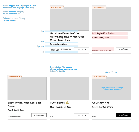
Event card
First I look through the whole UI file and figure out what is actually a card on this site — it turns out there are six or seven components that use this paradigm. Let's make some observations:
Zoom out on section of artboards

Another card, classes this time.
A card is a block of meta data about a page on the site.
It has an image/media and metadata — it's a media object.
It's shown in a group of objects.
That group is always typed (there's no view where there are search results and news articles and classes are all mixed up).
Each object has a single link to a page and no other actions.
Each object has a call to action (Book, etc.).
Each object may have times, categories, badges, and calls to action.
Each object must have media, title, and link.
So a card is the major way my user is going to find their way around this site. They are going to be clicking through guided pathways where they get a set of cards they can choose from, based on top pages like "what's on" or "classes." They're not getting options on this card. It's not really an interactive element — it's a guide, an index card, that sets her onto her path: in this case a purchase path where she books a ticket for a show at this arts centre.
Before going on, let me just frame this for you:
Imagine you were looking at a flyer for a show and discussing it on the phone. If you actually wanted to go to this show in real life. What would you do? You wouldn't just read the flyer out, would you? That's the text. And it might have all kinds of random stuff on it if you started literally at the top. You wouldn't start with "Twentieth Century Fox" or "Buy Hot Dog Get Cola Free" or "Comedy Drama Musical Family Friendly." (I would actually hang up on you if you did!) And you wouldn't simply describe the color or fonts. That's the CSS. You'd talk through the information on the flyer. You'd say, "It's The Greatest Showman and it's on Tuesday, starts at 7:30. It's at the Odeon on Oxford Street by the tram." Right?
This is the document. Keep that person on the phone in your mind.
Count, group, and name
So let's say we'll deliver a card as the inside of a list item. We want a group and that group should be countable. We've already named the page with an <h1> so we'll introduce and describe the group with a heading, an <h2>. First we'll name it, then we'll deliver it, so someone using a screen reader can:
Get the list signaled in the headings overview.
Get a count up front of the number of items on a page.
Know they can skip to the next list item to get the next card.
Know they can skip the group at any point and go to the next page — the pagination is the very next element and it will be labelled as a landmark.
See the Pen
Cards delivered as a countable list with descriptive heading by limograf (@Sally_McGrath)
on CodePen.
Anchor
In this particular case, I'm gonna wrap this whole card in an anchor element (<a>). There's only one link on the card and I want to front load that information so someone can click as soon as they know it's the right card, instead of having to search forward for the action. A big clickable area is nice too, though of course that can be taken too far and make an interface a sort of booby trap! But these cards are not too enormous and I can see they have a nice gutter around them, so there's a rest space that will reduce accidental clicking for people with more limited dexterity.
Title
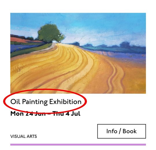
Event card "title" element
Then we'll jump down a heading level and mark up the name of each show as a heading, an <h3>. The designer has made this type the focus and we will too. Some people browse super fast by jumping to the next heading, then next heading, so I'm not going to put any important information before the heading — they'll jump right over it. I will put the image there, though, as I know in this case, I can't get meaningful image descriptions from the API so those images are hidden and have empty alt attributes. Now the user can guess (correctly in my case) that the developer is actually describing the content in some meaningful way and might flip back to headings overview (list headings level 3) and just get a list of the shows.
Now let's deliver our metadata. Let's list it:
Badge
Date/Time
Categories
Badge
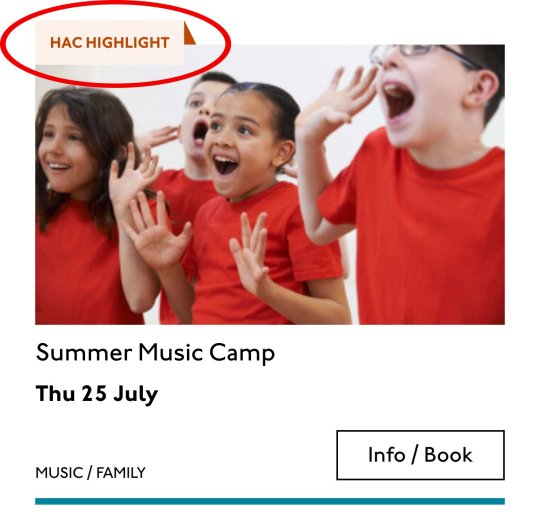
Event card "badge" element
This seems to be something the venue adds to a card to highlight it. As a developer, I can't immediately see why a user would look for this, but it's emphasized strongly by the designer, so I'll make sure it stays in. Katie has moved the badge up out of the flow, but I know that with a headings jump our user could miss it. So I'll just put the wording directly after the title, I think. I'll either put it first or last, so make it easier to account for in a non-visual browse and not be too crazy paving in a tabbing, visual browse.
<p class="c-card__badge"><abbr title="Harrow Arts Centre">HAC</abbr> Highlight.</p>
...But on second thought, I won't put an <abbr> after all. It's the brand color, so it's really a statement of ownership by this venue, and we've already said HAC a million times by now, so the user knows where they are.
<p class="c-card__badge">HAC Highlight </p>
See the Pen
Badge by limograf (@Sally_McGrath)
on CodePen.
A quick aside: the 'badging' is very specific to this organisation. They want to show people clearly and quickly which events they've programmed themselves, and which are run by other organisations who've hired their venue.
Date/Time

Event card "date/time" element
Now date and time. Katie is keying me in to this decision point by styling the dates in bold. Dates are important. I'm going to pop it in an h4>, because I'm thinking it looks like someone might be quickly scanning a page of events looking for the matinee, for example, or looking for a news article published on a particular day. I don't always put dates into headings, especially if there are millions on a page, but I do always make sure they're in a <time> element with a complete value so the <time>Thu</time> or <time>Mon</time> Katie has specified is read out as comprehensible English words "Thursday" instead of garblage. I could also have used hidden completion or <abbr> with a title.
Categories/ Tags

Event card "categories/tags" element
Next come the categories, and I'm putting them after badge and date. This section is next in the visual order reading top-to-bottom, left-to-right, of course, but it also seems to be deprioritized: it's been pushed down on the left and the type is smaller. This works for our linear storytelling. As a rule, we don't want people to sit through repeated or more general content (cinema, cinema, cinema) to get to unique or more specific content (Monday, Tuesday, Wednesday). Remember, we are inside our card: we know it has already been sorted in a few general ways (news, show, class, etc), so it's likely to have a lot of repeated pieces. We want to ensure that the user will go from specific to general if we can.
There is a primary category that is sorted first and then some other categories sometimes. I won't deliver this as a countable list as there's mostly just one category, and loads of lists of one item is not much use. But I will put a little tag beforehand because otherwise it's a slightly impenetrable announcement. MOVEMENT! SPOKEN WORD! (I mean, you can work it out retrospectively, but we always try to name things first and then show them, in linear order. This isn't Memento.) I used to use title="" fairly heavily but I've gotten complaints about the tooltip so I route around. Note the use of colon or full stop to give us a "breath." That's a nice bit of polish.
<p class="c-card__tags h-text--label> <span class="h-accessibility">Categories: </span> </p>
Also I'm hard-coding in my spaces to make sure the categories never run together into complete garblage even with text compression or spaceless rendering turned on somewhere down the pipeline. (This can happen with screen readers and spans and it's rather alarming!)
There's a piece of this design I will do in the CSS but haven't really pulled into the document design: the color coding on primary category. I am not describing the color to the reader as it seems arbitrary, not evocative. If there were some subtextual element to the color coding beyond tagging categories (if horticultural classes were green, say), then I might bring it through, but in this case it's a non-verbal key to a category, so we don't want it in our verbal key.
I'm sorting the primary category to the front of the category paragraph, but I'm not labelling it as primary. This is because there's a sorting filter before this list that sorts on primary category, and it's my surmise that it would be easier and less annoying to select a category from that dropdown than to read through each card saying Categories Primary Category Music Secondary Categories Dance. I could be wrong about that! Striking a balance between useful and too much labelling is sometimes a bit tricky. You have to consider the page context. We may be building components but our user is on a page.
See the Pen
Dummies in page context by limograf (@Sally_McGrath)
on CodePen.
Action

Event card "action" element
Last, the action. The direction to the user, to Book, or Learn More, or whatever it is, has been styled as a button. It's not actually a button, it's just a direction, so I'll mark it up as a span in this case. I definitely want this to come last in the linear document. It's a call to action and also a signal that we've reached the end of this card. The action is the exit point in both cases: if the user acts, we go to the target entry; if they do not, we go to the next card. We definitely never want any data to come after the action, as they might have left by then.
See the Pen
Card by limograf (@Sally_McGrath)
on CodePen.
My conclusion
This markup, which counts, groups, and names data, delivers linear and non-linear interactions. The page makes sense if you read it top to bottom, makes sense if you read parts of it out of context, and helps you jump around.
Katie, over to you...
Katie Parry, designer
What an ace article! Really interesting. (I particularly like that "Mon," "Tue," etc. on cards are read as "Monday," "Tuesday"... smart!)
One thing that struck me is that using assistive tech means users get information served to them in a "set" order that we've decided. So, unless there's a filter, someone browsing for dance events, for example, has to sit/tab through a title, badge, dates, and maybe several other categories to find out whether an event's for them or not. Bit tiresome. But that's not something you've got wrong — it's just how the internet works. Something for me to think about in the future.
Most of our clients are arts and cultural venues that need to sell tickets for events so I design a lot of event cards. They're one of the very first things I'll work on when designing a site. (Before even settling on a type hierarchy for the rest of the site.)
Thinking visually, here's how I'd describe the general conventions of an event card:
It must look like a list – so people understand how to use it.
It needs to provide enough information for folks to decide if they're interested or not. (The minimum information is likely an image, title, date, and link.)
It needs to include a clear call to action — usually a link to find out more information.
It needs to be easily scannable, visually.
Making information visually scannable is a pretty straightforward case of ensuring every information type (e.g. image, title, date, category, link) is sitting in the same place on every card and follows a clear hierarchy.
I focus a lot on typography in my work anyway but clearly: titles are styled to be highly prominent; dates are styled the same as each other but are different from titles; categories look different again – so that folks can easily pick-out the information they're interested in from simply scanning the page. I'm composing the card for the user, saying, "Hey, look here's the event's name, this is when it's on — and here's where you go to get your tickets!"
The type styles – and particularly the spacing between them – are doing a lot of work, so I will point out here that the spacings are not quite right in the code sample:

Spacing between the title and dates, dates and button, and button and piping don't match the design.
This is important. Users need to be able to scan information quickly as they aren't all looking for the same thing in order to make the decision to go to an event. Too much or too little space between elements can be distracting.
Here, let me tighten that up for you:
See the Pen
Card with accurate spacings by limograf (@Sally_McGrath)
on CodePen.
Perfect!
Some people just want a general mooch at what's coming up at their local venue. Others may have seen an advert for a specific show that tickles their fancy, and want to buy tickets. There are people who love music but don't care for theatre who just want a list of gigs; nothing else. And some folks who feel like going out at the weekend but aren't that fussed about what it is they go to. So, I design cards to be easy to scan — because most users aren't at all reading from top to bottom.
Despite the conventions I just laid out, cards certainly don't all look the same — or work in the same way — across projects.
There is always a tension in web design between making an interface familiar to the user and original to the client. Custom typefaces and color palettes do a lot here, but the other piece of it is through discovery.
I spend time reading-up about a client, including who their audience is by reading what they say on review sites and social media, as well as working directly with the client. Listening to people talk through how they work, what feedback they get from their audience/users often uncovers some interesting little nuggets which influence a design. Developers aren't typically involved much in discovery, which is something I'd like to change, but for now, I need to make it super-clear to Sally what's special about this event card for each new project. I write many, many (many) notes on Sketch files, but find they can tend to get lost, so sometimes we have a spreadsheet defining particular functionality.
And soon a data populator instead! :P
See the Pen
Cards in page context, scraped from production by limograf (@Sally_McGrath)
on CodePen.
The post Telling the Story of Graphic Design appeared first on CSS-Tricks.
Telling the Story of Graphic Design published first on https://deskbysnafu.tumblr.com/
0 notes
Last Seen Blogs

bluebeesknees
All The King‘s Monkeys

tridennt
○ TIED ○ IN ○ KNOTS ○

yustea
🥀

deekaytien
deekaytien

justamellie
Just Amellie