#i used to use it a lot for linework but now it looks so messy to my eyes
Text

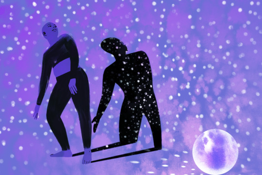
Some Yennefer and Tissaia softness, based on a scene from chapter 4 of And So We Fall Together (The One With The Unicorn) by @galeaspida
#sometimes i draw things#galeaspida#tissaia de vries#yennefer of vengerberg#the witcher#using that procreate dry ink brush again#i used to use it a lot for linework but now it looks so messy to my eyes#ughhhh
214 notes
·
View notes
Text
kinktober !

kink: waxplay
pairing: hwang hyunjin x fem!reader
wc: 2k
waxplay: a form of temperature play in which wax from a candle is dripped onto a person's naked skin
You were incredibly lucky to have a boyfriend like Hyunjin. He was sweet, funny, talented, such a gentleman - and completely and utterly infatuated with you. The two of you could be in a room full of people, and his eyes would be fixated directly on you the whole time. Most of your time together was spent with Hyunjin either attached to your hip, or gazing at you in adoration.
Most of the time.
You were currently lounging on his bed, while he sat across the room from you, painting at his easel. You couldn't complain, really - he gave you almost unlimited amounts of attention. It was okay that he wasn't focused on you at that moment. Or it would be okay, if you weren't unbearably horny.
Just seeing him sitting there, examining his sketch the way he'd examined your naked body so many times before… it did something to you. The room was dimly lit, with a string of fairy lights and a candle providing all of the illumination, save for a lamp pointed directly at a Hyunjin's canvas. The warm light was making him look positively angelic. His skin was glowing. He was shirtless, and you couldn't stop your eyes from exploring the planes of his neck, his shoulders, collarbones, pecs, stomach.
His hair was tied up in a messy bun at the base of his neck, though a few strands had fallen loose, which he'd tucked behind his ears. His eyebrows were furrowed gently, the cogs in his brain whirring away as he worked.
He was so fucking beautiful. You needed him.
"How's it coming along, baby?" you asked.
"Mm," he made a noise of affirmation. "Good so far."
You could usually tell his levels of engagement by how in-depth his responses were. A long ramble about the colour pallette, the shading, the linework? That meant he was still in the realm of the living. "Mm, good so far"? Yeah, he was gone. You might be in his peripheral vision, but on a conscious level, the only things in existence are himself, his paints, and the canvas.
You were going to have to work hard.
Hyunjin's face was barely an inch away from the canvas, and he didn't even look up at the quiet rustling sounds of you removing your clothes. You wondered if he even heard, or if his brain filtered the disturbance out.
"What’s your very favourite thing to paint, Hyunjin?" you asked, settling back on his bed, now naked.
"I like painting lots of things," he murmured, still not looking over at you. "I like painting you."
"You like painting me?"
"Yeah," he confirmed. "My beauty."
This made you beam. Disengaged as he was at the moment, you knew he truly meant it.
"Paint me now," you suggested.
"I can do another painting of you next," he compromised.
"Fine. Paint on me now."
Ah. You'd piqued his interest with this line. He turned around, eyebrow raised in question, before he saw you. Completely naked, lounging on his bed, paint me like one of your French girls style. His mouth fell open, his eyes scanning your body.
You waited for him to speak. And waited… and waited.
"I don't know if these paints are skin-friendly."
You snorted. What a Hyunjin response. Your comfort and safety is always paramount with him. "Okay, then. Don't use paint. Use…" You pointed to the candle on the side table. "That."
He looked to the candle. Then back to you. "I don't know if the wax is skin-friendly."
"Hyunjin."
"It could burn you, honey! I don't know much about that stuff-"
"It'll be fine. Promise. Plus, isn't burning me the whole point?"
He looked at you, straightfaced. "A little burn, maybe. Scalding your skin straight off? No."
You rolled your eyes. "C'mon, Hyun. It's gonna be fine. I know you wanna try this - I can see it in your eyes."
Hyunjin sighed. "Fine. Let me get a clean brush, okay?"
"Okay!" you said with a grin, laying on your back and waiting for him to prepare.
Moments later, he climbed onto the bed, straddling you. Hard already, you mused, feeling his bulge press against your crotch. Unsurprising. He always was quick to excite, when you were involved.
He had the candle in one hand, a clean paintbrush in the other, and an excited look in his eye. "Are you sure about this?" he asked.
You nodded up at him, almost trembling with anticipation. You could smell the candle, black cherry scented, and could feel the warmth from the flame. Hyunjin dipped the paintbrush into the hot wax, and brought it down to your skin.
Oh. It was hot, but not as scalding as you thought it would be. Not as painful as you had been fearing - or hoping? You felt a slight burn, but nothing that made you leap up in agony. No, it made your skin tingle. It made your clit throb, your pussy tense. It was good.
Hyunjin was looking at you, rather than his artwork, his eyes staring deeply into your own. "That okay?"
You nodded. "More."
He repeated the motion. Dipped the paintbrush into the wax, and smeared it across your skin in one long, delicate brushstroke. You exhaled heavily. The only thing on your mind was the sensation of the wax - the hardening wax, which was beginning to cool, and the fresh, hot, wet wax, melting into your skin, into your very core.
You loved to watch your man paint. You loved it even more when you were acting as his canvas. Having his full attention on you, on your body, was dizzying. You felt electric.
He was clearly working on something, you could tell this from the careful deliberation of his brushstrokes across your stomach. He was getting into the zone, making you his masterpiece. But, in all honesty, you didn't give a fuck about the art. That wasn't something you'd ever thought before, not about Hyunjin's work at least, but the hot wax coating your skin was making you positively delirious with sheer arousal. You wanted more, needed more.
"More?" he asked. Oh. Had you said that out loud?
"Feels so good, Hyune," you whined.
"I don't know how I can give you more - do you want me to pour it straight on? That might hurt…" He frowned, considering this.
"Don't care!" you insisted. "Want it to hurt. Please."
He considered it for a moment. "Alright. But let me know if it's too much, okay? I'll wipe it off straight away." You nodded quickly in agreement.
Slowly, teasingly, Hyunjin titled the candle over your body. The first red drop landed in the centre of your abdomen. It felt white-hot in the best possible way.
Another drop, slightly more substantial. You saw stars behind your eyes.
Another one, a slow pour. The scent was overwhelming your senses now, thick, rich, fruity. It was everywhere, yet you couldn't get enough.
"Hyun-"
"Yeah?" he asked, at attention within an instant.
"Tits - on my tits, please."
Hyunjin followed your command. Slowly, he titled the candle, letting a slow trail of wax dribble across your chest. It felt like molten lava, spilling across your curves, down the slope of your breasts, covering you, painting your skin scarlet.
"Is this okay?" he asked.
"More than okay," you confirmed. "Why the fuck did we never think of trying this before?"
Hyunjin smiled down at you sweetly. "I'm glad you're enjoying it, baby."
He was enjoying it too, from what you could feel grinding into your pubic mound. Your fingers went to his waistband, tugging at it, and he followed your cues, knowing exactly what you were after. He reached into his trousers, pulling down the waistband and lifting his dick and balls out over it. You sighed happily, grasping his dick gently and lazily stroking it as you lay beneath him, absorbing the sensation.
The weight of his dick in your hands, the hardened wax pulling at your skin, the heat of the fresh wax. The scent. Your boyfriend above you, looking like an angel. It was all tipping you over the edge. You couldn't help but moan out loud.
Hyunjin was getting distracted, you could tell. His cock was twitching in your grasp repeatedly, his hips stuttering along with your strokes. A lot of the time, he was very good at holding back his own pleasure while he tended to you. Other times, not so much. And who could blame him, with the excitement of trying something so new and sexy?
"Feels so good, Hyunjin," you told him earnestly. "Do you wanna feel too?"
He paused, looking up at you. "Hm? Me?"
"Only if you want to… I'm just thinking about how pretty your dick would look, with wax dripped all over it.
"Oh."
"Oh?" you asked.
"Oh."
He liked that idea.
"Not just yet. Wait til I'm - wait til I'm closer. Wanna see if it can push me over the edge." Hyunjin's cheeks were dusted with pink.
Get Hyunjin closer to the edge? If there was anything you could do, it was that. You swiped your thumb over the tip of his dick, gathering the precum that had leaked out of his slit and using it to slick up his shaft. You stroked with more fervour, quickly, tightening your grasp just the way he liked it.
He sighed, running his spare hand through his hair, casting back the strands that had fallen loose of his hair tie. He bit down on his lip hard, stifling a whimper. If you knew that noise (which you did, quite well) it meant that he wasn't too far off.
"Oh - baby, I'm - hold it for me, yeah?"
You nodded and did as he asked, holding his cock steady. He moved slowly, just as he had with you, allowing just a single droplet of wax drip onto the base of his shaft, letting out a strangled moan as he did so.
"How does it feel?" you asked, captivated by his reactions.
He looked up from his dick to meet your gaze, and you noted the tears in his eyes. "Hot. Good."
"More, baby."
He did so, letting another drop fall. It rolled down the length of his shaft, and he cried out. Another drop, bigger again. Bravely, he made one long, smooth pour, right along his member. He hissed at the feeling, the pace of his breaths picking up.
It was a fucking gorgeous sight. His long, beautiful dick, decorated as always with light purple veins, and tonight with deep red wax. It was hot within your hold, twitching relentlessly at the brand new sensations.
"Doing so well, baby," you coaxed him, giving his dick just the gentlest squeeze in your grasp.
He angled the candle over his tip, letting a single drop fall onto his exposed head. He yelped at this, a sensation so strong you felt you could barely imagine it. Merely a second later, his cock began to pulsate, once, twice, and on the third time, a single rope spurted onto your tummy. He erupted, cumming hard and heavily, painting over the red wax with hot, white cum.
"There you go, baby," you encouraged him through his climax. "So much cum, such a pretty dick."
He sat back with a long exhale, catching his breath. "That was nice."
You giggled at the understatement. "Yeah. Nice."
Hyunjin was grinning, the smile reaching his eyes. "Look at our art. We made that together."
You looked down at your torso. It was lovely, in a strange, artistic way.
"It looks like a sunset," he claimed. You wouldn't go that far - it was more like a red sea splashed with white - but it was very nice.
"Let's clean up, yeah?"
Hyunjin gasped. "No. Let me take some pictures first."
You were very used to this; you knew the drill. Hyunjin had been into erotic photography for a few months now, and it had become a regular aspect of your bedroom activities.
"Okay," he said, sounding satisfied after a few minutes of clicking photographs. "Let's go shower. And then… I'm finished painting for tonight. Back to bed and we can make love some more?"
You beamed up at him. "Sounds good to me."
#hwang hyunjin smut#hyunsvngbinitober !#skz smut#stray kids smut#stray kids fic#stray kids fanfic#stray kids x reader#stray kids scenarios#skz fic#skz fanfic#skz scenarios#skz imagines#skz x reader#hwang hyunjin fanfiction#hwang hyunjin fanfic#hwang hyunjin fic#hyunjin smut#hwang hyunjin x reader#hyunjin fanfiction#hyunjin imagines#hyunjin x reader#stray kids fanfiction#stray kids imagines#hwang hyunjin imagines
485 notes
·
View notes
Note
Less about OCs, but I'm interested to know what your process is like when creating a piece as detailed as that one you posted for Valentine's Day. How do you go about it? And do you happen to do time-lapse videos?
hmm can't say I can give an explanation that's terribly interesting or satisfying lol... I'm almost entirely self-taught, so "process" is a very loose and nebulous concept for me, and it changes from piece to piece. the one common thread among my works is that they all involve obscene amounts of trial and error. I don't have any recent time-lapses because I never think to record them, but if I did you would definitely see how often I feel the need to adjust and redo every little thing.
for the Valentine's Day piece, because it was a "remake" I had the benefit of a much more solid foundation than usual to start out with. however you can still see where I ended up deviating from the sketch phase - most obvious being her pose, the design of her hair, and the details of her sandals. (there were also meant to be candles on the dresser, but I forgot and didn't feel like adding them back in later and so I decided a vague suggestion of candlelight was enough lmao)
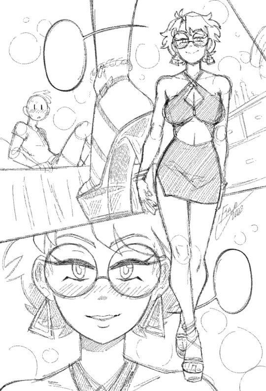
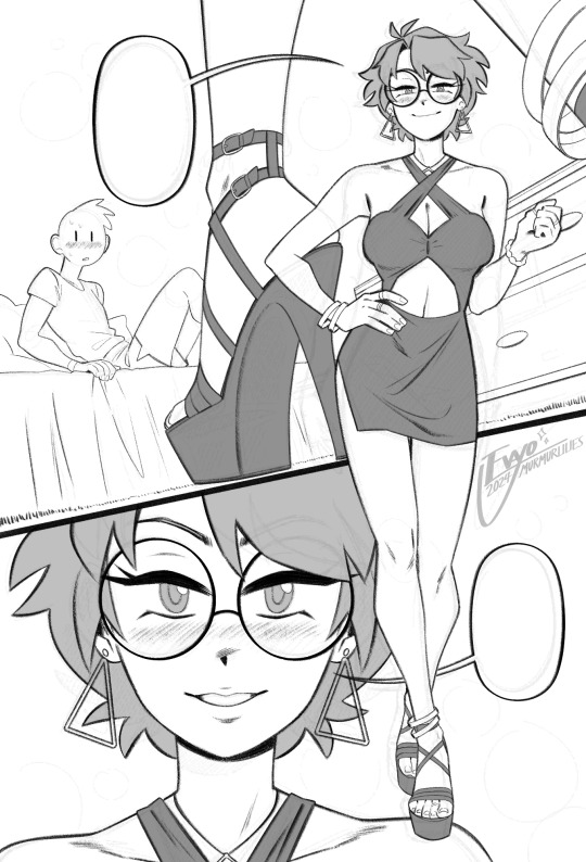
anyways, compared to everything else, sketching and linework are fairly straightforward and come most easily to me. there really isn't much to say, just scribble some messy lines and then whittle away at and draw over them till they magically become less messy!
when it comes to coloring and shading, things get a lot weirder and more complicated. this is where my process tends to vary the most, because it really depends on the mood of the piece. for this one I wanted something dark and seductive, so I covered the whole image in a layer of burgundy red, then painted the "lighting" on top across several Overlay layers. additional shadow details were brushed in on Multiply layers using deep purple instead of straight black, but ultimately I didn't want them to be too dark, as that initial layer of red was meant to serve as the primary "shadow" of the piece.
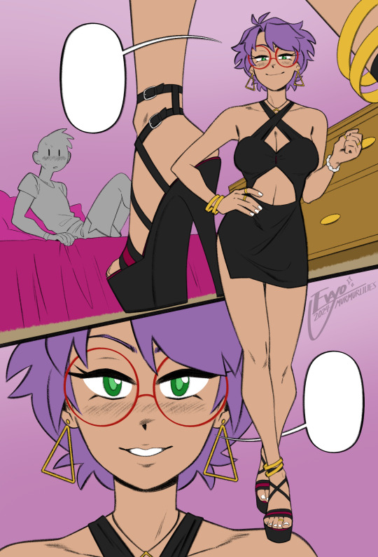
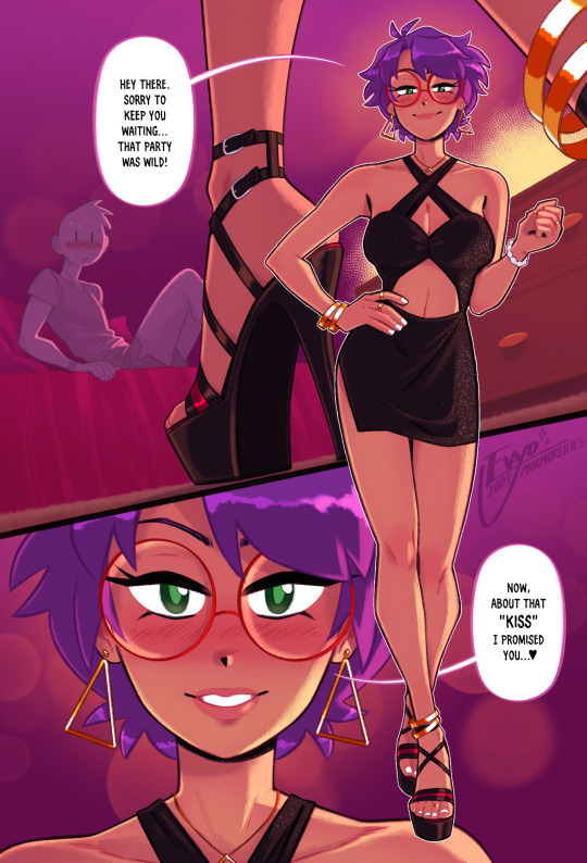
this is also usually where I decide which lines I want to "color" with clipping masks, which can either make certain elements pop or feel softer. it sorta brings the whole image together, giving it a much more painterly look overall. from there all that's left is to keep making adjustments and adding little details - the glittery effect on her dress was one of the last things I added, I thought it looked really nice!
...ok now take everything I just said and throw it all in a blender. because even though it might sound fairly orderly, the truth is I'm constantly making changes to all stages of my works, even the earliest ones, all the way to the end. I'll still be making adjustments to the linework and such after I've already put so much effort into the lights and shading! it's not the most efficient way of doing things... but again, trial and error. my perfectionism gets the better of me...
anyways I apologize if NONE of this made any sense, like I said I never had any formal training in art, so I'm not very good at teaching or explaining it!! at the end of the day my process is less about what makes logical sense and more about finding what feels right in a given moment. at the very least I hope it was a fun read lmao 🥳
#evayo asks#evayo art#glassborn#ocs#fun fact: i had no idea what to put in those dialogue bubbles till like an hour before upload LMAO... she could've been saying anything 🙊
37 notes
·
View notes
Note
hi Habs! :D i love your art and have seen ppl say they want to eat it and i would also like to partake lol. have you ever explained your methods of doing digital art? i love traditional but i would like to branch out into digital. i've tried different applications like krita, sketchbook, and sketch.io but i don't really vibe with them (if that makes sense). any tips?
Hello ! Haha thank you ! Totally get what you mean about vibes, I’ve used a few different programs, and I like paint tool sai and clip studio paint the most, and mostly use csp now !
Took me a long time to get into digital art, and the biggest breakthrough I had was that I didn’t have to do line art lol, now I only do it when necessary and 99% of my stuff is cleaned up sketches. Changing my process completely changed how I felt about my art for the better. It keeps my work dynamic, and also lessens feeling of the sketch looking better than the linework!
Generally my process is sketch, duplicate the layer and clean it (sometimes put the old layer on a low opacity so I can make sure I’m staying true to the sketch, so it’s like lineart with extra steps lol) then I block in one colour under the lines, either make a new layer with a clipping mask, or lock the opacity and colour on that layer.
For colouring, I usually use a single layer, I put down messy flats and shadows then clean it up and render it, add highlights and funky details and then I’m done. I’ve explained my colouring process here before, and I have a time lapse that shows my sketching/colouring process here.
I have shaky hands, so a lot of my brushes have stabilization turned up, usually I set it at 15 on csp brushes idk how that translates to other programs though.
For my sketches/clean up, I like using brushes that have little to no variation in brush size, and have varying density or opacity. Not for everyone but I like how it makes my work look and I end up liking my stuff a lot more like that. Usually I keep my sketches at the start really light and build up pressure as I clean
In general, I think the best thing to do is try a whole bunch of methods and figure out what works and what doesn’t! Lots of people have very different processes, so looking at how other artists work and trying out how they do stuff for yourself can be great for learning! Good luck with digital art!
95 notes
·
View notes
Note
Hi! Do you happen to have basic/simple/easy tutorials for editing comic panels to recommend?
i do not actually have one to refer you to, but i’m happy to write some things up! i’m assuming this is just for removing backgrounds and creating icons; if you want a how-to on the way i animate panels, that lives here.
i use photoshop cs6, but the same general principles should work in other editors. also, there are probably easier or faster ways to do the things i do. i like my methods and i’m comfortable with them, but i’d recommend experimenting to find what works best for you.
and... yeah! let's get into it.
step one: finding a panel
i save panels as i’m reading comics. they all live in one PSD file named “panels,” and i make a new one for each run. anything that seems pretty or thematically resonant gets copied and pasted in there. this way, i don’t have to dig through endless comic issues to find a specific image that stuck with me. i usually save the full page just so the edges are clean and everything is included.
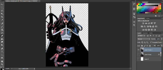
let’s go with this page from birds of prey:
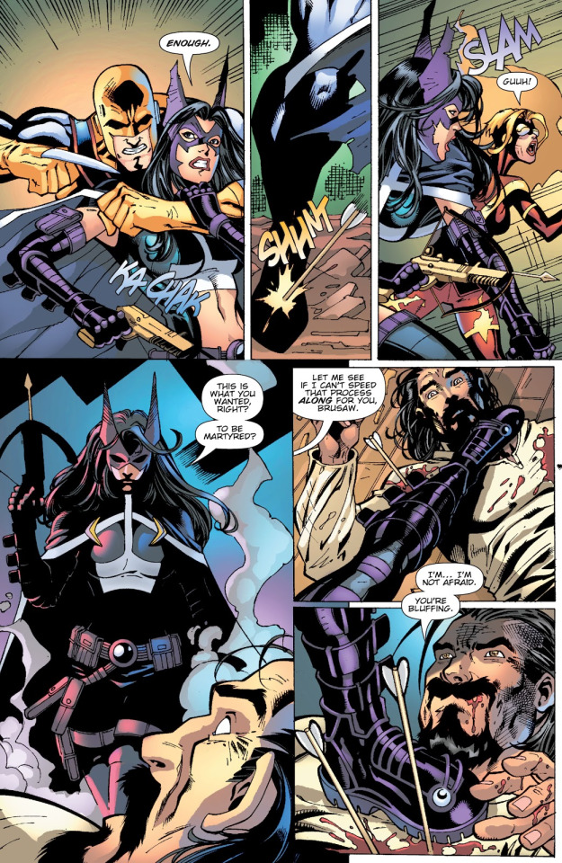
step two: cropping
the way i crop the image depends on two things: what i’m hoping to make, and what the image looks like. here, i’m just doing a basic portrait, and helena is taller than she is wide. that makes it easy; let’s crop it so she takes up most of the frame.

(my preferred ratios are 4x6 for smaller panel edits like this; for banners, i usually do 2x1, but if the framing works better as 3x2, I have done that, too. just feel it out. actual pixel sizes depend on the size of the original image.)
step three: removing the background
this part is, I think, the area with the most room for personal preference. we need to erase the background, and there are a LOT of tools to do this. each one varies depending on what the image itself looks like. there’s the magic selection tool, the eraser, or the lasso or magnetic selection tool.
(i don’t use the lasso or magnet because they’re evil, to me, but they work reasonably well when you have a character on a mostly solid background and art with thick, defined lines. i have no real advice other than that.)
here, we can mix and match some things. i’m going to start by using the magic selection tool to grab all the white or solid colors and remove them with the delete key, like so:

surprise! gone.
after that, for the more finicky areas, i am a perfectionist and i go in and erase pixels using the eraser tool at 4-5px width. i start by outlining the character, like so:

from there, you can use the lasso tool to select all of the remaining background and delete it. i usually hide the white background layer at this step, too. (i'm also going to color the smoke and the man in the foreground black and redraw the crossbow string with the paintbrush tool. this ain't about him.)
you should end up with something like this:

step four: cleaning the linework
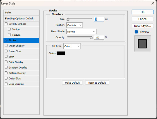
this part is mostly using the layer style stroke and the tool refine edge.
so, because of how selection tools and erasers work, there are a bunch of hidden pixels throughout the image you can’t really see. this drives me absolutely bonkers. at this point, i combine all the layers of the paint i've done so far -- everything except for the transparent background. select the layer with the character — Helena — and apply the layer style stroke, set to “outside” at 3px.

those little black dots are what we're after. there aren't too many right now, because this was a fairly clean edit; sometimes, it looks scary and messy, but that’s okay. the layer style has just outlined all those invisible pixels. i go through and erase them — especially in tight places like corners. for example, this pesky area between strands of hair:

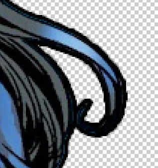
(before vs. after)
once you’ve erased all of those pixels and cleaned up the image, you can go back into the stroke layer style.
you’ve done a lot of erasing and feathering and cleaning up, so chances are, the line work is not nearly as crisp as it looked in the original panel. that’s fine! shift the settings to “inside” and 1px, like so:
sometimes it’ll need to be 2-3 px, sometimes it’ll need to be center-aligned, and sometimes you might even decide it looks better outside or without the stroke style at all! this is all personal preference. do whatever you like.
once it's where you want it to be, i like to duplicate the layer -- to save the one without the new outline in case anything goes wonky. then right click the copy of the layer and "rasterize style" to get a flat image with new linework.
your workspace should look something like this:
if it happens to feel like the edges are a little harsh — which happens sometimes! especially when using selection instead of eraser — you can select the whole image and use refine edge. this softens it. you don’t need to do much; i usually do 2-3px of feathering, a couple pixels of smoothing, and some contrast, depending on how it looks. see below:


you'll have three layers now. it gets confusing, so try to keep track of which one is your active layer. you can delete old ones, if you want; i generally don't, just in case.
there isn’t a hard and fast rule for this part. do what you think looks good. and if you want to refine the edge before you add the new linework, that can work! do another stroke layer style after the first round! test things out and find out what you like. most of the time, it depends on the image and your preference.
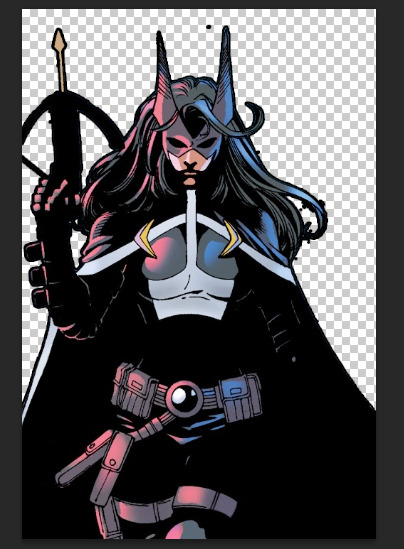
after all that, this is the helena we now have:
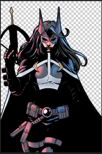
step five: creating a new background!
this part is easy. create a new layer, pick a color you like — i tend to pull from the actual background using an eye dropper tool, or if it’s for a multiple-part edit, I use the swatches i’ve decided on for the color scheme of the whole thing — and paint bucket that thing right on there. this is some of the blue that was behind her originally:

i don’t like flat colors, pretty much ever, because they feel harsh to me. so i go back and add artistic touches and mess around with the filters a lot. sometimes i pull text or accents from other panels and follow the same steps as above to incorporate them into the edit; sometimes, i don’t. no rules just vibes.
in this case, i want it to be pretty simple. so i’ll make a new layer, then fill it in with a gradient tool. i usually make a custom gradient; one side is the color of the background and the other side is either black or white, depending on the vibe I want.

i do an orbital gradient most of the time — circles are your friend — and focus the center on something that I want to draw the eye to. here, i’m going to do helena’s face.

then i mess around with the opacity until it looks the way i want it to. like this:
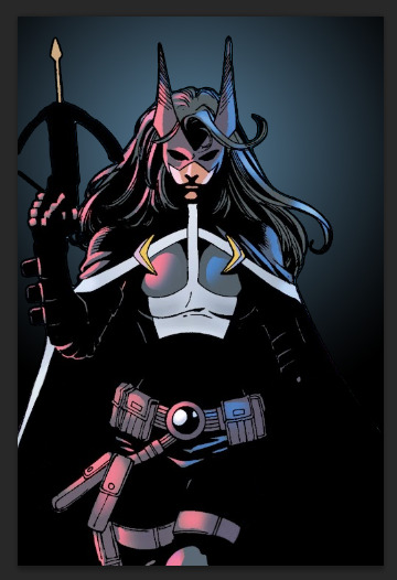
step six: final steps
congrats! you have an edited panel! you’re perfectly fine to post/share/use it at this point, but there are a couple other things i like to do to give it that final polish:
if you want to jazz up your edits, try messing around with outer glow, or drop shadow. both of those layer styles can add some emphasis to your focal point. (i prefer those be kept at a low opacity, when i use them, which isn’t often.)
i'd also recommend messing around with gradient maps if you want to superimpose a larger silhouette over the background. that would take more room than i have left in this already far too long guide, but it does add something to have it in there.
i dislike having text bubbles in my edits unless i specifically put them there, so i do have a process for removing them, much like the smoke or the man in the foreground. again, we are running long already, so i won't get into that here. my recommendation if you don't want to deal with entirely removing a bubble is to just paint over the text inside with white so you have an empty text box or speech bubble instead. it's simpler, quicker, and honestly the more common practice based on what i've seen.
that being said, if you want to know how i paint over them -- or how to do anything i didn't get into here -- feel free to ask. i don't mind writing these up.
i have a guide on how i size my images here, which walks through the exporting process. it’s not strictly necessary, but i like for my edits to remain consistent in size, so i do usually follow it.
and that’s it! you’re now ready to edit comic panels to your heart’s content. happy cropping and so on, and thanks for asking me. <3
#how to#ask.tb#anonymous#i hope this answered your question#and i especially hope it did so in a simple and easy to follow manner. despite how lengthy it got. i tried to stick to basics here.#but yeah! thank you for asking#best of luck!
31 notes
·
View notes
Note
I am all about constructive criticism. I mean, how am I supposed to get better at writing/drawing if people won't be honest with me and give me tips to get better. I personally think that people who can't take constructive criticism aren't very bright. How are they supposed to get better at things if they don't listen to others who are just trying to guide them?
Also, I would love some more tips on how to make the shell better. If you are willing, of course. :)
I am horrible at drawing. I usually have to trace things to get a decent drawing. (For instance, I traced like five different things to make Mikey a pony.)
I'm so much better at coloring than I am at drawing. My writing needs work, too, but I'm getting better.
First of all, can I just say that you shouldnt worry about tracing art to improve your own (as long as u aren't posting it as soley your own but thats a whole other rabbit hole) I did too! It helps build ground work for a good understanding of anatomy and poses.
However there are a few holes in tracing. Forst of all it is quite limiting in the outcome of your work, as your art is stuck static in one pose. this can alkost hinder your ability to see things in '3D' and visualise objects for multiple angles. it can also lead to 'skin wrapping' , which i think is the hole you fell into here (and also a term i just made up now)
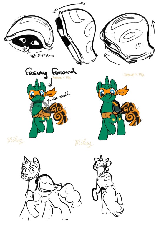
with the shell, you only coloured it within Mikey's trace lines - this caused the shell to loose a lot of its mass - making it look, quite frankly, not like a shell.
a way to improve on this is to look at more references of Mikey's shell in the show and its shape from different angles. this can help you get a good idea of how it should look, and it is a good idea to practice drawing it from these angles. this will improve your ability to think in a 3D space, (which is so darn hard, but seriously useful)
however, and you may have noticed this yourself, when you add new additions to the figure, the line art just doesnt line up! the line quality is different!
This is because the line you have done for the addition is Your Line. And we love your line.
so lets make the rest of the traced lineart fit into your style, instead of you fitting yours into theirs okay?
You may notice that when you trace art, the line work is just not the same, the lines are shakier than the original and it just doesn't look as good. this is not a reflection of your skill.
It is because, usually, (at least when I did it) you follow the original line so closely that it turns out shaky, probably taking your pen off the page a few times to take a break from the oen stroke. while the original artist did that line in one sweeping stroke.
a way to fix this, and make the line arr cleaner and more you, is to instead use the drawing as a very close reference. for example:
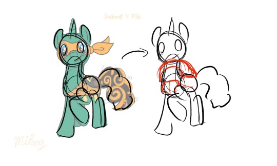
instead of tracing the exact lines of the art, merely trace the general shapes of the art. not only then do you add your own flair and gesture to the drawing, you are then more free to add more shapes to this sketch.
You can still use the reference drawing as closly as you want, but try to focus less on getting the exact lines copied, and more on the general shape. you linework wont be perfect the first time, it might be really messy compared to your usual tracing, and thats fine! you should see some of my sketches before i refine them!
But these will be your lines, theyll be smoother and more gestural, and overtime you will get better control over your penstrokes doing this.
Okay I cant really think of anymore to add here, I hope this helps! i think this was just one big word vomit lol. Keep drawing!! cause no matter what you do, as long as you are actively drawing you are always improving! dont be afraid to push yourself out of you comfort zone! who cares if it doesnt turn out the way you wanted it to? Its your art, You Created That with your Own Hands, and I think that is amazing.
<3
#asks#animal-lover-forever#i really hope this helped#its always hard for me to articulate my thoughts like this lol#YOU ARE GETTING BETTER#YOU ARE ALWAYS GETTING BETTER#art help#i hope#rottmnt#rottmnt mikey#mlp
36 notes
·
View notes
Note
ayo mod would u be willing to break down yuru (desmous) style ?
Yeah!! let's do this :)
I'm gonna assume you meant toyhouse user Yuru (who's account is now closed) if thats not who you mean then im sorry that you're getting a style breakdown of a random user. Oops <3
so what we have here is a style that's very inspired by early 2000's work, more 'amateur' techniques used by younger DA artists. This style seems to favor palettes of white with a few saturated accents, or a neon palette with a few neutrals and a black for contrast. We have a lot of long bodies and sharp lines, with hair and fur texturing that's very 'stringy' for lack of a better word.

the artist seems to favor what i referred to earlier as 'amateur' techniques but they're used effectively!! the gradients, crunchy color fills, airbrushing, and messy linework is clearly purposeful and draws inspiration from the old emofur stylings. The eyes are very kemono-esque and the hair is often very reminiscent of older manga and anime.
I say that a lot of this is purposeful use of "amateur" technique to evoke nostalgia because in the cleaner ref sheet shown below, we see a slightly cleaner style with less airbrushing and more intentional shading and even some nice rendering on the hair.
So to summarize we have a style that utilizes these key ideas
Emofur/early 2000's nostalgia
young/amateurish aesthetics
thin messy line work
white + neutral + black + 1 saturated accent palettes
neutral + black + saturated rainbow palettes
mspaint asethetics (the out of place texturing, stamps, gradients, etc
for my personal opinions on the style! I find it very effective at what it does, it's clear about its intentions and does what it wants to very well. The one thing I would like to criticize is that a lot of these characters are lacking in unique and recognizable silhouettes. Even if you keep the same body type across your style, I think it's important to consider how you can implement props and unique outfits to create more unique designs. This also might sound odd, but yuru, if you're reading this, consider getting into 3d modelling!! I think your style would be very well suited to 3d character modeling, look at folks like dreamalgia's 3d models for examples of what i'm talking about :]


I think overall, while many people will not find this style to their tastes, it's well executed, consistent, and clear about what it wants to do. I would encourage the artist to branch out and experiment further (should they wish to do so)
I especially would encourage further exploration with the use of unique texturing and patterns, recognizable silhouettes, and different color combinations. Some of these designs feel a bit confused about where the 'central detail' is supposed to be focused on. Balancing your negative space vs occupied space more consciously would really tie this style together.
My hat goes off to this artist, i'm sad they've deactivated otherwise i would subscribe to em.

9 notes
·
View notes
Text
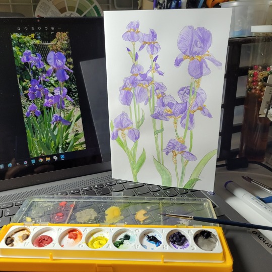
Been trying to get back into watercolors.
Even though I don't really have watercolor paper. LOL Actually, I think I have a pad of watercolor paper, but I'm not sure where to dig around in my room for it. Or maybe it's in storage; not sure. But either way, I've always been too anxious to be anything less than stingy with art materials. It was a real problem in painting class, when everyone kept telling me that I don't mix enough of the paint colors that I need. But I just couldn't stand the idea of throwing it out at the end of class. And even though I've switched to alcohol markers, I'm still too nervous to use expensive paper like watercolor paper. When I'm too afraid to mess up with expensive supplies, I end up drawing nothing, for months and years. Though, it is strange that I have no problem using Copic markers and other artist markers, though on cheaper paper. Maybe it's because I almost always get my markers on sale at anime/comic book conventions. Never pay $8 for one Copic marker, when convention booths will usually have them for $5 each.
Been making some notes during these past few days, while experimenting with getting back into watercolor painting:
5/12/2023. Tried to make intentionally messy, to differentiate from marker coloring. I wanted this to be obviously watercolors, to make switching from my usual markers medium, worthwhile.
5/12/2023. Still practicing watercolors, so tried doing my final linework as only pencil. Sometimes I wonder if the softness of pencil fits better with watercolors. I still want to differentiate my watercolors from my marker/ink drawings. So I tried some wet-on-wet techniques and allowed a lot of messy imperfections.
5/14/2023. I know I should have stuck to my usual Copic markers, since I was short on time. But it’s been a long time since I’ve done referential drawing, and I wanted the pencil’s ability to erase mistakes. Also, I’ve recently been experimenting with trying watercolors again. Back before markers, I primarily used watercolors. (Then again, back then I also had sketchbook paper thick enough to handle watercolors, and that’s not really the case anymore.) I may be comfortable with alcohol markers and ink pens now, but I keep wondering if something good might come of me returning to watercolor painting. Maybe it would look nice to color more organically, and allow some loose messiness, the way watercolors are often afforded. Maybe that type of style could really work for me. So I’m trying watercolors again.
Today reminded me how much I love drybrush, when I use brush pens—even though I haven’t gotten the hang of setting up that technique with a paintbrush yet. So I might practice more drybrush with watercolor paintbrushes.
5/18/2023. My last watercolor drawing reminded me that I could use drybrush with watercolors, to mimic the feeling of using brushpens, which I love. So I did a lot of hatchlines, like I would do with my usual pen/ink drawings. I actually wanted to do more sharp detail, but needing lighter colors for those details necessitated more water, which made the brush tip less tapered, so those smaller details I wanted, ended up broader and messier. But didn't I recently get back into watercolors, wanting to differentiate them from my pen/ink drawings? And I determined that allowing watercolors to be messy and looser (since people usually afford/expect that from watercolors) would be how I would differentiate my watercolors from my marker drawings? Then again, I had been wanting for a long time to find a way to break out of my hyperfocus on one medium at a time. If I could switch to dip pen in the middle of a watercolor painting, maybe that will bring me closer to mixing color pencils on top of marker drawings, or mixing pastels on top of marker ink, and just mixing more mediums. I want to be able to use the mediums to achieve the effects I need in each case, but I keep unconsciously locking myself in to only one medium at a time. But if dip pens make my watercolors too precise and erases that lovely, organic, messy looseness, then what's the point of me going back to watercolors from alcohol markers? Hmmm….We'll see what happens.
2 notes
·
View notes
Text
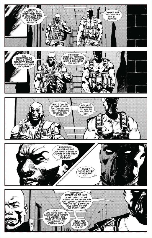
Blowtorch #2

Blowtorch #2
Second Sight Publishing 2021
Created & Plot by Alfred Paige
Plot & Written by Alex De-Gruchy
Illustrated by Montos
Lettered by Saida Temofonte
After a messy assassination gets Avery’s attention, he calls in Blowtorch to track down the man responsible. Following information that leads him to a Person known as The Middleman. Blowtorch along with Pinpoint and Infrared head out to answers. But those answers will not be what they are looking for.
There is a lot of dialogue in this issue and you really have to read it and pay attention to what’s being said. This almost verges on the too much dialogue but in the end it really is worth it to tell this story like it needs to be told. I am really impressed with this fledgling publishing house and the quality of books they’ve been putting out. These are intelligently written and gorgeously illustrated books and in this case it also has this fresh, new take on superheroes and a superhero team. I am thrilled with the opportunity to get to know this character further and learn what makes him tick and how he uses his abilities. I’m also interested in seeing more about the dynamic with Blowtorch and his teammates.
I am a huge fan of the way that this is being told. The story & plot development that we see through how the sequence of events unfold as well as how th reader learns information is presented exceptionally well. The character development that we see through the dialogue, the character interaction as well as how they act and react to the situations and circumstances they encounter is rather magnificent to see. The pacing is superb and as it takes us through the pages revealing more and more of the story along with the twists & turns along the way we’re caught up in this story in some marvellous ways.
I appreciate the way that we see this being structured and how the layers within the story continue to emerge, grow, evolve and strengthen depending on what avenues are opened up and then explored. The layers contain the characterisation, their assignment and Gareth and Michael with their little drama. Whether they work with the main arc or simply swirl around it they add this fantastic depth and complexity to the story. How we see everything working together to create the story’s ebb & flow as well as how it moves the story forward is perfectly achieved.
The interiors here are bloody mindbogglingly brilliant to see. The linework is absolutely brilliant and how we see the varying weights and techniques being utilised to create this level & quality in the detail work is astounding work. We see a fair amount of backgrounds being utilised but we could always see more since when we do see them they enhance the moments and work within the composition of the panels to bring us depth perception, a sense of scale and the overall sense of size and scope to the story. The utilisation fo the page layouts and how we see the angles and perspective in the panels show a masterful eye for storytelling. Since this is in black & white with shades of gray it really evokes some beautiful feelings and emotions.
Nothing about this book goes the way that I thought it would which is superb as it means that the guys are keeping me on my toes. I love that this issue will lead right into the next one which is great and makes me sad since I now have to wait to see what happens next. I really like how we see action in this book and the results of the affects as well. This is so intelligently written and mindbogglingly brilliantly illustrated that brings us into these characters world with aplomb.
1 note
·
View note
Text
For @stainedglass-wings
Sorry it’s not all in pencil, I started this as a pencil based tutorial but it evolved...(because my pencil skills are lacking, but that’s ok because these tips apply across all mediums)
This is my process, Things that I’ve picked up from practice and other artists.
I hope it’s not too jumbled lol
Choosing your colours:
If this was pencil, or another traditional medium, I would test my colours by colouring a rough sketch, or testing colour combos on another piece of paper as shown below.
Swatch sheet for art supplies, a permanent reference that allows you to get a feel for what colours you want, and have available:

If I was looking for six red or pink tones. I would consult my swatch sheet, pick ones that might work and test them as shown below.
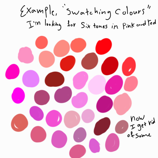
Now to remove the colours one by one, narrowing down to your six, play around by dotting them next to other potential picks.

If you wanted lots of different colours you do the same thing, Pick a few final shades of each colour and try them next to your other colours to find your favorites. You have your palette!
Shading and Placement of Colours:
Example: Shading jewels: Using a deeper shade of violet instead of black gives a more realistic appearance.

A second method of colour choosing is to start monotone, it’s a fun way of playing with colour placement or jumpstart a picture you have no idea where to begin with!
When I look at my piece I’ll imagine a single hue.
Here in my example I know I want it to mainly be blue, so I pick several tones and finding a ratio of dark and light shades I like.
(I shaded the shirt in black to show the difference of techniques)
By having the shirt and shoes darker blue, the light of the tie between them provides some balance for your eyes when you observe the picture.

Now below I use blue for the shadows, it is much softer, the intensity of the blue can be changed darker if wanted, but it gives a more complete feeling to the work then using black.

Looking at it now, I can see the hair is too bright/saturated for my tastes, so I’ll tweak it. This is where I’ll start playing with other colours.
Finalising:
After tweaking the colours:
what I changed:
choosing a soft yellow highlights over white adds dimension in the hair.
Adds same peach from the shirt to the face as blush
Darken the eyebags to balance the saturation
Make the facial shadows an orangey tan colour to add warmth
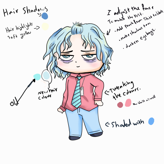
Example, The dark shoes tie in with the stripes on the tie and the shadows of the hair.
Now if this was a traditional artwork, I would have tested all these colour combos on a messy sketch of my linework to mimic the basic shape before using them in the final placement.
https://youtu.be/YoXXbOK2l7Y?t=452
In this video, at timestamp 8:48 onwards, you see how she makes several small thumbnail sketches to test how her colours work together? That’s one of the best ways of avoiding mishaps with your final image.
If you do make a mistake, sometimes darkening your picture’s colour scheme may hide it, other then that, a white gel pen, or even cutting out a piece of paper to stick over the ruined bit can work. Just redraw/colour over it! It just takes practice to perfect but it’s a handy trick to have up your sleeve!

Here a doodle I drew a while ago with pencils that uses this method. You can see I used purple and yellow to shade the skin.
Hope this helps a bit, it’s such a long post that I worry my rambles would be hard to follow. 😅
Happy drawing!
14 notes
·
View notes
Note
hey viria! I was wondering if you had any tips on improving lineart? bc when I sketch the drawing looks good and all, but when I do lineart it turns stiff and doesn't look natural ;-; plus, I can't make a long, continuous line (when I do it just doesn't fit with the sketch) I end up having to make many small lines one next to another. This makes the drawing look unclean and the process is really long and frustating... do you have any tips on how to fix these issues? thank youuu!!
Hi! I feel like this transition from sketch to lineart is such a common problem! I have it too, to a certain extent, though not as bad as it was before, but it’s still there.
To avoid stiffness and to leave the natural flow of the sketch, I think it’s very very important to determine what lines do make it dynamic and expressive. What you like the most about it. Let’s take expressions for example! You drew someone happy, and on the sketch it looks great, and you can FEEL this happiness radiating and you love the way the sketch turned out. But once you start transitioning to the lineart, it loses the certain something. I guess it happens mostly because when it comes to lineart, people feel the need to make it as clean as possible, which excludes some of the motion of the sketch. As to say, when you drew a sketch it has all those crincles of the smiling eyes, and the lines looked a bit messy and expressive, the smile was a bit lopsided and some lines are harsher than the others. Once you lineart it the line variety your sketch had often disappears, and that’s one of the resons it gets more stiff. When I lineart, I always make sure to actually lineart the lines of the eyes the way they are, I zoom in heavily and follow the width of the line my sketch had! So instead of new perfect lines I make new but still a tad messy, if only a bit cleaner and more readable.
When you draw the body, don’t be afraid to either lineart or simply leave some of the lines that made it expressive. If you sketched the leg and it wasn’t really perfect but it was expressive, don’t be afraid to leave those lines that formed it. You will still put colour underneath and all those lines won’t be as noticeable, but they will be there and the lineart won’t be as stiff! That’s one of the reasons why I always leave some bits of the sketch left under my lineart in my final work. I erase the sketch, but not fully. I often leave a lot of lines on the face, and on the hands and legs.
Basically, whenever you make a lineart (on the layer above your sketch), there’s a simple way to figure out what you need for it to still have a certain something. Click the sketch layer underneath on and off. Whatever places irk your eye and feel WORSE with the clean lineart - leave at least some bits of the sketch underneath.
So, if in short, follow the width of the sketch lines in your lineart, and leave some bits of sketch underneath. You can also then merge the layers of sketch and lineart together and play with the depth of the lines. You can simply (very lightly) erase some of those that are further away from viewer, and overline the lines that are closer. That’s optional, but I feel like erasing some very lightly help to make your lineart a bit more interesting!
Now, as for the lines problem. I am also someone who actually mostly uses a lot of small strokes instead of the long fluid strokes, but I feel like for me it works? It doesn’t look too streaky. You can fake the lines by being very precise with your continuous strokes just so it looks quite clean, or just… train your wrist to make long fluid lines.
I use those on the hair, and often on the clothing, whenever I can’t get away with using my strokes. If you do digital, and you do this fluid line but it isn’t in the place you want - undo it and do again, and again if it’s necessary. One of those lines will be good enough for you to be content to leave it there. I can undo so many of the lines over and over again until I am satisfied;;But really - there is only practising to get better with it. The wrist should be trained and there’s no other way to it unfortunately. Keep practising and you’ll keep getting more and more content with your linework!
Also the trick for drawing long lines (especially if you need them quite straight), don’t move your wrist alone, sometimes it’s necessary to move your arm. And you can put a pen to the paper, and then look at the point you need your line to end. And move your pen without looking at it, only at the point you want your line to add! I feel like it works so well so often, it was a trick one of our uni teachers mentioned and i was like WHOOAA
Pheh, I feel like that’s all i have in mind! I hope it helps
624 notes
·
View notes
Text
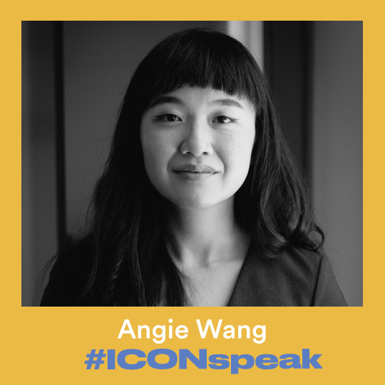
We spoke to Angie Wang for our second installment of #ICONspeak, a series highlighting some of the speakers you’ll see at #ICON11.
Angie is an illustrator and cartoonist living in Los Angeles. Her experimental style has captivated a slew of editorial clients that include The New Yorker, Vox, Google, BuzzFeed, and NPR. In addition to illustrating, she is a co-founder of the annual comics festival Comic Arts Los Angeles.
For those that are unfamiliar with your work, how would you describe your style? How have you honed your visual language throughout your career?
I think of myself as a grab bag—I never know what style is going to come out, or if it’s going to look good or work. This might sound bizarre, but it’s the way I function, it’s the way I stay excited and engaged and fresh. That’s the only pattern across all of my work, that very little of it looks exactly alike. Three years into my illustration career, I decided to destroy my existing (colorful, linework-oriented, delicate) style and draw in a completely different way (messy, textured, watercolor) instead, and I did, until I got tired of that too. These days, I don’t settle on anything. My dream is to approach every image in a completely new way, though it doesn't always work out like that due to time pressure.
I will say I tend to be more naturalistic than abstract, more controlled than loose, and more clean than gritty. Those are long-term inclinations that I haven’t been able to shake yet.
You've won a James Beard Award for your work. What was the project that won you that honor?
I won a James Beard Award, and my friends all thought it was for cooking at first! But it was for an article I pitched to Eater called "In Search of Water-Boiled Fish" about my quest to find specific Chinese food in the United States that constituted important parts of my memories in China, water-boiled fish in particular. I loved seeing the response from people all over the world who had important food-memories of dishes they were desperate to eat again but couldn't find anywhere. The award was a very pleasant surprise and a big honor.
How did you get into animation? How much of your work is animated versus static these days, and how do your approaches to the two ways of working vary?
I worked for almost seven years on Steven Universe, and folks on the crew—Danny Hynes and Rebecca Sugar in particular—taught me basic animation for fun, one lesson at a time: antics and overshoots, timing, smears, waves and arcs, etc. They were able to see all the tiny details that make a good animation (which is very different from what makes a good illustration): when motion feels dead because the timing was too even, or how redrawing a pose almost exactly the same before it settles makes the movement feel like butter. Suddenly there were all these new rules I had to learn, and every time I applied one of their lessons, I could see the difference. I didn’t have any interest in animation before, but learning from them made it feel accessible—less like a complete skill other people had that I didn’t understand and more like a skill I could internalize in little steps.
That’s how I got interested in it. I wouldn’t call myself anything more than a beginner, a total amateur, and all of my animations are experiments, me applying one lesson after another or trying out another method of rendering motion. These days, most of my professional work is still traditional illustration, but most of my personal work right now is about exploring animation.
The other part is that I fell in love with dance several years ago, and it's created an impulse for movement that wants to be expressed either through bodily action or through creating motion on a screen. It's inadequate to capture an arabesque as a still image at its peak. Dance is about every part--the entry, the arc, the exit, the transition—so a single image doesn't do it justice.
What’s one topic you’re passionate about in regards to illustration and/or the illustration community at large?
Unionizing! I joined the Freelance Solidarity Project last year. They’re still a very young union but cooking up some big projects, so the input and involvement of illustrators would be invaluable to their efforts. Now is absolutely the time to join if you want to have a voice in how the whole union is structured and in terms of setting priorities—it's very exciting.
I'm excited about unionizing because minimum rates for editorial illustration have stagnated across our industry for more than a decade. Especially with new media, a lot of illustrators are now doing the equivalent of full-page print art for $300 for web. There are issues with nonpayment, like with Nautilus. There's exploitation, like with spec work—even a major tech company asked me to do spec work recently. Between all of us here at ICON, we know everyone in the industry, and we'd have the ability to organize and set expectations and negotiate with major companies for better pay and conditions.
Have you been to ICON before?
I have never been to ICON before! This will be my first time.

What can we expect when we see you at ICON11?
I hope I can give a good talk about changing everything up mid-career that will help illustrators find some of that spark again.
2 notes
·
View notes
Text
March 28th-April 3rd, 2020 Creator Babble Archive
The archive for the Creator Babble chat that occurred from March 28th, 2020 to April 3rd, 2020. The chat focused on the following question:
How many hours do you work on your comic per week, and how do you manager to balance that with other responsibilities?
Holmeaa - working on WAYFINDERS
heheh So we are.. cheating a bit Both me and my coworker are unemployed, and is working on hour comic, like was it a full time job. It is our passion project, and dream that we can work and live of makeing comics. In Denmark you can apply for grants from the government, but you need to have releashed a book before that is possible. We are useing the comic, to show potentional clients in the future what we can do. For now we are working on it from 09:00-17:00 ish (with a long lunch break) while applying for other kinds of grants, and also does all the things we are supposed to to get our unemplyment money, and searching for jobs, and freelance gigs, gathering the courage to start our own small company (not right now though) and yeaah time will tell
carcarchu
@Holmeaa - working on WAYFINDERS that doesn't sound like cheating to me? more like using the tools at your disposal to turn your passion into a viable career
Holmeaa - working on WAYFINDERS
hehe it feels a little like cheating! there are some debates about if it is okay or not, but we think that strengthening our skills is a good use of our time
eli [a winged tale]
Haha also not cheating! It’s great you’re using the time to chase the dream I’m curious what’s your breakdown for those time working on the comic? As for me, usually 1-2 hours a day with a bit more on the weekend if time permits. These days with the quarantine it’s about 2-3 h a day
DanitheCarutor
Since I'm unemployed until who knows when I've been working on my comic between 40-50 hours a week about 6 to 7 days a week... most weeks. Some days, like update day or chore day, I hardly work on the comic or don't work on it at all. Admittedly I'm not the best at balancing drawing with other responsibilities, sometimes I get so into it that I forget about daily house chores, other weeks I do the opposite and only do house chores which makes me totally behind of comic stuff. I can't seem to find a good middle ground, it always turns into completely focusing on one or the other.
eli [a winged tale]
Yeah when I get in the zone, time flies and life gets put to the wayside
shadowhood (SunnyxRain)
So I have no school or work, so the webcomic has become almost a fulltime project for me
I average about 10 hours per day working on it, not counting on chores and exercise
Another thing I worry about is the possibility of carpal tunnel syndrome, which is why I've been relentless with exercise, too
I guess it's just a combination of relentless reminders and also sheer willpower that gets me to do other responsibilities haha
@eli [a winged tale] also I know that feeling
Joichi [Hybrid Dolls]
So since my school had to cancel, I have to be more responsible for my online course. Sometimes I give myself 2 days off each week to work more into my upcoming webcomic but I have to switch my mind for school work, online classes. Also extra time for food. I need to get back into exercise or I feel exhausted more easily. I keep a wall schedule so that I make it a routine to write what I'll do every 3 or 5 days, to keep my active brain reminded(edited)
LadyLazuli (Phantomarine)
I spent the majority of last year (fun)employed (partially by choice, partially not! my previous job let me go rather unceremoniously... and I needed a hiatus anyway... so it worked out) so I poured a lot more hours into that chapter of Phantomarine than I usually did. I worked on it almost every day - at least for a couple of hours, but sometimes up to a full eight-hour day. That number has dipped tremendously since I’ve gone back to work, but I’m spreading the same amount of time out in a broader way. I’m trying to get a good buffer during my hiatus, so I can work and draw in a healthy balance. I don’t have crazy overtime at my current job like I did at my last one, so that’s already a comfort. I’m confident I’ll be able to hit a good stride once the comic returns in June (edited)
eli [a winged tale]
Can’t wait Lady!!
Feather J. Fern
Two part time jobs, and school killed my comic, but I been working on getting one panel done a day, which is around 30minutes to an hour if possible.
eli [a winged tale]
My routine used to be rendering on the commute but now just once in am and once pm until this limbo time is clarified
That’s awesome Feather! It’s so rewarding when everything comes together after putting effort everyday
Feather J. Fern
Once school is done in two more weeks I will be more free to do things so I hope to get maybe two panels done in a day XD
Online school, stupid quarantine
Tuyetnhi (Only In Your Dreams!)
Due to the pandemic im mostly off school and my part time job so i spend like 4-5 hours on my comic per day. Still would like try to get a page done per day but lmao digital painting is slowwww
eli [a winged tale]
What’s everyone’s tips for breaks/stretches/balance? I feel like I certainly need to revisit these to avoid burnout and continue feeling motivated!
Feather J. Fern
Actually there was a cool manga artist who's tip was literally he only worked working hours. His mornings are free and since manga was his job, he worked form 12-6, giving him 2 hours to do other work he needs to get done, and takes morning walks and stuff.
Another person I know had "No working weekends" as a thing becuase they are a freelancer.
I personally have try to make sure I ahve a routine, and actually, stretch before drawing.
Streetch before, during a break, and then after, to keep that body nice and warmed up
keii’ii (Heart of Keol)
Health-wise there's this hing for your : every 20 minutes, look at something 20 feet away for 20 seconds. I'm not good at following this, but when I do it, it helps a lot.
Cronaj (Whispers of the Past)
Despite the current pandemic, my work-life hasn't changed much (unless you count stress getting in the way). I am currently "unemployed," but I do consider comicking my full-time job. I am also not very good at balancing work and life. Something's always gotta give. Last year, I worked at a job that basically ruined my ability to work on my comic. I worked 30-40 hours typically, ruined my sleep schedule, took work home sometimes, and was constantly exhausted. This is what resulted in my year and a half long hiatus, and it's what drove me to work like hell on my comic when I quit. Now (when I'm in the groove and not suffering from art block), I typically spend 60-70 hours on my comic and get 2-3 pages done: - 30 hours sketching (I know, ridiculous) - 5 hours filling in base colors - 20-25 hours painting - 5 hours adding text, speech bubbles, sfx, and finishing touches - 1-2 hours formatting for Webtoon I also spend some time throughout the week typing up the script, doing concept art for things coming in the future of the comic, and preparing for conventions, but I can't tell you exactly how much time.
eli [a winged tale]
Thanks for the breakdown! I’m always keen to learn from everyone and seeing how the workflow is like for different people
shadowhood (SunnyxRain)
oh don't forget to do wrist stretches!
eli [a winged tale]
Ahh formatting time is always so tedious for me!
Yes wrist exercises! Any recommendations?
shadowhood (SunnyxRain)
hmmm well the easiest one is literally just shaking it out
like every hour
and I also like to hold my arm out parallel, point my fingers up and using my other hand to pull the fingers back so i'm stretching the wrist
then I point the fingers down and pull on the fingers until my wrist is stretching
eli [a winged tale]
Awesome. Will be adopting those!
Eightfish (Puppeteer)
I'm pretty fast. 2-6 hours per page, depending on how detailed it is. Average of 3-4. I could probably do 2 pages/ week easily enough, but don't want to do more than that. I'm the kind of person who always needs to be doing a million different things. I need to leave time for my other hobbies and my paintings and my academics and extracurriculars. Otherwise I'd get burnt out doing one thing only
Holmeaa - working on WAYFINDERS
@eli [a winged tale] So since it is both me and @Q (Wayfinders: Off Course) working, we start with working on a rough each, our goal is one step (so rough, ink, color) for two pages pr day, pr person. So in a weak the goal is four finished pages a week, and then we upload 3 pages per week. So it is divided that in the morning we start at 09:00 in the morning, maybe checking mail, being practical or whatever. Then we work until 12:00 were we eat lunch, go for a long nice walk and then we go back to work between 13:00 and 14:00 ish and then work until 17:00 when we begin to prepare dinner. Then of course breaks inbetween
Q (Wayfinders: Off Course)
It’s pretty wild to be able to dedicate your entire day to comics like that
shadowhood (SunnyxRain)
damn you all work fast
do you guys have any tips on how to work on a webcomic faster?
Cronaj (Whispers of the Past)
Lol, I wish!
Still looking for those magical secrets
Eightfish (Puppeteer)
@shadowhood (SunnyxRain) You know the 80-20 rule? You can get 80% of the result with 20% of the effort? My comic is very messy if you zoom in. I don't spend time making sure the linework or the coloring is perfectly clean. Also, I'm pretty fast at drawing figures. I used to practice figure drawing a lot by rushing to draw strangers irl before they moved, or by drawing a bunch of fast figures from the free figure drawing model websites online. I've also taken a figure drawing course (didn't even have to pay because it was part of my university! Even if you don't have that option you can probably find free life drawing sessions on Meetup or similar!) which really helped me streamline my process for drawing people
shadowhood (SunnyxRain)
Oh I see! Yes, I used to take life drawing classes too! And your response makes me feel a lot better
I tend to be a bit messy with inking, and since i'm a perfectionist a lot of my time is wasted on editing/clean up
Eightfish (Puppeteer)
I've seen cronaj draw, and while I think the results look excellent, I think her method is a kind of inefficient. She draws like a printer, nearly finishing one detailed body part before moving on the the next. I think maybe if she drew in a more classical way, going from a gesture drawing to progressively more detailed, it might help her be faster and her poses more cohesive and dynamic. Maybe working on 1 or 5 min figures would help? Practicing things like this?
eli [a winged tale]
Yeah I try to do figure practices for efficiency
shadowhood (SunnyxRain)
I heard that there are some online life drawing vids you can follow too
but what are your experiences with online life drawing vids versus the real thing
like is there a real difference?
Eightfish (Puppeteer)
found some of my old 1 minutes
To me there's not too much difference
I've heard some people say that life drawing is either way easier or way harder though. Because of your depth perception when looking at a real person
But the bruises on my legs can attest to my horrid depth perception haha. That might be why I don't notice a difference
Actually those previous sketches might be 30 seconds? I don't remember
I would recommend you try both but right now we pretty much only have the online option haha
eli [a winged tale]
Yeah I’ve done both and I think irl creates complexity with depth and the interactions with others etc is helpful but online is my go to for flexibility
I think having a process streamlined will make things more efficient. The downside is that it might feel tedious and I do switch it up from time to time for variety
Eightfish (Puppeteer)
Might feel uncomfortable but that's how you know you're improving
keii’ii (Heart of Keol)
There is a TON of difference for me. I HAVE to look at a physical model in front of me.
Eightfish (Puppeteer)
Can't get better if you always do the same things
keii’ii (Heart of Keol)
This is what my brain does.
Eightfish (Puppeteer)
I wonder- could drawing yourself in a mirror be a decent substitute?
If youre lucky you might also be able to ask an SO or roommate to model for you. Should probably pay them back by cooking for them or something though
keii’ii (Heart of Keol)
Brain: sees a real model in front of me Brain: translates 3D to 2D, result: drawing Brain: sees a photo/video of a model Brain: SHIT. That's supposed to be 3D, isn't it? Brain: Translates 2D to 3D (basically re-constructing it in my head, or attempting to re-construct) so that it can translate it back to 2D Brain: BSOD
There's some online resources out there that have "3D" photos... you know, two near-identical images side by side, so if you look at it cross-eyed, it becomes 3D?
But I can't do those because I get a headache X'D
Eightfish (Puppeteer)
Just thinking about drawing from that makes me dizzy
eli [a winged tale]
Oh interesting!
Yeah maybe looking out the window to draw people would be the way to go...
Eightfish (Puppeteer)
But maybe figure drawing in VR exists?
eli [a winged tale]
Balcony figure drawings
Eightfish (Puppeteer)
I live on the top floor so those are going to be some very small figures
eli [a winged tale]
For ants
keii’ii (Heart of Keol)
Once this coronavirus thing is over, there's lots of ways you can do gesture drawings from just random people -- bus stops, cafes, museums (I have not done this, but people who have done this report this is really good because others assume you're drawing the artworks. XD)
Eightfish (Puppeteer)
I've done this a lot
Sometimes I've even shown people drawing of themselves if they've turned out particularly nice
They've always taken it well
shadowhood (SunnyxRain)
I like drawing my professors because they use hand gestures a lot when they talk
keii’ii (Heart of Keol)
Airport was REALLY good for finding people stuck in one pose indefinitely
shadowhood (SunnyxRain)
they alwayas laugh when I show them
eli [a winged tale]
Shadow omg I do that too
Draws classmates
shadowhood (SunnyxRain)
yeah the only issue i have with drawing classmates
is that they're always doing the "i'm using my phone" pose
keii’ii (Heart of Keol)
Become the master of drawing people on their phones
Eightfish (Puppeteer)
Maybe try drawing children on the playground?
This works better if you're a woman
shadowhood (SunnyxRain)
oh thank jesus
I also like going to the zoo or the museum
or the aquarium if i'm feeling adventurous
Eightfish (Puppeteer)
I am a University student so I also have some pretty interestng drawings of people asleep in weird poses
keii’ii (Heart of Keol)
I really need to start going to weekly figure drawing sessions once this is over (there's one here... 20 min drive... 8AM Saturdays )
shadowhood (SunnyxRain)
ditto or just go to the park and draw
and @Eightfish (Puppeteer) I've had some.....weird poses from all my profs
one guy was incredibly hard to draw; he was VERY enthusiastic about showing us knife skills
keii’ii (Heart of Keol)
The parks here are too spacious, to a degree where it's weird to get close enough to people
Eightfish (Puppeteer)
Bring binoculars
shadowhood (SunnyxRain)
Don't worry ma'am I'm an artist
nothing sketchy
Eightfish (Puppeteer)
(except my sketch)
shadowhood (SunnyxRain)
A+ pun right there
another place to go for figure drawing
theaters
like.....opera/plays
I once tried drawing the men dancing in the Newsies musical
Eightfish (Puppeteer)
Tried that once, but it took me out of the performance
shadowhood (SunnyxRain)
same i was dazzled by dancing men
aaaaand then i abandoned sketching at all when they started throwing newspaper strips into the audience
Eightfish (Puppeteer)
But they were giving you free paper!
shadowhood (SunnyxRain)
THEY WERE
i'll take what i can get
Cronaj (Whispers of the Past)
@Eightfish (Puppeteer) While I agree that my method of drawing is "inefficient," I do not draw like a printer. There are videos of people drawing like a printer and it's not what I'm doing. I have done gesture drawing before, but it always looked incredibly abstract, and not quite like people, which is fine, but not what I'm going for. I treat gesture drawing like a warm-up exercise. It doesn't really do anything for my end result, but gets my drawing muscles stretched out.(edited)
eli [a winged tale]
Gesture drawings are definitely a good warmup!
Eightfish (Puppeteer)
Perhaps it was an inappropriate analogy. What works for me I guess wouldn't work for everyone. I was trying to offer advice because whenever you talk about how much time you spend on art and you work life balance it's commendable but also dismaying. I hope you find something that works for you in the future
sssfrs (JOE IS DEAD)
Oh god.. I sometimes work 6 hours a day. I guess thats like 30 hours a week? Crazy to think about, it's like a full job
Oooh you guys are sharing figure drawings... I swant to show some of mine
Behold
sssfrs (JOE IS DEAD)
My figure drawing usually breaks down into like, medical anatomy study. I feel like I understand body shapes better by including the muscles & bones
carcarchu
ABS the most important figure study
Deo101 [Millennium]
ah figure drawing? I love figure drawing ^^
I do like a lot but this kinda thing is most of it
anyways as for the question at hand, I do a lot of different things for my comics weekly. My millennium pages take me 2-6 hours i would say, but I also have patreon things I need to do so I'd say i spend 10-15 hours on it a week. for my other comic, I spend about 6 hours an update, and it updates every other week. but honestly, all of my free time goes to assorted comics. If i'm not working on school work or chatting with people, I'm working on things for patreon, potential merch, or other comics I want to start sometime.
sssfrs (JOE IS DEAD)
Oooh nice poses!!’
Deo101 [Millennium]
thanks!! I have a ton of gesture/figure drawings but these ones are my most recent that I have saved to my computer i think
10 minutes im pretty sure. very good for speeding up
sssfrs (JOE IS DEAD)
Those look really nice, good values
Deo101 [Millennium]
thanks ^^ I really hate working in charcoal honestly, it kinda always winds up hurting my body somehow, but its very quick sooooooo
kayotics
My answer for the prompt question has changed a lot since I started quarantine lmao... I used to do about 10 hours of work throughout the week on my comic page (usually after work, I have an office job) but ironically it’s gotten harder while I work from home. I’ve been struggling to find time since I don’t have a separation between work and home now, and putting the boundaries up of “I’m not always available” to coworkers is difficult.
Also on figure studies: they’re a great way to practice speed. I use the concepts of figure drawings all the time.
RebelVampire
@kayotics As someone who always works from home doing remote contract work, I have to say I think this is something a lot of people underestimate about work at home life. In that it's sometimes really difficult to establish boundaries with ppl and make them understand you aren't always available and also aren't gonna work billions of hours of overtime. So I'm sorry to hear that's affecting your comic work.
Shadowmark Productions
I work anywhere from 6-8 hours a day on comic stuff. That’s an average though. Sometimes I slack and need to pull all nighters to make up for it. Yes, I am terrible at time management. They say entrepreneurs are the only people willing to work 80 hours a week for themselves so they do not have to work 40 hours a week for someone else. I guess webcomic creators are the only people willing to work 80+ hours a week so that they can... go to work for someone else afterwards
AntiBunny
4 days of procrastinating, 1 of procrastinating and hating myself, and 2 of actual comic drawing seems to make up my weekly comic making schedule. :p
sssfrs (JOE IS DEAD)
I can only imagine how stressed I would be if I forced myself to update weekly
Cap’n Lee (Flowerlark Studios)
This is a hard question to answer because it varies a lot depending on my energy levels. Ideally I’d spend several hours a day on comics, but realistically I draw as much as possible when I have the energy (5+ hours a day for as many days in a row as I can handle it) and then go weeks or months too tired to do comics. On average, barring any long periods of exhaustion or other interruptions from RL, I spend about 20+ hours a week making pages for my comics.
sagaholmgaard
I prefer to work on my comic for about an hour ever morning and maybe 2-3 hours in the evening, that's the ideal routine for me. Right now I sadly have a lot of schoolwork to do (writing my thesis) so i might get less than 30 minutes in the morning and then feel rlly tired in the evening so I dont get as much time then either. but oh well!
I can still work for 4-5 hours on the weekends so I manage ^^(edited)
chalcara [Nyx+Nyssa]
The whole stay-indoors order's currently completely wrecked my pattern, but before that I did between 3-4 hours a day.
Shadowmark Productions
Can’t imagine the stress of a daily or even weekly posting schedule. Hats off.
#ctparchive#comics#webcomics#indie comics#comic chat#comic discussion#creator babble#creator interview#comic creator interview#comic tea party#ctp
1 note
·
View note
Text


My drawing process in case anyone was wondering haha.
1. I start with a sketch which can take anywhere from a few hours to a few days. A lot of times I don’t make it past this stage at all. Sometimes I redraw the whole idea two or three times. In the case of this one, it was based on a old drawing I did in my sketchbook.

2. Next I do the line work. Sometimes this happens in stages. I’ll be working on the line work and realize I didn’t define enough in my sketch (more often than not I have to resize a hand. They are the bane of my existence) so I end up having multiple sketch/linework hybrids until I get what I want. Sometimes I delete whole sections and it drives Nicki crazy hahah. She thinks they look great and I be like “it’s not good enough!”
3. Base color is pretty self explanitory. I do go back to old drawings so I can eyedrop colors so I have a consistent color palette haha
4.shading varies? Sometimes I just do basic cell shading, other times I go for a more painted effect. I tend to shade with tints rather than color out of habit, but I’m learning(I used to shade by adding black or white to my base color, recently I’ve started to branch out and use diffrent colors and blending modes to do shading) in this one I used a peach color on a overlay layer for the highlights, and brown and a grey on a hard light layer for the shadows. Idk why I don’t do this more often, it’s way easier than mixing specific shading colors for every base color and using a billion diffrent layers to do so, and it looks so much better. Example

These ones tend to look a bit more flat, because there’s less of a sense of lighting. Also it’s way easier to adjust the levels and hue and saturation of one shading layer than it is to do 5 diffrent layers 😑
I’ve also gotten back into this old thing I used to do where I color the line art. Idk if that will stay but I like it for now.
5. And then finally the clean up. I realized after I finished all my painstaking shading and blending, that the picture looks much better cropped so the focus is more on Keyda, so I kinda threw out a ton of the background (not that it was that detailed, but still) sometimes you gotta sacrifice work to make the final product look better hahah
And then of course I went back and really went to town painstakingly softening all the shading cus it looked a little messy if I’m being honest.
So yeah
Thanks for all the likes, reblogs, and follows! You guys are so supportive and awesome!
#ninjago#ninjago art#ninjago ocs#ninjago oc art#art#tips in general i guess?#am i qualified to give advise?#idk#its kinda fun to see all the progress pictures next to each other#the only reason i have these is cus i send nicki progress pics all the time#i totally do it for her squeals of excitement haha#this one took me three ish days of work? prob around 10-15 hours total#gotta love school and work interfearing with hobbies#my new stuff looks so much better than what i have cued to post haha#its cus i jump around all the time#whenever the inspiration hits me#so i post all these old drawings and im like#i could do so much better now
49 notes
·
View notes
Note
Oml please teach me your ways, how are you so good at linework?? I can never get my hand to get linework to look nice no matter what settings I use. How are you so good??
OMG
First ofall – thank you! I’m so flattered (and a little surprised because I alwayshave a feeling that I struggle with lineart way too much XD). I’ll try to answerthe best I can.
DISCLAIMER:Everything written below is based only on my personal, amateur experience +various tips and tutorial I’ve seen over the years. I don’t claim this is the“right” way to do lineart, it’s just how I do it and what I find helpful.
Please prepare for a long “Rainhowls tries to explain things” post under the cut.
Ok, let’sbegin.
Tools
I use Wacom Bamboo Pen CTL-470 and Krita software (which is GREAT and FREEand I recommend this program with all my heart).
Here is a legit graphical representation of what makes my lineart.
Nice and clear. And now let’s get into details.
1. Cheating
No, I don’tmean paying someone else to do your lineart and claiming it as your own. I meanusing the powers of digital painting for your advantage. So, let’s begin. As amodel, we’ll use Templar kun from the recent lineart I was making.
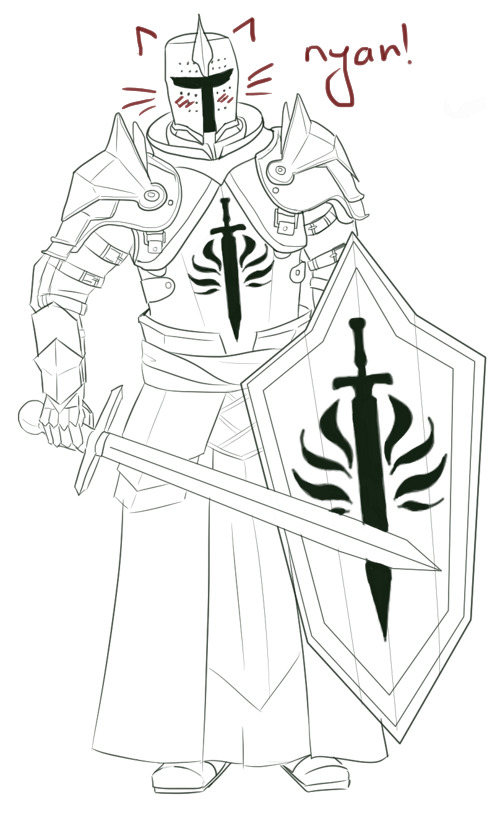
Use the simpleround brush with enabled pressure size but withoutpressure opacity. My two fav brushes for lineart are Ink brush 25 andInk-3G pen. The first one is better to imitate traditional brush and ink butthe second one is slightly easier to control.

Now, lookat the bottom left corner of the screen, where the tools options are – you’llsee the brush smoothing is set to Basic.
It is a default setting and it works alrightwith most of the short lines and small details (like Templar kun’s beltbuckles). Also good for eyes and other face features – IMO these little messylines make a face more interesting.
Let’schange the settings into Stabilizer.

Stabilizeris great for lineart because it „forgives” the small, unwanted hand movements thatoften make lines messy. You have a lot more control over the line and thissetting is great to draw things like hair and fabric. Templar kun’s helmet androbes were made with Stabilizer.
Butsometimes even the Stabilizer isn’t enough – we want a geometrical shape. Forthat we want to choose Bezier Curve Tool.

Simply byclicking, you show where the edges are and voila! You can also make large, softcurves with that tool (although it’s tricky – I personally prefer Stabilizer).I used Bezier Curve to draw most lines in the pauldrons and the shield.
Important – don’t overuse this tool! If too many of yourlines look perfectly straight it can make your drawing look stiff andunnatural.
- Beforedrawing lineart make your sketch twice as big as you’ve planned in on the finalpicture. It will make small mistakes almost invisible. Templar kun is already abackground character, so let’s use Aveline here.
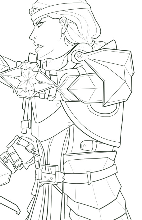
She looksquite ok.
But let’ssee her on 100% size and try not to cringe.
BUT! All thesesmall mistakes are here and I don’t have to care because human eye won’t catchit in a final drawing anyway! :D
- Play withline weight. Objects that are smooth, thin or far away will look good with thinlines, objects on the foreground can have bolder lines.
Templar kunis a background character so I didn’t bother with line weight. But KnightCaptain Cullen is much closer to the viewer and deserves a better treatment.That’s why I’ve tried to make his lines more interesting.

- Don’t work only onone layer when drawing more complicated elements of your lineart. I usuallydraw hair on a different layer than face and small details on different layerthan bigger shapes. It helps when you need to erase something – like parts ofthe face covered by hair – and don’t want to worry about your beautiful, smoothlines. When you are completely satisfied you can merge all the layers into one.
2. Practice
I know,everyone is sick of this advice but, well, it’s kinda true? Draw some lines,circles, get used to the pen pressure, experiment with different settings ofStabilizer to find the one that suits you best.
3. Time
Now, nomatter how good you are, clean lineart requires time and patience. You probablywant to make yourself a coffee and choose a 2 hour long song playlist inadvance.
- Don’tstart your lineart over a messy sketch. Sketching is fun because you usually usemany lines instead of one to convey a certain shape. In lineart, you have toconvey the same effect but with only one line. It’s often hard to find outwhich one would be the best and that’s why we often like our messy sketches alot more that inked final product.
So, let’slook at my first sketch of Templar kun.
I have apose, I know where the arms are, I know he has a sword and a shield but when itcame to details I was like „meh, it’s just a sketch”.
If I wastrying to put a lineart on this, even with a ton of references under my nose, Iwould be confused as hell. So – I need to draw another sketch. This timewithout a „meh”
Here it is.
The majorshapes of the armour are here, the lines are quite clear. We still don’t havethings like fabric prints or belt buckles but these minor details can be easilyadded.
Sometimesyou need only two sketches. Sometimes three or more. It will take time to drawthem but in the end it makes your lineart look more deliberate.
- Ctrl+Z isyour friend. Really. You’re going to treat almost all your lines with thosekeys. Several times. At best.
Remember,lines should be drawn in single, quick movements. The tricks I’ve mentionedearlier are useful, especially in simple, large shapes, but they won’t domiracles. You have to keep drawing this one damn perfect line until you’resatisfied.
I’vesketched this little heart and tried to make a lineart in 2 smooth movements.
First try.

Ugh.
Second try.

Fuck.
Third try.

Ok I guess.
Basically,smashing Ctrl+Z like a madman also takes time.
4. Slavicwitchcraft
Put warmslippers on your feet, get a bowl of pierogi and play the Witcher 3 OST – themagic will fall on you.
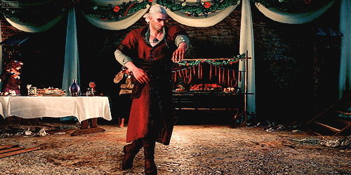
And…that’s all, really. I hope it helps :)
37 notes
·
View notes
Note
Do you have any art tips? Your art is amazing and gorgeous btw, but uhh i need some help lol
ya i do
i know people’s first advice is always use references and that’s my advice too, but i’m going to go further: use reference photos only. don’t reference other people’s art because you could be unintentionally duplicating their mistakes, or their personal style, and that can get messy. a good place to find animal photos to reference is arkive.org, especially if the animal is kind of obscure & it shows you related species that might look similar enough to also use as a reference.
once u can draw an animal/human/object good after referencing photos, throw the reference away and just do whatever. u now know the basics and the rules of constructing your Subject, so you can bend the rules and break them while maintaining the basic ability to keep your subject recognisable. this is how you ‘develop a style’ as the kids say. but a lot of people focus unnecessarily on STYLE and worry incessantly about being Recognisable and honestly chill, it’s fine. i recognise the style of every artist i follow even if that person bemoans not having one. and if you don’t have a set style, that’s cool too - it just means you’re versatile and commissioners like that. just draw what looks aesthetically pleasing to you, incorporate small inspirations from media you enjoy, etc (i would advise against copying someone wholesale. but if you like how they draw, for example, ears, then there’s nothing stopping you from drawing ears similarly and adding your own twist)
ok so those are the big two but i have some extra tips too
1. tangents. recognise what a tangent is and always avoid them in your linework. generally i don’t like hard rules but a tangent confuses your subject and reduces readability of an image. sometimes i have to move things around completely or change a pose just to avoid a tangent
2. expression. keep the expression of the character consistent throughout their whole body, not just their face. u can use the hands, fur, posture, etc. to help this. having a vibrant pose makes the art more interesting to look at. conversely, having a character standing around looking like a dead fish can help portray a strong Mood too
3. backgrounds i’m a hypocrite i’m not even going to go here but yeah try some out. who knows
4. lines & silhouette. ok here’s my big tip for lineart and sketching: don’t use multiple short thin lines when one big strong one will do.. especially if you’re describing the shape of a dynamic pose. when you use lots of little lines, you lose the energy of the form.
another BIG tip is don’t be afraid of straight lines. yes they do appear in nature and yes there are straight lines in the body. but more than that, they can be used to trick your eyes into following your image in a certain direction

look at this picture. where does your gaze relax and where does it go super fast?? the straight lines draw your gaze from the face, along the neck and back of the subject, then finally around in a spiral to the legs & face again, where it rests. if i had broken up the lines of the neck and back with tufts of fur, your gaze would get trapped briefly in the detail there and the whole image would be less ‘satisfying’. when i drew this picture i was not thinking ANY of that bullshit, i just knew instinctively that the nice simple straight lines looked nice. SO if you think you’ve drawn something that’s unusually nice to look at, consider ‘studying’ the image to see what made it successful like i did just there, then applying what you learned in future pieces
5. colours. literally my tip is to just do what looks nice. i don’t have a lot of Knowledge here lmao. but here’s a Big one for painting, which i don’t do much of for this blog big w/e - avoid white backgrounds when painting. you can have a white bg later, but while you paint and shade and add light sources and w/e your background should ideally be a light grey. not only is it easier on the eyes, but you won’t feel the need to ‘compete’ against the white for being brighter and higher contrast. i use light grey for all my bgs until the end stages where i just pick a bright colour that looks good and fill in the bg. you could even put a white bg in there at the end when you’re done painting
uhhh if you have any more specific questions lmk. or if you want me to draw a ??tutorial?? then we’ll see.
582 notes
·
View notes
Last Seen Blogs

justonlyhead
Untitled
just-another-thundermans-blog
Another Thundermans Blog
xxbimbobunnyxx
I’M A FUCKING STAR!
bellabuilds
𝕭𝖊𝖑𝖑𝖆 𝕭𝖚𝖎𝖑𝖉𝖘
vesselhoundz
i'm loving in america