#editing things
Text
would anyone be interested in being tagged for a zach edit?? I’m currently working on it and i should have it done by tomorrow
11 notes
·
View notes
Text
Editing mid-day update: 16/199
34 notes
·
View notes
Text
ig my step into editing ninjago was better than expected??

#ninjago#i do have 3k followers but the algorithm does what it wants with transition edits sometimes#especially bc i never edited ninjago before so i expected smth lower 🤔#editing things#ray rants
2 notes
·
View notes
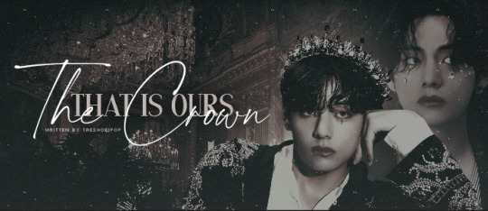
Note
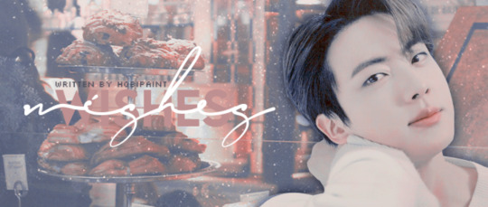
thank you for sharing the font ask, its been really helpful. Can i ask one last question about how to colour them and make them stand out? I'm struggling with that on ps🖤
absolutely! so i try to keep the text similar in the same color palette on a banner, and if i find that it's not standing out enough from the background, i use either an outer glow (for darker text) or a drop shadow (for lighter text), i've included a couple examples below!! along with being able to change the text color, you can also change the color of the outer glow and drop shadow too, they don't always have to be white or black, but that is typically what i use!
example 1
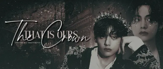
for this banner, you can see that i used a darker grey/beige for the 'that is ours' text which is similar to the skin tone of tae (after my color editing). the 'the crown' text is white with a drop shadow to make it stand out from the text behind it, otherwise, it would look like this:
example 2
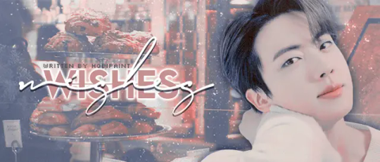
for this banner, i used colors that i found in the background for the text. there is an outer glow behind the farthest back 'wishes' and a drop shadow on the closest 'wishes', without either it would get lost in the busy background like so:
example 3
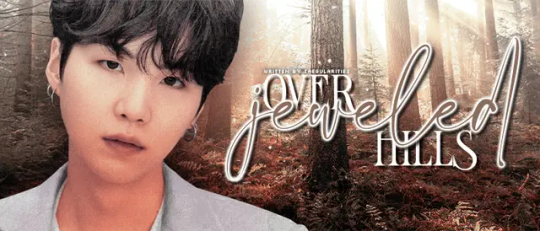
for this banner i used a drop shadow for the 'over' and 'hills' text, and then an outer glow for 'jeweled' and then also a drop shadow after adding the outer glow, this makes the white part of the glow stand out against the other white text, if i didn't do that it would look like this:
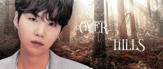
so basically, use drop shadows and outer glows and you'll get your titles to stand out more and be more noticeable :)
3 notes
·
View notes
Text
the funniest meltdown ive ever had was in college when i got so overstimulated that i could Not speak, including over text. one of my friends was trying to talk me through it but i was solely using emojis because they were easier than trying to come up with words so he started using primarily emojis as well just to make things feel balanced. this was not the Most effective strategy... until. he tried to ask me "you okay?" but the way he chose to do that was by sending "👉🏼👌🏼❓" and i was so shocked by suddenly being asked if i was dtf that i was like WHAT???? WHAT DID YOU JUST SAY TO ME?????????? and thus was verbal again
#yeehaw#1k#5k#10k#posts that got cursed. blasted. im making these tag updates after... 19 hours?#also i have been told it should say speech loss bc nonverbal specifically refers to the permanent state. did not know that!#unfortunately i fear it is so far past containment that even if i edited it now it would do very little. but noted for future reference#edit 2: nvm enough ppl have come to rb it from me directly that i changed the wording a bit. hopefully this makes sense#also. in case anyone is curious. though i doubt anyone who is commenting these things will check the original tags#1) my friend did not do this on purpose in any way. it was not intended to distract me or to hit on me. im a lesbian hes a gay man. cmon now#he felt very bad about it afterwards. i thought it was hilarious but it was very embarrassed and apologetic#2) “why didn't he use 🫵🏼?” didn't exist yet. “why didn't he use 🆗?” dunno! we'd been using a lot of hand emojis. 👌🏼 is an ok sign#like it makes sense. it was just a silly mixup. also No i did not invent 👉🏼👌🏼 as a gesture meaning sex. do you live under a rock#3) nonspeaking episodes are a recurring thing in my life and have been since i was born. this is not a quirky one-time thing#it is a pervasive issue that is very frustrating to both myself and the people i am trying to communicate with. in which trying to speak is#extremely distressing and causes very genuine anguish. this post is not me making light of it it's just a funny thing that happened once#it's no different than if i post about a funny thing that happened in conjunction w a physical disability. it's just me talking abt my life#i don't mind character tags tho. those can be entertaining. i don't know what any of you are talking about#Except the ppl who have said this is pego/ryu or wang/xian. those people i understand and respect#if you use it as a writing prompt that's fine but send it to me. i want to see it#aaaand i think that's it. everyday im tempted to turn off rbs on it. it hasn't even been a week
144K notes
·
View notes
Text

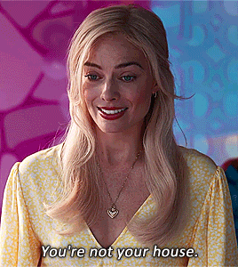
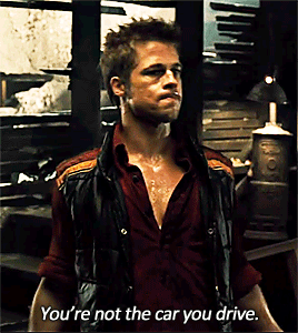
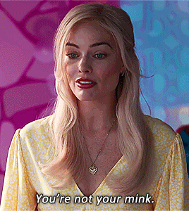
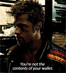
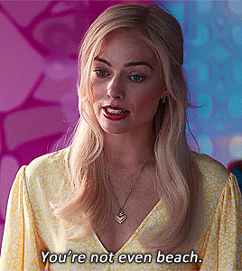

Maybe all the things you thought made you you aren’t really…you.
Barbie (2023) / Fight Club (1999)
#legit the first thing i thought of when i heard this speech#barbie#fight club#margot robbie#brad pitt#crossover#gifset#parallels#my gifs#my edits#colouring by daily-hundred#barbie 2023
104K notes
·
View notes
Text
love when ppl defend the aggressive monetization of the internet with "what, do you just expect it to be free and them not make a profit???" like. yeah that would be really nice actually i would love that:)! thanks for asking
#yes i want things to be free like ??? that is not a weird desire#'but but it costs money to keep up' ok and? how is that my problem#the government has plenty of murder dollars they could reallocate a few to make internet services universal if they wanted#also these companies were perfectly capable of supporting themselves before the internet got drowned with ads so ¯\_(ツ)_/¯#edit: muting notifs on this post bc new additions have kind of petered out#so no one feel bad about adding something someone else has said‚ it is not bothering me im just trying to keep my#notifs page cleanish lol#also since i saw some people are being redirected to read my tags: firstly hiiiiii this is a special secret message for you:3#secondly i have learned since making this that the reason they were able to support themselves previously was because#of investors bankrolling everything#and theyre now finally realizing that theyre never going to actually make a profit and arent as willing to invest#however thats just a minor correction and doesnt change my overall point#once again. so many murder dollars#so thats why im just adding it here in the tags rather than making an actual correction#anyways . love yall 💕#origibberish#bigger gibbers
31K notes
·
View notes
Text
So earlier in art class today, someone drew a characters hands in their pockets and mentioned that hands are really like the ultimate end boss of art, and most of us wholeheartedly agreed. So then, our teacher went ahead and free handed like a handful of hands on the board, earning a woah from a couple of students. So the one from earlier mentioned how it barely took the teacher ten seconds to do what I can’t do in three hours. And you know what he responded?
“It didn’t take me ten seconds, it took me forty years.”
And you know, that stuck with me somehow. Because yeah. Drawing a hand didn’t take him fourth years. But learning and practicing to draw a hand in ten seconds did. And I think there’s something to learn there but it’s so warm and my brain is fried so I can’t formulate the actual morale of the lesson.
#not whump#more real life ramblings let’s gooooo#EDIT genuinely why is THIS the post that took off#I have muted notifications for this thing mate I didn’t even double check my spelling#and you fuckers ran with it#good for you but also why
31K notes
·
View notes
Text
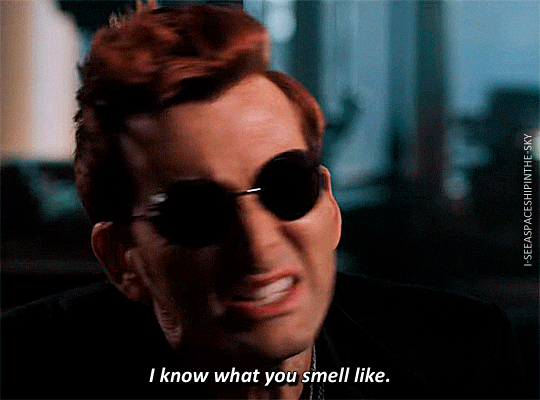
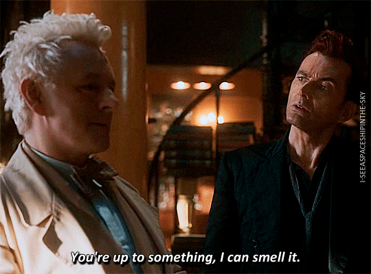

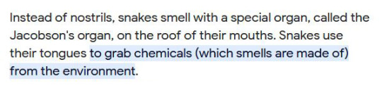
snakes smell with their tongue

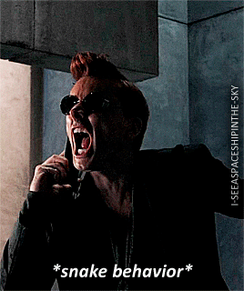
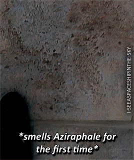
+ bonus: Stargazing Syndrome
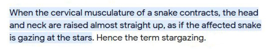

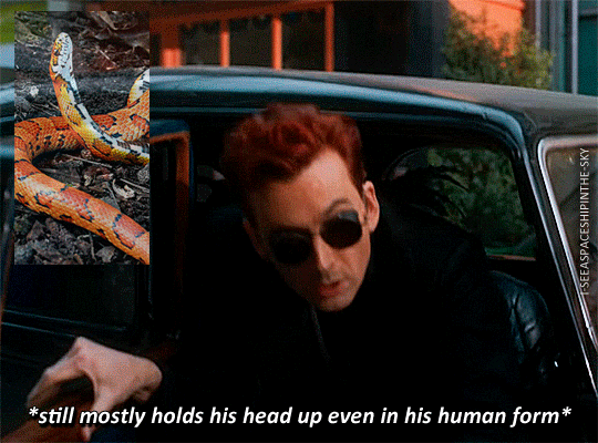
#the fact that crowley did the tongue thing around jimbriel... tried to figure out whether it was HIM or he was lying or not#headcanons be headcanoning and YES STARGAZING SYNDROME#good omens#goodomensedit#good omens edit#crowley#aziraphale#crowley x aziraphale#aziraphale x crowley#aziracrow#ineffable husbands#jimbriel#david tennant#michael sheen#jon hamm
22K notes
·
View notes
Text

you guys have no idea how excited i am for this edit 🥰
4 notes
·
View notes
Text
hate when a batman artist isn't committed to bruce's lame bat schtick... give that man a bat insignia on the bottom of his boots rn
#edit: check reblogs for the addition to this post 👍#listen. i can call it lame. hes a loser and its part of his character to be a loser. but he's also a committed cunt.#you think hes going to NOT have bat shoe imprints?? you think thats the one thing he's going to suddenly be subtle about?#commit to the campiness or get outta here!!!#ransom note
11K notes
·
View notes
Text
i have such a love for characters who descend into madness or villainy out of deep, deep empathy. characters who fundamentally cannot cope with the cruel realities they find themselves in and blow up about it in spectacular fashion. fallen angel type characters with tears of outrage in their eyes. characters who break before they bend, and break so badly they splatter blood all over their noble ideals. every variation on it gets me so good
#getou suguru#kaneki ken#abyss twin#i know there are others who im not thinking of rn#feel free to reblog with more examples#aphelion.txt#tropes#WAIT I REMEMBERED MORE#jaina proudmoore#dimitri alexandre blaiddyd#phosphophyllite#i just spent like half an hour trying to find this on tv tropes but it must be. Too specific of a thing i have in mind bc#I just kept finding similar and related but too broad categories#despair event horizon. fallen hero. well intentioned extremist. etc etc etc#like specifically i'm talking about when the character's EMPATHY is the CRUX of the problem. sosooo crunchyjuicytasty#edit:#also just know that i am reading every tag on this post#and enthusiastically scribbling down the names i dont recognizr#so i can check out their series later#edit 2 wow this post blew up 🫡 godspeed fellow villain likers#the amount of people tagging this as 'me lmao' is concerning to me#wwx#how did i fucking forget this was also yllz era wwx
20K notes
·
View notes
Note
hello! i've been looking through eerieedits tutorials about banners but i was wondering if you could give some advice on fonts and how to place them & make them look pleasing? 🎆🖤
of course! i'm more than happy to help!
i normally start with my background, photo + gif overlays, coloring files, etc. then move on to placing the member png - which i typically place on either side, i don't like to place them too close to the middle of the banner for this exact reason of font placement. (if you're not using a member png then it doesn't matter as much on where you decide to put the title of your fic.)
fonts are last bc i don't know how i'm going to set up the images yet, it's easier to me to do it this way. sometimes you'll still have to shift things around but the placement of everything is usually very close to how it originally was.
once you're ready for fonts, think of what types you want to use. i normally use a combination of a block font and a script font (i made a post a while ago about font pairings that may help you too).
if the title is long, i like to emphasize certain words or the 'main' word too that way it doesn't take up a whole lot of space on the banner. I also like the words to overlap, but that's a personal preference!
i also have certain 'rules' and best practices already in mind when it comes to creating banners that i learned when i got my degree in graphic design. some that come up most often are:
leave space along the edges of the banner, don't let the font touch the edge.
in some cases the title can 'bleed' onto the subject (member pngs) but it really depends on the placement and as long as the text doesn't go over anyone's face).
keep a good ratio for title vs subject - i like to set up my banners to be 700 pixels wide and 300 pixels high, and then i use a 70 / 30 ratio for text and subject - so 70% text and 30% subject (not including background).
if the background is super detailed, try not to place text over anything of importance.
and there are probably more but that's all that i can think of at the moment. of course, if you ever need anything explained or want advice for a banner you're working on - my dms are always open and i'm more than happy to help!
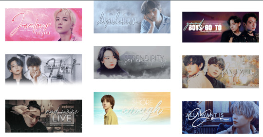
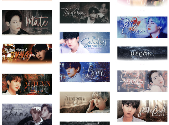
below are some examples from my portfolio that may be helpful to visualize what i mean too! feel free to use any of those titles + font placements as an example :) hope this helps and best of luck designing!!!
2 notes
·
View notes
Text
omfg ACTUALLY having fun with photoshop????? the colors are way too vibrant and shit but it's kinda fun?????
0 notes
Text
To illustrate this post by @mayahawkse I would like to visualize to you the difference:
A post in 2023:

A post in 2014:

A zoom out of the same post:
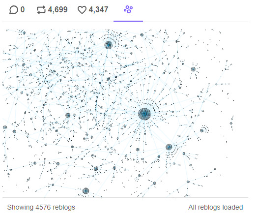
This is what a community looks like.
See how in 2023 almost all of the reblogs come from the OP, from their few hours/days in the tag search. Meanwhile in 2014 the % of reblogs from OP is insignificant, because most of the reblogs come from the reblogs within the fandom, within the micro-communities formed there. You didn't need to rely on tags, or search, or being featured. Because the community took care of you, made sure to pass the work between themselves and onto their blog and exposed their followers to it. It kept works alive for years.
It's not JUST the reblog/like ratio that causing this issue, it's the type of interaction people have. They're content with scrolling and liking the search engine, instead of actually having a reblogging relationship with other blogs in their community.
Anyways, if you want to see more content you like, the only true way to make it happen is to reblog it. Likes do not forward content in no way but making OP feel nice. Reblogs on the other hand make content eternal. They make it relevant, they make it exist outside of a fickle tumblr search that hardly works on the best of days.
If you want more of something, reblog it.
#i said i wont ever rant about this bc it's unseemly but HONESTLY.#you simply cannot complain about not having enough of A or B or C and then never reblog / interact with the content you love.#If you LOVE something you cannot just leave a like and silently wait for more to happen#I know countless of content creators that simply stopped doing art/writing fic/making edits#You need to understand that fandom content is made FOR the fandom FOR the engagement FOR the entertainment and fun it makes.#If a content creator does not have fun IN the fandom-- why would they spend the scares free time they have on making this content?#And we're not talking about things that you don't like-- no one expects you to reblog things you don't like.#However I think it's safe to say that when a post has more than 5k it's not some random shitpost with no value.#tumblr issues#tumblr#content creators#buns.txt#something something please don't starve your local clowns
30K notes
·
View notes
Text
me when the emotionally repressed character is revealed to have had something happen in their childhood that was completely out of their control but changed them in a way they can never come back from

#text!#did post this on twt but this belongs on the crying about characters website#and yeah this is about jarchivist and also marc spector in the mk show#idk it hit me yesterday that they were EIGHT AND NINE!!!!!!! when their respective thing happened and that ruined me#like it wasn't their fault but they think it is!!! GOD!!!!!!!!!!#holds those autistic bi men close to my chest#should've never smoked that shit* (*took my brother to a cave/read that book)#now im irrevocably changed* (*tied to the shittest god possible/destined to be the antichrist)#edit: this is getting a bit of traction so pls know that blorbo tagging and oc tagging is SOOO encouraged#thank you to the person who added the flaming text miles edgeworth thats so funny
85K notes
·
View notes
Last Seen Blogs
neverfaerie
~Fly With You~
fookoff
love is for the brave
areaxologist
SURRENDER
TO
CREATION
carolineisthekey
Caroline