#corporate design
Photo
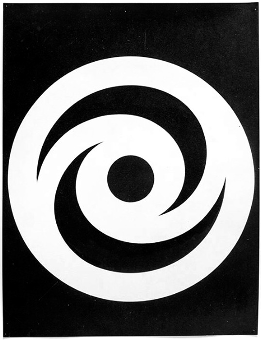
Hans Neuburg, [Hyspa], (draft), Hyspa, Bern, 1960 [Museum für Gestaltung Zürich / Grafiksammlung Donation Till Neuburg (Archiv Hans Neuburg)]
#graphic design#typography#visual identity#corporate identity#corporate design#logo#symbol#hans neuburg#hyspa#museum für gestaltung zürich#1960s
77 notes
·
View notes
Photo

Science and Style: A Symphony in Concrete and Glass the Gap
9 notes
·
View notes
Text


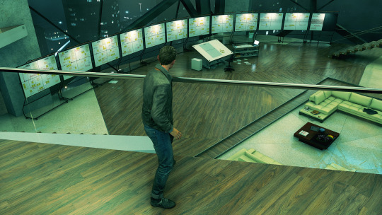

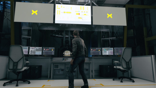
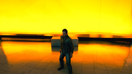

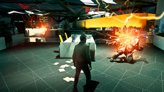
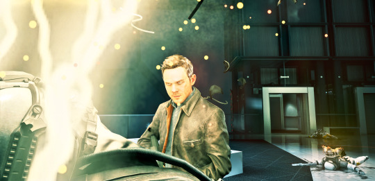

#virtual photography#quantum break#jack joyce#monarch#monarch solutions#glitch#time travel#corporate design
5 notes
·
View notes
Text

Otl Aicher (1922-1991) with his font "R O T I S"
4 notes
·
View notes
Note
If you could redesign the visual language of power armor, how would you do it? Or if you would not, why not?
I would not redesign the armour.
Although it is of course anatomically impossible to wear, as is proven again and again with amusing pictures. And although it is also otherwise impractical in any form. It would probably make more sense to put the Astartes in big rubber hamster balls than in this armour. So purely in terms of defence.
Not to mention the fact that there is no consensus among the authors as to how heavy these things are. I just read again (in a Black Library novel, so absolutely canonical) that a marine weighs 300 kilos including armour. That makes the armour "only" about 80 to 100 kilos. Which should be comfortable for an Astartes to move even without the support of the generator. Seems suspect to me! But GW would never allow canonical confusion! Never!
But - the armour is more than just iconic. They are a brand essence for Warhammer. They have an instantly recognisable silhouette and are immediately attributable to Space Marines in any situation. Their fictional design evolution over the millennia makes them the tree rings of the Warhammer universe and yet Chaos Space Marines have all the freedom with them.
Would I change details? Sure! After all, I do it all the time in my illustrations. Because I just like some things better in a different way. In general, "my" armour is lighter, less bulky. Because I like that. Nevertheless, I keep the basic silhouette.
But change them completely? No.
#Warhammer#Ask Post#Armour#Space Marines#Astartes#Corporate Design#Visual Concept#astartes Brand Identity
15 notes
·
View notes
Link
The fact that some of these are basic typefaces that anyone can access
#typeface#typefaces#typography#graphic design#brand identity#branding#brand design#corporate idenity#corporate design
6 notes
·
View notes
Text
blog post 3rd december 2022

The first stages of designing a logo for my corporate design course in uni.
The organisation that this is for is a non profit that is trying to fund a new organ for their church.
#studyblr#student#studyspo#study motivation#studygram#art#education#illustration#corporate design#logo design#logo#logo maker#communicationdesign#university#artists on tumblr
13 notes
·
View notes
Text

just a little western fun, y’all
#design#illustration#graphic design#illustrator#designer#graphic designer#logo design#vector#logo#adobe#western#vector drawing#drawing#artist#corporate design#graphics#texture#out west
4 notes
·
View notes
Photo
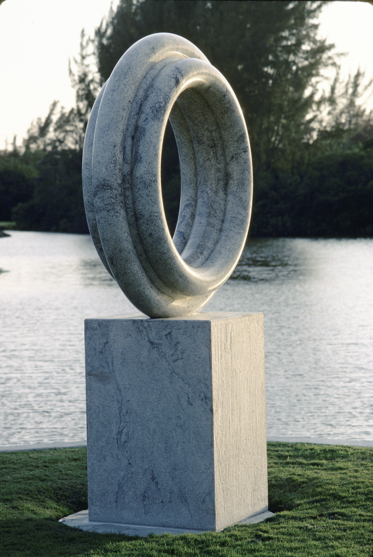

Boca Rio Country Club, Palm Beach County, Florida
#golf#golf course#florida#Landscape Architecture#Architecture#postmodernism#sculpture garden#landscape design#landscaping#picturesque#corporate landscape#corporate design#public art#private collection
13 notes
·
View notes
Photo


Performance marketing ads for TSE deadline
2 notes
·
View notes
Text
Designing for realtors/using realtor branding may actually be the worst.
0 notes
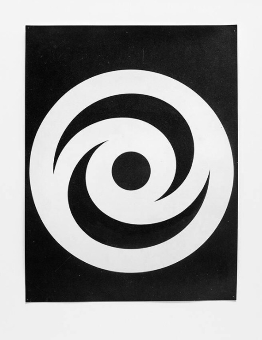
Photo


Hans Neuburg, [Hyspa], (draft), Hyspa, Bern, ca. 1959-1960 [Museum für Gestaltung Zürich / Grafiksammlung Donation Till Neuburg (Archiv Hans Neuburg)]
#graphic design#typography#visual identity#corporate identity#corporate design#logo#symbol#draft#notation#visual writing#hans neuburg#hyspa#museum für gestaltung zürich#1950s#1960s
66 notes
·
View notes
Text
Distinctive business cards with symmetrical designs
Distinctive business cards with symmetrical designs
AI/EPS, JPEG, PNG with transparent background available
Download:
Adobe Stock or iStock or Pond5 or Shutterstock
Dreamstime or DepositPhotos or VectorStock
Description of the Vector Images
The vector images in question are distinctive business cards, each featuring a unique color scheme and an intricate, symmetrical design. These designs bear a striking resemblance to snowflakes or…

View On WordPress
#address#business#business card#cards#company logo#contact#contact details#corporate design#design#email#information#mandalas#number#phone#snowflakes#symmetrical#visiting card
0 notes
Text
The issue with having some sort of corporate creative job is you’re not allowed to have creative block. Having zero ideas for a lame project is not an acceptable answer, but sometimes you have zero ideas.
#work ramblings#corporate design#is soul sucking#sometimes it makes me want to go back to retail where I don’t have to have ideas#but I hate customers so much
0 notes
Text

press release: schibborasso inc. proudly presents their new head of design;-)
4 notes
·
View notes
Text
See how corporate interior designs influence employee productivity and well-being. Discover the keys to a more efficient and satisfying workplace in this blog.
0 notes
Last Seen Blogs

saulgross01
Untitled

mlle-pscl-blog
Unbetitelt

sleepingbeauty85
Sleeping Beauty
tra1nchi
TRA1N

fox-on-the-moon
Tired and Queer