#corporate identity
Text

Corporate identities, logos, icons, emblems, symbols and insignia.
#logos#icons#emblems#corporate identity#symbols#illustration#design#graphic design#insignia#advertising#visual communication#visual metaphors#visual arts#graphic arts#logotypes#logo design#typography#identity
34 notes
·
View notes
Photo
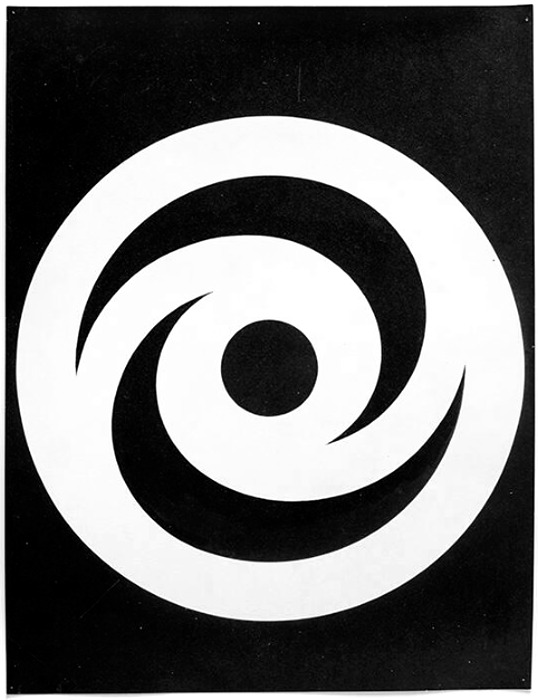
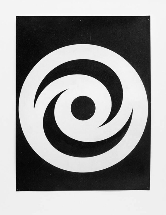
Hans Neuburg, [Hyspa], (draft), Hyspa, Bern, 1960 [Museum für Gestaltung Zürich / Grafiksammlung Donation Till Neuburg (Archiv Hans Neuburg)]
#graphic design#typography#visual identity#corporate identity#corporate design#logo#symbol#hans neuburg#hyspa#museum für gestaltung zürich#1960s
77 notes
·
View notes
Text
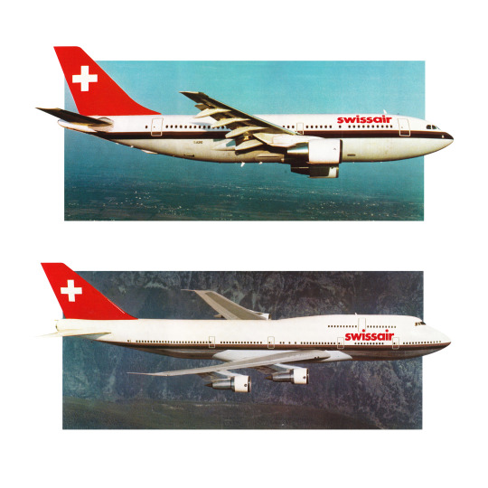


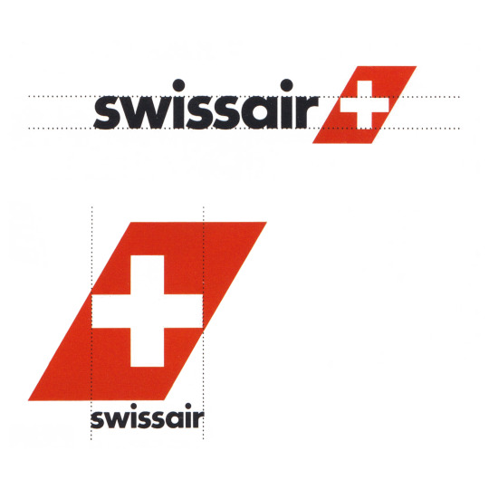
Swissair by Karl Gerstner, 1978
Discover more design history at:
www.logohistories.com
www.logo-archive.org
#logo design#logos#design inspiration#graphic design#print#design history#history#corporate identity#branding
41 notes
·
View notes
Photo

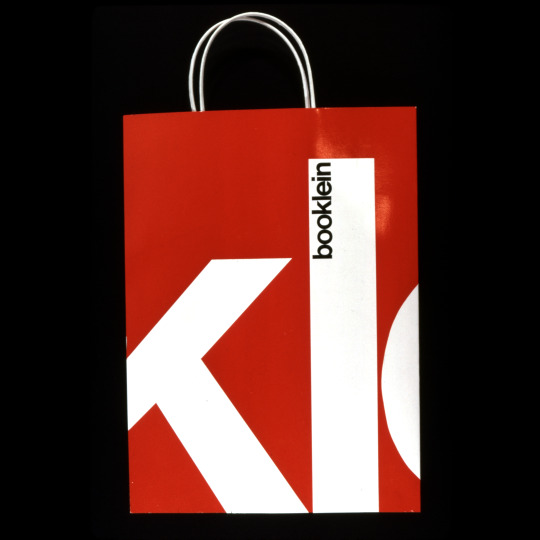

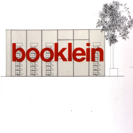

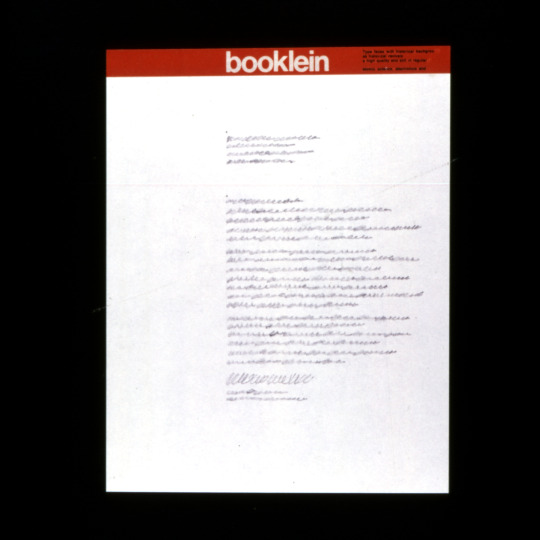
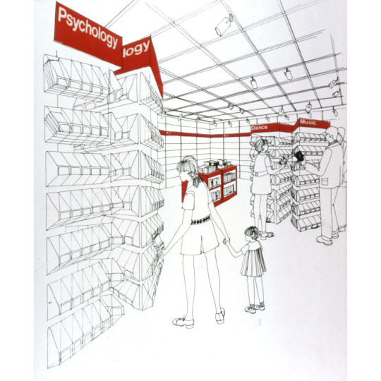

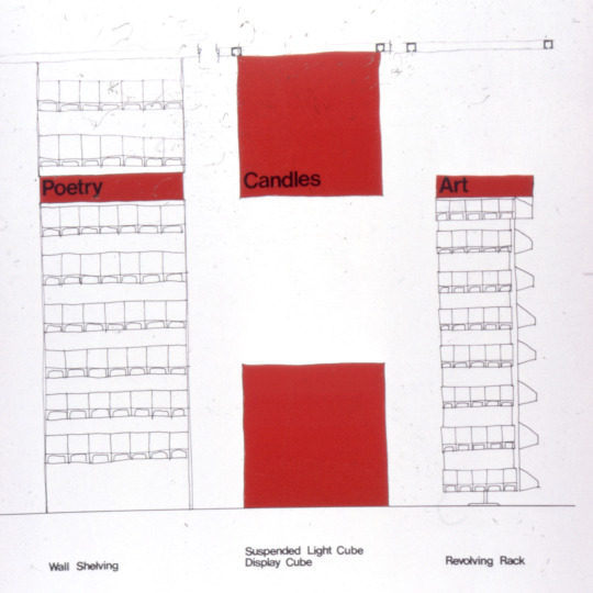
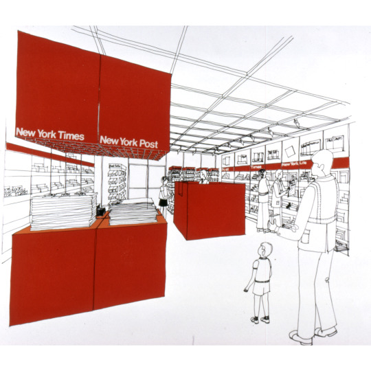
Found in the Archives!
Vintage slides for a proposed Booklein identity circa 1970s.
Booklein (pronounced book-line), named after the Klein News Co. president George Klein (an Ohio wholesale distributor of magazines, newspapers, and paperback books).
In the 1970s, Klein opened Booklein, a retail newsstand, which specialized in selling, you guessed it, magazines, newspapers and paperback books. They also sold tobacco, candy, maps, calendars and lottery tickets. On mallwalkers.net, the Internet Museum of Shopping and Retail History, PS Gitano wrote about Booklein and shared this slogan: “For all the magazines you’ve ever wanted to read…and then some.” https://mallwalkers.net/booklein
Fantastic line drawings with “Vignelli red” accents illustrate a proposed store made of grids on the ceiling, walls, and floor layout. The signage in Vignelli red with white Helvetica lettering. A band of red wraps around the walls labeling each subject section such as “Science,” “Psychology,” “Dance,” “Art,” and “Music.” Suspended light cubes on the celling light up counter top cubes below with signs which say “stationery,” “accessories,” “lamps,” and “wrapping.”
As with any graphic identity system, the proposal also included company van graphics, shopping bags, and stationery. Shopping bags featured the logotype enlarged to wrap around each side of the bag cropping it into fragments of text. One image shows a store front with the logotype stretching across the entire front of the building.
Do you know anything about this project or remember Booklein? We would love to hear from you! For now, we can enjoy these images and ponder many puzzles: who designed their logotype? Was this Vignelli proposal implemented? Where are the originals that appear in these slides? Who is the artist for these illustrations?
#vignelli#design archives#design history#graphic design#graphic identity#corporate identity#1970s#slides#vignelli red#newsstands#booklein#helvetica#puzzlesforposterity
35 notes
·
View notes
Text
#collage #typocollage #claudioventurini #collageartist #graphicdesign #studiodesign #perugia #umbria #umbriarte

#perugia#claudio venturini#graphic design#key business#design#umbria#packaging#grafica#claudio#logotype#art#agency#progettazione#graphic#italy#key#unitdesign#corporate#corporate identity#italian#collage art#collage
2 notes
·
View notes
Text
GIFs navideños! 🎄✨
✨😊¡Dale vida a tus mensajes con nuestros nuevos GIFs navideños! 🎄✨ Comparte la alegría festiva con estilo. 🎁🌟
En Kty&Pili brindamos soluciones en diseño gráfico y publicitario, ilustración y animación 2D. Revisa nuestro portafolio: 😊❤️ https://lnkd.in/eruudpNz
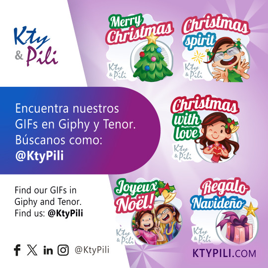
Revisa algunos proyectos realizados en: ktypili.com Síguenos en nuestras redes: Facebook | LinkedIn | Instagram | X:Twitter | TikTok | Pinterest | YouTube | Threads | Giphy | WordPress | Mastodon | Tumblr
Ubica nuestros datos de contacto en Linktr.ee de Kty&Pili
Nos vemos en un próximo artículo. 😊
#AMIGO SECRETO#AMIGOS#ANIMACIÓN#ANIMATION#BENDICIONES#BEST WISHES#BRAND DESIGN#BUSINESS#CHARACTER DESIGN#CHRISTMAS#COLORED PENCILS#COMIC#CORPORATE IDENTITY#COWORKERS#CREATIVE#DECEMBER#DESIGN#DICIEMBRE#DICIEMBRE LLEGÓ#DIGITAL ARTIST#DIGITAL ILLUSTRATION#DISEÑO#DRAWING#FAMILIA#FAMILY#FELICES FIESTAS#FELIZ NAVIDAD#FRIENDS#GRAPHIC#HAPPY HOLIDAYS
2 notes
·
View notes
Text


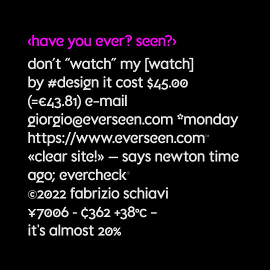


Everseen is an Irish company that developes visual AI for business.
I’ve been contacted by Ideosuite in 2022 to improve their custom font used to create logotypes and headlines.
See a selection of all FSD custom brand fonts.
#fabrizio schiavi#fonts in use#custom fonts#brand development#typography#corporate identity#branding#typedesign
4 notes
·
View notes
Text

Me, myself & I
Hey, let's meet each other. I am a graphic designer who specialised in developing corporate identity for brands. In fact, i appreciate my work. I finally found smth that brings me happiness and pleasure.
So i'd like to share my works with you. It would be great if you give me feedback and comments. Also, i'm open to make unique eye-catching design for your brands :)
#packaging#graphic design#corporate identity#logo#typography#branding#brand identity#aestheitcs#inspo
4 notes
·
View notes
Text

Part 2: Visual Identity and Branding for Toque Chef Clemens Nachbaur To bring Clemens Nachbaur’s culinary approach and philosophy across, we designed a simple and timeless visual identity. The logo works perfectly in both, the analog and digital world. This first post is showing the logo icon consisting of the initials of his first and last name. Visit our website to find out more about this project!
#logo#typography#graphic design#berlin#olex#logo design#corporate identity#branding#design#new york#logotype#logodesigner#logomark#graphicdesign#designinspiration#brand identity#brandidentity#chef#chefs#culinary#gastronomy
8 notes
·
View notes
Text
Vertical Business Card Template v02
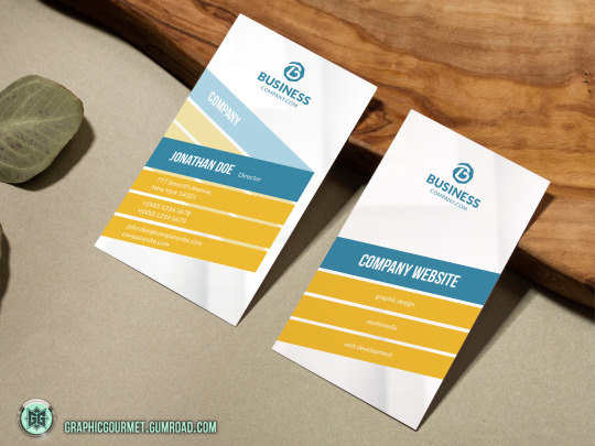
A highly versatile business card template that is designed for both corporate business and personal usage.
Specification :
- Standard Size Business Cards | 3.5" x 2.0"
- High resolution 300 DPI, CMYK color, Print Ready.
- Editable PSD format (Photoshop document)
- Layered and well organized. Easy to change text (bio) and colors.
- Fonts included.
Download Here
#business card#stationery#branding#personal branding#brand identity#corporate identity#visual identity
2 notes
·
View notes
Audio
dreams, emily in love feat. bisexual cyborg (2007).
so in love with the things that you do
#emily in love#australia#corpid#corporate identity#netlabel#2007#indie pop#electropop#indietronica#twee pop#bisexual cyborg#sing a song#you break my heart you bought it
4 notes
·
View notes
Text

Corporate identities, logos, icons, emblems, symbols and insignia.
#logos#icons#emblems#corporate identity#symbols#illustration#design#graphic design#insignia#advertising#visual communication#visual metaphors#visual arts#graphic arts#logotypes#logo design#typography#identity
16 notes
·
View notes
Photo


Hans Neuburg, [Hyspa], (draft), Hyspa, Bern, ca. 1959-1960 [Museum für Gestaltung Zürich / Grafiksammlung Donation Till Neuburg (Archiv Hans Neuburg)]
#graphic design#typography#visual identity#corporate identity#corporate design#logo#symbol#draft#notation#visual writing#hans neuburg#hyspa#museum für gestaltung zürich#1950s#1960s
66 notes
·
View notes
Text


www.logohistories.com
Amtrak by Lippincott & Margulies, 1971, USA, Rail.⠀
Discover more design history at:
www.logohistories.com
www.logo-archive.org
#logo design#logos#design inspiration#graphic design#print#design history#history#corporate identity#branding
3 notes
·
View notes
Photo

Open Houses are back this week!
Theme: TypographyWed 2/22/2023-Thu 2/23/2023 10am-4pm each day. Free and open to all!
On February 22, 1991, “A Few Basic Typefaces” exhibition opened at the School of Visual Arts (SVA) in NYC. Massimo Vignelli was awarded their annual Master Series award which included an exhibition. He chose to highlight work in only a few typefaces: Bodoni, Century, Garamond and Helvetica. This week marks the 32nd anniversary of this exhibition.
SVA’s Masters Series began in 1988 as “an annual award exhibition to honor great visual communicators—designers, illustrators, art directors and photographers—of our time.” Massimo Vignelli was the 3rd person to receive this honor.
“It was a polemical exhibition to protest the inflation of meaningless typefaces polluting our world.“ Vignelli: From A to Z, p. 187
For our Open Houses this week, we will be revisiting this exhibition and invite you to think about designing type and designing with type. You will be able to view many of the artifacts from this 1991 exhibition plus some designs done after 1991 that includes these 5 typefaces.
From the exhibition records, we found that the exhibition plan originally included designs using Times New Roman as well. You will be able to see these works too. Along with images of the original exhibition, the original exhibition checklist, and other documentation. Plus numerous OTHER typefaces, many custom, that appear in the Vignellis’ work. Futura. Optima. Didi. Bloomingtype. Our Bodoni. Our Futura.
Plus numerous custom alphabets for architectural graphics, logotypes, etc. And we’ll have examples of designs using type that might seem very “un-Vignelli.”
More details about Open Houses can be found on our website: https://www.rit.edu/vignellicenter/events
#vignelli#design archives#design history#Typography#1990s#bodoni#century#garamond#helvetica#times new roman#graphic design#corporate identity#Packaging#exhibition design#architectural graphics#open houses#archives for all
21 notes
·
View notes
Text
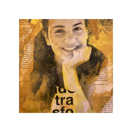
Claudio Venturini
Collage Artist & Graphic Designer
Perugia - Italy
#perugia#claudio venturini#key business#graphic design#umbria#grafica#design#art#packaging#claudio#logotype#agency#progettazione#graphic#italy#key#unitdesign#corporate#corporate identity#italian#collage art#collage
2 notes
·
View notes