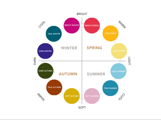
#colour analysis
Text
Fallout in ✨Colour✨
{Fallout 3}

{Fallout New Vegas}

{Fallout 4}

{Fallout 76}
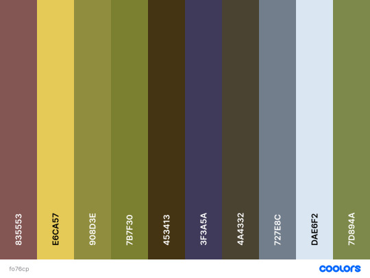
#fallout#fallout 3#fallout new vegas#fo3#fonv#fo4#fallout nv#fallout 4#fallout 76#fo76#fallout aesthetic#fallout edit#fallout 4 aesthetic#fallout 76 aesthetic#fallout art#gaming art#colour palette#colour pallet challenge#colour aesthetic#colour analysis#piqtpinned
898 notes
·
View notes
Text
#colour analysis#goblincore#goblin culture#goblin vibes#goblin community#goblin things#cryptidcore#eldritchcore#local cryptid#witchy shit
141 notes
·
View notes
Text
This is probably beyond niche BUT I want to talk about the colour palette that it has been said they’re using for Kate in season 3 of Bridgerton.
Now I’ve seen some people unhappy with the description of the colours she wears as inspired by “spices”. I’m gonna leave that to the desi women to speak to.
But purely aesthetically and from a story point of view these earthy tones are not the best colours on Simone Ashley. Like objectively speaking. She’s obviously incredibly beautiful but as a story arch it’s clear they’re trying to emphasise her beauty. So why? In what world are costume designers ignoring all a person’s best colours?! It drives me nuts. Especially since colour analysis is a LITERAL PLOT POINT across two Bridgerton books! Cool jewel tones are pure magic on Simone Ashley so wtf aren’t we getting them?!
#bridgerton#kanthony#kathani bridgerton#kate sharma#bridgerton season 2#kate sheffield#kathani sharma#anthony x kate#kate bridgerton#simone ashley#viscountess bridgerton#colour analysis#color analysis#costume#costume drama
38 notes
·
View notes
Text
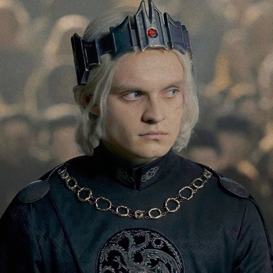
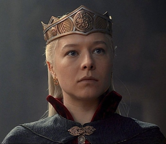
Aegon and Gold
Side note : this is a very mixed up “analysis” that sort of combines both show elements as well as some popular fan theories/assumptions since we barely had time with the character (may I remind you all, to possible infuriation, that we never saw Sunfyre up close). So yeah <3


So I do think it is said quite a lot that Aegon would wear gold to honour Sunfyre and what not and I do believe he would happily do that, it’s just he can’t.
Okay so first let’s just get straight what gold can mean for him.
Yes of course, it’s the colour of his most beloved dragon. They aren’t strongest dragon - rider bond in all of Targaryen history for nothing. Sunfyre was able to kill dragons much larger than him, defended Aegon in crisis and would not go down without a fight even when he was on the brink of death. Looking at the larger picture I think Sunfyre represents a sort of freedom for Aegon. To fly anywhere he’d like, on his own terms, never to be found and be freed from these shackles of duty that he (initially) does not want. Sunfyre also symbolises him finally having bonded with someone. His father acted as though he didn’t exist ; his mother was too young and pressurised to shape him into a worthy heir (and taking whatever means it takes to do so). His dragon is his very first true bond, him claiming the dragon alone is proof enough that he is a worthy Targaryen (in his head)
Other than Sunfyre however, gold is also the colour of the first dress we see (a grown up) Helaena in. His lady wife and younger sister. Now going off the show alone, sadly we do not have any scenes of them together but in context and background clues alone (Helaena laughing at his taunts at Jace, Aegon getting jealous when she accepts Jace’s offer, Helaena looking at him with pity/worry when he is crowned - knowing what this means for both of them and so on) I do not think that their marriage is a utter disaster (as some fans suggest). Gold is the first impression of his wife, the mother of their three children. Who do you think he had the courage to vent his heart to when he got too drunk in their shared rooms? Who do you think he constantly sends gifts to, as an apology for not being around? Who do you think Alicent brings up first when the Dyana situation happens? (“think of the shame on your wife..on me”). I do believe that Helaena is some source of happiness for him. It may have taken years to develop a strong bond ,as he did with his dragon, with her but they are there. After three kids and six kingdoms to manage, I think it is fair to assume that they get along fairly well.
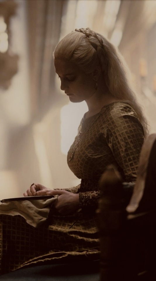
Now obviously there is a lot more to Helaena and Aegon’s marriage than “getting along fairly well” but for the convenience of the post and the topic at hand, I have had to make it somewhat more concise.
So Gold is definitely a positive colour for him. But one thing that is not gold is the very symbol of his title, claim and rule. His crown.
The crown of the conqueror is black with the red ruby in the middle. I’ve also heard some people call it a dark silver (which would be the direct contrast to gold). So while gold represents his freedom and happiness, silver (the direct contrast) or black (the title colour representing the opposing faction) represent the cage of duty he has to put himself in for his and his family’s safety. During the coronation itself, he does not wear dark green (as he did earlier) or gold (even though he may prefer it) but rather black to represent this in a way.
In comparison, the crown worn by Rhaenyra (the key figure of team black) is gold. And I think arguably Rhaenyra (even as a Royal woman in Westerosi society) has more freedom than Aegon.
Also the gold crown of The Old King was also worn by Viserys. I do not think that in Aegon’s perspective, his father was a source of happiness in any way. But what could have been, was his crown. Gold and the symbol of King Jaehaerys I, someone who had a long, relatively peaceful reign over Westeros. Since the idea that he was to inherit the throne was put in his head so early, he must have thought about it quite a bit. He did not want it of course but if it had to be done then perhaps, he would have desired a reign like the Old King’s. (Not to mention, he and Helaena named their first borns after Jaehaerys.)
A few comparisons to my Alicent “analysis” :
So similar to Alicent leaving her childhood memories with Rhaenyra behind when she became queen (abandoning the colour blue), Aegon also leaves his freedom behind when he becomes king (not wearing gold or green but black)
Both her eldest children and now king and queen (Aegon and Helaena) are following her patterns and reaching their breaking points and have had a shift in their wardrobe to symbolise as such.
#aegon ii targaryen#house of the dragon#analysis#colour analysis#helaena x aegon ii#team green#helaegon#alicent hightower#sunfyre
66 notes
·
View notes
Text
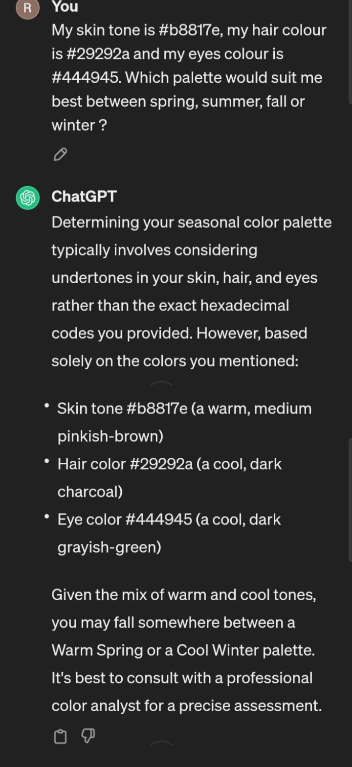
Guess who received a colour palette based on a colour analyses?
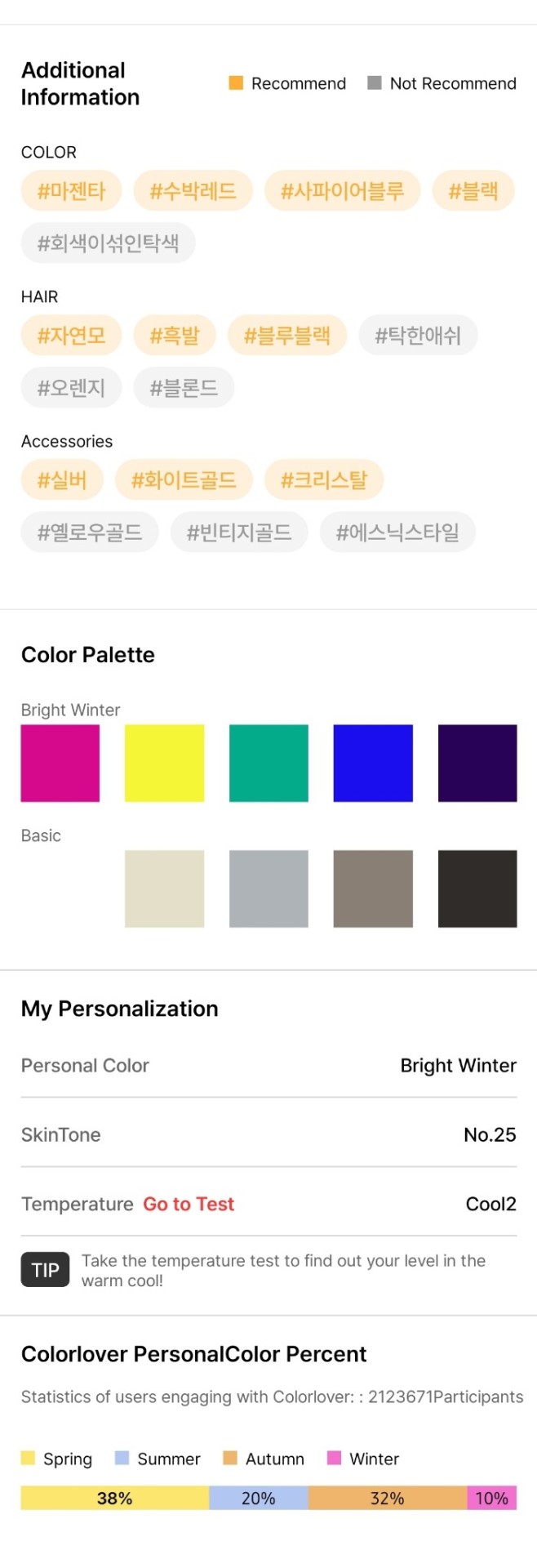
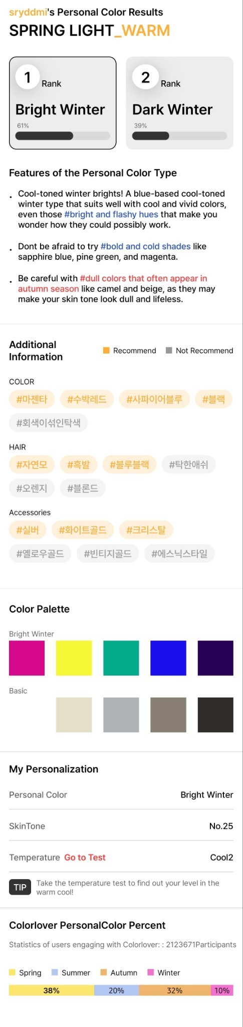
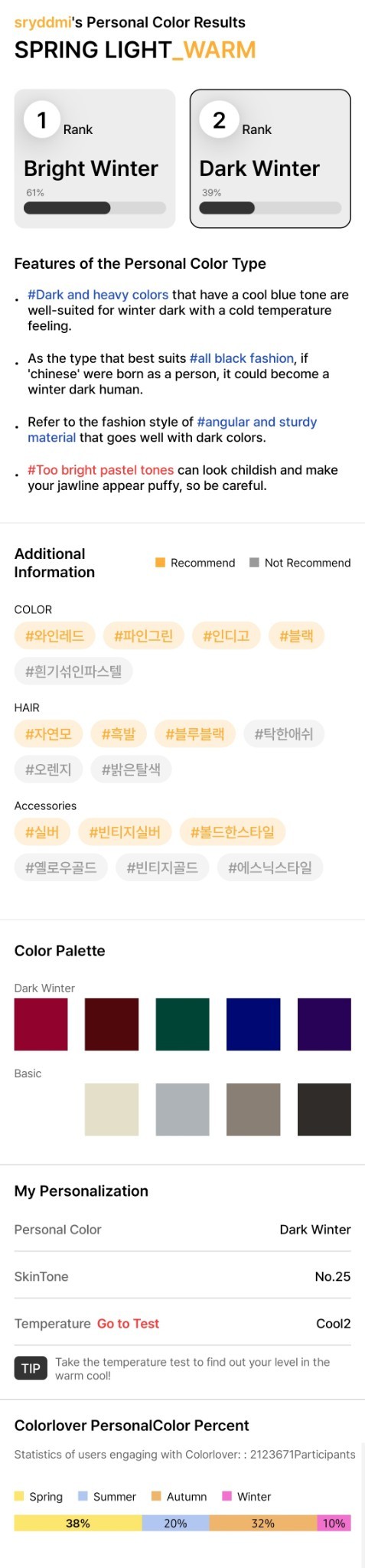
You can do the same with Chat GPT just just have to take a picture, drop on your skin colour, eye colour, and hair colour (you'll need hex colour code basically) and ask Chat GPT what goes best with it.
[this was a free app too named: 컬러버]
#desiblr#desi tumblr#desi#desi tag#desi shit posting#desi girl#being desi#desi humor#desi stuff#colour#colour analysis#colour theory
11 notes
·
View notes
Text
Thinking about my cover image here:

the shot compiled by @i-got-the-feels (thank you very much for this lovely shot of Alan). When I was exploring with filters, I found this yellow highlighted filter and just thought about how well it brings out the alternative emotions in this particular shot (which was originally blue, as Blue = Alan according to @respectthepetty - I absolutely adore their analysis!)
So, I think the alternative version of this shot with the yellow highlights would represent how Alan was feeling at the moment, how he was feeling sad, depressive, and heartbroken at the prospect of his relationship ending (and yellow represents these feelings too - pls correct me if I'm wrong, I'm new to the whole colours world, wholly inspired by respectthepetty's colour analyses)
This thought just came to me while I was staring at this image so here you go :)
15 notes
·
View notes
Text
I so wanna get a professional colour analysis at some point!!
#this is about mia maples video#she compared her worst & best colours#and the difference was soooo shocking to me#ive tried to figure it out myself at the beginning of this year#and im assuming im a deep autumn#im pretty sure im right too#but i would really like some confirmation at some point#color analysis#colour analysis
7 notes
·
View notes
Text
Valentine's Day Makeup Tutorial 2024 video now on YouTube! 😊🥰💙❤️
https://youtube.com/shorts/40NyxUQQ_z0?feature=share
#lgbtq#young#gay#baby face#skincare#colour analysis#color#style#style analysis#makeup#makeup tutorial#valentines day
4 notes
·
View notes
Text
Just watching too much msp so let's talk about ep 4. I think ep 4 is sometimes overlooked because of how much stronger ep 5 and 6 are in terms of the emotions showcased. But what really caught my eye was the use of colours in ep 4 so leggo.

Gotta appreciate how much colour is brought into the Student Council room with just a touch of Gun's magic. The stark white to this beautiful mess of colours. There's a lot of pink, orange and purple hues in the scene and the diffused light makes everything appear soft. Gives off very romantic vibes. Really sets the tone for how Tinn and Gun's relationship is slowly evolving. From enemies to friends, acquaintances to somewhat friends and potentially more.
I want to thank whoever decided to get that huge neon sign of cafe in pink because its perfect. Just the right colour for the ambience. It's definitely the centre of the display of colours. Also interesting how they show us the Student Council room through a window. We can see how the outside remains the same after the decor but the inside has changed so much. Kind of like how Gun entered Tinn's life and changed his life in monochrome to a life full of colour. All the emotions he could experience just because Gun decided to sing that day in the cafe. Love these hurt comfort vibes.


All the flirting happens while they're covered in pink hues. It's almost like they're blushing or something. And there's also Tiw rolling his eyes while he's covered in shades of orange. Tinn going wide eyed when Gun kind of flirts with him and as they get closer, all the other colours go out of focus, just leaving the pinks. Interesting how when Tinn and Gun are being romantic, you can only see the pinks but when where is warm interaction we see a lot of orange instead.

Back to the warmth of the yellow and orange shades as Tinn and Gun get some distance between them and get to their tasks. Even without being flirty, we can feel the intimacy building as the colours shift.
Then we enter a new scene with an almost sage green background. The colours are muted and not as vibrant, almost grounded as Tinn and Gun's converse about their experiences and fears. A lot more light and shadows present in the scene. There's more contrast compared to the previous scenes in the Student Council room. Tinn and Gun have simple but meaningful conversations which are crucial in understanding and connecting with people. I really enjoy how they develop Tinn and Gun's relationship and it's interesting to see much emotional connections form, with such dull colours as the backdrop. Love doesn't have to be bright and scorching.

Later in the episode, as Tinn asks Gun to go back to the Music Club, the pinks fade and the orange hues are more pronounced. And when Tinn worries about Gun, we see just a hint of pink shine on him.
When Gun returns to the Music Club, we have the same muted ochre and green in the background. But as he brings back Sound to the group and they perform together, the pink and purple lights are brought back. Really highlights how love isn't just romantic and there are so many different types of love. Even love between friends is such an important form of love.
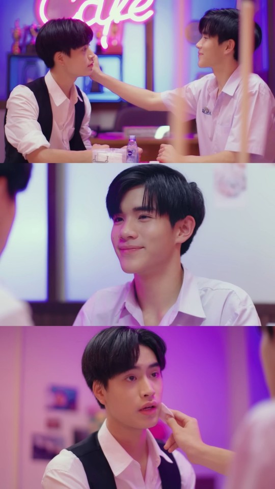
After the performance, Gun comes back to the Student Council Room and we get to see my fav neon sign. As Tinn and Gun sit facing each other, the colours are a lot darker on Tinn's side than Gun. Tinn looks like he is drowning in the pink hues whereas Gun is slowly getting dyed by the pink. To me, it symbolises how Tinn is sure of his feelings for Gun (took him only 2 years of crushing on Gun to get here) and Gun's feelings aren't as strong but he's somewhere along the way.
And ofc THE scene. Funny how Gun pulls Tinn for a with the neon sign as the backdrop and now they're both pink. A lot of glances and Tinn seeks confirmation from Gun before entangling their pinkies together. And they're finely holding onto each other. Definitely kids in love. And I'm definitely not thinking about how Gun's attention is constantly on Tinn's lips. Nope, not me.

So, basically, a lot of pinks which are always pleasant to look at. It's kind of cute considering what stage they were at in their relationship at that time in the show.
A lot of assumptions and inferences by me so nothing to be taken too seriously. And a lot of overthinking, again by me. Funny I wrote an entire post appreciating the use of the pink considering how long I hated that colour. The things msp makes me do. Anyway, gotta go watch msp again.
#my school president#tinn#gun#tinn gun#gun tinn#tinn x gun#gemini norawit#fourth nattawat#gemini fourth#overanalysing msp#msp#why do i love this show so much#need to go watch msp again#listening to msp ost on repeat#our skyy msp when#colour analysis#pink
20 notes
·
View notes
Note
Given your clothing analysis, would you say that green is more Cassandra’s color than Rapunzel’s?
Yes, absolutely! I don't know if you saw the final update I added to my post, but imo green for Cassandra represents innocence and new beginnings - it's the colour she's seen wearing in flashbacks to when she was a child, suggesting that when she wears it in the final scenes of Plus Est En Vous, it's a happy return to square one. She's reconciled with Rapunzel, forgiven herself, and reunited with her father - and it's the same colour she was wearing when Gothel abandoned her without a second thought, but the Captain chose to protect her and love her, and I can't imagine it would be lost on Cassandra that even after all she's done to push him away, he still loves her without question and wants her in his life.
(Green for Rapunzel, on the other hand, I think more likely represents doubt and uncertainty, since we only see her wear it on Terapi Island, where she argues with first Pascal (about his lie to the Lorbs), then Eugene (about how Hookfoot should conduct himself on his date with Serafina), then everyone (about the Idol). It's somewhat of a low point for her in Season 2 - and we see green on Rapunzel again when she uses the Hurt Incantation on the Great Tree, which, while not a moment of direct uncertainty, does mark the beginning of her friendship with Cassandra slowly truly unravelling.)
#colour analysis#nerdasaurus1200#ask coco#tangled analysis#rapunzel's tangled adventure#tangled the series#cassandra tangled#rapunzel tangled
15 notes
·
View notes
Text
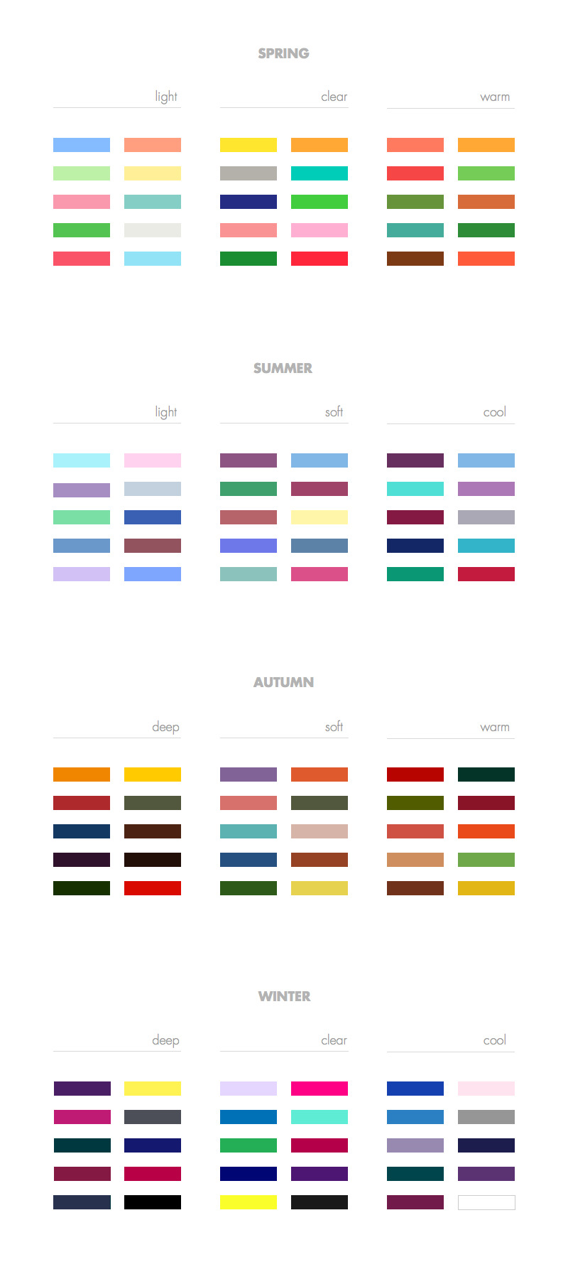
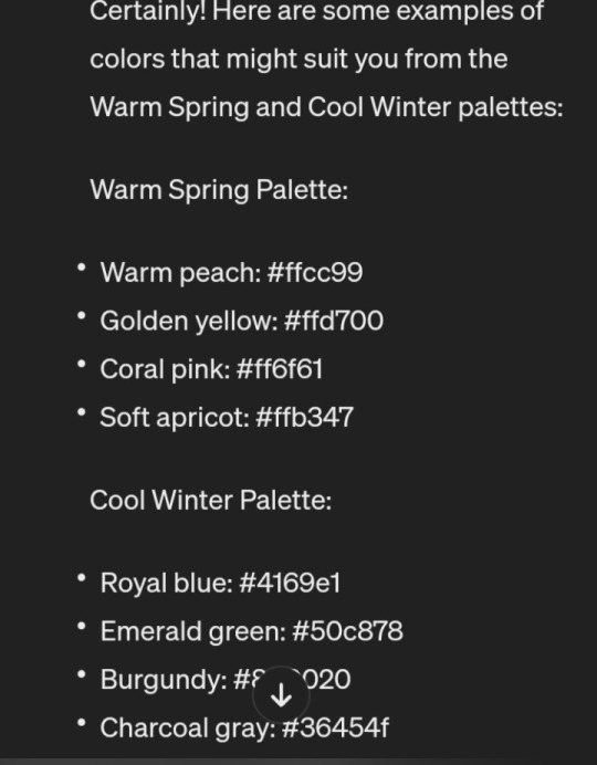
Since colour analysising is trending, let's show people how to get a free colour analysis with Chatgpt
1) upload a pic of yourself on a website that will give you the colour code of your skin tone, hair and eyes.
2) use these codes to help chat gpt determine which palette between spring, summer, fall or winter would suit you best.
3) if you're like me and aren't sure what colours correspond to these palettes you can ask for examples
You now have suggested colours that supposedly fit your skin tone, hair and eyes
#chatgpt#life hacks#colour analysis#fashion#trending#fashion trends#fashion tips#no need to pay 100s$ to know you'll look good in emerald green
2 notes
·
View notes
Text
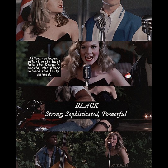
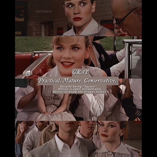
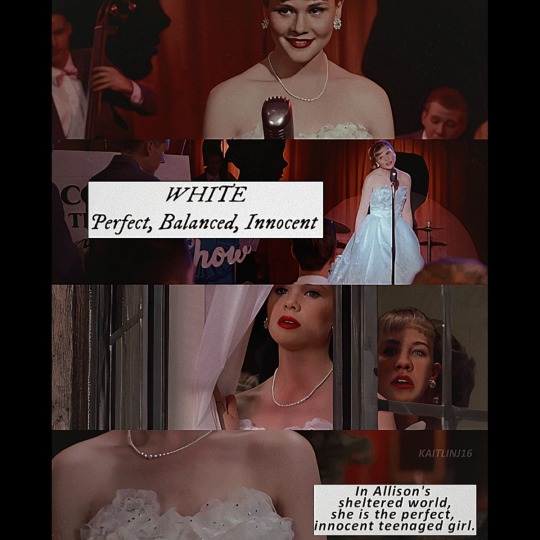
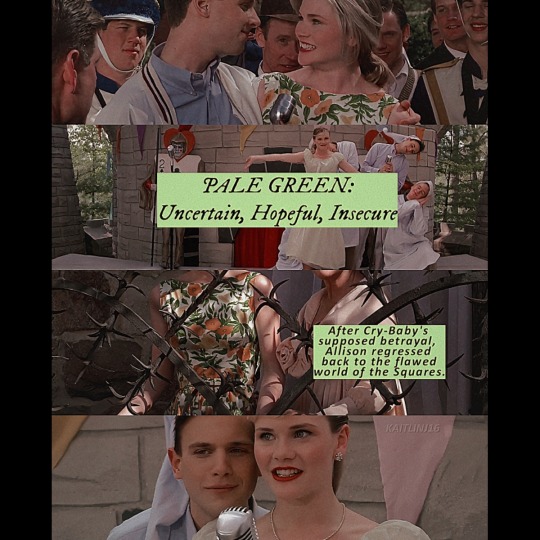
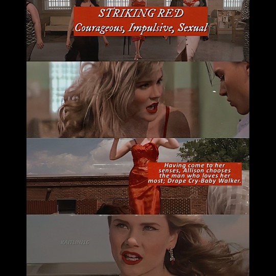
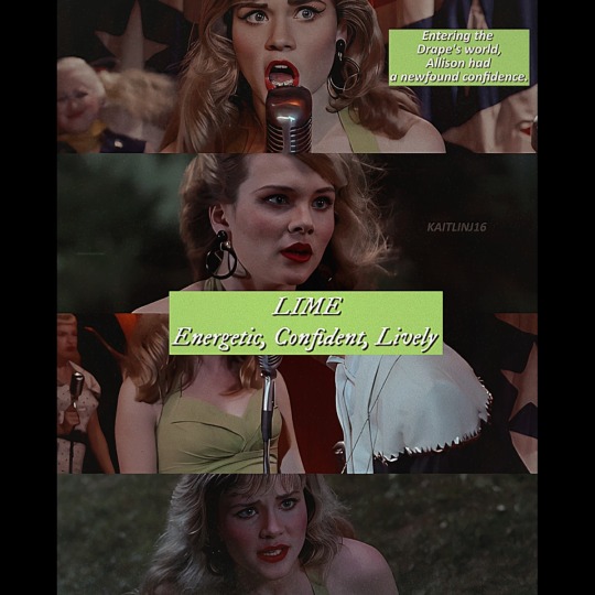


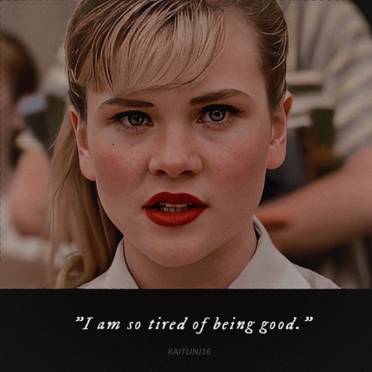
Allison's Colour Palette
Cry-Baby (1990)
♡ Pretty, fun and popular Square Allison desires the Drape lifestyle and gang leader Wade "Cry-Baby" Walker; in this 1990's parody of Grease, among other 50's cliches, Allison is a good girl who falls in love with a bad boy.
♡ Through Allison's wardrobe, viewers gets a snapshot into the world of Squares versus Drapes; as a Square, she wears dresses with full skirts in rather bland colors. In the world of Drapes, Allison truly shines; with neon colors bursting with life, she looks more comfortable.
Costume Designer: Van Smith
🤍💚❤🖤
5 notes
·
View notes
Text
Name Palettes
This is from the chain (boi it got LONG). And I have some thoughts and colour theory notes.
Personal Blog

Green-focused, with accents of bright blue. Other colours consist of brown and grey.
Green; peace, tranquillity, new beginnings, hope, optimism. Nature. Responsibility, hope, forgiveness, wealth. The shades of green here are softer, and 4 (top 2 left, last of the 2nd row, and 1st of 3rd row, are some of my favourite shades)
Brown; warmth, security, earth. Dependable. There's a more rich brown, and then a softer brown; I like both.
Blue; open space, freedom, tranquility, intuition, imagination, inspiration. When compared to the other colours it comes as a shock of bright colour, providing some contrast.
Grey; neutrality, balance. I also associate it with wisdom, modesty, and not coming on too strong - taking it slow.
Vibe; a cloudy day by a lake, sitting on a moss-covered log with a forest behind you.
Writing Blog
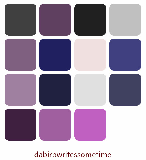
Heavy purple focus, literally the only other colour is pink, and grey is a shade (see above for grey analysis).
Dark purple; wealth, royalty, wisdom, spirituality. (I classify the dark blue-violet in this category).
Light purple; romantic, sensitive, light-hearted.
Pink; love, kindness, nurturing, nostalgic, playful.
Vibe; the sky just before the sun is finally down, pink clouds touching the horizon.
Full Name
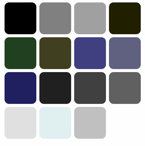
Shade heavy. No heavily saturated colours save for the pine green and navy blue.
Not going to list all of the colour meanings again, but something to note is the 3 more pastel colours interrupting the more dark colours, which I find interesting. Not my personal favourite, but it is forgiven for the pine green.
Vibe; hiking a mountain with dark clouds overhead, they part for a moment revealing the blue sky.
Firstname
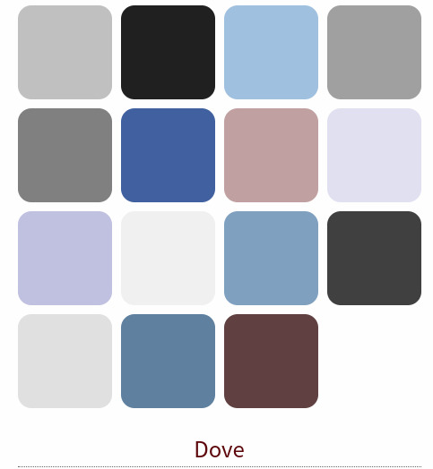
This is my favourite one. Overall it's really pleasing to the eye and feels super comforting. All of the colours have been mentioned (blue, grey, brown, pink, purple). I can forgive the lack of greens since I feel like this fits me the best. What I want in life and want to bring to others.
The pastels would symbolize a lighter feeling to the emotions mentioned, and wouldn't be overbearing. Not rushing, or pushing things or people.
Vibe; a quilt made by a loved one, smelling of lilacs and rain, birds singing outside. Nostalgic.
#dove chats#colour theory#colour analysis#full name may change as idk if I'll keep my surname#so yeah feel free to do your own analysis#i tried to keep it short
6 notes
·
View notes
Text

So, I personally know little about seasonal colour analysis but the other day I was wondering which season Caitlin could be and someone replied to me saying she is a light summer and you know what? I CAN SEE IT! It makes so much sense. How many times I said that pink is her colour? lol And the blue Cinderella dress was pure perfection on her. 😍
#just dropping this here#it's something i needed to post lol#Caitlin Thompson#colour analysis#colour palette#light summer#celebrities colour analysis#seasonal colour analysis
7 notes
·
View notes
Text
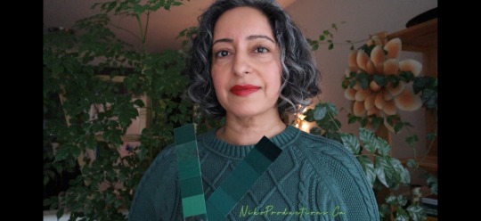
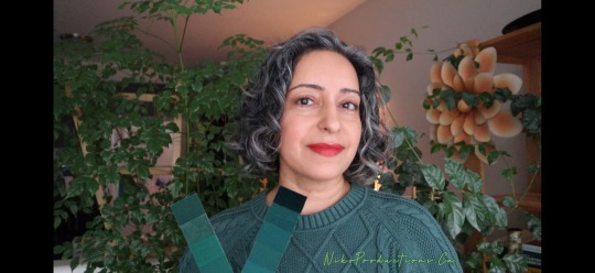
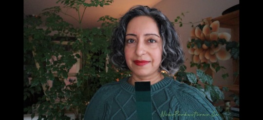
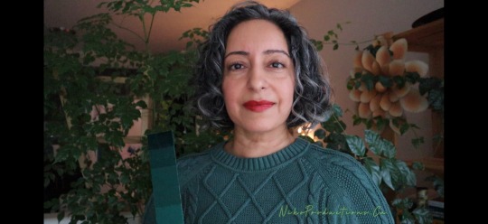
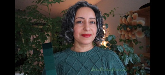
My first Friday as a fifty-one year old 🍰
Yesterday, I was 50.
Today, I’m 51.
Tomorrow, my family comes over 🎂
Past.
Present.
Future.
This green sweater seems to harmonize with the lipstick 💄 (red) arms of the #DarkAutumn colour fan. I got it a couple of years after my colour analysis.
It’s also a match with my #VibrantAutumn custom colour palette 🎨😃👏
Do you know your best versions of green? 🧩
#Clothing #Colours #Colors
2 notes
·
View notes
Text
This works! I'm a Soft Autumn.
0 notes
Last Seen Blogs

worshippgoddess33
Untitled

denneyboi
Untitled

waldwarrior1
De profundis
indierockdeath
livvv

nonprofitwordpresstheme-blog
Helpme NonProfit Charity Wordpress Theme