#binderary2024
Text
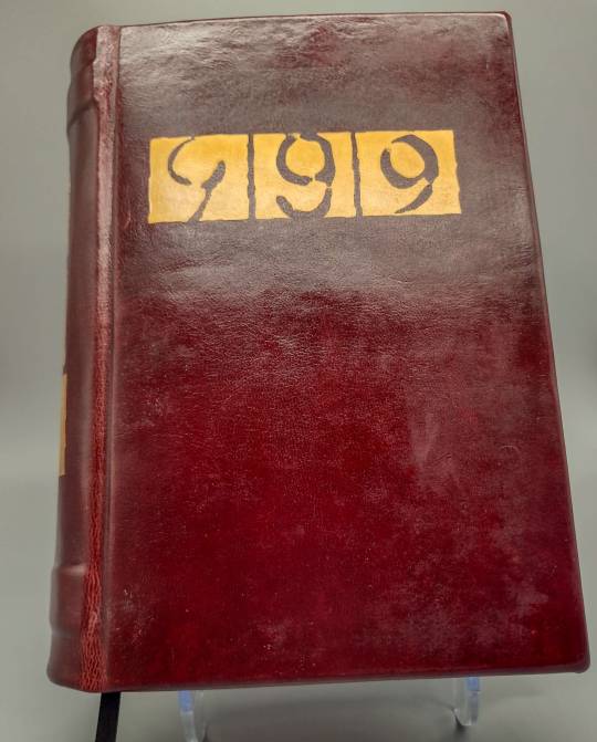
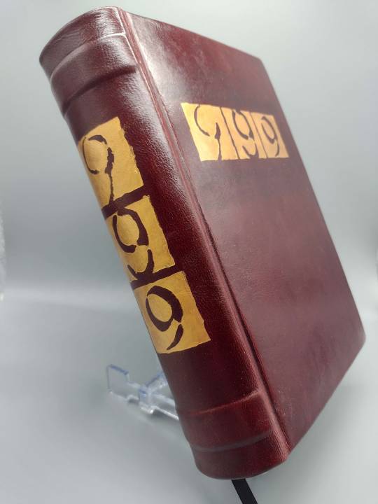
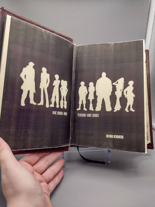

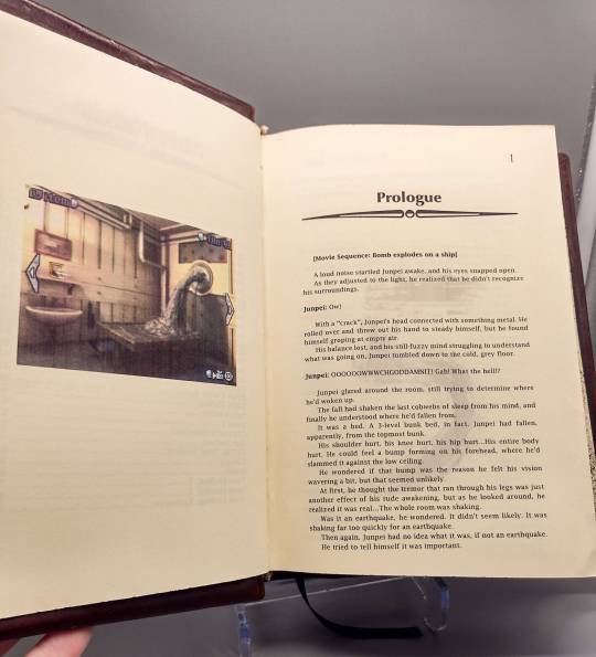


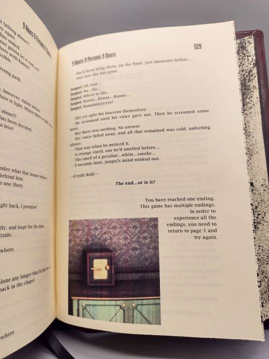
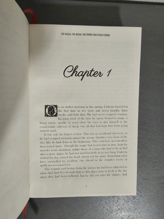
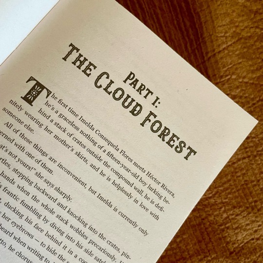
One of the largest projects I've been working on is this typeset and book version of 999: 9 Hours, 9 Persons, 9 Doors, one of my very favorite video games. (Which later became the first game in the Zero Escape franchise.)
The game is a visual novel and escape room game combo with multiple routes and endings leading to a true ending. So this version is structured like a Choose-your-own-Adventure book where you flip to different pages depending on your choices.
I also made it possible to skip all the less linear escape/puzzle sequences because they don't read very cohesively. But they do contain a lot of funny or revealing lines so I didn't want to eliminate them entirely.
I should also mention one of the reasons for doing this is that I wanted to preserve the original text of the game from the Nintendo DS version from 2010. When it was remastered/ported to PC and Switch a lot of the dialogue was rewritten very much for the worse. As well as making the novel sections optional, which destroys a lot of the point and atmosphere of the game.
The book is a full leather casebind, with stenciled titles. The leather was honestly a little too thick and required a lot of paring, which is terrifying because any slip could ruin it. And the final satin finish I put on made a lot of the leather flaws look worse and more obvious, which is annoying. It was my first time doing faux raised bands on the spine, and they came out nice.
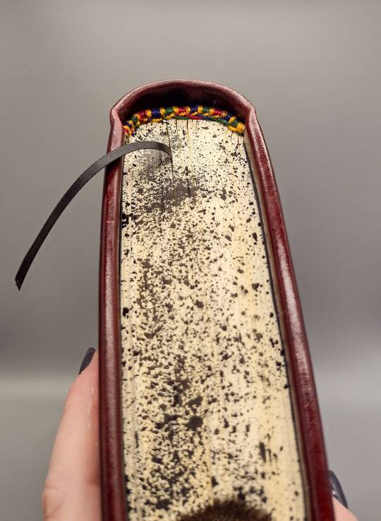
My printer decided to fuck with me while printing this one and the color alignment is off. This is my second attempt at printing it and it's better than the first but still not great. But I wasn't gonna waste so much paper again.
And no, I'm not planning on doing the sequels. I can't imagine trying to deal with VLR's 28 endings when doing 6 was this challenging and annoying. And the sequels are perfectly represented by their existing playable versions, unlike 999.
910 notes
·
View notes
Text
A year and a half ago, I made a post about @renegadepublishing launching their code of conduct. I’m pleased to report the community has been thriving, and is abuzz with even more growth!
Over the past year and a half:
The Discord size has doubled.
The membership has skyrocketed to nearly 200 members.
Our events have also doubled in participation!
We’ve started four brand new events!
We’ve launched 12 satellite servers with 414 members!
All this, and yet, there’s more to come! I’m pleased to announce yet another massive undertaking has finally come to fruition���
THE RENEGADE BOOKBINDING GUILD WEBSITE!
Renegade has grown so much and still remains such an incredible, vibrant community, and this step forward will only enable us to do so much more. There is still more work to be done, but it’s absolutely amazing how far we’ve come. I can’t wait to keep building this community with all the wonderful people in it! 🎉
We’re currently kicking off Binderary 2024 with a bang, with 34 workshops planned for the month of February, all completely free and community-run!
If you’re waiting for a sign, this is it! Come join us, and start your fanbinding journey!*
*Discord is 18+ only!
#fanbinding#bookbinding#fanfic binding#fanficbinding#ficbinding#binderary#binderary2024#renegadepublishing#renegadepub#or should i say#renegade bookbinding guild#🥹❤️
865 notes
·
View notes
Text
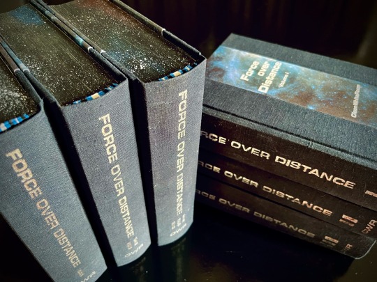
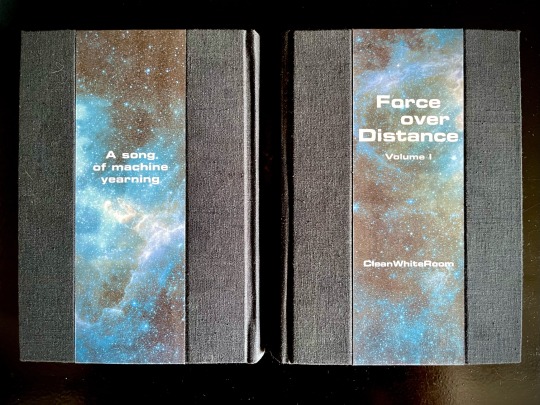
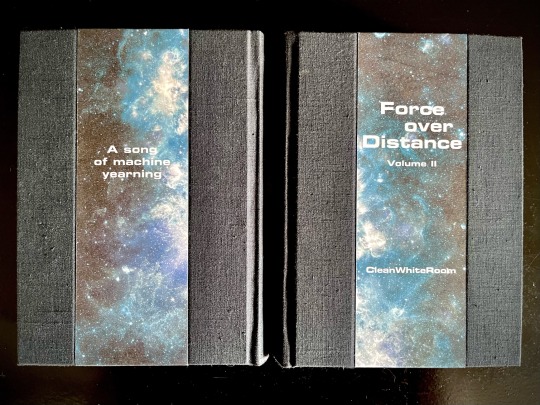
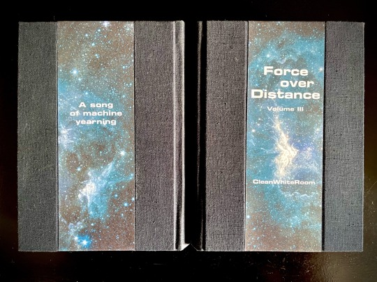
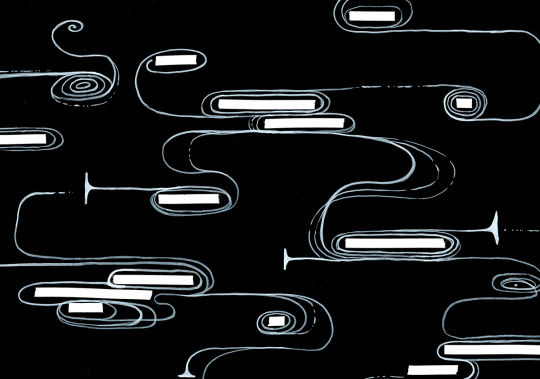

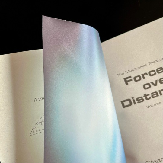

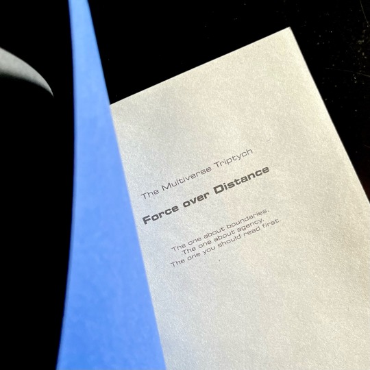
My magnum opus, the jewel of my Binderary round-up, the result of four months of hard work (that is to say, a lot of force applied over distance), the project affectionately known as The Motherfuckers (because it was rather unclear if I was going to finish these books or if they were going to be the end of me).
Force over Distance by cleanwhiteroom. It is currently also on AO3.
I was first introduced to this incredible story by a dear friend, who first sold me on actually watching SGU, and then said that they remember this fic since like 2011, which is always a promising sign. I went digging and found out I was in luck - the story was being rewritten and reuploaded on the author's blog. The next two weeks are described by the same friend as "one of the scariest moments in our cohabitation" as I'd spent literally every waking moment injecting the story directly into my eyeballs, and let me tell you, I'd not been doing a lot of sleeping at that time.
Then I gathered up my courage and reached out to CWR re: my burning desire to bind this story. And the rest, well. Let's dig into it, shall we?
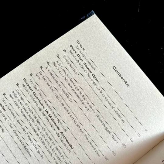
This was my first time typesetting 540k words. Considering I tend to prefer larger font sizes for increased legibility, it was immediately obvious that this was going to be a multivolume project. I settled on three, as it's the relationship between three individuals that forms the core of the story.
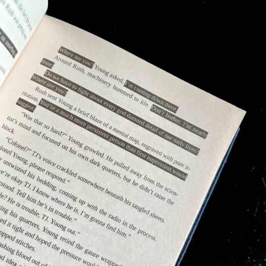
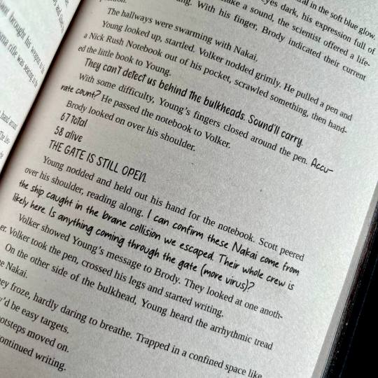
I also knew I wanted to keep the typeset in black and white, but play around with light and dark a lot. So I did. One of the first design idea I actually had was the way I wanted to handle projected speech. Mental link between Young, Rush and Destiny is THE most vital part of the story, and I wanted to make it immediatly obvious. I also wanted to be able to take one glance at the page and tell how much of the action is actually just two guys staring each other down :) Hence the blackout effect of thoughts being represented as light over darkness.
I also wanted to preserve as much of my reading experience as possible. So I saved all the chapter quotes/summaries in the TOC, and hid the chapter content warnings in the frame of the gate that marks the beginning of each chapter. For most of the chapter the warnings stay the same, so after a while you stop really noticing them, but then you open a new chapter and see that the familiar shape of the words has changed, and get this UH-OH feeling. Which, I think is very much how it works in my design, because when the warnings change there's usually another line of text added.
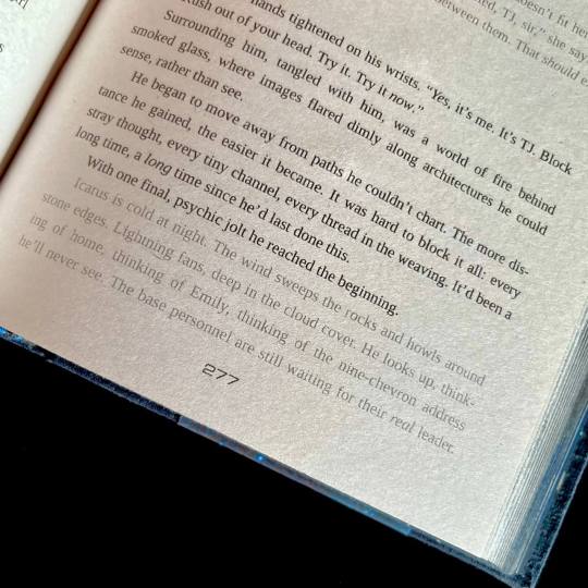
For flashbacks and dream sequences I switched from italics to a lighter shade of gray. I woudn't say it's more legible per say, but it's in keeping with the overall light/dark theme.
There are instances of people using handwritten notes in the story. I collected more than a dozen of assorted handwriting fonts, with each character having their own "handwriting". So when, for example, someone begins writing in someone else's hand, you immediately know it.
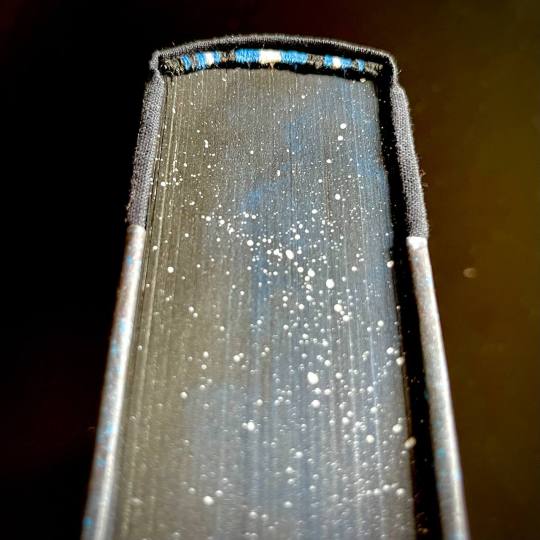
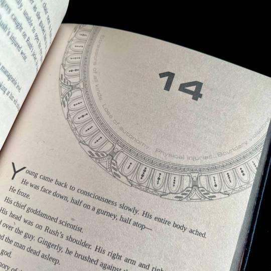
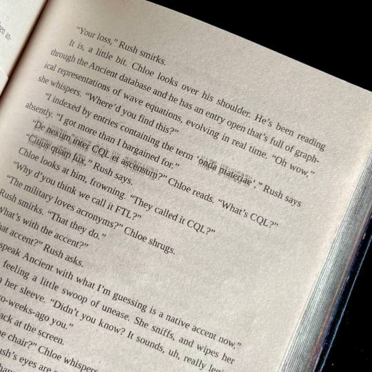
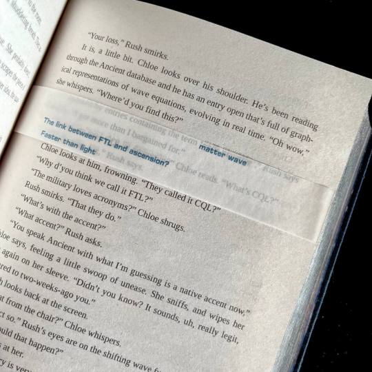
The most insane, labor-intensive part of the typeset, however, was the way I decided to handle the Ancient translations. CWR's gone through the trouble of setting up hover-to-discover for it, which gives you a very different reading experience than, say, having the translations in the endnotes. So, naturally, I said to myself that I want to replicate that, and footnotes just won't do the trick. So. Every instance of Ancient in the text has an underlay of light gray Ancient script. And an OVERLAY of paper vellum with the translation printed in blue. Now, not to toot my own horn too much, but if looks SICK AS FUCK. You also MAYBE SHOULD NOT LIVE LIKE THIS. For the two copies of this work I had to cut up 10 sheets of vellum into strips, and then spent from 20 minutes to an hour per volume tipping the strips in their proper places. I then had to wear kinetic tape on both my hands to help with the joint pain. (It was worth it.)
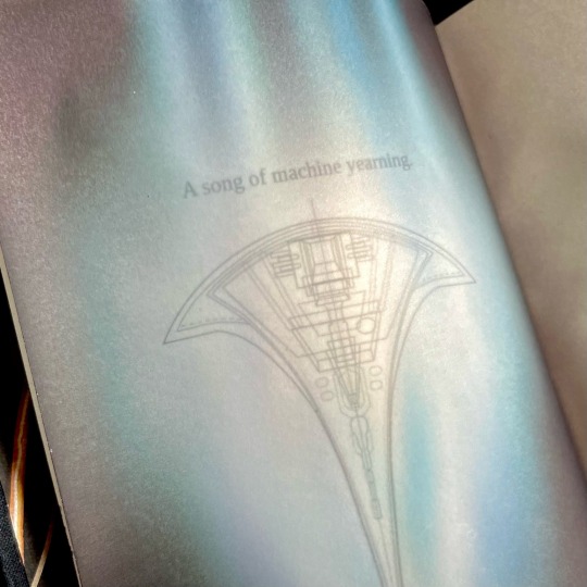
Now for the title spread. It is also paper vellum that you see as soon as you turn the first page (the half-title), and see it covering the title of the book and author's name. And then you turn it. And the shields sing the matter wave of Destiny through the black. And yeah, I think that's very, very clever of me, actually.
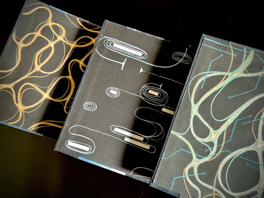
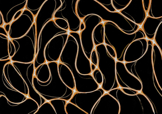
Then, of course, were the endpapers. All 12 of them are unique abstract paintings done on black cardstock by hand with brush pens and correction tape, I scanned a sample of each set for posterity. All of them are my interpretations of characters' midscapes. For volume 1 I went with the fire wind of Rush's thoughts. Volume 2 was for Young, and I went for the reverse blackout poetry effect (because for all the mental talking they do, the unprojected thoughts are opaque to their counterparts) and all the loops, hairpins and blocks he does. Volume 3 is for the combination - Rush's fire wind, changing its color to match the circuitry pattern of Destiny's AI.
The rest, in comparison, is easy. All volumes are stitched with 3 strands of embroidery floss, a combination of black, blue and silvery-gray. The French double-core endbands are sewn in the same color scheme (though with a different shade of blue and gray switched for white for added contrast). The edges are painted and splattered to look like space.
The covers feature my (signature at this point, I guess) half-cloth river pattern, with the base being dark blue linen and the printed parts being Spitzer telescope images of the W51 star forge, Jack-O'-Lantern Nebula and the Eagle Nebula (courtesy of NASA), waxed by hand for added sheen. The spines are foiled in silver with a foil quill.
Each set is 5 pound of solid hand-crafted book, with one set being my personal copy, and the other sent as a gift to the author.
And that's it, folks! This has been an incredible project to work on, and I'm very proud of what I achieved with it.
#mythril thread books#bookbinding#ficbinding#fanbinding#binderary2024#stargate universe#sgu#force over distance#stargate
424 notes
·
View notes
Text
Binderary 2024: Week 1
In the Renegade Bindery Discord Server, we are once again running Binderary during the month of February. Attendance is free, and a link to the 18+ Discord Server can be found on our carrd.
Whether you’re new to the world of bookbinding or an aged veteran, join us for a month of binding fun! This event is all about community & learning, be it trying something new or refining existing skills.
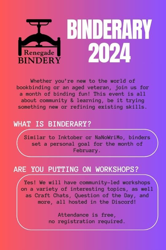

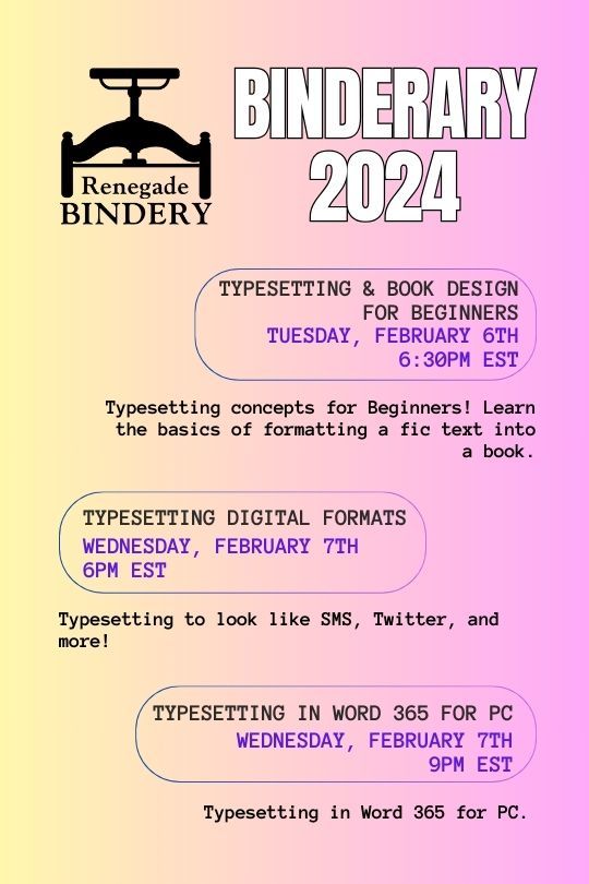

All our workshops are run by members of our fanbinding community, and some of them are even on Tumblr!
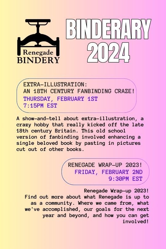
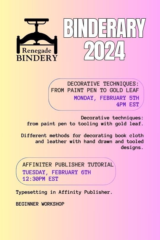
Here's the list of who's running the week 1 workshops:
Renegade Wrap-up 2023!: @robins-egg-bindery, @fanboundbooks, @celestial-sphere-press
Split Board Bindings!: @misanthropiczombie
Decorative techniques: from paint pen to gold leaf.: @blackoakbindery
Affinity publisher tutorial (Beginner Workshop): @kate2kat
Typesetting & Book Design for Beginners: @bearclubbooks
Typesetting Digital Formats: @sayornispress
Typesetting in Word 365 for PC: @no-name-publishing
528 notes
·
View notes
Text
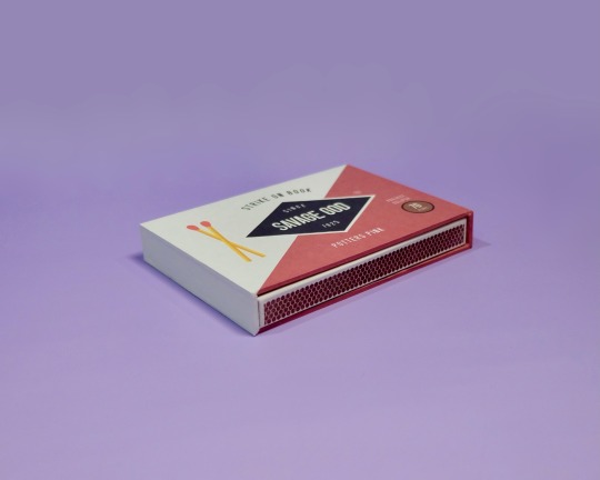
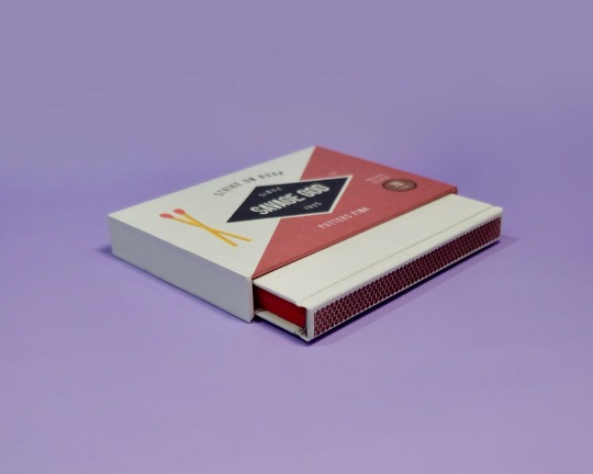
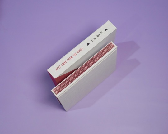
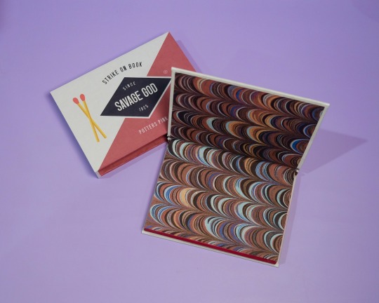
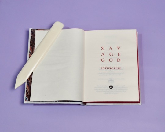


Savage God by PottersPink, binding by DCB Bindery
Summary:
Past, present, future, Steve knows Bucky Barnes. It’s why he recognized him when he found him in that alley in April of 1942, even though Bucky was older, stronger, wearier; he called himself The Asset, and had a metal fucking arm. He flinched when Steve tried to touch him, and when Steve told him he loved him, his first response was to ask why.
The Asset was only with Steve in 1942 for a few days, but it’s enough to change the course of Steve’s life forever; the journey to becoming Captain America is coloured with urgency, with an undercurrent of fear and determination that in the end he just can’t manage to hide from everyone — But it was all for nothing. Steve saves Bucky from Zola, just to lose him on the train. Their second chance, wasted.
Seventy years later, Steve wakes up in the twenty-first century, and he doesn’t know whether to be heartbroken or hopeful when some of the things Bucky revealed to him in 1942 start falling into place.
Specs:
Square back bradel, red edges, marbled patterned endpapers and endbands, A6, with slipcase.
A gripping read from @potterspink, undoubtedly one of my all time favorites. I’ve revisited this fic over and over again and it is no less satisfying to read each time!
On the process:
I knew I wanted to base the design of this binding around a matchbox, and decided to go with Diamond matches. Really liked how it turned out, especially with the striker design on the spine of the book. Had a lot of fun bringing in elements of the story into the slipcase design too, and the slipcase construction was so much simpler and easier than I expected!
I’m quite pleased with the matches marking parts one to three as well, adding a little pop of red that ties everything together. I’m binding three editions of this fic for Binderary so check out the paperback & collector's edition for a more in depth look at the typeset!
More DCB Bindery Projects
258 notes
·
View notes
Text


Golden Key tiny book charm, Feb 2024.
All my other tiny book charms except my first one were intended as gifts, and I decided it was about time to make one with words for myself. It includes some of my favorite odds and ends, including some poems, short stories, excerpts from novels. I nicknamed the project The Golden Key after the first story I picked, a fairy tale from the Brothers Grimm collection.
#my art#bookbinding#artists on tumblr#tiny things#tiny books#tailfeather binding#the golden key#another one finished during binderary!#binderary2024
180 notes
·
View notes
Text
💥Binderary Bind # 3 💥
A collection of 15 stories by @greygerbil.( Highly HIGHLY recommend their fics)


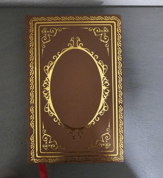
For the book title, I chose The Shield,The Spear, The Sword and chose another 14 of their stories (it was a struggle not to include all of them but i got tired of typesetting 😅)
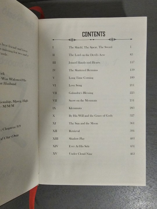
I made individual title pages for all of them (pic doesnt include all)
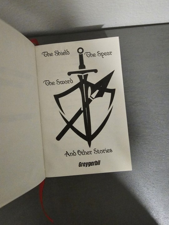

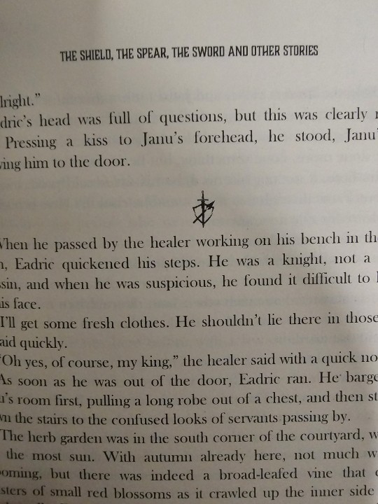
I did keep the drop caps the same in every story as well as the same line break image (a cute little shield,spear, sword combo i made on canva) to add continuity.
I tried a couple new techniques this bind.
Did my first ever rounded spine as well as some (easy and fake) raised bands. This was heavily inspired by those old traditional leather bound books.

Progess pic before the faux leather.
#bookbinding#ficbinding#fanbinding#mybinds#book art#fanfic bookbinding#binderary#binderary2024#im lowering by binderary goal to 4.#but this one was so intensive I'm counting it as 10 okay#binder math
185 notes
·
View notes
Text
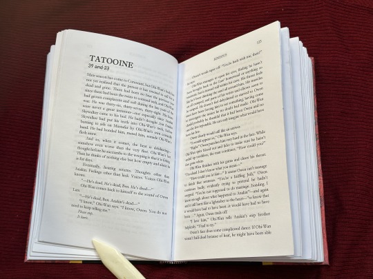
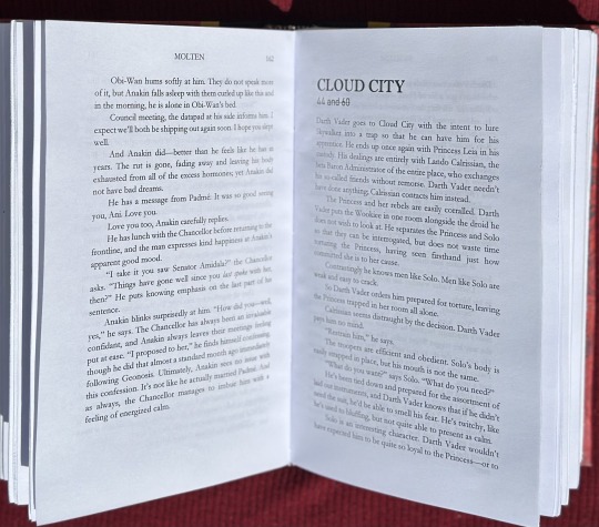
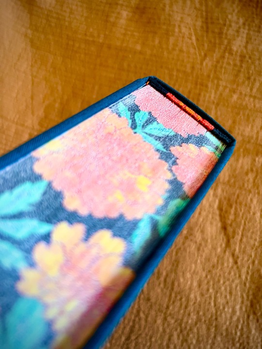
Fanbinding: Heart of a Volcano Series by @zimriya


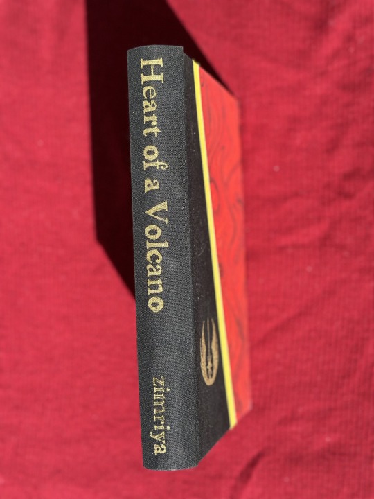
Summary: Obi-Wan Kenobi finds himself mated to Anakin Skywalker. Things are only slightly better because of it.
My biggest project of Binderary was this bind of Igneous, Molten, and Volcanic by zimriya. I read these fics last year and they basically took over my brain. I'm in love with the comparison between Obi-Wan's pov and Anakin's pov of their relationship.
This is definitely the most creative I have gotten with my covers so far! I'm still very new to this but I really wanted to try something special and different with this one. 3 fics, 3 stripes on the cover (if we want to get crazy with symbolism, I'm thinking black=igneous, red=molten, and yellow=volcanic). The paper on the front called out to me for this fic for obvious reasons. This is the second and biggest text block I've ever sewn together (12 signatures) and I think I'm getting better at it. I had fun typesetting the fic and including the age and location marks at the start of each section. Decorating the side was an interesting challenge. I initially used a gold foil quill to trace the text and Jedi symbol on the front but then decided it needed more definition. I tried one of the paint pens recommended in one of the workshops and fell in love. I can't BELIEVE how well the author name came out! The fact that my hand was steady enough to get the outline is crazy.
I'm really happy with how this turned out!
135 notes
·
View notes
Text

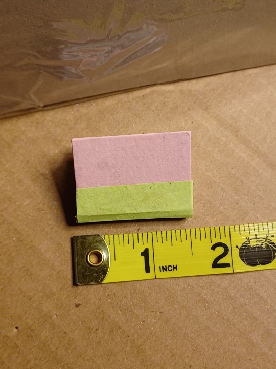
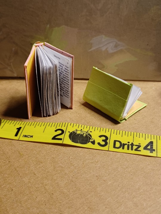
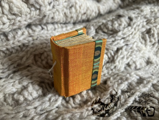
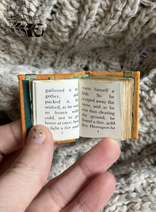
I participated the Renegade Bindery's "Tiny Book bind-along" workshop and crafted two little cuties.
First time creating books this tiny, I learned a lot! I can't wait to make more of these fellas.
111 notes
·
View notes
Text
Just bound this. Used a double bookcloth half bind.


90 notes
·
View notes
Text
Binderary Day One!
Binderary is the equivalent of NaNoWriMo for bookbinding, a month of personal goals and free workshops put on by @renegadepublishing. (Seriously, come join the Discord if you're at all interested in fanbinding! Tons of resource and friendly people.)

I have the same goal as last year, which is just to try to finish up as many of my WIPS as possible. Last year, I managed fourteen books, but had more sewn text blocks to start with.
This year, I've got four text block sewn and glued (one of them just needs a title and missed the photo), twelve more printed plus a blank notebook for a belated Christmas present, and... well. Maybe I have seven more to print. Perhaps there are another twelve typesets I wanted to finish.
Let's be clear, I am not making forty-three books in February. But I WILL end the month with more books than I started with. My plan is to just keep going and see how far I get.
Tonight's progress! Stacked up the text blocks. Punched and sewed two, and glued one—with endpapers. (My mantra as I sewed: don't forget the endpapers, don't forget the endpapers, don't forget the endpapers...)
Also found one more text block plus a Coptic stitch notebook in this second photo that escaped the first stack. However, I'm missing a package of cardstock. I put it somewhere so very safe and obvious that it's completely vanished. Oops?
81 notes
·
View notes
Text
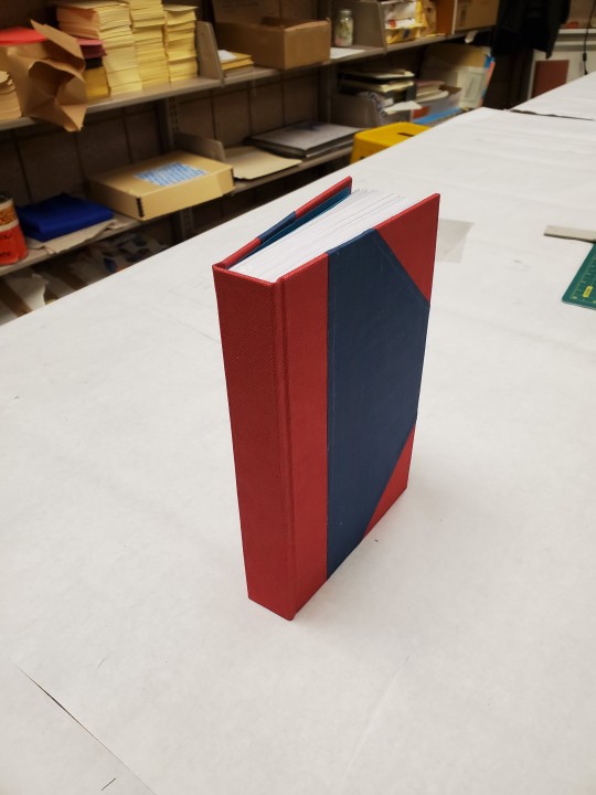
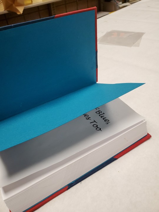
Book 4 of Binderary


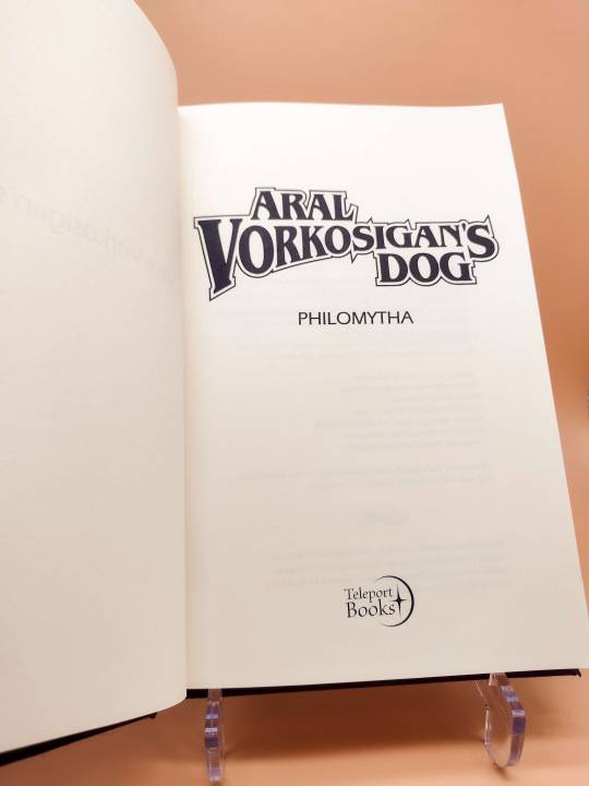

It's a typeset of Aral Vorkosigan's Dog. The typeset is by @teleportbooks from our Renegade Typeset Exchange this year. I love anything Vorkosigan so much and this typeset looks so great I had to bind it.
The style is simple but it was my first time using regular htv and I'm super happy with how it came out.
167 notes
·
View notes
Text

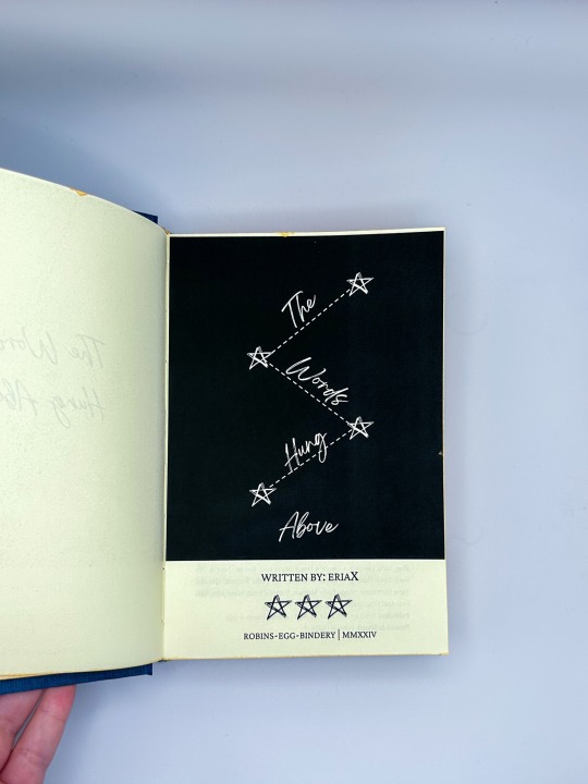
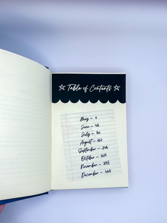
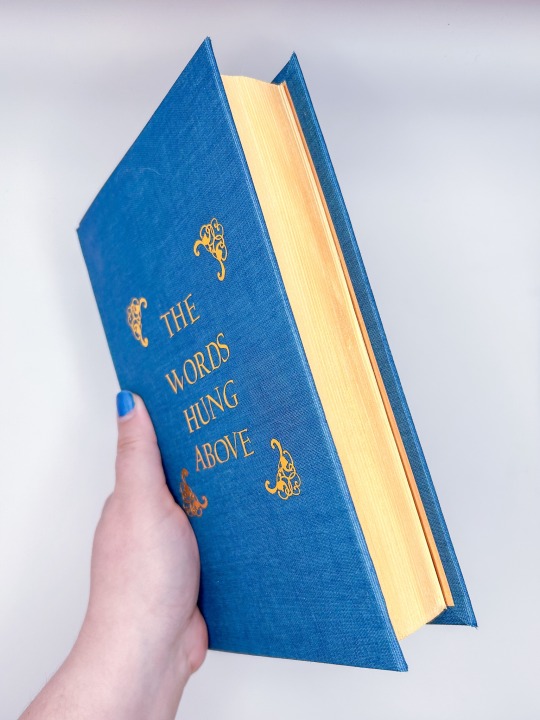
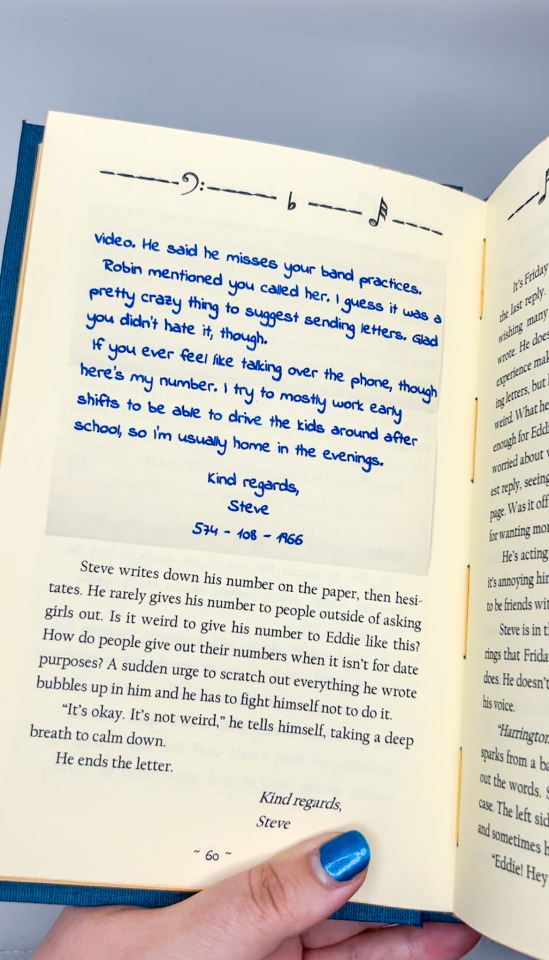


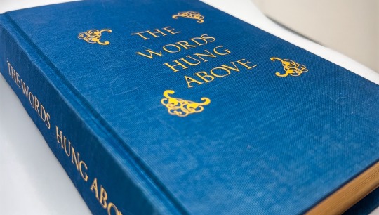
The Words Hung Above by eriaX
“I’m thinking of leaving.”
Steve almost chokes on his cigarette, hastily moving it from his lips and looking to Eddie where he stands beside him. He looks relaxed, despite the words that just left his mouth. A thin trail of smoke travels up towards the sky from his own cigarette that’s pinched between his fingers. Watching the smoke slowly fade into nothingness feels oddly foreboding. Like this small, almost-friendship he has managed to build is going to fade away, too.
He decides to hold on to it, if he can.
---------
Or, After Vecna is defeated and life returns to normal, Steve finally has a chance to become actual friends with Eddie Munson. But any potential for friendship seems lost when Eddie decides to move to Nashville to pursue music after graduating.
It’s Steve’s idea to become pen pals.
Over summer and into fall and winter, Steve battles insecurities around himself, as well as his own future and his parents’ expectations. As his friendship with Eddie deepens into something greater, Steve finds that there’s more to himself than he expected, and more to his friendship with Eddie than he ever imagined.
fic by eriaX
500 pages / 118,368 words
Title Font: Breathing, Crimson Pro
Body Fonts: Californian FB, The Signature, Indie Flower
Bound for the Steddie Big Bang 2023!
More info (and spoilers for the fic, beware!) below the cut!

What a project! This was an endeavor with the author for the Steddie Big Bang, and it was so fun to design the vibe of this with them! Thank you for sharing your story and this journey with me <3
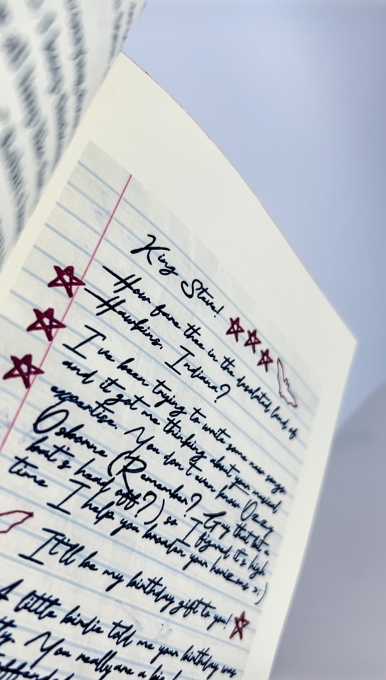
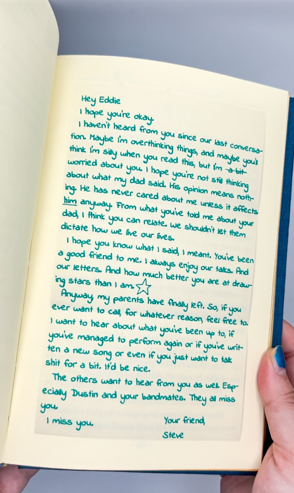
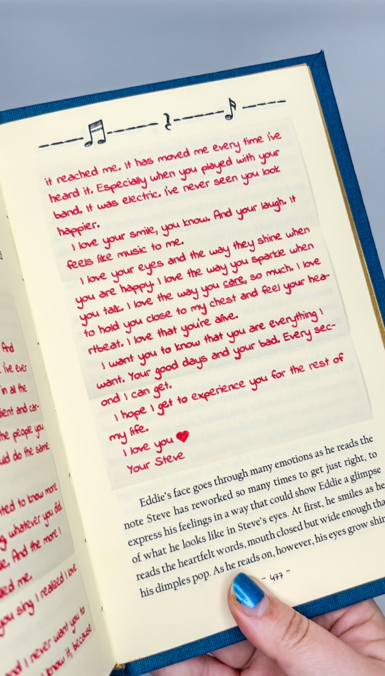
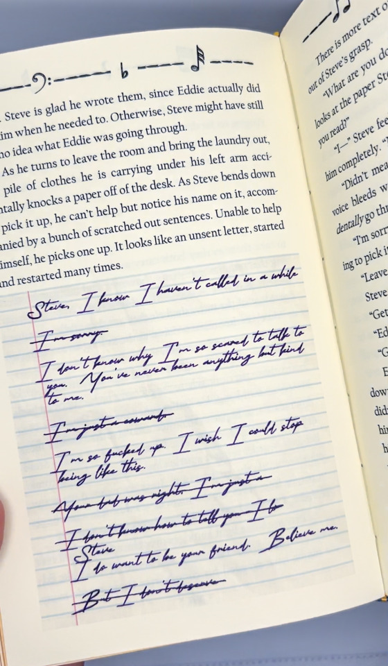
I love the letters that populate the story; if you skipped the content of them above, I highly recommend experiencing them in the context of the fic. I wanted to do something tactile to emulate them without interfering with the storytelling element; something that could stay archival in the future while also adding a dimension to the text. We selected the handwriting fonts together, and I fought the battle with my cricut to get it to write it properly. I had to go over carefully by hand to make the ink fill in well, but the result is perfect!
I also selected different inks as the months pass, even varying colors within Eddie's letters; I like the idea that maybe he was trying to make the letter perfect, doodling in the corners for Steve.
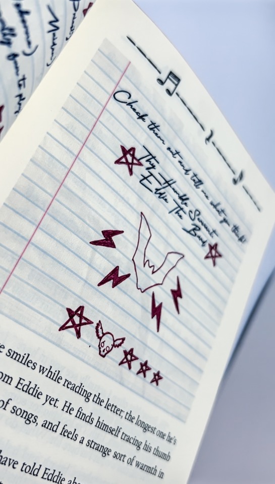
Music is another big device in this book, something that connects Steve and Eddie across the space between them, so musical notes and rests populate the header. Steve is Eddie's breath of fresh air amidst all the noise <3
I tried to keep the handwritten style across all the elements, including the title pages. We selected Dragonfly duo for the cover cloth, with gold accents; the deep blue color was reminiscent of the song that inspired the fic, and the gold felt fitting; the relationship that develops between Steve and Eddie being the sunlight leaking through the fear and uncertainty they face.
If you haven't checked it out yet, go read the fic!!!
#fanbinding#bookbinding#fanfic binding#fanficbinding#me myself and i#fanfic#ficbinding#binderary#steddie#steve harrington#eddie munson#steve harrington x eddie munson#steddie big bang#steddiebang#steddiebang23#binderary2024#stranger things
121 notes
·
View notes
Text
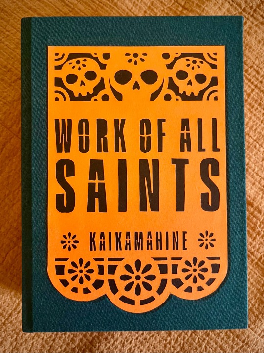
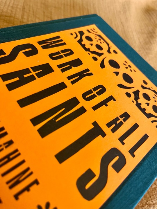


Work of All Saints by @kaikamahine
What is fanbinding if not an elaborate system of fic recs? A while back my esteemed colleague @pleasantboatpress recommended this story, and I really wanted to try my hand at binding it.
🏵️ I knew I wanted to give the typeset an old-fashioned vibe with some fun twists, referencing both el Día de los Muertos and Mexican culture in general; hence marigolds used for endpapers, frontispiece portrait frame, and scene dividers.
🏵️ Choice of drop caps was inspired by papel picado, and then I decided to just go apeshit on it, and cut out actual an papel picado banner for the cover. So I did! By hand! With a modeling knife! And backed it with black paper for added contrast.
🏵️ I need to maybe back off of foiling for a bit, because the tip of my index finger is loosing sensitivity, but! Still used it to title the spine (note two more marigolds).
🏵️ I actually decided to try a new method of edge decoration on a whim, and I couldn't be happier with the result. Transferring digital prints on the book edges has its limitations, but it's also quick, easy, and relatively mess-free and painless when compared with my usual adventures with acrylic paint.
237 notes
·
View notes
Text
Binderary 2024: Week 2
In the Renegade Bindery Discord Server, we are once again running Binderary during the month of February. Attendance is free, and a link to the 18+ Discord Server can be found on our carrd.
Whether you’re new to the world of bookbinding or an aged veteran, join us for a month of binding fun! This event is all about community & learning, be it trying something new or refining existing skills.


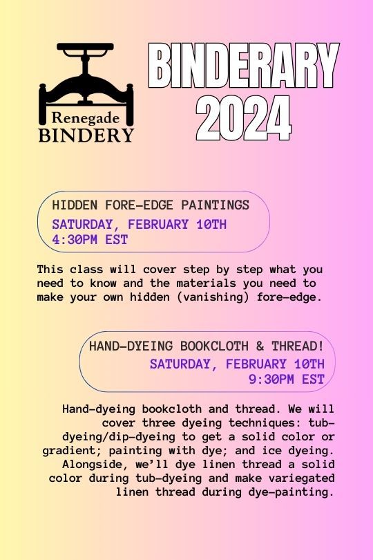

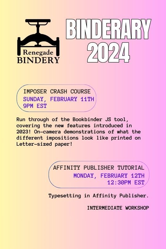

All our workshops are run by members of our fanbinding community, and some of them are even on Tumblr!
Here's the list of who's running the week 2 workshops:
Mini Monologues & Bind Along with six!: @simply-sithel
Double-core French Endband: @no-name-publishing
Hidden Fore-Edge Paintings: @duran-binding
Hand-dyeing Bookcloth and thread!: @epitomereally
Who Needs Tools?: @gargoyleandgremlinpress
Imposer Crash Course: @simply-sithel
Affinity publisher tutorial (Intermediate): @kate2kat
Book Photography: @robins-egg-bindery
Foiling the Evil Plot(ter) -- Computer-Aided Heat Transfer Foil: @starblightbindery, @mourningmountainsbindery
277 notes
·
View notes
Text
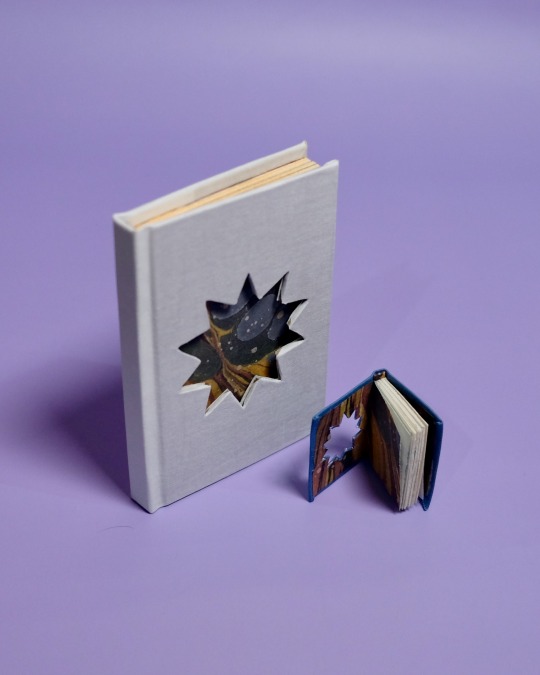
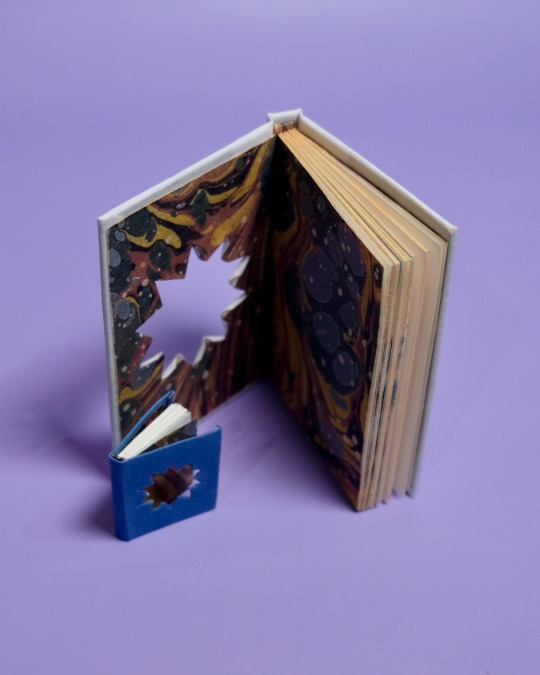


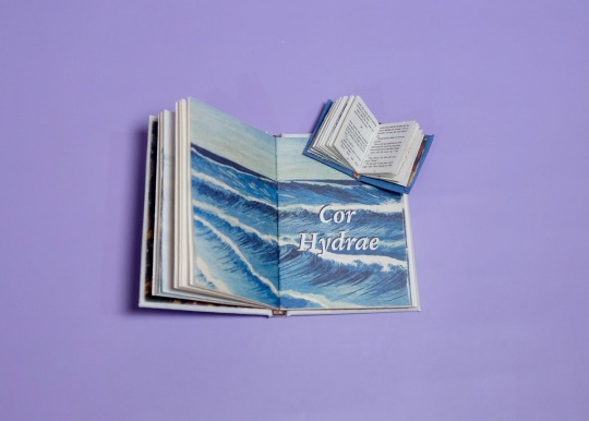
The Weight of Gold by dreamsinthewitchouse, binding by DCB Bindery
Summary:
“The plates around your neck,” the man says. “It’s your name on them, isn’t it? I’ve seen men wear those before.”
Steve nods, lifts his hand to his dog tags. “On the boat?” he asks, rubbing the metal between his fingers.
The man tilts his head and blinks at Steve, a slightly sad twist to his mouth. “No, Steven. On the bottom of the ocean.”
Specs:
Mini binding approx. 30 x 40mm and an A7 square back bradel. Matching marbled patterned endpapers and endbands, star cutout, and gold edges on the A7.
An enthralling mermaid au from @dreamsinthewitchouse that I haven’t been able to stop thinking about since I first read it. Such an intriguing and mesmerizing take on these two and their fate!
On the process:
Kicking off Binderary with a tiny book that I bound during @renegadepublishing’s mini bind along! I’m quite pleased with how it turned out, especially how the cutout peeks into the marbled endpapers. I can’t emphasize how tiny and cute this book is.
Originally I only wanted to do the mini binding for this fic, but I couldn’t help myself and bound an accompanying regular sized version. Somehow the cutout was much easier on the tiny book, but I did like coloring the edges gold for the bigger version.
More DCB Bindery Projects
(Submission for @steverogersbingo D3 Immortal Steve & @stuckybingo N3 Free Space)
#thanks to six for hosting the bind along workshop!#binderary2024#dcb bindery#bookbindig#ficbinding#fanbinding#dreamsinthewitchouse#stucky#fic#dontcallmebree#stucky bingo round 5#steve rogers bingo round 3
162 notes
·
View notes
Last Seen Blogs

starbirdpnw
Starbird Photography

sattar-sh-blog
Untitled

general-cyno
we're just having fun!
elpeladoysuspops
El Pelado y sus Pops