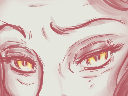
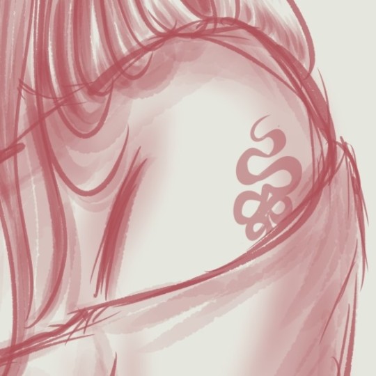
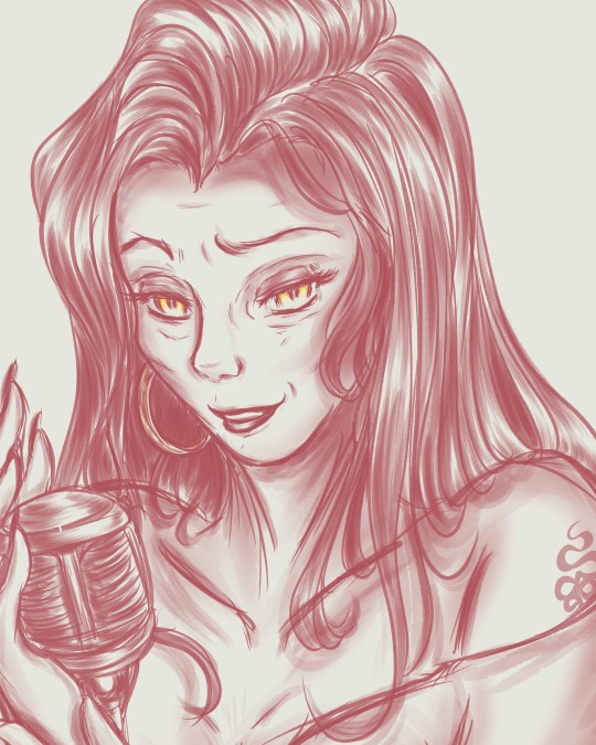
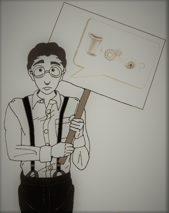
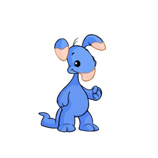
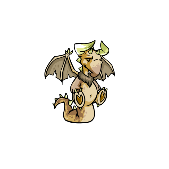
#been trying to work on improving colour and shading in my art
Text
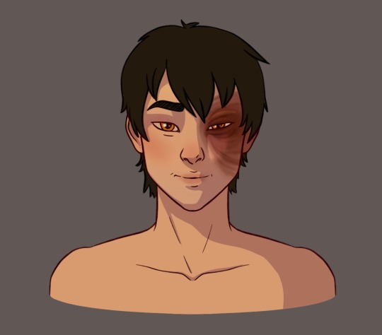
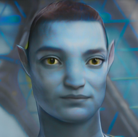
what to do when your mental health has hit rock bottom and every day is a constant struggle? draw zuko apparently ¯\_(ツ)_/¯
#wip#been trying to work on improving colour and shading in my art#and finding a lineart brush that I don’t despise#tougher than it sounds#I haven’t properly drawn anything in so long so oop#enjoy one (1) boy#zuko#zuko avatar#avatar#atla#avatar the last airbender#my art
390 notes
·
View notes
Text
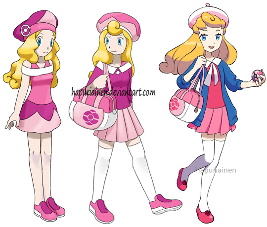
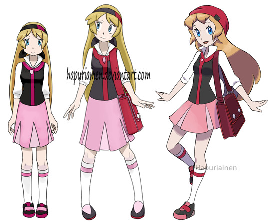
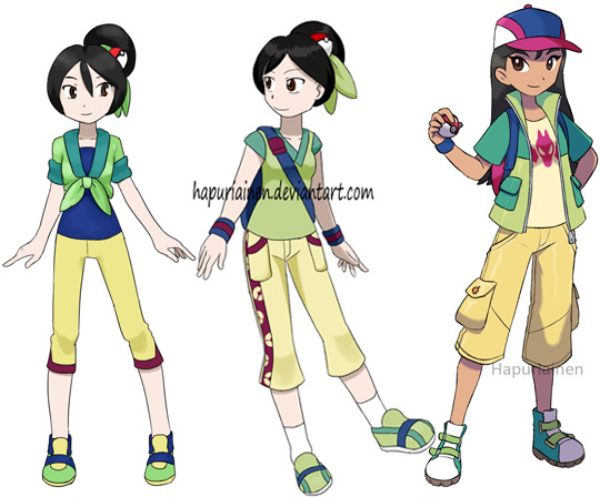
Some comparisons of the “Disney girls if they were the player character in a pokemon game” designs, the earliest being from 2012.
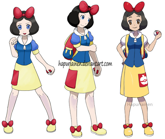
Snow White - hasn’t changed much from the initial idea. For the most recent version aside from the improved colours (which really goes for all of these) I made the pocket a bit more sensible in size and less bland with the logo and changed the sleeves into something a little less costume-y looking. And apparently I had never bothered to check what her eye colour is supposed to be before?
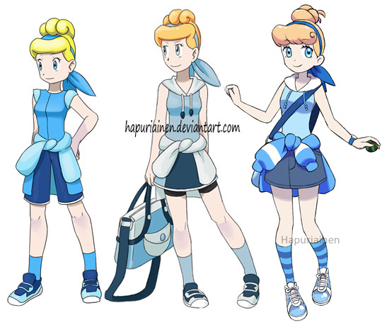
Cinderella - I think the first one is way too tomboyish for Cinderella so it was a good idea to give her a skirt instead. And stop trying to copy the hairstyle as is, how is it supposed to work anyway? The most recent version is supposed to be wearing see-through plastic sneakers which was the closest equivalent of a glass slipper I could think of, but I don’t think you can see that well enough from this far.

Alice - I also like the original idea but it does look a bit too much like a costume. The more recent version is one of my favourites of the set, both with the design and how the art turned out overall.
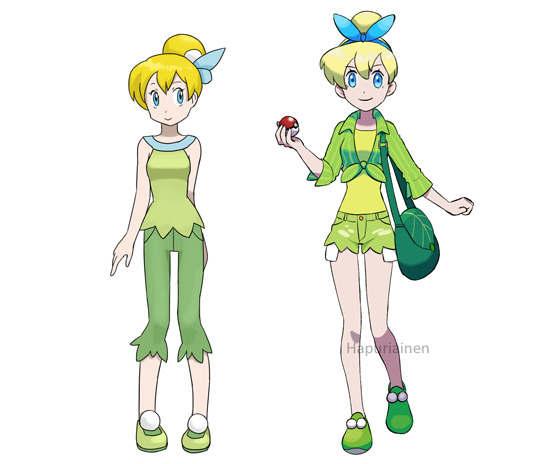
Tinkerbell - I remember being dissatisfied with the first version (mostly for being boring) and thought I should have given her shorts instead, so here is that now. The top could still use some work though.
Aurora - She feels like she’s incrementally getting towards my ideal design but isn’t there quite yet. I probably should have done more with the half pink-half blue thing.
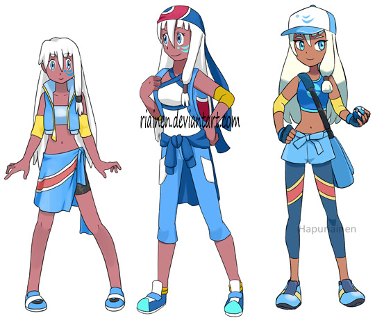
Eilonwy - not a lot to work with about her, though what is up with the shoes on the middle one?
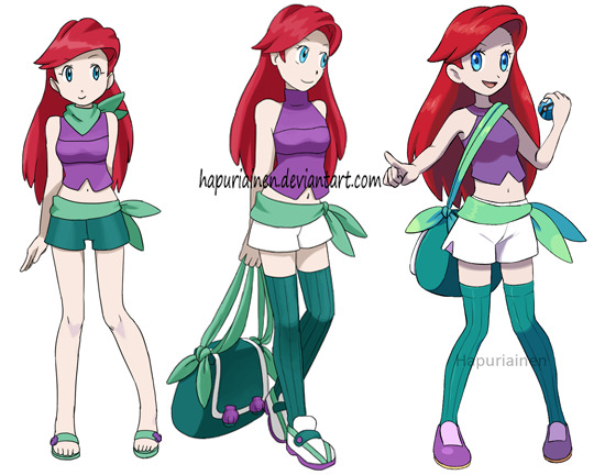
Ariel - I don’t know what I was thinking with the turtleneck in the middle one, it’s supposed to be a warm weather design. Though to be fair sandals would be a better fit for that, but I like the stockings to represent her tail. Also apparently I got obscenely lazy with the shoes with the most recent one.

Belle - has barely changed at all, I remember being very happy with the initial design. Though now that I think about it the bag probably should use a different shade of blue. I’ve also done an earlier design with the yellow dress, but it’s so monochrome that it’s a bit hard to work with it.

Jasmine - I clearly wasn’t even trying with the first design, it’s just her canon outfit with very minor tweaks and a pokeball, and the second one isn’t any better. But to me Jasmine had one of the biggest glow ups with the most recent design and the art turned out cute as well.
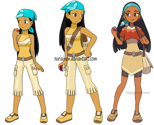
Pocahontas - I really like the pants and would have liked to use them again, but then I thought, “is this problematic”, and ended up not using the tassel fringe thing. Overall she was a huge struggle and I’m not happy with the result at all, Pocahontas’ canon design has a lot of elements to work with, but I tried so many versions of one sleeved/one sleeve off the shoulder/layered tops and they all looked like a dancer or a figure skater. And I also attempted a tunic-like design like Yellow but that just looked like a LoZ oc. So this design is definitely subject to change if I redo everyone again in ten years. At least her face turned out cute..

Esmeralda - Another mess in both attempts, her canon design also has a lot of interesting details but somehow the best I could do with ended up being a schoolgirl? In my defense she was among the last characters I drew for this set and at that point I was just burnt out and ready to move to something else, so it was either this or not being drawn at all. Better luck next time!

Megara - the first attempt is pretty random and lazy and I don’t like it at all, but I do like how the second one turned out. Overall it does skew a bit too young though especially for a character like Megara, but she’s a kid here so maybe it’s ok?
Mulan - she is my favourite Disney heroine so it’s always frustrated me that I had never been able to really get the Poke design to work. But this time it somehow clicked that I could take inspiration from the male protagonists instead. I think the details could still do some workshopping but overall I like the result this time around.
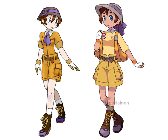
Jane - the first one isn’t a Poketrainer at all, it’s just a jungle explorer anime girl. Though I guess there’s not much change in the second one either...
Kida - this has always been somewhat of a “just throw random ideas in there” kind of design and especially the first one I clearly had no idea what I was doing. In the most recent version I think the decision to move the mark to her hat was the best update, a facial tattoo on the supposed average kid feels kind of strange.

Giselle - I really like the most recent one, it’s one of the most dynamic poses and I think it has a nice balance of “fine lady” and “going on a Pokemon adventure”. Not sure if any of them are properly recognisable as Giselle though.

Tiana - as you can see I have no idea what to do with her. I don’t know what’s wrong, there’s so much to work with her canon design but nothing ever works out properly. Many of my ideas, like poofy pants (because of the dress shape) also felt too kiddy and so out of character for Tiana who is at the more mature end of Disney princesses. Still, with the most recent attempt there is a lot I like, but somehow it doesn’t quite fit together and I now notice that repeating the flower shape everywhere is pretty awkward. Sorry Tiana! Maybe fourth time is the charm.

Charlotte - the first attempts feel too much like a formal party outfit instead of something for an adventure, so I had to lose the updo at least. The hat is a little silly but I figured it would fit the goofier Charlotte. I do like the bubble skirt (one of the abandoned Tiana ideas) but the top could still use some work.

Rapunzel - very pleased with how the most recent one turned out apart from the hair looking a little too brown, it’s supposed to be just shading and not two-tone hair.
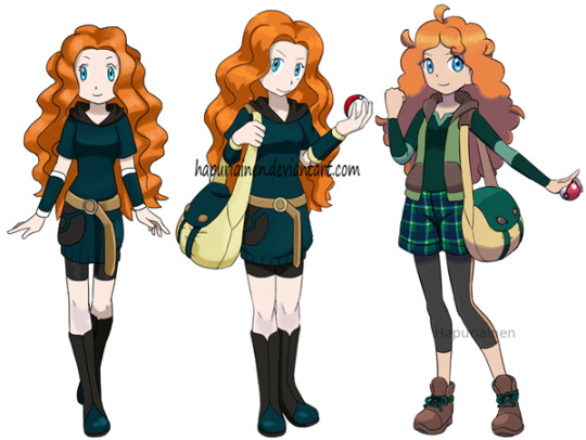
Merida - I’ve never figured out how to do her hair in Pokemon form and her canon dress is pretty stingy with workable details. I got the idea of using plaid from Sword/Shield, but I noticed everyone and their mother already drew Merida in a plaid shirt so I put it on her shorts instead. But in hindsight maybe I should have just gone with the flow.
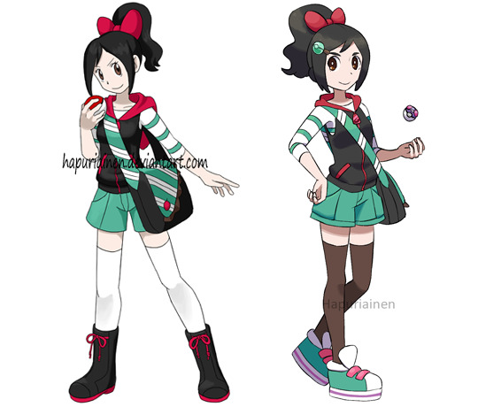
Vanellope - her design is really fun to work with and the result is one of my favourites. With the newer version I realised that I tend to use white a lot when I don’t know what to do, which usually is at least inoffensive, but that there could be a more interesting option if I dare to try something else (talking about the socks here).
Anna - quite pleased with how the new version turned out but it could still do with some work, what was I thinking with black boots and almost-black tights?

Elsa - I really like how the cardigan thing turned out, except for the fact that I realised I had already used practically the same thing for Aurora (but hers is more boring so it’s the one subject to change). Meanwhile the dress is pretty bland. The leggings use the ice type uniform design from Sword/Shield.

Moana - Another victim of the “I have to churn out something” project finale. I think I already had this queued and had to go back to doing at least some fixes because the initial version was somehow even more boring. I think the loose pants idea is very workable but she’ll just need more time and effort.

Raya, Mirabel - they’re too recent to have a comparison but let’s have a few words on them anyway. I just couldn’t get anything out of Raya’s design (though she was one of the last characters to be drawn and also I really don’t like her movie so I was very much not in a mood to try very hard) so the result ended up pretty boring and definitely waiting for a redesign. As for Mirabel I like her look a lot more and especially the skirt practically designed itself, but this still kinda feels like a first draft.
295 notes
·
View notes
Note
hi!!! how long does an average panel of one of your comics take??
i love your work so much!! it got me into silmblr hehe
HI NONNIE!!! thank u sooooso much for checking in and for ur lovely ask! it means a lot to hear that my silly ol scribbles were what introduced u to the glorious landscape that is the tolkien fandom! on tumblr no less!! i hope you stay a real long time, and have a blast while you're at it 💖💖
now onto your question! that's some good food for thought uhhhh i can try to estimate?? its been a while but i shld have some rough ideas abt each that i can share! the time frame each comic/panel takes is highly dependent on WHAT kind of comic it is. i hv two kinds of comics I usually do: 1) full-length, and 2) goofy/4koma.
i have a few full-length comics laying about in my archive, but my most recent one/best example is Ghosts which was around uh.... 7 pages excluding the bonus panels! in terms of the process, i usually divide it into 5 stages:
Drafting: this is either the fastest stage OR the slowest depending entirely whether i know what im doing LMAO,, if i have a set idea for what i want to happen, i might get drafts done in a few hours, but if i flounder, it can take a few days 🤔
Lineart: relatively simple enough once i hv the draft down, so id say anything ranging from an hour to half a day if theres nothing else going on irl
Block colouring (main actors): there are DEFINITELY easier and more professional ways to do this with mass-selection and the lasso fill/bucket tool, but idk how to do that on SAI (my art program) so i colour everything by hand HAHA which makes the process longer.... half a day to a day?
Shading: THE WORST!!! definintely my least favourite bc i find it tedious due to all the details/prettification of elves that i am legally obliged to pour into this stage 😭😭 as a result, it can take days!!!
Background + Lighting + Final Rendering: similar to the previous stage haha it just depends on how much effort i wanna put into the final product looking nice. roughly a few days? it kind of meshes with stage 4 anyways haha
just for fun, i hope this process gif for page 6 can illustrate that 👇

these are just rough estimates, bc all in all, the time it takes so finish a page is really dependent on how free I am hahaha. Also, I usually work on full-length comics like Ghost which have more than one page all at once, which means I drafted all 7 pages at once, then did the lineart for all 7 pages at once, coloured at once, shaded rendered bla bla bla 😚 iirc, i think it took me 11 days in total to finish Ghosts before the end of June last year!
For goofy/4-koma, its usually just one page with less detailed/more cartoonish/chibi character styles so it takes a day or two days at most! again, it all boils down to how free i am hehe
YEAH SORRY THIS ENDED UP BEING AN INFO DUMP but thank you so much again for asking and letting me ramble! <3 i ended up having a lot of fun looking back on my drafts n thinking back on my processes.... theres defininitely room for improvement, but thats another worry for another day heheh 😎
#rin replies#anon asks#silmarillion#yeah sorry again this turned into a yap fest 💃💃#i never knew all those wips wld come in handy but maybe its a good thing i like sending myself things hehe#cannot reiterate enough how much i HATE colouring :((((#thank you again for ur kind message nonnie <33#silm#silm comic#wip#behind the scenes stuff
51 notes
·
View notes
Note
Neopet review: the Zafara! Last in the alphabet of neopets, but certainly not last on how cool they are!
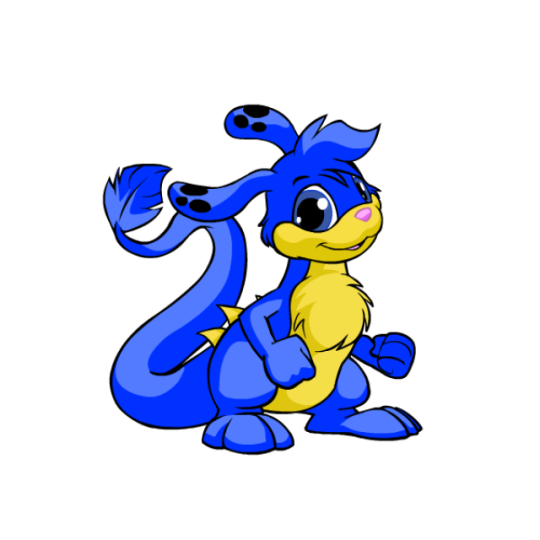
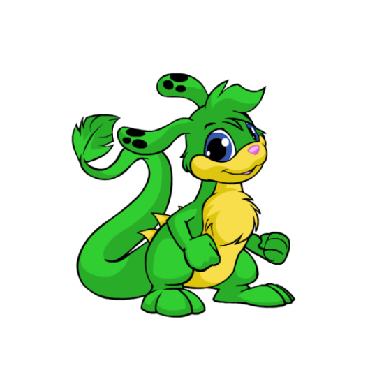
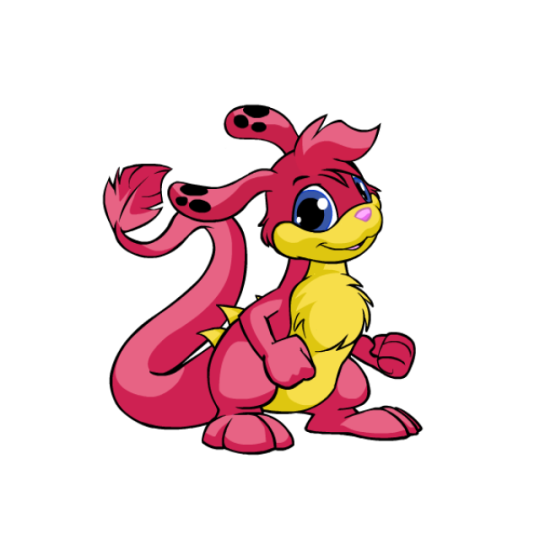
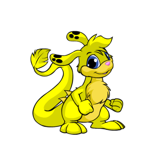
I always enjoy a good abstract creature that's still a believable animal, so unsurprisingly, I like Zafaras a lot. They've got a really unique body shape amongst Neopets that's vaguely like a kangaroo, but that's where the similarities stop. I really like the feathery structure to their tails, their long ears, and that random set of spines they have along their back.
Visually, my only nitpick is that I'm not a big fan of the base color's palettes—most PB colors fix this, but the base colors have a weird mix of beige, pink, blue and black going on with their accents and none of it goes together. I feel like the back spines should've been black along with the nose, or the spots should've been beige instead or black, etc etc.
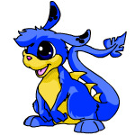
I'd argue Zafaras mostly benefited from customization as their old art was getting very dated by the time the conversion happened, and they likely would've received a redraw even if customization didn't become a thing. Plus a lot of the updates look really good, such as the tail tip shape being improved, fluff being added to the chest so they don't have a weird shape jutting out there, the feet being lengthened, etc. The only downgrade are the fists, and that's just a standard thing for customization.

My only other minor nitpick is that old Zafara eyes were almost pitch black and it gave them what I can best describe as a sopping wet meow meow vibe that gets lost nowadays. Even when they had color in their eyes, it was more of a crescent shape and overall cuter. Granted, though, the new eyes are more in line with other Neopets, so I get the change.
Favorite Colours:
Christmas: While most Christmas pets are just the standard reds and greens, the Christmas Zafara goes in a completely different direction by being an angel with a very pretty white and yellow color palette and a nice get of wings. It's super simple but very pretty. I also like how they fixed the color balancing that I mentioned above by changing the ear spots to yellow and making the tail tip match. (I do kind of wish the nose were black or something, but that's an extreme nitpick.)

Maraquan: I am 100% cheating by including this one because I usually try to stick to only pet colors you can obtain in the present day, but with UC styles becoming a thing I'm hopeful we'll be getting the old design back one day.
Because yeah, I absolutely love the pre-customization design; making it a sort of sea horse/leafy seadragon cross works perfectly with the Zafara's body shape, the pose is lively, and I love the bright pink fin accents to contrast with the teal body striping.
(The converted is... okay, but the concept was completely lost by changing the pose, the striping was reduced too much, and the body has this bizzaro lumpy shape instead of being a smooth curve like it should be.)
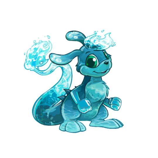
Water: Technically speaking this isn't too fancy, but I just think they did such a nice job with this one. There's so much gorgeous detail in the shading along the head and tail splashes, and the artist really did a good job at capturing that watery look. The choice to make the head tuft and tail splashes in the first place was a great choice, and I especially love how the ear spots are water bubbles. Super pretty all around.
BONUS: I really like burlap pets and think it's an underrated color, so I figured I should give the burlap Zafara a shoutout for being one of the best burlaps out there. The colors are kept muted, the uncanny valley vibe is present, the way they handled the fur tufts looks great, and I like the various slate blue patches on the body, which match with the back spines, spots, and eyes.
40 notes
·
View notes
Text
Day 18: "Hear me out, Angel" - Good Omens, Singer Fem!Crowley upcoming? + Important Announcement (♥Print Shop Opening, and promo code for you all!!♥)
Birds flying high
You know how I feel
Sun in the sky
You know how I feel
Reeds drifting on by
You know how I feel
It's a new dawn
It's a new day
It's a new life
For me
And I'm feeling good...

"Hear me out, Angel..."
Yes, hear me out, because I have the pleasure to announce that my Print shop is finally open! (link here)
I am so excited!!!! (And nervous too, but this is quite usual for me as you know :-p)
For this grand Opening, please have this special code for -20% on your first purchase: NAH4QBRN. It will last until the February 8th, but no minimal amount!


You have been quite a few to ask me if I do prints of my art, and more often since my most recent artworks ("We're bound" & "Bliss"). Well, here we are! You’ll find there my most appreciated artworks ("ancient" style and "New Red" style) There are some beautiful close-up shots of my biggest artworks too. If your favourite artwork/close-up shot is missing, please contact me on my Ko-Fi or ask on my Tumblr and I will put it in the shop too!
Come and take a peek!!!
About the sketch
Realisation time: 3 hours 30 minutes
Today's theme: my followers on Ko-Fi discovered last night my first attempt as drawing a new Fem!Crowley of mine. “Attempt” because I lost too much time hesitating on the traits, then the colours, then the shades… And the final result didn’t even please me -_- For the Wives, I usually draw DT/MS physical traits then try to smooth it and feminise it, but it clearly doesn’t work well for me. So, I tried something different here, and started to draw in my ancient style, then slightly changed the physical traits until I obtain a face that look like DT’s Crowley face. Maybe there are some tutorials about how to draw and feminise masculine traits… But, no, it’s funnier to find by myself :-p (for now).
I have an important new project in mind, a “Singer/Musician” ensemble of artworks (AU or Canon, I have yet to decide). But you my dear GO fam, you'll have a role to play in it. So, I HAVE to be able to draw my Wives more classy and sexy than ever. For now I will train a little bit more, but I hope I will be able to talk about it soon, maybe next week?
The Daily Sketch Challenge Rules:
Personal challenge: a simple sketch each day
Goal: forcing me to keep things simple - inking, shading, just a few sashes of colour
Improvement pursued: to get the movement, the emotion, finding how to add depth, learning how to leave things barely finished
Max time allowed: 2 hours Ow bloody hell, what if I change this rule for good? Each time for the last 7 days I had a perfect raison to spend more time on my Daily sketch. (Today it was the Grand Opening =D)
[Previous] [Next Day] [First Day]
Don't forget to 💕/ reblog ;-)
Buy me a coffee? ♥ https://ko-fi.com/elenthya ♥
#Good Omens#Singer/Musician!GoodOmens?#ALL the Ineffables await you in the shop :-p so here we go#Crowley#Aziraphale#Aziracrow#wings wings wings!#Wings#Ineffable Feathers#Ineffable husbands#Ineffable lovers#Ineffable Partners#Ineffable Wives#Ineffable Birds#David Tennant#Michael Sheen#ElenthyaAndGoodOmens#ElenPersonnalChallenge#Elenthya#ElenthyaGallery
38 notes
·
View notes
Note
i've been following you for a very very long time (the snk askblog days !) and your art still blows me away every time. i just love your colors and painterly style. do you have some art tips, tutorials, brush recommendations etc ? i really want to improve my digital painting skills and i'm curious about your process
Oh no! Not the ask blogs..... but thank you so much for your continued support of my work 🥺♥
I think the most important things I always keep in mind is colour theory though I can't say im always successful each time I do it 😂 Honestly when I see guides it all never makes sense to me?? What do they want me to do even!!

These guys explain things pretty well though and much more professional than me:
Emel's Colour theory notes
Gigi's colour/lighting notes
And also this image right here
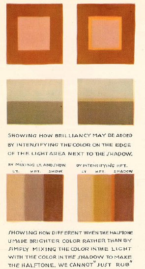
Honestly main things are
limit your palette - use a colour fill set to low opacity overlay or 10% opacity normal for the mood you want for the piece, your character might be wildly coloured but this brings it together
split/complementary palettes are great, saturate one side, desaturate the other for contrast (looks teal but its actually a grey if you swatch it )
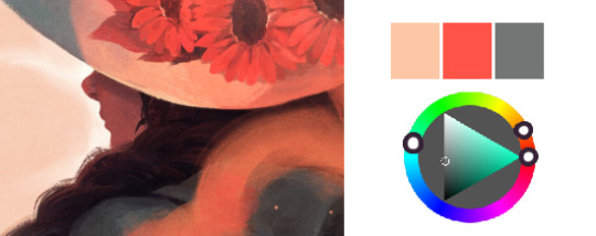
don't you dare use white grey or black to shade! dont you dare!!!!
add a slightly more saturated colour in the middle of your shading gradient for some pop
personal taste but i like to dab some colour elsewhere where it might not belong 🤷♀️
my personal pet peeve is that i dont actually like swatching from character sheets im sorry the cat is out of the bag whats the fun if you cant play around with lighting and mood
most important skill is to not be scared to try things that are hard that you think wont work out!! trust in the process!! itll look like ass the whole way through!! use colour balance at the end if you need to!!
also colour theory relies on the ryb wheel rather than rgb which really messes with you in digital settings... thats something i still need to memorise more... awful
Also tosses this out here too: Jing's brushes are my current go to since I work more in procreate now
Anyways half the time I dont even listen to myself and forget the stuff i should be doing and i have to go back and ref my own art style so who knows!!! take this all with a lot of salt
107 notes
·
View notes
Note
So you are one of my main art inspos, so I was wondering if you could provide tips on some of the "AHA!" moments you had in your journey. Sort if like things that one you knew them, your art suddenly got a lil better.
oh wow uh
it's hard to pin down specific moments but i'll do my best
vet school, forensic anthropology & human anatomy for radiographers courses (last two were electives) - this is the best way to learn anatomy. seeing how bodies are put together, especially the bodies of animals in my case, was a string of aha moments. i drew a lot of human bones and organs from life.
drawing other stuff from life as well - i learned about shading metals from a school project when i was 15. that stuff sticks with you if you try it often enough and you have a grade relying on it lmao
abandoning layer modes in most cases. i've never liked filters or layer modes and i used to think that a multiply or overlay layer was the easiest way to shade and my god no it is not. when i shade it's by direct painting and it feels so much more intuitive to me, and also i learned more about how to pick colours manually to go well together from the start. but what works for me might not work for you
abandoning my attachment to Having An Art Style. seriously guys so many people waste time trying to bring all their work in line and making it all look the same or agonising over Their Style... you don't have to do that. if you feel like drawing something completely different one day than the next then do it. you will have more fun. personally i love experimenting with how many different ways i can draw the same subject and making things that don't look like what i drew yesterday. broadens my horizons.
i've realised that if i kept going a lot of these would be just "when i stopped giving a fuck" and honestly yeah. it works and it's my #1 tip for helping me relax and have fun while drawing. you don't even have to improve at art (i'm assuming you want that since you're asking, but for everyone else - yes it is totally fine to not learn anything new if you're happy with what you have. who cares if you never learn how to draw something people think is mandatory.)
kind of related to "stop giving a shit about style", one of my great joys for a few years now has been in trying to faithfully reproduce specific shit i like with the tools i have - for example, trailcam photos, lino prints, pencil sketches, vintage comics, stuff like that. even if my motivation was just "i want to draw my werewolf character saying hi to a trailcam" and i was more or less tracing from a real trailcam photo at first, i was still learning. i learned about lighting, foliage, how to set a scene, stuff like that. it kills art block too
i saw someone say "cool shadows = warm highlights/warm shadows = cool highlights" once and it's been a core part of my personality ever since
#my journey...... thank you for the very sweet way of saying it#probably more applicable to ppl who want to make it as artists.. which i do not#but to be fair it does feel like a journey considering i started on a tablet the shape & weight of a hardback novel with windows 98#(it wasn't an art tablet. i transferred my paint sketch to my laptop and finished in the GIMP with my mouse)#info asks
159 notes
·
View notes
Text
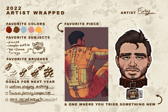
Thank you so much @bokatan and @h3raklion for the tag!
I can tell this is going to become a patented Furby wall of text™ so I'll just throw in a cut now. tl;dr: I love you all and i draw danse way too much
This has been an interesting year mostly in that its my first time posting personal art online in, what, 7 years? I stopped doing this kind of drawing shortly after high school. I picked up painting flash and have been focusing on my tattooing since then. In that time I never did any digital drawing or character drawing until 2 years ago this month, when I drew Val for the first time.
I was terrified to post anything anywhere, I think I posted one piece to reddit, but besides that I kept everything pretty private until April of 2022. I originally made this blog as a place to silently post my drawings and screenshots while providing a sort of devlog of my mods for my own records, and didn't think I would be noticed. I didn't realize people tracked the paladin danse tag, lol!
I'm really glad for all the people I've met through here, I never would have kept this blog up if it weren't for the wonderful messages from all of you guys. So much of my art, both in subject and execution has been influenced by the other users I've had the pleasure of interacting with and I hope to keep it up this year!
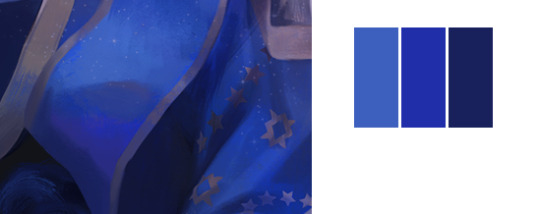
You all know I mostly just draw Val and Danse, and this is the palette I use for most things:
These are all pretty drab, I use different of blending layers and photoshop adjustments to get the colours how I want them at the end.
I usually try to use different brushes in each of my drawings, but these are the ones I come back to most often. The first one is a variant of one of these brushes, I modified it to change size based on direction and tilt. I used the brush almost exclusively until august and its still my favourite for quickly laying out forms and values. I use this one for freckles. The rest are some of my top picks from True Grit Texture Supply, mostly from Chromagraph and Monomania.
I'm glad I was able to really get into drawing this year, and going through my folder I'm pleased with how my anatomy and faces have improved. However I am disappointed in how much of it is just the same ginger fuck. I'm really stunting my growth by not varying my subjects, and now that I'm more comfortable with the tools I want to push myself to actually. uh. try. Put in the effort to make art that says something, tells a story. Less single characters floating in blank voids. More people interacting, scenes, environments. I also really want to get back into digital painting, I used to be really into digital painting and in theory know how to do it. I'm going to try and dig out that old knowledge lol.
Despite being bit bland, and having some glaring errors that still bug me, that Danse drawing is still one of my favourites. I think I spent at least 8 hours on it. I was dealing with some personal issues at the time and just really wanted to scratch that brain itch that the bos knight uniform gives me. It's stupid, I hate it, I can draw it nearly completely from memory by how often I'm looking at it.
The 'tried something new' panel is difficult because I feel like a lot of my recent work has been pretty stagnant. It's all done with the same technique, same palette, same boring cel shading, same layer order, boring. This is one of the few times I did any proper digital painting, and tried to adapt the looser style that I use when I'm drawing in analogue mediums to my digital work.
I just talked about art here and not mods because that would be a whole other wall of text. But it would boil down to: love to do it, no time, and expensive.
Also, if anybody is interested, I do my drawing in Clip Studio Paint and Photoshop on a Surface Laptop Studio.
39 notes
·
View notes
Text
Well, it's 2023.
I'm hoping against everything that it is significantly better than last year (and the several years previous). I don't know why it would be but nevertheless, I am hoping, and I'm going to do what I can to make it better myself. I'm going to put in the work to love myself more and forgive myself more; I've fallen back into bad habits lately and I need to get a handle on them again, especially when it comes to things like calling myself names and insulting myself when I make mistakes and having unreasonable expectations re: making mistakes in the first place. I haven't been very kind to myself this past year and it hasn't done me any favours, so we're going to try to do better.
I want to improve in terms of my art this year. I'd really like to work on my colouring and shading because they've always been shit, and good colours will go a long way towards making my stuff look more polished and finished. I've been bitter for years about seeing people with objectively terrible lineart and anatomy skills having 80k+ followers on Twitter and making bank on Patreon just because their colours and shading are decent and go a long way towards hiding the shabby fundamentals in their work. This year, we will close the gap between our lineart and our colours/shading, or we will die trying.
(Also my Twitter followers bade me to post mpreg on main and I am a man of my word, unfortunately.)
I'd also like to work more on Farewenden if I can. We're still working on getting our ADHD meds straightened out and we're... getting closer, I think? Hopefully it'll be easier to knuckle down and write once I can get that sorted. Soon. Soon.
And! I'm having my first appointment to get the ball rolling on top surgery this year! There's been some bullshit over this because of my BMI (muscle is heavy, it turns out), but I'm optimistic that I can make this happen if I'm smart and handle the medical professionals I have to speak to to make all of this happen with the right gloves. Stupid that I should have to do that at all to be honest, but it is what it is; the NHS loves treating people like walking sets of numbers that are either Within Normal Parameters or not, and we have to work within the limitations of the system we live in, regrettably. We'll get it done one way or another.
I'm going to do my best to make 2023 comfortable and positive for myself. The world conspires against me in this endeavour, as always, but that's never been a reason not to give it my best shot.
I hope 2023 is a good year for you too, dear reader.
17 notes
·
View notes
Note
Been meaning to ask, since you seem to be one of the few artists using the same process as me. I'm a uni student on my way to become a pro character designer and storyboarder, though I prefer doing most of my works on paper with every tool I have. Whether it is a pencil, a marker or even ink.
My question for you is, what are your primary techniques when drawing? I'm trying to learn new ways to improve, and your art is my main inspo when it comes to shading and coloring.
Hello! Thank you so much for the message, I’m sorry it took me a while to respond - I was thinking about how I wanted to answer. I’m not the best at explaining my art making especially technical aspects, but I’ll try my best to answer and hopefully it will be helpful for you!
So for colouring and shading - I honestly spend a lot of time drawing by just throwing things at the wall and seeing what sticks - lots of pieces turn out muddy or not quite right and it helps me become more familiar with what colours I have available, what I might be missing and how they’re all gonna interact. I suppose I always start having a clear idea in mind of what sort of emotion I want the piece to have, and from there try to narrow down my colour palette to the essentials. So if I know I want a piece to be primarily red and purple, I focus on those - any other colour I add is used to compliment or accentuate what overall colour tone I want focused on. the more complex the colour palette the more important I find it is to have colours carry throughout the piece and help guide the eye around so nothing stands out awkwardly where I don’t want it to be…
I also try to have a good repertoire of different mark making for colouring and shading. I personally don’t like pieces that look highly rendered and incredibly smooth, I like being able to see the mark making. So adding in different strokes, textures, strikes, swirls etc. creates more interesting effects and I’ll use those to layer up colours, create shadows, highlights n depth etc. I also just like playing with dramatic shapes for shadows or colour blocks that draw the eye to certain points of the figure or composition. even if the lighting doesn’t make sense in a realistic sense, its drawing focus. I guess I kinda treat it all like dramatic stage lighting and makeup - too bold to make sense in an every day context but with the right combination it works within the piece if that makes sense…
ANYWays I hope thats kind of helpful or interesting - I’m not the best at documenting WIPS as I’m working because I hate breaking focus while working on a specific step of a drawing fjkdfd…
Best of luck with your schooling and your future art endeavours!!
#answered#sorry i dont have like step by step pictures or anything dkjfhsdjf i dont really document my work like that#and id be self conscious if i tried to suddenly do that intentionally haha i think it wouldnt turn out
4 notes
·
View notes
Text
I BRINGETH!
Hate to admit it, don’t wanna name names.
But the level of structural accuracy of canon Na’vi character fanart MUST improve.
It’s been 6 months now. And I still keep seeing some very high quality art in amazing styles, however, the characters themselves are severely lacking in their accuracy.
I’ve been pointing out what I can about the worst victim of this, Recom “Ritch” Quaritch, and I’ve noticed people have been paying more attention and noticing these little things on their own. It’s great seeing artists working hard and perfecting their skills.
I hate as an artist to have to say that it’s not been enough for quite a lot of artists I’ve seen so far. I know everybody is improving and working hard. Including myself. And everyone has to start drawing Na’vi somewhere.
But I think I need to nudge things along a bit more. And I recently discovered a new way that may help.
Using a painting filter to basically give each character human-ish skin and eyeballs. (Unfortunately only in one light tone which is very frustrating but I guess it’s consistent and the lighter shade will make details harder to miss in different lighting situations) Clearing up the beautiful to observe but visually cluttering to study and paint details and colour palettes. Some of you may find this horrifying, I dunno. A warning anyway.

For months whenever people tell me “He’s ugly in the movie!” I’d rebuke with “He’s classically beautiful. Like works from the Italian and Dutch masters. Like the ancient sculptures of Rome. Slap him down on a couch in front of Da Vinci or Michelangelo and they’d piss themselves with sheer awe.”
Well, here’s the proof... kinda... using screenshots I’ve collected and made myself in as many angles as I could fit together for now with different levels of quality until I can get my 4K inputs sorted :

STOP JUST PAINTING HIM BELOW THE NECK!
YOU HAVE NO EXCUSES NOW!
Try rendering him similar to this in your target or individual style, and THEN put the Na’vi detailing on top. See if it makes a difference.
Granted, the filter only worked on some angles (I have more images to add later too) and it did make some very minor alterations, I did my best to mimise them, regardless take note. And it couldn’t get every little crease. But with how much missing the mark there’s been anyway, I guess aiming for this is still better than the status quo (again not naming names except for maybe myself).
I’m gonna be doing this with other characters, too. I simply figured starting with him would both be the best test as to whether this would help as well as fight the tide of “this artwork is amazing but who the hell is that guy” disease.
It might also be worth my while to morph these together and see what I get. 1 uniform face for each character. Guess I’ll see what happens with the others.
Note the other posts I’ve made about the finer details like moles and freckles past and future as companions to this one.
I’ve also got another post coming up about the consistencies and differences of the patterns in the bioluminescent freckles each Na’vi subspecies has so watch out for that if you’re interested.
(SO GLAD TO BE ABLE TO SHOW HOW VISUALLY DISTINCT HE IS FROM HIS HUMAN DONOR, TOO! LIKE DAMN. THEY HAVE THEIR SIMILARITIES OF COURSE BUT I SHOULD PROBABLY DO THE SAME TO HUMAN QUARITCH SEE WHAT SHOWS UP)
UPDATE HOLD UP I THINK I FIGURED OUT A BETTER WAY OF DOING THIS BY USING THE PAINTING FILTER AS A BRIGHTNESS LAYER WITH THE ORIGINAL IMAGE COLOURS UNDERNEATH BEHOLD MUCH BETTER RESULTS AND NOT HUMANWASHING I’LL TRY AND REDO THE ORIGINAL IMAGES THIS WAY:
#avatar fanart#fanart reference#atwow fanart#fanart#art reference#avatar na'vi#na'vi character#avatar recom#recom#avatar quaritch#recom quaritch#na'vi quaritch#avatar miles quaritch#recom miles quaritch#na'vi miles quaritch#miles quaritch#Colonel Miles Quaritch#recom colonel quaritch#quaritch fanart#recom quaritch fanart#colonel quaritch#avatar colonel#na'vi colonel quaritch#na'vi with human skin#human skin na'vi#de-blued Na'vi#still not sure about the implications of this but again there's no skintone options and this is for artistic reference#now go forth and do better
3 notes
·
View notes
Text
Yet More Art! (This should be all for today.) Milo Speaks!
This is the illustration for Tin Soldier #10, Short Subject on an Eye: A Conversation with Milo. It's been through some changes!
Ah-ha, another exploitable resource, which I used to produce the illustration for #86 quickly.
Milo is not necessarily bad at smiling - he can do everything Ann can do - but when he knows he should be smiling, he overcorrects and it looks weird. This smile is half genuine excitement and half terror. Still, if poor Calliope doesn't understand music is not screaming, maybe he can help her out with that - and maybe she'll like it, and maybe she'll like him, and maybe the can go to the zoo together and eat a sandwich and hold hands and oh my goddddds...
That's four little instalments before he utterly screws up his relationship with her and gets slapped for proposing marriage in the worst way, but he means well. (And they work it out eventually!)
Art with colour in it (apart from black, white and the paper screen) is a post-Calliope thing - Year Two and beyond. I still have 54 images (yiiiikes) left to produce for Year One, but I doubt I'll have the stamina to keep knocking them out in order. That image might evolve some, colour-wise, but I'm keeping that excited rainbow halo. I should probably be using more halos, but Milo needs a visual representation of his emotions more than most.
I'm sitting on this stuff for a while before I put it up on the site, so I can catch any small errors and make minor edits. Maybe more halos, maybe slightly different expressions or improved shoes, who knows! You should bookmark my site and find out! Eventually, there will be more story too. I'm just trying to fill in the art and build an audience right now.
Here's the original pen-and-paper version of Milo trying to talk...
...and the shaded version!
(I kept the sketch from that one!)
#illustrations#art evolution#tin soldier and soldier on#nonverbal people need to communicate too#just slow down and pay attention#and for god's sake don't talk FOR them unless you are VERY sure what they mean to say#yes sometimes i can't talk either#it sucks already so please don't make it worse
2 notes
·
View notes
Note
can i ask if you have any tips for beginners at pixel art/like any input for where to start from your own experiences? it's cool if not of course!
Hi!! Yeah! I love talking about pixel stuff! I ironically started by doing those silly bases on dA and then decided I wanted to try and do my own!
For making the art itself I just use SAI and the smallest brush on the binary tool and use that (you can make a binary eraser on SAI by duplicating it and setting Opacity to 0%) Other than that its just normal drawing! But you do have to think a bit more about how you do the lines, like if its legible and if the shapes arent too stiff and things like that! (btw look up about dithering for shading, thats the name for the gradient/shade that has that cool classic pixel affect, it helps on colour limitations if you want to make a gradient)
There is plenty of cleaning for the lines when youre drawing in pixel art, I made this to kind of show what I mean! If you feel like you prefer the look of the right one, defo go for it! This is just something I thought is helpful to point out because I find in my experience that clipping those bits off can help get the shape to come across bit better!

Other than that all I can say is just go for it and try it! Its trail and error to see what works for you honestly and I notice everyone does it differently, there is a huuuge plethora of other styles and interpretations! But basically, its not as hard as it looks and once you get the hang of it its very fun to do!
For animating, I use Aseprite. I used to put stuff together on stuff like, Ezimba and other free gif makers but personally I've been able to improve so much more by using that because you can flip thru the frames and theres an onion skin and things like that! I personally do a mix of frame by frame and tweening! Its a little messy but its what works for me, so my usual process is like
Draw thing - open as a transparent png in aseprite - make one more frame so og one is still there and untouched then just start rotating bits until the animation is how I want it then i go back through and clean it all up, if I wanna add frame by frame its typically one of the last things I do (like blinks, sparkles, tails etc)
As you can see rotating it (atleast how I do it, not sure if theres an easier way djfshdj) it scrambles the pixels! So I go back over it and clean it up, this guy was made with that process when I was still kinda figuring it out, his tail is frame by frame but everything else was done in the tweening way, for him I seperated all of his limbs to different layers. By rotating it, its easier to do big animations and keep it all even! Also I am absolutely not brave enough to do a full frame by frame body yet lmao
One of the most fun and easiest animations to do first off is just a blink and sparkles, they look good and theyre very easy once you get it down! Feel free to open up any of my pixels in aseprite to view the frames for educational purposes! I am not professionally trained for animation but I enjoy making them for myself and other people!
My way to go about it is held up with ductape and hours of messing about in aseprite so I'm sure theres easier ways and plenty of different techniques! And also sorry for the ramble but I think this is everything thats worth mentioning off the top of my head!
3 notes
·
View notes
Note
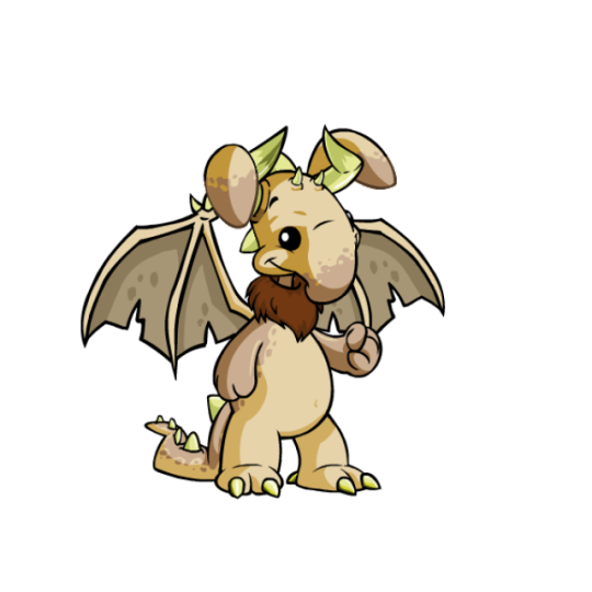
Oh mannnnnn Neopets reviews…how do you feel about my fav, Blumaroo?
Blumaroos are very vaguely based off of kangaroos, but they don't share too much in common other than jumping ability and the -roo name. Instead, they have a great abstract design that feels pretty realistic while being a complete fantasy creature, with floppy trunk-like noses and details that they can bounce on.
Visually, the soft pink accents of the nose are complimented by the ears, and this base works as a good neutral to match any color. They have these nice dot eyes and smiles that capture their happy-go-lucky nature, and just have a nice shape to them. I also like them having their own land and distinct personalities; it helps them stick out a lot in my mind.
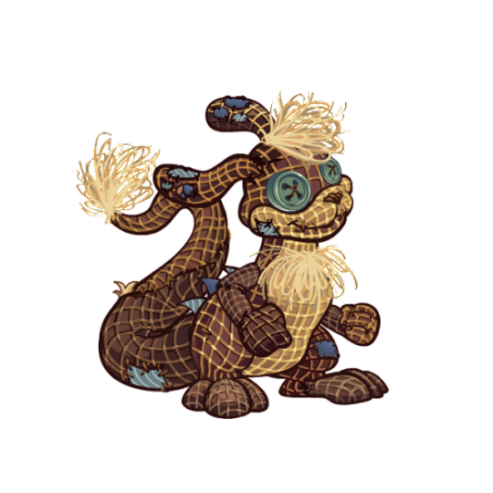
Customization-wise, the Blumaroo is a mixed bag. On the plus side, their old artwork was dated and needed a refresh (note the almost complete lack of shading). I like the way they're fatter now, the loss of the belly button is an improvement because it felt weird that they had one to begin with, and they come across as a bit happier in the new art.
But on the minus side, the lose of their old pose is a tragedy. Blumaroos bouncing and standing on their tails was one of their most interesting characters, and while it's obviously still a trait of the species, it's a shame that it's no longer shown in their art. This is particularly sad because their adorable heart-shaped feet are also hidden from view, which has the side-effect of no longer carrying the pink through the design as well as it used to.
I get that customization needed to regulate the poses a bit more, but seeing as each item has to be redrawn anyway, would it have been that hard to keep them on their tails? It's not like the Lutari where the pose would've made it difficult to see clothing or something. It's otherwise a fine conversion, but man, it would've been perfect if we got both the new art and old pose together.
Favorite colours:
Plushie: Blumaroos already look pretty huggable, but the plushie form ramps it up to 11. I love the soft blue color with just a few pops of color on the eyes and tail patch—it gives the impression of an old and much-loved plushie. The converted version isn't bad, but it unfortunately can't compete with the unconverted version, which has much bigger, floppier ears, a thicker tail, and a very cute pose.
Tyrannian: Speaking of colours that looked better unconverted, dang, the Tyrannian Blumaroo got it rough. I love the original's brows and horn-ears, with this nice neutral dappled brown serving as the base. The converted version had to change some things obviously, but it also feels like they didn't really try—why doesn't it keep the same expression (unconverted Darigan Blumaroos have different eyes, so it's obviously not a problem to change them)? Why is the brown on the tail so much lighter to the point where it's barely noticeable? Why is the ruff now red instead of the dark brown of the wings? Why are the horns so small, and why is the perspective wrong on them relative to the ears? Bleh. At least the original's still great.
Oil Paint: Thankfully, here's a Blumaroo color that looks great with the customized pose. Such a beautiful color palette, combining little strokes of colors with pretty flower-like blotches interspersed throughout. I love how the colors also flow with the body, like how the torso goes from green to red, or how there's red right around the feet. Lovely all around.
42 notes
·
View notes
Text
26.07.22
I still haven't recovered from the creative block exams have caused me. It's been going on for +20 days now and I figured out I should try to do something to solve it.
So today, I will be sharing with you how I deal with writer's block and some little things that have helped me in the past.

These are some things that might inspire you/help get you out of writer's block.
Go out. I usually go for a walk and sit down in one of my favourite spots. I get some fresh air and I also get inspiration from everything I see. I try to be as observant as possible in order not to miss any details.
I usually take a small notebook with me everytime I leave the house. That way I can write down any ideas that come to my mind.
Listen to music. This could be any type of music, from acapella to just instrumental music. Personally, I really enjoy classical music and feel like it inspires me the most - but there are songs out there with beautiful lyrics that also do the trick! This depends on your personal taste.
My personal recommendations would be long, classical music playlists.
Look for "real-life" writing prompts. This is related to the first point. Go for a walk and try to pay attention to any small details that can wake up your creativity. Here's a brief list of things you can try to focus on:
People, facial features, clothing styles, groups of people.
Colours, shades.
Smells.
Buildings, architecture, windows, any kind of decorations.
Plants, trees, flowers.
Reread any of your old, unfinished projects. Maybe you can start working on them again. Furthermore, you might find some interesting ideas that can be used again or improved (characters, scenarios, etc.)
Relax. It is always more difficult to create a good story or write a poem if you are stressing over the fact that you cannot write because you have a writer's block. Try to calm down.
Let your mind wander freely. Some ideas just find their way naturally into your mind. They appear suddenly, without the need to obsessively search for them. Take a deep breath, lay back and just let all your thoughts flow.
Visit some art-related places. Museums, galleries, monuments and so on. These places have a different aura, I believe. They are great for anyone looking for beauty and inspiration. If you cannot go there physically, you can try any online visits available or just look for works of art online.
Thanks for reading. I hope all of you find the inspiration you need in order to keep on writing and creating :)
Feel free to share your own tips. I really could use some help too.
#writeblr#literature#writing#author#books#writers on tumblr#writer#inspiration#writer's block#creative block
2 notes
·
View notes
Text

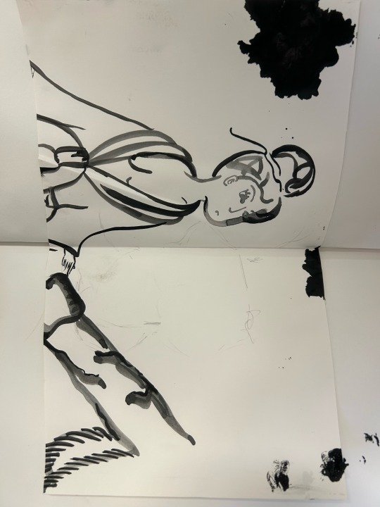
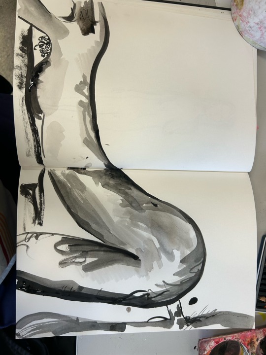
Drawing Ink Experiment
A media of art I have always wanted to at least try is ink painting, especially just using black and watering it down multiple times to create shade and dimension within a drawing or image.
My fascination for the medium comes from Japanese Shunga Art in the 1800s.
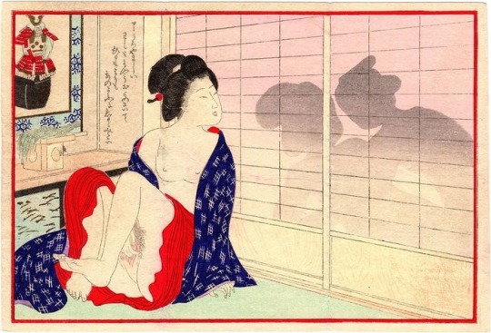
1890 shunga by Tomioka Eisen
This image to me is absolutely beautiful to lay your eyes upon. The line work is delicate and elegant, and the subtle elements of colour create a story with character and playfulness. It is an image that celebrates love making and the story behind the piece, the thrill of sex in a broader fantastical sense.
In a lot of Shunga genitalia that is created is disproportionate to represent a second face, one that is unreserved and bold. To me there is a comedic element when viewing this images especially when proportions are deliberately altered.
You can see from my first 4 images I tried to imitate Shunga with ink painting. To create these drawings I made 5 different pigmented ink trays, all descending in shade. As well as referencing Tomioka Eisen's work I linked my sex theme into my art.
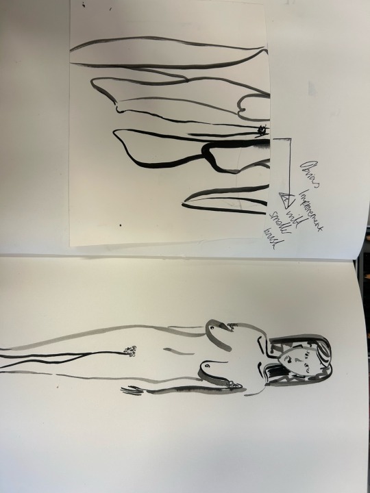
I generally liked all my images I created to say I haven't used ink properly and I self taught myself in this period. However I feel my first few tries at this medium could have been improved using a tainted hand and a thinner brush. Having a thicker line made my inaccuracy much more obvious and details weren't as appreciated.
When I realised a smaller brush would work better I instantly went to the store room and collected a finer brush to work with. I painted out an abstract nude women and I noticed a much cleaner look. I used simplicity in my favour and I feel it really worked out. Using the more diluted ink for shadows to create dimension within a 2Dimensional piece. The reason for painting a nude woman is the relation nudity has with sexuality which in my opinion is taken for granted.
Drawing these erotic images really links to previous projects I have done on women and the body. I have a fascination with the curve and the way a woman and man is built which is ironic when I am extremely insecure about my own body.
I'm glad I tried drawing ink, I feel like I need to improve a great deal with my patience and placement of the media to get the desired look I want. I feel next time I should designate more time for the media.
Now I have tried this media I want to experiment with acrylic paint, not just doing what I already know but tested different materials and even laying different things under and over the paint.
0 notes
Last Seen Blogs
moodcloth
moodcloth

sinkinglucidsensations
HD Gay Tube
mascbttmson
Just A Bottom Boy

smallbusinessresults-blog
Untitled