Last Seen Blogs
jinnie-aep
윤지

technologicaltriplets
Just a bunch of Hard Drives

mayers-com
Mayers

rrrawrf-writes
rrrawrf writes things
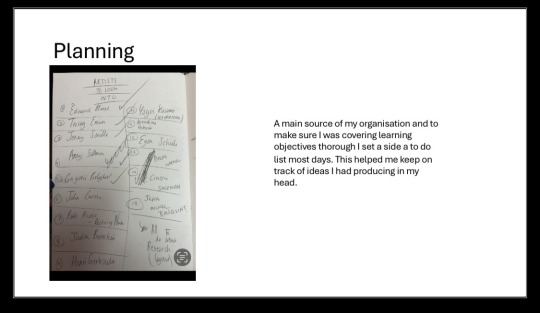
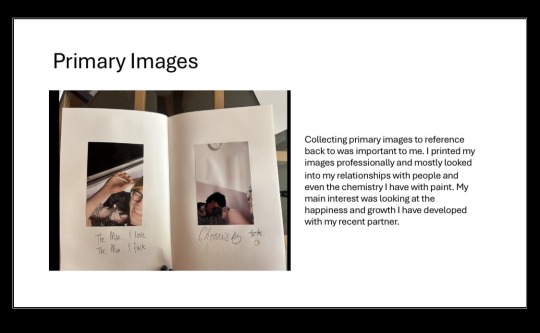
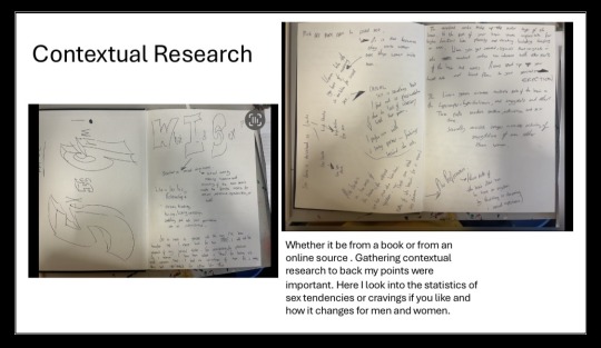
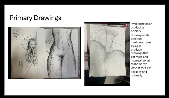
Text
College Week Activity/Location Resources
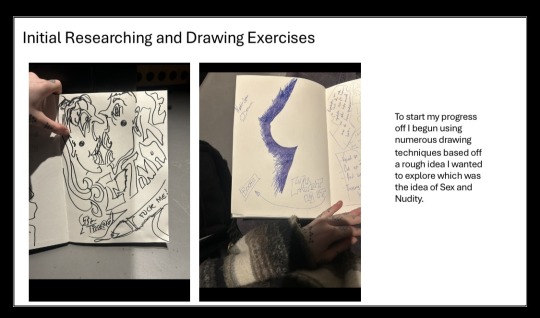
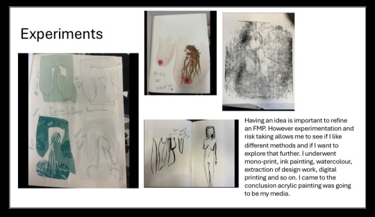
05/02/2024 Independent study, working on reading week tasks. Reading books and creating initial research on developing concept for FMP.
Sketchbook work and analysing as I go along. Library Resources, Books and an online source for internet use. Use equipment
such as iPad, and computer
tech to do secondary
research that is essential.
Sketchbooks and paint to
create portfolio work.
12/02/2024 HALF TERM
19/02/2024 Continue with portfolio work and general
research. Start developing
personal statement and application. Create some documents relating to my chosen theme. Electronic device to keep
up with journal work and
general development.
Printer to display images I
can reference back from
and use as inspiration.
26/02/2024 Continue with general project work
gathering primary and secondary
research from different sources.
Continue with project proposal application.
Continue to problem solve and receive
critiques from peers and tutors. Sketchbook to document any
essential annotations.
Electronic device to research
and support my practical
work.
04/03/2024 Continue with general project work
gathering primary and secondary
research from different sources
Continue to problem solve and receive
critiques from peers and tutors. Device to take images that
relate to my chosen concept,
such as phone or camera.
Different mediums to
experiment with primary
drawings.
11/03/2024 Secondary research to gain a general
consensus of the theme I want to go
down.
Develop portfolio work for socialism
as well as attending group tutorials.
Sketchbook work and analysing as I
go along Various materials to show
experimental skills.
Printer to print out further
images that relate to my
theme. OneDrive software.
Use printed images to
material test.
18/03/2024 Further Materials Testing. Show Various
techniques and methods.
Keep building ideas up for my
concept, get more specific. Do this by
looking at different references such as
books and articles. More varied materials.
iPad to do further research
into concept.
Any books that link to my
developing concept.
EASTER HOLIDAYS
EASTER HOLIDAYS
08/04/2024 Contextual research. Look into artists/Designers and general research with primary images. Who I am inspired by. This can then strengthen my project concept and any practical work I develop. Continue to use checklist handed out make sure I am up to date with all work. Primary sources such as
images from iPad camera.
Different mediums for design
plans. More materials and
primary images to refine my
concept.
15/04/2024 Research my audience, does my project reflect my proposal effectively. Online research source, primary research, such as interviews.
22/04/2024 Refinement of FMP. Start to begin clear development and problem solving along the way. Continue to undergo peer review and group critique. Surface to create final piece
on. Specific mediums I plan
to use to create final piece.
Primary images to refer to
(on iPad) as well as
secondary images and
general research. A4
sketchbook that has all work
I have done so far.
29/04/2024 Continue to develop final piece, make
sure to stretch and develop it as much as
I can, annotating my thoughts and
feelings whilst creating my piece. Get
feedback on what I have produced so far,
see if I can go through with any advice,
they have given me. Mediums needed for final
piece. iPad to create
secondary research to back
up my concept even further.
Colour testing and palettes
06/05/2024 Painting and Prep work for exhibition. Installing my FMP into the studio ready for 09/05/2024. Make sure I am in college to undergo my visual plan for exhibition. Plan and use previous notes to create my imagination and to exhibit my work accordingly.
13/05/2024 Making sure all theory work is done, including pecha kucha, project proposal, evaluation, action plan, bibliography etc. Hmad in date 16/05/2024 Have all sketchbooks to hand to make sure all written work is accurate and has the correct grammar. Onli
0 notes
Text
Bibliography
Books
Author-Book Title-Year-Publisher-Location
Lister.K-A Curious History of Sex-2020-Unbound-London
Hirsch.D-Redeeming Sex-2015-InterVarsity Press-Illinois
Weiner.J-Who Do You Love-2015-Atria Books-New York
JLey.D-The Myth of Sex Addiction-2014-Rowman And Littlefield Publishers-New York
Carnes.S- Mending a Shattered Heart-2014-Ebook.com-N/A
Blumenfield.D-Overcoming Racism and Sexism-1995-Rowman and Littlefield-New York
Simone.S-What Every Man Thinks Apart From Sex-2011-Talent Shed Limited-
Crowborough
Paige.L-Sex Symbol-2017-Laurelin Paige-N/A
Johns.C-Sex or Symbol?-2000-Routledge-Oxfordshire
(ED)Zillman.D-Pornography-2012-Taylor and Francis-Oxfordshire
Saunders.D-On Pornography-2016-Palgrave Mac Millan-London
Dines.G-Pornography-2013-Taylor And Francis-Oxfordshire
Hamlin.H-Full Frontal Nudity-2013-Scribner-New York
Carr.P-Nakedness-2014-Reaktion Books London
Galleries
Museum-Exhibition-Date
Tate Museum- Women in Revolt-26/03/2024
Firsrsite Gallery-Big Women-18/06/2024
Tate Museum-Now You See Us-16/05/2024
Burlington House-Marina Abramovic-23/08/2023
Art Gallery of Creator Victoria -In the Flesh-31/03/2023
Websites
Author-Web Adress-Year-Date Accessed
Kelly Richman Abdou-www.mymodernmet.com-2018-21/02/2024
Balsas Takac-www.widewalls.ch-2019-21/02/2024
Alina Cohen-www.artsy.net-2019-21/02/2024
Rolf Lassese-www.jstor.org-2005-21/02/2024
Ineke Knudse-www.medium.com-2018-21/02/2024
Chris Harvey-www.telegraph.co.uk-2014-21/02/2024
Jonathon Jones-www.amptheguardian.com-2013-21/02/2024
Mike Wade-www.thetimes.co.uk-2022-21/02/2024
Rachel Cook-www.amptheguardian.com-2013-21/02/2024
Jonathon Goodman-www.whitehotmagazine.com-2012-21/02/2024
Emine Saher-www.amptheguardian.com-2016-21/02/2024
Lexi Mantakis-www.dazeddigital.com-2018-21/02/2024
Helen Molesworth-www.frieze.com-2020-22/02/2024
Laurie Barron-www.ocula.com-2021-22/02/2024
Angena Rigamonti-www.studiointernational.com-2023-22/02/2024
Desi Gonzakez-www.artnews.com-2013-22/02/2024
Stuart Jeffries-www.amptheguardian.com-2022-27/02/2024
Jennifer Higgie-www.frieze.com-2007-27/02/2024
Glenn O'Brien-www.interviewmagazine.com-2009-27/02/2024
0 notes
Text
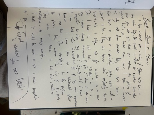
PROJECT PROPOSAL FMP
Rationale
Coming to end of this year my skill set and knowledge has progressively grown.
Constantly expanding my personal interests within the art world, testing different paint
methods techniques and ways of application. My love for paint has motivated me this
FMP and I plan to continue to develop my skills with acrylic and and using the
application of my hands to communicate my themes. I want to experiment with scales
whether it be small or immense, I feel being able to communicate a message on all
diameters is important and a skill I desire for my art career. I have benefited majorly
from contextual studies this term and artist research is an ongoing process I wish to
continue to back up my practical work and other research.
Project Concept
The idea behind my concept is to go down a personal life journey of my own with my
theme of finding a person romantically that builds your sexual confidence and own self
worth. I aim to go down a venture of how my body confidence has grown through
experiencing a healthy relationship which I am in currently. Through my research and
practical work, I want to research into how men and women are seen differently within
intercourse and the pressures both genders have with content such as porn out in the
world and how that impacts a relationship. I aim to thoroughly support my work with
primary images that fluently link to my theme.
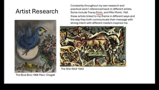
An artist who has provided me with inspiration this term is Tracey Emin who is a
multimedia artist who focuses on sexual misadventure, heartbreaks and masterbation
amongst other things people avoid talking about. I will experiment with colour mixing
within acrylic as well as investigating ways of communicating my work through
abstraction. I will create a massive amount of secondary and contextual research
looking into the science of the sexual organs both women and men have. I also plan to
write a journal of my current sex life as well as interviewing different genders on their
thoughts and feelings on relationships they have been through and if they consider
feeling confident within there own body.
Evaluation
Through my project I will ask for advice and guidance from tutors and peers. I wish to
display all my critical thinking and problem solving in my sketchbook and online journal
as clear evidence of my experimenting and development. I will create an unusual piece
that creates a sense of debate within the minds of the viewers.
0 notes
Text
Background Descision Making and Final Conclusion
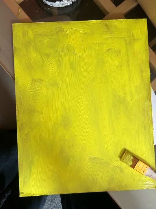
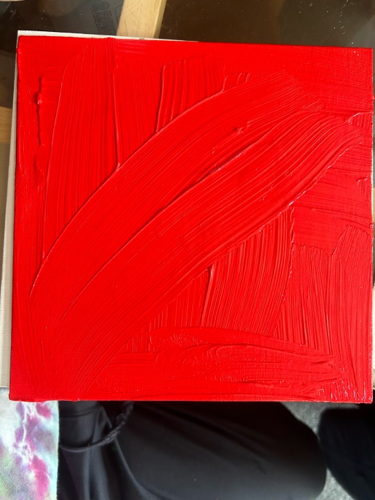
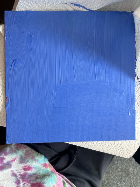
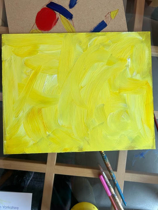
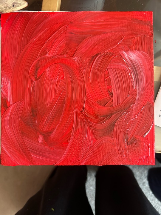
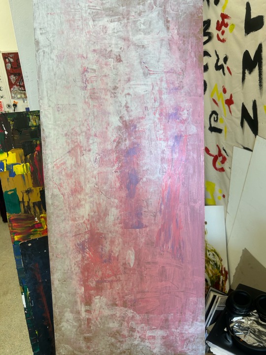
In my previous blog I came to the conclusion that I wanted to use the 3 primary colours for my 3 paintings. Red being one background, yellow the other and blue the last. I practised this imagery I had in my head by application some acrylic paint I had onto some small wooden boards, I plan on painting on wooden boards for the FMP too due to the smoothness of the application it is with paint for me.
I took pure hue red, yellow and blue and applied this to 3 different pieces of wood. I already was gathering excitement noticing my image in my head come to display in reality. Even though I was happy I knew I could be even more proud of the outcome of these backgrounds, I wasn't satisfied with the flatness of the backgrounds due to it being a pure hue. I photographed each background and then added tone and shade to each background by adding hints of white, black and more mixed colours with a low contrast to each primary colour. After doing this to each one of the images I looked at each painting and gained a lot life satisfaction from each image, I didn't need the background to be busy as the composition I was going to apply on top of the background would be lost itself. I had upgraded the look of each background without going over the top in my opinion.
The only other thing I was trying to work out when painting the backgrounds was what colours I was going to layer over the top of each one, that stood out. I automatically thought of complimentary colours to each of the primary colours. This means basically the opposite colour on the colour wheel the colour displayed.
Complimentary colours for red -
Green and blue
Complimentary colours for Blue- Orange and Yellow
Complimentary colours for Yellow- Purple and blue
To put these to the test I decided was my next thing to do. When my background of dried I will apply each composition of the opposing colours to stand out.
0 notes
Text
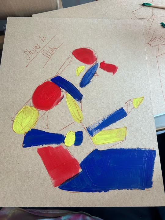
I began planning my FMP, covering basics of what I was wanting such as colour combination, overall sizing, compositions etc.
After doing all the sketches of my decided primary images for my FMP. I began dabbling in painting the images, I didn't have a set thought of what colour background I wanted I just knew I wanted to follow the pallet I created when researching into intimate colours and how they represent that image.
I mixed a pale green colour and a purple and used these as backgrounds at first, I did like the image but I wanted to link the paintings together more obviously maybe with primary colours for instance I thought at first. The original square paintings I did of my torso and a kissing image were on white canvas which I didn't really like either. The shape was wrong for my images I needed a more rectangular shape for the images I was going to be creating. Although I didn't like the canvas I painted roughly more abstracted versions of the image and I liked it but not as much as my more cubist result from drawing.
I created an abstract cubism composition of all my sketches which was my preferred choice when drawing and this time I painted the shapes I created within the layout, red, blue and yellow, and which are the three primary colours.
I liked this a lot, they complimented eachother so well but I still felt unsatisfied with this image. I took a step back and looked at it for a few minutes and this is when I realised using the primary colours was the right thing to do but the placement was wrong, this is when I discovered using primary colours for my backgrounds for my FMP were the way forward. The primary colours link all 3 paintings together and make it known that images are a series of eachother but a more interesting way of looking at the meaning behind my choice is the fact that the 3 primary colours are a foundation for all other possible colours and amazing contrasts, I want to link this to the fact that my relationship is a strong foundation and having eachother by our sides can create amazing possibilities just like the theory of the colours.
Going forward I need start creating miniature paintings of my desired look this way I can fully prepare myself for my FMP which will be much more sizeable and my knowledge of the colours will have improved immensely.
0 notes
Text
Pecha Kucha
This was a few slides from my Pecha Kucha which has just been introduced to me this year as a presentation with specific time limitations on each slide.
This presentation is a quick way of us communicating to our classmates what our theme is all about and our journey to a final piece for our FMP. The PowerPoint is made of 20 slides all with a time consistency of 20 seconds. This limits our speaking time so we have to only speak about the key important things in each topic of slide.
I view this as a fun way to communicate what I have achieved with this project as well as the things I have improved on or experimented with. In each slide I have included a title which supports different learning objectives that are essential for getting a good grade for this final major project.
Doing the Pecha Kucha this year has allowed me to gain confidence talking in front of audiences of people regarding my work which I know is beneficial for my future especially with the career path I want to take which is to be an art teacher.
0 notes
Text
Peer Review with a Student from Different Specialist Courses
Peer Review is an element to this course that I have learnt to adapt to and gain constructive criticism. As from my previous blogs you will know I have had a group review session where it was more of a social but helpful advice provided. This time I went out my way to get a more personal review from a person from each of the other specialist course. I debated doing this earlier on in the weeks but I battled it with the fact there is no point gathering advice from someone who doesn't know fine art or interested in it. Eventually I came to my senses and realised speaking to someone with different methods of art can look at my work from a different perspective and really see things I'm missing that I'm not aware of.
First I went to Communication of Design and asked Nell who is currently doing digital work, about her opinion of my work and my FMP idea.
' I really love that Rhianna experiments with topics and styles of art that aren’t commonly seen throughout college. She thinks outside the box which i find impressive. I think she needs to work on spending more time on single pieces and putting more into them rather than multiple pieces at once.' Nell
Her points were motivating and I appreciated her view on time keeping especially with the ambitious ideas I have for my FMP. I took this into consideration and made sure to write lists of things I need to achieve each day to get the grade I want.
Next I went to the fashion department and asked Acid about her views on my work. She bullet pointed her thoughts and feelings on the matter.
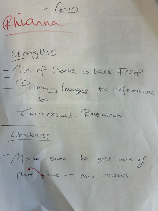
Acid gave me some great points for strengths I have and the weakness I may need to improve on. At the start of the year I was inexperienced with mixing colours and I didn't go outside of pure hues very often. Her point of going outside my comfort zone in this aspect I totally grasped and took note of. Mixing colours is something I am going to be really challenging myself with this FMP and I'm making this a priority for my final works.
Overall I'm glad I went with the idea to ask students from other specialist courses as I gained really great advice coming up to my FMP.
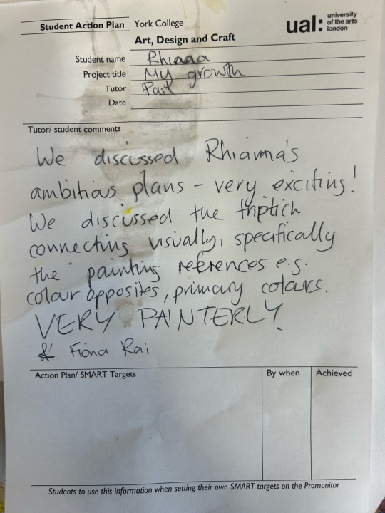
To add on I also gathered some feedback from a tutor I don't work with, just out of interest out of what he thought of my ideas and the way I was going to present my work. He made me think of the more practical side of the exhibition like where I need to place them, if I want each painting off the floor etc. He also gave me an artist to research which is relevant to my own work. Fiona Rai is someone I plan research into further whilst doing more practical work leading up to my FMP.
0 notes
Text
Audience Research for my Work
My tutor made me aware of the importance on researching what kind of audience I want to attract with my artwork. I looked at age differences and the kinds of reactions older audiences would give my work, as initially I thought gathering positive responses from older people would make me feel more satisfied myself due to more experience being held in there bodies and knowledge.
However this is absolutely not the case I would be lying to you if I said I was doing my work for a specific kind of audience, I am creating my FMP for the satisfaction of myself and myself only. Feeling proud of my own work and enjoying the work I've produced visually is exactly what I want and the only way I will feel happy in what I've created.
When it comes to the end of year exhibition I think my work will attract a mixture of ages. I know that generally there will be people my age which will be student and parents of them, which will generally be middle aged, younger or older. Due to the fact my paintings will be abstracted I think my work will course different interpretations and queries. It is all about what your eyes allow you to see.
In the big world my desired audience would generally be a mixture of age groups with different loves and career paths. But there again if my desires are not met I still will feel happy doing the thing I love which is creating artwork mostly painting.
Seeing people enjoy my work will allow me to meet new people with similar creative thoughts and feelings which is something I crave to do going forward in my life. Talk to new people and enjoy those moments.
0 notes
Text
FMP Refinement
Coming into the final month of FMP, I needed to ultimately decide the direction my final piece was going to take.
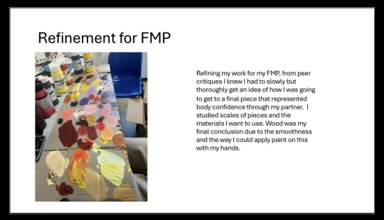
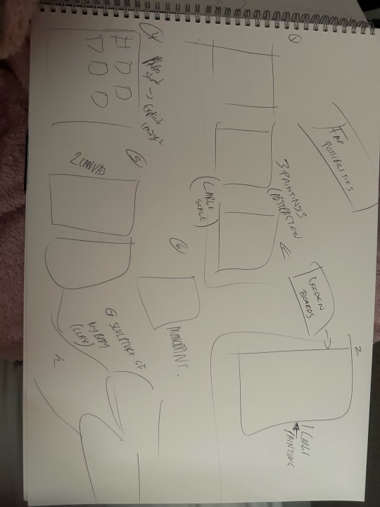
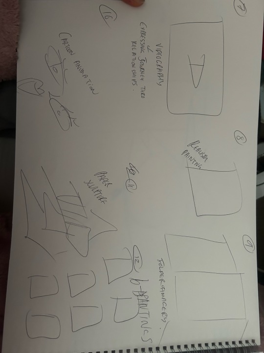
In previous projects even though I have had a rough idea of what I have wanted to create I always benefit from thinking of 12 possible FMP ideas so I can really compare what I think is best for my project. I think off final pieces made from all kinds of media and methods of art in general. It is a comparison activity I like to undergo for the strongest work in the end result. When I had come up with 12 ideas I looked at all my previous work and decided the best idea for my works was creating 3 large scale paintings on wooden boards.
I feel creating just one image will not be a clear enough message that my man has helped me with my body confidence. A 3 image composition I can reference images from real life experiences of my relationship and I can also include an image where I felt beautiful in the time being with Oli. This then tells a story of how I am in the mindset I am in now.
I knew after doing numerous practises with acrylic paint I wanted to use this media for this potential final work, due to the pigmentation of the media. I like how strong a message a colour can bring and the range of colours I can create from a small amount of pure hue.
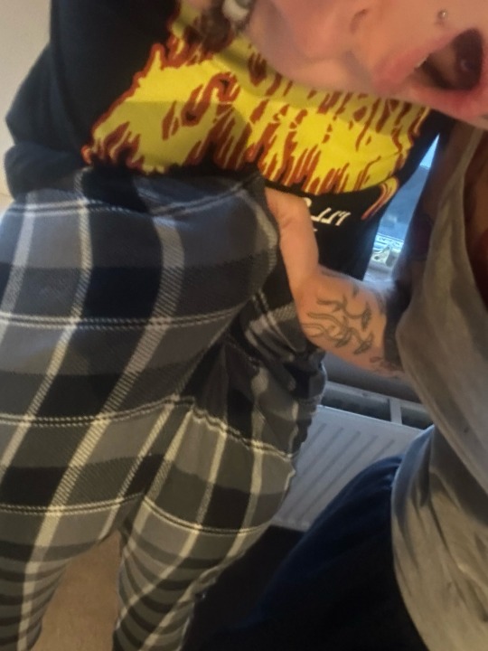
To select 3 images I wanted reference for the 3 painting FMP i looked at my primary photos blog and selected my favourite 3 where I felt something looking at the imagery.
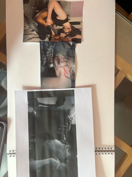
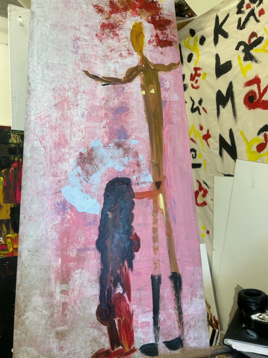
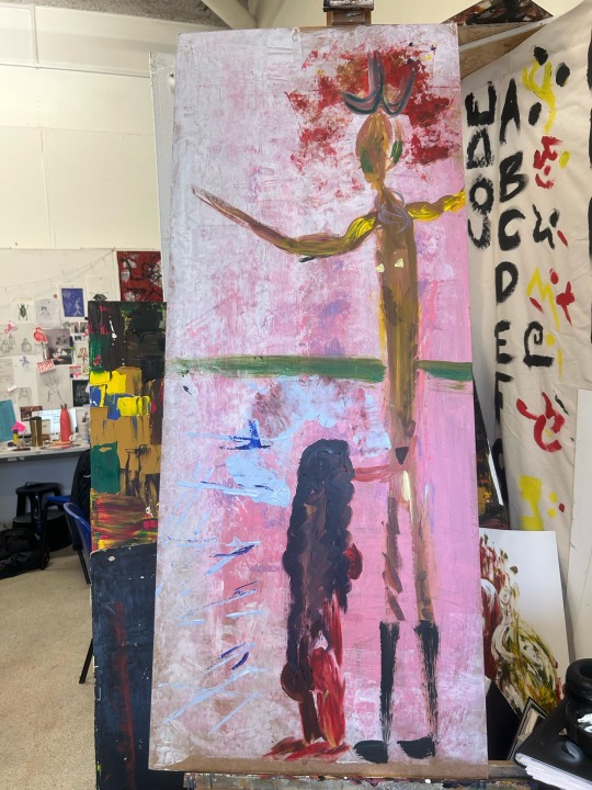
This was my decided composition for the paintings. I have used ballpoint pen on the middle image of a nude image of myself so it wouldn't be deemed explicit for viewers looking at this blog.
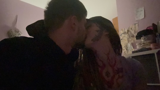
All these images I found were perfect for the message and my theme I wanted to communicate. I have an image of Oli doing what he loves which is music. I remember the way I feel when he plays to me and it makes me ambitious to get to the goal I want in my life, the second image is a nude image I took of myself where I felt beautiful and appreciated. This image represents the confidence I have grown from being in this relationship. And the final image, is me and Oli showing an intimate kiss, this represents love and the beauty in finding the right person.


I obviously wanted to create paintings out of all these images however I knew planning and really going into depth of each picture was best rather than jumping straight into creating a final piece.
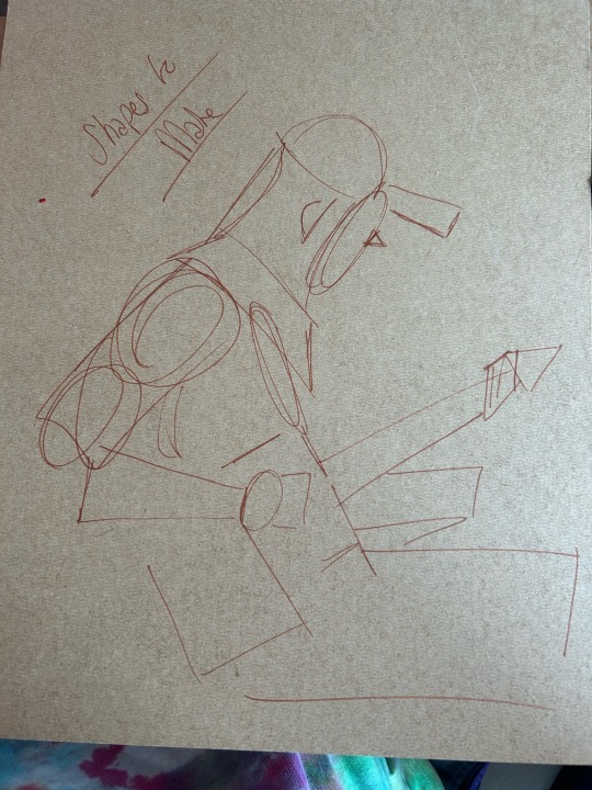
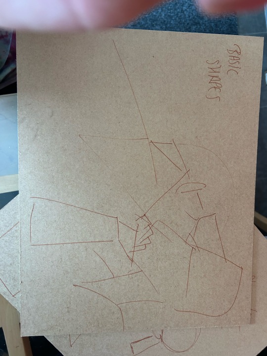
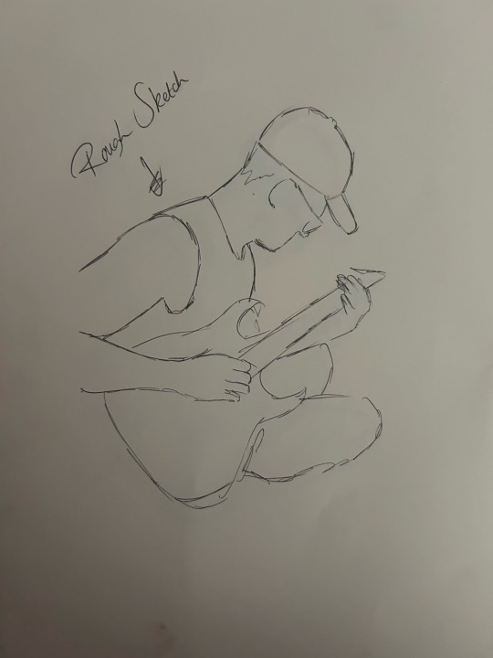
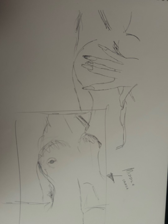
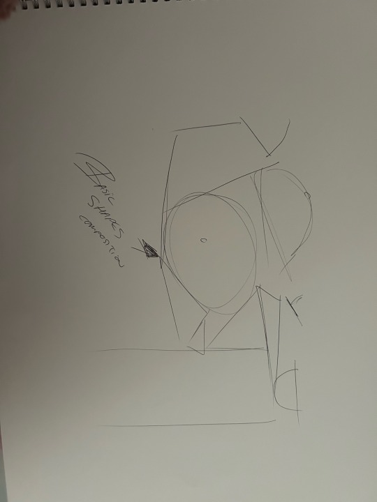
I created 3 sketches of each image, one rough sketch, one more detailed image and then an image showing the basic shapes in the composition of the primary image.
I used a ballpoint pen for all my drawing and sketches as I feel this is more pigmented and I can see my line work and the shapes I create much better than if I created the drawings with a pencil.
Doing 3 sketches of each image allowed me to really get to know the lines of each image. The first image is the hardest to create just due to the fact there are more shapes to consider.
I actually really liked my images where I showed the basic shapes of each image, which was a surprise to me. I like the abstraction and the unusual way it looks as a whole, I feel like as a painting it could be really interpretational and beautiful to look at. Going forward this is definitely a route I want to go down further so I will expand on that going further.
I also want to go large scale coming towards my FMP I feel like this would dramatise my journey which is exactly i want. I also want to include a link in each painting so it is known that these paintings are in the same story. I feel like I could do this with potentially including primary colours for each of the back grounds.
0 notes
Text
My Topic Direction Change

After a peer review session I sat down with my tutor to gather her full interpretation on the matter of my theme in general. She advised me my theme so far of sex and nudity was far too broad and it wasn't exciting enough for viewers. Creating a final piece on the matter would be unclear on what message I was trying to communicate with my viewers.
After having this chat I decided to really think about the route I wanted to go down getting closer to the FMP deadline. I have consistently done research on the body and the topic of sex, I have also incorporated my boyfriend into the mix due to gathering intimate moments with him. This is when I decided to go down a much more personal route of the intimacy with my partner and how my body confidence has grown being in a healthy positive relationship whether it be in general or sexually or just a more beautiful mindset.
I could still link all my previous work to this topic direction change but yet this time I felt way more involved and even excited knowing I was going to create something that was much more meaningful to myself. This how I became aware of the importance of continuously getting opinions of others on your work whether it be your tutor or your friend.
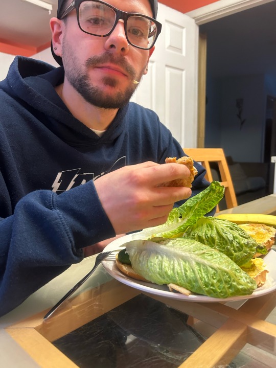
Why do I want to do this work Based off Oli ( my boyfriend)?
I have previously been in relationships where I felt unloved or just essentially not good enough whether it be the way I look or the love I give. I started my relationship with Oli in January of 2024. Oli is 24, he has autism, ADHD, and severe Anxiety. A lot of Olis traits fit together with the way I work as a person and I have never felt a connection to the fact that my boyfriend is also my best friend too. I think that's magical. The way he gives me love whether it be in a physical setting like sex, or just words of affirmation or just his general company, he confirms I am beautiful everyday of my life. I have never felt so confident during sex with a man also. He lets me know all the time it's okey. And this is the reason I want to create a piece on my relationship with this man. I want to express how fortunate and loved people should always feel once in their life.
0 notes
Text
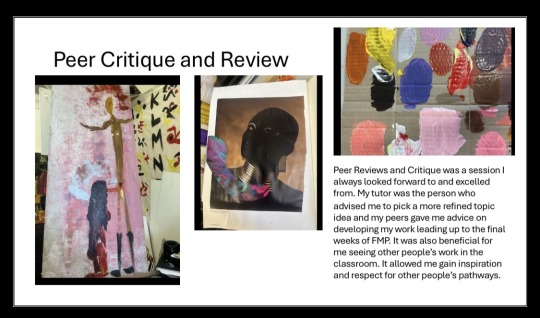
Group, Peer Review
During the week before Easter me and 5 other peers sat down to review each-others work. I always gather a few nerves when it comes to these sessions as showing your work to other people you are not close in relation to can be a daunting experience.
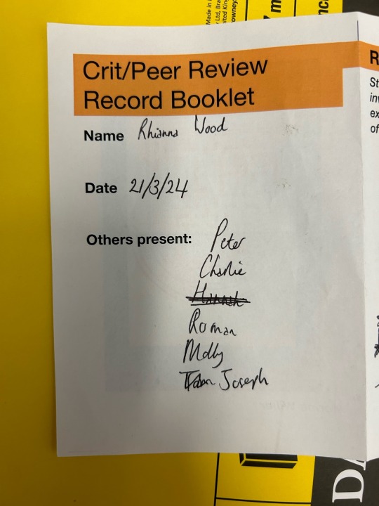
My group crit lasted about an hour and a half, in this hour and a half we communicated what route we were going down with our theme and how we have produced this theme with our practical work. We intricately went through our sketchbooks displaying our FMP journey so far. Taking notes of each others strengths and weaknesses and how each-other can progress going forwards.
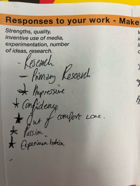
My peers informed me my strengths were primary research, a strong concept and impressive amounts of knowledge experimentation. Being told this from my classmates was really encouraging to me and I gathered a lot more motivation to try my hardest till I get to the deadline date for the FMP.
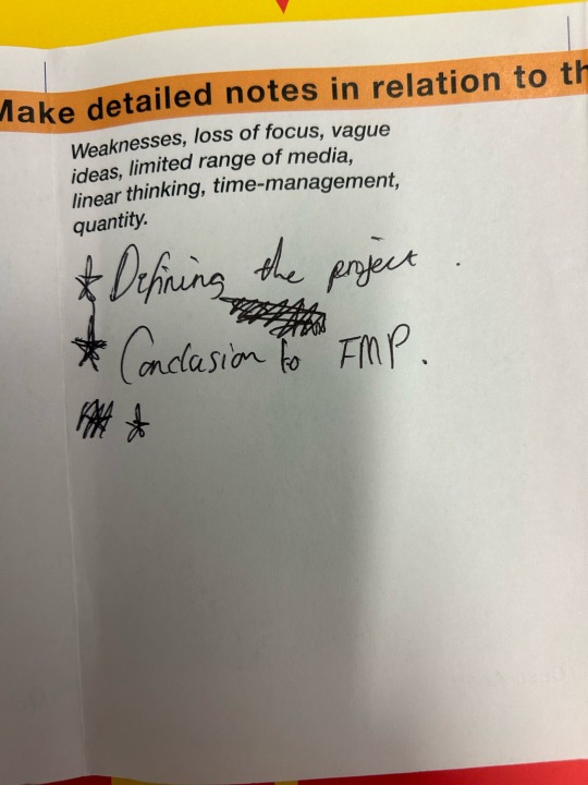
My weaknesses were I need to start to define my project theme more thoroughly so I can eventually come to a final piece. I totally agreed with these points and I took that in to consideration as I know sometimes I can get lost from all the experimenting I want to achieve.
Going forward I was informed it would be best to start to decide what my FMP would look like and start using the media I was going to be using for the final outcome. This way I could experiment with the compositions scales and thoroughly support my FMP to try get the best grade I possibly can.
Overall I really enjoyed this Peer Review, it builds my confidence as an artist every time I have one of these sessions and it is something I want to persists do with my work especially knowing I am going to University.
0 notes
Text

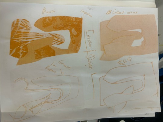

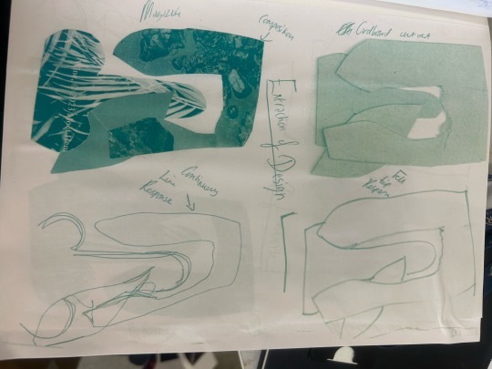
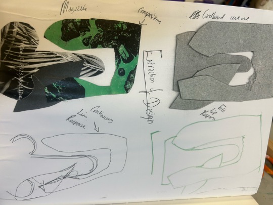
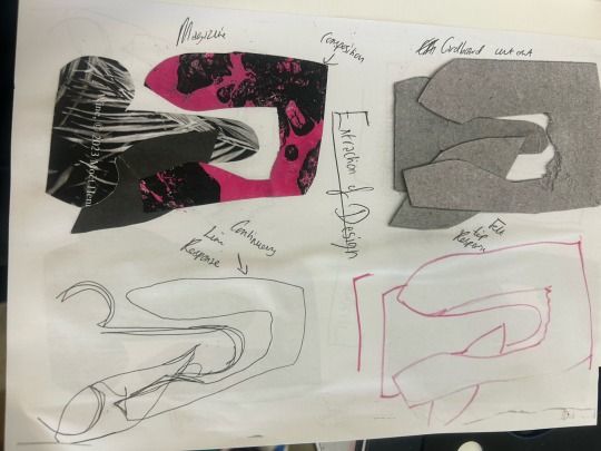
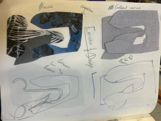
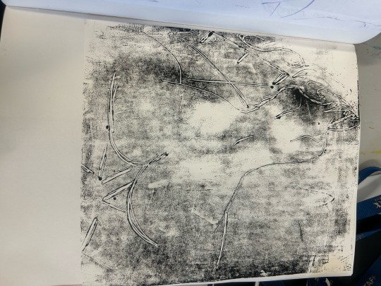
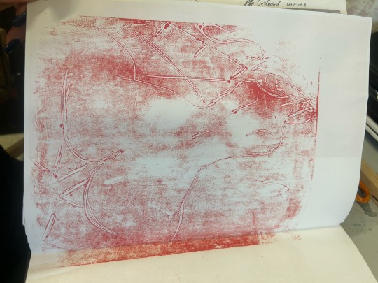
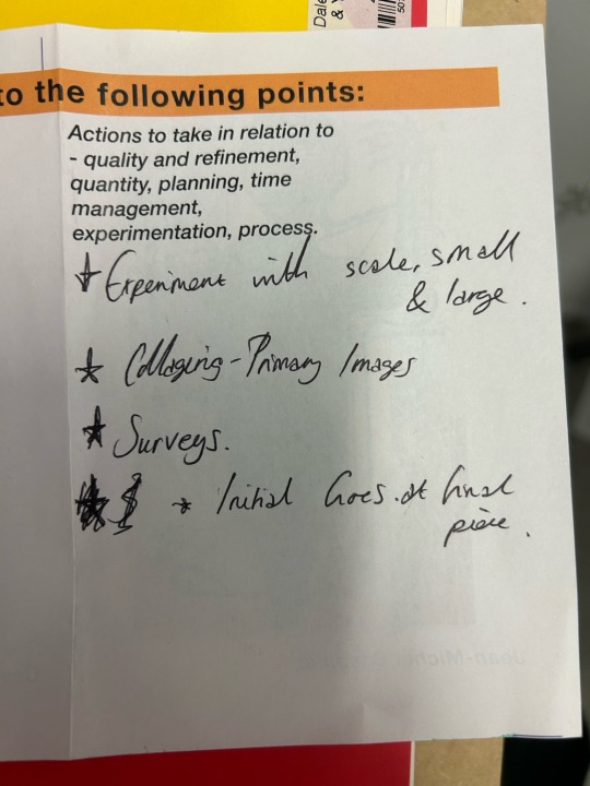
Here I have created an experiment exploring the different affects I can create to a work I have made using the photocopier.
The first thing I did was perform extraction of design with 3 shapes that link to genitalia and my overall theme. I stuck to 3 shapes which I cut from a mixture of materials such as magazine (glossed paper), cardboard, and tin foil. I experimented with a mixture of compositions with these 3 shapes and with my favourite composition I then went further and created drawn responses of the result using different mediums such as felt tip, and ball point pen, I also created a continuous line example to test general drawing methods.
I actually really liked my drawn response with felt too the best I think this is due to the fact I haven't used the media in a while and I really love pigmented media hence why I love acrylic paint so much.
My cardboard composition added an element of 3Dimensional value and a tiny fiber texture which is soft but hard.
After doing the practical side of this extraction of design practise I took a step back and asked myself how I can take it further but also stretch my artistic skills. I decided to do this with photocopier prints changing different settings on the machine which gave different affects such as colour and shadowing.
I decided to really play with the photocopier and print a few different colour examples off as displayed in my photos at the top of this blog. My favourite outcome from doing these prints was my magenta and black colour affect. This really complimented my magazine composition most, due to the different visual textures.
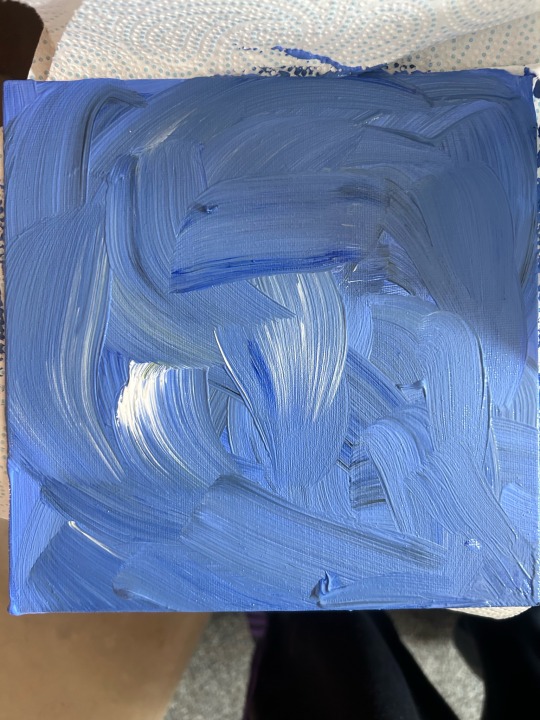
The artist Ian Burn is a conceptual/process artist.
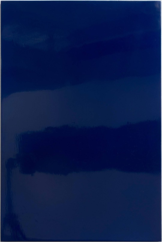
Blue Reflex, 1966
Blue Reflex is an artwork that stands out to me. It is a portrait format monochrome blue painting on board. This followed a group of similarly blue monochrome paintings that had been painted with acrylic paint and a layer of glaze. Burn wanted to create a surface that would not be broken up either by the canvas weave or the irregularity of manual applied paint.
The painting is a piece that displays no traces of artistic gesture at all.
Ian burn was an artist I found when trying to find inspiration for an artist who used more untraditional methods of art. His work is intricate and I admire his results to all his works although his way of art is very different to mine. I yet again get a new found respect for artists like Ian Burn who introduces to me the many possible routes in which art can go down.
Today I gained a lot more familiarity with the photocopier/printer I feel like I could confidently try these methods again however I also didn't enjoy the process so I feel it is a method that I won't use for an end result such as FMP but for experimental value.
0 notes
Text

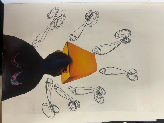
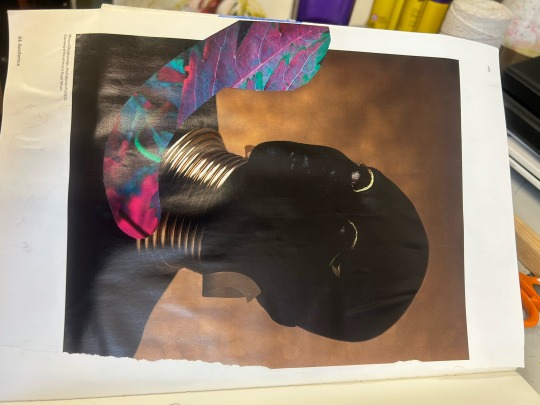

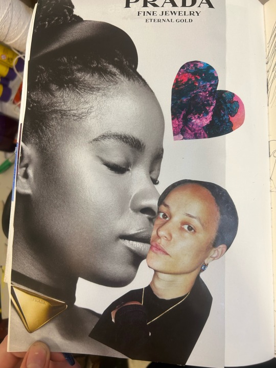
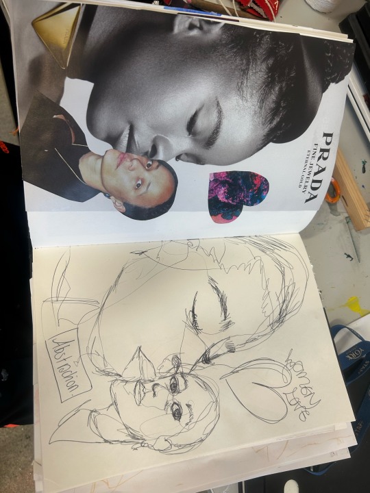
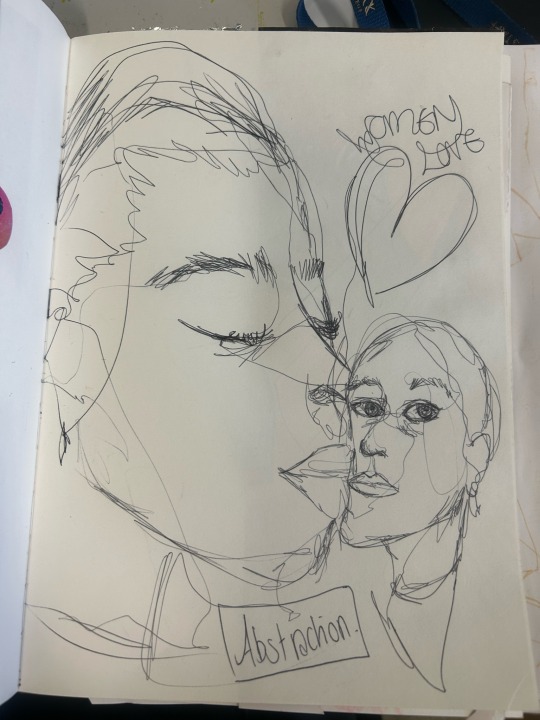
Here I have performed a series of practises to test and query my experimental skills and knowledge. The pictures I have supplied for this blog demonstrate elements of collage, use of negative space, and 3D sculpture using extraction of design.
For my collage work I used an aesthetica magazine I had previously purchased, and cut out shapes that resembles genitalia or sexual organs. I made compositions that represented love or intimacy this links to my own theme and what I want to pursue for my FMP. I enjoyed collaging to an extent I like the way you can create such different appearances with the same cut out shapes. It just slightly bores me after a while and makes me what to use my more knowledgable mediums like pencil, and paint.
I layered magazine in different ways, this adds depth and history which genuinely creates a more interesting art piece. Layering patterns and different images like I have done in my images creates a busy visual texture like no other. I love these kind of outcomes however I also lack the patience to keep up with wanting to transform collage a potential end result.
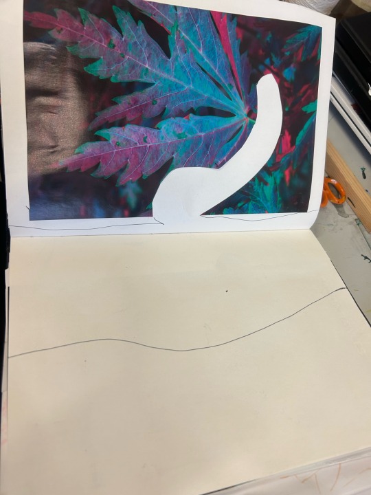
This is my favourite composition I created with a magazine. It is simple but affective. These pages represent a man's penis and buttocks from a side point of view. I have used a ballpoint pen and negative space to create shapes that represent this nude scene. The abstract high stimulating colours from the magazine image contrast and complement the simplicity of my pen work on the second page.
This is my least favourite work I created within this day. This was a continuous line drawn response from a collage I created with the magazine pages. I dislike the outcome due to the proportions being incorrect and it not looking as realistic as I'd like. I can appreciate my efforts and I am proud of myself for keeping this result in my sketchbook rather than throwing it in the bin due to being unsatisfied with my skills. I've learnt it is just as important to reflect on what went wrong within my designs as well as the successes.
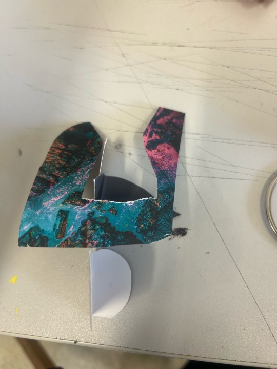
I have never been a fan or fascinated with sculpture as I am with painting. But I like to test myself with what I like so I made the most simple sculpture I could out of shapes from magazine that represent genitalia so it still linked to my theme. I was actually very impressed with the different possibilities that were potential with 3 pieces of glossed paper. I know I could have expanded this experiment further but I was content with my results I had as of present.
Dabbling in sculpture due to experimental purposes made me have a new profound respect for sculptors in general especially when it comes to the material of paper, which is such a plain object from the average human eye.
Sculptor Peter Callesen is a visual contemporary artist who has a series of selected paperwork

Dead dove,2016.
Callesen found his fascination within a media that is taken for granted everyday. White A4 cartridge paper is the most common and consumed media for carrying information. Thin white paper gives his paper sculptures a frailty that underlines the tragic and romantic theme of his overall works.
His mastery with the media is one that inspires me fluently and his skills to transform something plain into something magical for the human eye is exactly the way I want to go as an artist.
0 notes
Text
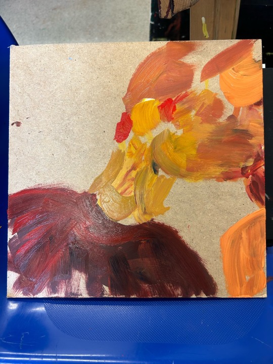
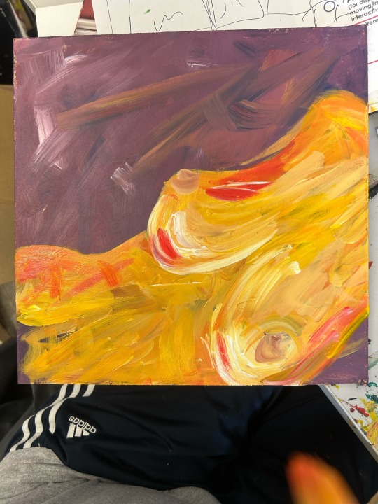
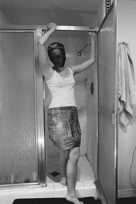
To break out of my recent practises as of present, I decided to use the medium of acrylic and create a large scale painting. This was for general practise with the media and also for motivation as I find larger scale images to be exciting and fun to create. I feel the scale the bigger it is, the sometimes bigger the impact I create. I applied the media with my hands due to feeling there is more control within my finger tips and skin to media contact rather than applying with paint brushes. I painted an abstract take of a woman giving oral sex to a man, the reason for this was due a previous practise painting I also did which was oral sex in the reverse order. I painted on a scrap piece of wood which I collected from the joinery department in college.
The composition I created is not one of a magical moment of sex but this scene I created shows a difference in power. A woman's figure presents on her knees with her face not showing. The man on the other hand is stood upright with a much larger scale body to show the difference in power men and women have. A man receiving oral sex is something a male asks for and wants much more than women do.
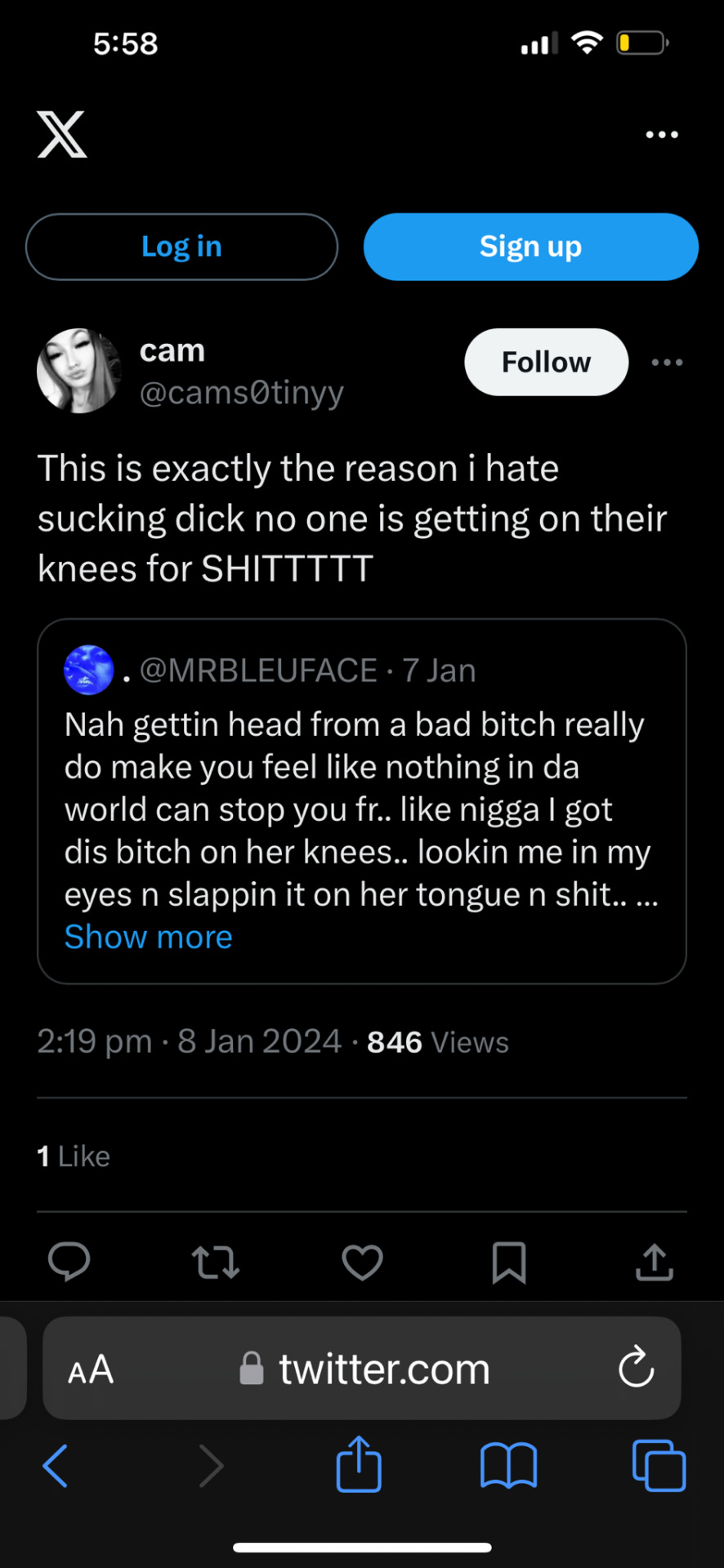
I found this quote on twitter which represents exactly what I am trying to communicate with the power serge men get from having their penis sucked.
Here is an article I gathered inspiration from and enjoyed the general read of.
An artist I feel links to my painting and my general theme is Francesca Woodman. She is a photographer who found herself getting frustrating feeling she had to fit to the males gaze. In 2016 she created a project named 'Body Doubles' where she photographed women in different states such as being undressed, their faces being obscured. She created this shower off the male gaze and see women as she sees them through her own eyes.
Here is an image from the series I have just mentioned about. I love the retro age to this imagery it feels much more raw than it would to say feel in this current generation. Creating the image in black and white is extremely bold thing to do as colours communicate a lot of emotions and states, Woodman creates a deep sense of sensitivity without this and that shows mastery in her photography specialism.
The colours I used in my painting I display at the top of this blog stem from my colour palette I was trying to create which was me investigating colours of intimacy. I made a mistake by using these colours due to the lack of intimacy and love that is resembled in my painting. But I feel you can look at that sense in an ironic sense and make it work if you have the right interpretation.
I think for future reference because I want to go on more of a personal journey through my sex life so I need to start refining my work to myself and really research into myself more.
0 notes
Text
Today I have completed a variety of general investigations and tasks to see what I like to query my interpretation and my imagination.
Materials and mediums I have used in these practises is canvas, cartridge, tin foil, acrylic paint and a 2B pencil.
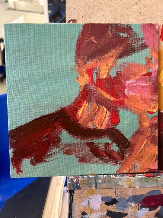
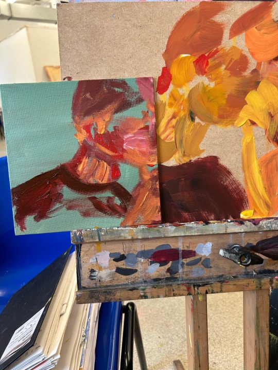
I created a rough sketch of a man performing oral sex on a woman. I did this due to oral sex being my personal favourite. This rough sketch was primarily line work just to establish the basic shapes and items I wanted in the composition.
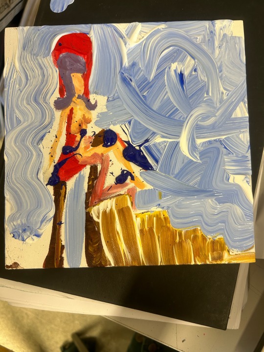
After gathering the basic composition information I tried to perform that rough sketch into a small acrylic piece. There weren't any specific techniques I was trying to practise I just wanted to get a feel for the acrylic on the canvas, due to not painting for a while on the material. I used a paint brush as an applicator which was nice as a change from my hands which is my preferred applicator. The brush allowed me to create finer details, which I enjoyed doing.
I really liked the outcome of my square canvas, the colours could be much more advance but the abstraction. I deliberately painted a thrown for the woman to be sat on to represent the way a woman feels when she orgasms during clitoral stimulation, especially from the man's tongue.
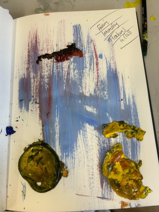
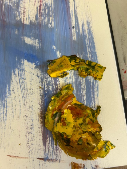
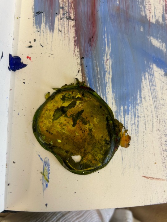
The other images are acrylic paint with different materials I formed. The pictures with the pale blue paint on are combined with dried painting ink, I left ink in a paint palette over night and as soon as it were fully dry, I peeled them out and it created a beautiful speckled circular 3Dimensional shape. I then stuck these peculiar objects on a plain painted background. I really enjoyed this unexpected outcome. I would be lying if I said I deliberately left painting ink overnight but I absolutely over the moon I did, because I created a texture I hadn't witnessed before myself. I feel like I can take this knowledge further down the line of my career.
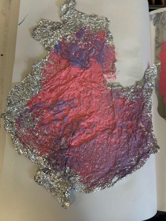
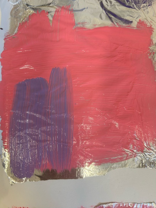
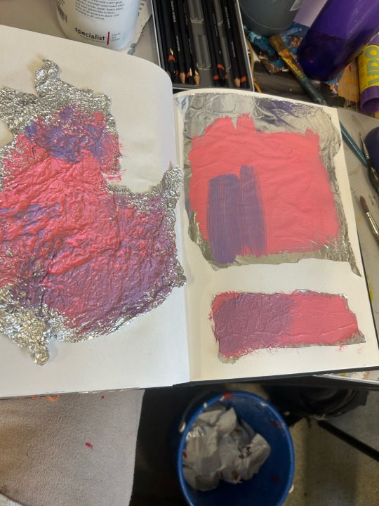
My tin foil practise was an investigation of texture. Tin foil is reasonably soft, with human touch you can mould the material into a variety of textures. Here I demonstrate different pressures I've applied to the foil and the appearance that creates with acrylic paint layered on top.
0 notes
Text

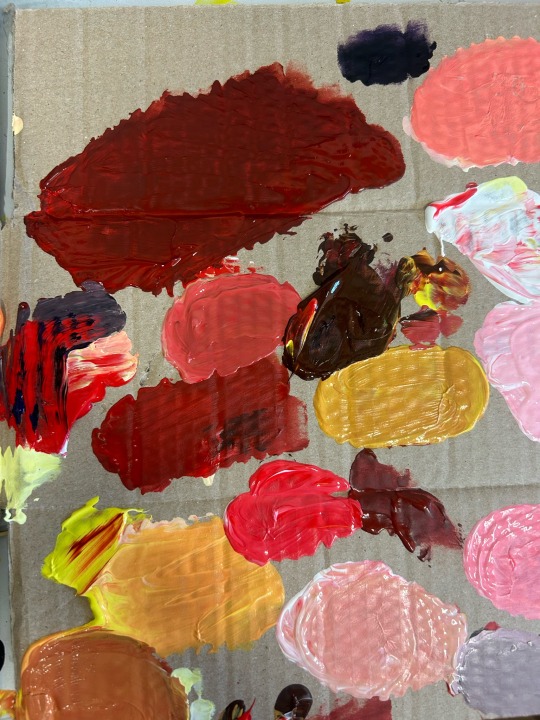
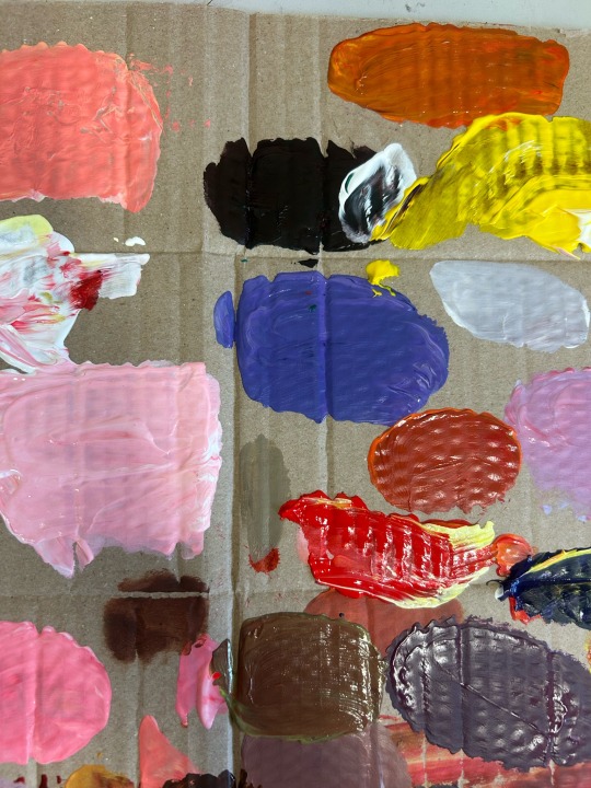
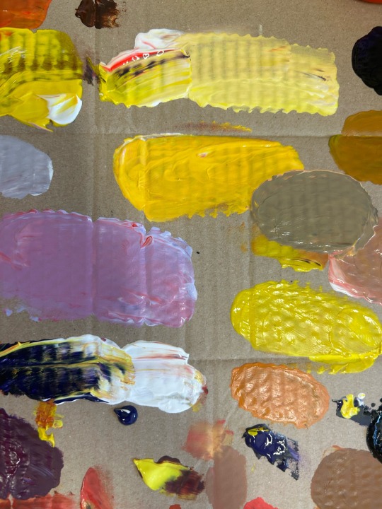
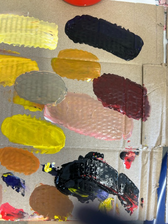
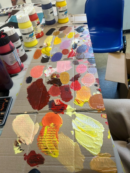
After previously painting abstract observational images of myself and my partner, I wanted to investigate a colour palette for my potential FMP.
I had already started to lean to the medium I want to work with further which was acrylic paint. I find the medium to be very familiar to me due to working with it previously. This time round I want to really test different materials and methods using the media layering under and over different items. I find acrylic to be the most versatile medium I've personally ever worked with. I can apply it thickly to create extreme pigment or I can apply water to create a watercolour like solution.
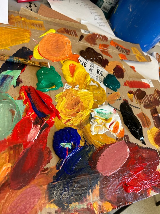
To create this varied palette I considered to consist of intimate colours I used a rough piece of cardboard to apply acrylic onto. My colour mixing is something I have been wanting to expand on a lot more, at the start of my painting journey I didn't create secondary or tertiary colours often I stuck to pure hues. This project I knew I was going to step outside of my comfort zone and really test myself with colour making, so he are my palettes results.
I simply used my fingers to mix all these different colour results, I find using my own body to combine the paint feels like a beautiful process and it makes me feel as if my soul is within the art I produce.
The colours on the images represent intimate loving sex. I associate warm colours with love and warmth and that's the emotions I get when I'm with my boyfriend Oli.
As well as the colour palette I produced I also researched into the topic of pornography and the controversy around it. I also produced my own interpretation on the porn and the way I've dealt with the unrealistic expectations when it comes to sex.
An artist I used as motivation to create my research on porn is conceptual artist Milo Moiré. She is a Swiss model known for her nude performance which is her interpretation of art.
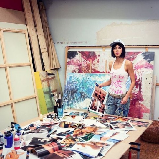
What I like about this artist is her unconventional methods of art. She touches important topics such as femininity and the menstrual cycle which can be linked back to my own theme of sex. Her work crosses boundaries which is a subject area I want to cover myself in my work especially in this project.
Doing these tasks I have mostly learnt how the smallest difference a colour combination can create a different tone/ shade. I have refreshed my colour wheel knowledge, reminding myself of complimentary colours and contrasting colours. I plan to keep on working with acrylic and adapting my preferred colours much more refined.
0 notes
Text
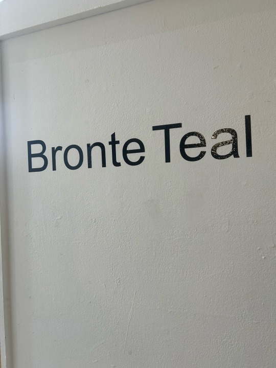
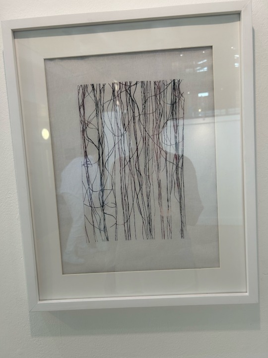
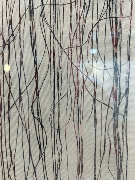
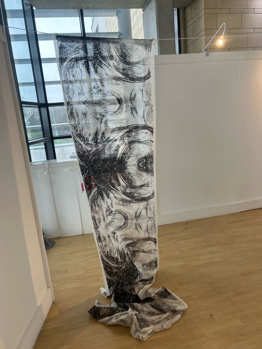
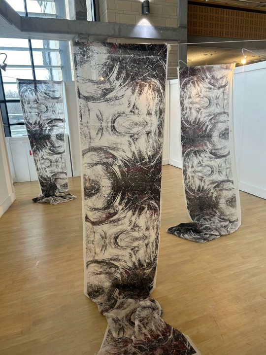
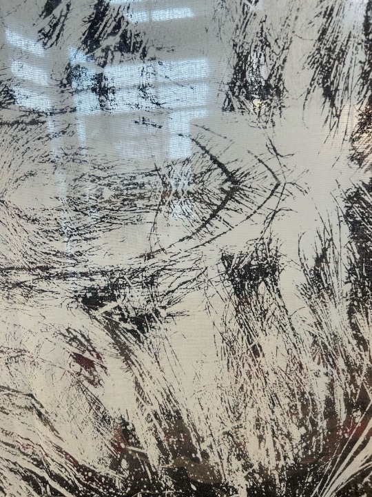
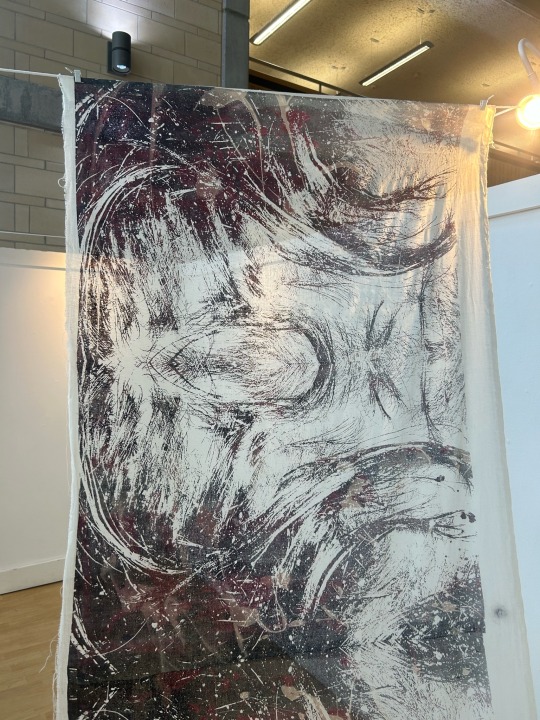
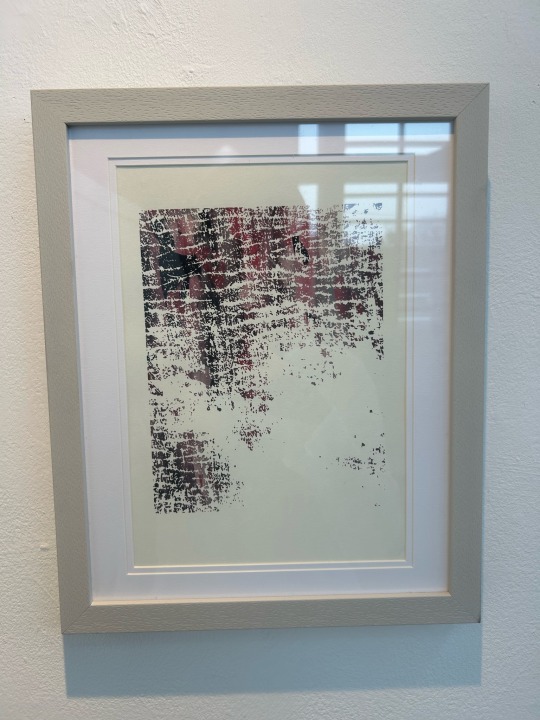

Bronte Teal Exhibition
Bronte Teal is a screen print and installation artist whose work explores issues surrounding her skin condition, psoriasis. Original photographs of her flare ups are edited to reveal patterns within and are then screen printed onto predominantly fabric surfaces. Brontes work contemplates all the aspects of living with the condition, including its unpredictable nature which is embedded in her process. These particular fabric drops showcase treatment on the scalp, with the bold prints contemplating the fragile and tactile qualities of the fabric.
I really enjoyed this exhibition I viewed, being a young artist it was useful to ask questions about University life and what to expect afterwards. Her work holds great personal significance which is something I value in my own work.
0 notes