#Photoshop tips
Note
oi prin, tudo bem? amei seu tutorial!!! baixei o ps 2024 que está linkado lá e estou com uma dúvida, as fotos aparecem bem diferentes no programa e no arquivo salvo... vc sabe como posso consertar isso? faço icons e tá me atrapalhando um pouco na hora de visualizar os psds :/
oiê, tudo bem e contigo? então, isso já aconteceu muito comigo tbm e eu me bati demais até achar o problema jskdfjks
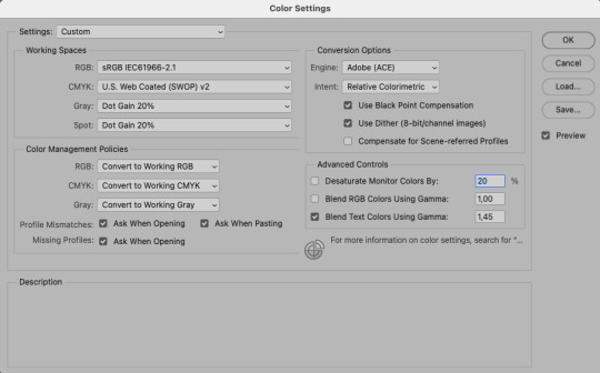
mas enfim, vc vai precisar fazer alguns ajustes dentro do painel de cores no photoshop. pra isso vá em edit > color settings > e selecione a opção “north america general purpose 2”; depois vc faz alguns ajustes, deixando assim:
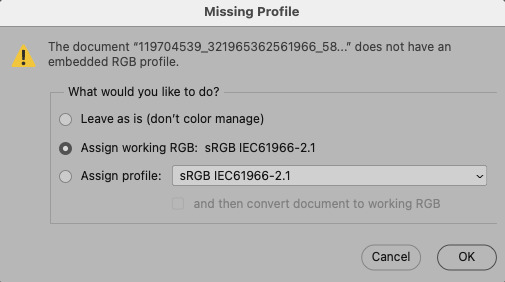
depois de fazer estes ajustes, quando vc for abrir uma foto, vai aparecer uma mensagem dizendo que o perfil de cores não bate com os ajustes, então é só vc selecionar a segunda opção, assim:
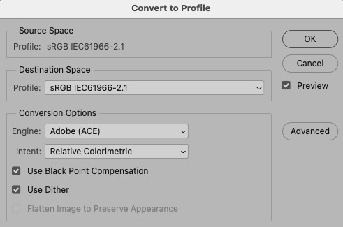
OU se vc não quiser fazer a mudança já antes da foto abrir, vc pode mudar depois de aberta, é só ir em edit > convert to profile > selecione sRGB IEC61966-2.1, nessa janela assim:
já para visualizar sempre como vai ficar a edit final com o psd, vc pode ir em view > proof setup > selecione a opção “internet standard RGB (sRGB)”, assim:

espero que te ajude! hehe qualquer coisa, se seu photoshop for em português ou se vc tiver outras dúvidas, só mandar outra mensagem que vou ficar feliz em ajudar :)
8 notes
·
View notes
Text

Process snapshot!
I love this trick for getting just a little edge colour on complicated shapes using clipping mask, layer mask, and gaussian blur! These steps are for Photoshop but a similar principle should work in most programs.
The object whose edges you're highlighting needs to be on its own layer.
Create a new layer above your Main Layer. Select the new layer, then click and drag THE MAIN LAYER to the [+] sign at the bottom right of your layers palette. This will give your new layer a layer mask matching your Main Layer's shape. Select the layer mask and reverse it using ctrl+I on your keyboard (or by going to Image > Adjustments > Invert).
Fill your new layer with a bright colour, then apply the layer mask.
Make your new layer a clipping mask above your Main Layer. The colour will alllllmost disappear - this is where Gaussian Blur comes in!
With your new layer still selected, go to Filter > Blur > Gaussian Blur and adjust the slider until you have the amount of blur you want. Apply the blur!
Last step: use Image > Adjustments or layer opacity to adjust your edge colour until it's just right.
Unlike making a selection and then using Stroke, this method produces a strong and reliable colour. The double mask also ensures that even small unconnected areas have the technique applied to them. It can be a pain to shift+select too many small areas!
#process snapshot#digital painting tips#photoshop tips#it might seem complicated but once you walk thru it#it's fast and easy to do
21 notes
·
View notes
Text

Quick tips for better result in Photoshop
Never let your shadows be black. The shadow's color will always match the background's one. It can be halftone brighter or darker - depends on the lighting you have on the scene, but never goes completely black.
Preserve the colors at any cost. No matter how many additional layers you have above, the original colors must be preserved even after all manipulations.

3. Convert your raster images into smart objects. Resizing such things in default mode = quality loss. Luckily for us, this problem was foreshadowed a long time ago. Convert your non-vector images to smart objects before doing the resizing / warping / perspective transform and enjoy the flawless result!
56 notes
·
View notes
Note
is it ok to ask how u edit ur lookbooks? i love your style sm
hiii!!!! omg thank you 🥹
first thing you need to know is that where my lookbooks are concerned i'm not doing a whole lot of editing. that's my secret, i think. i do as much as i can in blender. which is why this is exceedingly flattering for you to say because i do not consider myself very good at editing (mostly compared to those ppl that do shadows and hair strands, that's not my bag yanno!!!) i also try not to get too repetitive, so this is all just kind of general. if you got specific lookbooks in mind, i can dig into it.
also to preface this, i'm not going to link to any specific tutorials, because i don't know your particular learning style and there are soooo many tutorials out there that i could take hours just finding one. so i'm sorry but i'm going to have to leave the research with you, and point you in the right direction.
i've been using the same PSD, more or less, for well over 10 years now. i tweak it a little every time. learning how to make your own PSD can be a game changer-- you can learn how to manipulate the colors the way you wanna manipulate them, and if you use it long enough (like i have!) you'll create a signature. i'm such a sucker for the selective color adjustment layer, it's how i get my pinks so uniform. 💗
almost as important as a PSD is the action you use. i also made that, just a little sharpening, very tiny topaz effect, and more smart sharpen. in doing this (either taking the time to learn to make your own, or finding one you like) you'll free up a lot of time by quickly filtering your images and moving onto the fun parts.
layers layers layers!!!!
blending options for your layer open up (little mermaid voice) a whole new world! whether it's text you're bringing style to, cool outlines, soft glows, you can have a lot of fun just playing around.
fonts. just collect cool fonts you like. lost-type co-op is one of my favorites. play around with making some typography. there's no right answers!! but if you're working in a bigger canvas, make sure to zoom out so you know it's gonna be readable when tumblr scales it down to fit its format.
if you're going the blender route:
get in the habit of doing transparent background versions of every shot. even if i don't plan on using them, i just have them, and it makes editing a lot easier, a lot less painful. don't even have to crop out the backgrounds, it's just done.
learning how to use the compositor is another game changer. it's how i bring a little bit of a glow to my renders and make them pop without even having to open photoshop.
turn on node wrangler. this isn't relevant to anything in specific just look into how to enable node wrangler and thank me later.
also turn on the ratio aspects in your blender camera settings. this will allow you to see if things are centered, or juuuust the right amount of off-center if, if you're into that.
#i hope literally any of this is helpful#my brain is scrambled egg today i'm tired it's been long my head hurts#and i was about to work on this months lookbook when my mouse died :3#asks#anon#blender tips#photoshop tips
11 notes
·
View notes
Text

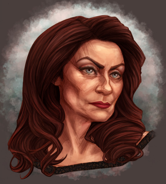
I’ve been trying for DAYS(!) to attempt to replicate this photo I revised back in 2019. I have literally not been able to figure it out wtf my 20 year old little brain did to achieve this look, straight up looks like a painting imo.
This was my most recent attempt but it’s still not anywhere near the original photo.
My shadows are too sharp
Not enough red in her lips and hair
The background has like a teal layer over the colors somewhat in the original
I’m racking my brain around, I miss this photo so much, I wish I had the files still ToT (original photo shown is a screen shot from Instagram)
Any editors be able to give me some tips lmao, maybe y’all see some stuff I don’t ?
#photo editor#art#help me#photoshop tips#photography#portraiture#me#artists on tumblr#lgbtqia+#lgbtqia+ artist
4 notes
·
View notes
Note
Hey. I love your art and the style, I admire them very much.
I'm still a newbie in art. when I saw your artwork first things got me was the strong lines and volume and made me to think how can I add more volume to mine to look less flat? all my works look very flat, and the lines lacks any energy, so any tip that can help me would be great!
Hi, thanks very much! It's such a treat when someone says they enjoy my style!
As to my lines, the main thing to note is that they're traditional, either graphite or ballpoint ink, which I then scan in to colour. And beyond that, my number one rule is to Stay Loose when you're first sketching. So don't sit with your nib locked in place, but rather draw with as much of your arm as you can (this is why it helps drawing on an A4 piece of paper on a desk, so I'm not confined by a screen). Let the lines overlap each other where they need to be darker, if you want to emphasise a certain region's contour, add some more lines!
Here's a lil zoom on my most recent portrait that shows off the method:
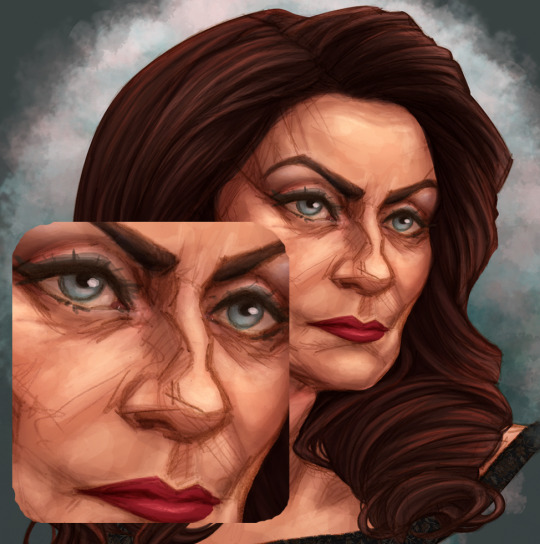
All the scritchy-scratchy lines provide a loose 'context' for the shapes, but then extra lines come in to reinforce the truly important contouring and convince the eye of the whole thing.
As to the "volume", I'm guessing you mean how I show depth by shading? Once again I always try to stay loosey-goosey, and really not focus too much on where strokes end up until the very end. To encourage this behaviour, I use a fairly large brush head (basic hard, round brush in PS) at varying opacity, and treat it like real paint, just approaching each thing I'm focussing on (like lips for example) with various angles of stroke until the core of it feels deep.
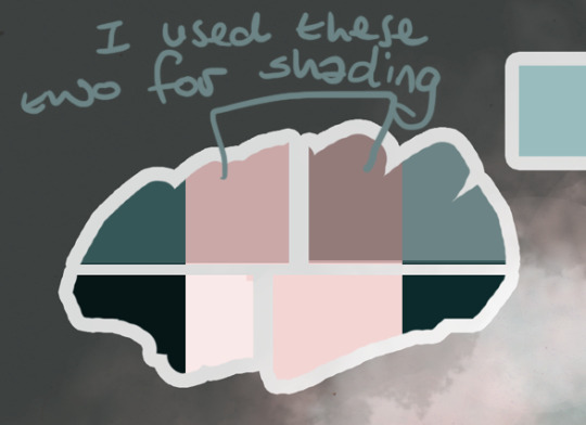
Make a colour palette as soon as you start the art! This will decide what overall tone your art has, as well as giving you easy access to colour picking as you paint, just like a physical artist's palette. I give it its own layer at the very top (so that it's not affected by any other layers). First, choose your middle colour, then darken one part of it like 50%, pale one part by the same, and if you want to, make even darker and paler portions. Then duplicate the palette and invert the colours. This will give you a set of secondary colours (either warmer or cooler) that will automatically fit in with your main colours -- Hacks!! You can use these colours to add depth and mood to your piece, by shading with them rather than the primary palette.
All that said, my shading process works like this:
(2.1 - I often add blush to a face at this point, as that ends up with a less even, more human feeling to the skin. )
1- base level: This is the colour of the area, the one you'd either pick with a colour picker, or what you'd try to eyeball as someone's middle-most skin-tone.
2- gradient: This layer is optional, but if I'm trying to get a realistic depth rather than more cartoony, I'll do this layer. It subtly follows the shape of the object, and probably won't be very visible until it's layered by the next shading level. Set this layer to multiply.

( 3.2 - make-up!! As a treat, it really gives me something fun to do early on.)
3- first shadows: Here is where I start defining the details, first with a brush that might seem way too big for the space -- but it's set to low opacity, so you don't have to worry! This is working from biggest brush to smallest, as you get closer and closer to the focal point of each stroke. This layer can be set to a basic multiply too, but if I'm going for something more dramatic, I'll use linear burn.

4- secondary shadow: This layer is where you gotta be a bit brave! When one is shading, it's easy to be too subtle, to make something look realistic. But then at the end, you find it's so subtle that it can look flat! Focus on the deepest folds in the image, including where areas are draped over (like the back of the neck, where hair is most solid).

5 - primary highlights: Here's where things feel properly Shaped for me! Where the skin is tightest across the flesh (so over bones or cartilage), we can throw some bouncy light to bring it to life! Don't worry about going overboard here, just use the Screen or Linear Light setting while painting, so you can see clearly what you're doing, then change it to a more fitting blend mode later if you need to.
One option is to choose a unifying colour, add it as its own layer, then toy with the layer setting (multiply/overlay/hard light etc) and its opacity, to get a feeling you like. Don't stop there tho! It might make things a bit flattened. So then you want to go into the Levels or contrast settings, and bring back some of those lighting curves!
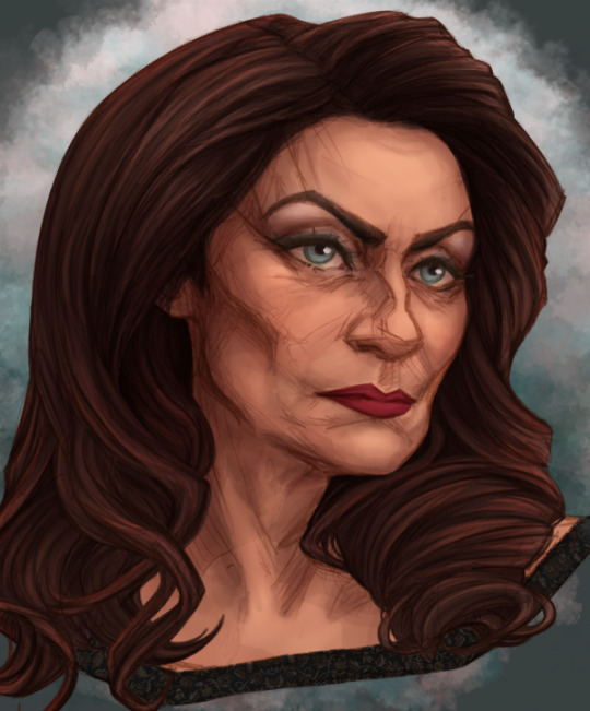
6 - secondary highlights/ eyelights: This is for any surfaces that are especially shiny, or are getting secondary lighting from something around them. With this art that wasn't the case -- I had intended to do some sunlight hitting her from ahead, but then forgot lol
(And yes my eyelights were on all the screenshots already, sorry, I do them first so my art isn't staring all creepy at me)
7 - unifying and balancing (optional): Say you've done a great job with your palette and everything looks balanced, but you *still* feel like it could hang together better, or you just want to make sure. I generally make a ton of versions of my pieces, so I'll use a combination of methods as I play.
In the case of this piece, I added a peachy tone set to Overlay mode at 10% opacity, to soften everything (subtle, but it's there!).
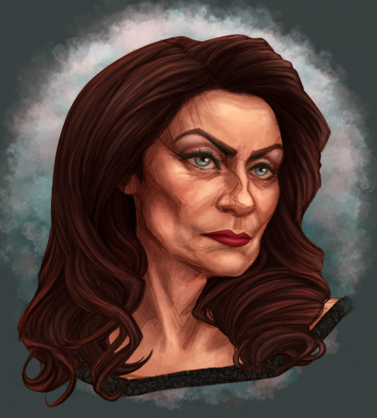
As well as adding tint layers, you should also go into the Colour Balancer menu, to give yourself a more accurate sense of whether you're going overboard with your warm or cool tones in the high, low or mids. Often even if I think things are really well balanced, I can end up looking at that menu and realising that my shadows are WAY too red, and dialling it back can give a more natural tone. Staring at a piece for hours and hours can make it really hard to tell without this tool.
Using the colour balance menu, I came up with this very satisfying version:
I hope that was helpful, and that you'll link me to any thing you'd like me to check out in specific. (^_^)b
2 notes
·
View notes
Text
How to Cel Shade using Photoshop Tips-N-Tricks You Tube Shorts Video.
#funlabsdesignstudio#youtube#characterdesign#cel shaded#cel shading#tips and tricks#photoshop#photoshop tips#digital art#illustration
2 notes
·
View notes
Text
its already out click in the link below
youtube
Reimaging memories: learn how to colorize your black and white photo | photoshop tutorial
its already out click in the link above
#photoshop tutorial#photoshop#adobe photoshop#youtube tutorial#learn photoshop#photo edit#beginner photographer#colorized#tutorial#digitalart#photoshop tips#photoshop template#adobe#learning#photography#photoshoot#photographer#photo editng#video editing#Youtube
3 notes
·
View notes
Text
youtube
2 notes
·
View notes
Photo
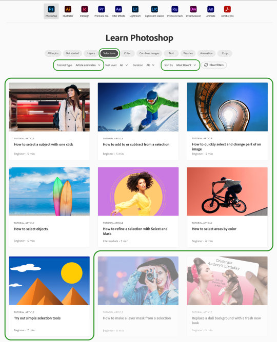
As part of my work on the Adobe Learn team, I recently recorded seven new tutorial videos on making selections in Adobe Photoshop. The link below will take you to a page that is already filtered to show the most recent videos on selections and the seven new ones I made will show up there (though the order may be a bit different). You can use the filters under the “Learn Photoshop” title to find many more tutorials on other topics, including others that I’ve made. It’s an excellent, free resource for learning Photoshop, especially if you're new to the program.
4 notes
·
View notes
Text
Does anyone on here have tips for how to add GIFs you made into templates in photoshop? I am a rookie and am bad at this and would like very much to learn
#photoshop#adobe photoshop#gif making#gifs#why is photoshop so hard to USE?!#photoshop tips#send help
1 note
·
View note
Text
These apply for most art programs outside of Photoshop, too!
#photoshop#howtodraw#how to draw#how to do art#how to do digital art#photoshop tips#photoshop art#digital art#digital artist#new artist#art education
1 note
·
View note
Video
youtube
How To Design Window 11 Pro Document Folder Via Photoshop | Yunic Photos...
0 notes
Text
ADOBE IS DISCONTINUING CREATIVE CLOUD SYNCED FILES ON FEBRUARY 1ST OF 2024
DOWNLOAD ANY IF NOT ALL FILES YOU HAVE STORED
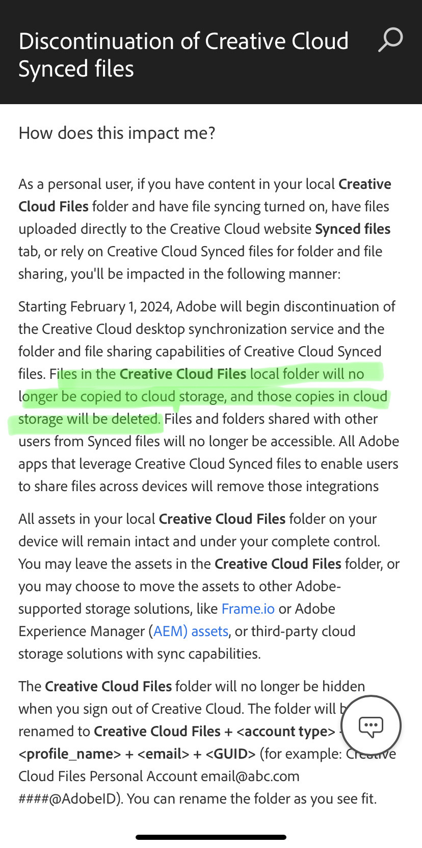
Full article here
#yep#art tip#adobe#creative cloud#photoshop#illustrator#adobe illustrator#adobe photoshop#premier pro#adobe after effects#adobe lightroom#indesign#adobe indesign#adobe acrobat
10K notes
·
View notes
Video
youtube
photoshop 2 min tips | crate light effect in photoshop | photoshop in H...
0 notes
Text
Photoshop Menu Bar
Photoshop Menu Bar
Photoshop Menu Bar में Total 11 Menus होते हैं। Menu Bar का प्रत्येक Menu Commands के एक group को Represent करता है। जो आपको किसी image के कुछ भाग में या पूर��� image में किसी भी तरह का Changes करने की अनुमति देते हैं और files को manipulate करने में भी यह आपकी Help करता हैं। यह Screen के ऊपरी भाग में Left ओर स्थित होते हैं। यदि Menu command के Right ओर कोई Right Facing Arrow होता…

View On WordPress
#adobe photoshop#adobe photoshop cc#adobe photoshop tutorial#complete photoshop course#complete photoshop course for beginners#complete photoshop tutorial from beginner to pro#how to use photoshop#learn photoshop#photoshop#photoshop 2020#photoshop by ishan#photoshop elements#photoshop in hindi#photoshop menu bar tutorial#photoshop tips#photoshop toolbar#photoshop toolbar missing#photoshop tutorial#photoshop tutorial in hindi#photoshop tutorials
0 notes
Last Seen Blogs
mollyponkevitch
The Ecliptic

hildcit
Hi! o/

paulobsf
Paulo Ferreira

zethz-blog-blog
Roronoa Zoro

ciabartta
Ciabartta - Art Account