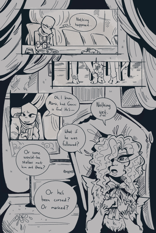
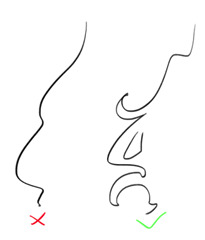
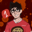
#I’m not adding the colouring layers to it lol
Text
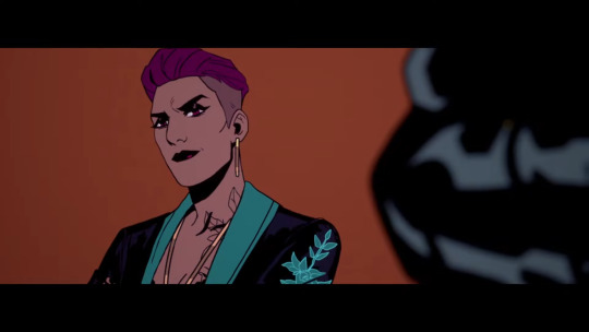
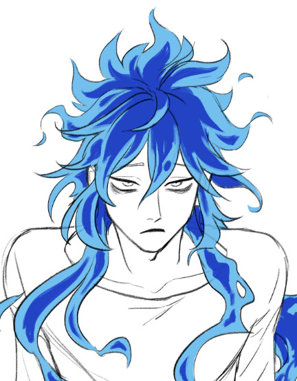
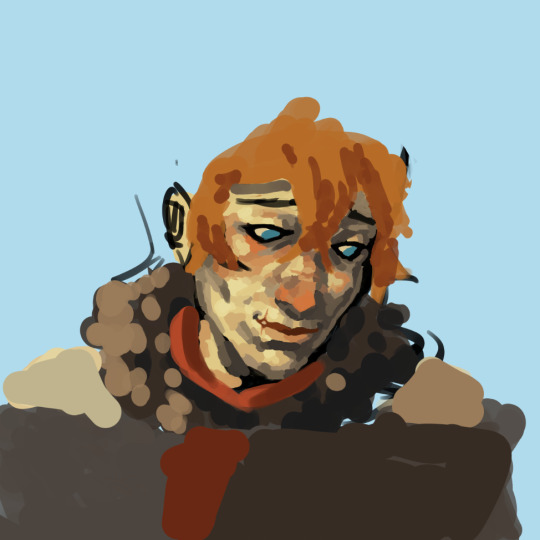
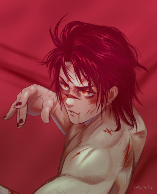
Pretty Green Gaze
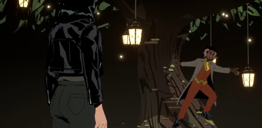
A fanart for @tree-reads fic Pretty Green Paper
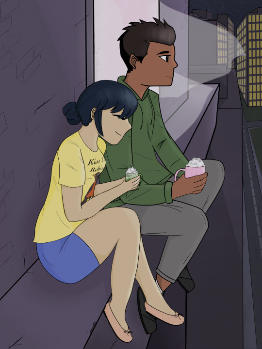
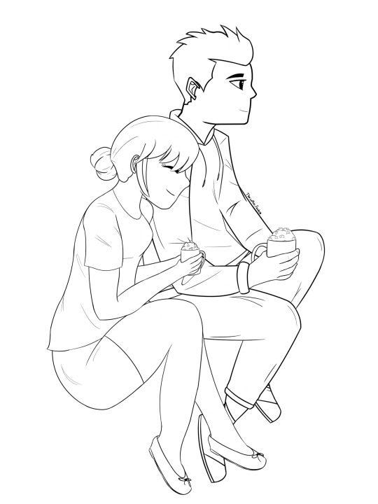
#The fic is worth the read#trust me#second fanart on this fic so clearly worth the read#this is actually not in the fic itself but I’d like to imagine it happened afterwards#I forgot Damian wasn’t wearing a hoodie but I adlready had it drawn and I would have literally cried if I had to restart that#Damian took 99 layers#Marinette took 130#I’m not adding the colouring layers to it lol#took me 8 days to finish this so that’s pretty good#maribat#mlb x dc#maribat fanart#the coffee fandom#ttt2023#team art couple ttt#damianette#damianette fanart#I have literally shed tears multiple times drawing this both out of joy and frustration#zoom in and look at my dots they are great I love them
44 notes
·
View notes
Note
I love your style and how you utilize halftones and textures and colours. It’s just so tasty! I’m curious if you’d be willing to show a bit of your process on how a comic page comes together?
Ah, thank you! ; w ; And sure, I can try, at least! Usually I start with some kind of a script. Sometimes it's a bit more detailed, like this:
... And other times they look more like this.
It just depends on my mood! But either way, I typically have a pretty good idea in my mind's eye of what the comic is generally going to look like. Once I know what I'm making, I do all the rough sketch pages.

... And then I line it!. For Gemini, I go for a dark blue rather than black 'cause I like the way it feels, and it lends to the overall 'papery' vibe. I usually lay down a grid pattern at this stage, which helps a lot with keeping panels and dialogue straight, and with perspective. I always do the gutters and the words first, then the figures and backgrounds. I been leaning a lot into really heavy shadows recently-- one of my professors in college told me once that a black-and-white comic page should be about 50% black and 50% white, and I've been trying to bring that to the table, lol.

I can ditch the grid at this point, and I put down a really light, pale-gray 'wash' on all the panels. It's a pretty subtle effect, but helps separate the panels from the 'background' of the gutters/negative space, and also just adds texture.
I lay down all the color next. Flat colors first, then a second pass over some parts to add depth/shadow, and then all the spot-colors like Leo's red stripes, light gray eyes, etc.

I use a pretty fine-grain half-tone brush for the background, and then a slightly more defined one (layer set to overlay) on the characters.

Once that's done I go back in and add highlights and such (white shine to eyes, hair, etc.) and go and add light outlines to any areas that need a little help being defined-- like Big Mama's arms and hands, for example.

And then the absolute last step is adding paper grain textures and gradient overlay over the top of everything!
(A lot of the brushes I'm using for this comic I got from True Grit Texture Supply, just by the by for anyone who's curious.)
... With Swanatello I kinda tend to just. Go for it. I (sometimes) start with a vague script and then I just draw it. 🤷🏻♂️ No thumbnails, no sketches, no heroes, no gods--
Just Swanatello.
#asks#fidgetwing#i hope this makes sense/is helpful? ; w ; ive never done a lil step by step like this before lol
187 notes
·
View notes
Note
hi! not exactly a request but i do wanna ask, whats your process when you're rendering more paint like art? (if that makes sense, English isnt my first language so apologies hdskhsjdbd) i really love how you use the colors and im curious how you do it :0
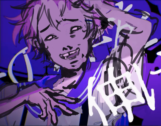
i’ve been meaning to answer this one for a while so here’s how i painted miku in today’s post (put under the read more because yeah prepare for a long post
i’d also like to preface this by saying that i never follow a set way of doing things, so in terms of what my personal process is like, these are only broad strokes of what i do! sometimes i’ll combine or skip parts entirely, depending on how i feel. also, this is not a tutorial, just how i do things, so please don’t treat it like one :’D this will read like the ‘how to draw an owl’ picture if you do
first, like every artist, i sketch. more specifically, i’m getting an idea of what i want to paint later on. this could be how a scene is set up or in this case, how a character is posed. here i’m not concerned about details or getting everything perfectly, i’m only planning how the thing will be composed. maybe a lot of canvas size changing, or adjusting what miku’s doing (note how busted miku’s right hand looks from all the transforming!) however, i still have to be concerned with how clear the sketch will be to future me, because the sketch won’t be any good if i can’t read what miku’s doing

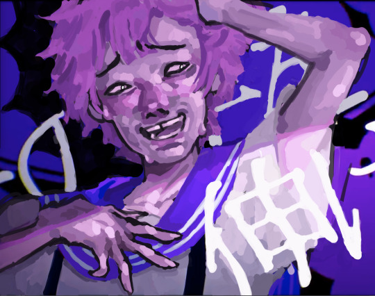
after that, i lay down a flat gray under the sketch, mainly focusing on giving miku a clear silhouette. this is also a good time to make adjustments to the composition on the fly if i suddenly feel like something can be improved upon, like shortening miku’s left arm from the sketch!
after painting a flat silhouette, i start shading in grayscale, focusing only on lighting. i usually do it in two passes, one for the lightest and darkest tones i’ll use (not black and white) and then a second for midtones to blend them better with the base gray but i forgot to screenshot the result of the first pass 🗿 nevertheless, here is where i can start adding some amount of details. i’m not including any extra accessories yet, just focusing on the base design of the outfit and the character herself (for anyone wanting to draw characters from That Gacha Game, this is how i personally make the process more bearable for myself.) i still use the dark gray to separate where certain details (like the facial features and fingers) begin and end, mainly to make colouring more bearable later.
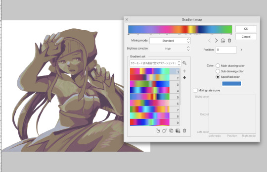
now here’s where i get the Good Colours. it’s a cheat lol. i put a gradient map layer over the grayscale painting so that there’s a little bit of color to start. some gradient maps can be applied as is, some need the layer settings adjusted to make it look good. this one, for example, is a (free) gradient map set from the csp assets store that needs you to set the layer opacity to 20% and to set the blending mode to color to achieve this result. in general, i tend to pick which gradient map i want to use based on vibes, or basically whether i want the work to be warmer or cooler, colour-wise. but this does do quite a bit of lifting for the colors in my stuff.
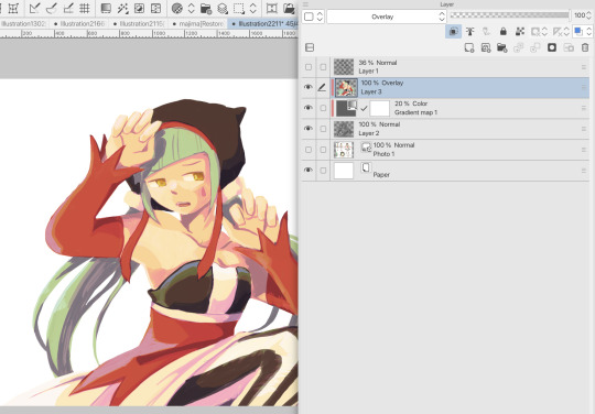
and then, finally, i add the colours. i add flat base colours in an overlay layer. at this stage, i’ve made the character silhouette clear enough that i don’t need to refer to the sketch anymore for what miku looks like. also, the gradient map layer does its magic by making the shading a bit more vibrant than it would’ve been without it. after that i paint over with a new layer to add details like the lace.
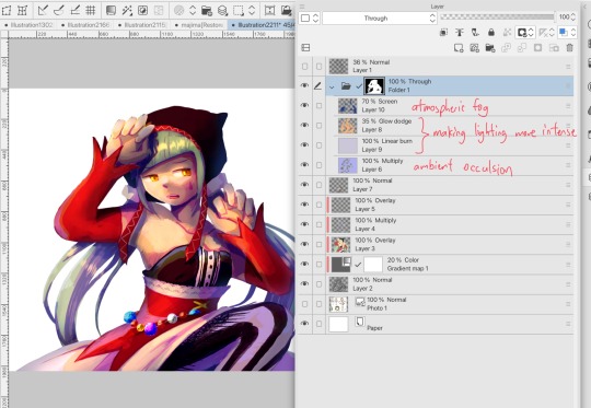
and then i put some extra shading on top. basically this is where the ‘better lighting’ happens. again, this isn’t a tutorial, so i’m not here to say what each part of the lighting is, but i’ve labeled which layers do which job. in other works where the lighting within a scene is more defined (from a window, from a small crack in the walls, etc) the glow dodge layer may be more opaque and sharper, but since this isn’t a work with that, the lighting was applied using an airbrush. the linear burn layer is also there to make the whole thing darker so the glow dodge doesn’t end up oversaturating miku. i also usually match the lights to the vibe i want, and use a complementary color for the shadows. so here you can see i have warm colors on the glow dodge layer, but light purple on both the linear burn and multiply layer.
and that’s it for the character—here’s a gif showing how each layer adds to miku! (sorry it’s so toasty)

as for the background, depending on the complexity, it may go through a similar process, or if i can settle with flat image backgrounds, i just go for that. it’s ok to use external image materials. i didn’t have a background in mind for this miku in specific, so i got some default csp materials and threw together something
and that’s about a rough overview of what my process for more finished works looks like! again, art is a fluid process so i never specifically stick to certain steps all the time, and you shouldn’t either. i can probably answer why i’d pick this colour over another in one particular work, but it’s something that kinda has to be learned on a grander scale. i think everyone can already feel what colors work with what atmosphere or what setting, even if they can’t immediately explain why. colors and composition do take some level of experimentation to find what works best!
125 notes
·
View notes
Text
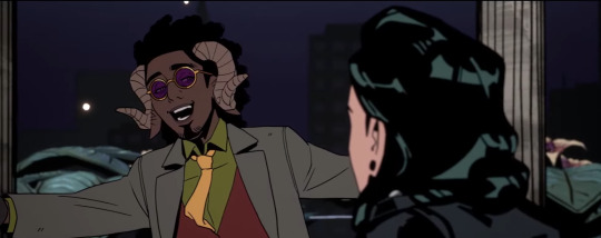
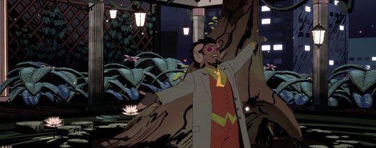
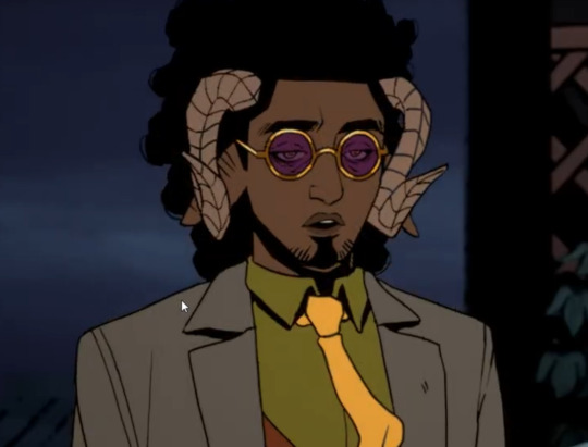
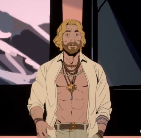
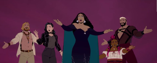
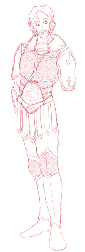
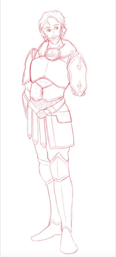
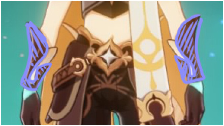
Stray Gods Character Design Thoughts
In order we're going Pan, Apollo, Persephone, Eros, Aphrodite and a little bit of Venus! Disclaimer that I have no professional experience in character design at all, so these are only my vibes-based ramblings and observations purely for fun and because my brain simply won't shut up about this game haha. Also I will freely admit Pan probably gets the most attention in this because of who I am as a person and where my heart truly lies at the end of the day lol
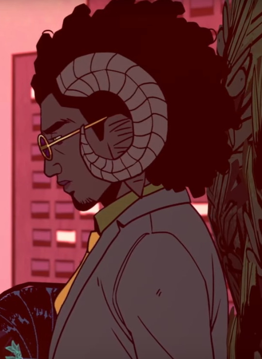
PAN

Ok, first of all I have so many questions and they all delight me. This guy is the god of the wild places ("Where else would I be, but among the trees and the wild things?"), he lives in a magical garden on top of an office building... and he’s walking around everywhere in an expensive three piece tailored suit (when Freddie accuses him of being a sleaze in a cheap suit he protests mildly that his suit is anything but cheap haha). The cut of it is really carefully thought out and planned, but the bold colours under the grey coat and (studied I am sure) careless details like the tie also make it fun and playful. Which is pleasingly coherent with the general theme of his character in the writing too and I adore it.
This is not the point, I know, but I’m wondering how he makes that work just like. Practically now. Has Athena fixed up Olympus with in-house laundry service? And other sentences I did not expect to type out today lol. Ah well he’s wily I’m sure he has his ways.
I can't heap enough praise on it, this design is SUCH an interesting and elegant marriage of the immediately recognizable satyr features and thus animal symbolism with all its added pagan weight in a post-Christianity setting, and the sort of ‘man of wealth and taste’ imagery of the devil at the crossroads they clearly want to evoke, especially in his first scene. And partially through his mannerism there’s also an added element of like… eccentric but surprisingly competent college professor — just look at the way he carries himself whenever he isn’t putting on the charm or when he’s being guarded and self-contained. That little hands resting on his back pose exudes ‘nerd’ so deeply to me haha. (Incredibly fuckable nerd, to be sure, but still!)


you don't fool me buddy I know what you are. I know all the trouble you went to to get a book.

His body language shifts very quickly between wild playful expressiveness and a sort of nonchalant urbane detachment that borders on coldness sometimes, and it fascinates me. Especially since that more refined unavailable side seems to be something he’s deliberately cultivated, to some extent. When Grace calls him out on how boring it sounds to just let yourself go numb and distant to survive, he doesn’t deny that at all, only saying that at least it’s been quite effective.
Putting the rest under a cut to save people's dashes! I may, as they say, have gotten a tiny bit carried away.
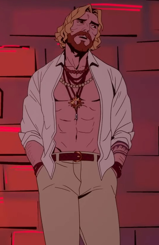
Physically he’s not very imposing — he’s only a little taller than Grace, and the shortest of all of the love interests, which I find somehow very charming and also plays into him being more of a guile-based character. “Seeing as I am neither big nor truly bad, it behooves me to be wary of those who are both” indeed!
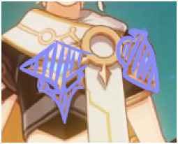
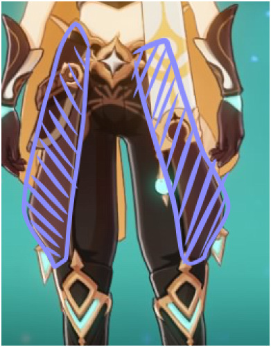
I’m fairly sure he’s the character wearing the most layers. Even his hands are mostly covered by gloves. He partially covers up his eyes with the tinted glasses — interesting, as one of the features that most give his real nature away with their sidewise pupils, and the lenses are tinted purple as the complimentary colour to yellow, so it downplays just how bright they are. All together it’s very much a ‘well, he’s certainly got to be in there somewhere’ sort of vibe at times. (Since he also seems to care about his clothes quite a bit — he complains about scuffing his pants during the climb in the Medusa mission if you go the lockpick route — I have drawn the conclusion that getting him out of all of that must take quite a bit of time, no matter how much practice he’s probably put in over the years of meeting 'delicious people' lol)
It’s a design that manages to give, at the same time: animal-featured ancient god, deal with the devil, teacher, overtones of con man if you’re inclined to be Freddie-levels of uncharitable lol, eccentric rich weird uncle… there’s a lot going on here and somehow it all works haha. He isn’t wearing any jewelry at all unless you count the glasses, which now that I’m looking at the rest of the character designs in this game is actually fairly rare among them!


His eyes really are incredibly bright when uh naked as it were, though. I like the implication that he is aware of this and actually goes out of his way to downplay it, even when he’d normally be wearing glamour anywhere it would strictly matter for it to show. Between that, the meaningful zoom in on him at the Underworld when Apollo says that all the Idols can be themselves there even if they don’t look human, Pan claiming he’s been distrusted and side-eyed by the others basically since the beginning and seeming kind of frustrated and hurt about it, in his deflecting way, and the implication of a hierarchy among the Idols at least under Athena’s leadership in this stained glass painting (notably all the visibly non-human Idols/hangers on are at the bottom, and Hecate, Asterion and especially Medusa are the characters most affected and confined by the oppressive status quo Athena upholds)...
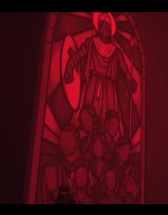
this one! sing it with me now EVERYBODY LEAVES THIS PLACE ALIVEEE ok we can move on
you know, some possible Subtext and Implications going on here, I’d say. (It is only potential subtext and implication, though, so, you know, take my extrapolations here with a grain of salt!) He certainly doesn’t do himself many favors with the persona he’s built up in regards to being trusted and included either, but his status as a little bit of an outsider does seem to precede that so I feel like it’s more of a response than the main cause. Along the same lines he gets much more testy about the Green route of ‘I Can Teach You’ than he does about you just not choosing him in the Red one, he takes that pretty gracefully. So it is the being deliberately kept on the outside and openly distrusted and dismissed that gets to him. (To be clear I don't think openly distrusting a strange guy showing up in your living room like that is at all unreasonable either haha I just think the nuances of his response are enlightening as to where he's really coming from)
this one isn't even to illustrate anything it's just because I love him so much and think he's pretty I'll be real with you all
Anyway I just keep thinking about how incredibly tender it would be if sometimes, when they’re in private, Grace takes his glasses off to see his eyes better and he lets her. That shakes something deep in my soul apparently. That fucks me up but like in a good way.
APOLLO
- Apollo’s style of dress leaves his navel helpfully exposed for the copious amounts of depressed gazing he habitually subjects it to. (I say this not entirely without affection.)
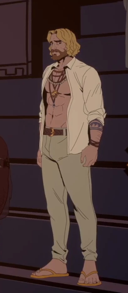

a crumpled tissue of a man
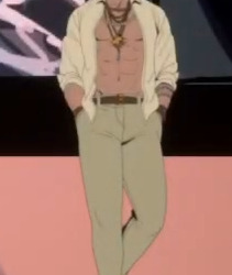
In keeping with his incredibly emo mode, there’s very little colour involved and he doesn’t take much care to present anything with care (look at the state of that shirt and tell me if Apollo has picked up an iron in the last forty years), BUT interestingly he’s not entirely open and unadorned, he does wear that network of jewelry across his chest and neck. Which I think is to show that the old Apollo is not entirely gone (“There he is, god of the sun”), even if he has been a sack stuffed with sad for a long time now. I wonder how many of these things are leftover preferences from being only Lucas — presumably the tattoos at least are from before he fished Apollo up from the sea? If I’m reading the vibes right on that, the blue of the tattoos and the gold of the sun… thingy he wears with the jewelry are the main splashes of colour in his design aside from his hair, and they’re both ‘leftovers’ from both his previous lives, surfer bro and solar deity recently fallen on hard times. Physically he would be tall and imposing, parodically built, except that he carries himself with all the confidence and panache of a damp depressed dishrag.
Also I can’t believe this guy is walking around everywhere in sandals. Apollo makes sad flip-flop sounds wherever he goes, including when he steps up during ‘The Trial’. That’s so amazingly pathetic (affectionate).
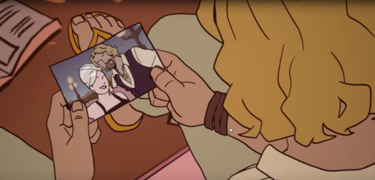
We can see from the photo with him and Calliope that he wasn’t always quite this much of a mess. Once, he did his shirt up a whole maybe four buttons and wore something that wasn’t beige!
Intellectually I acknowledge that it's a design meant to provide fanservice, even though I personally could not consider this guy in a sexual or romantic light if you gave me a thousand years to build up to it. (I've said it before but if he's anything to me, he is the incredibly fail father figure continually letting me down in tiny ways I never had.) Godspeed to the Apollo-enjoyers out there, though, Summerfall gave him those abs and that poor little meow meow energy just for you and it's your right to enjoy that
- Pan and Apollo also bring out some really interesting contrasts both as characters and designs when you hold them up against each other:
Once you scratch the surface a tiny bit Pan clearly has just as much self-loathing as Apollo (“If Athena had taken me up on my offer, the Idols would have been better off” uh. Okay buddy we’re gonna have to process that one together later what do you say), but where Apollo is completely helplessly open in his misery at all times, you need to unbutton Pan at least three layers until you get a honest or straightforward emotion out of him and I think that’s amazingly carried through into their visual designs. It's Good Visual Storytelling Brent
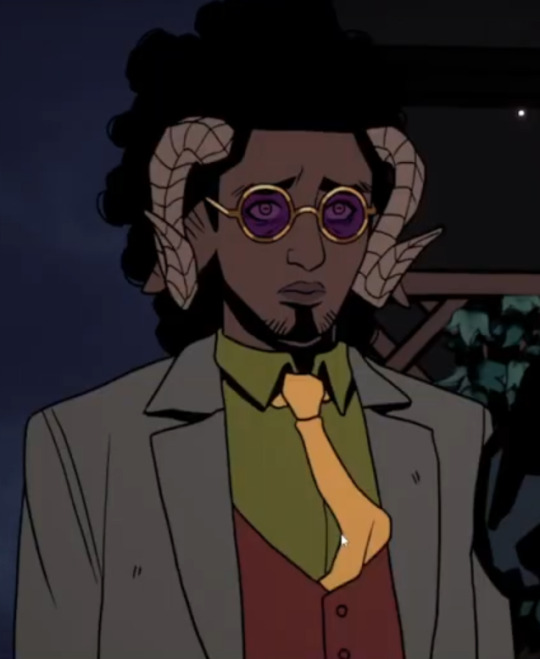
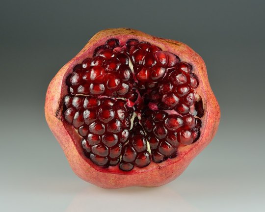
PERSEPHONE
- I’m fairly sure the colour of Persephone’s suit is supposed to evoke pomegranate seeds. See and judge for yourself I suppose:

She also has details on her coat that depict foliage and growing plants, but colour-wise they and the rest of the detailing is in the blue-green that symbolizes the Underworld and so death. Her jewelry is gold, which — and I’m about to do some reaching here, I’ll be big enough to own — could play in with Hades being the god of riches as well as of the dead/the underworld. Probably it’s because it works well with the colour scheme, but I’m going to pretend that it’s because even if she didn’t get the throne she did get that motherfucker’s hoard when she killed him <3 Love that for her. Her jewelry is more rose gold than Apollo’s yellow gold, too. Watch me go for even more of a reach: between the necklace and the watch, those round discs of gold remind me of the coins put on the eyes of the dead but like you know repurposed since she doesn't need them to pay the Ferryman. I never promised I'd be reasonable in this did I.

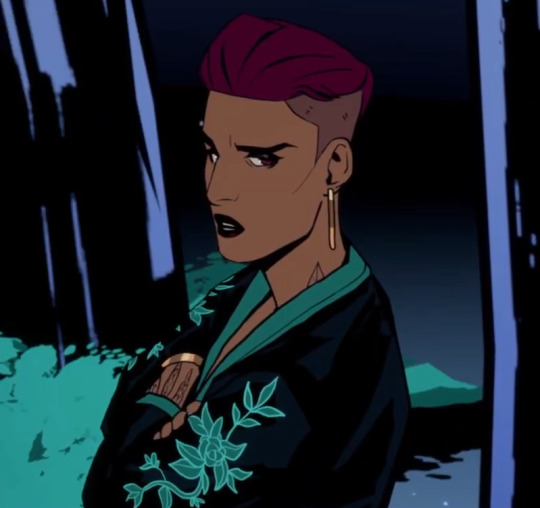
The short hair works real well for the butch vibe and looks amazing no notes, but I think it’s also a deliberate way to differentiate herself from her younger self — when speaking of Demeter’s death, she says that moment was also the final death of that young her, ‘that girl with the long hair who loved her gardens’. Clearly the Idols do a lot of reinventing themselves over the ages in more and less conscious ways.
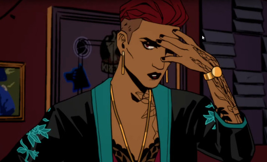
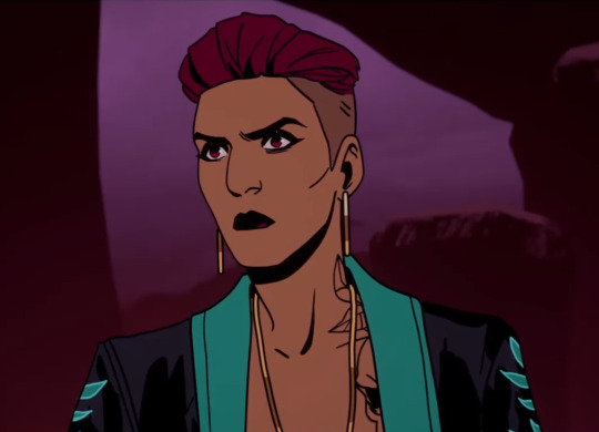
She has a tattoo of what looks to be foliage and a skull across her left chest and arm. I really like that idea of her having the testament to both sides of her — goddess of spring, queen of the underworld — directly on her skin, under two layers of clothes that each represent those aspects. The one on her arm looks like stalks of grain tied together to resemble the bones of the hand/forearm, maybe? which is metal as fuck, needless to say.
She is TALL and scary and the staging always plays that up, Grace tends to look up at her like O.O. I love how sharp she is too.
Also she is incredibly hot but you don’t need me to tell you that you all have eyes I assume.
EROS, APHRODITE and VENUS:
- I love literally everything about Eros’ design except his hair. Not even the concept of the haircut and colours or anything, just the way it’s rendered. It looks like one strange flat cap I can’t quite make understandable in three dimensional space as hair in my head lol. Other than that it’s a banging design though, the delicate see-through material over the leather BDSM harness is genius. Choosing this form of sensuality and attractiveness for him to embody -- one that is so deeply queercoded -- also works super well. The warmth and vulnerability of his body language on top of it is *chef's kiss*. just. please define his hair a bit more and it's perfect haha.
- I'm not sure I have that much to say about Aphrodite’s design except that of course she is beauty she is grace etc., it takes a lot of thought to make such a simple design shine and by god did they do it she’s so stunning. Also interesting how her dark blues and greens with cool/silvery details contrast with Venus’ warm reds and pinks and… brass? Idk I don’t really understand jewelry haha. All warmth and soft romanticism, anyway, it looks nice. (Side note but I love Venus’ rose tattoo.) Eros and Venus have much more matching colour schemes and they both bring those islands of warmth standing around Aphrodite in her shimmering ocean coolness. (Which of course is something she has to deliberately put on before going into public these days, and is unselfconsciously glamorous in the way of an old timey Hollywood starlet, as the blue route of 'The Ritual' lampshades)
:') *whisper* everybody...
Venus is wearing pearls, which is pleasing considering her connection to Aphrodite (and the backgrounds of the 'Lost in a Moment' variant of 'The Ritual')! and both of her and Aphrodite's outfits go for a shoulderless look to great effect.
ETA: When the camera is close on Aphrodite you can actually see that she has dark circles under her eyes, only partially covered by the makeup :'( I didn't notice that before I played through 'The Ritual' on a bigger screen today
All in all I just want to acknowledge what a fantastic job the character designers at Summerfall Studios have done! There are some really fresh new takes on these mythological figures here, and it makes so much sense within the world the game presents without resorting to well-worn and tired iconography, I really do admire it greatly.
#stray gods#stray gods pan#stray gods apollo#stray gods persephone#stray gods eros#stray gods aphrodite#sorry about the varying quality of the screenshots I have done my best lmao#if there's anywhere you can get the sprites in high resolution I couldn't find it so uh well be gentle lol#it's SO hard to track down scenes where you see them all in full figure and decent clarity#stray gods meta#meta#i don't even know if this is coherent anymore but it IS out of my head which is what I needed it to be haha I am free!! for now
136 notes
·
View notes
Note
How do you draw Idia’s hair so good?? I struggle with the basic shapes so much!
Sorry for the late reply! Your ask got us excited because Idia’s hair is such a pain to draw, but also such a fun detail, and I’m very happy that you like the way I draw it <3
Katsu suggested to me to record a speedpaint, and uhh, here it is. Please, don’t mind the wonky anatomy and me horsing around with zooming in and out randomly. As you can see, I struggle with Idia’s hair myself and constantly redraw it until I’m satisfied or at least tired enough to say “eh, that’ll do”. In case you’re wondering, it took me ~25-30 minutes to do the hair, and the original video was 59 min long lol I always spend a lot of time moving, reshaping and redrawing details when I draw Idia…
youtube
I’ll also list some tips and thoughts about it based on the way I draw it…
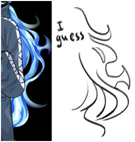
The shape of Idia’s hair is not at all consistent. Even in Toboso’s art it looks slightly different sometimes, which makes sense, because Idia has magical fire hair and technically you could do whatever you want with it.
But some rules tend to apply each time. For example, even though Idia’s hair is long and seems naturally “heavy” because of it, the individual strands tend to be turned upwards, like fire would. Not every single one, but the shorter ones and the ones closer to Idia’s head tend to do so.
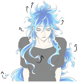
It’s wavy, but not too wavy. If the hair starts looking too “soft”, add sharp edges, random strands sticking out, rough shapes, etc.
Oh, and it’s important to remember that it floats. This means, it doesn’t just go straight down, it does this weird “S” shape. It’s also hella long, I always forget just how long Idia’s hair is. If the magic fire logic didn’t apply to it, it would reach the ground easily. The volume of his hair is much bigger than I tend to remember too: it's quite thick and luscious lol So please give him lots of hair!

Tiny little flames + “holes” in the main ehh body of hair (wow there must be a way to phrase it better) make everything look good and more believable. Have fun with it. You might’ve noticed, I draw and redraw and move them around a lot in my speedpaint.
Obviously, I am no expert, and every artist I know draws Idia’s hair a little bit differently. The speedpaint doesn’t show it, but I always have some of Toboso’s artworks of Idia open when I draw him, just to make sure his design is not too off. I would definitely recommend looking at refs while drawing Idia (or anyone), and maybe even trying to redraw the hair from Toboso’s artworks once or twice as a study, it’ll probably make it easier to understand how Idia’s hair works.
You haven’t asked about the colouring, but I love colouring Idia’s hair, so I’ll talk about it a little. Colouring Idia’s hair is simultaneously the most fun and the most tedious part of drawing him lol 15 minutes of my hour long video is just me filling Idia’s hair with the base blue colour with a lasso (I refuse to use a bucket tool…)

But once you’re done with the base, this is where the fun begins. Because at this stage you can be pretty rough, just add in darker and deeper blues near the middle/core(?) of the hair mass. It doesn’t have to be very even or pretty, add some smaller dark spots; we personally really love it when Idia has this round little blob on his bangs. In the video you can see that I added it later on because I forgot about it lol
After the dark part is done, erase the ends of it a little bit with a soft brush. Not too much, we should still be able to see the shapes.
Then, on a separate layer set on overlay mode, with the same soft brush add some additional brighter spots, to make the hair look glowy. I used the same light blue as the base colour, and the overlay gives it a pretty hue.

And finally, add some white highlights at the ends of the strands. This is the stage when everything stops looking wrong and weird and starts looking like Idia, at least to me.
Phew, I think this is everything I wanted to say… I hope it was at least somewhat helpful.
Sorry for the long post, I just love talking about the drawing process. And about Idia too!
Once again, thank you for your kind words; I’m very happy that you like my art.
Have a good day!
265 notes
·
View notes
Text
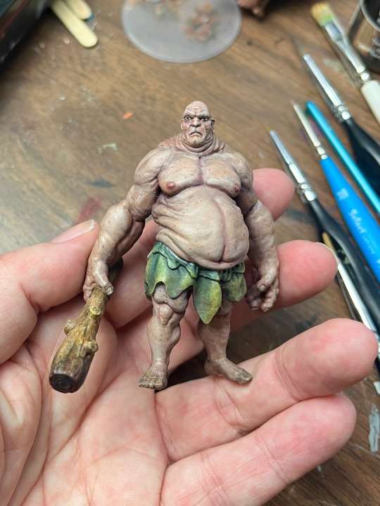
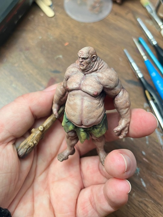
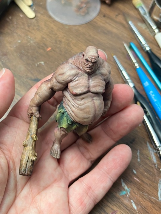
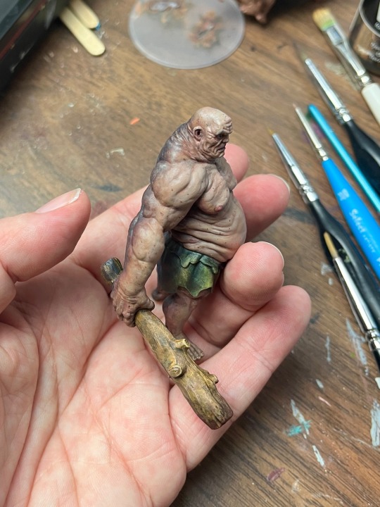
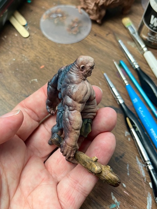
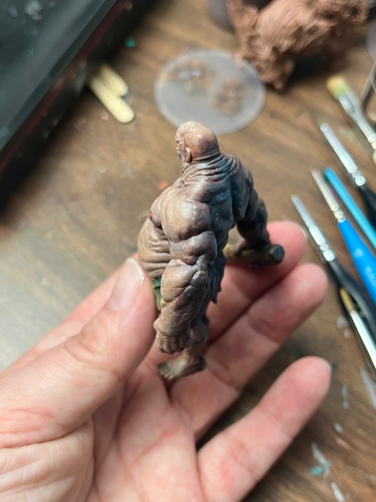

Pretty stoked with the way this Hill Giant has turned out.
Smoothed out the transitions in the skin some more, saturated the skin tone with a smidge more colour, brought out the shadows and a few more skin spots. A little dried blood on the end of the club just added that last little something.
This Hill Giant now gets to go to his new home which I still have to make yet. A nice grassy hillside with some lovely flowers, perhaps some daisies and a hint of a hill giant cave. Then it’ll get a nice photoshoot not just some shots at the paint table LOL
I’m putting together a little process video. There were so many layers trying to get this to where I wanted it. It could have been done, tabletop ready while ago but I had a vision and wouldn’t stop until I saw it come to life.
Thanks to @foebender3d for the quality 3Dprint, sculpted by @duncan_shadow_
#paintingminiatures#minipainting#paintingminis#nerfblat#dndminiatures#rpgminiatures#wip#tabletopgaming#paintingwip#paintingmakesmehappy#paintingprocess#paintinginprogress#miniature painting
38 notes
·
View notes
Note
if youre comfortable sharing, whats your rendering process? what are some ways you learned? your art is very yummy
HSHSHHSHS hello!!!!!!!!!! first off omg,,,, thank you so much,,,,🤭🤭
secondly!!!! heres my attempt at a rendering process explanation. uhm. warning ive never really been asked to explain it before please bare with me
BUT. here goes. this'll probably be ungodly long apologies
so when i render my biggest rule is basically Do Not Blend Ever. what i do is do my sketch, then flats, then basic placement of blush/shadows+darkest parts/etc and then i go in and just colourpick the inbetweens+place them between colours in small strokes until the changes in colour don't look too sharp/jarring
here's some examples of the process;;;
(still a wip but HSHSHHS) so i work on 3 layers primarily (sometimes i do the hair+items that cover the face on another layer, too, though they might end up getting merged):
^ with just the sketch layer n flats / and then with the render layer added
i go in with a bigger brush to block in colour variation on the face on the flats layer and then paint over that, as well as over the sketch, with smaller strokes on a render layer- i never do lineart lol, and any "lineart" thats visible is just the sketch peeking through. I try to rely on colour and shadow to create shapes and boundaries instead of lines though this isn’t a hard and fast rule.
i also try to stick to the same pallette the entire drawing- once the flats and shadows are first roughly blocked in all the other tones/midshades/colours are basically just inbetweens picked directly from the drawing. Just me zooming in real close till I can see the pixels and colour picking where they sort of mix. (any smaller shifts in hue/tones are just colours with saturation slightly turned up or down, usually) im also not sure if this helps but i use the Sol brush from the clip studio assets store for literally everything from sketch to render, which is basically just a slightly soft opacity brush which ive deluded myself into thinking helps give my art a softer look. idfk if it does or not.:)
I like to use really saturated blush and for shadows I usually use two base colours; a warmer one and a colder one- a warmer one for smaller shadows and shadows near light and then colder ones for planes more in darkness. Also, usually, at the very end of the drawing I’ll add a layer that’s just fully yellow with colour burn or linear burn or multiply turned on and the opacity turned low just to make everything warmer.
(a little thing I like doing for shadows sometimes is never making them reach the edge of the plane; the actual edge is usually a slightly lighter shade and it sort of looks like stylised bounce light that would probably not be there but anyhoo)
but yeah,,,, Never Blend But Make It Look Almost Blended. I’ve been doing it forever,,,,,, and I really like the almost shiny feeling it gives things:)))
And where did I learn. Ough. A lot of what I do I figured out through trial and error and just drawing a bunch (IM SORRY THATS REALLY NOT HELPFUL) but some sources I looked towards were sinix design and bluebiscuits on YouTube!!!!! Sinix has a really good video on rendering skin which is where I sort of took my principles from and ran. And bluebiscuits was a huge inspiration for me when I started trying to render things beyond flats!!!!!!! They’re also where I found the sol brush, lol. Also just,,, the impressionist movement as a whole is a massive inspiration. The use of light and shapes to create form is just,,, omg. Especially Claude Monet in particular. (and for the basics of drawing I learnt from my aunt!)
and honestly, just observing people. A lot of the time when I’m watching a movie or on a walk or even just talking with someone I tend to start looking at their face, and the different planes, how light hits it and how shadow interacts with it, where the shadows are harsher/softer……….people are wild man
I really hope that made sense!!!!!! I’ve never tried explaining it before and honestly, I’m not even really sure how I do it. I just sorta. Switch off and start drawing, yk? BUT I HOPE IT HELPED!!!!🫶🫶💞💖
in case that was all utter nonsense here’s a speedpaint that’ll hopefully demonstrate my process;;
I also have straight up screen recordings of me drawing but. I don’t think anyone wants to sit though that
thank you for the ask!!!!!have a nice day/night and SORRY THAT ENDED UP THAT LONG
7 notes
·
View notes
Text
WIP Wednesday!!!
Pretend there’s a cool graphic here. Perhaps I’ll have time to make one some day soon. Or if anyone wants to whip one up for me, I’ll draw your blorbo as an exchange of goods and services.
Anyways! On to the sharing! I was really pleasantly surprised with last week and how many people shared with each other what neat things they were working on and kept the chain going. So I’m doing it again! Remember, there’s no pressure, but show me what you’re working on! What neat things do you have cooking in either the Dragon Age or otherwise fandoms?
I myself don’t have a whole lot this week. I’ve been suffering from an overwhelming number of ideas and brain bugs and can’t really sit down to complete any of them. Instead I’m bouncing from idea to idea like a ping pong ball. I did a little more work on my Inquisitor’s character sheet this week, focusing on his post-Trespasser design as head of Divine Victoria’s honour guard.
(Art and discussion of concept ideas, as well as tag list are below the cut.)
For context, this was the original “design” which was done last year and mostly on a dare after making the joke that the Divine’s bodyguards in Trespasser were just wearing recoloured versions of Sebastian’s outfit and “lol wouldn’t Quinn look dumb in that.” I added a few elements of Divine Victoria’s armour - mainly with the red fur mantle but it’s pretty basic.
This was my first pass at the redesign for Quinn’s new reference sheet done a couple months ago. I kept the shoulders the same, but tried to lean into Divine Victoria’s armour more. Unfortunately, I don’t think it suits a male figure or it just didn’t really translate well for me. The addition of texture/embossing on parts of the armour also made it feel a bit too busy for me more than looking decorative or elegant. It also didn’t look like it allowed for much movement in the torso and while I make the dark joke that Quinn is so drunk and depressed at this point in his life that it’d make sense to strap him into armour that forces him to stay upright, compared to the other outfits I’ve redesigned this just... didn’t feel it.
Here is my more recent pass at the redesign! Again, the shoulders are largely untouched. I like the idea of the armour completely covering what remains of his left arm, plus it has the added practicality of likely having a strap at the bottom that wraps around the bottom of his sleeve securing it into place. The bracer on his right arm has also largely been left alone - it’s a hold over from some of his Inquisitor gear in one of my designs and I like carrying bits over... like a wardrobe evolution. It also shows that Quinn has personal attachment to articles of clothing and accessories. The fur mantle of the Divine is still there... never gonna get rid of it, but it’s sort of combined/blended with the in-game body guard appearance. The chest has also been flattened and simplified, going back to resembling the body guard/Sebastian chest piece but a little larger and more protective. Plus the hint of plate layering too. The scaled coat is still there as the under layer, but it’s less prominent or visible. There is a vest between the armour and the scale coat to give the breast plate a little more friction to stay in place. It will likely be red with gold accents. All the embossing on the armour has been removed. I am unlikely to bring it back.
The waist design was also re-worked, taking inspiration from one of my favourite artists’ character design work in Fire Emblem. The Roman-esque belted skirt is more of a half-skirt, with a fabric skirt draped over part of the belt. I’ve blocked out a section where I am going to experiment with embroidery patterns similar to what I’ve done on previous outfits to give this more of a my-idea-of-the-Trevelyans feel. I haven’t done a colour test yet. But I do think I like this better overall.

Close up of his face, if you like. He’s so sad. He’s so tired. He needs a beard shave and a haircut.
Tagging with absolutely no pressure: @rosella-writes @roguelioness @potatowitch @cleverblackcat @noire-pandora @darethshirl @kittynomsdeplume @little-lightning-lavellan @little--abyss @plisuu @blarrghe @inquisitoracorn @morganlefaye79 @knuttydraws @knightdawn @n7viper @sulky-valkyrie @drag-on-age @oxygenforthewicked @bluewren @nirikeehan @effelants @greypetrel @scribbledquillz @transprincecaspian @transfenris-truther @jellydishes @absyntthe @idolsgf @terencessong @internetdoashouting
As always, if you would like to be added or removed, please let me know. Don’t feel shy or bad about it! You can even DM me privately and know one else has to know!
#i need to make a spreadsheet for this#no one say anything about the rat man#unless it's to agree both he and quinn have great hair and facial hair#i have a type#and I'm cool with that
46 notes
·
View notes
Note
Hi, yoonia! I have been wondering how to make fanfic banners like the ones with member’s pics in them? Like do you use Photoshop? Can you do a tutorial or something? Because those banners be looking fine asf!
Also, a small request, cna you also do a tutorial on how to make the header image like yours is, it's a gif, but with yoonkook’s picture in it? How do you do that? Looks pretty as fuck! I wanna learn how to do that! And your header image is so pretty, may i ask where did you find the background picture, the black, purple one? It’s very pretty!
Hello! First and formost, I’m sorry for the late reply, I haven’t been well lately, but your message is so kind, so thank you so much for making me smile! Yes, I do use Photoshop to create my fic banners.
I actually learned my way around it based on this wonderful tutorial shared by @eerieedits. I followed the steps in the tutorial to learn my basics before adding my own touch for my banners. The tutorial is really easy to follow, and there are resources links added to help you find anything you need, so I’m sure everything that has been added in the post can help you to learn the basics :)
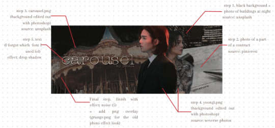
For my fic banners specifically, the steps I take to create them usually goes like this:
step 1. choose the background that would fit the story (I usually find the background photos from unsplash)
step 2. pick the member(s) photo that I want to use. As for the member photos, I usually delete the background and change them into blank png either manually (with photoshop) or use this website to help me
step 3. add other key elements that represent the story (the picture below may explain more about this part)
step 4. adjust hue/saturation/colouring according to the theme I want — you can find steps by steps to do this on the post linked above too
step 5. add text
step 6. final touch: I usually add png overlay to give a more dramatic effect and a noir look (that isn’t fully noir lol)
See down below for an example of the step by step process of my fic banner editing:
for example, this banner for Carousel
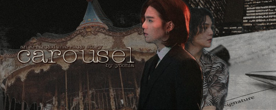
the steps I go through to create this and the items I added:
For these banners on my blog, I used the same steps to create them together:


First, I got the black-purple background from unsplash. A little tip, If you want to try to find similar images with these sparks of colours, use “[colour] background” on the search bar provided in the site. I had to go through a bunch of scrolling before choosing this one and I had to tweak the original picture a bit before I got the final look.
Minor adjustment on the background photo: added a copy of the background photo as a second layer over the original/background photo, add multiply effect on the second layer, arranged it with 50% opacity to make it darker without losing the details of the purple sparks.
For the rest of the steps, I followed the same steps as mentioned and shown above. Only difference that I made was switch the png overlay with gif overlay. I used star.gif from eerieedits’ resource/collection.
I hope this helps!
9 notes
·
View notes
Note
Hi !
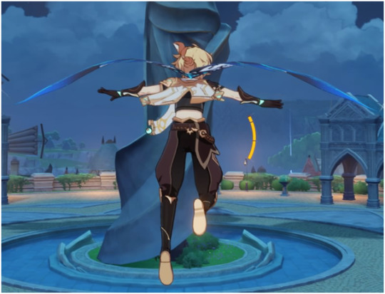
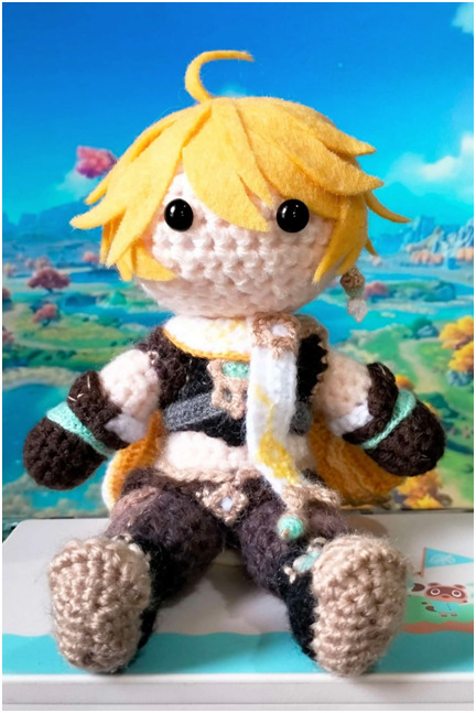
I saw your Aether doll, and I was just wondering what's your process for the hair and the clothes? A friend's birthday is coming up (very) soon, and they really like Aether, so I'd love to know how to make this kind of stuff.
I think you're really talented! :)
Hi! Thank you for your kind words :)
My process is largely on a ‘trial and error’ basis, but I’ve done my best to make a guide for you (using Aether as an example, since you mentioned him specifically). Unfortunately right now all of my stuff is in storage due to unstable living conditions, so I hope you’ll forgive me for only being able to offer pre-existing photos and hand-drawn diagrams. When I get access to my stuff again, I might do a step-by-step process for hair (for Lumine, since she’s my current WIP) but that could be quite a while yet.
Stuck under a read more because this is gonna get long lol
I’ll start with clothes because I always leave hair til last.
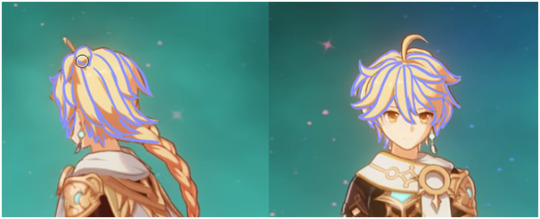
The first thing I do is hoard as many references as I possibly can, from as many different angles as possible. These are the one I used for Aether (made myself because I couldn’t find any online that met my needs), though I did also sometimes log into my game and rotate him in the character menu haha
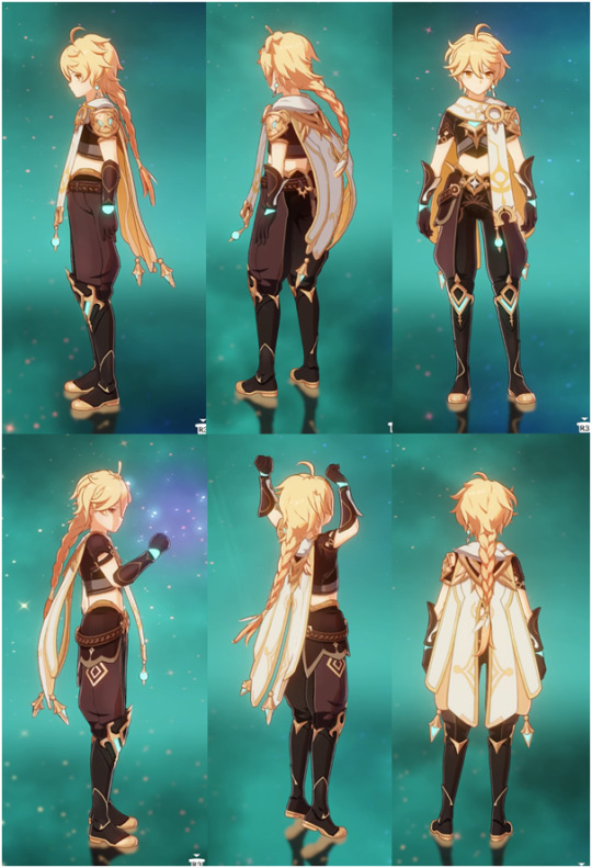
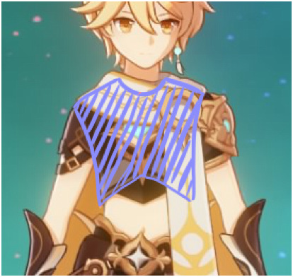
From here, the next step is to start dissecting the layers. Work from the base up, and break it down specifically into what you would make as a single piece, rather than say the shirt base AND the sleeves AND the decal. If that makes sense.
I don’t normally draw diagrams or anything like I will be for this, but if that helps you visualise it by all means do!
(I also tend to go really ham on the details because I’m a perfectionist, but please don’t torture yourself unless you really want to. Making things a little more simplistic is perfectly fine and valid.)
I won’t do the whole thing or I’ll reach image limit but here’s an example of how you might break it down:


The more you simplify it, the easier time you’re going to have.
The next step for me, after I raid my cupboard and the local craft store for the right colours, is to work out which pieces of the clothing I’m going to incorporate into the doll’s base body and which will be separate.
For Aether, for example, the ‘hand’ part of his gloves are the actual doll’s hands, but the bit that flares up his arm isn’t. The boots are part of his actual legs up until the part where it flares up over the top of his pants, which I made as a separate piece. The seat of his pants are the bottom half of his base body, but the pant legs themselves are add-ons. Does that make sense?
Next, make your base body! If you’d like to use my pattern, you can find it in my pinned post :)
Once you’ve got the base doll, I start adding layers of clothing. I always use a smaller hook size for the clothes than I do for the base body. In my case I like 2.5mm (and a teeny tiny 1.25mm for fine details and thin layers – but we’ll get to that later). I normally start with the pants.
My normal method of doing pants is this:
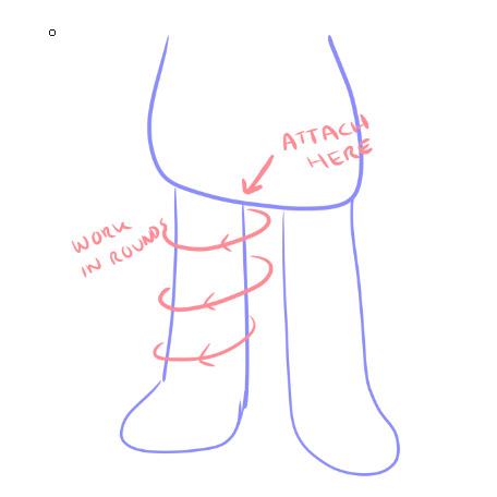
Essentially, I crochet directly into the base body in a circle around the base of the leg (so I am not chaining, but actually single crocheting through random stitches on the base in a loose circle shape), and then work in rounds until I reach the length I want.
Because Aether’s pants are puffy at the bottom and have two colours (*shakes fist at hoyo designers*), though, the process ends up being a little different.
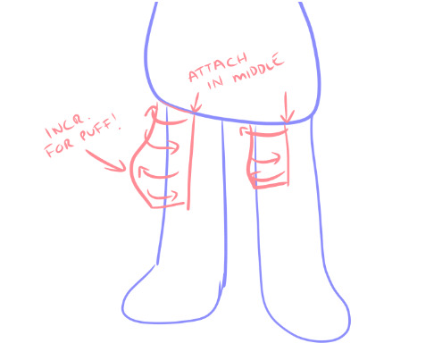
I made his pants in two pieces: the outer side and the inner side. So instead of rounds, it ends up being rows. To get that nice puff, just do some standard increases in the right spot and make sure to decrease on the lower rows to taper it back in.
Once you have both pieces, you can just sew the two halves together.
The flare of the boot over the top of the pants is exactly the same process. Attach and single crochet directly onto the leg from the top of the boot, working up towards the waist.

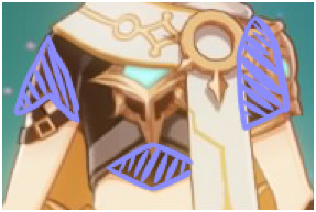
For trickier shapes like the gloves, it’s sort of just familiarising yourself with what kinds of effects different stitches do and allowing yourself to get it wrong about a dozen times before it actually works lol
If you break down the gloves properly, you end up with a shape similar to this:
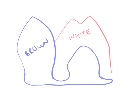
(this is not great i am so sorry – I am realising once again my reference was awful for the gloves)
But you can kind of see how it’s largely bulb shapes for the brown part, which is easy to do with increases and decreases. The white part I made separately and attached afterwards. Yes it was a huge, tedious pain in the ass.
For finer details, like his jewellery and, like, the shoulder armour, etc etc, I use the smallest hook I can tolerate. Please do not attempt this unless you lowkey hate yourself because it is torture.
So when you look at yarn, you can see that it has a bunch of smaller strands wound together, right?
You gotta split em.
Like this.

(image borrowed from http://illuminatecrochet.blogspot.com/2015/03/what-is-ply.html)
And then. You are going to use that tiny ass hook. And crochet those individual strands. It sucks. It breaks constantly. It makes you want to commit a crime. But damn if it doesn’t look good.
On a similar note, don’t be afraid to use the 2.5mm/whatever hook you use for clothes with less than the full ply of the skein you’re using. For Aether’s cape, I did the outer facing white part with only 2 of the strands in my 8ply yarn, and the inside orangey part with the 1.25mm and one strand. It’s still a little fatter than I’d like but it’s better than doing the whole thing in single strand torture mode lol
I’ll wrap up clothing here but if you want some help with anything specific just let me know!
On to hair!
For hair, I use felt square sheets that are like $1 each. Except for Aether because he has to have a Very Special Hair Colour that my craft store doesn’t stock so his cost me $7 :/
It’s a similar kind of deal for hair as it is for clothes. Break down the shapes and start from the bottom up.
(This is not a good look for him rip)
Layers are your friend! As are sewing pins! For real, do not glue anything down until you’ve got the whole thing pinned down because once you glue you’re in for a bad time if you need to fix something.

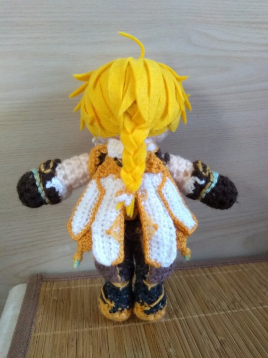
I’ve made two Aethers (one as a custom gift commission, one for myself) and they’re both a little different from each other, but this should help give you an idea of how I translated it to felt. I like to simplify if I can, purely because larger pieces tend to look a bit neater and less chaotic than a bunch of smaller ones.
For his braid, I found the easiest way to do it was to just cut three really long straight pieces, braid em, and then trim the end to the length I needed.
My absolute biggest #1 tip for hair:
If it looks bad but you haven’t finished, do not stop and restart.
It will always looks stupid as hell in the early stages. Don’t make a judgement call on whether or not it looks right until you’ve at least got the whole front part/fringe area fully pinned in place. Trust me.
I think that’s probably about all I have the energy for right at this second, but again if you have any questions or want help on anything specific, my inbox/DMs are always open – and that goes for anyone reading this! I’m always happy to help :)
3 notes
·
View notes
Note
Hello! I was wondering if you could a small tutorial on how you render your pieces?? They’re all super pretty btw!! I love your art :D!!
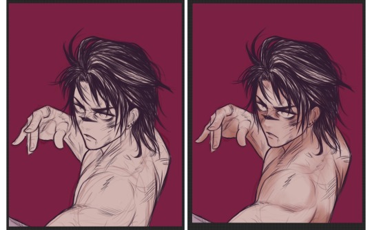
Ahh thank you sm!! <3 0: i’m not very good at explaining my process, and it changes depending on what I’m drawing as well, but I’ll try my best to explain it!
imma use the choso panel redraw since it’s a pretty simple portrait (done in Procreate, but most of this can be applied to CSP too)
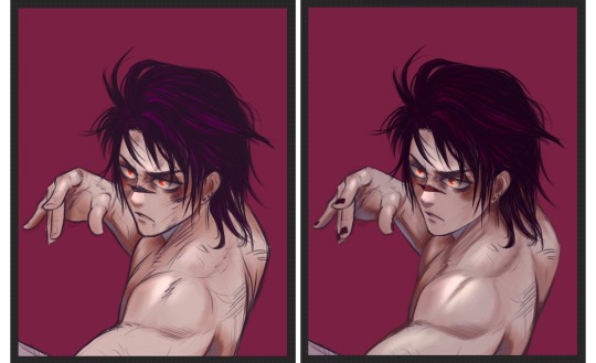
once i’ve got a decently refined sketch, i fill in a basic starting skin colour for the character. i start some shading once i have a basic idea of where i want lighting. colour-wise, i usually go a bit darker & warmer for the first pass. (i use a brush that’s a basic airbrush settings but i replace the shape source with a reuleaux triangle) besides where shadows will fall, ill also focus on making the colour more dense on the ears, fingers, around the eyes, and sometimes the blush area. (also let it be known i use Liquify a lot, and constantly flip my canvas. as you render you’ll often start noticing lil adjustments that need to be done)
ill build up passes of colour, going darker & more saturated as i do. as the colours darken, they’ll be in the more receded/hidden areas of the face (like under brows, under chin, inner ear, unless the lighting calls for otherwise) in this case though, he’s also kinda beat up, so i added more colour under the eyes/on the cheekbones to add to the bruise vibes
for the nose/brow/shoulder highlights, i made a new layer & set it to Add. it’s a handy way to get a highlight colour and brighten your hot spots for lighting. this is usually when ill mess with the sketch/linework, sometimes i switch the layer mode to Multiply if i know i want to fully paint over it. in this case i think i just Alpha Locked the layer and painted in the hair/eyeliner since i wanted them darker. once the linework is thoroughly fukt with, i make a new layer and start painting over. usually involves a lot of colour picking & making some adjustments, playing around with levels of colour. I also swap between the reuleaux and a funky dense rectangle thing for rendering, sometimes little sketch pens for smaller details too.
(technically the blue-tinge reflective lighting wasn’t very accurate for the bg/scene colour i chose, but i got carried away and didn’t wanna change it lol)
hair rendering is fun sometimesssss. i make a new layer, choose a slightly brighter colour, and messily block in where i want the highlights. idk how else to explain it besides like, think about using H-adjacent shapes when you’re erasing/refining the highlights. for the last step, i make a new layer, set it to Add, and paint inside the highlights for the sharper look.
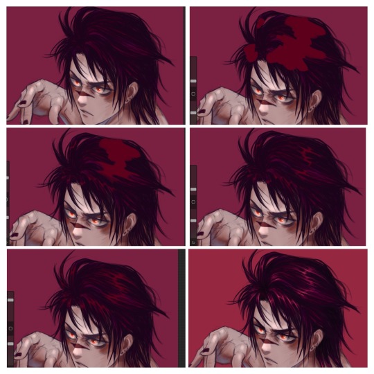
When it’s getting to a place i kinda like, (added some blood/cuts on this one before moving on) ill usually start messing with some overlay effects. this usually involves picking a random colour, filling in a new layer, and seeing how it lays over the piece. depending on the vibe im going for it can change a lot, but i find myself usually liking Exclusion & Subtract a lot. (sometimes ill throw a Noise + Overlay layer on top as well, but didn’t for this piece)
i hope that makes some sense??😭 im sorry if anything isn’t clear, i can try my best to answer specifics if needed.
it’s not my most thoroughly rendered portrait but it’s one i got a decent amount of wip screenshots for.. my style in general is still a wip, and i change it up a bit every time. i encourage experimentation always!!! it’s helped me a lot. i’ll see about making a more thorough tutorial for a properly rendered piece soon too!
50 notes
·
View notes
Note
Hi!! I really love your art, it's so soft~ You almost make me ship them even though I've never watched the SuMo anime 💗
Do you have any tips you'd like to share about digital art..?
thank you!! ^^✨
i don’t have any particular tips tbh, im actually a traditional artist at heart and i struggle to understand a lot of digital techniques- i am not a technical artist at ALL 😂 i only recently got a good grasp on blend modes and use them consistently in my drawings since last year haha, and in my paintings i tend to merge all my layers and work on a single one - honestly i’m terrible LOL
i tend to stick to more textural brushes because i love how it looks and the extra detail it gives. and i love adding more detail to the colouring with lines, which helps to give it more interesting shading too!
and when sketching it’s always good to think about composition and how the drawing will look on the canvas. my favourite thing about digital art is being able to move it all around and tweak it as much as i like without having to erase it all and start again :d
sorry i can’t be much help, i don’t know what i’m doing 😭💦 digital art is so broad, i guess it’s good to keep playing around and finding what you enjoy ^^
9 notes
·
View notes
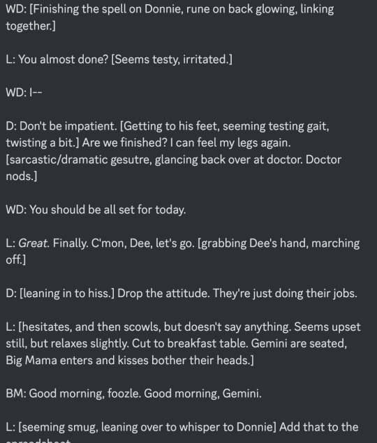
Text
Silkscreen week 1+2.
Read till the end if you can. Lol.
So this was harder than I thought it was going to be. Not the actual physical pulling or printing. But more the thinking. I’m used to being able to control Z, delete layers, re-do layers, have a v36 within 20mins. All digitally.
I couldn’t do this here. We had a pre-made screen and then we started printing. I just had to do. And I didn’t think. And Rolina showed me how to finger paint on the screens. Amazing! So freeing. No thinking, just moving your hands. Just intuitively feeling your way.


So there were no smooth beautiful ombré gradients - which I love!! But I equally loves these mish-mashy prints of colour and I got to just freestyle on the screen.
And then we added layers. This is where I got a little stuck. Not stuck. Just…'ohhhh that’s what happens if you do that, not the other thing I thought of in my head'. My positive/negative needed to switch around 🤣
But some cool things emerged and it was a learning curve.


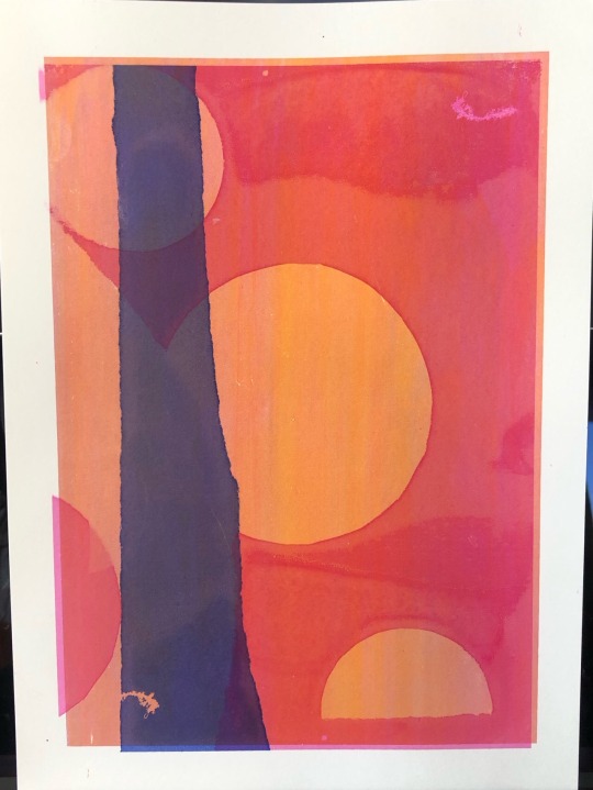
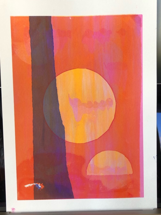
I needed to plan this and I didn’t have the brain power to do that in class.
But I love the quality of the prints and it was really easy. Using simple stencil shapes - in my case the moon phases - gave these lovely halo effects. There was at one point just a full circle print. It was bold. And pulled you in. Powerful. I love the simple shapes. They aren't that simple though. They hold information and power. And so much more.
3 notes
·
View notes
Photo
Another WIP I’m starting for the anon who wanted me to draw Dazzler. I may have gone a bit mad and added Jono and Lila Cheney as her rocking back up British mutants >_>”
Also, thought it would be a fun look into how I paint. I first do everything with good old paper and pencil, then scan it in and clean it up using Photoshop levels to get clean white backgrounds and blacker lines (see Jono there). Stick that as a multiply layer. Then I put in the flats for what colour I’d like to paint in (Dazzler). Each colour is on a different layer (my computer loves me for that, not). Simply because I’m pretty bad with using a graphics tablet, 10 years later and I’m still crap. I have a very wobbly hand and cant do straight lines (or curvy or any that's not wonky) to save my life. So flats help me stay within the lines. You know like a kid with a colouring book lol Then like Lila I start to render in the colours using a mostly hard round brush. Hope that gives a little peek into my way of painting. It’s not an easy way of doing it. If I had a pen tablet I wouldn’t have to do the flats that’s to be sure *grump*
60 notes
·
View notes
Note
I’m obsessed w your art style omg!! If you don’t mind me asking how do you shade skin? I’ve always struggled w over shading but the way you did it in your most recent piece is beautiful
ahh thank you so much!! i can try to show you a little step by step on how i shade skin ;0 though keep in mind that my art style is not the most consistent in the world but no matter the art style i choose the process is always the same!
before i start though, it's important to note that i use clip studio paint as my main drawing software, so most of the brushes used will be available on the clip studio asset store. however, some brushes i used are made to mimic paint tool sai brushes, so i'll be showing my settings for both
(also this isn't really a tutorial--this is just how i personally do it!)
step 1: base colour
what i do first is choose a base colour. the simplest part LOL.

step 2: blush
next i like to pick a colour for the blush. the colour depends on the skin tone but in this specific example i went for a more orange-ish colour. i apply it on the cheeks, nose, eyelids, ears, and lips.
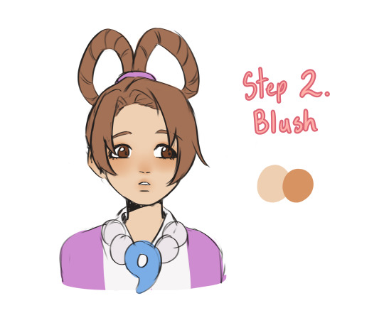
the brush i used is Mitch's Smooth Blending
this brush is the closest to the brush i used in paint tool sai 2, which is this one! the basic watercolour brush but slightly altered

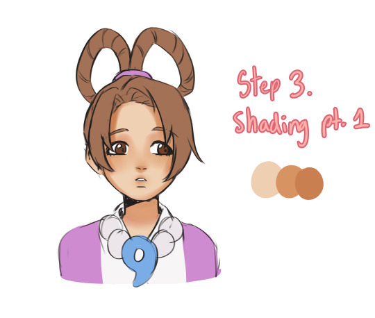
step 3: shading pt.1
so here i just take a colour slightly darker than the one i used for the blush and kinda go over where i think the shadows would be? the brush i use helps a lot because i can go softer on some parts (top of eyelids) and harsher on others, so there are some variations
step 4: shading pt. 2
i take a cooler tone and softly go over some of the shadows w it?? dont rly know how to explain it but i started doing this once and havent looked back ever since LOL ... hope the visuals make sense tho

extra: lighting + overlays and stuff
if the skin looks too dull i slap an overlay later on top of my skin layer and add more colour to it ^_^ also i like adding some lights and stuff idk its my fav part tho

anyway thats it! its not the best example im sorry about that but i hope it was still interesting ^-^
11 notes
·
View notes
Note
I’m just gonna start by saying that I’ve already typed this whole thing out then my old as time computer died again! Anywho there’s tears in my eyes rn but I just hope I remember what I wrote in the first place😂
Hi Пчёлка! Which apparently translates into bee/little bee affectionate??? Bees are cute and you’re cute so I though I’d give it a try!
I’ve seen painted denim jackets before and every one of them looks so cool. I’ve always wanted a denim jacket though I do have quite a few cool jackets already.
How dare tumblr be homophobic against my half-assed flower paintings 😠 (Although I did see you were able to post I normally which is weird)
Fustercluck is stolen directly from my favourite sci-fi book.
Do you have a favourite book? Doesn’t even have to be for the plot it could be just for the aesthetic.
Love, just because just because it’s isn’t it my cup of tea doesn’t mean it can’t be yours! I’d never judge you for it, plus you’re not the first person to like it after I gave them a recommendation (you’re the second one but that’s not the point lol)
AS for Wild West Ronance all I’m saying is that for a brief period the Victorian era and the Wild West existed at the same time. Imagine... Nancy goes with her father who is attending to business across sea Canada/America doesn’t matter, they get there and he leaves Nancy alone for a bit so she’s decides to take a walk (bringing a shot gun in case) so she like sitting somewhere in a full Victorian dress reading and holding a shot gun, enter stage left COWBOY Robin!!! Hat, boots, and horse, who sees this beautiful lady readin AND HOLDING A GUN! That’s all I have to say thank you for coming to my ted talk.
Ah yes, Alvvays, my sweet, sweet Canadian band WHO STILL HASN’T RELEASED CANADIAN TOUR DATES(I may be a bit salty about that)
All three of those music recs are lovely!
99 Luftballons will always be bright red and childhood memories, Twinkle Lights is giving electric purple and sleepovers at your friend house in summer without A/C but also driving around in the middle of summer, Atom is bright orange (like max’s hair, or cheese) and also jumping on the trampoline.
YES! I am a Paramore fan they’re my second favourite band. This Is Why sounds like the colour maroon but with a bit of blue added in, not enough for it to be purple but enough the darken and mute the red.
One last thing about music but both Paramore and Alvvays are releasing new music for the first time since 2017 (Very Online Guy has been stuck in my head since it came out and I may be going a bit crazy) but all that with MOSS just being released means I’m being very musically fed. Blue rev comes out in 12 days and I am HYPED!
I actually had to look at up what a bradford pear was, here we have so many cottonwood trees I always feel so bad for people with a cotton allergy.
I guess that is a bit gay of me, speaking of gay I need more piercings! Yeah, I have decided on the hair I just have to go pick up the dye!
Do you have any pets? I have many but I also don’t want to be the weird one
As for the mutual thing, that’s for me to know and for you to (possibly) figure out.
A bit of a Victorian sign off today!
Sincerely and entirely yours
-el
Hello sweetheart! I’m so sorry your computer is being homophobic. Damn those Boomers and old people 🤪
I think I’m going to melt at that nickname. Little bee? 🥺 I love bees so much. That just made my brain go ahdjskjdkeksk. You think I’m cute? Yet again I say lord have mercy on my poor gay heart. I just know you are adorable as hell.
They’re so much fun to paint! Maybe one day I could paint one for you, if you’d like. Jackets are the coolest! Maybe it’s just because I’m bisexual, but layers!!! Jackets, button ups, flannels my beloved. I have a particular love for denim jackets tho
Oh, what book? I fucking love sci-fi dude
Oh lord, I love a lot of books, it’s hard to pick favorites. Ask me to pick a favorite child, why don’t you? You’ve found another subject I don’t know how to shut up about. But in all seriousness, The Hunger Games and The Hobbit were both very important to middle school me and I love them still very much. Also The Giver. I haven’t read as much recently because school gets in the way, but I loved “Leah On the Offbeat” by Becky Albertalli (god I related so much to Leah it’s not even funny) and “Crier’s War” by Nina Varela (enemies to lovers my beloved) are both recentish reads that I adored! How about you? Any favorite books?
Oh I’m aware! I say it all in jest, I swear <33
OH OH OH YOU ARE SO RIGHT. I see your cowboy Robin and I raise you: Outlaw Robin. Featuring Victorian Nancy with her gun seeing this swaggering cowgirl who speaks multiple languages and has a Secret Backstory roll into town, then seeing her wanted poster and deciding to try a little bounty hunting while also being hopelessly intrigued by her 👀 Is this AU sitting in my WIPs? I will confirm nothing—
El, darlin’, I could listen to you describe music in colors all day. That is so cool, and they sound so accurate!!! Atom is so orange, yes, and your imagery for Twinkle Lights? Astounding.
That makes so much sense! I love it so much already and I legitimately cannot wait for an album from them. I have been obsessed since I first heard The Only Exception. Last Hope remains one of my favorite songs in the history of ever and I WILL belt it full volume any chance I get.
!!!!! I’m so excited!!! I will have to listen to it all. We really are being musically spoiled this year and I am loving every second of it.
They look pretty, smell terrible, and are my worst seasonal allergy 💔 My parents both have trouble with the cottonwoods but thus far I’ve somehow ended up lucky enough not to inherit that one lol
Piercings YES, those are so hot and cool. I don’t have any yet, but I’ve been dying to finally get my ears pierced. I’m hoping to have a good chance to do it over fall break or something
Oh gosh, if you count with me now, I would say no because college, but back home is a farm so we have MANY. Dogs, cats, horses, goats, donkeys, you name it. No cows tho. I’ve always wanted a fluffy cow 😂 Do you have pets? I’m happy to hear about them <33
Darn, but incredibly fair! The mystery makes it fun, I am simply curious. Tell me one thing, perhaps? Are you from the US? If you’re not comfortable sharing/want to keep the mystery, that’s cool too of course!
Affectionately yours,
- Max/Lo
3 notes
·
View notes
Last Seen Blogs
bonez-yard
Bonez

bortsoff
Бизнес-Омбудсмен Камчатки
rawenergy
Angelface
askpizzadwight
LEADER
fotografias-de-um-nerd
Fotografias de um nerd