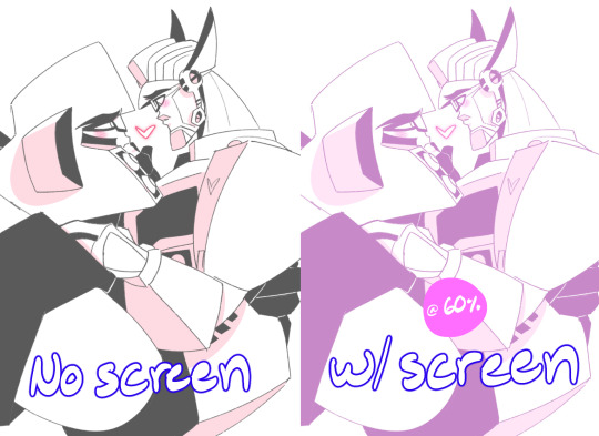
#I recently discovered gradient mapping
Text
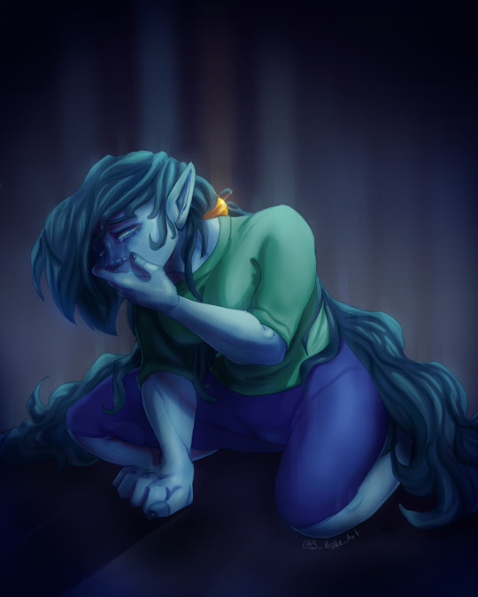
It's not easy being the newbie
#I recently discovered gradient mapping#And my job got easier#But now I have to learn color theory noooooo#rayman fan character#fan character#rayman#digital art#digital drawing#artists on tumblr
10 notes
·
View notes
Text
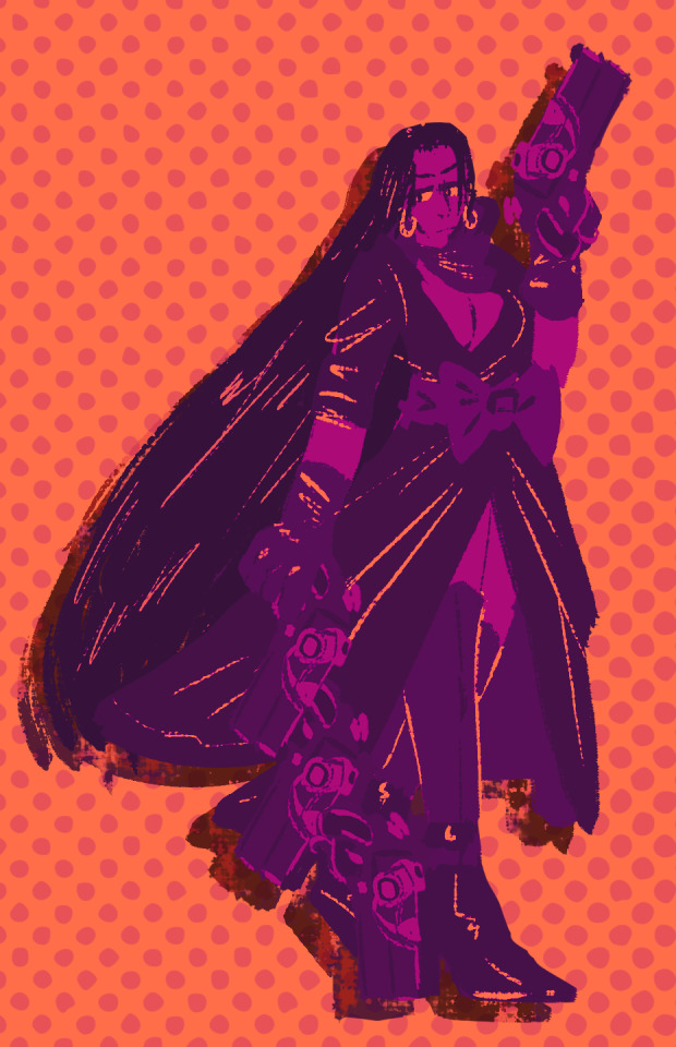
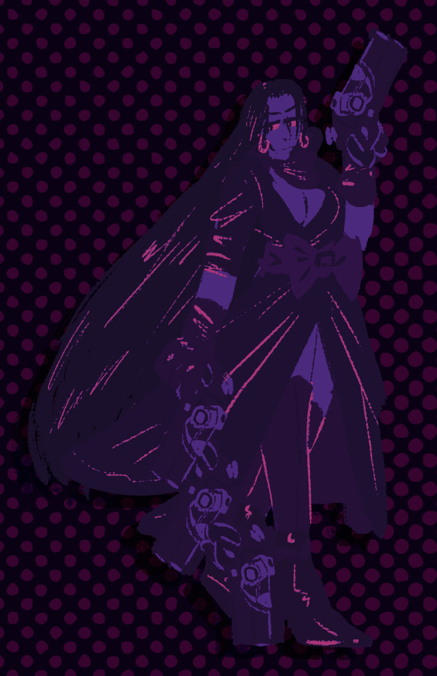
i watched the bayonetta anime movie and, despite having just about 0 knowledge of the series prior, i am now obsessed with this woman. so, naturally, the first thing i had to do was draw hancock in one of her concept art outfits
#one piece#boa hancock#lorillee.png#eyestrain cw#<- possibly?#genuinely considering trying to get bayonetta on my computer btw#also i have recently discovered the fun of gradient maps on photoshop
39 notes
·
View notes
Text
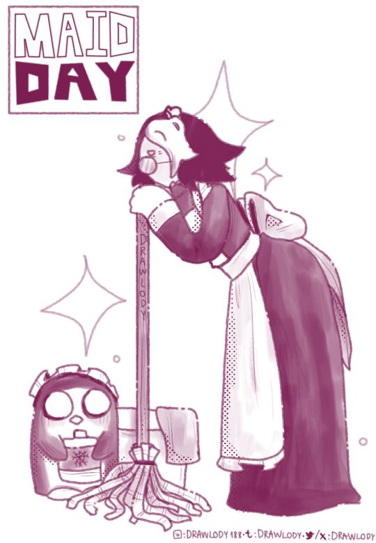
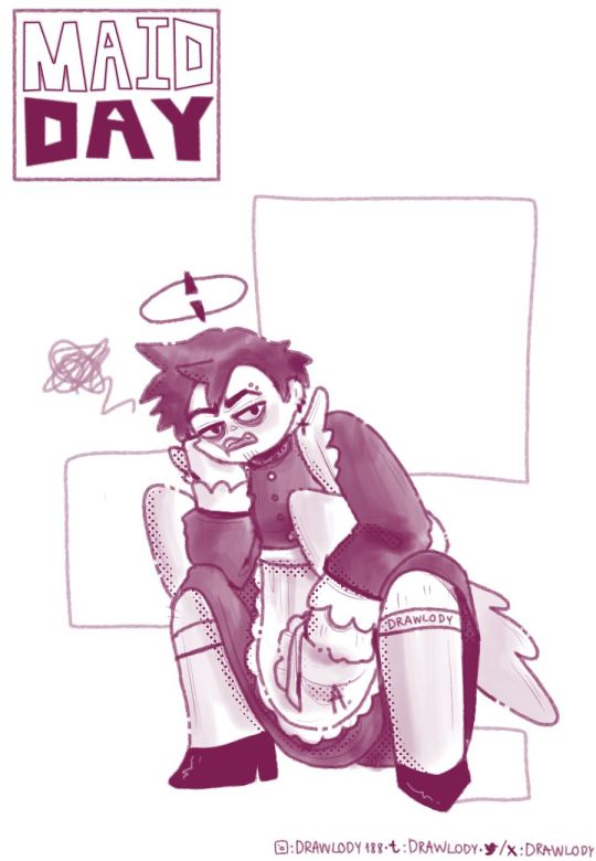
I AM NOT LATE FOR MAID DAY >:000000000


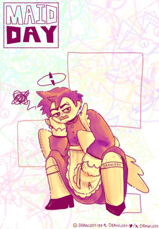
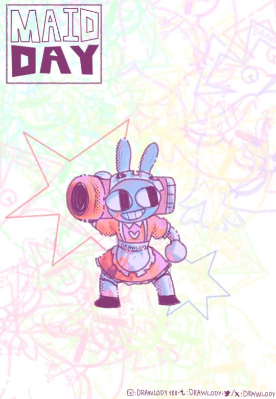
I like my men in pretty dresses hehehee
+Sans be rocking those shorts x fishnett
+Simon coming in with the sass (I like this one colour the most its so whimsical)
+Adam one is taken from a dtiys on twitter lol
+Jax is here cause idk who to put n then I remember Goosework posted a pic of him in a maid dress last year:))
At first they r 1 colour but i recently discovered gradient map n yeah :DDDD


#maid day#maid outfit#undertale#undertale sans#adventure time#fionna and cake#simon petrikov#hazbin hotel#adam hazbin hotel#hazbin hotel adam#the amazing digital circus#tadc jax#fanart#men in maid dresses is my religion#not really
56 notes
·
View notes
Note
First off- I LOVE HOW YOU COLOR???
Also- Do you have any ongoing stories for your ocs?
WAAAHHH WAHHHH THANK YOU SOO MUCHHH T^T recently discovered new coloring style (greyscale then gradient map and then render all together) and it's what rekindled my love for drawing so to hear that ppl also like it just... WAHH THANKU
I do!!! getting back into writing as well!!! >:3c I got my story Living Dolls ongoing and getting out of hiatus soon on DA! And I got a batch of chapters of my upcoming story Giant Burden coming to it as well (but might also post on ao3 since ppl have asked abt that hehe)
hoping to get both a chapter out by the end of this month B)
11 notes
·
View notes
Text
My 2021 Art Evolution
Since we're nearing the end of the year, I thought I'd take a look back at how much my art has evolved and changed in the last twelve months.
When I created this blog in the earlier half of the year, I'd only really been drawing in Procreate for a few months. Prior to that, I'd spent 20+ years doing only traditional art, and maybe once in a blue moon goofing around with my frequently neglected Wacom.
Contrary to popular belief, transitioning from traditional to digital art styles is not easy. Sure, some things carry over, but there is a massive new skillset to learn and it can take a while to get used to it.
The first picture below was the first piece I ever made in Procreate.
As you can see, it was a rough first attempt. I struggled with proportion because I wasn't used to the pens or the smooth surface of a tablet. I struggled with lighting because I hadn't yet learned about overlay layers, gradient maps, etc...
Here is a more recent attempt at a similar concept:

As you can see, not only have I gotten more used to the medium, but my proportions are far better. I've discovered different lighting tricks and learned about how to use the tool. I've also established and settled on a style that I'm happy with.
There's about 8 months of almost daily practice between when these two pieces were made. I'm looking forward to seeing what I can do with another 8 months :)
Thank you all for supporting me as I continue to grow and develop my art 💕 it means the world to me that people like what I do. Please know that I do try to read every comment, message, tweet, ask, etc. and that even if I don't respond right away (or forget to because I'm often quite forgetful) I am very, very grateful for the support 😊
#art growth#style evolution#thank you all so much#seriously#when i started this blog at the beginning of the year i never expected to ever get so many followers or so much support#yall keep me going and it means the world#so thank you💕#art evolution#aftg#all for the game#the foxhole court#andrew minyard#andreil#neil josten#aftg fanart#art#artwork#drawing
254 notes
·
View notes
Note
I love your art and I'm studying art at college. I just want to ask how do you get your colours? Like how to you get the pink tint with not only base colours but the shadows as well? How did you get the blues and green tints with your recent post? Is it practice or is there something I can use?
first off thank you 😭💕glad you like my work!!
my go-to hack for putting a specific colored hue across all my layers would be having the top layer set to ‘screen’ (with that pink you mentioned) for softer colors! makes line art look a bit more fun and makes even simpler shading more colorful
Here’s a quick visual :D I’ve found this works well too with not only plain doodles, but colored ones as well! mmm very soft colors all around
Also setting that top layer to ‘overlay’ instead and messing w the color and opacity of said layer often gives nice look to your work too
As for my last piece though with the greens and blues you mentioned, I’ve been using the trick that’s starting out with having all flats be in greyscale, then from there I use layer settings or filters to work the colors in (via overlays, screens, color burns, sometimes gradient maps too)
basically that doodle above^^is near the method of starting from greyscale
This post has a nice visual for coloring from greyscale!! Really emphasizes experimentation with different layer combinations
Going from a greyscale to color that way I’ve seen takes a whole lot of time out of trying to match hues manually :/
(One of my fav layer settings I’ve recently discovered if this is old news my bad then is throwing a top layer set to ‘lighten’ with any color really will cast color on pretty much only the darkest part of your piece (like the lineart) it’s BEAUTIFUL!!! Pls give it a whirl it’s a good time)
#and you’re in art college oh that must be a BLAST I hope you’re having fun!!!#hope this kinda helps 😬😬#unfortunately much of my process is like me trying combinations a million times before smth looks right. filters are my best friend#trial and error trial and error#but it’s worth it and after a time you learn which layer settings work best for which moods or character palettes!#asks#helpful
119 notes
·
View notes
Photo


Challenge: From your creations, choose GIFs and do a split of before and after adding colouring!
Thanks @steveroger for the tag! 🥰🤗
After looking at this I think my editing style is a lot more subtle than I thought haha - I guess that means I could really crank up the vibrance. I focus on just making them as bright as possible, especially since so many scenes are so darkkk. I approach every gif separately, I barely ever copy/use a saved filter from a previous gifset... maybe I should lol it might be faster.
Im still learning, every time I made a new gifset I feel like I get to know a tool a little better. I only recently discovered the gradient map and learned how to “properly” use the curves tool.
This was cool seeing my edits side by side, its my favourite thing to do when I’m done with a gif, turning on/off the filters to see what I’ve accomplished
No pressure tagging some other wonderful content creators!!
@pascalsky @pedorkpascal @nobie @binary--sun @eddardstark @din-djarn
#tag game#when i look at them like this the changes seem so subtle!! ughh lol#maybe eventually ill try more drastic edits/colouring#the whiskey one looks like theres no difference hahaha... maybe because its the one gif in actual GOOOD lighting#*edits#colouring
19 notes
·
View notes
Note
hiiiii <3 do you have any coloring tips? I really really enjoy the colors in your hanguang june series especially <3 <3
🥺🥺🥺 wild to me that anyone would ask for tips thank u (your gifs always look amazing and so vibrant, i would love to know about your process too!!)
i'm still very much in the learning stage so idk if i have anything worth sharing? i rarely use hue/saturation and most of my colouring is in selective colour, usually starting with colour balance to increase reds & yellows. you’ll probably already know of these but here are a few other things i've discovered recently 😌
gradient maps loml. i haven't used coloured ones much but i almost always put a black to white gradient map set to overlay or soft light at a low opacity. it adds some depth & contrast
no gradient maps — red to yellow 20% — black to white 35%

photo filters!! i use these a lot to make the whole gif warmer, or when the skin tone isn’t quite right. my go-to is a pale orange or peach at like 15-25% density depending on the lighting
without photo filter — #f7ce77 at 25%

this isn’t the best tip because i really don’t know what i’m talking about, but i only started using curves for colour correction a few days ago. it works so well and is definitely worth exploring!! some are quite harsh so i often lower the opacity, but it’s finally an answer for awful blue scenes that used to take too many adjustment layers to fix. and we all know fewer adjustment layers = better quality so this is a very exciting revelation for me
original shot — simple colouring — one curves layer added (!!!)
that’s all i’ve got i think!! hope something is useful! i’m relatively new to this so it’s going to be embarrassing for me if all these are common knowledge jdhfbjd
anyway thank you so much, means a lot to hear you like my posts :)) happy hanguang june! 💙
#asks#recapitulation#also congratulations on being the first person in this inbox!!#hope you're having a great day 😊😊#all tag
6 notes
·
View notes
Text
Spot, Spotters, and Spotted
Dave Baugher has been a regular contributor over the past several years. Although most of his posts have touched on the poignant and personal side of being out on the PCT, in this story he takes a mostly humorous examination of the using a SPOT device (although he does conclude with a story that reinforces the importance and value of SPOT devices).
Dave has also included a story in the upcoming 10th Anniversary edition of The Pacific Crest Trailside Reader that the Mountaineers Books will be publishing in 2022.
By Dave Baugher
The backpacker and his GPS are more like a match made in the local tavern, like beer and pretzels. Current Global Positioning tracking technology uses a network of satellites to determine the location of a device that was specifically designed for that purpose. The basic idea is that a GPS tracker uses trilateration to determine its physical location based on its distance from three GPS satellites. For the hiker going about his way on the trail, the technology is innocuous. However, for those following, the technology can spawn a myriad of humor, concerns, and dismay, just like an evening at that local tavern.
However, these devices sometimes baffle sideline audiences and armchair quarterbacks by the hiker's behavior on the trail, as shown on Google maps. Consider a little during-the-hike episode on the second day of my 2014 Pacific Crest Trail hike when I arrived at Lake Morena.

It was one of those quiet afternoons, with a scattering of high clouds, green cottonwoods around the lake, and the smell of fresh-cut grass on the breeze. Arriving at the county campground early in the afternoon, home tonight would be campsite #31. I laid my pack across the picnic table, took a long deep breath, and basked in the afternoon sun, planning for a much-anticipated shower, dinner, and relaxation. Getting up, I grabbed my pack; I walked down the dusty road to the Oak Shore Grocery and purchased a couple beers and a local newspaper. Returning to my campsite, the remainder of the evening played out precisely as planned. The shower was hot and clean; dinner was satisfying, and reading the newspaper with my cold beer was intimately relaxing.
Later, I discovered that my trip to the store generated multiple jokes amongst my friends who were monitoring my progress along the trail via SPOT; my compatriots were closely watching. Little did I know that the store was titled “Ice Cream Shop” on Google maps that year. Doug, a cigar-smoking jokester, slipped in a picture of a hot fudge sundae into my resupply box, retrieved from the Warner Spring Post Office later.
That incident had the usual inferences related to SPOT tracking. However, there is another facet to spotting folks on the trail when looking at the Google maps on a two-dimensional computer screen. That same year, while hiking on the JMT/PCT with my son Jacob and future-son-in-law Patrick, we merrily enjoyed our hike along the John Muir Trail. Family and friends focused on our progress via the SPOT and Google superimposed tracks. Once we returned home, I had several folks question our progress along several specific areas. Looking at the map of these locations, it was apparent that these areas had high elevation gradients sections with steep switchbacks. These challenging vertical sections for folk-uneducated in more nuanced aspects of topographic map detail would look at two-dimensional Google maps as a series of overlapping orange dots on the computer screen and wonder what was going on out there. Interesting indeed.

Another result of this GPS technology is that these devices are fast becoming legendary as a life-saving tool or beacon for someone in trouble. An example from 2017, during my spring solitary PCT hike in the Sierras north of Lake Tahoe. A snowstorm of near-blizzard violence had caught me below a high ridge near the timberline and forced me to take shelter for several nights in my tent. To my wife, Luann, that orange dot, unmoving for three days, meant I was dead, bear bait, feeding the worms, you get the picture. Luann would have called out the military to rescue me if it had not been for my son-in-law Patrick. An Eagle Scout and avid outdoorsman, Patrick had been watching the weather along my route. Understanding where I was and the current weather conditions, Patrick considered the situation. He reassured a panicked mother-in-law that I was ok. On the third day, the storm broke, and my Spot’s orange dot began moving once again on the home computer screen.
On that same trip, several of my “Spotters” discussed why my track appeared not to follow the trail. Confusion reigned amongst these folks spawning conversations about why Dave wandered over the PCT Trail line in a zig-zagging path. I overlapped the trail in quarter-mile eastward only then to veered westward over the track for another half-mile in a wayward fashion. Back and forth for days. Confusion amongst friends? You bet! Why? Well, the trail was covered in a deep spring snowpack, buried in fact. Signs, tree blazes, markers, and PCT emblems were nowhere to be seen in the deep snow. Conserving my GPS battery, I was using map and compass to follow the trail orienteering from one landmark to another,
Obviously, kinfolk following hikers along the trail via a tracking device retains a propriety attitude toward their favorite hiker. Actively considering “they” are, in fact, part of the adventure, living vicariously through the daily movement from the device strapped to a dusty pack. You might get the impression that almost every “Spotter” in my life nowadays has a Dave yarn or two to tell. Many of these should be preserved for posterity.
On another trip, difficulties began when I included a new friend, Steve, on my PCT Spot tracking list. During this particular PCT adventure, I encountered heavy snow depths on the PCT in Northern California. An impending spring storm approached the higher elevations out of Castle Craig’s State Park. After a quiet night's sleep, I awoke to boiling grey clouds, falling snow accompanied by a winter storm warning. Careful consideration of the weather and the impending climb to higher elevations coming along this trail section for the next 60 miles, I pulled the plug on the hike and retreated home.
Unfamiliar to my antics on the trail in the past, Steve was confused about why the orange dot was moving back down the trail along the same path from the day before. He contacted several of my friends about my wanderings. Technology malfunction? Nope, just a wise hiker returning home. Being spotted by spotters with my Spot on backpack, once again.
However, consider this; carrying a GPS transponder on a pack is an insurance policy for protection from the trail's worst events. Let me share the story about another hiker, George, from Palo Alto, CA. On June 30, 2008, during a summer backpacking trip in California’s Kings Canyon National Park, the 52-year-old hiker found himself suffering from acute abdominal pains on day ten of a 200-mile hike along the John Muir Wilderness Trail. At approximately 11:00 pm, George’s pain worsened, which led him to end his trek early and initiate an emergency alert with his SPOT transponder.
From George: “My friend and I were enjoying a great trip when I began experiencing an intense pain in my stomach near Safire Lake as we were setting up camp for the night.” “I knew something was very wrong, but being so far removed from any help at 10,800’ elevation and deep in the backcountry, I had no choice but put my faith in the SPOT, which I recently purchased for checking in with my family during his expeditions, press the 9-1-1 button and wait for help.”
The GEOS international response center received the message from George’s SPOT unit shortly after 11:15 pm and relayed the information to the Kings Canyon Ranger Center. Due to darkness and the ruggedness of George's terrain, the Ranger had to wait until daybreak before he hiked to George’s location to assess the situation.
According to rescue officials, when they reached George, his pain was severe, and there was no way for him to make it off the mountain on his own. That was when they requested a helicopter for an evacuation. George was flown to the Community Medical Centers in Fresno. He underwent immediate surgery for a perforated intestine, which, if left untreated, can be fatal. He was released from the hospital a few days later.
This is beautiful technology — the GPS transponder allowing hikers on the trail to happily wander through the mountains in relative safety. Friends and families able to follow the trek from afar. However, for the hiker going about his way on the trail, the technology is innocuous. Nevertheless, for those following, the technology can spawn a myriad of concerns, humor, and dismay, just like an evening at your local tavern.
2 notes
·
View notes
Photo


ORIGINAL → EDITED
gif making process tag
I wasn’t sure if this was something anyone wanted to see from me specifically, but I’ve been tagged by @cuddlerlouis @ltwalls2020 and @finewalls to do it so!!! okay sure!!!
LEFT: animated, cropped, resized from a 1080p video
RIGHT: sharpened, colored, text added (optional)
Listen...I’ve been making gifs since the dawn of time. I think I first taught myself how to gif when I was 11 with Windows Movie Maker and a program called Paint Shop Pro 9 and the only social media that existed were fandom message boards. I’d have to manually screenshot the video frame by frame. Nowadays, (and for the last decade on tumblr) I’ve used KMPlayer to screencap and Photoshop CS3 to make the gifs because the “load files into stack” extension doesn’t work in my version of CS5 and that’s how I like to do it lol. My entire experience of making gifs on this site is still documented on my blog, and you can absolutely see how I’ve improved over the years and discovered my own style and stuck with it. But I am STILL constantly learning and adapting!!! so it’s quite fun. anyways, onward.
I load the screencap files into a stack. Then, I use an action I made myself of my basic giffing steps to speed up the process once my files are imported—make frames from layers, reverse frames, flatten frames into layers, set time delay to 0.04. Time delay is a personal preference but I like smooth gifs, especially when I have a lot of frames. I run this action before I crop so I can see exactly where my subject moves around and compare where they are in the first frame vs. the last frame, so I don’t accidentally cut them off somewhere when I crop. Once it’s cropped how I want, I run a sharpening action.
Then I color it from scratch! I used to be big on finding PSDs and altering them to fit the look I was going for, but I find that doing it yourself layer by layer is how you really learn about coloring. I specifically chose clips for this that were gonna need more editing than your average gif that is already well lit with a decent white balance (rip to every person who has ever filmed Harry and Louis but I’m different) so you can see the difference and how I work around inconsistent lighting or unstable concert footage with ever-changing colors and shadows. I usually go in the same order:
curves - (I only JUST recently discovered what the eyedroppers in this tool can do for a gif’s white balance, so....*clown music*....glad I know that now) and do a minor adjustment to lighten the gif a tiny bit.
levels - to further crisp up the black and white points and brighten
brightness/contrast - ya know
selective color - I bump up the black in every gif to avoid any noise and this also helps lower the gif size by the time I save. it helps make a gif pop a little more and gives it some good contrast. Then I’ll fuss a bit with the red and yellows and take out any unwanted tones I don’t want like the blues/cyans in the background or the yellows in the original color grading (why the FUCK is the Lights Up video this way). BUT! This is not always necessary and there are times where it should be avoided. I included a gif of Rami here because I notice a lot of gif makers go ham on the selective coloring and brightening, that he’ll look pretty whitewashed in their final gifs because they take out a lot of reds/yellows and his skin loses color. so it’s important to pay attention to your subject’s skin tone especially if you’re giffing a POC, pay attention that your editing doesn’t wash their gorgeous skin out ok!!!! you can brighten a gif without brightening their whole being!!! moving on!!!!
color balance - this is a fun layer to play with and a very crucial step to how my final gif looks in terms of color. I gave the Lights Up video a reddish tone with this, but you could also go with more blue-ish look here too.
text/captioning - I have my font settings saved as a PSD file so I just pull that up and drag and drop the text, and edit the layer to whatever my caption is. I’ve been using the same font settings for YEARS and I think that is one of the main things that differentiate your gifs from others is having your own style of captioning. It’s fun to experiment with this!
I might add a couple more brightness layers or a black and white gradient map set to soft light at a very low opacity!!! or play with the exposure tool!!! it depends on what I’m working on, but those are my basic steps!!!!! then I save them set to Pattern or Adaptive (whichever looks better) and that’s pretty much it :) i’m happy to answer any questions or help if you’re starting out!!!
Idk who else has done this yet but I’m gonna tag some of my favorite gif makers in other fandoms to spread the love @summercohen @joewright @barrysberkman annnd @s-k-y-w-a-l-k-e-r but no worries if you don’t wanna share all your tips and secrets, fam. We totally get it xx
#...very sorry about how long this is#this is why!!!! gif makers get frustrated about stolen gifs or lack of notes...it's a lot of work
103 notes
·
View notes
Text
Through the Learning Glass: Worldshaper
When you get right down to it, education’s really a pair of glasses. Not just any old pair, mind—your first pair. The ones you peer through when you first realize, my god, you can see the leaves on that tree, and, perhaps more importantly, when it hits you that everyone else has always been able to see them.
They press into the bridge of your nose as you stare, mentally recalibrating, because suddenly the world seems clearer in more ways than one—transformed, even. That feeling, green blur shifting to leaves, that recalibration, that sudden clarity where there was none—that’s the core of learning, the true value.
So educational experiences are glasses.
And each one is your very first pair, conceptually speaking. Each one is a lens, as it were, through which to view the world writ large; each grants you awareness of new details and concepts; and each serves as a catalyst for insights which bring more nuanced and clear understandings of the world, your community within it, and yourself.
After reading extensively about autism from autistic perspectives, for example, I found myself noticing autism-related things everywhere—among them, the prevalence of functioning labels in allistic, or non-autistic, discussions about autistic people. I’d been aware of the trend before, but with my blurry view had seen nothing wrong with it. After researching and strapping on my “autism glasses,” however, it became crystal clear, and I began to form connections between research and reality. The connection, in this case, allowed me to see that functioning labels are both inaccurate—autism is like a circular color spectrum, not a linear gradient from “tragic thing” to “basically normal”—and disrespectful—they are often used to dismiss autistic people’s voices on the grounds that they are either too low- or high-functioning to have an opinion.
On a broader level, I formed a connection between this inaccurate disrespect and the concept of ableism—and began to see, in this and many other ways, how ingrained it is in our society. I also came to understand that my previous perception of both it and disability had been fundamentally flawed—blurrier than a park in a snowstorm at ninety miles an hour—though it now seemed clear as day, my world transformed and its pervasive inequality laid at my feet.
In short, I developed a clearer, more nuanced understanding of both disability and its relation to society, and so my worldview shifted—explicitly because my increased awareness of recently-amassed facts caused me to see related concepts everywhere and interpret those with said facts in mind.
In this way, education gives people new frameworks which better enable them to understand the world around them by spotting patterns related to the education-subject and analyzing them on both narrow and broad conceptual levels.
Education doesn’t limit itself to only the world writ large, though; the frameworks it gives us are as applicable narrowly as they are widely, and can be used on smaller scales, to make further connections within, for example, one’s own community. These connections can be—and indeed often are—the same as the societal discoveries, but in miniature. When I looked at my personal community through my autism glasses, for example, I discovered ableism in places I’d never expected: my sister using the aforementioned functioning labels, my mother claiming that “everyone is a little autistic,” and my doctor supporting hate-group-disguised-as-charity Autism Speaks. Critical framework application revealed that each of these examples mapped onto ableist ideas in larger society; in this way, education enables one to see connections not only between what they have learned and their communities, but between said communities and the world.
Yet the new connections formed on this level need not be related to such overarching themes; they can occur on entirely new tracks, and are just as often based in individual details. Such was the case when I looked at other individuals through my autism glasses: I recognized echolalia in my younger sister—that being a fancy word for repeating things you’ve heard others say as a means of communicating, and often easier for autistics than creating novel sentences. Before I recognized it, I often found myself somewhat unsure how to figure out what my sister wanted. Afterward, though, it was easy to see that I just needed to take a more active role in the conversation, both to understand her and to give her new words to echo. In this way, I made a connection not only between the information I’d read about autism and my own autistic sibling, but between her experiences and my actions—specifically, the ways my actions could affect her experiences.
Thus, education as a framework enables people to form more nuanced understandings not only of the other people in their communities and said people’s relationships to the framework-subject, but also their own relationships to their communities and the ways in which they can interact with them.
This holds true regardless of the subject matter, because human nature demands that we apply new information to old, to compare and contrast, and above all to do so with the things which matter most to us.
Relatedly, and perhaps most importantly, the various frameworks education provides us with can be—and often are, consciously or otherwise—applied to ourselves. This is due to the aforementioned human tendency to personalize everything and interpret information through the doubled-up lenses of the framework in question plus our own experiences. Such application often results in new insights into ourselves, on a variety of levels ranging from minor to overwhelmingly significant.
For instance, while researching autism, I found myself applying the framework to my own life. In doing so, I discovered that autistic experiences—and indeed the official diagnostic criteria—mapped easily onto my own life, habits, and personality; among many other things, I discovered that I use echolalia like my sister, just in a more delayed fashion; that I favor repetition in all aspects of life; and that my social skills are learned. I discovered, in short, that I am autistic.
This discovery completely altered my self-perception and sense of identity as I went from a fuzzy sense that I was weird and somehow broken to the crisp realization that I am disabled, certainly, but need no fixing—am merely different, not less, as per the disability theory aspect of the framework. And so, as a direct result of my research, my sense of identity shifted utterly and for the better—perhaps in a more dramatic fashion than that of the average educational experience, but nonetheless in a manner exemplary of education’s potential to alter our understandings of ourselves.
This potential, it must be stressed, holds true even in more rigidly academic settings, as seen when history students grasp parallels between their own actions in the present day and others’ from decades past.
Education in all its forms and degrees of personal intensity, then, encourages us to examine ourselves as well as our various surroundings, resulting in insights which allow increased clarity, nuance, and connection to new concepts in our self-perception.
Said insights don’t end there, however—they often extend beyond ourselves and back to other perceptual shifts, to encompass our understandings of ourselves in relation to our communities and broader society.
For example, after I discovered that I am autistic, I proceeded to reexamine my interactions with others in this context. This reexamination revealed that my communication style is more different from most people’s than I’d realized, given my repetitive speech and difficulty saying what I mean; in this way, the educative framework allowed me to more accurately view myself in relation to others—and to accept this view as per the aforementioned disability framework. This combined realization and acceptance enabled me to discover how to better express myself in ways that are comfortable to me and understandable to others.
Thus education can influence interactions with one’s community, not just understanding of it and oneself. Likewise it can influence interactions with one’s world writ large by better illuminating one’s place within it—in my case, allowing myself to be visibly autistic in defiance of a primarily ableist society, but in other cases, of course, different interactions and roles.
In this way, education functions as a framework for understanding not just the world and not just ourselves, but our roles within it and the ways in which we interact with it.
Thus, in myriad ways, education serves as a framework, a positioner, and a pair of glasses to hold up to each subcategory of our personal universes and to the relationships between them, the better to understand them and their intricacies in ways we previously had not considered.
Education clarifies, it illuminates, it diversifies, and it does so with attention to the smallest detail, bringing our experience of life into a newer, sharper focus. And with every educational experience we have, we gain another framework, another pair of glasses, which we can consider separately or together, swapping frames and stacking them, continuously, to gain ever-more-nuanced understandings of our worlds and our lives and how they might relate.
This understanding, this nuance, this continual growth—it is, above all, why we should learn, why we must learn—because there is always more of it to be found, and it comprises, in essence, the true value of education: it is the eternal worldshaper.
1 note
·
View note
Photo

DIRECTORS LOUNGE AT MITTE MEDIA FESTIVAL
IN THE OTHER SIDE, BY HER SIDE
Program I: Friday, April 20, 5:00 pm – 7:00 pm at Z-Bar
Ao lado dela, do lado de lá (In the other side, by her side) curated by Elaine Tedesco is a proposal coming from Brazil, that presents contemporary videos of women artists.
The program shows a whole of interests: the city, urban issues, the arts circuit, performance, social problems, speeches and their forms, feminism, audiovisual language, memory, selfimage, daydreaming, etc. For these artists the video is, each with its poetics, one of the media adopted to create their artwork, but not the only one.
The urban space that seems to be the background to most of the videos presented is much more than that, it is the Vortex of these artists’ productions - here as the spinning movement between the urban experience and the personal imaginary space that creates “other places”. In the routine of large metropolises, public spaces become, increasingly, places of passage, and the borders between public and private gradually become more blurred. It should not be forgotten, however, that these spaces of passage have long since become, in a special way, private spaces, among many others, for the homeless, the street sellers, or the performers.
In the other side, by her side is organized in four interpenetrating axes: videos that are vectors of other works; daily records; videoperformances; and fictions.
complete DL at Mitte Media Festival program here
DL at Mitte Media Festival: In the other side, by her side
Tula Anagnostopoulos - The red carpet, 2017
Rochelle Costi “Negócios à parte”, 2017
Lucia Koch - Yamanaka-san, 2010
Marina Camargo - Brasil, extrativismo (Brazil. Extractivism), 2017
Sandra Becker - Roundtrip , 2017
Marion Velasco - INSTANT BAND, pero esto no es Música. Espanha, 2015/Brasil, 2016
Andressa Cantergiani - Como matar um artista (How to kill one artist), 2017
Viviane Gueller - Camburi (Série Interlúdio) (Interlude series), 2016 Deni Corsino - Faixacorpo, 2017
Lu Rabello - Selfie, 2017
Amanda Teixeira - Changing Rooms, 2017
Dani Amorim - Através (Over), 2017
Natalia Schul - Em pedaços (In slices), 2017
Camila Leichter - Ensaio a pedra (The stone essay), 06 December 2015 - 16 August 2016
Ananda Aliardi - O que tocamos, o que nos toca (What we touch, what touches us), 2017
Daniela Távora and Itapa Rodrigues - Quem vai ser o rato do século XXI (Who will be the mouse of the 21st century), 2017
Ana Paula Pollock - Crise (Crisis), 2017
Samy Sfoggia - Aféfé Ikú, 2017
About the videos:
AMANDA TEIXEIRA Changing Rooms, 4'45" (2017)
Looking for a place to live in Munich I wrote for more than 100 landlords, I received eight answers, and I visited 3 apartments. How can a house become a home?
ANDRESSA CANTERGIANI
Como matar um artista (How to kill one artist), 8′ (2017)
From the questions how to kill one artist, how to kill the public and how to kill the work, I perform one action in the middle of the traffic in Porto Alegre, Brazil and Berlin. The video intent a urban analogy about the differences and connections involving the two cities and the artist attitude in relation to authorship and participation in the art system.
ANA PAULA CUNHA
CRISE (CRISIS), 3'13" (2017)
Living a crisis and experiencing a pulsion that creates new signs from a encounter. Crisis is the chaos of the becoming-world: it paints pink upon pink in order to become itself imperceptible in constant contemporary vigilance.
ANANDA ALIARDI
O que tocamos, o que nos toca (What we touch, what touches us), 3'57″ (2017)
Ineluctable, but it is the split that separates within us what we feel from what touches us: insult is also impulse. The video brings reproductions and reactions to what women instrumentalists hear from men about their competences.

CAMILA LEICHTER
Ensaio a pedra (The stone essay), 8'17″ (06 December 2015 - 16 August 2016)
Synopsis: I found in Samuel Beckett's Molloy (1947) one language proposition about a image thought to be transformed into action: before the unspeakable of experience, suck the same four stones in succession.
DANI AMORIM
Através (Over), 4'7″ (2017)
Over it is a reflection about the self-identity and how we offer ourselves be seen by the other. A visual metaphor of resisting and allowing look through our surface, into the real self, without shields.
DANIELA TÁVORA and ITAPA RODRIGUES
Quem vai ser o rato do século XXI (Who will be the mouse of the 21st century), 2'53″ (2017)
"A white horse, without ensiles and without reins, graze in the middle of a road, whoever who rides the animal will be taken to a garden of paradise, and when he comes down, his feet will be crossed by thorns hidden in the grass"; The record was held at Vila Cruzeiro in Porto Alegre, Brazil, a neighborhood that has become a endless construction site, since the city hall began to open a new avenue where the houses of the first residents remained.
DENI CORSINO
Faixacorpo, 1'45″ (2017)
Faixacorpo associetes urban space issues and the performance attitude in order to raise a critical view about the contemporary city, full of buildings and big avenues that doesn't have restores spaces for the citzens. Moving with my own security strip, I can choose my path, to stay, to live, to be present and to occupy the urban space.
LU RABELLO
Selfie, 3’19 ‘’ (2017)
Selfie in cross point and comments about the work.
LUCIA KOCH
Yamanaka-san, 5'45″ (2010)
Synopsis: In a kimonos fabric store, a saleswoman displays some fabrics, demonstrating their qualities, their weight, trim, color and luster, volumes and folds. But in these fabrics there are no figures of birds or flowers, no pattern printed. They seems too simple, except for the colors bending over each other. The continuous gradient transition "breaks" as the saleswoman moves the fabrics. She also seems to be exploring this material, trying to discover her possibilities to sensitize the customer. The video was made for the Wave project (Choja Machi, Aichi Trienale, 2010, Nagoya, Japan).
MARINA CAMARGO
Brasil, extrativismo (Brazil. Extractivism), 10'14" (2017)
The action of erase a Brazil school map is recorded on video. The title of the map gives the name to the work, while, at the same time, along with the gesture of erasing these regions of the map it refers to one important ecological issue related to the current public policies of the country.
MARION VELASCO
INSTANT BAND, pero esto no es Música. Espanha, 2015/Brasil, 9´36″, 2016.
Performance by Marion Velasco (BRA) in collaboration with Seth Rossano (MEX) on bass and Carlos Llavata (ESP) on clarinet. Images by Marion Velasco and Verónica Hernández Menchara (MEX), sound capture by Miguel Molina Alarcón (ESP).
INSTANT BAND deals with the snapshot, the immediate, the transient, the passing. The format refers to the street music, to the instant bands that, in general, are configured and present themselves in the urban space for an audience, also, dynamic. Throwing glass bottles at the collector for recycling is a noisy and everyday action on the streets of Spanish cities, but by mixing it live, with an amplified electric bass and a clarinet, the action has become a sound performance and a transgression. INSTANT BAND, but this is not Music is a sound performance, collaborative, remote and therefore oriented to audio and video
NATALIA SCHUL
Em pedaços (In slices), 2'48" (2017)
She moves broken mirrors that show fragments of her face and the front of her body to the fixed camera that only captures the back and the vision provided by the mirror's reflexes.
ROCHELLE COSTI
"Negócios à parte" , 10'03" (2017)
The video "Negócios à parte" was held for the recent exhibition Avenida Paulista no Masp, São Paulo. In a survey of about 8 months, the artist traveled the avenue dozens of times, recording invisibility through characters detached from the corporatist profile of the region and small incidental and ephemeral events. Renato Firmino, painter, scavenger and resident of the avenue participate as a conductor of the video and make a partnership with
the artist. In the exhibition, his car serves as space for the projection of the video. Soundtrack: Sara Não Tem Nome.
SAMY SFOGGIA
Aféfé Ikú, 01′38″, p&b (2017)
Video Art pos Dadaist, tupi or not tupi.
SANDRA BECKER
Roundtrip, 2'53″ (2017)
The Video is a search of life. Where do we go to and what are we looking for?It is shot in New York and in Berlin using both cities as reference in the art world where artists are searching their way to got to. The elevator is used to show the up and downs artists are facing trying to finance their projects.
TULA ANAGNOSTOPOULOS
The red carpet, 2" (2017)
The video “The Red Carpet"; problematizes the relationship between audience and artist during a walk through the red carpet. During a walk through the red carpet, the red carpet stretched out to the ground indicates a way forward. It is a remarkable path to walk, with slow or rapid steps, to walk under the eyes of a public desirous to see the stars - mainly actors and actresses. (When you are part of the convenient group of anonymous people who for one reason or another are out of focus, the trajectory is a moment of suspension: neither reality nor illusion.) Look at all sides at once: when you are inside and /
or when you’re out? This video was made in collaboration with Tecna PUC / RS, Kolor360º during the 45th Gramado Film Festival, Brazil.
VIVIANE GUELLER
Camburi (Série Interlúdio) (Interlude series), 01'54″ (2016)
The Interlude series is constitutes from situations of suspension in daily life. In a interference of the sound over the image, the Camburi video traces the experience from the displacement and the waiting as poetic exercise.
1 note
·
View note
Text
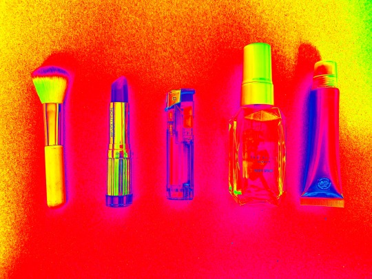

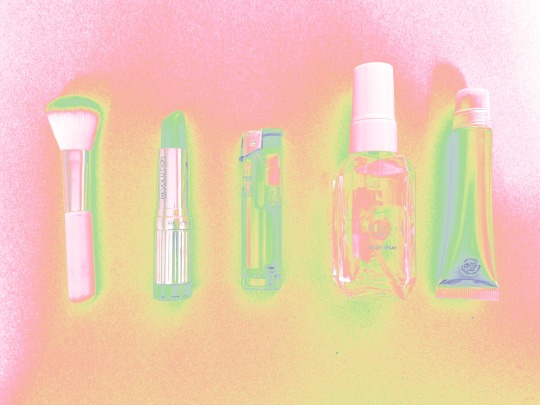
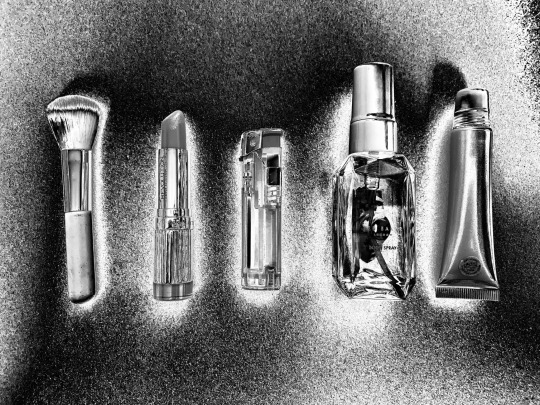

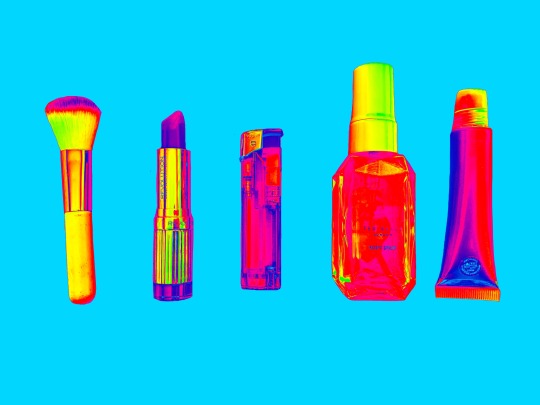
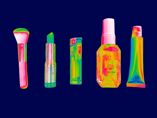
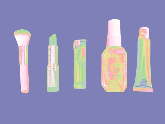
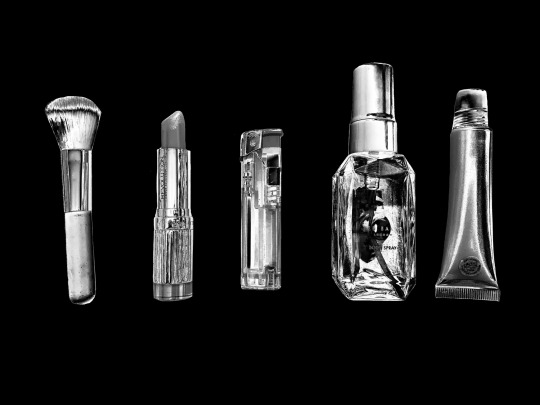
One thing I recently discovered on photoshop is ‘gradient mapping’ I had a play around with some and these are some custom ones that I made myself. I’ve found that different ones work better on different images and that they can be further manipulated so they’re better suited for the image. With these ones I didn’t like how the background looked against the objects so I coloured the background in black on the original image, drawing round the object before gradient mapping again which gave much better results. I think these type of images look better against a solid colour background.

0 notes
Text
SESSION 7: BIOINFORMATIC ANALYSIS OF CANCER GENOMES
The final session of the meeting, chaired by Nuria Lopez-Bigas, starts with the Bioinformatics Challenge results from Mike Schatz.
Pan-cancer network analysis of combinations of somatic mutations
Ben Raphael (Brown University) follows Mike with a slightly revised talk on mutational heterogeneity. Recap of driver mutations, intra-tumor heterogeneity, long tail discussion and inter-tumor heterogeneity. Announces a “whirlwind tour” of methods developed in his lab (uhoh).
Can we infer tumor composition from single, mixed tumor sample? Number of SNV- and CNA based methods (shows dozen of references from ABSOLUTE to TITAN to PyClone and more, 2014 the year where this exploded). Copy number aberations used to be based on SNP arrays, shift to NGS. Detect subtle shift of red depth, combine signals across multiple aberrations and subpopulations (probabilistic algorithm THetA, recommends reading the paper for optimization tricks, works for ~7x WGS data). Example from ~200x BRC samples with 3 subpopulatins and how THetA automatically deconvolutes them; another example from whome-exome data (compares favorably to ABSOLUTE).
Wanted to go further to study tumor evolution process using variant allele frequencies. Noisy for single mutations at lower coverage, but can be clustered across genome (dirichlet process mixture models) and used to create the original tree. Can’t measure leaves without single cell data, but can convert allele frequency histogram to create the evolutionary tree using binary tree partitions (assumption: only one clonal expansion event at a given time). Simulated data examples look reasonable (but only around 50% precision at 8+ populations).
Next compare mutations across different genomes. Ranked list of significantly mutated genes — how to handle the long tail? Genes don’t act on their own, univariate analysis not ideal. Analyze gene groups instead and use topology of gene interactions: aim to discover pathways given enough samples, but can’t do it without any prior information. HotNet and Dendrix work on that intersection to find significantly mutated subnetworks. Consider gene score and interaction scores at the same time (HotNet, HotNet2 using heat diffusion methods to spread significance scores across network, with HotNet2 using directionality information). Applied to TCGA pan-cancer project to find consensus subnetworks, e.g., cohesin complex, condensin complex, SWI/SNF identified. Mutual exclusively another story they have been working with. What about mutually exlusive gene sets (Dendrix and now multi-dendrix for multiple pathways, and Dendrix++ with probabilistic scoring).
Also started looking into some visualizing approaches with d3.js just out of necessity. Overall aim is to combine different data types, get better at stratifying samples.
Ginkgo: Visual analytics for single cell CNV analysis
Somehow I missed the announcement of Tyler Garvin’s talk (from Mike Schatz’ lab) . Quick summary of single cell sequencing, CNVs in cancer. Underlying concept are CNV profiles for each sample/cell, allowing you to cluster patients or individual tumors and explore the resulting tree. Data is quite noisy due to whole genome amplification, wet lab protocols, sequencing biases. Correct for outliers, provides lots of QC metrics for each sample/cell, clustered and visualized. [Followed by demo of the ginkgo software using data from Navin et al (2011). Framework looks good, but again hard to live-blog.]
Validated with five public data sets, easily reproduced results in ~30 minutes. Compares GC biases across different data sets and data dispersion, and the need to correct for these. Couple of recommendations: use DOP-PCR for WGA, sequence healthy diplied cells, plan 25% cells to be filtered out and plan accordingly, save your FACS data (get estimate of ploidy from staining), start with 500kb bins, 100 reads/bin (1.5 million reads per cell) and do control for gender.
Mapping intra-tumor heterogeneity using multidimensional single cell data
I’m scared of trying to cover [Dana Pe’er]’s talk (Columbia University) given the amount of information she tends to pack into a single presentation. Talk on work with the Silva lab (Felix Sanchez-Garcia). Unclear what went wrong for a primary tumour (dissecting the plane crash: what went wrong, what do the broken parts do), vs functional approach (analyze individual features). Integrative approach (Helios) to combine the best of both approaches. Gives examples of oncogene addiction, Helios scores neighbouring genes to come up with best candidates. Training sets too small and biased, using an unsupervised model with frequency of alterations as key. Quick detour to copy number modeling and how to integrate these and other features (EM feature learning to identify important features and associated drivers).
Shows how it pinpoints BCL2, 6th based on CNA but oncogene addiction raises it to top of peak. Looked at 17 most frequently amplified regions and test them one by one. In vitro validations tends to score known candidate genes highest, cloned picked genes for genes without known targets in six replicates to see if they drive tumor development. 10/12 genes validated, overall 93% accuracy.
Switch themes to intra-tumor heterogeneity. Mass cytometry as a game changer looking at millions of single cells, label biomarkers with metal isotypes, 45 dimensions simultanously measured in millions of individual cells (see viSNE paper for details on data analysis of healthy immune system, detecting rare cell populations in ALL and more). Now to the unpublished stuff (with Nolan lab at Stanford). Ceullar profiling of an AML cohort vs healthy bone marrow. 28 samples, 19 perturbations, 16 million single cells. Must clustering approaches fail for this kind of data. Don’t know number of clusters, size assumption, unclear distribution. Graph-based clustering to tackle the toplogy, each cell a node connected to most similar cells (similar to already published work). Their ‘PhenoGraph’ seems to be doing better than competing methods (tested on healthy data). AML graph landscape is mixed between patients. Each patient resides in multiple areas of the map, each region contains multiple patients. Some structure to the aberrant surface expression of AML, visible when color-labelled by surface marker expression: developmental gradient apparent.
Try to find ‘metaclusters’ shared across patients, iterate on graph to find clusters of clusters. Each patient has its own combination of (repeated) metaclusters. Samples with similar genetics have similar meta-cluster profiles, i.e., genetics is driving some of the big structure but not the difference between the subpopulations. These seem to map to intracellular signaling structure — response to drugs, growth factors and other perturbations. Matrix of 16,000,000 x 31 cells reduced to tiny fraction to learn surface-signalling axis is disrupted in AML, some CD34- populations signal like stem cells (surface, signalling link uncoupled). Signalling data can be used to classify healthy cells successfully. Try to find AML subpopulations signalling like healthy cells [and I got lost at this point.] Possibly new definition of ‘primitive’ cell, % greatly differs between samples and does not agree with CD34+ fraction currently used to describe them. Map to gene signature, then used gene signature to test in much larger data set, linked to survival.
[I need a break now…]
Structural variation analysis of tumor genomes
Peter Park (Harvard Medical School) with the last ‘full’ talk of the session (another disclaimer: like Nils Peter is a collaborator). Quick summary of SV events in cancer (refers to Nils who made some of the graphics of different events). First part of the talk on published work regarding complex SV events, e.g., duplication with deletion. Need to look at all events combined to understand the actual event. Tons of manual curation to find unusual / novel cases. Found SV in TERT promoters (part of the TCGA work), asked whether they can infer mechanism based on sequence homoogy at breakpoints (fork stalling, template switching, non-homologous end-joining, etc., see work from Kidd et all, Cell 2010 for HapMap). Try to do this in short-read cancer data. Nice summary of somatic SV types and mechanism spectrum (by frequency) from 140 samples.
Characterized GBM, reconstructed complex re-arrangements in detail. About 20% of somatic deletions are complex formed by replication errors. Many focal deletions caused by FoSTeS/MMBIR, both DNA DS-breaks and replication erros drive somatic complex events. Amazing reconstruction graph involving 45 events that might explain a single EGFR event, trying to proof that this is the only way to get there, but no automated way to generate these yet.
Switch to transposable element analysis pipeline (see paper), checking for somatic mosaicism in brain based on data from Chris Walsh. Is there somatic variation in different neurons, is there retrotransposition? Genome mosaicism driven by retrotransposition might reshape genetic circuity. Whole genome amplification, sequenced L1-sequencing of 300 single neurons to detect L1 insertion sites. Observed ~.6 insertions / cell, much lower than previous publications. Sequenced 16 cells at 40x (MDA) compared to populatin of 100 neurons and bulk data. Compares MDA vs MALBAC, biases. Retrotransposon detection workflow in the paper, show L1 insertion in same places across muliple neurons (expect to be the case if they have the same progenitor, validated). Think close to 80% sensitivity in single cell compared to bulk. Found additional insertion missed by L1-seq (longer than DNA-fragments captured by L1). See another recent paper on impact in cancer genomes.
Other bits and pieces: nozzle shown, used by the Broad for Firehose (and other NGS reports). Shoutout to Refinery, a repository framework on top of Galaxy (work with Shannan Ho Sui in our group). Facetted browsing for modENCODE data. Followed by list of ~10 other tools (Meerkat, BIC-Seq, StratomeX again, etc.).
Using de novo assembly to exhaustively catalog tumor mutations
A selected talk from David Jaffe (Broad Institute) on mutations only seen by de novo assembly. Start with cheap data, 0,5ug of DNA, PCR-free library, paired end read 50x, 250bp from breast cancer cell line, but also tested on primary tissue. DISCOVAR de novo is the algorithm, tumor and normal assembled together, mutation caller still work in progress and unpublished. Walks through the graph assembly algorithm. Bubbles represent alternative paths including somatic mutations. Look for tumor only edges, reads from just from the tumor not the normal sample. Compare against MuTect, Strelka, Taiga. [Live demo having minor difficulties due to having to reboot his Mac and of course getting logged out of all his sessions]. DISCOVAR finds ‘funky’ nversions not found by standard methods — reads can’t be aligned. Also found a ‘crazy quilt’ rearrangement (love the names). Re-arrangement supported by 140 reads in tumor, trace in assembly which goes through 13 segments all across the genome, each 100-200 bp.
A general mutation finder that sees invisible somatic mutations, more than 500 of these found in HCC1143. Want to test drive on interesting samples, volunteers welcome.
I did have to miss the last talk of the meeting from Hossein Khiabanian on Moduli spaces of phylogenetic trees describing tumor evolutionary patterns unfortunately.
Thanks to the organizers and chairs for a terrific meeting. Just the right size for networking and a good mix of talks!
0 notes
Text
50+ Keynote Templates to Create Skilled Displays in…
4/5 (4)
It takes Herculean efforts to create a enterprise presentation that may spark investor’s curiosity in your concepts, proper? And in the event you use the software program that’s completely new to you, the method could by no means get off the bottom. That’s what occurred to me once I purchased my first Mac. It was like studying a right-to-left language. Every little thing regarded so completely different from Home windows that I even googled tips on how to make a screenshot.
Paradoxically, at the moment I needed to current my new undertaking to the large boss ASAP. As I discovered, there was a particular program for that on Mac, i.e. Keynote. Once I opened it and tried to create a presentation from scratch, I acquired caught. I had no time to grasp a brand new program together with a brand new operation system, which is strictly what Mac was for me again then. The deadline was too shut. And I needed to give attention to tips on how to persuade my boss that my enterprise story did not suck.
With the acquisition of Mac, I acquired used to googling lots, so I began in search of one thing that may ease my ache. Fairly shortly, I stumbled upon ready-made Keynote templates and skim lots of constructive suggestions about them. So I downloaded just a few templates at no cost and didn’t remorse a single second. All I needed to do was to switch the default textual content with my very own content material and drag and drop my photos. That’s all I did. The good truth is that it took me solely like ten minutes. If you’re not new to Mac and Keynote, you’ll do the job even quicker.
Right now, I need to share a roundup of 30 Keynote templates to create an expert presentation in minutes. Right here, you will discover each premium Keynote designs and lots of freebies. It’s as much as you, which considered one of them to make use of in order that it wouldn’t have an effect on your finances.
Premium Keynote Templates
Let’s begin with premium Keynote templates. They arrive full of a number of ready-made slides for a number of functions. You may current something from your corporation mission and values to analytics and location-based information. There are additionally icons, infographics, charts, animations, and different tips that may allow you to add zest to your presentation.
Geometry Keynote Template
Geometry is among the greatest Keynote templates constructed with Slide Grasp. As its identify suggests, this design makes skillful use of geometric shapes that may give an edgy look to your presentation. There are 56 totally animated, widescreen slides you could simply customise with your individual content material. As a bonus, the template gives an enormous pack of 4000+ vector icons for any want.
Get It Right here
Enterprise Presentation Keynote Template
Create an unforgettable Keynote presentation in minutes with this skilled template. Its wealthy bundle accommodates 100 distinctive HD slides, every of which is on the market in ten colours on white and darkish backgrounds. That manner, you’ll get a thousand ready-made slides for a single worth and a set of a number of vector icons.
Get It Right here
Powerpoint & Keynote Bundle
Get It Right here
Raven Vertical Keynote Template
Searching for vertical Keynote themes? Try Raven with 68 retina-ready slides. They are going to turn out to be useful for various functions, from an organization profile and masonry portfolio to providers and staff members. You may print out the slides in A4. 400+ icons, limitless shade choices, free fonts, resizable vector components, – there are numerous issues that may show you how to create an excellent Keynote presentation very quickly.
Get It Right here
Epic Keynote Template
Epic is a multi-purpose Keynote template that consists of 55 skilfully animated slides in 16:9 ratio. There’s additionally a set of ready-to-use Font Superior icons to reinforce your presentation. You may edit, take away and resize all of the template shapes with none high quality loss since they arrive within the vector format.
Get It Right here
Symbolis Keynote Presentation
Symbolis is a classy Keynote template packed 40 slides in 16:9 display screen ratio. A young palette brings the data to the forefront and gives an eye-friendly expertise. Because of Grasp pages, the template is straightforward in customization. All of the content material is editable. If you happen to want some steerage, there’s additionally a assist file within the bundle.
Get It Right here
BizPro Proposal Keynote Template
BizPro is a cutting-edge Keynote template with 105 full HD slides and 620+ font icons. As all of the objects, e.g. maps, gadgets, icons, and so on, are made in Vector, they’re totally editable. You may change their coloring, dimension, fashion, and so on. As a bonus, the bundle accommodates ten high-resolution images that you’re free to make use of for each private and industrial functions.
Get It Right here
Axa Keynote Template
Axa is an easy-to-use Keynote template for 09 and 6 variations of the software program. Its bundle accommodates 90 widescreen slides with sensible charts, maps, gallery, gadgets, Gantt diagram, SWOT evaluation, and far more. You may edit all of the shapes, colours, fonts, and different graphics. There are additionally 500 free font icons to visualise some parts of textual content in your presentation.
Get It Right here
Quark Particular Keynote Template
Quark is a Keynote template designed to showcase any kinds of merchandise, from furnishings to handmade jewellery. There are 100+ distinctive slides, 630+ Font Superior icons, 18 machine mockups, limitless colours, free fonts, documentation, and so on. You’ll additionally like computerized numbering of slides, dynamic transitions between them, and an overlay image impact. Quark comes with free bonuses, i.e. a resume template and banner emblem creator.
Get It Right here
Inventive Minimal Keynote Template
Are you looking out common product for any wants? So Inventive Minimal Keynote Template will turn into a superb alternative. It’s nice, colourful and completely snug in utilizing and enhancing that’s the reason you may be utterly content material with it. This pattern includes 33 unusual customized slides, drag-and-drop interface. Selection components and icons are mixed there to make a shocking presentation.
Obtain Right here
Enterprise Plan Presentation – Keynote Template
Basic and recent Enterprise Plan Presentation – Keynote Template suits for a lot of the needs. Out there and speedy assist will at all times be true helper in enhancing the slide deck. The template holds 250+ numerous slides and 2500+ vector icons so ensure that you get hold of the very best consequence with this premium template. In consequence of manifold infographics and helpful diagrams any undertaking can have marvelous and cogently look.
Obtain Right here
Trendy Enterprise Presentation Keynote Template
In case your efficiency is in want of slight replace, so meet the Trendy Enterprise Presentation Keynote Template. Imagine, this one will put greatest foot foremost for every intention. Buying it you get hold of 30 authentic slides which have HD(16:9) ratio and are quick customised. Right here you will discover various charts and multitudinous infographics that may take all viewers’ fancy. Shades are mushy, nice and match to any sphere of enterprise.
Obtain Right here
Droplet Pitch Deck Keynote Template
Minimalism is in Vogue these days! Droplet Pitch Deck Keynote Template is a glamorous instance of this development. Simply take a look at this unimaginable variety of shiny and development setting slides which you get buying this merchandise. Might you think about there are higher propositions? It’s completely animated and customised so make sure in regular work with this pattern. Additionally, it accommodates free internet fonts for great design.
Obtain Right here
Colours Keynote Template
Success lies in numerous shiny colours and you’ll achieve virtually all of them in Colours Keynote Template. It fits for all purchasers functions whether or not that’s internet improvement or college. In fact, this one is editable in order that work with will probably be 100% snug. You’ll get sturdy, focus typography, end-user efficiency, picture placeholder, and drag & drop picture fixing to buy this product. Do you continue to doubt?
Obtain Right here
DREAMER – Inventive Keynote Template
Are you an individual who values free time? Do you might have a lot time to waste it on constructing an breathtaking and blue-chip presentation of your good designs? Making use of DREAMER – Inventive Keynote Template you’ll function just one software program and maximize your time. It holds fairly just a few gorgeous slides (150), obtainable fonts and is predicated on Grasp slide. Past that, there are 5 premade shade schemes.
Obtain Right here
Inexperienced Inventive Enterprise Keynote Template
Inexperienced is a shade of peace, calmness, and good focus. What in case your efficiency will meet the attention of the spectators merely utilizing inexperienced? Right here comes Inexperienced Inventive Enterprise Keynote Template which is appropriate for any sphere and is delicate to use. All customers shall be actually happy with the strenuous and mushy work of this 30 eye-catching slides on the Grasp Slide base.
Obtain Right here
Clear Keynote Template
What’s the important factor about planning a affluent presentation? No doubts that it will depend on its simplicity in enhancing and lovely outward. With Clear Keynote Template, the main focus of consideration shall be your undertaking in consequence of efficient gradient colours and variety of many infographics and tables. You get 102 totally editable slides which do not want utilizing Photoshop.
Obtain Right here
iFood Keynote Template
I’ll wager something you hadn’t seen so minimalistic and fool-proof template for vitamin presentation earlier than. Please, welcome iFood Meals Keynote Template. It is going to turn into trustworthy helper in constructing such a restaurant undertaking. It comes with 50+ tasty slides that are animated with full HD display screen dimension, numerous icons that look excellently. Entry to quick and limitless assist is on the market any time after buying this template.
Obtain Right here
The Model – Keynote Template
So simple as ABC. That is of Model – Keynote Template which is able to help you throughout designing enterprise or artwork tasks. Excellent colours, coherent interface represented by 35 excellent and totally custom-made slides with including all components and icons. Drag and drop picture makes the operation quicker and extra snug. Delicate colours shall be a welcome shock for you.
Obtain Right here
Multipurpose Enterprise – Keynote Template
Might you ever think about the Keynote template with an incredible variety of slides? I suppose – NO. So a formidable Multipurpose Enterprise – Keynote Template is the nice proof which accommodates 3700+ slides and suits any concepts. With it, you get hold of 5 shade schemes with mild and deep backgrounds, a wrought by hand 3D infographic in PowerPoint, many primary and map infographics, worth tables, portfolio and picture gallery, and so forth. It has a fully sensible and clear design so you may be absolutely fulfilled.
Obtain Right here
Enterprise Plan Presentation Keynote Template
Any enterprise efficiency can’t go with out excellent help akin to Enterprise Plan Presentation. Buying this Keynote template you obtain 182 shine and rememberable slides that are correct for any goals with customized animation for every aspect. As well as, it combines picture placeholder PSD and 10 shade variations. After buying this product the entry to assist with video tutorials is assured. Be on the excessive horse creating the undertaking.
Obtain Right here
Reverta Keynote Template
Simply eye this excellent Reverta Keynote Template! You’ll by no means be ignored utilizing this one. It holds greater than 100 out of the field slides for instance about, app showcase, charts, timelines, group and so forth. As effectively it accommodates 250+ vector icons and 900+ Google materials icons with predefined textual content kinds for headers and textual content. So after making some enhancing your presentation is prepared for performing.
Obtain Right here
NOYA Keynote Template
Wow! What an outstanding template is anticipating you? Be able to be taught first hand about NOYA Keynote Template. It is going to instantly steal your coronary heart in a minute. It is going to do the very best for you by the help of Keynote software program and 70+ gorgeous slides. This one includes 500+ vector line icons which have simple editable colours with out dropping high quality As a bonus you get 2 PSD mockups thereby enhancing turn into less difficult and pleasurable.
Obtain Right here
Pleased Folks Keynote Template
Find out how to make the presentation ambiance blissful? We suggest you to fulfill the Pleased Folks Keynote Template. It may be fitted for advertising and marketing, inventive company, social media, journey, instructing, health and different. You get hold of uncommon 100+ slides with individuals, 100+ vectors and shapes which can be 100% editable. If it’s essential to flip shade simply do one click on. 24/7 assist is consistently ready that will help you.
Obtain Right here
E-Coach Keynote Template
Are you within the temper for E-Coach Keynote Template? This merchandise is out of the field and prepares many bonuses for you. Definitely, you get 70+ slides and 200+ nation flags, 1650+ icons, 50+ design belongings as a bonus. Sounds nice, is not it? It really works on MS workplace variations 2010, 2013, O365, 2016, 2018 and completely match for bloggers, writers, communication consultants, college students, inventive administrators and lots of of others.
Obtain Right here
Watercolor Keynote Template
Extra artwork are on this life with Watercolor Keynote Template. 20 masters and a couple of slide sizes are offered, thereby you’ll be able to choose with none points probably the most appropriate format on your information. It comes with multitudinary diagrams, matching charts, infographics and the remainder components for higher visualization.
Obtain Right here
Firland Keynote Template
Firland Keynote Template shall be an impressive different on your astonishing portfolio concepts. This template has 62 sensible and light-weight slides that are snug in customization. All shapes are completely editable, additionally icons and free fonts are contained.
Obtain Right here
Free Keynote Themes
Right here’s my favourite a part of the roundup – free Keynote themes. Though these freebies don’t have as many slides as premium templates do, they nonetheless present prime quality and elaborate designs.
Free Enterprise Keynote Template
In case your presentation is predicated primarily on the analytical information, this free enterprise Keynote template is simply the job for you. It comes with every thing it’s essential to set up the data in an easy-to-understand manner. There are interactive graphs, charts, tables, and even maps if you wish to current some information on a nationwide or a worldwide scale.
Obtain Right here
Company Report Free Keynote Template
Try the most effective Keynote shows to make use of at no cost. It gives 50 elegant slides of 16:9 and 4:Three ratios that look equally effectively on iPads and high-resolution shows. Every of them is available in three shade variations, particularly blue, emerald, and yellow. It means you’ll get 150 slides in whole, with out spending a cent. Some slides current the data on a clear, mild background whereas others use a subdued full-width picture for this. The template additionally helps animation in order that you can add some vigor to your presentation.
Obtain Right here
Air Free Minimal Keynote Template
Air is a free Keynote template designed within the minimal fashion. It is going to hold your message clear and straight to the purpose. With this freebie, you’ll be able to current your concepts in 10 completely different layouts of 16:9 ratio. Irrespective of whether or not you utilize 06 or 09 model of Keynote, the bundle accommodates information for each of them.
Obtain Right here
Easy Free Minimal Keynote Template
Current your data in a tastefully easy but elaborate manner with this free Keynote template. It has 10 trendy HD slides for a welcome message, newest works, employees, iPhone and iPad tasks, and so on. Because of the sunshine background, your content material will at all times be within the limelight.
Obtain Right here
Free Skilled Pitch Deck Keynote Template
Optimize the content material hierarchy of your Keynote presentation with this freebie. It has a number of components for this, from tables and comparability diagrams to maps and icons. Its ready-to-use slides serve completely different functions together with a enterprise mission, staff, providers, pricing, places, step-by-step processes, and so on. The slides are available 16:9 and 4:Three side ratios for each outdated and new Keynote variations.
Obtain Right here
BizPlan Free Keynote Template
BizPlan is a win-win keynote template to impress the viewers together with your marketing strategy. It is going to show you how to create a spectacular slideshow consisting of 15 retina-ready layouts. Orange accents will add a heat contact to your corporation presentation. The fonts used within the template are PT Sans and Montserrat from the Google library.
Obtain Right here
Free Keynote Template for Social Media Presentation
This free Keynote template is designed particularly for social media shows. It comes with clear slides to point out your imaginative and prescient, comparative information, steps of any course of or cycle, and extra.
Obtain Right here
Free Company Inventive Keynote Template
This free company Keynote template comes full of 10 widescreen slides. You should utilize them to current something out of your company philosophy and newest tasks to staff members and contacts. You’re free to rearrange the textual content in a single and two columns within the format or current small parts of content material with smooth icons.
Obtain Right here
Firm Profile Free Presentation Template for Apple Keynote
Utilizing this free and 100% customizable Keynote template, you’ll be able to current your organization profile with ease. It’s composed of 9 trendy slides for six.5 and 09 variations of this system. Visually, the template is mild, clear, and straightforward on the attention, with inexperienced accents bringing the primary data into focus.
Obtain Right here
Startup Highly effective Keynote Template
Would you want to inform about your startup and stick into individuals’s minds? Obtain this minimalist and well-structured Keynote template at no cost. In its bundle, you’ll be able to entry 30+ Grasp Slides with a world map, machine mockups, characteristic lists, timelines, and far more.
Obtain Right here
ProBusiness Free Keynote Template
ProBusiness gives 10 easy but skilled HD slides of 16:9 ratio. They cowl crucial points on your Keynote presentation together with enterprise ideas, philosophy, values, portfolio and undertaking samples. There are additionally slides with a comparative diagram and column charts that make the info simple for understanding. The bundle contains information for each 09 and 6.5 variations of the software program.
Obtain Right here
ALTEZZA Free Presentation Template
Altezza is a thought-out template that offers free entry to 25 slides. This Keynote design is notable for fashionable charts and diagonally divided backgrounds. There are additionally 200+ minimal icons to make the data in your presentation simple to scan.
Obtain Right here
Enterprise Plan Free Presentation Template for Apple Keynote
Have interaction the viewers together with your marketing strategy utilizing this free Keynote template. To assist your textual content, slides have placeholders for pictures. They add curiosity however don’t digress out of your message because of a subdued impact. You can even use a gallery to showcase your tasks and diagrams for instance the numerical information out of your studies.
Obtain Right here
Inventive Presentation Template
Whether or not you’re concerned in enterprise, design or every other area of interest, this common Keynote template suits any function. You’re free to select from 90 ultra-modern slides in purple shades, a whole lot of icons, and trendy fonts offering most readability.
Obtain Right here
Presentation on Surroundings Keynote
Do it’s essential to create a presentation associated to the surroundings, agriculture, nature or every other comparable area? Give a attempt to this free retina-ready Keynote template with 17 distinctive slides. They’re designed in orange and inexperienced colours which can be excellent for the character matter. Utilizing this freebie, you’ll be able to create an informative Keynote presentation with step-by-step guides, tables for analytics, progress bars for stats, and so on.
Obtain Right here
Chomolungma Final Presentation Template Equipment
Chomolungma is a multi-purpose Keynote template on your startup, eCommerce undertaking, product or anything you must current. Its free model accommodates 87 slides on your portfolio, monetary studies, calendars, testimonials, coupons, adverts, social information, and so on. You can even entry lots of Vector icons and maps to edit the best way you want. The template is made with Grasp Slides and is predicated on a customized modular grid.
Obtain Right here
Free APPO 3.zero Keynote Template
Give a shiny look to your Keynote presentation with this freebie designed at midnight tone. The template comes full of 50+ distinctive slides of 4K decision to stipulate your agenda, stats, pricing coverage, demographics, and so on. To enliven your presentation, you should use Three video backgrounds included into the bundle.
Obtain Right here
Report Free Keynote Template
Right here’s the final merchandise on the checklist of free Keynote presentation templates. It gives 15 distinctive HD layouts spiced up with purple and crimson accents. The template additionally contains 60+ multi-purpose icons and makes use of Poppins and Nelda free fonts.
Obtain Right here
Philosophy Minimal Keynote Template
Philosophy Minimal Keynote Template is a primary alternative for biz, your individual goals, and startups. It holds superior premium slides, 16:9 ratio, maps vector and bonus icons. Your creating shall be quicker thanks to pull and drop image placeholder plus auto-adjustment. Enhancing of form shade, dimension or place is totally clear and fast. All in all, you may be amazed by this glamorous and minimalistic template.
Obtain Right here
Enterprise 2018 Keynote Template
Obtain Right here
Excellent – Minimal Keynote Template
Obtain Right here
Be – Keynote Template
Obtain Right here
Low cost Scrumptious Presentation Keynote Template
Obtain Right here
Zane Free Keynote / PowerPoint Template
For a contemporary, colourful, {and professional} presentation, use Zane. Though this presentation template solely accommodates 11 slides, you might have a vast quantity of the way to arrange your data. Not solely will your viewers be impressed together with your creativity, however they may even be targeted on the data you current, due to the beautiful pastel colours used to make your data stand out (shade appeals to viewers visually). You can additionally add pictures and infographics to offer the large image and let your visuals do the speaking. A picture is price a thousand phrases, so do not simply inform your viewers, however present them and hold them intrigued by your presentation.
Obtain Right here
Minta Free Keynote / PowerPoint Template
If you’re in search of clear presentation template that’s excellent for a enterprise or firm presentation, then Minta free template is the perfect presentation template so that you can use to impress. You should have 21 trendy slides with distinctive layouts that may make your data stand out. This free PowerPoint template makes use of shade to reinforce your viewers’s consideration whereas giving your slides an eye catching look. Impress your viewers together with your creativity and add visuals to make your data extra interesting. Not solely will you improve your viewers’s consideration, however you’ll give your viewers a greater understanding of what’s being introduced. So, wow by them utilizing this implausible presentation template.
Obtain Right here
Enterprise Free Keynote / PowerPoint Template
Getting right down to enterprise could also be tedious and tense, nevertheless it would not must be. Create a presentation template that may impress your viewers, and provides your presentation a recent look utilizing the Enterprise Free PowerPoint Template. This presentation template makes use of shades of blue and inexperienced which give a cool and calm really feel, not overwhelming or distracting the viewers. You should have your viewers’s undivided consideration if you use this presentation template. Enterprise shows have by no means been extra attention-grabbing than they’re now. No extra presenting boring black and white shows that permit your viewers to daydream and get distracted. All it’s essential to do is collect data, edit this easy template, and voila!
Obtain Right here
TOP 10 Keynote Templates to Create Skilled Displays
Making a presentation from scratch takes an excessive amount of time. Imagine me, nobody does that crap any extra. And why on earth ought to anybody do it when there are such a lot of highly effective Keynote templates on the market? When you have by no means used Keynote earlier than, it’s alright. There’s no have to take a course to have the ability to use considered one of these templates. Merely drag and and drop your pictures, resize shapes, change colours, add your textual content, – that’s all.
These Keynote themes have HD slides to allow you to current your undertaking at its greatest wherever, be it a projector, retina show or laptop computer. When you have some numerical information, you’ll be able to visualize it with charts and diagrams. To make the data simple to scan, there are totally editable vector icons for a lot of functions. These templates supply lots to customers, so get considered one of them and also you’ll provide you with a win-win presentation in a blink.
P.S. Be happy to share this roundup of the very best Keynote templates with pals on social media. Proper now, a few of them could also be sweating over a presentation on Mac.
window.fbMessengerPlugins=window.fbMessengerPlugins||{init:function(){FB.init({appId:'1678638095724206',autoLogAppEvents:true,xfbml:true,version:'v2.10'});},callable:[]};window.fbAsyncInit=window.fbAsyncInit||function(){window.fbMessengerPlugins.callable.forEach(function(item){item();});window.fbMessengerPlugins.init();};setTimeout(function(){(function(d,s,id){var js,fjs=d.getElementsByTagName(s)[0];if(d.getElementById(id)){return;} js=d.createElement(s);js.id=id;js.src="http://connect.facebook.net/en_US/sdk.js";fjs.parentNode.insertBefore(js,fjs);}(document,'script','facebook-jssdk'));},0);
Supply hyperlink
source https://webart-studio.com/50-keynote-templates-to-create-skilled-displays-in/
0 notes
Text
First Snow Fall
Back in the early 70's my father was drafted into the Army. While serving, he spent his hard earned money on some really top quality stereo and camera equipment. On a recent trip home, I dug into the back of a closet and pulled out all his old photo equipment. He had used a Canon FTB body, with a wide array of lenses. I was pleasantly surprised to discover a couple of them were capable of mounting on my modern day Nikon DSLR. Today I took one of those lenses out, a Vivitar 70-150mm f3.8 telephoto and took some pics of the kids enjoying the first snowfall of winter. When I came back and processed the pics, I was amazed at the vintage film quality of the images. Looking at this you might assume there was a lot of of post-processing, but I can assure you all I did was bump up the exposure in Lightroom and did a simple gradient map in photoshop. The pictures have such a great personality that just can not be emulated with modern glass.
0 notes
Last Seen Blogs

cbintanica
dar Cbint

rosaliecreates
Mobrid longing for picturesque

lostarchitectmusic
Lost Architect

thetwelveangelsofficial
Twelve Angels Official

him-own
Untitled