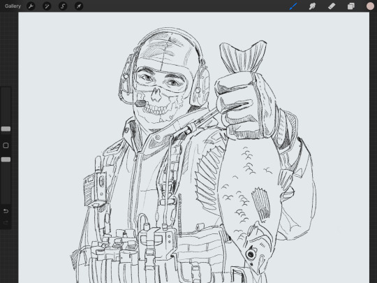
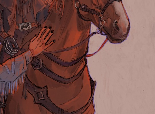
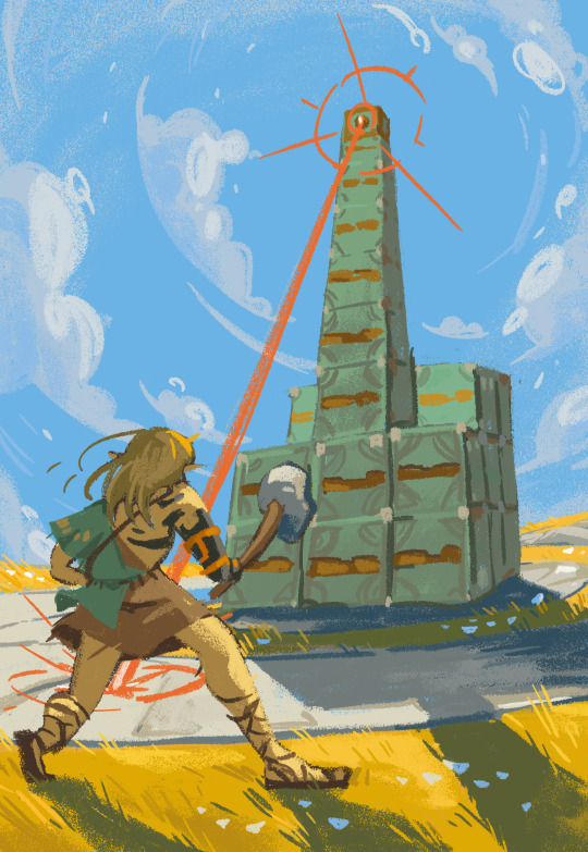
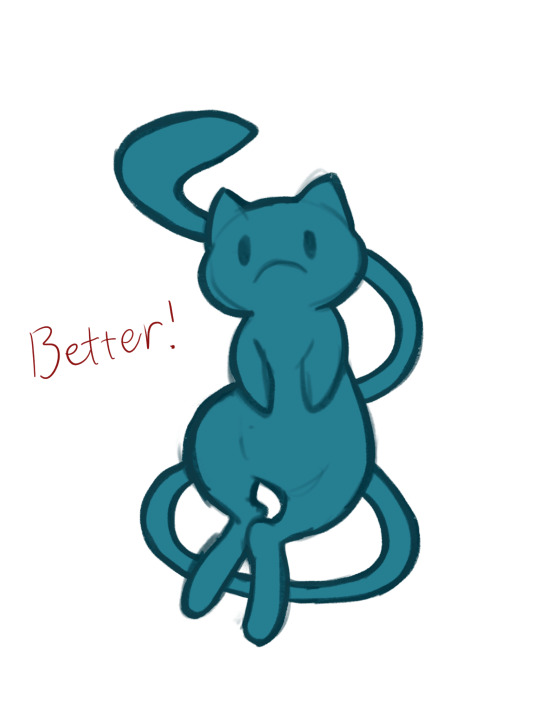
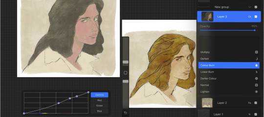
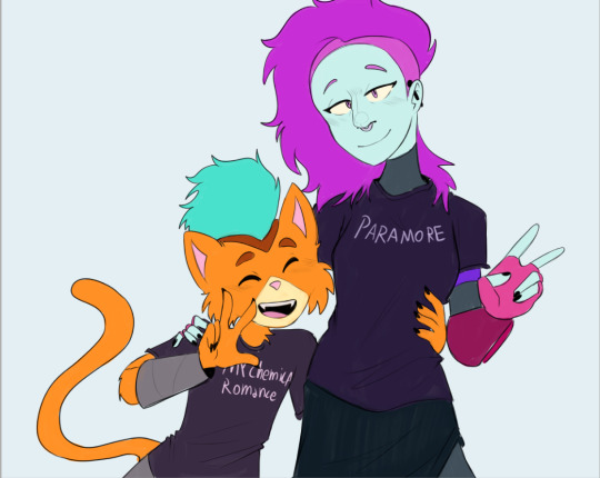
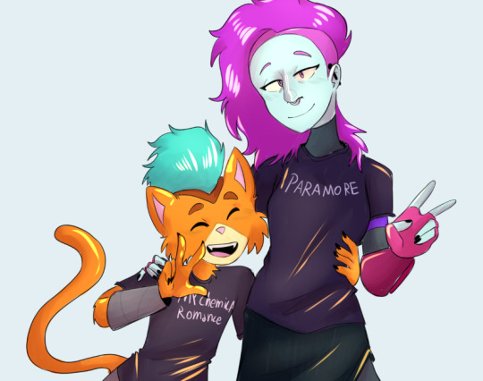
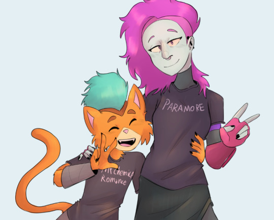
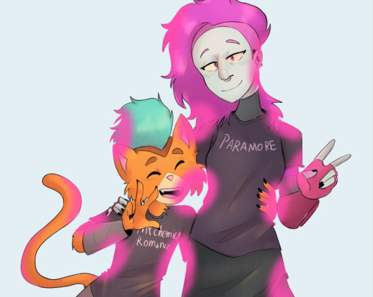
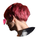
#I like how the default brush in paint looks SO MUCH
Text
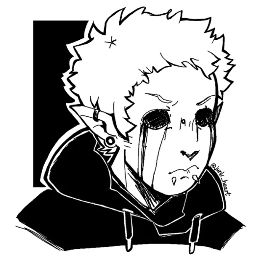
Photoshop decided to betray me so I switched to ol' reliable - paint
#eyeless jack#ticcy toby#creepypasta#creepypasta fanart#eyeless jack fanart#ticcy toby fanart#I like how the default brush in paint looks SO MUCH#it's so tasty#and crisp#if paint had layers I'd be drawing in it full time
750 notes
·
View notes
Text
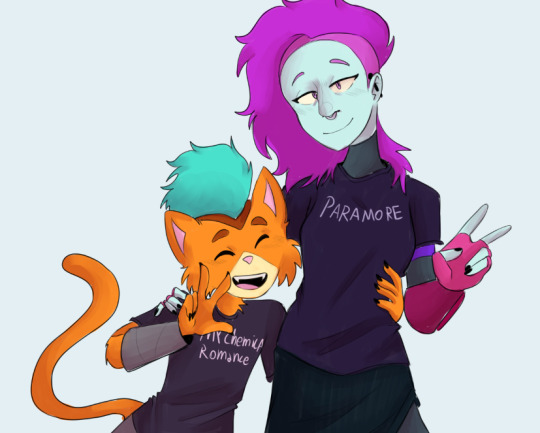
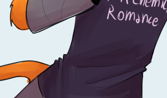
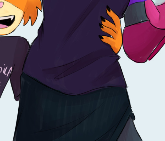
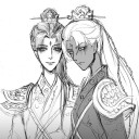
lovebrush chronicles ⇢ “I CAN HOLD THE WORLD IN MY HANDS”
how they react to you saying you can hold the world in your hands then gently cupping their face
ft. ayn alwyn, alkaid mcgrath, lars rorschach & clarence clayden
note: reader’s cat’s name in alkaid’s drabble is set to beans which i named my mc’s cat because i forgot what the default name was djsjdjsja

just as you expected, you find AYN in the music room, practicing his piece for an upcoming school program. careful not to make any noise, you tread lightly to where he’s sat, slowly sliding into the already little space next to him on the piano bench. without pausing his hands above the keys, ayn scoots over to give you more room. soon he’s playing the last key of the composition and the moment the sound fades into silence, he lets out a frustrated sigh and runs his fingers through his hair. unable to find the right words that would seem helpful, you simply lift a hand to brush his locks, straightening a few flyaways and fixing his bangs before you cradle his face in your palms in comfort. for a moment, you wordlessly stare at ayn, taking in his stunning visage, and he doesn’t miss the abrupt quiet. “what is it?” he asks to which you answer playfully, “nothing. just holding the world in my hands.” the smallest of smiles adorns ayn’s features in an instant but not without a subtle eye roll. still, his crimson eyes turn into rubies as a gleam of affection flickers in his gaze. “you’re distracting me,” he replies in jest. you let go of him as you jokingly put your hands up in mock surrender, “please don’t call your bodyguards on me.” that coaxes a chuckle out of ayn, “tempting.” soon, you feel his arm snake around your waist as he pulls you closer and when you don’t inch away from him, he resumes his practice.

you and ALKAID are sat side by side on the couch as you watch beans and sparkles roughhousing in the middle of your living room. you don’t notice how much time has passed but it feels like the silence has gone for too long when you speak. “you’re an astronomy major,” you tell alkaid. “yes,” he confirms earnestly as if the information wasn’t already glaringly obvious. “can you hold the world in your hands?” you ask him quizzically. alkaid is clearly caught off guard by your odd question so without waiting for a response you know you’re not getting, you raise your hands and gently cup his cheeks, “i can.” alkaid gives you no response and you begin to think he’s put off by the cheesy gesture until a smile stretches across his face and he finally speaks. “so you’re saying i’m about…” he pauses briefly as he tries to recall a fact, “12,756 kilometers big.” there’s a hint of amusement in alkaid’s expression as he relays the information to you but you only knit your eyebrows in confusion so he continues with a sheepish grin, “that’s the size of the earth.” “of course.” you can’t help but roll your eyes at his sense of humor but you also find it incredibly endearing that you don’t bother to stifle the giggle that bubbles past your lips. alkaid laughs at your reaction, “what?” “only an astronomy major would say that.”

LARS invited you to spend the day with him at work—“i’m feeling lonely,” he said over the phone, the pout on his voice very audible on your end of the line that you couldn’t bring yourself to deny him. so here you both are, tangled up in each other’s embrace since the moment lars joined you on the couch in his office sometime during the afternoon. under the orange rays of the sunset passing through the glass walls of the room, his blue eyes shine more brightly than they already do and his blonde hair have turned golden. he looks ethereal like this. “something on my face?” his voice snaps you out of your reverie, smugness painted all over his visage. you realize he can tell you’ve been staring. earlier in the relationship, it would’ve flustered the hell out of you but now you simply mirror the expression on his face as you gently hold it in your palms and you’re immediately filled with pride when his breath hitches at your affection. “nothing,” you say with faux indifference, “just checking if i can hold the world in my hands.” lars’ ever so familiar cockiness dissolves from his features, instantly replaced by a loving look in his eyes, “well?” “i guess i can,” you murmur. the deep rumble of lars’ chuckle soon hits your ears then he’s pulling you close as a teasing smirk stretches across his face once more, “you are so in love with me.” and you don’t deny it. you lean further onto his chest as he tightens his hold on your body. against your cheek, you feel his heart pick up the pace and that tells you enough—lars rorschach is undoubtedly just as in love with you.

“knock knock,” you say as you poke your head through the door to the student council’s office and CLARENCE immediately turns to the sound of your voice. “hi,” you add with a grin that clarence returns—or tries to return rather. despite the softening of his gaze and the air of authority around him vanishing, it’s easy to notice the stress that has dampened his spirits. “hey,” he replies anyway. he invites you to join him at his desk and you gladly do, although carefully perching on the edge of the table. “everything okay, mr. president?” clarence huffs out a chuckle at the nickname before releasing an exasperated sigh. “what’s up?” you ask again and clarence answers this time. as an insignificant member of the student body, you only understand half of his student council worries—one of them being this year’s stellaris cup not having enough participants. “what if i join?” you suggest and clarence can immediately sense the halfheartedness in your tone. “you’d do that?” he asks dubiously, the corner of his lips now quirked up as he prepares to call you out on your bullshit. maybe you are just attempting to cheer him up but it’s the thought that counts. “i would,” you retort as you get on your feet with theatrical confidence, “for my first trick, i will hold the world in my hands.” clarence raises an eyebrow but he doesn’t interrupt so you walk around his desk until you’re standing in front of him. when your hands softly land on his face, he’s quick to understand what you mean and in your grip, he shakes his head in amusement but a subtle blush now dusts his cheeks. “that’s a winning talent if you ask me,” you jest. that earns you a laugh from clarence as he jokingly agrees, “it is.” in the same instance, you feel him lean further into your touch, closing his eyes as he basks in it then he sighs in pleasure.
#lovebrush chronicles#lovebrush chronicles x reader#lovebrush x reader#lbc x reader#ayn alwyn#ayn alwyn x reader#ayn x reader#alkaid mcgrath#alkaid mcgrath x reader#alkaid x reader#lars rorschach#lars rorschach x reader#lars x reader#clarence clayden#clarence clayden x reader#clarence x reader
225 notes
·
View notes
Note
I saw your squirrelflight art!! It’s amazing, and if you don’t mind me asking, what program do you use/ what does your drawing process normally look like? I live how you did the texture of the painting, it feels like an old-school TV or something similar
thank you so much! :’) i use procreate, but for similar lineless work the program shouldn’t really matter, just the brushes you use. i used water pen (the default and a version that i modified to be completely opaque) since it has a really nice grainy texture!
here’s a timelapse of the process (watch out for some flashing images)
139 notes
·
View notes
Note
hi!!! <3 I love your art so much <3 your style is soo good, especially your coloring, it's so pleasant to look at <3 also, mind if I ask what kind of software and brushes do you use? The texture of the sketches, lineart etc. look so nice and I was wondering if there's something like that it Photoshop. Have a great day! <3
Hello!! Thank you for your sweet words!! <3
I work on procreate and mostly just use these two basic ah default brushes. I am sure photoshop equivalents exist for both of them out there somewhere!
And since I work a lot with these two I thought I would give ya some extra insight into how exactly I put them to use :)
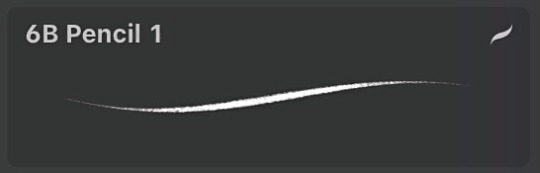
The 6B Pencil brush has got to be my all time favourite brush and I use it for literally everything!
From rough sketches..
to lineart..
to colouring and details.
This brush is quite pressure sensitive, so you can achieve many different variations of size in one stroke by changing the amount of pressure you apply by hand. Through it all, it maintains it's relatively rectangular shape and brings with it soft grain like texture.
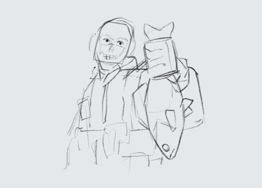
Come to think of it, I think I drew this whole next piece with only the 6B Pencil, start to finish. I think it really goes to show that in the end, it's not really about what brushes or software you use, but about how you make them work for you and how much fun you have while creating. I find that the drawings I have the most fun with end up being my favourites in the long run.
And to me, the 6B is just a damn fun brush to use!
It is perfect for adding silly little shapes and lines all over the place :)
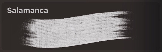
And the other brush I find myself coming back to is Salamanca from the Painting category.
I use it for filling in bigger areas of colour and just colour blocking in general. I like it's subtle canvas texture and the fact that it is not entirely opaque by default, which allows for interesting variations of hues.
But that is not all! I like to size it down to use it to add details and colour to my portraits. I find that it's softness works really well on faces and it's transparency makes it easier to bring in variations of colour.
And would you look at that! More shapes and lines! It's really all I know how to do haha
At the end of the day, I try to just enjoy the process of drawing as much as I can :)
I find that young digital artists often put a lot of emphasis onto finding the correct drawing software and brushes. And while that is important, I find that it is equally as important to throw caution to the wind sometimes and to just try out new things and to not care so much.
I mean hell, people create masterpieces in MS Paint!
My drawing process usually boils down to simply trying to ensure art stays something fun for me, and these two brushes have helped me achieve that over the years.
Hope this has been some help and not all pure gibberish!
161 notes
·
View notes
Note
hello! i love your zelink stuff sm😭 do you have any advice on how you get your characters so textured? like,, idk how to explain, but the clothes, hair and skin have a cool smudged effect. it might be rendering, but i really like your style of it!
uhhh okay im not sure exactly what you mean so i'm just going to go over everything you could potentially be talking about lmfao. (this is the problem with having multiple coloring styles)
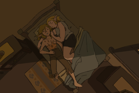
what i think you're probably talking about is the very soft, smudgy rendering style that I sometimes use for more finished pieces. I haven't used it that much recently though so i'm not entirely sure?? for examples it looks like this:


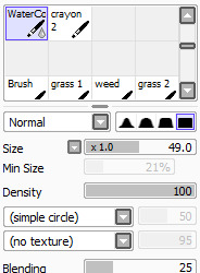
this is a combination of 3 different sai brush presets. I sketch with a custom crayon brush, do flat colors with sai's default paper acrylic brush, and shade with a custom watercolor brush, and then i do a second pass overtop of all that with the crayon brush again to smooth things out and define important details. these are the settings for those brushes:

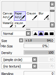
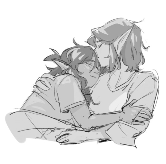
if you're talking about the kind of cleaner block-color look like this, which I think is the style I use most often:

this is the same crayon brush and paper acrylic brush mentioned above, but instead of shading with the soft watercolor brush I use the same paper acrylic brush to cell-shade. color and line do most of the heavy lifting here, since the only brush with any special texture is the paper texture on the crayon brush that's used for the linework.
the third potential style this could maybe (?) be about is this rougher, more obviously textured style, although in my mind i wouldn't call this 'smudged':

this is my new holy grail brush. i love her and i use her for absolutely everything. this one is for CSP, not sai. it's called sketches / doodles by REN99W, content ID 2024976 on the asset store, and it's FREE which is insane because it's the best csp brush ive ever used in my entire life. its pressure sensitivity is really cool because at normal pressure it will basically act like a normal linework brush with a bit of nice crunchy texture, but if you press harder than normal you get that sort of spray effect that looks almost like a halftone. literally incredible. works for sketching, lining, painting, ANYTHING. this brush has carried my art for the past semester and a half
#asks#i hope one of these was the answer you're looking for <3 if not im gonna need a specific example because i switch it up so often lol
80 notes
·
View notes
Note
your art is SO gorgeous (especially your Laois Galahad painting omg?? as a Arthurian saga FREAK I was FEASTING!!!) if you dont mind me asking, what brushes do you use? how does your drawing process look like? I'm so curious!! also you're SO so talented, I wanna show the whole world your art for some reason so that they also get as much serotonin as I haha. Best of luck with all your endevours!!!
ahhh thank you so much!! these 2 are my most used brushes currently, the 1st for sketching/lineart and the 2nd for painting! you can download both sets for free :] i used a couple of more painterly ones for the background though but those were just some default procreate brushes :’) if you’d like i can post the speedpaint on tiktok/twitter too!
36 notes
·
View notes
Note
would you consider dropping some tips on how you color? your art always has such a nice feeling to it
Thank you so much, and yes, absolutely!
So... I have been agonizing over how to answer this question for over a week because I tend to make a lot of my major decisions based on what looks and feels good to me in the moment. It’s sort of hard to explain. Then I started getting philosophical with it (“how does one color? How do I explain aesthetic?”), and I started rambling, and had to cut the answer way, way, way down lol.
But here’s what I can help with right now. I think the most important part of how I color is my tools and what they allow me to do. These are currently my favorite brushes to use:

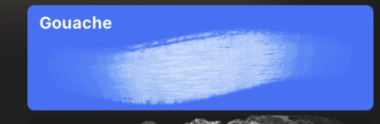
From top to bottom, I use Kyle T’s Gouache for just about everything. A lot of my recent pieces are done entirely in that– I love the chunky texture and how the pressure mimics traditional gouache. It’s great for children’s book illustrations, and filling linework, and realistic portraits. She is my soft wife and I love her.
I practically never use the default hard round. Ignore that.
The roller brush is another one I use for painting. It was my go-to before KT’s gouache, so you’ll find it a lot in my older work (and as a big texture thing in my current works). The “Sampled Tip” below that one I usually use for children’s book styled illustrations. It’s like a really dense, waxy crayon, so it’s fun for textured lines and details.
I always paint in my own shadows and highlights, but I like to use the soft round if I want to blow the shadow or highlight out. It’s for extra large areas.
And finally my pencil. I use it for sketching as well as linework, if I plan on doing a linework-centric piece. I don’t think there’s much of a difference between the two there… one is probably smoother than the other.
______________
The reason why I like textured, pressure-sensitive brushes so much is because they’re important to how I paint. When I blend, I don’t use a blender brush or a smudge tool. What I do is layer two colors– lightly– then use the eyedropper to select the color between them and continue painting with it. That’s probably the key to most of my work. I’ve gotten pretty fast at it, so I’m constantly selecting colors from the painting and reusing it throughout my painting.
I still use the color-wheel to hand-pick what I think will look best, though. This is probably going to be a really frustrating answer, but I choose color palettes based on basic color/lighting theory combined with personal aesthetic preference. It can take some studying (of both theory and other artists’ work). If you’re ever looking for a really great reference on the former subjects, I highly recommend Color and Light by James Gurny. Even if you’re not into watercolor or dinosaurs or realism, the guy is a master at explaining all that different stuff in depth.
Shape and negative space are also pretty important to me, but that's a whole other thing. And as a side-note, I recommend following more children’s book illustrators. Their work may look simple, but a lot of intention goes into how they use color, shape, space, and texture.
Also, on texture, I hand-draw most of mine. I love to add little scratches and drops and splashes when the painting is almost over. It's one of my favorite things to do :')
____
Now, the other most important tip:
Once I’m happy with the sketch/linework, and once I’ve laid down the basic colors of my piece, I do a Really Terrible Thing. I become a graphic designer’s worst nightmare and collapse everything onto one layer.
Then I paint directly on top of it, linework and all.
I do this for a lot of reasons, but mostly because 1) my tiny brain is overwhelmed by the clutter of too many layers, and 2) it forces me to approach a piece as if it was traditional media– a process which I find a lot more comfortable and rewarding. I paint right on top of the base colors, and right on top of the linework, effectively redoing and cleaning up what I already have there. Even if I'm working with a blank background, I'll paint a new blank one on top because it gives the feeling of a more unified piece, if that makes sense.
Basically, I approach my drawings as if I’m using traditional media. I like chunky brushes, utilizing (what I personally think are) interesting color combinations and textures, and smashing everything down onto one page so I can just paint.
Anyway, please let me know if there’s anything specific you’d like me to go into detail on, any pieces of mine you’d like to know how exactly I went about it, etc etc etc. I’m happy to answer ^^
113 notes
·
View notes
Note
What's your usual process? Do you have a sketch layer and then a lineart layer or do you directly draw onto your sketch layer?
Here's the process for my last piece! I'm gonna try and explain my reasoning and add some art tips too.
I started out with an idea: a diver is playing hide and seek with a little mermaid and lots of little fish (I also had an older piece with the same concept).
Then I made some simple thumbnails.
The third one was my favorite. I liked how the dark background and light characters made the characters stand out. The other two ideas were too busy with the colors.

Loosely sketching on top of the thumbnail. I knew the characters would stand out in white, so I paid attention to the flow of their silhouettes. I really like how I got it so that the shape of the diver leads the eye into the merguy, and then the tail of the merguy leads the eye back to the diver.
Next, going straight from the sketch to colors. I think doing this preserves the energy of the sketch, and also I hate doing neat lineart.

Base colors. Red underpainting to give everything a warm undertone.
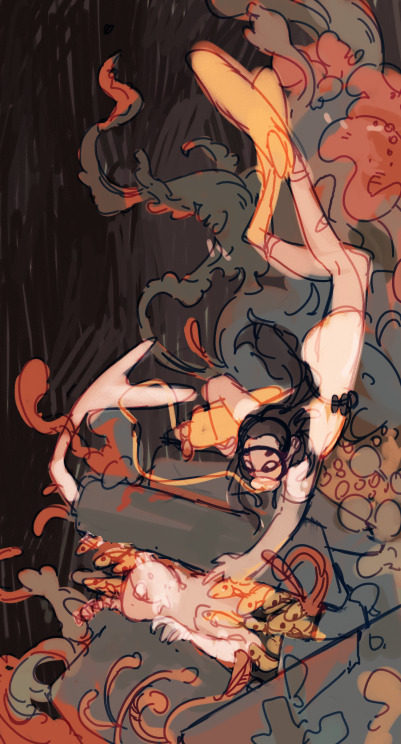
Blue, red, and a little green for the colorful corals. Yellow and light colors reserved for the characters to make them stand out.
Also changed the sketch layer to be blue, and set it as an overlay layer. I like how this makes it blend in with the colors.
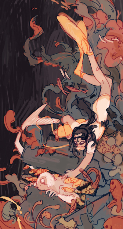
Adding the fishes and more details.
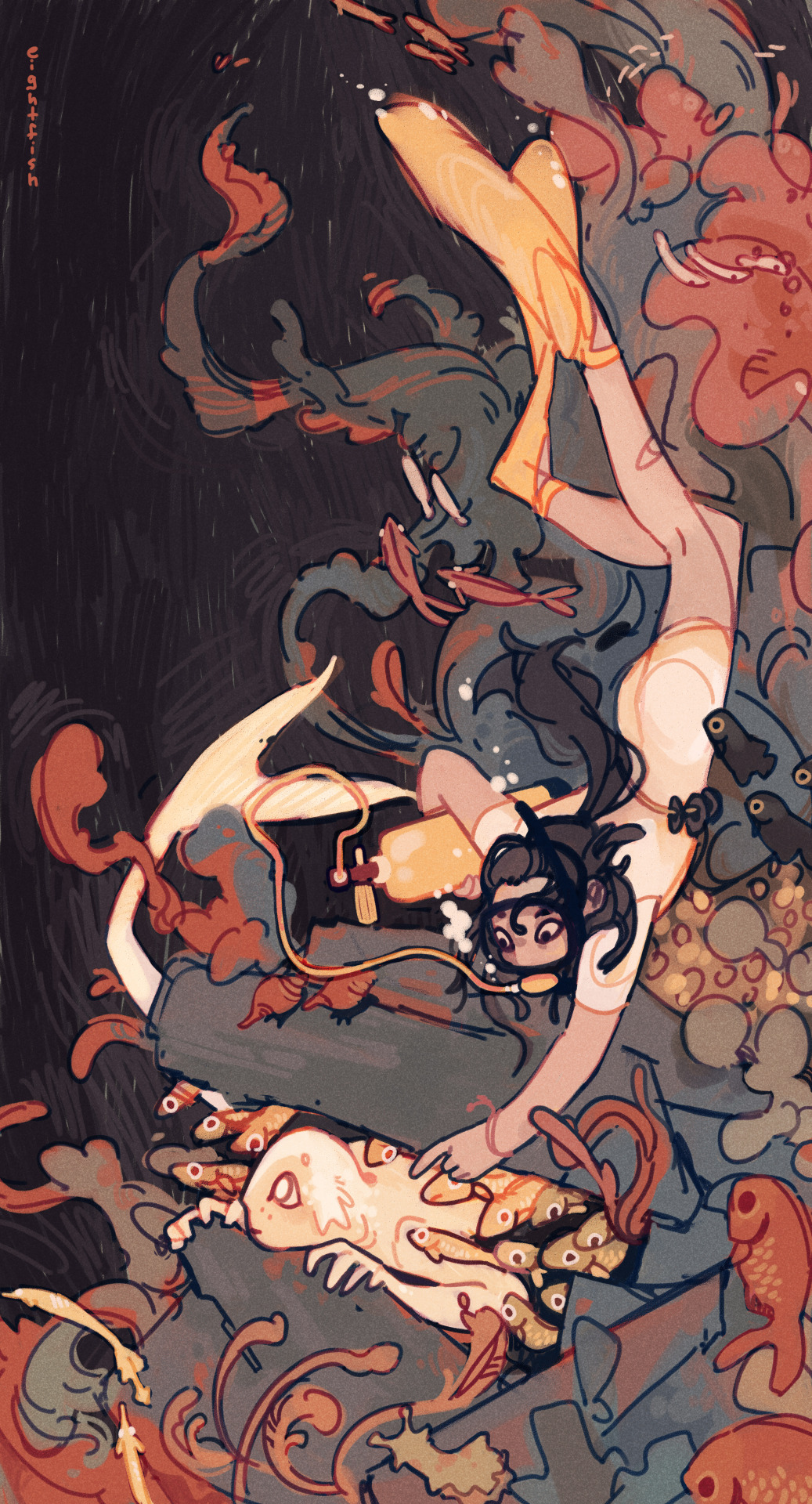
Then I merge all the layers together and paint on top of it to make sure everything is clear. Done!
I also added a simple texture (default watercolor paper texture in PaintTool SAI) as an overlay layer.
In general I have a fairly minimal process that doesn't use many layers or special effects.
I like drawing fast without thinking too much about anything besides how the piece is looking, and I like my pieces to have a loose and energetic feel. So I use one brush for everything, paint on mostly one layer, use only one or two sketch layers, and don't spend much time on rendering. It's just what I've found works for me and what I like to draw!
If I had to give a tip what helped me find my art process, I'd say experiment and spend more time on things that are important to you and you like doing, and cut out the things you don't like doing. So for me, that means spending more time on coming up with ideas and composition, and not spending time on lineart or meticulous rendering.
Hope this was interesting to read and feel free to send me any other art or comics questions anytime :)
115 notes
·
View notes
Note
hi! if you don't mind me asking, how do you blur the logo on your gifs?
hi angel! it's actually quite simple, i'm gonna put a step by step under read more but if you wish to just do it i made an action to automate the process for me. just make sure you run the action before adding any adjustment layers OR select your gif layer before running it. click here to download and let me know if you have any questions!
alright so! after i've made the gif, i'm usually left with this. if you have only one layer afterwards, that's fine, it doesn't really matter. just always make sure your gif layer is selected. (my photoshop is in portuguese but it should be pretty easy to follow, lmk if there's any questions)
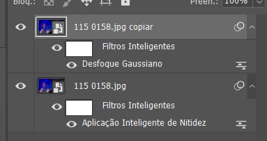
step one: duplicate your gif layer and don't worry if the filters are still activated or not, doesn't really matter. the only thing i usualy edit is the opacity of my layer cause that second is sometimes at 50% so i change the duplicate to 100%.
step two: then, add gaussian blur to your duplicated layer. my default one is this one but you can always edit afterwards if that's too much/too weak. so don't worry too much about that now. now we're left with this:
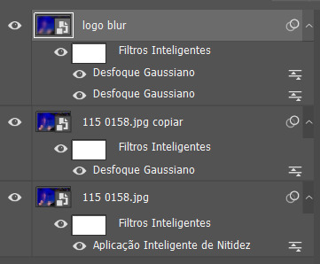
step three: now, to make sure the blur only stays on the logo you're gonna make a layer mask. for anyone not sure, here's where to find it:

and you'll be left with this:

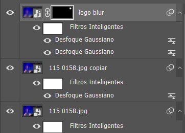
step four: use the select tool (M) and ctrl + A to select the entire image, then delete the entire thing. make sure the mask layer is selected and not your layer, otherwise it will just delete your layer. after you've deleted it, just click anywhere (or ctrl + D) to unselect your image.

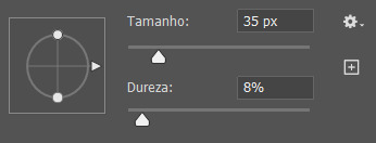
step five: select the brush tool (B) and paint over where your logo is. i usually set the size to 35px cause that covers most logos but you can edit if you need something bigger/smaller and i keep the shapness bellow 10% to make sure it blends a little better.
honestly... that's it! your layers should now look similar to this:
and your gif should look like this now vs then

#gif tutorial#faq#idk how to tag this#and hopefully this makes sense... i suck at explaining things honestly.#but lmk if you have any questions
32 notes
·
View notes
Note
whats your general work flow in zbrush to make your realistic dinosaur textures, im still trying to figure out how to make my dinosaur textures look realistic ;w;
Hey, thanks for the ask! I saw your edit where you meant substance painter instead of zbrush so I will do a breakdown on my texturing workflow in there.
I find the key to realism is a lot of contrast, noise, variation and randomness!
I always start with just the base colours where I remember the above keys and fill in the patterns on the animal. Some colours are also just easier to make look realistic on dinosaurs than others! I find browns just about always look good while blues as an ex can be much harder to make work.

Using my Tarchia as a reference this is how it appeared after I painted just the colours, which I did using mostly the default dirt brush and a few other dot, mold, dust and other dirt default brushes. Afterwards I also go over with a few dirt and noise textures set to overlay to add more variation.
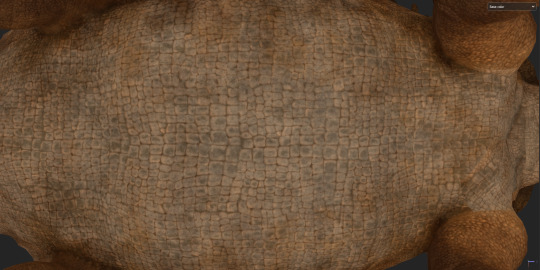
My next step is to add in ambient occlusion and curvature generators. I usually do 4-8 set at different colours, balances and some at multiply and others at overlay. This automatically puts in any ambient occlusion and natural fading to the scales that helps in final rendering.
During this process I also add lots of variation in the roughness maps! Keratin especially should have a very shiny base and then have lots of dirt generators over the top to add sharp variation while between the cracks have little to no reflectivity, which I also apply to the scales.
Now my final and favourite part... Cement das conk creet baybee!!

I literally just put a cement dirt generator over the top of the colour and as a high roughness. I don't always do this but usually I find it helps give the appearance of dirt and dust that's gathered in between the scales. a lighter colour brings more attention to the individual scales and a dustier appearance instead of just blending into the shadows and AO. It also adds extra noise detail for when you zoom in that is basically impossible to achieve at such high detail in the sculpt alone.
Extra things that can help are adding a specular map on top of the roughness with lots of noise breakup. If you're doing close up shots, UDIMs and splitting the head and body can help too like I did with my Tarchia. Most of the texture quality comes from the colour and normal map in my experience.
Best of luck! And remember good lighting can make even the least realistic textures look real!
#leave my spelling alone im australian its right in my country#my art#paleoart#art tutorial#i guess#me talk#3d#3d art#dinosaurs#palaeoart
33 notes
·
View notes
Note
That last piece aaaaaaaah beautiful and sweet, really captures how Lav feels about Randy :D
Also I love how you colour and shade everything, how do you do it? Do you think you could record a speed paint or something? What brushes do you use? Canvas size? How do you painstakingly colour within the lines? What device do you use?
Sorry for so many questions in one ask, I’m really curious lol. Hope you can answer these! No rush :3
First off, thank you so much!
I use Procreate on iPad, which has a handy-dandy little feature where it automatically records everything you do on a canvas, and you can create a time lapse of it. So, yes, I can give a speed paint. :3
(Yes I painted this specifically for this ask.)
For comics (and this painting sample), I use a canvas that's 1813X2263.
For doodle dumps and other less dedicated projects, I use a 1955X2357 canvas, rotating as I want or need to.
If I have a bigger project I want to do, I start with Procreates "Square" canvas default (2048X2048) and crop as I need to as I work.
I've been sticking to this Jingsketch brush set for a while now, though I've modified some to make them more comfortable. As of now the set is free to download. (There appears to be a larger Jingsketch set that costs about $15--I may get that someday lol)
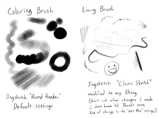
For smudging of shadows and markings, I use the Jingsketch "Jittery Smudge".
Alright, prepare for a thorough rundown of the time lapse. X3
As for how I color, the video shows my two most used methods. I do the Momo method when I want it to look a little neater or smoother, and the Midas method for when I don't care how unpolished it looks and just want to show a colored image.
For flats (the solid red seen in the video) I do it on a layer under the lines. I usually put all the flats on one layer, but this time I did their flats on separate layers for demonstration purposes, and merged them once they were both filled.
For Momo, I colored by drawing just inside the lines, erasing what went outside. Then used a Freehand (or equivalent) selection tool to fill in the inside. This is the more time consuming but smooth of the two methods, in my opinion.
For Midas, I specifically drew the outer lines thicker so that I could use the "automatic" (I guess that's "wand" in other programs? I'm not sure) selection to do a quick fill. This method will usually leave the colors with a hard, semi-unappealing edge. (Feathering the selection a little or smudging the flats can probably help with that, but I don't do that very often.)

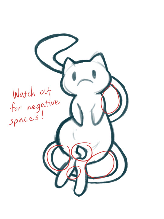
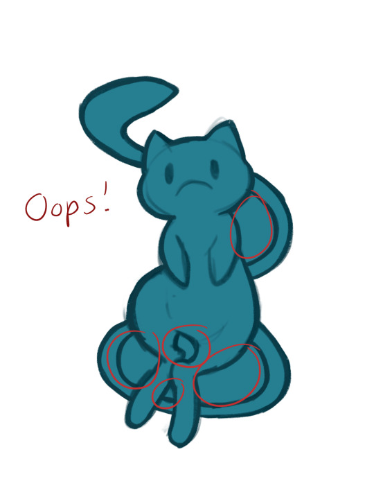
What I do is select the OUTSIDE of the lines, expand the "Selection Threshold" so that it barely selects JUST outside the lines, then invert the selection so that it filles everything INSIDE the lines. With this method you need to be careful to get all the negative zones as well--I didn't think about demonstrating that in this painting, so here a mini-tut on that.


For the actual colors, I usually do each color on a separate layer set as a "Clipping Mask" to the flats layer. Eyes usually get a layer of their own--The iris colors and pupil (if present) get the Clipping Mask treatment until I'm satisfied with them and merge them into one eye layer.
For shading, I'll fill an entire layer, still Clipped to the flats, with my color of choice, usually set it to the Multiply blend mode, and adjust the opacity as I want. I usually shade the main body separately from the eyes, but try to match the blend mode and opacity settings.
For more high-effort projects, I'll fill a layer with a solid color under the shadow layer but above all the other colors so that I have a better idea of the shapes. Colors like on Midas here can really badly mess with the perception of the shapes and shadow locations. I may also add more Multiply layers if necessary.
And that's my lengthy and extensive look into how I paint~ Keep in mind this is MY process, and I admit I work in a rather quick, dirty, and even somewhat lazy way. So take what you will from this, and go arting as YOU please! ^w^
94 notes
·
View notes
Note
hi!! Your art is incredible and awesome... not sure how to say it otherwise but it's super tasty looking lol 🫶
I was wondering if you have ever posted what brushes do you use ? I am always on the lookout for nice brushes! Also if you've got any tips for inking, I'd appreciate it enormously. No worries if not! 💕
hi, thanks so much!
i mostly just use whatever defaults came with clip studio paint. for inking, my go-to is the the default marker pen brush (under the marker tab in pens), but sometimes i'll swap to the calligraphy one (should be in the pen tab), or this brush but with the pen pressure turned off. just depends on how i'm feeling about whatever i'm inking. when i want to add some texturing when toning, i use stuff like the spray or diagonal line brushes (again, should be included in CSP), i just make an eraser version of them so i can also use them on layer masks.
as for inking tips ... i don't have any hard and fast "always do x for y" advice but i rambled a little about how i approach it.
this first point is actually pretty straightforward, it's just to look at inking techniques by artists you like, think about what makes them work so well in their context, and try them out for yourself. this isn't about plagiarizing art styles but more about understanding how other artists choose to stylize certain things in their work, and seeing what works and what doesn't for you personally. sometimes it's through looking at other people's stylizations that you get a better understanding of how you want to approach translating this actual 3d object (people, clothes, background details, whatever) into your own art as well. as you try out various techniques, maybe you find that some of them work well with your own style, and some of them don't and you stop incorporating those. it's all a constant work in progress. over time you can adjust how you use them in a way that fits your own drawing methods and workflows and they just start to come more naturally to you. of course, they may and should change a lot along the way because now it's something that's part of your own style. in essense, work on developing a good eye for these things and be thoughtful about what you want to convey and how.
just as an example, daiya no ace by terajima yuji definitely has to be up there for me in terms of influences, the way he approached body lines and clothing folds as a way to convey movement and posing made a lightbulb turn on in my head back when i was still reading it.

not a comprehensive list, but other manga i just like looking at off the top of my head - rookies (morita masanori), anything by yamashita tomoko but i really recommend the night beyond the tricornered window for something that's easily accessible, anything by asada nemui (please check for content warnings for their works first though!), all-rounder meguru (endo hiroki), urasawa naoki's works, dungeon meshi (kui ryoko), witch hat atelier (shirahama kamome), yotsuba&! (azuma kiyohiko), a bride's story (mori kaoru), i recollect love (moegi yukue), the later works of tojitsuki hajime (unfortunately a lot of is now out of print and not accessible online but i managed to get all their books bc their commitment to crosshatching shaved heads each time impressed me so much LMAOSJDsd) etc, etc.
this second thing is much vaguer and harder to quantify but ... honestly just draw a lot and see what feels good to your hand. inking and art styles in general are fluid things. so much of what inking comes down to, to me, is just drawing the lines that in a way that feels good to me. that only really comes from doing it a lot (not saying i'm a hardcore artist or anything lol just that i've been drawing on and off for a while now) and, well, getting a sense of what you like doing. sometimes you might look at a detail you finished that looks really good but feels like a happy accident, and it kinda is, but it's also just as much of the things you've internalized over time. combining the first point (developing your eye and a sense of thoughtfulness about inking) and the second (getting experience through developing your muscle memory) is basically it.
idk if any of this made sense lol but hope some of it helps!!!!!
25 notes
·
View notes
Note
please post a tutorial or walkthrough or even just a longer process video talking about how you draw!! im obsessed with the textures and colors but i cant seem to wrap my head around it!! (i would pay money for a whole mini course tbh if you were interested in uploading one to gumroad or wherever 😵💫)
thank you, i'm flattered :') texture and colour are really important to me so i'm always fine-tuning them to find what works. to be honest i feel like i'm not qualified to teach others since i haven't really even settled on a process, i just kind of mess around until i like what i'm looking at. there are certain things i do much of the time but it's definitely not a linear process!
that being said lately i've been experimenting with traditional media and i've found i really enjoy how gouache behaves so i've been trying to replicate the process in digital. i'll try and explain how i've went about it recently using this super boring piece of a random person...
i'm using a basic pencil brush and a default procreate brush called gouache. i picked it for the name when i was looking for something similar to the paints i'd been using but honestly it looks more like a marker to me.

i find trying to do separate inks on top of a sketch distracting so i just erase what i won't need. i'll add a darken layer on top of the sketch and go over it with a single colour as a kind of underpainting. i did the flat colours on a separate darken layer here but generally i'll just work on one layer.
we'll add some colour variation and shading, it looks super subtle here but i'll punch it up later. i think the critical thing with this kind of brush is working with transparent layers so you don't lose the texture and you can play with mixing colours.
i'll often mess with the curve tool a lot but this piece is pretty simple and i ended up only using it once or twice. when i'm happy i'll duplicate the colour layer and see which blending mode i like, testing stuff out at different levels of opacity until i find something cool. i think i went with a transparent overlay layer here.
the lineart is getting buried so i duplicate that layer as well, drag it to the top of the pile and repeat the process of stacking blending modes. something i like to do is add one layer with the lineart blurred to give it a softer look.
i'll fill a new layer with a dark colour, add about 80% noise scaled up a bit and set the layer to saturation. again you can experiment with the blending mode but i've been using this one recently.
this next part might be pointless but i save the image, open the new file and resize it without actually changing the resolution much, then sharpen it to bring back the detail. maybe it's in my head but i feel like this makes the image look a tiny bit more finished and adds some crunch.

finally i duplicate the whole thing, blur the layer on top and set it to luminosity on low opacity to create a soft glow effect.
final touch-ups and you're done!
sorry for the convoluted explanation! my process tends to messy, i get distracted and don't often work in distinct steps but i think i managed to describe some of the things i do the majority of the time. i hope it's even a little helpful :)
98 notes
·
View notes
Text
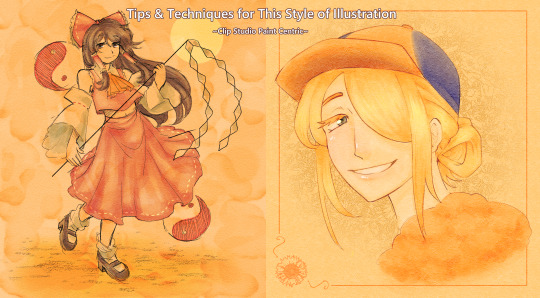
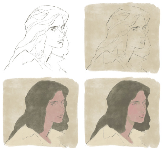
I wanted to start giving some insight into how I draw certain things (and also I just really like talking about why I do certain things the way I do), so after finishing this illustration of Reimu earlier today, I thought it'd be a good time to show a bit of my process when it comes to this yellowed-paper style. Keep in mind that this is Clip Studio Paint centric, because that is what I use to draw, but if you use another program a lot of this advice should still be applicable.
The defining aspect of this compared to my other illustrations is usually a much lighter/washed-out color palette, utilization of textured brushes (surprisingly, a lot of what I use is default Clip Studio Paint tools!), and using a noise/paper texture on an overlay layer at some opacity depending on how dense it is.
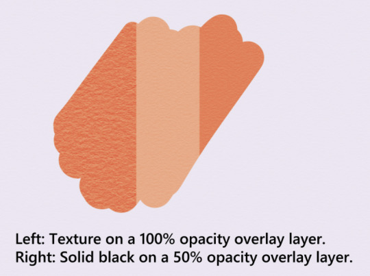
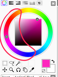
(Image is of a color swatch being affected by 2 different clipped layers. On the left, is an overlayed paper texture at 100% opacity. On the right, is an overlayed solid black layer at 50% opacity.)
Firstly, you don't have to use yellow/orange specifically for this, but it lends to a certain appearance I like a lot, so I find myself using this range of colors the most. You do want to make sure that it will look good with an overlay layer set over it.
How one goes about lining the character (you don't even really have to) doesn't matter that much ultimately, and a lot of times I'll set the line art layer to a lower opacity or make it multiply/linear burn.
I use a lot of overlay layers. It helps contribute to the appearance of the overall piece if everything sort of bleeds together. However, when coloring, I'll also alternate between linear burn, linear light, and glow dodge layers. Sometimes color burn as well, but it's quite a bit more finicky to use. Glow dodge specifically is good for making highlights that stand out. For some colors, using a normal layer at reduced opacity also works. The important thing when coloring a piece like this is to make sure the colors mesh well with the paper color you chose!
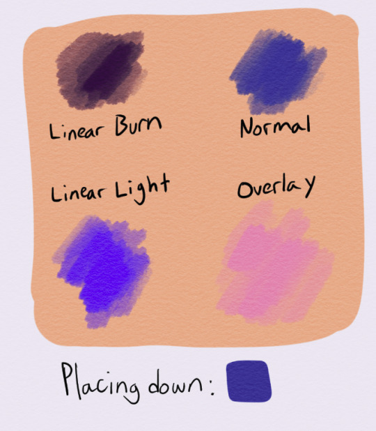
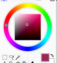
(Image is of a selection of swatches for the color blue on an orange-yellow background. The top left swatch has been applied on a layer that uses Linear Burn, top right is Normal, lower left is Linear Light, and lower right is Overlay.)
Lastly, here are some assorted techniques for decorating your piece.
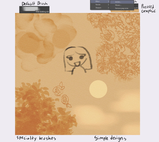
(Image is of a selection of effects added to 1 layer. The top left is captioned "Default Brush", the top right is captioned "Pressed Graphic", the bottom left is captioned "Specialty Brushes", and the bottom right is captioned "Simple Designs.")
Wet blotting ink is a default Clip Studio brush you can find under the India Ink tab, and creates a nice water-stain effect on your piece if you use overlay + a solid black pen color.
You can also make complex designs by either running an image through the artistic effect and setting it to "Lines Only", or by using specialty brushes made for creating specific designs, like this leaf brush I use.
Lastly, you can just create basic designs. It really just depends on what you need for your image!
This is the process I generally go through whenever I draw these pictures. I hope it helps you!
18 notes
·
View notes
Text
Sunny's unnofficial rendering tutorial because idk why but people say they like how I color
Hey kid. So you got your drawing, right? And you have your flat colors, now you gotta render 'em, right? Then you find that BAM, you have no idea how to make it look cool? Neither do I! But here's what I do (I've been told that my coloring is cool)
1. Place your flat colors
Imagine these are your flats. A few things: you want your base colors to be all around the same hue, that way they look better together. See how all the blacks, greys and whites are purple/blue-ish? That's on purpose babey! But how do you acheive this? idfk. jk, you have to stay on one (or two) areas of a hue wheel.
This way, all the colors look like, nicer around each other. You're not FORBIDDEN from going outside an area you picked, but you should still try to make sure everything is in the same hue so you have to do less overlay layers later.
(FYI: I do this because it saves me time on rendering. I don't think it's mandatory, there's no rules to art. Go crazy!)
2. Shading
I think shading makes or breaks a drawing. Personally I don't have a lot of rules about it, but there are still tips I can give.
So here's what you gonna do. You're gonna pick a color that's somewhere on the opposite of your main hue, alright? Here, my hue is mostly cold colors, so I'm going to pick a warm tone. You're gonna make sure it's dark enough so it's like, a shade, but not enough so it becomes black when you set the shading layer to multiply.
(Note: I never get this right on the first try)
(Another note: as you can see, I have the entire drawing, including the lines, inside a group. Don't worry! I'll explain this later)
Personally I like to use a paintbrush-esque brush because I like the look of it being hand-painted that it gives my art. Mine is the default paint tool sai brush, but I'll leave the settings down here just in case.
I don't. Really know how to explain the way I shade, I mostly follow the lines I already placed in the lineart phase, and give them depth. I guess my biggest tip would be to FOLLOW THE CLOTHING FOLDS!!!

Idk how to explain this. But people always tell me that they like how I shade the clothes, it's because I follow the fold lines I place on the lineart phase! Not only does this give the clothes depth, it also makes shading a lot easier. Follow your lineart, idk what else to tell ya.
Now you're gonna set the layer to multiply...
And lower the opacity as much as you want until it looks good. No real rules to this, it's kind of depending on the vibe you want your piece to have.

Now, and stay with me here, grab a blending tool, okay? This is the one I use, I have a textured version for when I'm feeling brave, and a regular, flat version (the one I use the most) Here I'll use the flat version.
And. Stay with me here. I want you to blend the FUCK out of this. Just absolutely destroy those borders. Okay? Trust me. If it looks messy you're doing it right. You're gonna want to follow the shape of the shadows tho, this way you don't lose the shape of the objects you're shading.
Woah! Suddenly everything has depth! Let me go back to the clothing folds, because holy shit, the clothing folds.
See how I'm adding depth to the shadows I placed by kinda. Following the line I drew and blending the outside? Idk how to explain this. You blend whatever isn't touching the line, okay? Trust me.
3. Lighting
Ok. I'm holding your hand gently. You have to do lighting on your art, okay? You have to. It adds depth to the shapes and also is sososoososo easy. Here's how. It's so easy.
Grab your airbrush tool. Yes, that one. Hear me out okay?
Pick a light, warm color between yellow and orange.
Stay with me. Make a new layer, set it to whatever lighting mode you prefer. I use luminosity because I live dangerously.
Now.
Airbrush everything that the shadows aren't touching. Yes. I'm serious.
It's gonna look ugly as shit. DON'T BE ALARMED. This is part of the process. I want you to take the blur tool. And blur the ever loving fuck out of this. Just go fucking ham.
Good. You're doing so well. You're being so brave. Now lower the opacity as much as you want, until you like the way it looks.
Like so. I also like to add a few brush strokes and blend them on an up-and-down motion for the hair and certain details, but this is optional. Same as before, you're gonna take a (slightly warmer, but still bright color) and make a new layer on luminosity mode.
Take the blending tool and make it small, only slightly bigger than the brush strokes, and blend these lines until they look nice. Adjust the opacity, and voila!

Now, I could stop here. But I'm extra so I keep going.
4. The pizzazz
AKA, "Ah fuck the colors don't look the way I wanted them to!"
Do not worry! I have a solution that's almost never failed me.
Overlays. Just a whole fuckton of them. I don't really have a method to this, I just kinda try colors and layer modes until something looks good.
For this one, I felt like I wanted the colors to be warmer, so I picked a warm color and overlayed it on multiply. Then, I noticed that the darker colors came out darker than planned, and you couldn't really tell them apart, so I picked a light warm color and overlayed it on screen.
Voila! We're not done! There's one more thing I like to do, and here's where the layer folder comes in!
Remember how I said I keep everything, including the lines in a folder? This is why!
Make a layer that's on top of everything, like this. Pick whatever color you want, make sure it's bright. (Personally I like using pink). Take the airbrush tool again and airbrush whatever edges you want to give a little more pizzazz to.
Blur it as much as you'd like...
And adjust the opacity and layer mode however you like!
5. And done!
Sometimes I add white highlights. Sometimes I add more shading, or more lighting. It depends! But this is the method I use in a nutshell.
Hope you enjoyed it, or at the very least realized idk what the fuck I'm doing!
21 notes
·
View notes
Note
Hi! I love your art a lot!
I saw a doodle page you did, and I’m curious how you got your brush to be darker with more pressure applied? (or at least that’s how it looked to me—)
aaa thanks so much!
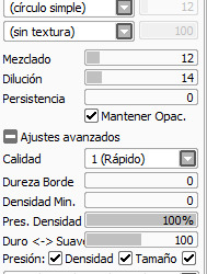
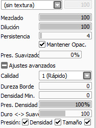
first of all, i use Paint Tool SAI, so lemme grab a few screenshots of my brush settings. i made these for myself and @invadergrabass to use in order to blend our styles for collabs; theyre based on our combined preferences so they will more than likely require customisation if youre interested in using them. regardless, they will help me explain, since not everything is easy to put into words for me lol

to make my brush respond to pressure the way it does, i first start with a default brush tool as opposed to a pencil. i set the minimum density to a non-zero percentage (usually between 10 and 40) depending on what i want to use it for, and lower the pressure sensitivity to 60. (this may differ for you, since i know i have a heavy hand and ive set my tablet sensitivity to a custom value. but the minimum size is key here.)
heres a demonstration:
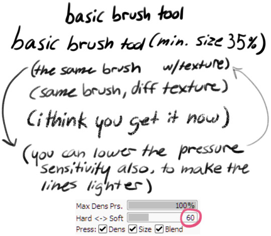
(the brush kinda thickens up when a texture is added, which is part of why i reduce the pressure sensitivity)
i find the brush tool feels a lot like a gel pen when being used for linework. this tool is called Butter Brush because its extremely smooth to work with for my partner and i.
heres a breakdown of each brush and how i tend to use it:
Butter Basic is an all purpose tool, i use it equally often for sketching lining writing and shading. it has a minimum size of around 20%
Butter Sharp is for writing and more bold linework. it has a low minimum size for detail work. i rarely use this tool for sketching but i do sometimes use it in shading, and i prefer it if i have to do a lot of writing on an image. its pressure sensitivity is at 100 so i see less of the texture when using it. (you can see the difference in the two drawn arrows above, where the left is at 100 and the right is at 60.)
Butter Soft is my favourite sketch tool, and predictably the one with the highest minimum size. it is also extremely soft, and cant easily be used for writing. i use it extensively for shading, more often than the tools ive made specifically for shading lmao. i sometimes use it for lining also, since it is the most comfortable for me personally to use.
i hope this helps you or anyone else looking for help with their art!
(note: in an earlier version of this reply i accidentally said "minimum density" instead of "pressure sensitivity" in Butter Sharp's description)
#paint tool sai#brush settings#talking with a ghoste#asked#long post mby i shoulda put it under a readmore...
17 notes
·
View notes
Last Seen Blogs
jungswhore
MagicShop
pvpsx
PVPSX
the-manors-writer
dear detective...
coatlscoatlseverywhere
*Happily Buzzing in Coatl*
sbk-zgvlt
SEBEK ZIGVOLT USER PLEASE GIVE THE NAME UP PLEASE