#I bought the books though
Text
Physically I’m in the bathtub, carefully eating a left over enchilada.
Mentally I’m in Ketterdam, scheming and building my own gang and causing mischief just to get Kaz Brekker’s attention so I can be his next investment.
#shadow and bone#shadow and bone netflix#netflix shows#kaz brekker#ketterdam#six of crows#inej just got on that damn flying boat and made eyes at tolya#mine now#mama i’m in love with a criminal#new special interest just dropped#haven’t read the books yet#I bought the books though#freddy carter#s&b season 2
17 notes
·
View notes
Text
i have learned so much about cecil gershwin palmer as a result of the tumblr sexypoll rematch and yet i still feel as if i know nothing about him. hes canonically gay married and has been for seven years. hes jewish. he has an adopted son with his gay husband. he canonically wears fake cat ears. everyone draws him wearing crocs and at this point im assuming thats also canon. he doesnt know what he looks like because hes afraid of mirrors because his mom told him hed be killed by one someday. he was at dashcon. as im typing this the cecil/sans poll is at 65/35 and cecil is winning. he didnt even get past the first round of the first poll and suddenly hes in the finals of this one. the person whos running the polls barely even knows who he is. who is this man. does this entire website have some inherent fondness towards this man no matter how much youve been exposed to night vale. at this point i think hes a cognitohazard and needs to be contained lest he upset the larger sexyman ecosystem like an extinct species being revived and unleashed upon a world too weak to handle his presence. i voted for him by the way
#tumblr sexymen poll#wtnv#cecil gershwin palmer#i have the first night vale book btw#i bought it turning a book buying spree because i thought it looked cool even though ive never listened to night vale#if he wins ill read it
1K notes
·
View notes
Text
absolutely obsessed with the interviews of dennis o'neil, marv wolfman, & chuck dixon in the book 'dick grayson, boy wonder: scholars and creators on 75 years of robin, nightwing, and batman' by kristen geaman
dennis o'neil:

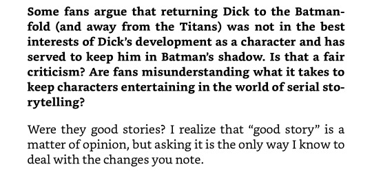
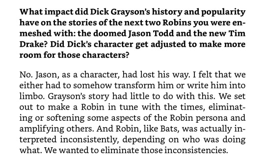

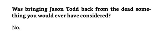
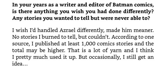
marv wolfman:
chuck dixon:
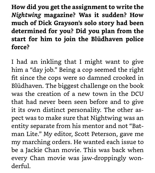
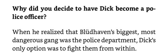
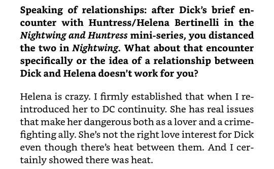


chuck dixon is the epitome of even a broken clock is right twice a day (as in, there's about two answers i'd totally agree with his reasoning)
#anyways i ostensibly bought myself this book because i did want to see creator thoughts#....mainly devin grayson thoughts because i feel like she's the main reason for the implication that of course circus people are poor#even though. they're not necessarily and to assume as such is stereotypical and offensive
110 notes
·
View notes
Text
Happy Halloween! Have a book:
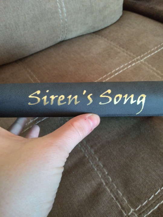
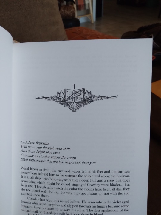
This is Siren's Song by @kedreeva (Hi! I asked to bind your fic months ago, sorry it took so long XD). It's an incredible Good Omens siren AU, which needs no introduction from me but it gets one anyway. It's one of the most in-character fics I've ever read, tackles a lot of the most resonant themes of the original (love in the context of aromanticism and asexuality, human labels in the context of non-human perspective), and has incredible world-building. Later parts of the fic always make me cry but they're good tears. You'll see. When I first learned that fanbinding was a thing and started looking into how to do it, this was one of the first fics I thought of. It just took me a while to learn the skills I needed before I could do it.
More pics and process talk under the cut!
So the cover up there is black faux leather and momi paper that I bought...about two years ago? And just kept on hand till I was ready to do this project. This is the first time I've worked with it and it was fairly nice, though harder to get a nice crease into than lokta or chiyogami. It felt very fragile when I was handling it but I didn't have any issues with tearing or glue bleed-through like I thought I might. It did bleed some color when I got it damp with the glue, and it took way longer to dry than normal, but once that was done it's been fine. Which is nice because I have a lot left over, so it'll probably be making many future appearances in my binds.
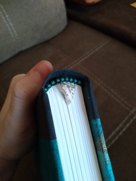
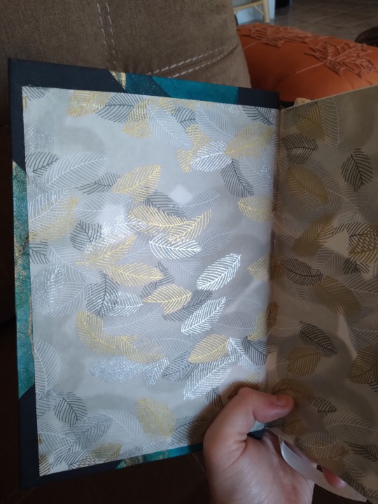
Look! It's rounded! I got a backing setup recently and this is my first time using it. It was Very Hard and I am not very good at it yet. But I think it looks pretty good for a first attempt, and there was really no other way to mitigate the spine swell on this one. I used a thick paper so I've got a thick book. I also tried something new with the case, though it isn't visible. Usually I make the text block and the case separately and then attach them as the last step, but for this one I actually built the case around the text. Like, boards attached to mull/tapes (sandwiched between thinner boards, with grooves cut for them so there are no bulges), then covered with momi, then leather corners and spine, then paste down the endpaper. It's got an oxford hollow, too! The tapes and mull actually wrap around the outside of the boards instead of the inside like I've done before. Endpapers are my favorite feather chiyogami. Combined with the marbled momi they make for a very opulent look, and I had just barely enough to do this. Like, down to the millimeter. I had to trim the edges and then glue the endpapers after to be sure they were right. I'm glad they were, because I didn't have a backup plan. Handmade endbands, colors picked to match the cover. Also, last note, I got the corner bits right for the first time. Measured properly, with no weird pointy bits that come out at funny angles. Very proud.
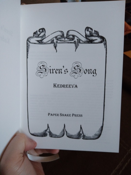
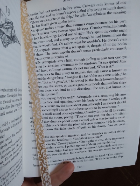
Title page and bookmark/interior shot. Did you know that some basic fonts in MS Word look different when you use a huge font size? Because I didn't until I made this title page. That's Parchment for the title, and it only gets those swirly bits around the capital letters if you take it to 26pt or higher (I used 72 here). Now I wonder if any of the other fonts have easter eggs in them like that. The ribbon is very fancy, to go along with the rich endpaper/cover combo. I think it's pretty appropriate for a mythological golden age of piracy story, as are the text ornaments:
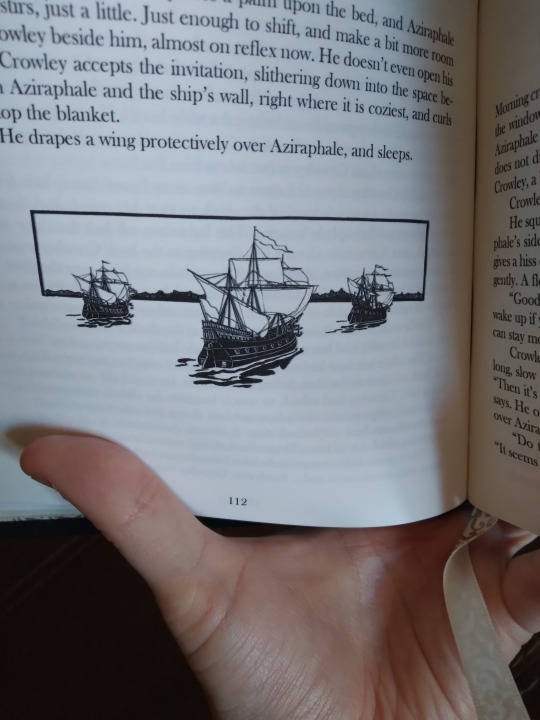
Chapter header image, chapter end image, and section break image. It was a very image-heavy typeset. I was originally planning to only have a header and a section break, but I couldn't decide whether I liked the ships or the book/shell/feather better, and they both suited the story so well that I just went with both. Again, opulent, but I think it fits. All the images came from rawpixel, all I did was resize them.
There was a small error in the trimming process. Comes of having to calculate so closely the exact amount you can trim off, that you have to trim off so your slightly-too-small endpapers fit. I think something got misaligned when I poked the sewing holes because only the first signature is like this. The rest of the book has a more appropriately-sized margin between the page number and the edge. I got very lucky here, and I know it, and I'm never cutting it this close (lol) again. Next time we just order another sheet of chiyogami.
And that's it! I have one author's copy and one new bind in progress right now (that's taking a while because I'm learning more new stuff for it), and then I have two Christmas gift books to do, so it might be a bit before I have another book to share.
#bookbinding#fanbinding#snek makes books#good omens#fic rec#this one was months in the making#maybe years if you consider i bought the momi in 2021#long before i started working on the typeset#i love it so much though#when i was done i wanted to carry it around all day and show it to people#like a kid who wants you to put their drawing on the fridge
93 notes
·
View notes
Text
waking up at 5 am to see that yep, Sifo-Dyas is mentioned on the character list in the Living Force, but all I can think about is that his last transmission to the Temple (his confession about the clones, his last words) has been hanging out in canon from a YA novel that came out in 2019 and I didn't know until last night (Thank you @dapurinthos for letting me know about this and for my resulting emotional breakdown)
"Come find me!" 😭😭😭😭😭
#Force Collector#yeah I bought that book in about two seconds#Force Collector came out in 2019 same year as Dooku: Jedi Lost so it actually tracks#because it actually SOUNDS like Cavan's Sifo voice#I am going to speed run the Living Force though
24 notes
·
View notes
Text
did anyone else read flowers for algernon.... i read it earlier this year for school and i just remembered about it and how much i loved it. i remember looking for a fandom but got almost nothing other than it being just another book in those "books that made me cry" videos </3
#i literally cried in class reading it yall#that shit was GUT WRENCHING#flowers for algernon#i only read the excerpt for class though#but i bought a copy of the actual book :3#i haven't read it yet tho bc im reading some other stuff rn... swearsies once im finished with those ill read ffa#i even hyper fixated on it for like 2 weeks LMAO
23 notes
·
View notes
Text

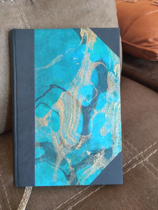
trying to get my excitement for reading back, so I put some of my TBR books I'm excited for on the hanging bookshelf.
I think Chlorine by Jade Song might be my first book of 2024, the cover is gorgeous and I'm intrigued 👀
#all books i bought in 2023 and didn't read lol#the hanging shelf has been empty for a few weeks though so i needed to refill it#books#tbr books
22 notes
·
View notes
Text
i hope you all spend a very good lesbian summer !! nina and lotte are !!
i draw "with two left hands" so i'm very self-conscious about my drawings, i know i'm not very good, especially compared to other much more skilled people on here but i ended up liking it quite a bit, it was really like in my imagination.
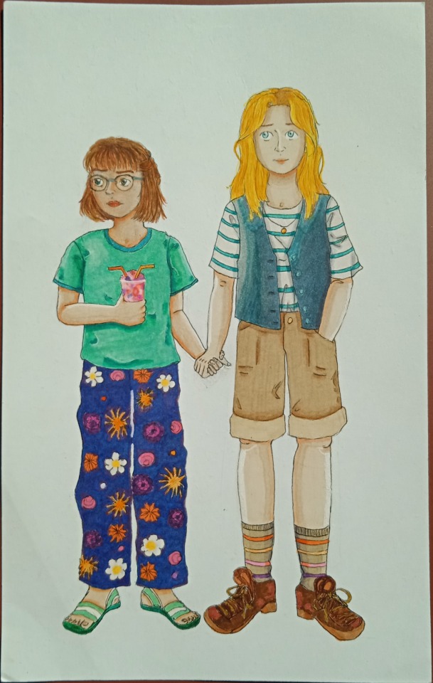
also notice the little lesbian flags : on the trousers' pattern, the socks and the granita and straws they share 🧡. also i love slowly butchifying nina (lotte's turn will come), it makes me very happy and her south of france fit is one of my favorite of hers as a butch myself and someone living in france. idk why tumblr gives the picture a worse definition.
below the cut is the scanned version + fuller pictures and what i used as well as what i liked doing the most.
so the paper is a bristol paper which means the drawing is rather small. i used different marker pens i gathered around the years as well as different types of regular pens to colorise it.
for nina's hair, at first i ranked the yellows i wanted to use from lighter to more orange. i colorised first with a pale yellow crayon base and then used my pens to get her haïr more and more darker.
also i wish i did better for lotte's face in terms of skin color but the final result is better than some versions that i came up with before.
what i like the most are : nina's skin and its shadows as well as her short, her t-shirt, the shadows in général, the granitas, the flowers and lotte's trousers blue color (i did it with a dark purple, then dark prussian blue markers and added a lighter dark blue since it was still a bit too purple).
the fuller picture + one with a slightly different lightning.


the scanned version i just did :
#also my background for the picture is my 6th volume of monster i bought wednesday <3 i'm sad just thinking about finishing the books though.#also i have a pair of similar trousers as lotte i just made the flowers a bit more lesbian flag :').#nina fortner#lotte frank#lesbian stuff#monster#naoki urasawa's monster#sophia talks#my art#traditional drawing#monster manga#monster anime#lesbian
40 notes
·
View notes
Text

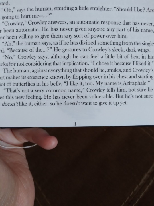
Listening and learning
#this isn’t about anything I just found this funny book#I’m supposed to be working and instead I’m doing a photo shoot bc my dressing gown and arrow shirt make me feel hot as helllll#very glad I bought this fancy dressing gown for my sad Crowley Halloween costume#pays dividends every day#also oops I haven’t eaten anything#MY ATTENTION IS AT A DEFECIT#OKAY IM GOING TO WORK NOW#AND I GOT SOUP#onion’s nighttime thoughts#might’ve got some new headshots though
14 notes
·
View notes
Text
not to try and pull a bigolas dickolas wolfwood on here but if you are looking for something to soothe your rogue heroes brain worms you SHOULD go read this right now I AM very serious
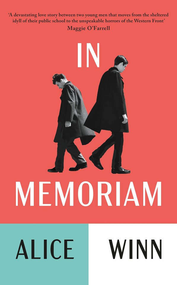
it's beautiful it's heartbreaking it will make you want to chew glass. it's about love and hope and the horrors of war and let me tell you very few things will make you as insane as reading this when you are super sleep deprived on a train and you are listening to The Green Fields of France
#no fr tho. if you have still not recovered from paddy and eoin this book will wrench your heart out of your chest and then soothe you#i read the arc ironically around remembrance time and it made me want to lay myself down in the dirt and scream.#first time i actually went and bought a book i was given as an arc#sas rogue heroes#in memoriam#alice winn#oscar rambles#hmu if you want more details but genuinely I am SO serious if you like rogue heroes you WILL like this that's a threat#not to spoil it but especially you eoin lives au girlies. you will enjoy this. this is a statement#anyway the cover sucks i hate it SO much. i hate the american one more though
66 notes
·
View notes
Text
I consistently say that I'm not sure whether I like medieval studies, and yet when I'm doing an assignment I often end up focussing on something medieval. I just took ELEVEN BOOKS from the shelf on the Gawain poet because apparently I'm a nerd
#also little side ramble but when i was out with my friend yesterday i was so worried because of how much of a nerd i am#she's quite girly and trendy and has a big group of friends and they go out a lot and stuff#and I'm just here burying my head in medieval books and i wish i could be interesting like her#but i just feel so so dull sometimes#even though i dress like the coolest medievalist-to-be#plus i had a lil social anxiety freak out yesterday when i was out with her and was just terrified the entire time that she hated me#I'm wearing my new docs today tho so I'm excitedddd#also i bought a new dress yesterday but i have nowhere to wear it and it's not very cottagecore like at all#rants n rambles
10 notes
·
View notes
Text
reading the name of this book is secret and I love how cass and max-ernest interacting is just Oh That's Clashing Autism
#they are operating on such wildly different logic levels that overlap on the funniest things. they are so cute i adore them.#might not read anything past this book?? idk???? but i am curious to see where this one goes.#ONCE UPON A TIME I DID IN FACT OWN THIS BOOK -- i bought it in 2010#my age group/school class was VERY into snicket as kids but we had NO similar attachment to bosch. at all. whatsoever.#so i didn't even know about the books until high school.#i wound up never reading it though. got rid of the book at some point#oh! I'm reading the ebook on libby. gracie if you see this it DOES have the illustrations.#lulu talks about bosch
20 notes
·
View notes
Text
I hate decluttering but I have so much stuff and there's no room for me anymore
#not me sitting on the floor crying about getting rid of a goofy book my brother bought 2 copies of so we both could have one even though i#never knce read it and never will#wizard apprentice problems
23 notes
·
View notes
Text
2023 reads // twitter thread
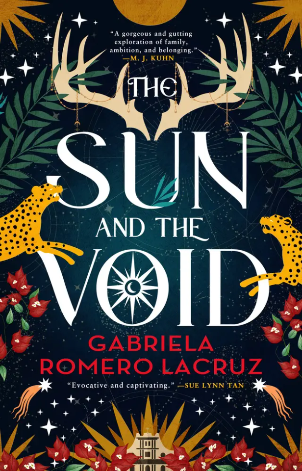
The Sun and The Void
Venezuelan inspired high fantasy
follows a young outcast swordswoman taken in by her grandmother, the dark sorceress for a noble family, who relies on the magic to keep her alive after being attacked by monstrous creatures
and a young noblewoman who’s the shame of her family because of her mixed heritage and desire to use magic
both are manipulated by those with more power than them into a plot to free an ancient evil god
mineral based magic, politics, nonhuman MCs
#The Sun and The Void#aroaessidhe 2023 reads#hm. haha. surface level this is kinda interesting and cool but i am going to follow with so many complaints#though I feel like it didn’t go into the magic or worldbuilding as much as I wanted and it felt irrelevant to the characters#like how does the magic even work? idk man#though I feel like it didn’t go into it as much as I wanted and it felt irrelevant to the characters#very slow to start and the pacing is weird. it would also go ages without having the other POV. very disjointed?#it felt like the first 60% was just context for the group of characters getting together as a group and then it was a bit predisposed with#They’re A Group! even tho. they're barely a group for long#the authors note mentions that the story concept started with a line about the god and ritual and…..yeah I can kind of tell#I feel like everything was built up around it in a way that ultimately that part didn’t fit right#I never bought that any of them were actually like fully committed to the evil dark magic? and also there’s this plot twist#that they have to fully kill the sacrifices & I was like…did we not already know that? girl r you stupid what do you think sacrifice means#also#oh my god at like half way one of the MCs is like. oh finally this guy who I’ve been exchanging letters with for months turned up to get me#away from here! by the way I’ve been exchanging letters with this guy and we’re friends! and like. she’d been doing nothing much for the#last 10% of the book why was that not like….shown as something she was doing? and like build up the friendship for the reader instead of#just dropping it on us - and also that we know the character from the other POV. and hes a racist prick. and we're supposed to believe she'#charmed by him because of this letter writing WE DIDN’T SEE….. why.#and then also that is like. he’s a shitbag and it’s obviously not romantic at all. he’s manipulative and terrible to her#EXCEPT at the end it implies his bad behaviour is because demon and oh uwu he gets all beat up and maybe hes sowwy now#and starts to imply she likes and is attracted to him? and I get the impression the next book is gonna be like evil power couple dynamic?#which. feels like the first concept the author had; and then tried to build up to that but not effectively lmao#for the lesbians:#I DO APPRECIATE having an assumed love interest then realising that that was idealised and actually you have feelings#for this other person you’ve become friends with! nice slow switch up. though quite brief#I do however dislike that when she admitted her feelings to the first LI and she rejected her it was still framed as the other’s fault#for not reciprocating the feelings….worst trope….also like. it kind of conflated her not feeling that way to her having a bit of class disc#which. yikes? oh my god stop villainising people for not reciprocating romantic feelings (ALSO they turn out to be related anyway 🤪)#i just feel like the romance switchover could have been done with more nuance and complexity
21 notes
·
View notes
Text

Was this written by future President of the United States Chester Arthur or Anne of Green Gables?
#history is awesome#presidential talk#most of the letter is on a similar level of unrestrained gushing#he was totally a sanguine#there are lots of fun letters which makes it very easy to keep reading#woodrow wilson's was more impressive than it might have been because it came right after the tafts#so i was just like 'thank goodness! someone who knows how to use punctuation!'#(but also it is a nice letter in its own right)#theodore roosevelt wins the prize so far for complete lack of punctuation#which does have the effect of making it seem very stream-of-consciousness which seems very right for him (esp at that age)#lucretia (soon-to-be) garfield's letter made me tear up though#i might need to make that its own post because wow the drama and the heartbreak (and the spine of steel that woman had)#i was unsure about this purchase but dang it might be the best book i've bought this year#extremely good formatting for one#lots of white space and nice clear font so it's incredibly easy to read#which is a very underrated aspect of books but maybe one of the most important things when it comes to the reading experience#i've started taking that into account when i select books and it's made my reading life so much better
29 notes
·
View notes
Text
was definitely the most fuckable guy in the supermarket just now. good job everyone
#forgot i owned dungarees bc I didn’t take them to uni…they really are such a wonderful garment though <3#AND I wrangled my hair into one of those half up half down things. it took me half an hour btw#BUT! bought myself daffodils for my book vase + avocado + bacon for some toast :-)#and jam!! for vday cookies tommo!!#(ridi's) bigmouth strikes again
96 notes
·
View notes
Last Seen Blogs
distillatoria
baby you're a haunted house

gabrielleavancini
Gabrielle
some-love69some-crazy
madness

swimmingluminarywasteland
OCqA9bKEEKM

hamedprint
Untitled