#I am sorry for not posting
Text
Should I start putting random titles to these things? 🤔
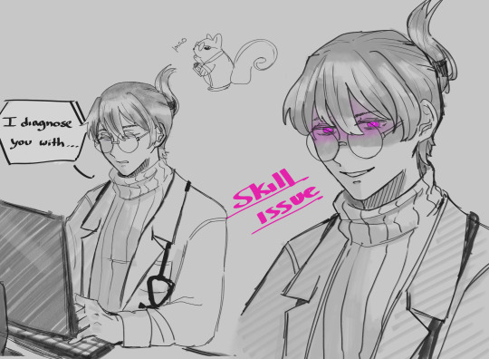
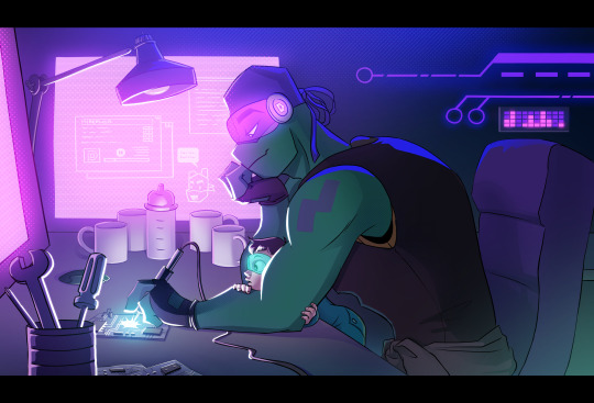
Anyway, a badly drawn sketch for a comeback woohoo... (I had a nightmare where this bitch said this to me cuz he got the doctor title earlier than me or my classmates ever will. Like, fuck you and your hypnosis 😊)
Does anyone here speak spanish? I want to make silly badly drawn references but I fear no one will get them ;;
#dol#dol fanart#dol harper#harper the doctor#moth art#that tag looks like mozart lmao#I am sorry for not posting#degrees of lewdity#I ate a watermelon#it was yummy
74 notes
·
View notes
Text
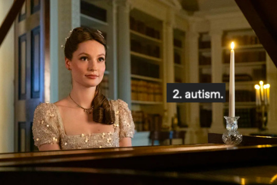
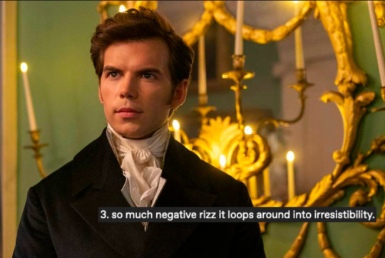
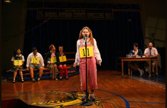
this will not be a bridgerton blog but for the foreseeable future i will not be thinking about anything other than bridgerton
(original post @romanceyourdemons)
#bridgerton#i'm sorry to go so off track guys but hopefully some of you are with me on this one#every once and a while i get to post about my little romances!!#as a treat!!!#also do NOT get me wrong i am a colin girly but the man is a wet dog#and that's what i LIKE ABOUT HIM!
12K notes
·
View notes
Text

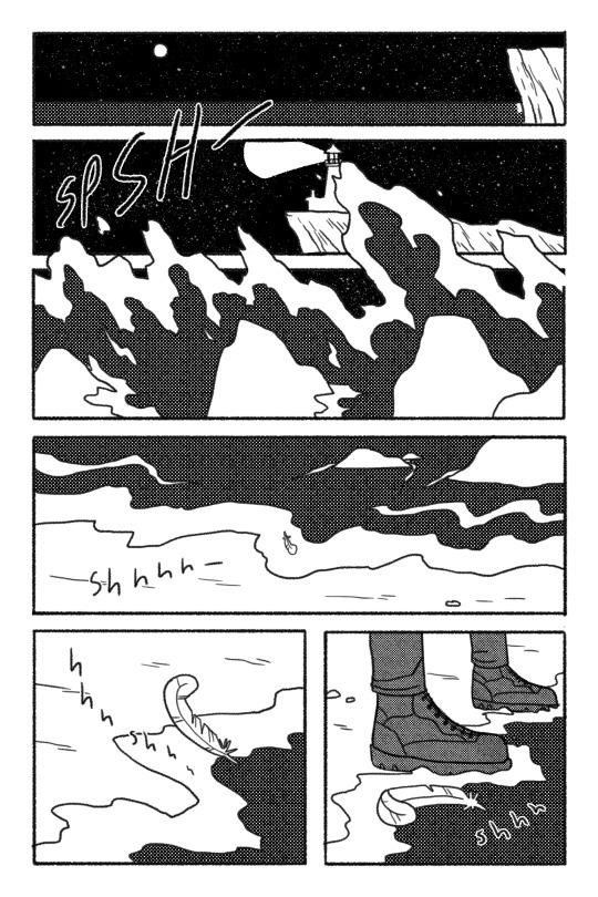
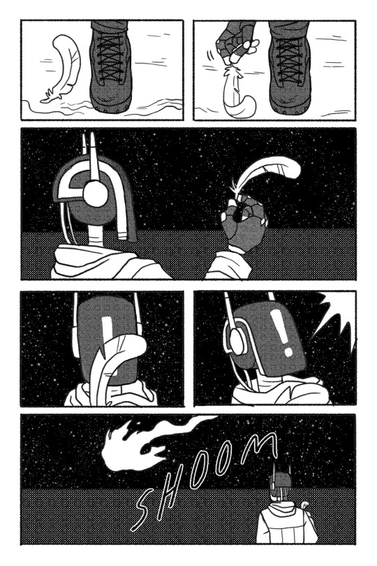

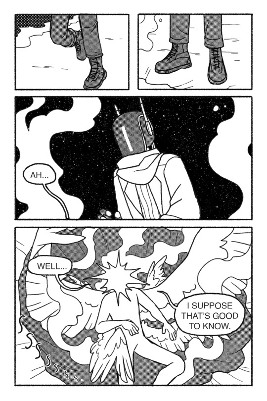
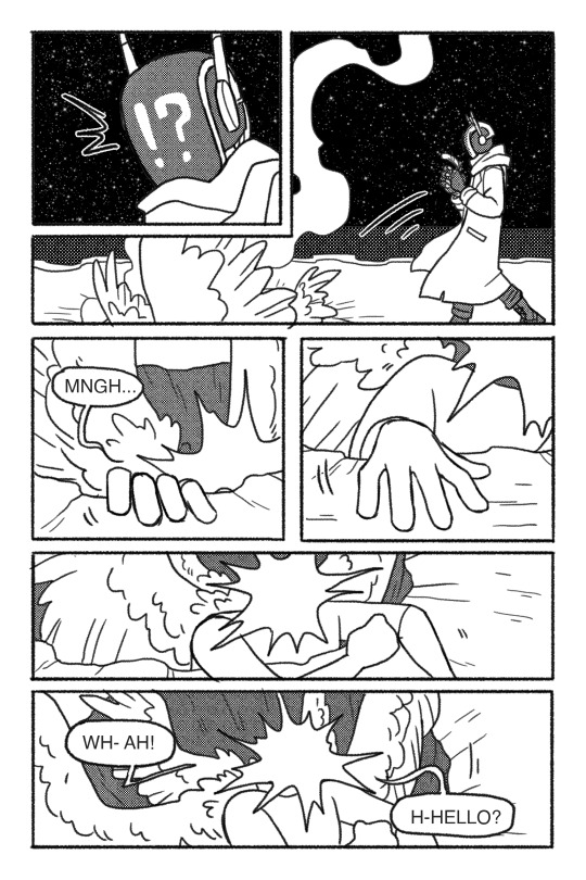
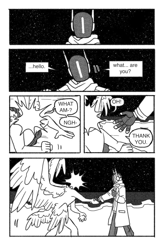
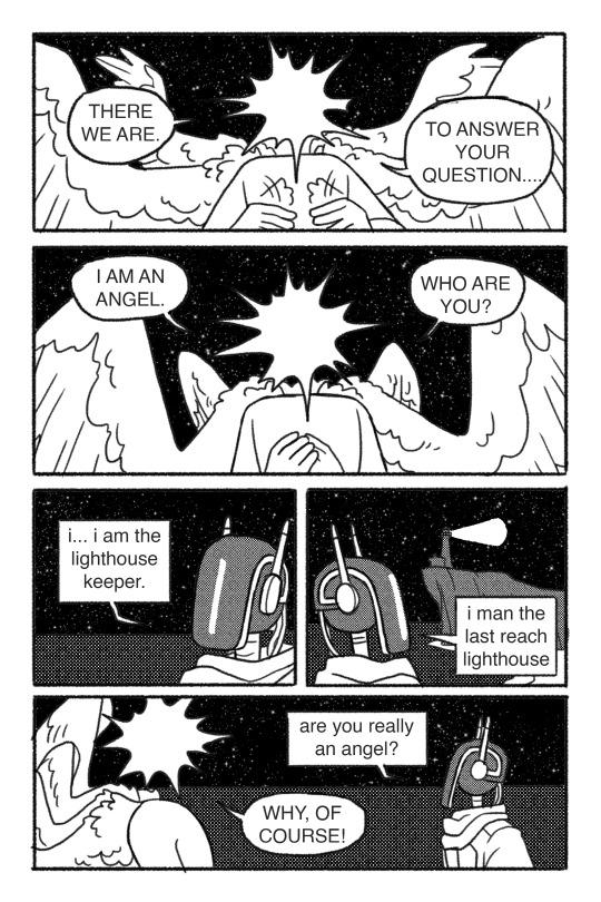
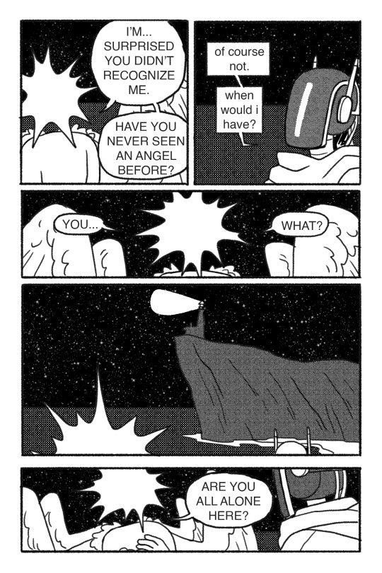
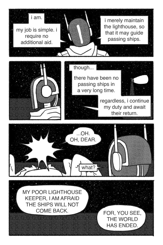
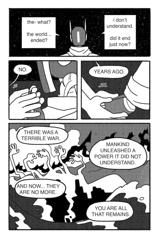
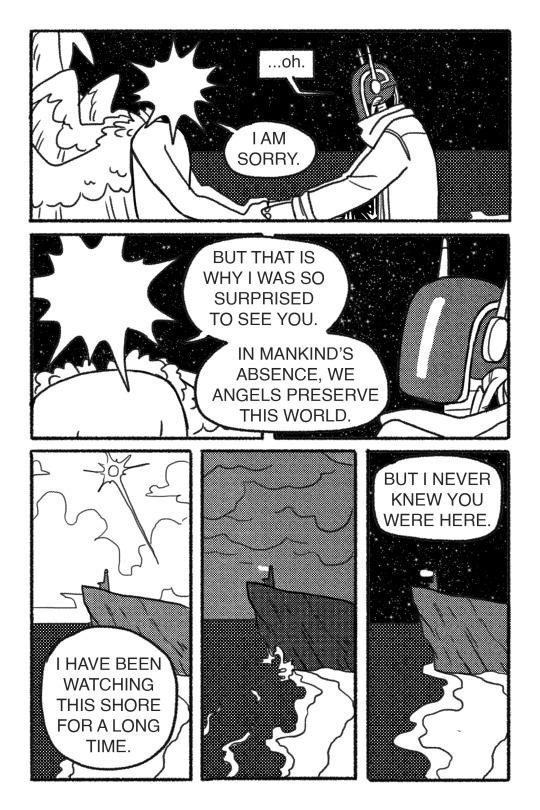
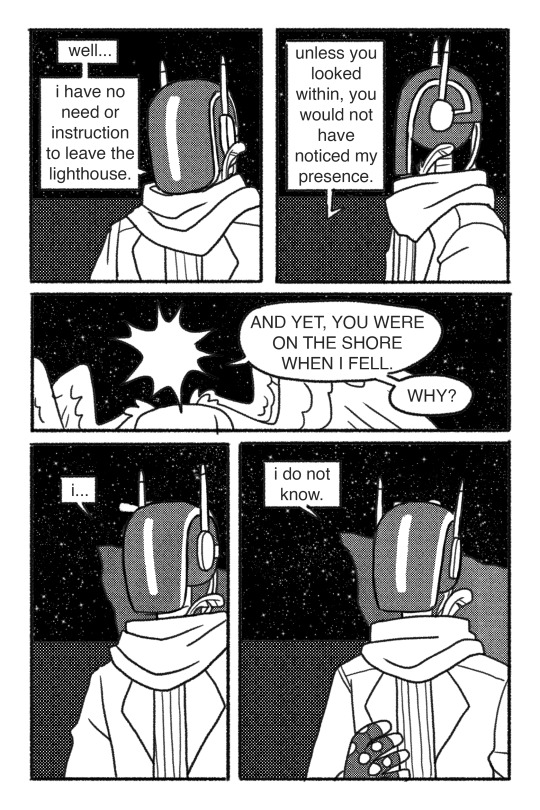
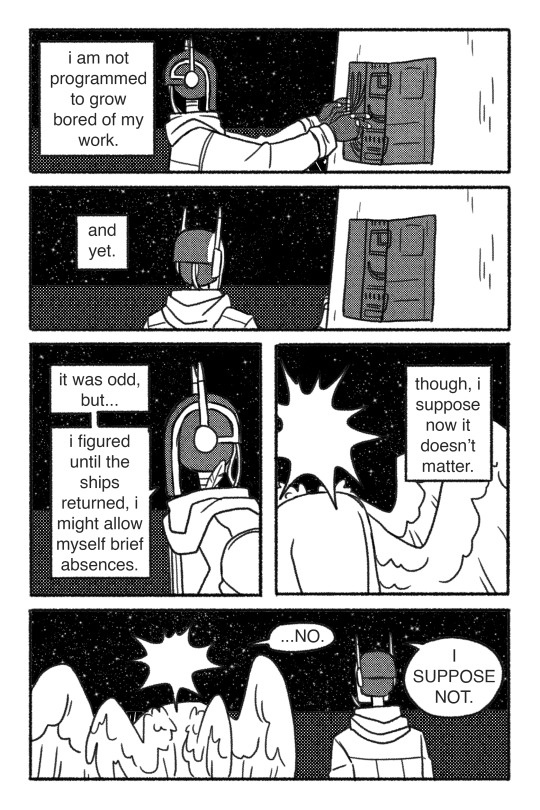
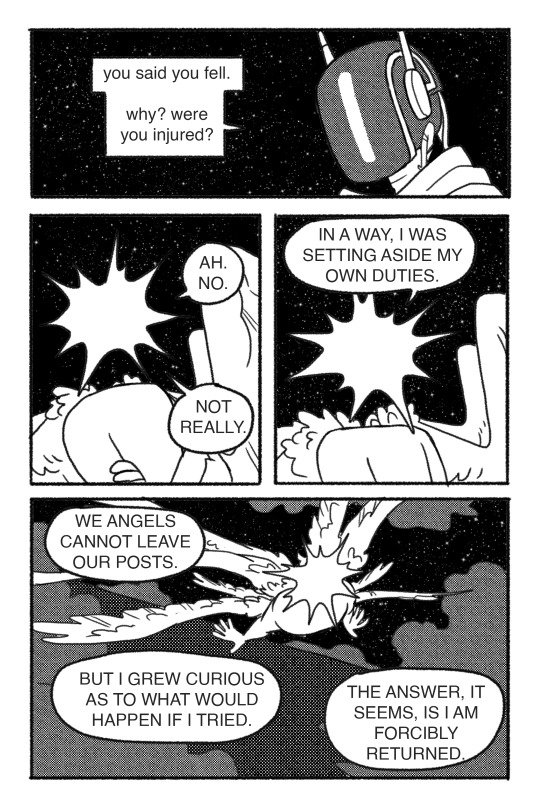
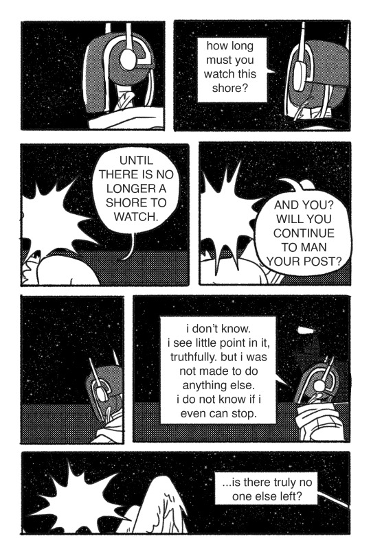
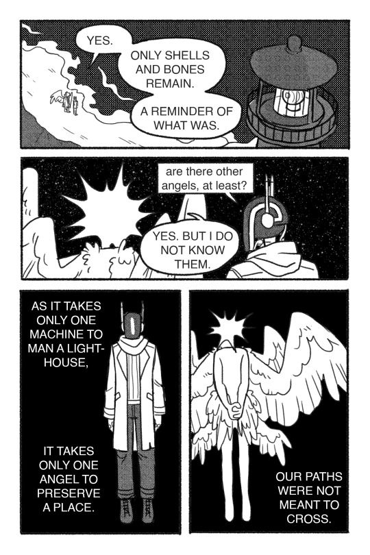

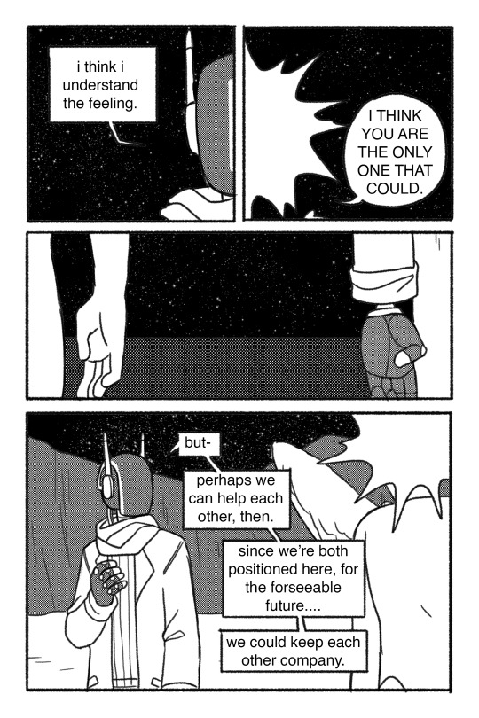
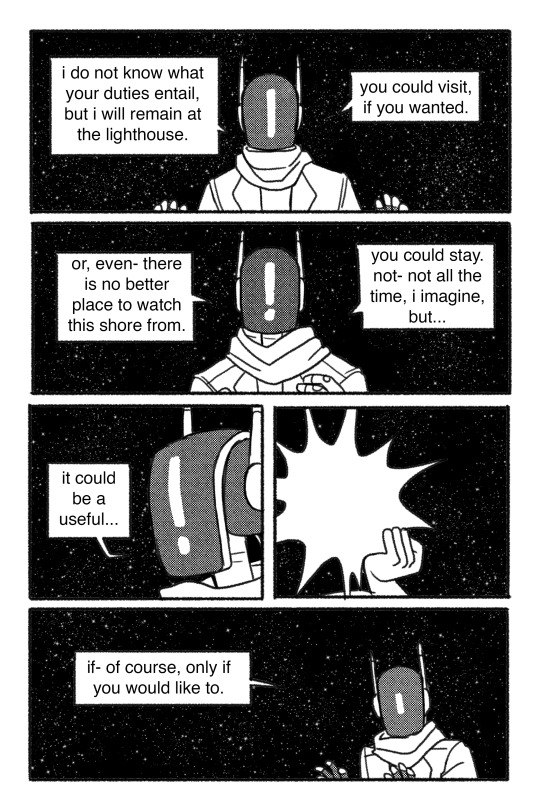
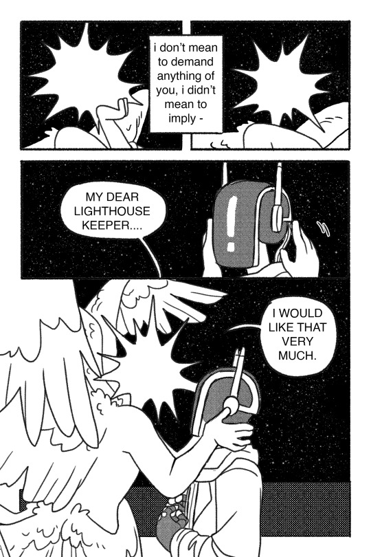

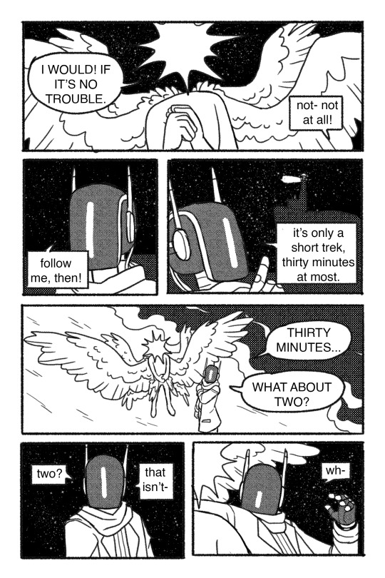
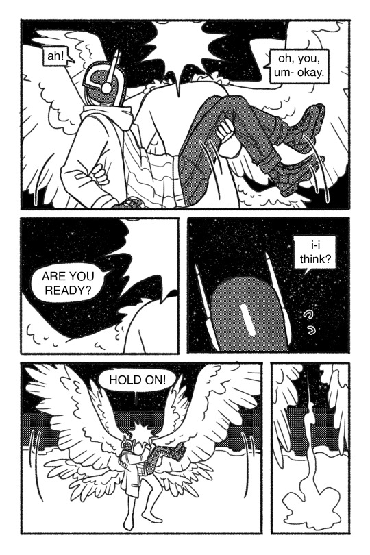

Keeper -- a short comic about an angel meeting a robotic lighthouse keeper that doesn't know the world has already ended. Made in about 18 hours for a 24-hour 24-page* black and white comic challenge (that I arrived late to, ha.)
*the actual submission does not include the cover, which was created after the fact for this post.
This was a really great learning experience as someone who's... never really made a completed comic. I ended up really attached to the story by the end of the project (possibly due to all-nighter deliriousness lol) and ultimately am very proud of what I made.There are some things I'd still like to change, particularly text placement, but in keeping with the spirit of the challenge I've elected to leave it as is.
#sparks art#comic#angel#robot#my art#my comics#keeper: the angel#keeper: the lighthouse keeper#my ocs#hoogh. this was a grind yall lmao. but i am pleased with it#i hope you enjoy :pray: also keep your fingers crossed for me that this wins the contest#like it. it wont. because i am up against actual SEQA kids that know what theyre doing. and i dont actually mind really#but it would be funny#long post#very long post#sorry#i hope the readmore works
31K notes
·
View notes
Text
y’all remember we’re talking ab allegations of pedophilia and human trafficking and domestic violence right. real-life abuse. this isn’t fucking hannibal or Genshin or some shit even as a joke these posts are fucking weird
#sorry i turned rbs off this post is radioactive#og tags ->#am I being sensitive idk#but kdot’s been talking ab a very well-documented history of drake w predators and being a predator#also allegations of him abusing his partner#why make posts like this#x#kendrick lamar
9K notes
·
View notes
Text
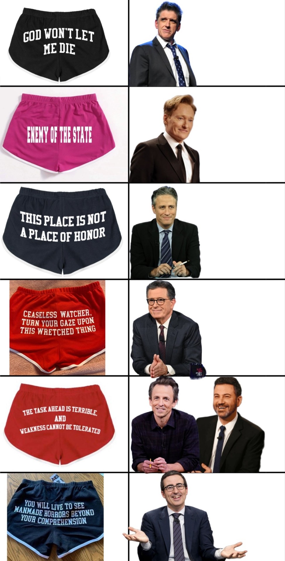
Edit: muted this monstrosity but if you're looking for the blank template it's on my blog and I'll tag this and it with "the stupid fucking shorts post" so you don't have to scroll through everything 💀😂 (I did not make the template btw, I don't know who the OP is but if you do please let me know)
#the stupid fucking shorts post#everyone asking about Trevor i am sorry but I've never watched him 💀#stephen colbert#john oliver#jimmy kimmel#seth meyers#conan o'brien#craig ferguson#jon stewart#strike force five#strike force memes#strike force#last week tonight#the late show with stephen colbert#the late show#the late late show#conan#conan o'brien needs a friend#late night with conan o'brien#late night with seth meyers#jimmy kimmel live#the daily show with jon stewart#the problem with jon stewart#the jon stewart show#the colbert report#meme#late night#late night hosts#comedians in queues
12K notes
·
View notes
Text
@staff if you [change] the [design] of the fucking [dashboard] i will kill you
edit. i want it on the actual post that i am not actually making a de-th threat against the staff. that's shitty. the caption quotes the fucking costco hot dog meme, which i originally said in the tags. if any staff member sees this please do Not take it personally
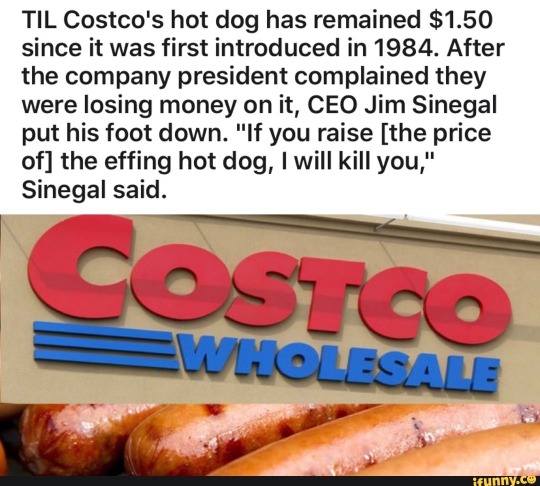
#dashboard#staff#tumblr update#comic#art#doodles#costco ceo about the price of a hot dog.png#i refuse to believe this is a real problem that site owners think people have#frankly i refuse to believe people had this issue with deviantart before eclipse#i am sorry you have to put about 15 minutes of effort into understanding a new website. feel better soon#my main blog doesn't have it yet but i logged into here to make this post and. i have it#this is fucking terrible. it would ahve been really really funny for april fools day but not as a permanent change#i hate it a Lot. i hate it so fucking much. oh . my god.#edit - guys i amnot actually sending de*th threats to staff it's the costco hot dog meme
28K notes
·
View notes
Photo

the crucible (1953) - arthur miller
“ough”
#ough#ok#i know i literally never fucking post#but um#i will not be as active#i am genuinely very sorry#idk#im just kind of having a rough time#who isnt tbh#but anyway#this is my warning and also my apology for this#sorry#blackout poetry
40K notes
·
View notes
Text
REPLICA PLAYLIST
MUSIC UNDER CUT
I have been receiving requests for any songs that inspired Replica, so here, have my personal playlist. Sorry it’s not Spotify/Soundcloud but they don’t have some of these songs available so uh… guess you’re stuck with YouTube vids. For fun I'll include my personal titles for them (which might give a few hints of what to expect in the future/end).
Replica Main Theme - “Die for You” by Grabbitz
Like Father Like Son Like Brother (Omega and Shelldon) - "As Above So Below" by Alistair Lindsay
Mikey's Theme / The 1st Vision - "Suzume no Tojimari" by Nanoka Hara
Military (Mad) Dogs / Central Park Colony - "Imperium" by Madeon
Shanghai - "Icarus" by Madeon
Boom Goes the Donnie-mite (Mikey/Donnie vs the Sweeper) - "The Red Zone" by Mitsuoto Suzuki
The Day the Sky Bled Red - "7 Seconds Till the End" by Nobuo Uematsu
Going Out Like a Boss (Raph and Leo) - "Agape" by Nicholas Britell
Remembering the Right Way (Mikey and Leo) - "The Souls of Many" - by Alistair Lindsay
Mystic Hands / The 2nd Vision - "Am I Dreaming" by Metro Boomin x A$AP
Book 2 Trailer - "Sea Dragon" by Covet
7 Years Later - "Iron" by Woodkid
Leo's Theme / Attack on the Labor Camp - "Ego Death" by Polyphia
Omega's Theme - "Touch" by Daft Punk
Flat Lines (Omega Alone) - "Die Toteninsel Emptiness" by 1000 Eyes
Spear - "Monsters" by Tommee Profitt
Final Protocol - "The Kraken" by Katie Dey
Rise / Epilogue - "Close in the Distance" by Masayoshi Soken & Tom Mills
I will admit, it's a little embarrassing since you can easily see the patterns of what I've been listening to for the past year or two. I swear I listen to more than just videogame OSTs, these songs just jive well with the story and I often find lyrics distracting when brainstorming scenes. Regardless, the music I listen to is such an important part of my creative process and some of these songs really defined the scenes I now have locked in my head. So I figured it was only fair to give them the credit they're due.
I will continue to add to this playlist, and will note in comic updates when one of these songs is applicable!
#lofi Donnie anyone?#also sort of celebration for 19k followers wow#should I do something else for it?#I particularly like Leo's theme being titled Ego Death#very fitting#Also the final song makes me cry because the lyrics are just too dang perfect#I'd like to do an animatic with the song when this story is all done#check out the lyrics if you get the chance#in fact I'd like to do an animatic trailer for the Book 2 Teaser#we'll see though#i can't allow myself to get too distracted from the comic itself haha#replica#rottmnt replica#kathaynesart#playlist#music#spoilers? but like... you know how it ends in the movie so not really?#kind of?#did you see the rise movie?#then you’ve been spoiled sorry#posting again at an ungodly hour#I am tired#save rottmnt#rottmnt#TMNT#Donatello#casey jones
3K notes
·
View notes
Text


im sorry senshi
#my art#dungeon meshi#senshi#chillchuck tims#chilshi#// blood#Is it too obvious how attracted i am to senshi im so sorry.#post dedicated to paes and cab<3
4K notes
·
View notes
Text


Charizard is a weird axolotl in my minds eye. in my dreams too
#my art#pokemon#artists on tumblr#charizard#pokemon art#original character#my designs#doodle#sketch#sorry for not posting polished things i am so stressed
10K notes
·
View notes
Text

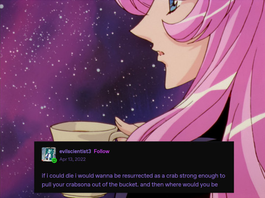
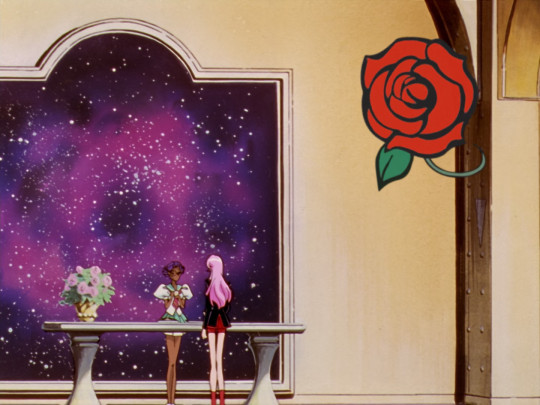
#rgu#revolutionary girl utena#sku#shoujo kakumei utena#utenanthy#utena#utena tenjou#anthy himemiya#sorry i saw this post and rushed to my computer to make this#its literally them#if someones already made this i am not sorry#we just have to share now
15K notes
·
View notes
Text
#polls#polls and research#pointless poll#united states#midwest#hell#location#moving#america#look im sorry if youre insulted by me grouping some states but there are 12 Midwestern states and only 10 options allowed#i just took a trip across the country and my limited perspective is that Ohio is Not So Bad#i grew up in Missouri 🫠#why yes i am blazing this post#i enjoy whoring my ideas to the masses to satisfy my curiosity
14K notes
·
View notes
Text
as a bi person, the bisexual flag brings me infinite joy and always puts a smile on my face, however as a person who has a Passion for Graphic Design, that undersaturated shade of purple infuriates me when it's used digitally
like, on an actual flag - which was its original purpose - it looks great!

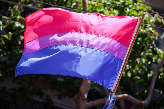
those look fine! lovely, even! with the semi-transparent fabric, the way it catches the sunlight, it looks beautiful!
but now look at how it looks digitally

the pink and blue are so vibrant compared to the sad, lonely lavender!
and let's look at this statement from Michael Page, the creator of the bi flag:

(sidenote: he created this flag in 1998, so if his takes on bisexuality is different from yours, it's okay to notice that! a lot has changed since the 90s when it comes to lived experiences and the way we describe them. but, it's also important to respect his thoughts about this and the way he presented them, even if today, we'd probably not say that bi people "blend unnoticeably into both the gay/lesbian and straight communities.")
so in pantone colors, the pink is 226 C, the blue is 286 C, and the purple of the flag is 258 C.
but...here's the deal
Michael talks here about how the key to understanding the symbolism is to know that the purple blends into both the pink and blue. and on a physical flag, I think you can see that!
but digitally, it absolutely does not blend. it clashes badly, and looks oddly separate from the other two colors.
which got me wondering...what purple do you get if you actually blend 226 C and 286 C?
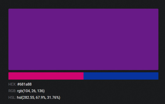
oh! oh, my god.

look at that! look at how nicely it fits between those colors!
look at it next to the original color scheme! look at how much more vibrant the purple is!
and friends. this is just blending through rgb! you get even more purple variations when you use other color spaces!
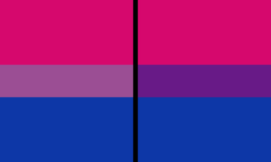
let's compare all of them:


(top: original, lab. middle: lrgb, lch. bottom: rgb, hsl)
look at all of the different purple options you can get just by combining these two colors!
if you want almost too-vibrant saturation, you can go hsl, if you want something more relaxed that's closer to the original, you can go lab or lrgb. and if you want to split the difference, lch is bright and violet, while rgb is there with its saturated but darker purple.
anyway, I guess I don't really have a point here? this isn't so much an informational post as it is Me Getting Weird About Colors, but I think it is a useful lesson about how colors look very different on screens compared to how they look on objects in real life.
and sometimes, I think it's okay to compensate for that.
out of all of these, this is my favorite bi flag:

it's the one where the colors were blended in lab color space. for me, the lighter, softer purple is close enough to the original bi flag purple, while also feeling like a smoother blend of the blue and pink
but that's just me! and it might not even look the same to you, since every screen is different, because technology is a nightmare!
anyway, thank you for coming with me on this colorful journey! I will now retreat back to inkscape and make pained sounds about inkstitch gradients until something tangible pulls me back into reality
#bi#bisexual#bisexuality#bi flag#bisexual flag#sbs rambles#graphic design is my passion#id in alt text#but#the ids are probably deeply unhelpful for the different variations of flags#in the alt text of the six flags all grouped together#I just put what method the purples were blended with#and then tried to describe them more in the paragraph below#but this is an inherently visual post#so if you're reading it with a screen reader I am sorry :(
19K notes
·
View notes
Text

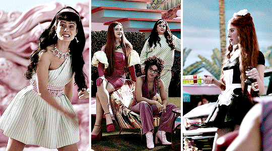
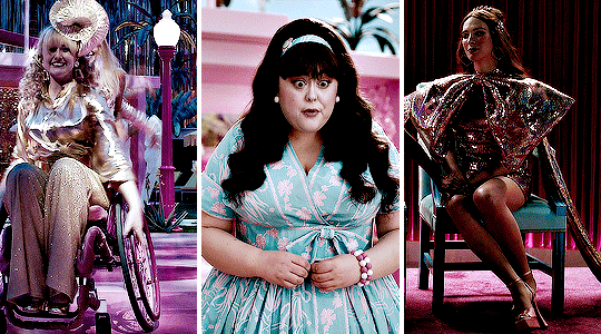
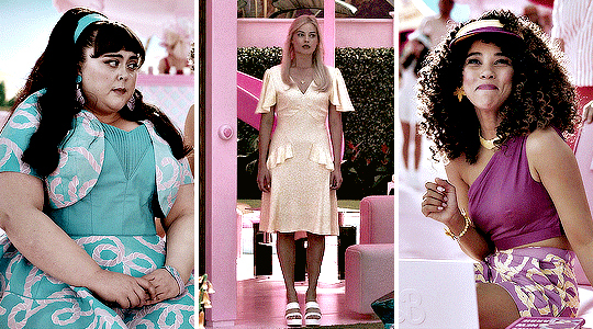
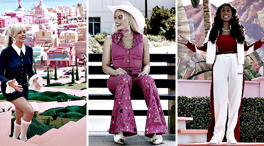
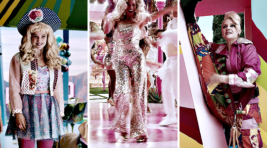

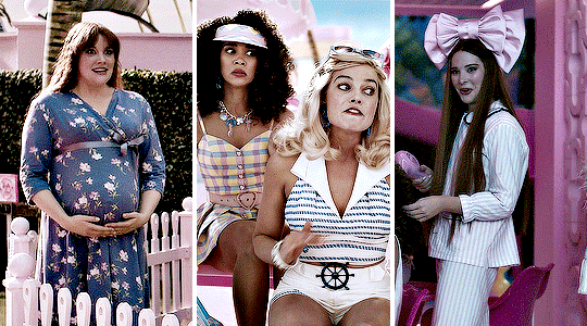
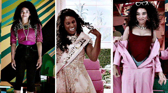
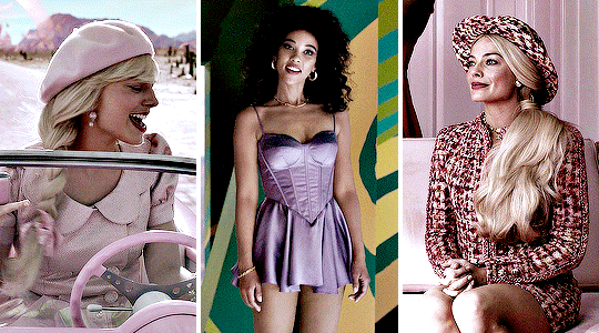
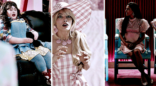
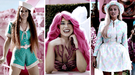

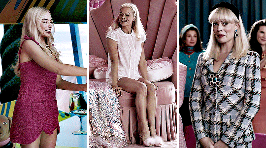
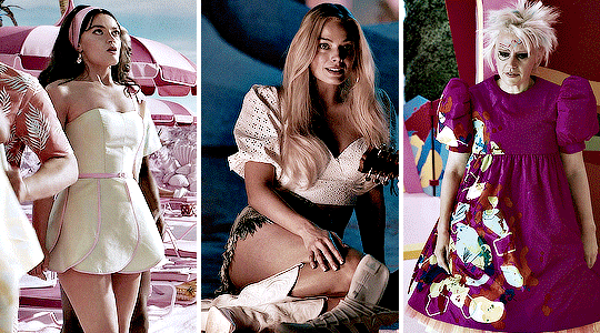
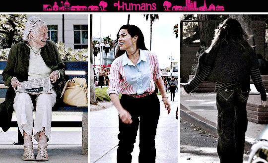

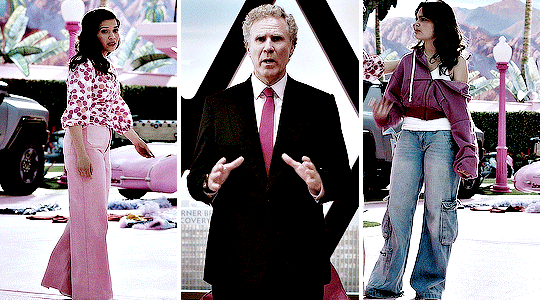

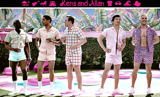
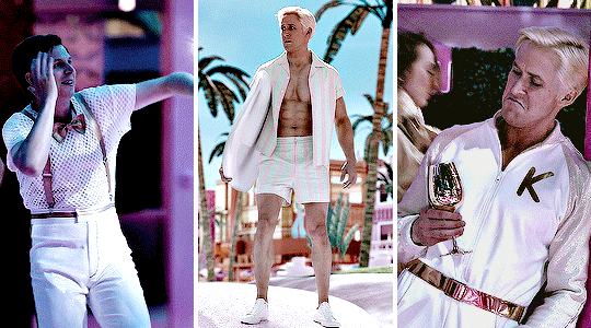
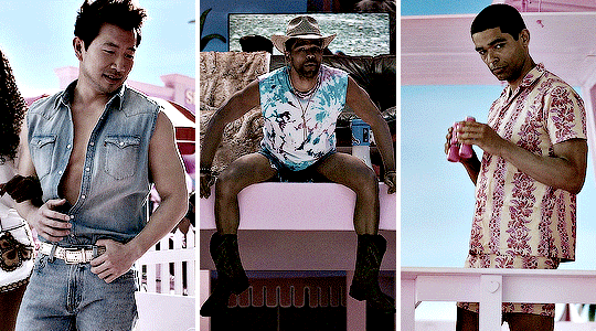
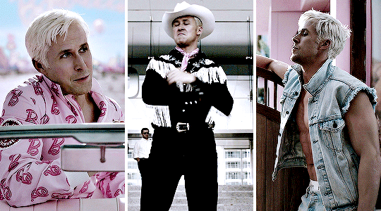
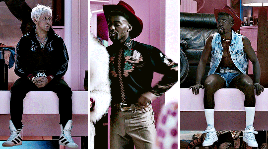
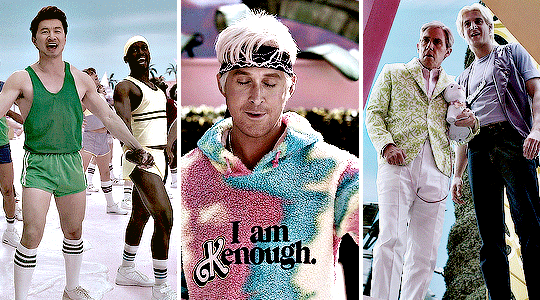
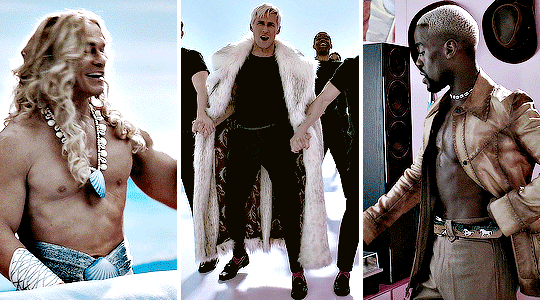

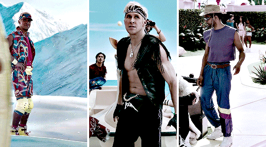
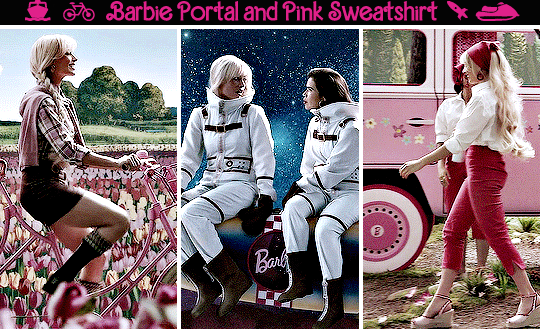
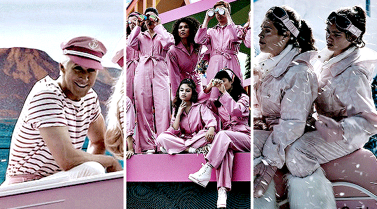
Costume appreciation series: Barbie (2023) dir Greta Gerwig
Costume Design by Jacqueline Durran
#barbie#barbieedit#filmedit#filmgifs#moviegifs#dailyflicks#junkfooddaily#cinemapix#userrobin#usersugar#arthurpendragonns#nessa007#usermandie#tusersadie#ivashkovadrian#userliz#costumeedit#margot robbie#ryan gosling#*#mine: cas#i am genuinely SO very sorry for the length of this i tried but i failed#long post for ts
3K notes
·
View notes
Text
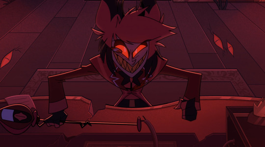
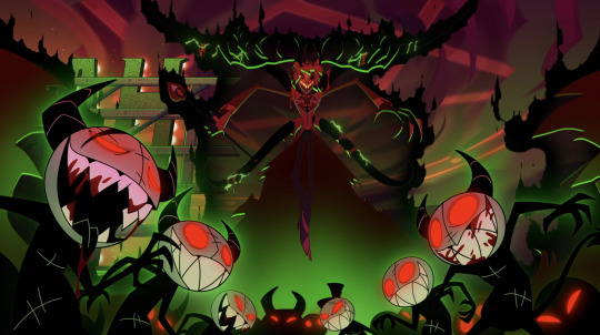
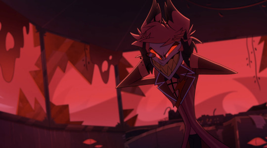
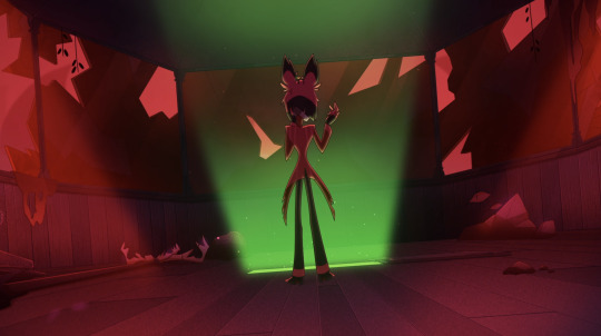


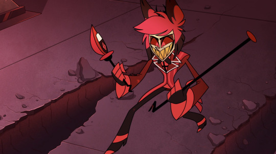
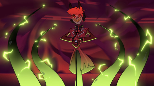
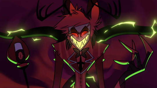
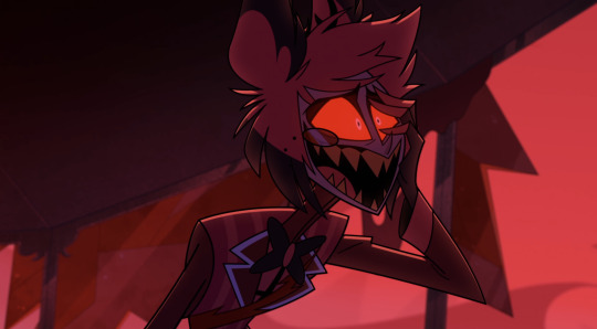
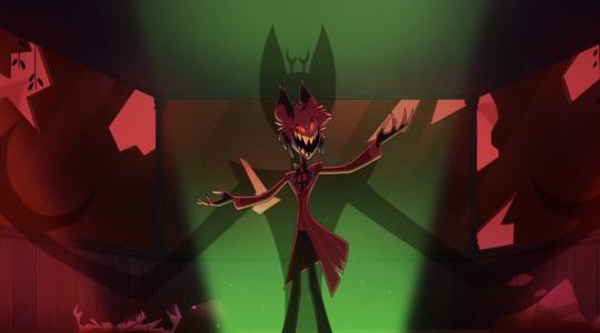
#bro is going through it#also what a drama queen#yes a separate photo dump for Al was 100% necessary#I am very normal about him wdym#hazbin hotel#hazbin#hazbin hotel alastor#alastor#hazbin alastor#alastor hazbin hotel#alastor the radio demon#hazbin hotel spoilers#hazbin hotel screenshots#my post#I’m so sorry to the person who was asking about image descriptions#I don’t know how to do that#aaaaa please forgive me
3K notes
·
View notes
Last Seen Blogs

floxie-spoonie
floxie spoonie

fromtheothersideby
2BOOMERS
fromtheothersideby
2BOOMERS

quadrantmodelquotes
Quadrant Model Quotes from 2013 Lectures

outfitsbykaeshlee
outfits by kaela & ashlee.