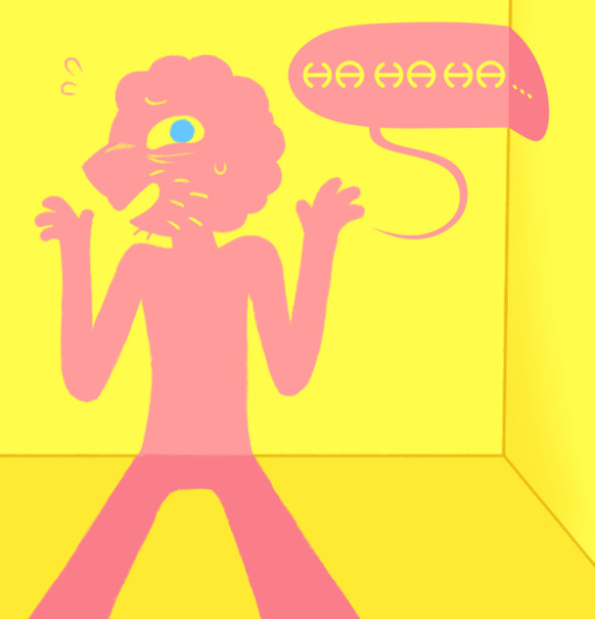
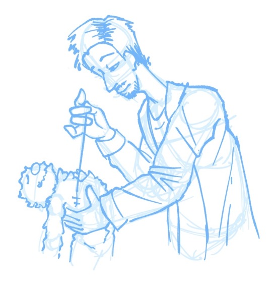
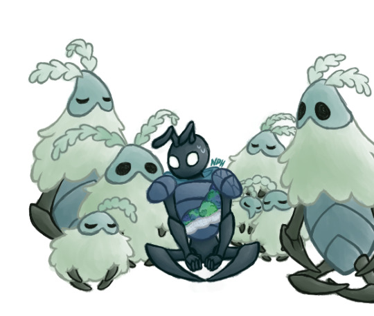
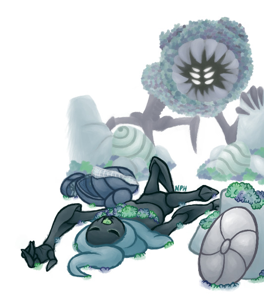
#I actually really like drawing lineless it looks so good
Note
Hello! I love your use of geometric shapes and saturated colors in your illustrations. Which artists influence your work?
Honestly while I can name a lot of artists who serve as some sort of inspiration for things like creature design or color, I can't really place ones for specifically the geometric aspect! I'm sure there are some out there, but I think a large part of specifically that is probably just me personally liking balanced/clean/symmetric stuff along with most of my sketch papers growing up being gridline paper, so doing sharp geometric shapes was common. I also tend to think of my lineless art as similar to layered paper art, which has to be physically cut out. Its sort of one of the reasons I reuse colors often? Like you'd reuse the same piece of paper
Color wise I pull a lot from my friends, save a lot of art I think does interesting stuff with colors, etc. Generally I might skip through a couple artworks for a good "starter" color or a palette I like and go from there, adjusting it for personal preference. All the parts are drawn in little individual bits, so I can change them all independently. So often I have colors in mind at the beginning, but don't actually pick them till the very end. Here's some pieces to show how that gets fiddled with

And if you go back far enough, everything starts as a yucky mash of whatever colors made it easiest to tell one piece from another with zero regards to palette
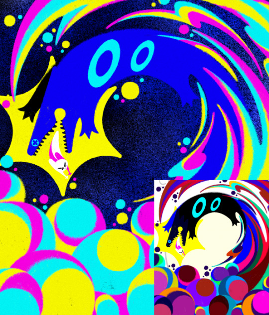
I just really like bright saturated colors and honestly just kinda feel it out from there. Sometimes that's making it brighter sometimes that's making it a little more washed out. Sometimes I decide what I was going for doesn't actually look as nice as I thought.
It's sort of hard to name inspirations directly because so much of what I do I do effectively by feeling, and I have piss poor memory so naming exacts is real hard. If I tried to list people whos art I think about a lot we'd be here all day. I know a lot of my recent stuff has had more direct inspo from Boxheadpaint who has just amazing shape language (but almost the exact opposite of 'geometric' but I try and match their vibe a lot when I'm trying to draw a little looser and less stiff. Also looooove how they texture stuff)
19 notes
·
View notes
Text


What if Tigerstar wasn't the one who murdered Redtail?
What if he was...
Framed?
A warrior cats au where Darkstripe mentors Ravenpaw, kills Redtail, and tasks Ravenpaw to frame Tigerclaw for it.
#Wc au#Warrior cats au#My au#Ravenpaw#Darkstripe#greystripe#Fireheart#Firestar#Tigerclaw#Tigerstar#Warrior cats#Framed Tigerclaw au#I actually really like drawing lineless it looks so good
492 notes
·
View notes
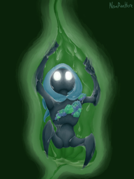
Photo
He dunked up (Patreon)
youtube
#My art#Adventure Time#Fionna and Cake#Prismo#He's actually really fun to draw haha#It probably would've been easier to draw him as a vector but eh! Sometimes you gotta hand draw a lineless guy#That's actually what I did with his word bubble - turned out cool right? >:3c#I downloaded that font years ago and like never use it but it feels like it suits him#Finally I can utilize it somewhere lol#I was close to considering the Mr. Saturn font for him tho haha#He was mostly just a warmup while I worked on other stuff - a simple and fun intermit!#I'd been drawing him a bunch interacting with Simon so it followed that I had to draw him with his facial hair lol#And eyebags but tbh I kinda just draw him with those anyway lol#They're a good look! They add to his expressions quite a lot#I like leaving the eyebrows off AT characters as much as I feel I can get away with - clearly not here tho lol#He's fun I like Prismo#I still like AT!Prismo more than F&C!Prismo I think but he only got So much screentime - it's understandable#They still did a good job with him tho
12 notes
·
View notes
Text
oh my god i forgot how awful drawing lineless is
#draw the new mn chapter scenes lineless they said#it'll give the art more EMOTION they said .#i got one of my many ideas down on a canvas . one#bc it was lineless and took SO LONG#it looks good tho . i actually really like how it turned out#will continue tomorrow hopefully i can do the other ideas i have#< likes drawing sweet and also likes drawing angst#prince thoughts
1 note
·
View note
Text
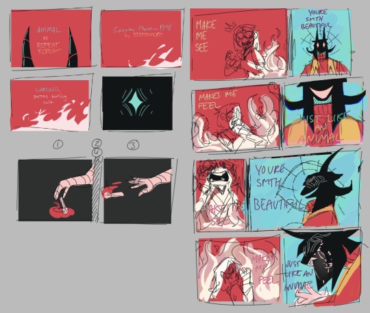
CONCEPTS AND RAMBLINGS | "animal" cult pmv extras
thank you everyone for liking my pmv (and on yt and twitter) !! i got more attention than i thought it would and that means the world to me! <33
here’s some of my concept art + rambles for it!

the first thing i made up, the character designs!
i didn’t think to refine them because they were good enough to use LMAO... so i scribbled colours down, threw a filter and called it a night
i wanted a sharp change from the verses and chorus (since the song goes from calm to... louder) so i made it greyscale (with a red filter) that changed to brighter colours!
also changed the text font/colour for ignacio hmm. the font was hard to read, in my opinion.
ignacio's design
ignacio loses his bandage colours because that was too many colours for my liking… i completely forgot his hair highlights tho
ah and he doesn’t get a mouth until the fire scene too…
it was only meant to be done for a few frames but i thought it be cooler if it was consistent.
the missing mouth represents his repressed feelings/silence, or something like that.
skidad's design
i got a few questions on whether skidad was a goat. despite looks, skidad’s design is actually based on the herbiadean/jacob sheep! four horns!
i have drawn skidad as a jacob sheep before as well!

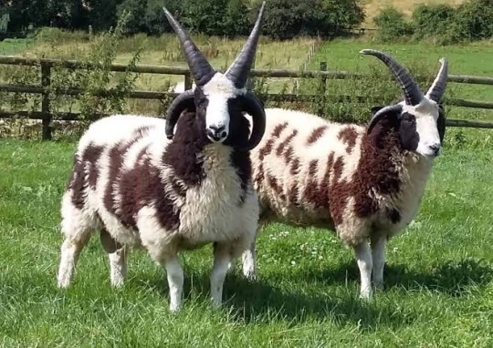
look at them ominous friends.
the resemblance to goats is something i considered as well (links with cult/sacrifice) so i think of it as a fun bonus
i gave him wolf teeth because the whole “wolf in sheep’s clothing” but also because i like it when prey animals are given predator features
i left the body as "human" because i only wanted the face to be censored… i considered clawed/darkened hands too but nah
skidad was originally going to be lined like ignacio, but i liked the lineless look for him so voila! makes it feel like he’s “not bound by anything”... actually, this is the same reasoning for the match to be “out” of the border, even though it’s ignacio’s hand
storyboards
i rarely storyboard (most are locked in my mind) but i figured it'd be fun to try!
halfway, i got bored of drawing digitally so i moved onto my notebook. i think it was a good decision; since i drew with my ink pen, it forced me to move on with my mistakes instead of clicking "clear canvas" lol
i had a pretty solid idea of what i wanted after weeks of listening to the song over and over again. the only thing that really changed was the mirror, which was replaced with a shadowy ignacio
the coloured thumbnails i actually did first, just to figure out out what i’m doing for the chorus part… limited palette my beloved
i didn't know where to put the text so i was scribbling everywhere lol

ratio changes
in the chorus, the ratio of ignacio and skidad’s frames changes! it’s more obvious if i combined them together, like this
less for ignacio, more for skidad


did you notice that the fire in this shot look like the cult ?!!! why did i do that, you ask? well:
the fire is the same “red”as the robe
too lazy to draw fire without abusing motion blur
mmm symbolism idk. it's somewhere there
it wasn’t in my plans but i’m happy i made the choice in the last minute. this was the last thing i needed to finish before syncing it up with the music

also this… i just wanted to point it out… make sure everyone knows... did you notice this? did you? did you did you? well now you do!!!
that's it !!! that's your trip into my mind!! okay byeeeee !!
#even though i gave my own reasons; i welcome any other interpretations!#/gen !! i'm very interested to hear! throw an ask or in the reblogs!#[ mourn's mourns ]#[ mourning pmvs ]#[ the art of mourning ]#spooky month ignacio#spooky month skidad#not apologising for the absolute chaos of my writing... its rambling for a reason........ /J LOL#i won't be free from skidad videos ough#but now im starting university so i guess they won't be out anytime soon HAHAHA#hope you enjoy reading this!
49 notes
·
View notes
Text
Yuri!!! On Cards collaboration!
So, I know I've been pretty inactive recently, at least in posting my own art but for good reason! In the Yuri on the Web Discord server artists and writers alike have all collaborated to illustrate a deck of cards and write stories for each of them. And as a resident artist myself, I couldn't not take the opportunity to draw for this project UuU
Oh and if anyone was wondering, yes, I am to blame for inflicting this giant project onto the server BUT I REGRET NOTHING AND NEITHER WILL YOU IF YOU CHECK OUT EVERYONE ELSE'S WORKS. Trust me, they are amazing! The masterpost can be found here!
GIANT thanks to @lines-on-ice and @yaoiconnoisseur for helping so much and being amazing co-administrators and basically making this entire thing possible! You really saved me from my own overambition XD
The guidelines for this project can be found on the Yuri!!! On Cards blog as can the masterpost with all the links to everything. All the art that gets posted to Tumblr will also be reblogged by the blog.
With all that said, here's the actual art I made! (Break for those who don't want their dash to die UuU)
Okay, I lied. First, I'd heavily recommend for you to check out the guideline posts, both the general and artists' and even the writers' if you're up to it to get a grasp of the perimeters of this project. There's also some vague lore and AU stuff about the whole thing to find which will give you context for why the art looks the way it does to a certain extent.
You can also just jump right in and take everything as I ramble about it which, I mean, I won't stop you, the guideline posts aren't short. I will not blame you. You can still just look at the art. If that's your choice, go on ahead!
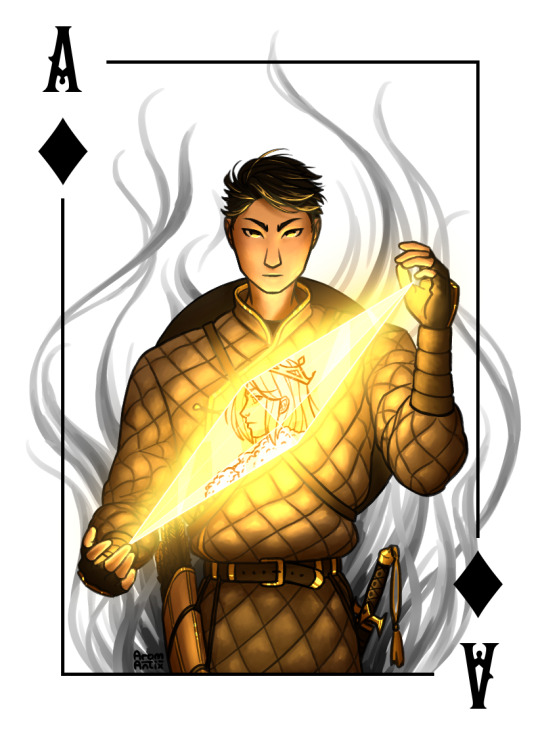
First up!
Ace of the Kingdom Otabek, The Deep Shadow
Being of the Kingdom of Diamonds, he's skillful and sharp. He moves quietly as a shadow and is just as mysterious.
Okay, I can't comment much on how he actually is, you'll have find that out by reading his fic(let?). They were supposed to be ficlets but as writers tend to do, none of us could manage that so take "ficlet" with a big grain of salt for every written work.
I've, by the way, not read any of the ficlets for this project beside my own so I'll get to experience the reveal with y'all and I'm gonna perish waiting.
Anyway, about the art. The yellow of course comes from the Kingdom of Diamonds' designated colour. As for the outfit, it's based on this handsome fellow I found who's supposed to be a Kazakh archer which I thought fit Otabek's whole shadow thing perfectly (and Writingfromtheshadow's fic Equivalent Exchange has me in an iron grip and I don't want to be released).
If there are any Kazakhs in the audience, you are free to laugh at me for any inaccuracies or missteps, I am but a humble little not-Kazakh, I don't expect to have gotten it all right UuU
Next up!
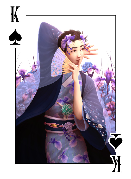
King Yuuri, Wanderer of Dreams
The ruler of his realm, he is as the mind flows. Kind and benevolent yet of fickle thoughts, the spirals of the subconscious are ones he both masters and bows to.
Again, gonna be waiting for his fic with everyone else but like. It's Yuuri. Anxiety is kind of a given.
In terms of art, I don't know if you can tell but this was where I started writing my will because oh my stars, what did I get myself into. If you follow me or my art, you'll know that I don't draw lineless. Like ever. And apparently I decided this project on a deadline that others were depending on me making look nice was the place to go all out.
And the worst part is that I'm not even mad at it so I have no argument to not do it again.
Anyway, the blue is from the designated colour of spades and yes, you've guessed right as to why this colour was picked for this suit. I'm predictable, leave me alone. As for the rest, the outfit is inspired by traditional Japanese dress that the Internet told me about (again, Japanese may laugh at me all they want UuU Your culture is very cool but also there was so much info, I hope I got it at least a bit right).
Also I spent like eight hours looking at hanakotoba for this and I've never been this happy about a decision I regretted so much while I was having to draw that many flowers. And you know I had to include The Gay Flower^(TM).
The Japanese iris is now Yuuri's btw.
All the flowers used are: Japanese irises, Jasmine flowers, Forget-me-nots, cherry blossoms, white roses, green carnations and blue roses (Viktor's flower. Read: I am predictable).
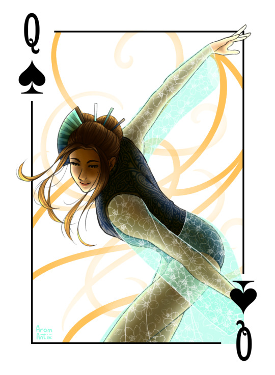
And finally!
Queen Minako, Tamer of Minds
Of the Realm of Dreams, she sees your fears, the snares laid by the subconscious and, strict and blunt as she is, she clears a path for the motivated and lets no potential go to waste.
Again, haven't read a word of the fic.
This one was by far the one that I made the fastest and I would've loved to do more with it but like deadlines. I'm gracefully skipping over the fact that I set the deadline and am fully to blame for being late.
But, as with Yuuri, blue is for spades. And since I wanted her to have a leotard but still match Yuuri and make her outfit look even slightly Japanese inspired, sheer fabric to the rescue! With cherry blossoms, of course, because CSP had the pattern preinstalled UuU
And I don't know if it worked but I tried to make her hair both look like her signature style, traditional Japanese hairstyles I found on the good ol' Interwebs and then kind of a spade by having that middle stick be the stem and the hair the spade's butt.
Also this probably goes without saying but the ranks of the characters are just titles. Yuuri is not married to Minako, she is just the Queen and he the King, don't worry.
Again, a BIG thank you to everyone who also participated, it was so fun to work together on this and see everyone's progress! Nic and Lil, you're amazing, thank you so much for everything you've done for this!
And to everyone who's made it this far, thank you for sticking around and please go check out all the other art and the ficlets! I promise it's worth it!
Masterpost | AO3 collection
#AAAAAAAAAAAAAAAA this project almost killed me#i am so infinitely happy about everyones contributions they are so lovely and i am gonna die happy now#but seriously what idiot decided to try a new and more detailed rendering style on a deadline#its me#i am that idiot and if i had a time machine past me would have gotten the fattest slap#idk if im ever gonna do that again but if i know myself at all itll happen because this wasnt disastrous enough a result to dissuade me#and most of it im pretty happy with#also i had so much fun with otabek#i got to play with light and texture and light and those smoke tendrils in the back and light and that fabric and light and#also rendering minako was a BLAST even if i churned her out on severe sleep deprivation my only energy being spite for my own mortality#oh and yes it was a this we decided that the aces should somehow incorporate the king of the given suit so the anger kitten is there#in otabeks i mean#now ON TO ANOTHER PROJECT#THATS... ON A DEADLINE#UH#yuri on cards#yuri on ice#yoi#yuri on ice fanart#yoi fanart#fanart#art#arom antix art#arom antix#otabek altin#katsuki yuuri#okukawa minako#collab
60 notes
·
View notes
Text
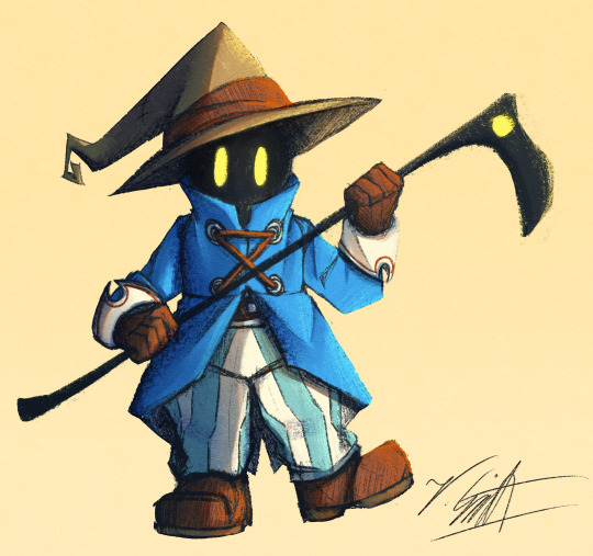
I've crawled out of my cave after playing Final Fantasy IX for a long ass time what have I missed?
Artist's Notes:
I'M BACK BABY! A while back I made a post with a new style experimentation thingy but I ended up deleting it because it was just kind of a boring face thing, I was planning on doing more art but then I started playing Final Fantasy IX and uhhhh yeah so that game has kind of taken of my brain for the past two weeks and I am 20 hours into the game because I love it so much. I wanted to draw Vivi because Vivi is just really fun to draw ok? I've kinda been feeling really burnt out with my lineless style, mainly because of how hard it was to do lighting. I'll show one of my initial art style tests on the bottom of this post. Again, used to have it be an individual post but it was just one face so it was kinda boring, so might as well include with this one on the subject of art styles. I wanted to kinda mix some aspects of my older style with the sketchy shading lines with a more painterly way of doing the lighting (mainly in the shadows). All in all, I think that's my favourite part about this drawing, it feels nice to finally be able to do some proper lighting again, and I want to experiment even more with my lighting and rendering in future pieces. Also, part of the pant shading got kinda lost in the sketchiness, so for next time I'll probably focus on the clarity of the more sketchy parts of the drawing, since I did go with my initial sketch for the final drawing. I also gave up on the background since I had no idea what to do for it, and I didn't put too much detail into the staff as I forgot which one I gave him in my current playthrough and I didn't want to risk spoiling myself via looking up references, but that's ok I like how the singular yellow circle on it matches Vivi's eyes. Also I was having a bit of trouble figuring out how to draw his body and how to pose him, but I like how the pose turned out a lot. It was inspired by his idle animation when in a battle in game where he does a little shimmy.
Ok I need to talk about Vivi's design because I love it so fucking much oh my god-
I absolutely love how his face is just in complete shadow and only his eyes stand out, it's so cool and unique and I love how they recontextualized the original black mage design from the classic Final Fantasy games. How they did it I won't say because I don't wanna spoil the game, but someone give this poor baby a therapist because he goes through a lot. Actually, same can be said for all of the FFIX cast, they all need therapy (again, I won't spoil anything, please go play the game for yourself).
While I do love almost all the characters in the game, even though Vivi is most fun to draw, my favourite character has to be Zidane (the main protagonist of the game). He's a really fun protagonist, and they could have easily written him as a misogynistic jerk who doesn't respect women but they didn't, and I really appreciate that. He's just an overall cool dude who's a really nice older brother figure to Vivi and also just has a cool character design (who I also want to draw eventually). Initially in the game I was planning on grinding levels for Vivi to make him the tactical nuke of the party, but then that title went to a different character (who was initially multiple levels behind the group since I grinded the party in the starting area way to much before they joined, but now they are two levels ahead of everyone and have pulled the team through a lot of tough battles, again I won't say who it is because it is kind of a spoiler and the way the gameplay actually ties into their character arc is just so good omfg). Once I eventually finish the game I'll probably write a full review on here, so no spoilers until then lol
Also, I've kinda been burning out a bit with making Touhou art, which also made me a bit burnt out with Touhou stuff in general (although I will continue keeping up with the manga) so getting into other things (i.e. Final Fantasy and even Fallout since I've watched the first season of the TV show which is a whole other post for another day) has helped me refresh and given me something new to think about. I've ended up in the exact place I feared ending up, where I would start drawing fanart for it not because I wanted to but because I felt like I had to, so I'm taking a bit of a break. When I do draw Touhou fanart again I'll try to draw for the sake of myself, and to all the other artists and fanartists on this platform (and on any social media for that matter), take care of yourself and don't forget to take breaks when you need to!
(Ok part of that last paragraph was definitley influenced by the good ol' "it's 9:00pm and I need sleeb, but the message at the end still holds up, always take care of yourself)
Oh yeah, and here is that one style experiment I did btw
Man I really fell down the "Yoshitaka Amano art enjoyer" to "Final Fantasy fan" pipe line didn't I?
8 notes
·
View notes
Text
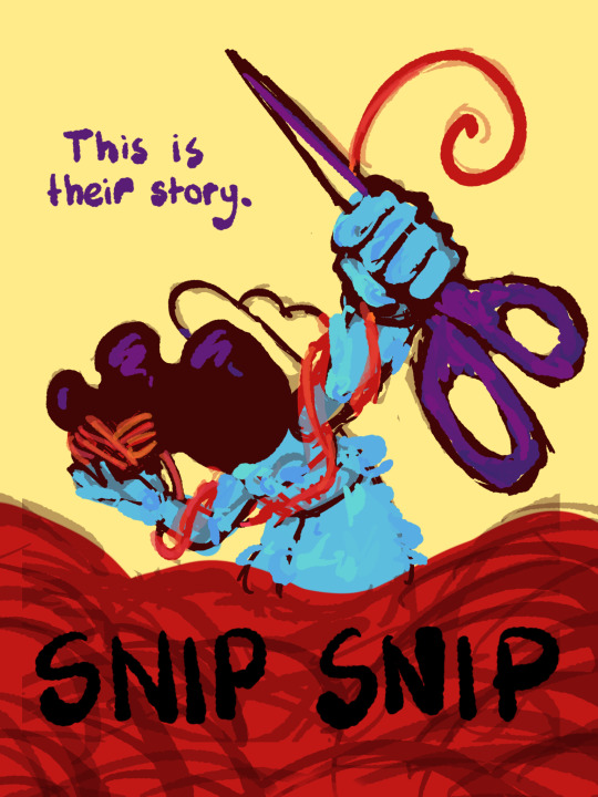
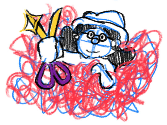
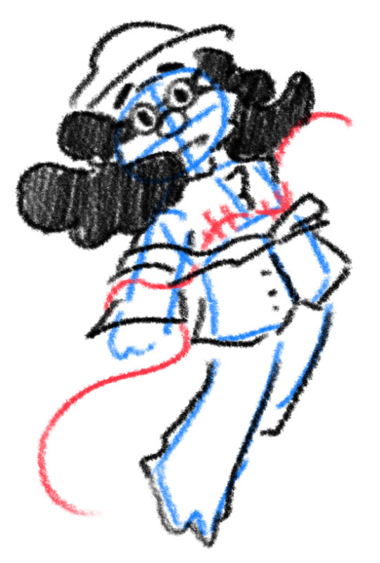
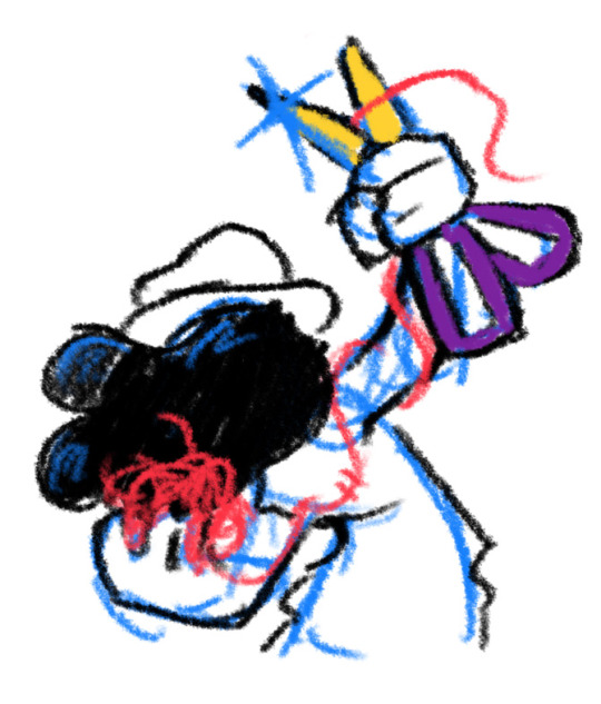
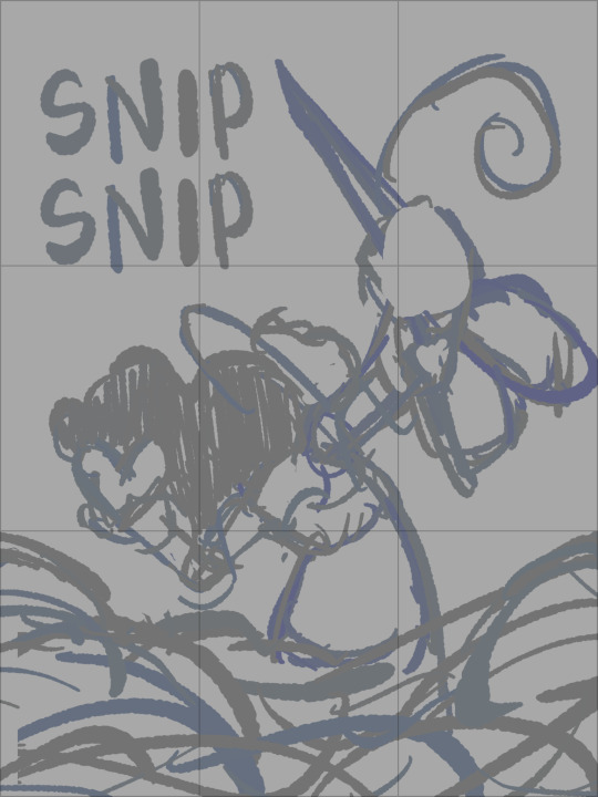
I thought I'd share the sketch of this poster/book cover as well as my initial concepts! You can click the "Read More" button for more in-depth explanations on my design process.
Thhis is all for my latest fanfiction, Snip Snip, so if you'd like to check that out, then...
Now let's crack in!
For the release of "Snip Snip", I actually had several different directions in mind! One was a comic of one of the scenes from the fanfic—specifically the one where the Professor breaks down in front of Kate and Joyce with the line "I don't like being a woman"—and the other was a series of doodles showing the Professor's transition. Unfortunately, both directions met dead ends as I couldn't find the motivation to do either. The most progress I made were these sketches.
If you're wondering, "The first one looks familiar..." that's because I reused that pose for my first promo art! It was too good of a pose. I couldn't waste it :P
But anyways, after a period of getting extremely frustrated over the lack of progress, I realized my main problem: I was biting off more than I could chew. I didn't know this at the time, but I was dealing with burnout from school assignments that made drawing more ambitious ideas like the ones I had very difficult. Hence, I had to scale it down. It made me think, "Why not do something like a movie poster or a book cover?"
That's how the sketches at the top of the post came to be! I consulted a friend of mine over which pose to choose, and he picked the third one which I understand why so. The obscuring of the Professor's face not only made it cool, but it adds symbolism in how we don't really see his true identity—the real him—until his transition. Here's the first sketch!
As you can see, the title is on the top left corner! However, I moved it to the bottom for two reasons
It's advice I learnt while looking up how to make movie posters since moving the title to the bottom tends to bring more focus to the illustration above.
I couldn't find a font that fits! And the idea of doing typography again (especially after the Keep Yourself Safe poster...) was really not what I signed up for.
But then it left the problem of the top corner looking empty. It was too distracting! So what did I fill it in with? The subtitle: This is their story. The composition is now more balanced, and also the subtitle tickles me.
As I said before, I looked up movie posters for this! Special thanks to the Nashville Film Institute and Muse by Clio for their articles that guided me during this poster making process. I will say though I got really sidetracked watching Filmmaker IQ's The History of the Hollywood Movie Poster 😭 It's really interesting, I'd recommend watching it!
One thing I learnt is that movie posters limit their colour palettes. Of course, this is good advice for art in general, but movie posters emphasize on its colour usage to attract the audience with their simple yet bold schemes. It is a piece of advertisement after all! Following their footsteps, I limited my colours to the primary colours (red, yellow, blue) and purple to make the scissors pop and allude to the nonbinary flag colour scheme.
And from there, it was just a matter of experimenting with rendering! I wanted a mix of pop art and storybook illustrations, so I mixed lineart with lineless, and I wanted to retain the energy of the sketch while still polishing it, so I cleaned the sketch, merged it with the colours, and painted on top of it rather than make a separate lineart layer.
Overall, I'm extremly proud of the end result! The struggle of figuring out the promo art for this fic has been tormenting me since the beginning of the year, so I'm glad to bring it to an end. Thank you for reading my ramblings! I hope you learnt something or at least had fun? Either way, have a good day!!
#this truly has been a rambles moment#i really really recommend watching that video by the way it is FASCINATING#the professor#shane madej#puppet history#poster design#art process#design process#art#artists on tumblr#sketches#concept art#chris p fried rambles#chris p fried art
8 notes
·
View notes
Note
Hello Red! I'm happy to say you've inspired me to start drawing comics, but the biggest issue I've encountered is that it takes actually forever. I'm always really happy I did it when I'm done but it's hard to convince myself to start when I know a couple panels is gonna take me days. So I was wondering if you had any advice regarding streamlining the process for time efficiency or keeping up motivation for long projects, and, if you remember, how long a page took you when you first started vs how long it takes now?
Hoo boy. Yeah, I can help out with that. The very first page of the comic took me, if I'm recalling correctly, a full week. No other projects or pages, just this.
A lot of work went into details that are frankly impossible to see, though I am still glad I did it, both as a learning experience and because I felt like I owed it to Vash to do it some justice before I squished it in twelve pages.
Hell, if you look closely, you can even see the cavalcade of little visual errors I missed because I didn't have it in me to do a seventeenth cleanup pass after a week straight of drawing tiny houses. Getting faster meant I'd have more energy left to polish the pages and get them looking nicer.
The process of getting faster has been kind of a fits-and-starts situation. Drawing that many humanoid figures over and over again eventually means you just get better at the parts you're less sure of, so the process of lining the pages has gotten rather faster since I don't need to burn as much time getting the character poses and lines right. Currently, depending on page complexity, I can fairly consistently get 3-5 pages fully lined in one night. Backgrounds have also gotten faster, and I tend to do those in large batches, sometimes filling out entire chapters with location backgrounds and skyboxes because the scene location isn't going to change and that makes it easier to keep it consistent.
Initially my backgrounds were both more complicated and worse-looking, which is a bad combination.
I ended up deciding between chapters that painstakingly lining a bunch of background trees probably wasn't worth the effort, and worked on finding a shortcut that would work better. I ended up doing something a little more lineless, a shortcut I initially discovered because I didn't want to plug in my drawing tablet and was playing around with things I could do with just my trackpad.

It was simpler, faster, not too jarring, and it meant my clearly-lined foreground figures were more naturally visually separated from the distant background. Win-win-win.
For the style of coloring I do, I tend to shade before I add color, though this is a shortcut I didn't figure out until something like chapter 6. This process is also pretty fast, all things considered, though I've had a lot of practice doing this kind of cel shading which is why I can hammer out a lot of pages' worth of shading quite quickly.
I like working in batches of about one scene, often broken up into subgroups of 4-6 pages at a time, so I can't give a front-to-back turnaround for an individual page - but I also think this kind of assembly-line process has sped up the process overall and makes it more fun for me, because I can storyboard basically as far in advance as I want to, which in turn makes it easier for me to motivate myself to keep going, because I know there's all kinds of good stuff I'm looking forward to drawing down the line. There's some good shit I'm excited for in Chapter 21, and bursts of enthusiasm on the storyboard end of things often translate to enthusiasm on the page-finalizing end which makes it easier to slog through even the tedious bits.
As a bonus, working ahead means the story's got a better chance of making sense and having good pacing when it's read back as an archive. Another win-win.
Overall the greatest optimization tool I can recommend is just working on the project. There's no better way to identify the parts that feel unnecessarily slow and could be changed, or the parts of your art you're unsure of that need polish to get more speedy. If you're planning on publishing the comic anywhere, I recommend building up a buffer beforehand - something like the first chapter (or in my case, first three chapters) will give you a very good sense of what parts need more practice or improvement as you move forward. And it is genuinely easier to motivate yourself to continue if you have an audience giving you positive feedback and/or panicking at what you're doing to their darlings.
193 notes
·
View notes
Text


Hooooo that took a while- I mean, uh, woah, more art! Started this sort of reference sheet thing like a month ago or so, been working on it very sporadically, and brain kept wanting to add more details and shading so it kinda just kept going and going. but hey, twas fun! and I got some more experimenting in, this time with not actually having proper shading and highlight layers and instead just messing around with the brush opacity
So anyway, it's plant boi. Or Moss!T/iso, as I've been calling him. Sort of just to show how I visualize him, and also what he's been up to since his, uh, revival. tho of course the internal there is from while U/nn was still healing him
And also a bit of a teaser for what should be my next fic! Admittedly, I haven't been working on it as much as I'd like to, with college stuff and also working on the art here. for now, enjoy the snack until I can finish the meal ;) (also click for higher quality, I worked hard on this ;w;) (like seriously the Hunter's hood took hecking ages and for what)
and look below the cut for an extra treat~ (warning for fearplay)
oh gee, wonder what happened to our boi here. merhaps a follow-up to that last image? either way, rip Tiso (he'll be fiiiiiiine)
seriously this was supposed to be a quick bonus sketch but as soon as I started coloring in the face and leaving light around the eyes I was doomed. ....WAIT SHOOT THE LIGHT- okay fixed. the colors really do look way better on my drawing tablet than my laptop screen huh
here is the undarkened version
aaaaaaand lineless. because I went out of my way to make sure it looked good without the lines :>

okay that's actually it now eheh bye
—————————————
DNI NSFW blogs, blogs that post exclusively hard and/or fatal vore, weight gain blogs, mpreg blogs, proshippers, TERFs, ace exclusionists, etc.
#soft vore#safe vore#extreme cuddling#g/t vore#half size vore#hk vore#hk spoilers#fandom vore#vore art#my art#tw bugs#fearplay#yeah that's probably enough
131 notes
·
View notes
Note
HOO you don't have to respond to this bc I'm gonna RAMBLE but I just wanted to say thank you so much for making this game. I remember when it first came out years ago, I love dating sims, but I had never seen Gravity Falls before. I thought "aw man, if I play this, a bunch of references will probably go over my head huh" so I decided to actually sit and watch GF, I binged it and managed to finish the whole series in about two or three days. I wouldn't have taken initiative to watch the show at *all* if it wasn't for this dating sim, but I sincerely love visual novels more than anything else in the world, and I am so glad I watched the show. I really enjoyed it. Now, years have passed, I decided that I wanted to replay this dating sim again today, but it'd been years since I'd played or even watched the show and I didn't remember much of anything at all, so I rewatched again and fell in love like the first time. I'm pretty sure I sped through the episodes in less than five days this week because I was so so so excited to play this game again. I smiled SO big when I heard the music after opening the title screen. Felt like coming home.
I can tell a lot of love was put into this game. I've tried making dating sims before, just personal ones for my own self indulgence with my OCs and such, and like... dude, it's so hard! Making games is hard!!! Pushing yourself to actually finish a game is hard! Not to mention coding, that's like a whole other can of worms more tempting to never open. So the fact that you finished this game is impressive just in itself! Not only does your game seem so in-character, making it so easy to read everything in the character voices, but it's got such expressive sprites!! I cannot tell you how many otomes I've played where the sprites are just one plain expression with maybe 3 different eyebrow angles and just a switch between a smile and a frown. But your sprites really move!! The body language!! Oh my god. The way the sprites are colored to fit the setting. Like their coloring is darker if they're outside, and even tinted red in the sunset backgrounds. I literally just sat and stared at the screen when that first transition into nighttime happened and you see the characters matching. I was so impressed. Even Stan's hands in his pockets change when he bunches his shoulders forward ever so slightly. The attention to detail is amazing. The outfit changes too!!! Ahh!!! :D
The illustrations. Wow. Just.. man, please let me ramble about the CGs, they're gorgeous. The brush strokes look so so so soft and the fact that so much time was put even into the backgrounds... lineless and so clean... every few minutes I take the time to just stare at the artwork. I rarely draw backgrounds because I find it so difficult, and anyone who has the patience to make backgrounds and also paint is really admirable to me. I'm so blown away by the art in this game. The illustrations are magnificent. There is genuine fondness and joy in their eyes in each drawing and it's so pretty to just [parks and rec voice] this is beautiful, I've been staring at these for 5 hours now
I'm so happy to have found a fan-made dating sim who is not only true to the characters, but also slowburn. It feels real, making a genuine connection with these characters at a steady pace, not rushing into things. And maybe this is just because I'm ace, but agh, I can't tell you how refreshing it is to play a game where I don't have to do anything raunchy to get a good ending... like, I've played so many dating sims, it's one of my favorite things to do, but it's always a little bit disheartening to only get a good ending if you do something sexual, from the perspective of a person who. well. isn't! And when I replayed this game today, I remembered "oh yeah... I don't have to worry about that sort of thing" and it also makes me feel more lovable because... well. ahh this might sound dumb but it made me feel like these two would really truly love me, not just despite me being ace, but maybe even *because* of it? It was so refreshing, I'm sorry I'm not the best with putting things into words but I hope I was able to phrase it clear enough to state: I am really, really grateful that this game is made the way that it is, that someone like me is able to play it without any worries. A huge lift off of my shoulders. I can't tell you how many otomes I've played where I've gotten a bad ending or a neutral ending just bc I didn't sleep with someone. Playing this and just having pure fluff and kisses (with a bit of the steamy makeouts on Stan's route? heehee) Hoooo, that was perfect, that was just perfect.
This message is getting so long fjdhkfh I'm sorry I was gonna ramble more about how much I love the game like, the dates, how the dates are very fun to play bc there's such a variety of things to do that makes you feel like you're really in Gravity Falls, and I love how you get to interact with many more characters on the side without it distracting from the main storyline, like interacting with Dipper and Mabel and even Dan and Susan, things like that! I love the little mini games like boxing and playing dungeons, I love that you have to really work hard to get the perfect endings and that Ford takes a little more time to open up about his feelings - hell, I love the little detail that you have to encrypt the codes to get their walkthroughs!! That's such a cute little touch! This whole thing couldn't be more perfect. I adore everything about this game, it's very dear to my heart. You've all put so much love into it, I don't think there's any other fan-made games out there for any other fandoms I'm in, at least to my knowledge, that are so well put together. It's one of my favorite things and I love replaying it at least once a year. Thank you for making me feel like these characters would love me, it helped me through a tough time lately, I've been in and out of the hospital for a few months and this game gave me some much needed comfort today. I hope everyone who worked on this game is doing well right now. And know that there is some random person out there on this planet under the same sky as you, who is always going to cherish the love put into this game, forever, always gonna have a special place in my heart for it and I am so thankful it exists 🥰💙
i love that you noticed so many details about the game!
reading this felt like looking into a mirror a couple times--i've had a similar experience with vns/dating sims, though for me i gave in and stopped playing them bc it felt like while i loved the genre, it never loved me. i've felt those thoughts and worries myself, so i'm really glad you can just relax with this one!!
thank you so much for sending this in :') i hope you're doing well right now too!
62 notes
·
View notes
Note
Both actually! I was mainly wondering how character shading works for lineless art among how you do backgrounds. I've been trying for ages to ask someone, just didn't expect to ask a furry but a good artist is a good artist! So I would love to learn some skills from you.
Just as a caveat, I don't really think of myself as an artist-- I'm not really aspiring to make a career out of drawing or anything. I'm more of a hobbyist who has picked up a few things along the way. As such, I'm sure that the more serious artists out there can offer more efficient or straightforward techniques for this sort of thing.
Anyhow, here's a lineless character sequence. If Tumblr shrinks the image, you can view the full size here.

Now, that rigamarole is for if you're drawing freehand. If you're looking for a more sleek and minimalistic style, I'd recommend using vector art. With vectors, you can skip the lines entirely and just mash together shapes to make a fitting silhouette. Then add shading to define it as needed. This simple Zangoose only uses four pieces of shading:
Also note the common lineless shortcut of simply making the limb that's farther away darker than the close one.
I actually find that, with vectors, going lineless is faster and easier than using borders. If I had wanted to retain the borders on the below Lopunny, I'd have to go through and block out the seams between the different segments of the arms and ears, which is tedious. By removing the borders, I can skip right to shading.
Like with the original tutorial, it's a good idea to keep the lines around until you have a good idea of where the shaded areas are going to go.

That's what I know about character shading. I'll try to put something together for doing grass and such soon.
8 notes
·
View notes
Note
ALL the artist ask game questions. ALL OF THEM-
omg yes hold up
1. uuh krita, fire alpaca (i used to use fire alpaca but not after getting csp)
2. left? i think? i can draw all directions (-ish) (it wont be good but i can)
3. none?? idk bro i have bad memory (or maybe i suppress them idk)
4. anything from canon media. like i love you boo but why. also clothes and poses
5. i post very little of my art actually lmao whoops. very busy lately but might start posting art again if i remember
6. my hyperfixation at the time. or well, me. also art tutorials i see on pinterest, though that's a bit more conscious i think
7. SCULPTING TRADITIONAL PAINTING GRAFFITI all so cool amazing wow
8. there's so many that i cant even remember jesus christ-
9. everything is keysmashes. i do not name my layers. i am satan
10. mm i actually like drawing shirts i think?
11. music. fun fact i listened to paranoia on loop for over a week. thats what brain rot does to a man
12. uuuh hhand
13. i really dont know. every thing is my thing. every creator is admirable in their own way. love everyone. commit crime
14. death? eldritch horrors? blood? rot and corruption? yeag the good shit
15. my room. at school also because im studying animation and game design
16. making. sprite sheets. for 2d game.
17. i usually have a tea nearby but i always forget it. i kinda drink it halfway when it's still warm, then forget about it and then when i go back for it it's cold so i just chug it all and go get a new one
18. uuh i'd say like? 10? im very gentle and loving with my stuff uwu
19. no. i do not. ok but maybe like. cloth idk.
20. hands. idk bro i drew them so much at one point out of spite i just kinda got good at it and now i just wing it and it looks good and doesnt require much thought. and if it requires thought it's in a funky position but then i just wrangle my own hands a little, inspect it, and then continue to draw
21. lineless, painting-esque, thick lines, realistic, sketchy... yeah good shit
22. nah man i just go straight for the laptop
23. uuh sometimes
24. im satan i dont use references often. but when i do? yeah i think
25. i havent been told so idk
26. i. dont really intend anything on purpose? so when someone interprets something wild i just kinda go "yeaah sure! idk either!"
27. Dno. straight for the art. might doodle thine truly if im not in a hurry
28. nah, but i'd like to! i've made art for two 2D games in the past year and now there's a 3D one in the making. im charged with making the 3D model for our main villain thing and boy is it pain
29. bold of you to assume anything doesnt inspire me artistically (he doesnt know)
30. thats a great question i have no idea 👍
#i should be arting but i answering this instead whoops haha#i needed a break anyways so its fine#ask chilei#my beloved mutual#somebody (once told me) my beloved#chilei's on skooma again
2 notes
·
View notes
Note
Hey, I adore your artstyle mate, I loveeee all the vivid colors and the fact that most of it lacks lines?? You doing the hard stuff, but it paying off 💜
can I ask, as I’d like to get into comic making, how long does it take you to finish a a single panel?
Hi!! thank you very much!!
drawing lineart is incredibly frustrating to me so im very glad i was able to make the jump to mostly lineless artwork, tho im very much still at the beginning to learn how to do it xD
to answer your question, i .. cant say really, it depends on what is on the panel, and i always jump around when working on a page, i draw half of the very last panel, then jump to another, maybe i see something i want to change right away and work on the third
besides i ... dont know anything about panel composition, i think in movies so i play it and try to pause it on a frame that could work as a panel, whichs is probably why it goes alot slower than normal comics, idk how much to skip gndfjknvgfdjk
im by no means an expert in making comics, you kinda have to find your own way of what works for you, i have done many in the past but all failed, i gave up before getting even one chapter done many times
general advice i can give you is, most importantly, dont wait, i know its daunting to start, but you have to start, even if you dont think you are good enough, you will always change and improve anyway, better start now or you might do it never, and remember, when a page is done its done, i know how tempting it is to go back and redo it, but if you start with that it will only lead to an endless cycle of remaking it over and over
a cause that made me abandon my old projects, was partly lack of support/recognition, but mostly that i was forcing myself to things that werent fun, like one i made in black and white bc i thought you had to do it bc color takes too long, but i live for colors, so it drained the fun out of it immediately
the only "rules" i have set for myself is that its understandable, the flow of the action doesnt flip around too much, speech bubbles are aligned in a way that guides you (of course im not perfect at that either and always learn);
i dont jump between pages, i jump between working on panels, but i dont start another page before the previous is at least acceptable, otherwise id get ahead of myself and get impatient, just wanting to skip ahead and neglect older pages;
and that i only work on a panel/page as long as it has acceptable quality and is fun to draw, when i notice im getting bored or frustrated i finish it quickly as best as i can and move on, otherwise it might drag the entire project down, which is why each panel or page in 'Destiny' varies alot in quality
i can barely look at the first pages .. or even at the last one i made for that matter, but its also fascinating, how much my art changes within even one update which takes me about a month for 4 pages, since i have set my 'fun' rules at least, it used to take much longer
(i wish i was faster, and i could be, but i have a job, and have to look out for my health, both physically and mentally, so i take whatever time i need and draw however much i feel like drawing, no rushing)
my progress so far is that i write a rough script, what happens, what dialog, where it ends, and so on, it doesnt have to sound good, god knows mine are shitty xD but its a good guideline, even if rough!
then i make a rough draft, basic panel layout, dialog (it always changes fro mthe script, again its more liek a guideline than a rule ;) )
then i start with actually drawing the first page, my art and way of .. art and writing changes incredibly fast (idk if its for the better lol) so .. by that point i redraw the rough draft version of the page if i see how it works better, rewrite dialog too, and even cut stuff from the rough draft
im not done with the first chapter (im slow af lol), but wrote the script for the second one when my hand was injured and i couldnt draw for a month, once im done with this chapter i will draw the rough draft for ch2, then write the script for ch3 then go and draw ch2 fully, at least thats the plan
the more time passes the more i know what the next chapters are gonna be, tho i know the important points long before; right now i have the entirety of the first arc sepeareted into chapters, and the end of it all too, but between there its still a lil blurry and im adjusting everytime i think of soemthing better
anyway, sorry for that long ass ramble, its late and i thoguht about this ask bc im trying to get my want to draw back (not feeling well rn nkfdnkd) so i randomly decided to answer it .. probably in the most unhelpful way possible, alot of stuff noone aksed for lol
anyway, sorry, and goodnight uwu
#ganondoodles answers#i hope i didnt sound too preachy#or soemthing#idk im not good at giving advice#..and my way of drawing changes so fast#whenever i explain sth it usualyl changes right afterwards#and man that feels shitty#like im lying to people#:(
34 notes
·
View notes
Note
oh my goodness your art is just. sublime. i can't even express how beautiful your rendering is. please pray tell your painting/colour picking process!
tysm for the kind words!! i'm glad you took the time to send this message!
i don't think i do anything too special, but there are some rules/teachings i try to keep in mind while i work. i love talking about art and color so i'm happy to get into them in what'll probably end up as an unnecessary amount of detail!!! let's go!!
first off, relativity is The Main Rule of coloring, and you'll probably see it referenced in, like, all of the following tips, because it's my main way of thinking about art. color relativity is less of a school of thought and more of a scientific truth: human vision is incapable of processing color on its own, we can only process what we see as it appears relative to its neighbors. my bro josef albers did a lot of important work on this subject.
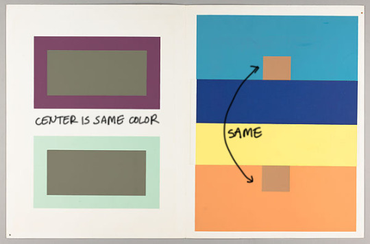
it always comes back to bauhaus.
you don't see blue, you see bluer-than-everything-else. if your surroundings are orange (blue's opposite on the color wheel, or, in relativity-speak, the-least-possible-blue), the bluer-than-everything-else object may as well look gray in a blue setting. though i gave a simple example, this isn't a simple spectrum, because saturation and value also affect each other, making for a three-dimensional matrix of trouble.
boy, if everyone understood this concept, that white-gold/blue-black dress argument sure would've been short.
anyway, going from there:
1) i usually start with a 50% neutral gray background. relativity is a negotiation, and starting in the color equivalent of switzerland sure makes negotiations easier. starting with white will make everything look darker and more intense than it really is. (this tip works for irl painting too, i always tint my gesso!)
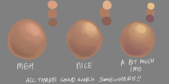
2) #ffffff and #000000 are treats only for special occasions. they are the fried ice creams of values. use them sparingly and in very important areas (or not at all--i tend to avoid true black altogether in lineless work, usually opting for a deep tone of the work's main color instead). i save these until i'm very close to finishing up, because if you add them too early, you'll throw off the balance of the relativity.
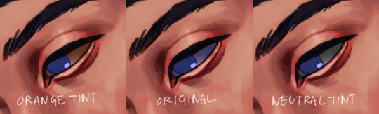
3) finally getting to actual color! when choosing highlights and shadows, i always adjust the color in addition to the value according to a general rule: lighter areas appear warmer, and darker areas appear cooler. this is a pretty common tip, but it's parroted for a reason: it works!
for flesh tones, that means highlights are yellower and shadows are redder or bluer. doing this also adds liveliness and helps prevent the doll-like appearance that rendered flesh can get (but don't get carried away with this or you'll end up lisa franking it. not that lisa franking doesn't have its own important application).
4) relativity isn't just something you have to negotiate with. once you get the hang of it, it's a very useful tool! as renowned art theorist francis bacon famously said: color relativity is an excellent servant, but a terrible master
to circle all the way back:
- if you want something to look very blue, surround it with orange,
- if you want something to look very light, surround it with darkness,
- if you want something to look very saturated, surround it with dull colors,
and vice versa.
this can be a useful compositional tool, not just a rendering one--make the focus of your drawing light/dark and saturated, and keep the unimportant areas in duller mid-tones.
a straightforward application of relativity is in the whites of the eyes, because you have an area on the face that's neutral by nature, and neutral = your playing field. like our homestuck kids with their fun eye colors... to make rose's purple eyes look super purple, i tinted the whites of her eyes just a little bit yellow-y (i ended up leaning into soft orange bc otherwise you'll just get jaundice).
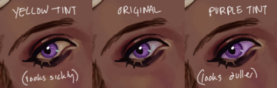
and this isn't a just one-way relationship: in the john piece, i DIDN'T want his eyes to be a super distinguished blue, because that was a work about him feeling too absorbed/swallowed in his surroundings (retcon power moping), so i made the whites of his eyes very blueish, lessening the impact of his eye color.
slightly off the vein of relativity: i also usually like making the whites of the eyes around the same value and saturation as the skintone for a sense of cohesiveness, but that's more of an personal preference. white-whites kinda scare me (but, to emphasize, scary eyes have their own application--see, conveniently, kanaya and her brighter-than-her-skintone eyes for that slightly uncanny alien vamp effect!).
i mentioned that i always start with a 50% gray background, but if you're particularly discerning, you may be thinking: hey, wait, your rosemary piece has a darkish blue-gray background! cheater!
and my response to that is yes. so true. i was cheating. color relativity may be a negotiation for the artist, but it's a straight-up scam for the viewer. that's why they call it a trompe l'oeil, a deception of the eye, and not something nicer.
i wanted to make rose appear very warm and a little yellowish because she's Sun Light Girl and a cooler background will fool people into seeing that. i wanted to make kanaya appear glowy without painting her white, because, as mentioned, that's fried ice cream, so a darker background will fool people into seeing that.
here's what it would've looked like on a neutral background vs. the final one:
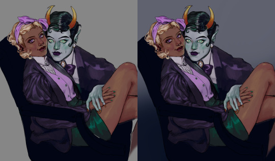
haha ignore the lazy leg i hid in the shadow
this is why i think it's so important to start pretty neutral. if you go full saturation/light/dark from the start, then you'll have no room to play! this doesn't mean painting in shades of gray, but it does mean having a bit of restraint with the extremes of color and value. this can involve a little more planning and negotiating, but the results tend to be worth it. and, luckily, those of us in the digital realm can easily tweak these relationships through adjustment layers and overlays.
fuck that's a lot of text. anyway. hope something or other in there helps.
if something's unclear please know i am a little too eager to clarify!!
53 notes
·
View notes
Text
October wrap-up
So! October is at an end! And I have not finished Spocktober/Trektober. Let's see how I did!
My goals for the month were:
To have fun :3
To get used to finishing drawings
To get used to posting them, too!
To have fun :3
To improve my sketching and lineart skills
To end up with a bunch of finished drawings (of Spock!!!) :3
To let go of a bit of my perfectionism
TO HAVE FUN :3
So how do I think I did?
Having fun:
I had a lot of fun with it this year! In previous years, I've pretty much immediately devolved into an anxious mess because there were too many options and I bit off more than I could chew. This time around, thanks to my guidelines (only inking, not spending too much time on each day, sketching and thumbnailing in advance), it was a lot easier to let loose and have fun thinking up ideas and enjoying the process. Plus, I let my friends know I was doing it this time around and got encouragement and support, which was lovely.
Getting used to finishing drawings:
I did better at this than I thought I would! There are several drawings I've finished this month that I would have given up on if not for this goal. Do I think they were all my best work? No. Did I learn from the process? Yes! And some of the ones that have gotten the most notes were ones I thought no-one would like and struggled to finish. So! I also figured out new ways of motivating myself to finish things, which is also very helpful.
Getting used to posting things:
Also went better than I thought! Although I didn't manage to maintain a cushion of queued posts like I wanted to, the response I've gotten from actually posting my art has been amazing! I've gained several new followers (hello!!) and gotten so many nice comments, and went from being afraid of posting anything to tentatively looking forward to people's reactions, which is a huge improvement for me. Getting that accountability of posting publicly also helped keep me going when I felt like giving up - seeing my friends laugh when I showed them my silly comics or getting nice comments really made me feel like sharing my art is worthwhile. So thank you to everyone who reblogged my art, commented, liked, etc. I'm glad you did!
Improving sketching and lineart:
I definitely think I improved my art skills. Getting into the habit of thumbnailing really helped take the pressure off the sketching phase, and trying so many different ideas pushed me out of my comfort zone and forced me to try drawing things I wasn't so confident on - look how many hands I drew!!!! As for the lineart, I think I've gained a bit more experience in using pens, although I did buy a whole new set of them halfway through the month which put me on a new learning curve. Lineart's never been a huge favourite of mine, and I do miss using my tablet to do lineless art, but the nature of the challenge did help me to loosen up and experiment to keep my mind engaged the whole time.
To end up with a bunch of finished drawings of Spock:
Check! I have 14 finished drawings, with another four sketched and needing inking, plus a whole load of thumbnails to work from in future. I may go back and add colour to some of the days for funsies, but there's several that I can just put on my wall as-is and be proud :)
To let go of a bit of my perfectionism:
I definitely did! Like I said, there's a few of the ones I've posted that I'm not too proud of and know I could do better on, but I've spent all month purposely smacking my hand away from perfectionism, and I know I've tried my best given my limitations. I'm still proud of myself for getting this far, and for posting when I was anxious, and for improving my skills, and now I get to stick up my art on my wall and be proud of it! I'm not magically cured by any means, but I do have a bit more evidence that perfection is not a good goal to pursue, so I'm going to keep this experience in mind for the future.
So what now?
I do have thumbnails for almost all of the rest of the prompts. I am doing NaNoWriMo this month, and I have a digital piece that I want to finish for the 5th (holy shit. three years.) So I think I'll take a little pause on these prompts, but I don't want to stop. I'll keep coming back to them, and keep posting them, until I run out of prompts or motivation, whichever comes first. I've really enjoyed seeing people's reactions to my Star Trek art, especially the comics! I also have a backlog of SPN fanart I want to post, so I'll probably queue some of that to come out soon.
TL;DR: Watch this space!
And if you've been following along/commenting on/reblogging my art this month (or anytime), thank you so much! It's folks like you that make sharing art worthwhile!
#original poast#artie talks#i am feeling so much more positive than any of my previous attempts at an inktober style challenge!#this has genuinely been so much fun and it's so nice to feel like part of a community#i'm sad I didn't get to any of the suptober prompts#cause I had some ideas for those too#but given various life stuff and also my very last minute decision to even attempt it this year i think i did excellently#and I am going to record the fact that I am proud of myself for future-me to look back on#also. uh. the askbox is open if anyone would like to send prompts. i can't make any promises but if something catches my imagination#i may doodle a little thing for you!#chatting is also encouraged! i like making new friends :)
2 notes
·
View notes
Last Seen Blogs
dailybrussels
Daily Brussels

realanjeljuice
제목 없음

cartoonnetwork-india
Untitled
euphorbic
comes spring