#Highlighter and pen and white out are my medium of choice
Text
shaking sorry all I ever do is doodle
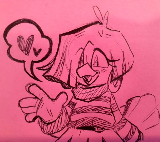
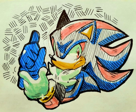
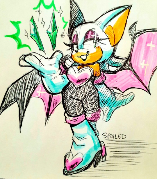
#rouge the bat#shadow the hedgehog#tekno the canary#sonic the hedgehog#Spoiled art#Highlighter and pen and white out are my medium of choice#On scrap work papers and sticky notes
1K notes
·
View notes
Text

my acetate cel materials test sheet. took 3 hours to paint the colors on, so hopefully that gets faster (granted, it does have 4 faces on it) but i definitely wish i'd put more time into making the test drawings be a little more... on model.
i used grafix 8.5 x 11 acetate sheets (about 25 cents a sheet where i bought it) (i went for printer sheet sized cause it's the size of my scanner's scanning bed.) All the actual lineart is done with a technical pen with koh-i-noor acetate ink in it. i tested all my regular liners and stuff (pentel pocket brush pen, sakura pigma microns and brush version, white gel pens, sharpies) just to see if i was going overkill by buying a 22$ pen and 7$ ink i'll use Only For This and nope, everything else wipes off readily except regular sharpie, which is unfortunately just not opaque enough for lineart. (weirdly, the sharpie liner wiped off so completely it's just a smudge) Although i did the white highlights in gel pen anyway, cause it's easy and a little bit more stable than some of the regular liner's inks
Even the special acetate ink is a little fragile and takes a while to dry. Note the smudges on the upper-left drawing, which i inked first. the acrylic is just cheap-ish DecoArt brand i got in a set because it had close-enough colors for most of ragged's design, but if i continue Seriously i might invest in 10$ a pot to get vinyl paints, cause although only one brand out there now still labels it as specifically animation paint (toon tones) afaict most vinyl paint should be the same thing. at least for painting cels in western animation
here are some things i've learned about the medium from this:
it's freaky how much it looks like digital art in person. the colors are so impossibly flat and smooth, which you don't think about much when looking at old animation because it has the texture of the film grain on it
harder to color in the lines than you think. especially when your colors cover up the lines. probably gonna have to try to draw a little bigger. a good reason for that stylistic choice of having thicker outlines just for the outer edges though, i couldn't afford a second technical pen right now sooooo i'll just have to git gud
you Really gotta blob on the paint. this could be from getting cheap acrylics but footage i've seen of old production suggests that's just how it is. a softer brush was better for it (i think it was a cheapo watercolor brush?) but i could only use that for fairly big areas cause it splayed out wider
it seems like the acrylic faintly warped the acetate, i think from the acrylic shrinking as it dries. in general, the cel got pretty wibbly from just handling it. Later productions did use polyester instead of acetate and perhaps that is less affected, but i don't think i feel a need to have archival quality materials, at least not when i'm just experimenting and am going to digitally composite my animation anyway. (and acetate was cheaper than Dura-Lar)
gonna have to solve the shadows it casts in the scanner, even when the lid is pressing it down. it's a pretty cool-looking effect for just an image, but it's gonna be annoying in the video editing stage (and the smooth flat colors make it super obvious to me that my scanner's colors are really off, i still had to edit this but didn't bother making it totally irl accurate)
taking out the light table for this was a pretty good idea even though i wasn't animating, cause it made it real easy to check for missed or thin spots on the paint
cotton gloves to avoid fingerprints made me feel like a Cool Serious Artist, and then i didn't have to scrub paint off my fingers afterwards
i feel like i really Get something about why old animation looked A Certain Way that i didn't understand just from reading about it, but can't put it succinctly into words. aside from that and the fun of Nerdiness, research and bragging rights i'm not sure i'd suggest animating like this when digital tools are available, cause once you put it on a screen it just looks like digital art anyway
1 note
·
View note
Text
HOME Gallety Visit - Joy Yamusangie.
04.11.20
This was the second installation to the HOME Gallery, Joy is a mixed media artist specialising in illustration, she also uses materials such as wood and cloth to back her work. This particular exhibit, is titled ‘Blue glass fortunes’ which is a series of dreams visualised, revealing subconscious anxieties, hopes and desires. It is inspired by a vision of blue goblets with Candle set inside, flooding a room with lights. The meaning still remains unknown, revealed with future insights hindsight. 
I absolutely loved this exhibition, as I found out that Julie is a visual artist, specialising in illustration along with a range of traditional processes such as drawing, painting and collage to produce mixed media pieces. She also explores socio-political themes from a personal perspective. Joy’s works takes the form of PaperWorks, clothing and paintings on cardboard, this work explores themes of memory, intimacy race and culture.
So my research I also found out that she is particularly interested in how archiving is incorporated is used a lot within practice, inspiration is drawn from past conversations, places and moments, from kinesia shop fronts of fleeting interactions and conversations, by archiving routines and cultural practices through her pieces of work, these exist to preserve memories and stories, each individual piece documents and retells moments in her life, creating a permanence to past experiences from her life.
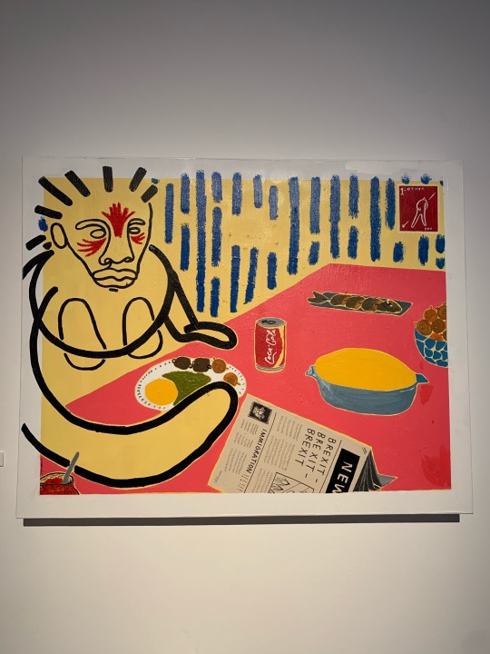
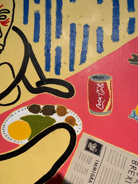
When I first walked into the home gallery I was greeted by this large-scale piece, which was names English breakfast, this was made using acrylic, oil, pastel, pen and news print on canvas. this particular painting shows someone sat at the dining table, eating their lunch with different foods on the table, something that drew my eye to this painting all the colours especially this pink, it really brightens up the work, I love how it’s mostly all line work with a single paintbrush outlining the physique of the person at the table. If you look into the details of this image you will see that the newspaper on the table is upside down but the words clearly spell Brexit and immigration.
To the naked eye, as I don’t really know much background information off this before I research, I feel due to the first exhibition being about lockdown, this also has something in common into what’s going on at the minute such as Brexit and immigration. Subtly highlighting the worlds current problems, but within fun energetic and colourful work.

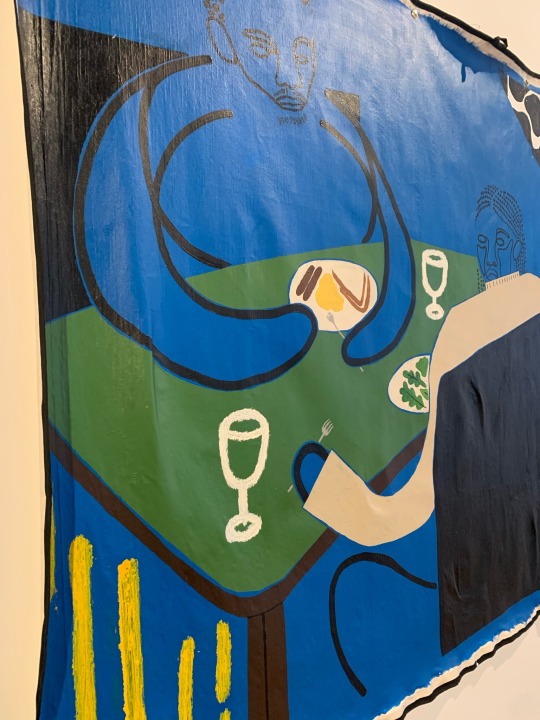
As for this particular piece of artwork, this was also backed onto cloth which I found very interesting, this is my least favourite piece out of the entire gallery that joy created, I think it’s down to the choice of colours as I really think blue changes the mood and perception in a negative way however as for the others this was completely different as those colours were brighter and drew my attention straight away.
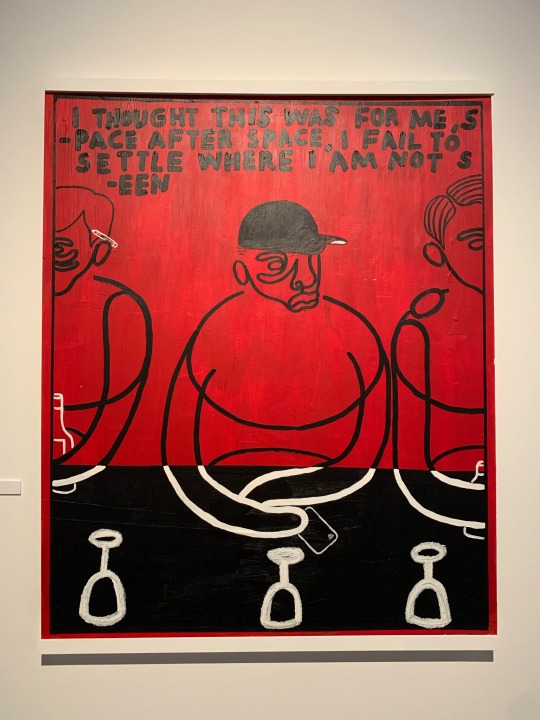
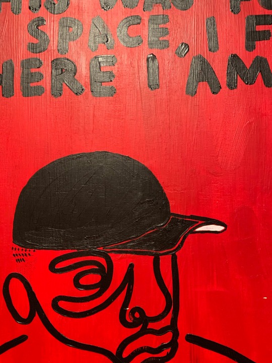
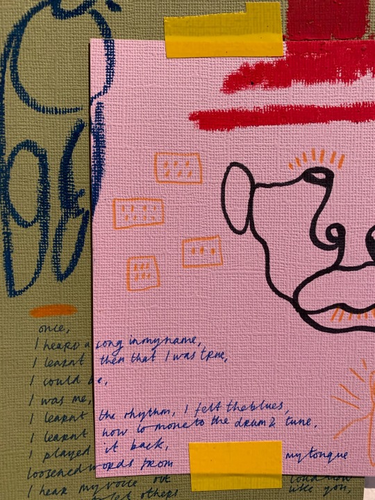
“ I thought this was for me, space after space, I failed to settle where I am not seen”. This relates to the description of this particular exhibition, food brings people together but we can still remain alone no matter who we are with, in the description of this set of work joy also mentioned that these figures alternate between day and night, alternately seen or rendered invisible. In these images also have the same re-occurring white glass at each table.
I love the simplicity of this particular piece of art, the only colours used are black red and white, the white is very minimal, once again this is all a use of thick black outlines especially for the writing which is all in capitals, which seems to be the main point of attraction for the public to read, I feel many will be able to relate to this, the feeling of being invisible or not settled amongst a crowd. 

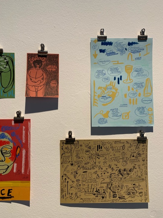
Finally, we came to this sort small section of work, all using pieces of paper clipped to the wall, from first impressions to me this seems to represent the thought process that Joy went through before she decided to create this installation, this included different outlines, text, colours of pages, and a huge my map filled to each edge, of ideas and potential.
However, there didn’t seem to be any form of description for this particular section of work, each one had a title and told me what medium was used for example one of them was drawn on an envelope.
2 notes
·
View notes
Text
Cammi’s Blog Series on Watercolor #1
Due to several requests from many of my twitter mutuals, I’m going to talk about watercolor for a few posts.
This is everything based on my own experiences and my suggestions or methods are in no way “the right way to watercolor.” There’s pros on youtube that can teach you how to watercolor like a champ.

I just draw silly characters!
in THIS post, I will list my suggestions on watercolor supplies to purchase for getting started. Later posts during the week/month of February, I will go into defails on specific kinds of paints, paper, brushes, palettes, and then some. A table of Contents will be added to this original post as more posts are added to this series.
All price estimates are in US dollars
1: My Personal Favorite:

Daniel Smith Essentials Set of 6 ($30 on Amazon)

Daniel Smith Primatek Introductory Set of 6 ($25-30 on Amazon)

Meeden Empty Watercolor tin with 12 half pans ($11 on Amazon)
Interestingly enough, now Daniel Smith has a 15-color pan set for about the same price as this setup, and it has all the essential colors except for New Gamboge, but it doesn’’t include any of the gorgeous Primatek colors, and the lid isn’t made for mixing color (the water spills onto your lap) so you’ll have to buy an additional palette anyway. Still, iif the colors in that set are up your alley, go for it!
Daniel Smith has been my dominant paint choice for almost a year now; getting them last February and taking a few months to get used to them after using cotmans for two years and artist loft for the 10 years prior. I didn’t think artist grade paint would be worthwhile for the likes of ME because I just draw character doodles and not landscapes or textures that rely on high-pigment paint to really shine, but I was wrong. The colors lay down so much better and you use less paint per drawing because of the high pigment load. I’ve painted a lot more in 2008 than I have in previous years and none of my tubes are close to running out! The Plague Knight and Mona drawing posted above was done with artist grade paint.

I’ve expanded since then, buying another tube of Daniel Smith when I was able to go to Blick with a small wad of cash, or get a Winsor & Newton Artist grade tube for $5 with a Michaels coupon.I also repurposed my Cotman box for my current paint set. I can’t remember how much this whole palette is worth together, but the initial 12-color+metal case setup was about $70 (the primateks gifted to me), and then I added a new color every several weeks or when I felt like I really needed something else.
2: The Simple Budget Grab-n-Go
You are very new to watercolor, not sure if you are willing to commit, or you’re just plain not in a situation where you can be spendy.
Maybe you’ve used those $5 watercolor cake sets and you’re tired of the chalky powder rubbing onto adjacent pages when the paintings dry in your nice Moleskine book
Winsor & Newton Cotman: Sketchers Pocket Box. These days, you can get it for around $13 on Amazon.
There are LOTS of different cotman sets, but this one has two kinds of reds, two blues, two yellows, two greens, and 3 neutrals, which, if you’re a beginner, is a great way to learn about color mixing. It also has some of the most popularly-used colors in the world of paint, such as burnt sienna, french ultramarine, cadmium yellow [hue], alizarin crimson, sap green, and the pthalos, so you can develop familiarity with these and easily find tips and tricks on using them online. Any color you don’t like later on can get tossed in the garbage and replaced with another color (I’ve replaced black with Paynes Grey, white with Cerulean Blue Hue, and Burnt Umber with Van Dyke Brown).
You can make all sorts of colors with this, and you won’t get overwhelmed with having too many colors to glance over.
Refills and additional colors are available for $5+ each
It comes with a small brush. You may not like it.

Cotman Brush Pen Set, $17 on Amazon.
I’m not a fan of color setup except for the inclusion of Paynes Grey, Turquoise, and a really nice purple, but I LOVE this box! It comes with more mixing space on the lid and a waterbrush that I think works really well. It’s a very thin tipped brush, so if you want something to more easily paint over larger areas, I suggest getting a medium size waterbrush listed below.
If you don’t like waterbrushes, a foldable pocket paintbrush can fit in the slot just fine.I’ll have a separate post on paintbrush details.
---
The main issue with cotmans is that they carry less pigment than more expensive pants as these are student grade. Many of the colors are still vivid and wonderful, and you’ll just have to layer some colors a few times to get some really bold color application on the paper. Many people use cotmans just fine.
avoid Van Dyke Brown at all costs. Look at this Banjo!

3: More Colors for your Buck!
You don’t care about mixing or portability, You love color. you want to explore all that’s available in paint or want to build a collection that’s as big as your copics.
You have options, my friend!

Kuretake Gansai Tambi, $30 on Amazon, $40 on JetPens. I do not recommend these if you like to mix colors or complex layering because these don’t handle that well. I’ve tried layering color on commissions and it would just lift the bottom later of paint after it dried a week prior, and this nearly destroyed two commissions. HOWEVER, if your watercolor style is simple shading, bold, flat colors, using the white of the paper for highlights, this set will be a terrific friend of yours. The pinks, greens, and blues are absolutely fantastic and I use it for my Superstar Saga art whenever I’m home.
The paint is really opague unless you water it down a ton. It’s still going to look great regardless.
Smaller sets of this are availablle, but since mixing more than two colors at a time doesn’t work out very well, you might as well go with the largest set.
There’s also the option of larger cotman sets with a half pan set of up to 45 colors for $55 on Amazon.
Paintbrushes
For this post, I’m going to briefly list some travel brushes. a more detailed post about bushes will come in the near future.
The main points are:
You would want a water brush if you like to paint with water in the brush, or paint on the go with no real opportunities to put a water cup down anywhere.
You would want a synthetic paintbrush if the stiffness works with your painting style and you want the brush to hold more pigment than water You can get these in assorted price ranges, but the super cheap ones will wear down and need frequent replacement.
You go for a natural hair paintbrush if you want to make really long paint strokes or paint large areas without having to re-add paint and water to the brush so frequently. Most of these are pretty expensive.
Anyone may tell you “natural hair brushes are the best brushes” but this is completely up to preference and painting habits Any small brush over $10 will last you a long time if you take care of it. Unless maybe it’s from Artist’s Loft.
A good size main brush (particularly if you do A5-sized paintings like me) is a 6 round. if you could only afford one brush, make it this one. This would be your go-to brush that can do thick fills, tight corners and thin lines as you need. Other size and shape brushes can be added to your set as you feel you need or could afford them later on.
Pentel Aquash waterbrush: $10 on Amazon. You simply fill the barrel with water, and the brush will drip water from the bristles and let you paint without needing to dip the brush into a jar of water. You won’t need a jar of water at all! Some people love the convenience, some people hate how out-of-control the water flow gets.
I recommend the medium for a main brush. If you need a finer point for details, you could get one as a secondary brush, but if you feel you don’t need it, then just the medium is fine.
I just started using the Pentel brand a couple of months ago and can’t give judgement on them yet. Other brands I’ve tried before needed replacing at least twice a year with regular use.


I love travel brushes because I like the bristles to be protected when I take them places. Normal handle bushes can be cheaper or longer. Personally, I don’t look for brand names when picking brushes, I look for the material of the hair.
Both Escoda and DaVinci make great Red Sable brushes, and they have been my mains for two years. Expensive as they were, they are still working great and have perfect sharp points 18 months later. Not to mention, I’ve made the money back through watercolor commissions, in which these brushes allowed me to complete more commissions in less time.
White Taklon has worked well for me for synthetic brushes. Princeton has been my regular brand in late 2008 since I was able to snag those at Michaels in the mixed media brush section.
---
That’s it for now! Next post I’ll cover watercolor paper.
10 notes
·
View notes
Text
Chapter Fifteen: 'Or this one?! It’s so pink and fluffy!'
”Kiddo, Logan and I were talking about taking you on some shopping today, since… you know… they’re going to take you a-away from u-us. And you’d n-need stuff t-there a-a-and…” Patton smiled warmly, but the more he talked the sadder he sounded, making Virgil feel guiltier with each word.
“Patton, honey, no one is taking Virgil away from us.”
“But Joan is!” Patton sobbed.
“That is not how this work, we have been talking about this already.” Logan sighed, taking Patton’s hand in his own. “Joan is right, we cannot keep Virgil here, just because we want to. Virgil’s parents are still his legal Guardians and there are laws that-“
“But they left him! They have no say in this!”
“But the government has, Patton. Joan said this is the only possibility they could provide us with without involving the police department or any social workers. We were able to help Virgil only because his parents haven’t reported him missing and you know it.”
“Yes, but-“
“Patton, do I have to remind you that it was Virgil’s choice as well?”
“No- But- You- It’s not fair!”
“That is how this world work, Patton.”
“But-“
“Look, Virgil is still going to be here, he is going to attend the school we BOTH work at, you will be able to see him almost EVERY single day, maybe even eat lunch with him if Virgil would be up to it… Virgil is not going to disappear only because he will stay at Talyn’s.”
“You have to visit us often-“
“Well-“
“-And stay with us over weekends, kiddo!” Patton finally looked over at Virgil who just sat there quietly listening to the word exchange between the two grown up’s, trying not to disturb anyone, nervously wringing his fingers out of the joints. Virgil didn’t really want to be a part of this conversation, but he guessed it would only turn worse if he kept silent, so he cleared his throat before speaking.
“Uhm, Patt, I-I…” Virgil looked directly into Patton’s eyes, making the biggest mistake he could possibly make. Patton’s big and glassy ‘puppy-eyes’ were tearing apart the remains of what once was Virgil’s soul, imprinting their hopeful gaze in teens brain making him give in. Virgil swallowed hard, unable to look away from the man in front of him. “…Ye-yeah, sure.”
¨¨
“What about this one? This bag should be efficient enough to accommodate all of the school necessities… And this black color should appeal to you as well, it is quite practical as it fits the most accessories and clothes we already choose for you.”
“Logan, please, it’s not necessary, really. You’ve done enough for me already.”
“Virgil, don’t be ridiculous.”
“But I’m serious. I’ll buy it on my own when I’ll be able to. Please, Lo.”
“What about this one, kiddo?! It has kitties!”
“Pat, sto-“
“Or this one?! It’s so pink and fluffy!”
“Pat.”
“Or- or-“
“Patton, pleas-“
“This one has RAINBOW ON!” Patton squealed, gawking, his hands on his cheeks. Logan only sighed, putting the black bag into the shopping cart. Logan murmured something under his breath, reading off of some piece of paper he held in his right hand, reaching for a couple of grey notebooks with his left one at the same time without even looking away from the note for a second. Patton just jumped left and right looking over at all the cute stuff the local market had to offer while Logan helped Virgil looking for the school supplies. It wasn’t one of the easier tasks as Patton was almost unbearable with all this excess energy he somehow managed to accumulate in some mysterious way and Virgil tried to convince the teach to leave the shopping mall every other minute or so, finding new ways in which he could possibly speak some sense in the older’s head. It was already past noon and they were out for about two hours, being almost at the end of the shopping list as Logan assured. They had already picked up some school utensils such as pens, markers, highlighters, notebooks, folders and etc. as well as some hygiene products and clothes. While it was quite easy to just pick whichever toothbrush and shampoo, clothes were a whole other story. With Virgil constantly denying participating in anything involving buying things for him and Patton running from shelf to shelf and picking the most ridiculous outfits there could possibly be, Logan had to pretty much do it all himself. From what he’d learned about Virgil the young teen wasn’t a huge fan of many bright colors… or anything that was bright… or colors in general… so the most of the shirts and t-shirts ranged from light grey to black, with an exception for few v-necks in dark purple, dark red and dark blue, all in the smallest size there was in the men section. While Logan knew for a fact that Virgil was quite muscular, the teen was so malnourished there was almost no fat on his person, making him really skinny… But not just skinny as in working out skinny, but the unhealthy type of skinny... Virgil was underweighted without a doubt, which was probably a result of deprivation from food, water and sleep. Just by thinking about it Logan could almost feel Virgil’s ribs poking him every single time he hugged the kid. It wasn’t the first time Logan saw something like this, Virgil just reminded him so much of a stray kitten- pushed around, denied love or any kind of care, left behind to be forgotten. There were heavy signs of strain on the teen's body alongside with many… way too many bruises and scars. Logan saw them only once, but he still couldn’t forget this horrible sight.
Logan looked back at Virgil, noticing how the teen stood there staring at his feet and clenching the rims of the sleeves of the black hoodie Patton had found him just a couple of days ago. It seemed like Virgil was feeling rather comfortable in it as he spent most of the days clothed in said hoodie even if he was proposed another options. Virgil was visibly more relaxed whenever he was enveloped in the black jacket and who was Logan to deny someone as little comfort as this?
The pants where actually much more problematic as Virgil denied revealing the size of his trousers, but one look at how Logan’s old sweatpants were presenting on the teen he guessed it would lie somewhere in small-medium as well. After some persuading from Logan Virgil actually tried on some clothes, more anxious about Patton and Logan buying him stuff in wrong sizes unnecessarily than buying him anything at all, which could be expected from the anxious boy. The clothes Logan choose for the teens fitted him quite well, so with the recently acquired knowledge on Virgil’s size, Logan got him two pairs of plain black jeans (not as skinny as the usual skinny jeans, but skinnier than the regular kind of jeans), one grey pair and one regular baby-blue one, not counting the dozen of plain black boxers Logan choose for him and another dozen, but more colourful with many different cartoons on printed on them as Patton just decided Virgil should own. There were also some white and black socks- nothing out of the regular. As for the shoes Virgil assured it was fine with the sneakers he already owned but Logan insisted on getting him some real leather boots instead. With the most things already found Patton was left with picking the little smaller things such as hairbrush and pajamas and of course, a cat onesie. Just as the majestic tradition of building pillows forts of Prince Roman’s decree told- everyone at the Sanders family should own at least one onesie. Logan might say it wasn’t as important as everyone thought, but Patton knew better and choose the cutest one the store offered. After the ‘unnecessary’, as Virgil stated, shopping, the three of them made sure to grab some groceries on the way home as Patton planned on doing some sort of a ‘farewell’ meal for Virgil, completely ignoring the fact that it would not be the last time the two of them would meet.
Hours later when they got home Virgil would take every given chance of being near Patton, Logan or even Roman, feeling an eerie and unsettling ‘something’ growing inside his body, more specifically in the very pit of his stomach, making Virgil uneasy, jittery and weirdly emotional.
Whether it was helping with cooking the meal or washing the dishes or simply just by standing near any of them.
Every time Patton hugged the teen Virgil couldn’t help but try and lean in, needing to feel the love Patton so radiated with, smirking at the giggling puffball.
Every time Roman bickered and called him names, Virgil just had to bite back, but in a much softer and friendlier manner than what he was used to doing, throwing Roman off a couple of times.
Every time Logan commented on something or began to debate with Virgil, he found himself smiling and just listening to the warm baryton of the older man, sitting there and nodding, answering if needed or expected.
Virgil really liked it, the feeling of constancy and just pure easiness, but no matter what you wouldn’t catch him dead admitting to any of it. Everything felt so right and good, but so, so wrong at the same time. At the Sanders Virgil felt at home, like it was somewhere he belonged, somewhere Virgil fitted in with being himself without needing to lie or fear for his life. It was something Virgil haven’t felt in years, starved for this warm and pure but feared and truly despised feelings. It was just so irrational and wrong, considering the only family he ever had was now long dead or wished him dead, love being nothing more than a way of making him open up and be vulnerable once again. Virgil couldn’t let open his heart yet again, just to let them tear it from him, stomp and jump all over crushing it mercilessly against the cold and disgusting floor, making Virgil have to kneel down and collect all of the shattered pieces of something that he once trusted them with.
Virgil wanted nothing but to forget about everything.
Forget about the endless competition and endless hours of studying.
Forget about the violin and school.
Forget about his parents.
Forget about all this time he was forced to fend for himself, alone in this cruel world.
Forget about Granny.
Forget about his work.
Forget about the abuse.
Forget about Shon.
But the most Virgil wanted to forget was how to breathe. How to function. How to live.
Virgil just wanted to forget he even existed.
To forget the feeling of being alone, useless, unwanted, disgustING, WORTHLESS, DESPICABLE, WRETCHED, MISERABLE, TO FORGET HOW AWFUL HE FELT WITH HIMSELF EVERY MORNING HE WOKE UP AND WAS STILL ALIVE.
Virgil wanted to forget everything.
Not because it was painful.
No.
The pain was actually something that reminded him that he was still alive and failed miserably.
Virgil wanted to forget because he was just tired of everything.
Virgil just wanted to go to sleep… and… never wake up again.
He was so tired.
So. So. Tired.
But…
The more time Virgil spent with the Sanders, the more…
The more he realized he really missed that.
He missed being cared for. Missed how it feels to being loved by someone. Missed what it meant to have a family.
He missed every single thing.
The waking up every morning by 7 o’clock with a kiss on his forehead, announcing him he managed to live yet another day and to welcome him to a breakfast. To sit at the table and just chit-chat about what things he planned on doing or not doing, eating the delicious meal one of them would prepare. Missed sitting around and goofing, playing games and watching movies jauntily. To help with the cleaning or the homework or any other thing or task. To be able to hug someone whenever he felt like he needed reassurance. Missed being able to feel something but the constant fear of being punished or used. How…
Virgil missed all of that, but…
He was scared.
So, so scared.
Scared of opening up to someone yet again.
Virgil feared being rejected or left behind once again.
One day Virgil had everything…
And now he had nothing.
Virgil feared if he only as much as left a creak in the doorway to his soul and heart, someone would just barge, bust in and mess him up.
Virgil wished he was already dead.
Oh, what he wouldn’t give to go back in time and just stay and let the man eventually, finally finish him off…
Or to maybe to go in a different direction the moment he left Shon…
Or to just take his own life by jumping off of that bridge he crossed while heading to where Patton had found him…
Or to let himself drown in that lake he crossed and fell into, struggling to remain on the surface and get back on the constantly crushing and cracking under his weight, thin, thin ice…
Or to just let that burglar from five years ago to shot him.
Virgil wished he was dead. He really did, but…
The more time he spent with the Sanders, the more uncertain he grew on what was that he actually wanted from everything, from everyone, from life, from himself.
Did he really want to die?
Did he want to have his family back?
Or…
Did he want the Sanders to be his new family?
Virgil couldn’t tell, but…
The more hugs and kisses he got, the more snare comments and silly nicknames, the more ever so interesting and captivating conversations he held…
The more Virgil didn’t actually care about what was that he actually wanted anymore.
Virgil wouldn’t give a fuck.
Or he wished he didn’t.
But one thing he was sure of.
Virgil was happy to be able to come back and stay on the weekends with his family.
Family.
Yeah.
That sound about right.
Chapter fifteen of my story “The Death of a Violin” I’m writing on ao3, feel free to come by and check the full story out!
https://archiveofourown.org/works/13950288?view_full_work=true
#sanders sides#thomas sanders#virgil sanders#roman sanders#patton sanders#logan sanders#joan and talyn#sanders sides! alternate universe#fluff#angs#feeling#how do i even tag this#how do i even live#please help#seriously#help me
2 notes
·
View notes
Text
working over our news articles
Today we worked into the pages of our articles creating responses to them based on the context of the page and the article. To inspire my compositions I researched Tom Phillips project “A Humument” as well as Mark Powell, who makes hyper realistic biro portraits on manuscripts and maps, and Lynn Skordal who created a piece which was sewn into a scientific page.
Tom Phillips
“A Humument” is an ongoing project by Tom Phillips where he sets himself the task of buying a cheap second hand book and highlighting words in it which he then illustrates with the means of paint, collage and cutting up the page. By leaving only certain words visible Phillips completely changes the original narrative of the page and turns it into something of his own to manipulate and visually communicate in his own way.
The way he leaves the words blank and connects certain phrases with a small blank line is reminiscent of a speech bubble typically seen in a comic book. This could be purposeful as he as the illustrator tells us blatantly what the pieces are about.
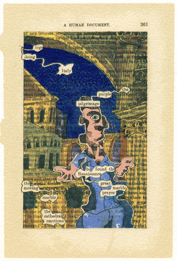
I really enjoy his style of illustration and how the people are quite abstract and disproportionate to how people realistically look. The bubbliness of the person fits with the bubbles that the words are found in and overall the piece has a silly roundness to it making it very cohesive. I also like the way he has made the sky a deep blue and the clothes a light blue as this means that he hasn’t used so many colours that could clash and instead has opted to make the colours work nicely together.
The piece above differs from the one below as even though most of the words are coloured over in the previous piece, they can still be seen, but int eh piece below the collaging element of his work as completely ridded most of the words from the page. This is an interesting choice as it makes the original purpose of the page even more enigmatic to the audience.
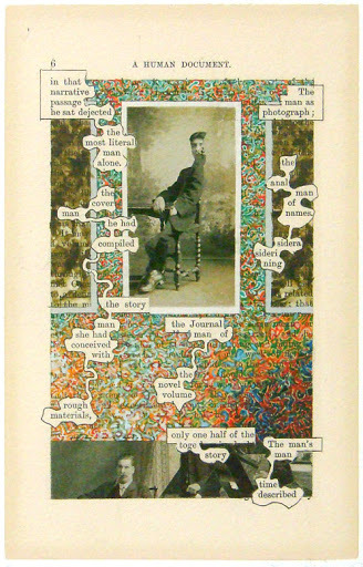
The way he has covered the majority of the words in this piece is with a very scribbly intricate pattern that is very colourful compared to the rest of the piece which consists of black and white photos of men. The use of this photography is a very simple but effective representation of the words which Phillips had picked out and they fit the theme of the page perfectly.
From looking at this work I want to think about how I cover up certain words and whether I decide to do so, and my use of the page as a whole a and whether I should work in black and white or colour or a mix of the 2. I also want to think about the medium I use as I probably won’t use paint like Phillips does and instead opt for pens or pencil so as to not tear through the thin paper I will be working on.
Mark Powell
Mark Powell is a phenomenal artist who creates biro portraits on very old manuscripts and other papers. He commonly leaves areas of the portraits completely blank especially in areas of clothes and therefore the original text of the pieces can be seen which is something I should consider doing in my own work as I really like the way it allows the canvas to become part of the entire drawing. He also uses some very dark areas in the back of his portrait with wavy textures which can be seen extremely clearly in piece below, This makes me think about how I can create texture in the background with whichever medium I choose to use.
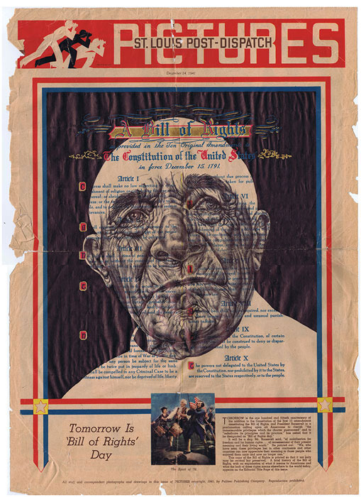
He also allows the page he is working on to create the frame for his work. Personally I think this looks very nice and ties the whole piece together as it gets rid of the need for him to draw a border or possibly have to fade the edges around the neck out to the shade of the page. I don’t think this is something I could utilise in these pieces due to the fact my pages don’t have any clear cut borders but it is something I enjoy the look of nonetheless.
Powell creates pieces which tell the story of how a young person who may have used or viewed these pages would age to look and I find that very interesting as in a way all the wrinkles in their faces quite literally tell a story.
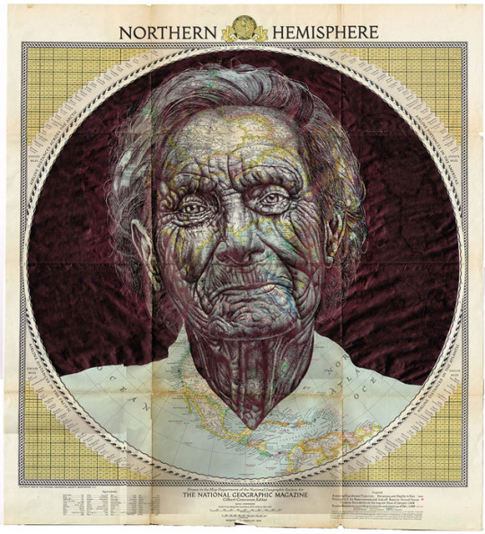
I really like this piece as the map lines work as additional wrinkles in this woman’s face. The map overall adds a lot of texture which works very well for the face of an old person and the blues and greens behind the biro add a lovely colour shining through where the biro is lighter. Blue can evoke a sense of sadness and therefore the blue may be to represent that the person whose portrait has been drawn has had a sad life or an unfortunate end. The way a biro has been used to make a very intricate drawing intrigues me and is something I could use in my own work as I definitely have a biro.
Lynn Skordal
Lynn Skordal is an artist who uses thread along with techniques of collage to create pieces which evoke strong emotions in the viewer. I particularly like the piece below where she has used thread on an old scientific anatomic page to highlight the nerves/ veins of the person and create a rather eerie image. The way that the lines spread across the face and body almost growing over it like the roots of a tree could be to imply that this person is being overwhelmed with some emotion or situation that they can’t deal with.
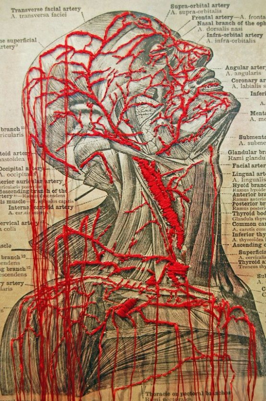
The use of the colour red may be as a link to the body and blood but it could also be because the person is feeling anger very strongly and this is the emotion that is overwhelming them. The colour love can also link to love and therefore they may have just fell in love for the first time and therefore are very taken aback by it, although the imagery implies something much more grotesque than love.
The way that she lets the stray ends of the thread dangle down across the whole image is something I like a lot. This make the red thread look like blood pouring out of this persons body but could definitely fit the themes of anger or love as well as it could be a representation of how they are letting the anger out of them and expressing it, or how they are so in love with someone that they can’t hold it in anymore.
In my own work I intend to use thread in a similar way to this as I think it looks very good and can add lots of interesting textures and a new dimension to a piece which may have been very flat prior to this.
my work
In my own work I created many scratchy textures due to the speed and way in which I applied my medias. For the first piece I tried to cover up the negative space in a dark colour similar to Mark Powell, using the text and page as a base colour for the person which I added. i worked very fast to achieve a scribbly texture. This piece is based on my article about curing blindness hence why I chose to put a big black scribble where the eye would be.
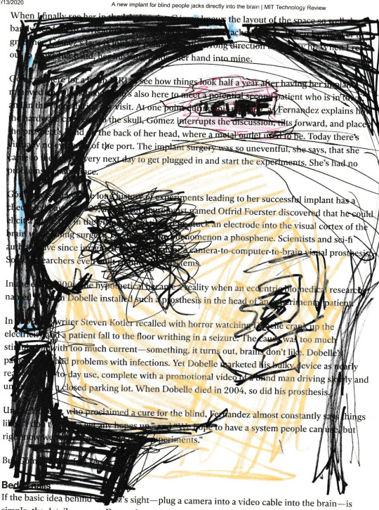
Where the skin would be I coloured in with coloured pencil to show that there is a differentiation between the skin and the white bandage which surrounds the mans head, with a part cut out of it which says cure as they would add an implant to the brain to cure this. The choice to allow the text to show through as the whiteness on the bandage as it contrasts very well with the black background which is something I saw in a lot of Tom Phillips work as the character would stand out on a dark background, but also something I really liked from Daniel Egneus’ work when I drew my train people.
If I was to do this again I would be more careful with the proportions of the face as I don’t think they are very accurate and the person’s face looks very flat because of this. I also may have chosen a darker skin tone as the tone I chose didn’t show up very well. Another amendment I would’ve made is to allow some words to show through in the dark background in a similar way to how Tom Phillips does.
For my second piece I chose to do it based on the robot CIA fly spy. I thought about imagery commonly associated with spies and came up with the idea to do a sketch in biro of a pair of binoculars. I also surrounded the binoculars in a border of rectangle as I felt like the overall page was very empty and I wanted a border in a similar way to Mark Powell.
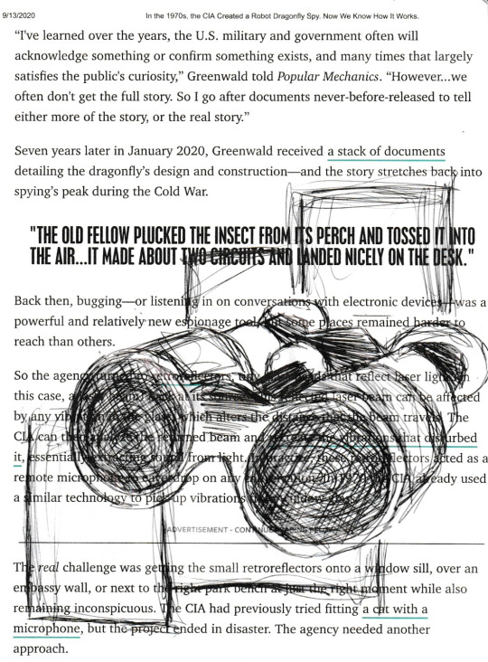
I did the biro very sketchily and layered it in areas I wanted to have more depth and some shadow. I wish I took more time on this piece to make it realistic in a similar way to Powell but I am happy with the proportions and I think it is obvious what the drawing is of so I was successful in that way. I am also glad I added the rectangles as they made the overall composition make more sense than just a pair of binoculars on a page. I wish I put the effort into making the darker areas extra dark and using the white page behind to show the lighter areas.
In my third and final piece I made it based on the article about brain implants to connect us to social media. To begin with I used fineliners to draw a person whose head is missing at the top. I really like how the eyes look and how i subtly used the orange fineliner to display a skin colour. To then visually represent the brain I used thread in a way inspired by Lynn Skordall.
I made the brain overflow over the entire page as if it is spread out for everyone to see to represent the issues with security in this implant. I wish I had pink thread as that is a colour more fitting for the brain but I didn’t so I made do with red. I really like the way that the thread gives a texture and how it winds all over the page in a very captivating way. If I was to change any elements of this I would’ve made the face using collage, but overall I am extremely happy with how this turned out.
0 notes
Text
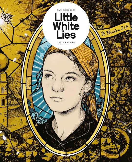
Little White Lies - Magazine Cover Examples
Little White Lies is a bi-monthly print magazine that’s purpose is to give information and celebrate great movies, it also pays credit to the talented creators behind them through in-depth interviews.
Art is a huge component in this magazine, they create incredible illustrations that can be seen not only on the front cover but all throughout the book. Incorporating eye-catching artwork with journalism makes it overall more interesting, therefore the reader becomes further entertained and enjoys the writing more. The designs in each issue is inspired by the featured film and is usually represented through its lead actor, related objects and/or scenes. Even though each design is completely different, they share the same overall template of the title in a white circle.
Here are 5 examples that use digital techniques:
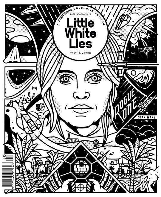
In this piece you can see clear and perfect symmetry that can only be portrayed digitally, this creates a style that is satisfying and appealing to the eye. This design also includes lots of details that explains the movie further, these are drawn with clean, crisp lines which helps a busy piece of art to not look messy. Combining the two elements, symmetry and clean lines, created a style that’s polished and ‘perfect’.
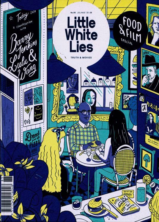
This piece presents a lively scene of a café, rather than focusing on one main object or character. This looks to have started as a drawing on paper of which was then filled with colour digitally, this is clear because the colours are perfectly solid and consistent through the whole of the piece. To do this you can either fill it in one go by dropping a colour in a section, or you can manually colour in where you want with a paint brush too. Using a paint brush can also allow you to draw extra shapes, this could represent shadow, shines, patterns etc.

The next design uses multiple digital techniques such as removing backgrounds and changing opacities. In the background you can see the title of the film spread across the page, even this is a technique as its layout can be easily designed and edited whereas by hand even this process would be difficult to get perfectly. You can also see that the highlight section in the face is completely transparent, letting the background be seen through. However the shadows of the face is mostly filled in blue, but you can still see through it slightly as the opacity has been turned down and now everything can be seen.

This piece has a collage element to it and even though you could do this by hand, it comes out much more clean and is a lot easier to do as you can change placements as you go and perfectly cut out your components. However some of the edges, mostly around the face, were purposefully softened which is a big advantage of digital art. With all this you can also edit colours, shapes etc into the piece to really make it stand out, for example there has been an added shine to the helmet which is subtle but effective.
Lastly in this piece you can clearly notice that this was made digitally, because as well as the crisp lines and perfectly blocked colours the colours used could not be replicated with any pencil or pen etc. Here you can see a bright green and pink that spreads across the design, these colours are so vibrant that they make the whole piece really stand out. The blacks are also very black and the same applies for white, I think having this contrast makes the colours pop out even more but also softens the look so it’s not too much.
Here a 5 examples that inspire me for my own work:

For this piece the design is simple however the skill to illustrate is immaculate, because it is so impressive the design doesn't have to be too complicated as the art speaks for itself. I also am a general fan of realistic portrait drawings, I find it a really fun challenge and when it works out it catches peoples attention and their amazement. Even though the design itself it’s much I quite like the simplicity of the spread out letters, and even the off balanced placement of the drawings adds a little bit of interest.

This piece combines pencil drawings with digital elements. You can see that the face was clearly drawn and shaded with pencil, and once scanned in colour was added in and blended subtly. Incorporating this with more digital art creates this mixture of mediums that works really well together, the two styles compliment each other in similarities and differences which is super effective. I am also a huge fan of mixing together hand made and digital art, I think this allows you to see the best of both worlds in different kind of abilities.

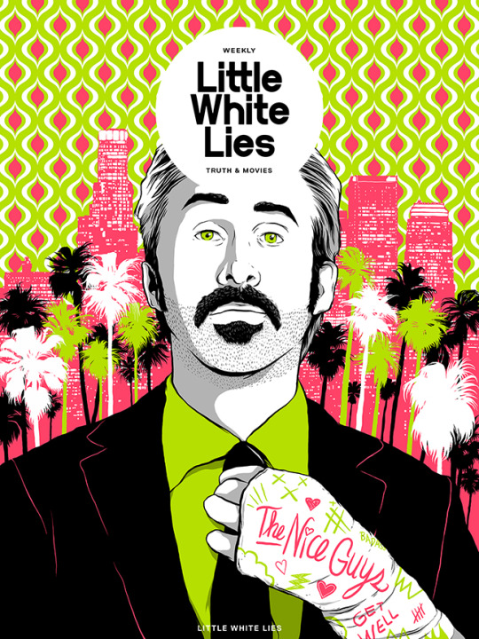
Next this design is super focused on its use of bright colours that all compliment each other. As you can see there is almost no black or white in this piece as even the shadows are a beautiful blue/purple, light and shadow is clearly thought through in this because the drawing itself is completely made of dots big and small. What I mostly love about this piece however is the overall vibrancy of it all, there are no boring or dull colours yet still doesn’t look too crazy and messy.

There are many elements in this piece, you can see pop art, bright colours, a ripped page effect, display of multiple characters etc. However the main component I am intrigued by is the composition, because for this specific design it is focusing on the film ‘Mask’ where one man plays two characters, and the idea of ripping the surface of one to find another is extremely creative. I also think the use of colour is very clever as the different sections are more clearly separated, these also compliment the actual art in front and are super bright to catch attention.
Finally I really like this piece for its colour pallet, I think the colours are very rich and stand out in other ways to typical super bright colours. They’re generally pleasing to the eye which makes viewers want to look and therefore appreciates the work, this is the effect I want to give to my work as I believe your choice of colours are super important and give different effects in emotion etc.
0 notes
Text
Week 2
This week was focused on the aspect of relearning how to draw. The idea behind this being that learning to draw like professionals will allow one to create sketch books that convey information clearly to people how may look into them and lock the ideas in ones head for the future more clearly.
Pens Vs Pencils
Pencils are very versatile things they are often created from wood and have lead or charcoal as their core, they are used wildly fro art and for writing. The use of writing with a pencil is more commonly used in Primary schools which then leads to writing in pen in High school to using a keyboard for higher education degrees. The act of using a pencil for sketching into a book has a few advantages and disadvantages which can be seen in the image below which was sourced from wowpencils.com.
https://wowpencils.com/pen-vs-pencil/
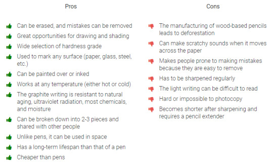
It can be seen that pencils have a good amount of advantages and disadvantages. The main thing that they have as an advantage is that they can be erased but as can be seen above also leads to a disadvantage which is, if you know you can erase then you are less careful and have no confidence in drawing straight lines and draw more hesitantly, pencils can also break, they help deforestation for wood and the lead or charcoal can smudge in sketchbooks.
Pens on the other hand also have a good amount of disadvantages and advantages. They are the choice that most Ux designers tend to opt for due to the quality and confidence it creates when sketching for clients. This does not mean that they can not age or fade or even rub when in sketch books but this is more the case for pencils and pens are chosen more to create a skill of drawing straight lines quality to get ideas quickly for clients. The full list from wow pencils can be seen below:
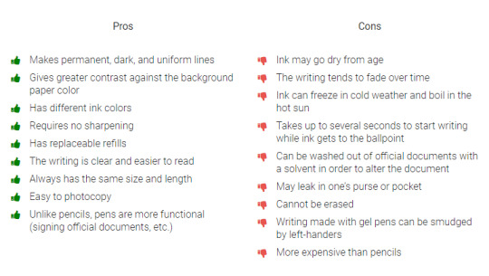
Over all pencils have their place, I believe that pencils are a great tool for drawing art as they have various shades and materials to create illusions on paper, they are also a good way to draw before using pen as the permanent outline, in terms of client work and sketching quickly pen is more appropriate as the ink will last much longer than lead but also it looks cleaner and will again smudge less so ideas will stay clearer much longer in books.
Icon Drawing - https://www.smashingmagazine.com/2018/02/user-interfaces-icons-visual-elements-screen-design/
Icons are great little things, they are simple images that are used to convey/communicate something clearly. They are easy to recognise and remember. They first arrived when the first GUI OS (Graphic User Interface Operating Systems) arrived on the scene with the Macintosh or example. The very first icons showed up im 1981 for the xerox alto (they where the first ones to support operating systems based on GUI’s). The image of the first GUI can be seen below.
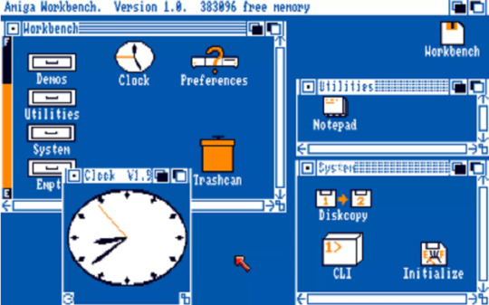
Apples big leap with the icons where for the Lisa with icons designed by Susan Kare. At this time the technology wasn't to advanced to include colours but the idea of making more friendly and clear interfaces made computers more acceptable to everyone and not just people who could write lines of code or build computers. The coloured icons came from the Amiga Workbench in 1985 which can be seen below:
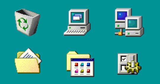
Windows made icons become more a familiar site when windows became the most popular OS, soon people began to associate cretin aspects on computers with the icons that can be seen below. The icons soon lead to the evolution of every aspects of the the computer having some GUI, icons lead to menus being more widespread, drop down menus as well. The evolution leads into how to showcase all information from the likes of windows 7 to how to show necessary information in windows 8 which I believe is due to the GUI on phones being restricted by memory and size which forced designer to only show the important things in icons which may have influenced the UI/GUI on composure.
Icons have a great impact as they are a commutation tool that allows the communication of ideas through images meaning that they are applicable to all languages meaning that a persons design will be more wide spread especially due to the world of connectivity that we currently live in.
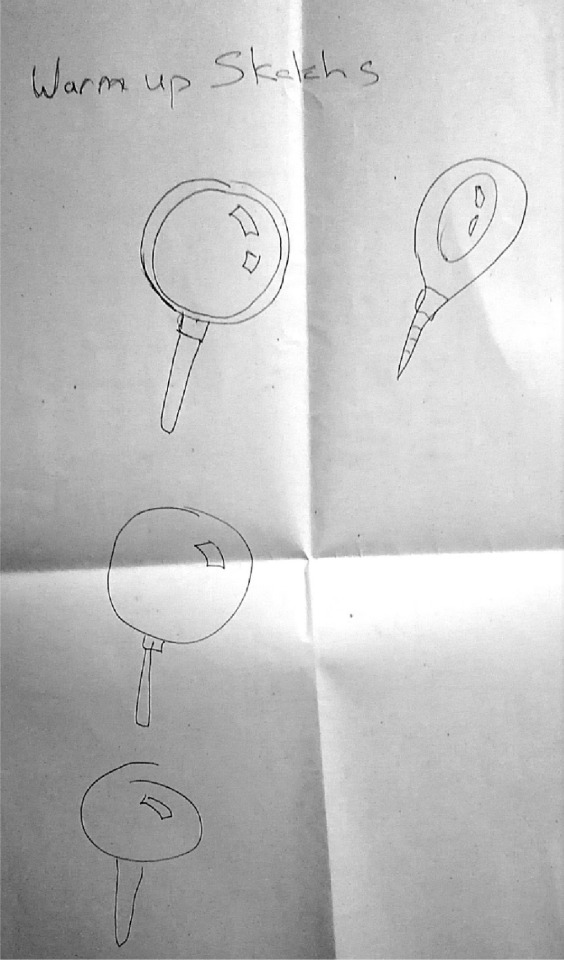
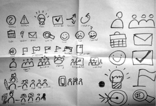
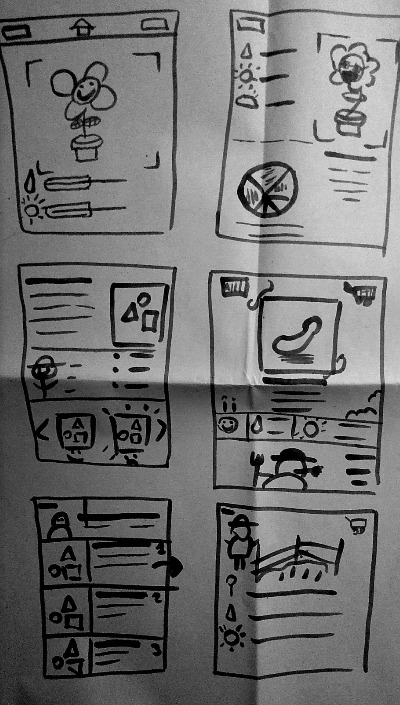
Drawing icons is a good way to symbolise a idea in a sketch book and can be done much quicker than writing a word and again hand writing may be hard to write especially if the person is writing fast. I believe a combination of a word with a icon works better than option to choose one over the other. The exercise that was done in the class was to Patrice drawing wire frames and icons which can be seen below. The ones I drew has a limited colour pallet of blues and grey but this was part of the challenge and for the most part a more challenging choice would have been to draw with just black and white. The drawings done in the class can be seen below:
This first image was a warm up sketching exercise as the idea was to get used to drawn items with speed going from about 10 seconds to 2 (top left to top right) the the basic idea of the magnifying glass was still kept, the handle could be rounder on the last one but and in my opinion the first 2 only look like a magnifying glass so clearly there is need for improvement with the speed for detail.
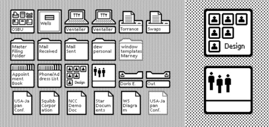
The next and main part of the work shop was to draw icons, these are meant to replace the words in our little note pads. They work as a quicker way of getting information down without having to write and allows other people to understand the information without having to try and read someones bad handwriting. The main icons include things like people and groups, how to show a team and team leader, on target icon, an idea bulb and an email icon to name a few.
The progression in the tasks was to now create real UX drawings, one for a calculator and then we had to mimic some sites a recreate their UI/UX in our wire frames. These were also done under a time limit, the idea was to get basics as in using our icons and squares to make the boxes for content and lines for written content. I think that my wire frames came out very well by this stage in the workshop I believe I had gotten the hang of drawing essentials and drawing quickly. Shading was used to highlight certain buttons and sections of UI.
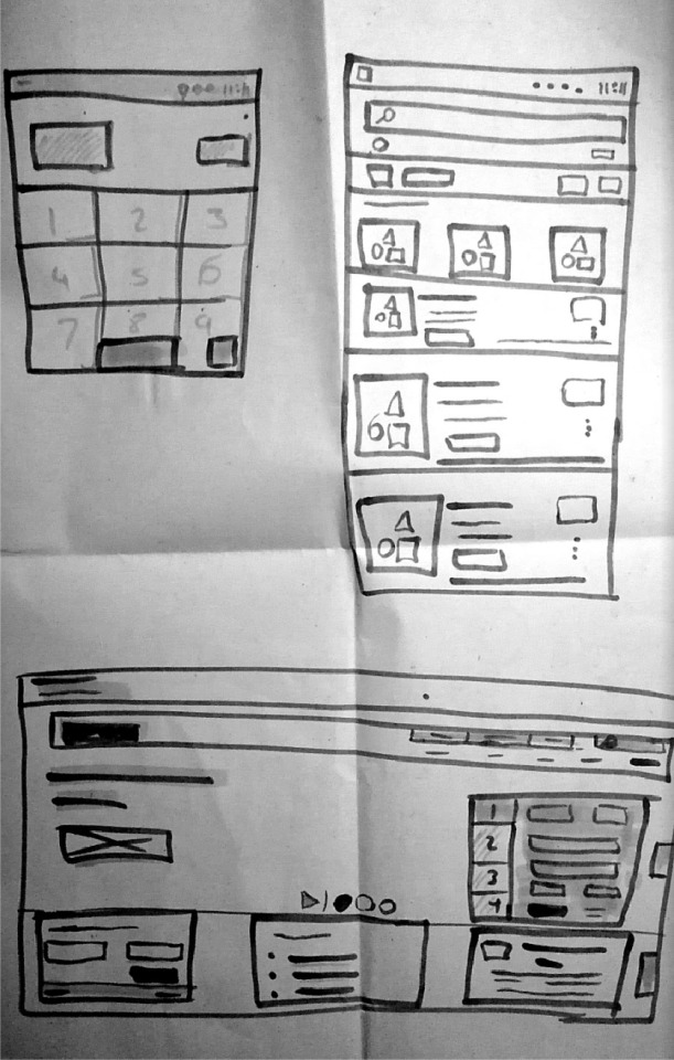
The next and final drawing exercise was to make a idea for an app that would co-exsits with a device that is planted with plants and can monitor how well its growing and looked after such as how much sunlight it needs or water it needs.
This was a group exercise and the first image below where my ideas that I told my group, my idea was mainly to do with combining the watering of plants into some sort of game, the better you looked after your plants the more points you could get to customise them with clothing items and decorate you UI more borders etc. The group then combined all of our ideas to make one final idea which was to make a fighting game that takes the plants well being into effect. The better you look after a plant you get points to buy gear, the better gear you have means the better you virtual plant will do in fights, the idea was to put two players against each other to fight and the more fights you win the more coins you get meaning you can unlock better gear. Different types of plants have more hp and streetlights and weakness so picking the right plant is key also knowing what gear to give to increase weaker stats was also part of the idea. When you lost you lost some gear to the winner making winning fights something you want to achieve more.
Drawing from the world
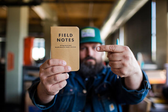
The concept of drawing from the world is basically to take a small note pad or filed notes with you at all times, this is done so that a person with this field note can take inspiration form everything around them such as buildings, signs, nature or whatever people stumble upon in the real world. Part of the job of creating user experiences is also to create some form of story or a flow and its almost impossible to be inspired or to create user stories without going outside to experience stories in the real world. This idea of taking inspiration from everything outside also means that most of the ideas drawn down will be entirely from your own mind not just from someone else Instagram, its also good for your mental health to go out and enjoy life and talk to people (sometimes non designers have some of the best ideas). Collecting things such as badges and stickers is also a great way to collect colours and ideas.
There are plenty of big time designer that do this as it keeps your mind always engaged and thinking, my favourite is Aron Draplin from Draplin co. This guy is so invested in this concept that he actually has his own brand of filed notes with some really cool designs on them. The guy is also really invested in symbols and logos that can be used on a variety of mediums such as clothing, furniture and signs for example.

0 notes
Text
How to get white in your coloring book pictures
Which white pencil, pen, crayon, mark-making gadget ought to I take advantage of to make areas of my mission white? That’s one of the requested questions in our Facebook group so I figured I ought to provide you with all my favourite white strategies.
White Pencils
Of course, you may have a white pencil in your set so a method if you would like a big space to keep white is to coloration it first with the white pencil. You can even use your white pencil to mix different colours and to soften or lighten them up a shade. This doesn’t actually work when you have already coloured one thing in so let’s transfer on to one other methodology. The Luminance White Pencil by Caran D’Ache is actually the perfect white pencil to use for making issues white as it’s the most vibrant and you should buy it individually. It’s a softer methodology than these beneath however could be fairly efficient.
White Gel Pens
There are a pair that we love and it simply is determined by your makes use of. Hands down my favourite are the Uniball Signo White Gel Pens This is a three pack of the broad level and it simply retains out performing different pens and it dries fairly shortly. It works over all sorts of coloured pencils and even watercolors & some acrylic paint. The image I coloured above exhibits you ways effectively the Uniball pens present up even on gentle pastel kind colours.
The subsequent in line is the Gelly Roll White Gel Pen, this one can fade into the pencils somewhat greater than the Uniball nevertheless it’s an ideal alternative in the event you can’t discover my favourite.
White Paint Pens
White paint pens are the trickiest of those three choices however provide the most dependable protection over your coloured pencils. You have to shake them every time you utilize them and prime them the primary use by urgent on a chunk of paper with the tip LIGHTLY till the ink flows.. do NOT do that ON your coloring book!! (I’ll have completed that and ruined a web page… OOPS!) .
White Sharpie
The most economical alternative is the Sharpie WATERBASED White Paint Pen. ( I can’t discover these regionally however possibly your retailer carries them. Just be certain it doesn’t say OIL on the packaging) These come in Bold, Medium, Fine & Extra Fine.
White Posca Pen
These take somewhat longer to get the US however are definitely worth the wait. This set of three has all three of the sizes, medium, advantageous & additional advantageous.
Dylusions Paint Pen
I confess, these simply got here out and I purchased this set with black and white paint pens in it however haven’t had an opportunity to strive it but. I like the opposite Dylusions merchandise and these different two choices are sometimes arduous to discover so hopefully they’re filling a distinct segment that’s wanted in the artwork provide part. Click to order Dyan Reaveley’s Dylusions Paint Pens in Black & White.
There are so many makes use of for white in your coloring, the apparent issues like snowflakes or highlights in the eyes, however you too can use them for detailing like I present in the image on the high of the web page. You can even use any of those three choices to soften coloration that’s gotten too sturdy the place you need it highlighted, the pencils you utilize by mixing however each the gel pens and the paint pens are liquid whenever you apply them so you may take a humid paint brush or your finger (Yes.. my fingers at all times have colours on them) and smudge it in to get the impact you might be searching for.
The post How to get white in your coloring book pictures appeared first on XNX Adult Store.
0 notes
Text
Microsoft Office Whiteboard app launches new colors of pen, background & more
Microsoft Office setup has come with its most recent updates in Whiteboard app. Since the user engagement on Whiteboard has increased, Microsoft team decided to make it even better and therefore, introduced 10 vibrant pen colors, where the thickness of the pen is adjustable, so you can go from thick highlights to think underlines.
With this new approach, users can play with their own creativity and produce fast designs. Now that you are free to work as flexible as you wish, you can become more productive now. Besides users, who do not have Whiteboard, they cannot enjoy the innovative features of this app.
To be more resourceful, go to www.office.com/setup and log in using your Microsoft or Office setup account details, purchase a subscription, and get started with the Whiteboard app of Microsoft Office setup. If you skip the step of purchasing the software, you will not get the access to the app for it is only accessible to licensed users as of now.
Visit More Information @:- office setup with product key
Today we are pleased to announce the general availability of the Microsoft Whiteboard app for Windows 10. Whiteboard gives teams a freeform, intelligent canvas for real time ideation, creation, and collaboration. Since releasing a preview of the app in December, more than 200,000 customers have helped us fine tune the feature set and end user experience. Based on their feedback we’ve added a number of new features, including text notes, the ability to add and manipulate images, enhancements to shape and table recognition, accessibility improvements, compliance with various global standards, and more. In addition, the Whiteboard app for iOS and preview on the web will be coming soon. These releases will mark an important milestone in our journey to make Whiteboard the best tool for freeform collaboration across platforms and form factors.
Create freely, work naturally
Whiteboard provides an infinite canvas where imagination has room to grow. Draw, type, or add images. Use sticky notes to organize ideas. Stack things up and move them around. Designed for pen, touch, and keyboard, Whiteboard allows you to share your ideas naturally. Intelligent ink recognizes shapes and makes creating tables a snap. And because the canvas expands along with your creations, you never have to worry about running out of space.
Work together in real time, wherever you are
Whiteboard brings a team together* – and gives them space to create. Teammates can huddle around a large touchscreen in the same room or work together on their own devices from around the world+. And, avatars on the canvas help you keep track of who is doing what and bring a natural rhythm to the interaction.
Save automatically, resume seamlessly
Forget taking photos of conference room whiteboards or marking them with “Do Not Erase.” With the Whiteboard app, your brainstorming sessions are saved automatically to the Microsoft cloud, so you can pick up where you left off, whenever – and wherever – inspiration strikes next.
To start using Whiteboard on your Windows 10 device, download the app for free at the Microsoft Store and log in with your Microsoft account (Outlook, Hotmail, Live, Xbox, etc.) or Office 365 account (work or school).
----------------------------------------------------------------------------------------------------
* Whiteboard currently supports collaboration within Office 365 tenants for commercial customers, and across personal accounts for customers with a Microsoft account. Collaboration across multiple Office 365 tenants is planned for future release.
+ Microsoft Whiteboard is available as an app for all users on Windows 10 devices. For commercial users, the Whiteboard app will be coming soon to iOS devices and will be accessible from other devices via the Whiteboard web client (preview).
An office setup subscription will entitle to your these Whiteboard features
Create an open classroom or conference place to share ideas using the medium of Microsoft Whiteboard.
Moreover, with the changes that have been introduced recently allows you to color your figures with vivid shades and intensities. This new update in Office setup Whiteboard has nine choices for board paint and eight types of gridlines, creating a colorful background will be fun.
As soon as you get a licensed access to Office.com/setup, changing Whiteboard’s background color will be open for you. Until now, Office.com/setup Whiteboard has only allowed users to write on white background. In addition, for users who have devices with no pen inputs, Microsoft Office development team has given a supplementary support for text entry with the keyboard so they can enjoy the new asset as well.
Hey, I’m Smith Leo. I’m a web developer living in California. I am a fan of technology, design, and web development. I’m also interested in camping and snowboarding. You can visit my website with a click on the button above. Visit@:- McAfee.com/activate, Norton.com/setup.
0 notes
Text
Sakuga Weekly: Who Made All Might's Final Fight Look So Amazing?
Over the last few months, whispers that something big was coming to My Hero Academia kept on making the rounds online. Comments by the animators themselves, the distribution of staff, all signs pointed at the production of this third season saving up its energy for something truly special. And as time approached, it became clear that it was All Might’s awe-inspiring final battle that they had focused so much on – a grandiose fight on its own right, but also an immensely emotionally-charged baton pass that the whole series had been building up towards. It deserved the best treatment it could possibly get, and as you’ll have noticed if you watched the episode, that’s what it got.
But before getting into the whos and whats regarding the production, I’d like to talk about the why. Because it’s not simply out of a sense of duty towards a big title like My Hero Academia that the staff needed to surpass themselves for this episode. It was narratively important to portray All Might as the ultimate symbol of peace, to actually animate him as the unparalleled superhero that he’s been established as. Much of this arc, and the series as a whole, has explored the idea of heroes as symbols; All Might isn’t what he is simply due to his vast power, it’s because he’s perceived by everyone as the number one hero. Villains see him as an undefeatable foe, and civilians have an indestructible source of hope to cling to.
And that means that anything less than an exceptional portrayal of his final battle wouldn’t have cut it. All Might's iconic fight in the first season had already been overseen by rising star Hakuyu Go before Go went on to direct one of the best-animated episodes of all time in Fate/Apocrypha #22, meaning that the staff are plenty aware of how important it is to nail All Might's appearances. For the bystanders within the show and the viewers at home to be in sync while cheering for All Might’s feats, the crew at studio BONES had to put together an all-time high for this series and shonen anime altogether. And that’s exactly what they did.
I’m truly spoiled for choice when it comes to highlighting impressive sequences in My Hero Academia #49. When it comes to climactic episodes like this, you usually have some individual artists who clearly stand out from their peers, but I feel just about the whole team here deserves credit for the success – another kind of All For One. Plenty of animators deserve a callout this time around.
We’ve got people like French artist Cedric Herole, who accidentally leaked his involvement with this special episode back in February – and seeing how much impact he packed in this clash, his excitement was deserved. Others like Masaya Sekizaki instead got across the magnitude of the confrontation with very memorable layouts, escaping this adaptation’s tendency to slavishly stick to shots from the manga. The final punches embody that desire to allow the anime to stand on its own legs with a thrilling back and forth that truly exploits the medium.
Versatile young animator Shuu Sugita had me screaming with the glorious last blow shown above (not the first time he achieves that!), which is intermixed with the already legendary black & white fire sequence + All Might's rushing face (covered over in a warm filter) that was likely penned by effects master Takashi Mitani. But again, this time more than ever it’s not just them. Every animator, painter, the compositing team... absolutely everyone nailed perhaps the most important moments of My Hero Academia to date.
And you know what’s a good follow-up to many people’s favorite episode in a super popular series? A visually quirky outing in a show that nowhere as many people are watching in the first place! Episode 23 of Record of Grancrest War is one of those idiosyncratic showcases of a single creator’s style that will leave no one indifferent, especially since at this point the production can afford no time to add extra polish.
Though the episode had its fair share of noteworthy guest animators, it all comes down to the work of Hirotaka Tokuda: storyboarder, episode director, supervisor of the animation on all levels, action director, and still with enough time to draw a bunch of sequences himself. If that sounds incredible, keep in mind that he’s occupied all those roles for multiple episodes in this series, and that he’s ready to return for the finale as well. Whether Tokuda is human or not is still up in the air, but we don’t discriminate against mechanical creators over here either way.
Tokuda’s episodes immediately stand out because of his eye-catching block shading. You would assume that’s at odds with series director Mamoru Hatakeyama’s fondness of flat, unshaded character art, but Tokuda’s deliberate usage of it during the most ferocious action moments tends to work quite well. Bold departures from the norm receive mixed receptions at the best of times, so I imagine that an episode like this that is truly rough beyond the intention of the creators will for the most part be met with complaints.
Even its most impressive scene, by the hand of the characterful young ace Nakaya Onsen, fails to live up to its potential and get across the grandiosity that we’ve seen previously in his work. And yet it still drew me in like very few moments can, because its essence is just that captivating. There’s a delicate balance between ambition and polish, and at the end of the day, your reaction to pieces like this will greatly vary depending on your personal priorities.
With other action-packed series like DARLING in the FranXX and MEGALOBOX also having strong episodes by their own standards, we could be over here highlighting frenetic sequences all day, but let’s not forget that anime is much more than that. So unless an animation earthquake forces me to change priorities, next week we’ll be talking about Hinamatsuri’s enchanting character acting – its unique rhythm has many of us enamored!
---
Kevin Cirugeda is one of the founders of Sakugabooru and an editor and writer for the site's sister blog, Sakugablog. You can find him on Twitter shouting about children's anime, Messi (sometimes), and sakuga memes at @Yuyucow.
0 notes
Photo
New Post has been published on https://nexttattoos.com/180-delicate-female-tattoos-beautiful-pictures.html
180 Delicate Female Tattoos - Beautiful Pictures
Delicate Female Tattoos – if before the tattoo was restricted to certain groups and synonymous with rebellion and marginality, today definitely represents a lifestyle, a status fashion . The art of permanently beautifying the body conquers, more and more, numerous adepts among the most varied styles that seek to overcome limits, to free themselves from the imposed moorings, to express their individuality and to reveal their personality through the chosen figure. Not surprisingly, women are gradually giving in to tattoos that match their values, ideals, aspirations and personal taste. Graceful strokes, subtle designs, pleasing colors, in smaller formats are the preferences of this audience – especially those who undergo tattoos for the first time.
About delicate female tattoos
Therefore, one of the recommendations is to evaluate with affection the figure to be stamped on the skin as well as its symbology. Hearts, birds, feathers, stars, musical notes, meaningful words, flowers, butterflies, diamonds, moon, bows, cherry are sure choices and will hardly cause regrets. Try to avoid to the maximum names of partners and designs that are in vogue, because the chosen figure must express in essence, its identity. Once in agreement, consider an area of the body that does not have as much exposure so as not to upset and / or disrupt your daily life, such as wrist, back, back, feet, arm – these are the favorites among those who seek feminine and delicate tattoos.
180 delicate feminine tattoos to inspire you
If the will speak louder and the certainty, security and confidence reigns supreme, check before tattooing, our special gallery with 180 incredible suggestions of delicate female tattoos and go ahead at your choice: Picture 1 – What about mixing several delicate elements in a single tattoo? Fine and delicate traits translate the delicate style to a feminine tattoo. Choose this style to have a beautiful and harmonious composition on your skin. What about? Picture 2 – Forever love, peace and us! The doves represent love and peace, make a delicate feminine tattoo using these symbols with fine lines and subtle on your skin. Picture 3 – Graceful ballerina in watercolors in the hand A beautiful delicate dancer at the ankle is unexpected and at the same time adventurous, choose a similar theme with a small and subtle design for your skin. Picture 4 – The selected color chart pleases even the most talkative The black and white is easy and practical to adapt. The shell of this tattoo follows this proposal with a small and delicate size for a female tattoo. Picture 5 – Dies for love for cats? Choose this template! Picture 6 – The butterfly is the symbol of the renovation, freedom and beauty Image 7 – Stamp a scenario or moment that marked your life Picture 8 – A bracelet of olive branches Picture 9 – Realistic and beautiful flower stamped on the wrist Picture 10 – Roses are a unanimity among women Choose a plant and your preference and tattoo the foliage delicately as shown in this example. Image 11 – Do you prefer more fun and eccentric designs? This will fall like a glove for you! Small dashes and dots demarcate and create the evidence of the tattoo, choose a similar model to have a delicate proposal for your skin. Picture 12 – A dynamic pair behind the legs Picture 13 – Gather several symbolic elements and make more sense to your tattoo Image 14 – Light and subtle strokes give more delicacy to the drawing Picture 15 – The flower is feminine, delicate and kind Image 16 – Watercolor tones give lightness to goldfish Picture 17 – Small stars monochrome in the leg Image 18 – The sunflower represents vitality and light Image 19 – The pink sneaker is synonymous with femininity Picture 20 – Pop dog Picture 21 – The pen symbolizes luck, protection and justice Picture 22 – There is no way to resist such delicacy A super simple and small design may be what you are looking for in the next tattoo. Choose for a symbol of your choice and make the tattoo in miniature size to have this effect. Picture 23 – How about stamping the man’s best friend on the arm? Picture 24 – Enter without knocking on the door Picture 25 – A perfect combination: flowers and a seductive mouth Image 26 – A Certain Choice Image 27 – Little and imperceptible third in the finger Image 28 – Be pure and true Picture 29 – Good fork! Picture 30 – A heart that pulsates for you! Image 31 – Minimalist Moon Image 32 – The Fruit of Sin Picture 33 – The light and fine traits bring out all the delicacy of the tattoo Picture 34 – King of hearts Picture 35 – The texture of the dog makes all the difference to the tattoo Picture 36 – Differential couple in the back Image 37 – The rose is the symbol of love, romanticism and sensuality Picture 38 – Interior design Image 39 – Mix of two elements: hearts and infinity Picture 40 – For fashion lovers Image 41 – The mandala is one of the favorite drawings among the female audience Picture 42 – Do you prefer to dare? Bet the flowers in watercolor tones on the wrist Picture 43 – Add your name next to the flower and ruin! Picture 44 – The dream filter is synonymous with protection Image 45 – Vibrant and powerful blue moon in hand Image 46 – Innovate with Emoji Picture 47 – Forever Image 48 – Elephants with monochrome contour on the wrist Are you passionate about dogs? Declare all your love on the wrist! Picture 50 – Romantic bouquet on foot Picture 51 – Not wide of you! Picture 52 – Free to fly! Picture 53 – Okay for you? Image 54 – Bouquets of flowers with serene and soft traits Picture 55 – How about stamping your name on the wrist in the form of a bracelet? Picture 56 – The ladybug brings with it all the luck of the world Image 57 – The color chart is perfect for feminine and delicate tattoos Image 58 – Explosion of colors, sensations and aromas in the arm Image 59 – Symbol of fidelity, stability and strength Image 60 – Birds represent freedom, wisdom and friendship Picture 61 – Dog tattoo in shades of gray on the leg Picture 62 – Who does not like to win flowers? Picture 63 – Pop Image 64 – Flamingos are the symbol of the soul toward the light Picture 65 – Precious Picture 66 – Small delicate bow on the leg Picture 67 – Messenger between the celestial and terrestrial worlds Picture 68 – Never forget, my love Picture 69 – For lovers of dance Picture 70 – The Arrow of Love Image 71 – The ruby diamond symbolizes purity, immortality and perfection Picture 72 – How not to fall in love? Picture 73 – For the travelers of the world Image 74 – The summit of delicacy and grace Picture 75 – The heart feels everything, everything sees Picture 76 – Good luck! Image 77 – Realistic shades of gray Picture 78 – Cherry blossoms in bracelet format Picture 79 – Beauty, love and harmony Picture 80 – Symbol of fertilization, perfection and spiritual purity Image 81 – Yes or no or both? Picture 82 – Paparazzi Image 83 – The flowers are delicate and feminine, therefore, they are favorite figures among women Picture 84 – A musical note differentiated Picture 85 – Infinity Picture 86 – A dolphin kissing Picture 87 – Couple who misses passion Picture 88 – The outline tattoo is perfect for beginners Image 89 – Conqueror of the Seven Seas Picture 90 – Sweetness, youth and innocence Image 91 – Vibrant, cheerful and full of vitality Picture 92 – Peace to the world Picture 93 – Be Happy! Image 94 – Want to dare? Choose eccentric figures, but full of personality! Picture 95 – Funny lace in the neck Image 96 – Heavenly Wonder Image 97 – Bird with non-continuous traces in shades of blue Image 98 – Branches of wheat for luck! Image 99 – The dog represents loyalty, protection and companionship Image 100 – Lonely and colorful flower on the arm Image 101 – A Certain Choice Picture 102 – Flower tattoo with delicate and subtle features Picture 103 – For Art Lovers Picture 104 – Minimalist Picture 105 – Kiss, kiss, bye, bye Picture 106 – The world is of the whales 107. How about stamping a beautiful portrait on the back? Image 108 – Several elements that harmonize in a single area Picture 109 – Original and creative Image 110 – Balloon in geometric format on the back Picture 111 – Life is a gift trip Picture 112 – Heart flying Image 113 – Flower bowl with medium contours and watercolors Image 114 – Where’s the nut that was here? Image 115 – Red peep toe never to feel shallow Image 116 – Geometric bird in shades of blue Image 117 – A combination that always gives certain: moon and constellation Image 118 – Birds are the symbol of friendship Image 119 – The blossoming of a flower Picture 120 – Kitten full of style in the hand Image 121 – Bouquets of graceful roses on the leg Picture 122 – Delicate strokes and contours make all the difference in the dream filter tattoo Image 123 – Personality Image 124 – Stamp a meaningful phrase for you! Image 125 – Notable fish in the arm Image 126 – For music lovers Image 127 – Tree tattoo, planet and monochrome moon Image 128 – How about honoring your partner in the back? Picture 129 – Gather your favorite elements on the wrist in smaller formats Image 130 – Friends Forever! Picture 131 – Buh! Image 132 – Is Dancing Your Passion? Show her in the leg! Picture 133 – Be lovely Picture 134 – Now or Never Image 135 – Contour kitten with highlights for the ears, eyes and muzzle Picture 136 – Romantic rose stamped on the arm Image 137 – Invent, innovate and dare! Picture 138 – Beautiful and enthralling Picture 139 – The rabbit is synonymous with fertility, cunning and prosperity Picture 140 – How to resist the charm of a pearl? Picture 141 – Hands Holding Picture 142 – Fun tattoos are very successful among women Picture 143 – Unicorn Whale Image 144 – Monochrome Dandelion Tattoo on the Wrist Image 145 – Bring your personality to the tattoo Picture 146 – Sly, but full of power! Image 147 – Well delineated traits Image 148 – Enjoy the internal area and replace with incredible textures Image 149 – Delicate strokes add texture to the lotus flower Picture 150 – I’m fine Image 151 – Geometric and monochrome bird on the leg Image 152 – Do not you want to make a mistake? Bet on infinity! Picture 153 – The metamorphosis of the butterfly Picture 154 – Radiant bird in shades of blue on the arm Picture 155 – A musical note with claw Image 156 – Stamp a meaningful word on the wrist and ruin it! Image 157 – Bird full of style and attitude! Picture 158 – Declaration of love for your kittens Picture 159 – The potion of love Picture 160 – Small, graceful and delicate pulsating heart Picture 161 – Passion for flying Image 162 – Blue-toned flower tattoo on the arm Image 163 – Feather brings protection and luck Image 164 – Sunflower is life! Picture 165 – Minnie Mouse Image 166 – Mix the shades of blue and pink: it works great! Picture 167 – Sincerity Picture 168 – Can not resist such a cuteness in the wrist Image 169 – Self portrait on the back Image 170 – Tattoos bring life and joy! Image 171 – Non-continuous traces, yet full of style! Image 172 – Symbol of luck and protection Image 173 – A gemstone in its path How about declaring your love to your partner? Image 175 – Realistic Flower Image 176 – The arrow represents conquest, destiny, knowledge Image 177 – The tree of life Image 178 – Female adornment Picture 179 – Rare jewelery Image 180 – The swallow is the symbol of hope, renewal and love For a delicate feminine tattoo, use details and symbols that translate the style into your skin
0 notes
Link
Drawn to Death, the brainchild of David Jaffe, The Bartlet Jones Supernatural Detective Agency, and SIE San Diego Studio is a game that is defined by aesthetic choice and artistic direction. But the distinctive art style evolved over time, according to Steve Merghart, art director at The Bartlet Jones Supernatural Detective Agency.
“The game was originally envisioned as a stick figure shooter,” Merghart says, “and was always intended to have a very rough, hand drawn look that could incorporate whatever bizarre and creative ideas that the 'artist' came up with. But as the gameplay and weapons evolved, so did our idea of the artist; eventually we settled on a high school kid who was extremely creative but not terribly skilled artistically. In the game, when a player summons 'the Hand' for a super powered attack, it’s that artist’s hand that appears.”
The result is an incredible blend of the stark style of games like Mad World with the line drawings and artistic flair you’d expect to find inside the sketch book of a teenage Megadeth fanatic.
Molded to fit an arcade-y third person arena shooter, the art serves the action in fun, novel ways. When the murderous, maniacal teddy bear you’re controlling (complete with massive bloodied chainsaw) launches an explosive AoE attack at foes on a platform below you, the radius is telegraphed in a bright, lurid red dome made up of shaded panels and wavy lines that would look right at home in a college ruled notebook.
“We all remember that classmate that would draw in class all day, filling their notebook with amazing doodles even if they weren’t very well executed. A lot of us actually remember being that kid, which is why the art style seems to ring so true for so many players. As far as our ‘medium’ is concerned, we tried very hard to make it look as if the notebook doodles simply come to life exactly as drawn on the page. So in essence, they are made of mostly ballpoint pen scribbles.”
The “high school kid with an art kit and overactive imagination” extends all the way to the game’s palette, which Merghart says was thoughtfully limited to what you might find in a teenager’s backpack.
“We envisioned that the kid had a couple of different colored ballpoint pens, mostly blue and black, but also a red one and maybe a green one. For real splashes of color, it’s not a stretch to imagine that he also had a couple of highlighter pens in the backpack. We intentionally limited the artist’s art supplies because from a narrative point of view we didn’t want this kid to come off as very artistically talented. “
While crafting bad art is a fairly easy process, Merghart says the real challenge came in manufacturing lots of bad art with consistency. “We initially joked about simply hiring high school students to draw all the art, but the technical requirements for making reliable and consistent game art quickly ruled that out. The one thing we need to be able to do when making this game is replicate the artist’s art style over and over and over. Creating art for a 3D action game that is intended to look badly drawn by one specific artist is surprisingly hard to do!”
This meant the team needed to find experienced, highly talented artists that were also capable of drawing at a much more primitive level than they were used to, and doing so consistently and at the same reduced level over and over, across months or years of development.
“It’s a bit like needing someone to sing a song very badly, but in exactly the same way for every showing of a Broadway musical. You end up needing an extremely talented singer with amazing vocal control, which is essentially how we’ve staffed our art team: A small team of amazing artists with an amazing range of art style control. From the concept artists, to the modelers, to the VFX artists, to the animators, everyone is able to put aside their individual styles and channel the angst-ridden musings of this creative high school kid. “
The approach to this kind of regressive art engendered some interesting experiments.
“We’ve had right handed concept artists try to draw with their left hand, texture artists holding the pen in a kindergartener’s stabbing grip, and our VFX artist struggling to find the balance of classic game effects and crudely hand-drawn splats and explosions. The one thing that no art director ever thought he’d have to say is, ‘That looks way too nice! Draw it again, only crappier.’ With a million apologies to my amazing art team, that was an almost daily occurrence.”
Throughout the art’s unique evolution though, Merghart emphasizes that the team never lost sight of their real goal: making a video game that was as fun to play as it was visually interesting.
“Fun and rewarding gameplay has always been the guiding principle for Drawn to Death from its inception. The art style has gone through significant evolution from a stick figure shooter, to flat paper dolls running around a paper level, to the high school notebook scribbles where we have now, but the goal of making a fun-as-hell shooter with the moves and depth of a fighting game has never wavered.”
But their bizarre art design did mean a lot of room for experimentation, and that no concept for weapons and equipment was off the table, regardless of how surreal or ridiculous. “It’s been extremely amusing and gratifying to watch some of the crazier concept designs inspire some truly off the wall weapons and abilities. We have a monkey that rides on your back literally throwing poop at your enemies, a coffin that catapults out a fat, bloated, exploding corpse, and a shark-headed ninja that summons smaller explosive sharks to wreak havoc on the battlefield!”
After the design had been mostly cemented and a lot of the original artwork generated, implementing it was a completely different challenge, one that ended up generating some very unique (and ambitious) potential solutions.
“Production art had a different set of problems to overcome, as our original goal was for the game to have an actively scribbly look to it as if it was constantly being redrawn. From double and even triple texture maps that would cycle to give the characters a very animated look to complex toon shaders that would draw and re-draw the scene for that squiggly look. Environments added a new twist as we initially wanted the game to appear as if it was taking place on a piece of lined notebook paper, flattened out and with no lighting. We quickly learned that so much white on the screen was giving people headaches, so we began looking for a lighting scheme that would make our 3D environment fit our highly stylized vision. We settled on a very controlled set of environment textures where the mip maps are actually individually drawn, and the shadows are built from layers of scribbled textures.”
As is so often the case, reality intervened and put the brakes on some of the more inventive approaches, but Merghart says the core design was retained. “Ultimately, limitations of the engine ruled out some of the more ambitious methods, but Drawn to Death still holds true to the creative director’s vision.
0 notes
Last Seen Blogs

pretamanger87
Pretamanger

strodinguer22
Flash

whalemonday22
The Journey of Mcfarland 162
pretamanger87
Pretamanger
quintral
QUINTRAL