#Goudy Old Style
Text


Typography Tuesday
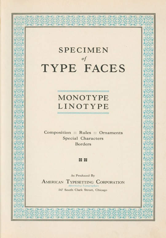
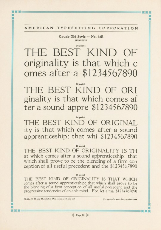
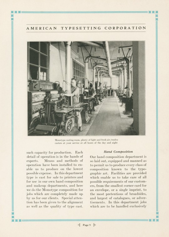
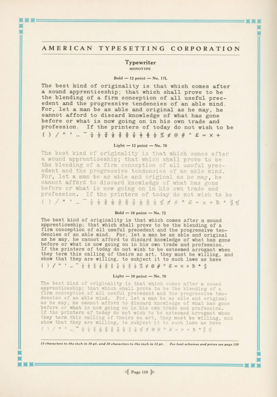
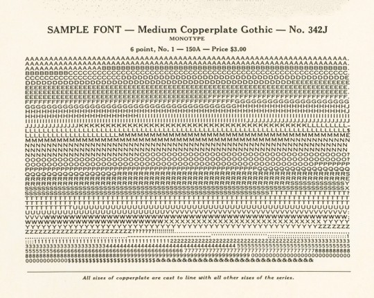
Specimen of Type Faces Monotype Linotype was produced ca. 1930 to display the range of typefaces used at the American Typesetting Corporation of Chicago, "the largest of its kind in the world," established in 1919. The plant operated 24 hours a day, offering day and night services. Their Monotype Department boasted ten keyboards and twelve casters, and their Linotype Department operated ten machines. The typefaces shown here are Goudy Old Style, Cloister Text (a Gothic face, not the Roman Cloister designed by Benton), Typewriter, Monotype Accents, and Copperplate Gothic.
View our other Typography Tuesday posts.
#Typography Tuesday#typetuesday#monotype#linotype#American Typesetting Corporatioin#Goudy Old Style#Copperplate Gothic#Cloister#Typewriter font#type setting#type composition#20th century type
75 notes
·
View notes
Photo

https://pad.dotincorp.com/
#Dot Pad#tactile#graphics#display#tactile communication#braille#device#black#typography#type#typeface#font#Neue Haas Grotesk#Goudy Old Style#2022#Week 51#website#web design#inspire#inspiration#happywebdesign
2 notes
·
View notes
Photo
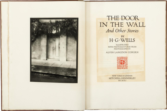
the door in the wall
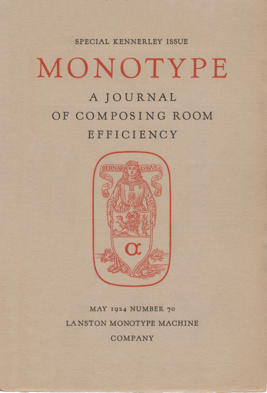
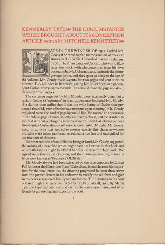
late in the winter of 1911, the english-born, nyc publisher mitchell kennerley asked his friend frederic goudy «if he cared to plan for me a volume of ten short stories by H.G. Wells.» [‘Kennerley Type, The circumstances which brought its Conception’, A Journal of Composing Room Efficiency, number 70, lanston monotype, philadelphia, 1924, p5.] matthew j. bruccoli relates: «The most typographically distinguished volume bearing Kennerley’s imprint appeared in 1911. The limited edition of H.G. Wells’s The Door in the Wall and Other Stories was proposed by Alvin Langdon Coburn as a vehicle for his photographs. Kennerley commissioned Goudy to design the book, and sample pages were printed in Caslon type by Norman T. A. Munder.» [matthew j. bruccoli, The Fortunes of Mitchell Kennerley, Bookman, hbj, 1986, p51.] bruccoli then quotes much of kennerley’s article from A Journal of Composing Room Efficiency [op. cit.].
goudy was not pleased with the type fit of the sample pages & suggested to kennerley the cutting of a new face, one that would set more tightly yet carry color as caslon. kennerley relates that goudy drew inspiration from oxford’s fell types [monotype, op. cit., p5.]; but to my eye goudy was looking at jenson (or the lettera antiche tonda of the scribes). clearly, kennerley is a 20th c. neo-venetian: canted stroke to the eye of e, serif, color, fit, canted hyphen; only, the cap-height has been brought into agreement with aldine norms.
«Goudy, who retained the rights to Kennerley, leased it to the Lanston Monotype Machine Co. [lanston monotype 268] and to the Caslon Type foundry in England. … Three days after completing Kennerley Old Style, Goudy designed an entirely new face for the title page & story titles of The Door in the Wall, inspired by the lettering in the Roman Forum and accordingly named Forum Title. [bruccoli, op. cit., p53.]
«Six hundred copies of The Door in the Wall were printed in November 1911; but publication was delayed by the spoilage of Coburn’s photogravures [photo-chemical engraving process, intaglio prints], which were to be inserted in [tipped in] the books. … Only three hundred copies were published with all ten illustrations.» [bruccoli, op. cit., p55.] of the three hundred copies not containing all ten photogravures some had at least one, but the complement was made up from aquatone prints—half-tone, relief process. [gleaned from book seller descriptions on the web, vide e.g. abebooks.com].
«As with many of the events in Kennerley’s career, it is impossible to be dogmatic about when Kennerley Old Style was actually first used in a book. The Door in the Wall is usually credited with this distinction, but it seems clear that Kennerley type was used to print 1911 books that appeared before the Wells volume. Kennerley stated that the first use of the type was in the four-page prospectus printed for The Door in the Wall.» [bruccol, op. cit., p53.]
some
settings in kennerley old style: ‹egg&dart›, ‹hommage à klaus›, ‹slender mark›.
#literature#photography#typography#h g wells#alvin langdon coburn#mitchell kennerley#frederic goudy#kennerley old style
2 notes
·
View notes
Text
Download goudy old style regular

#DOWNLOAD GOUDY OLD STYLE REGULAR PRO#
#DOWNLOAD GOUDY OLD STYLE REGULAR DOWNLOAD#
#DOWNLOAD GOUDY OLD STYLE REGULAR FREE#
As a result, Windows itself already has a wide range of fonts pre-installed by default.
#DOWNLOAD GOUDY OLD STYLE REGULAR PRO#
226 glyphs Trajan Pro 3 Regular – Adobe 1398 glyphs Futura BT Book – Bitstream.
#DOWNLOAD GOUDY OLD STYLE REGULAR DOWNLOAD#
His typefaces are among those … Download Aachen font for PC/Mac for free, take a test-drive and see the entire character set. A benefit of using a hosted service is that it is likely to include all the font file variations, which ensures deep cross-browser compatibility without having to host all those files. His initial design consisted of an alphabet of squared capital letters with a unique twist that characterized its appearance: corners with rounded exteriors and right-angle interiors. The Mono version now includes four variations – Mono Light, Mono Regular, Mono Medium and Mono Bold. 1 Abadi MT Condensed Light Albertus Extra Bold Albertus Medium Antique Olive Arial Arial Black Arial MT Arial Narrow Bazooka Book Antiqua Bookman OldStyle Boulder Calisto MT Calligrapher Century Gothic Century Schoolbook Cezanne CG Omega CG Times Charlesworth Chaucer Clarendon Condensed ComicSans MS Copperplate Gothic … body If you open the URL for the font, you can actually see all the work being done behind the scenes. IRender nXt is a feature-rich photo-realistic rendering program used to create architecture architectural renderings, visualizations, presentations from SketchUp models, perfect for architects, interior designers, engineers, and industrial designers. Radio-Canada is a Canadian federal Crown corporation that serves as the French national public radio and television broadcaster in Canada. com is a collection of 100,000 fonts from the best designers of the font. Look at any pocket map from the 80s for instance. The market research organisation provides advice on existing and emerging technology. With more than 24,000 glyphs in 49 fonts, Winner Sans leaves nothing to be desired.
#DOWNLOAD GOUDY OLD STYLE REGULAR FREE#
Below you can freeload fira sans extra bold font. Add egg to meat mixture, mix egg well into all parts of meat. Monotype Fonts streamlines the paperwork and approval process so you can work with the fonts you need when you need them. Download Coral Blush Font Family From Set Sail Studios Condensed, bold, and beautiful, Norwester is a sans-serif typeface your graphic design toolbox needs. Its neutral and cleanconstruction has been specially designed for short texts, headlines, logos and branding. The family was one of the winners selected in the 2003 International Type Design Contest, sponsored by Linotype GmbH. Empirez is a thick sans-serif sports font with bold plated serifs that carries so much attitude that of course, it’s a sports font. Discard beef fat and then add butter to the pan. How about this wonderful condensed sans serif that's perfect for headers, titles, and signage.
1 note
·
View note
Text
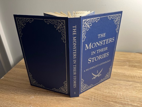
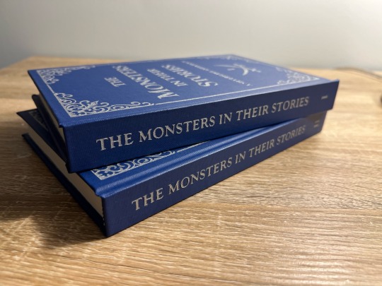
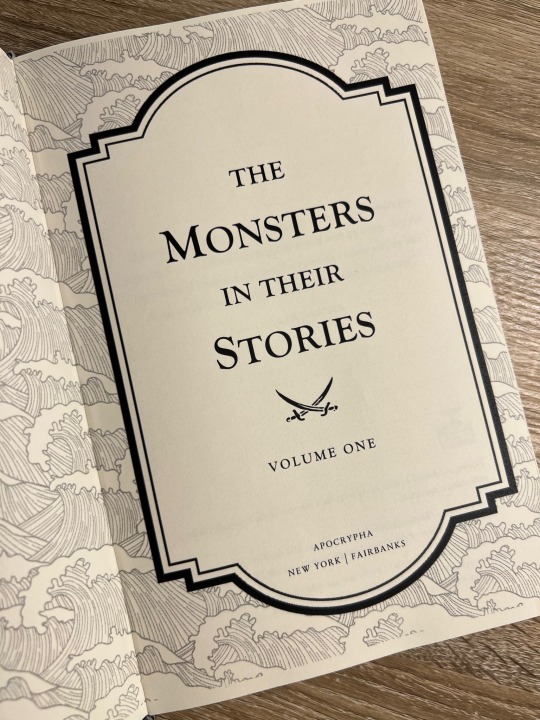
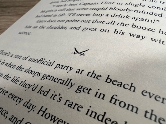
My First Fanbind! A Black Sails Fic Anthology Series
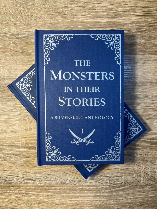
It took me a year (and a lot of anxious research) before I worked up the courage to bookbind fanfiction, and after months of on-again-off-again work, my first fanbind is finally done!
I knew that if I was going to bookbind fic, I had to bind something from the Black Sails fandom, aka the fandom and show that have had the biggest impact on my life. Y'all, I almost went into academia to study slavery in the 17th-18th century Caribbean because of this show - when folks say this show rewires your brain chemistry, they are NOT kidding. THEE show of all time. Happy 10th anniversary to Black Sails! This fandom is small but mighty. May we continue to get our hearts and souls blasted to smithereens by this show for many years to come.
Ao3 abounds with magnificent Black Sails oneshots, so I decided to put together an anthology of my favorite Silverflint fics under 20k, which I split into two volumes. Included are works by @justlikeeddie, @vowel-in-thug, @balloonstand, @annevbonny, @francisthegreat, @nysscientia, and more! Thank you, thank you all, you brilliant wonderful people, for gracing the Internet with such amazing writing. When I read the fics in these anthologies I want to fling myself into the sun.
More on the design and binding process below the cut!
Vol. 1 Page Count: 270 (12 fics)
Vol. 2 Page Count: 248 (11 fics)
Body Font: Sabon Next LT (10.5 pt)
Title Font: Goudy Old Style
Other Fonts: IM Fell English, pirates pw
The typeset (which I did in Word) took a while, mainly because I'd never done it before. Manually adjusting the hyphenation line-by-line was especially tedious. After making these books, I abandoned Word in favor of InDesign, in large part because InDesign gives you way finer control over your justification and hyphenation settings.
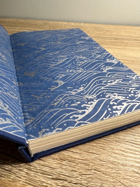
Regarding my actual design choices, I'm happy with how the ocean motif on the title page turned out (it's not the same pattern as my endpapers, but they're complimentary) and I'm very fond of my divider dingbats, which are little swords! Goudy Old Style was a fun title font to use, since it's the font that Black Sails uses as its logo. The stories in Vol. 1 are divided into parts based on what Silver WAS at that point in the show (cook, quartermaster, or king), and Vol. 2 is split up into comedies, histories (AUs set in the canon universe) and tragedies - befitting Black Sails' Shakespearean ~vibes~.
I stuck to a flatback binding, as I wasn't feeling quite ambitious enough to try rounding and/or backing. I've learned that I ~Anakin Skywalker voice~ hate sanding, enjoy folding/sewing, and don't LIKE edge trimming but enjoy the results enough to make it worth it.
The real adventure was decorating the cover, which remained bare for months. After agonizing over Illustrator and experimenting unsuccessfully with HTV and lokta paper embossing, I ultimately turned to using stencil vinyl to paint on the designs. There was a bit of seepage under some of the stencils, but I was able to scrape off the excess with my Cricut weeding tool without damaging the coated surface of the bookcloth (probably Arrestox Blue Ribbon from Hollander's). Even though it was very time-consuming, I'm so happy with the end result of the stenciled paint job and I intend to stick with stencils for my foreseeable future binds.
Are there things I would change? Sure. It was humid out when I printed, so the pages have got a wave. There’s an extra two pages in Vol 2. that I have no idea how I missed, and I got a line of glue in the middle of one of my Vol. 2 endpapers. I’m pretty sure I didn’t case in quite right, since my endpapers pull away from the case at the spine. I think the inner margins are a bit too big, and despite going line-by-line there’s still some wacky justification spacing in the typeset. But man, am I proud of these books! It is so satisfying to learn a new skill - MANY new skills, if we’re being honest - and to make something both beautiful and practical. If I’m still binding in two years or so, I can see myself redoing the typeset in InDesign, cutting out the existing text block, and reusing the cases. I’m also already planning for Vol. 3, which will be Silverflint Modern AUs.
Thanks for reading!
#bookbinding#fanbinding#ficbinding#my books#black sails#silverflint#fanfiction#bsanniversary#10yearsblacksails#10bsfest
270 notes
·
View notes
Note
Would you be so kind as to entertain this most random and pointless question: do you have a favorite font?
Beloved, this isn't a pointless question at all.
First of all, serifs clear. Let's get that out of the way right now. I barely have time for a sans serif font, and if it doesn't have a good-looking question mark, I get the ick immediately. Conversely, EB Garamond has a perfect question mark, but the rest of the font is too spindly and the lettering isn't a consistent thickness, which is key. Of the sans serif fonts, however, Lucida Sans (also known as the AO3 body font) is actually my favorite. Its quotation marks are appealing to me, as is its question mark, which is ironic, because usually I don't like top-heavy question marks. Makes no damn sense. Compels me though.
My all-round favorite font is Adobe Garamond, which is elegant, unobtrusive, not hard to read, well-balanced in terms of symmetry and thickness, and has beautiful punctuation. If I write something and want to get it printed, I want it printed in AG. If I ever bind or publish a book, I'd want it in Adobe Garamond. (It is also, fun fact, the font that my original copies of Harry Potter are printed in. Go figure.)
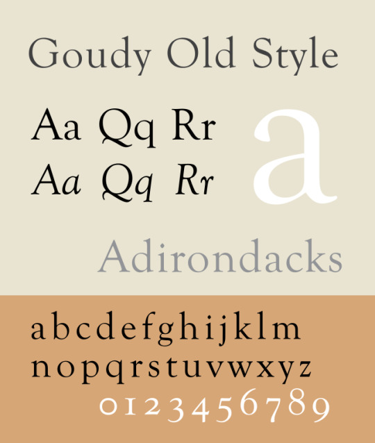
My most beautiful font is Goudy Old Style, which is absurdly pretty and fancy and frilly and feels like a fine lace doily. I put a document in GOS when it's a reference text, and I'm going to be looking at it, but I'm not going to be typing in it a whole lot.
My most reliable font is Times New Roman, i.e., if I have 1,000 words that absolutely need to get churned out by the end of the day, I'm tagging my beloved childhood ally TNR. This is the font that makes the words go. I don't really know how that works, but it is.
25 notes
·
View notes
Note
I was wondering, what are you biggest inspirations when it comes to your range of artistic style?
I think about this a lot!
Some online artists come to mind are @/timestables, @/hhbm, and @/qsfocus (although there are so very many more!) but within the last year or so I've really found most of my inspiration via traditional artists. To name a few: Robert & Sonia Delaunay, Haejin Park, Hana Chatani, Zoey Frank, Lachlan Goudie
It's very easy to pinpoint who (or what) I'm specifically inspired by depending on what I draw. For example here's a screenshot of something I'm working on compared to a piece of Zoey Frank's that inspired me the second I saw it, and something I drew several months ago vs. a piece of Robert Delaunay's


My art class last year forced me to do studies and compositions I likely never would have done otherwise and I love incorporating parts of these styles into my art. Honestly most of my inspirations I find by happenstance... if you ever get the option, buy an old art textbook and just flip through it. That's what I did. You'll see beautiful things!
I am not afraid to upend my art style to try new things, which I definitely used to be. I change brushes constantly and try new color palettes all the time and push shapes as hard as I can because there's just too little time for me not to
65 notes
·
View notes
Text
Common serif fonts: Times New Roman, Baskerville, Garamond, Goudy Old Style, Georgia, Didot, Cambria. There are also slab serifs like Rockwell, American Typewriter and Courier.
Common sans serif fonts: Arial, Helvetica, Franklin Gothic, Avenir, Verdana, Trebuchet MS, Futura, Gill Sans, Comic Sans, Calibri.
I read this article to find out what classed as serifs or sans serifs - there are also several subcategories of both but perhaps that's a poll for another day, lol
If you pick the 'something else' option, please feel free to elaborate in the tags or comments, I'm curious!
#writeblr#ficblr#wips#writing#fonts#serif fonts#sans serif fonts#typography#tumblr polls#polls#my polls
33 notes
·
View notes
Note
Oh weird questions pls: numbers 1, 3, and 4 :)
Hey there @ohtobealady, I sincerely thank you for this ask ❤️
And my answers are right here ⬇️
1. What font do you write in? Do you actually care or is that just the default setting?
My answer: I do write in a certain font, and I do actually care! The font I personally wirte in is "Goudy Old Style". Always has been, propably always will be!
3. What is your writing ritual and why is it cursed?
My answer: Well...Let's put it this way- and I apologise for the long answer. I decide I should start writing, I fill up a glass with cold water, I sit down at either my desk or on my bed, I open up my laptop, I realise I've forgotten to grab my headphones and my notebook so I get up to fetch those, I sit back down at my laptop, I open up my tabs (word, google translator, spotify, finnish->english dictionary etc.), I try to figure out what I want to listen to today, I think some more, and then even more, I decide on a playlist, I drink some water and have to fill up my glass again, I come back to my laptop and read my notes on what I am supposed to write about, I get lost in thought, I write a few words, I get on Tumblr, I get back to writing and write a bit more, all of a sudden decide to change playlists, I see an update on one of my favourite fics, I go read that fic, I scroll my Tumblr dash a bit more, I get back to my WIP, I write for a while until my brain forgets how to form words...and so on. At some point, I eventually get to properly writing. It takes me a long time from sitting down to write, to actually writing. I can't be the only one? And I will not have to tell you what is cursed about this, do I?
4. What's a word that makes you go absolutely feral?
My answer: I don't think I have simply one word that makes me go feral. It really depends on my mood, or the situation. One day it might be something very simply, for example "was" or "were", because my brain refuses to know how to use them. Then, on other days it might be something along the lines of "sex", I am a child at heart it seems as it on some days makes me laugh like a 5 year old.
I hope my answers weren't too disappointing! Have a great day/night, my loves <3
7 notes
·
View notes
Text
The House That Lars Built → Site of the Day for July 19, 2023
Fonts: GT Alpina, Sweet Sans, Tilda, Goudy Old Style
1 note
·
View note
Text


Poster Development
After completing my document, I went back to my poster to develop and upgrade it. Remaking it entirely from the ground up.
This time I made the poster using my updated header font, Goudy Old Style. Spaced out the letters and shrunk the lines down to look more like the ruled lines they are supposed to. (I also went through the document and replaced the rule lines with these smaller lines throughout)
I tried experimenting with the placement of the header white text., before deciding I had it right the first time. Finally, I added the text and icons.
This poster is a drastic upgrade from the original and feels suitable and up to standard for my hand in tomorrow.
0 notes
Text
Tutorial: Glyphs
Follow "Tutorial Illustrator Glyphs.pdf" in Design 2 > NYU Design 2 Work Files > Glyphs Tutorial.
If you finish early: Use Illustrator to re-create a classic Plakatstil poster. Alternate challenge: Pick a product from a modern brand. Translate one of their current advertisements to a classic Plakatstil poster. For example: A poster for Delta airlines in the style of Lucian Bernhard’s famous poster for Manoli cigarettes. Bonus: Use a Glyph from Illustrator.
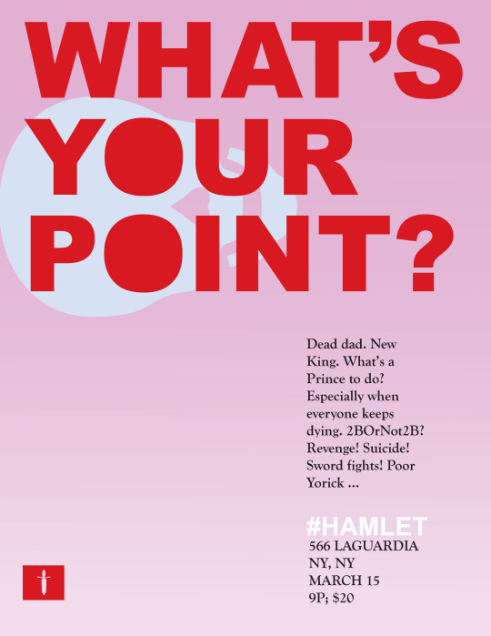
What’s Your Point?
1. Start with a vertical page, letter size.
Make a rectangle.
2. Create a pink background with a slight vertical gradient. I used spring pink from the “Gradients > Seasons” library. You can access this through the color palate, which is on the right side of your screen -- the one that looks like a windowpane. Once you open that, choose the library icon on the lower left.
3. Use the type tool to write the words What’s Your Point? (Don’t draw a rectangle for your type. Just select the cursor and type.)
4. Bring up your Character panel and change the font to Arial Black. Kern the letters with the ALT-left arrow command. Change the color of the type. I used the red from the “Art History > Pop Art” library.
5. Use the text tool to draw a rectangle for Area Type. Cut and paste or type the poster copy: Dead dad. New King. What’s a Prince to do? Especially when everyone keeps dying. 2BOrNot2B? Revenge! Suicide! Sword fights! Poor Yorick … #HAMLET.“
6. Change to Goudy Old Style or something similar, like Times New Roman. The copy should be 18 point. Hamlet should be 32.
7. Add area type for the address and date. Change to 18 point Goudy Old Style (or something similar, like Adobe Garamond).
8. Add skull art. Go to the Type > Glyphs menu. Find Wingdings. Add the skull as a font.
9. Select the entire glyph. Change to Outlines. Use direct select tool to delete crossbones.
10. Rotate skull and align eyes with the Os. Change skull to white.
11. Change your type to Outlines and use the direct select to delete the center of the font.
12. For the sword logo on the bottom left of the page, first, copy the rectangle made with the question mark at the end of the word "point.”
13. Keeping the proportions, size the rectangle to match the height of “HAMLET” and 566 LaGuardia.
14. Add dagger art. Go to the Type > Glyphs menu. Find Webdings. Add the knife as a font. Select the entire glyph. Change to Outlines. Use direct select tool to delete the shadow on the blade and the hilt.
15. Place the knife on top of your rectangle. Select both together. Bring up the Pathfinder panel. Choose “Minus Front” to punch out the knife shape.
Exercised based on the Lynda.com tutorial 11 Things Every Beginner Needs to Learn to Love Illustrator with Russell Viers.
If you finish early: Use Illustrator to re-create your sign with a classic Plakatstil poster look. Alternate challenge: Pick a product from a modern brand. Translate one of their current advertisements to a classic Plakatstil poster. For example: A poster for Delta airlines in the style of Lucian Bernhard’s famous poster for Manoli cigarettes. Bonus: Use a Glyph from Illustrator.
0 notes
Photo
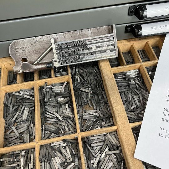
Atypical morning today… typesetting 10pt type. Goudy Old Style, if you’re curious. #letterpress #bostonprinter #printing #bostonpress #popmembers #crankclickyankback #type #lead #tin #antimony #vandercook #stovefactory #Charlestown #ink #paper #inkonpaper #goudyoldstyle #treasuregems https://www.instagram.com/p/CoP1Yw4Owd8/?igshid=NGJjMDIxMWI=
#letterpress#bostonprinter#printing#bostonpress#popmembers#crankclickyankback#type#lead#tin#antimony#vandercook#stovefactory#charlestown#ink#paper#inkonpaper#goudyoldstyle#treasuregems
0 notes
Text

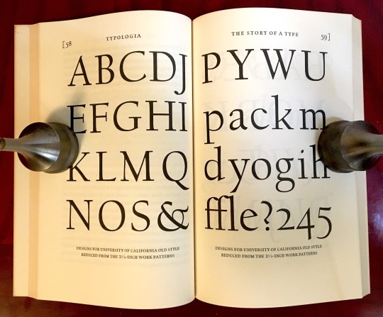


Book 160
Typologia: Studies in Type Design & Type Making
Frederic W. Goudy
University of California Press 1977
As one would expect, this is a beautifully designed book with a large, spacious type. In fact, Goudy created a type design just for this book—University of California Old Style.
#bookshelf#illustrated book#library#collection#personal library#personal collection#books#book lover#bibliophile#booklr#typologia#Frederic Goudy#uc press#typography
0 notes
Text
San serif fontbook

SAN SERIF FONTBOOK HOW TO
SAN SERIF FONTBOOK PDF
Make sure you leave ample spacing between paragraphs. This is especially important with print books or PDFs where you have fixed the font size. Because of this, it is best to err on the side of too large instead of too small. Some work well with each other but it's something to keep in mind.Īn important reminder is that when most people are reading your recipes they will be in their kitchen and not in a normal reading situation. Two different serif fonts next to each other can look a little strange. General Cookbook Font TipsĪ good rule of thumb is to mix and match serif and sans serif fonts if your header font is different than your body font. This will make it much easier for your readers to read it.
SAN SERIF FONTBOOK PDF
12pt is generally a good default font size that the reader can then overwrite if needed.īe sure to add in some line spacing, usually 120% to 150% works best.įor PDF books I highly recommend using a sans serif font or one that is designed to be read on a computer screen. Preventing them from doing this will just upset them and lead to bad reviews.įor this reason it is also best not to lock the font size of the body text, different people like reading it at different sizes. It's usually best to only do this for headers because many readers like to pick their own body fonts. We then use the bold version of the font at double the size for our largest header and move the size down from there.įor fancier presentations you can also embed fonts into your Kindle books. We have published our books using Palatino, Verdana, and Georgia as our base font for different books. It's almost impossible to accurately judge the look, feel, and size of fonts without printing them. The fonts will look very different on your screen than they do on the printed page. When selecting the fonts you will use for your print cookbook, be sure to actually print some sample pages out. The font size can vary depending on the context (recipe headnote vs body text vs ingredients) though 10 to 14 is usually used.įor headings, a larger or bolder version of the body font can be used or a more stylized font such as Bookman Old Style or Century Schoolbook. These are all serif fonts, which tend to be easier to read in printed books. The major ones are Georgia, Adobe Garamond Pro, Minion Pro, Palatino, Baskerville, and Goudy Old Style. There are several standard fonts used for printed cookbooks. Print and eBooks will have different fonts because some fonts are easier to read on a computer and others are easier to read in print. Sticking to basic fonts will not make your book stand out, but you can ensure it will be as readable as possible. Poor font selection can result in a book that is hard to read and can frustrate your readers. One of the more important parts of your cookbook design is choosing which fonts to use. Or Get More Information about Self Publishing Made Easy What Fonts to Use in Your Cookbook Click here to get great self publishing content via email
Cookbook Newsletter Promotion Templates.
Cookbook Writing and Marketing Templates.
Sales Channel Revenue Breakdown with Modernist Cooking Made Easy.
Should You Publish Your ebook Directly or Use a Distributor.
KDP Select - What Is It and Is It Worth it?.
Great Books to Learn About Food and Recipe Writing.
SAN SERIF FONTBOOK HOW TO
How to Get Blogs to Write About Your Cookbook.How to Launch Your Cookbook Successfully.How to Create and Sell a PDF on Your Blog.How to Publish Your Book Through Smashwords.How to Publish on Amazon With CreateSpace.How to Write a Selling Book Description.Cookbook Design and Formatting Guidelines.Comparison of Print on Demand Cookbook Printers.Competitive Breakdown of an Amazon Sales Category.How to Generate a List of Keyword for Your Cookbook Subject.Finding Complementary and Competitive Products.Determine the Competition In a Cookbook Subject.Self Publishing Master Course Introduction.
0 notes
Last Seen Blogs

osexvi
Sin título

musicreviewunpopular
Music Reviews

bunniartzi
Bunni.Artzi

graafs-world
workout

thatseventiesbitch
that ~*seventies*~ bitch