#But given my style and the cartoony nature of how I draw
Text
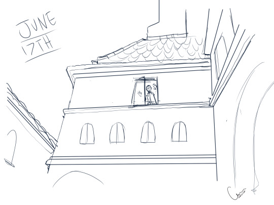
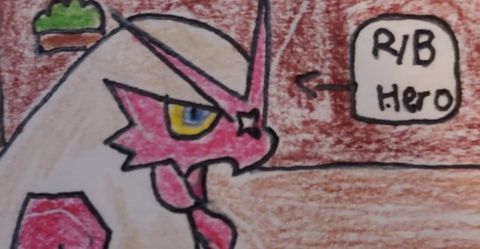
Dracula Daily sketch for June 17th
In which Jonathan catches a glimpse of the outside world.
Not comfortable at all with the language used to describe most of the characters and actions in this entry, so I took the opportunity to look at pictures of Romanian castles and focus on castle Dracula's design instead.
#I don't think they should be ignored or glossed over#But given my style and the cartoony nature of how I draw#I don't want to highlight the xenophobic and bigoted aspects of this novel as somehow light hearted or acceptable#art#artists on tumblr#Dracula#Dracula fanart#Dracula Daily#sketch#daily sketch#Jonathan Harker#Castle Dracula#Castle#Gothic#Horror#gothic literature#Victorian#location design#digital art
103 notes
·
View notes
Text
Fighting my sketchbooks - Arch - 26th Jan ‘24
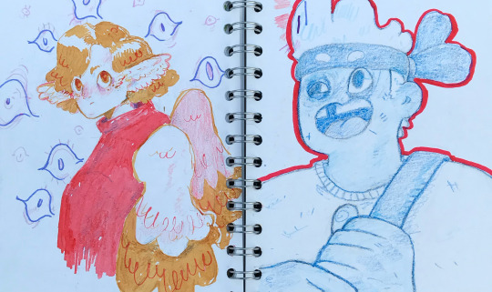

For the past several weeks I’ve been creatively resting - playing a lot in sketchbooks. Most of the time, I find myself a little bit addicted to the grind of making polished, finished projects, but I’m trying to take a break from that at the moment and just have a play around! This has mostly involved drawing a lot of fanart (I’m on a minecraft yt hyperfixation right now - kill the part of you that cringes!!!!) which you can find on my tag #archillustrates if you fancy.
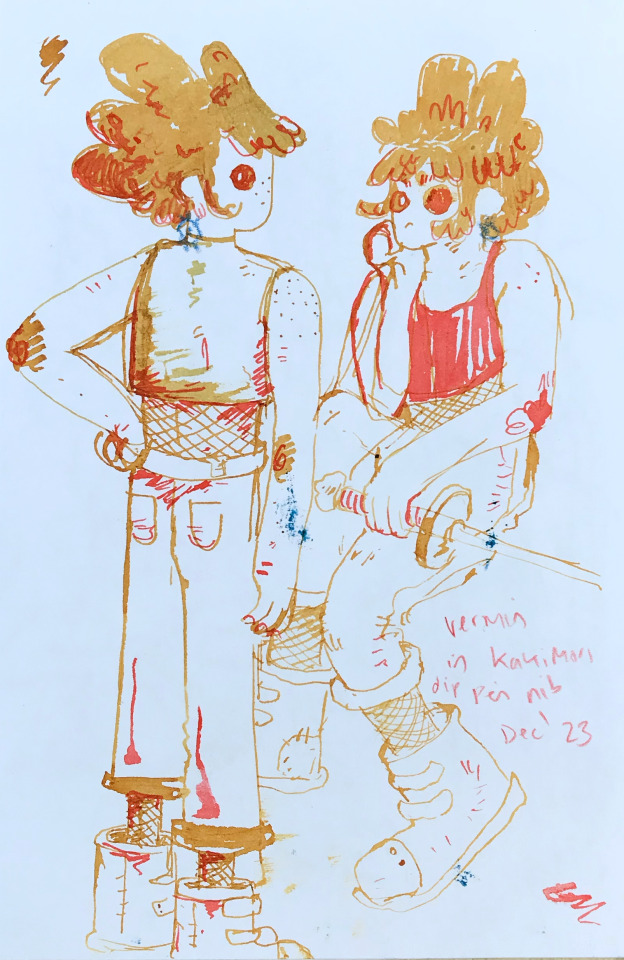
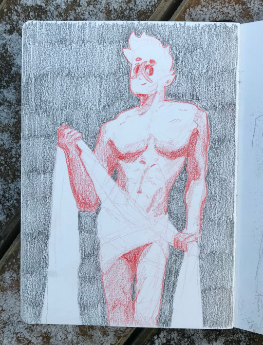
Though I’m trying my best, I find it hard to ‘just play’ in sketchbooks. There’s part of me that feels stuck if I’m not improving on every single drawing I do - which is just impossible. This does give me a drive though, even if it’s not entirely healthy. I’ve been enjoying playing with new materials - here you can see some experiments with a new dip pen I was given for xmas and some lovely inks. I’m loving the range of thickness you can get with your linework with this nip, although it’s a bit hard to control. (These are some OCs that might make it into a comic one day)

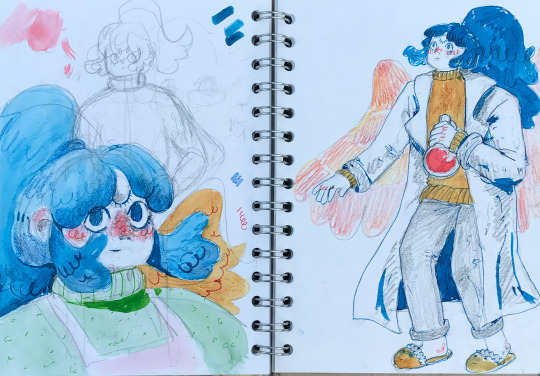
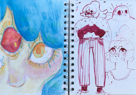
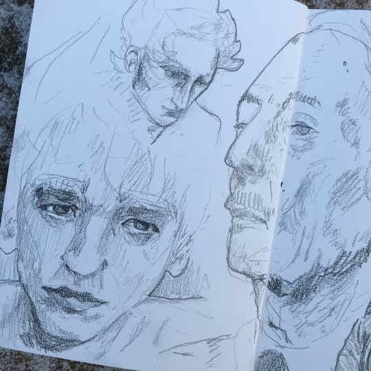
I’ve been playing with more cartoony styles and proportions for several weeks now, and I feel like I’m reaching a limit in my development of those styles before I have to go and study more anatomy. I think taking anatomy study slowly is key for me. I find it draining and don’t have a natural inclination to do it most of the time. Adding a little bit here and there in different projects and in between other themes I find more engaging makes me more interested in learning. We can’t become perfect overnight, and the pressure to do so is what kills the fun. Right now, as I’ve been playing for a while, drawing some observationals feels right. So here’s some I’ve been doing!
This might be a bit existential for my first proper post, but I’ve been thinking a lot about what motivates me to create and how for me it’s absolutely to fill some kind of void - be that something to keep my brain occupied or validation. I’d like the process of creating artwork to mean more to me, and I don’t know what that looks like yet, but it’s on my mind. I think focusing less on outcomes and the validation I receive from it is important. It’s tough though! Hopefully I’ll begin to understand my relationship with my artwork a little better soon. Would I still make if no one was watching?
#artists on tumblr#queer illustrator#archillustrates#art#illustration blog#art process#art resource#process#illustration#small art blog#art blog#comic artist#tumblr art#tumblr art blog#art on tumblr#sketchbook#sketchbooking#artist blog#artist on tumblr#arch is learning#traffic life#life series#3rd life#hermitcraft#fanart
7 notes
·
View notes
Text
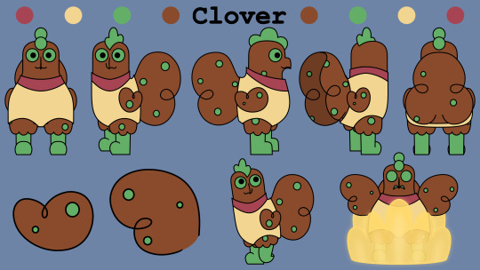
The Design Evolution of Clover Bennet
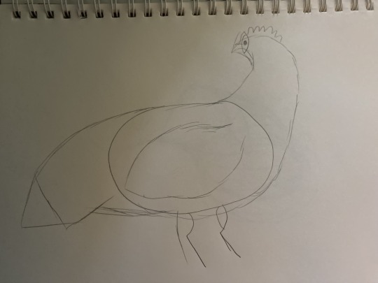
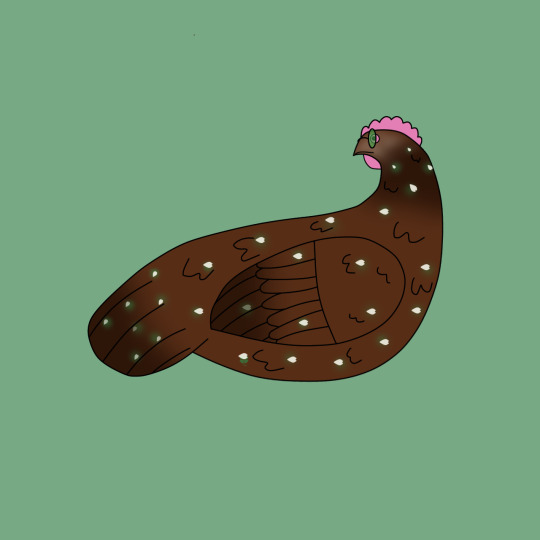
These were Clover’s very first pieces of concept art, and I believe she was the first one of the characters I ever drew digitally (tho there is a drawing of Dia that may predate this). The earliest Designs of the characters more realistically resemble actual chickens, and are much more detailed. I also didn’t know how to draw her legs so I kinda just didn’t draw them at all.

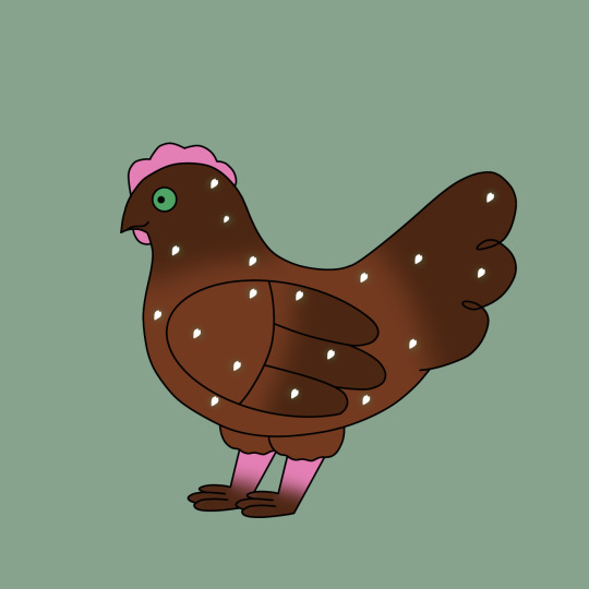
I drew a few more designs, and after making concepts for a few other characters (who will be getting their own posts), I decided on a more cartoony style. Some of these design elements seen in these early drawings are still present in the current style. For example, the more paw-like feet, because to this day, I cannot draw bird feet. I also finally gave her a sweater, which she has kept throughout all of her designs and was also inspired by Mabel Pines’ iconic sweater.
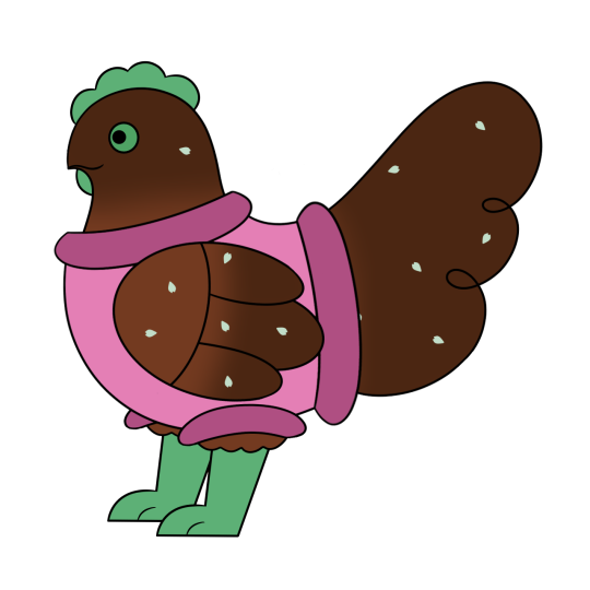

I eventually switched her accent color and sweater color, both making her name make more sense since she was now naturally green, and also leaning more into the Mabel Pines inspiration. I also got rid of the brown gradient on her wings, head, and tail around this time to make her simpler and easier to keep consistent.
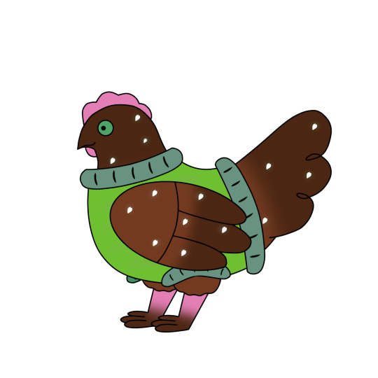
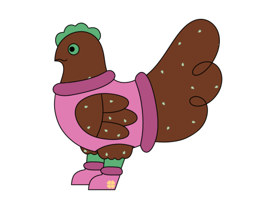
I also made these concept sheets for each of the main characters, and poor Clover probably had the most boring one. I was pretty set on these core elements, however I did soon start messing with them more.
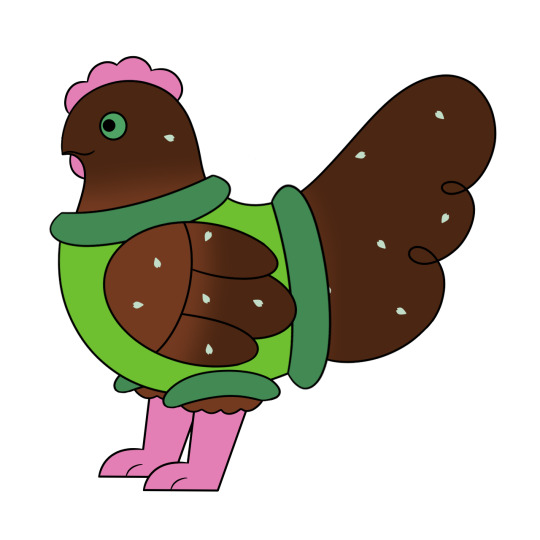
Each of the characters also got one of these turn arounds. They weren’t my best work looking back, but they were very useful because they helped me see some of the flaws in the proportions and perspective of this style. I changed Clover’s sweater colors again to yellow and pink, which I have kept as the sweater color from here on. I also changed the shape of her wings and gave her tail two floofy segments instead of the previous three.
After making those ref sheets, I started adjusting the style as a whole to make it look more cohesive and easier to draw. I mainly changed the head shape and the connection between the back and the tail. They still all had the more round and almost chibi style from the reference sheets, but it was still a bit stronger.
I eventually made this lineup, which I think is floating around somewhere on my main blog. I wanted to give the characters stronger silhouettes, and made this as a base for the current lineup.
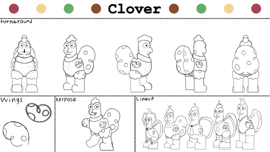
These are what I currently use as reference when I draw Clover. I gave all of the characters more diverse shape language, but Clover remained about the same. She has always been the kinda soft round one, given why she was the only one who kept the plain circular eyes.

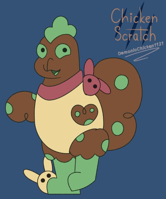
And this is how she looks now! Her design as well as the other characters might change a bit more over time, but I’m overall happy with this look.


Have some Clover doodles :>
#chicken scratch#character design#concept art#cs clover#gay chicken art#gay chicken lore#chicken scratch art#chicken scratch lore
3 notes
·
View notes
Note
Opinions of furries?
From being a furry for decades, i can give you bit of information on it all in case you dont know. There is different "catogries" of furries. I can say that there is a hypothetical graphic that all furry charracters can stumble on.
The x axis would be the level of anthropomorphisation. the extremes going: (-100) Human (fully human. No anthropormorphisation whatsoever), (0) Anthro (the blend between feral and human. Characters tend to walk on two legs, skeletons and anatomy are usually changed, etc,), (100) Feral (Literally an animal).
The y axis is the aesthetic style your character is intended to be in: (-100) Toony (Stylized in a way that is very cartoonish. Big expressive eyes, distinct character design, etc,) (100) Feral (Literally an animal).
The z axis is the intelligence/sentience your character have: (-100) Human (fully capable of all of the abstract human thought and intelligence and critical thinking), (100) Feral (Literally an animal. Usually aligned with the level of intelligence/behaviour the species of the character.).
A character that is (0, 0, 0) Is i would say your average furry.
A character that is (100, 100, 100) would be a straight up animal. a whole ass animal with no unrealistic characteristics or behaviors. like a frog or something.
A character that is (-100, -100, -100) It is just a human person that is stylized in a cartoony way.
Most furries have fursona characters that are only existing in artistic form. Like drawing on a computer or a paper sheet. Most do not own fursuit costumes.
I am wanted to know curiously what you think about the furries. Where do you draw line? Do you not like things certain?
good day for you, i hope
excuse myself for the not so good wording english is not my first language
Mate I've spent the past 15 minutes or so staring at this and trying to puzzle out how to respond to furry algebra in my fucking inbox.
Funny answer: If you've got a hide to peel and look like an animal then I'm hunting you like an animal. Smart as people makes the job fun. Rare, unique, artistic? Sounds like it'd be nice trophy over my mantle. I'm sharpening my skinning knives and you should start running.
Real answer: Iunno, mate, furries make me really bloody uncomfortable. Even a human body with animal ears and tail kinda toe the line for me. It crosses wires in my brain that don't jive well. When I was younger I liked the art of, er, anthro wolves and shit (think Native American-esque themes, with natural colours, not sparkledog stuff) because I thought it looked cool but the community's always kinda given me a weird vibe and whatever interest I mighta had completely detached with the whole Kero situation in addition to having some... unpleasant interactions with people in the community. I want nothing to do with the community at all at this point, not even the art. Gives me the creeps, especially the more sexual aspect.
If you're a furry you can still interact of course, I just... don't wanna be sent furry stuff. Makes me uncomfortable. One of the few tags I've got blacklisted here.
8 notes
·
View notes
Text
i had a sort of semi-epiphany or something earlier but i havent been able to fully register it yet. in regards to art
it was when i was looking at my old art style again and. oh fuck it i'll turn this into a ramble post lol
anyway so i was thinking about my cartoony style. you know the one. the one ive been working towards for like..years at this point lol. and i was thinking about how i originally fell in love with it bc of how simple and appealing it was, but it kind of over time turned into a necessity to learn how to draw that way bc i wanted to break into the animation industry. and ive found that now that i no longer want that for myself, im kind of slowly falling out of love with my toony style??
not that i'll completely give it up b/c i do love drawing anime characters as cartoons sometimes still, but im starting to realize i have another style inside me that ive always enjoyed and that came to me naturally--the style i used in 2014-2015. ive said it so often but i think it still holds up aesthetically--it just needs polishing in terms of like..anatomy and structure. i think i can do it
the thing about the 2014 style i used was just..it felt like Me. it screamed "dan drew this" to me when i looked at it, and that feeling still holds true when i see it now. so i think i wanna continue to use it
i know a lot of ppl enjoy my toony stuff so im reassuring those ppl that im not giving it up! i just might not use it as frequently haha
ive given some thought to my career and honestly right now im pretty happy just being a commission artist. it makes pretty decent money (and by that i mean it pays for my rent and food so far, sometimes extra if im careful) and it allows me to draw for people and set my own schedule and just. do what i love for a living. its pretty great atm. so i dont want to work in the animation industry all that much anymore
with that in mind, its given me some room to let my style go loose, since i dont feel like i have to conform to a style that appeals to the masses or is super animation-friendly. so thats where im coming from when i talk about using a less toony style in the future!
10 notes
·
View notes
Text
I Find Comfort In Change (Final Exam)
Art has always been a part of my life; ever since I was 3 or so. As soon as I could pick up a marker, was when I started. I drew on everything; furniture, walls, my cat. When I started school is when I had my first art class. It was easily the highlight of my day. Since then, every Christmas or Birthday I've been gifted art supplies, such as canvases and paint, colored pencils, charcoal, even an iPad and Apple pencil specifically so I could do digital art. I'm fortunate enough to have a family that is so supportive, including my extended family. My aunt Ksenia went to a school called the Minneapolis College of Art and Design. It's a school dedicated to all forms of art, and last summer I was given the opportunity to do a stay on campus solely so I could immerse myself in photography, which she paid for. I'm so lucky my family could afford to give me all of these opportunities, because I was able to flourish and I know most can't relate. I'm incredibly grateful for my family and their encouragement.
My art process is a little chaotic. Normally when I make art I either have a reference, a prompt, or a picture in my mind I want to create into the physical world. When I'm not drawing from a reference, a lot of it is trial and error; I think part of me suffers from perfectionism, which is why I tend to prefer drawing from a reference. When I draw from a prompt or an idea in my mind, it's harder for me to detect what exactly it is if something looks off. That's why drawing from an idea was more of a challenge for me.
I didn't want to draw from a prompt that was too cliché. It seems like almost everyone suffers from some sort of issue, whether it's anxiety, depression, ADHD, anger issues, addiction problems, etc. and naturally, a lot of people create art around it. When I try to make art that surrounds an internal issue, I just feel awkward. Most of my life I've felt like whatever mental issues I went through were not significant enough to complain about. Instead, I decided to center my prompt around me changing my appearance. Within the past year or so, I cut bangs, then my bangs grew out and I got highlights done, then I dyed my whole head blonde, and about a week ago I dyed it back to my natural color. I also gave myself a few ear piercings, and my clothing style changed and still changes a lot. I like to change my appearance a lot, it makes me happy. I think life is too short to be afraid of change, because it helps people grow and builds character. I've gone through a lot of change in my life, and even though some of it is hard, some of it benefited me.
This sketch is a memory from when I was 13 and it was the very first time I started experimenting with my style. I dyed my hair blue with some box dye I bought at Walgreens. I didn't really follow the directions I just went nuts.
The media I decided to use is colored pencils, mostly because it's the most accessible but also because I'm most familiar with it.

This is the general idea, I had a lot of refining to do, as well as add more intricate details. I tried to replicate my old drawing style, which was very cartoony. Like I mentioned earlier, my style now is more of a realism approach. But I like that my style had a very bubbly, happy vibe.

The original sketch is finally done, I decided to add a Smashing Pumpkins shirt my dad gave me :).
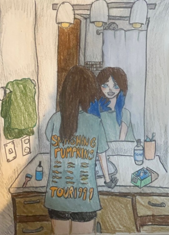
Finally, the sketch is colored in. I wanted to approach it with a very "doodley" feel. I tried to draw my actual bathroom at my old house before I moved, which is where it all took place.
Overall, taking Art Appreciation has definitely shaped my perspective about art a lot more. I am a big fan of the renaissance era, which I'm happy this class focused in on a lot. However, I also now have a new appreciation for modern art and sculptures, as well as performance art. I even discovered interactive art which I didn't even know was a thing. I think this class has also shaped how I'll do art in the future, especially with my creative process itself.
0 notes
Text
Alright, so since I decided to join Tumblr to start posting my comics, I have been sort of laying low. Just getting to know my new surroundings. And boy, has it been an experience; I was hit by a bad joke by Jeff, saw PM Seymour's blog (big fan by the way), followed my favorites Pukicho and Advos, admired some Lego photography, rolled my eyes at a catgirl wishing death upon America... You know, all the usual stuff.
Now, I've been mostly hanging out in the Pokémon/PMD communities since I figure that's where I'll post most of my stuff. During which, I've come upon two realizations...
1. You guys really love Mewtwo and drawing yourselves as Pokémon.
2. All of you, and yes, you in the back, too, are INSANELY skilled artists.
This is no exaggeration. While some art styles aren't my favorite, all of the art I have looked at has ranged from good to awesome. I tip my hat to you, Tumblr.
Now the question is: OP, what is your art style?
In an ideal world, I would say "cartoony" or even "homestyle."
In the real world, I'd say my art style is... bad. Very bad.
Yep, that's my work. Both shoddily hand-drawn. Using a combination of office paper, BIC mechanical pencils, colored pencils, black pens, ultra fine Sharpies, and some hopes and dreams.
And that's assuming I don't mess up. If so, I have to be very careful that I don't smudge anything with an eraser. If I mess something up beyond repair, then I have to resort to nature's Photoshop, a.k.a. a glue stick and index cards. (To be fair, to the naked eye, they are indistinguishable. One of Swampert's eyes was made using this method.)
One thing I failed to mention about art on here is the amount of customization and personality there is. There are Original Characters and alternate stories out the wazoo, all unique from each other.
Me? Umm... I gave a tiny scar to a Blaziken and a pair of sunglasses to a Raichu.
The thing is, the first is a reference to the manga, and the other is an exact idea I've seen before that I'm just borrowing.
And that's just Pokémon. I have already given up on drawing humans, so I'm going to live up to my name and base my humans on square-like finger puppets. I'm not exaggerating.
So, in short, I suck as an artist, but I've done enough roasting my own drawings. Now, how do I appeal to a wide audience such as Tumblr? Well, I have already answered that: By being unique, sticking to their guns, and not giving a care.
While my art does need work, why should I stop myself from drawing and posting? Did all these artists and writers just give up because they thought they were bad or were actually bad? No, they stuck through and improved their craft, and I'll try my best to do so as well.
You might wonder where these drawings are coming from, and you're allowed to laugh at this; It is a PMD parody comic/song of "Another Irish Drinking Song" by Da Vinci's Notebook.
Now, this is a huge project. There will be around 72 panels if I estimate correctly, and since I have real-life stuff going on, this should take me at least 3 months to complete.
However, I promise I will complete this one way or another. It might take a while, but I am not giving up.
See you guys later. I need to get back to work.
#drawing#drawing struggles#artist struggles#i suck at drawing#pokemon mystery dungeon#pmd#pokemon#tumblr#if pm seymour sees this I will scream
1 note
·
View note
Text
Through a Lens: Storyboarding and stylization
We had a workshop focused on figuring out the narrative and storyboarding the story, as well as finding the style of our animation. We were given a storyboard template and were tasked to make the story board, as well as a drawing of a frame or something connnected to our animation, then draw tjhe same thing but in a different style.
For the storyboard, since I do not know exactly how many noises will disturb her I made a vague outline of the possibility of a plotline. Doing this made me realise how many key frames can go by so easily, and considering how small this animation is (between 10 and 20 seconds) I ended up leaving a lot of frames empty since I think if i added more action it would definitely go over 20 seconds.
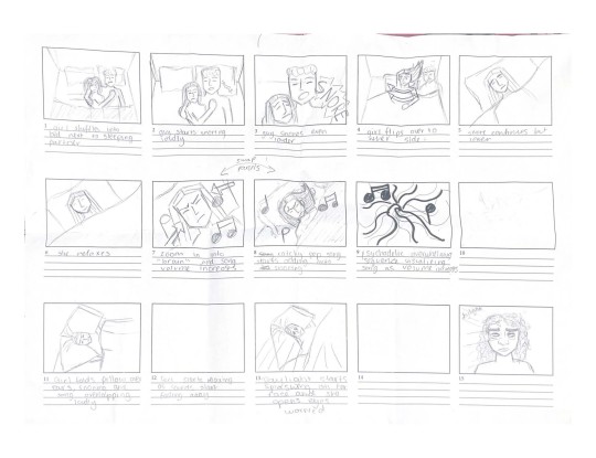
For the drawing I decided to make a frame that will be in the animation regardless the choices I will make of the story, which is of one of her trying to sleep. I chose the image below as reference for the drawings. I got the image from https://www.womansera.com/5-ways-in-which-pcod-can-be-treated-naturally/

I started out by redrwaing the reference but with very geometric shapes and a cartoony style, which is good for showing expressions in an exaggerated way. I traced it with pen which gave it a very drawn look, which could be effective when I make the animation digitally, as it will reflect a more organic arstyle and not so polished that can sometimes happen with digital art.
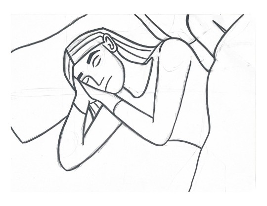
I then redrew the scene using tracing paper, and altered the scene to look more detailed and somewhat realistic looking. Her hair is splayed out like it would be when someone with long hair is sleeping, and there are creases on the pillow and duvet. While I liked the result the first variation felt a better option as it is more vague looking and will help appeal to the relatability of the animation, which is my main intention with it. The first option also makes for a cleaner style to animate with.

Since I had a style defined I decided to use this base and trace it with tracing paper to make another frame that I am sure to include in the animation. By having two key frames made by hand in the same format it gives me a good template for the style in order to keep it consistent throughout.

I could not exactly start the animation yet because I was not certain yet about how many action scenes there will be of the noise disrupting. I decided to make a new storyboard, this time more concrete in the sense I decided that there will be three main noises that will disrupt her: the snoring, the white noise, and then the birds to show her it is already morning and she has not managed to sleep yet. By limiting it to three I will have enough space to explore her reacting to them, as well as play with the volumes getting gradually louder and quieter. It also is a nice number of noises as it is enough of a quantity to make the audience feel frustrated, but also defines a clear start, middle and end.
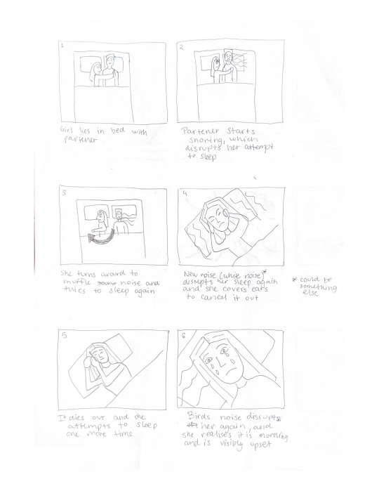
To start the animation I decided to scan the frames I made by hand and bring them into Procreate so I could define which brush I will be using to make the lineart, as digitally things look different. I tried the caligraphy brush which would make it look very hand drawn and have considerable lineweight variation (bottom version) and a hard edge paint bursh which is solid and consistent throughout (top version). Putting them side by side I decided the best option was the caligraphy brush, as the variation in weight of the line makes it more interesting, and overall has a more handdrawn, organic look.

0 notes
Text
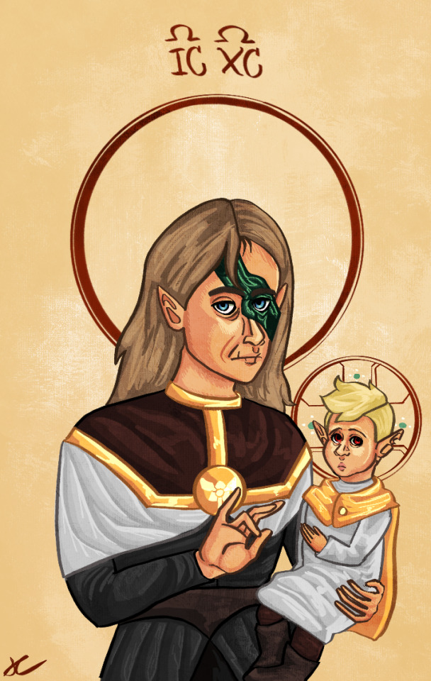
catholic iconography hunter and belos; finally got around to adding my analysis here :))
i lost my apple pen a few days ago and just found it last night which means i’ve been thinking about drawing this For Days. i have so many thoughts all the thoughts. everything here is drawn for a specific reason.
the way clothes are drawn in iconography is really interesting - folds in clothes are almost entirely geometric, it represents heavenly order. they also have a specific meaning. black, outside of the application as traditional monastery dress, represents, yk. evil. death. etc. i kept belos’ clothes pretty similar to what we see in canon but the Vibes fit. the brown is like, dust to dust or something? i think? don’t quote me on that but that also felt fitting given his whole mud transformation thing.
in iconography gold is pretty much reserved entirely for christ - i kept belos’ gold accents to kind of represent how he’s usurping the titan’s will, and there’s definitely some kind of jesus metaphor going on with hunter and the whole day of unity sacrifice thing so he gets a gold shawl. i consider belos’s white to just be part of the ‘fit, but hunter is in a white smock partly because white is pretty uniformly used to represent swaddling clothes, and is also used to depict purity. he’s baby!
belos and hunter’s faces are pretty stylized…which, i mean, i’ve always had a rather cartoony style, but you see a lot of flat, almost uncanny faces like theirs in iconography for a reason. again, represents divinity, being closer to god…etc etc. belos’ is flatter than hunter’s because i imagine him as more disconnected from his humanity (witchanity? would it be witchanity for hunter?? we need words for this).
hand gestures are specific too…i thought about those a lot. belos’ hand gesture is meant to display that he’s about to speak. i thought about having him make a gesture that more closely correlates to ‘speaker,’ since he claims to be the titan’s prophet, but i felt like straying a bit away from that could show how the titan doesn’t actually favor him.
hunter’s hand gesture is one that you see made a lot by saints known for spending time in prayer - i believe it represents the success of prayer? here, i’m using it to show how much he’s forced to dedicate his life to the titan and belos’s cause. it’s like..the purpose of his existence, poor kid. having him use his left hand instead of his right, as is traditional, to sort of symbolize how he’s ‘different’ - the no-magic thing is not even a metaphor for disability, it’s pretty much explicitly a disability, and there’s no way this kid isn’t neurodivergent. further tying this in with the fact that historically, left handed people were kind of treated awfully.
aaaand last but not least the halos. belos just has the simple halo you see in most iconography because fuck him, and also he technically represents the virgin mary in this scene? i based it off of marian iconography so. yk. the perfectly circular nature of the halos represents sanctity, etc, etc, and it also just helps draw attention to their face. hunter gets the special jesus halo because again. vibes. metaphors.
(also hunter looks like an actual *child* here instead of the weird homonculus looking thing you see in iconography of young jesus because a) baby hunter and b) that looks so fucking weird. like in theory i understand why it was done but oh my god. why. why. i’ll shut up now but i could talk about this at length)
anyways uhhh tldr; dana terrace went to catholic school, something something religious trauma, something something biblical imagery in the emperor’s coven
#the owl house#the owl house season two#the owl house fanart#the owl house belos#belos the owl house#the owl house hunter#hunter the owl house#toh#toh s2#toh fanart#toh season 2#hunter toh#toh hunter#toh belos#emperor belos#phillip wittebane#wittebane brothers#hunter the golden guard#the golden guard#sam’s art
98 notes
·
View notes
Text
You know what I’ve got time so uhhh here’s some basic art tips I’ve learned while at Art School™
This is gonna be long and I namely specialize in digital figure drawing but this can apply to traditional as well. These are also just 5 guidelines off of 2 years of knowledge so forgive me if they seem scattered these are just the ones that most impacted me.
quick definitions
Contour lines: These are the lines that define the outline of a shape. Think most cartoon line art - it gives you enough information on the features.
Cross contour lines: define the shape. Think of drawing a bottle with tape on it in a gridded pattern. The tape isn’t straight across - its curved. These help your drawings look more 3D
- Never reference other people’s art for poses
In fact if possible, work from life. That’s not an option for everyone especially now a days so just make sure you’re working from photos of real people. Whether you mean to or not your brain will pull from their style and whatever mistakes or decisions they made you will make. Drawing inspiration from others art is fine !! There’s just lines of befitting you in the short term versus the long term. That being said...
- Trace what you like. Do it. (Just don’t post it as if it’s your own)
This is like the one thing artists tell you not to do. It’s A LIE!!!! Kinda... Tracing over photos or art helps understand proportions and what makes them work. The kicker is you don’t want to do just do the contour lines - do everything and then some. Figure out how the limbs are connecting, the direction of the hair, if it’s a landscape figure out the vanishing point. Get some real information off of it to see how they solved problems. And then Do Not Post It. If you happen to post it directly credit the artist you drew and if they’re from the renaissance say it’s a (the artist) masterwork study.
- Fail fast and hard
This one is probably the most important, at least to me. Last year I did probably over 50 large scale figure drawings in a quarter long class and I think only like ONE. But they all helped me improve my speed, realize what was off with my proportions, and allowed me to be critical without destroying myself. Some of them I was only allowed 3 minutes to do and so it’s easier to accept what’s wrong and then work to not make that mistake when it takes you 3 minutes. Not everyone can work with charcoal from a model so the at home alternative that I still do today is going on to timed poses sites and trying to draw those in the time limit given. I recommend traditional just because it’s typically faster for this type of thing. You might not be able to keep up - that’s okay, allow it to be unfinished and continue. The sites at the end usually display the photos back to you so you can fix them later if wanted.The point is just for practice so no one has to see - and please don’t compare yourself to others. Instead compare it to the work you did yesterday and you’ll see the improvements.
- Art Styles are a solution to a problem
Technically I learned this online, but I was in art school so it probably counts. I think a lot of people online are obsessed with having a pretty art style or looking like their favorite artists. When what art styles are is basically you as an artist deciding what you want to draw and what you don’t. Think animation - typically it’s more cartoony / simplified because no one wants to draw all that detail for thousands of frames. So maybe you don’t want to draw every hair strand - simplify it into groups. You don’t want to draw a complex torso so you translate it into a square like shape. It’s all making decisions that help you ! Because sure, you could draw like Da Vinci did but why the fuck would you ??? (Unless you want to - and if so good for you I do not have the patience /gen) so when looking at other artists work see how they solved the problem of that complex forms we see every day rather than just seeing parts of a whole you want to take.
And this one is just a personal rule that I have myself
- Know when to be critical, and when to just have fun
I’ve seen so many of my friends stop doing personal art because they’ve forgotten how to not be critical of it. Not every moment is a race to make your best piece and for it to be perfect or even “correct.” Have art that helps you grow and learn more, the stuff that shows your technical skills. And then have art that makes you happy. That you do for yourself or for fun. Art schools often ask for both because they recognize that that detailed study of a bowl of fruit isn’t who you are as a person, but it does show you know your way around some value. Art is ultimately self expression! There’s the starting points and rules but they are there so you can learn them and then break them!
There’s so so much more I could say and I know this is so much !! But for now this is my knowledge for today !!! Also due to the nature of art, not everyone is gonna pledge by these rules and that’s okay. This is just what worked for me and kept me sane :]
I didn’t proof read this! Because my class starts soon!! I hope it’s comprehensive!!!
175 notes
·
View notes
Note
I mean, personally, just comparing them a little, some of the differences between your fawfuls then and now would probably be that he's a little more detailed? I can see where the brow is, and the teeth have a whole thing going on there, but I know what you mean about the accuracy thing. As cool as the detailed teeth are, his tend to be more like chatter teeth - they're cartoony! - and his face is more round, so you wouldn't see a separation for the brow like that.
YES! And my natural style does tend to add that sort of detail to everything. One of the reasons learning to draw Fawful was so hard for me is BECAUSE he's so simple! People severely underestimate how difficult simple, cartoony styles are to learn. Literally some of the artists I admire the most are those who are able to create extremely simple but VERY visually appealing images.
I think oftentimes people just see detail and immediately go "that's better" but anyone who's done both... we know differently, lol.
In my experience, the simpler a character design is, the easier it is to get wrong. This is also a thing I found true when I used to cosplay a lot. Say you're creating a Mario costume and you mess up Mario's overalls, EVERYONE is going to notice! All the pieces have to line up to make the character.
But if I mess up a few things on a Final Fantasy character's outfit? It won't matter much at all as long as everything comes together in the end. Complicated designs are a lot more forgiving.
I draw this character as a pure labor of love because I can promise you this has not been easy for me. I struggle with almost every single drawing I create of him but I love him so much that I just keep doing it anyway lol. If I felt any differently I would’ve given up a long time ago.
16 notes
·
View notes
Text
Divine Comedy
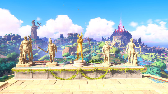
There’s a lot to be said about Immortals Fenyx Rising. That it’s a close of Breath of the Wild. That it’s far too childish. Or that it’s essentially Assassin’s Creed, but reskinned. In an age where games have aimed for photorealism and developers have been adamant about using a colour palette that has basically amounted to shades of brown, Immortals Fenyx Rising is a breath of fresh air. The sharp contrasts of yellow, purple, blue and green make the world vibrant and a wonder to behold as they pop out of the screen. Even the art style is a reminder of decades long past when mascots dominated the scene.
I, for one, find it much better than the deluge of similar character models we’ve encountered for several long years of video games. But I’m getting ahead of myself.
While the title of this post is a reference to the epic poem written by Dante Alighieri, which I haven’t quite finished (and in all likelihood, it might take years before I actually bother with Paradisio and catch up with Dante’s yearning for Beatrice), I thought it quite an apt descriptor for the narrative of Immortals Fenyx Rising. Why, you may ask - as the epic poem describes Dante’s descent into the nine circles of Christian Hell before he journeys to purgatory and on to paradise?
Simple. Because while the plot of the Divine Comedy doesn’t have many (if any) parallels with the game itself, I thought it was a great way to draw attention that Immortals Fenyx Rising is a story told within a story. And who should tell it but our favourite titan chained to a rock, where his liver is ripped out by an eagle every day, as well as the Father of the Gods, Zeus himself.

While the internal timeline takes a bit of time to adjust to, I liked having Prometheus and Zeus commenting about the actions Fenyx was undertaking. It was amusing to listen to them argue, provide commentary (mostly Zeus’s opinions of his many children and his exploits) as well as edits to the ongoing narrative to add a little challenge.
But while the telling of the story was exciting, the actual tale was one as old as time. There was nothing original about finding the Gods, collecting their Essences and tackling Typhon once Fenyx was decked out with upgraded gear and had unlocked all the abilities at their disposal. As a purveyor of video games, I’ve encountered the same loop many times and was a little deflated by the time I had defeated Typhon. Even the plot twist near the end failed to serve up much in the way of surprises.
Typhon, himself, was a little too hammy. While a serviceable villain for a children’s game, there was far too little depth when it came to his interactions with Fenyx. So, if one was hoping for an epic tale, I would advise to look elsewhere.
Still, given my love for Greek mythology, I liked the retelling of many of the Greek myths and seeing Immortals Fenyx Rising’s rendition of some of my favourite Gods. Though most were not explored in depth, mentioned only in passing, I liked the references made to the Trojan War, the many ways Athena turned young maidens into cursed monsters or animals/ insects, and the numerous Greek heroes that have since found their way into the mainstream.
What I liked most was that Atalanta was given a piece of the spotlight alongside Herakles, Odysseus and Achilles. Even the animated show Class of the Titans stumbled somewhat with the title screen - declaring Atlanta a descendant of Artemis (which is impossible because the Goddess of the Hunt was prided for her virginal status).
The characterisation of the Gods was also quite nice. Given Zeus’s proclivities, it made sense that his children hated him. Hephaistos soared in the role of tortured artist and Aphrodite’s transformation into a tree, along with her more selfless attitude in that form were all great to witness. Ares, of course, probably had the most fun quoting God of War (2018) with his: “do not be sorry. Be better.”
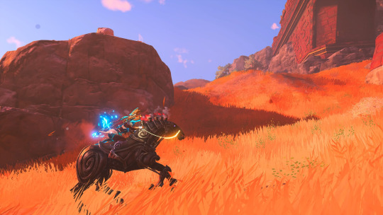
When it came to the controls, I felt that they were a little too floaty - particularly when it came to running and jumping. Given the aesthetic, however, I was relieved that it was not as pixel perfect as other games. Combat is serviceable and revolves around the use of sword, axe and bow. After levelling up my weapons and armour, and equipping those that would complement my play style, I was nigh unstoppable as I tore around the Golden Isles on my noble steed.
The one major gripe I had about Immortals Fenyx Rising were the puzzles. There are far too many. Almost every collectible or myth challenge involved moving weighted boxes around, hitting targets with arrows or racing a countdown timer. While most are quite easy, some of the Tartaros vaults could be downright devilish with how precise the timing is. I hope that future iterations would allow for separate difficulties for combat and puzzles/ dungeons because I still have nightmares about a few of them. It just seemed that wherever Fenyx went, they were dogged by contraptions that needed solving and this sucked out quite a bit of the fun from exploring and taking a look at the next question mark on the map.
Immortals Fenyx Rising is different from many games that have come from triple-A studios. While there are many similarities to Nintendo’s Breath of the Wild, the colourful nature of the land of gods and monsters is a far cry from what Ubisoft had primarily been churning out on a regular basis. And that’s a good thing. Shaking up the formula, even a little bit, by making things look a little more cartoony or using colours that pop out of the screen is a great way to reengage with players that might be suffering from first-person shooter fatigue. And while I don’t mind exploring the English countryside as a Vikingr, it is nice to be able to freely customise my avatar and make them wear goofy outfits rather than watching them grimace realistically for the sixtieth game in a row.
Also, it featured a credits scene. Albeit, a fake one that was meant to throw the players off. But, at least there kind of was one?


8 notes
·
View notes
Note
Hey Rox, random question. How can one learn to draw? I mean, I got the whole take a pencil and a paper and practice everyday but I mean, after doing that you understand proportions, light, perspective? Naturally? Just by practicing everyday?
Artists telling people just to practice art and not giving them any solid starting place is a bullshit cop-out and something I’ve probably said at some point, but I’m going to rectify it now by giving you a comprehensive guide to starting art.
Some people may disagree with me (and honestly I recommend asking other artists this same question to see what they say and what you yourself agree with), but I think no matter what kind of 2D art you want to make, you should start with traditional, realistic drawing or painting. The reason for this (aside from anecdotal evidence of it working for me) is that learning to draw things that occur in real life gives you a foundation for branching out into different styles or media down the line. Even if you want to draw cartoons or anime, learning realistic drawing will help you, because it will familiarize you with the complicated shapes that more cartoony drawings simplify or exaggerate. For example, if you learn to draw a realistic nose, then you can see different ways to turn that realistic shape into a simplified version of itself. Practicing realistic art can also help train your eye and get you accustomed to different techniques such as line quality, shading, color theory, composition, and various types of art materials, or media, as I will probably begin referring to it as.
So, the next step is to figure out how the hell to start learning to draw realistic stuff. I will help, using written descriptions, tips, and videos I have found online to help you.
First off is Materials/Media.
You can make art with practically anything. Anything from the humble paper and pencil to the most expensive and high-end art supplies. You can burn a piece of wood in a fire for a bit and then use the charred end to make marks with. You can use mud to paint with. You can dip your toe in ink and use that as a paintbrush. My point is that you can really get creative with it and I think creating art should be a joyful experience, not a painful one.
Art supplies can be very expensive, so for beginners I really do recommend a paper and pencil. Not a mechanical pencil either, but one of those wooden ones. They work well for drawing because you can use both the point and the side of the lead to make marks with. I also recommend getting a good eraser. My favorite kind are the grey kneadable ones, because you can squish them into any shape you need for any particular area that needs erasing. I’ll link to some on Amazon later on.
You can practice pencil drawings on lined paper (I have a whole lot of sketches I did in high school that are just on lined paper), printer paper, cardboard, etc, or you could invest in a sketchbook. Cheap sketchbooks are pretty easy to find, like they have them at my local grocery store, but you can also find them online for fairly cheap. Sketchbooks are made of different paper depending on the media (drawing materials) that you’re using. Paper intended for pencil drawings tends to have quite a fine grain for smooth blending, whereas paper in watercolor sketchbooks is rough and absorbent to suit the wet medium. You can get a sketchbook with any paper you want, really. I’ve done pencil drawings on pastel paper before, because it was the only paper around, and it still looked nice, just different than it would on finer grain paper. What materials you choose to use depends on the look you’re going for, and you’ll figure that out more with experience.
To start with, just grab some paper and a pencil and start making marks on it. See how many different looking marks you can make on the paper. I’m not really talking about shapes persay, but literal marks with the pencil. Thin lines, thick lines, scribbles with lots of pressure or just a little bit of pressure. Scrape the side of the pencil along the paper and see what it does. Try blending the lines with your finger. Just take some time to play with the material without getting hung up on creating anything. Do this sort of experimenting with any new art material you’re introduced to. The first thing you should do with a new tool is acquaint yourself with it, and that’s what this is doing. Get used to how the pencil feels in your hand and what motions feel comfortable with it. Keep in mind that you don’t have to hold the pencil the same way as if you were writing. Often if I’m shading with a pencil, I will hold it with all of my fingers around it and use my thumb to put pressure on it.
Now, shading.
Shading and mark making go together, because shading is basically using the marks you’re making with your pencil or pen to indicate lightness vs. darkness. To practice mark making and the techniques that are used for shading, I recommend watching this video and drawing along with the exercise. The artist uses pens in it but you can do it with pencil too!
When you’re ready, you can start trying to shade basic forms (shapes). Shading gives a two dimensional shape a three-dimensional look. It turns a flat circle into a sphere. Once you learn how to shade basic shapes, you can pretty much figure out how to shade just about anything. For example, once you learn how to shade a sphere, you know how to roughly shade a head! And what is an arm if not a cylinder? A nose if not a pyramid?
There are lots of videos online for practicing this. Here’s one that’s pretty good.
This is where I recommend starting. Once you are more comfortable with that, here is a list of things that you can look up and try to get a handle on, in what I think is a pretty alright order.
Perspective (one-point, two-point, three-point)
Value, Tint, Shade
Drawing negative space
Foreshortening
Composition
Drawing from life
Color theory
It would take me a very long time to outline all of this stuff, which is why I’ve given you that list of stuff to look for online. There are a lot of great resources out there and I recommend searching for them and comparing them. I can’t go into depth on everything right now because there’s a LOT of stuff, but I hope the little outline I gave you will help give you a foundation and know where to look and what to look for! If you have any questions about specific stuff, feel free to come and ask me about it and I’ll try to help.
Here are links to some cheap art materials on Amazon:
Grey kneadable eraser
Sketchbook for pencil
Pen set
There are lots of other listings for stuff like this online, so do check around for what you want! The ones I linked are just options.
I hope this helped! Thank you for the ask anon, and good luck!
#ask box#anon#art tips#art instruction#long post#beginning art#sorry i petered out at the end it's just i'm so fuckin hungry rn#i'm about to lose my mind i haven't eaten all day like an idiot#Anonymous
12 notes
·
View notes
Photo

redraw of this piece from 2016! this was both an exercise in art improvement and in seeing how my perception of myself has changed over the years.
some commentary below, comparing the two pieces + reflection
i feel like my style has both gotten more cartoonish yet more realistic? like the way i draw facial features is more realistic instead of just, that *vague blob* stuff, but also just my general line style and the rounded nature of the features make it feel more cartoony as well. i also tried to shy away from smoothing over the things i don’t like about myself. my nose shape... still isn’t quite how it is irl, but i didn’t round it off as much as i did in the 2016 piece. i also tried to include my acne marks this time, although it was actually harder than i thought to draw acne scars? so i actually struggled with getting them to look natural and not just, weird dots. also i still have no idea how to draw clothes but i think this time it actually looks like a hoodie at least lmao
some other differences that can be chalked up to just, how my life itself has changed over time - i gave myself severe dark circles under my eyes in the old piece bc i was actually pretty sick when i drew it. i also noticed how absolutely desaturated the colors were in the old piece and i have no idea why i did that? i had also given myself a flower crown bc 1. i was obsessed with them back then and 2. i had just wanted to draw flowers anyway lol, but this time i wasnt in the mood to deal with flowers. i also gave myself a choker this time bc its become my new permanent accessory in real life. any color hoodie + black undershirt + choker is my everyday fashion
one last thing! my bangs appear to have changed sides. but that’s only because i fucked up in my redraw and drew myself according to how i look in the mirror... in the 2016 piece i drew my bangs to how other people see me but this time i forgot to account for that
#art#i PAINSTAKINGLY drew that choker exactly how it is irl#i held it up like i was a rock inspector checking for gold#trying to figure out the actual pattern#most ppl i see who draw these chokers just do squiggles but i was like NO! theres a real PATTERN to this so i have to#and i think i pulled it off LMAO#please appreciate the choker <3
3 notes
·
View notes
Text
Russian Circles Interview with Brian Cook // Stylus Magazine
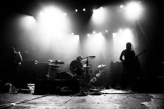
Full interview by Chris Bryson via Stylus
Russian Circles perform in Winnipeg on April 8th at the Garrick Centre. Chris Bryson had the chance to chat with bassist Brian Cook to get a sense of the world of Russian Circles.
Stylus: You’ll be coming through Winnipeg on a pretty extensive tour. How do you deal with the challenges of being away from home when on a long tour?
Brian Cook: Well, at this point the band has been doing this kind of thing for 13 years, and I’ve been touring for about 22 years, so at some point you just learn how to cope with it on some subconscious level. There are a few obvious things you can do to keep yourself sane: take solo walks away from the club, keep in contact with friends and loved ones back at home, try to eat well and exercise when you can. A friend advised me before my first tour to spend 10 minutes alone every day, and that’s good advice. I find the bigger challenge to be dealing with coming home. Tour has its own momentum. You get in the van and it takes you to your next destination. At home, you have to recalibrate your brain to be self-motivated. I occasionally see articles about musicians dealing with post-tour depression and it’s a very real thing. You go from being constantly in motion, constantly validated, and constantly surrounded by people to being static and alone. Dealing with that is the bigger challenge, in my opinion.
Stylus: Does the band ever change or alter its approach to songwriting and if so what have been some of the reasons for doing so?
BC: Every song is a little different. We all live in different states, so we end up trading a lot of audio files. Sometimes songs are cobbled together out of a bunch of different ideas, sometimes someone comes to the table with a fully written song, sometimes we just stumble across an idea when we’re all in a practice space together. We don’t have an established process.
Stylus: Being an instrumental band allows you to cover more ground stylistically with less need for adherence to a particular style. What aspects of your music do you think best benefit from this flexibility?
BC: We’re all music hunters, so we’re always exploring new artists and new sounds, but we obviously owe a lot to metal. And for me, honestly, most of the interesting guitar-based music happening today owes something to metal. But metal also has a tendency to cling to these aesthetics that can be a little cartoony and juvenile, and that winds up manifesting in a lot of the lyrics and vocal delivery in the genre. So being an instrumental band has benefitted us because it allows us to cull from the instrumental side of metal without having to shoehorn some campy frontman into our sound. I think it opens up our music because we’re not working with the limitations of a vocalist, and i think it provides us with a broader swath of listeners who might not be open to the guttural growl of the Corpsegrinder or the operatic wail of King Diamond.
Stylus: The music of Russian Circles is filled with an emotional weight buried within transcendental darkness. What are some of the inspirations and influences behind the narratives and ideas for your music?
BC: Any narratives are totally subconscious. We don’t have an active muse and we don’t write music based on a theme. I have nothing but respect for artists who can work off a concept, but for us, the music either resonates with us or it doesn’t. We don’t try to cobble together songs based on a preconceived notion; we write music based on what resonates with us on a very immediate base level.
Stylus: Was the looping of guitar always something the band has done to give added heft to your music? Are there any other methods the band uses to further amplify or give added effect to your sound?
BC: We’ve always tried to fill as much sonic space as possible. Looping allows us have multiple layers and multiple textures going at any given time. We’ve also incorporated things like the Moog Taurus so that one musician can play two instruments at a time. Ultimately, we really just want to make things texturally rich and dynamic, but we also want to adhere to the three-piece format without resorting to backing tracks or having a laptop on stage. There are a few other tricks we employ, but we can’t give away all of our secrets.
Stylus: What made the band decide to do a live album?
BC: The songs are constantly morphing. With our studio albums, we’re making adjustments and edits all the way up until mastering. Once the album is actually finished, the songs still wind up evolving in the live show. We don’t drastically alter them, but we find new things to highlight and new ways to simplify things. So there’d been some talk about trying to record a few shows at some point just to document how the songs had grown. The problem is that going into a show knowing it’s going to be under the microscope of recording would ultimately sap some of the energy out of the performance because we’d be trying to play things as meticulously as possible. It just so happened that the Dunk! Festival set was recorded without our knowing it, and it was a concert we were all very happy with. There are still a few flubs in the performance, but that’s the nature of live music.
Stylus: From what I’ve read Russian Circles is a band whose members don’t live in the same city and don’t get the chance to play together often. When it comes to sculpting and recording what songs or a final album will be, how do differences in ideas and opinions get resolved?
BC: If it doesn’t resonate with all three members of the band, the material gets scrapped. We’re all pretty open to criticism; no one is afraid to ditch a riff or mix up a part if it isn’t working. Honestly, the biggest conflicts in this realm have been pretty minor. I remember Mike really gunning for this one particular thrash riff that wasn’t really vibing with Dave. I was the mediator, and I told Mike the riff was really “fun”. That was enough for him to willingly scrap it. There is no fun allowed in Russian Circles.
Stylus: I read in an article with The Seventh Hex that with the music you create you said you “want to make something that sounds natural and human.” As an individual player and collectively as a band, how do you go about doing that?
BC: I’m just not a fan of music that sounds like it was built on a grid. I’m not opposed to using technology to make the recording process cheaper and smoother. It’s way more financially practical to record on ProTools than tape, after all. But I don’t want music to sound mechanical. There is very little electronic music that resonates with me because so much of it sounds like canned music. It doesn’t ignite my imagination. It just makes me think of someone sitting at a computer screen, staring at a grid, and plugging sounds into quantized beats. It really depresses me. I want music to be an escape from staring at a computer screen. And more and more rock music is recorded in that manner. The drummer doesn’t even play on a lot of current metal records; the engineer just samples drum tones and they plug those sounds into programmed beats. It’s no wonder so many modern rock records sound so sterile and flat. There is no push and pull. No space. No interaction between the instruments. I know that’s what some people really want out of their music—they want it to be perfect and crisp and even. But i prefer when it sounds like the band is so passionate about what they’re playing that they run the risk of mucking it all up. That’s way more exciting for me.
Stylus: Do you think it’s important when creating music (or any art) to maintain a balance between the pursuit of perfection and retaining immediacy and cohesion?
BC: Absolutely. I’ve been really digging this Workin’ With the Miles Davis Quintet record, and there’s one note Miles hits in the first song that sounds flat to my ears, and I totally love it. It’s jarring, but it reminds you that this album was made in a live environment. It’s a snapshot of a time and place. It’s not trying to create its own reality. And it makes all the moments where the band locks in and plays off each other feel that much more inspired. But I’m also someone that would rather spend five years listening to a record and wrapping my head around it than to hear something that’s beat-detected, auto-tuned, and ultimately designed to be instantly digestible and quickly forgotten. I want to make art that’s still interesting ten, twenty, thirty years down the road. And as someone that still buys vinyl, I only want to spend money on music that still excites me after a decade or two of repeated spins.
Stylus:. Will the band be bringing any new elements into the fold with the next music you put out? Can you tell me anything about the next Russian Circles release?
BC: Hopefully. There are a lot of ideas floating around, but we haven’t yet started to put the album together, so who knows. There been discussion of trying to make a darker, uglier album, but we also have a tendency to wind up writing songs with the opposite mood of what was initially intended. So we’ll see what happens.
Stylus: If you were to give one piece of advice to a musician/band trying to make it in the musical world as it is today, what would it be?
BC: Well, first things first, you would need to define “making it.” When I first started playing in bands, all I wanted to do was play a show. Then it was just a matter of putting out a record. Then the goal was to tour. And that’s about it. I had “made it” by the time I was 18. “Making it” should really just be about creating something you’re proud of, and everything else is just icing on the cake. At this point, I’m way more interested in musicians like Sir Richard Bishop or Daniel Higgs—musicians that have a history of doing whatever the fuck they want even if it means they only draw 50 people in their hometown or only sell a few hundred records. It’s more exciting to see someone make art that makes them happy than to see someone try to build a lucrative career pleasing other people. So my advice is to do whatever you want and do it passionately. Be involved in your musical community. Go see other bands. Support underground venues. Buy bands’ merch. Throw your own shows. Make your own tapes or records or CDs. Value your own art. Make it special. Make it sacred.
8 notes
·
View notes
Text
Character Design - Style Referencing and Silhouette Research - 30/12/20
For today’s research on character design, I thought I would look into the style referencing for my characters as I’m still not sure weather to go for a realistic art style or a cartoon based one. On top of that, I’m kinda not sure what kind of art style I would then go for either style I end up choosing which is something I plan for today to understand and find out for myself.
Starting off with looking at the realistic depictions, Cyberpunk 2077 is definitely one I’m already hooked with having already covered it previously in my blog posts. It’s dark, gritty, noir-style visuals give it a rough environment to be in but also an emotional one whether its trying to be sombre on your mood or trying to show the sadistic nature of the world that those characters live in. The visuals of the characters are very mute looking with their colour palette with the exceptions being gangs like the Maelstrom with these bright neon lights emitting from their faces standing themselves from the crowds. In fact, neon colours are the only ones that seem to stand out on any character from the universe other than a few colours being saturated highly. I think this is to go alongside the tone of the game as whilst it can be a chaotic game, there’s a real human element to it’s art style and narrative that you can see from looking at the characters which is most established in it’s launch trailer for the game. That goes for the environment too as it’s often muted in colour to help further emphasizes that realist tone to the story and the characters that live in it.
In addition to it’s use of colour, the way characters are made and rendered are very hyper-realistic as it looks like a natural progression of human life in the future with us adding cybernetic parts to ourselves. This also goes for the clothing of the characters too being very detailed and natural to the world created. I think this style of render is what i’m so far attached too from how these elements have come together especially for my kind of setting being in a Cyberpunk universe.
youtube
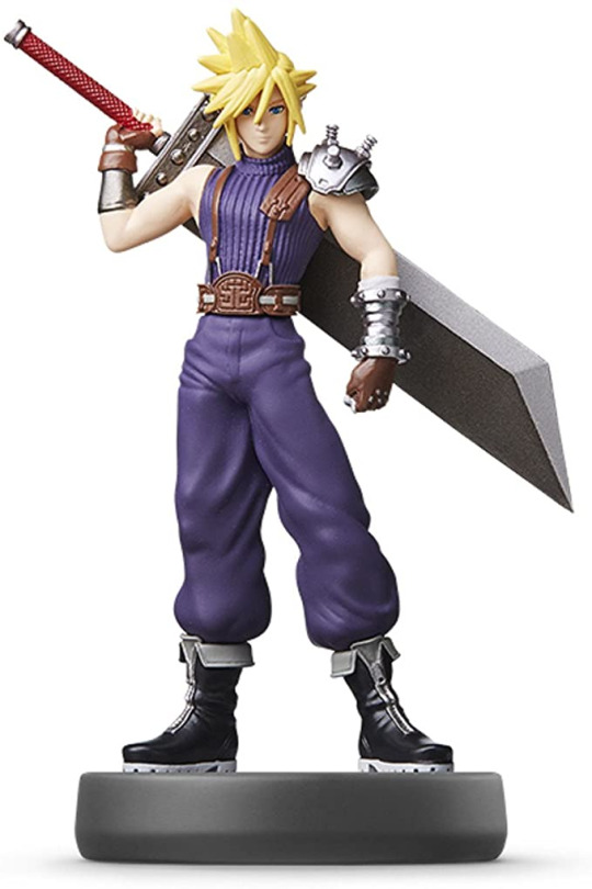
Another source of render that I was influenced by and a bit of a comparisonment to Cyberpunk 2077 is another game called Final Fantasy VII Remake which contrasts Cyberpunk’s mute palette as whilst it’s set in a similar styled environment, there’s a lot more colour and freedom to be found as characters are distinguished from each other with colours popping out in their uniforms to many different and unnatural colours illuminating the city. Even somewhere like the slums that we see in the opening cinematic look busy, healthy and vibrant to look out from how brightly lit the city is. Character's like Aireth (the one in the red jacket) are really defined in the city by how she pops out of the dark city with her reds and pinks in her colour palette. The characters themselves have a much smoother render to the much more realistic style of Cyberpunk 2077 with the characters looking a bit plasticy in comparison. However for close up’s of the characters, details of them looking realistic are more present like close up of eye’s where we can see eyelashes and skin particles/textures evident. Unlike Cyberpunk 2077′s different usage of designs on the faces of their characters, FFVII Remake’s faces are a lot cleaner looking which whilst mostly looking the same-ish across all the characters from the game, the designs of their outfits really help the characters define who they are as people which makes them easy to identify. This also links into the silhouette design of these characters too as if you were to only create a black mask of their neutral poses, you would easily be able to identify who’s who from their body structure as well as key characteristics which is a lot more than Cyberpunk 2077′s visuals. Characters like Cloud are defined by his thin statuerette and his rectangular sword which is very identifiable in this space and somebody like Baracus who is known for his immense body and gatling gun arm. Details like these is something that’s going to be really important to me when I come back to making my characters again.
Final Fantasy VII Remake - Opening Movie | PS4
youtube
Cloud Strife Pose
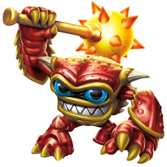
One of the last renders I looked at today was from the Skylanders Games for it’s cartoonish art style as well as looking a little bit into the characters as I’m still considering of going with a dynamic animalistic design for my characters. The style of these characters is similar to the plasticy nature from FFVII Remake’s design but works alongside the dynamic and exaggerated features of the characters like the bug eyed eyes of the characters as well as the specific details of each character that makes them unique. One of my favourite characters Wham-Shell helps bring this point across through not only his eyes but the exaggerated size of his weapon and his crustation on arms which you could also say for the body of the character too. Looking at him and the rest of the characters that are featured in the game’s universe, they all provide a very glossy finish to the characters like they’ve been made in a factory and are brand new looking. This gloss tends to evolve overtime with each new iteration for the game as the characters get a lot more glossier as they progress
Wham-Shell Character
Skylanders Spyro's Adventure Opening Scene
youtube
[HD] Skylanders Swap Force Opening Cutscenes + First Area Tutorial !!!
youtube
I think overall looking at the skylanders games as ideas for my render, I think I’ve come to the conclusion that I want to pursue a more realistic depiction of my characters both look wise as well as render. I think this decision mostly comes from the overall tone and setting for my characters as I imagine a darker but gritter environment for them to manifest in which I can’t see with the cartoony style of the skylanders games and think sources like Cyberpunk 2077 and Final Fantasy are tonelly more correct. However, there are some details I would like to carry over into the realistic art style such as looking into the big eye designs that a lot of the characters posses from the games into my characters.
After my research and conclusions with render research, I looked into silhouette designs after being inspired by both Final Fantasy VII Remake as well as one of the natural progressions I needed to take with my character in order to make an effective model/character for the project. I first started by looking into different websites for creating effective silhouette theory which I stumbled across this really nice set of pages of showing how you can use silhouettes effectively from developing your ideas. The pages show a complete page of developed silhouettes that have been used to express different ideas for a character which those designs have been inspired to create drawings from to eventually lead to a final character. I think combined with Jon’s suggestions as well as from these pages is where I would really succeed in developing my character for the project as this feels the most comfortable avenue for me to advance the designs of my characters as well as understanding the flow of the character too.
(Note: Artwork is from "The Skillful Huntsman" Copyright 2011 Design Studio Press & Scott Robertson - artwork by Mike Yamada.)

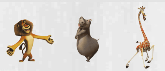
Looking into the term itself, silhouettes are used to help define a character by using shape language to suggest what a character may look like and act just by looking at them. This is usually done by using different types of shapes to help build up the character and what kind of emotion they’re suggesting in their pose which range from; organic, geometric and abstract shapes. ‘Concept Start’ was a really good website that highlighted this way of working as it uses the characters from Madagascar as examples to expressing emotion through silhouette. Below they detail that Alex (Lion) having such a wide expression to him makes him very inviting from his silhouette as its very inviting to us if we were to see his shadow. For Gloria (Hippo), she comes across as very round and smooth and very much like shes comes straight from a cartoon from the light bits of details suggested in her design. And then for Melvin (Giarffe) his body and and appendages are very jumbly and clumsy which perfectly describes the kind of movement and character he is. But going back to the term again, the best thing you can do with a silhouette is if the character is still recognisable if you block them in, then it makes the silhouette strong and readable.

Overall, I’m happy with my research as not only have I understood what kind of style I want to aim for my characters mainly Hyde, but as well looking into how I can create characters more effectively using silhouettes as well as having that extra bit of info from the tutorial notes I was given. I think looking forward, I plan to create my Hyde character through using silhouettes designs the same way as the image above as well as maybe trying it with my Jekyll character too.
The use of Silhouettes in Concept Design
http://characterdesignnotes.blogspot.com/2011/03/use-of-silhouettes-in-concept-design.html
SHAPE LANGUAGE & SILHOUETTE IN ART & DESIGN
https://www.conceptstart.net/art-tutorial/improve-shape-language-silhouette-in-concept-art-design-illustration
How to Design Characters with Bold Fashion and Strong Silhouettes
https://www.clipstudio.net/how-to-draw/archives/157653
0 notes
Last Seen Blogs
fu0ck7
Malaysian Hotties 🥵

wayward-in-neverland
wayward-in-neverland
spideybot-house-of-mango
Burning down the house...
xkxmme-blog
A Visual Orgasm..
cassteph-blog
i would die for you johnny storm