#... also I have no idea why the layout of this page is so chaotic but it does seem fitting I suppose kfjghkdf
Text
hello I just dug out the OG concept sketch sheet from back when I thought I was gonna build Idri as a halfling and when I found it I said out loud 'SHE HAD AUBREE HAIR'
#I was pretty sure she always had short hair but I had thought it was more like a pixie cut or something#it's so weird like-- I can see where some of the same Energy is there#but also it lowkey looks like if you took aubree and stretched her out#I should build out this shadowverse AU idri 🤔 what would I have named her... how would she have been different#her backstory would have been mostly the same (rogue by way of circus magician)#but there's so much about idri that's defined by her cultural background and everything#... also I have no idea why the layout of this page is so chaotic but it does seem fitting I suppose kfjghkdf#my OCs#sketches#dungeons and doodles#dragonclaw guild#idri#(you know. kinda)
4 notes
·
View notes
Text
Stack Magazine
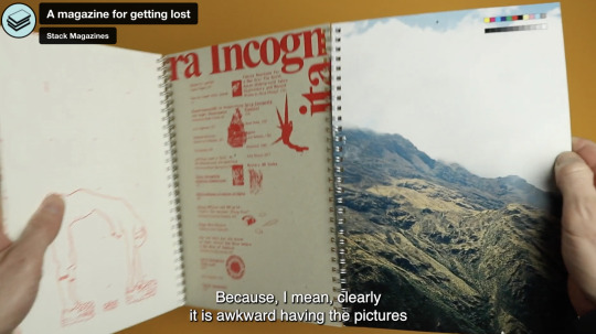
Stack Magazine was mentioned in my tutorial so I thought I would have a look at how they create a narrative through the magazine as I am struggling to define the narrative for mine.
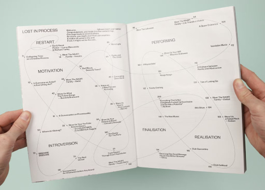
A magazine for getting lost
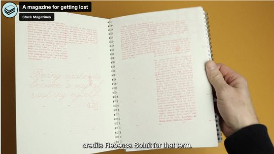
'a tri-fold structure that separates the text from the images, and encourages readers to flick back and forth between the two.'
You almost get lost in the book, I love the concept of linking the narrative to the user experience - encourages users to get lost.
Coordinates instead of page numbers.
‘Terra Incognita’, the term used on maps to show areas not yet explored
Allows the user to explore the book in a unique way and make their own parings of word and image
Yep Yep
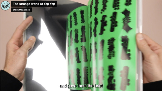
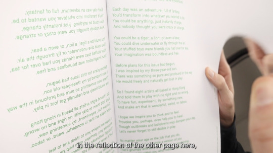
Inspired by childs willingness to play and experimentation
Image based
Mirrored pages - have to read words through reflection of the page
Play with no right and no wrong
Avoiding audience capture
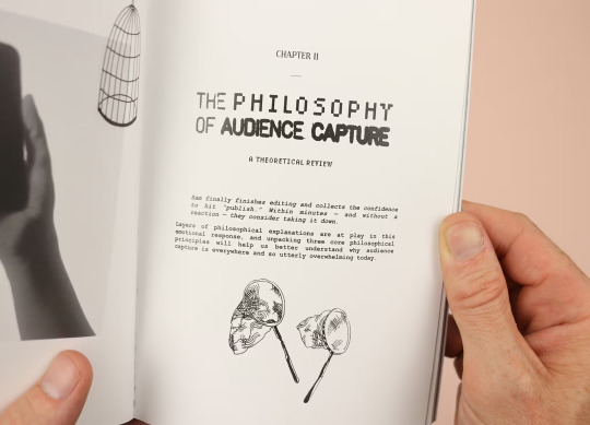
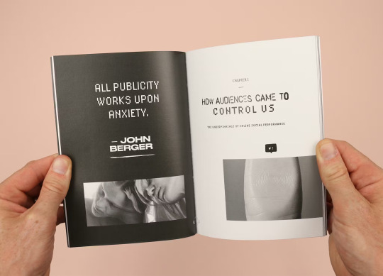
Investigates the phenomenon of creators being controlled by their audiences
Unrestricted contents
Encourages readers to read book in whatever order they want
'(In a further break from boring old front-to-back linear reading, each article finishes with a ‘choose your own adventure’ A/B selection, encouraging the reader to pick their way through the magazine, flipping forwards and back to jump from story to story.)'

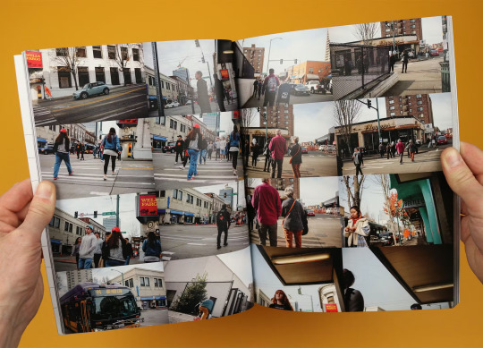
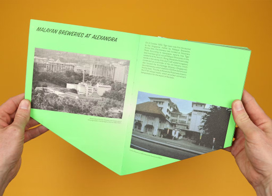
She interviews locals and photographs the scenes she finds along the way, creating an image of a messy, chaotic but characterful neighbourhood.
By contrast the contents page uses the clean, clear grid layout of the streets themselves to show where photographs were taken, giving the reader an extra layer of context and also emphasising the difference between looking at a neat map, and being lost in the landscape itself.
Meantime
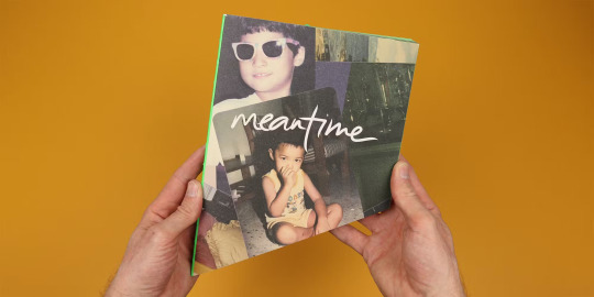
The new issue of Meantime is themed ‘Bad Stories’, with seven sections inspired by the seven deadly sins.
A corner has been sliced off the magazine, so when it’s stood on end it looks like it’s sinking
The missing corner, then, came to represent the stories that have been cut out of the magazine, and instead of sinking into the ground, this issue becomes the tip of the iceberg; the part that’s visible above the waterline, the version of Singapore that Meantime wants to create.
A hole lot of fun
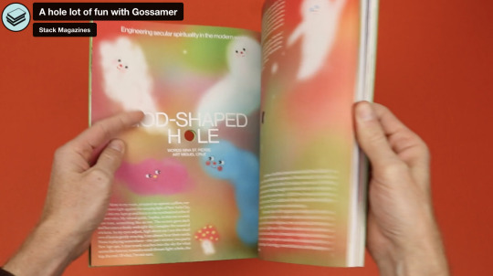
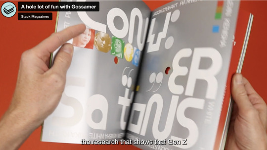
'‘Space’ and comes with a literal space drilled through the middle of the magazine...giving the pages an unusual focal point and interacting with the text and other page elements.'
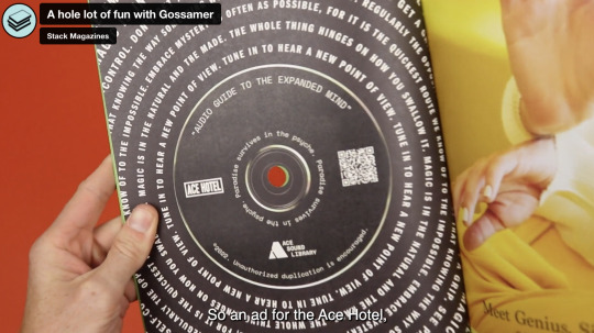
Touch
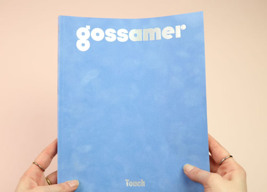
Comes wrapped in a lovely soft, flocked cover
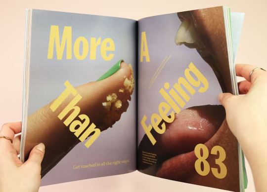
Gossamer is nominally a magazine about cannabis
“Naturally, the experience of touch is heightened by cannabis, whether in beverage, flower, or even infused popping candy form.
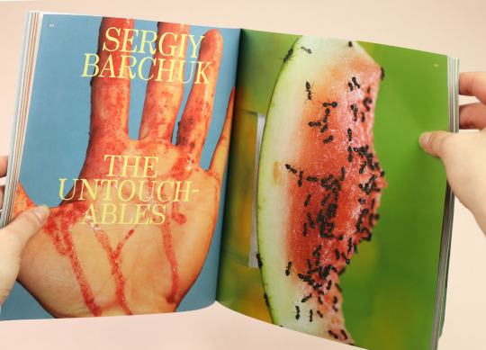
The Untouchables
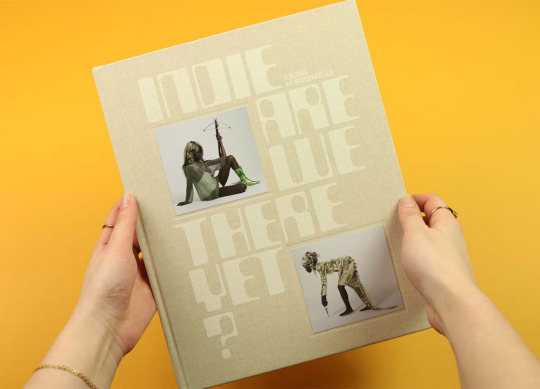
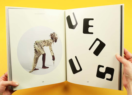
The latest issue of Indie is less interested in touch as a theme, but uses it to create a totally distinctive publication that subtly plays on ideas of past and future.
���Why do we romanticise the past? / Why are we obsessed with the future? / Are we there yet?”
The issue becomes a sort of scrapbook of looks and ideas, mixing nostalgic memories with exciting ideas of the future, all bound up within its thick covers.
The theme of the issue is clothes, and it brings together a collection of stories that consider the things we wear as the most fundamental building blocks of fashion. There’s critical writing on the history of clothing, stories that consider the impact clothes have on us, and brilliantly bizarre, extreme experiments in fashion and performance.
Feeling blue?
Every issue of Sindroms is based around a different colour. This time it’s blue, and the magazine has decided to interpret that colour emotionally: in other words, this is an entire magazine themed around sadness.
I loved looking at stack magazines, it has given me so much inspiration for editorial projects. I love that they all tell a narrative throughout the magazine and express this in a visually interesting way. I would love to do some more editorial work for FMP, I think I could create a typeface of some kind and then present this in an editorial format. The ideas I have been looking at are quite abstract so an editorial piece will let me explain my idea and concept in more detail.
0 notes
Note
Hey writingquestionsanswered, I'm writing a scene where an entire town is being turned into a horror show with wild magical chaos, I'm talking alligator pigeon hybrids, enormous geese that tower over humans,fire balls that exploded and then turned everything in it's radius to ice(or freezing every thing in it's radius in the ice) that type of shit, how should I write the sheer terror and confusion of that situation and the protagonist being like"huh, did I do that? I probably did that, nothing else here could have done that, do I have a responsibility to stop it? I probably do, so I think I should stop it" how should I write the utter chaos? And how should I write the absolutely horrific consequences of the destruction, even though in The story it's happening on a scale of barely minutes? And above all else, how should I fill the scene with just enough chaos that it gets the point across, without being to much or redundant, or just plain stupid?
Writing a Chaos Scene with Impact
1) Know the scene's purpose and your character's goal. Before you worry about how to write a scene, you have to understand why you're writing it. Why is this scene necessary in the story? What does it accomplish to move the story forward? And, more specifically, what is your character's goal in this scene? What are they trying to do or what do they need to do? What steps need to happen in the scene in order for them to accomplish this goal, or try to accomplish it? What obstacles do they face along the way?
2) Keep it brief and to the point. Your brain has conjured this scene in vivid detail, but avoid the temptation to translate everything you're imagining onto the page. Instead, choose a few things to describe--either because they're the most relevant or because they're the best examples to illustrate the chaos.
3) Use sensory description to create emotional impact. Chaotic moments are rarely just visual. Don't forget to think about other sensory details your character/s experience in this moment: what can they hear? What can they smell? What can they touch or physically feel? What can they taste?
4) "Block" the scene as you would in theater. If you've ever been in a play, you remember the process of "blocking," which is when the director tells each actor where to stand and where to move to during different parts of the story. You can do the same thing for the characters in this scene. Try drawing a layout of the area where the scene takes place. Pencil in any important details like structures, paths, stairs, doors, furniture, geographical features--anything your characters would see or potentially need to interact with or avoid. Then, mark down where each chaotic thing happens. Mark where the alligator pigeon hybrids are, and where they go. Mark where the ice "fireballs" originate and where they hit, circle the areas they freeze. Note where other characters are and what they're doing. Now, mark down your character's path through this scene. You can detail their progress with timestamps if you want, like if they start at 7:57 p.m., maybe they run out of the way of the first hybrid pigeon at 7:58, then walk a little further and duck out of the way of an exploding ice ball at 7:59. For each step, you can also put a note about what they might be thinking or feeling in that moment.
5) Just dig into it. Even if you've done all of the above, it can be daunting to start a scene. Remember that it doesn't have to be perfect the first time around. Sometimes the best thing to do is to just start writing it and see how it plays out. Try some different things. See what works and what doesn't. By the time you get to the end of the scene, you'll have a better idea of how it all needs to play out. Sometimes that will retroactively inform the earlier part of the scene, and then you'll know how to make the first part better.
I hope that helps! ♥
•••••••••••••••••••••••••••••••••
Have a writing question? My inbox is always open!
Visit my FAQ
See my Master List of Top Posts
Go to ko-fi.com/wqa to buy me coffee or see my commissions!
112 notes
·
View notes
Text
nct dream on social media!
excluding weibo, messenger apps, and dating apps
note: this is purely my personal opinion. kinda inspired by my irls :)
mark
he loves to share what he does when he can
on instagram he’s the kinda guy who isn’t really... there
busy boy finding out about news a whole week late
when he posts stories it’s usually like... super vague pictures of music or lyrics he’s working on
probably one or two basic shots of food
AND ESPECIALLY
shares what he’s listening to on spotify I Kid You Not
if mark lee posts a story it’s probably going to be what he’s listening to on spotify
he’s more active on twitter because uh
memes
mostly quoted retweets tbh
his replies are always just “HAHAHAHAHA” or “LMAOOOO” and some goofy one-liner
has mutuals on stan twt because he likes to steal the memes
it’s honestly like ????
tweets mostly in english but korean is always there
you would find him laughing his ass off and why? because one of his mutuals tweeted something off of punhub
“can you perform under pressure?”
“no, but i can perform bohemian rhapsody”
or
“doctor, it hurts when i do this”
“then don’t do that”
I SWEAR TO GOD THIS DUDE HAS THE FUNNIEST TL
not only because of punhub trust me
he’s mostly on local twt just on about netflix shows and music because he doesn’t have enough to time rlly branch out into one community other than his own
has tried uploading his works on soundcloud but just feels more comfortable uploading covers and stuff on youtube
he’d accidentally get in everyone’s recommended because hey here’s a talented man on the guitar who’s goofy and cute
BUT ANYWAYS
overall since he’s a very busy person he’s not too active, but social media kind of gives him a little laugh every once in a while so that’s great
renjun
say it with me, instagram
the prettiest golden hour selfies
your resident pretty boy
says he Doesn’t Care About Fashion but then posts a body shot of his fit smh
can’t complain because he’s mad fine let’s be real here
he has an account for every single social media out there but isn’t always active on every account
i swear to god he;s made a linkedin account
the way he’s probably made a mf foursquare account…
he’s just such an all-around sociable guy he just has mutuals everywhere
i mean the entertainment industry is all about connections so
go get it reonjeon!
makes an appearance in everyone’s social media like he’s EVERYWHERE
jaemin’s instagram? check. jisung’s tiktok? check! chenle’s twitter? check. he’s in everyone’s mentions fr
his stories are always reposts of other posts and of the stories he’s tagged in
work socmed! he makes his career look so comfy and homey from his posts and stories
was one of those guys who used to be super active on snapchat but gave up after insta stories became a thing
mans stalks more people than you think… he’s just a sly dude
not in a creepy way ofc he just gets pretty lost within the internet
you could actually play any trending tiktok audio and you’d hear him sing along every word in the background… what has this mf been doin??? uhm???
sends posts he thinks are funny to ig and twt gcs
mostly to jisung because he’s the only one who actually leaves SOME sort of reaction whether it be double tapping the text or going ㅎㅎㅎㅎㅎ
likes to visit pinterest every once in a while because it’s like a nice eye cleanse
it’s also good outfit and food inspiration in the cases that he feels like creating something non career related
in general he just likes looking for new ideas and sometimes pinterest is just a great outlet for a visual layout like that
renjun and jisung, THESE TWO
they scour the internet together
goin wild with the crack videos with jisung
jeno
this dude is nowhere
like. he has thousands of followers on instagram and for WHAT
twitter page: empty
snapchat: gave up after insta stories
insta stories: DOESN’T EVEN POST SO WHAT’S THE POINT
but he’s like almost always actively liking everything on your timeline
like... every post on your feed is “liked by jeno and xx others”
WHERE IS THIS DUDE
texting him becomes a game through all the different dm platforms online
like will he open his twitter dms today or will he only answer if you furiously facetime him
some days it’s katalk and somedays he just chooses to ignore you
PURPOSELY SO YOU HAVE TO CALL HIM
anyways when he does post on instagram it’s usually just his surroundings and daily activities
or his cats
yeah
does a lot of things with his friends so you’ll probably find him tagged in the dreamies’ stories
but not anywhere else for some reason
he’s more active on twitter!
he kind of feels more relaxed on twitter since it isn’t based on images
tweets out of context things
like a random “fml” out of nowhere and you’re like okay i guess
pretty vague too
doesn’t really make an effort to make any mutuals because it’s kind of like a vent place for him
stays on private
friends only so... about 30 followers and that’s it
people who follow his Instagram don’t really know his twt so it relieves him a bit
food videos on youtube
not mukbangs but like
very nice cooking videos
like have y’all heard of Nino’s Kitchen
he loves that shit BET
the greatest mix between dry sarcasm, humorous attacks and beautiful food
mans just likes real life interactions i guess
haechan
youtube addict!
gamer haechan
he could spend DAYS on youtube and just forget about time and space altogether
just finds the best rabbit holes to go into from music to snails to gaming to fancams
also on tiktok but his tiktok is on instagram ya feel
finds it stupid but so, so entertaining
loves watching those makeup and art tiktoks because they’re so well done
humor tiktoks on his explore page
number one edit fanatic
mans loves watching edits on instagram and how they’re so well made like
he’s truly one to appreciate art
his stories are uploaded on the weirdest times of day
want a video of him serenading the camera at two in the morning? sign yourself up
twitter is lowkey his diary
he just tweets whatever is happening all day errday
sometimes he completely forgets about the existence of twitter altogether so there are days where he’s on twitter every second but there are weeks where it’s just CRICKETS
loves to listen to other people’s playlists
open to new vibes (but no hateful vibes!)
still does snapchat streaks... hm
and who might he be talking to?
his snapchat streaks are always the same shot of the window or some scenery from his apartment
the kind of guy who snaps you until goddamn 4am
make room for online boyfriend hyuck
goes on twitch for the fun of it when he’s too busy to play
finds it real satisfying to just see the streamers engage with the audience while being real good at what they do
either way he’s just always on youtube but when he isn’t he’s usually just consuming content instead of uploading content
but when he does post anything it’s like quality!!
jaemin
unlike jeno, this man is EVERYWHERE
and when i mean everywhere i mean he’s also on letterboxd (!!!) and soundcloud
maybe this is just an excuse for me to force the jaemin film and photography student agenda
this man has customised every part of every profile on social media
except for linkedin
folks, his instagram is just pictures of everyone else but him
even on soundcloud his self-written songs are sung by other members in nct
his insta stories are the only place you can actually hear his voice
insta stories are just food and friends
and by friends i mean wtf moments at the dream dorm
memes all over twitter
steals memes pretty regularly
like he’d always like the tweets before stealing and those tweets would always end up in your tl so whenever he uses those memes in your convos it’s just like
aHa i see
posts “mood” tweets
mostly replies to other people rather than making his own tweets
loves to do deep dives on youtube because he always discovers the cutest music
also gets the best inspiration from youtube
has a few favourite youtubers and genuinely appreciates their content
again, inspiration
watches lots of movies but doesn’t really leave any reviews so he just gives a few stars (or none) on letterboxd
the kind of guy who’s glued to his phone
i don’t blame him
his phone is full of content
still on snapchat apparently
but he’s the kind of dude that just sends streaks every day and updates his snapchat story like never
his streaks... lmao
usually goes for a black screen with a plain “s” or just a random shot of his bedsheets
but if he considers you a close friend he might get distracted and send you a bunch of videos of him playing with filters
he really does think they’re quite the fascination
maybe he’s just bored lol social media is pretty expansive
chenle
he’s like jeno but gives less fucks
so... instagram and twitter are equally chaotic
such a mood
just makes you go WHAT IS THIS DUDE UP TO
this dude is usually just Chillin
and he gets bored so he just brain farts into twitter
whenever there’s a basketball game he’s watching he’ll fill your entire timeline with out of context reactions
also kind of a random out of context dude who posts things at the weirdest times of the day/night
doesn’t give enough fucks to go on private
gets a lot of followers on twt solely because so many people find his life so fascinating like hm...
what might zhong chenle be doing at this time of day
on instagram it’s kind of a different story because uh he might have to think twice about whether or not he wants a certain picture on his feed
but then again, no fucks
so he’s like meh okay sure i’ll post it
pics of food and places he’s been to and laid back selfies and #tbt type beat
NOT WAYV’S TURN BACK TIME I MEAN THROWBACK THURSDAY
but he does a lot of promo for nct and wayv
get that bag boy!
chenle on instagram is like hyuck on twitter: he can go weeks being completely inactive but one day he suddenly remembers the existence of instagram and posts five pictures in a day
all with either no caption or like the vaguest “ㅋㅋㅋㅋㅋ” or “哈哈哈哈”
if y’all have seen his weibo then y’all would know his twt would be filled with “哈哈哈哈哈”
mentions everyone (especially jisung) in each and every single one of his insta stories
replies to random comments
eternal chenle menpa how bout that
goes on wattpad and ao3 for the fun of it
actually kind of enjoys some of the work on wattpad... his fav trope is enemies to lovers
that one mutual that casually likes all your tweets
he would literally spam like all your pictures/tweets as soon as you guys become mutuals and it’s sweet
comments on everything
always dragged in jisung’s tiktok antics
knows all the tiktok dances by heart even though it looks like he’s so unbothered
thinks tiktok is cringey but HIGHKEY gets into it
jisung
now this dude is on tiktok but he doesn’t really fetch for clout
he likes doing short freestyles
the challenges are cool too and he’s had a few mutuals on tiktok so that’s nice
but this dude screams TWITTER and YOUTUBE
watches shit like vox and jubilee because it’s so interesting to him
has been through a vsauce phase but eventually got bored because they didn’t upload a lot
youtube is there for his deep dives and curiosities
also is subscribed to a lot of youtubers so his recommended page is super diverse
comments on videos with the most candid thoughts
youtube has been a big part of him honestly especially as a child who didn’t really get a formal education
he’s just kind of learning from the internet
doesn’t bother with instagram because... he can post pictures on twt too...
eventually gets instagram anyways so
the pictures/videos jisung sends on lysn bubble are literally his insta feed
but on twitter he’s just kind of vibin
says he goes on twt 5 times a day so there we go
likes those generational tweets and tiktoks that go like
“kids born after 2005 will never understand this”
his retweets bruv
he just retweets funny one liner replies from viral tweets
also keeps up with the news (ehem this was the boy on the political section of daily korean news let’s hear it)
rather than just korea he’s pretty interested in international news too so he’s a pretty outspoken guy
doesn’t really do a lot of tweeting himself though since he just kind of goes “헐” or “대박” or “ㅋㅋㅋㅋㅋ”
him and renjun are youtube buddies just because. yes.
usually spirals into crack compilations
like renjun, he’s also seen pretty often in other members’ mentions
ESPECIALLY CHENLE THIS DUDE WONT SHUT UP ABOUT JISUNG
but he honestly really likes being mentioned and being active online because he’s spent most of his life either practicing or online so
feels like home huh
kinda gen z spirit there lmao
#this was rushed#haechan gamer!#jaemin film student agenda uh#renjun is THE boy on instagram#jeno... nowhere to be found#mark gettin clout without trying#khchenle is everything#nct dream#mark#jeno#renjun#donghyuck#haechan#jaemin#chenle#jisung#nct#nct scenarios#nct dream imagines#nct dream headcanon#nct drabbles#nct blurb#nct headcanon#nct dream social media au#social media au#nct jeno#nct mark#nct chenle#nct jisung#nct jaemin
67 notes
·
View notes
Text
I, a campaign manager
so in addition to being a CTO, a CS major, and a dorm vice president, i was also a campaign manager for 2 weeks (the exact campaign that I was managing is not entirely difficult to figure out if you really want to know, especially if you click on the links BUT i will be trying to not mention it specifically here lol). You might be wondering - (1) why and (2) how did you end up becoming a campaign manager..... you're not even a poli sci/gov/humanities/literally anything vaguely related to this major??
You're correct, yes, how did this happen? Well that's a great place to start this story:
How in the world this happened
Friends drag you into stuff. This happens to be the same friend that dragged me to New York, and then was 20% of the reason I got dragged into the negotiation class, and then was maybe 15% of the reason i got dragged into nonprofit activities? In terms of providing unique opportunities in my life, she definitely takes the cake. So one day, she says "I'm running for this position," and me and the squad says "we gotchu." What does that mean? Clearly wasn't sure in the beginning, but we were texting campaign strategies and slogans and tiktok ideas in the chat for fun. None of us had any real responsibilities, especially since the actual candidates were still weighing the playing field and figuring out their platform.
I also was a course 6, so I guess there was some expectation that I would make the website, even though I didn't actually code the website from scratch.
but anyways, it was actual campaign time.
CAMPAIGN SZN
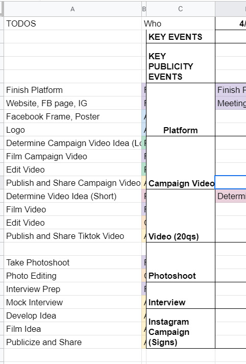
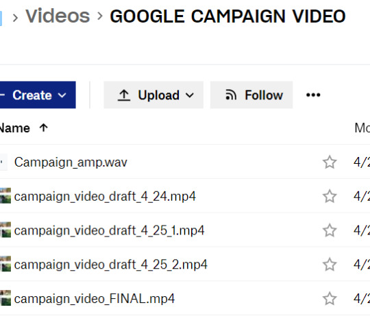
After they figured out the campaign platform, it was game on for the campaign materials. We spent a lot of time on artwork, we photoshopped pictures from a photo shoot, we came up with campaign motto ideas, we brainstormed strategies for officially announcing the campaign. We had an actual campaign meeting to talk over things in mid-April where I met like six different people, friends from both candidates on this ticket, who were supporting this effort. We had a google drive AND a Dropbox. Look at this:
Despite this seemingly organized effort, it was not that organized because this publicity team didn't actually actively do anything for like a week. Many reasons for this: one being it was actually the semester, and it was also CPW weekend. Unfortunately for me, that weekend was literally hell for me, because I was managing this site for our nonprofit, CPW events (so like five zoom calls on a Saturday), classes (because those are still happening), and then the campaign thing finally started, about a week before voting opened. In the form, of a website.
So the tl;dr is I developed an entire Squarespace website in one night. Yes, one night. I had to model it from I think the website from a Harvard campaign site, which took me like three or four hours on a Saturday night, which is a very fast time in my opinion to learn how to use Squarespace. I also bought a domain and figured out how to connect it to Squarespace at like 1 in the morning, which was the first domain I ever bought in my life!

(It expires in a month. I am absolutely going to let it die.)
Also, if anyone from squarespace is reading this for some reason, yall made a really solid product. I actually was very happy with my experience. You all should use it, I am 100% not sponsored by them at all, but honestly it was a very good experience. If you need to develop a website in four hours and don't have a lot of webdev experience, definitely consider it. You can even see website clicks and user analytics, it's actually really put together.
The next day we spend a lot of time going through website changes and artwork changes. It's bad. We had so many discussions about color palettes and the advantages of a 3 column vs 4 column layout. Yes. I'm serious. I'm starting to go crazy.
If anyone's interested, I would say that our website definitely was better than the other campaign's website. Like objectively. Like both campaigns were great, but the website? well. Here's the link (archived because I only paid for 1 month of squarespace :D) The amount of detail that went into it is actually incredible, the amount of spacing, i even had to custom CSS the header image so that mobile headers would show up correctly.
THE CAMPAIGN VIDEO
so sometime during this week, I had this thought about making a really good campaign video. I was very inspired by some of these Google ads that started with a Google search bar. (Yes, I am aware that I am that much of a Google simp.) To be honest, rewatching this ad, I really definitely just copied this entire ad lol, it's ok we don't have to talk about that.
That Wednesday, we coincidentally talked about what makes campaign videos successful. We talked about how Trump's incendiary imagery helped stoke the flames and how it was really effective in getting people to vote, and eventually helped him beat Clinton in the presidential election. So I went and took that and grabbed news clips and campus videos and overlayed that in the video, and it went from like a solid 6 to an 8 immediately, in my honest, unbiased opinion. You can see what I mean in the video itself: [link].
We also had to put together quite a few interviews about what they wanted from the school and were looking for in their candidates, which took a million years of coordination, but we somehow got it done in three days, and everything was put together in a flurry of a weekend, unending changes and small fixes for sixteen hours straight. I could not even tell you how much I learned about premiere pro and how to use layer masks and everything. I even composed the music for the first fifteen seconds of it. Literally, composed, it.
And so on a Sunday afternoon FINALLY right before voting, the video drops. I'm sitting in my backyard absorbing the sun because I hadn't left my computer for 48 hours straight.
It gets like 1000 views or impressions or something in like two days, which is incredible for me, since I'm not a professional by any standards, but I am considering being a professional campaign manager at this point. By the way, we're also managing an Instagram page, a Facebook page, a tiktok page, a website, our individual social media pages, and we're trying to synchronize this video drop and all of our publicity efforts across every single one of these channels. It's chaotic at best.
VOTING SZN
So it's voting week, where we give everyone an entire week to vote. Across the week, it's mostly a waiting game, we make a few more tiktoks and funny videos that we publicize to get out the vote more. The last day, we're thinking about it, and we know the final vote's gonna be close, so we message every. single. person. in our Facebook friends list. I think I singlehandedly convinced like twenty people to vote (and hopefully vote for our ticket).
There's a lot of drama about different stuff. I won't really talk about it because I think it got really messy, but this week and entire couple weeks was a lot to get through honestly. As a reminder, I'm also working on my senior thesis and my nonprofit website work is peaking at this point, so everything is very, very bad and none of us have slept in a while. Also it's the pandemic.
Finally, the results come out. We lost by like 20 votes or something, out of 1500 or so total votes casted or something like that. It's one of the highest voter turnouts in school history or something, I don't quite remember. After that, we're so emotionally drained from this whole thing that we just don't talk about it for a while and that's that.
If the ticket won, I wonder how it would've turned out. I feel like things would've continued to be busy, and maybe that's not a great thing. So maybe everything happened for a reason. I don't know, but those three weeks were quite interesting, quite fun, quite odd. I'm putting those videos in my personal portfolio and am putting Adobe Premiere Pro and Squarespace on my resume and moving on.
Anyways, thought I'd just share! i haven't posted in a while, and this was definitely one of my #weird #odd stories from my time at MIT, which is quite reminiscent of #weird #odd at MIT in general.
1 note
·
View note
Text
Why A Custom UI / UX Design Stage Is Necessary To Product Success
I first found out how important UX / UI design was in 2012. So, my natural instinct was to map out all the business logic and operational processes and then make an RFP for a variety of offshore construction companies. So, I didn't have any experience in product development.
I saw product development as potentially approaching the project through the eyes of inexperience. I note, however, that right at the beginning of the development process UX / UI time was allocated when I received input from software development companies.
At the same time, I also learned about the value of testing my designs using sample prototypes in my initial target market. That was extremely fortunate, because in a month's time, I was able to finish my first product concept and then sell my design in Sydney and Melbourne.
NOVATEUS
Novateus is an innovative company that helps businesses create and build custom web apps for UI UX. Production of customized apps.
They are known as custom software development company, web development company USA, web Development Company, software solutions company, software services companies, software development company USA, software development companies, software company near me, enterprise software development companies, custom software development services, app development companies, mobile app development, mobile app development Louisiana, IOT development companies, mobile app development companies.
Visit at https://novateus.com/
Our main goal is to understand the value of the customers and users of the product to their customers and users and to identify why they need a particular function.
Discovery Phase
We always launch the discovery process when you talk about developing new products and start-ups. During the discovery process, we have multiple workshops with the founders to try and understand the company and future customers: what they need, and what they think and feel about competing solutions on the market. This is also a time when we are producing more ideas and building a UVP for the product. The following diagram depicts the discovery process as chaotic as we use a variety of solutions to the customer's issues that we have defined.
Design Process
We'll start with user flows and the application’s overall information architecture after a comprehensive discovery process has been completed. This is a preparatory stage for the development of photographs of the product.
Information Architecture Phase
The main user streams and information elements on each screen / page must be identified. This is called the Information Architecture Stage and lets us save our customers time and money because it's easier to use the layout as a mental map than in technical programs such as Sketchup and Invision (following this process). The diagram below shows the cost and ability of the product generation lifecycle to change applications.
Wireframing
After that, we start building low-fidelity wireframes that allow us to view our application by identifying features and content and clarifying calls for action, etc.
UI concept creation
The object of the UI concept is to demonstrate how the final version would look like. Typically, we offer customers a preference for the user interface concept. Taking into account the unique value proposition of the product and the empathic maps, etc., we are building UI concepts for the customers / users of the product.
UI design stage
Then we go to the user design stage, where almost all the application screens are generated according to the user interface concept selected.
Visual description helps us to clarify our client's vision in order to determine if the business logic and the subjective design elements, such as color and style, have been correctly captured. The UI description must react to the user of the application, who often does not have the Product Owner of the application. This is one of the problems with some of our Product Owner’s customers.
1 note
·
View note
Photo
(FRIDAY 15TH - TUESDAY 19TH MAY 2020)
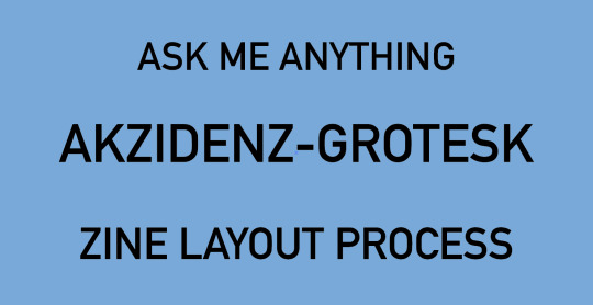
Over this past week I have been attempting to create page layouts for the current zine project. For ages, I was set on creating quite an illustrative zine, however, recently I changed that plan, and chose to base my page designs off the International Typographic Style/Swiss Style, as it speaks more to the time period that Akzidenz-Grotesk was most popular internationally. This change also enabled me to develop a question in my set. Instead of asking the typeface about the hallmarks of the International Typographic Style - which I would be visually depicting in my layout - I could ask about an artist who primarily used Akzidenz-Grotesk and whose work grew from the design period.
I have done a lot of visual research about the International Typographic Style, to understand the way that typography and shape is used in the design. I remember hearing in a lecture recently, that we should be posting both our successes and failures to this page, so I have compiled a few images that explore some of the different directions so far that I considered.
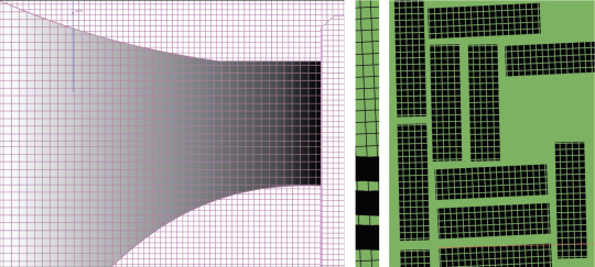
These two images depict some early drafts for my layouts. I played with layering shapes and reducing the opacity of layers to create another colour. Apart from the fact that it (left) looks....weird, this approach wasn’t a method used by designers in the period. Shapes were coloured solid, and didn’t normally fill the page, particularly as using the negative space in a concept was popular. I also trialled a variety of shapes, including this four-pointed star (right) and triangles, but they were really challenging to work with, and frankly, weren’t exactly the shapes used by designers during the International Typographic Style period...so I went back to rectangles.

Grids were a hallmark of the International Typographic Style, so I felt that it was important that I feature one in some way. A week or so ago, I reblogged a post from @estacabronseryo , that depicted a tiled pink room that bent round a corner. I really liked this concept, and attempted to recreate (top, left). I struggled a lot and was very unsuccessful in the end. Later, I rescaled the grid I had created for my last attempt, recoloured, cropped and rotated it, and simply placed in on a green ground colour. I didn’t find creating this page (bottom, left-side) particularly challenging...more or my issue was creating the right-hand-side page. It was important to me that these two pages looked related and mirrored the same colour palette and idea, but I didn’t want them to be the same in any other measure. I did have a variety of trials, but this is the only picture (top, right) I have from this process. In the end, I settled on a less chaotic design (bottom, right-hand-side) as I thought that a double-page spread covered in grid may be a bit overwhelming for an audience and hard to focus on the written text. Additionally, while I wanted the pages to share elements, I wanted them to be strong by themselves and compliment each other. I think I achieved this.
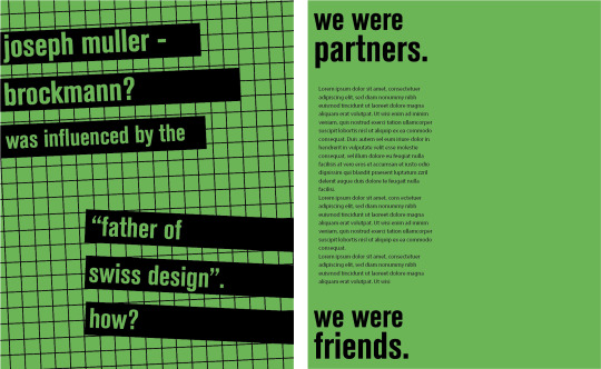
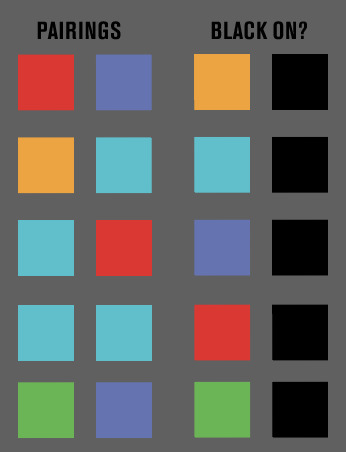
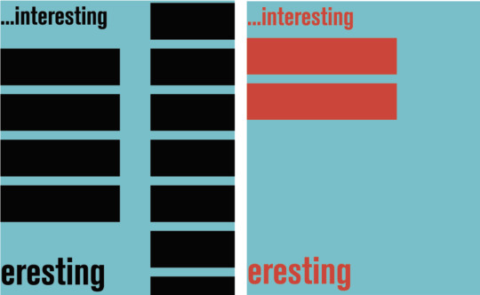
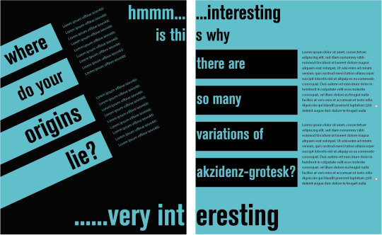
I tested a variety of colours in this design, including walking away from clean contrast pairings between a bright colour and black, testing legibility and overall appeal. In the end, I found that using black was essential, as it created a base for another brighter colour and enabled it to be quite prominent in the design. Also, the typography should be the primary design element, and therefore, neither the elements of colour or shape should detract from the type. I also trialled different shapes, but ultimately returned to the rectangle. I just think it worked better in the tests that I did and was easier to manipulate. Similar to the green spread, I wanted these two pages to illustrate a relationship, hence why I also maintained the same colour palette. Asymmetrical balance was also prevalent during the design period so I wasn’t really restricted in my choice of design beyond the colour scheme. I furthered the pages’ relationship by depicting a voice (’hmmm...interesting.......very interesting’) travelling between the pages, as well as linking the question/answer on the left page, to the question/answer on the right page through ‘is this why...’.
#rmit#communicationdesign#zine#akzidenz-grotesk#swissstyle#internationaltypographicstyle#contrast#wip#WK11
3 notes
·
View notes
Note
I just want to thank you for keeping this public. I have promoted you on Twitter and will continue to do so. I want to help in any way I can.
I debated all morning on how to reply to this. I know this is reference to Melinda making her blog private for Tumblr users only, and I think it’s important for me to express my opinion on that situation.
But first: thank you for the Twitter promotion! I have a Twitter account, but I admit I rarely use it (because I find it confusing to use lol). It’s @july_skies !
Regarding Melinda’s decision to privatize her blog: I support it. She works hard on her content and deserves to feel that people who like it will be capable of supporting it in a direct way (reblogs specifically). Nothing sucks more than making stuff and seeing that nobody’s looking at it or enjoying it, and whether or not that’s what it seems like to (general) you, that’s how it comes across when people don’t reblog her stuff. It’s depressing. It’s like she’s throwing her hard work right into the void.
While I’m on the subject, I’d like to talk about content creation a little more, to help give you guys a better idea of fandom and your place as a consumer of fanworks; I know a lot of you might be new to the concept, and you can’t know if nobody thinks to tell you.
For my “credentials,” let’s just say I’ve been a content creator for more than half my life and there’s something we lifers call fandom participation or fandom engagement. They are more or less the same thing, and the terminology boils down to us answering this question: “How is the fandom at large engaging with our content?”
In the last handful of years, participation is down across the board. When I first got into writing fanfiction I’d get at least 40 comments on anything I wrote. Many of my works ended up with 60+ comments on them!
Now I’m lucky if anyone comments at all, especially in this fandom. Again, it’s a problem everywhere, but I still get comments on fanfic I posted five years ago in other fandoms; meanwhile, this one remains relatively silent.
I post on AO3 for two big reasons. 1) ACCESSIBILITY. AO3′s site layout is easy to read! It’s easy to format! It’s friendly to people with issues seeing small print! And then we have 2) I do it to give people the option of commenting anonymously (in case they’re shy or nervous).
Having an account there isn’t required at all. People just choose not to engage with me when I post fanfiction.
It feels bad to spend hours of your time on something only to see 0 notes/comments/likes/reblogs/whatever on it later. Four ‘likes’ doesn’t feel that good either. Did people actually like it? Are they pity-likes? Do they even care? People mindlessly ‘like’ a lot of things; maybe they did that with your content, too. I’m not saying I don’t enjoy seeing ‘likes’ but a ‘like’ is more or less an acknowledgement that they’ve seen the content, not that they enjoyed it or want more of it.
Also, likes/kudos don’t draw in more readers: comments do. When a reader’s scrolling down the front page of their favorite AO3 fandom, they click on the ‘fics that look like they might be ‘good’ and even though it’s not always TRUE that the ‘best’ stories have the most comments, a lot of readers filter by the number of comments!
Comments tell other readers: this is worth checking out!
Let’s look at a quick example of one of my ‘fics:

This is from my AO3 account, a random WCtH fanfic. It’s not a long one, but it’s not short either. It’s a reasonable read in terms of time spent to read it, and as you can see 185 people clicked on it, 14 people ‘liked’ it (kudos are “likes”), and I have two comments: one of those comments is @trash-god and the other is me replying to her comment.
Her comment isn’t ‘less than’ because she’s a close friend, but she and I spoke at length about this story on Discord and her comment was just a nice little ‘addition’ to that conversation. Sure, the story’s about characters not many people care about, but look at that: 185 hits on the story. 14 likes. And only one person who read it took five seconds to leave a comment? Really? What about the 13 other people who ‘liked’ it?
What this says to me as a creator is that the ONLY person who is going to comment is the one person who might feel obligated to, and if that’s the case, why don’t I just save my stories to show her privately? Why bother posting them out into the void to hear nothing but silence from everyone else?
This is the direction that @whencallstheheart is coming from. What’s the point of spending hours creating these things when nobody interacts with you? Posting to silence feels bad. And look, to put it into perspective, editing gifs to post, writing fanfic, doing write-ups, maintenance of a blog, site, or social media presence: it’s super time-consuming.
Melinda and I both work full-time jobs as it is. My job hit full busy season and I’m even getting overtime now. I’m in training to take over the department next year and I’m tired at the end of the day. When I get home I have eight cats, a house to take care of, and a spouse, not to mention my in-laws live right next door and need help sometimes. We also have a property we just planted 1500 trees on by hand that we have to monitor, and my husband owns a house we rent to someone that needs work done on it, too. Sometimes, life is busy.
And don’t get me wrong! I enjoy creating, just like I’m sure Melinda does. I feel awful if I can’t “create.”
But if my choices are:
work for five hours on a fanfic or episode write-up only to get 4 likes on it, OR
play a video game or watch a movie or read a book or sit on the deck watchin’ the sun go down while I work on a crocheting project…
The latter definitely appeals to me more knowing I have to get up in the morning to go back to work again. My time is worth something. Neither Melinda nor I are getting paid to create this content. We put it together for free, in what spare time we have, in the midst of our own chaotic lives. My website costs me a chunk of money every year to keep up and running ad-free, and I could get all 1500 trees weeded in the amount of time it takes me to put together an episode write-up or decent fanfic.
All content creators ask for in exchange for their free labor is a sense of community, and that can be anything from:
comments on fanfics you enjoyed, even if they are just to say, “I read this and enjoyed it.”
messages that say, “I really like how [this edit you did] turned out.”
reblogs on Tumblr, retweets on Twitter, emails to website owners
you can even create your own blog and use it to begin conversations with those creators!
You guys have been pretty good about engaging with the show itself through us, but don’t forget to engage with the content you enjoy seeing that comes about because of the show.
Fandom content keeps the show alive even when it’s not currently airing, and supporting content creators keeps them creating. Everyone wins, then!
To talk specifically about written content...
Readers are the ones who ensure more material is created. Hands down.
And again: I love writing!! I DO. I’ve been writing seriously for more years of my life than I haven’t been writing seriously! But it’s disheartening to post a fanfic and get my one obligation comment.
Now, it’s fine if you don’t read fanfiction or even enjoy it. It’s also fine if the things I’ve posted aren’t to your specific tastes. Trust me, I get it; nobody is obligated to comment on my fanfiction, and I don’t want anyone to feel that they should be.
But please know this: if you do enjoy something, whether it’s fanfic or edits or something else, you NEED to engage with it, or it WILL disappear. People don’t like talking to walls. It’s frustrating and it isn’t a good use of their time.
(This is one of the reasons I haven’t bothered doing a novelization of the series. It could be fun, but for 0 comments it’s not worth spending the time on.)
Again, you guys have been great when it comes to engaging with the show material, particularly while the show is airing. It’s been fun speculating with you and hearing all of your different thoughts. I know sometimes Tumblr doesn’t make it easy to communicate, either, and you’ve all done a great job of getting around that.
But in between seasons things get slow on this blog and it’s hard for me (or anyone running a blog) to feel motivated to provide content of any sort if you’re not going to take the time to engage in it.
I’ll never mark this blog as private, but if I get to the point where I can’t get any engagement from the fans, I’ll shut it down. The point of having a “fandom blog” is to interact with other fans.
I enjoy providing content to you guys, but if participation drops off to nothing, I’ll be taking that as my signal that the audience is gone and my time would be better spent elsewhere.
So if you’re here and you’re enjoying things, don’t forget to take a little time out of your day to let your content creators know! Not just me and Melinda, of course, but your favorite people on Instagram, Twitter, and other sites as well. ♥ You might be surprised how happy they’ll be to receive interaction from other fans.
And another plug for fanfiction, because 1) they always get the short end of things considering how hard it is to amass the creative energy necessary to tell a good story, and 2) I noticed it’s the #2 page on my website getting visited: if you’ve enjoyed anything you’ve read for When Calls the Heart, tell the author! Here’s the section for WCtH on AO3! Is English not your native language/you’re not confident in your ability to write English? No worries! I’ve gotten many thoughtful comments in other languages and from people who spoke limited English, and trust me: I treasured every one. If you’re just not sure how to comment on fanfic, send me a message and I’ll give you some tips!
I don’t intend this as a slight against my anonymous friend up there AT ALL; I think it can be hard to be in fandom, especially if you’re newer to the scene. There’s a lot of history that’s long gone by now and missing out on it means it’s harder to step into fandom without also accidentally stepping on toes.
Sometimes we take for granted that we have an almost unlimited supply of fanfiction, gifs, memes, blogs, and so on at our disposal. But none of that comes from thin air and it never did. It’s the cumulative hard work of millions of people throwing their hearts and souls into something they’re passionate about in an effort to engage with other fans.
I hope this helped put things into perspective a bit!! Sending love at all of you that stuck around this far; I know it was quite a bit of a ramble LOL!
#when calls the heart#anonymously asked#answered mail#thank you for the kind comment but here's my perspective#in the hopes that you'll understand melinda's a little more#the lack of engagement gets me down too tbh#if i felt people would comment on and want to talk to me about#a novelization i'd start writing it tomorrow
10 notes
·
View notes
Text
Joselia Hughes

Joselia "Jo" Hughes is a Black 1.5-generation Cuban-Jamaican-Guyanese-American writer and artist from the Bronx. She lives with Sickle Cell Disease (HBSC) and ADHD.
Where did you find the 3rd grade poem? How did you decide to include it? What other collage or found art/poetry do you like?
The 3rd grade poem was from a collection of student works, Witch’s Brew, released by my grammar school, Horace Mann. I have two issues from 2nd and 3rd grades. Both of my works were quartered in the “Fantasy” section. There was another section called “Feelings” and, I think, The Sky more accurately suggests a feeling. Scratch that: it explicitly discusses a feeling. This misidentification by academic administration/curatorial staff (which doubles as a political demonstration) is telling. I think it explains a lot about the root confusion between what I have felt/feel to know as Experientially True versus what I’m told to know as The Truth. When considering the emotional and material lives of Black femmes, we must remember Black femmes have been historically disallowed, disavowed and dispossessed of creative virtuosity. Too often, we are strapped in the monolith of stereotyped caricature dictated by the manifested destiny written into commandments/constitution of misogynoir. Black femme virtuosity is reappropriated, regesticulated and worn like some earned bloody body wisdom by the Opps (Oppressive Forces). While I didn’t have those terms as a child, I experienced the consequences of misogynoir in conjunction with dis/ableism and classism, which aren’t separate entities but necessary vices that amplify asphyxiation. Is disabled Black femme loneliness only permissible when classified as fantasy? That shit don’t sit right in my spirit. I also used the poem because the title is Witch’s Brew and my zine, Heartbeats But No Air (HBNA), is a kind of exorcism. A few years ago, I pieced together that my maternal grandmother was a covertly practicing Bruja. With the widening reclamation of ancestral wisdom by BIPOC, in an effort to decolonize our existences, I was tapping into that tender tendon of wisdom.
Understanding my grandmother’s practice reminded me that she wanted to name me Darthula Verbena (daughter of God, enchanting and medicinal). I started referring to myself as DV, my pre-name, and inspected my childhood. That’s been a remarkable endeavor. I had to teach myself to play again. Through play, I learned how to feel. Learning feeling meant learning the qualitative and quantitative nature of the labyrinth of my thoughts. Once I learned some of the turns of the labyrinth, I could feel to know how to navigate the terrain without fear and engage in the rigorous study that’s always characterized my central self. Play is a code switch. I often think of code switching as a means to subvert/refigure power differentials. To hide in plain sight by retooling “seeing” to perception/sensing. How much are we perceiving/sensing? How often do we mean perception/sensing yet default to “sight”? Perception/Sensing adds dimensionality that isn’t always articulated with and through “sight” and “seeing”. Ralph Ellison’s identification of “lower frequencies” and J. Halberstam’s configurations of Low Theory do this work. I toy with these multiplicities in the zine. I work low to the ground which means I work close to my heartbeat, my central drum. I work meta; I go beyond. I like to sprinkle codes, tickle clues, tuck in questions, sew in wisdoms so I know what I’m doing, why I’m doing it, who I’m doing it for and to always remember the fun of FLiP (Feeling, Learning, iPlaying).
Some of the works/folks who’ve helped me FLiP are Dana Robinson’s meditative and piercing collages; Zulie’s mind bending, heart wrenching, time suspending zines; Nikki Wallschlaeger’s I HATE TELLING YOU HOW I REALLY FEEL; Seth Graham’s tattoo practice/paintings/unbounded love of outer space (they’ve done 3/4 of my tattoos); Amanda Glassman’s razor sharp poetry and encyclopedic curiosity; L’Rain's music has literally helped me scale the side of a mountain and carried me through hospitalizations; KT PE Benito’s multidisciplinary liberation praxis and collaborative friendship; Zoraida Ingles' holistic creative prowess (a conversation with her is why Heartbeats But No Air, as a title, exists); and Marcus Scott Williams’ writings/video/sculpture work that readily embraces the persistence of ephemera. This isn’t an exhaustive list—I have a solid library of books and papers and zines and tunes at my crib—but, genuinely, I’m inspired by everyone I’ve had the honor to encounter.
There are themes of love and race and beauty and culture and self-transformation in this book. Paired randomly, some pieces may not make as much common sense together, but as a whole, it feels powerful and cohesive. What was the structuring process like for this chapbook? Each zine is different, right?
It is one zine. I find it cool that you consider HBNA a chapbook made up of many zines. The word chapbook had never crossed my mind. I walked into the process with DIY zine logic and HBNA was printed using office photocopiers. I think the feeling of cohesion you mention is what happens when you witness a lot of parts of one person. In this case, you’re witnessing a lot of different parts of me, my thoughts, my actual labor. Whole is the goal ‘cuz people are whole. I am whole. I consider HBNA a single revolution of myself— one big twirl around a fire, a sun. I was in a very strange place. I’d alleviated, with the help of acupuncture and CBD products, a significant amount of the chronic pain I’d been experiencing since August 2014. I fell around love with someone and rose in love to myself (thanks Ms. Morrison and Ms. Stanford!). I was in an unfamiliar painless trance. I created and tinkered with all of those pieces during a very short period of time from Summer 2017 to Summer 2018. HBNA was originally named Girl Pickney (the prose pieces were written under that moniker) and before that NggrGrl (a nod to Dick Gregory). I wrote the poetry in an even shorter period of time—March to July 2018—and the poems are actually part of a full length collection that I wrote in those four months. I didn’t decide on the layout of the zine until I was with two friends formatting it for printing two days before I was going to read at The Strand and sell it. I kept all the pages, the puzzle pieces, in a folder. A lot of book structuring, for me, is based on emotional knowing—when to slap, when to pound, when to breathe, when to confuse, when to stun, when to anger, when to tell, when to soothe. All of my structuring decisions are fly about to get swatted dead but fast enuf to fly away first intuitive. If I’m channeling that intuition, I know I’m in running in the proper heat and lane.
You were in an MFA program at one point. How does this chapbook contrast with your style from before that program and during that program? Did that program have an effect on your writing? This doesn’t feel like the most MFA-y writing, which is why I ask, and which I mean as a compliment.
I’ve attended a few schools. I’ve completed fewer than I’ve attended. Until my late 20s, I was shy and desperate for people, those noun-verbs, to stay. This desire for people to stay meant I spent an inordinate about of time and energy relegating the difficult parts of myself to the margins of the margins and continually stepped into social/academic shoes that did not fit. HBNA was the first fitting of the bespoke shoes I can now emotionally afford to make. The first copies I sold had typos! I misspelled my own pre-name and that’s exactly what I needed to happen. It needed it to happen because I’m full of mistakes and yet! I try! I understand HBNA as a radical refutation of embarrassment. Depending on when you purchased a copy, you’ll see I used white-out to make a few corrections. No two zines are the same; only 80 copies exist. I’m printing 12 more copies (they’ve already been claimed) and then on to new pastures! The zine was printed in three different places (two offices I don’t work in and a local printing shop) and I was lugging around 800 individual sheets of paper that I stapled, numbered, indexed and decorated with stickers by myself…standing barefoot on the carpet of Staples in Co-Op City, listening to Ryo Fukui’s Early Summer on repeat until I finished and then I jetted to the Strand to read. HBNA was how I knew to embody my physical, emotional, intellectual, and spiritual labor. I’m a goofball with zany ideas, an indifference to external definitions of relevancy, sickled cells and a lot of chaotically grounding love. I write for myself first. Of the school lessons I did receive and learn, there weren’t many I didn’t later disassemble to rebuild, freak unfamiliar or completely misunderstand. J. Halberstam calls this “failing”. Rejigging failure has been such a gift to me. How wonderful! A failure AND still happening? Fuck yeah! I was a wildly uneven student whose knees buckled at mere thought of rigid academic authority. After years of shame and refusal, I can finally admit I am an autodidact. I intentionally get lost and navigate in and to the direction of my own senses. School didn’t teach me to write for myself and that’s who I always have to write for. If that’s selfish, so be it. I am my first audience. If I’m sus of me, then me and myself got foundational problems. I know my writing is non-institutional and that lack of institutional alignment and support, while scary as shit, pushes me to make and take risks to believe beyond the immediate demands/plans/remands of whatever external force I am facing. My writing is constantly colliding into A New I can’t predict. I’m fully committed to unfolding, unraveling, for curiosity’s sake.

What’s a typical day like for you?
My day to day life is as predictable as it is unpredictable. I am formally unemployed and have been for awhile. I live on very little cash and am kept afloat because my mom is a gem and hasn’t kicked me out. My days are 100% influenced by the weather and I spend a good portion of my time negotiating how to minimize the occurrence of vaso-occlusive crises and other complications from the disease I have, Sickle Cell. Between January 2018 and January 2019, I was hospitalized three times. Each hospitalization was about a week long and recovery took significantly longer.
Here’s a sketch of what I call a really great day: I wake up before 10. If the night’s sleep was especially restorative, I can comfortably rise at 8. Depending on how my body feels, depending on how much pain I’m enduring, how much fatigue is shrouding/clouding my faculties, I decide if I have the energy to take a shower. I do the bathroom routine, get a cup of orange juice and take my medications (Endari, sometimes Adderall, Folic Acid). I use the first hours of wakefulness to connect with loved ones via text-phonecalls-DMs and browse the internet for headlines-news-updates-new smiles. I wear my fits comfortable. I call comfort my uniform—upend normcore to body sensible—sweatpants/leggings, pullover, one earring (although I’m leaning to pairs again), handy dandy baseball cap and sneakers. I keep it simple. If the weather is aight—if it isn’t too cold or too hot and if precipitation is mostly at bay and air quality isn’t extremely poor—I go outside and get some living exercise. When able, I take extremely long walks. Once I walked over 50 miles in a week! It’s my preferred form of meditation. Walking/body movement grounds my ADHD symptoms more effectively than stimulants, strengthens my body for potential Sickle Cell episodes and satiates my unyielding need to feel connected to other people. I’m at my best when outside and happening. Illness can create an inescapable interiority. Inside reminds me of the hospital and my relationship with the hospital is, at best, fraught. Walking allows me to follow myself. I engage in peek-a-boo with babies, witness accidents, smile at strangers, duck the eyes of leering people and learn how to love differently too. I go to playgrounds and swing. I take photos and notes. If I’ve got a lil cash, I ride the subway for fun. I poke into shops, admire graffiti and other street signs. I have one woman dance parties on sidewalks. I rest on park benches and read. I pick up grub from hole in the wall spots—you know—I live my life and embrace as much as I can while centering kindness and gentle flow. The walks are my favorite part of my job, which I do not have. When I return home, I rest then get to crafting which I sometimes call spelling. Crafting/Spelling can be anything from adding to my I-Box, spitting verses from the abstract (poetry), spinning short stories, detailing journal entries, doodling, painting, knitting, researching & studying, dancing & stretching, bugging out on Twitter or reading. My bedroom is my studio so I work small yet widely. I intentionally provide myself with many targets so I can a) keep my thoughts and feelings flowing b) find the connections between all of my actions and c) mitigate the stress that sits in the heart of a lone project. I am a multifaceted, multifauceted being. Why not turn on all the taps?
The more long form prose pieces in here have the feel of nice punch-y flash fiction. Are you writing a fiction collection without poems and collage in it? I want to read that, too :)
Hahaha! You’re onto me! Yeah, I am writing another book of poems, a manifesto zine and a collection of fiction. I’ve been writing a collection of fiction since 2012. I had a lot of the difficultly writing the fiction because I was too attached to the title, the characters I conceived needed to grow up with me, and I experienced many years of unremitting and improperly managed mental and physical illness. I was holding onto and telling lies. The shame woven into those lies kept me silent and scared. All of that shit needed to get integrated or dropped. I couldn’t enter the prose/fiction I’m currently writing without learning how to survive myself and the world and bottom-belly-believe in survival too. I’m getting there— healing with primary, secondary and tertiary intentions. Won’t say much about the fiction pieces of than: ~15 stories, lyrically speculative fiction, capital B Black, disabled, and queerfemme parables of creation and destruction and maintenance. My website is in flux but I do readings and performances. Hit me up on Instagram , Twitter or email me at [email protected]. Might take a minute for me to respond because I’m thoughtful yet questionably organized. Now go play, ya’ll!
Unintentionally wrote a poem in the interview. I call it A.B.B in Lieu of A.B.C
beyond
fly, about to get swatted dead but fast enuf to fly away first,
always believe beyond
#joselia hughes#heartbeats but no air#zine#chapbook#poetry#fiction#nonfiction#writing#adhd#sickle cell#verse#abstract#stories#speculative fiction#parables#walking#walks#DIY#ralph ellison#Bruja#prose#MFA
2 notes
·
View notes
Text
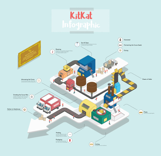
Week 3 - Final Production
For this final week for the chocolate infographic, we are to keep developing ideas and onto the production in Adobe Illustrator. I’ve got all of the researches completed, and the sketches are done, now it is time for me to create the infographic. However, I don’t want to use the 3D tools in Illustrator as I find it to be quite rigid and it doesn’t have the option for me to edit the shades and tones of the isometric shape freely.
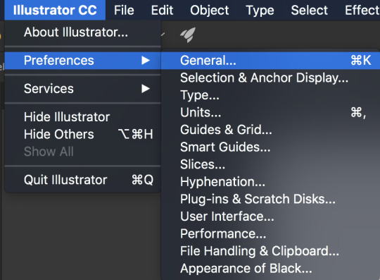
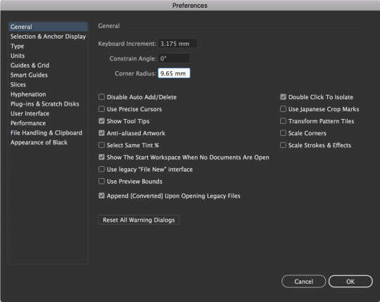
The easiest way for me to go about this is to create an isometric grid. Creating this isometric grid is really simple, I need to go to the Preferences and general. In the general panel, change the keyboard increment to 3.175 mm and adjust the corner radius to 9.65 mm and click OK.
Select the line segment tool to create a straight line. Next is to make sure to press and hold the shift + alt and keep pressing the right arrow key to form equal increments between these lines.

Expand the lines and group them together so that they’re in place. Copy and paste the lines again, and select the rotate feature. Change the angle to 60° and press OK.
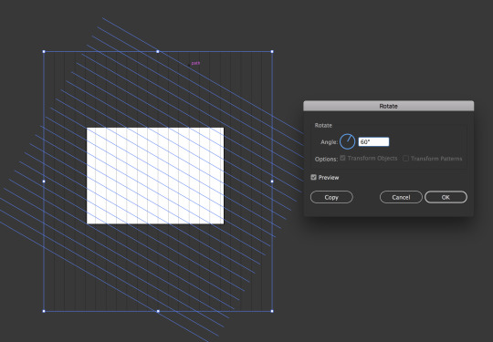
Copy and paste the lines again and reflect it vertically to get the opposite angle.

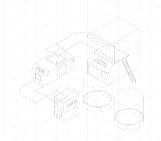
Once the isometric grid is completed, I began creating the first building which I have sketched - sorting and cleaning machine. I have decided not to create machines for the harvesting, fermenting and drying process as it would complicate the infographic. I thought about it, and the approach for me to make this work is by creating a truck delivering the cocoa goods to the factory, and going through the process of cleaning, roasting, winnowing and grinding, etc.
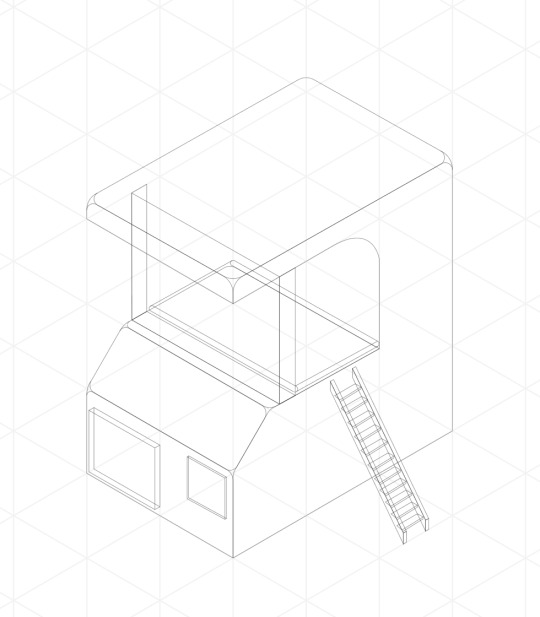
On the other hand, if I do add all of the above into the infographic, it would look really chaotic and too much which in results, could make the viewers confused about where they need to be looking first. Moreover, it would also ruin the layout for this infographic which I had initially planned. Furthermore, To make everything more accessible, I didn’t add colour to the isometric building yet. All I did was use the stroke and set it to 0.25 pt so that I get a clear view of the general shapes of the building. I repeat the process and create the roasting, winnowing and the grinding machine the same way.
I then repeat the process and create the machine for where the sheets of wafer travelled to and the paste machine which the wafer sheets are pasted together. In addition to that, the cutting machine, molding and packaging machine which all needs to be created. At this point, I already had a clear goal of what this infographic is going to look like, including the general layout of where the viewers should be looking at first.
Once the design has been completed, it is time for me to add colours into these building and the process of this is really simple. I created another layer behind the design layer and used the pen tool to fill in the gaps with shades of colours appropriately. Moreover, I created many layers for the colour process as each individual layer would have each building I had designed. The reason why I do this is that it is easier for me to know which layers is which for the colours, therefore, I would always have the ability to change colours if need be, and it just makes everything organised.
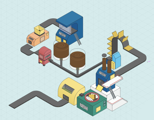
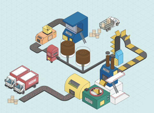
Once everything is coloured in, I then add additional objects such as the cardboard boxes, cocoa beans, more wafer sheets, KitKat bars, truck, etc. These items are then coloured in the same way as I did it for the machines and making sure that I create separate layers for these as well.
In addition to that, to make this infographic a little more fun and interesting to read, and instead of leaving this as it is - I have decided to add people into the factory to show that they’re working and to make this infographic a little livelier. However, my intention was not only to make it fun, but the uses of these characters were to give a sense of scale to the viewers in comparison to the sizes of the machines.

To make this infographic really pops, I have to add a floor to act as a base for these buildings. However, it isn’t going to be just a plain floor. My intention for this is to create an arrow floor, indicating the directional of where the viewers should be looking first and in which orders.
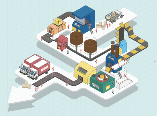
I finally add the line indicating to these machines and explaining what it does, including the process that it goes through. Moreover, I tried to keep the information as little as possible and leaving the explanation only on the graphic itself. I then added the title “KitKat Infographic,” at the centre top of the page to let the viewers know what this infographic is about.
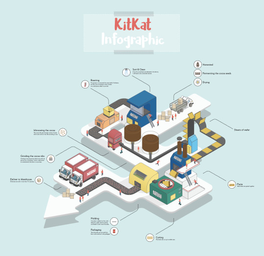
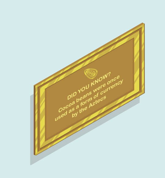
Lastly, to make this infographic fun to read, I have added a golden frame on the left-hand side, with information about how cocoa beans were used as a currency by the Aztecs. This was also associated with how the frame is golden as well as the cocoa beans, as it is an indication of how it was once used as a currency before.
Creating this infographic in an isometric view was something that is new to me, and it was a great experience, plus challenging at the same time to create something this complicated in the amount of one week. However, I have learned a lot from this.
Is the design successful?
From the amount of work that I’ve put into this project, I could say that this design is successful. I had my doubts at the beginning of the project as this was my first attempt to create an infographic in an isometric view. Not only does it turn out well, but I really like the final results.
What went well?
What went really well for this task was that I was able to get to the results that I had in mind at the beginning. Moreover, it also went really well that I was able to connect these buildings and machines together without any problems, as I was bewildered of what I should be doing first and how these are going to be connected to each other.
What didn’t go so well?
Adding the shadows was one of the hardest things I had to do for this infographic. The tools can be rigid in Illustrator, and this is why I had to import a PNG of this infographic to photoshop, and I used the tools in Photoshop to create the shadows instead as it was easier for me. However, it does take a long time to do it, and this is why I left out the shadows for the people as I was really short on time.
What could be improved?
As mentioned above, if I could improve on this, I would redo the shadows entirely and get it as accurate as I could possibly can. Moreover, I’d also like to experiment with more vibrant colours as to what worked well with this infographic.
Why this idea?
Initially, I wanted to just create the process for making chocolate, but I thought that it has been done too many times, so I just wanted to do something a little different by focusing on a chocolate brand and how they’re made.
Final results:
7 notes
·
View notes
Text
Magazine Proposal Work-in-progress ideas
The first idea for a magazine is an art analysis magazine that focuses on artworks that influenced peoples’ opinions and ways of looking at the medium through which those works were created with. As this idea revolves around human perception and experience with art, the artworks analyzed will be those that have revolutionized the general way of interpreting said work’s medium by exploring themes of human behavior by putting into question the methods that have led to that prior way of looking at the medium in the first place. I was heavily inspired by articles such as Véronneau Pierre’s “Quebec Film History: 1896 to 1969” which detailed different advancements and films that changed the course of how film was regarded in the province.
So far, I have selected 3 works: Citizen Kane by Orson Welles, Rhythm 0 by Marina Abramović, and Undertale by Toby Fox. The first is a film about the rediscovery of the past life choices of one deceased Charles Foster Kane, focusing on the innovative techniques that the film introduced while touching on the importance of this character’s choices (Brownell). The second is about the choices of the audience when presented with the option to either perform silly acts with the items laid out in her performance piece and how they escalated into more sadistic ones, providing insight on human nature when given complete freedom (Wood). The third will also involve player choice using games to juxtapose different realities to present different worldviews (Tuersley). It simultaneously puts into question how people make decisions in games (Signor). This selection should have enough content to talk about to make up several pages, enough variety in terms of mediums discussed, and enough similarities throughout in their respective themes relating to personal choice and human behavior.
Due to how I intend to lay out this magazine in a dualistic manner, the most appropriate format for it would be that of a saddle stitch binding print magazine. As for the magazine print itself, I plan for it to be the standard 8.5x11 inches, though the page sets will be heavily center balanced, with images lining the middle in a symmetrical layout to the other page and text lining the middle and the edges of each page. As the general theme throughout this magazine issue is that of choice and human behavior, and how those decisions can change depending on previous actions, the overall layout strategy will reflect that through both bilateral symmetry and a chaining/helical structure, with the page split acting as the vertical axis, possibly adding a horizontal axis if needed. I plan to pictorialize the text to fit the shape of the prevalent element of the content being discussed in each set of pages.
All in all, I’m aiming for a magazine that uses symmetrical techniques to help visualize contrasting points in the content of the magazine, which in and of itself revolves around contrasting choices.
Works Cited:
Brownell, Richard. “Why You Should Care about Citizen Kane.” Medium, Medium, 5 Jan. 2019, https://medium.com/@rickbrownell/why-you-should-care-about-citizen-kane-19d98346317b.
Signor, Jeremy. “Undertale Will Make You Question the Essence of Video Games.” VentureBeat, VentureBeat, 19 Nov. 2015, https://venturebeat.com/2015/11/19/undertale-isnt-just-a-retro-throwback-itll-also-make-you-question-the-essence-of-video-games/.
Tuersley, Andrew. “Patrician Perspective: Reading Undertale - Youtube.” YouTube, 5 Feb. 2019, https://www.youtube.com/watch?v=5vK5qg2R588.
Wood, Catherine. “'Rhythm 0', Marina Abramovic, 1974.” Tate, DCMS, Mar. 2010, https://www.tate.org.uk/art/artworks/abramovic-rhythm-0-t14875.
===============================================
The second idea for a magazine revolves around a website layout for a music-oriented magazine which focuses on the types of music and trends in music becoming more prevalent online, such as more chaotic breakdowns in songs and remix culture. It will investigate current trends in music such as formal deconstructions to figure out why people are being drawn to them. I’m personally really drawn to songs with these sorts of breakdowns, so this serves as a good opportunity to delve into these trends specifically.
Three songs that I already have in mind are Zalinky’s Tired of the Noise, Musithical’s Headspace, and Glass Animals’ Take A Slice. These songs make use of contrasting tonal shifts to stun the listener and enhance the experience. Apart from those three songs in one interesting remix in particular by Cole Russo which combined Breezeblocks by alt-J with Take A Slice, which combines the two points of the magazine. No one has really done any analysis of this kind on these songs in particular, so I’ll probably have to find articles loosely related such as an analysis on online musical culture.
As it’s a music-based magazine which focuses more on the sporadic commonalities in different types of online music, it will take a more spontaneous composition like that of Thomas Ockerse’s works (Samara 196). I intend for it to be a website as it would better accommodate the subject matter thematically, sporadic music on a sporadic platform. It will include a lot of overlap, but I won’t try to go too much into experimental designs as to retain some coherent elements in the magazine. I will also include repetition and combined fragmented and networked text and image blocks.
To end off, this magazine will be a website which outlines the trends behind musical deconstruction online and the remix culture surrounding it. It will incorporate those chaotic elements through overlap and repetition.
Works Cited
Samara, Timothy. Making and Breaking the Grid (Revised and Updated): A Graphic Design Layout Workshop. 2nd ed., Rockport Publishers, 2017.
0 notes
Text
David Carson
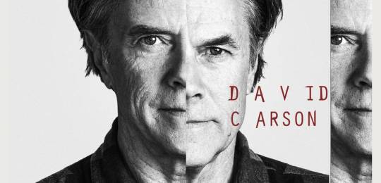
David Carson is a contemporary graphic designer, who's unconventional graphic style revolutionised the graphic designing scene. He is renowned for pushing design boundaries, and in the spirit of exploration he is sometimes left with completely illegible typography, which I think can make the art look even more interesting. Being able to read the words is expected so when artists step outside of the norm, it intrigues us because it goes against what we've learnt. With a little effort you can figure out what is written, however you can always see what Carson is communicating through the art of it. This made designers realise that editorial layouts don't have to stick to the rules, including image placement, consistent typography etc. issue after issue.
His work usually involves chaotic typography, patterns and a disarray of photos overlapping each other, these could look meaningless at the surface but they hold a larger picture. You also find that the disorganised use of his typography has its own purpose, like how each stroke of paint triggers different emotions, imagery and ideas. He experiments with all sorts of techniques, digitally and hand-made, which supports his idea to never close off an idea and let your mind run freely. No two of his artworks are the same, which is why his art will always be exciting and unique. I would like to take his messy but intriguing creativity as inspiration, specifically the illegibility of his typography which I think is so effective.
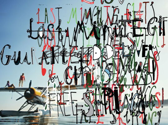
The first piece is a collage made of just two/three elements, these are the hand drawn typography and photograph. This is a perfect example of him mixing medias by hand drawing the type, scanning, digitally editing and placing it over the photo. However that's not to say it is simple, because just the typography in itself is a crowd of messily written letters, some drawn as other things like eyes. Once again this piece is a great example, but for the illegibility of his typography. Overall, I really like this piece because of how crazy the writing is, and how well it's worked with the image behind. The digital editing also really brings them out, and allowed Carson to be really creative with the digital tools.

This next example displays one of Carsons a hand-made collages, it was created with his designs on paper, ink on clear plastic sheets and a bright light box. It's colour scheme is made of multiple vibrant colours, which I really enjoy because they're fun and positive. I also like how the layout of the layers are messy yet still looks collected, and as usual the typography is also difficult to read but that's unimportant.
In this piece you can also see how Carson experiments with interesting tools and materials, one of them is a light box which fills the entire background. There are many possibilities with light box art, you can turn paper slightly see through, add printed text onto see-through paper and print off your own designs, all of which he did in this piece. I like how he used messily ripped pieces of paper, in my opinion this added character and Carson's general messy style.
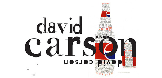
Next is a design he made in collaboration with Pepsi, it's clear because of the bottle shape and well known Pepsi logo. These bottle and can illustrations are made mainly with words, but if you look closely some of these words have been coloured red. This is so the main slogan stands out and will actually be seen, rather than blending in with the rest of the words. The red text also matches with the red labels on the drinks, keeping the colour scheme simple and bold.
As for the large text of his name, this may look simple but the more I look at it the more complicated it seems. I noticed that there are two different fonts, one thin & fancy and one thick & round. These have been overlaid and cut out in sections, revealing parts of the other and merging the two font types. However what makes it even more interesting is how it looks disconnected, in many parts the two don't particularly 'flow' or 'properly connect'. But this is what David Carson is all about, pushing the boundaries and keeping the imperfect details.
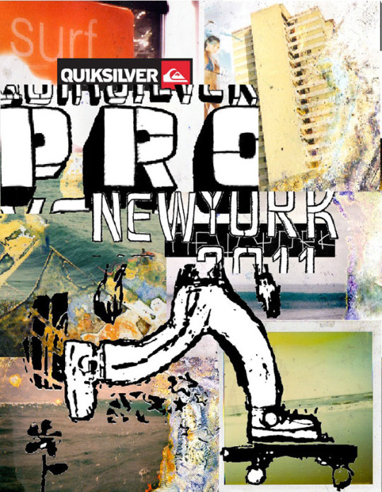
This piece is on of Carson's busiest designs, where I find it difficult to properly see or focus on anything. Collaged together is a super rough sketch, hand-written typography, printed images etc. These pictures have also been tampered with, as it looks like the colour has been washed off or burnt. This simply adds to the grungy look and business of the piece, but I think the piece has surpassed messy to the point where it works and doesn't look 'too much'.
There are some smaller details that I've noticed which are super effective, for example the skateboard sketch remains filled as the background has been deleted. However, there are a couple parts of the sketch that were also deleted because of error in joining up lines, but Carson decides to leave the happy mistake and allow it to add to the piece. Viewing this makes me feel inspired to experiment with distressed imagery and effects, which would mean stepping out of my comfort zone and trying out new styles to broaden my abilities.
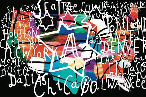
Last but not least here is David Carson's illustration of the map of USA, it includes every state however the labelling isn't the clearest. This is a brilliant example to show how being able to read what the letters are isn't important, because he communicates the idea/what it is through the whole design. The names may not be on their state and each section painted may not be perfect, but you can see straight away that it's a mop of America, hence the large 'A'.
Once again Carson has created something chaotic, like the first example, mainly seen in the typography. Most of the words have been messily written in a swirly manner, this by itself makes it less clear, but they also overlap each other and get mixed together. This covers the whole page and the painted map, which I think has been made in such a creative way. Each colour represents a different state and of course he didn't just stick to a few colours, he displayed a rainbow of different shades and left many of the paint strokes seen.
0 notes
Text
I couldn't work on page 4 today since I spent most of it sleeping so I thought since I had some funny headcanons about the Trust-vers (Some will actually appear in some form in the comic)
Remember these are my headcanons and not necessarily Canon to the Trust fanfic.
* Grillby originally lived in his bar. It was a one bedroom house that he renovated himself into a bar with a kitchen in the back and a side room that you can only access through the kitchen.
* Grillby bought his house when his cousin was born and he was asked to take care of them from time to time, and to help give a more stable place for his aunt to live during pregnancy since the Hotlands were still chaotic with construction at the time. He didn't put a lot of thought into the house besides what his aunt wanted and that he needed to ensure it had a full kitchen.
* speaking of layouts, his bar actually has five exits. One is the front door, one is the back door. There are also three secret doors: One right next to the door to the kitchen that you'd only find if you knew it was there and where to press on the wall, a camouflaged door in the side room, and A secret door near the roof that only Sans and Papyrus can get to and leads out into a very thickly branched tree outside. Grillby had this last one installed with the door in the roof of the kitchen to give the two kids more piece of mind for finding a quick escape.
* other additions and renovations he made is a secret doorway next to the jukebox that originally only Sans and Papyrus knew about, but now is also known about by Greater Dog, a walkway built into the rafters (plus hidden lounge area with slightly raised guards) for sans that also includes an 'emergency exit' into the side room, and the entire removal of the door to Grillby's kitchen at his private home after the door had been destroyed in a 'blaster incident' .
* Alphys gets Sans, Papyrus, and Undyne to watch anime with her, and tries to convince them that it's human history so they won't mock her for it. Sans clues in right away, Papyrus takes until about the second season of their third anime about giant robots fighting in space To clue in, Undyne and Gnash are 10000% convinced (Frank thinks it's hysterical and never corrects this)
* speaking of the Undyne family, they have a running tab at Grillby's. Not for food, they always pay that, but for things they broke. There are three separate categories for each family member. Gnash has the highest item count followed by Undyne, but Frank broke the most expensive item (the jukebox). Grillby waved the tab for the Jukebox in favor of Frank making a short notice house call to do a medical exam on Sans and Papyrus, but asked Frank to remind Gnash that he still owes him for the damages to his bar counter, wall, and a customer's umbrella and abacas.
* Undyne was so excited to one day ride around on papyrus's back that he had to be forcibly stopped by Frank or Grillby a few times when Papyrus was still to small. Shed usually try and get on Sans who would just plop down on the ground and not move. Ever. Gnash would think it was hysterical.
* As kids Papyrus was always the Short One, even smaller than Alphys. Undyne would crack jokes and call him Shorty until he hit 12 and had a sudden growth spurt that just didn't seem to stop until he hit 18 and was suddenly even taller than Gnash. Undyne still calls him Shorty, even if he's at least a foot taller than her.
* Speaking of Heights, as kids Undyne was the tallest, followed by Alphys, then Sans, then Papyrus. As adults it's now Papyrus, Undyne, Alphys, and Sans. Sans doesn't mind.
* Sans is shorter than Papyrus but bulkier and can lift more weight. In his Blaster form he can even comfortably carry Alphys.
* Papyrus and Sans actually suggested carrying Undyne and Alphys once. Mostly as a mock play of an anime they were watching about a girl who rode on the back of a wolf. Undyne had the time of her life whipping through the trees. Alphys tried but kept falling off and didn't think it was that much fun even though Sans did his best to make sure she wouldn't fall off. With some help Sans made a saddle for her which surprisingly worked very well and Alphys enjoyed her next ride. She isn't comfortable using her friend as a means of transportation though, especially Sans, so it's a once in a blue moon/emergency thing that has her do this.
* Papyrus and Undyne have battle plans for how they could use his Blaster form and her spears in combat. It's as epic as it sounds. Frank had to use every ounce of his own determination to keep Gnash from challenging them.
* Asgore makes frequent trips to Snowden to check in on Sans and Papyrus. A few times he went dressed as Santa so they wouldn't know but Sans figured it out. Papyrus was oblivious.
* Dogamy and Dogressa eventually do have their own pup, a female named Doge! (This one isn't entirely Trust Centric).
* As the bros get older Grillby starts to wonder if perhaps he should invest in a larger house. Neither sibling is very eager to leave, and there is a fairly large vacant house just past the Librarby....
* Judging by how hit headed Gnash acts at work and how Brash and Mule-Headed Undyne can be, you'd figure she gets her stubbornness and penchant for stupid ideas from Gnash. As Gnash can attest, her stubbornness actually comes from Frank. He says it would be easier to convince a mountain to fly than convince Frank against something he has set his mind to. Frank says the stupid idea thing is a combo from Gnash and Frank's rebellious kid phase.
* Gnash makes all of Undyne's clothes. For multiple reasons but the main one being that he can weave magic into them so they are a 1000x easier to clean and fix after she's done running a rampage outdoors all day.
* Frank got the idea go hide sweets and stickers in his sleeves from Gnash to use on Undyne. As a baby she refused to cooperate during his physical exams and the normal tricks of giving her a sweet didn't work on her. Gnash gave him the idea of sleight of hand tricks to make it a game (having heard it from a fellow guardsmen about getting their kid to take vitamins). It worked like a charm and Frank always used it during her exam times, eventually adding stickers as well. Other children he treated loved it to so he just kept doing it.
* Frank usually runs his sticker and sweet choices by Undyne before he goes to an exam
* As Sans started to pick up on his tricks, Frank had to up his Game. A lot.
* Sans found the Door to the Ruins before he met Grillby! He managed to pass Snowden since he was to fearful of the monsters there and managed go find the door. He couldn't get it to budge but the noise he made on the door attracted Toriel's attention who had been checking on it and about to leave. When she called out he fled. He went back once later on, well after being adopted by Grillby during a Run with the Dog Unit. He wanted to knock, to see if he really did hear a voice but couldn't muster up the courage just yet.
* After the Core was rebuilt and a new Royal Scientist was named Asgore made sure to regularly check in on their lab in person, along with requesting more insight on their personal and official projects. He has had to replace the Royal Scientist a few times when they refused to answer some questions about their projects to him.
* Bertram never really forgave himself over not properly listening to Alphys. He eventually decided that he HAD to make amends as best he could and out in for an extended vacation to spend some actual quality time with her. They had a great vacation that ended up being over a month long and after that he not only incorporated her into his work more he always made sure to stop and actually listen to her when she brings up her concerns and fears about something, no matter how trivial or outlandish they seemed.
** The above is also why Alphys now has flood lights installed under her bed and in her closet with a 'panic button' that activates and deactivated them with a touch on her bed.
* Alphys lends Sans her science books, and helps tutor him when he gets to the point that he is more advanced than the teachers at his school. Bertram helps from time to time as well.
* Bertram was the one to make the school curriculum for Grillby to use when he homeschooled the boys before they were ready to join public school. Both boys ended up being slightly above average for that first year but evened out into their own strengths and weaknesses the following year.
* Asgore invited Sans, Papyrus, Alphys, and Undyne to tour New Home and some of the surrounding area which ended with the four helping in his garden and being allowed to each take a golden flower home with them. Admittedly the tour had some mishaps (including a hole in the throne that Asgore swears was his doing and certainly not the kids, but the kids won't say otherwise so everyone leaves it at that), but otherwise went smoothly. Alphys's flower only ever had one flower to it but is still alive into her adult years as she followed Asgore's directions to the letter, Undyne's now makes a very beautiful golden chain bloom in Gnash's office (it was later moved to his living room when he retired), Papyrus's decorates the inside of the window's at Grillby's bar, their stalks tall and thin but the blooms large and vibrant. Sans has spread the most actually: he separates new blooms and gives them to his friends and close companions. Each member of the Dog Unit has a flowerpot with the large but short blooming golden flowers, Grillby has a small collection, and the librarby has several as well. Dogamy and Dogressa got an additional pot overflowing and draped with golden flowers Sans grew himself when their child Doge was born.
* the five Blasters were all eventually adopted by various monsters in the underground, except for the eldest 003 (Arial). They only resurfaced years later and it's because Gnash found them nearly at Dusting point in Gaster's fallen lab after hearing reports of strange noises. 003 was given to Asgore and while he did his best Arial still took off once they were strong enough to move again. Asgore does sometimes see them (just for a moment) in the gardens but they teleport out as soon as they see him. Asgore has been considering adding denser plants that something it's size could hide in.
19 notes
·
View notes
Text
Web Design Trends of 2020 – Complete Edition
Just just like the spectators on the theatre are waiting for their favored actors to play their elements within the performance, internet designers and builders meet each New Year looking forward to the brand new traits with a purpose to appear on the stage very soon.
It's been 1 month left before the tons-expected party of the New year 2020. We have simply celebrated the New Year, so it’s time to speak approximately cutting-edge web site design trends which might be in all likelihood to spread within the path of 2020. Only lazy bloggers don’t speak about traits now and we aren't from their cohort.
There is most effective one trouble with the trends and we can attempt to remedy it for you. There is constantly an excessive amount of facts on them at the net. We have examine nearly 70 articles, which took us almost 3 days to enter the coronary heart of the matter.
However, you will be able to get the complete collection of 2020 traits in internet design with none tedious research. We bet our version of this beneficial analyzing will take you no longer more than half of an hour or perhaps even less. Moreover, you may pass the trends you are not inquisitive about in the meanwhile and glance through the statistics that is vital at the moment. We made up a form of article plan for the motive. Each item is an anchor main you to the relevant facts. We need to be a one-stop-keep for you, hopefully this may workout. Do check: hybrid app development services
When human beings meet the New Year, they always don't forget the best moments of the previous yr and the high-quality matters that had befell to them. We discovered a whole lot of terrific developments in 2019. Some of the tendencies listed under reached or have almost reached the pinnacle in their reputation, so we are looking forward to their further development and improvement in 2020. In other phrases, please don’t be amazed to meet your exact old 2019 pals on the list.
We tried to summarize, systemize and put into order all the available cloth for you, hopefully this will assist and you may start to sense flawlessly secure speaking about internet layout trends of 2020.
⚡️TOP Web Design Trends 2020: Best UI, UX Examples & Predictions
Why Is It Important to Follow Web Design Trends?
What's the purpose of your internet site? Aside from having good pictures, your net page desires to have a sure history that could appeal to the internet target audience and convey emotions. Need an instance? Just think what attract you on Instagram? That's a beautiful presentation and well-idea-out enterprise of branded profiles that encourage you to stay on an internet page for longer. The succes and developing variety of income via the community verify this trend.
What's the trick? A customer thinks that he will pay for a product, but in fact he makes a speciality of the picture that stands in the back of it. While perceiving a catching presentation of a product or a provider in a selected surrounding, a purchaser imagines how cool this product will on him.
The identical strategies are implemented to web design. An appealing and remarkable web web page can capture a consumer's eye, encouraging the target audience to discover more about your brand or order your services.
WHAT WILL NOT CHANGE
Mobile-first
Load time
Chatbots
WHAT TO EXPECT IN 2020
FLAT AND NOT-SO-FLAT
FLOATING ELEMENTS
GEOMETRY
VIDEO BACKGROUNDS
BROKEN GRIDS
EXPRESSIVE TYPES
DAMAGED, LAYERED IMAGES
CHAOTIC INTERACTIVE TEXTURES
DREAMY COLORS
BRUTALISM
HAND-DRAWN ILLUSTRATIONS
INTERACTIVITY
OLDSCHOOL AND GAME-LIKE
3-D OBJECTS
WHAT WILL NOT CHANGE
Mobile-first
Now it’s legit: there are more people browsing websites from cellular gadgets than computer computer systems. In 2019, we’ve visible the rise of micro-interactions, roll-out menus, and custom icons. This fashion will no longer change, however only benefit momentum. In 2020, you will now not want a internet site this is just responsive; you'll need one this is cellular-first.
Load time
This is a bit bit controversial. In 2019, many professionals believed that clean minimalistic websites would take over the internet due to their rapid loading speed. But that didn’t appear.
Instead, we see how new technology are adapting video and picture content to the needs of the cell-first era. In 2020, designers and developers will preserve looking for a compromise among creative Java designs, full-width unique content, and decreased load time.
Chatbots
E-commerce web sites will still need to transform in 2020, and chatbots have established to be an effective manner to do it. In 2020, the web shopping for revel in will keep striving closer to more personalization and extra state-of-the-art AI technology. So, in 2020, we are able to see smarter and greater interactive chatbots on top e-commerce web sites.
WHAT TO EXPECT IN 2020
Now allow’s pass directly to the principle internet design tendencies we’re watching for to look in 2020.
FLAT AND NOT-SO-FLAT
Flat design, as a website esthetics, has been with us given that 2017 and is right here to stay. Web owners love flat design for higher mobile revel in and better search engine optimization rank. Designers and users enjoy clean layouts, vivid beautiful imagery, and masses of whitespace.
Flat internet design philosophy postulates that a site with fewer pix can be as dazzling as its picture-heavy and sluggish loading analog from the 2000s.
Looking at the beneath examples, who wouldn’t agree?
Here is an instance of a fantastically made flat design website. There are few illustrations, however all of them are very charming. When you travel thru the internet site, you see that each new web page functions a specific instance. Traditionally for flat layout, there’s enough whitespace and clean navigation.
This website demonstrates what flat layout can deliver if you add heavy animation and interactivity to it. The pages feature lots of texture and exquisite transitions. Viewers may also even get a little overwhelmed by way of what’s occurring on the website. It seems, but, that that is exactly what the designers were after.
The semi-flat approach permits adding intensity and motion in your minimalistic designs and having all of the advantages of flat with you. In 2020, we can see even extra versions of this.
This design capabilities incredible product photograph compositions with custom illustrations, Parallax, and excellent interactive factors. I additionally enjoyed the animation that makes the web page sense heavy and deep under your scroll. Here we can also see how a long way semi-flat web layout will reach in 2020.
FLOATING ELEMENTS
In 2020, website designs will defy gravity. This fashion is not absolutely new: we all understand that chaotic layouts have been already trending in 2019. Next 12 months, we are able to see many interactive elements doping up right here and there, converting shapes and awaiting a cursor to hover over them.
Open compositions can also be the mainstream of internet layout in 2020. So, put together to look designers ditching borders and leaving interactive 3-D elements to go with the flow at the pages.
0 notes
Text
Final Zine Evaluation
As our first project of the year, we were asked to create a zine based on the themes of the self, home, community, locality, or neighbourhood in the current changing Covid-19 environment. We were urged to work in groups with this project to gain as much group experience as we could during the restrictions of Covid-19, taking this opportunity, I paired up with a fellow classmate and we got to our research.
Originally, my partner and I were in a group that had different ideas but we split due to difficulty after we had done some work on it already so we were behind a week than everyone else. But, we pushed through it and caught back up again. It ended up with my partner coming up with the idea of ‘Youth Culture’. Since we were youth ourselves, it made our work much easier to understand and be able to put ourselves in someone else’s shoes.
First, we organised our research by the topic of all the articles and which one was more important by its place in the zine, for example; I had to get Toxic Masculinity done before anything else since it was the featuring article. This type of organisation actually helped us keep up with our work, we were able to prioritise workloads and organise the look of the zine all in one. Furthermore, we were able to identify what type of research needed to be done for what bit. It was mostly practical research compared to writing, as a result, that might have hindered us a bit as we didn’t take much inspiration into our work. However, this does mean though that most of the zine is just us and our style which means It could stand out a little.
Back on to the research itself, in our zine, there is a moderate amount of street/candid photography. This is because we felt like to have that authentic youngster look we needed it to be natural, we took the research we did on the street photography and photographers such as Martin Parr with his pandemic photography, and Robin Maddock with his close up less chaotic version of his portraits. We used these as inspiration for the smaller articles inside our zine, bar stereotype vs reality, and one large article, Pandemic Panic. On the other hand, for our other three larger articles and stereotype vs reality, we used a more set up images style. For Toxic Masculinity, Gen-Z LGBT and Music Mayhem, we used the research we learnt in the LED lighting session we were given at the start of the term. In my opinion, we didn’t really use any particular style of any photographer that we have been introduced too during this term. On the other hand, stereotype vs reality has a stock photo style; This was more by accident than anything but I think it does give it a nice touch.
When we first started this project I wasn’t very confident in my work nor people, so it was a struggle for me to get my work in the zine because I just didn’t feel confident enough in my work to see as very okay to go into my work. Nevertheless, my partner was able to push me out of my comfort zone and gave feed back on my work in a way that pushed me forward to improve without second guessing. Consequently, I was able to ask a man for a photo of them, this can be seen in the contents page, this helped me greatly improve on my people skills.
Additionally, this project as helped me work more on my portrait skills with lighting. On the Toxic Masculinity article we were stumped on what to do, this led us to leave it last minute. At this time I wasn’t very confident with pictures of people and I honestly felt that they just weren’t for me, that was until I finally spoke to my brother and found my umbrella lights. I was really pleased how these turned out, I especially love the eyes and how they look almost animated.
Further, to complete our zine we had to learn to use InDesign as we found it easier to use than photoshop which was originally suggested for this project. It gave us a better view on the layout of our zine than we expected, however, it wasn’t that easy to use at first and it didn’t really show how to do it so it did have a learning curve which set us back a little. To make it worse, when my partner did work at home and brought it in we found out that the school did not have an updated version which set us back again. Aside from those, I would choose InDesign over photoshop when doing a zine just because of ease when printing and putting together.
If someone asked the question ‘Did you meet the brief or your proposal?’ I would honestly have to say yes and no. Here is why:
Yes, because we have created a zine that we hope would appeal to mostly teenagers and young adults. We have created something for every topic we chose and I believe we have made that at least an okay level, we have also included a large article about the pandemic as part of ‘the current changing Covid-19 environment.’ I, myself, have ticked off things that I hadn’t dared to try before and moved out of my comfort zone. We have got evidence of our research though it might not be sufficient amount on my part. Though, I will be leaving a link to our project folder that has all of our evidence. No, because, as previously mentioned before, I might not actually have sufficient amount of evidence to back up my project in writing. I also believe in myself that I could have put more of my work forward instead of writing articles and throwing some image near the dead line.
On the whole, this project has really helped me become a better writer and to be more confident in my work. I have learnt how to be more profession when it comes to writing and how to voice my thoughts louder, and clearer to be more engaging when doing group work. I have become very aware of showing evidence and leaving enough time to get things done by planning a head instead of leaving everything till the last minute, I am now much more aware of pressures and responsibility which comes with deadlines, and group work than I was in previous projects from secondary school. Though this project was very stressful and made me want to give up, I still found enjoyment out of it and learnt mean new things that will hopefully help me though the next term.
Folder Link:
https://drive.google.com/file/d/1Ie28_DVCf34OdB1bRo-jBx-JGwTS6-xO/view?usp=sharing
0 notes
Text
Building up to Arlong Part I
“Just wait ‘till the Arlong arc.”
I think anyone who’s been in the One Piece fandom for any length of time has read some variation of the above sentence. It’s almost universally agreed that the Arlong arc is the tipping point from the series, elevating One Piece from okay to great. Detractors, newcomers, and the generally curious are all told to hold off their judgment until seventy chapters into the series, which seems like an absurd amount of time for a reader to get hooked.
In an interview with several of Oda’s former editors (English summary here, about three-quarters down the page) it’s stated that One Piece met some initial resistance in Japan among the staff at Shonen Jump, with some of the editors not seeing the appeal and others having to convince them of its “awesomeness”.
It’s hard to imagine the manga garnering such a reaction today, but I think it’s important to keep in mind that One Piece is Oda’s first serialized work. He had been an assistant and written several one shots, but he’d never had to put together a long-form story before. He was learning and growing as an author and artist as he went along.
Just compare the art in these two pages
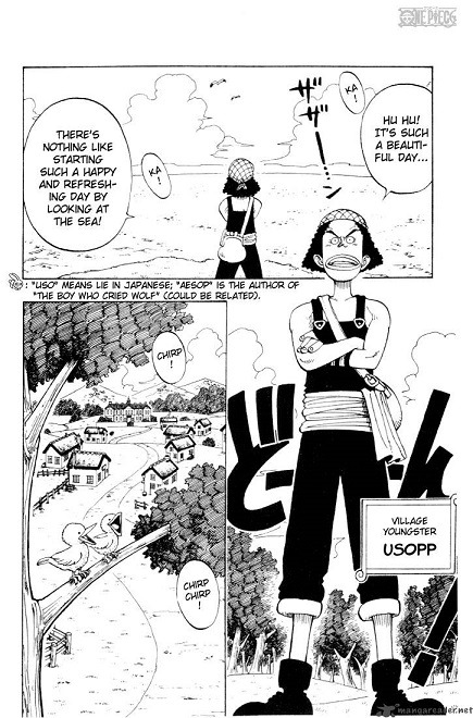
.
.
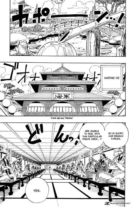
Both are establishing shots of new locations, one of Usopp’s hometown and the other the Marines setting Luffy’s first bounty. The amount of detail outside the marine base blows the idyllic hills of Syrup village out of the water. It can be jarring to see how sparse early One Piece panels are when you’re more used to the cluttered, chaotic pages of later chapters.
But I think it would be impossible for Oda to make the jump from “meh” to “this is amazing” without some proper buildup. Early One Piece arcs contain bits and pieces of what makes the series so beloved, and as each arc progresses Oda takes what he’s learned and adds it into an ever-improving whole. So let’s take a look at these early chapters and find the diamonds scattered among the rough.
Romance Dawn
Chapter 1 is arguably the best crafted stand-alone story in these early chapters. That makes sense. As a pilot chapter for the series I’m sure it was written and rewritten dozens of times for maximum effectiveness, and I think it gets across everything it needs to without belaboring the point.
Romance Dawn is a glimpse of the quality that Oda would later produce on a more consistent basis. The characters are fun and have hidden depths, the art is simple but dynamic, and the bait-and-switch where Shanks doesn’t initially beat the crap out of the mountain bandits is a surprise considering the genre. And if haki was indeed planned from the beginning it’s also the first instance of Oda’s famous foreshadowing ability.
Considering future backstories it’s a little surprising that no one important to Luffy dies, but the familiar themes of inherited will, dreams, and sacrifice are present. The lack of uber-tragedy sets Luffy apart from a lot of protagonists and fits with his lighthearted, carefree characterization and the more whimsical nature of the series, while still hinting at the darkness that exists within the world.
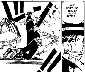
Alvida
Chapter 2 is also a stand-alone story, but it’s much more generic. Following a common trend during these early chapters, it’s more focused on establishing Luffy as a character than any of the antagonists, and world building is minimal. Alvida is so boring that Oda completely repurposed her design and personality when she was reintroduce in Louge Town, and at this point Coby is a walking, talking foil to Luffy with little to no personality of his own.

There are a couple of things to note, though. One, Luffy’s characterization is remarkably consistent to what we see later in the series. Here we see him smile as he faces death, while later in the chapter Luffy insults Coby and calls him a wimp in a scene that’s reminiscent of his interaction with Shirohoshi during the Fishman Island arc. He also doesn’t help Coby until Coby stands up for himself, subtly enforcing the idea that Luffy is not a hero.
Second, we can see the embryonic form of Oda’s later paneling and page layouts. The above scene reminded me of a picture I pulled for my analysis of Chapter 218.
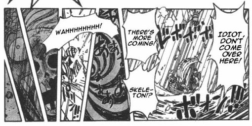
You can’t see it here, but in Chapter 218 Oda tilts his panels to match the rocking of the Going Merry, using an unconventional panel format to convey the chaos the Straw Hats are experiencing while also giving the eye an easy path to follow.
Chapter 2 has the “fade to black” Oda commonly uses when transitioning scenes, but the format is the traditional three lines of (mostly) rectangular panels. Despite the huge whirlpool you don’t get a sense that the situation is dangerous.
Also note the sheer amount of information conveyed in the sequence from Chapter 218 compared to the Chapter 2 despite them sharing basically the same layout. There are four separate panels of the same whirlpool - adequate enough in showing the passage of time, but visually kind of boring, which sums up the art in general during these early chapters.
Shells Town
The Shells Town arc shares a lot of the same flaws as the Alvida encounter, but has the benefit of a longer page count, which is helpful in fleshing out the story. Coby starts to grow into his own, and Zoro is introduced. The focus is still on establishing Luffy’s ideals as a pirate and Morgan is a one-note villain, but the world is starting to grow, namely with the complex morality of the marines.

We also get our first taste of Oda’s specific brand of Tragic Backstory (tm). Zoro’s flashback is arguably the weakest of all the Straw Hat’s. The pacing is rushed and I personally find the segue in and out of the present day to be a little jarring, but the bones of it is sound even if the execution is iffy.
The fight against Morgan doesn’t last long, but outclassed as he is, he at least puts up a better showing than Alvida. There are some neat camera angles and perspective tricks that Oda uses that sell Luffy’s flowing, so-long-as-it-works-I’m-going-to-do-it fighting style.

Again, this is but a taste of things to come, and short as it may be the Morgan fight is fun. Oda has said he gave Luffy the gum-gum fruit to help keep things from ever getting too serious, and reading these early chapters I believe it.
Orange Town
I would call the Buggy arc the first “standard” One Piece arc. At fourteen chapters it’s decently long by East Blue standards. It’s is leaps and bounds better than anything we’ve seen thus far, and we have the flashy bastard himself to thank.
Pre-comic relief Buggy manages to straddle the line between menacing and likable. One thing I do appreciate about One Piece villains is that they’re generally not given an excuse for their evilness (a trend that is admittedly starting to reverse post timeskip). We are never told why Buggy, Kuro, or Kreig set out to be pirates, and frankly we don’t need to know. Buggy is given a reason for his animosity towards Shanks, but it’s never used as a justification for his more jerkish behavior.
And he is a jerk. A clever, reasonably powerful, flashy jerk, but a jerk all the same.
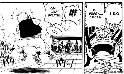
With this added characterization, Buggy has the honor of being the first charismatic and memorable villain of the series, and is also the first instance of camaraderie within an enemy organization. In all honesty, I think the only thing separating Orange Town from the Cocoyashi village is emotional stakes. Buggy’s opinion notwithstanding, there is no Tragic Backstory (tm). The little dog comes closest, but the effectiveness of Shu depends entirely how much one cares for sad animal stories (I am immune, and subsequently don’t much care about Laboon either).
More importantly, it’s here that we see the first primitive instances of Straw Hat interaction, and some of the stuff that happens when Oda lets all the different personalities bounce off of one another is pure gold
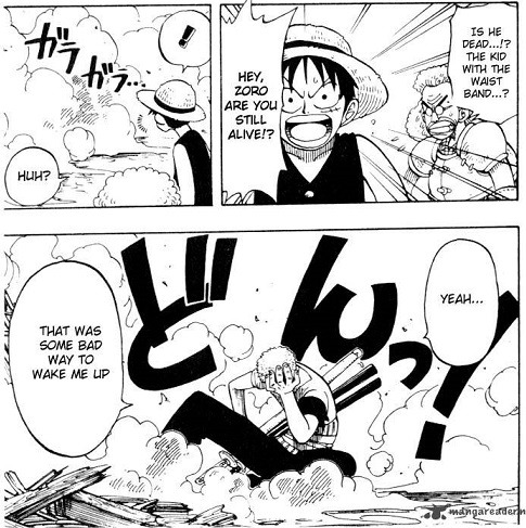
Also Luffy shoves an old man face-first into a wall for his own good. I feel like that ought to be mentioned every time someone tries to call him a hero.

But the thing that really stands out in Orange Town when placed within the overarching plot is Oda’s burgeoning skill at playing the long game in regards to his storytelling, specifically in regard to Nami.
The Alvida, Morgan, and later Gaimon’s arcs are largely self-contained little stories that serve to flesh out Luffy as a protagonist. When Zoro was recruited the audience was informed of his history and character motivation almost immediately. During Nami’s first conversation with Luffy in chapter 9 we learn that she’s 1) raising 100,000,000 berries to buy a village, 2) loves money and tangerines, and 3) hates pirates. We don’t learn the reason for any of these things until her backstory is revealed in chapter 78.
There are obvious parallels to Robin’s recruitment much later, but really this is Oda something does quite often. Vivi and Law were both around for awhile before the meat of their stories were told. Having someone familiar around for big conflicts helps give a face to the nameless masses. It would have been really hard for Oda to make the reader care about the average Joe in Cocoyashi village without having a pre-established connection in the form of Nami, and it would be really hard to care about Nami if the audience hadn’t been given the time to get to know her first.
By waiting so long to let Nami develop as her own character, the emotional stakes missing from Orange Town are fully present during the much-beloved march to Arlong Park. The latter cannot exist without the former.
I said in the opening that 70 chapters is an absurd amount of time to get hooked into a story, but in some ways I can completely understand why it would take that long. One Piece isn’t built on slick one-liners or “cool” characters. It’s fun and goofy and doesn’t take itself too seriously. Hints of future intrigue and mystery are strewn along like bread crumbs down a path, organically delivered as the world unfurls bit by bit. There’s a methodicalness to it that catches the reader by surprise, yet makes perfect sense as the crew goes from island to island.
Orange Town is just the beginning of this in action, but once again this is getting pretty long. I’ll finish the road to Arlong Park in another post. Thanks for reading :)
#One Piece#Analysis#Manga#World building#Luffy#Nami#Zoro#East Blue Saga#Straw Hat Pirates#creative-type analyzes
58 notes
·
View notes
Last Seen Blogs

manhattans
oh you fancy huh
artemispt
It's bigger on the inside!

mrs1-blog1
❤️🍀

rene1morphs
Rene1 - The World of MMM