#wing flap emojis
Note
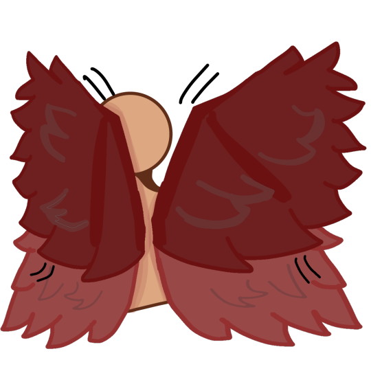
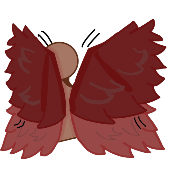
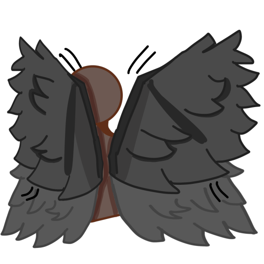
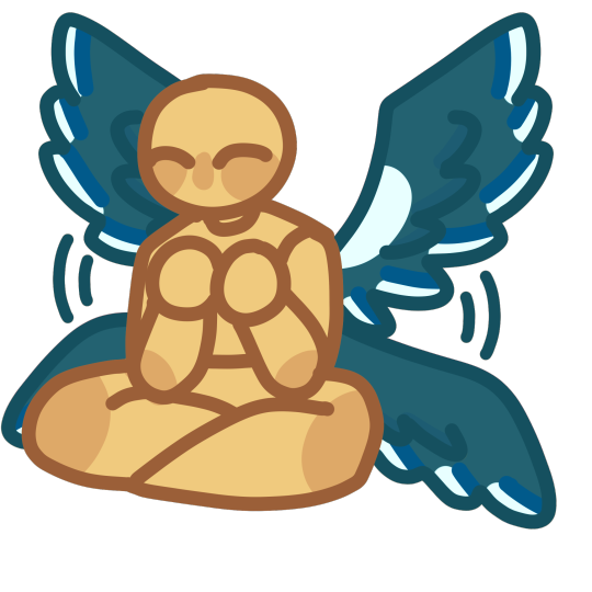
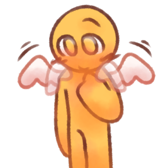
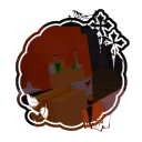
this might be a bit too specific so sorry if it is. can you make emojis that are the wing flaps and stuff but with the wings that pale king (from hollow knight) has? except only two pairs of wings
thank you! and take your time with this and all that :D
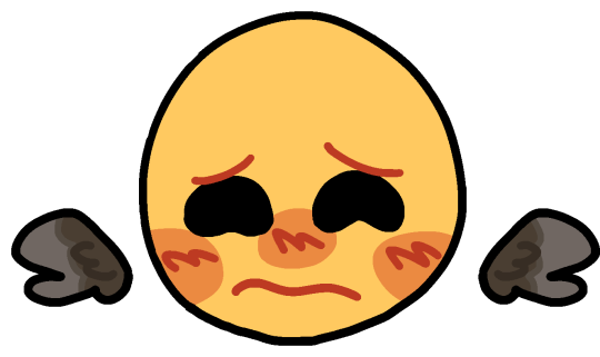
here you go!! hope everything is correct, i had to draw bodies for the Little Guys™️ (the hugging ones) so hopefully they don’t look odd
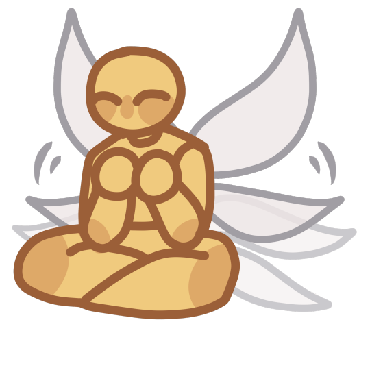

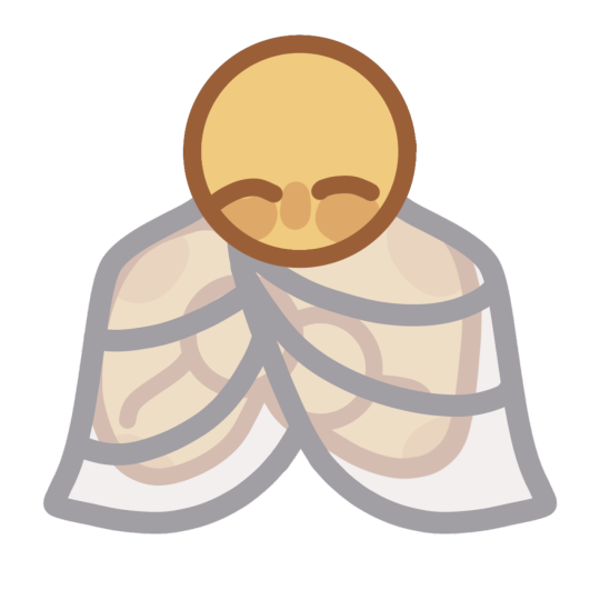

#requests#ell’s emojis#custom emojis#custom emotes#discord emojis#emotes#emoji#stim emojis#wing flap emojis#wing stretch emojis#hugging emojis#wing hug emojis#self wing hug emojis#pale king#pale king hollow knight
187 notes
·
View notes
Text
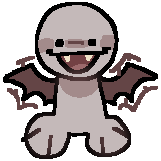
vampire bat wing flappin
[IMAGE DESCRIPTION:
1. a light reddish grey humanoid with no arms and stubby legs. it has reddish brown bat wings on its back and vampire fangs. it has a happy open-mouth expression, and its wings are flapping./END DESCRIPTIONS]
#zombiie emotes#discord emoji#discord emote#custom emoji#custom emote#emoji#emotes#vampire#vampirekin#vampire irl#stimming#stim#wing flapping
62 notes
·
View notes
Note
If possible an animated red wing flap? /nf
Animated Red Wing Flap!!

Here ya go!
Requests Are Open!
REQUESTED BY: @undeadpacksys
#discord emoji#discord emotes#custom emoji#emote#stim emote#stim emojis#stim#stimming#therian#otherkin#wing flap#animated#animated emoji#animated emote#red wings#red#wings#feathered wings
82 notes
·
View notes
Note
Looks at u with my tiny eyes
Could you possibly make gold wing emojis? 🥺🥺


some gold ver. of this posts wings !! if you want some other specific ones , lemme know ^^
#custom emoji#custom emojis#custom emote#custom emotes#discord emoji#discord emojis#discord emote#discord emotes#free to use#wing stims#wing wrap#wing flap#stims#stimming#stim#golden wings#gold
41 notes
·
View notes
Text


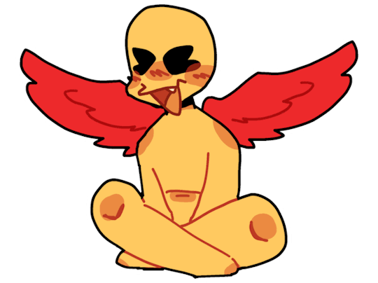
new wing flapping and tail wag emojis! + the full body sitting emoji!
#custom emojis#custom emoji#custom emote#custom emotes#base emoji#requested emojis#flapping wings#winged emojis#tail wag emoji#pet regression emoji
10 notes
·
View notes
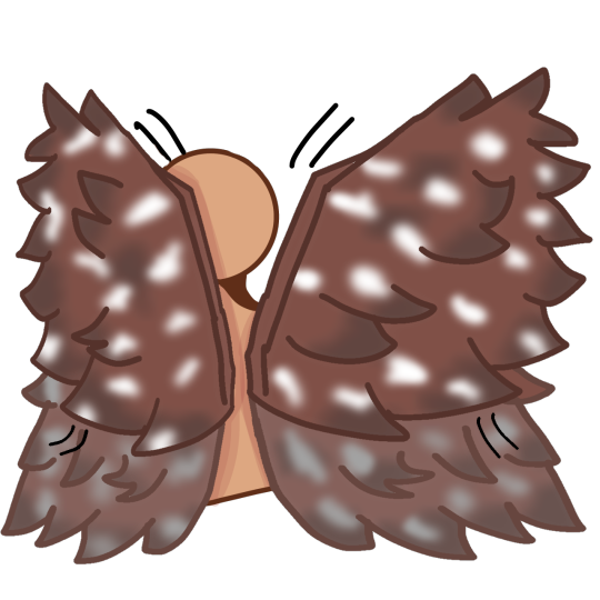
Text
for when the normal wing stim just
isn't enough


plus ear wing stims!


might make an animated version of some of them
#traumagenic system#custom emoji#custom emote#discord emoji#discord emotes#emoji#art#tshabts#bll#snc#wing#stim#wing stim#wing flap
56 notes
·
View notes
Note
Hii! If it's not too much, are you able to make wing and tail flapping/wagging emotes like you did with the httyd one? (I'll add images) with my wings? Also, I don't get notifications so if you do end up making them, can you please tag me? Love your work! Please take care of yourself

[⚠️CAPS/TQ⚠️]
I DID MY BEST, I HOPE THIS WORKS ^^;
#citrics emojis#custom emojis#custom emotes#cute emojis#discord emojis#cute emotes#discord emotes#non verbal#stim emojis#stim emote#wing flap stim#tail wag#avian tail wag#avian wing flap
55 notes
·
View notes
Text
get ready for a shit load of wing emojis over the next while. either tomorrow or a few hours
put under the cut for your convenience.
Requests : Open


#custom discord emojis#custom emoji discord#discord emojis#custom discord emoji#discord#emote#emoji#emoji art#emojis#emoji artist#custom emoji#wings#wing emoji#bird emoji#wing flap#flap wing emoji#emoji dump#avio emojis
6 notes
·
View notes
Text


Here's a wing flap emoji to get the blog started!
#emoji blog#discord emote#discord emoji#winged emoji#wing flap#nonhuman emoji#stim emojis#neon mods#moxxi.txt💔#made by moxxi#not requested
87 notes
·
View notes
Note
oooh ae see in your carrd it says you do discord emojis! in that case, can ae request a mothman wing flag emoji?
Mothman wingflap!
[Image ID: A cartoon drawing of the cryptid mothman from the knee up. It has its wings down. Behind it is a semi-transparent set of wings to cause the effect of it flapping its wings. /end ID]
42 notes
·
View notes
Note
Hi there! I was wondering if you could maybe do a pegasus stimming emote? Like a wing flap or hoof stomp? Thank you in advance if you do! (Also if the pegasus could have a white coat + mane/tail, it would be greatly appreciated!) Thank you again, have a nice day!
I tried my best haha

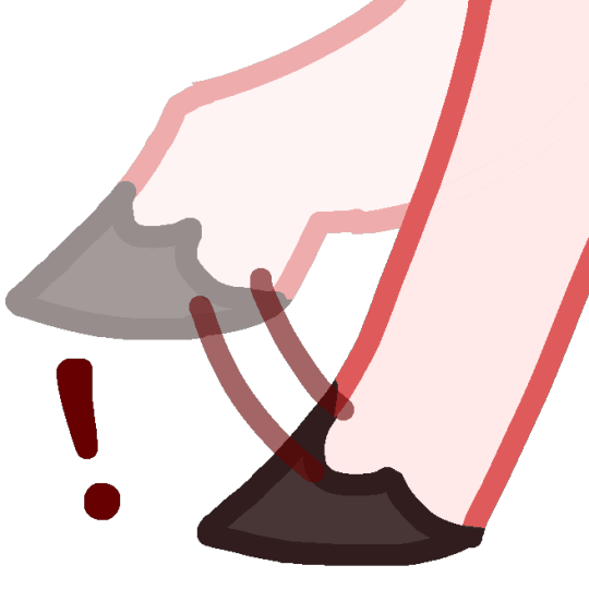
Pegasus stim for when uhhh neigh
#animojis#pegasus#pegasi#horse#horses#emotes#emote#emoji#discord emojis#wing flap#wings#hooves#stimojis#stims#stimming#posmoji
23 notes
·
View notes
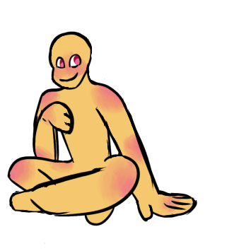
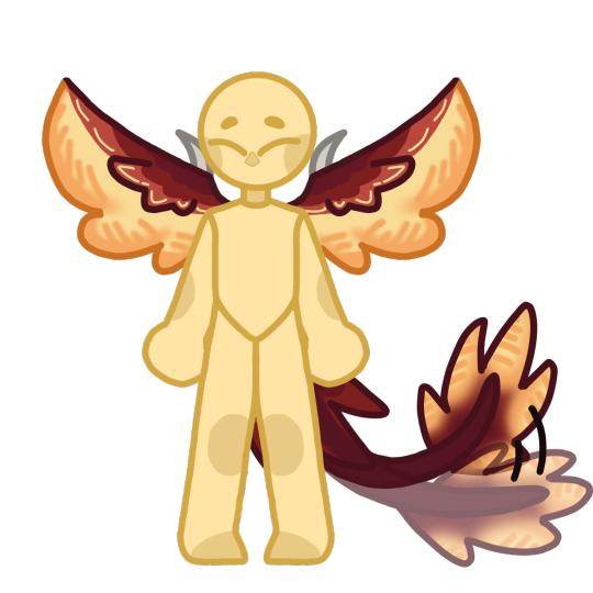
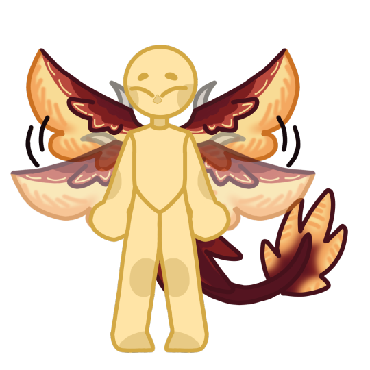
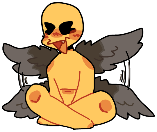
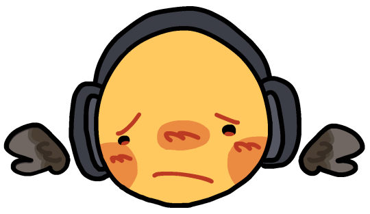
Note
Hello!! Could I get flapping wing stim, self hug w/ wings and hugging another with wings? And could they be Eurasian Magpies aswell?
here you go!


#requests#ell’s emojis#custom emojis#custom emotes#discord emojis#emotes#emoji#stim emojis#wing flap emojis#self wing hug emojis#wing hug emojis#eurasian magpie#blue#green#white#turquoise#teal
268 notes
·
View notes
Text
sara is 80% leg why is that how do they build tengus
#thinking emoji#;the general of the shogun's army is a simp. all she knows is bow and arrow. obey orders. flap tengu wings and die. (ooc)
1 note
·
View note
Text
Therian Wrentit Stimming Emojis!!


Part 2/3
Requests Are Open!!
REQUESTED BY: @yourneiborhoodcanine
#discord emoji#discord emotes#custom emoji#emote#stim emote#stim emojis#stim#stimming#therian#otherkin#bird therian#birdkin#bird#wrentit#wing flap#hand flap#requests open#request#ask answered#ask#avian#avian therian#aviankin
103 notes
·
View notes
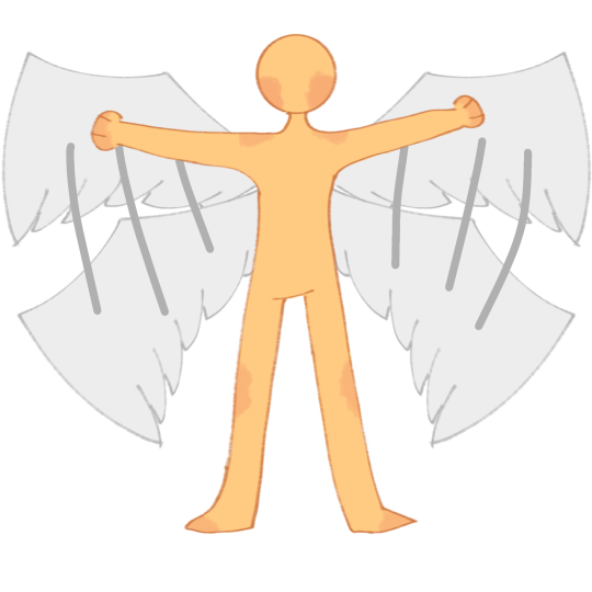
Note
hey, i was wondering if I could ask for some soft fluffy angel wing stim emojis? either white wings, or if its not too much trouble, galaxy colored angel wings >.<
anyway i just wanna say i love ur artstyle n ur other emojis, theyre so warm n they make me so happy ( ⸝⸝´꒳`⸝⸝)


some wing stimmies , both in white & galaxy colors !! here we have wing flap and wing wrap around ^^

#custom emoji#custom emojis#custom emote#custom emotes#discord emoji#discord emojis#discord emote#discord emotes#free to use#wings#white wings#galaxy wings#stimming#stims#wing stims#wing flap#wing wrap
36 notes
·
View notes
Note
id be interested in seeing you rank plane emojis from different platforms (by their livery, or by whatever else) just for fun, if you want!
You're right. I WILL do this for fun, because this is fun. Not based on livery, since they're mostly white with blue wings - just how much I like them. I'll be adding a rating out of 10 for each one because I think that's the tradition for this sort of thing.
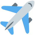
Apple - 4/10
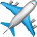
I mean, because I have an iPhone this is my default conception of an airplane emoji - I think it's fine, I just find it a bit offputting how they model the individual flaps and cockpit windows but the rest of it is a white airbrushed tube. It's a weird contrast.
It's fine, I think. Acceptable. I maybe think emojis by default aren't the most aesthetically pleasing.
Google Noto Color Emoji - 4.5/10

I think this is a slight improvement over the Apple version because of the more consistent stylization. It's also a little more contemporary, since most airliners that are flying now have two engines. I like that they added a few windows and highlights to keep the cabin interesting, and I think it's a bit...something that they took off the flaps but added flap track fairings. Cockpit windows look awful though.
Samsung - 2/10
This is a bit more of a realistic shape for an airplane but for some reason I don't like it. Maybe it's the fact that you can barely recognize that there's a tailfin at all, or the cockpit window looking weirdly...shiny? I think what gets me the most, though, is that those engines look like Super Mario pipes.
Microsoft - 1/10

She's a little...phallic somehow. I just think a top-down view of an airplane is almost always going to look worse if you make it super round and blobby. On the bright side, it's still recognizable as a plane.
WhatsApp - 7.5/10

I really like the way this one is red. Way to stand out in a crowd. It's also quite realistic without giving up on being stylized. My one issue is with the cockpit windows, which look a bit out-of-place and weird. This seems to be a common point of failure for this sort of emoji. Also, I'm unsure if this is meant to be a two-engined 747, but if it is points off for those not existing.
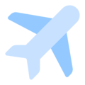
Twitter - 6/10
I hate to ever hand it to Twitter but this is just solid. That's an airplane, just a very simplified and round one. Even the cockpit windows on this one look okay.
Facebook - 3.5/10

Maybe airplane emojis with airbrush shading just look bad to me. There's nothing fundamentally wrong with the shape of this but I don't think they differentiated the tailfin from the fuselage enough. It looks like a stub. Also, what is up with that miserably short wing chord?
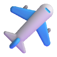
Telegram - 7/10

I mean, it looks like a 3D version of the Apple one, but it's surprising how much making it 3D improves it. Plus, gotta hand it to them deciding their emoji was being flown by Tex Johnston. I admire that sort of verve.
Microsoft Teams - 0/10
On the flipside, animating this one and making it 3D makes it so much worse! It looks like it was made right when people just figured out that 3D animation was a thing that was possible to do, back in the 50s or something. And boy are those pixels crunchy - I wouldn't mind this if it weren't already heinous. Seriously, how is that tailfin even attached?
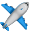
Skype - 10/10

Now this I really like. Most of these are impossible to assign a model to but this distinctly looks to me like one of the earlier, stubbier 737s, just really short with a pointy nose, and she's waving at you. Crisp, nice smooth animation, just fantastic.
Twitter Emoji Stickers - 0/10
Looks bad. One of the few of these which are very easy to recognize as a specific model of airplane - this is clearly a 747, based on the inclusion of the hump. There is a reason basically none of the others are trying to be a 747. Adding a weird lump to the front of your emoji doesn't really make it any less weird-looking, and rendering a plane from above tends to be weird-looking already. It looks like she was stung by a bee.
JoyPixels - 6.5/10

As with the WhatsApp red, I appreciate anything setting itself aside in color, so I have to compliment the choice of this sort of toothpastey green. This is one of the better simplified airplanes we've gone over today, and the only thing I really dislike is that it has the same issues with the tailfin Facebook does.
Toss Face - 0/10
I can barely tell this is supposed to be an airplane. It makes me want to, excuse the mental image, toss face.
JoyPixels Animations - 10/10

Now THIS is what I'm talking about! Just a nice little pixel aircraft, doing the same sort of smooth wriggling as the Skype airplane - no criticisms.
Sony PlayStation - small/10

Adequate, but too small to really assess further - but the fact that I don't dislike anything about it is honestly a credit at this point.
Noto Emoji Font - 3.5/10
This just looks like the Samsung emoji but rendered with plain lines. Removing detail from these tends to improve them.
OpenMoji - 0/10

Oh, no, I take it back! Too few details! It's like a torpedo with wings awkwardly stapled on. A really phallic one at that.
emojidex - what the hell/10
I think this more or less looks fine, and the livery it has also looks fine, but I'm so thrown off by the fact that I don't think this is a real airplane. I am obviously not an authority on every model of airplane ever built but I'm reasonably sure this isn't a real one. It most resembles a BAe 146/Avro RJ, the only four-engined t-tail plane intended for passengers rather than heavy cargo. But the 146/RJ has high wings, located above the cabin windows, so...what is this airplane? What does emojidex know that they're not telling us?
Messenger - 7/10

While not ugly per se, it's a bit futuristic for my taste. Still, the choice to model it from a position other than directly from the top avoids a lot of the pitfalls that make many of these so bad to look at.
LG - 4/10
Boring? Yeah, without question. But this is just a good representation of an airplane, and at this point I'll accept that. Does the tail thing, though.
HTC - 3/10

Something about the way this is shaped makes this look more like a rocketship than an airplane. Or a Convair Pogo.
SoftBank - 5/10

A decent pictoral representation of an airplane. See: LG. Fixes the tail thing.
Docomo - 5.5/10

Also a decent pictoral representation of an airplane, but I think rendering it in silhouette gets rid of many of the pitfalls associated with airplane emojis. No details to mess up, just the shape of an airplane. Why do the majority of these have four engines? Seriously, there are only three four-engine airliners in passenger service right now. Have the people designing these not flown since the early aughts?
au by KDDI - 2.5/10

Okay, I know I've been saying being a good representation of an airplane is good enough but this is just simplifying too far. This isn't an emoji, it's a unicode character.
Mozilla - 1/10

Why pointy but only sometimes? Why does the tail pinch in like that? It's ugly, Mozilla, you made an ugly one.
477 notes
·
View notes
Last Seen Blogs

malaguu-salon
オールハンド痩身、黄土よもぎ蒸し、マタニテ
dianarodri02
Diana✨
capitaloffense
persephone
pockopea
changes. evolves. grows.

themortgagebrain-blog
The Mortgage Brain