#tutorial ig???
Note
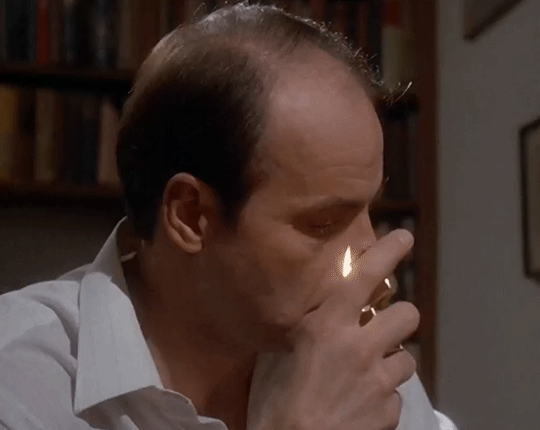
Hiii i have a question a little word maybe , I love your mood boards and wanted to start doing it but I have no idea how I have never use photoshop or something like that and I also always wonder how you manage to get the pictures to fit so well in terms of what you are looking for so I wanted to asked if you don’t mind some tips to make moodboards I would appreciated it a lot 🌸
hiii! ofc! i love doing moodboards and it's pretty easy once you know what apps to use.
to look for the pictures themselves i use pinterest. i usually search "x topic" and add aesthetic. so for example, with this moodboard i searched "the hunger games aesthetic" and "the ballad of songbirds and snakes aesthetic."
if this doesn't work, i just try to vary the search. it really depends on the topic and what do you want, idk of im explaining myself correctly.
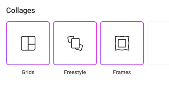
and for the collage i just use picsart. it's simple and it takes nothing.
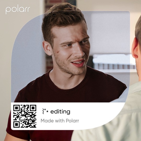
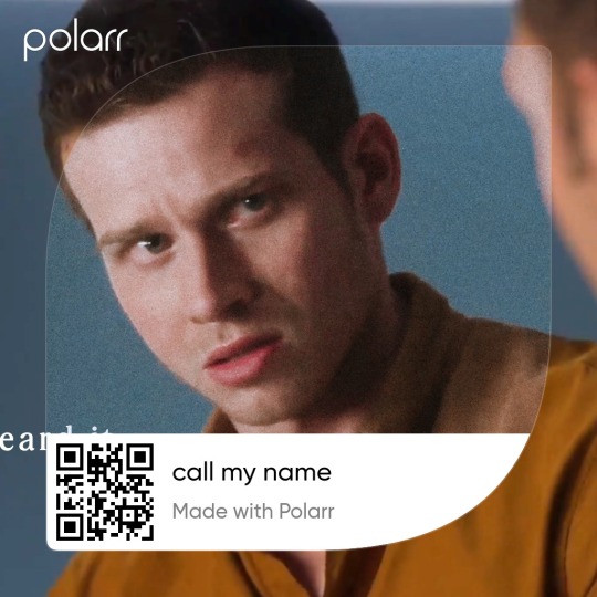
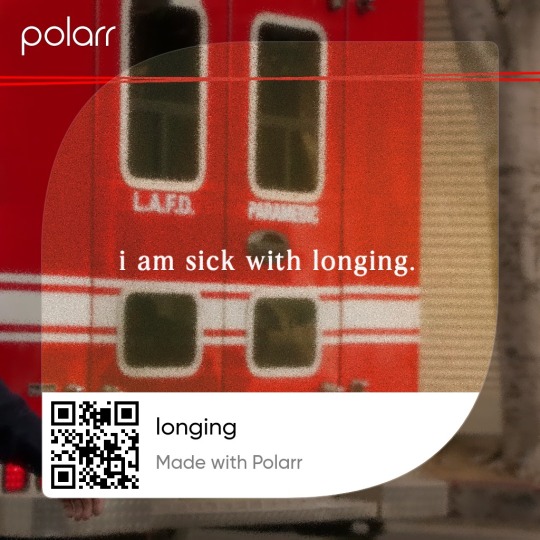
i also go the extra mile and go to polarr to add a filter to my moodboard. i have a new phone and i lost all the filters i had saved but i managed to create a few new ones. i'll leave the codes here just in case <33
7 notes
·
View notes
Note
Hello, I hope you don't mind me asking, but I love your art style so much, and the way you draw Ragatha!!!
Would it be okay if I asked you for advice on how to draw Ragatha's hair?
Thank you!
It's perfectly fine to ask me for advice, but just so you know, I'm not the best at explaining my art processes tbh. I've never done an art tutorial or anything similar to that.
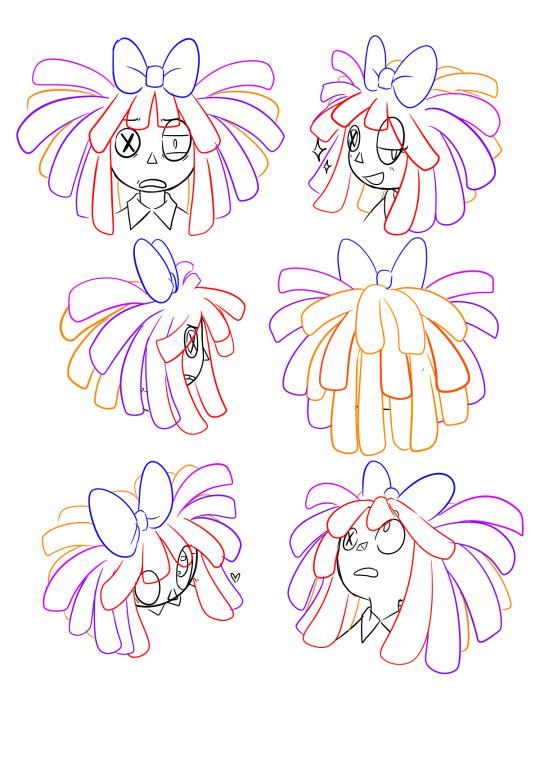
However, I tried making a small guide here on how to draw Ragatha's hair - well, how I draw it at least. It's sort of a rough sketch, but hopefully it'll be useful for you!
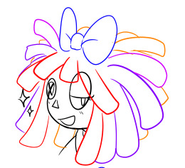
First off, I'd like to point out that when I began drawing her character, I used one of her official 2D artworks as reference to draw her hair, not her 3D model!
To be more specific, I used this one:
Another important thing to take into consideration is THE VOLUME her hair has.
If you have curly hair and it's long enough, you might know that to make it have that sweet sweet volume, you gotta style it in LAYERS! The same applies to Ragatha here, which you can actually see in the image above! If you wanna make her hair look voluminous, you need to draw it in layers (Assuming you'll be drawing it similarly to how it looks in canon - like dreadlocks)
Anyways, now onto the process!
1st step - Bangs
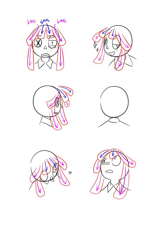
When drawing her hair, I will always start by drawing her bangs first. It helps me sort out where the other locks will be going for the most part.
I will always start by drawing the 4 locks that go on top of her forehead. The two in the middle will always be shorter than the ones on the sides, but that's just my preference.
Once that's done, I do the longer locks that go down along the sides of her face.
2nd step - Locks on top + bow
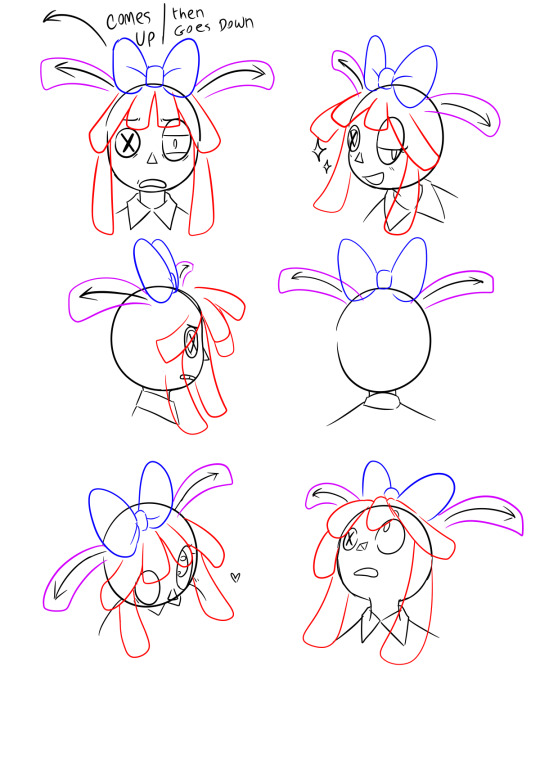
Bow is not mandatory, but I must admit it does make my life easier when i'm drawing her, because then i'll always know where to put the two locks she's got on top of her head - that being right where the bow begins - behind it.
3rd step - Superficial layer!
Once you get the two higher locks and the bangs done, this step becomes way easier. You just gotta fill the gap between them.
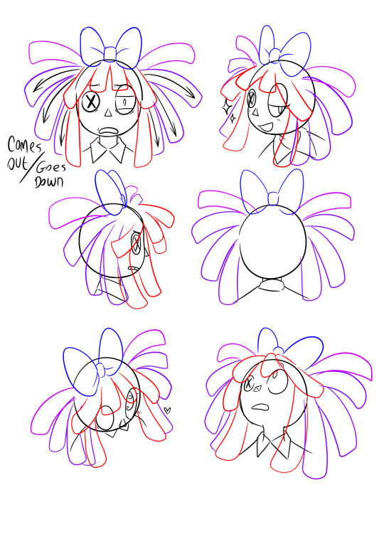
I'll normally draw 3 on each side, but of course that will depend on the thickness of the dreadlocks you're drawing. It's overall pretty simple.
I like making these 3 locks more droopy than the other 2 coming from behind the bow, but that's also just my own preference.
4th step - Secondary layer
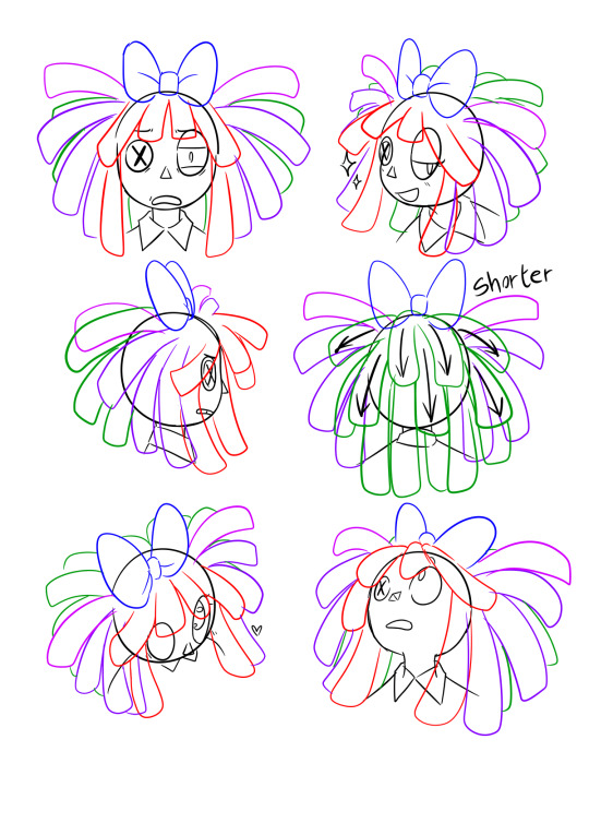
As you can see in the two examples in the center, the shorter locks on top will sort of flow in the same way as the 2 smaller bangs in her front. They go up, then down.
The longer ones that go behind her neck will just go straight down since they're longer and therefore heavier, just like the two long locks on each side of her face.
Clean up + fixing asymmetry
In the top left example, some of the bangs were asymmetrical, so I fixed that after cleaning up the sketch. Mistakes like these tend to be very noticeable once you clean things up, so try keeping each side as symmetrical as you can to one another, especially if you're drawing her front view.
Anyway, that's pretty much it for my process! I feel like I could've elaborated a bit more and made this more organized, but at the same time I kind of have no idea what to do lol sorry
Still, I hope this helps you out somehow!
#miga answers#art tutorial i guess?#art advice#sounds more fitting ig#also i loved how the one in the top right turned out#i'm saving it for life as a reaction img#my art#tadc#the amazing digital circus#tadc ragatha#ragatha
273 notes
·
View notes
Text
So this one anon wanted a tutorial on drawing eyes
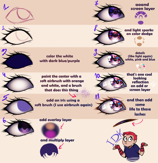
I hope this makes sense XDD
166 notes
·
View notes
Text
rough art tips to learn and then break at your leisure.
the distance between your eyes is roughly one eye. the corners of your mouth dont extend past the middle of each eye. ears are roughly in the middle of the tip of the nose and the eyebrow. the eyes are in the very centre of the head. the neck is just a Little slimmer than the width of the head (varies with fat distribution, but fat tends to build up under the chin). hair is easier to draw when you plot out the hairline and then where it parts. leaving appropriate distance on the side of the face (cheekbone area and back to ear) contributes to making characters look more realistic/hot as hell. i dont know specific tips for that so use reference. an amazing reference/study site is lineofaction.com . if you think of the face in planes it makes it easier to construct (look up tutorials). if you draw a spiral like a tornado it can help you figure out awkward perspective for extended limbs (look up foreshortening coil technique). tangent lines are when two lines intersect and cause visual confusion (when it looks like a line that defines an arm is part of the line that defines a building, for example) and avoiding them makes your art way easier to comprehend. quick trick to good composition: choose a focal point (where you want your viewer to focus), detail that area the most, and make sure various elements of the piece are pointing to that focal point. you can use colours to contrast hue, saturation, and brightness and make certain elements of your drawing stand out. drawing in greyscale can help you figure out values. using black in a piece isn't illegal but you should know what you're doing when you do use it- it desaturates a piece and if used as a shading colour can desaturate and dull whatever youre shading too. if you use almost-black lineart and then add black to darken the very darkest areas it will do a lot to add some nice depth. the tip of your thumb ends just above the start of your index finger- your thumb also has two knuckles and all your other fingers have three. if you see an artist doing something you like (the way they draw noses or eyes or hair or anything else) you can try to copy that and see if you want to incorporate it in your style <- this is ENCOURAGED and how a lot of us learned and developed our styles. there are ways to add wrinkles to faces and bodies without making the character look a million years old, you just have to keep experimenting with it. The smile wrinkles around your muzzle dont connect to your mouth or to your nose; there should be a small space in between smile or nose and the wrinkle line. eyes when viewed in profile are like < aka a little triangle shape. think of the pupil like a disk and apply foreshortening to it (it looks like a line when seen from the side instead of a full round dot). subtle gradients can add a LOT to a piece. texture can also add a LOT. look up Tommy Arnold's work (his murderbot pieces are some of my FAVOURITE) and zoom in. find those random little circles he added and try to figure out why he added them there. light bounces. there's lots of way light bounces. sometimes it even spreads through the skin. i do not know these light tricks yet but i want you to know that they exist. draw a circle to indicate hand placement, draw a straight line between that circle and the shoulder, and then (normally at a right angle) draw a straight line on top of that line to find the placement of the elbow. elbows are normally placed Just above the hip when standing and your arm is at rest. there are no bad colour combos if you're brave enough about it, just fuck with the saturation and brightness until it works. keep playing. try new things. add your own tips to this post if you want or even expand on some ive mentioned here. good luck go ham etc
#look at this post#the sum of almost all of my art knowledge#all that i can remember rn anyway lmaooo#shit i didn't mention the tips for backgrounds that i know#eh that's environment most of this deals with character work anyway#i learned most of this from tutorials and kind artists who like to talk about their work#i would not know NEARLY as much about creative shit as i do if it weren't for the people who were willing to talk about their skills#and their tricks and their observations. id be nothing without them i dont remember most of them but i am so so grateful for that kindness#so ig here ill spread that a little further#if you have any questions go ahead and ask i am a NERD about art okay i do not know everything but i am always willing to talk about what i#do know#art tips#one of the most important things for you to do as an experienced or beginner artist tho#is to PLAY#experiment#figure out what's fun and what looks nice and what looks nice faster and just. whatever the fuck you want to learn#it is SUCH a joy
256 notes
·
View notes
Note
any tips on drawing faces & anatomy? :D i love your art and style so much
TY! idk what im doing 90% of the time so here some crude examples
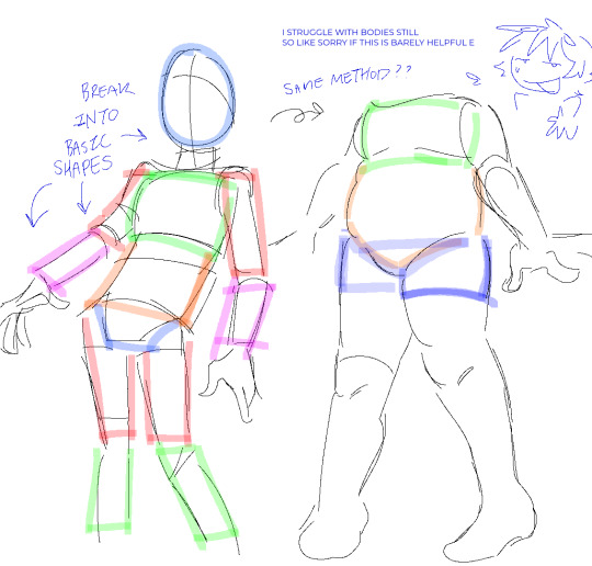
i totally recommend studying irl bodies or whatever,, if you want something... more specific like hands?? i can try to explain that too,,,
79 notes
·
View notes
Note
hi ! do you have any examples of different body types drawn in your homestuck style ? im just curious as to how that would look :)
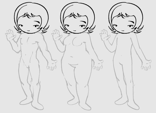
ignore the shitty inaccurate anatomy, but the way i draw bodies is the same as i would draw in any other style but with less detail. it all boils down to the, ig the head really..

see same exact bodies just a different head, it doesnt register as homestuck style unless the heads are accurate.
i don't really think that the body stylization is as important as you probably think and ill explain why..


if you look at the hero mode panels for the characters, you see that they have relatively normal human shaped limbs despite them all being big long twigs. they even have five instead of three fingers a lot of times.

and then in other panels their limbs are chubby noodles, their fists being meatballs with three little wieners on em.

all of these register as homestuck styled despite having different body types, its because they all share a common head and face structure.. essentially as long as you don't add too much detail, any body type can be a homestuck body if you get the head right.
i usually limit myself to the tubular style more often because its the easiest, i should play with the realer human shapes some time.
heres a disgusting edit to hopefully get you to see what i mean.. blaaargh
204 notes
·
View notes
Text
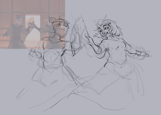
not exactly a full tutorial, but here’s the process sth like this goes through

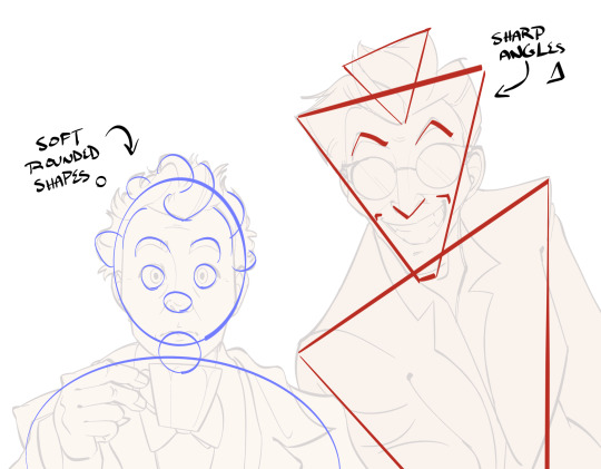

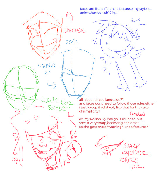
first is the rough sketch. when i’m translating a real person to 2d work i try to hone in on personality to determine what shapes to use.
for example Crowley is a demon and very cool looking so i emphasize his actor’s sharper features using shapes like triangles. whereas with aziraphale i ephasized the softer band more rounded shapes. exaggeration is really important when it comes to animated/cartoony characters to distinguish their features, but also be aware to not overdo it or fall into stereotypes.
i really love this shot because of the contrast between their expressions, so i tried to bring that out as much as i could

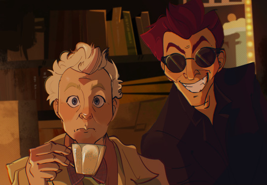
when i choose colours it’s really a feeling/vibe i go for. so in this pic i chose to use warmer base colours for crowley, and cooler bases for aziraphale to have them contrast with their expressions. the lighting mostly covers this contrast during rendering, but it’s still useful to have to exaggerate the mood for the overall picture.
when it comes to backgrounds i always just simplify the biggest shapes down to their colours, unfortunately i don’t have the separate picture for just the bg here but i’ll probably show my background process at some point if anyone is interested in that sort of tutorial
if y’all have any questions feel free to speak in comments or ask box :3
#mints tutorials#good omens#drawing tutorial#ig? idk how helpful this is#i’ll make a proper tutorial eventually when i’ve got time
256 notes
·
View notes
Note
Love how you draw legs n paws, think you could show us a tutorial ?👉👈
akwhdawdg Thank you and OFCOURSE, I'd love to share my "secrets"
Now, I'm not like the best or even average at teaching so- bare with me lol
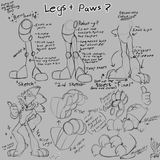
Hope this helps
#sugarhog au#sth#sonic the hedgehog#sonic au#art#shadow the hedgehog#art tutorial?#ig more of tips to replicate my style#idk lol
137 notes
·
View notes
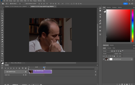
Text
low quality video ➜ "HD" gifs tutorial! (2022 UPDATE!)
back by popular demand. warning, this is a work in progress! so far I have found this is the best way to restore low quality movie videos into somewhat clear and “hd” gifs. I will update if I discover anything different (:
this works on movies/videos in 720p and lower
you must have basic gif making knowledge
I'm using adobe photoshop cc 23.4.1 (2022) for windows
link to previous version of this tutorial
TUTORIAL UNDER THE CUT 🔽
so this tutorial is going to show you how to create the ILLUSION of high quality and film grain in your gifs just by using smart filters, coloring, and the filter gallery tab! this trick works on 720p, 480p, 360p, and 144p resolutions
1. MAKE YOUR GIF BASE
I’ll be using a scene from hello mary lou: prom night 2 in a *really* gross 480px lol
2. RESIZE YOUR GIF
ctrl + alt + “I”
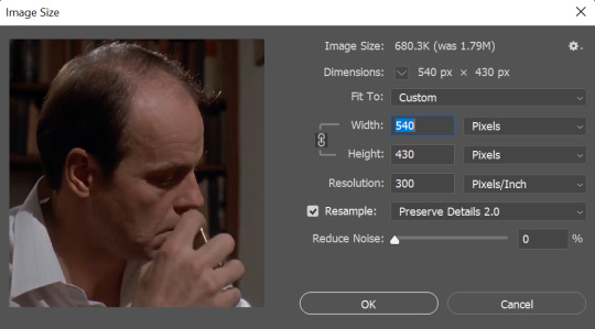
These are my resizing settings (copy these).
Resampling your gif under the ‘preserve details 2.0′ option allows you to resize your gif without losing those small details - essentially making your gif sharper.
⭐ please note that gifs will look better if resized to 268px instead of 540px as its easier to hide low quality trails that remain in the end.
3. ADD ‘SMART SHARPEN’ FILTER
filter ➤ sharpen ➤ smart sharpen...

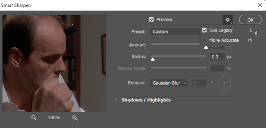
When adding your smart sharpening layer, be sure to unselect More Accurate from the drop down menu at the top. (You can access this menu by clicking the gear in the right hand corner)
Unselecting this option will add more sharpness to the highlights and shadows of your gif, which is essential for this trick to work
⭐ of course if you have preferred sharpening settings, feel free to use those instead!
3. ADD ANOTHER ‘SMART SHARPEN’ LAYER
filter ➤ sharpen ➤ smart sharpen...
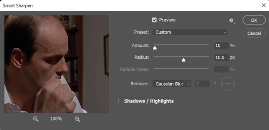
Copy these settings
Keep the More Accurate option SELECTED for this layer!!!
4. CREATING FILM GRAIN
filter ➤ filter gallery... ➤ texture ➤ grain

These settings will depend on what you think looks best! For this gif, these are the settings I ended up with
Be sure that the “Soft” option is selected from the drop down menu. Its the cleanest grain filter photoshop offers and its the closest you’ll get to grain used in films
The intensity will depend on you and what your gif needs. Don’t go too crazy here. Keep the number low (no higher than 10)
Contrast will generally stay in the 50′s but if you need more black areas in your gif feel free to push that number a bit
⭐ Don’t get too attached to these right now as they may change throughout your process!
4.2. ARRANGING SMART LAYERS
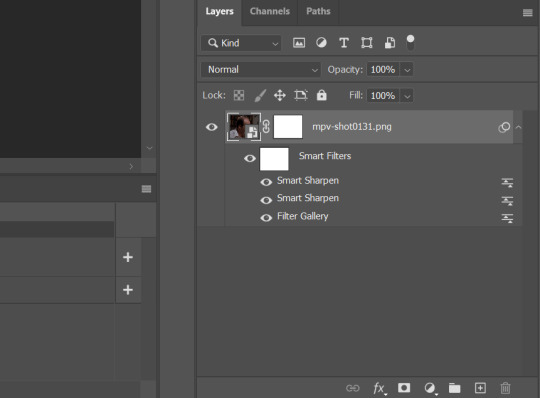
MUY IMPORTANTE!!!!
In order to get that sharp grain look, you’ll need to place the “Filter Gallery” layer beneath the 2 smart sharpen layers like in the pic above
Edit your grain settings as needed!
5. COLOR COLOR COLOR
After all of that is said and done, add your coloring! Try to push the shadows and add more black in your 'selective color' adjustment layer just to give your gif more contrast. This will clean up the pixel-y blacks and make your gif look a bit nicer to look at. Again this will all depend on what you’re looking for and what you think looks best!
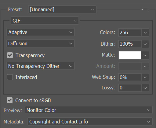
6. SAVE!
Once you're satisfied with how your gif looks, alt + ctrl + shift + “S” and you're done! Here are my save for web settings
MY RESULTS!
480px video, before and after:
(Still looks pretty shitty but I guess its better than the original ???)
360px video, before and after:

(I ripped this movie straight from the DVD and the glitch you see came with it unfortunately 😒)
End notes/tips!
This trick will not work on every low quality movie
Please play around with the sharpening, grain, and color settings to find the best version for you!
The higher the quality of the video (720p, 1080p dvd) the less grain you will need to add
Again, gifs look even better if they are put into 2 column posts instead of a single column (268px instead of 540px)
The grain filter will unfortunately make your gif size very large which is something I havent been able to work around
And once more for the people in the back - this is FAKE HD, it won't turn your 480p video into a crisp blu-ray 1080p quality. it just gives an illusion of higher quality 🤠
Please feel free to send me a DM or an ask if you need further help or have any questions whatsoever! Thank you!✨🖤
#i fought for my life getting these to look somewhat decent#but ig im proud considering how bad the originals are#anyways i hope this helps someone#gif resources#resources#gif tutorial
1K notes
·
View notes
Text
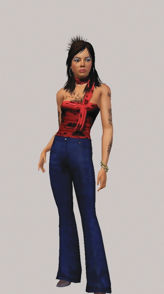
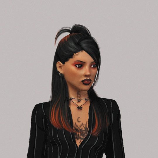
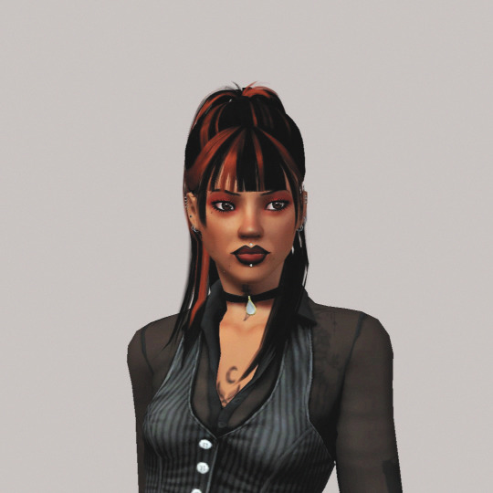
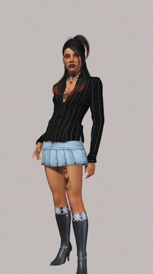
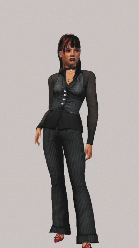
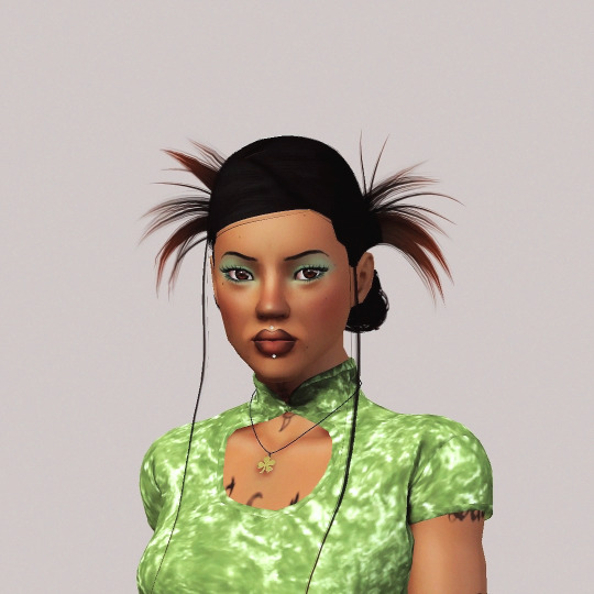
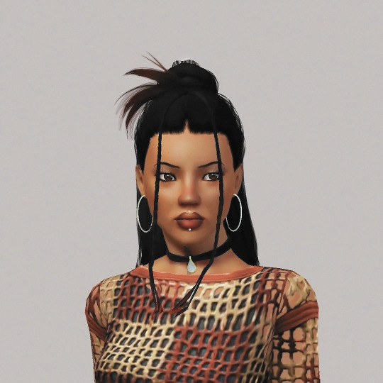
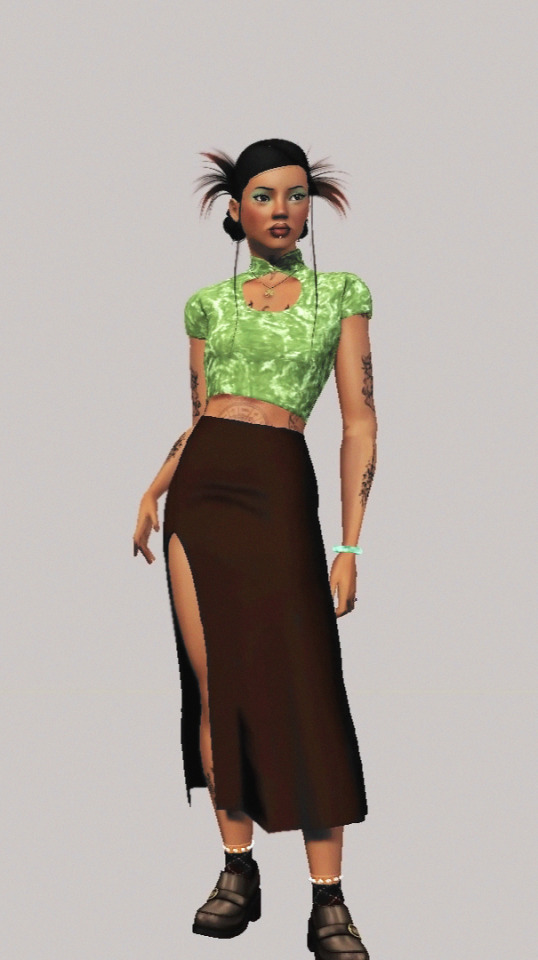
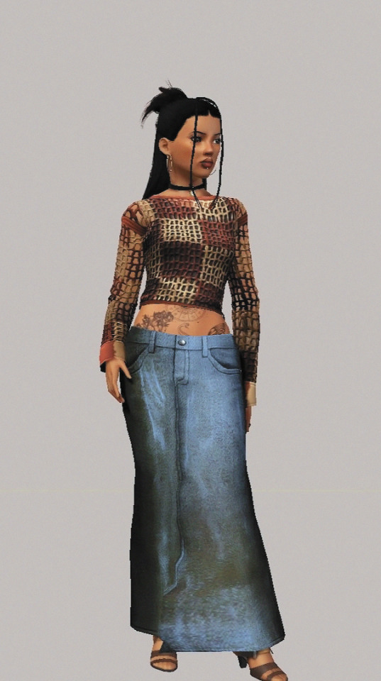
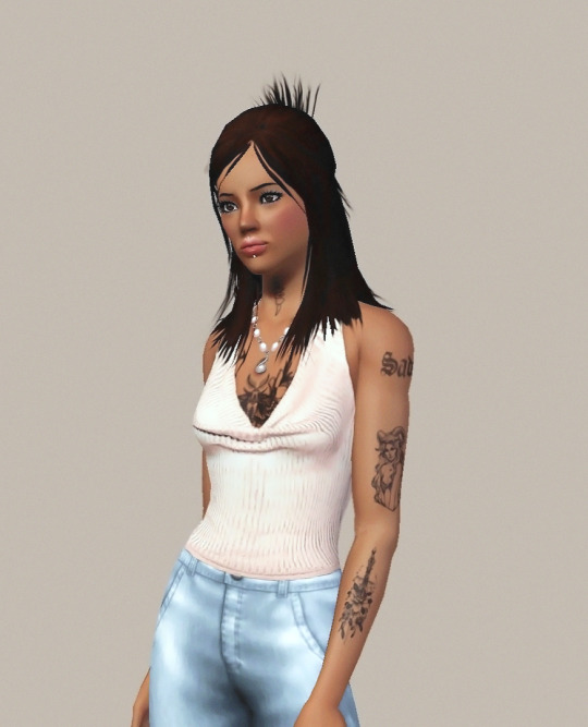
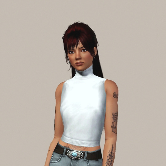
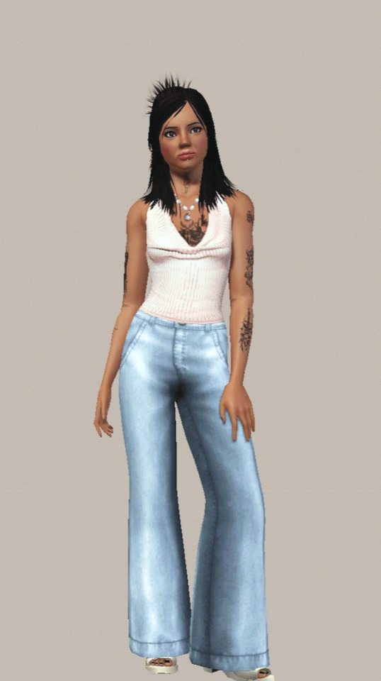
Tami's Everyday Looks
Signature, Sharp & Sleek, Eclectic & Earthy, Classic & Elegant.
Please check my cc finds blog before sending WCIF :)
#the sims 3#ts3#sims 3#ts3 lookbook#ts3 cas#ts3 screenshots#ts3 sim portrait#sims 3 screenshots#sims 3 cas#sims 3 lookbook#sims 3 sim portrait#the sims 3 screenshots#the sims 3 cas#the sims 3 sim portrait#the sims 3 lookbook#sims 3 simblr#simblr#the sims 3 simblr#ts3 simblr#i got my base down and copied the adjustment layers across all the pictures but i had to make edits to the colour balance each time#PHEW my hands are tired. my elbow locked up after a while too...#i originally was trying to follow a tutorial for making digital photos look like 90s magazine prints#but it just didnt translate to sims screenshots. the depth and resolution just werent there ig#anyways um so i came from the sims 4. tami is gonna have 5+ outfits per category + a party outfit lineup... thems the rules#TFA
39 notes
·
View notes
Text
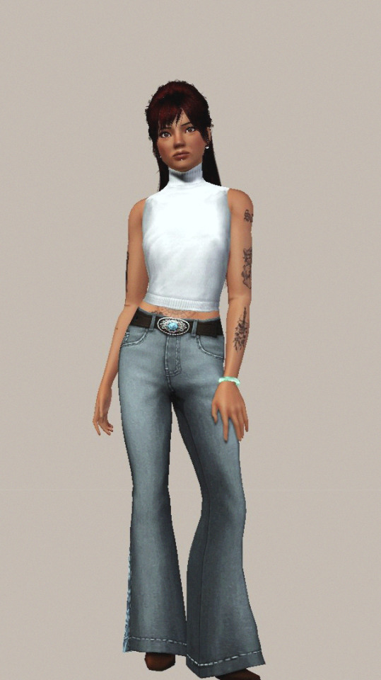
Sokka's face shape eludes me... very hard to translate it into my round, chubby art style for some reason...??
#his head shape is just. its round but also long. korra's art style doesnt help cuz it makes him hella angular and sharp as a 40smth yro#wanna keep his adult angles in mind while still giving him youngster roundness... maybe im too ambitious...#also wanna keep his culture's inspo in mind. so that's a third thing to tack on...#anyone with a style similar to mine wanna show me a sokka face tutorial... unless...??#majart#wip#delete later#atla#atla fanart#sokka#suki#atla suki#atla sokka#scene redraw#i looked to suki's LA actress for inspo fyi. but sokka's actor just doesnt match what i had in mind ig???
46 notes
·
View notes
Text
So you wanna sell your art on Redbubble but you don't know how?
(Or, I meant to write this months ago but better late than never lol)
OKAY okay. I have a bunch of friends as well as mutuals who have lovely lovely art and have considered selling it online (specifically on Redbubble lol that's what's being covered today anyways) but don't really have any clue how RB works, if it's right for them, or what to expect. SO I'M HERE TO GUIDE Y'ALL THROUGH ALL THE BASICS and hopefully, if I've done my job right, this tutorial will help you set up your RB shop and start selling your art online (or help you decide that RB isn't for you lol).
Table of Contents:
What the heck is RedBubble and should I use it?
How to make your account and set up payment
How to add a new work
Pricing? Markup?
Extra: Checking sales and payment history
Extra: Taxes and copyright, in case that scares you.
Extra: The Partner Program (or how to make "officially licensed" fanart)
What the heck is RedBubble and should I use it?
>> RedBubble is a site that allows you to upload your artwork and sell it on quite a variety of different products.
>> The main benefit of using RedBubble, aside from reach and visibility, is that RB handles *everything* when it comes to the manufacturing and shipment of your product. You are literally not responsible for anything other than making the art, uploading it, and deciding how you want it to look on different products. If there is any kind of problem with material quality or delivery (though in my experience they're pretty good with both of those things), it's not your responsibility to correct!
>> RedBubble does not charge you to sell on their site, but they do set a base price for all products to cover manufacturing and to ensure that they make some level of profit for each sale. We'll look into the specifics of this in a later section when discussing pricing and markup, but it would be considered pretty standard, for example, for an item to cost $20 and you to make $4-$5 upon making a sale.
>> At the end of the day, whether or not RB is right for you largely depends on whether or not you feel their pricing and payment is fair, and whether their available products correspond to what you wish to sell.
Okay, so how do I get started?
Well first you're gonna need an account!
>> Head over to the RedBubble main page and click "Sign Up"

>> Select "Artist Signup"
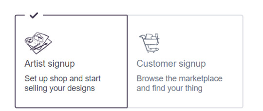
>> Fill in your email, shop name (this is your username also), and password
>> Click "Sign Up"
>> You will be brought to this dashboard page:
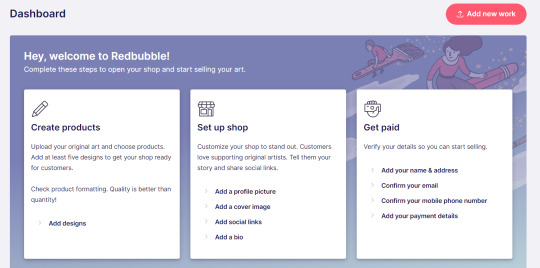
>> We will discuss creating products in the next section. Everything under "Set Up Shop" is optional and I'll let you explore that on your own so we can focus on the essentials. That just leaves... Getting paid!
>> First, check the email you used to confirm your email address. If you didn't receive an email to confirm your email address, don't worry, we can resend the form- keep going with the steps for now.
>> Then, under "Get Paid", click "Add your name & address". Note that all of the options in the "Get Paid" section actually lead to the same form, but selecting this option starts us near the top.
>> Fill out all the fields on this page. If you didn't receive the email to confirm your email address, click on this button:
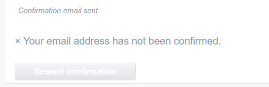
Then check your email again.
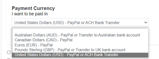
>> Note when choosing your payment method: if you are from Canada, like me, then paypal is your only option. Same for parts of Europe that aren't in the UK. Otherwise, you also have bank transfer options:
>> Once you've finished filling in everything on this page, click "Save Changes" at the bottom and... That's it! Now you can get paid :)
**Note: I believe RB still requires you to make a minimum amount of money before they do a transfer (for me in Canada I believe it's $20 CAD?), so do keep that in mind!
>> Payments are made to your account monthly, generally on the same day every month (assuming you've made profits!).
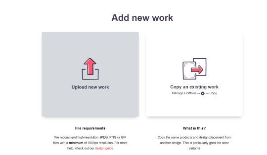
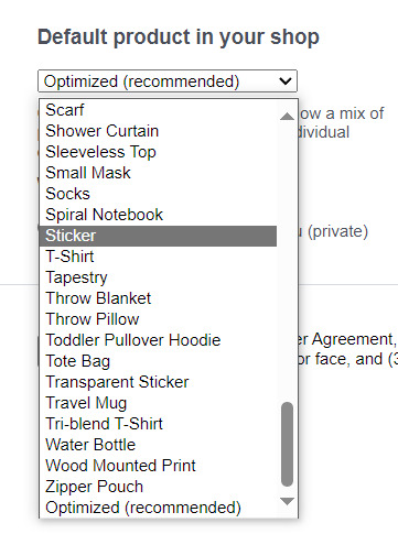
How to add a new work
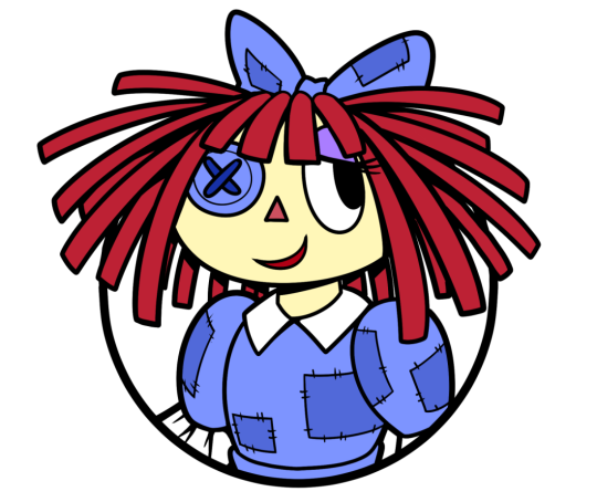
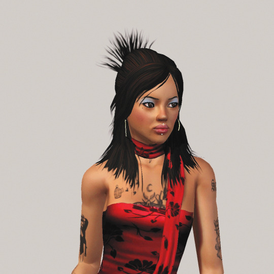
So you've made your account, fantastic. Now you're ready to actually add your works to RB and make them available for purchase to the wider public! To demonstrate the process, we're gonna use our pal Nicky here (who was a gift from my lovely friend @llumimoon) and pretend that we want to upload him:
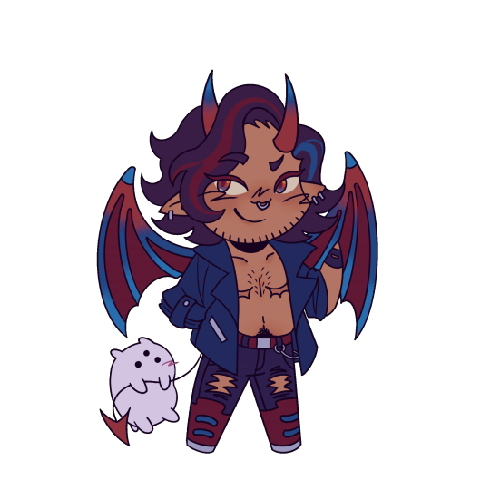
Ain't he a doll? Anyways, let's begin.
>> Hover your mouse over your pfp in the top right corner to make this drop down menu appear:
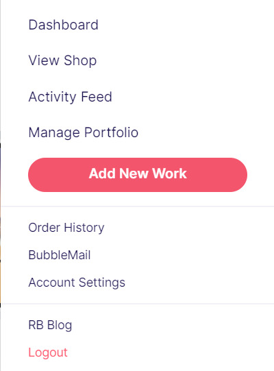
>> Click on "Add New Work"
**On a new account with nothing uploaded, this will look a bit different. instead choose "Sell Your Art" from this dropdown menu, then "Add New Work" from the top right corner of the same dashboard page from earlier.
>> Click on "Upload New Work" (and note the file type and resolution requirements at the bottom. I always stick with PNGs, but in theory JPEG or GIF works as well.)
>> Select the file of the image you want to upload. In our case, that's Nicky.
>> Now write a title for your work, tags, and a description if you want. The tagging system is how people will actually find your work, it works a lot like Tumblr's! Try to choose things that are relevant to whatever your piece is. If you're uploading fandom-related art and aren't sure what tags are used for your fandom on RB, try looking some up and seeing what generates the most relevant results!

>> You may have noticed the "background color" section right below Nicky. This sets the default background color for your piece on different products. We're gonna keep this as the default white here, and I'll show you how to adjust this for individual products very soon.
>> Scroll down. This is where we decide what products we want this design to be available on and how we want Nicky to look on each thing we've enabled.
For example, if I were actually selling Nicky here (if that wasn't clear obviously I'm not actually selling my friend's art lol don't do that ofc) I would definitely want people to be able to buy him as a little sticker :]
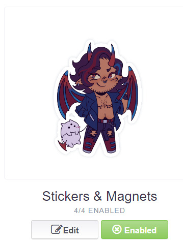
>> In this case, "Stickers & Magnets" have been enabled by default. If you wanted to disable them, you would simply click that little "Enabled" button. Similarly, if we want to enable a product type that is disabled, just click that same button (which will be grey rather than green and say "disabled").
>> If a product is disabled and you are being prevented from enabling it, that's because the dimensions of your image are too small for the product in question! You'll wanna resize your image (preferably in a manner that retains its resolution of course) and come back.
>> Hm. Let's use the hats here as an example of how we might make edits to the layout of a specific product.
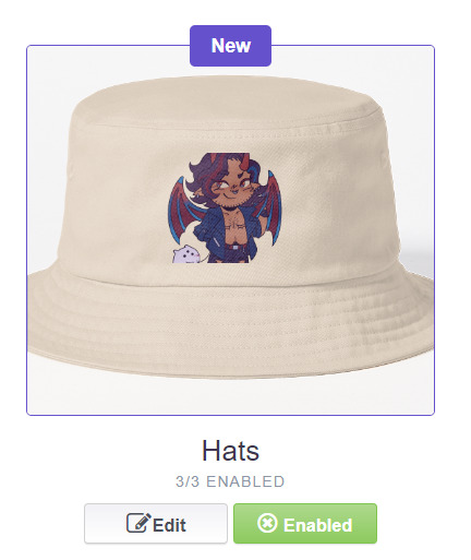
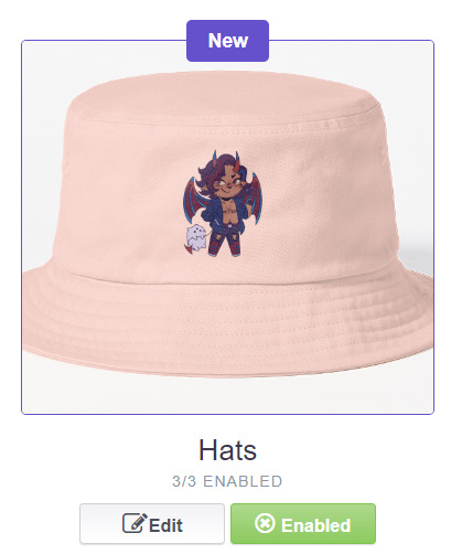
He's kind of cut off, as you can see actually that's pretty in-character, and I think I want this hat to be pink rather than this default beige-looking color.
>> Click on "Edit"
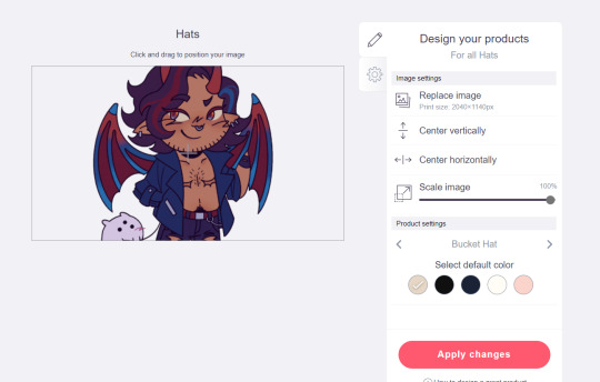
So, the first thing I'm gonna do here is use that "Scale Image" slider to scale him down a bit. I'm also gonna click the image and drag him up a bit to re-center him.
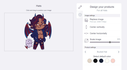
Next, I'm gonna pick from one of the default colors and choose the pink one.
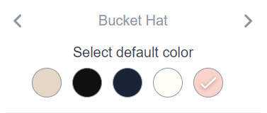
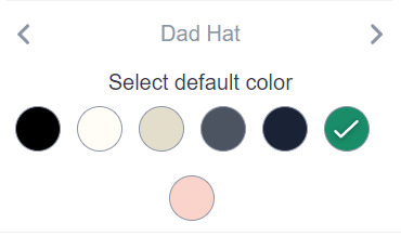
>> Notice the two arrows beside the words "Bucket Hat"? This lets me go through the different types of hats available and change the background/base color for each of those, like the dad hat:
>> Before we apply our changes, click that little gear icon right under the pencil icon
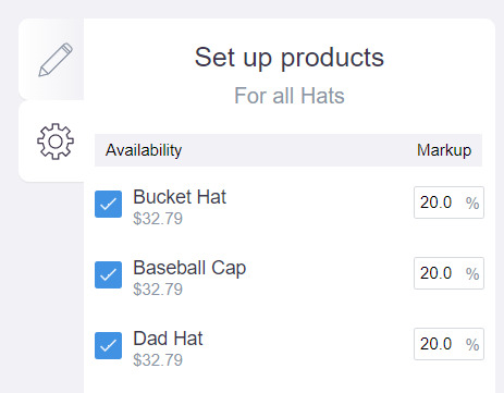
>> This lets us adjust the markup price for each individual hat. It is 20% by default. Changing the markup percentage affects how much you will make off of a sale, as well as how much your product will cost. More on that in the next section!
>> Click "Apply Changes"
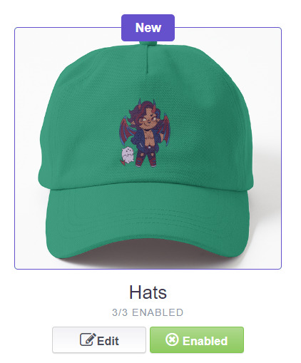
The "dad hat" was the last hat I had selected (when setting its color), so the display has changed to show that one in the preview. Here's our bucket hat from before:
Nice!
>> The specifics of how you can adjust your design will vary depending on the product. With pillows & totes, for example, the editing menu looks like this:
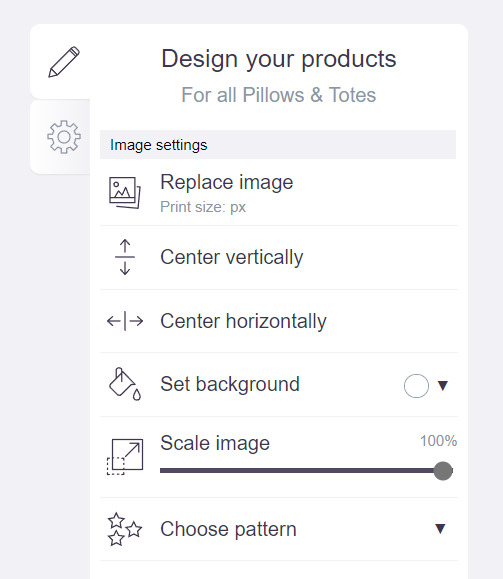
Using the "Choose pattern" option, I can make the Nicky image repeat as a pattern like so:
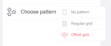
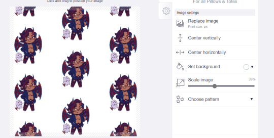
(note that I also scaled the image down a bit here too).
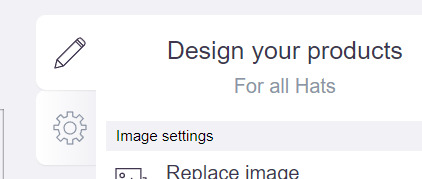
>> One last thing. See that "Replace Image" button near the top?
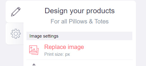
You can use this when you want to use a different version of your image altogether for a specific product.
>> That's the gist! Play around with the settings for each item as you see fit. You can always edit them again later.
>> Scroll down. Select up to 2 relevant media types.
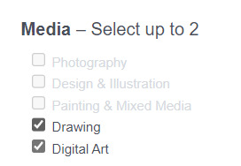
I'm pretty sure this affects search results when users choose specific filters, but tbh otherwise I don't think it's all too important.
>> Let's look at what remains.

>> I have the "Who can view this work?" section set to "Only You"- THIS IS SO I CAN FINISH THE STEPS HERE AND SAVE THE WORK WITHOUT ACTUALLY MAKING IT AVAILABLE TO THE PUBLIC. In practice, you'd only use this option if you wanted to buy your own work on something but didn't want other people to be able to see or buy it. Otherwise, you're always gonna choose "Anybody (public)".
>> Collections can be created to organize the pieces in your shop (for example, by fandom), but we won't cover the specifics of how to do that here.
>> Set whether or not your work contains "mature content".
>> If you want, you can set which product shows up in the preview for your work when people view your shop. If you think your piece looks especially nice on a mug, for example, you can make sure that's what people see first.
>> Finally, agree to RedBubble's User Agreement (read that little blurble, since that's basically all you generally need to care about when it comes to what you can and can't sell on RB, but more on that later).
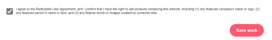
>> Click "Save Work" and voila! Your piece is now available in your shop, and can be found in the search results of whatever tags you left on it (this may take a few minutes to take effect).
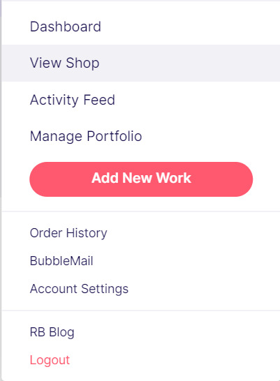
>> If you want to check out your design in your shop, navigate to your pfp and click "View shop"
>> Don't fret if the design doesn't appear in your shop right away! Again, this can take several minutes.
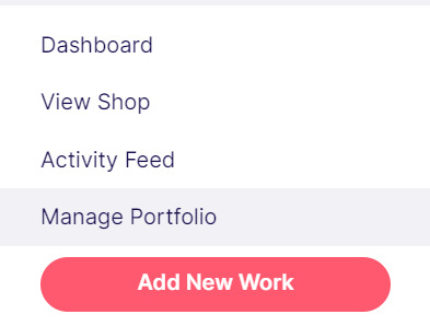
>> To edit your design again (and to view/purchase privately uploaded designs like Nicky here), click the "Manage Portfolio" option instead:
>> Here is Nicky as he appears in my portfolio (again, your portfolio and your shop are different things- Nicky will not appear in my shop at all because he is set to "private")
>> You can click that little gear icon to do a variety of things, like return to the editing menu from earlier. The three icons below Nicky refer to the amount of comments, sales, and likes your design has received in total.
>> Click on your design either from your shop page or your portfolio page. Wow! Your cool art is now available on all the products you enabled. Be sure to look through them and make sure that everything is to your liking!
Pricing? Markup? What's that about?
Well good tumblr user, RB handles everything regarding the production (and shipping) of your product, which means that they set a base (minimum) price for every kind of product to account for materials and production, and of course make some amount of profit themselves. The *markup* is a percentage that you the artist set (see the previous section on how to do so), and will determine how much you actually make off of a sale. Note that increasing the markup price means that your product will increase in price as well!
>> An Example (using hypothetical but more or less realistic numbers):
Let's say that the base price (0% markup, i.e. no profit for you) of a phone case on RB is $15. You set the markup to 30%. 30% of 15 is 4.5, so the public price is increased to $19.5, and if anyone purchases this phone case with your design on it, you will make $4.5.
And that's really the gist! Ultimately the markup price is up to you and what you feel is reasonable, though RB sets it to 20% by default.
Extra: Checking sales and payment history
Eheh, unfortunately I've reached the image limit for this post but:
To check your sales:
>> Click on your pfp
>> Click "Account Settings"
>> Under "Artist Tools" (on the left side), click "Sales History"
To check your payment history:
>> From the same "Artist Tools" menu (see above), click "Payment History"
Extra: Taxes and copyright, in case that scares you.
>> Do I need to report the income I make on RB when I do my taxes?
Yup! But dw, it isn't anything special. I mean, I'm not here to do your taxes for you, but money you make on Redbubble counts as "Self-Employment Income", same as if you sold your art just about anywhere else really!
>> So what am I actually allowed to sell on Redbubble? Is fanart okay?
Generally speaking... Yes! Obviously work should be your own, and it should not contain any company logos or names that you don't have the right to, nor photos of actual people unless you have their explicit permission.
>> Hm, okay, but what if I *do* accidentally sell something that isn't allowed?
In most cases, it'll just get taken down 👍. And no, you won't be asked to pay back any profits you made off the work in the meantime.
**A more extreme case: Story time. So, years ago a friend of mine uploaded some official Rick and Morty art that he forgot to set to "private". Overnight he made... Let's just say he made quite a bit of money. RB responded by taking down the work and banning his IP address, effectively preventing him from ever selling on the site again. But they still let him keep the money he made, and he didn't get into any actual trouble outside of that. What I'm saying is, even if you really fuck up, it'll be alright. And again, this was a pretty extreme scenario.
***Note: if your work falls under one of the brands in Redbubble's "Partner Program" (see the next section), it will be temporarily removed from the search results and your shop while it undergoes review. So don't panic if you see your fanart suddenly disappear from your shop!
Extra: The Partner Program (or how to make "officially licensed" fanart)
Very briefly, Redbubble has their partner program, which I won't explain in full detail here, but basically it means that if you upload a work and tag it as one of these brands, it will be inspected for review and, upon passing that brand's guidelines, will be considered "officially licensed" merch for that brand. Just felt worth mentioning!
So that's really the gist folks! There's certainly much more to play around with when it comes to RB, but that's all you need to know to get started! Hopefully this was useful? Hopefully lol. In any case, good luck out there!
#*breathes* OKAY#gee I sure do hope this is actually useful lol#artists on tumblr#redbubble#selling art#idk what to tag this as lmao#baba's tutorials#<- new tag ig lmao#if y'all have other questions (especially friends and mutuals and followers) feel free to reach out and I'll answer what I can!#so if you're wondering. yes I've sold on the site before. no you don't get to know what haha.#bought a lot from RB too- their shit's good quality!#but to be completely clear ofc I don't speak on their behalf haha this tutorial exists so that I can buy more of my friends' cool art lmao
30 notes
·
View notes
Note
so sorry if youve already answered this, but how do you add the glitchy effect to wanderer!donnie's battle shell? I'd like to doodle him but want to make sure I'm getting the design right :)
Hi! I haven't yet :D
I actually have a few glitch brushes that I downloaded from the Clip Studio Paint store.
The content ID is 1892357 but it does cost 10cp points. However, feel free to experiment!
Maybe you have the brushes, or you're just curious as to the actual process of how I do it? Imma include a brief tut under the cut <3
CW glitch effects and eyestrain for the 3rd pic!
First thing's first, doodle your battle shell! This 60 second sketch I'm using was brought to you by screen fatigue and excited speed drawing.
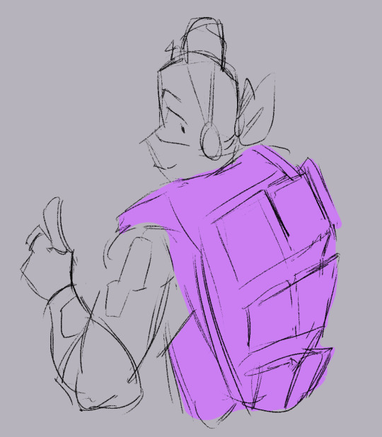
Fill it in with the base fuchsia color. I usually don't worry about the lines being filled in perfectly, we're just gonna cover em up afterwards.
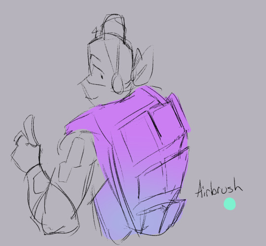
Lock the opacity on the layer, and grab a bright cyan and lightly airbrush the bottom! I think it gives a somewhat holographic vibe, and I use the same effect for the brothers' avatars as well.
This next part might be intimidating, but it's fun!
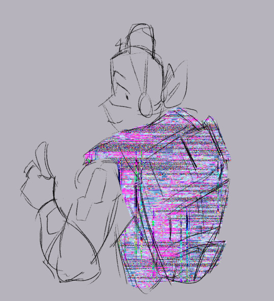
Above the current layer, make a new clipping layer. Anything you put on this one should only show up above the base colors.
Go ham! I like to use pink and blue glitch effects with some static bits. I stay away from the darker ones, but feel free to experiment!
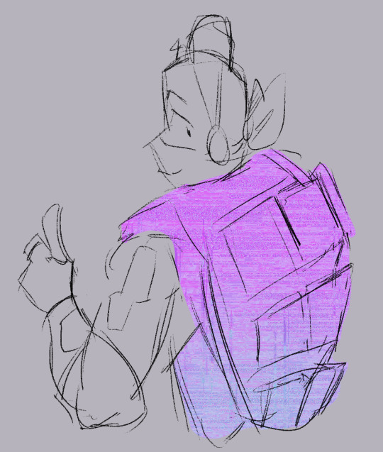
Change the layer's blending mode to Overlay, and set the opacity down to 30%. It makes it softer!
One last thing and then we're done!
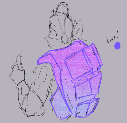
Grab a light purple, and do some lines on a layer ABOVE the lineart! It doesn't have to match up perfectly, it kind of gives off a glitchy vibe that way!
I like to go in and splotch erase bits of the original lineart beneath it as well. Bits I don't like, or bits that seem too dark.
Thanks for asking, and if I need to clarify anything lmk!
I can't wait to see what you might create!
90 notes
·
View notes
Text
to that one anon that asked about how i do my side profiles i hope u see this n i also hope this makes sense ....!!!!
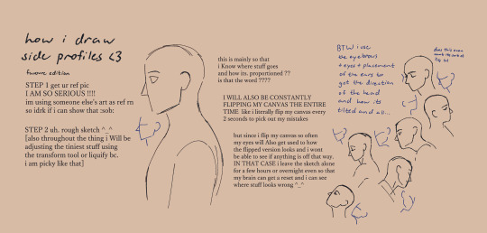

the rest is under the cut vv


#tutorial#art tips#art tutorial#drawing tutorials#anatomy tutorial#anatomy tips#ig ???? idk what 2 tag this really lmao#favourarts#soooo shy to post this my first time posting some sort of tutorial gahh .......#im a observe n learn kinda person when it comes to art so. its rlly hard for me to explain stuff rlly sdhfksdf#STILL i hope. this can help in some way ............#ALSO TO THAT ONE ANON THAT ASKED ABT SHORT OR SLICKED BACK HAIR I'LL BE DOING THAT ONE NEXT !!!!
974 notes
·
View notes
Text
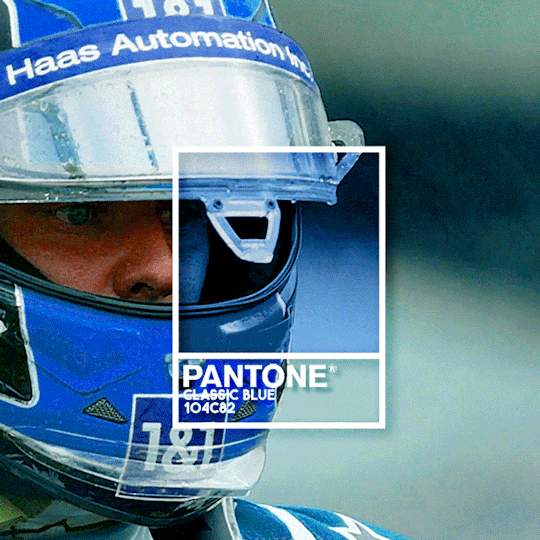

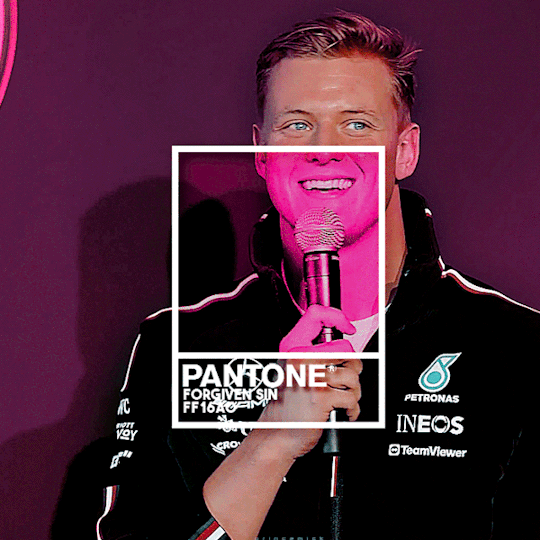

CLASSIC BLUE - LOVER BOY - FORGIVEN SIN - FIERY RED
Pantone colours I associate with Mick
(insp)
#its kinda messy but this was fun#might do it for all drivers idk#f1#mick schumacher#also ig lowkey inspired by xiaoluclair's gifset but not rlly bc ive wanted to make this for ages n had that tutorial saved for months but#their gifset did make me finally actually MAKE it so s/o to them ig#f1edit#kyle.gif#mickschumacheredit#edits**
111 notes
·
View notes
Note
Not sure if this can be asked or not but- how do you format your bio into a column?- I wanna figure that out so mine can be less messy-
YEAH OFC!!! Personally I like the stacked look better hehe
so at the end of a line all you gotta do is write <br/> at the end of a line to create a break! So It ends up looking like this vvv
And then it stacks!
#Ask#the goop speaks#tutorial#ig hehe#This reminds me I need to create a new banner#I don’t really like this one tbh
69 notes
·
View notes
Last Seen Blogs

psylv
☻

toh-divergence
[ - The Owl House: Divergence - ]

j-aeys
⌗ 𝗇𝗂𝖺 .ᐟ

a-level-in-between-blog
A Level In Between

uniquearmy
Taç Giymiş Palyaço