#trying 2 figure out how to stylize them consistently.. i think i figured it out??
Text

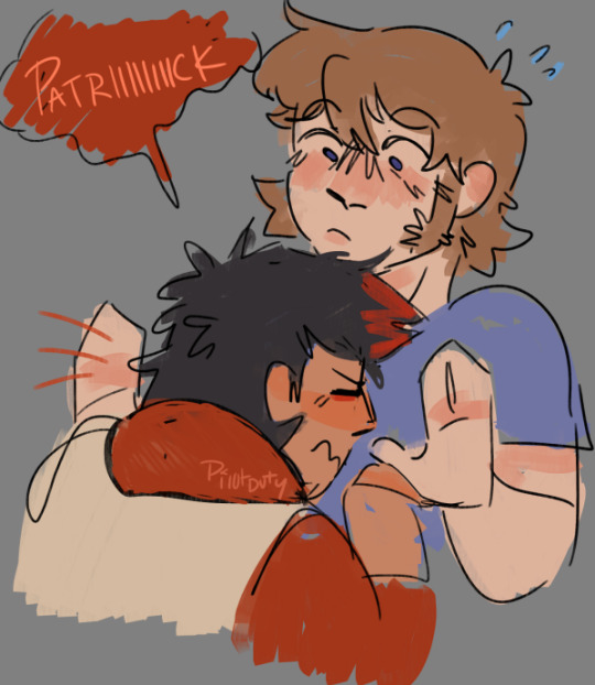


my growing collection of p squared doodles from this week (all in varying states of unfinished)
#trying 2 figure out how to stylize them consistently.. i think i figured it out??#all from the trucker hat era bc fluffy trucker hat patrick is my favorite to draw#my stuff#peterick#fall out boy#pete wentz#patrick stump#if u guys want more of these fuckers ive got like 600 shitty doodles of them stockpiled atp so ask and ye shall receive i guess
286 notes
·
View notes
Note
id be interested in seeing you rank plane emojis from different platforms (by their livery, or by whatever else) just for fun, if you want!
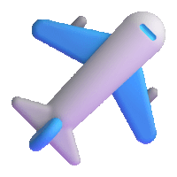
You're right. I WILL do this for fun, because this is fun. Not based on livery, since they're mostly white with blue wings - just how much I like them. I'll be adding a rating out of 10 for each one because I think that's the tradition for this sort of thing.
Apple - 4/10

I mean, because I have an iPhone this is my default conception of an airplane emoji - I think it's fine, I just find it a bit offputting how they model the individual flaps and cockpit windows but the rest of it is a white airbrushed tube. It's a weird contrast.
It's fine, I think. Acceptable. I maybe think emojis by default aren't the most aesthetically pleasing.
Google Noto Color Emoji - 4.5/10

I think this is a slight improvement over the Apple version because of the more consistent stylization. It's also a little more contemporary, since most airliners that are flying now have two engines. I like that they added a few windows and highlights to keep the cabin interesting, and I think it's a bit...something that they took off the flaps but added flap track fairings. Cockpit windows look awful though.
Samsung - 2/10

This is a bit more of a realistic shape for an airplane but for some reason I don't like it. Maybe it's the fact that you can barely recognize that there's a tailfin at all, or the cockpit window looking weirdly...shiny? I think what gets me the most, though, is that those engines look like Super Mario pipes.
Microsoft - 1/10

She's a little...phallic somehow. I just think a top-down view of an airplane is almost always going to look worse if you make it super round and blobby. On the bright side, it's still recognizable as a plane.
WhatsApp - 7.5/10

I really like the way this one is red. Way to stand out in a crowd. It's also quite realistic without giving up on being stylized. My one issue is with the cockpit windows, which look a bit out-of-place and weird. This seems to be a common point of failure for this sort of emoji. Also, I'm unsure if this is meant to be a two-engined 747, but if it is points off for those not existing.
Twitter - 6/10

I hate to ever hand it to Twitter but this is just solid. That's an airplane, just a very simplified and round one. Even the cockpit windows on this one look okay.
Facebook - 3.5/10

Maybe airplane emojis with airbrush shading just look bad to me. There's nothing fundamentally wrong with the shape of this but I don't think they differentiated the tailfin from the fuselage enough. It looks like a stub. Also, what is up with that miserably short wing chord?
Telegram - 7/10

I mean, it looks like a 3D version of the Apple one, but it's surprising how much making it 3D improves it. Plus, gotta hand it to them deciding their emoji was being flown by Tex Johnston. I admire that sort of verve.
Microsoft Teams - 0/10
On the flipside, animating this one and making it 3D makes it so much worse! It looks like it was made right when people just figured out that 3D animation was a thing that was possible to do, back in the 50s or something. And boy are those pixels crunchy - I wouldn't mind this if it weren't already heinous. Seriously, how is that tailfin even attached?
Skype - 10/10

Now this I really like. Most of these are impossible to assign a model to but this distinctly looks to me like one of the earlier, stubbier 737s, just really short with a pointy nose, and she's waving at you. Crisp, nice smooth animation, just fantastic.
Twitter Emoji Stickers - 0/10

Looks bad. One of the few of these which are very easy to recognize as a specific model of airplane - this is clearly a 747, based on the inclusion of the hump. There is a reason basically none of the others are trying to be a 747. Adding a weird lump to the front of your emoji doesn't really make it any less weird-looking, and rendering a plane from above tends to be weird-looking already. It looks like she was stung by a bee.
JoyPixels - 6.5/10

As with the WhatsApp red, I appreciate anything setting itself aside in color, so I have to compliment the choice of this sort of toothpastey green. This is one of the better simplified airplanes we've gone over today, and the only thing I really dislike is that it has the same issues with the tailfin Facebook does.
Toss Face - 0/10

I can barely tell this is supposed to be an airplane. It makes me want to, excuse the mental image, toss face.
JoyPixels Animations - 10/10

Now THIS is what I'm talking about! Just a nice little pixel aircraft, doing the same sort of smooth wriggling as the Skype airplane - no criticisms.
Sony PlayStation - small/10

Adequate, but too small to really assess further - but the fact that I don't dislike anything about it is honestly a credit at this point.
Noto Emoji Font - 3.5/10

This just looks like the Samsung emoji but rendered with plain lines. Removing detail from these tends to improve them.
OpenMoji - 0/10

Oh, no, I take it back! Too few details! It's like a torpedo with wings awkwardly stapled on. A really phallic one at that.
emojidex - what the hell/10

I think this more or less looks fine, and the livery it has also looks fine, but I'm so thrown off by the fact that I don't think this is a real airplane. I am obviously not an authority on every model of airplane ever built but I'm reasonably sure this isn't a real one. It most resembles a BAe 146/Avro RJ, the only four-engined t-tail plane intended for passengers rather than heavy cargo. But the 146/RJ has high wings, located above the cabin windows, so...what is this airplane? What does emojidex know that they're not telling us?
Messenger - 7/10

While not ugly per se, it's a bit futuristic for my taste. Still, the choice to model it from a position other than directly from the top avoids a lot of the pitfalls that make many of these so bad to look at.
LG - 4/10
Boring? Yeah, without question. But this is just a good representation of an airplane, and at this point I'll accept that. Does the tail thing, though.
HTC - 3/10

Something about the way this is shaped makes this look more like a rocketship than an airplane. Or a Convair Pogo.
SoftBank - 5/10

A decent pictoral representation of an airplane. See: LG. Fixes the tail thing.
Docomo - 5.5/10

Also a decent pictoral representation of an airplane, but I think rendering it in silhouette gets rid of many of the pitfalls associated with airplane emojis. No details to mess up, just the shape of an airplane. Why do the majority of these have four engines? Seriously, there are only three four-engine airliners in passenger service right now. Have the people designing these not flown since the early aughts?
au by KDDI - 2.5/10

Okay, I know I've been saying being a good representation of an airplane is good enough but this is just simplifying too far. This isn't an emoji, it's a unicode character.
Mozilla - 1/10

Why pointy but only sometimes? Why does the tail pinch in like that? It's ugly, Mozilla, you made an ugly one.
477 notes
·
View notes
Text

This is the first proper thing I've drawn in ages (and first are I think I've posted in over 5 years?)
I just needed to draw the opening to Act 5 and my reaction to it.
Nothing has gripped me in such a way and forced me to finish an art piece like this in so fucking long.
I see far too much of myself in him. I just want them to be ok after this is all over.
STARS, this is just Asriel all over again isn't it. But WORSE!/pos
…I guess that could make this vent adjacent? ¯\_(ツ)_/¯
I also made a shitpost edit that I posted separately here.
There are so many things covered by each other and I just need to share and talk about them.
Bonus details and rambles under the cut.
Siffrin's expression was like the first thing I drew and if it didn't turn out as good as it did I probably wouldn't have spent almost 10 days slowly adding to this and I just need to show it because his hands/arms end up covering most of their face.
Nothing much else to say about him, I'm just super happy with how everything about him turned out (I did have to go back and redraw some of his hair towards the end because the line thickness wasn't consistent with everything I drew after.
Next is ME yippeeeee. I have no idea why I spent so long adding details even tho I knew alot of it would get covered by Sif 'cause of how I was posing this.
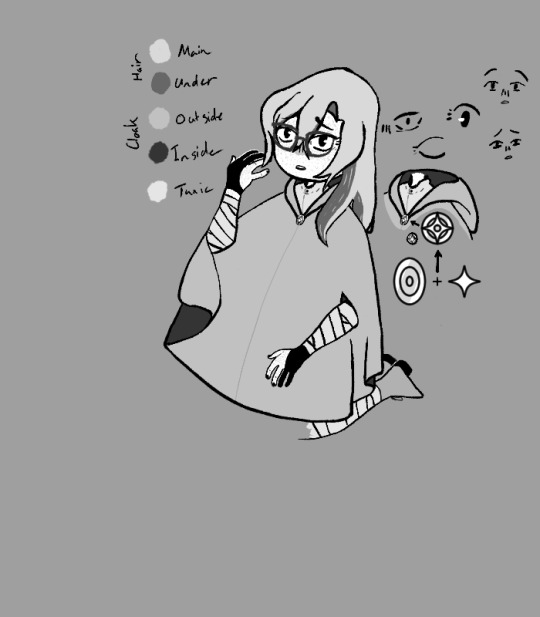
I even designed a little button based on the Change Ornament + Star (the Change Belief and Lost Belief in The Universe really spoke to me in so many ways)
The gloves are an Archery Glove on the right hand and a Drawing/Writing Glove on the left.
The cloak is based on the style of cloak my mom made for my family for SCA events when I was young. It's just a simple hooded cloak but it has a slit in each side so you can stick your hands threw without needing to open up the cloak.
I imagine it being stylized like, the opening doesn't exist until you stick your hands threw and then it can just freely glide around the face of the cloak to wherever it's needed, stopping at the elbow only letting threw the forearm, below the slit beginning to hang off the elbow with gravity while the part above begins to move with the upper arm.
I didn't even try to draw the outfit under the cloak because dealing with the folds of a thick wool cloak was enough for me (you can see how I gave up at the knees because I KNEW Sif was gonna cover them up). What I imagine the outfit being is this big baggy tunic and pants that are tied down at the forearms/calves to keep from getting in the way, it's also supposed to have a big baggy turtleneck thing that can be pulled up as a(nother) hood (iirc, this sorta thing was used so someone could wear a chainmail hood without it grabbing your hair(there ware also like stand alone cloth hoods that did the same thing too but eh, my memory is bad I might just be misremembering this)) but I couldn't figure out the folds and ended up just doing a simple button up thing (which then got covered by Sif's big head anyway.)
I spent soooo long trying to draw my eyes, trying to figure out the shape, and ended up just doing a bunch of small tests to the side before finding one that actually looked right. Drag it over the face and see that it fit EXACTLY, didn't even need to redraw it or anything.... unless you're talking about the other eye in which case I just duplicated it, flipped, and did some perspective warping until it looked ok because I could NOT draw that again especially at a different perspective (can I just say I have no idea how I drew that creepy eye but I love it, it was the first eye I drew and I just threw 4 lines down what the fuck how. Also the Mira-ish one looks cute too but didn't fit the expression.) I also needed to figure out what the hell was wrong with the expression I had before so you get 2 faces from me figuring that out (turns out I had the eyebrows facing the wrong way.)
I ALMOST FUCKING FORGOT MY FRECKLES TOO AAAAAAAAA (they're actually missing from the version I posted in the official ISaT server.) It was super weird trying to add them at the obscenely low resolution I was drawing at and they're probably gonna get compressed to hell and back but I think they're cute.
final thing.

Why is my hair so similar to Sif's but longer? Like, you can see I was sketching over my drawing of him to make sure I'd keep the proportions right when I started working on myself but in the process I realized that I was basically drawing over his hair but longer for mine (drawing I was using as ref here made by @leemak)
Add that to the uncomfortably long list of things I have in common with Siffrin I guess.
#In Stars and Time#ISaT#ISaT Spoilers#ISaT Act 5 Spoilers#Siffrin#ISaT Siffrin#vLink Art#oh hay this is the first time I can finally use the tag I thought up for art of myself yay#technically the fan art tag would be 'fArt' instead but eh
27 notes
·
View notes
Note
Hey, do you have any art tips that you use or anything? Any advice?
Uhhh that's kind of a broad question! My art advice is mostly situational.
A few very very broad suggestions for you:
Use references. Your brain can only hold so much, and most images we stick in our head are symbols. Aside from a select few very impressive people, no one can photographically remember, say, a tree. You can remember a symbol of a tree [Brown and red and green, in a specific shape], but you're not going to remember off the top of your head how tall an ash tree is relative to its surroundings, how all the leaves look from a distance, etc. So, use references. This includes references for things like poses, or colors, or art styles. I've gotten in the habit of collecting things I think are aesthetically pleasing for exactly that reason.
Draw from observation or life, as practice. Kind of an extension of above, but even if you don't draw realistically, you can learn a lot about stylizing, say, a bottle, by staring at the bottle and drawing it. Same with landscapes and buildings and animals and people. Different lighting and their affects on color and things. Its a great way to learn what looks realistic, in terms of relativity -- figuring out where shadows fall, how cloth lays, that funny shape your arm makes when its pointing straight on. Another interesting twist on this is making copies of artworks you like. Pick up the prettiest watercolor you've ever seen, sit down and try to make it. You won't come close, but you'll learn a lot about what that artist thought was important. Draw This In Your Own Style memes are also good for this.
Use tracing and replication for what they're made for: building skills. They're very good tools for teaching yourself how to take things apart and put them back together again, which is how we as humans tend to learn best. You learn how to do math by learning 2+2, and then you figure out 22+22 is basically the same thing, but when you were 5 learning to count in preschool, they didn't start you out with the 22 bit, did they? Same goes for art. All those "How To Draw X" books start you out with "First a circle then some lines" for a reason. If you can break up the big bit into tiny bits, you can figure out how to build stuff from scratch. Tracing and copying art styles, coloring styles, and poses can go a long way to teaching you how to break up all those things into digestible shapes.
Draw often. There's some saying somewhere that you need to put a thousand hours into something to advance a level. So, 1000hrs to go from "I know nothing" to "Beginner." 1000hrs from Beginner into Novice. Etc. It's not a literal rule. I'm sure I've put a few thousand hours into art, but I wouldn't call myself an expert yet. But art is a muscle as much as it is a skill. You only learn how to draw a straight line by drawing 50 wiggly lines and then miraculously one of them is straight, and you feel how that line felt in your wrist and you try to make it feel that way again. You make a really nice texture by accident once and you try it again 100 times before you can consistently remember its by crosshatching there and erasing over there. A long time ago I used to swear by comics [the largest leap forward I ever made in art was when I sat down for a year and drew a comic when I was, like, 13. It had a couple hundred pages, and rapidly progressed from "I'm basically tracing deviantart wolves every pose because I can't see them in my head" to "I can pose these little guys on my own and they actually kind of look like who they're supposed to look every time!"
Uhm... smaller advice tidbits.
Play with as many mediums and art supplies you can get your hands on! Thats how you figure out what you like, and also you draw wildly differently with a brush than a pen. Its really fun to see those differences and integrate them into other things.
If you're working digitally, experiment with merging layers and drawing over them. If you're insecure about it, copy the whole thing into a new document and draw over top of it. It's really fun, lends to experimentation, and there's a lot of effects you just can't achieve by fiddling with your layers.
If you drop your pencils, you will break the lead on the inside. That's why sometimes you sharpen a pencil and it just keeps breaking until there's no pencil left. This happens especially often with colored pencils, because the lead is super soft. Protect your pencils with your life.
For every "pretty sketchbook" you keep around, keep beside it some shitty copy paper/lined paper book with a ballpoint pen. Its good for warm ups, and for getting over the anxiety of "but I don't wanna ruin my pretty sketchbook" :( anxieties
Keep a bottle of water in your art space. This is good for drinking, for spilling on things, and for reminding you you are human and have needs. I recommend one with a cap if you do watercolors, so its less likely you'll dip your rush in it.
Get in the habit of resting every hour. If you have tendonitis [like me] rest every half hour. Set a timer if you have to. This keeps your wrist from exploding, and it keeps you from randomly picking up objects three days from now and wondering why your hand just decided it didn't want to anymore.
Don't feel pressured to post everything you make online -- in fact, keep from that habit as long as you can. The little seratonin rush is very nice when people comment on your work, but if you rely on it to motivate you, you will stop working on things. I have pieces that live in a vacuum, that no one will probably ever see. Most of them art shit, some of them aren't. The fact that no one can see them and tell me they're pretty is good and healthy, actually.
Don't destroy your work. When you finish a long project, there will be a little demon in the back of your head that whispers "I have never hated anything so much as this. Burn it. Kill it. Punish it for existing. I hate it." Do not listen to that little demon. It has been starved of all your existential angst while you were Stuck In Creation, and it is hangry. Put your art away somewhere, wait a few days, a week, a few months even, if you have to. Eventually the little demon will get involved with something else, and you will look at your art and go "Oh, hey, that's not so bad actually" :)
If you wait a year and you still think its shit, objectively, it might be, but I still maintain its demon is probably just being stubborn.
27 notes
·
View notes
Note
I’ve been seeing you get a lot of Asks about your art so sorry if this is getting repetitive but I wanted to ask how you went about developing your personal style? Do you have any particular inspirations or other artists you tried to emulate with how you draw? And is there anything you’d want to change/improve on with the way you currently draw?
Don't be sorry! I actually really prefer talking about it... It gets me thinking about things I don't normally get to think about, and I also really love sharing information about how I do what I do because I really believe in making all info as accessible as possible when it comes to art!
I am gonna put this under a break tho since it got pretty long;;
1. To me, building a style is about so many different, miniscule conscious and subconscious choices. A huge part of it has to do with the act of drawing itself... Like, how heavy handed I am, how I hold my pen, what lines physically feel good for me to make. Drawing is a stim for me, so all that stuff really matters. It made drawing a very physical thing. I like doing heavy-handed lines and ink splatters and grungy ink work because it feels good to do in real life, and also it looks cool. I can also replicate it on a tablet.
This is why even though my style might change slightly depending on what I'm drawing, there are still certain things that are consistent throughout:

So as well as using elements of things I liked in other people's styles (things like eye shapes, face shapes, etc.), being able to figure out how I liked drawing traditionally and experimenting with lots of different kinds of art supplies and methods of making art really helped a lot.
2. I spent a few months trying to draw like Gerald Scarfe in college... Though before that it was Egon Schiele... And in 6th grade I tried to draw like Jhonen Vazquez... And in 5th grade I tried to draw like Jamie Hewlett....
...
I think I'm pretty happy finally being able to draw mostly like myself, now.
Not that I don't get inspiration from artists of course... I'm still inspired by all those styles, as well as other artists I see on Twitter or Tumblr or while I'm around vending. I think it's important to surround yourself with the things that inspire you, especially if those things are coming from other artists. I just don't find myself emulating as much as I used to.
3. YEAH there's TONS of stuff I wanna get better at. I know I said this before but backgrounds and colors are two big ones for me. I have my safety color palettes, but I need to find more. Also backgrounds suck and I'm bad at perspective. BUT I'm trying to force myself to draw them more.
...Coloring backgrounds is double hard...
I also want to be able to make more interesting comic pages... and I need to get better at writing comics... and I also need to learn how to flat properly and quickly so I can do it for money.
I'm also slowly trying to get better at drawing stylized animals, but it's not a main focus yet.
Also I'm trying to improve my printmaking skills, since I'm not very good at relief carving yet.
Also I want to learn how to paint someday.
That last one's mostly out of spite tho.
20 notes
·
View notes
Note
Any advice for someone who wants to start up a muse oc blog :0?
( :O !!
well my first advice would just be to go for it - even if it doesn't work out or you decide not to continue with it for any reason, i do like having a separate blog around for storing details on that OC (especially if you're like me and put a LOT of thought into them that you don't want to up and delete later on). and who knows, you can always repurpose the blog for other things later on too if you want to consider that.
but moving past all that practical but kinda not very encouraging info - i do think it helps to make sure the details on your OC are accessible and readable!
and i don't just mean having an obvious link to a carrd or googly docs or an about page on your pinned post, or something like that. make sure the text on your muse profile + rules + whatever other info you want to provide is formatted in a simple enough way - no super tiny text, no weird color choices that makes it hard to read against the background color, for the love of god choose a readable font to begin with, and of course, paragraph breaks.
like it's mean of me a little but 50% of the time i simply do not interact with people who
1) don't make it easy to find info on their muse (this is kind of why i hate overly stylized themes on desktop; why am i spending five minutes mousing over the blog trying to figure out what part of your overly fancy background is a link?????)
2) don't make said info easy to even understand.
the other 50% is vibes. which, unfortunately to say, will probs be the main thing you're going to face - rpcs are a difficult place to get an OC into the door because your character is a completely new unknown, and while everyone will have their reasons, i know some people just don't have the energy to rp with everyone and will try to go with muses they can reasonably see their own muse interacting with off the bat. OCs present very fun, dynamic opportunities imo but you really need to plot out how exactly they can slot with other characters so some (lots) people may be disinterested just because they don't know where to start.
which is why you're probs gonna have to ensure, on top of all that, you stay encouraged for yourself, your writing and your muse - you're starting a blog because You can see some sort of potential in them interacting with others, so you have to push forward with that. try having ideas in mind for plots or relationships, and don't be afraid to promo yourself ten million times because either way that is going to happen so whatever man, just try to have fun with it
i suppose it also helps if your OC just has something unique about them - like a very specific thing about them that can work well with others (like a specific detail about their backstory that meshes well with the lore/background of other muses), has an intriguing premise (like for eg. my tonitonis running on an AU first and foremost), or they're just really entertaining during dash shenanigans or something
lol ok this got a bit long but yeeeeeaaaaah. OC muses work like, twice as hard just to grab a consistent stream of interest its very suffery gomenasorry)
#ooc | (written and loved and forgotten);#(me siting here like technically my tonitonis arent ocs but..... LMAO i write them so whack they kinda are i guess lol)#(anyway ty anon for ur random but thought provoking ask i will now lie flat on my side drinking strawberry milk again)
3 notes
·
View notes
Text
my art struggles :)
i have been struggling with art as of like december i think?
Let me tell you like, around last year i was rll happy drawing, like i would just draw pictures i thought looked good without giving much thought to my process and at that time i just thought i would improve over time. After like a while, i thought that i needed to change things up because i was tired of how my pieces looked.
After draining dry my friends for advice and critiques, i decided to search up on youtube. Up to that point, i only really followed art tutorials that my friends gave me and nothing else. But then i discovered a lot of art youtubers like Ethan Becker or Samdoesarts, basically the current youtube art stars. I really liked their content and i learned a lot by them. But thats where like my problem started appearing.
Like i undestand those videos are very helpful for people who are completely clueless about drawing, but those videos pressured me a lot. They were making pointers like using references ( i didnt even know what a reference was ), thinking about the silluette, separating the body in specific shapes and all around adding more and more rules to something i thought i had somewhat started to figure out. I’m not in any way saying these tips aren’t important, but like after knowing these things, all i could do was find those mistakes in my artwork.
So what i did, was that i worked on everything at once and tried to implement everything into my art style. Long story short, it didn’t work at all and it resulted in me not being able to finish any piece i created, because i just didnt have any attatchment to it. Every sketch i made felt like miles away from the previous one and together with school and my desire to want a consistent art style, i kinda broke down for a while. At these times most people would take a break from art and thats what i did, believing that what i had was art block. In reality, the breaks i took didnt work and i kept drawing the same and still judging it very harshly.
Just a heads up, i didn’t just take advice from just 1 or 2 youtubers, i took from like 6 , everyone with a drastically different art style, which didn’t blend in with the previous one. I was thinking of the silluette of a character while at the same time wanting to do realistic shading to make it look more 3D, as well trying to implement as many colors as possible, and the cherry on top is that i started to paint, which meant i had to do so much rendering to the point that the piece looked completely different from the sketch and not good at all. Im not saying what i was aiming for was impossible, but i am saying that it was difficult for me.
To be honest, i still don’t think i can give up my harsh judgement to my art. Even when i just sit and draw out of my head i never like the piece and think its not good enough. It feels like im doing too stylized work and that it will seem like i haven’t improved at all from like my early days of digital art, where the pieces were horrible. Saying that, i have tried finding an in between with semi-realism, but i didnt like that either.
Its safe to say that the critique system on my art has been destroyed and i don’t know what is right for me or what is wrong. I have thought about giving it up, but to be honest when i sit down and look at art works, it just makes me want to draw even more, so yeah it seems like im not going anywhere lol.
This is already a very long post but idc, here’s also a persona drawing without using any references. Anyways, what i wanted to say and i will see how this develops from here
5 notes
·
View notes
Text
Inside 'Star Wars: The Clone Wars'
By: Gerri Miller (original article link on howstuffworks)
Sources
George Lucas interviewed August 4, 2008
Dave Filoni interviewed September 11, 2008
The sci-fi phenomenon that began more than 30 years ago with a movie about a galaxy long ago and far, far away has expanded exponentially ever since with sequels, prequels, books, games and animated spinoffs. Although the animated "Star Wars: The Clone Wars" movie, released this summer, has to date grossed a less than stellar $34 million, it was an offshoot of creator George Lucas' mission to create a TV series, and it served its purpose as a promotional tool for the weekly "Clone Wars" episodes that premiere on Cartoon Network Oct. 3, 2008.
Focused on the conflict briefly referred to in the original "Star Wars," the galactic civil war takes place in the period between "Star Wars Episode II: Attack of the Clones" and "Episode III: Revenge of the Sith." The Clone Wars pit the Grand Army of the Republic led by the Jedi Knights against the Separatists and their Droid Army, led by Count Dooku, a Jedi turned Sith Lord aligned with the evil Darth Sidious. Many of the characters from the "Star Wars" universe are involved, including Yoda, Obi-Wan Kenobi and young Anakin Skywalker, before he was tempted to the Dark Side and became Darth Vader.
"I was lamenting the fact that in 'Episode II,' I started the Clone Wars, and in 'Episode III,' I ended the Clone Wars, and I never actually got to do anything on the Clone Wars," says Lucas. "It's like skipping over World War II."
To remedy that omission, he tapped Dave Filoni, an animator (Nickelodeon's "Avatar: the Last Airbender" series) and passionate "Star Wars" fan, to bring "The Clone Wars" to TV.
Ensconced at Big Rock Ranch, near Lucas' Skywalker Ranch headquarters in Marin County, Cali., Filoni and his team of artists and computer animators are making 22 episodes in season one and have nearly two more seasons written.
"We're way ahead. We've been doing this ever since I finished 'Revenge of the Sith,'" says Lucas, who hopes to do at least 100 installments.
He and Filoni collaborate on everything from story to design to execution in translating the "Star Wars" universe for television. It's a daunting creative, technical and logistic task, as we'll explain in the following sections.
Building the Universe
How do you scale down an IMAX-size spectacle for television and still have it make an impact, especially on a small screen budget? That's just one of the problems Dave Filoni has to solve.
"'Star Wars' is very famous for the scale of it, and how convincing it looks. So when you're doing a weekly television series, you have to figure out how to do things on that level," he notes. "Sometimes it forces you to be creative and come up with solutions that are better than if you can shoot everything you want," he continues, preferring to consider budgetary constraints a creative incentive rather than a limitation. "The team here is challenged to come up with these giant battles. We haven't shied away from anything."
While he did some of the initial character design, subsequently, Filoni has spent most of his time supervising other artists and animators, who number around 70 in-house and another 80 or so at facilities in Singapore and Taipei.
"Everything is written here, and the story and design and editing are all done here. The animation and lighting are done overseas, and sometimes some modeling as well," he outlines.
"I meet with George to talk about the episodes and he hands out a lot of the storylines and main ideas for the stories. I'll draw while he's talking and show him the sketch," Filoni continues. "That way we communicate right off the bat about what something might look like."
At any given time, the director notes, episodes are in various stages of completion, "from designing to working on a final cut, or adding sound and color-correction. I have four episodic directors to help me, who each have an episode they're managing."
Rather than use computer animation to duplicate the live-action films' characters or continue in the very stylized vein of the 2004-2005 "Clone Wars" micro-series, "We kind of shot for the middle," says Filoni, who endeavored to blend a 2-D esthetic with 3-D technology.
"The 3-D model makers and riggers who worked on the prequels dealt with the height of realism to create convincing digital characters. I knew that we weren't going to be able to do that for the series. And we wanted it to be different than a live-action feature, to get away from photo-realism. It was a choice to simplify something in the character models, the same way we would do things in a 2-D show."
So how did Filoni stay true to the "Star Wars" legacy in this newest installment? Read on to find out.
Clone Style
Taking some inspiration from the earlier cartoon series, Filoni
approached the characters as a 2-D animator would, "but stylized the face a little more. If you look at Anakin, he has certain edges and lines in his face. I would draw an edge or a line that might be unnaturally straight or curved, and that would play into the lighting of it. I tried to sculpt in 3-D the way I would draw or sculpt an image in 2-D, with shadow and light. I wanted it to look like a painting -- you see a textured, hand-painted style on every character. I have texture artists who literally paint every single character right down to their eyeball, because I wanted that human touch on everything."
Advances in computer animation have allowed Filoni to accomplish much more than he would have been able to in traditional 2-D. "For eight years I worked just with a pencil. I never touched a computer. But working with George, we try to look at computers as an incredibly advanced pencil. The technical side helps the creative, artistic side," he says.
Battles filled with huge numbers of soldiers can be rendered faster than ever before, but they still have to be created, along with every other prop and character in an enormous universe. "'Star Wars' is so complex in that you're building a whole galaxy. We go to many different planets," Filoni reminds. "So every rock, tree, blade of grass, native vehicle -- every asset -- needs design. We had to create a whole bunch of assets for each episode, and the budget goes up for each element you have. Once you build it, you have it, but we can't go to a different planet and have the same chair there," he laughs. "On a schedule where we need those things right away, it's difficult to get it all built."
Since "The Clone Wars" is chronologically sandwiched between "Clone Wars" and "Revenge of the Sith," it has been a mandate for the creators to stay consistent with the mythology. "That's probably one of the trickiest things," admits Filoni. "We always have to keep in mind what the characters are thinking and feeling at the beginning of this and at the end. You have a lot of room to play with when you're in the middle, but you have to remember what people say in the third movie. With characters like Obi-Wan or Anakin or Padme, I have to pay very careful attention that it will hook up. And then there's the expanded universe of "Star Wars" novels and video games. I try to be aware of it all and work it in, because fans really appreciate it."
Filoni hopes to attract existing fans and create new ones, especially among the younger generation, but admits doing the latter may be easier. "One thing we have that's different from any movie that came before is we're an animated series. But there's an instant reaction to the word animation that it's for kids. How you get around that is with the stories you tell. We'll have our snow battles and we'll also have our lighter 'Return of the Jedi' moments. Some episodes lean older, some younger. But in the end it has a broad appeal," he believes.
The recent "Clone Wars" movie (out on DVD Nov. 11 ) served as a stand-alone prequel to introduce the characters at this point in time. In contrast, "The series has its small arcs and shows you the war from across a broad spectrum of episodes. It's not just Anakin Skywalker's story," Filoni underlines. "We can go left or right of that plot and deal with characters we have never seen. There's a lot of material. It's a three-year period in the history of the 'Star Wars' Universe, and there are so many stories to tell. The longer it goes, the more chance we get to tell fascinating stories in that galaxy."
Character Study
"The Clone Wars" shows a different side of some of the film franchise's most iconic characters. "In a series, you can do a whole episode about a character and learn more about what they were like, which makes what happens to them a lot more poignant," explains Filoni. "We know Yoda is powerful, but how does that power develop? How does he use it? We get to go into more detail that you just couldn't do in the live action films, because they're mainly focused on Anakin."
While few of the actors from the live action movies agreed to reprise their roles in voice over for "The Clone Wars," Anthony Daniels, the original C-3PO, is the exception. "One of the special moments for me was hearing Anthony on the telephone, discussing C-3PO with me and his experiences. That really helps us round out the characters," says the director, who enjoyed similar input from Rob Coleman, the animation supervisor who worked on Yoda on the prequels.
Of the new characters not seen in the live action series, there's the alluring but venomous Asajj Ventress, a disciple of Count Dooku. "She is, of course, a villain, and fits into the structure of the Sith," Filoni elaborates. "Darth Sidious -- Senator Palpatine -- is the main bad guy, and his apprentice is Count Dooku. Dooku is training Ventress in the Dark Side. She's getting more powerful. I wanted to make her intelligent, deceptive and also kind of sexual. She's kind of a forbidden fruit -- Jedi are not supposed to get involved with the more lustful aspects of life. She adds another dynamic to the series."
On the other side of the good/evil coin is newcomer Ahsoka Tano, Anakin's teenage padawan, or apprentice. "She's Anakin's student and helps us see him as more of a hero," says Filoni. "Once he gets over his initial reaction, he takes pride in her. He's unpredictable and the Jedi know that, but he has compassion and that is used against him and it later brings him to the Dark Side."
Ahsoka was created, says Lucas, "Because I needed to mature Anakin. The best way to get somebody to become responsible and mature is to have them become a parent or a teacher. You have to think about what you're doing and set an example. You look at your behavior and the way you do things much differently. The idea was to use her to make Anakin become more mature. We've made her a more extreme version of what Anakin was- - a little out there, independent, vital and full of life, but even more so. He gets a little dose of his own medicine."
"She's been a really fun character to develop," adds Filoni, who likes Ahsoka but admits that his character tastes tend to run a bit more obscure -- his favorite is Plo Koon, "a bizarre Jedi Master. It's been fun to develop him and show his personality beyond the fact that he's bizarre looking and carries a lightsaber."
Fan Fare
Just three years ago, Filoni dressed up as Plo Koon to see an opening night showing of "Revenge of the Sith," so it's not surprising that the 34-year-old fan is still pinching himself that he has this job. "It's a very creative atmosphere," he says of Big Rock Ranch, where the lakeside setting is "meant to inspire us artistically and definitely does. A lot of the people I work with grew up with 'Star Wars,' so we have a great time. It's hard, intense work, but George is very engaged in what we're doing. What more could you ask for? I have the guy who created the 'Star Wars' universe excited and interested in what we're doing. We couldn't be happier about that."
Asked why he thinks "Star Wars" remains a fan favorite today, three decades later, Lucas says diversification is the key. "We were always able to deal with different aspects of the story in various forms and I think that keeps it alive. It is a lot of fun and it's a universe that has been created to inspire young people to exercise their imagination and inspire them to be creative, and I think that always works."
"The original 'Star Wars' had broad appeal to everybody, and it holds up so well," adds Filoni. "I think there's a timelessness to it, even though Luke looks like a kid from the '70s with that haircut. Luke is a farmer boy and Han is a cowboy. Jedi Knights are like the samurai of Japan or the knights of Europe. Those archetypes work the globe over. It's a world phenomenon that speaks to everyone. There will always be a character you can relate to."
#interview#crew#George Lucas#Dave Filoni#the first part is useless read the stuff about design and characters under cut#highlights bit for own reference
8 notes
·
View notes
Photo

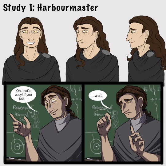


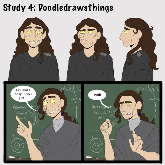

[Brief image description: A series of illustrations of Gerou teaching in front of a blackboard. The illustrations repeat, each in a different art style; at the end is a collection of doodles mixing the art styles and a few notes reflecting on the exercise. Full description and transcript starting at the heading below the cut. End ID.]
Part one of some recent style studies I’ve been doing, featuring Gerou struggling with student teaching!
I wanted to explore how different artists that I like handle stylization and simplification in comics, and when I asked around several people gave me permission to post the results. I recommend checking them out!
1) Harbourmaster is by @waywardmartian.
2) Never Satisfied is by @ohcorny.
3) Broken is by @yubriamakesart.
4) @doodledrawsthings makes a lot of content that is posted to tumblr, most recently a fair amount of A Hat in Time fanart.
Thank you all for the permission to post! ^_^ I'm having a lot of fun with this.
.
Side notes:
I genuinely thought that the Harbourmaster style would be easiest for me, since it contains roughly the same amount of detail as my own style and since I’m like 75% sure that reading it as a younger teen informed a lot of my own style and character designs. Turns out it was actually the hardest! Perhaps because, since there aren’t as many blatantly fundamental differences, I had to pay more careful attention to proportions and specific forms?
.
Never Satisfied was interesting! Alongside the work of Doodledrawsthings it’s definitely the furthest from my own style, and choosing Gerou for this honestly doesn’t do that difference full justice. I looked a lot at Fidelia, Sylas’s mom, and Thierry in trying to figure out how Gerou’s facial features would translate. Part two of my plans is to explore different character designs that might make fuller use of the difference in style, heh. (In other news: Colored lineart looks very neat and studying how it’s handled in NS is the first time I’ve been able to carry it off in a reasonable time frame, hah.)
.
Broken is just... very pretty, y’all. xD I don’t think it really saved me any time or much ease of drawing over my own style, but it’s very nice to look at. And I think the style differences and specific simplifications do lend themselves very well towards creating more consistency than I ever manage in my own art. Noticing the patterned way of drawing ear details was a fun moment for me, I’d never really thought of codifying anything that way before!
.
I did the first drawing in Doodledrawsthings’s style (the 3/4ths view in the turnaround) and thought “Oh goodness this is lovely and quick and feels nice.” It’s very nearly the first time drawing something in a cartoony style has ever come easily for me. But... I struggled much more with every other drawing in that style, ahah. Still, it was comparatively quick and I do love the expressiveness of the stylized eyes. :D This is another style where I think I’ll need to explore a wider range of character designs, though. I think it’s also worth thinking about how character design is fundamentally changed in some ways by the change in style; some of what I would think about designing a character specifically for that style is very different from the details I would normally think about when designing a character.
.
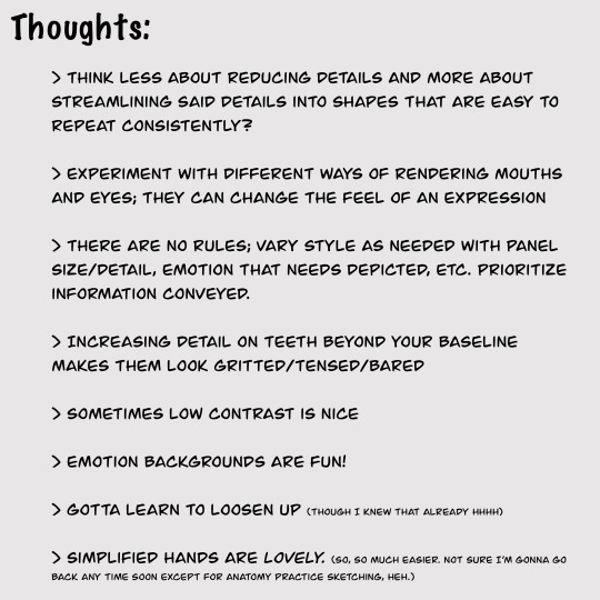
[Detailed image description:
A series of images repeating the same content in different art styles, followed up by a page of sketches and a page with text notes.
The repeated content is a turnaround of the character Gerou as well as a short two-panel comic showing Gerou as a student teacher in front of a blackboard. Gerou is a thin white man with sallow freckled skin, a large hooked nose, long wavy brown hair, and glowing orange-yellow eyes. In the comic, in the first panel he gestures animatedly with a wide smile and says, “Oh, that’s easy! If you just--” then breaks off. In the second panel he holds up a hand as if asking for a pause, and says, “...wait,” with visible consternation.
The sketches feature continued style experimentation with Gerou making a number of expressions and gestures, including: absolutely failing to maintain a good pokerface; looking stressed; various smiles, from tired to nervous to wide and happy; sighing tiredly; sticking out his tongue with arms crossed huffily; arguing with someone; drinking tea; and fighting off a dizzy spell.
The text image is headlined Thoughts and reads as follows:
Think less about reducing details and more about streamlining said details into shapes that are easy to repeat consistently?
Experiment with different ways of rendering mouths and eyes; they can change the feel of an expression
There are no rules; vary style as needed with panel size/detail, emotion that needs depicted, etc. Prioritize information conveyed.
Increasing detail on teeth beyond your baseline makes them look gritted/tensed/bared
Sometimes low contrast is nice
Emotion backgrounds are fun!
Gotta learn to loosen up (though I knew that already hhhh)
Simplified hands are lovely. (So, so much easier. Not sure I’m gonna go back anytime soon except for anatomy practice sketching, heh.)
End image description.]
#I have been hyperfocused on this for a week straight whoops#art#style study#artists on tumblr#style experiment#comics#my art#my stuff#sketches#Gerou#Imperfect Science#image described
35 notes
·
View notes
Text
Lava’s Art Masterpost
Hey, all! Welcome to my art masterpost! I have no idea if this is a thing that is done typically for art, but oh well, I like organizing things, so here we are! What you’ll find here is mostly Dragon Age, with a few non-DA pieces in there, and there’s a range of styles I like to use, depending on my mood. But a lot of what you’ll see will most likely combine lineart with some other form of coloring/shading.
Feel free to browse at your leisure, and I hope anyone who stumbles upon this enjoys what they find! :D And thank you to anyone who sees this and likes, or reblogs, or even just stops by to peruse a bit!
All that said, away we go!
Digital Portraits:
1. Portrait of Nameless Woman, 2020 - This one is just an experiment with a watercolor brush that I did. It’s not anatomically perfect, but I enjoyed playing around with shading.
2. Sketch of Aja Amell, 2020 - This one is basically sketch practice with my Amell~ Not really the most expressive pictures, but it’s a start toward drawing her more expressively. Full disclosure: Aja is one of those OCs of mine that I have had trouble with deciding on a definitive appearance for several pictures, and I really want to work on upping my level of consistency when drawing her.
3. Long-Haired Fenris, 2020 - Exactly what it sounds like; this was for practice drawing Fenris’s features (I love how distinct they are), but with long hair because I am weak for it. This one was a fun piece to shade, and mixing the stylized lineart that I normally use with a greyscale shading spectrum was really enjoyable.
4. Portrait of Ilorin Lavellan, 2016 - This is an oldie. Basically practicing expressions, and it is technically a WIP, but I’m still very happy with how the shading turned out, especially because this is actually (aside from the unfinished hair) one of the more minimal pieces I’ve done in terms of lineart It’s still there, and it still shapes the flow of the picture in some ways, but it also ends up flowing with the shading instead of standing out next to it, which I like. (Both styles are good, though, and I love seeing other artists try both too.)
5. Old Portrait of Aja Amell, 2016 - Much older picture I did of Aja; she... honestly looks very little like the newer one, I think, and that consistency is something I’m still working on, but this one was the first picture of Aja with that particular hairstyle I drew. What I like about this picture is how young she looks; it fits with her image as a fresh and sheltered Circle mage who’s only about 20 years old at the time of DAO.
6. Old Portrait of Trilyn, 2016 - They very first piece of art I posted to tumblr~ It’s not exactly how I envision Trilyn anymore, but it was still very fun to draw, and helped me get a feel for drawing him in the future.
Dynamic Movement Pictures/”Moment’s in Time”:
1. Tabris in Arl’s Estate, 2020 - TW: blood. I am super proud of this one. My ultimate goal is to draw all of my Warden DAO OCs, and I could not believe I’ve never drawn my Tabris, and so here she is. This was, in large part, practicing expressions because I absolutely love art that depicts characters in motion, or capturing some kind of expression.
2. Velyn in the Rain, 2017 - This one was actually based on some art that I saw in a Teen Wolf fic! It was an experiment with a more expressive style (and one of the first pieces I did without lineart left in the finished version) and it was a huge step out of my comfort zone. But overall, I am extremely happy with how it turned out.
3. Jem Nocking an Arrow, 2016 - And here is the lineart version. This was entirely an excuse to draw my DAI baby, Jem, and to do a cool archer pose because archers are my fav, and I love characters in motion.
4. Solas Teaching Trilyn Fade Magic, 2016 - This one was a painterly picture that was also (like the Velyn picture) something which I tried to keep lineart out of. Overall, I am proud of a lot of parts of the pic, but I think I would definitely go back over it and change a few things now if I had the patience.
5. Trilyn Closeup WIP, 2016 - TW: injury, blood, mention of abuse in the author’s note. A lot of early pictures I have are of my OC, Trilyn, and this is one of my absolute favorites. His entire upper body is technically in the picture, but I hadn’t finished rendering it yet, so this was what I posted. And it was an experiment with a cross-hatching style with the pencil tool for some texture, with air brush shading and a blurring tool. It’s a style I had fun playing around with!
6. Trilyn Blood Ritual, 2016 - TW: blood, injury (the slight cut used to supply the ritual with blood). This one was definitely a sort of “captured moment” from a backstory I gave Trilyn, and I think what I was really going for was an atmospheric piece that could fit with any potential fic I wanted to write for Trilyn. And then it ended up being practice for extreme lighting/shading techniques, and drawing the blood and the gross mass of demon ichor (or whatever the heck that is) turned out to be highlights of making the piece for me.
Art + Text:
1. Freedom and Control, 2020 - TW: scars, but very difficult to see. This one was ambitious for me! It started originally just as Solas and my Tal-Vashoth OC, Saara, facing each other, because I love the dynamic I’ve built for them in my head, but then it turned into an attempt at a tarot-esque background, and just sorta grew from there... Overall, I’m happy with how it turned out, especially with how Solas and Saara themselves turned out. The version you can actually see a larger view is here.
2. Marianna and Delia Codex and Art, Pt. 1, 2020 - I love writing my own codex entries, first off, and I love combining art with text to create a (hopefully) seamless work. This work was an attempt to flesh out these OCs of mine with both art (because unique facial structures are hard for me to get down, but so important regardless) and text (because writing~). I think it turned out well overall, but there are elements of the portraits that I might at some point touch up a bit.
3. Marianna and Delia Codex and Art, Pt. 2, 2020 - Part 2, with what I refer to as a “DAI Outfit Change” because I have always loved seeing fans show their own OCs as they look in DAO, DA2, and then finally DAI. So I absolutely wanted to jump on that bandwagon myself. The skin tones are a little off (and I’m sorry about that!) because I was playing with the watercolor brush at that point, and it dilutes the colors I use. Still working to figure that out, but I was very happy with the overall lineart and structures of the faces.
4. Alistair/Aja Amell Picture with a Blurb, 2017 - Ooooold, old, old, old, OLD! I still love the art, and I’m soooo happy with how the interaction between Alistair and Aja turned out (drawing kisses is extremely difficult for me; I always end up creating a distorted weird lip-creature, instead of realistically puckered lips...). I’m not as happy with the blurb that went with it? At that point, I was still very much figuring out my own DAO worldstate, and the characterization for everyone, so, eh. Take it with a grain of salt!
Unfinished Costume Designs:
1. Ancient Elvhen Armor with Dwarven Influence, 2018 - People who do costume design work are amazing and mystical beings, and I wish I could do what they do. This was an attempt at merging the Keeper robes from DAI with a more dwarven armor aesthetic, solely because I created an ancient elvhen character, Ceda, who was taken in by the Cad’halash dwarves mentioned in the Witch Hunt dlc, and I wanted this character to have a mix of the elven style of armor and the dwarven style. I’m overall decently happy with it, but there’s still that persistent level of self-criticism present.
2. Herald of Andraste Outfit WIP, 2016 - This was a very old picture, not one I showed around a lot, but the idea for this was entirely born of my intense interest in how fashion and outfit designs could be used to create a symbolic image for the Herald of Andraste. In general, I love the combination of ceremonial armor with long and flowing cloth, so that was what I went for here. I’m still actually very proud of how this came out, and headcanon something similar for my Herald in my canon DAI worldstate.
Pencil Sketches:
1. Quick Saara Sketch, 2019 - TW: saarebas mouth scars. Exactly what it says; very quick sketch of Saara I did in a small notebook I carry around with me. This was basically a test for myself to see if I could manage to draw Saara with the features and facial structure I envisioned for her without needing to use a lot of references.
2. Mass Effect Character Sketch; Jesse, 2018 - Similar reason for drawing this one as the above Saara sketch! With these characters, I love sometimes the way they can turn out with the specific character creator used for them, and when I draw them, I enjoy trying to create a definitive look for them using what I get from the CC, and my own knowledge of Hooman Faces.
3. Saara Sketch, 2017 - TW: saarebas mouth scars. A more detailed sketch of Saara than the one above, and one I definitely put more time into overall. It’s currently the profile picture I’m using for ao3, and is the definitive go-to reference picture I use whenever imagining Saara in a fic, or for other Saara pics I make. I am extremely proud of this picture, and feel like I should work in graphite more often. It’s such fun, and the texture is so nice to look at.
4. Sketch of Nameless Alamarri Woman, 2017 - This was a sketch I did of what I envisioned some Alamarri tribes to look like; I used artistic depictions of Gaul tribes and hairstyles for inspiration, and have used this as a go-to reference for my version of Alamarri tribes. Nothing super notable about this one, but I really liked the way the shape of her face turned out.
Events and Gifts:
1. Another Scar, 2020 - TW: blood, injuries, gore. The most recent piece of art on the list, and a gift for @cartadwarfwithaheartofgold; featuring sisterly love between Rica and fem!Brosca, which was her requested prompt. This was a tough piece for me because of the difficulty with the lighting I dealt with. For some reason, that one particular element of it gave me so much trouble. Overall, I’m very happy with how it turned out, though, especially the skin tones of the sisters; Brosca I always sort of like as having this greyish, more gaunt look to her, while Rica I like seeing with a darker, richer, and warmer tone to her.
2. A Very Cousland Christmas!, 2019 - This was for a holiday exchange for a server, and I drew a friend’s Cousland (Elissa, the girl on the left) with my Cousland (Gazza, the girl on the right). I love kid-fic, and I love kid-art, and so I decided... baby Cousland art! Drawing kid proportions was the toughest part, I recall, and I thiiiink it turned out well, and I’m still quite proud of it overall. Elissa’s design came entirely from my friend, but I added the holly~
3. Exchange Gift with Dis Brosca and Mabari, 2018 - This was an exchange gift for @fanfoolishness, using her lovely Dis Brosca, and was my first real attempt at backgrounds... I struggled with the coherence of the foreground and background a bit, but I’m still very proud of how it turned out, especially with the colors I had to work with. What I also really enjoyed working with was the lighting and the expression on Dis’s face. Backlit subjects are always fun to play around with!
4. Inktober Picture, “Deep”, 2017 - TW: scars, injury, mentions of abuse in the author’s note/attached dialogue snippets. This was for an Inktober prompt (the only one I’ve ever done, sadly... because I am bad with deadlines...), and again features Trilyn. Trilyn’s backstory has him a former slave in Tevinter, and a lot of the early works I do for him are sort of deep-dives into his life there. It’s all meant to be an exploration of the things he endures, and then those moments when he overcomes it all and takes back his own autonomy and self. This art is definitely provocative, and I can understand if not everyone likes it, but to me, I just wanted to show just what he faces (without glorifying it) before showing the moment of his own triumph.
5. Christmas Holiday Picture with my Brosca and a Friend’s Amell, 2017 - This was a piece of art drawn first by a friend of mine, @nanahuatli~ She drew the Amell, the background, the mistletoe, etc. All I did was add my Brosca to the mix to finish the image. It was a lot of fun to do, 1) because it was fun trying to match her style so that the picture looked cohesive, 2) because I love doing collabs with friends, and 3) because it was just such a fun thing to imagine my surly short Brosca, looking at this weird plant/fungus/thing dangling over some puckering human! It was an absolute joy to do this collab with her!
6. OC Kiss Week Pic of Jem and Saara, 2017 - TW: saarebas mouth scars. A spur-of-the-moment thing meant to demonstrate just what kind of dynamic my OC, Jem, has with my other OC, Saara (both of whom are members of Leliana’s network in DAI). This was a very quick picture (deadlines...) and was mostly just to have fun drawing these two characters interacting, and to see if I could make them look like themselves. I think I did a decent job with it overall, especially with Jem’s kissy-face! (Again... drawing kisses are the bane of my existence, although hands and feet take a close second.)
11 notes
·
View notes
Note
I don't think this is an ask but I wish we got a Ranger's Apprentice animated series/movie instead of a live action
I would love an animated series! I’ve been watching the Tangled TV show and it has this neat storybook style art. I think something heavily stylized like that (or like Spider-Verse 👀) would be amazing
I’ve also been saying for ages that it would work better as a miniseries or a full length show, a la GoT or Good Omens. I think the people in positions to make these things happen are too caught up in the idea of movie adaptations. RA, especially early on, feels more episodic. The pacing would be awful for a movie, even for a series of movies.
Season one would be books 1 and 2, culminating in the duel with Morgarath and Halt just barely missing Will. During the training, throw in some lines about the Temujai warriors, maybe about the Scotti at the border to help set up future seasons
Season two is book 3 and 4. The alternating viewpoints in book 3 would make for great A and B plots in episodes
Season three is book seven. Out of order books are a lot easier than out of order episodes in a TV show, so I think it would have to be chronological. After Will splits off, he spends the episode getting lost until he collapses. There are two options—either the last moments are the other rider finding him, or the beginning of the next episode is that. Depends on if you want a darker tone. Also, Will being separated allows for easy A and B plot structure
Season four is books 5 and 6. I would adore Malkalam’s interrogation fully animated. Can you imagine the effects? And Grimsdell wood in general. So spooky, I love it. I forgot to mention that prior to now, Alyss is made a more important character. She shows up to more things (welcome home parties, downtime, etc). As fans of the book, we know she’s going to be the love interest and we also know that she’s kind of forced in, so we can avoid that with hindsight. (I would also be okay with a bigger adaptations change to make Hill canon, but for the sake of argument, I’m trying to stick as close to the books for this as possible.)
Season five is books 8 and 9. I think at this point in the series you could argue for the books to be split because of length but I like how cleanly the arcs break up. You could either have the same VA for Halt and Ferris and let the actor have fun with it, or have two different VAs who sound similar. I could honestly argue for either way. Both have merit.
Season six is book ten. If we made it this far, the show will hopefully be popular enough that they can pull in some really good consultants on historical Japan so that everything is respectful. Imagine the landscapes, though. Animated, stylized Japanese topography. I’d die
Lost Stories is an odd duck. I would love to include them, but it’s hard to find where they’d fit in a way that doesn’t ruin the flow. We could make the seasons longer, a little more flowing, and split the books up further, but I personally like this structure. If someone wants to figure that out in more detail, I’m happy to see it work, though. Maybe a miniseries between seasons, animated by different people in different styles to give newer artists a chance to work on a bigger project?
Adapting the story now that it’s complete lets us address issues and ideas to make the new version better. More diversity, clearing up the timeline a bit, making minor characters more defined early on, etc. The biggest thing, in my opinion, is the magical elements. I would love more magic in RA, but there needs to be a careful balance because we have arcs later on that are explicitly about fakers, both arcane and divine. But there are also moments that are undeniably magical—the Wargals, The Kalkara, and the hypnotism in book 6. That’s not how real hypnotism works and is borderline magical in its effects and application. I think if more magical elements are added to maintain consistency, they should be grounded and treated as natural. Beasts that come from mythology but are just more weird animals, for example. Maybe give the Rangers a more magical connection to nature that Halt has to sever when he’s banished. The Bedouin live around springs and oases that extend their lives a bit and give them stronger bodies that can withstand the desert. No spells or transformations or anything really flashy. That way, there becomes a distinction between “real” magic and what Malcolm and Tennyson do. The Wargals aren’t treated like fantasy monsters. No one really questions how they’re real. Magic like that is just part of the world.
That would be the biggest change. (And canon Hill if half the fandom wouldn’t be upset over losing Willyss.) I’d love to see an otherwise faithful adaptation of the series. I think structurally and stylistically, it’s already set up for a great TV show. And making it animated like anon suggested would be absolutely amazing, particularly if the producers allow a more unique look rather than trying to mimic classic Disney CGI style. It looks great, but it’s so boring and they all look the same. Give me Tangled the Series style, or Into The Spider-Verse, or even a more traditional comic book style (think Teen Titans or Batman the Animated Series) or something inspired by anime or more recent Western cartoons.
I’m not going to tackle BB and TRR because I haven’t read most of them, but they would most likely be spinoffs/sequels. Same with TEY, though I don’t know if there’s enough there to make a full, satisfying show. (I haven’t finished TEY either whoops) I also didn’t mean for this to get away from me like this, but here you go. All my RA adaptation thoughts in one place
#ranger's apprentice#rangers apprentice#ra adaptation#literally all the characters#latte has opinions#thank you so much for the ask!
41 notes
·
View notes
Text
Textiles 3- Studio work: Disperse dye and Macramé. Homework - Boro/Sashiko
Disperse dyes and heat press
Happy to be back in the studio, we began by being shown how to use the heat press machine and using disperse dye for printing.
To transfer a print onto fabric using the heat press:
- Paint a design on cartridge paper using disperse dye. It has a similar consistency to ink and can be diluted to vary degrees for tonal range. It can also be mixed together to create colours.
-Make sure that the design on paper is completely dry. We used a hair dryer to speed up the process.
-Using the heat press: Sandwich the design and fabric to print between greaseproof paper. Place the design face down onto the fabric or you can place the design first and fabric on top. We used a polycotton for the fabric.
-Make sure the heatpress is hot enough and clamp in place with the lever. Wait for the countdown to finish (usually 30 secs) before releasing.
-Slide or peel the print away from the machine to reveal print. The design will be printed in reverse. (Health and safety- Heat press is hot, take care and do not leave unattended).
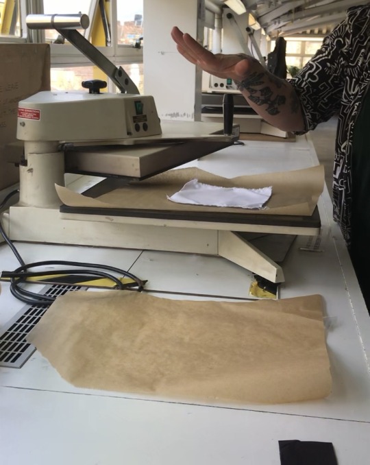


Example of fabric printed with heat press.
Heat Press experiments
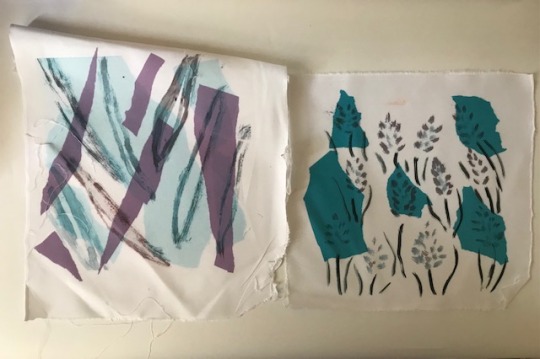
Print 1 - based using a spider plant leaf as a stencil and painted around it. I then used dye transfer paper on top, which I ripped into similar shapes and layered on top.
Print 2- is of lavender painted with a brush. I mixed colours for the purple and placed ripped dye paper on top. The paper came out darker than expected as I thought it would be a pale blue/purple colour.

Print 1- Experimenting with mark making and diluted the disperse a bit for freeflowing marks.
Print 2- Based on spider plant leaves in studio, replicating veins of plants with different colours.
Print 3- My first ever print with heat press. Using colour and petal from St John’s Wort.

Print to use left over ink- Exploring more mark marking. Paint brush used and twig used for black marks.

Print 1- First print experimenting with dye paper and some scrunched to see how texture would be print on fabric. Some pieces are cut and others ripped.
Print 2- Exploring mark marking with layered dye transfer paper. It reminds me of vintage shirts. I like it!
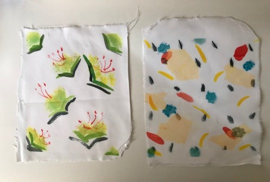
Print 1- Print based on St John’s Wort plant as a repeat print. Painted with paintbrush.
Print 2- More marking and layered dye transfer paper. For some reason it came out quite light, I believe I might’ve placed the paper the wrong way round (Dye colour facing up instead on the fabric, which resulted in lighter colour).
Print 1- Printing on a fabric found from stash in studio. I believe its a cotton. I wanted to see how the dye paper would come out on a coloured background.
Print 2- Loose painting of St John’s Wort.

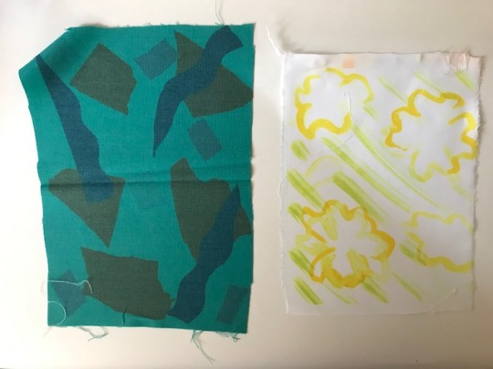
Print 1- First test with dye transfer paper. Ripped up paper. Some string got caught while in the heat press and created an interesting stencil.
Print 2- Another unexpected print. I think I placed the blue paper upside down again. Used wood material (possibly used for basket weaving??) on top of dye paper and string. The wood ending up getting partially dyed (dark bit) instead of leaving a white stencil like the string.

Print 1- Print using a twig, (dipped in ink and drawn like a pen). Representing blossoms on branch.
Print 2- First print using spider leaf plant as a stencil. Only painted around it instead of using the leaf in the heat press.

Print 1- Using spider plant leaf again as a stencil and painted around it with yellow and red. Blended the colours together.
Print 2- Dye paper and print with mark making use with brush. This was printed on a thinner polycotton.
Reflection for heat press experiments
It was a lot of fun printing using the heatpress and disperse dye. I had wanted to try translate painterly and illustrative mark onto fabric and this was a great way of producing samples for it. I had some issues using real plant leaves as a stencil as it did not leave a clear impression. Perhaps next time I could put the plant in the heat press machine with dye paper for a better print, similar to what Emma had done.
Some prints I did not like, for example the St John Wort prints when I tried painting the plant semi figuratively- I thought it would be more interesting to either create abstract prints of the plant or a stylized or figurative version. Some of the mark making did not go so well on the first try, particularly using the twig. I tried to make an impression with it but was better to draw with it like a pen.
Some prints I was really happy with include the markmaking with layered dye paper (that reminds me of a vintage shirt), the lavender illustration, the stencil of the leaves with purple and blue dye paper and the colourful lines that represent the veins of the spiderplant leaves. I was also intrigued by the print where the wooden material and string had printed, which created an interesting x-ray like effect.
Overall I was really happy with how most of my prints came out and experimented with different materials and style of painting. Sometimes it came out with unexpected results but I like the element of surprise of how it would print on fabric. For example, I hadn’t expected the disperse dye to come out so vividly (they look darker on the palette) and mixing purple for the lavender came out darker when I thought it would be brighter. I really enjoyed using the heat press and disperse dye and plan to make more samples for our final lesson.
Macramé
For part of the session we were shown how to do Macramé. Macramé is a type of textile that using knotting techniques to create products. It has been used in fashion, homeware and in sculpture.
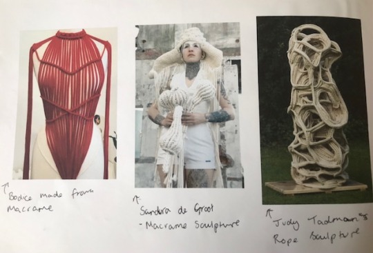
Sketchbook notes on Macramé and used in different ways.
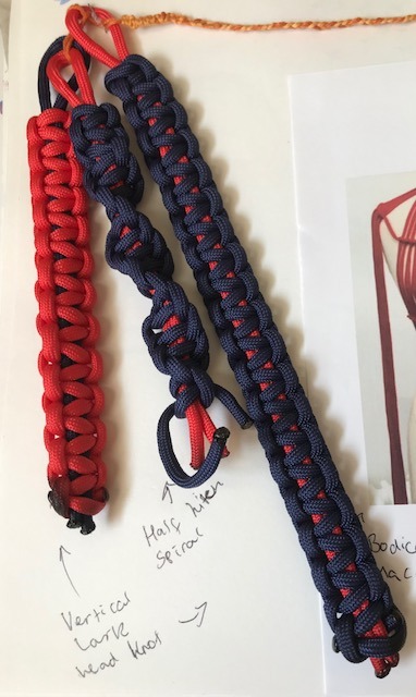
My macramé practice.
Jill showed us how to do two different types of knotting- A vertical lark head and a half hitch spiral. I really struggled to get the vertical lark head knot right and had to been shown a few times! I did another one in blue by myself as more practice. I found the half hitch spiral a lot easier to do and was pretty cool seeing the spiral form. It also reminds me when we did these in secondary school. Once I got the hang of it I found macramé to be quite relaxing and could be interesting to explore it more. Perhaps with fabric or creating a sculpture with it on a large scale like Judy Tadman’s rope sculpture.
Boro/ Sashiko
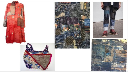
L-R: Traditional red Boro Tunic, Josh Blackwell Street Bags- using sashiko stitching on a plastic bag, detail photo of Boro by Jennifer Corkish, Jeans using Boro technique, detail photo of Boro by Helen Terry.
We also learnt about Boro and Sashiko. Boro is a technique that repurposes saved garment pieces and other handspun indigo fabrics. It is sewn together as a patchwork and built in layers for warmth. This art was born out of necessity in northern Japan where peasants made them during the Edo period. (1603-1863).
Sashiko is a style of stitching that commonly accompanies Boro. The stitching can be complex and create different shapes or simple with straight and long running stitches.
Homework
For homework we were tasked to create some Boro/Sashiko samples.
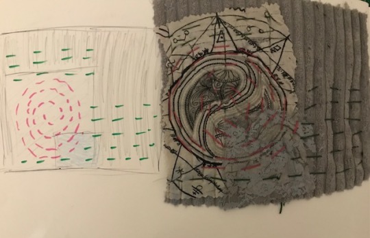
This sample features fabric from an old cushion, tshirt and lace from a bra. I liked the circular design and wanted to try replicate that with stitching. I found it a bit hard getting the length of stitching similar but this was due to not giving myself enough time.

The second sample features fabric from old tops and pj bottoms. I wanted to try different types of stitch, so did a cross stitch. The intention was to have cross stitch all around the plaid material but again did not have enough time. I also wanted to challenge myself and had create a pocket and stitched that into place with diagonal stitch.
The last sample was actually the first one I created and struggled with the most. I had wanted to try create pleats but the tension is uneven throughout. As I was sewing in a rush, I had also caught the wrong side with my stitching and was unable to undo it without unpicking everything. The piece came out a bit crumpled and doesn’t lie flat but was a good learning curve.
Session reflection
Overall I really enjoyed today’s session and to be back in the studio! I loved using the heat press machine and disperse dye to create painterly prints on fabric. It was also fun to use dye paper in a collage way by layering and ripping to see how that would print on fabric. I explored a lot of mark making and used natural materials of leaves and twigs for stencils and mark making. I struggled a little bit with the macramé but once I got it I found it quite enjoyable and think it could be really interesting to use in a sculpture. I found the boro/sashiko stitching the most difficult, making due to not giving myself enough time to stitch. I’ve definitely learnt that with sewing you have to take your time or end up with a poor product/ losing time to mend mistakes.
Going forward for our final lesson, I’d like to use the heatpress again and see if its possible to use the freehand embroidery machine. It would be great to create a sample with the combination as I’ve been inspired by Veronica Cay’s work ‘I hesitate’ (research towards end in a previous post) . I would like to create something similar but with my concepts of plants and mental health in mind and will try achieve that for the last lesson in the studio.
3 notes
·
View notes
Photo
Péguy
Hi everybody!
In this news feed I've told you a few times about a project I named Péguy. Well today I dedicate a complete article to it to present it to you in more detail but also to show you the new features I brought to it at the beginning of the winter.
It's not the priority project (right now it's TGCM Comics) but I needed a little break during the holidays and coding vector graphics and 3D, it's a little bit addictive like playing Lego. x)
Let's go then!
Péguy, what is it?
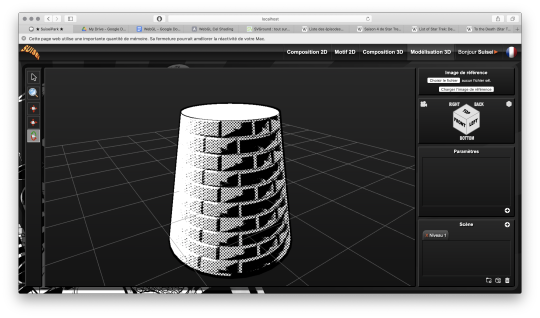
It is a procedural generator of patterns, graphic effects and other scenery elements to speed up the realization of my drawings for my comics.
Basically, I enter a few parameters, click on a button, and my program generates a more or less regular pattern on its own.
The first lines of code were written in 2018 and since then, this tool has been constantly being enriched and helping me to work faster on my comics. :D
This project is coded with web languages and generates vector patterns in the format SVG.
In the beginning it was just small scripts that had to be modified directly to change the parameters and run individually for each effect or pattern generated.

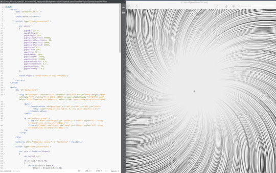
Not very user friendly, is it? :’D
This first version was used on episode 2 of Dragon Cat's Galaxia 1/2.
During 2019 I thought it would be more practical to gather all these scripts and integrate them into a graphical user interface. Since then, I have enriched it with new features and improved its ergonomics to save more and more time.
Here is a small sample of what can be produced with Péguy currently.
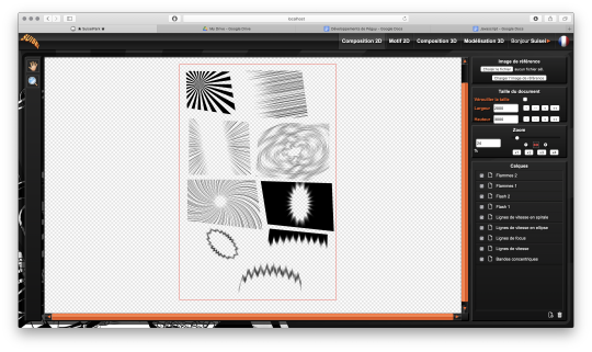
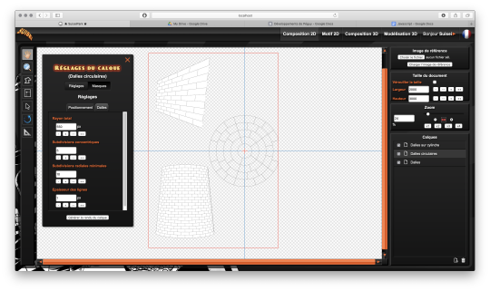
Graphic effects typical of manga and paving patterns in perspective or plated on a cylinder.
All these features were used on Tarkhan and Gonakin.
I plan to put this project online, but in order for it to be usable by others than me, I still need to fix a few ergonomy issues.
For the moment, to recover the rendering, you still need to open the browser debugger to find and copy the HTML node that contains the SVG.
In other words, if you don't know the HTML structure by heart, it's not practical. 8D
A 3D module!
The 2020 new feature is that I started to develop a 3D module. The idea, in the long run, is to be able to build my comics backgrounds, at least the architectural ones, a bit like a Lego game.
The interface is really still under development, a lot of things are missing, but basically it's going to look like this.
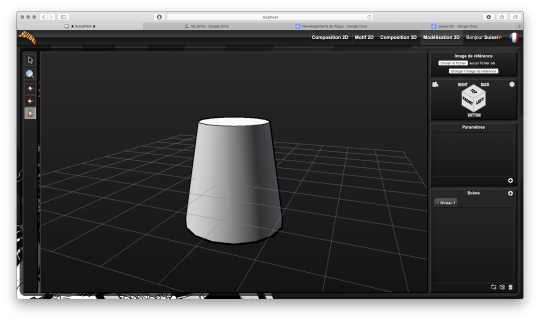
So there's no shortage of 3D modeling software, so why am I making one? What will make my project stand out from what already exists?
First, navigation around the 3D workspace. In short, the movement of the camera.
Well please excuse me, but in Blender, Maya, Sketchup and so on, to be able to frame according to your needs to get a rendering, it's just a pain in the ass!
So I developed a more practical camera navigation system depending on whether you're modeling an object or placing it in a map. The idea is to take inspiration from the map editors in some video games (like Age of Empire).
Secondly, I'm going to propose a small innovation. When you model an object in Blender or something else, it will always be frozen and if you use it several times in an environment, it will be strictly identical, which can be annoying for natural elements like trees for example. So I'm going to develop a kind of little "language" that will allow you to make an object customizable and incorporate random components. Thus, with a single definition for an object, we can obtain an infinite number of different instances, with random components for natural elements and variables such as the number of floors for a building.
I had already developed a prototype of this system many years ago in Java. I'm going to retrieve it and adapt it to Javascript.
And the last peculiarity will be in the proposed renderings. As this is about making comics (especially in black and white in my case), I'm developing a whole bunch of shaders to generate lines, screentones and other hatchings automatically with the possibility to use patterns generated in the existing vector module as textures! :D
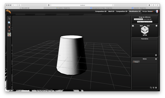

What are shaders?
Well, you see the principle of post-production in cinema... (Editing, sound effects, various corrections, special effects... all the finishing work after shooting).
Well, shaders are about the same principle. They are programs executed just after the calculation of the 3D object as it should appear on the screen. They allow to apply patches, deformations, effects, filters... As long as you are not angry with mathematics, there is only limit to your imagination! :D
When you enter a normal vector in a color variable it gives funny results.
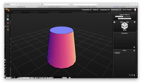
Yes! It's really with math that you can display all these things. :D
Now when you hear a smart guy tell you that math is cold, it's the opposite of art or incompatible with art... it's dry toast, you'll know it's ignorance. :p
Math is a tool just like the brush, it's all about knowing how to use it. :D
In truth, science is a representation of reality in the same way as a painting. It is photorealistic in the extreme, but it is nevertheless a human construction used to describe nature.
It remains an approximation of reality that continually escapes us and we try to fill in the margins of error over the centuries... Just like classical painting did.
But by the way? Aren't there a bunch of great painters who were also scholars, mathematicians? Yes, there are! Look hard! The Renaissance is a good breeding ground. x)
In short! Physics is a painting and mathematics is its brush.
But in painting, we don't only do figurative, not only realism, we can give free rein to our inspiration to stylize our representation of the world or make it abstract.
Well like any good brush, mathematics allows the same fantasy! All it takes is a little imagination for that.
Hold, for example, the good old Spirograph from our childhood. We all had one! Well, these pretty patterns drawn with the bic are nothing else than... parametric equations that make the students of math sup/math spe suffer. 8D
Even the famous celtic triskelion can be calculated from parametric equations.
Well, I digress, I digress, but let's get back to our shaders.
Since you can do whatever you want with it, I worked on typical manga effects. By combining the Dot Pattern Generator and the Hatch Generator but display them in white, I was able to simulate a scratch effect on screentones.

In the traditional way it is an effect that is obtained by scraping the screentones with a cutter or similar tool.
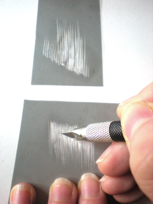
Péguy will therefore be able to calculate this effect alone on a 3D scene. :D
I extended this effect with a pattern calculated in SVG. So it will be possible to use the patterns created in the vector module as textures for the 3D module!
Here it is a pattern of dots distributed according to a Fibonacci spiral (I used a similar pattern in Tarkhan to make stone textures, very commonly used in manga).
Bump mapping
So this is where things get really interesting. We stay in the shaders but we're going to give an extra dimension to our rendering.
Basically, bump mapping consists in creating a bas-relief effect from a high map. And it gives this kind of result.
The defined object is always a simple cylinder (with 2 radii). It is the shaders that apply the pixel shift and recalculate the lighting thanks to the high map that looks like this.

This texture has also been calculated automatically in SVG. Thus we can dynamically set the number of bricks.
Well, this bas-relief story is very nice, but here we have a relatively realistic lighting, and we would like it to look like a drawing.
So by applying a threshold to have an area lit in white, a second threshold to have shadow areas in black, by applying the screentone pattern to the rest and by adding the hatching that simulates the scraped screentone, here is the result!
It's like a manga from the 80's! :D
I tested this rendering with other screentone patterns: Fibonnacci spiral dots, parallel lines or lines that follow the shape of the object.

Now we know what Péguy can do.
I think I can enrich this rendering a bit more with the shaders but the next time I work on this project the biggest part of the job will be to create what we call primitives, basic geometric objects.
After that I can start assembling them.
The concept of drawing while coding is so much fun that I'm starting to think about trying to make complete illustrations like this or making the backgrounds for some comic book projects only with Péguy just for the artistic process.
Finding tricks to generate organic objects, especially plants should be fun too.
That's all for today.
Next time we'll talk about drawing!
Have a nice week-end and see you soon! :D
Suisei
P.S. If you want miss no news and if you haven't already done so, you can subscribe to the newsletter here : https://www.suiseipark.com/User/SubscribeNewsletter/language/english/
Source : https://www.suiseipark.com/News/Entry/id/302/
1 note
·
View note
Text
My beliefs now
I set this blog up for a bunch of different purposes including conlangs/worldbuilding stuff, my writing, and my views on religion and maybe also politics. So far, mostly, I’ve ranted a lot about the beliefs I left behind. Now that I’ve let that particular sketchy brand of Christianity, now that I’ve discovered the ways it and my conservative family background were probably turning me into a fascist while I was still in all that, I figure I might as well try to hash out where I stand now. I’m around eleven months out from my deconversion, and a lot has already changed. I might try to attempt a before and after thing but there’s a lot to unpack about how I used to think and I’m not sure I’ve understood everything yet. I think I made the mistake of thinking that not very long before that repressed memory about “Sharon” and her Jonah display came crashing back in March. This is current to late July 2020 and may not include everything.
So without any further ado, let’s talk background. First, some things I’ve already either mentioned or given more than enough evidence for. I used to be a Christian fundamentalist. (Clearly. I rant about it a lot.) I got into that because I was raised religious, then let myself fall right the fuck into what I’ll call “deep end lite” shortly before senior year in high school. Some local churches in my small town arranged a missions trip thing and the way I agreed to go along felt in the moment like surrendering to a voice that’s been speaking to me all along. In ...a way, it was. Just not the voice I thought. I’m pretty sure I didn’t want this god, at any point like ever, until that little part of me whispered that it would be easier to accept him. I have a megathread document that I’ve stored a lot of my “God stories” from my time as a Christian in. Unfortunately I didn’t remember many specific details of this experience to write down in there, but I did write a bit of a “life-story” thing that reminds me that, chronologically, that happened after a period of focused attempts by the church to indoctrinate me, some traumatic things my family did, social struggles, and feeling like an asshole because of things I’d done in the past. I remember having this growing sense over the previous year that I was approaching some kind of very dangerous breaking point, to the point where (trigger warning: mental instability, school shooter mention. Please either stop here or skip to where it says “in other words” in the next paragraph after this if that’s going to be an issue. It also keeps getting dark from there for a minute. Please, please tread with care if you need to. There is no shame at all if this becomes too much. Take care of yourself first and foremost.)
when discussing how I came to accept the faith, I told some of my Christian friends that I felt like there was a scary chance of me becoming a school shooter. I think this may have been a post-hoc projection, but I can’t quite be sure of that. I was in a bad place for a bit there in high school. I had a wild temper and some sketchy intrusive thoughts.
In other words, it hit at a perfect moment of weakness. That’s how oppressive forms of spirituality function, it’s how hate groups function... it’s a massive shit cocktail and I found a pretty bad influence in the form of people who promote that whole “born again experience” thing in Christianity. I’d say I’m glad I missed out on being dragged into a fascist ideology this way, but uh... I’m no longer convinced I didn’t grow up around something like that. More later.
From there I spiraled my way through my first attempts at college through the university’s chapter of the Chi Alpha campus ministry and, peripherally through that, Assemblies of God (holy shit those guys are wild), then through a local Baptist church (more peripherally) and Calvary Chapel (I was a worship guitarist here for like 18 months and helped with their youth ministry for almost as long) closer to home and a CRU chapter at my community college. With each passing year I slipped further and further into this weird shame-induced funk where I got like... addicted to Jesus and hated myself or something. It’s a bit hard to find words that don’t take multiple entire extra pages and I want to be concise, so I’ll simply call it “Jesus-flavored depression” for brevity and because that was enough of a genuinely bad time (and I’m still fucked up enough) that I might need some fairly serious therapy.
Near the end of 2018 I was reaching a breaking point, wondering why nothing ever seemed to change in my life from “sexual sin” (...which in my case literally consisted of being attracted to women and occasional self-pleasure, but they literally teach you to hate yourself for less than that in the spicier churches rip) to my direction in life to how trapped I felt by my family. I also started to have more questions about the violence in the Bible and some of the sketchier doctrines, and that was strongly reinforced by some of the things I saw in a creative writing class I took, including an atheist who shared a story of a profoundly negative experience involving being taught about hell at a very young age. All that led to the absolute disaster that was December 2018. It was my last semester at the community college I went to. Finals week was a fucking disaster, and the week before that too, and my grades were really good but at great cost. I won’t go into a ton of detail because 1. space concerns and 2. this time is still damn painful to discuss, but just know that I’m unconvinced I’d have survived that month without this song. (Yes, that’s Paramore. Shut up xD they’re still good.) I looped it for like three days straight and I think it was just enough to keep me going through what was the third time I had any suicidal kind of thoughts ever and by far the worst and longest period of it so far.
So the next several months (and I won’t go into a ton of detail about this, I intended this post more to describe my current position and I don’t wanna get too in the weeds with background) were a confusing period of questioning, starting with, of all things, my family dynamic. The spiral after the week before finals was ...considerably worsened by some comments my dad made, and between that and some experiences in the past that the creative writing class I took that fall reminded me of, I was exposed to a bit of a deeply toxic pattern. I might discuss that more deeply in another post, but for now suffice it to say that extensive youtube binges and some other research between about January and March told me the situation is probably adjacent to pathological narcissism in some way. I brought some of this up to the church I was attending at the time (a small town Calvary Chapel, if I haven’t mentioned that already) and their responses were ...inconsistent. Some people blamed me, some people said “oh dang your dad is abusive”, and some people took the “your parents are trying their best” tack. In retrospect I think that made me doubt if God’s messaging to these people could really be trusted. Then, in about April, the question of hell came up again. I was helping in the church’s budding youth ministry at the time and we had about four regular attendees between the ages of 12 and 18. There were about three weeks in a row when one of the other adults (I’ll call her Kelly for the purposes of not doxxing; also more on her later) talked at length about how unbelief leads to hell. I remembered that atheist from creative writing, made the connection to these four kids, and thought, “what the hell are we doing?” (Pun not intended but rather convenient.) I immediately backed down from my role in the youth ministry, citing other equally valid but less pressing reasons involving stress from the issues with my dad, and tried to go on with life. But the floodgates were open.
In late May or early June, I was staring out a window one morning and suddenly a question crossed my mind unbidden: “Is God a narcissist?” I thought back to a relatively recent sermon by the associate pastor in which he explained that the purpose of the world was “for God’s glory”, to some apparent sudden flights of rage, and some other factors in the scriptures, and thought, “holy shit, I need to investigate this, because God is also very adjacent to narcissism.” It took a hot minute for the ball to really get rolling with that, but once it did... I came to a point by late June or early July where I delivered an ultimatum to God, something to the tune of “Ok, either show me how all these questions I have can be answered beyond a doubt or I’m done.”
There was no answer.
God was silent during this time, and the people in the church were shocked that I had the questions I did and either concerned or ...rather spicy. I joined an ex-Christian discord server to aid in a proper, thorough investigation. I aired my questions both there and on a Christian discord server. The Christian server was toxic as fuck and the ex-Christians started making a crazy amount of sense. I watched some videos from Cosmic Skeptic and TheraminTrees (most notably the latter’s deconversion story) for new perspectives and, by mid-August, had crashed out of the faith altogether.
So the last time I ever stepped into a church with the intent of attending service (I showed up after once in January of 2020 to kinda let them know and that went pretty badly lol) was about two weeks before I started college again in the fall. I burned all but one of my Bibles and a collection of gospel tracts I never did anything else with and stylized it like my limited understanding of what a satanic/pagan ritual looked like, complete with a chant in my conlang Aylaan for a more personal twist because of course, to feel edgy. (I did a lot of kind of weird shit to feel edgy; that’s one of two of them I’m sure I don’t regret.) And after that, things got ...ah, confusing?
Because of course when the linchpin of your understanding of the world gives way, everything becomes fucked for a hot minute.
So the first thing that happened was a couple months of anxiety and confusion. I slowly started to deconstruct my inherited political views too. (More on that later.) Then I had this really beautiful interesting moment in late September where I walked past a tree on the way to a class and had a sudden realization that I didn’t have to force the tree into a Christian framework anymore, it was just a beautiful mass of green shit and cellulose. I could appreciate it in whatever way I felt was best. I damn near broke down crying in the bathroom before class, it hit me that hard. So that’s fun xD
Since then I’ve kinda gone through a bunch of funky phases with this, including a couple of months of fairly salty atheism. Along with that process, I started questioning my sexuality in December (more on that in another post in a minute lmao it’s a trip) and literally shredding my politics in the face of Trump being a crackhead in a dangerous position getting away with confirmed illegal shit, COVID-19 and the ...dehumanizing responses of corporations and their sponsored politicians, and then what I noticed about the deaths of Ahmaud Arbery and George Floyd and the fallout from that. (In a nutshell, holy FUCK there’s a huge problem and it’s messed up that people don’t see it.) At this point, I’m socially progressive and pretty left leaning. I don’t know what the hell to do about it or how either other than some of the tense discussions I’ve been having, but I’d like to work against racism and discrimination too. So that’s cool and a lot better than where I was...
which... I regret deeply.
I don’t know exactly how to define my old political views, and they were marked by considerable cognitive dissonance. I’ll try to illustrate this as best I can but I don’t know what label I can use. Here goes.
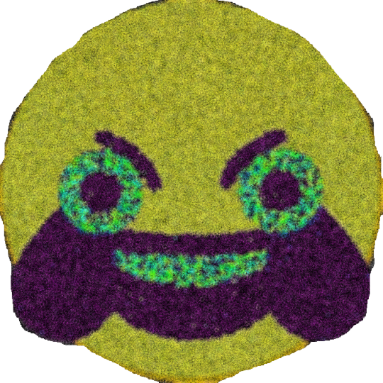
Cursed images aside, I think the best way to explain this is through some background, i.e. what my parents believe, because my beliefs were largely inherited.
This might be majorly over-simplified and based on what I remember of my own pre-deconstruction views and what I hear them say lately. I’m doing my best, but take it with a grain of salt. Basically, it seems like they walk this weird line between constitutionalist and very authoritarian that I see a hell of a lot of in rural America. Kinda like the Republic party used to before they yeeted into Trump’s mindfuck wholeheartedly. They’re homophobic to a rather alarming degree (more on that in another post soon) and not ...overtly Christian-supremacist but you can tell that their ethics are dripping with it and they’re terrified of Islam and they’d like to legislate some aspects of Christian morality. They also support the second amendment, which is the one thing I still agree with them on that I’m aware of, but they take it to more of an extreme than I’m willing to. For further ...flavor, they also reject the premise that parts of our society are systemically racist (and maybe also the idea that such a thing is even possible because of course), subscribe to the “bootstrap theory” for everything they can think to apply it to, reject climate science, and have been extremely conspiratorial about COVID-19. Also they like making it out like everything is a Democrat conspiracy theory, compare the Democrats to Hitler and Stalin to a weird degree, have on at least one occasion called Fox Motherfucking News left-leaning, and think Alex Jones is wacky but sometimes raises valid points.
So that’s, in a nutshell, a bit of a look at my past political views, except I think I was a bit more Christian-dominionist than them and I think I had moments of “...does this really make any sense?” for years before I crashed out of everything. The first domino was my Christianity, but once that fell, my entire approach to the world went some places.
So ...yeah. Oof. I was sketchy as shit. Glad that’s changed.
So uh... I’ve already mentioned a vague (read: as much detail as I feel confident providing) description of my political views now, but after all this bullshit let’s finally get to the other half of my titular current beliefs. This ...isn’t going to be easy to explain either, but I feel more confident going into more detail. Buckle up :^)
Alright. So except for a couple of months where I was like “there is no god reeee” half because I was sOmE hYpErInTeLlEcTuAl SkEpTiC and half because of trauma from the toxic flavor of Christianity I left and some shitty developments in both politics and my social circles (I’ll talk at some length about “Kelly” in a sec here I think), since leaving Christianity I’ve always been what I’ll call “hopeful agnostic” (I think I stole this term from Rhett and/or Link lol). In a nutshell, what that means to me is “there may or may not be a god, but I hope there is at least one and they’re nice, or like, at least some spiritual thing that has a good aspect that can help me”. I also dabble in shitty rituals where I burn dead plants and occasionally also hate literature like gospel tracts (and, that one time, a couple of bibles) and basically call on “anyone who is listening and gives a fuck, else the placebo effect” for whatever my goal is. Like... witchy-adjacent but I don’t think about it very much at this stage. I kind of enjoy it, and I think for one reason or another it can be good for my mental health, but I’m wary of any kind of commitment or even more serious experimentation, even as I hope to find something good, because ...trauma, and maybe even absent that a desire to not be wrong in a way that’s dangerous to anyone else again. So that’s fun :^)
So if you’ve made it this far through this weird bullshit, thanks, this story is kind of important to me xD and if you couldn’t, and you’re not reading this ending thingy because it got too dark or it pissed you off or something, that’s cool too and you’re beautiful and valid. Whoever you are, I hope you find whatever healing you need. :)
5 notes
·
View notes
Text
Episode 10x11 “Morningstar”: Sirius, the star that returns just before dawn...
SIRIUS AND MORNINGSTAR
A theme in all of my theories has been how TPTB like to utilize synonymous symbols, for example how the symbols «bear» and «beer» really means the same, and they are utilized in similar ways in TPTB’s use of symbolism. For example, both «beer» and «bear» ultimately points to the North Star, and it ultimately means «home». I’ve written about it elsewhere, so I won’t get into it here. The way it works is that one symbol alone does not tell the full story. It is the symbols together that act like a secret language, where words make up sentences, and several symbols together can tell complex stories. The Sirius symbolism tells one such complex story. It’s been a long story, it started in 4x12 «Still», but now were about to see that story come to its fulfillment, and I suspect these next few weeks will be glorious for TDers!
The Sirius symbolism is without a doubt what I’ve talked about the most in terms of TD symbolism. It took a couple of seasons for me to figure out which direction of TPTB wanted to take it, but I never doubted that I was on to something important, because TPTB consistently left enough breadcrumbs for me to follow, and there was no way they all could’ve been coincidences. I’ve written a master post on my interpretation of the Sirius symbolism here:
https://frangipanilove.tumblr.com/post/183736635005/sirius-and-the-north-star-or-pigs-feet-and-frosty
Since I’ve written so extensively on it earlier, I won’t go into detail, but the bullet points go something like this:
Sirius is the brightest star on the night sky
Sirius is affectionately called «the Dog Star» (hence all the dog symbolism around Beth)
Sirius means «scorching, glowing»
Sirius disappears from the night sky for a time, it’s «just gone»…
Sirius eventually returns to the nights sky, it re-appears «just before Dawn»
Sirius is therefore called «The Morningstar».
Try to put yourself in my shoes for one second. I’ve been tracking the Sirius symbolism for literal years, I’ve written tens of thousands of words on it, and even if I sometimes get super exited over «finds», or «evidence» I also spend a lot of time in self doubt, wondering where this symbolism is supposed to go. Because unless it actually goes somewhere, its useless. Sure, I believe in what I’ve found, and in recent years I’ve had the pleasure of sharing this theory with other brilliant theorists, and engaging in discussions with them, discussing it and enhancing the theories with the help of exeptionally creative people, and if they find it credible, then I shouldn't feel so much self doubt about it, right?
But I always feel that it needs to go somewhere. When will it culminate? When will it be fulfilled?
Well, I believe the time has come! I believe the Sirius symbolism will be fulfilled in a spectacular way real real soon. And this is why:
Episode 10x11 is called………»MORNINGSTAR»!!!
After all the Sirius symbolism we’ve had around Beth (and Rick) since s4, we will now, in just a few weeks, get an episode that will actually canonically be called «Morningstar». Remember, Sirius IS the Morningstar, it re-appears just before dawn after having been «just gone» for some time…
(originally it was Venus that was thought to be the Morningstar. However, Venus is a planet, not a star. It appears at dusk as well as at dawn, but mostly, its not the Morningstar because it’s a planet. Venus has a fascinating history in history, literature and mythology though, and I might do more on it at some point)
I became aware of the Sirius symbolism after 4x13, after watching the now legendary Sirius piggyback.
I observed the Frosty Cola on the kitchen table, serving as a massive hint towards the «Sirius» poems of Robert Frost, And interestingly, just before Siddiq was murdered in 10x7, TPTB gave us one of the most famous Robert Frost quotes in existence; «I’ve got miles to go before I sleep» It foreshadowed Siddiq’s death, but on a happier note, it also provided evidence that the Sirius symbolism was still at play, so many seasons later. Not that I ever doubted it, but its always nice to get confirmation.
THE 10X10 CLOCK FROM «SLABTOWN»
The 10x10 clock from «Slabtown» is probably the single most anticipated piece of symbolism in the TD fandom ever. But I want to officially throw out there that I believe the really groundbreaking symbolic gem will occur in 10x11 «Morningstar». And here’s why:
I’ve written thousands of words on the 10x10 clock over the years, and so has other brilliant theorists in the fandom such as @twdmusicboxmystery @angelthefirst1 @bethgreeneprevails and @wdway to name a few, as well as a large number of anonymous contributors. However, as much as I have been anticipating episode 10x10, I’m starting to believe that the correct way to interpret the «Slabtown» clock is to think of it as pointing towards episode 10x11 «Morningstar» rather that towards 10x10.

In other words, I believe the 10x10 clock from «Slabtown» points to episode 10x11, not 10x10.
Allow me to explain. In «Shane’s «22» necklace» theory, I talked a lot about different ways of interpreting the «Slabtown» clock. I discussed how it can be interpreted as pointing towards episode 2x2, 2x10, 10x2, 10x10.
Obviously these episode numbers consists of various combinations of the numbers on the 10x10 «Slabtown»clock. Read it here if you want:)
https://frangipanilove.tumblr.com/post/187351457970/blue-clues-shanes-22-necklace-truckers
In addition, the number «22» is interesting, as «22» is a different way of writing 10PM. Of course, I want to tie it to the theory I wrote on Shane’s «22» necklace.
But first and foremost, in my opinion it’s Noah's t-shirt that primarily foreshadows 10x11 as an important TD episode. Link to noah’s T-shirt theory here:
https://frangipanilove.tumblr.com/post/185522170650/noahs-t-shirt-theory
Remember Noah's t-shirt? A stylized version of the Blue Heron bird seen behind both Rick and Beth? The bird that I believe ultimately represents survival, rebirth, salvation-via-helicopter?

Noah's t-shirt also had the mysterious writing «One One Recording Studio» on it. And this is the important part; «One One» can be interpreted simply as «2»!
Or….»11»!
And if this is starting to seem a bit technical with a bunch of random numbers, please don’t give up on me just yet, there will be a point to all of this! The «one one» on Noahs t-shirt is not random, far from it! It’s super significant !
Remember the fire truck that Abe and friends found, and used to drive towards Washington DC back in 5x5 «Self Help»? They conveniently found it in a building that had a giant «102» written on it. The fire truck itself had «82» written on it. It foreshadowed the Blue Heron painting seen behind Rick in 8x2, and it was one of the first instances of foreshadowing fulfilled that I discovered myself. I wrote about it in «Noah's t-shirt theory».
But my point this time around, is that I suspected that there could be several ways of interpreting the «82» on the fire truck. It could clearly also point to 8x11, because obviously «11» consists of two «ones», or «one one» as Noah's t-shirt said.
And 8x11 actually turned out to be a treasure trove of this particular brand of Sirius symbolism that ’m looking for.
Remember in Robert Frost’s original poems about Sirius he describes Sirius as a «…heavenly overlord with a star in its eye». Sirius was referred to as a one-eyed dog because of the celestial maps used at the time, had the constellation “Canis Major” depicted with a star in one eye (Sirius), giving the impression of being a one-eyed dog.

TPTB played into this impression of Sirius as a one-eyed dog by having the scruffy one-eyed dog come visit Beth and Daryl in 4x13 «Alone». Sirius as a one-eyed dog is canon in TWD-verse.
So, back to 8x11. We watched Father Gabriel, almost blind due to an infection on the optical nerve, stumble his way across a virtual minefield of animal traps surrounding a dilapidated house that we later came to affectionately call the Radio Shack.
Radios are closely associated to Sirius symbolism due to the connotation to Sirius Satellite Radio, something which I explained in my Sirius masterpost that I linked to above.
So the fact that FG lost his eyesight on one eye in this episode (and became a Sirius figure «with a star in one eye» ) is super significant.
There were other significant moments as well, such as when FG and Dr. Carson found a piggy bank with the inscription «Ham Radio» in the radio shack. Ham radio is a term describing short band amateur radio.
But anyone remember the «Sirius Piggyback» from «Alone»? In order to tie these two episodes together, TPTB gave us a Sirius Piggyback in 4x13, and a Sirius Piggybank in 8x11.

Also, I believe there’s a connection between the «Ham Radio» Piggy bank, the Sirius piggyback and the Pig’s feet. More on that in a different post.
An even crazier callback to «Alone» was the animal traps outside the radio shack. Dr. Carson managed to step into one of them, much like Beth did in 4x13.

The Sirius callbacks in 8x11 makes me expect great things from 10x11 «Morningstar». And on the surface, it will probably be about the new cool medieval weapon we’ve seen Daryl sexily carrying around in various teasers. But come on! This episode is not about some weapon, unless you want to describe Beth as a weapon. And I’m sure you could!
I also at one point wrote a post about a sequence from 2x8 “Nebraska”. Rick, Glenn and Hershel encountered a couple of guys from Philadelphia. They weren’t the friendly kind, and ended up dead pretty soon, but the sequence was interesting for a few reasons. One, the Philly dude was wearing a sports team t-shirt with the number...yes...11 on the back. Also, much later it was indicated through a teaser that the Helicopter people had taken Rick to Philadelphia. Or at least that Philadelphia was involved in Rick’s new arc in some way.
Here’s my post on it:
https://frangipanilove.tumblr.com/post/187000918775/the-philadelphia-angle-or-noahs-t-shirt-theory
I’ve been tracking Sirius symbolism since s4. Its not a coincidence that we now get an episode called «Morningstar»! It’s fulfillment of symbolism from up to six seasons ago. And it’s certainly no coincidence that «Morningstar» will be the eleventh episode of the season. On the contrary, it’s a continuation of the Sirius thematics introduced in 8x11, with FG, the radio shack and the animal traps.
It will also be a fulfillment of the «One One Recording Studio» written on Noah's t-shirt.
And, if you need further evidence that 10x11 will be huge for TD, consider that Christ at one point in the Bible, namely in Revelation 22.16, described himself as «the Morningstar»:
«I Jesus have sent mine angel to testify unto you these things in the churches. I am the root and the offspring of David, and the bright and morning star.»
Every TDer will recognize Beth as a Christ figure, and reading about Christ describing himself as the «morning star» should make us all very exited about 10x11.
This is already long, so I’ll stop now. But know that there is plenty more to say about this. For instance, despite having written about Shane’s «22» necklace, I haven’t elaborated much on the Beth/Shane parallels/anti-parallels, which I absolutely could’ve. But did anyone notice exactly where in «Revelation» Christ referred to himself as the «Morning Star»?
Yup, it was Revelation 22.16.
We have a «22» reference and a «Morning Star» reference in the same spot in the Bible. Shane has a «22» necklace, and the «10x10» clock from «Slabtown» can be interpreted as pointing to various episodes containing the numbers «22» (2x2, 2x10, 10x2, 10x10), it could point to «22» as in 10PM, it could point to 10x11 «Morningstar», it could point to Revelation 22.16. It’s never-ending.
Not to mention, something that occurred to me the other day…At this point I’m not entirely sure how much emphasis I should put on it, but as far a coincidences go, this was an interesting one…

Daryls scar can easily be interpreted as pointing towards 10x11! The “x” obviously stands for “10″, and the parallel lines could easily be interpreted as “2″, or “11″...
Interestingly, it is also fairly common to utilize «Morningstar» as a name associated with the Devil, as in Lucifer Morningstar. And here’s where it gets messy, because «Lucifer» literally means «Light Bringer» and is meant to describe “Venus as the Morningstar” bringing the first light. To my knowledge, the use of «Morningstar» as a name for the Devil has its origin from art and literature rather than from the Bible. But I’m curious to see what TPTB does with this rich material. There are so many ways they could play it.
But bottom line is, Venus was a planet, while Sirius is the actual Morning Star. And the Morningstar will arrive in about three weeks....
Can this hiatus please be over already, it’s been 184 years…
#Team Delusional#team defiance#team beth lives#bethyl#Beth Greene#BETH LIVES#beth is alive#beth x daryl#beth and daryl#twd#10x11 morningstar
20 notes
·
View notes
Note
Three things: 1) The Kylo comic said ‘fuck anyone who thinks Kylo is weak’ 2) Hmmmm Kylo fought a big desert monster in this comic and Rey will be fighting a big water monster in the interim TLJ-TROS comic, it could be a totally random coincidence but I’ll enjoy the parallels nonetheless, 3) Please hire someone who can accurately capture Kylo’s live-action likeness, Marvel, I am begging you to pick artists who don’t just draw Sharp Jaw Manly Men all the time and are stumped with different faces
God I’m so IN LOVE with Kylo slaying a monster/dragon from the inside of its belly and carving his way out of it, the sacrifice/rebirth imagery was so STRONG, and YES to the parallels with Rey (and to everything you said, including Likeness Fail, jfc... I know from experience that it’s hard to consistently get an actor’s likeness in every drawing or comic panel, but if there are reylo artists who are able to churn out piece after piece of Adam Driver looking like Adam Driver even at different stages of stylization---@kasiopea-star-wars , @lilithsaur, @clara-gemm just from the top of my head, but there are many others---whoever Lucasfilm is hiring can certainly try, or better yet: just hire reylo artists in the first place, lmao)
Okay so the Kylo comic is exactly like one of the edgy Vader comics where he does a bunch of evil badass shit fighting some one-off monsters or mooks, which to me is a sign they’re separating the Kylo persona from the Ben Solo persona and presenting material the way they do for Anakin and Vader. I’m pretty sure they’re going to give it the full-on Vader treatment after TROS where the Kylo comics are DFP with hints of pathos and then Ben Solo is this whole other wobbly-lip sympathetic figure 😉
I can’t help but side eye this two personas-split a bit---tho I recognize it’s an effective narrative shortcut to convey Ben’s disassociation and negation of his core identity and the resorting to an artificial persona to steel himself up when he has to do something unpleasant that would *split his spirit to the bone*---but yes that’s likely what’s going on here (mostly, I hate how convenient it is from a storytelling perspective, in that it superficially gives the fanbros what they think they want this character to be as a villain, while pursuing the *ben solo is baby* narrative in every aspect that really matters---it allows them to play both angles, and regress to cardboard-cut villain!Kylo at convenience if the tone and target of the story requires it).
8 notes
·
View notes
Last Seen Blogs