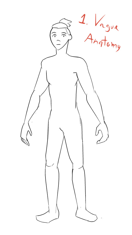
#this is the most detailed lineart i’ve ever done
Text
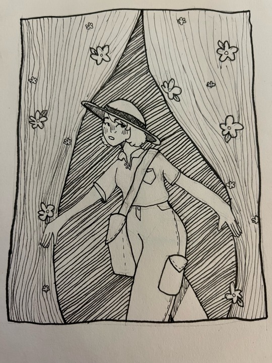
wow lineart
#this is the most detailed lineart i’ve ever done#it took forever lol#i might color this later#but yeah sketchbook#illustration#artists on tumblr#sketchbook art#sketchbook dump
3 notes
·
View notes
Note
hi Habs! :D i love your art and have seen ppl say they want to eat it and i would also like to partake lol. have you ever explained your methods of doing digital art? i love traditional but i would like to branch out into digital. i've tried different applications like krita, sketchbook, and sketch.io but i don't really vibe with them (if that makes sense). any tips?
Hello ! Haha thank you ! Totally get what you mean about vibes, I’ve used a few different programs, and I like paint tool sai and clip studio paint the most, and mostly use csp now !
Took me a long time to get into digital art, and the biggest breakthrough I had was that I didn’t have to do line art lol, now I only do it when necessary and 99% of my stuff is cleaned up sketches. Changing my process completely changed how I felt about my art for the better. It keeps my work dynamic, and also lessens feeling of the sketch looking better than the linework!
Generally my process is sketch, duplicate the layer and clean it (sometimes put the old layer on a low opacity so I can make sure I’m staying true to the sketch, so it’s like lineart with extra steps lol) then I block in one colour under the lines, either make a new layer with a clipping mask, or lock the opacity and colour on that layer.
For colouring, I usually use a single layer, I put down messy flats and shadows then clean it up and render it, add highlights and funky details and then I’m done. I’ve explained my colouring process here before, and I have a time lapse that shows my sketching/colouring process here.
I have shaky hands, so a lot of my brushes have stabilization turned up, usually I set it at 15 on csp brushes idk how that translates to other programs though.
For my sketches/clean up, I like using brushes that have little to no variation in brush size, and have varying density or opacity. Not for everyone but I like how it makes my work look and I end up liking my stuff a lot more like that. Usually I keep my sketches at the start really light and build up pressure as I clean
In general, I think the best thing to do is try a whole bunch of methods and figure out what works and what doesn’t! Lots of people have very different processes, so looking at how other artists work and trying out how they do stuff for yourself can be great for learning! Good luck with digital art!
95 notes
·
View notes
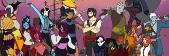
Photo


Secret Santa for @kourumi of Bloody Finger Hunter Yura in the style of his concept art, or as I, a non-Elden Ring player like to call him, Funny Hat Man. Quite possibly the most intricately detailed combination lineart and color job I’ve ever done, but I thought it turned out quite nice! Merry [late] Christmas and Happy New Year! <3
#my art#bloody finger hunter yura#shabriri#elden ring#frenzied flame#fun fact the weapon strapped to his thigh is called a tantō#secret santa
189 notes
·
View notes
Text
Ya know what?
You
fuckin
Know
wat?
I’m sleep deprived, I suck at colouring and I don’t think I even have the energy or motivation left to finish this because I have already drove myself nuts on getting every lil thing right and fixing and tweaking SO.MANY.THINGS with it that if I try and colour I will just get angry and hate the art piece and think I’ve ruined it. Its a common occurrence sadly

Cute shit. We love to see it.
I FINALLY kicked my art block after like 2 years after playing a game with a buncha people and doing a bunch of stuff for that. Apparently now i can draw again. And apparently everything I have been drawing involves a lot of feathers I swear to FUCK I HATE FEATHER-
ahem
Julian is my favourite boi ever and every time I read his reversed ending I sob like a fucking baby so I wanted to draw cute shit of him and my MC. I have yet to draw him in just his human form because I still struggle drawing humans. ESPECIALLY if its like a character from smth and I go insane trying to make sure it definitely looks like the character. Think I got this pretty spot on tho ngl, and its one of the most detailed linearts I have EVER done. f e a t h e r s s s s s
Anyways, enjoy, and don’t art steal or I will bite your face off. Respectfully.
Or not so respectfully
PS: More sprite edits soon I’m just a lazy bitch rn
#The Arcana Game#the arcana#julian devorak#arcana julian#Reversed ending Julian#birblian#My fuckin bird husband#i love him#my art#my mc#arcana mc#quack <3
63 notes
·
View notes
Text

art by em year in review 2023!
for the fourth time, i present to you a selection of the art i did this year! this definitely was the Year of Understanding Procreate, and i think it paid off. as usual, reflections under the cut.
january: i saw @malcolm-f-tucker tag a picture of abigail thaw with a comment about a theresa faceclaim and it left no survivors, i.e. i decided that theresa should have greying hair and did not look back. this was from when i was still trying to figure out what brush to use for lineart in procreate. luckily i had learned my lesson from the sketchbook learning curve and realized that what i liked for lineart would most likely be in the pencil section. however i wasn’t a huge fan of the brush i used in this one, so i didn’t use it again. instead, for later pieces, i decided to customize the 6b pencil brush to my liking, and…
february: …this came out of it! this is still one of my favorite things i have ever drawn, and it’s my favorite thing i’ve drawn yet for herc and linda. this piece really convinced me to use overlay layers more in my art, and the amount of detail i managed to capture in this one still amazes me now. and before anyone asks, yes, they are doing specific things in the startup procedure for an airbus a320-family aircraft, except linda is doing things off the CM1 checklist and herc is doing something off the CM2 checklist, which i learned later is not really something that is done. let’s just say herc is not the tightest stickler to convention.
march: one half of an intended two pieces centered around the f1 au (which, regrettably, i have yet to continue… i just reread what little of the second part is on ao3 and god, it slaps actually, i really need to continue it so bad) depicting a pivotal scene from around the outside, where theresa and linda decide to put aside a childhood feud at the top of the banked curve at monza. at sunset. on theresa’s birthday. i know, very meaningful, incredibly homoerotic. read the fic to see how well that turns out!
april: i always knew i wanted to redraw the first filipino!hercolyn thing i did back in 2020, the one that completely solidified in my mind the notion that These Characters Are Filipino, Actually, and when i got comfortable in procreate i quickly jumped on that. (if you notice, a lot of the stuff i did this year were redraws of old pieces i really liked but wasn’t fully satisfied with.) of course i wanted to draw them in the traditional clothes in my parents’ and grandparents’ wedding pictures. the implication of this being, of course, that this is the soft shoe shuffle wedding. i have a fic planned centered around that, from douglas’ perspective. now that grad school apps are basically done, if my honors thesis doesn’t kick me too hard, i’d love to get on that as soon as i can.
may: YOU JUST GOT COLINED! SEND THIS TO A FRIEND TO TOTALLY COLIN THEM! ah, colin fairbairn: the figure whose presence haunts all of newcastle but is never actually. named. (much to the chagrin of a lot of people who genuinely thought linda’s dad was named colin bc i Wouldn’t Shut Up About It) i just love him so much and i love this piece, i wanted to depict the wistfulness of an older colin whose airline is on the verge of collapse, who has been secure in his job as chief pilot of air cal, who looks out over glasgow airport (that’s glasgow’s runway in the background) and wonders if it’s time to put himself out to pasture. wondering what he could have done differently. it’s okay bby. there’s no way that you could have prevented this. but he’d never believe it. he’s too duty bound. he lives in my head rent free.
june: another redraw, this time of a piece from 2021. i was so happy with this one, and i am very happy with it still! everything about the older piece i loved was improved massively by this redraw: the poses, the proportions, the line work, the coloring. honestly, just thinking about the two of them just existing in the airport, overlooked by bustling passengers, just part of the landscape, but having such a rich history and relationship between them… it’s something i think about a lot and i love it.
july: this comprises the third part of an unofficial trilogy of drawings i did centered around douglas/martin/theresa. in each one, i centered a different member of the ot3: i did one centering martin last year, one centering douglas in the spring, and this one centers theresa between douglas and martin. i really enjoy how i did the expressions in this one: martin, looking out toward the planes; theresa, following his gaze, eager to share in the passion they both have; and douglas, looking down at both of them (yeah i think they’re both shorter than him. i think it’s cute). i feel like when i draw these three, where they look and how they look is very important to me.
august: can you believe before this point i had never drawn herc and douglas together? yeah, me too. anyway, them 🤍 i’ve literally only ever drawn them as older men so trying to draw them younger was. lowkey kind of hard. i’m hoping to revisit air england herc and douglas in the future, especially since i didn’t intend for this to be anything more than a quick bit due to those bisexual divorcee brackets (which i don’t know what became of them in the end except that douglas got through and herc didn’t, lmao)
september: unposted self-portrait done as a part of my aerospace fellowship application i wound up getting rejected from because they required me to do a creative component. not much to say here. anyways.
october: yet another redraw, this time of a portrait of herc, carolyn, linda, and arthur i did a year prior, in october of 2022. i like to think that lfeu!herc carries pictures of linda, arthur, and carolyn in his wallet: he had never wanted to be the family man for most of his life, but in his new life, this new form, he can play it well. something about the coloring seems a little off to me: i think i may have to go in and adjust arthur’s skin tone because i think it doesn’t look 100% right. but i love this one too. i hemmed and hawed for ages over what they should be wearing but in the end i put them in what they’d wear for work bc i couldn’t think anymore. but it turned out super cute and i think it emphasizes what brought the four of them together in the first place: aviation.
november: a cute little doodle of young!colin with baby linda, from a bigger piece. something i generally feel like i’ve gotten stronger with this year has been drawing a larger variety of poses. i discovered that procreate allows you to import reference images in a smaller window that can be very easily dragged around and resized, which was a massive improvement over my previous strategy with sketchbook, which had been to import reference images as their own layers. often, moving it around or resizing reference images resulted in some loss of quality. anyways there’s something just so tender about colin and linda and i love to revisit them.
december: last but not least, we finish off the way we started, with theresa (and an added douglas lol). and boy, how different does december look from january? granted, it’s a different angle, but i personally think there is so much more dimension at the end of the year compared to the beginning. i was less afraid of using overlays to enhance the coloring. and the brush i wound up settling on for lineart really ended up serving me well this whole year, culminating in this piece. not much to say on this one, i like it a lot :)
overall thoughts: i didn’t think i drew as much as i wanted to this year, but looking back i still think i made really good progress and improved a lot from last year, so i’m still happy. definitely want to draw more next year, explore new subjects, and maybe work on redrawing more pieces from previous years because those projects have been very fun to undertake.
once again i want to say a big thank you to everyone who’s ever shared or commented or left a like on anything i’ve drawn: it will have been 10 years next year since the end of the show i primarily create fanwork for, and to still have people out there who like what i do is such a gift. yes i create for myself, but i do also like receiving feedback from others and sharing it with others, so thank you thank you thank you. and happiest of new years to all :)
13 notes
·
View notes
Photo

It’s finally done. I’m... feeling a little emotional, honestly. All my D&D character references are now “recovered”, as in redrawn completely, from my broken SSD whose files were all lost.
I... I just want to sit back and put my head in my hands. [Cont’d]
This... It’s every character I have made for D&D since I started playing. The first two I designed - Miri Evenwood and Cecillia - down to the most recent two - Zarris and Joy - all together, all forms, all types, all everything, all at once. I’m just... This was so much work and effort.
When I lost the original file with all these guys in it, I thought that was it. Nothing. But I do post my art here and on Twitter, no? I saved what I could off here and there, and the quality of these guys was... bad. Like, really bad. Most of the pictures I downloaded looked like this:
Fuzzy, illegible, and most details lost. Some were better quality, but...
...the image compression of being uploaded to Tumblr or Twitter was... difficult to contend with. I did have some I shared on Discord, however, those were a little more to work from.
I had some sketches, linearts, in-progress images, and some poor-quality finished works. All out of order, all wildly differing in quality. I sat back and had to think, what could I even do here? My character references, all lost to an SSD that Windows Recovery corrupted the data off of. That was probably the end of the story.
But I am stubborn.

I started to redraw them. Why did I start with Ezra, Axel, and Blaze? I don’t know why, but I’ve held these three close to me. And then I started making the basic line art for each other character, either completely by scratch (see Verda here) or with a crunchy, fuzzy, off-my-twitter-or-tumblr reference to work from.

With each new character I drew the lines for, with each finished reference, I felt like the task ahead of me was monumental - impossible at times. Work got stressful, life got in the way, and whenever I had a few minutes to myself, I was putting character after character through the redux machine and redrawing them by hand.

Some stayed incomplete for a while. Some were started and finished within a... week, reluctantly. I spent a lot of time looking at what I’d done so far, and then back at the ones I had yet to finish or start. At a certain point, I felt like I had given myself a task that I would never complete - a problem I could never solve. Maybe I would’ve given up after a certain point.

But then I didn’t. I refused to give up. I made notes for myself, I reviewed old notes saved to my old phone that barely worked that told me which of my unsaved list I had later dropped or redone. I kept drawing these characters, and about at this time I realized something.

I had been making D&D characters for almost a decade. Some of these guys are from that time - Miri and Cecillia, namely - and some had been in-progress for years before I actually ended up using them - Blaze and Axel came to mind - and here they were. Again. After I had initially lost them.

This was something that gradually made me better at drawing. This was history - my own personal brain’s history, at least - and I was doing everything I could to ensure I kept it. Not only was I determined to have at least one single full-body reference of each character I could ever use in D&D, I remembered my original goal when I was drawing these guys.
One of each race and class combination. Of course, a silly goal, but it allowed my creativity to flow and make some genuinely cool characters. I would always look back on these guys and smile, and now I can do that again - and add more.
And the satisfaction of lining them all up in a colour order was so good.
--
So yeah, from October to December. So much work, and the payoff was absolutely worth the effort and time that went into it. Through every burnt-out evening, from days I spent stuck on the couch unable to move through the pain to days I spent here and there and back again. Through each hour worked at my job, to each our I worked at home and doodled these guys. They’re here again, and they’ll see me through.
And I encourage you to design your own characters. I use D&D as inspiration for these, but I have others, after all...
But at least these references are more stuck towards their names than their full outfits, fuck’s sake. These were my May-August project of recovering files so... This year’s been certainly interesting.
#the disappointment speaks#drawings by me#OCs#D&D#the powerful stance I have rn is off the charts. look at these fuckin guys. so many of them#I challenge any AI artist to capture this feeling. spoiler: they cant! art is the combination of imagination and skill#and god. my skill is nothing in comparison to every other artist out there.#challenge yourself in the new year: become an artist. I don't mean like picasso or the group of seven artist. I mean draw something.#doodle a guy now and again. make some stick figures. have fun. get some cheap paints and printer painter and go ham. *make something*#one of these days you'll look back on those first drawings and smile. oh how far you've come.#that is the feeling I have.#the feeling of ''look at me now. look at my road and how far I've come. I could cry.''#and to be honest...?#I might. who knows.#<3 anyhow love everyone and be kind. peace out and catch you all later
3 notes
·
View notes
Text

So, this post is gonna be a bit long, so I’ll drop it under the cut. This is my general process when it comes to painting. “Tutorial” might be a bit of a stretch, but I’ll try and explain some of the things I do!
This is all done in procreate, but it doesn’t really matter as long as you know more or less how to use your tools!
Step one: rough sketch
Usually when I know I’m aiming for painting, I try to keep my sketch a little simpler. I don’t like spending too long on one piece, and I don’t really have the skills for complicated painting. I try to get most of the outlines where I want them, and a few more details than usual. Since I won’t be doing lineart, It’s a bit harder to fix things I don’t like once I start.
Painting for me is very focused on shapes, so that’s what I try to think about from the beginning. Neatly defined faces, outline that shoulder, are there gonna be specific blocks of color?
Note; sometimes I do actually do full lineart, but I don’t really see the point if it’s going to be covered up
Step two: figuring out composition and colors
Let’s just say that I go through… quite a few ideas. I knew more or less what I wanted from the beginning, but I didn’t have the exact image. I’m using a couple pieces of inspiration for this:

You can see that I had a bit of a theme going on here. I had this image in my head of Jim and Bones holding one another on a cliff looking out over the ocean. It changed a bit later, but that’s why I chose what I did here!
So I start blocking out colors and background, but I realized it wasn’t what I wanted so I changed it a bit. This is where I decided to make it a second part to my corn Illustration! That also helped, since it meant I could use the same color palette (shhh, don’t tell)
I’ve saved the original colors, though. I really did like it, but I thought the energy wasn’t quite right for what I was going for. I might use it another time, when I next feel like painting lol
This entire step is just trying to figure out wth is going on, so it’s all quite rough. None of the layers here will actually be visible in the final piece! I color picked from the different pictures above and blocked in the characters and background so I knew how it worked together before I actually started. Using color balance and adjustments at this stage is a lifesaver!

Step three: start painting
I’ve turned off the background sketch at this point so that I can focus on the characters. I’ll make a clean version later.
First, I set my sketch to multiply over the rough colors and merge it. Then I make a new layer to start painting over. I try to block out shapes a bit more cleanly, get a couple transition colors in there too (sadly, when I saved this picture I had my extra sketch layer on top so you… can’t really see. But believe that it’s cleaner!)

During this step, I start choosing my final colors. My rough colors were made with one flat layer and a simple multiply layer. This means that I’ve got light and dark, but some of the shades aren’t great. In my first bit of painting I got rid of some of the dull purple in Bones’ uniform and replaced it with th green. I kept a bit of the pink for the lighting though.
When thinking about colors for painting, I try to have a base color, but then slightly different colors for light and shadow. Here you can see that Bones’ blue gets purple shadows and pink lighting! Jim’s got a kind of… maroon? Anyway. This helps keep it interesting. You can find a lot of posts about color theory saying to move around the wheel for shading. That’s what I’m doing, but sorry I can’t explain it well!
Step four: rendering
Ok, rendering… is hard. I gave up on realism in my personal art a long time ago, and my version of rendering is hard block colors. I barely ever blend, and when I do I try to keep it subtle. I try to keep my shapes pretty clean to make up for this!
I’m not gonna pretend to be able to tell you how to do this (I have no idea!) but here’s some of my things
So, in my base colors, I had a multiply layer. This means that I have light colors, and dark. Then, I use some of the sketch (which is purple) set to multiply to choose darker shadows. You can see this in the underside of Bones’ jaw! That isn’t actually my sketch, but it WAS colorpicked form it.
For lighting, I’m using a very light desaturated yellow, which means that between the harsh lighting and the main colors we use a saturated yellow. You know when light falls across your hand and you can see the saturated red at the edge? Yeah we’re doing that.
You can still see little bits of my sketch, but by this point it’s mostly covered up. This means that all of the clarity falls to the colors. I added some darker shades around joints and intersections of similar colors to make everything more visible. These are once again color picked from the remnants of the sketch!
I’ve also chosen more transition colors. Usually what I do is zoom in and select one of the pixels between the two colors, then saturate that color and shift further to green or red depending on how you feel. This helps keep it interesting when I paint!
Step five: final background
Here we are, home stretch. Now all we’ve got is a whole bunch of clouds.
And, you know, blue?

I started by painting in my gradient. I blocked three shades of blue then Gaussian blurred it all. Then, to get the kind of paint-ey effect I used a flat chalk brush to blend—this is my go-to blend tool! It doesn’t make it too blurry and keeps some texture as long as it’s big enough, so I like it.
Next, I blocked in the clouds and alpha locked them. From there it was just crying as I tried to figure out the colors. Here’s what I can say about that:
Find. References. It will save you my pain. Clouds reflect the sky weirdly, and if you want to capture it you really need to actually see it. I was a fool. Don’t be like me.
From there, it’s just adjustments (adding a noise layer, changing color balance a little, and chromatic aberration) and then I’m done!
Thank for reading, and I hope it might have helped a little!
-lizard
#mckirk fanart#art tutorial#digital painting tutorial#excavatinglizardsart#fanart#art#how to#lizard makes a queue
59 notes
·
View notes
Text
Running An Art Shop With Minimal Crying 101
Hey y’all, not sure what compelled me to write this Now but I wanted to put together a list of helpful ‘good business practice’ tips for artists who want to start selling commissions on FR and want to build up a good reputation and make bank. I’m not sure if I’d feel comfortable throwing this on the forums personally so here you go, y’all have to look at my stupidly long possibly helpful brutally honest post cuz I don’t know where else to put this.
I’ve been doing art on FR since I was a young teenager in 2015 and through that time I’ve definitely learned some lessons the hard way. I’ve taken on more than I could handle, I’ve let commissions rot for months because I got overwhelmed… you know what I mean. Here’s some of what I’ve learned over the years that’s helped me run a consistently successful art shop for well over a year now.
I don’t have a tumblr and I don’t know how to add a ‘read more’ to a submission, so happy scrolling <3 I apologize for causing some people a very minor inconvenience
-Do not take prepayment for either more than three commissions at a time, or more than the number of commissions you think you can finish within a month or two, whichever is smaller. This is especially true if you’re like me and you have ADHD. Trust me, the more commissions people have already paid for you have piled up in your to-do list, even if they’d only take you 20 minutes each, you will get more overwhelmed and discouraged and people will wonder why it’s taking you so long. Even if you aren’t getting concerned PMs, a lot of people are just too anxious or polite to ask for updates. (On the flipside, if you commissioned someone and haven’t gotten any word/updates in a while, you’re not in the wrong to ask how things are going and when you can expect an update.)
-Full payment upfront is something I definitely recommend for smaller pieces (headshots, sketches, etc) you can finish in one sitting. However- if you’re doing a ref sheet, a rendered fullbody, etc, and you’ll be spending multiple sessions on the piece and getting feedback for it multiple times- split it up, take half upfront and half either after the sketch is approved, or before you send them the final unwatermarked version. I’ve done dozens of commissions like this and never had a problem, personally. There’s a low chance of a customer backing out on you if you’ve already started and sent WIPs because, y’know, sunk cost, and on the other hand it is reassuring to customers (especially if your shop is new) that if you drop off the map, they paid $20 upfront and got at least a sketch, instead of paying $40 upfront for an unfinished piece.
-In the same vein: if you’re doing a large piece like a rendered fullbody, ref sheet, etc, more communication is always better than less! I always stay on the safe side here. Some people will tell you they just want you to go apeshit and do whatever you think will look cool, other people might have much more specific ideas of what they want and how closely your artwork needs to match the image of their character in their head. Send them the sketch and ask them if they want any changes. Send them the lineart and ask if it looks good. If you’re working on a time-consuming painting that will take you weeks to finish, please please please, communicate! Send updates! Your customers will feel a lot less anxious about how long you’re taking if you keep them posted (plus this is just a personal thing but I love seeing peoples’ artistic process, it sparks joy!!)
-If, once again, you’re like me and stuff like painted fullbodies take you so much longer than other commission types- the worst thing you can do is underprice. Let’s say a detailed, shaded dragon fullbody takes you, for instance, 8 hours, maybe longer because you get burned out and can’t finish it in just one sitting, but you don’t think people will buy an $80/8kg fullbody. Do not lower the price you think your art is worth. If fullbodies take you really long compared to other art, or you get unmotivated, just… don’t offer painted fullbodies, or scenes with multiple characters, or whatever. If there’s a form of art you’re capable of creating but it’s faster, more fun, and gets you more money to do smaller things, just do more smaller commissions instead of taking the big ones. This one was a lifesaver for me.
-Once again in the same vein: It is okay to say no. Just because you are physically/artistically capable of drawing a detailed scene of multiple dragons with complex apparel, doesn’t mean you won’t get burnt out or bored. For me, larger pieces take exponentially longer because I just get bored and don’t want to work on them anymore. If someone asks if you can draw something that will require so much of your personal time and effort to go into a single piece, just say no. Sometimes I’ll say yes to some big commissions because I think the character is cool and inspiring and I want to draw them; otherwise, I will admit, I’ve said no to big commissions because I personally found the character boring as hell (though I wouldn’t phrase it that way). And that’s ok!
-If you are going to be really busy in the near future, stop taking commissions. You have finals? Don’t say “sorry if things take forever, I have finals”… just don’t take the commissions while you’re busy. If you have too much on your plate, commissions will just stress you out more, and nobody likes to draw motivated by stress. There’s nothing wrong with temporarily pausing your art shop. Put your mental health first. And if you aren’t able to get commissions done on a regular basis because of mental health, or because you don’t give enough of a shit about other peoples’ characters: don’t do commissions. I don’t mean this in a bad way; I’ve been in that spot before and it’ll just cause more stress and guilt than it’s worth.
-NO PARAGRAPHS. That sounds hypocritical of me writing this lol but do not put long paragraphs in your art shop, ever. I promise nobody will read it. Put your rules, and any other information, in bullet points that are one or two lines. Keep your rules clear, simple, unambiguous and short, or everyone will ignore it and I won’t blame them. Put titles and subtitles wherever you can. If you have a block of text longer than probably five lines, it will be ignored by most people. I have decided not to buy art from people because I didn’t want to have to dig through blocks of text for information.
….so yeah I think that’s about all I can think of at the moment. time to sit back and get yelled at for not being able to shut the fuck up and get to the point lol, hope you (yes you) have a great day c:
44 notes
·
View notes
Text
A totally self indulgent compilation of my favorite works on this blog of the year June 13, 2020 - June 13, 2021
2019-2020
The following lists are all in chronological order according to the date each post was first published.
Top 10 panel edits:
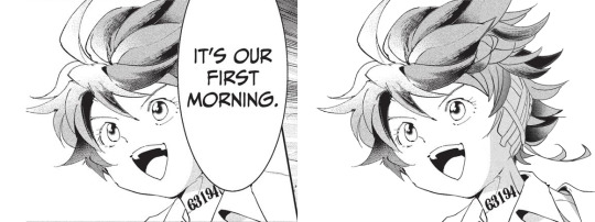
#1: It's our first morning
Date: Aug 20th, 2020
Time: ~ 2:18 h
I really like how this one turned out!!! The 2020 Emma b-day edit has a lot of major panel redraws, but this is probably my favorite. I I really enjoy how I made the shadows work!! And the ear banfage looks pretty neat. Nice!!!
Immagine
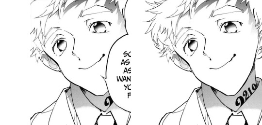
#2: Norman birthday edit 2021
Date: Mar 20th, 2021
Time: ~ 2:21 h
Awww, soft Norman :')
There was a bit to redraw, but I think everything turned out pretty neat!!! I believe everything works out fine. Though looking back at it, the part of the ID I added is definitely top small :')
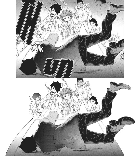
#3: Manga dub: Yuugo gets knocked out
Date: Mar 27th, 2021
Time: ~ 5:05 h
Here start the Manga Dub redraws to which I gave my everything ahah. This one turned out nice! I think the shoes turned out particularly good eheh. I like how Yuugo's clothing lineart- for the texture, I wanted to go for something heterogeneous, but I'm not fully confident in the final result. Gilda looks very rushed but ¯\_(ツ)_/¯
#4: Manga dub: Yuugo makes his dramatic entrance
Date: Apr 5th, 2021
Time: ~ 4:02 h
This is pretty cool!!!! The coat took ages to redraw, but sis it turned out perfect!!! I'm very proud of this.
#5: Manga dub: RayGildEmma hug!!!
Date: Apr 9th, 2021
Time: ~ 1:31 h
Awww, a beautiful panel I was really happy to have the chance to redraw. Taking into account what there was to redraw, I'm actually surprised with how little this took! Ray's backpack was a pain to make, but I think it turned out fine. I'm very happy with Emma and Ray's heads!!
#6: Manga dub: Formalities
Date: Apr 12th, 2021
Time: ~ 5:31 h
It is not always easy to give sense to Demizu's perspective, but I do my best!!! In this I am *so* happy with how Don and Ray turned out, they look neat! The background on the other hand... It took hours to make ahah. I'm not fully confident in the perspective, but I'm happy with the details I've added- I really did my best to make it look like athe other manga panels and I think it paid off!!!
#7: Manga dub: We may be weaklings, but we're still alive
Date: Apr 30th, 2021
Time: ~ 1:37 h
This little Emma is so cute!!!!!! I think the redraw turned out pretty perfect. I'm really satisfied with how this one turned out, and it's such a cute little Emma!!!! She's so brave and optimistic, I love her. It's a shame this panel didn't make it to the episode :')
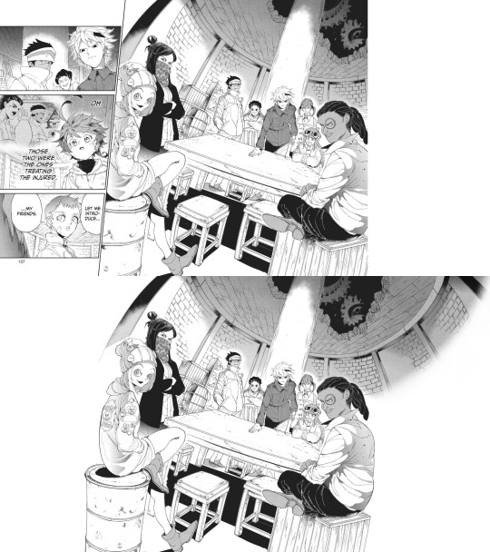
#8: Manga dub: Goldy Pond Gang
Date: May 7th, 2021
Time: ~ 8:44 h lmao
This is probably the panel redraw I'm the most proud of ever :')
Just think everyone turned out very nice!! The ceiling is not exactly perfect, but it still works somehow. I'm very happy with how Gillian's back turned out!! I don't really like the fading effect on the right, but 8h in I got pretty tired of working on this ahah
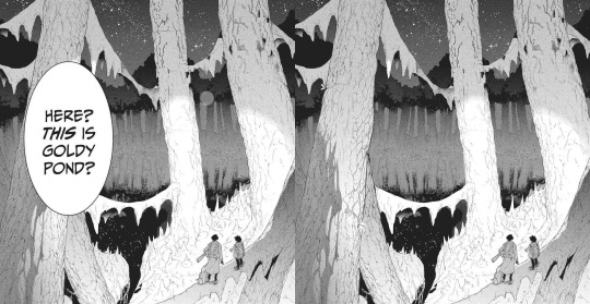
#9: Manga dub: This is Goldy Pond
Date: May 21st, 2021
Time: ~ 1:29 h
I'm very glad for how the Manga dub has been challenging me to learn to redraw backgrounds, something I had quite literally never tried before. It can be a little frustrating, but it's so satisfying to see the final cleaned piece!! With this panel, I also learnt to use copy and paste, which is something I had never done before beyond texture
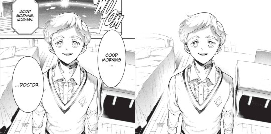
#10: Manga dub: Good morning doctor
Date: May 21st, 2021
Time: ~ 3:42 h
This is another background that turned out pretty good!! That one Norman is one I knew I would have had to fully redraw sooner or lager- the background was a bonus ahah. I'm very happy with the final result!!
Top 5 edits as whole:
#1: The Promised Neverland manga ending edit
Date: Jun 14th 2020
Time: ~ 12h 41min (5h 45min of cleaning panels in the edit + 5h 37min of cleaning panels that didn't make it to the edit + 1h 19min of resizing) + time spent cleaning panels I've deleted the file of so I can't see lmao
This is overall very nice!!! The concept of an Emma evolution through her back is cool, and I think overall the edit turned out very aesthetically pleasing. The concept idea came to me while I was working on the 2019 Emma's birthday edit, a long time before the manga ending announcement- back then I wouldn't have imagined using it in occasion of the manga ending, but I think it ended up making a nice tribute. The colors add a nice touch, since so far my edits had always been black and white- it makes a sweet closure. To make that edit I selected 76 panels of Emma framed from her back; I plan to make other versions of that edit using the discarded panels eventually!
#2: Emma - Chapter 181: Beyond Destiny
Date: Jul 12th 2020
Time: 2h 57min
My last edit for the manga 🥺🥺
I think this one is my very "manga ending edit" because to me it really signed the ending of weekly chapters and their weekly chapter edits. It makes me a little sad to look at it, but it's also, I don't know, kinda sweet to see how I grew both in my panel cleaning and as a person since I first started my blog. I'm glad I got into TPN!
#3: Emma birthday edit 2020
Date: Aug 22nd 2020
Time: 8h 54min
This one turned out so well!!! Though I used the same concept for all the trio edits, I think this one is the best one. The two panels on the left / two panels on the right alternation combo never fails ahah. The colors are nice (shout-out to my sister for making me a palette), despite the fact that it was hard for the lighter ones to make them work with the images without having those disappear. I'm very satisfied with the panels I chose for this, I think they work really good together! Also, it got me very happy to read everyone's comments saying they liked the fading effect in the last panel :)
#4: Emma + Eyes Close Ups [1/?]
Date: Jan 24th 2021
Time: 5h 55min
This one was really nice!! Another idea I got when working on the 2019 Emma birthday edit I was glad to finally execute. Started the edit in September, finished it in December. I'm overall very happy with how it turned out... I hope I will be able to make more in the future!
#5: The Promised Neverland Parallels → (9/?) » 114 // 122
Date: Feb 23th 2021
Time: 5h 7min (panel cleaning only)
Aaaaahh I really like this one!!!! A parallel I love very much, and I'm really happy with how the edit turned out. All the hair redrawing looks neat!!!! The gif is maybe a little excessive, but I think overall it's a nice edit. I like it!!! Fun fact, I completed it on August 26th 2020, but I couldn't find the right moment to post it ahah.
Honorable mention: The Promised Neverland Parallels → (5/?) » 08 // 16
Date: Aug 30th 2020
Time: 2h 52min (Second picture cleaning only; I deleted the first picture art file so ¯\_(ツ)_/¯ )
I don't have much to say about this one except!! It turned out very nice!!!!! Love the pen lmao.
Top 10 analysis:
Too many analysis,,
#1: Post chapter 181 Emma analysis
Date: Jul 9th 2020
Mmmh a nice analysis. I think it was important for me to put down in words what I think of Emma's characterization and the manga ending, so I'm happy I did it!
#2: A long Oliver analysis because I love him very much
Date: Dec 6th 2020
What can I say I just love Oliver tons 😔😔💕💕
This was very fun to make!!!
#3: TPN s2 previsions
Date: Jan 14th 2021
Really love the effort that went into this + me proving that 11 episodes GP could have possibly worked + it's just a lot of fun to read again after s2 ended pffft
#4: More s2 delusional previsions lmao
Date: Jan 27th 2021
I think the points and previsions I made where pretty neat!! In my defense, it was pretty impossible to predict the anime would have ended with this season. I always feel honoured when friends and Anon ask for my opinion, I'm like "you wanna know what I think? Wow. I'm flattered (◍•ᴗ•◍) "
Thank you to anyone who ever sent me an ask!!
#5: Why Emma not wearing pants is 𝕨𝕣𝕠𝕟𝕘
Date: Jan 29th 2021
Really proud of this!!! Pants Emma is important!!!!!
#6: Post episode 5 manga Emma analysis
Date: Feb 4th 2021
A depressed analysis, but a necessary one 😔
#7: Norman analysis
Date: Feb 12th 2021
I love him!!!! And I'm happy I eventually got to put down in words what I love about his character. The day I posted this ww3.readneverland was in maintenance so I couldn't use the volume scans for it- the thought of that post having fan edited and fan translated scans still haunts me
#8: RayDon rambles
Date: May 12th 2021
I had a blast writing this and like. It's likely the post of mine I reread more often of them all. I love this ship tons!!!!! I'm satisfied with how I put down in words what I like about them. I LOVE THIS SHIP
#9: Chapter 58 analysis
Date: May 23th 2021
I've wanted to express this concept since like the first time reading the manga- I'm so happy I finally did!!!! This concept is one of my absolute favorite things about tpn- the feelings that people are good. The concept that kids who got to live in an healthy and supportive environment will always be inclined to kindness and altruism, because humans are just inherently good. From the Three Character Classic: “people at birth are inherently good”. I want to have faith and courage to hold on the goodness in myself, and to hold on the goodness in the world, no matter how difficult it to do that (Chloé Zhao).
#10: Norman and Lambda squad relationship analysis
Date: May 24th 2021
I think this was a pretty sharp analysis and I like what I did with it!!
Other stuff:
#1: Krone birthday edit
Date: Jul 15th 2020
This edit is so good ;; Like not perfect since it was my first attempt at coloring gifs but still I believe it turned out so good ;;;;;;
The time and effort that went unto this is crazy, but... Maybe I'm happy to have dedicated time to something I like for a satisfying result.
#2: Get to know my ship- Wolfpack Trio
Date: Aug 24th 2020
Uuuh a good post. A good ship.
#3: Gilda + blank glasses
Date: Aug 27th 2020
This is such a cute nice compilation!!! I love looking at it. A few panels are missing but still :')
#4: Apollo Ray AU
Date: Sep 7th 2020 (Though it was written Sep 2nd 2019 lmao)
I'm so happy I finally gathered the courage to post this 😭😭
I really enjoy what I did with this AU, so this one and its other installments are all posts I have a lot of fun rereading. More than everything, I was astounded and overjoyed by the positive response it got: that gave me tons of confidence to put my ideas out there, no matter how unique they sound!!! Here's to hoping I will be able to post my RayEmma Hadestown AU, by other big AU from late summer 2019 :')
#5: TPN timeline project
Date: Dec 2nd 2020
This is like. I don't know it's a lot ahah. Arguably the project I'm the most proud of ever making. I'm just so happy of all the months long hard work and of the final result!! The post didn't receive much response (though the ones I got were extremely kind and sweethearted so that totally makes up for it), but in the end I don't really mind? I'm just so proud I accomplished that idea :')
#6: TPN calendar
Date: Jan 4th 2021
A nice sum of the tpn timeline + everyone's birth dates!!! I really like how it turned out visually. It's a cute little tpn calendar!!!
#7: Ray smiles compilation
Date: Jan 17th 2021
Ray's smile. That's it that's the post :')
#8: Trans Oliver headcanons
Date: Jan 24th 2021
MMMH really like this headcanon I think about it a lot
#9: Thoma and Lani theory
Date: Jan 28th 2021
I really don't want to brag but this is the best joke I've ever made :')
#10: My TPN AUs
Date: May 10th 2021
Ok you gotta admit those are very good AUs, I'm glad to have made a list out of them!!!
#11: Ranking Emma promotional art outfits
Date: May 16th 2021
This is one people seem to have liked a lot which makes me happy ahah. I'm glad to know we can all agree Emma deserves more pants outfits!! Please stop it with the gendered clothing :')
This is the post I want to be remembered for
#12: TPN musicals AU part 2
Date: May 20th 2021
A GREAT POST I can't stretch enough how happy I am with those character-song associations. I hope I have time to make a part 3 in the future!!
#13: TPN Drive folder
Date: May 30th 2021
This was born as a way for me to have all the tpn extra contents easily accessible, but I'm happy to have shared it with people- I hope it will turn out to be useful to others too!
#14: TPN s2 recolorings
Date: Jun 12th 2021
A more diverse children cast is good for the soul :')
That's it, this year was really fun!! Thank you to everyone who supported me through it, I can't express how grateful I am for all the kindness and validation I received. Here's to many more months in the fandom!!! (ノ◕ヮ◕)ノ*.✧
#mine#tpn#the promised neverland#tpn manga spoilers#Tumblr: *literally refuses to let me open the post*#Me: *Turns on my computer* B*TCH YOU THOUGHT I'M POSTING THIS TODAY AND NOTHING IS GOING TO STOP ME#Been working on this for four hours now.. I'm literally dead...#Also thank you Tutu for deleting the other post you're the sweetest :')#Once again this is just a personal report you don't have to read all (or any) of it unless you want to :)#Ok to reblog btw#I'll click the post button now I don't want to hear anyrhing else
26 notes
·
View notes
Note
What art are you most proud of? And please show us a pic if you can! <3
Not gonna lie, this was actually p hard to answer. I’m honestly proud of any piece I get done, especially any full body, full color, full background pieces, and I refuse to let myself out-right hate anything that I draw in general now-a-days, unfinished or no. I draw for fun, always have, so I try not to put too much worry on how good something looks so long as it gets my idea across in a way that I like, or that I tried?? (And ik being proud of a piece doesnt have to tie into what the end result looks like, im just covering that base) I looked through all of my recent digital art on my ipad(that i’ve had what, 3-4 years at this point?) and found myself about just as happy with each finished piece-
-Except one. There is one piece that I forget about constantly but I’m honestly super proud of the amount of effort it had put in to reach the end result. It probably sees a number of glances infrequently(due to my sporatic activity on said blog) but isnt posted to this blog’s art tag.
It’s the blog banner I drew for my @thelostguardianau fic, of the(at the time) whole cast in the au. You can find the post to reblog it from here but i’m also adding it below for reference. (* and honestly I’ll mention every other art piece in this au posted to it’s blog stands at having this same proudness, as each individual characters complicated design fed into this big banner, each one having a giant set of uniquely drawn wings, complex body markings, and unique clothing and features. And I would not have been able to complete this banner without having those singular character chart pieces finished first, except for Thomas’s design, who has yet to be posted for ✨reasons✨)
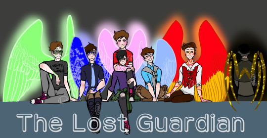
This fricking Banner was and still is(for now, *wink*) the most ambitious piece I’ve managed to finish. It took me so long, my wrist hated me, my ipad hated me, my ipencil hated me, medibang hated me, this piece pushed the limits of the poor app. Every time I try and open this piece up on the app it takes a solid couple seconds to open, save, and close.
From sketching to lining every single character, to having to uniquely match up Their Wing Sizes and Heights, because Guardians are fucking Tall, so Wing size and Height size was hell to calculate and portray. Why, you might ask?
Because I was limited to the proportions that would actually fit into a tumblr mobile banner. Which, funfact, is much smaller than you’d think!
I had to make sure they’d all fit, wings and all. And they didnt fcking want to. But I made it fit, because I wanted a full body + wings cast banner and goddamn it that was going to happen. And I did. And I lost a fuck-off amount of detail-space for it.
Coloring it wasn’t exactly difficult, but I will once again point back to this app hating this piece and it draining my battery because of it. I work in layers. My lineart will have 5-6 different layers in color before I combine them and set the hue to black, but I still keep my lineart seperate in that each character has their own lineart, and the background lineart is seperate.
I had their lineart, and probably still do, seperated into Seven different layers, one per character, each one w/ an extra masking layer for their wing glow. Each character got their own folder for colors, and had multiple layers for each colored section: clothing, skin, skin blush + eye whites, hair, wings, body markings, marking glow. And then there was the background layers, and the glowing affects, ect. The whole piece stands at having about 80 total layers having been used over the course of making it.
So yeah, Medibang does not like this piece when I try to open it. xD
But really, setting aside fighting and babying technology thats being pushed close to its limit, the real pride comes from the fact that this piece has Seven fully colored, near-full body characters drawn, all touching and interacting and accurate to the scale that I made. It is the most amount of characters in one piece that I’ve ever drawn, colored, and finished, and I’m pretty fricken proud of it.
Which makes it all the more daunting that said banner is going to get an upgrade, because it’s a Character Cast Banner after all, and its going to have four more fully designed and full winged characters added into it.
And by upgrade, I mean I get to redraw the whole dang thing. Because I gotta rearrange ✨everyone’s✨ positions. And at this point, the only way thats possible is by starting over.
wish me luck on that. o_o;
128 notes
·
View notes
Text
Day 23
Prompt: At a certain age you switch bodies with your soulmate for 24 hours.
Word Count: 2,076
Main Taglist: (Send an ask to be added or removed!) @starlocked01, @spoopy-turtle, @lizluvscupcakes, @more-fandon-than-friends, @i-cant-find-a-good-username, @vindicatedvirgil, @star-crossed-shipper, @justaqueercactus, @gayboopnoodle, @sanderssidesweirdo, @the-sympathetic-villain, @8-writes, @lizzy-lineart, @battlebunnyteardropsinthesun, sirprplsnail
Soulmate taglist:(Send an ask to be added or removed!) @elizabutgayer, @melodiread, @tsshipmonth2020, @mikalya12, @8-writes, @lizzy-lineart
CW: Food, implied abusive household, one (1) curse word.
Virgil rolled over, hand smacking to turn off an alarm he didn’t remember setting. Eyes opening, he found the world to be fuzzy and out of focus. He noticed the sheets surrounding him were softer than anything he’d ever felt before. Glancing at the side table, he noticed a white notecard sitting atop a black cylinder. Reaching forward, he picked up both items. The cylinder fell open and a pair of glasses tumbled to the sheets. Virgil picked them up and put them on, groaning in relief at being able to see, the eye strain he hadn’t even noticed disappearing.
Looking down at the notecard, he found neat handwriting on it. ‘Greetings! My name is Logan Croft. I am 20 years old. If you are reading this, that means you are my soulmate and have turned 18. You are free to eat anything that is in the kitchen however I must ask that you refrain from eating peanuts of any kind throughout the day as I am severely allergic. My schedule for the day is on the kitchen table. Happy birthday.’ Great, he thought. I thought I had another year until this.
Virgil rolled out of bed, moving to the mirror propped in the corner to look at the face he’d be wearing for the next twenty-four hours. His hair was slightly mussed from sleep and his night clothes hung from the tall and lanky frame. Lifting the shirt, he was surprised to find a muscular abdomen. He turned, sorting through the closet for something he could stand to wear for the day. It was filled with business casual to formal which made Virgil think he was a business major of some sort.
Thinking that he’d decide after breakfast, he walked to the kitchen and found the schedule. Picking it up, he found a loaf of bread and made some toast as he read over it. Glancing at the kitchen clock, he saw that the first class was in twenty minutes. He grabbed the toast and ran back to the bedroom, not wanting to be late for class. The class list seemed more in line with a marine biology major than a business one but he still put on a polo and jeans. He would have attempted the tie but he’d never been taught how. Then, with toast in his mouth and the schedule in hand, he quickly pulled up a navigation app and was out the front door.
~~~~~~
Logan woke to a loud and annoying song blaring near his ear. He sat straight up in bed, taking a second to notice that his vision wasn’t blurry before he turned to riffle under the pillow. He felt a rectangle and pulled it out, finding a phone that was quite a few years past its usefulness. He swiped it open and turned off the alarm, the music cutting off.
He slid off the bed, feet hitting a cold floor, before looking around the room. He found a clean, if bare, room with papers strewn across a desk in the corner and a purple hoodie tossed over the back of the desk chair. He moved over to the desk, picking up a paper to find math equations scrawled over them, the name Virgil Stern written neatly at the top.
“Hello, soulmate.” He whispered quietly to himself, the voice raspy with sleep. He glanced up, seeing his reflection in the cracked mirror covering the closet door. There were dark circles much larger than he knew was healthy under his eyes.
Before he could get a better look, a voice cut through the silence. “Virgil, if you don’t get down here soon you’re gonna be late and I’m not waiting for you!” The shout from outside the door was combined with pounding.
Logan took that as his cue to dress. Picking up the hoodie, he made his way to the closet and threw on a tattered looking shirt and some ripped black jeans. Slinging the hoodie over his shoulders, he snatched up the bag next to the chair. He found a list on the desk that seemed to contain what was needed for the day. Seeing the class schedule on the back, he shoved it into the bag.
He heard footsteps outside the door and tore out of the room, running down the stairs. “I’m coming!” He called.
“It’s about time!” The woman standing at the door exclaimed. Logan ducked his head, passing her on his way out. He stood uncertainly on the walk, not knowing what to do. The woman waited for five other teens to pass her before she closed the door. Logan silently followed the others to a minivan, sliding in with the ones who looked closest to Virgil’s age.
~~~~~~
Virgil got through the first class just fine, taking as detailed notes as he could. He had no idea what was going on or what his soulmate might need so he wrote down everything that seemed important, which meant he was one step away from writing down the whole lecture. He was on his way to the next class, searching the sides of buildings for names, when he heard someone call Logan’s name.
Turning, he saw someone running toward him so he slowed down slightly. When the person caught up with him, they looked like they were about to time travel to the past. Virgil couldn’t help but chuckle. “Is it dress like a pirate day and no one told me?” He immediately wished he hadn’t spoken.
The stranger just put their hands on their hips and laughed. “Logan, how have I not told you about the most recent play I’m in?”
Virgil just chuckled. “Uh, you might have at one point. I’m not myself today.”
The stranger laughed with him. “You could say that again. So, did you and your soulmate swap?”
Virgil sighed. “I have no idea how to act like Logan.”
The person laughed, sticking out a hand. “I’m Roman, his best friend. I go by they/them pronouns.”
Virgil smiled, shaking their hand. “Virgil; he/him.”
Roman smiled. “Cool. Logan also goes by he/him. Come on,” they began walking and Virgil fell in step, “We have classes near each other so we usually walk together anyways.”
Virgil smiled. “So, what’s your play about?” Roman launched into a detailed explanation of it while Virgil was just glad to not have to think or do anything besides walk and listen for a few minutes.
The peace was over as they arrived at the next class and Virgil once again had no idea what was going on. He followed along and took notes just short of being the transcription for the lecture, trying to get down everything. Luckily, it didn’t look like Logan had any classes after this so he was free to meet up with Roman and simply follow them around as needed. He ended up spending the rest of the day sitting in the theatre while Roman ran lines and did the costume practice. He even got the chance to meet Roman’s soulmate, Patton.
~~~~~~
Logan was in his own personal hell. He had to deal with so many rowdy people in one car, high school again, and people who obviously didn’t care about his soulmate. For goodness sake, none of them had even mentioned that it should be Virgil’s eighteenth birthday. They should have known it was coming, they should have asked about it, done something. Instead, he got a lecture in the car ride about needing better sleep habits.
When he got to the school, he was almost instantly attacked from behind. Muscle memory moved the body before he even thought, throwing the person over his shoulder and flat onto their back in front of him. Logan took the few seconds while the person was getting up to wonder why that was the first instinct.
“Hiya, Verb!” The person said, dusting the front of their clothes off.
Logan straightened his backpack and frowned. “Am I supposed to know you?”
The person laughed. “Wow, looks like your soulmate is a year older than you, Virge. Or, I guess I should use your name, Virgil’s soulmate?”
Logan began walking into the building and Virgil’s friend followed. “My name is Logan. I’m assuming Virgil’s eighteenth birthday is today as I’ve been twenty for almost five months.”
The person snapped, reaching a hand out to shake Logan’s. “Well, my name is Remus but Verb normally calls me Stinky. What should I call you?”
“Logan will suffice. I’m assuming we have the same classes? I don’t know this school’s layout.”
Remus nodded. “Yep! Just stick with me and you’ll be fine, friendo!”
They went through the rest of the day at each other’s sides. Logan took as detailed notes as he deemed necessary, the important things from what he remembered. At lunch, he was informed that Virgil and everyone around him thought that he was turning seventeen today instead of eighteen. When he asked about that, he was told that Virgil had been in the foster system for a while and had to repeat a grade due to bad home life disrupting his grades.
The end of the day came and he went back to the front of the school with Remus, having to pack himself into the van with the other kids. He sent a quick, “Bye, Stinky!” for show before the door closed. He spent the rest of the ride in silence but his thoughts were racing. His mind was made up as they arrived at home, Logan instantly going up the stairs to do Virgil’s homework for him. On a scrap piece of paper, he wrote his phone number down before pausing.
Carefully, he began writing in his neatest handwriting. ‘I don’t know you yet, but I want to. I want to know what your laugh sounds like when I’m the one making you laugh. I want to know what you think about late at night. I want to know you. I want you to know me, to know whatever you want about me, to know my darkest secret and know I give it willingly. I want to know you and be known by you. I can’t wait to meet you, no matter how long it takes. I hope you had a good birthday and that Roman took you out for ice cream or something. I hope you know you are loved and appreciated.’
He went about making the bed and neatening up the room as much as he could. If he couldn’t be there to wish his soulmate a happy birthday, he could at least give him a nice present. That present might not be an expensive item, but it could be finished homework, a clean room, and a good night’s rest.
~~~~~~
The end of the time came and they swapped back at midnight. Both soulmates’ best friend filled them in on the events of the day and everything their soulmate did. After all, it was a few years before they met again.
When they did, it was by complete chance, as most soul meetings went. It was outside an aquarium. Logan was just getting off his shift and Virgil was going to the donut shop across the street from it. Logan saw him and paused. “Virgil?” He called.
Virgil turned, trying to find the voice that had been his own for a day and still populated his dreams and evenings, the nightly calls coming to mind. His name was called again and he saw the figure standing across the street. He waved and watched as Logan came across to him, a smile on his face. “Logan, hi.”
Logan couldn’t help but reach forward, hand brushing Virgil’s in a silent ask for permission to hold it. Virgil’s smile grew as he turned his hand to take Logan’s. “You know,” Virgil began, “I was just about to grab a donut if you wanted to join me?”
Logan smiled. “I’d love to, soulmate.” The word was said as both an endearment and a promise. A promise of a life spent together, of days starting and ending with each other, of a shelter and a place to relax without having to hide any part of himself. An endearment of love, of someone worth loving, and that was all that Virgil needed. If he hadn’t been in love with his soulmate already, he would have fallen in that moment for that one word that held so much.
#tsshipmonth2020#soulmate au#analogical#logan sanders#virgil sanders#roman sanders#remus sanders#angst with some fluff thrown in for variety#ace writes
135 notes
·
View notes
Note
Do you have any advice on how to draw clothing? I’ve been trying to get into making my own art and all my characters look like they are walking around in socks 😂. Idk how you do it so well
... that the day has come when someone has asked me how I draw ANYTHING is genuinely mindblowing to me xD I know I've upped my game in fabrics lately but this is surreal xD Am I really gonna do an art tutorial, for the first time ever in my whole life?!
Well, for you, Anon, I shall try xD

First off, you're going to want to doodle a basic body shape. I am not going to pretend I am good at doodling body shapes. Nope. But what matters there is getting the position of your character, figuring out what goes where. Once you have that, you go to stage two, and that is putting clothes on 'em!
You can start with basic clothes, the way I did. I simply draw them atop the body outline, then erase whatever bits of the body the fabric will cover up. Depending on what kind of clothes you're drawing, the fabric behaves differently. But what you need to keep in mind is that fabric usually has its own volume, weight, and is affected by a body's movements and positioning. As this body is in a general, simple standing position, the fabric doesn't need to move around MUCH... but it does need to move around a bit if we want it to feel legit.

For the sake of making it look more real, you have to account for where the folds show up more often in clothes. My typical choices for that are locations where fabrics overlap, or where there are joints. Feel free to add a few extra folds here and there, of course, especially if the clothes are meant to be baggy and with a lot of air! The clothes that aren't baggy, however, like (in this case) the gloves or the arm bandages, as they're meant to be tight on the body, won't need folds unless you're drawing something highly detailed with a very peculiar hand shape.
After that, it's base color time! Base color is very very important, as the shades and lighting will be derived from that initial hue. Gotta pick each color right!


Now... SHADING! This is something I used to do with air brush tools. Currently, as I'm working on Clip Studio Paint, I use this fabrics' brush and it has really improved my fabrics' game, so if you can find a good brush that gives your fabrics more texture, it'll help heaps :D if you can't, however, the basic air brush tool, on any art software I've used, can achieve good results on its own.
Normally, when I color, I select the fabric's color, all of it, to avoid unwanted accidents with color bleeding out all over the place. I believe some people just make different layers for everything, but I like pain (?) So, believe it or not, the most important part here is selecting the right color: I leveled up big time in art on the day I started choosing more saturated colors for shadows. I typically went for gray-ish shadow tones, back in the day... but in my humble opinion, it does not hit the same way as more saturated shadows do.
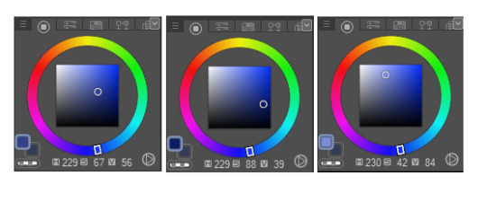
The first one there is the base color, the second one the shading color and the last one is the lighting color. As you can see, I'm not that far inside the black area of the color wheel in the shading one, but I'm choosing a much more intense shade of blue, and that results in a contrast that doesn't require a lot of darkness to feel right.
As for where to apply your shading? That's in fact what the folds are for! :D they serve as guidelines, pretty much, for how you'll shift the color across the fabric. At the shading stage you can even add extra folds you didn't place in your lineart too, if you want, but what matters most is that they will give your clothing volume and texture.
Just as it is with the shading, lighting will lean on the folds as well!

(don't fret, we ain't done yet xD gotta soften that lighting later, naturally...)
I picked a much brighter color for the lighting, and far closer to white. This can work fairly well, but you can also choose a more saturated color if you want to, in some clothes. Makes them feel extra luxurious in my experience xD One of my tricks here is that there will be parts touched by the light that will be brighter than others. Hence why you can see that, while I applied my brush all over the folds, some parts are softer than others. This as well provides texture to the piece, and a dynamic feel that offers it extra volume.
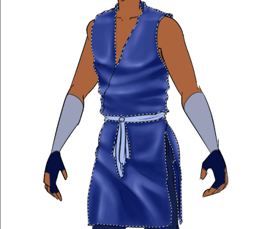
With my base color once again, I've softened the lighting by brushing the base color over it veeeery lightly, and lo and behold! Looks a lot more normal now, right? :D and the colors blend well into each other (if you can't achieve this with a simple airbrush, the blending tool, applied carefully, can result in a similar outcome).
You can use the lighting and shadows to highlight some body shapes too: see how there's shading on that thigh, but instead of flowing right back into the base color, it shifts into the lighting color directly? That helps in giving the fabrics some shape too, therefore, the lineart isn't the only bit that matters in giving fabrics the behavior you may be looking for.

And as I wasn't even sure what number we were at anymore, here we go, step number ?, finish up lighting and shading everything XD I left it with very basic lighting and shading because Tumblr won't let me add any more images to a single post *shakes fist* but usually I play with layer modes, namely Multiply, Glow Dodge, or Color Dodge, to get some extra volume and feeling in clothes. Still, the bulk of the work is what you've seen here :D
Alright, some last tricks I want to share: if you take the lighting shades and brush them veeeeeeeery softly over the edges of each element in the artwork, you can get a really nice contrast that makes the clothes more realistic, to a fault. And one last important thing to point out is... commit to your shadows and lights xD if one area of the shirt is bright and, say, there's another layer of fabric right below it, you have to try your best to follow the pattern of lighting and shading that you set up in the first clothing item you shaded and lit up (?) if that makes sense xD if it doesn't, I'll try to explain it better in another ask, if you send one :D
Anyway! I hope this has been helpful, if it's not thorough enough then I'll have to think of some other way to pack up a proper tutorial that Tumblr won't attempt to destroy x'D but good luck with your next art ventures, and may all the fabrics be on your side in the future! :D
#anon#sokka#I kinda had to#I thought of using Azula but her clothes are... not just more complicated but very armor-y#whenever I draw her :'D#so Sokka felt like a more natural choice for this xD#thanks for the interest in my wonky techniques!#I am by no means a professional but if my amateur ramblings and tricks help anyone I'll be thrilled!#:D
13 notes
·
View notes
Text
SnK Episode 68 Poll Results (for Manga Readers)

The poll closed with 146 responses. Thank you to everyone who participated!
Please note that these are the results for the Manga Readers’ poll. If you wish to see the results for the Anime Only Watchers’ poll, click here.
---
RATE THE EPISODE
140 Responses

The anime continues its positive streak with just over 90% of respondents rating the episode a 4 or 5. MAPPA appears to be blowing this season out of the water for most of us!
Noice
Good!
I liked it
WHICH OF THE FOLLOWING MOMENTS WAS YOUR FAVORITE?
144 Responses
We got a pretty mixed pie chart this week. To be expected, given how many moments were in this episode. At a tie with the largest pieces of the pie were Hange’s eccentric attempt to greet the Marleyans and Eren’s gunshot figuratively hitting Sasha. Behind that two more options tied in each with 10.4% of the vote - EMA’s conversation at the shooting range and Sasha appreciating Nicolo’s cooking. This is followed closely by Eren’s mirror scene with 9.7% of the vote. Onyankopon explaining why he looks different when Sasha asks him about it took a solid 9% of the vote.
WHAT WAS THE MOST EMOTIONAL PART OF THE VISIT TO SASHA’S GRAVE?
144 Responses
This was almost too close to call, but Mikasa sitting alone managed to edge out just slightly over Connie’s “I’ve lost half of me” moment at Sasha’s grave. Trailing behind the two were Nicolo’s grief and the agreement between Papa Braus agreeing to a free meal from Nicolo.
AFTER SEVERAL TENSE AND ACTION PACKED EPISODES, HOW DO YOU FEEL ABOUT THE TRANSITION TO SOMETHING MORE CALM?
138 Responses

The larger chunk of respondents are feeling relieved to get a break from the action for a few episodes. 21.7% prefer the action but don’t mind a break here and there, while 21% state that they enjoy the exposition more than the action anyway, so they are content. A small handful don’t care either way.
We needed this for another build-up to more action
I like the action but it’s important to move the story along
These just feel mandatory fillers to me.
I miss the warriors
I feel fine with it. I thought that was going to be some happy-go-me episode, but gladly it still had a serious tones.
This episode felt like a very welcome respite after the absolute shitshow that was spoilers week and....whatever the fuck chapter 137 was.
Nice breather of sorts, I always like seeing characters from action-heavy series in their downtime.
WOULD YOU RATHER GET A SURPRISE GREETING FROM EREN & HANGE, OR ARMIN & LEVI?
141 Responses

The vast majority of respondents would prefer the slightly less lethal greeting given by Hange and Eren at the beginning of the episode. We’re not sure if the other 29.1% are masochists or just really love Levi and/or Armin that much more. Or perhaps they’re intrigued by the pig piss from the filthy island devils.
ON A SCALE OF 1-5, HOW HAPPY ARE YOU TO BE BACK ON PARADIS?
139 Responses
Overall, fans are happy to be back in familiar territory and put into the perspective of the Survey Corps again. Let’s get ready to rumble!
MAPPA HAS SPRINKLED IN ANIME-ONLY ADDITIONS THROUGHOUT THE EPISODE. AS A WHOLE, HOW DO YOU FEEL ABOUT THEM?
139 Responses

Though subtle, MAPPA did include some anime filler (such as Eren’s, erm, mouth breathing). 51.1% enjoyed the noticeable additions, while 37.4% are completely confused by the question and didn’t realize there were any. A handful generally don’t prefer additions but enjoyed what little ones we had this episode. A small sliver didn’t care for them.
HOW DO YOU FEEL ABOUT THE SCENES FROM CHAPTER 107 THAT WERE PEPPERED IN BETWEEN THE MOMENTS FROM CHAPTER 106?
139 Responses
MAPPA is shuffling things around to pick up the pacing of this arc, and 48.2% of respondents are feeling very positively about it. 38.8% also feel that both the order of events in the original manga and the anime work out just fine regardless. A couple of smaller groups either felt that things were a bit off from the manga, or didn’t really care either way.
I think it's great because it allows an episode to start and end on the same chapter if mappa ever wanted it, allowing the right twists or cliffhangers to be in the right episodes, all WITHOUT having to slow down, which I wholly appreciate.
I'm fine with the changes. Mappa is doing good job.
WHAT DO YOU THINK ABOUT THE CHANGE OF GABI BITING HER NAIL AND ANGRILY SAYING EREN’S NAME IN HER JAIL CELL?
142 Responses

Nearly half of voters feel that both MAPPA’s take and Isayama’s original take work just fine for Gabi’s character. 28.9% prefer the anime’s take on Gabi’s reaction to all that happened, while 14.8% feel that her more defeated posture in the manga makes more sense for her character.
I'm a mix of both? Her defeated posture implies that she's not happy with the way things worked out with them in jail and Zeke betraying them. On the other hand, her angry face is realistic to the scene too because it implies she really blames Eren for their current predicament.
She looks like some female version of young, angry Tarzan. This time Mappa should have kept the original postures, because the defeated Gabi feels to be more realistic, than the crazy anime one.
I think they both work but the anime's take might be the anime team beating us over the head that she's just like Eren when he was young.
Makes it clear to the anime-onlies that she really is psychotic
Gabi sucks
HOW WELL DO YOU THINK MAPPA NAILED THE TRANSITION OF EREN SHOOTING THE GUN, TO SASHA TAKING THE HIT?
141 Responses

The response to MAPPA’s take on Eren’s shot inadvertently hitting Sasha was overwhelmingly positive, with only a few people saying that they could have done better with it.
Eren shot linked to Sasha's death was awesome. Mappa is nailing it!
THE PART WHERE JEAN, SASHA AND CONNIE ARE TRYING TO GUESS WHAT A PORT IS WAS CUT OUT, WITH ARMIN’S NARRATION INSTEAD CUTTING INTO THE SCENE. WHAT DO YOU THINK ABOUT IT?
140 Responses
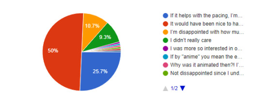
Exactly 50% felt that while having that JSC characterization would have been very much welcome, they’re okay with that small detail missing from the manga (granted, it was at least acknowledged by one panel being animated). 25.7% have a more nonchalant response, stating that if it helps with the pacing, they’re fine with small cuts like this. 10.7% are just let down by JSC’s lack of characterization in the anime overall and didn’t appreciate even more being taken from their characterization in this episode.
I was more so interested in our Paradis Peeps talking about newly discovered technology but I’m happy with what we got.
Not dissappointed since I understand you can't show everything but I love them so sad
Why was it animated then?! I’m so confused
Normally I don't like it when they cut corners like this, but I wasn't fond of that scene in the first place so it's okay.
If by "anime" you mean the entirety of it including the past 3 seasons, then option 3. I'm always going to be salty about how much they took out or changed for these three during the uprising arc. So far mappa has done okay with them, I guess.
Would have been a funny JSC moment, but it was really absolutely pointless. In manga format it works as just background words on a panel. Animating it takes seconds of an episode that could be used elsewhere. So I'm fine with it being cut out.
SOME HAVE COMPLAINED THAT THE ENDING SCENE OF EREN REPEATING HIS MANTRA INTO THE MIRROR LACKED THE IMPACT IT HAD IN THE MANGA. HOW DO YOU FEEL ABOUT THAT?
138 Responses
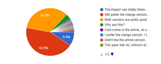
43.5% were receptive of the anime only shots, but favor the way the scene was portrayed in the manga more. 34.1% felt that both versions were done well, with only 9.4% feeling that the impact was largely the same (if not better). Based on the write-ins, the main complaint seems to be the lighting/color scheme of the scene not quite meeting expectations, or that MAPPA made Eren’s back look weird.
theyll make up for it when eren screeches at hange next ep
Impact was there, art just felt a bit wonky and toned down the scene overall. 9/11
This goes into my criticism of the color palette and shading style mappa uses, which is far more subdued. The contrast is lowered and the scene is very dark, and there is little rim lighting, so while the actual lineart has far more detail, the detail in the lighting is reduced. Damn I really am writing a wall text aren't I? I prefer Wit Studio's art style a lot but Mappa has honestly been doing great so I couldn't care less, manbun Eren is hot.
I prefer the manga version. I think the anime version have weirds shadows in eren's back. Plus the mirror don't have the same energy, less impactful
Cool scene in the anime, an unforgettable blow to the brains in the manga
Idk
Most of the time seeing things for the first time is what's really impactful. Feel this way towards Armin's transformation in the boat as well. It was definitely less impactful than when you first read it in the manga.
I understand the fandom because this moment was very popular when the chapter was out. I think that in the anime Eren lacks the anger he had in the manga. His voice was too calm while repeating his mantra. .
WHY DOES HIS BACK LOOK LIKE THAT
I didn't care for it in the anime, it was really underwhelming.
I think most people are annoyed about the lighting than the impact. It’s a bit too dim and the lamp hides Eren’s new hair.
Didn't like the anime version at all
The animation wasn't good and they totally fucked his hair, face, and body up. Although the added shots were definitely welcome.
Eren could've been sexier/animated better, I hope they do better next ep 😭
WE WILL ASK YOU AGAIN. HOW WILL THE ANIME DEAL WITH MIKASA’S HIZURU TATTOO/SYMBOL?
135 Responses
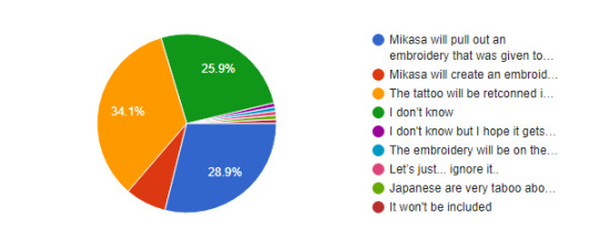
With Mikasa meeting Kiyomi presumably being inevitable in episode 69, we wondered if any opinions had changed on this. 34.1% feel hopeful that the tattoo will be retconned into the anime and that we will see this scene faithful to the manga. 28.9% think that Mikasa will happen to have some kind of embroidery on hand already. 25.9% don’t want to make a call either way, and a small handful think Mikasa’s going to just pull out an embroidery kit and go with it, lol.
The embroidery will be on the inside of her bandage.
Japanese are very taboo about tattoos because of the Yazuka... it will 100% be the embroidery.
I don't know but I hope it gets retconned. Never liked the embroidery thing.
It won't be included
Let’s just... ignore it..
I really really hope MAPPA retcons Mikasa's tattoo next episode. This will be the one retcon I will absolutely celebrate. Plus, it's not really a retcon if they're just amending Wit's changes.
WE WILL ASK YOU AGAIN, AGAIN. WITH THE PACING CURRENTLY UTILIZED BY MAPPA, WHERE WILL EPISODE 16 END?
137 Responses

Uncertainty continues to loom over exactly how far MAPPA will get into this (first half of the?) season. Nearly 40% don’t want to make predictions one way or another, while 23.4% feel that it won’t make it quite to chapter 122. The rest believe it will make it to chapter 122, with 17.5% feeling there will only be minor cuts, if any, and the remaining 13.1% feeling that there will be major cuts to make the feat to chapter 122.
116 (?) when the allied force attack paradis
122 with the amount of cuts being somewhere in between. They can cut a lot of the Gabi and Falco plotline and still have the story remain intact.
See, I'm not sure buy I'm also worried and curious about it all. It brings up the question of will the story continue in a possible second half of the season? With the manga ending very soon now, it makes sense to have the story wrap up in its anime medium as well. Fees like there's some kind of uncertainty surrounding this, it's unnerving tbh.
119 with Eren's head being blown off.
gabi no scoping eren, ending creds is eren entering paths and we see ymir standing behind him, s4p2 starts w the ymir backstory
121
No idea and I don't think about it. I just enjoy the show.
Your guess is as good as mine, I'm still fearing major cuts.
119
HOW DO YOU FEEL ABOUT NICOLO’S PORTRAYAL?
138 Responses
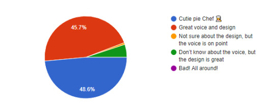
With Nicolo now formally introduced in the anime, we were curious how you felt about his portrayal. Overall the reaction was positive, with 48.6% agreeing that he’s a “cutie pie chef”, and another 45.7% feeling that his design and seiyuu are absolutely great! A small handful were less happy with the voice, but happy with the design, and a sliver went in the opposite direction, preferring voice over animation.
HOW DO YOU FEEL ABOUT THE ADDED DETAIL OF THE FLOWER BOQUETS AND THEIR SYMBOLISM ON SASHA’S GRAVE?
140 Responses

Respondents vastly appreciated the flower symbolism from MAPPA with 82.9% of the pie. 12.9% aren’t really sure what symbolism there even was, and a small amount either don’t care or felt the effort could have been spent on something other than flowers for Sasha.
WHICH SCENE FROM THE PREVIEW ARE YOU MOST LOOKING FORWARD TO?
143 Responses
This pie chart wound up being almost eerily even. 42.7% are most looking forward to the 104th discussing Eren (hopeful for the train flashback?). 39.9% instead are looking more forward to Hange and Eren’s tense conversation at his jail cell. The remaining three preview moments were pretty evenly split as well.
DO YOU THINK WE’LL GET BLUSHING!104TH NEXT EPISODE?
130 Responses
71.5% feel that there is a chance we will get the train flashback of the 104th in this episode, but don’t want to say for absolutely certain. 18.5% feel that it is a guarantee based on what we saw in the preview. 10% feel it is instead guaranteed that we will NOT get the scene in 69.
WE WILL LIKELY SEE PREGNANT HISTORIA NEXT EPISODE. THOUGHTS?
140 Responses
The plotline that continues to be a frustrating mystery in the manga - Historia’s pregnancy. 34.3% aren’t particularly looking forward to seeing her in the rocking chair and aren’t very stoked about having to relive this plotline all over again. 33.6% mainly just care about seeing how the anime only fans react to the scene. 17.9% just miss Historia altogether and will take any scraps they can get. And a small handful, at 9.3%, are actually looking forward to seeing anime!Historia with a baby bump.
Don't really care about historia
It's in MAPPA's hands now. I just hope they can add a little more of her screentime somehow.
I hope so. I want to see the design of her adult self.
I honestly wouldn't mind if Historia's entire arc, which consists of equal parts pregnancy, irrelevance and uselessness, is just completely cut in the anime lol
not interest
I'm not interested
I've hated this fucking plot line with all my being and what it's done to Historia since the leaks for this chapter were revealed years ago. So I'm not looking forward to anime-only people jumping in with their hot takes too. 🤮🤮
ADDITIONAL THOUGHTS ON THE EPISODE?
mikasa was shown in sasha's grave in the morning/afternoon and then she was shown again at dusk. SHE SPENT THE WHOLE DAY THERE. and annie... what a queen. and hisu's few scenes? so pretty.
Really glad the pacing was well done
nicosasha ship just flew in and took the spotlight
fantastic!! maybe it's just because this isn't my first time going through this arc anymore, but i feel like the anime feels chronologically less confusing than the manga—I remember being very confused my first time reading these chapters.
The lack of score by Hiroyuki Sawamo is negatively impacting my relationship with the anime. The depth of the emotion that could have been evoked was not present. I also did not get the sense that Nicolo and Sasha were in love, which was a major disappoinment. There were other aspects that weren't so bad, though; specifically, Levi's portrayal and Onyankopon's philosophy.
It felt a bit all over the place, but just seeing things from the manga being animated, I ain’t even mad.
I think that the scene between Sasha and Nicolo was made better in the anime. Isayama has problems with writing romantic moments, so in the manga the whole moment looked like it was taken from some light romance. Mappa made this scene more serene. I liked it.
I think MAPPA is doing so great tbh! I just need them to hurry up and explain if there will be a part two to this final season or what?! I need to know if we get more anime or they'll diverge into movies or.... just tell us! Lol!
How DAREEEE they not give Levi his black steed!!!! .....Although knowing what happens ummm yeah maybe his pony gets to live another day this way lol
Here comes the train wreck, choo choo!
I'm really sad I didn't get to hear Sasha call Jean a perv. I was really looking forward to that. LOL I love them.
When EMA were at the shooting range, it looked too much like Mikasa wasn't wearing any pants.
VERY solid. Not the biggest fan of the War for Paradis arc but I'm here for the ride.
WHERE DO YOU PRIMARILY DISCUSS THE SERIES?
128 Responses
Thanks again to everyone who participated!
19 notes
·
View notes
Photo

Outfit Friday #53
The final one! This is a redraw of the first one! But I was having an off day when I drew the first one so it’s not a totally fair comparison XD Wow this has been a journey! Here’s a gif of all of them together, I’ll put some ramblings under the cut.
Also, if you’re struggling to come up with outfit ideas, you can feel free to use my Outfit Friday gallery as inspiration! I know I will be XD

So, when I started Outfit Friday, the goal was to learn to come up with new types of outfits, instead of drawing all my characters in sweaters and hoodies. And it was a great success! I’ve gotten pretty comfortable drawing casual clothes, and I have a better understanding of clothes in general. Even skirts and dresses, though I still hate them.
Some of these pieces I don’t love, because they were days when drawing just would not work correctly, but I pushed through anyways and I’m proud of never missing a day! There were a couple times I almost forgot because it just slipped my mind, and people had to remind me, but I still managed to get them all done on time.
So, what’d I learn as I went along? A couple of things. First of all, seams are like the most important thing. Seriously, go and look at actual clothing, and pay special attention to the seams and where they’re placed, and how some pieces of clothing use the seams for decoration! Learning how important seams are was a game changer for me. Once I figured out seams, every drawing from then on had them.
Next, folds. I always knew I needed to learn to draw folds, but all of the advice out there was “look at real clothes and how it lays” which is honestly the least helpful thing I’ve read, personally, because I would look at clothes and my eyes would get overwhelmed by all the colors and patterns and just not knowing what I was looking for. Also, my style isn't super realistic; I don't want everything covered in folds, so which ones are actually important? Instead, what I’ve learned, is think about where the character’s body would bend, because that’s where the clothes are going to bunch up a little. Knees and elbows are the most obvious. Are the shoulders raised? There’s gonna be some cloth bunched up between the shoulders and the neck. Also, around the hips is good too. Depending on what type of pants your character is wearing, how low they are, and what shoes they’re wearing, it might bunch around the ankles, too! The same goes for the wrists, depending on what kind of sleeves your character is wearing. In general: if it’s an area that twists and moves a lot as the character moves around, it’s going to have folds. And don’t be afraid to let your folds influence the lineart a little! It makes drawing limbs easier tbh because it breaks up what would be long, straight lines. Note: you should also make your seams follow your folds! It looks awesome, and really makes it look more like clothing.
As for color, I don’t think my coloring changed that much since I started. I try to use mostly desaturated colors, and I try to reuse one or two colors in small areas if it works for the piece. For example, I might draw gray pants, and then use that same gray for the gray of the buttons on a shirt, or the bracelet the character is wearing. I think I’m getting better at making it blend in a little better, at least.
As far as patterns and stuff on clothing goes, I upgraded to Sai2 this year, and the scatter brush has been AMAZING for that stuff. I also learned that I love plaid, and I should definitely draw it more often. I know I didn’t really get into too many detailed patterns, but... honestly, I don’t know if I’ll ever be bothered to do that XD That’s a lot of work for a look I don’t even like.
I thought accessories were going to be really important, but as it turns out, they really weren’t. They can add a lot to a piece for sure, but most of these ended up not having accessories and I like them that way.
And finally... I learned that like 50% of outfits have jeans. Sometimes colored jeans, but holy cow jeans are so common everywhere you guys, at least where I live. Colored jeans look really nice though, and are a fun way to spice things up! I should definitely do that more.
Anyways, that’s all I have to say about outfit design. If you’re struggling to come up with outfits to draw, I suggest going to your local thrift store and taking a look around! That helped me a lot in the first few days to just get an idea what to even do.
On to the next challenge, which is starting in a couple days. Hoping it’ll be as successful as this one was!
Also, as thanks for making it this far down, here’s a faster gif of all of them together

12 notes
·
View notes
Text
i wrote down some art-related thoughts and tips, inspired by people i follow who occasionally say the sort of things that they wish they were better at drawing but don't really know where to go with it, not like i'm much of an authority or anything and nobody's asked my opinion but, if this is helpful for someone out there, then it's worth writing!
- examine other people's art, especially those that you like, and study which things you actually like about it. you shouldn't directly copy someone else's art, but what you can do is take inspiration or study the details that you enjoy and adapt them into your own style. for practice it's fine to copy someone else, but if you post the final piece, you should mention whose art you referenced in it. also, do the same with art that you find yourself not particularly liking! think about the things that don't make it very good in your opinion and see if you can learn something from that. if you don't like your own art, you can even study what makes it disappointing to yourself. process it a little instead of just going "wow i suck at drawing" and moving on, even if it feels difficult.
- also related to the above: widen your view of how art can be done in the first place, and if you find that you're always drawing one and the same thing, maybe try something different every once in a while. and by this i don't really mean the actual subject matter but small things like, do you always use a black lineart brush? try using colours instead. do you reference fanart from official art? try making your own version instead or reference the style of some other series, go a little crazy with it. do you have a particular style of drawing eyes, or faces in general? play around with shapes and see how it turns out, go more realistic or more cartoony. i sometimes draw noses on characters and sometimes i don't, just kind of depending how it looks like to myself, and i don't draw nostrils because i don't really like the look of two holes in the face. you don't have to stick to just one "truth" with art. (of course it's totally fine to want to draw realistic humans and not the kind of anime stuff i personally do, these are just examples from me and you should focus on the things you like yourself)
- pay attention to shapes, and the fact that sometimes simple is better than adding too much detail. or if you like adding tons of details, then it may be better for the base drawing (e.g. the character under all that detail) to be extremely simple in contrast so that it doesn't look too busy for the eye. when i draw faces, i only really put details in the eyes because i like pretty eyes a lot but leave the rest of the face very simple, which makes the eyes stand out more. again, you don’t need to do that, but it’s something to think about when doing art. there are so many details to every single thing ever and it’s generally better to choose which ones you want to emphasise in art.
- a thing i see relatively often is that people draw in black and white, maybe with pencil on paper, and then lament that their art doesn’t get enough attention. the thing is, making b&w art interesting is much harder than giving it personality with colour, because it won't catch people's eye the same way. to me personally, an artist's use of colour is one of the things that draws me into their stuff (actually even the main thing in most cases), so while black&white art can be really beautiful as well and it's totally fine to want to pursue a b&w art style, i'd still encourage people to learn to use colours. it's much easier to give your drawings character with colours, and if you honestly want more attention (which is a valid thing to want), then i'd especially encourage it. it takes more time, so you may need to get used to the fact that finishing a fairly simple drawing can take 8 hours instead of one, though. at least if you're a slow ass person like me
- and as an addition to the former, there are so many different ways to use colour, so don't limit yourself by thinking there's only one way. you can even make art that's primarily black&white but add an accent colour or two in there and it already changes the feeling of the image completely (i do this sometimes and like that style a lot). or you can have a style that only includes flat colours and no shading or anything at all, you don't need to become a master painter with realistic shadows everywhere if you don’t want to. (if you do want to, then my best advice would be to study photos and paint using them as reference.)
- if you find yourself going, "this artist's colours are so good! i wish mine were like this!" -- why not use similar palettes with that artist then? think about what kind of colours you like and what kind of mood you want to convey in your drawing, bright hues will look completely different from darker or duller ones, blues will look cold and reds warm, some colours pop out more when placed next to another. don’t shade with grey or a darker hue of the exact same colour to make it look more interesting. look up palette websites, or study the colour wheel and pick colours from the opposite or adjacent sides for ideas of colours that go well together. this is the stuff that a lot of tutorials mean by colour theory, and it's not rocket science but actually rather simple when you take a look at the colour wheel. if you don't like how the colours turn out, play around with the hue, saturation, brightness and contrast settings all you want. most of the actual magic you see in a lot of digital art is adding layers with a multiply, overlay etc setting on top, so find those in your drawing software and go crazy with it. (they take a while to learn to use, i have plenty of drawings where i've used them badly, but that's just how learning anything is)
- youtube is full of videos of people doing complete drawings from sketch to finish. they can be a bit much for beginners (sometimes for me as well tbh) but give a good idea of the overall process of creating a full-colour illustration and what phases go into it. to me it's crazy that there's artists who put in the colours first and then do a lineart on top but that's just one simple example of how there's not just one way of doing art.
and just one practical thing that goes into doing digital art, you'll find that there are a million different brushes everywhere and every artist seems to have a “brush set” for different things and you’re supposed to know how to pick which to use yourself. if it's any consolation, i use exactly one (1) brush ever on clip studio paint and draw every single thing with just that one brush. because fuck that noise i don't care
#really just my number one tip is looking at art you like#and if you're like#i wish i was drawing like this person instead of how i draw!#then start drawing more like that person#there's no art police that comes to your door like sir you drew differently from before
6 notes
·
View notes
Text
Processing a panel
As I’m in no way a professional comic artist, I still want to share some of my process in drawing a panel. Maybe in the future I’ll change my way of working but for now it works for me.
So whenever I finished designing the page layout, I’ll usually sketch the most crappiest storyboard you’ll ever see and place the speechbubbles. Getting the speechbubbles in right place is important as they take a lot of space. So it’s not about getting the details right but moreso the right idea, setting and character traits for the dialogue.
My first storyboard, contained a dissapointed Damiane and Elena having some attitude towards Damiane.
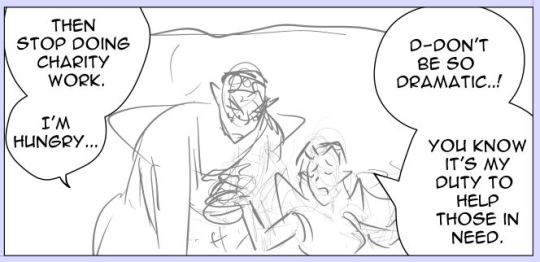
At first it was fitting with the dialogue because the original dialogue contained:
Damiane: Then stop doing charity work.
Elena: Can’t do. That’s basically the purpose of my existence.
The reason why I changed the dialogue and also the composition/storyboard of the panel was because of their dynamic in the previous pages. The story I wrote before starting this comic is the guideline but within the process of the pages, I’m willing to change the dialogue into something else because I think it fits more natural within the panel or character.
So I changed it into this:
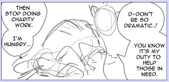
The main reason I changed this panel is because I wanted them to be nicer to each other, while still having a bit of the original dialogue.
I’ve also changed the composition because a composition where two characters are standing next to each other is less interesting than a composition with a different angle.
Something to keep in mind is that after a few pages it’s becoming a bit boring if the characters are constantly having the same pose. So that’s also one of the reasons why I’ve changed their poses.
Last but not least: when making these changes, I always check if the panel still fits with the panel that comes before and the panel that comes afterwards.
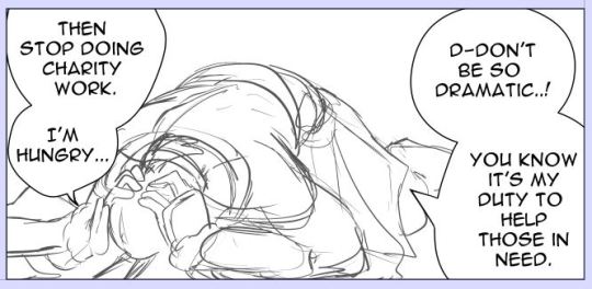
So when the set up is right I’ll focus on the anatomy. I’m going to be honest with you. I think I’ve used 10+ layers to get it in this condition. Each time I just redraw the pose with better adjustments. I usually check references such as Pinterest and the Morpho anatomy books to get the anatomy right. I know a lot of Webcomic artists use 3d-models that come with Clip Studio Paint and sometimes they’re great! But I always have the feeling the anatomy gets either stiff or just wonky when they are traced directly.
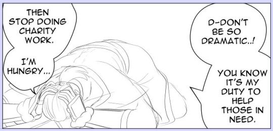
Clean up sketch. This is the process I always do when going towards the final lineart. I usually do this step in 3 or 4 times and when the most important details are right, I’ll start lining it.
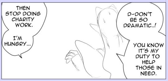
I also drew Elena quickly. As her pose is less difficult, I started later with her. But since she’s at the foreground. She needed to be done before Damiane. And yes I draw the characters always seperate from eachother.
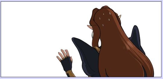
So this is why Elena needed to be finished first. She’ll cover Damiane mostly and I didn’t want to erase his pose because she’s infront of him.
Because I could see how Elena was infront of Damiane, I could also resize him so that it fitted the composition better.
And I was also lazy with his foot because I knew Elena was going to cover that part of his body.
Fully colored. Also when colored drawing can change. So sometimes I need to adjust the final lineart. Which sucks. Especially when it comes to their faces. But this one came out alright. :P No face.
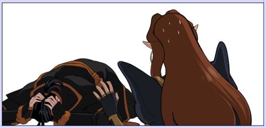
So now you have the two characters together. Last thing I’m going to add is the background. If the background is complexer, I’ll start with the background first and then add the characters. Sometimes I want to move the characters a bit (yay for drawing them seperately) and when I haven’t draw the background first. Well I get an ugly blank space I need to correct.
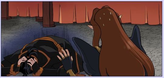
Since I knew the background was easy, I just drew it later. I always make a grid for the background to get the perspective right.
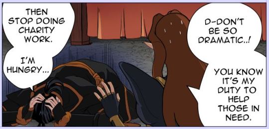
And done. In the end, I’ll just let it rest. Sometimes I’ll go back and edit minor details like the sizes of their eyes, color or background details. I’ve also completely removed panels and redrew them with a different angle (sigh). Really editors stuff.
Fully page:
Thank you for reading :-D!!
3 notes
·
View notes
Last Seen Blogs
farmerpaddy-blog
Farmer Paddy
crushed-crucifixes
rage is righteous

reidogwboel
Untitled
bennysubreddy
Rabid Raccoon Activities
knowledgeislife-blog1
Random Knowledge