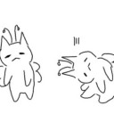
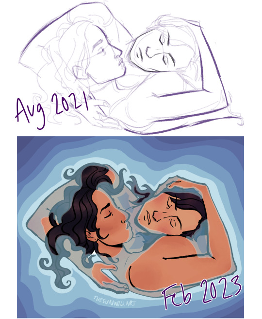
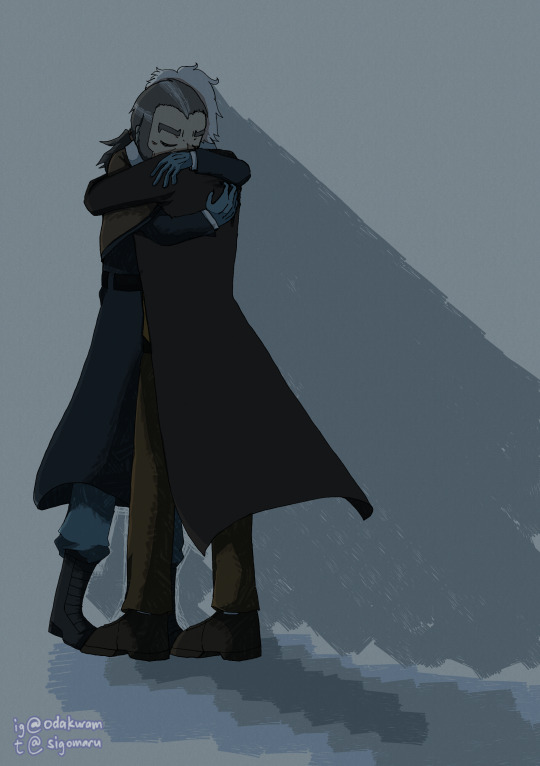
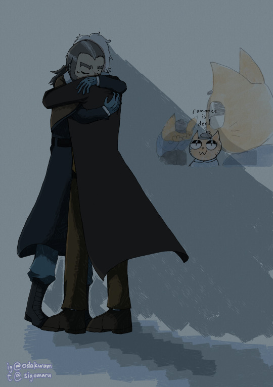
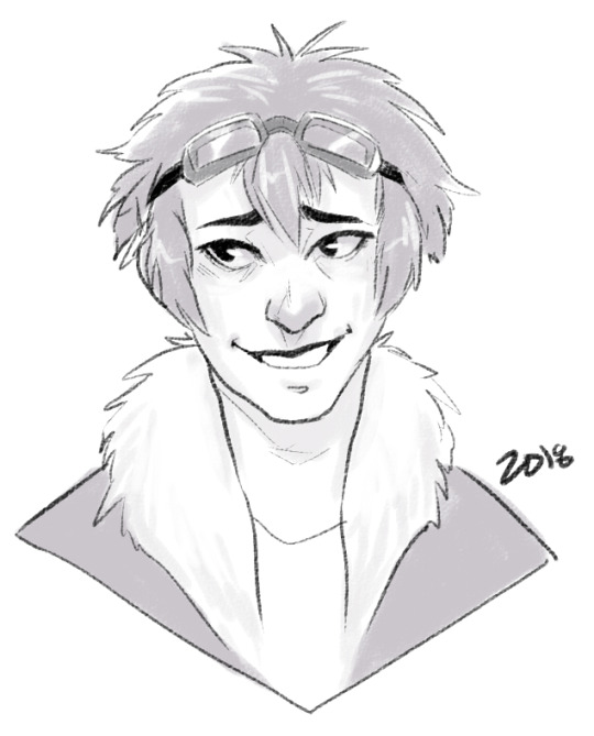
#this is a redraw of the same pose or so from 2+ years ago. it’s nice to see how my art’s improved! 🫡
Text


Happy Birthday, ya crazy mallard!
#looney tunes#daffy duck#baffy#because he’s holding the baffy mug i actually have irl 😌#i ain’t late i’m just postin late!#cels doodles#happy birthday to daffy and me 🥳#this is a redraw of the same pose or so from 2+ years ago. it’s nice to see how my art’s improved! 🫡
420 notes
·
View notes
Note
do you have any art that youve redrawn over the years? id love to see your improvement!!
hi!! there's been a few pieces that i've either redrawn or just revisited the sketches after a year or two! i've hunted down a few here...
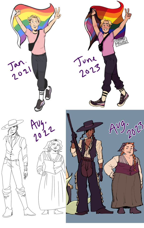
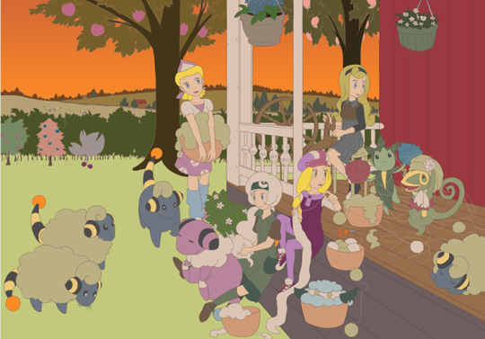
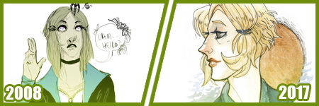
1 - pride alex [1st, 2nd] is probably the Most Redraw i've done, same pose and a few years apart. but it was so nice to see how my art's improved!
2 - [wash away your fear character line up] so i never posted the original sketch of these, but i had planned to do this character line up back a year ago, but i was really struggling art-wise and also just in personal life, so it was gathering dust after i gave up on it. i just decided to pick it up again the other day and redo it all!! and im SOOO happy i did. really makes me all warm to be able to redo them.
i'll put the others under a read more cuz this is. long LOL
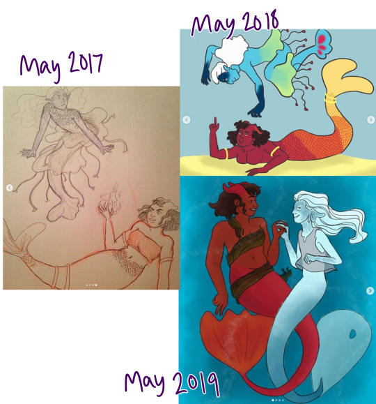
3 - one of my first FIRST on purpose redraws! these are me and my friend's ocs Chrissy & Arcturus, and i had drawn them every year for mermay until 2020... i think there's a sketch laying around somewhere lol (I got my first digital tablet in 2018 awww)
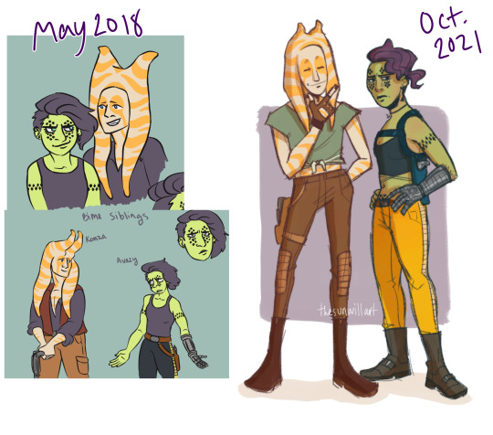
4 - [bounty hunter siblings] do oc redesigns count? im gonna say they do. i remember i just didnt know what i wanted to draw but i wanted to draw SOMETHING in oct 2021, so i pulled out these old star wars ocs lol
5 - [what the water gave me] another case of "i dont know what i want to draw so im gonna revisit an old sketch" this time the old guard themed lol i couldnt figure out how to do the water so i gave up on it at first
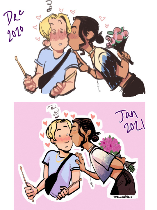
6 - [kiss one, kiss two] back in 2020/2021 i was drawing so much that i felt like my style was changing rapidly (and i guess improving as well with the practice!) so i felt like the redraw a month later really had improvements!! theyre so cute
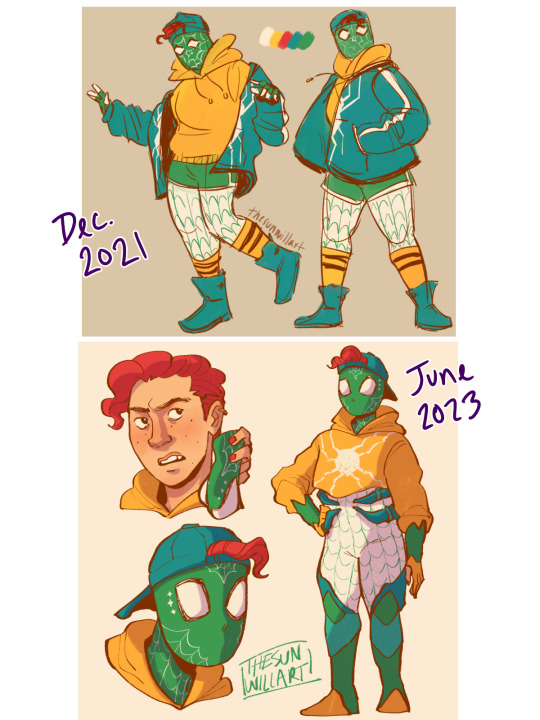
7 - [spidersona 1, redesign] another oc redesign! im really happy with how they came out!! very "first homemade suit -> official suit" vibes from these lol
but yeah!! that's the ones i found this time :D i hope u enjoyed this trip down memory lane! there's actually a small pile of pieces i want to do legit redraws for... i'll get around to them on a rainy day lol. also ty for the ask <3!
#ryn talks#asks#anonymous#this was so fun!! hehe#i didnt realize i had so many oc redesigns/redraws LOL#there's probably more too
33 notes
·
View notes
Note
do you have any tips for makign the pngtuber?! it looks so cute, are they just idle animations or do they actually move when you draw etc?
it's just idle animation, the movement on the drawing/gaming ones just use the blink slots to randomly change between the "normal" pose and the "doing something" pose. i used veadotube mini so the only thing I directly control is the shift between talking/not talking and switching between the different states (standing/drawing/gaming). they're quite simple, it's just the movement of animation giving it the illusion of complexity. I know there's a way out there to map mouse/controller movement to your vtuber thing, but I didn't look into it because... well. I didn't want to lol
things can be as simple or as complicated as you want it to be. I'd recommend keeping the designs simple so it's faster to draw and make variations of. it took me one night to work on this one and I learned a lot about better ways to organize/set up my art/file for exporting as I was making edits. if I had a really intricate-looking drawing to start with, I'd have spent more of my time just drawing a single pose instead of being able to place an image in the program to see how it works and how things look in it. I started with just 2 static images and then went "what if it moved a bit" and then added things as I went. breadth vs depth, I guess.
hmm... as for tips...
the talk mouth is on a layer that covers up part of the face when I unhide it. this was nice because when I made a change to the animated drawing/controller poses, I could export out the talking variation immediately by just turning 1 layer on, instead of having to swap/redo changes between multiple layers (annoying). I also had the parts that moved (the arms) in a separated group, so when I changed the thickness of a line on his vest I didn't have to redo that change over and over again across 3 more frames. I still had to redo it for the 3 poses, but that's just 3 times total instead of 1 + 3 + 3 = 7 times total. if I were to do this again, I'd have things set up in a way where the different variations use as many of the same layers as possible, so changing something in one place automatically works for every pose.
and you can keep your life simple. for the animated frames I didn't redraw the arms from scratch for each frame of movement-- I just used the liquify tool to nudge them slightly and fixed up any small sections that looked weird. it ends up looking very intentional but with less work. it's easy to make it look bad though if you don't keep it subtle, I just had to feel it out by doing it.
...and you don't need to do any animation if you don't want to!! I just think it's cool and also a fun challenge. all the stuff I did on this one is built upon my experience making that older one I linked in my post, 2 years ago. the goofy crying pose i made for that is where I learned you weren't restricted to static images for the stand/talk/blink/blink-talk poses.
the drawing sprite in my new one has the default pose set as a looping "drawing" animation, and the blink is set as a "paused drawing" image. it used to be the other way around but I found a limitation with how setting the random start time and duration of the blinks worked, so I switched them.
#pivasks#the entire learning process is about trying to do something specific and finding out all the ways to do it bad.#and eventually you solve enough problems to end up with something less bad. perhaps good eveb#I tried the liquify thing because I wanted slight movement without the full effort of redrawing...#the only reason it worked out is because I've used liquify and done enough animation-adjacent things in the past to know what to avoid lol#that's experience I guess. look at the difference between my old one and this new one. that's experience!!
6 notes
·
View notes
Text

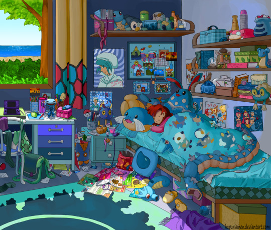
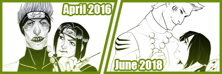
Did a little redraw of some ith fanart from around 2 years ago !! It’s so fun to see the similarities and what’s changed about my style!
[ID: two side-by-side drawings of Sonny and Graffiti Pete in the same pose- Sonny is grinning with his eyes shut, holding a slushie, while Pete is kissing his forehead with one arm around his shoulders. End ID]
#sonnypete#graffiti pete x sonny#sonny de la vega#graffiti pete#in the heights fanart#in the heights musical#redraw#sketch#procreate#digital art#artists on tumblr
50 notes
·
View notes
Photo
redraw of this one thing from 2 years ago
bonus under cut:
i have a really hard time drawing romantic poses and i stress doodle on the side whenever i do end up drawing them
so i drew something on the same canvas of the piece and almost forgot to hide the layer before exporting:
48 notes
·
View notes
Text
I recently reblogged that one post where someone redrew their old oc. I thought about the same, but I don’t really have many (I mostly drew animals, pokemon and other creatures as a kid). But I did venture to the depths of my 13-year-old deviantArt gallery to see what I could find. So now it’s time for a cringe compilation on some teen’s artwork! Or so I thought, but the depressing fact is that I found a lot of stuff in my old work that I could learn a thing or two from...
Overall this post is just a place for me to get a chance to talk about older drawings nobody looks at any more so good luck to those who intend to proceed to readmore.

(2006)
There were some unkind discoveries in my tour to the past when I noticed how I had stagnated on some areas (and sometimes it even feels like regression), but it is comforting to see that there has been some development too. But seriously that is some ow the edge design right there. If you ever think about edgy deviantArt ocs you should know that I was there too.
(The angel chick looks kinda dull in comparison...)

(2007)
I did some couple dozen chibis on characters I knew (though not necessarily too well apparently, I’ve never played Disgaea). I find the poses and expressions on some of these fascinating, like nowadays I feel it’s much more common for me to draw just a generic standing pose. With this and many of the other older drawings there are some fun and expressive ideas that were beyond my ability to execute properly, but apparently I didn’t let it stop me. Now it’s more like that if something seems too difficult for me to draw I won’t even try, but back then I drew it anyway. I probably should put some effort into trying to get back to that mindset.
Part 1 & Part 2 on dA

(2009)
I have no idea how I’ve been able to create this one because the light effect. And this is drawn with Copic markers! In traditional media! So I had to get it right on the first try! And since Copics are expensive I had very limited resources!
The girls are unnamed ocs, the one on the right is the everygirl and the other one is her friend from some alternate fantasy world that changed according to the everygirl’s wishes (so it was like her imaginary world).


(2011)
This is Beta, the only oc of any substance I’ve ever had (aside from the FuwaFuwa gang I guess). She had such a grand story that it never got anywhere, but I sometimes posted drawings of her that didn’t mean anything to anyone else since her story was only in my head. I really like that winter outfit, the web is a fun design idea even if it looks like it’d get stuck on every bush branch on your way. The pic of her trying to put on a hood pisses me off because I have a feeling that if I tried to draw that today it would look worse. Maybe I should take my own advice from three paragraphs ago and try a redraw anyway
(More pics of her outfits and hair: Clothes 1, clothes 2 & hair on dA)
I also found a winter themed drawing of her which looks like an early FuwaFuwa precure.
(2012)
I’ve always liked style parodies and apparently I did 44 of Beta. I remember that white hair was kind of an unfortunate choice since it made colouring highlights impossible. The Precure ones looked decent enough that I think I’ll give them their own post.
(These are Sugar Sugar Rune, Utena & Trinity Blood)
all 44 on dA

(2013)
At some point I drew a lot of stuff for a Disney Princess Pokemon au, and while it has now been overthrown by Attack on Titan and magical girls I’d love to get back to it one day. Art-wise some of the best and most ambitious stuff I’ve ever done is from this au, and the first drawing on this list (that’s Merida) is one of my favourites. Granted it was done with a how-to-draw-rain tutorial so the colour palette is copied, so it’s always felt like I can’t really take proper credit of the result, but the concept and execution are still mine.
I’ve always liked ‘cluttered room’ type drawings, and I even submitted an idea for a Precure themed one for a zine. It didn’t get chosen, but I still want to draw it one day. Like, right now this instant, as if I didn’t already have enough on my to-do list.
The last one was abandoned because I didn’t know how to get the colours right for a warm sunset vibe. Shame really because there’s a lot of fun stuff going on there.
full size on dA: #2 & #3
11 notes
·
View notes
Photo
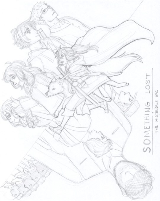
This begins as a story of a girl and her wolf. But really, it is a story of a girl, her wolf, the friends they meet, and the enemies they make.
This is a story of finding Something Lost.
---
Middle, bold highlight:
Satoru (the wolf), Miyaka Fujiwara (with a sword a cape).
Upper left side, from left to right:
Emilynne Faye (very wavy hair, round glasses), Aera Elaine Neryns (wavy hair, waving), Kenji Matsumoto (wearing a jacket, sword over shoulder), John Burke (rectangular glasses, short hair).
Lower right side, current orientation (sorry):
nondescript Remainders (5 shadowy figures with hats), Christopher Whelan (middle area immediately below Miyaka and Satoru, wearing suspenders), ??? (large figure with obscured eyes), Louis Wiram (rightmost with the hat, next to the SOMETHING LOST logo).
---
Hello hello, and long time no post. I had access to a perfectly good scanner over my summer break, but honestly couldn’t find it in me to actively scan and post my drawings. I’ve yet to really decide on what kind of drawings I’d like to post or not on this particular blog, since I draw almost exclusively characters / content from Something Lost, and fairly often as well.
Last night, I spent around two hours cranking out this sketch. A year and a half ago, I sketched a series of “posters” for each arc of Something Lost, where each one contained all the featured characters within the arc. I remember being quite proud of them, but looking back, they were rather chaotic and messy.
Remembering those sketches inspired me to do a redraw of, at the very least, the poster for the first arc of the story. I like to think I have a better sense of composition and how to arrange characters this time around, even if I did slightly misjudge where the middle of the paper was. I’ve also been incorporating bold outlines into my drawings these days, which was a huge help in distinguishing Miyaka and Satoru from the rest of the characters on the page.
I’ve forgotten how hellish it is to draw so many characters together on the same page, which probably explains why I had spent the 2 hours on it. I more or less squandered all my energy working on Miyaka and Satoru’s posing that I didn’t quite have the energy to carry it through for the rest of the characters featured in the drawing. Regardless, it’s rather refreshing to see everyone in my current style.
#something lost#miyaka fujiwara#satoru#emilynne faye#aera neryns#kenji matsumoto#john burke#christopher whelan#louis wiram#sketch#akami art
1 note
·
View note
Text
10 months ago, I decided to make a game.
10 months later, I have a bunch of art and a bunch of interface code and a whole pile of design notes, and not much game.
This is my story.
(Now in bullet point form so that I can stop redrafting it >.>)
I have a treatment-resistant anxiety disorder which significantly interferes with my ability to work - both on my own projects and other things that might be called 'gainful employment'. (I still feel some shame at admitting this so bluntly, even though I feel ideologically that there should be no more shame in this than any physical impairment that resulted in the same. Fuck mental health stigma, defining self-worth by employment is toxic capitalist dogma, etc, etc.)
In part because of this, I had been effectively unemployed and living with my mother for a number of years. (I still did my best to hammer out projects, but nothing, y'know, actually PAID anything... >.>)
Then in late 2017, my mother died (somewhat unexpectedly) of cancer, which left me with no home (we'd been sharing an apartment that she had been covering most of the rent on) and literally zero income. Obviously grief and upheaval did not help with any of my prior difficulties managing employment, either.
After some debate, I decided to combine the savings I had left over from my last stint as a network administrator with a (modest) inheritance from my mother and try to actually make a living at making games. This is something I had always theoretically wanted to do, but never put actual money on the line for. (Okay, in a perfect world, I'd happily give all my work away for free and live on some minimum guaranteed income, but we do not yet live in such a world).
One of my historically biggest gamedev weaknesses was a lack of artistic ability, so this seemed a perfect thing to put money towards. I could hire an artist, which would not only allow me to make a more commercially appealing product, but would also free me up to focus on the mechanical and writing aspects of gamedev, which are the areas I most wanted to be working on and also consider myself best at. (Any followers that remember my work on ToK may recall me complaining there about how it seemed I spent my time on nothing but graphics? >.>
This was shortly after Touhou fangames had been given the official blessing to be sold on Steam, and some had already achieved great success there, so this seemed like a good way to create some instant appeal and interest in my game, while working with a franchise that I already loved to death and had written hundreds of thousands of words of fanfiction for (eg: This or that or this other thing)
And so Chronicle of False History was born!
...and yet I somehow still spent most of my time working on art. You see, having never worked with an actual artist before, I underestimated a number of things:
1) I underestimated how much work it would be to find a suitable artist in the first place (though at least this part is done)
2) I gravely underestimated how much of my time would be spent on 'art direction' or 'project management' or whatever you want to call it.
Every sprite that is created, even for canonical character designs, requires making a large number of decisions regarding:
What attack and spell poses it will have (and how to cover the broadest range of signature abilities with just two 'frames', for budget reasons)
Which of enumerable (and sometimes mutually-exclusive) costume details from canon (and fanon) should be selected (and do you have any idea just how many variations there are on things as straightforward as 'the hilt of Miko's sword'?)
Gathering a pile of reference images that clearly detail every element of the character (and action poses) to be drawn (which is also harder than you might think; a lot of art is sufficiently suggestive of details to view without actually being a good reference to reproduce and anything that isn't exactly what I'm looking for risks my artist misunderstanding my request entirely)
Designing alternate-history variants of this character in a way that can be clearly conveyed with minimal costume and color changes alone (as any significant redrawing would cost far more and the cast of the game is so large already) and doing so before the part of the game they would appear in is even written.
Gathering reference images for all of those things
Writing up a detailed description of all the decisions listed above (and often drawing actual diagrams of action poses and projectile overlays that are ambiguous to express with just words) and handing it over to my artist
Waiting a while, then getting sketches back and finding out that there is inevitably a whole pile of things that need changing (either because the artist misunderstood my request entirely - despite all that previous effort - or because an idea of mine looked far better in my own head than it does, or just the usual 'incremental improvements' to something that is on the right track but not quite there - like a sort of collaborative redrafting.)
Spending hours poking at these sketches in an image editor, testing how well individual details resolve at in-game size, how well the action frames snap together, and how I feel about each questionable element. This often extends to (crudely) adjusting and readjusting the position and angle of individual limbs and eyebrows and projectiles that feel 'off' so that I can figure out what I would like her to do with them (and whether it's even worth making her take the effort to do anything with them at all)
Finally, summarizing that feedback into a detailed list of change requests (often with new diagrams to clarify my words) and repeating the last two steps over and over and over again.
Like, she does great work - don't get me wrong. I'm very pleased with the end results and this is just an inevitable part of the process of making something professional. But it does also mean that my original idea that paying an artist would free me up to work on things other than art has been... laughable in retrospect, to say the very least. In fact, it's very possible that a greater percentage of my dev time is spent on art-related tasks than on previous projects where I was doing all the art myself - I just get better art for my trouble (and money....)
This is especially true given that:
3) I underestimated just how much art work I would still need to do completely independently of her
Raven is doing character sprites. These are arguably the most individually important art content in the game, and certainly the ones that give it the most screenshot appeal, but that has left me to do everything else. Which has included:
Figuring out how to make battle backgrounds that passably match the art style of the game (since commissioning enough of these to fill all the locations needed would absolutely blow my budget)
Designing the entire look and feel of the combat screen to mesh well with Raven's sprites while also being something I am personally capable of making (using only cheap/free resources)
Creating all tweened animations and particle effects
Designing every single little UI element that exists in the game:
Elemental symbols
Dialogue boxes
Spellcard icons (and the entire menu design that requires them in the first place)
Combat action menus
Icons to indicate spellcard usability
Spellcard tooltips
Targeting overlays
A turn order bar
Spellcard availability reminders
Font choice for damage/healing numbers, spellcard names,
More cursors that you can shake a stick at
Lots more stuff, I'm sure
And even the completed sprites I get from Raven still need multiple hours of processing each to split them into component parts with sufficient information to re-composite and animate in-game. (If you've ever wondered why my screenshots seem to only involve Nazrin while I've already shown sprites for multiple other characters, this is why)
It never ends!!
...which is a fact that has been extremely draining. Like, it is probably difficult to overstate just how demoralizing it has been to pay this much money and work this hard and long and still somehow be mostly doing art (or visual-related coding) when I naively thought this project would offer some freedom from this after the endless, endless hours I spent doing this for ToK.
And it has also revealed a very tangible (and extremely stressful and troubling) fact about this game's development:
I am going to run out of money before I am remotely close to having a saleable product
When I first laid out plans for this project, I ballparked a modest but realistic budget for the artwork. I chose an art style that could provide pleasing visuals for a very large cast of characters at a cost-effective rate (for a game, at least). I deliberately limited my cast size based upon the agreed-upon cost per character with my artist (and have repeatedly held myself back from various fun ideas because I felt I simply could not afford to make a habit of such things). I studied sales figures for comparable games to aim for a target that had a reasonable probability of sufficient return (or at least breaking even). Game development is always a gamble, of course, but I felt (and still feel) that I made a sensible budget call and it was an amount I was fully able to pay.
But in all this, I neglected to factor in what has been, by far, my most costly development expense: remaining alive.
You see, at the rate my artist is able to produce work, the cost of retaining her is utterly dwarfed by such banal things as food and rent and not freezing to death in the winter. I live about as modest a lifestyle as possible - a one-room apartment, no car, no eating out, nothing in the way of luxuries (I don't even own a cell phone) - but that is still awfully expensive when you have no income and no prospect of it in the immediate future either.
It's a vicious cycle. The less work I get done, the more I feel future financial pressures breathing down my neck, the less work I'm able to get done (due to stress and general demoralization), the more I feel future financial pressures, etc, etc, etc.
And there's a logistical problem even outside of my own stress and anxiety and being damnably human in my need for actual rest: I've spent nearly 10 months working together with my artist and thus have a pretty good sense of how fast she's able to get character art done. And unless something changes dramatically, the time required for her to finish the art assets for the game will be several years longer than I will have any savings left to pay for them - because, as it turns out, hiring an artist is actually a tiny expense compared to merely continuing to exist.
I... don't really have a good answer for this problem and I've spent a lot of time consumed by it at this point. I have faith that Chronicle of False History can be a great game... eventually. But that does no one any good if I can't stay afloat long enough to make it. I've considered pivoting to another smaller-scope game project in the meantime, in the hopes of generating some modest influx of cash that could be used to fund the rest of CoFH's development, but there are a whole slew of reasons this is dicey (not least of which is that small-scope projects have a tendency to not be nearly as small as one anticipates...)
I've also thought about exploring Patreon, but like... I'm fully aware that I don't currently produce nearly enough interesting content for people to just want to throw money at. Tantalizing glimpses of it, perhaps. The promise that in the future I might. But what do I really have to show for this at the moment?
And so, here I am, exhausted by a marathon of work I did not properly anticipate and without the tangible reward I'd expected to have by this point (not a finished game, by any means, but like... much more of one than I actually have). And every month that passes by in which I get less done on my game than anticipated is yet more cash bleeding out of my bank account, like I'm trapped on a badly leaking boat with no shore in sight. I need a rest from all these stressors (and some more personal ones not described here), but when time spent not working has itself become a stressor these days, where can I even find it?
...wow, this sure sounded upbeat, huh?
In any case, I still care a lot about CoFH and have no intention of stopping work on it. I just... need to figure out some way to allow myself to continue to do so without this enormous capitalist behemoth crushing me beneath it.
(I had originally intended to provide more of an overview of the useful work accomplished over these past 10 months here, with mockups showing the evolution of the game's visual design, but clearly that goes into a future post at this point).
#Chronicle of False History#Gamedev#Game Development#CoFH#Personal (Kinda)#What; surely posting a massive wall of text at 5 in the morning is _completely sensible_#And not at all inane#I am... tired#But these sure are words#So many words#I apologize if I drown anyone in them
5 notes
·
View notes
Text
Art Growth Compilation

I really enjoy doing posts about improvement in art.
It makes me feel better about my work, especially with how busy I am these days.
I wanted to compile all the comparisons I’ve made over the years and kinda discuss the posts, for myself or others.
I thought it’d be funny to start with comparing how I first drew on a tablet, using dodge and burn tools, to how I do now which is using layers and actually painting. It’s funny to look back on that, you know?
I linked the post I made, compiling all the month to month memes from 2003-2017 that I try and do yearly. And everything else is under a cut ;w;’‘/

Most artists have done a drawing of themselves and a few Pokemon, or their team. I did that in 2010, and was dissatisfied with my work...
I took a crack again in 2013 after I’d learned to draw more animals and not be so Edgy(tm) I really liked the results. I still didn’t use references though, because I was lazy. I just didn’t want to. I still was on that boat feeling like I was CHEATING. I wasn’t being CREATIVE if I looked at references.
Artists get stuck on using reference and it’s AWFUL. USE THEM. USE TWENTY. LEARN!! It’s so HELPFUL, I wish I had started sooner.
In 2014 though -

I tried again.
I had gotten better at anatomy, but most of all, I started to work off references more. I started to really focus on not stylizing so much, but to work on actually making things look like things. I started to work on caring about COMPARISON sizes. Composition!!
While Pokemon reference sizes are -wiggle hands- and while my team changed up, I was satisfied that I could draw Arbok ACTUALLY like a cobra now, Meowth is easy given it’s just a noseless cat so to speak, Haunter is literally a triangle cloud - I was satisfied having drawn that team.
My secondary team in the new games? I was excited to draw them. It was fresh and new and FUN and it turned out PRECIOUS.
I learned better how to proportion things in an image for layout, and just... making characters feel COHESIVE in the same space.
It was a nice thing to keep visiting. I have a sketch in the works for an update even hopefully.
These pieces are kind of interesting to me too, because they’re towards the end of my era of THIN lineart?
My lineart has gone from this, and THIS, to this.
Literally I use to not believe in line weight, I can still do thin work of course, but I’m not a fan of trying to FORCE it like I use to? Even the second link, I went from the SMALLEST brush in Sai, to using a marker brush that had barely ANY give, to a custom brush on Sai that acts like a Paint Chat brush I use to use with friends online!
That’s what I mean about style too, like you may reserve yourself about things - like not coloring black in and outlining with white, or certain ways you do things. But the growth and changing and figuring FUN ways to color that black etc is where the fun of art comes in, to me??
Learn. EXPERIMENT. PUSH!
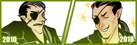
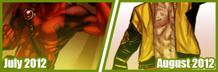
A few months ago, I did my first redraw. Of this piece from 2012.
Six years difference.
This was interesting for a number of reasons. There’s aspects I like more in the old one, but not many. I really like the pose a bit better, but I like the casual closeness that I did in the new one because that’s more my Shepard.
But technically speaking, it’s worlds better because I took time. I paid attention to details. I did fun things instead of rushing. I took time with my coloring and didn’t SMEAR it around. I had a friend who use to complain I drew so fast and they felt so SLOW, but I love what that taught me. I started taking more time on my art, and enjoying it more since I caught more mistakes and vastly improved. By leaps and bounds.
It’s amazing what a difference six years makes in not only style, which is often a FOCUS of these things? My style has come awkwardly and naturally to me over the years of critically picking certain things apart? but I really love where it’s gotten.
I have things I want to get back to, but I love... where it is, and CAN be?
But it’s wild to me how much change happens in technical handling? It’s a hand in hand thing, you can’t focus on one or the other only, or the other suffers.
Honestly this has been my favorite improvement to notice though?
Kisame was a character I felt I should be able to draw EASILY? Not so much. Itachi? ALSO EASY. Not so much??
Kisame has weird eyes to grasp how to draw? Thus focusing on them kept making them wonky to me!! On top of that, he’s everything I’ve been use to drawing for AGES because he has a muscular body, with a smaller waist? ... that was something I was use to drawing? I still was awkward getting back into the swing of that... Drawing HIS HAIR though? NOT SO EASY....
But like, Itachi should have been easy, but I have a thing about him appearing too feminine as he gets drawn because his eyelashes, and I’ve really found a nice... medium at this point?
But even still like my face styles and eye styles are finally to a comfortable point for me? I have stopped focusing on some weird things with Itachi’s hair and just... DO IT? But even still like...
The improvement here is literally just if I don’t know how to do something, or I’m not satisfied with how I do it? I just keep at it.
It’s a theme of this post honestly... repetition, persistence.
Keep drawing it. Keep trying to figure out what it is that’s catching you off about how you do it. Don’t like how you do eyes or how they fit on the face? Look at facial structures and references and figure it out. Draw them separate and figure out how to apply them to what you are.
Remember there’s a skull in there. I draw the holes in the skull like the eye sockets, and the nose area to help my proportions for SURE.
I’ve also gotten to a nice marriage in my lineart? The piece before the recent one, those lines feel HARDER or HEAVIER? The newest piece seems...softer? Like I’m lighter handed again?
I really like critiquing my own growth on what is good or working better for me? Older pieces it looks like I’m putting lineweight for SAKE of it versus where it goes now?
INTERESTING.
Like this lineup -

My style shifts so RAPIDLY, it still is noticeably MY style to people, but parts shift so VIOLENTLY because I’m constantly picking at what I don’t LIKE.
It’s funny too in the case of Kisame and Itachi because consistently I’m drawing the SAME character over and over - can make you REALIZE how you’re doing something wrong?
Like, here’s a difference of eight years, and it’s all the brush I use now, and it REALLY shows how my style has changed - in the aspect of one point of reference?
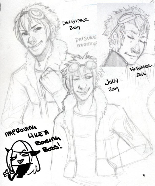
I have a childhood favorite character too, of Daisuke, and I use to be bad at drawing boys, and I use to be SUPER bad at drawing fluffy hair?
It was something I specifically started to learn to do? And I started to draw Daisuke every few months or years for a while. Especially when I started to first REALIZE I didn’t like my style that much?
But the middle one was July 2009, top left is less than 6 months later, and the last one is about a year later. DRASTIC DIFFERENCE. But next -
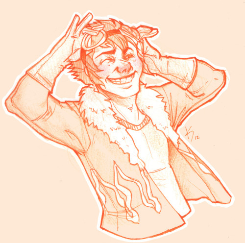
This one was in 2012, when I started to do more with teeth, or first dipping my toes into anatomy. I started to focus more on HANDS too, I was super bad at them. Overall I started to focus more on making my art have...ages? Like a boy versus a man. Facial features being DIFFERENT.
I can look at this boring little bust and see that he comes off more of a teenage boy to me now. I need to work more on figuring how to draw asian features especially the eyes. Sometimes I hit the mark, other times I don’t.
but between this and 2012? Not too much has changed. I do hair fluffier now, and I angle the eyes better. The teeth not being outlined doesn’t give that weird effect where I might give him TOO MANY TEETH....
People do that and it’s easy but whoof.
So there’s still learning and adapting to do in QUICK drawings, you know? but I can still see there’s good things. That took me like 5 minutes to draw? Not bad honestly.

In it’s own bracket is original characters though too?? But also divergent of STYLE shifts because like...
OKAY. Nightmare Syndicate’s story.. started for me in 7th or 8th grade, that was when I was...14? 15? I’ve been fleshing it out for like 13 years, that’s wild haha!! I love my kids and all.
But okay so SIALI. She’s still fairly similar but I restructured her face for SURE. She’s gotten less edgy, she’s.... a teenage girl.

FELIX?? CHRIST. He’s been such a long journey!! More on that later?
Rot and even Cor?? Rot and Cor are a shorter span of development, but Rot started in Highschool so almost 10 years ago, and Cor has been fairly solid - but even just DRAWING him over three years? Go look at how much he changes.. I’m not married to concepts easily. haha!
People act like making a character you’re STUCK with it. Like Oh boy, I better make this character good, from the get go!!
I only worry about that with small potatoes like my Pillar(Gods) designs I just made for the comic?? Even still, small things will change with them I’m sure.
But not only has Felix and Siali changed, but they’ve GROWN with my style and DEFINED it even. I’ve had to adjust my style to support Felix’s look honestly a LOT. Bend my rules. Break my anatomy stickler attitude - and honestly, that’s the thing.
You have to learn the rules and anatomy BEFORE you can break them. A style built upon broken anatomy will fail you down the road if you just excuse everything with style.
Learn to draw the hands. Learn to draw the feet. Figure out the face. Bones exist. You can break the FUCK out of it once you learn how to do it, you know? Like I’ve seen so many styles I LOVE who are cartoony and BROKEN AS FUCK, but there’s still some STRUCTURE to it. Most of those people can still structure a face just fine, and the reason exaggeration works so well is because there’s like unwritten rules for what works and doesn’t based on that?
Idk.
Felix has a very elongated torso, he’s like 7′ or 8′ tall so I mean?? He’s... broken anatomy, but he’s... lanky - but his muscle is LITHE and stretched. It makes contextual sense. That’s the important part.
But even designs, it’s important to understand designs YOU make, or like... to understand they’ll CHANGE and that’s growth within your art too?
Like okay, example. Felix has a millipede inspired monster form. But with designing that? I still have to know how millipedes and SNAKES work because there's bones and vertebrae in there??

But there’s also the difference of like... CONCEPT, versus execution. You can design a fucking badass character, but understanding your own concept is SOMETHING.
I had no idea how this would play out, until I was mapping out his ‘midsection’ spikes? and man. MY STYLE WAS MADE FOR THIS CHALLENGE NOW. Which is so interesting how smooth my style has always been? Felix has defined ANGLES in it, and it’s hilarious tbh?
But even too, I’ve had to work with Felix’s monster form FACE, to break the rules to make it WORK the way I need it too?
On the anatomy subject too, like when I first got into Marvel comics 6 years ago or so? I had no idea how to do muscle structures?? I was so BAD at it.
I can look at this left image and CRINGE so badly at how NONE of those are muscles?? THOSE ARE THINGS I PERCEIVE AS MUSCLES. Like...
A course I took taught me to draw what I see, not what I know. That’s the whole point of that post that goes around about drawing a shrimp. Look it up. It’s hilarious and cute.
But it’s like, asking an artist to draw a bike, you can tell who uses reference and who WINGS it. It’s funny, but like it’s what you know versus what you see.
I started to study anatomy like crazy and was seeing improvements days at a time. The right image was done like... a month later? already I can see the muscles under the pectorals? those look normal now. the abs aren’t dough lumps under the skin in a perfect 6 pack, they’re the actual plane shapes.
I was trying to find a good reference for myself of learning to make men ‘thicker’ too in terms of the waist etc since the left is really...thin.... but...

A bit better, but even still, comparing these two - they’re 2 months apart? and I can see understanding more about arms and how they connect to the body, where the planes ACTUALLY lay for the chest and obliques and such?
I can see improvements from July 2012 up there, to - WHOOPS. I FORGOT TO CHANGE THE YEAR LMAO... TO FEBRUARY 2013...omg
I mean, I could go on and on about improvements I see, when I go through my art though? Gosh.
Like I’m seeing so SO many bad hands and feet in my old stuff, and just CRINGING because tricks I learned for myself by now?
I give so many pointers and streams and screenshares on discord still to help people with art and it cracks me up?? Like...
I dunno. I’m pretty mediocre tbh, but god damn.
21 notes
·
View notes
Photo

Process and wip images for A House That Holds Long Limbs (Part 2)
See Part 1 process and wip documentation
Read the pages for part 2 here (full complete version will be linked from YYH North Bound master post)
As a story progresses, I tend to become more comfortable with jumping ahead and around in my so-called process. This is mainly because the idea of getting deeper into the action is exciting and I want to get to drawing the pages as quickly as possible. The downside is that it usually results in a lot of “oops” and rework on what was supposed to be a final page.
Here you’ll see that script/pagination/thumbnailing and final pages are all starting to drift even more than in Part 1.
The (last version of the) script
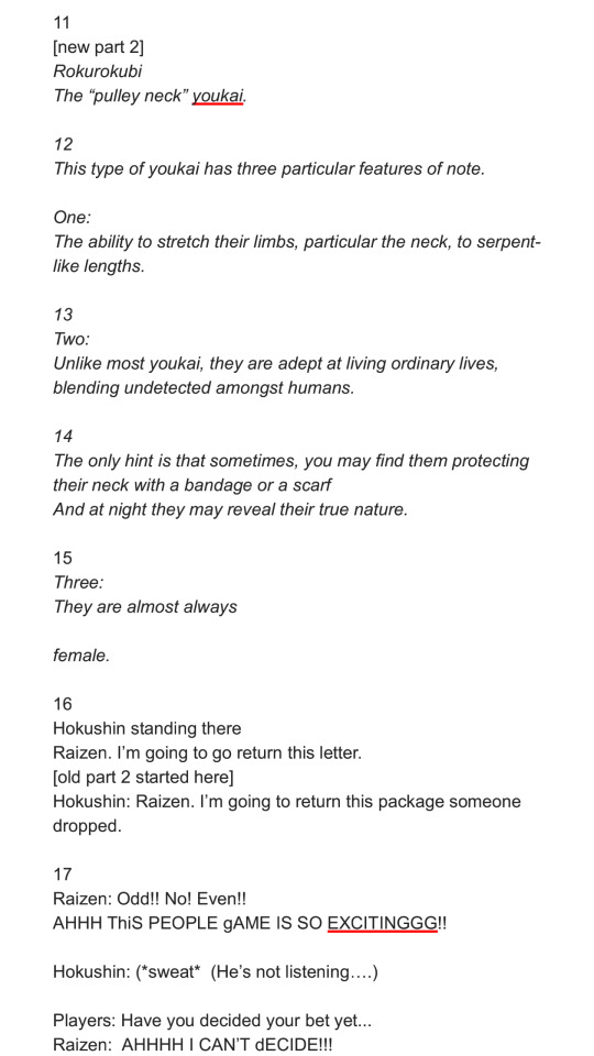
Earlier versions were even more point form and incoherent with typos. But, it only needs to capture enough that I can recognize key actions, points of dialogue, the mood, things to draw in the panels, etc. A few specific items to point out:
“[new part 2]”: The script originally had no exposition on rokurokubi - it went straight to Hokushin telling Raizen he was leaving. It occurred to me later, after I’d started thumbnailing, that inserting a few pages of storytelling narrative right here would help to further solidify the kaidan (traditional Japanese ghost story) effect and mood. More importantly, it creates a baseline reference for what the reader will know about rokurokubi for the purposes of this story. I was lucky that Part 1 and Part 2 were cut neatly enough that this wouldn’t be jarring.
I’m still not entirely happy with the text for this section, mainly the “features of note” about rokurokubi. Not just the fact that it’s oversimplification and slight adaptation of actual Japanese folklore - which can’t be avoided unless I want to write a historical essay here. I’m mainly not super keen on how each of the three items has been phrased. It’d be nice to make the three points more parallel in terms of length, but I couldn’t seem to edit, increase the number of points (by splitting them up), or reorder it effectively without negatively impacting other aspects of pacing and information reveal. More points would draw out the pages longer than I wanted, and some points were clearly sub to other points. The final here is the “good enough” version. JUST GET IT DONE ALREADY SO THAT IT CAN GO OUT INTO THE WORLD.
Sooo many word choice changes. The biggest one, done at the last second, was “They are almost always female” to “They are rarely male”. Other phrasings I debated - “They are very rarely male”, “They are almost never male”, etc. Lemme tell ya, it’s easy to get lost in the weeds… Anyways, the main reason for this was because after I drew it and ran the text through my head, the originally-intended juxtaposition of Hokushin on this page with the word “female” felt too subtle. I felt it would create a brief moment of cognitive dissonance that didn’t serve the flow of the story, so I changed it to create emphasis on the same gender instead with the rationale that it will flow more smoothly and allow the reader to focus their attention on the fact “males are very rare” more than the mental hiccup of processing the juxtaposition. DOES THAT MAKE ANY SENSE?? It made sense in my head.
Anyhow, I’m sure there are people who will disagree with many of the decisions I’ve made, but at least you can see what I was trying to do.
Thumbnails
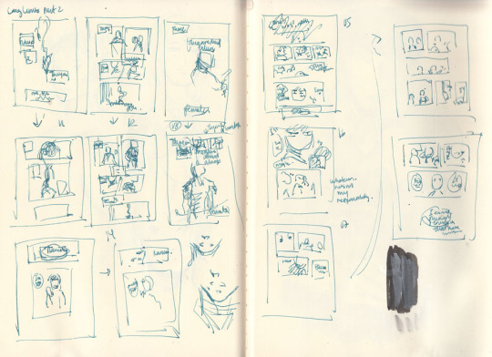
As mentioned, these thumbnails were done BEFORE I decided to insert the exposition at the beginning.
The first two rows on the left hand page are actually the same set of pages - you can see little arrows pointing down or to the right whenever I’m dissatisfied with a thumbnail and attempt to redraw it.
WIPs
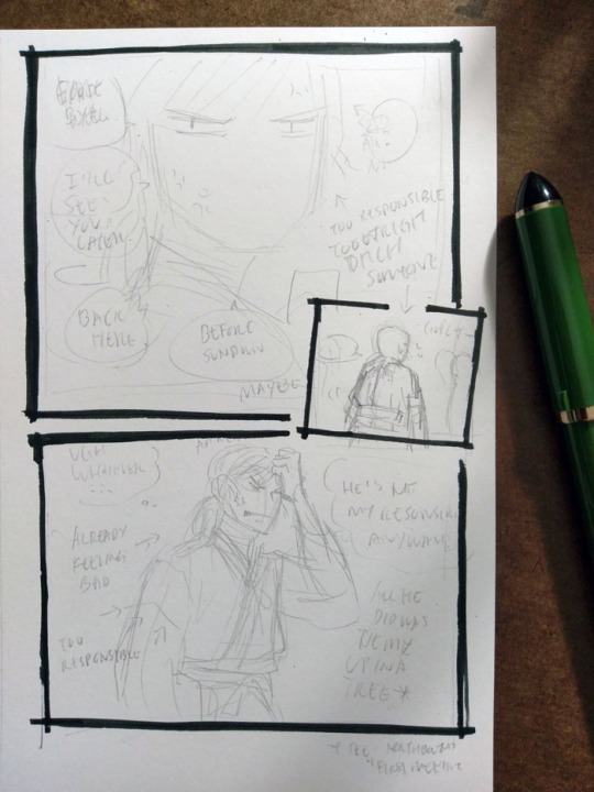
I really like how Hokushin turned out in the last panel here; I like the pencils more than the final inked version. It’s also another example of changing text up to the last second. In case it’s hard to make out, it says (along with what happened to them in the final):
First thought bubble: Ugh, whatever… (moved to the next page, seemed to work better as the end exclamation for this sequence of thoughts before he turns his attention to something else)
Over Hokushin’s head: Aaaargh (moved into the thought bubble)
Second thought bubble: He’s not my responsibility anyways! (no change)
First arrow: *already feeling bad* (no change)
Second arrow: *too responsible* (dropped, since a previous panel already said “too responsible”. Too redundant)
Next to Hokushin: All he did was tie me up in a tree (no change)
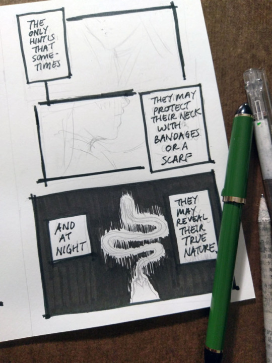
The above panel “And at night...” was a thrilling and scary thing for me lmao. I don’t usually tackle large patches/fills of black, since many of my comics are scribbly in style (pencils, hatching) or colour. I’m too lazy for screentones, traditional or digital. It’ll be interesting as parts of the story coming up will involve poorly lit/dim/dark spaces. I’ve been reviewing how other artists handle it, particularly those with styles driven by pure-ink or minimalist type approaches. Two immediate examples from Yu Yu Hakusho that I’ve been going back to are the dark room fights during Genkai’s successor trials (I’ve taken a similar approach here), and the haunted bedroom case in volume 19. Hardcore cross-hatching seems like a likely route, but that freaks me out when I have to do it over faces. I’d like to minimize or avoid screentoning out of principle, but I still want to create a clear mood, so we’ll see how it goes...

This was my view while inking this page - holding the book in one hand while inking Hokushin with the other. Using the more freehand, sketchy inking style for this comic was so helpful in terms of reducing my inking anxiety and allowing me to work faster.
It’s always great when you can find a reference for period armor (because I find armor very difficult) that is so close to the pose you’re already drawing. There are some small differences - for example, Hokushin’s head is turned more to the right; his left arm is turned and raised more as he’s pulling the sword upwards. But it’s close enough.
Also, spotlight on a few of the books I’ve referenced over the course of working on North Bound in general and this part specifically.
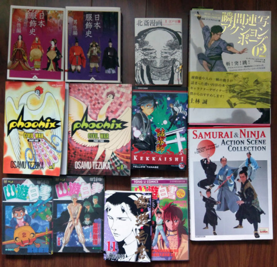
Clockwise from top left:
日本服飾史 女性編 and 男性編 (History of clothing/costume in Japan female and male editions). This marvelous set of books highlights Japanese fashion throughout history. I’ve actually been referencing these photos for a long time before I ever picked up these books - you can see them at the Costume Museum’s website here, alongside helpful line drawings and translations of some of the details. But the books allow me to see a lot more detail.
Hokusai manga vol 1 (this book is published as part of a set of 3). Sketches by Hokusai. This one focuses on “The life and manners of the day” and includes drawings of youkai, including rokurokubi, as well. You can check out the drawings online at places like The Pulverer Collection Online Catalogue.
Action references!! Real Action Pose Collection 02 (focuses on sword fights) and my favourite Samurai & Ninja Action Scene Collection. Not used as much in Long Limbs, but was helpful in some of the other chapters. The time frame is really much later than what I need for ideal clothing references, but it’s helpful for things like movement.
Kekkaishi volume 32. SPOILER a key flashback takes place about 500 years ago, which is actually a few centuries off give or take from but at least it’s closer than the Edo period. I’ve been looking at it for houses, some clothing.
Osamu Tezuka’s Phoenix - Civil War parts 1 and 2. I reference this so much while working on North Bound in general. It has scenes with peasants and commoners and some appropriate street and interior environments, not just stuff focused on the aristocracy or warrior classes. Just have to remember that they flipped all the artwork in the English version lol
Bunch of Yu Yu Hakusho manga and anime references from the end of the series, mostly for Raizen, the kudakusushi and just to check against things he or Hokushin said. The actual clothing and environments are not helpful at all lol
Last minute edits
After I posted, I discovered a few mistakes (of course). I used to freak out a lot and drop everything to fix it. Now I just sigh and laugh (and still freak out a little bit, depending on the mistake) and then decide what’s important enough to fix and what is like, “Oh well, whatever, move on with my life”.
I feel that seeing other artists share their frustrations and mistakes helps a lot of people feel better about it when they realize IT HAPPENS ALL THE TIME TO EVERYONE (including professionals. There are errors like this in professionally published series, like Yu Yu Hakusho, too). YOU’RE NOT ALONE.
So, these ones bugged me enough that I quickly redrew them on the computer.

#yu yu hakusho#comics#fanart#hokushin#process#wip#art supplies#sketches#art by Maiji/Mary Huang#yyh north bound#raizen
6 notes
·
View notes
Photo
Ive been meaning to redraw an old pic I used to love,,,, so I mean,,,, ;0
This is my first redraw guys,,,,,, and I love it and hate it at the same time cuz I keep looking up atht the old picutre and Jack is just,,,,,,,,,,,,,, He reminds me of like Mr.Crocker cuz hes pale, kinda hunched over, awkwardly posed and becuz his chest is so flat and boxy it just looks like his boobs are sagging and iM D Y IN--
Also in the first pic from like 2 years ago Jack just looks sad and in the newer one he just looks mildly pissed and confused at the same time and if that isnt the best representation for his character development thus far, then idk what is
ALSO HIS HAIR IS SO POOFY AND WILD AT THE SAME TIME AND ITS EXACTLY HOW IVE ALWAYS WANTED HIS HAIR TO BE IM SO HAPPY!!!!!
33 notes
·
View notes
Text
Evaluation of Process
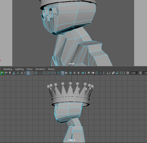
Throughout Unit 2 I’ve learnt lots of new skills and a brief understanding of different programs such as Maya & ZBrush. This is my first time creating a character so I was also developing my own personal work flow through this Unit.
Preproduction
I started my process with preproduction specifically creating mind maps of different ideas for both my protagonist and antagonist. I knew I wanted to create characters that would be used in my game next year so they both needed to suit the setting of the game.
I feel mind maps are a great way of organizing my ideas and I will definitely continue to use them as part of my creative process. It really helps to have a clear map of the initial idea and then branch off. Before creating a character, you want to have a solid concrete idea of exactly what you’re creating so it’s important to get your preproduction done right to not waste time.
In my mind map I looked at possible motivations, attacks and backgrounds for my character. I also related my ideas to existing characters in pop culture and games and took inspiration from them. I really liked using the mind map and it helped me narrow down an exact idea for my character. I personally like to have a clear idea in my head before I begin drawing my character to save time.
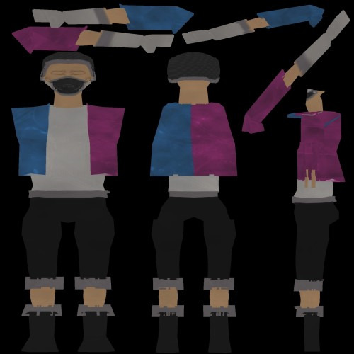
Once I had settled on an idea for my character I began searching tags I’d used in my mind map and used Pinterest to create mood boards. It was great having visual references for my ideas and seeing what other people tend to use. This was also the part of the process where I decided to base the character’s weapons around the “Player 1 & 2” Pink and blue arcade guns.
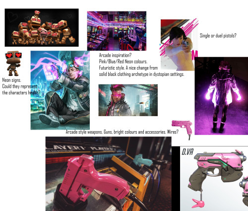
This is just one of four different mood boards that I created. I added small annotation to point out points I liked about the images and went into more detail about them on my blog post. Mood boards are seen commonly in the industry especially when creating concept art for characters.
After creating mood boards I went into Photoshop to begin the concept art. I’m quite familiar with Photoshop so I was able to get right into finding a pose and body type that I liked. I decided to settle on a smaller body type instead of the large bulky muscular male you typically see in video games. This is just because I’ve planned for his attacks to be quite mobile and feel it’ll work better for the animation.
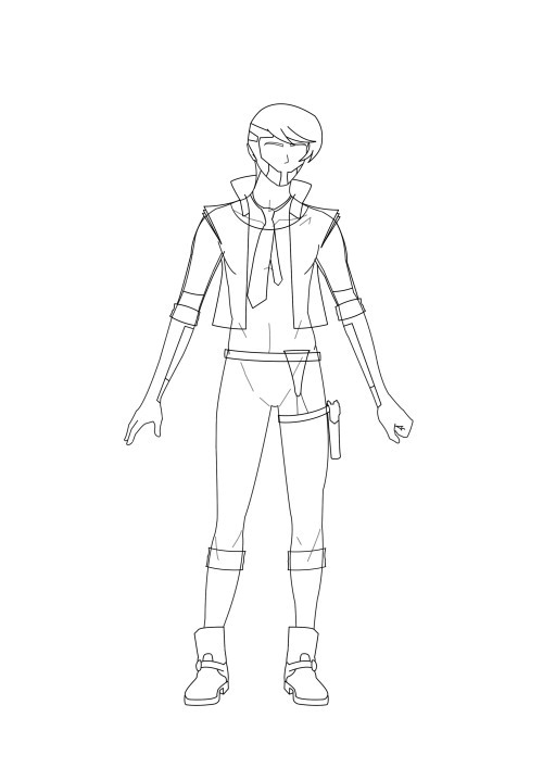
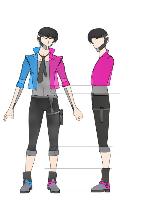
This simple turnaround helped a lot later on the in the modelling process as I was able to open the PNGs into the image plane on Maya. I can’t imagine modelling without a reference open directly in Maya and this is something I’ll probably always use in the future. I really enjoyed using Photoshop and it’s definitely my go to program when doing anything art related. Since I created this art a few months ago and have been practicing almost daily I found my drawing and Photoshop skills have improved a lot since then. Over the summer I plan on going back over and redrawing my character to create higher quality art. I’ll also begin the process of drawing different poses to show off his personality and possible animation ideas. This will help a lot next year when we begin to animate our character in UE4 and work on creating our game prototype. My game design document already has a list of attack ideas but it’ll be nice to have concept art included.
In a VICE interview with Bill Petras (Art director for Overwatch) and Arnold Tsang (Character-concept artist) they spoke about their role as artists in the games development and the importance of concept art.
“One of the main jobs that we do as art directors is having a vision for what the game looks like, of what the heroes look like, the feeling of the animation, the color palette, and the architecture of the buildings of the world.” And often that means putting ink to paper: “A lot of times the art directors themselves will do a painting of a concept to show a vision to the team. That’s step one.” –Bill Petras
Arnold Tsang speaks about how the concept art is important for making the vision and idea of the game clear to the other developers.
“Early on, our first job is to inspire and rally the team behind our vision. The development of the style guide is a huge first step in getting our feet on the ground for Overwatch.” Setting down the core of the game’s look is an incredibly important part of the early process. “After we had the core tenets in place,” says Tsang, “we worked with the engineers and some of the animators to start to realize that content and make visual targets that start to realize what we set out to do in the style guide. And we saw how things worked in the game engine, and how these characters moved and acted.” –Arnold Tsang
When we have an idea in our head it might be obvious to us what the character looks and moves like but to others it’s not clear at all so concept art is integral for making that vision clearer to others. In the industry where you have specialised modellers, programmers and animators it’s important everyone is on the same wavelength. You wouldn’t start building a game without a games design document and you wouldn’t start creating a character without completing preproduction.
Maya
When I finished preproduction I moved into the next stage of modelling my character in Maya. I also installed the student version at home so I can continue working on my model outside of college. I opened the turnaround images and began shaping from a simple cube. There are plenty of different methods of creating a character and everyone has a different workflow but I decided to stick with this recommended method as it’s good for beginners like myself. I extruded and multi cut the shape to create a simple humanoid shape and then started adding finer details such as clothing later on. I had to go back a few times to recreate certain sections of the model. I had issues with multi-facing where Maya placed faces underneath faces and I had to slowly go through the whole model deleting these issues. It was also a challenge dealing with edge loops and topology. I’ve never dealt with it before so it was a lot of trial and error figuring out what works.
My main issue with modelling is I chose to create an organic human shaped character but my result was a lot blockier and square especially in the waist/torso area.
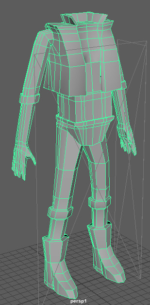
Even with some adjustments I wasn’t 100% happy with my result. I also struggled a lot on the fingers as they were too sharp and pointed and almost resembled claws. I used MudBox which detected errors in my model so I could go back into Maya and fix them. This however was a difficult process as I had to go back and remodel entire sections again. I was getting frustrated with my model and did quite a large rework.
This model although fixed is a lot less detailed and not what I envisioned for my character. I decided instead of beginning again I’ll just begin the UV process as that will take a while and I was beginning to run out of time. I repeated my preproduction and modelling process with my villain character. I found the second time around was considerably quicker as I wasn’t relearning all the hotkeys and jargon.
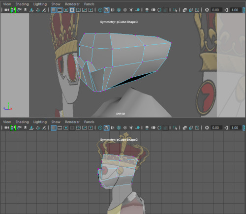
A huge mistake I made with my first UVs was doing the front, back and side as three large chunks. I didn’t fully understand how the UVs related to the texture maps and so I didn’t see how much of an issue the overlap caused until I placed the image onto the UV. You can see the grey areas where the black pants and grey accents share a UV and cause issues. I had to delete these UVs and looked into other methods.
I used planar mapping and unfolding the different pieces of my model to create clear separate sections. This thankfully allowed me to avoid the same mistake I made without any overlap.
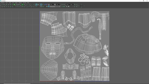
The UV process was a long task but essential for creating a character. I now have a better understanding of how to do it and how it relates to textures and painting the character later on. In the future I’ll be a lot quicker at the process. Like most of Maya it was simply a learning curve but the best way of learning a new program is by practice.
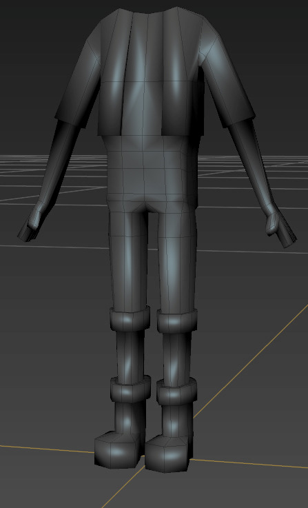
ZBrush
The next step after finishing my UVs was exporting my model as an OBJ and opening it in ZBrush. I decided to keep the Hair and Eyes as separate subtools.
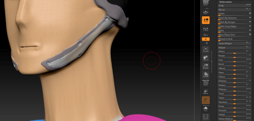
My first attempt at Polypainting was rough as I didn’t fully understand the tools and brushes I was using. I looked at different methods online and went back over my model. I found the ZBrush youtube channel as a great resource as they do really quick tutorials on the different tools in ZBrush.
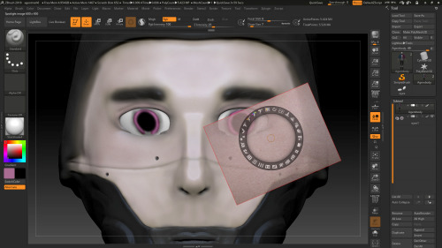
The spotlight is a really powerful tool that allows you to paint directly onto the model with other images. You can scale, rotate and adjust these images and apply them directly onto the model with total control. I was using a tablet too so the amount of pressure I applied also determined how strong the brush was. I saw the potential with the insane detail you could put into the skin with ZBrush. I’m not going for a super realistic human character though so I didn’t want to add loads of blemishes so just simple colours and blush was enough for me.
My favourite tools and brushes in ZBrush was the DamStandard, Curve and Curvepinch brushes. This was useful for creating folds around the eyes and also definition on the welded sections of the face. I spent a lot of time experimenting with different brushes but next time I create a character. Surface, Noise Editor and the Deformation tools were also great ways of quickly editing large portions of the model.
Because I like Photoshop so much I decided to go back on the hair and see if I could try a different method of texturing them. I opened the UV as a png and a simple hair texture with Photoshop brushes.
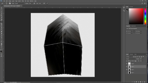
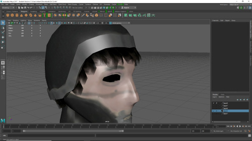
I like the different layers of opacity and think it looks more interesting than just block opaque colour. I’ll probably stick to ZBrush in the future however as it’s a much more powerful tool than Photoshop.
I was able to create the texture maps from Polypaint and then create Normal maps directly in ZBrush. If I wanted to neaten up or edit my textures, I could open the JPEG directly in Photoshop and paint on that.
Conclusion
I really enjoyed this Unit. I found it really interesting to go from having a character concept to a 3D model. It was my first time ever modelling something as complex as a character and I’m really proud it’s my own original idea and not an already existing character.
I didn’t have much trouble preproduction with generating ideas and creating mind maps/mood boards. The majority of my issues this Unit came in the production phase but that was mainly due to inexperience and some issues with the programs. I have however begun to enjoy using ZBrush after painting my character.
I got quite frustrated at points as I felt I wasn’t at the quality I wanted. I’m still not happy with the end product but I now have a much better understanding of the tools and programs and know I could work at a faster pace. I’m planning over the summer to do a full rework of my hero character.
As my game concept has changed my characters have changed slightly. I want to go for simpler cartoony proportions for my hero instead of realistic. I think this style would suit my game better. I also think a more cartoony player character will blend better with my very wacky cartoony robot villain. At the moment they contrast and look like they’re from different games.
I’m excited to redesign my character and think this will a much better style for my game concept. I think it’ll also be great for creating fun dynamic animations as the games attacks and mechanics I have planned are very fast paced and colourful.
0 notes
Text
The Islamic State is on its knees, but its legacy will long haunt the Middle East
http://bit.ly/2vSEchK
youtube
Abu Bakr al-Baghdadi, painted portrait thierry ehrmann/flickr
After three years of violence, Islamic State has encountered a major defeat that could mean that its end is near. On July 10 2017, Iraqi Prime Minister Haider Al-Abadi, after a successful nine-month military offensive to “liberate” the northern city of Mosul, declared “total victory” over IS in Iraq.
He categorically said: “I announce from here the end and the failure and the collapse of the terrorist state of falsehood and terrorism which the terrorist Daesh announced from Mosul”, using the Arabic acronym for ISIS or ISIL.
Almost exactly three years ago, on June 29 2014, Abu Bakr Al-Baghdadi, the group’s self-styled caliph, proclaimed a cross-border caliphate stretching over vast swathes of northwestern Iraq and eastern Syria.
youtube
Today, the Iraqi half of that territory has been almost totally eliminated (the northwestern Iraqi city of Tel Afar, close to the Syrian border, being an exception) while the Syrian half, based in the city of Raqqa, is facing imminent collapse under powerful US-backed Kurdish-led military offensives.
It’s a major turning point.
In the summer of 2014, an ISIL blitzkrieg swiftly defeated Iraqi defence forces across northwestern Iraq, capturing some 40% of Iraqi territories.
Prior to this rapid conquest, ISIL fighters had captured the Syrian province of Raqqa in January 2014, taking advantage of the bloody civil war let loose by pro-democracy movements.
But the territorial conquests could not be sustained for long. After a string of crushing military defeats throughout 2015 and early 2016 at the hands of Iraqi and Syrian armed forces, ISIL lost 65% of its Iraqi territories and 45% of captured ground in Syria.
When Raqqa falls – sooner or later – to Kurdish-led forces, it could mean the complete destruction of the caliphate.
What went wrong with ISIL?
Al-Baghdadi, whose fate is currently unknown, declared his caliphate to realise a series of “impossible” objectives – including restoring Islamic power under a single authority, eliminating US and Western influence on Muslim lands and laying a claim to global leadership – and called upon all Sunni Muslims from Europe to East Asia to unite under his new flag.
These were the same objectives that the now-deceased al-Qaeda leader Osama bin Laden boastfully proclaimed in the early 1990s.
They were also unrealistic goals given the policy choices and capabilities of ISIL. In his first official speech on June 29 2014, Al-Baghdadi presented a world divided into two mutually opposed camps: Islam, and the camp of disbelief and hypocrisy.
He put pro-caliphate Sunni Muslims in the camp of Islam while the camp of disbelief was the abode of Shia Muslims, Jews, Christians and almost everybody else. This set the new caliphate on a collision course with the rest of the world.
ISIL militants, like their Wahhabi counterparts in the Gulf, also declared Shias to be non-Muslims and viewed the sheikhs, kings and emirs of the Gulf region as American surrogates, ringing alarm bells in Iran and Saudi Arabia.
The spectre of the threat they posed soon forced Iran, Saudi Arabia and the US to close ranks to militarily deter and contain ISIL together, despite their differences.
Lack of followers
The spate of atrocities committed by ISIL fighters against the Yazidi community in Syria, who practice a non-Islamic faith, led the United Nations to accuse ISIL of perpetrating genocidal crimes.
This senseless use of violence against non-Muslims alienated most Sunni Muslims, so ISIL was never able to develop much popular support. Less than 8% of Sunni Muslims in the top 20 Muslim-majority countries across the Middle East, North Africa and Southeast Asia supported the ISIL caliphate.
In early December 2015, to ISIL’s despair, thousands of Muslim clerics from across the globe declared the caliphate a terrorist organisation and branded its supporters non-Muslims.
ISIL’s military defeats, loss of territories and control over resources represented further serious blows.
In 2014, the caliphate had eight million Iraqis and Syrians living in its territories, assets worth nearly US$2 billion and annual revenue US$1.9 billion.
Two years later, after territorial losses in Iraq and Syria meant fewer people and businesses to tax, that revenue was more than halved to US$870 million. Its control over oil fields – a lucrative source of money – also shrank from 2014 to 2016.
ISIL’s challenges and legacies
ISIL might be on its way to becoming history, but it will certainly leave its mark.
Just as its emergence posed a twofold challenge (territorial as well as ideological) to the Middle East and the West, ISIL’s demise is also leaving behind the legacies of sectarian violence and killing, inter-ethnic malice and seemingly unmanageable rivalries involving regional and extra-regional powers.
Rightly or wrongly, many commentators saw the declaration of the cross-border ISIL caliphate as a possible death blow to the post-first world war political arrangements in the region.
Present-day national borders in the Middle East are the outcome of a secretly negotiated agreement between Britain and France from May 1916, known as the Sykes–Picot Agreement. It divided the Ottoman Arab territories of the Levant, Jordan, Iraq and Palestine between Britain and France.
Half a dozen Arab states were created: Iraq, Jordan, Syria and Lebanon. Israel, originally created as a “homeland” for the Jewish people in 1917, declared itself a state in 1948.
The caliphate partially challenged British- and French-imposed national boundaries by systematically dismantling the Iraq-Syria border, redrawing the map. It also expressed its resolve to eradicate colonial legacies in the region by extending the boundaries of the caliphate.
This attempt to rewrite the history of the Middle East may keep destabilising the region for years to come.
youtube
Ideologically, ISIL has challenged the West’s eurocentric claims to universalism, in which Western values of democracy, human rights and freedom are promoted as universal values that are applicable to all societies, regardless of cultural and racial differences.
Though criticised by many people from within the West, eurocentrism is alive in the hearts and minds of many Western people. The 2003 US invasion to remodel Iraqi society on American lines is just one example.
ISIL rejects Western dominance over the Middle East and has sought to promote the alternative Islamic claim to universalism based on the commandments of the holy Koran.
The Koran instructs all humans to engage in universal morality by creating and upholding a moral order based on the values of justice, equality, truthfulness, fairness and honesty. This applies to all humans, regardless of their ethnic, cultural and racial differences.
Claiming a universal moral order that negates Western values could not but pit ISIL against the West. Future Islamic radical groups, if they emerge, are likely to carry on the ideological battle.
They may well do so in less violent ways. The Koran does not sanction brutal and inhumane methods to fulfil its commandments.
The mess after ISIL
The possible end of ISIL could still mean a more unstable Middle East, at least in the short term.
Currently, most Iraqi factions have morphed into a common front against ISIL, hiding the mistrust and rancor that persists between Shia and Sunni Iraqis, among diverse militia groups, and between Arab and Kurdish Iraqis.
If ISIL disappears, this tentative, temporary alliance may simply fall apart, unleashing more violence on the war-ravaged nation.
Syrian society is likewise polarised; along divisions between the foreign-backed pro and anti-government groups and between the rebel groups themselves. These tensions will outlive ISIS.
Other contradictory interests persist in the region, too: those of Iran, the US and Russia in Syria, and the Iran–Saudi competition for power and influence across the Middle East.
The elimination of ISIL will reaffirm the region’s post-first world war political and territorial status quo but don’t expect it to bring peace to the Middle East.
Mohammed Nuruzzaman previously received funding from the Kuwait Foundation for the Advancement of Sciences. He is also doing a research project on Shia - Sunni violence and Middle East regional security as a Durham Senior International Research Fellow, Durham University, UK. The project is funded by the European Union.
0 notes
Last Seen Blogs

namienakh
Studyblr

softichigo
Exactly How To Settle House Equity Financing Or He

skizzo1234
Wtf

ramonroyblog
Ramon Roy