#these girls look fantastic
Text
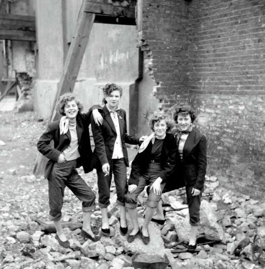
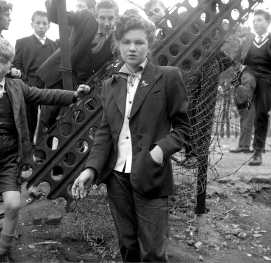
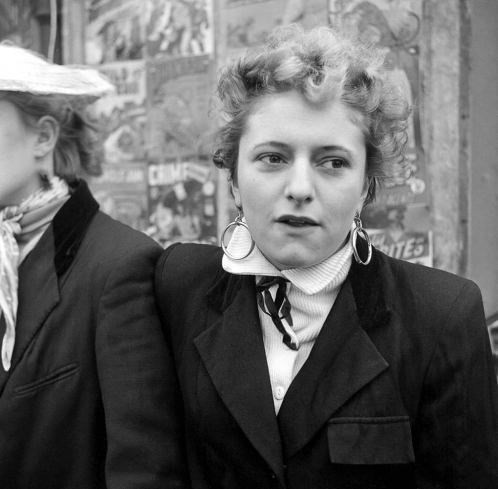
Post WWII in England, Teddy Girls, sometimes called Judies, voiced their particular brand of personal rebellion by adopting a singularly androgynous look based loosely on Edwardian menswear. They had a smart, well crafted appearance that was quite at odds with the notion of rebellion. They were in fact, more intimidating because they staunchly refused to adhere to societal norms.
Along with their counterparts, the Teddy Boys, they appeared first in the working class areas of East and West London that had been hardest hit during the War. They rejected the austerity of the post war economy and essentially gave the finger to the ruling class by adopting and changing its styles.
Film director Ken Russell took these images of Teddy Girls in the Notting Hill District of London in the mid 50s. - Attire's Mind
#teddy boys#teddy girls#judies#ww11#world war 2#ken russell#vintage photograph#post war#rebellion#menswear#these girls look fantastic
244 notes
·
View notes
Text
Edit: Yes, the original Sokka sexism arc is great and important. But we don't live in a world where the live action show runners decided to include it in the same form. So:
Unpopular opinion time: Sokka unlearning sexism isn't actually a large part of his character arc--it literally only takes the opening episodes. And removing it COULD be a sign that the live action is taking seriously the complaints I've seen from native fans about the original show runners deciding to make the Water Tribes that sort of sexist to begin with. Sokka's actual character arc is about gaining confidence and leadership skills, and they have the opportunity to focus on that MORE if they change the Kyoshi episode to focus on Suki as a fellow teenager forced into a leadership/protective role in her community and rocking it rather than using her as an object lesson on sexism for a male character to learn from. Whether they will ACTUALLY do that is on them, but it took me less than ten minutes to think up, so I sure hope someone in the writers' room actually cares about using the live action to expand on new angles of the characters. Big ask, I know.
Now the real question is: did they also remove Uncle Iroh's unwanted physical advances on a literally paralyzed Jun, and all of Zuko's snipes about girls? Because THOSE are the actually "iffy" sexism parts in AtLA, not Sokka's five minute arc.
#avatar the last airbender#atla#Sokka#Zuko#Iroh#So help me if Iroh still gropes Jun#Our girl is looking FANTASTIC and she deserves better
4K notes
·
View notes
Text

Suscribete bb.. Tengo de regalo sexting para suscriptores nuevos 💋😏📸
#sexy content#sexy chick#arsmate#hot as fuck#chilenita#so hot 🔥🔥🔥#chile#onlyf@nz#bad gurl#hot nude#tumblr chilenito#tumblr chilensis#chilean#chocolate#penetrative sex#chilegram#latin girls#my ass looks fantastic
206 notes
·
View notes
Text


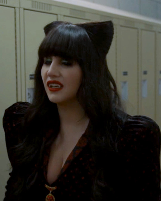

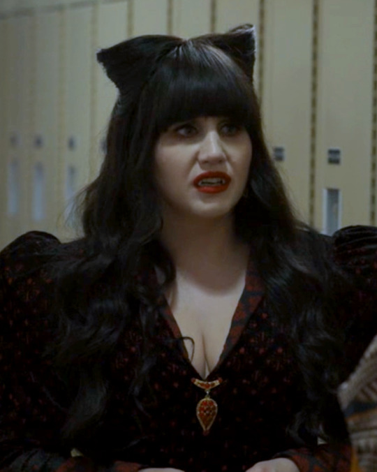
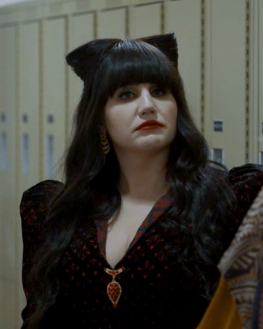
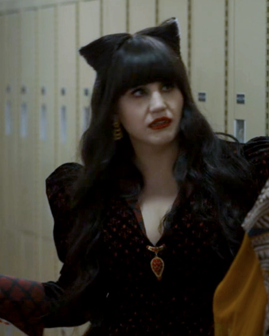

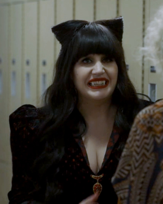
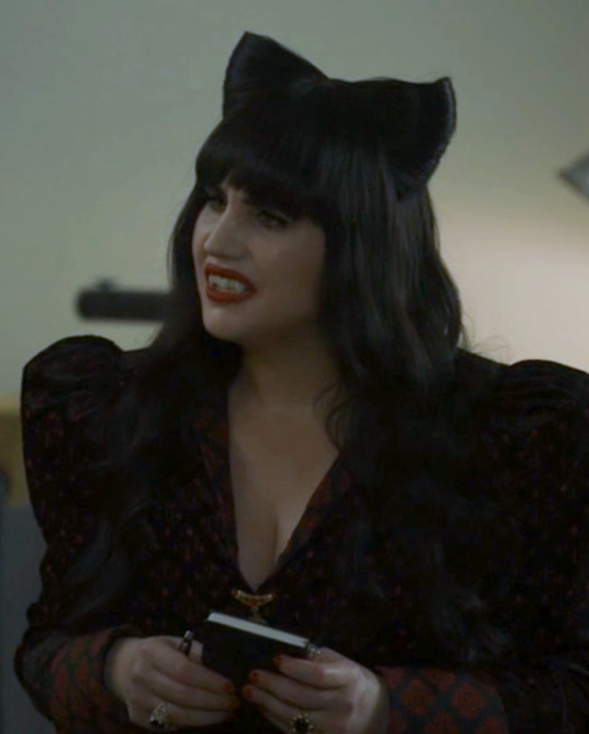


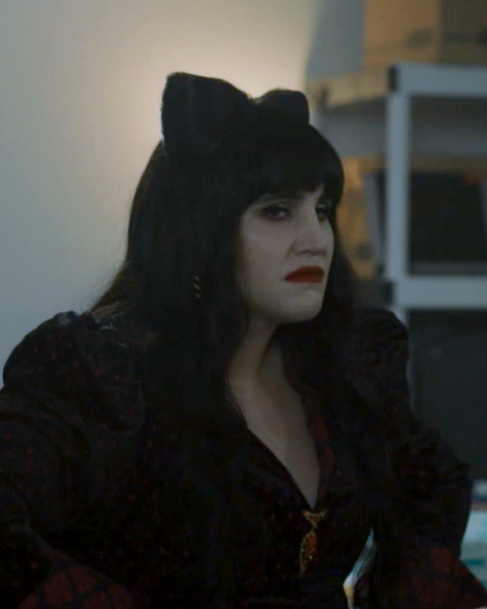
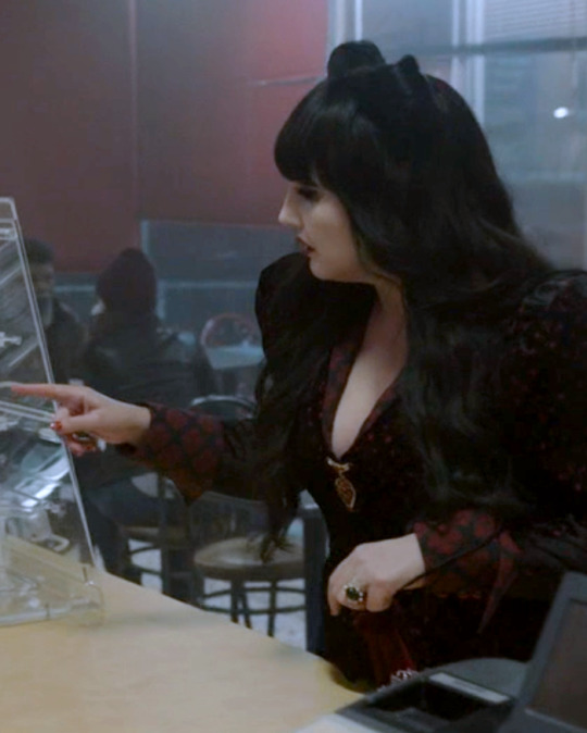

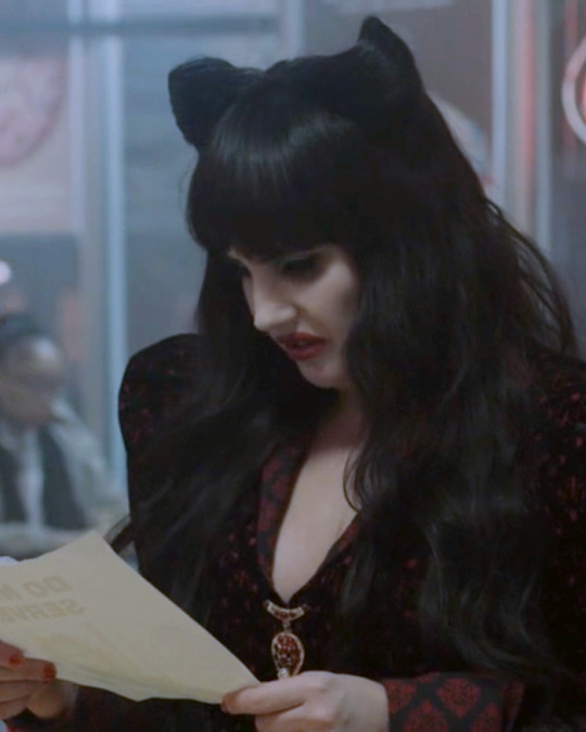
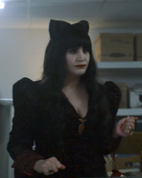
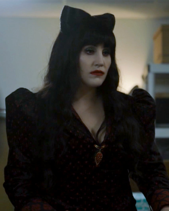
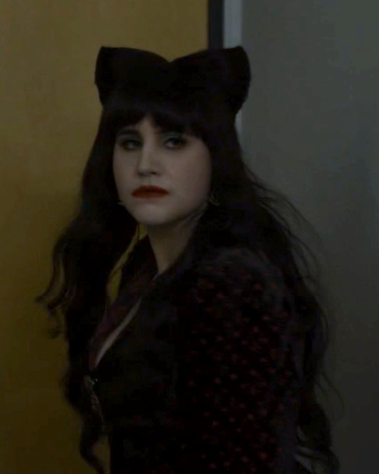
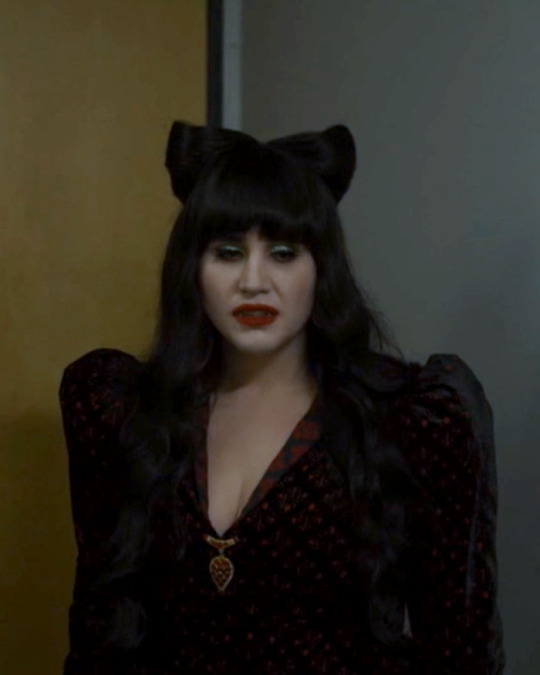
Nadja of Antipaxos
What We Do In The Shadows - Hybrid Creatures
#nadja of antipaxos#Nadja#Natasia Demetriou#What We Do In The Shadows#WWDITS#Tash#Tash Demetriou#my edits#ndedits#wwditsedits#tv : comedy#tv : Mocumentary#What We Do In The Shadows Episodes#Hybrid Creatures#Spoilers#What we do in the shadows spoilers#wwdits spoilers#She is so fantastic this season#and her looks are amazing and I am living for them#You know I love my girl in red 😍#Also that neckline is gonna kill me
251 notes
·
View notes
Text
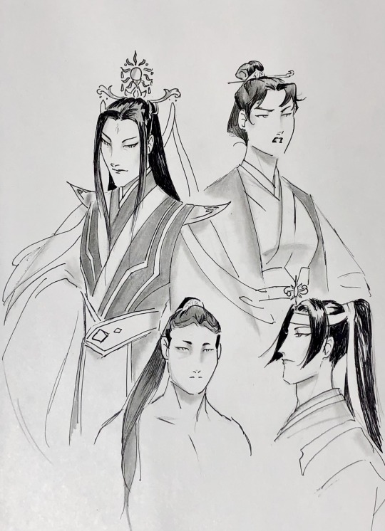
chase the sun into its grave
Wen Ruohan, Wen Qing, Wen Ning, Wen Yuan
#mdzs#wen ruohan#wen qing#wen ning#wen yuan#lan sizhui#qishan wen#my art#mdzs art#mostly an excuse to sketch out my mental picture of wrh after binging a couple of fantastic wrh/wq fics#once saw screenshots of cql!wen qing and instantly noped out#my girl’s built like a fucking brawler with surgeon’s hands not some delicate waif 🫤#not sure why I did lsz in side profile instead of my usual 3/4 like the others#it looks bad lol
109 notes
·
View notes
Text
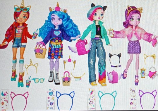
Hasbro heard about Monster High making a comeback and they came out mad as FUCK with these dolls
#holy FUCK#mlp#mlp g5#equestria girls#i literally havent been this hyped for a doll line in a long time. maybe ever. fucking look at them#they look amazing#how did we go from g4 eqg dolls to THESE#theyre BEAUTIFUL#srry i said text posts were done but this is pony related so its fine#LOOK AT THEM#the face sculpts and screenings. the different heights. the clothing silohettes. the ARTICULATION#buying these the FUCKING SECOND they go on sale. I MUST HAVE THEM#g5 toyline in general has been pretty disappointing and cheap. these have absolutely blown my expectations out of the WATER#not art#sunny is my favorite. her design is amazing#translating the rainbow hair stripe to be on her shirt instead. fantastic#only question is why is izzy the shortest one when shes the tallest pony? but thats not really a complaint. just an observation#look at izzys cute ass boots. the bunny ears....#the clothes are arill hasbro quality and will probably be papery and whatever#but im more focused on the actual designs since im just gonna be displaying them and not really touching them
517 notes
·
View notes
Text

everyone give it up for some of the best character writing i have ever SEEN
#redacted asmr#redacted audio#redactedverse#art#illustration#redacted vincent#vampire#look its definitely a sunk cost fallacy thing but COME ON look at him hes such a fantastic character#we've got teen angst at 21. we've got dad puns. we've got the most uncomfortably realistic portrayal of depression i have ever seen in media#what more could you want#at the end of the day#he's also just a girl#alexa play my dad is rich by danny gonzalez#which i refuse to add to my vincent playlist but by god if the song hasnt been irreversibly linked to him in my mind#i'd hang out with him#just to play uno or something
133 notes
·
View notes
Text

Kinda a redesign of Creme Brulee Cookie! I definitely wouldn't want the redesign as the final thing but it's more of a "direction I would push him in" kind of thing asdfghgfd
#he's just literally so boring#LIKE HIS HAIR LOOKS FANTASTIC BUT GOD. GIRL HE IS JUST IN A SUIT KJHGFDFG#creme brulee cookie#cookie run#my art#fanart#my redesign
102 notes
·
View notes
Text


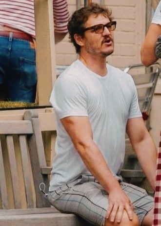
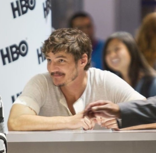

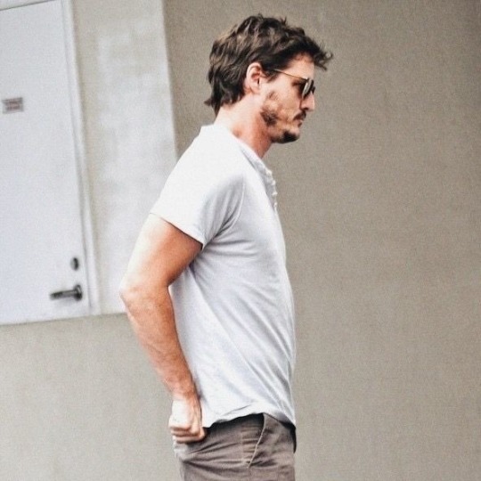
those arms in a white t-shirt are literally a chef kiss
#jose pedro balmaceda pascal#pedro pascal fandom#pedro pascal#ppascaledit#pedropascal#they look fantastic#and hot#i dream with those arms#pls don't judge me#i'm just a simple girl#who suffers daily for pedro pascal#aka pedrito#softiedingo
464 notes
·
View notes
Text
what a fantastic transition
#as much as i absolutely adore LT with all my heart there are no cartoons out there that give me such a CONSISTENT sense of raw visceral joy#than the Fleischer Popeyes#they are the epitome of fun. that’s such a vague word i know but i think it perfectly encapsulates these cartoons#not too gaudy or self absorbed. despite the fantastical nature of some plots and the gags and visuals there’s a down to earth humility as#well. it owns its simplicity very well. hearing that ‘30s jazz reach a climax as the visuals and gags and tactility and emotions get#stronger and faster in the climax of these shorts literally#gives me goosebumps! it’s an adrenaline rush#i also adore Olive Oyl. i mean i love them all. Bluto is the greatest cartoon asshole of all time. i love the nobility of Popeye. but i#really love that Olive gets to be just as loud and mean and weird and ‘ugly’ as the rest of the guys. she can throw a punch too. she’s not#just there to look pretty or be coquettish. she has a really natural charm and doesn’t feel forced like ‘oooo look at the cool LADY#participating too!’ which i feel is an issue with cartoons of both the past and present#she’s just another facet to these cartoons without calling much attention to herself and i really like that and wish there were more#like her#popeye#seasin’s greetinks#kneitel#vid#the lack of regular woman characters outside of thin tropes in golden age cartoons doesn’t bug me as much as it really should#because as a kid i was so used to watching ‘boy’ cartoons and connecting with ‘boy’ characters (i thought liking girl characters would make#me ‘girly’) and so it’s something i’ve always been sort of used to#but with that said Olive is one character i feel very strongly about and am glad she exists for those reasons#i don’t know why i’m getting so deep on this 10 second post? but anyway you should watch Popeye if you haven’t
219 notes
·
View notes
Note
The art style of Cloud Castle is absolute ass bro why are their eyes so big
Idk man it just looks.... off
I wish they brought back the og art style like Blue Scarab Hunt because that was gorgeous
Well if you’re referring to the book's artstyle as a whole, then calm down buddy the illustrations as a whole are pretty good all things considered (believe me some of the illustrations in the later books are waaaaayyyyy iffier)
But if you are referring to Danilo Barozzi’s illustrations in the book then uhhhhh… yeah I don’t blame you, I didn’t like the big anime irises either, she didn’t cook with this one,,,
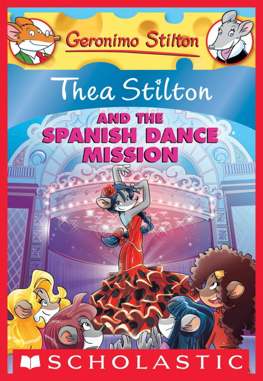
The interesting thing is Barozzi also did pieces for Secret of the Snow and those looked fine (she did well enough that I have to squint to determine which ones were done by her). My guess is either she did a lot of the illustrations for the latter half of SotS and we just got used to it, or it’s because the artstyle of special editions 2 and 3 were more… experimental? Books 4 onwards developed a very specific… look for the artstyle that adhered very closely to the main book illustrations of Spanish Dance Mission onwards, thus the illustrators had to follow suit, resulting in whatever looks off to look especially off.
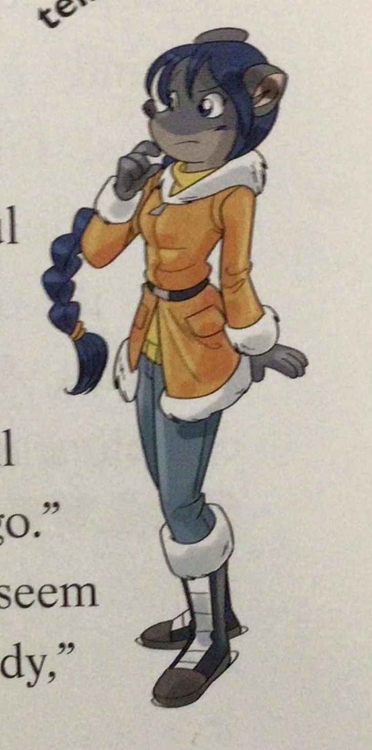
(Even with this set of pictures, I’m only about 70% sure these are Barozzi’s because of how alike yet different the styles are from each other in the book. The first one could be Barozzi’s, but it could also be Giuseppe Facciotto’s, since he also did illustrations for SotS and his stylization means he sometimes puts the eyes really close to each other in a way that’s weird but still makes sense somehow.)
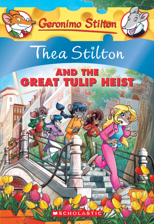
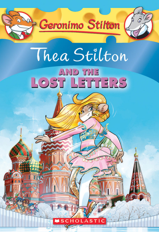
On the contrary, books 2 and 3 (and I would probably even include book 1 there) had a more experimental look to the illustrations, which seems to be based more on (and this is just a theory of mine) Giuseppe Facciotto’s iconic work for the covers of Mouseford Academy books 2-12, 14, 15 and 17 in the English books (he did waaayyy more covers for the Italian Mouseford books— he was basically the cover guy for the Mouseford books for a WHILE) as well as the books from Spanish Dance Mission to Lost Letters. If you’re wondering why those covers go as hard as they do, then now you know why.
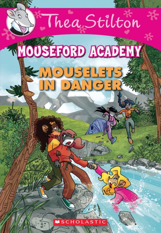
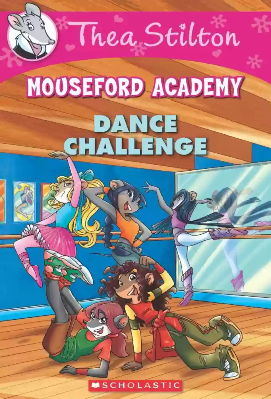
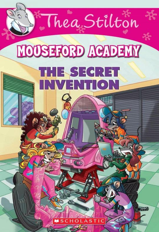
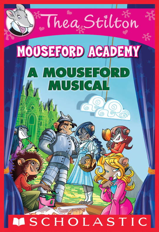
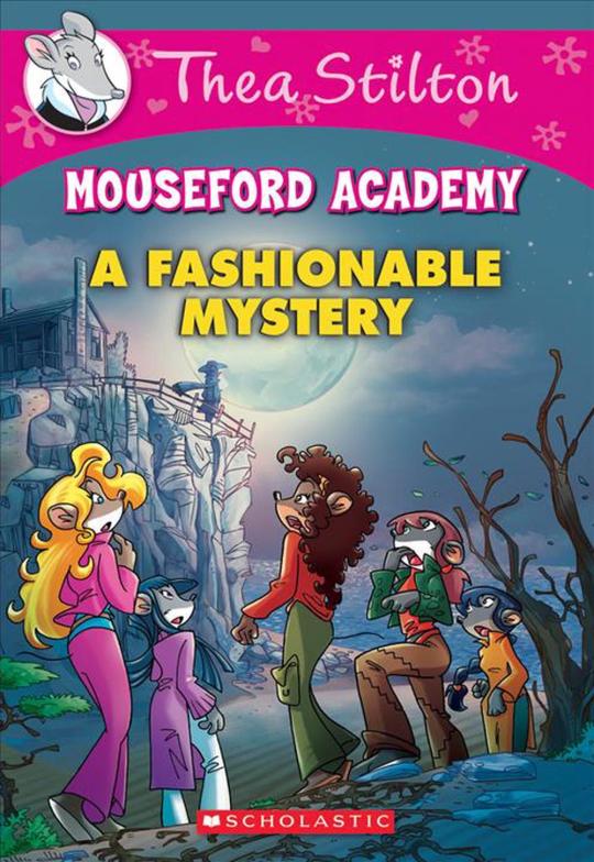
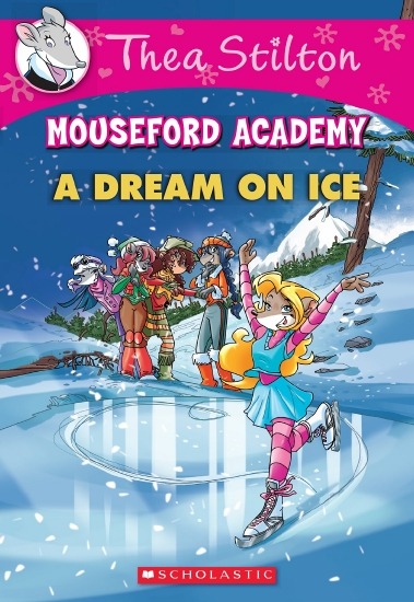
(These aren’t all of Facciotto’s works for the covers we know in English but you can see that he popped off <3)
But yeah as you can see with special editions 2 and 3, the art direction seems to be heavily inspired by Facciotto’s artstyle.
However, when Barbara Pellizzari’s works became the aesthetic poster child of the books’ brand, that was reflected in the illustrations and how their aesthetic changed, as seen in the main books and how they look currently, special editions 4-9, and the Treasure Seekers trilogy.
This new profile thing of the girls? This was done by Pellizzari (coloring was done by Flavio Ferron), and thus it became the main reference for how the girls look in the book’s illustrations.
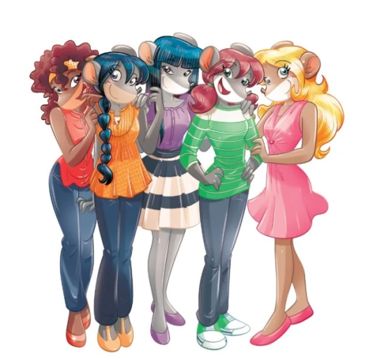
And it’s not just in the general direction to the artists for how to draw the Thea Sisters, but also in the direction given to the colorists. Alessandro Muscillo was the colorist for the special edition books since book 1 and the Treasure Seekers trilogy, and you can see that the direction for the style varied through books 1-3, like maybe direction was experimenting with the mood the illustrations were to convey, beginning with the cartoony and bright colors of book 1, easing into the more grounded and layered palettes of books 2 and 3
Then book 4 was when they transitioned to using digital art /j
I jest, but seriously book 4 was the debut of the coloring style we end up keeping for the rest of the special editions and for all of Treasure Seekers, which is very… bright :D
(I would show more picture examples but I manually took pictures of my physical copies for the Cloud Castle and SotS illustrations and gwuh I’m too lazy to grab my entire collection just to take pictures,,)
Bright as in like… the colors are very defined and saturated. I dunno how to describe it, but when you see it, you get what I mean. It’s very bright and pretty and colorful and it stands out. There are still variations that happen on occasion (Star Fairies in particular uses a good dose of airbrush for the lighting and shadow effects, and Crystal Fairies looks like someone had a bit of fun using sparkle brushes), but other than that, it’s very bright. I don’t hate it, but I do acknowledge that yeah, if I was introduced to the series when it had fully transitioned to the new style, I never would’ve gotten into the series in the first place, because the older books had something that didn’t make it feel specifically catered to girls. The colors were bright, but not too bright. Colorful, but unified. They weren’t that complicated, and they didn’t have to be because the colorists (plural, there were at least 3 per book once upon a time) were popping the hell off with the colors they were given. But y’know, the newer books’ consistent style did give me a good spot to practice drawing mouse furries so I’m not complaining too much about the newer style, haha.
(Tiny baby E’s (it’s literally from 2020 what’re you on about mate) her first mouse Violet drawing using Barbara Pellizzari’s artstyle in Treasure Seekers 1 as an anatomy guide!!)
With that said tho, yeah I miss the old books -m- dunno if it’d fit the aesthetic of the special editions but m a n we could’ve had it and it probably would’ve looked cool
Also the illustrations go way harder in the older books, like Prince's Emerald? I've talked about Prince's Emerald and how it goes hard before, and I still stand by it and say that it does in fact still go hard
Maybe it won't fit the uh splash of color they gave the hardcovers, but imagine they grabbed Giulia Basile's coloring work for the graphic novels and used that as sort've a basis for the coloring style of the hardcovers. Not exactly the same-- would probably still add a touch of whimsical watercolor and/or paint to the very cel-shaded style, but we could've had something pretty dope -m-
Anyway that's my ramble simultaneously defending the hardcovers' artstyle and reminiscing on what could've been haha
#geronimo stilton#thea stilton#thea sisters#questions with e#rambles#the style of the older books is gorgeous but the main thing I'm wondering is can it pull off fantastical whimsy#that's the main thing i dunno if it can do (i would love to be proven wrong tho)#the style is so grounded that i'm wondering if it can pull off what the hardcovers needed it to do#which is convey the otherworldly fantastical thrill of exploring the fantasy worlds (which uh the newer books were able to do but#my main gripe is that fantasy and reality are near indistinguishable in vibes coloring-wise#sure there are sparkles and stuff is more saturated but the girls' dorm in book 4 still has the same-ish feel of the land of clouds#i dunno what it is. the bright colors just feel mundane somehow and don't take a shift when returning to reality)#looked at my books again and i think it might be the fact that the later books have no grounding color?#compare book 3 to book 5 and you'll see it the most distinctly methinks#the newer coloring style doesn't have a color that grounds the illustrations' palettes and thus everything's always bright 100% of the time#the girls' colors are always at their most saturated#like they're always under broad daylight in terms of lighting#it's not eyebleeding or anything but they don't look affected by the lighting in the setting they're currently in#and the result is it looks.... meh?#we get so used to the bright colors that they end up looking meh somehow#i'm not an art expert by any means this is just my observations as someone with a little too much brainrot
33 notes
·
View notes
Text
okay, girl help. I have to buy new jeans (old comfy ones getting worn out in the thighs, old nice ones don’t fit anymore) and I fully do not understand the new style of jeans. like. I don’t dislike them. they’re fine? but I do not understand how they are meant to fit. it’s not just a straight leg jean it’s? something else? and is it just me or are they short??
what is this new style of jean. is anyone making high quality jeans anymore or are they all shitty. and what style of jean should I be wearing with a tiny waist a constantly pregnant-looking lower stomach and a truly amazing ass
#if I’m totally honest the only jean I have ever fully understood is the skinny jean??#because it’s just supposed to be skintight all the way down your leg. I can figure that out.#and I might just go look for skinny jeans! I don’t mind being behind trend in principle!#but in this case if I’m behind trend it’s gonna look like I REALLY want to show off how great my ass is#I cannot emphasize this enough: my ass is fantastic#okay sorry male followers byyyyyyye#but seriously girl help
22 notes
·
View notes
Text
ghost trick really is such a great game I GET THE HYPE NOW I GET IT!!!! IM RIGHT THERE WITH YALL!!!!
#finished it yesterday and my roomate came in while i was watching the credits and asks me what happened#and im like SO MUCH HAPPENED. SO MUCH HAPPENED OH MY GOD AAAAAAAAA#FANTASTIC game ugh ughhh. extremely shu takumi ass game in the best possible way djdjdk#shu takumi truly makes the queerest characters and we thank him for his service#cabanela and jowd.... i am looking i am LOOKING 👁👁#also king of weird little girls. A+ character designs. the animations were stellar and the MUSIC AUGHHH#im in love with everything about this game. that scene with ray... i got *EMOTIONAL*. I YELLED#truly game of all time#raps talks
44 notes
·
View notes
Text

Listen I‘m melting. So adorable 🥰💜
#jeremy renner#girl dad#love his smile#love and titanium#music coming soon?#he loves his daughter#he looks fantastic#my heart is melting#i love how he protects her privacy
27 notes
·
View notes
Last Seen Blogs

sweetbutpsychobutsweet
Sweet But Psycho
awkwardcatman
your local emo twink
timmyofthelostboys-blog
I've Lost My Marbles
jimmerzz0905
then it go fart fart fart fart inaudible noise bruuuhhhhh bruuuh

incorrectnoobs
Incorrect noobs