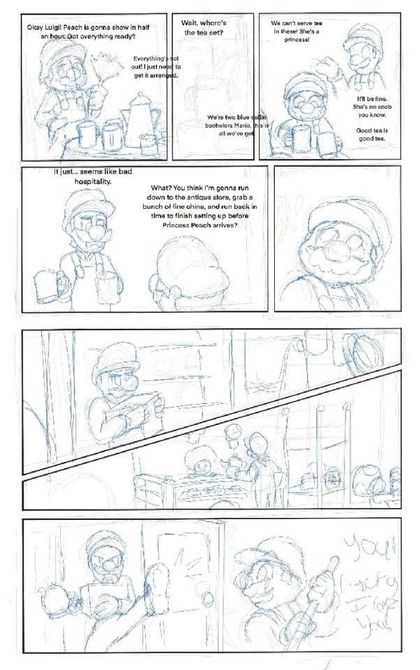
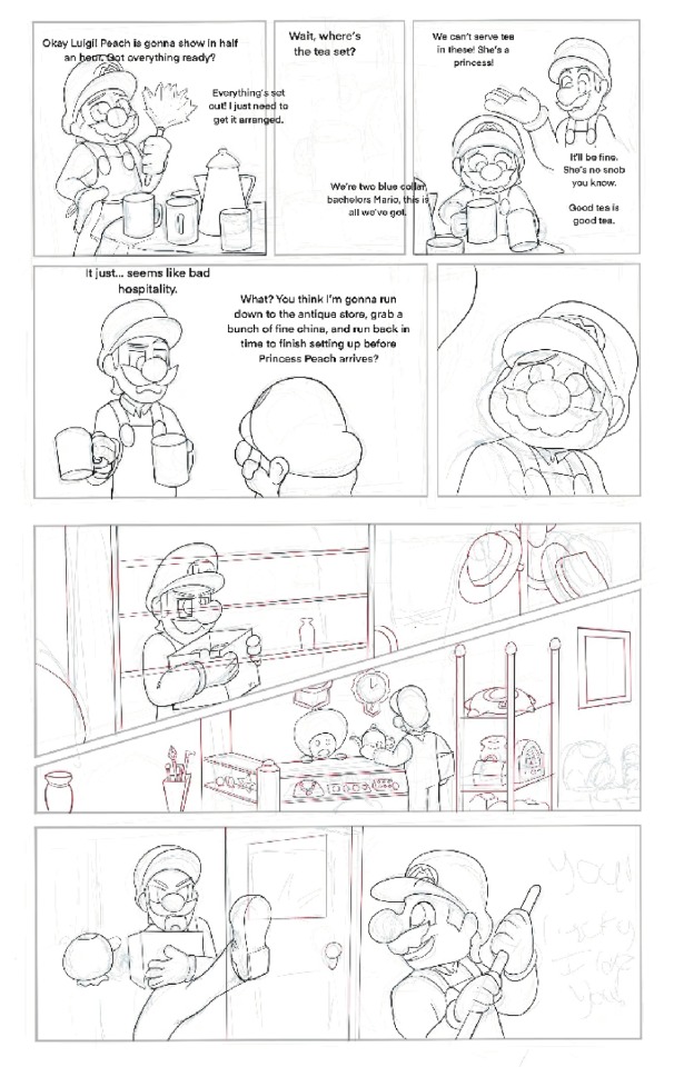
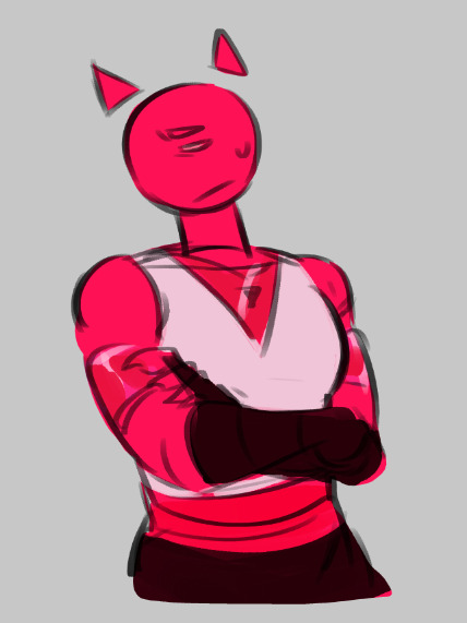
#the line art is so nice especially with the soft coloring
Text
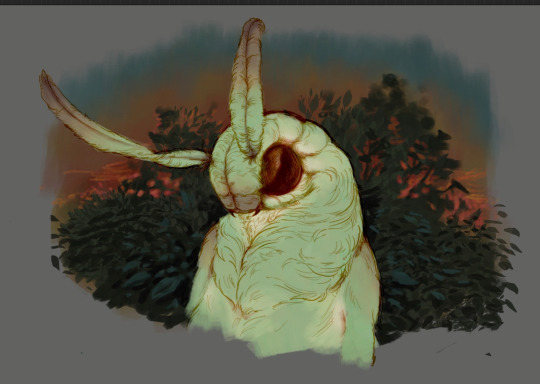
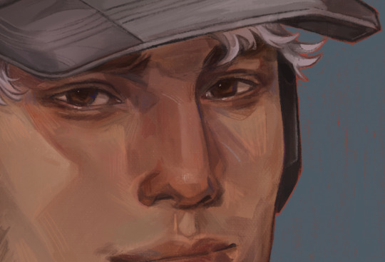
Coloring tutorial I guess
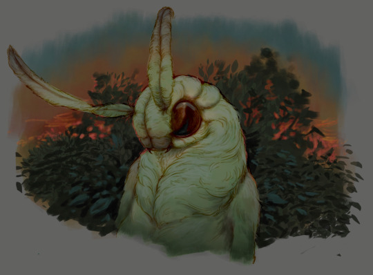
That's my most default shading style, a hybrid of line drawing and painted shadows, and I'll tell you exactly how to get this look.
But before we start, you need a weapon
This is my main brush for basically anything, including line art on days when I don't feel like switching to something actually intended for inking. It's a lightly textured square brush with color variation on every stamp. Intended for Procreate but you can always just rip the alpha texture out of the file and use it for a brush in any drawing program.
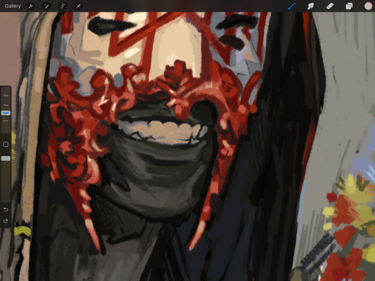
That out of the way, let's go. I'll use the same line art as the one in fluff tutorial.
Set the line layer to ~60 or so opacity and get to blocking in the base colors of your character. The jitter brush will introduce some color variation on it's own, but changing the color occasionally will add more visual interest.
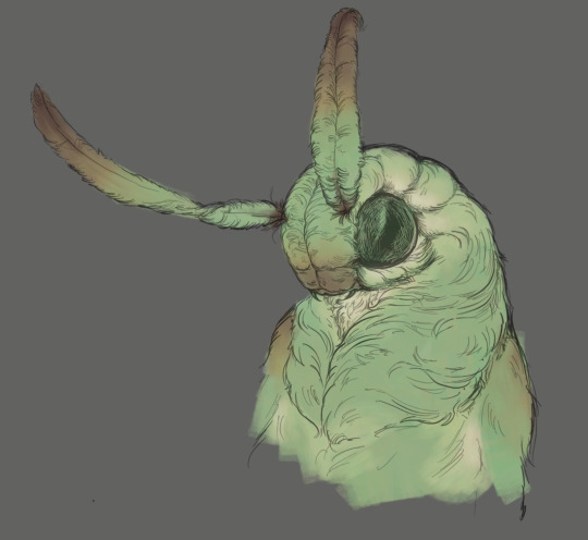
After this I add a multiply layer on top and dab orange or red in places where we might be able to see the base of the hairs or peek at the carapace underneath.
It's places where hair parts and where it's shorter. This accent color works great on joints as well. Example of the thing I'm going for in real life:
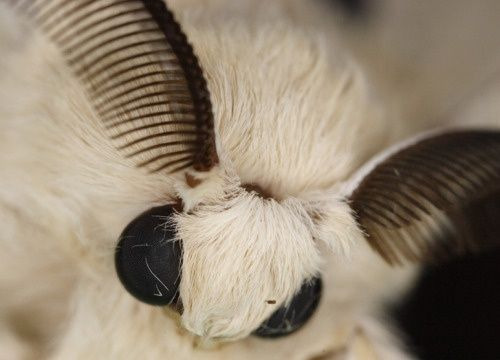
Especially visible behind the head. It's not present on every moth to be fair, but I like to add these accents even where it wouldn't make sense, just because it looks nice. Even on insects without hair.
Block in the eyes and mandibles now, best if it's on separate layer.
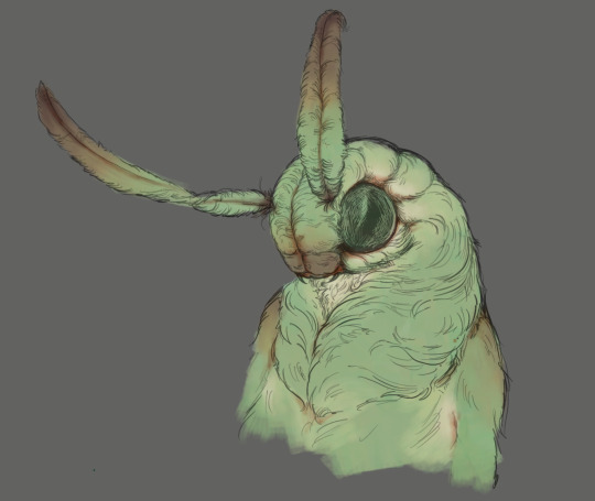
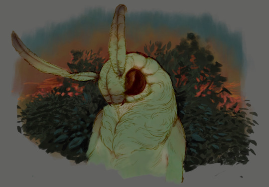
Now, the actual funny tricks begin. If you're one of the people who only use multiply or add blend modes, stop it, get some help
Understanding the math behind blend modes is gonna get you a long way.
My lineart is set to subtract more often than not. I find it produces juicier and more colorful results than multiply. I want to give this picture a warm orange feeling, so the color of my lines should be the opposite - blue.
And, subtract.
Perfect, but not quite. We can push the lines to an even softer feeling. Take the line layer, copy it, invert the color and set to multiply. I then throw gaussian blur on the resulting copy and reduce opacity until the lines bleed into the surroundings just a little bit.
On to actual shading. People who shade without getting in some background first scare me, so let me throw something together real quick.
A simple gradient will also suffice for this use. We just need some information on which colors are present in the surroundings.
Copy your background, bring it on top of your character layers and gaussian blur it real hard. Set it to multiply, remove all parts of the layer that go beyond the pixels of the base color layer. Adjust opacity until the character fits in the background.
Let's identify the light sources. In this case it's only the sky, but it produces two distinct colors - soft blue lighting comes from the top, slightly stronger red comes from behind.
The blue light I set to exclusion blend mode because it felt most appropriate in this case. Both add and screen looked too strong to be the light coming from such dark sky.
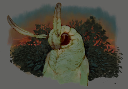
In this lighting context the lower part of the body will receive less light that the upper part. I use the green of the bushes set to multiply to darken the bottom.
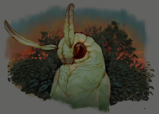
The character is surrounded by all kinds of soft light, but it can't get everywhere. It's time to add ambient occlusion, or contact shadows, for those without a 3d background. Anywhere where there is a crevice or surfaces almost touch, a soft shadow will form.
I do it on a multiply layer with a neutral gray-green color. Gray because any color light isn't really getting in there and green because the fluff is somewhat transparent and whatever light does pass through it gains a greenish hue.
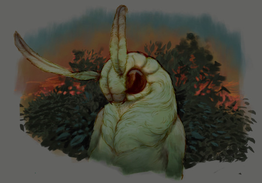
Last step, red rim light from the fading sunset behind the character.
Since it's rim light I just work with normal blending mode. Setting it to add or something of the sort would make the rim light brighter than the source of the light. And it'd be odd.
And that's it. I usually throw on some post processing in Snapseed. Pull some curves, throw on a bit of grain, etc. But it's a topic for another time.
In conclusion, try to think about the environment more when shading. What route does light go through to reach where you're coloring? Did it reflect off of any colored surface? Did it pass through something transparent to gain a different hue? What color shadow would this ambient lighting produce?
Go have fun with your colors now.
209 notes
·
View notes
Text
Hey it’s been a bit! The Mammon episode finally came out, so here’s my review!
Pros:
- The sign language scene was cute. Kinda weird that a kid was seeing a show that was clearly for adults but I love me some representation so it gets a pass.
- Despite Blitz not really needing to be in this episode, I thank god he had little screen time and more time was dedicated to Fizz.
- The fish ladies (despite having wonky color palettes that made them EXTREMELY hard to look at) were cute.
Cons:
- Mammon is so flat and uninteresting but I don’t know what I expected from a creator who always hypes her characters up that always end up being one of the three go-to personalities she picks for her male characters. In Mammon’s case he’s just a loud mouth cursing bum so way to ruin another Deadly Sin and make them boring af, moving on.
- I don’t like how Mammon and Fizz’s relationship are similar of Val and Angel’s, Viv keeps recycling stories, characters and plot lines ect, it makes Angel’s story for Hazbin really predictable/underwhelming and not exciting to look forward too especially since we already have the “mafia bad daddy” aspect to him too that they pulled for Moxxie. I guess the idea of Mammon being a controlling ruler is fine on paper but not much is done with it, Fizz just quits in the end like it was easy with zero consequences so what was all that build up for.
- Fizz himself once again feels REALLY out of character, he’s just too soft compared to how he was introduced in season 1. He’s constantly nervous in this episode and insecure, as well as walking on eggshells, and even in Oops he wasn’t THIS sensitive. I’m all for characters struggling and being kicked down but it has to make sense and not feel forced, and once again it feels like Viv is trying way to hard to make the characters she once introduced as snarky assholes to uwu innocent babies. I refuse to believe Fizz was actually INTIMIDATED by this random geeky imp who insulted him, as well as the fish ladies whom he was weirdly nice and welcoming to. It’s also weird seeing how uncomfortable/nervous he was around his fans when I thought the whole point was that he LOVED praise and loved being famous, at least that was season 1 Fizz. Now he feels retconned. Seeing him say “I just need this gig” is weird too, the explanation to why he went through all of this makes no sense, Fizz still has Ozzie and is famous in the Lust ring, and I understand Mammon is his idle but to go through all that abuse for so long for something that could have been so easily avoided feels forced to fit the plot, but it also makes Fizz look dumb.
- There’s confusing lore stuff regarding Mammon and Ozzie, and it makes me realize that Viv should have picked ONE storyline aka ONE Seven Deadly sin to go with Fizz’s story because this is getting mixed up. Fizz acts like if he looses this completion, he looses everything, which confused the heck out of me because no he wouldn’t have? First of all, Ozzie is a fucking powerful sin, how would you loose him? Second, from what we know from season 1, Fizz is a jester who performs at Ozzie’s club. It was Ozzie who built the sex robots across the rings of hell, NOT Mammon, and in season 2 we see that Fizz is under Ozzie’s care and lives in his house. Yet for some weird reason Mammon also represents Fizz and uses him for profit, but it’s not really explained in a way that makes sense, like Love’s art had said in her Fizz redesign video, Fizz’s job is really confusing on what exactly he does. Having both Ozzie and Mammon represent him overcomplicates things and the show did a poor job at explaining how this goes.
- Once again Viv dumps trauma and struggle onto her characters without building it up first. When did Fizz ever give off the impression that he was being controlled or abused, or even that he was so insecure and constantly walked on eggshells to be perfect. In Oops he was happy to be in the spotlight and happy to get the attention, he bragged to Blitz about how successful he was. He seemed happy to perform for Mammon and talked of him highly, and now you’re pulling an Angel Dust situation where he’s expected to be perfect 24/7 and it gets to him emotionally, while also being someone who’s physically and mentally abused. Yet another season 2 episode that wasn’t planned, same as how Millie wanting to feel important wasn’t planned, same as how Stolas seeing Blitz as genuine love wasn’t planned. Different episode, same issues.
- I’m so done with the Hell lore bro, this place officially has no rules and demons can just do anything without consequences. There’s no class system, there’s no rankings, there’s no power dynamics, screw anything that Viv says. There was no fucking reason why Ozzie and Fizz’s relationship needed to be a secret. There was no reason showing Ozzie threatening his workers to not tell anyone about his love life if he was just going to admit it to EVERYONE THE NEXT EPISODE IN FRONT OF ANOTHER SIN ARE YOU FUCKING KIDDING ME— what was the POINT. What is the point of Stolas and Blitz’s conflict. What is the point of Stella being classist. What is the point of these class systems and rules if you can just announce that you technically broke a hell rule and no one gives a fuck and you get off scott free. Mammon telling Ozzie “you’ll regret that” like a cartoon villain doesn’t do anything either. What is he ganna do? Tell Lucifer, the character that canonically won’t appear in HB because the sins won’t appear in HH? If Lucifer rules over the sinners, who the fuck is in charge for the rest of Hell. Where’s the authority? And Mammon is just ganna come back for another episode to give the gang trouble cause lord knows we don’t have enough fucking villains already.
- It feels weird that Ozzie would just sit back while someone whom he knows is a piece of shit is treating his loved one badly. I get he was concerned but you’d think one of the seven deadly sins would have more power and authority.
- I was expecting some big gross bug-like thing to appear when Mammon was transforming into his final form, only for it to the exact same design but with small extra eyes and a spider lower half that isn’t even visible in most shots….GOD VIV.
Watching this episode also made me remind myself that this is supposed to be Hell. Seeing Fizz feel better and stand up for himself was sweet but these soft lessons and morals don’t belong in a show like this, and it’s extra aggravating regarding Viv’s double standard, how she can just pick and choose which characters she wants to be evil and which characters are saints. Overall not anywhere near the worst episode of season 2, but I am officially done with Helluva Boss so-
#vivziepop critical#spindlehorse critical#helluva boss critical#helluva boss critique#helluva boss criticism#helluva critical#anti vivziepop#helluva boss
326 notes
·
View notes
Note
hi!!! <3 I love your art so much <3 your style is soo good, especially your coloring, it's so pleasant to look at <3 also, mind if I ask what kind of software and brushes do you use? The texture of the sketches, lineart etc. look so nice and I was wondering if there's something like that it Photoshop. Have a great day! <3
Hello!! Thank you for your sweet words!! <3
I work on procreate and mostly just use these two basic ah default brushes. I am sure photoshop equivalents exist for both of them out there somewhere!
And since I work a lot with these two I thought I would give ya some extra insight into how exactly I put them to use :)
The 6B Pencil brush has got to be my all time favourite brush and I use it for literally everything!
From rough sketches..
to lineart..
to colouring and details.
This brush is quite pressure sensitive, so you can achieve many different variations of size in one stroke by changing the amount of pressure you apply by hand. Through it all, it maintains it's relatively rectangular shape and brings with it soft grain like texture.
Come to think of it, I think I drew this whole next piece with only the 6B Pencil, start to finish. I think it really goes to show that in the end, it's not really about what brushes or software you use, but about how you make them work for you and how much fun you have while creating. I find that the drawings I have the most fun with end up being my favourites in the long run.
And to me, the 6B is just a damn fun brush to use!
It is perfect for adding silly little shapes and lines all over the place :)
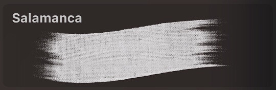
And the other brush I find myself coming back to is Salamanca from the Painting category.
I use it for filling in bigger areas of colour and just colour blocking in general. I like it's subtle canvas texture and the fact that it is not entirely opaque by default, which allows for interesting variations of hues.
But that is not all! I like to size it down to use it to add details and colour to my portraits. I find that it's softness works really well on faces and it's transparency makes it easier to bring in variations of colour.
And would you look at that! More shapes and lines! It's really all I know how to do haha
At the end of the day, I try to just enjoy the process of drawing as much as I can :)
I find that young digital artists often put a lot of emphasis onto finding the correct drawing software and brushes. And while that is important, I find that it is equally as important to throw caution to the wind sometimes and to just try out new things and to not care so much.
I mean hell, people create masterpieces in MS Paint!
My drawing process usually boils down to simply trying to ensure art stays something fun for me, and these two brushes have helped me achieve that over the years.
Hope this has been some help and not all pure gibberish!
161 notes
·
View notes
Text
Helloo~ I was bored in class one day so I thought "why not do an art study of the artists I like" except it incredibly scuffed and I really just looked at a bunch of art on their page and i tried my best to replicate one of em
So these are the 2 'studies' i did that day
1st:
My ver:
(Art by @izuke-the-zombie )
ref pic:
What I noticed first while sketching is ofc the super gorgeous cute style. Though not long into the sketching phase noticed her lines are quite sharp and pronouced, for most of her works she keeps her sketch lines making it seem more mmm hazy is the right word? Or effortless, but with every sharp line a rounded(?) line contrasts it, giving it that signature fluffiness. I absolutely adore how well this all mixes together, i dunno just sonethin bout her lines bro
I love the expression, really gives off absolutely love sick, I didn't capture the eyes quite well (I blame my chonk pen because all good artists blames their materials/j) Macaque looks more scared than breath taken and I put the eyes too far apart. I basically deprived the eyes of its soul lmao note for next time I do a study.
Ok this part has not much to do with the ref pic but her art in general and that includes her writing. I adore the cute HCs and little stories/AUs she would post, just so much creativity and its always so comforting to read as theyre so wholesome and cute. Im so sure one of my first posts here were a drawing of one of her HCs LIKE SRSLY SO CREATIVE. I was also surprised as I saw in some artworks she's able to draw structures and environments that draws your into the scene, its fits the universe so well, just adding to that little wonderment of awe. Shes amazing at coloring too, real soft, but still makes the characters pop, i'd say more but my brain is short-circuiting from all this analyzing. Shes just all round incredibly talented and creative honestly. Her style is exactly what i wanted to have as a kid and what im striving to have now. So cuteee
So far 11/10 art style, love the chibiness, cuteness, expressions, the pure and pastel feel and colors, and details. Just love her in general<3 check out her page lol
2nd:
My ver:
(Art by @clatteringbats )
ref pic:

Ok so immediately off the bat I knew I was gonna have some trouble here since I've been drawing chibis from the very start.
Just from observing her art I alr saw it has a lot of movement in em, lots of dynamic poses, and LOTS of embraces, really just pouring with that fluff/angst energy. At first I tried the anime body guidelines and boom instant error. Though not all that noticable the heads have sum chonk in em, especially the cheeks, giving that cute factor despite not being a chibi style. Im all for it. The lines are very soft, not a lot of sharp edges and if there are theyre placed in a very subtle way. The expressions are wonderful: from a subtle hopeless smile from an overwhelming roar of grief and anger, she's mastered the the art of slight details that give these effects their magic. Her lines are sketchy but not messy (does that make sense) they clump together neatly, giving the illustration clarity.
AND OMG HAVE YOU SEEN HER ANIMATICS? THE MOVEMENT, THE PACING, THE SMOOTHNESS, THE INTERACTIONS, THE EMOTIONS, THE EVERYTHING. THEYRE SO AAAA ITS LIKE A PROFESSIONAL STORYBOARD FOR A TV SHOW.
The way she uses color too— just o h m y g o d .
Her colors are so bright and clear, so nicely blended together, so bold, but not in the way that burns your eyes, she keeps them neutral in a way, that envokes that sense of harmony; like a sunset. (I legit have one of her colored artworks as my wallpaper) I have lots more to observe, but so far this is all I have to say. The skill of overflowing
Anways, back to the task at hand. I made the heads bigger than i shoulda , cause well chibi artist ehe. Again, I blame my chonk pencil. I didn't get the embrace quite right, but Ion think I could level with the queen of LITERALLY DRAWING TEARJERKING HUGS LIKE? I tried with the hands, I swear. I knew they were a little small but only now am I realizing its that way cause I made the heads too big. I wanna try drawing more in her style as its really just full of movement and flowiness, I wanna try mastering the way she draws perspectives too. I noticed for perspective shots theres this grid for the sky and ground (which is genius) will try that out when I actually pick up digital art again.
Check out her page, theres lots to see shes amazing 11/10 artstyle<3
#lego monkie kid#lmk#monkie kid#macaque#six eared macaque#lego monkie king#liu er mihou#shadowpeach#sun wukong#lmk swk#sketch#art study#art analysis#lmk fanart#fanart#SUPPORT THESE ARTISTS#shadowpeach fluff#monkey king#wukong#doodle#ink
395 notes
·
View notes
Text
Wyll NSFW Thoughts/Headcanons Part 2
These are a little more specific than the previous ones so hopefully you all enjoy these as well
These are mostly top/dom focused & gender neutral (18+ Obvi)
•Wyll is a dancer and a fighter so he has excellent control over his body. The roll of his hips are precise & intentional; always seeking to draw out the most pleasure for both of you. Only gets sloppy when he's about to come or has been overstimulated
•Wyll's default is to be gentle & doting with you, but he'll handle you however you like to be handled. You wish to be treated gently? His touch will feel akin to a rose petal. You wish for something rougher? He’ll pin you down, spank, and maybe even choke you as much as you'd like. He just wants you to feel good & enjoy your time together
•Concerning rough sex, he has limits for what he's willing to do. He wouldn't be comfortable slapping you in the face, making you bleed, using tools for impact play, or anything overly humiliating. There is also a limit to how much strength he's willing to use if you want to be handled roughly - some bruises and hickies are fine, enticing even. But your body looking freshly beaten? A huge turnoff for him
•I can't imagine Wyll enjoying being on the receiving end of rough sex, I think he wants to feel loved. Be nice to him!!
•Definitely into wax/candle play. He loves seeing you tense as you anxiously wait for the hot wax to hit your skin. He’s particular about the wax color, he’ll choose something that compliments your skin tone so you look like a piece of art. He’d blindfold you for the full experience, and when he's ready to move on he'd remove the blindfold and drip one last time, telling you to watch how beautifully the wax melts and runs along the contours of your body. Yum
•I know this is said all the time but PLEASE grab him by horns. Especially when he's going down on you - he loves it when you show him exactly what you want. When you're kissing, or being playful give them a peck, trace the grooves with your fingers. Remind Wyll they're just as loved as the rest of him, poor guy
•Praise this man - tell him he's making you feel good, tell him he's beautiful & sexy (he still gets self-conscious about his newfound fiend body), tell him you love and need him. During and not during sex
•Wyll can be a tease - because of his heroic & kindhearted nature I think ppl forget Wyll is a lil shit & instigator at times (complimentary)
•He’s never mean-spirited when he teases you, but he’ll get the faintest quirk of the lip, the slightest self-satisfied glaze in his eyes that tells you how amused he is. He never allows his teasing or denial to get to the point where it's humiliating for you - his purpose in doing these things is to make the reward all the sweeter, not an act of subjugation
•WYLL READS SMUT!!!!! And man does this play out in some fun ways. He talks about it in past tense sure, but once he gets to live the soft life again I bet he'd pick it back up. Especially since you, who is reading this, most likely read smut too
•100% down to read them together. He's good at reading aloud, his voice is smooth & he doesn't tend to make mistakes or fumble lines. It becomes a pleasant pastime in the evening, with you resting your head on his lap as he reads for the two of you
•If you read a particularly spicy scene he'd suggest you try & reenact it. aka this man is into roleplay (bard tavs rejoice)
•Yes he loves his rose petals on the bed and sensual baths, but he also enjoys being silly and goofy in bed. He attempts to do a voice for the part he’s playing & it sounds utterly ridiculous & you both break out into laughter and giggling while you're trying to kiss. He's got such a beautiful grin how could you not melt? The silliness just brings you closer & makes the sex all the more special
•Cockwarming? Cockwarming. Loves just staying inside you to feel close while holding you from behind. Might ask you to read from one of your dirty books out loud while he fondles you, letting you feel his cock gradually harden and lengthen in you. Also likes doing it after he’s come inside you
•More naughty reading stuff because I love this concept for him. He'd have you read your book aloud while he gently fucks you & wouldn’t let you come until you finish x amount of pages. If you stop, he stops - might even pull out. If you're incoherent, he goes excruciatingly slow until you can enunciate properly
Let me know what you think! Or if any of them should be a fic of their own
135 notes
·
View notes
Note
Hello, I wanted to ask you how you are able to create these comics. Like what is the process of making a comic? How do you design the script, the panels?
When I write scripts, I sometimes only include the dialogue to give myself a vague impression of what's happening (especially for longer comics, where I change my mind on what happens/what is said on a regular basis.)
Other times, if it's a mostly-visual comic or a simple one shot, I go out of my way to describe what's going on in the panels.
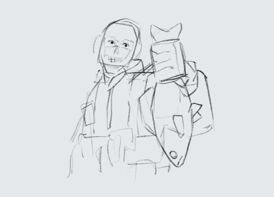
After I finish the script I draw a rough draft, then I draw second less-rough draft on top of the first one, complete with panel boxes and text so I have a nice solid idea of the layout.
(You can't quite tell from these pictures, but usually I put the foreground layer in blue, and the background layer in red)

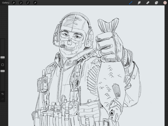
Then I start win the line art, giving what's in the foreground slightly thicker, darker lines compared to the background before I move on to the solid colors.
(Sometimes I start with the background and make my way to the foreground, or visa versa, but this time I got messy and didn't color anything in any particular order.)

After all the colors are added I create some new layers and add the shading. My go-to method is to shade the background with only soft shading, while the foreground gets hard shading to help create a sense of depth.
Then I layer on more shading and more details... the little background elements and the tiny reflections in the character's eyes...


Until finally…

Tada!!! Finished comic!
42 notes
·
View notes
Note
can I ask a question?
how do you render your art? like you make it feel doodly but clean at the same time
hope you have a nice day
Thank you! I like to think my art style is an organized mess! It's cause I've leaned more to a certain digital painting style where I don't have to rely on making clean lineart as I can just render it all instantly. Here's my work progress:
I use a marker brush on Firealpaca (One of the drawing programs I use, the other being medibang for the comic), it's on a soft pen pressure setting 0.20 (soft) and with opacity by pressure on so it has a soft feel along with no sharp edges so that I can focus on anatomy structure calmly.
The lineart process is simple, not wanting to go overboard besides drawing the important stuff. The imperfections can be altered later.
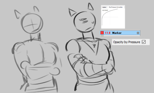
Then, I color it. A base layer is really for the main colors, if I wanna put shading then I separate each color by clipping layers so I can shade them individually but for this example, I won't dive too deep into it besides that I don't use any watercolor brushes besides- well, Dp-flat is like a watercolor brush/blending brush but it has a strong texture that I like. I prefer to shade manually with airbrush, dp-flat brush, and a makrer brush (opacity on).

And we got rendering!!! I Spend a lot on rendering as it's fun- especially for smaller pieces! I often use a marker brush but with a different pen pressure (normal, 1.00) so it has a sort of sharper end so I can also add faint brush strokes/lineart to give it a solid look. I use the color picker a lot to overpaint some specific lines and colors while also using the brush as an eraser to shape/sculpt the form!
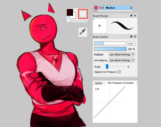
I've got more examples for my more finished works to show how noticeable the results are regarding how I render! I like to experiment from time to time

45 notes
·
View notes
Note
Hey!! Just wanted to say I love your style very much, especially the way you paint your artworks. If you haven't answered it already, what are the brushes that you use usually?
Hello!
Thank you!
I answered a similar question before but I've added a few new brushes to my arsenal since then so it's time for an update!

SU-Cream Pencil - the og, I don't use it as much anymore but it's the one brush I return to when I need a good pencil texture.
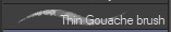
Thin Gouache brush - 90% of all of my art (both line art and painting) is done with this amazing brush 👌

平行歪6点線 - for all the fancy artsy random lines in my art, especially hair strands etc.
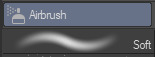
Soft Airbrush + Noise - i feel like airbrush is essential too. depending on how you use it. sometimes you need the smoothness, great for eye-dropping colors and painting over.
△Watercolor11/水彩下塗り - i don't use it too often BUT it's really good, nice texture and has a fun thin outline. i use it on chibi faces to do rosy cheeks :)
I can't think of any more at the moment, if I remember I'll add them later but these are the most essential brushes I use in pretty much all of my art!
Though, to be honest, I experiment with all kinds of stuff CSP has to offer when it comes to default brushes, especially in the thick paint section.
Hope this was useful 🙏
53 notes
·
View notes
Note
Just wanted to say that I love your Human Bowser comic! I specifically loved the colors chosen for pages 42-47! They’re so nice and satisfying it’s kinda hard to describe! What’s your thought process when choosing the colors for a particular scene if you don’t mind me asking?
I'm not sure if you want the emotional answer or technical so I'll just go with how I know how to answer art questions:
First I have a set color scheme for the flat colors. This doesn't change, but the coloring i do on top of that does. For example: human Bowser has set flat colors that have not changed since page one. But as I learned new techniques I changed the effects/mapping i add on top of it.
I learned a lot of different coloring techniques between pages one and the current pages. At first i was nervous to change how I colored the comic and I had a LOT of new things I wanted to try and was worried people would be upset at the drastic coloring change. But thankfully all the feedback has been positive.
After I do flat colors I then will choose various color gradient overlays that I feel suit the mood of the page/panel. I like to use a lot of dark-to-soft-light overlays to add depth to the base colors. I also sometimes add gradient mapping, which is a art technique where a set gradient is added on top that drastically changes the tones. I usually put this layer at a super low opacity so its just a hint of change.
For lighting I currently love added bursts of light where i can, and then softening the colors of the line layer to make it look like the light bleeds over. Some softer glowing effects also help with this.
A big change i also did since the beginning of the comic is I now soften the line layer and color layers to give it that 'dreamy' look.
For the emotional side of things, when I pick colors my attempt is to think of what color pallet fits the mood/environment. I'm still learning when it comes to coloring (it's a weak point of mine for sure) but everytime i think i learn something new that will help with a scene I'm doing I try it out now.
One of the biggest things I'm doing right now is watching a lot of youtube videos on comic storytelling/layout/coloring to really try my best to get better.
I have a obsessive disorder/condition so I often need to be doing something with my hands. Either gaming, cleaning, or drawing. So I currently draw 3-4 hours a day after work (while listening to music or youtube) to keep myself occupied or I get antsy. It's why I tend to look like i work 'fast'. I'm not really fast at drawing, but I draw every day, and certain scenes/characters are second nature now when drawing.
I still make a lot of mistakes and have a ton of weaknesses but I'm loving drawing this comic a lot so I'm doing my best to fill in my knowledge gaps as I go. Clip Studio also has a ton of amazing assets/tutorials that really help and I highly recommend the program, especially if you struggle with perspective.
I hope this answers your question and wasn't too long winded 😭
34 notes
·
View notes
Text
TF141 HOME DECOR HC'S
Ghost:
(I like to think that Soap and Ghost are roomies, so they compromise on a lot of their flats’ decor)
His bedroom though? Dark colors for the win
Charcoal gray sheets and comforter
Considered painting the walls gray but decided
Wanted skeleton sheets as a joke (not), but couldn’t find one to fit his bed so he settled with a decorative throw
100% has a window that he only opens to peek at whatever bullshit’s going on in the street
Both of them have a display cabinet they share
Simon’s side is full of his fave knives and “chest candy” (medals) neatly lined up
Soap:
Johnny’s side of the display cabinet has old campaign polaroids and some silly little souvenirs
Light blue walls and tartan sheets for sure
Messy organized, but it works
Definitely has a clothes chair and to-do lists tacked onto a corkboard
Simon can’t wrap his head around his method of organization. Stopped asking questions a loooong time ago
Stacks of used and unused sketchbooks on the nightstand
Has a minifridge so he can get a ‘nip in the night’
Ghost jokes about swaddling him like a baby and giving him liquor to nurse on (no pun intended)
Has a photo of Graves he throws darts at as stress relief. He’s good, but not as good as Ghost so there are a couple tiny dents on the walls
Gaz:
The award for coziest bachelor pad goes to …
Flat smells GOOD. Like that gentle, fresh laundry smell
Type of guy who has a spreadsheet tracking all of the furniture he wants to buy off FB marketplace (Price put him on)
Sad that he can never own plants since he’s away often
Has a few things mostly for ‘easy maintenance’ (out of sight, out of mind)
Makes sure these few things look and feel high quality. Won’t settle for less
Blue sheets with tiny mid blue stripes
Ghost and Soap don’t understand why he owns art but agree it looks neat
Definitely has a balcony with a small chair specifically for smoking and thinking
Only things he has on his nightstand are a lamp, metal cigarette holder and matching ashtray Price gifted him
Price:
This man has a house … and that house is his baby
Especially the front yard. Do NOT fuck with his front yard
Subconsciously anti-lawn and has a beautiful low maintenance garden
Has beef with his neighbors (cause of said garden). Shoots the shit about them with Gaz on his front porch
Shed for all his handy shit. If Gaz picks up some furniture for his crib he will turn it into ‘father-son bonding time’
The interior? Rustic and neutral, with modern touches ... nice n' warm
Mid century modern enthusiast. Fell down that rabbit hole once he joined Pinterest and never came back out. This man has probably had Pinterest since it's inception -- his username is probably his first and last name XD
Burgundy comforter vibes. One of those soft, smooth quilted ones.
His office’s desk is his prized possession. It's one of the fancy wooden ones with the mini built-in drawers on top. Keeps his best cigars along with stationary there
Photos of his boys (sons) of course
Definitely has a bankers’ lamp
#cod#cod headcanons#captain john price#john soap mactavish#soap cod#kyle gaz garrick#kyle garrick#gaz cod#simon ghost riley#simon riley#ghost cod#call of duty modern warfare#this has been steaming in the drafts 🔥
26 notes
·
View notes
Note
I just discovered your blog/art and OMG IT'S SO CUTE! your art has this tender softness to it and i love how you do your line art. your pastels and muted color choices in your gijinka designs are so nice. your paintbrush gijinka gives me so much gender envy, i especially adore them.
IM SO FLATTERED!!!! TY!!! Y’all’s complements means so much <:)!! Especially w the color choices I always worry it’s too boring haha! ALSO ty for complimenting the paintbrush gijinka!! My aim for designing them was college art student vibes, inspired by the people I’ve been around! Laid back but they can still slay while being painty!!

39 notes
·
View notes
Text
Lenore Loomington Review Part 1 of 2
I already did a preliminary post on here where I compared her price point to other Monster High dolls and delved into some head cannon to try and tie down her design choices and give her personality (I want to pretend she’s worth $81.95 by getting really attached to her….)

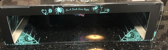
Here she is in box! She came in really quickly. Her box has some really bright hot pink and teal and has a plastic slip cover with more teal designs on the outside.
Good news: she already looks better than her promo pics, but her shimmery skin is a bitch to try and photograph.
Box photos and accessory break downs under the cut:

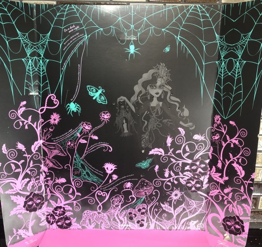
Trippy. :) The right side of the box. I like the effect, I just wish that the colors or the imagery tied more in with the character’s design.

The left side of the box has her name in a nice, specialized font.
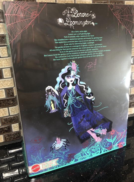
The back has a poem on it saying that Lenore followed a light to a spooky garden full of strange creatures and plants, decided to stay (with some “persistence”) and she died, becoming a ghost. Well, that’s a start of something.
The artwork on the back is fine too. The most interesting thing from this art is seeing the color differences in the art vs the doll (especially the shoes; seen here as a more lavender/duller color vs the brighter magenta that is seen on the doll).
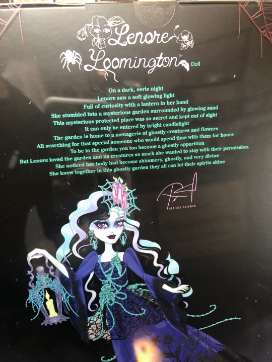
A close up of the poem, the signature, and a bit of the artwork. The more I look at what I thought were vines on her accessories, might all be dewy spiderwebs….?

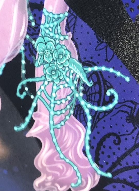
You can actually make out the detailed sculpting on the flowers better in this artwork than the actual pieces themselves (which is odd as I usually think that Mattel has the better sculpts when compared to competing companies).
The top of her box is also decorated.
Okay, now let’s rip this bad boy open.
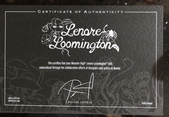
Here’s the Certificate of Authenticity, taped to the back of the inside sleeve the doll is strapped to. They got specialty textured paper for this, but it feels thinner than the usual paper-board thick ones.
Here is the inner sleeve. It actually looks a bit menacing and it reminds me of looking at photo negatives.


Here’s a cute little rat, hiding in the corner, and the poem is also written in parts on the right hand side of the sleeve.
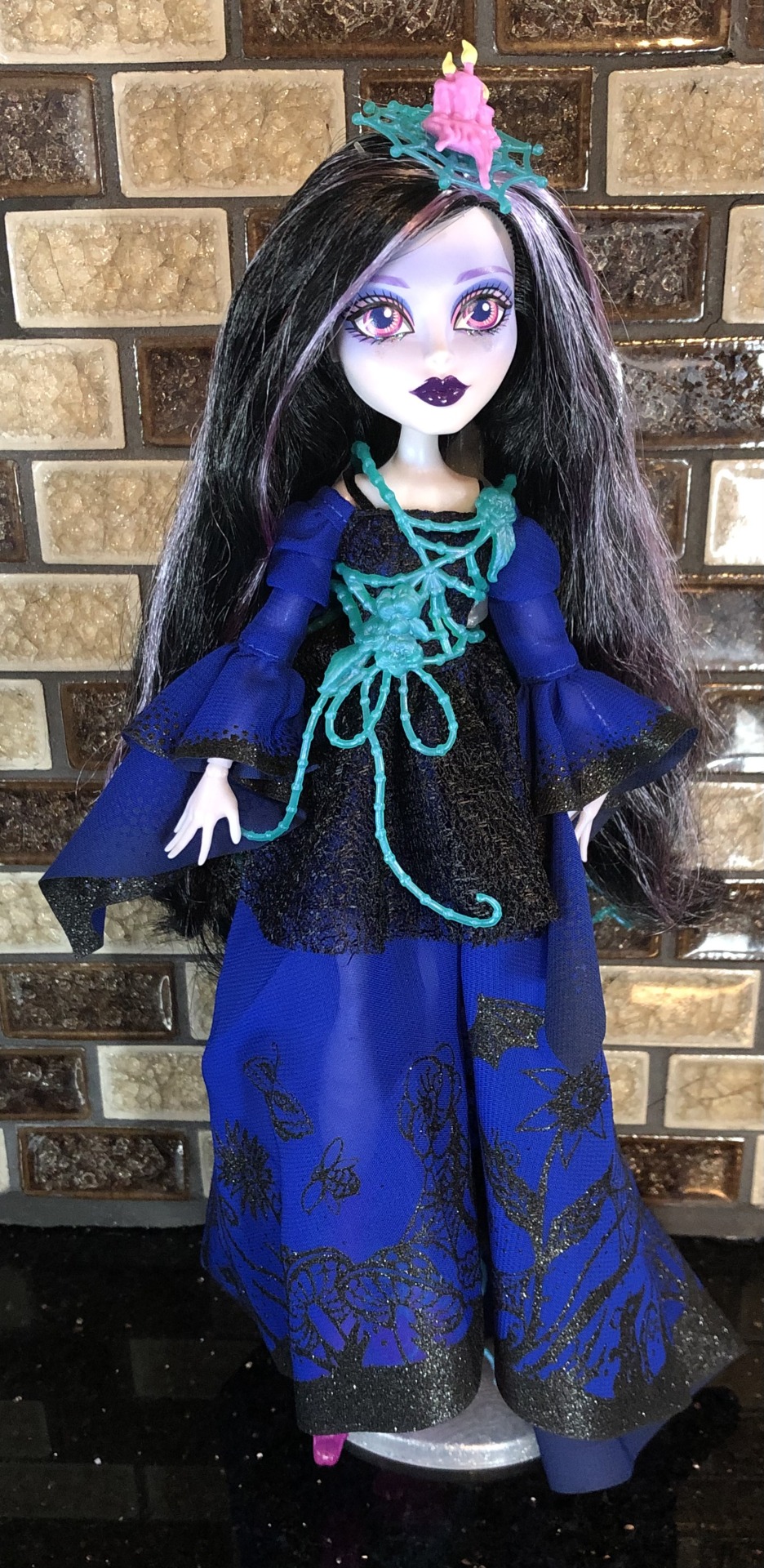
And here she is out of the box and after I ran a metal comb through her hair. Her hair is soft saran and is a bit fuzzy on the ends.
Let’s look at what she comes with…
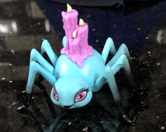
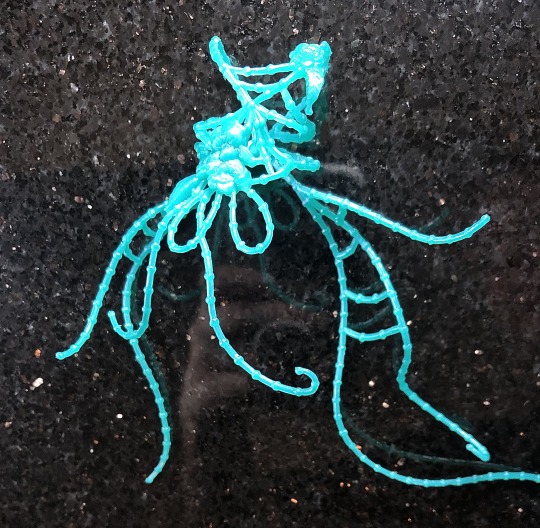
Here is her unnamed spider pet….? Captor?? Accessory maker…? The candles are not removable, but at least it’s a different sculpt than the other spider pets of Monster High.
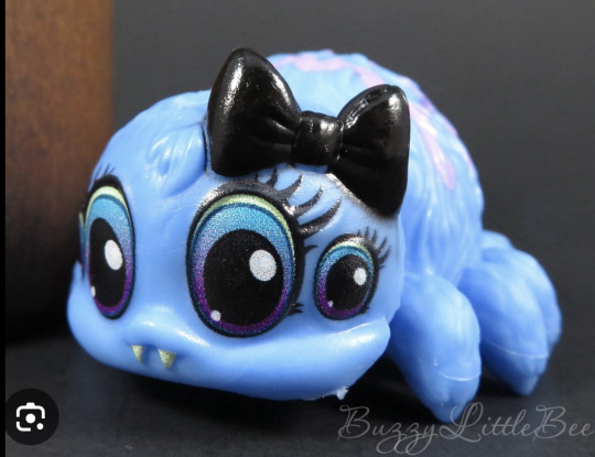
(Webby from G2; credits to Serendipity Doll Boutique for Memphis Longlegs and BuzzyLittleBee for the G3 Tarantula pic).

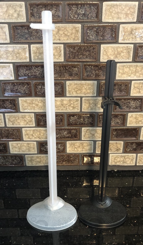
She also comes with a very tall, sparkly stand….and I get why it’s tall (so she can float) but it makes her hard to fit on my shelf, the bracket wants to bunch up her dress and my doll sinks farther down the stand once she is clipped onto it.
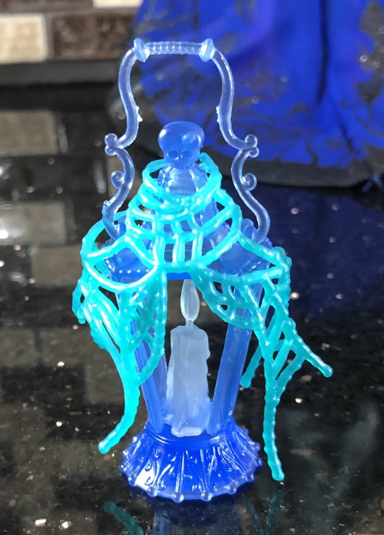
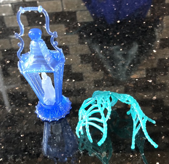
Here is her major “purse-akin” accessory. It has some cute detailing on it and it’s made of a really light plastic. Actually most of the plastic accessories feel like the really light plastic found on cheaper toys. I was expecting the plastic to be heavier and/or more rubbery (like the chains used in the Haunted Line).
The spiderwebs are removable and the candle glows in the dark (which is a really nice detail).

Okay, her earrings!

They have the eyeball pansies on top (they’re kinda hard to make out). And dripping candles under it. Sadly, their flames do not glow in the dark.

Here is the head piece. It’s connected to a headband and it also doesn’t glow in the dark (booooo). It’s an odd size and I feel like the spiderweb should have either been much bigger or much smaller (like stopping at the inner spoke of the spiderweb).
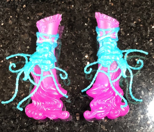
Everyone (me too, not going to lie) was giving her crap for having hot pink, blobby looking shoes.
And honestly, that’s because the photos for it were meh and the color was also….a choice….but I ended up liking them more than I thought I would.

The eyeball pansies shoe clip-on remind me of the Bloom and Gloom shoes (see Jane’s shoes? that hibiscus POPS in comparison to the mold Lenore was given)….but not executed as well. The sculpt on the flowers are really flat and blend in with one another. :/
Okay, now what shoes sculpt is hiding behind there???

Look at that hidden detail! The buttons have little button holes, all the little frills and stitching and all that filigree detail on the back of the boots….if only it was PAINTED….
The spectral waves on the bottom of her shoes are reminiscent of Art Class Draculaura’s paint shoes (credit for image: CoyoteCrowCollectables).
From her boots that I was pleasantly surprised with, to my least favorite piece from her: her belt…chest thing…
Again, the flowers don’t really pop out in the sculpt and it sits really baggy on her in random spots, it just doesn’t seem to lay well on her and needed a few more tweaks.
Now that her accessories are looked at, the next part of my review will focus on her dress(s) and comparisons to other Monster High dolls.
#monster high#aleta’s toys#doll collecting#monster high doll#dollbr#monster high dolls#doll collector#Lenore Loomington#Monster High skullector#mattel#monster high lenore#monster high g1#doll review
14 notes
·
View notes
Note
The thing i always notice first in your art is your use of lines and line color (especially where you use black vs white lines/when you combine them)
it makes your art look so soft and smooth and confident, i love it so much
your art is always so clear which is something i struggle with myself so i always take the time to appreciate it extra 💕
i hope you have a nice day!
hhgahabzvua?? reading this after coming home from work is so nice aaaa thanks!!! unfortunately my brain is overworked and tired so idk how to respond properly 🥹 thanks tho, please have a nice day/evening as well 💚
33 notes
·
View notes
Note
May we ask what brushes you use for your work, it always looks so clean and nice 🥺
Hi hi! I actually do have a post where I shared all my brushes!
They're procreate brush files but you can also refer to this picture to sort of gather how they look/behave
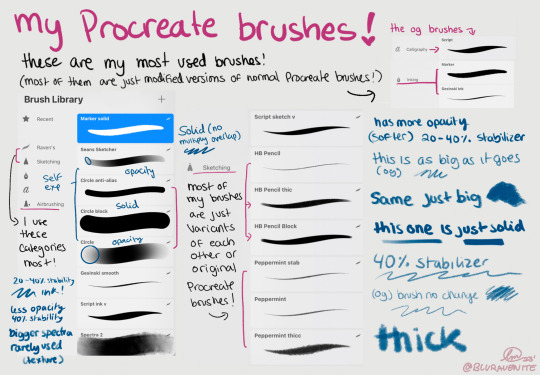
Sometimes when I feel a bit of art block I play around with brushes (I've been using some other procreate pencils like Derwent and the procreate pencil, as well as some other inking brushes like Baskerville, mercury, tinderbox, and syrup but I rarely use those)
I like to ink with the pencils, tbh because I can still retain that softness and smooth control over every line (especially the opacity of the lines) and line weight!
I also do a little trick where I duplicate the inking layer two times, so that I have 2 inking layers, and I blur the bottom one a little okay with the opacities so they're not too heavy, and then use a clipping mask with a dark color that matches the drawing and lower the opacity until it's barely visible but the lines feel more integrated, and plz lmk if none of this makes sense cuz I can make a little video to show it
27 notes
·
View notes
Note
I really wanna say I like your arts sooooooo much!🌟✨💕💓💖💐🌼
The way you draw Leon is so gorgeous, stunning, pretty, exquisite, radiant, alluring, breathtaking, bewitching, angelic, sensuous and striking beautiful, like I can't even describe or form a word to admire your artwork.
You draw him like he's having a golden retriever aura all the time and it's sooooooo adorable! So cute my heart hurts. He's so babygirl and such a sweetheart in your style, also looks like a puppy too. I really wanna pet him in that picture, him close up with the green petals.
Ans especially him holding flowers in that picture, every details you add in the picture is so dreamy. The way you painted the flowers, Leon and the background are chef kiss. The way he's smiling but the flowers covered his mouth but we're still know he's smiling because his eyes curled up is hella cute. The pallette in the picture is so warm, everything in that picture is so perfect. And those flowers in his hair! It's so precious😭💖💐 I wanna put some flowers or a flower crown on his head too.
Your line art is so cute, if I have to describe it's look so soft, mild and smooth. Like, idk but your line art gives off like that and your arts are eyes catching with that style of yours. Your Leon arts look so casual and lovely, like he's actually exited😭😔💖🌟 That picture of him playing electric guitar, the picture of him holding flowers or that picture emo Leon! Like he's a man whom you can find in your town but he doesn't exist😭 Even though the picture of him being zombie or infection, he's still looking so cute in your art.
I really like the way you used your color palette too, it makes your art looks tender and dreamy. The the combination of warm and cold palette together but the warm tone more, makes your art look so adorable. Feel like sitting in front of the fireplace on Christmas night, the warm and the mood give off like that, hehe.👉👈
Anyway, please keep up with your drawings! Every drawings of yours is so precious and adorable! When I look at your art I wanna make hot chocolate top with marshmallows for your hardworking! (If you like chocolate, ofc.) And your oc for RE is so cool! I wanna see them fight with Leon, hehe. 🌟💖💓💕💐✨🌟🌼
(Pls don't mind my English skills, England is not my first language.)
On my knees crying!!
Thank you! Thank you so much 😭😭 it's so nice and sweet!! :')
13 notes
·
View notes
Text
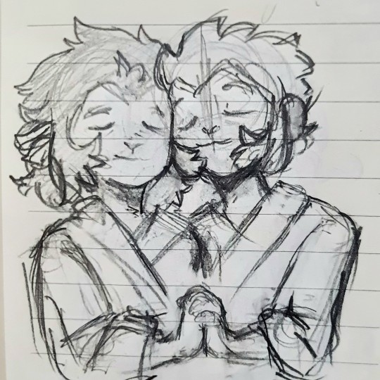
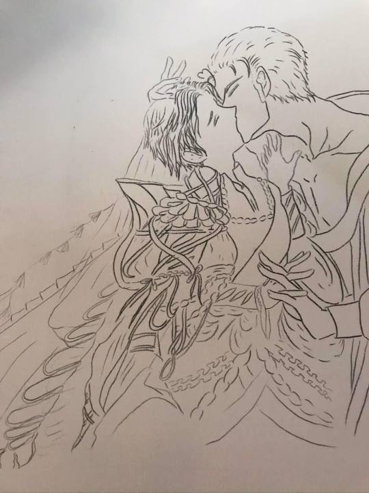
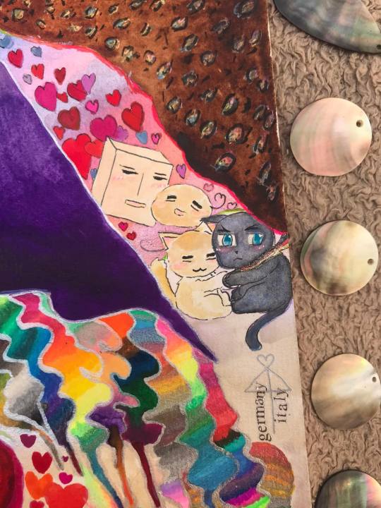
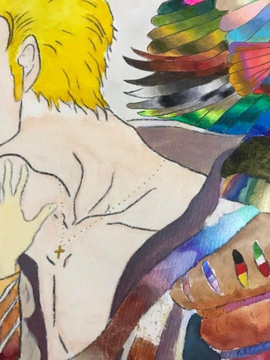
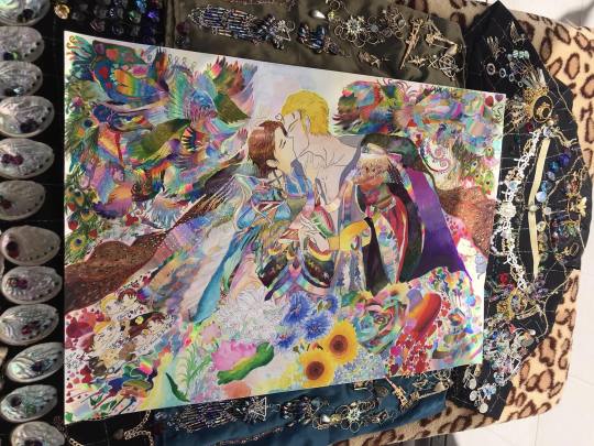
GerIta Week 2023 - Day 7 - Engagement/ Weddings
My first GerIta fanart is 100 % finished
Long post, skipping the read to just enjoy the pics if you want.
Those who take time to read are even more appreciated.
Either way, thank you.
Now, enjoy!
Note: English is not my first language so pardon any mistakes there *hug*
The royalty regalia wedding outfits were designed carefully and creatively with my imagination and creativity, after referencing lots of sources for fashions in various periods in history. They are all inspired mostly by ancient historical medieval German and Italy Fashion feat some of the likes in other nations mixed in a little. That’s all for the brief description of costumes since explaining in detail would be too time-consuming…..


Here’re my outfits design sketches for Italy and Germany ..... and some random materials of references in endless sources I’ve based on (source mostly from world4.eu .....)


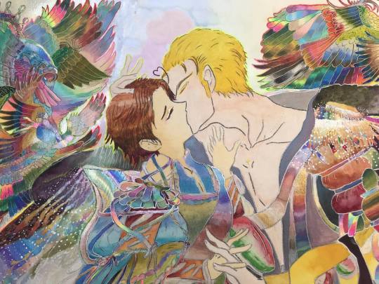
As GerIta melting like ice on a desert in each other
passionate endearing yet soft gentle hugs and kisses vowing and exchanging wedding rings, they happen to find out previous lives in sudden rememberance.


In one life, they were enemies to lovers but unable to marry due to wars. In another life, they were King and Jack of the kingdom of Heart in which Feliciano chasing after Ludwig. Then in other lives, they were couples, in the form of kittens, in shapes of mochis, and so on.
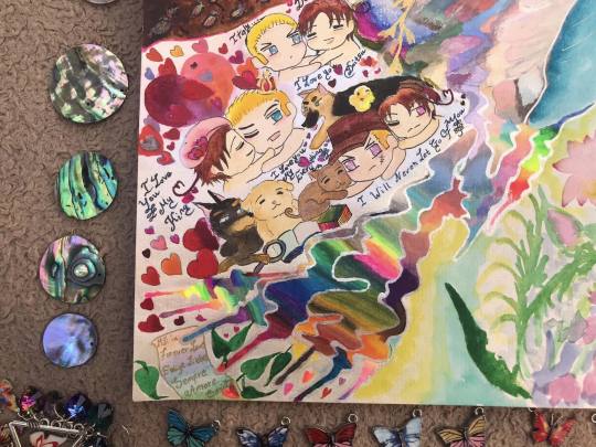

Any boundaries, whatever circumstances, they always fell in love with one another. Despite being human, animal, unknown creatures, or living in what universe, era, or countries speaking what languages, Love found them always. They were destined to be together. Ever since forever till now and forever more. Everlasting love felt so illusional still real no less.
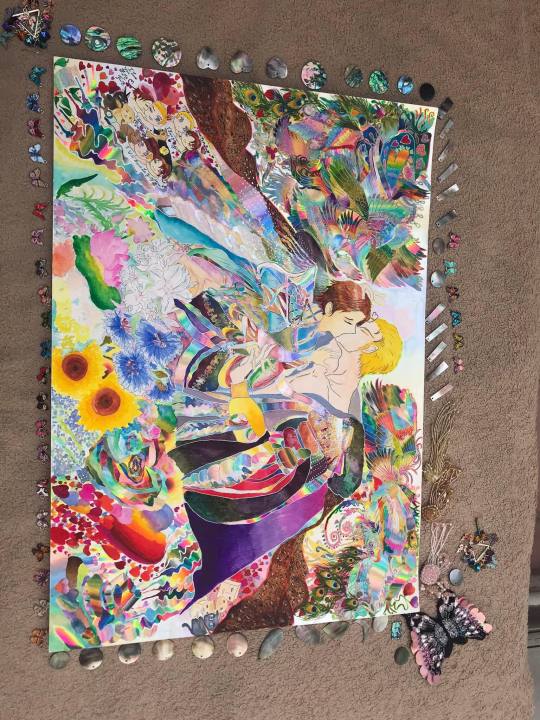


P/S : Actually the colors and effects vary up to the light's difference Some parts were eaten and ruined by cockroaches while I was busy doing other stuff and forgot to put the drawing away…..

Fortunately, I’ve had experience in drawing and fixing traditional art so it turned out nicely, not bad at all


I did want to write some more lines for other details,like the national flowers or especially the gigantic magical iridescent flying creatures and such but that’s all for now …..
Base reference is forgotten, I will add it later when I find it.

P/S 2: I do want to share lots of pics but that would be beyond too much….
Thank you for looking at my drawings.
Have a nice day/night in your area
Thank you @geritaweekso incredibly much for holding the event and everyone participating enthusiastically
@geritaweek

#mixed media#traditional art#gerita#ludwig beilschmidt#aphgermany#feliciano vargas#geritaweek#aphitaly#day7#geritaweek2023
9 notes
·
View notes
Last Seen Blogs

sereneusa
USA Blog
elizabethbaennet
eunoia
soolucky
beauty full (dami solo)

mathiassenohlsen80
The Life of Colon 168

chrisbear01
chris hen bear