#the flames of hope
Text


Qibli the Sandwing
[Image Description: A digital drawing depicting Qibli from Wings of Fire. He is small wiry with a sail that flows downward to the side like it is hair, and a zig zag scar on his nose bridge. He is a dandelion yellow, with an off-white under belly that starts at his chin. Freckles are featured all over his body on his face, legs and tail. He also has tear duct markings that are similar to a cheetah. His sail and rattle is colored brown, with his eyes and tail barb being colored an even darker brown. He has orange yellow on his paws, snout, as a dorsal stripe marking and on the arms and fingers of his wings. The webs of his wings are a duller orange color. His horns and claws are an off-white that is lighter than his underbelly. He is standing with a grin on his face, with one eye winking, and an arm lifted to show the inner side of his claw, as though he is accentuating himself. In a second image, he is wearing a cowboy hat with his horns poking out that has a piece of sky fire embedded in, a neckerchief and a golden earring with a teardrop on his left ear. /.End ID]
#wings of fire#wof#dragon#wof arc 1#wof art#dragons#wof arc 2#the brightest night#moon rising#winter turning#escaping peril#talons of power#darkness of dragon#the lost continent#the hive queen#the dangerous secret#the flames of hope#sandwing#qibli#wof qibli#qibli wof
208 notes
·
View notes
Photo
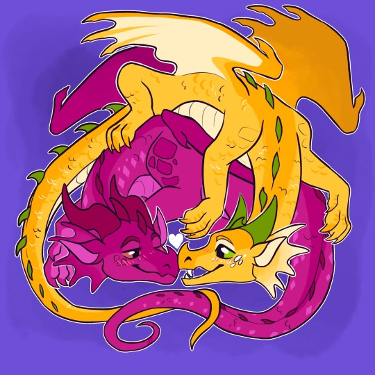
Jambu x Pineapple
#jambu#pineapple#wings of fire#wof#wof fanart#wof fans#wings of fire art#art#artist#fanart#the flames of hope#arc 3#rainwings
431 notes
·
View notes
Text
Some little drawings of Luna and Clay I did not to long ago :3
Don’t mind why the shading on Clay looks horrendous, I’m not good at shading :’)
#wof#wings of fire#wof luna#wof fanart#wof clay#the dragonet prophecy#the flames of hope#sombra arts (me)#art
39 notes
·
View notes
Text
youtube
FINISHED A NEW PMV!!!
#wings of fire#wof#wof fanart#wof art#dragon art#art#animation#pmv#i did this in 2 days#fear the power of speedrunning animation#i fear it too#for i dont know what possessed me to do this so quick#luna wof#dusky wof#freedom wof#the flames of hope#tma#i still havent read the 3rd arc lmao#Youtube
108 notes
·
View notes
Text

I thoroughly enjoy reading Wings of Fire.
A scene from the latest book, "The Flames of Hope" featuring Luna and Swordtail.
and we're into 2023! Ish!
#TripleAArt#Wings of Fire#Luna#Swordtail#The Flames of Hope#Silkwing#dragon#art#digital art#fanart#the truth is queued
39 notes
·
View notes
Text

Freedom!! A prompt from my Wings of Fire Goretober Challenge. A little late with this one, but oh well.
I don't really get the hatred towards The Flames of Hope...? I also thought it was a little disappointing (especially for a grand finale), but I didn't think it was bad. I feel like people need to lower their expectations for a series that targets elementary students. If fourth grade me read this book, Freedom would have RUINED me 😭
I think its main problem was introducing Cottonmouth and Freedom waaaay too late. A lot of people seem to hate Cottonmouth being the real villian, but I'm actually okay with that 🤷♀️ I thought the book had good tension and some cute moments. People who complain about it being too cheesy forget that WoF has been cheesy from the start lol.
#wings of fire#wof#freedom#lizard#body horror#plant growth#dragon#digital art#art#animals#my art#dragons#flames of hope#the flames of hope#freedom wof#lizard wof#character design#goretober#drawtober#feral#othermind#breath of evil
30 notes
·
View notes
Text
Just finally finished reading “The Flames of Hope”, and it’s the saddest fucking book I’ve ever read out of the series, despite the happy ending. Or, honestly, I think it’s just how sad Freedom’s story was.
Her egg was stolen by a power-hungry man, and grew up never knowing how much her mom cared for her. Died as a dragonet, but her mind lived on for five thousand years because of a plant that used her as a host to help it grow and spread like an infectious weed (which it pretty much was). Only given Lizard as a name. Never received or gave any love during that time; lived on with only hatred shared between her and her human captor. Basically forced to control sentient beings until it was normal for her that she felt no need to retaliate having to do what the human or plant wanted.
Honestly, I’m glad Tui wrote this book in Luna’s perspective, because it’s something that was needed. In the few days that Luna was trapped down in the abyss, Freedom needed that time. It may not be enough compared to the five thousand years of misery and isolation, but it was something. Something to give her—show her—that not all dragons were as terrible as Cottonmouth (the human) claimed they were. It gave her a friend in Luna, and in the dragonet that was with her. The memories and the hug she was given; she needed them. In the end, it was all for something. And it was so heartbreaking-but-so-kind for Luna and Dusky (the dragonet) to give her a name worth giving to her, that represented something—Freedom.
I love how this book turned out 💚
#wings of fire#the flames of hope#wof#wof luna#luna wof#wof freedom#freedom wof#wof dusky#wof cottonmouth#wof human#wof silkwing#Pantala#breath of evil#Othermind#Brook rants
80 notes
·
View notes
Text
WINGS OF FIRE BOOK ELEVEN: The Lost Continent


WINGS OF FIRE BOOK TWELVE: The Hive Queen
Variant covers for different languages


WINGS OF FIRE BOOK THIRTEEN: The Poison Jungle
Variant covers for different languages
I don't know if the gif is official for The Poison Jungle. (likely not official)

WINGS OF FIRE BOOK FOURTEEN: The Dangerous Gift
Variant covers for different languages
((Theres a gif of this cover, idk who made it, can't upload it but here's the link))

WINGS OF FIRE BOOK FIFTEEN: The Flames of Hope
Variant covers for different languages
B1 B2 B3 B4 B5
B6 B7 B8 B9 B10
#wof#wings of fire#wingsoffire#wof arc 3#arc 3 wof#The Dangerous Gift#The Flames of Hope#The Poison Jungle#The Hive Queen#The Lost Continent#silkwing#silkwings#hivewing#hivewings#leafwing#leafwings#icewing#icewings#skywing#skywings#wof wren#wren wof#blue wof#wof blue#queen snowfall#wof queen snowfall#queen snowfall wof#wof luna#luna wof#wof sundew
36 notes
·
View notes
Text

luna grrr, Book 15 made me sad I felt bad freedom :((
(It was freedom☠️☠️)
18 notes
·
View notes
Text
Just some random thoughts on the 3rd Arc (Spoilers Below, Swearing)
Honestly, I think the 3rd Arc would have been better if it was a self-contained story.
No traveling to Pyrrhia, no characters from the 2nd or 1st Arc. Animus magic wouldn't be taken away (Boa might still have done that, but since we never travel back to Pyrrhia, we never know).
I mean, it feels like the main characters of the 1st and 2nd Arc had their time to shine, and with their addition to the 3rd Arc... I can't help but think that they take precious time away from the characters we're supposed to follow. Sure, it's nice to see them again, but personally, I'm just here for the Pantalan dragons.
There were so many things that were set up and NEVER resolved or utilized.
The Chrysalis? Just a couple chapters in a book, then NOTHING. Where's the big uprising? Where's the part where SilkWing slaves gain the courage to fight off their masters? "Oh, SilkWings are so helpless they need help from Pyrrhia dragons to save them!" I call bullshit.
Flamesilks in the cavern? Forgotten.
Queen Wasp? Surprise! She got kicked out of the big baddie role for fucking scavenger, and then she just got a slap on the wrist for all the shit she did. We don't even have the satisfaction of watching her be defeated, we were told. She was an amazing villain, and it's such a shame she was swept under the rug.
Don't get me started on scavengers suddenly becoming a big part of the story for... some reason? Honestly, they should have just stayed unintelligible rats, IMO. Humans are always a big part of basically every dragon book in existence, and it grinds my gears SO MUCH that WoF did the same. I'm here for the DRAGONS, I don't want to read about humans! I thought you were different 😩!
The ending of TFoH was so goddamn rushed, I kept looking at the pages, thinking, "What? That's the end of the book???? Where's the rest of it?"
It's just... the canon story is a clusterfuck. I love The Lost Continent, The Hive Queen, and The Poison Jungle (mostly), but the lackluster ending really soured my experience. I don't know if I could ever read it again because the ending is just so disappointing.
It's such a shame. Because I really do LOVE the dragons of Pantala. HiveWings, SilkWings, and LeafWings. The designs of Pantalan dragons are so interesting and fun! I can't help myself but keep drawing them. That won't ever change.
#i haven't read the 3rd arc in forever#so please take it with a grain of salt#wof arc 3#wings of fire#wof#the lost continent#the hive queen#the poison jungle#the dangerous gift#the flames of hope
10 notes
·
View notes
Text
(WOF CHARACTER SPOILER FOR BOOK 15)
ATTENTION ARTIST WOF TUMBLR FANS! IF YOU SEE THIS POST I NEED A FAVOR FROM YOU! I NEED YOU TO DRAW BULLFROG FROM WOF BOOK 15 AND REBLOG THIS POST WITH THE DRAWING OFC. ILL GO FIRST

#artists on tumblr#wof fanart#wings of fire art#wof art#wings of fire#wof#wof bullfrog#wof fans on tumblr#bullfrog wings of fire#i dont know what tags to put#book 15#wof book 15#the flames of hope#the flames of hope wof#hi#art#illustration#ur cool#please
81 notes
·
View notes
Text

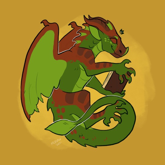
Jambu the Rainwing
(Based on different colors of jambu fruit and the jambu fruit dove)
[Image ID: A digital drawing of a hot pink rainwing dragon with a curly tail. His name is Jambu from Wings of Fire. His sails, frills and wings are an emerald green color. He has peach pink heart shaped markings on his shoulders and his knees, and most notably, a big one on his chest. His under belly is an off-white orange color. His horns and spikes down his back are all a dark purple red. He has a snake like face and a long neck and tail, with some slight chub to his tummy. A red color is on his face from his nose to the bridge of his horns, as well as on the outer parts of his wings, body and on his tail tip. He has a red heart shaped beauty mark on the left side of his cheek. He's flying while grinning lazily. /.End ID]
#wof jambu#jambu wof#rainwing#wof#wings of fire#dragon#the hidden kingdom#the flames of hope#wof arc 1#the dark secret#the brightest night#winter turning#my faves
103 notes
·
View notes
Photo
queen hazel
#wings of fire#wof#hazel#queen hazel#digital art#digital artist#art#artist#meroaw wings of fire#meroaw wings of fire designs#the flames of hope#dragon#fantasy#dragon art#dragon artist#dragons#wof fans#wings of fire art
373 notes
·
View notes
Text
Ranking all Wof Cover (except winglets and graphic novels) because I’m bored :p (Some spoilers!)
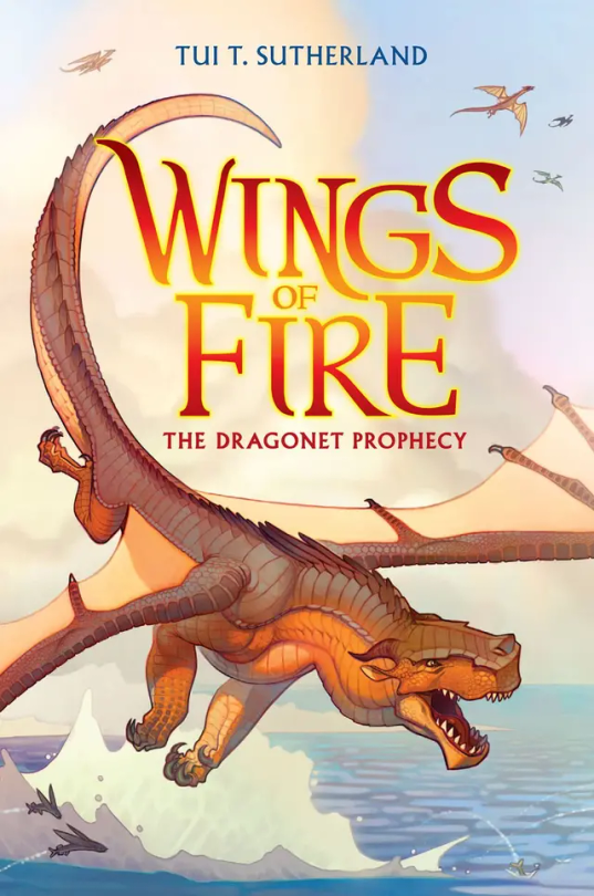
#1: The Dragonet Prophecy. Personally, I think it’s cool, although I think it could have a little more action on it. In the drafts, it was gonna have Queen Scarlet’s arena, which I think would’ve been a cool edition to the cover, but sadly they removed it. 7/10
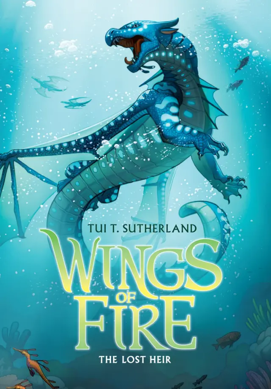
#2: The Lost Heir. Ok this one is awesome. It really shows Tsunami’s personality in her pose and it has so much action yet not to much. But they did forget to put the royal markings on her wings, which kinda makes her seem a little less important if you’re just looking at the cover. Originally it was gonna be called “The Last Heir” which sounds epic, but then again Anemone is in the book, so it wouldn’t make sense. 9.5/10
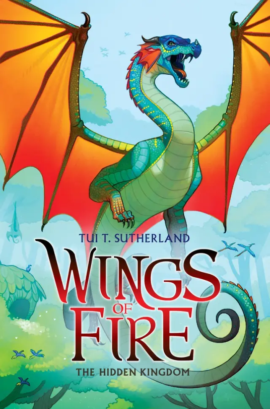
#3: The Hidden Kingdom. One of the coolest covers, I’m a sucker for the wings contrasting with the background (which is a reason I love The Dangerous Gift) but to be honest, Glory just kinda doesn’t stand out. Even with Tsunami being blue on blue, she stands out while Glory just… doesn’t. I think it would be cool if we saw her using venom, and if you say “But she doesn’t use venom in the Rainforest in the book!” Boy are you gonna do a flip when you see The Lost Continent. 5/10.
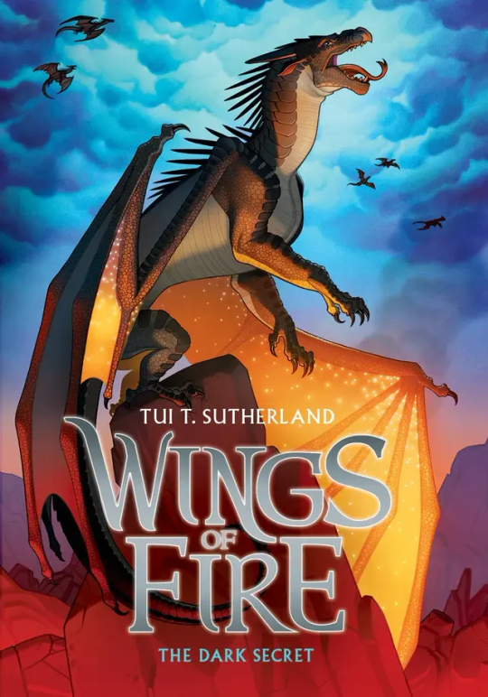
#4: The Dark Secret: Honestly… just kinda… meh. I mean sure Starflight’s pose is cool, as it shows how the Nightwings are supposedly these evil mind reading future seeing beings that are going to rule the world, but it’s not really as cool as Tsunami’s or Clay’s. If anything I think the background makes up for it. The blue cloudy sky contrasting with the dimly red lit stone just catches my eyes immediately. 5/10.
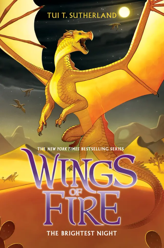
#5: The Brightest Night: I love this cover. Mainly because I love the way Sunny is portrayed on it as she is a hybrid but also I love the three moons in the background and the Sand Kingdom. Sunny’s golden yellow on the black night in the back is just perfection to my eyes. 10/10.
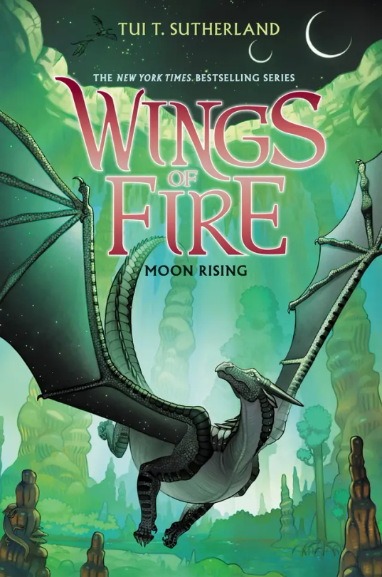
#6: Moon Rising: I adore this cover. And not because Turtle is on the back but that’s a reason I love it as well. Moon having that green fade on her wings is just really cool imo, and this is one of the covers that actually takes place in the book. I think it would be a little bit better if MoonWATCHER was look in the direction of the MOONS, but other than that I love this cover. 9/10.
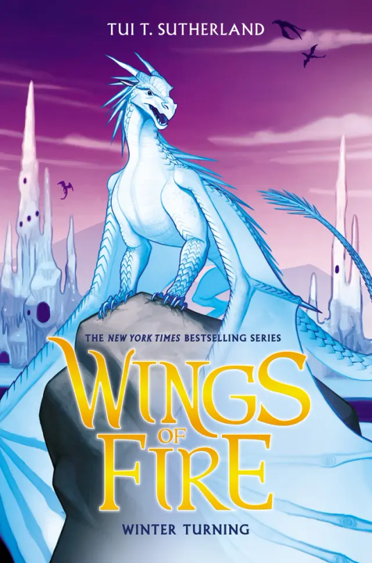
#7: Winter Turning: The draft for this wasn’t going to have purple on it, and to be honest, I’m glad they added that. The purple really brings out Winter and the Ice Kingdom, and it really makes everything pop. 10/10.
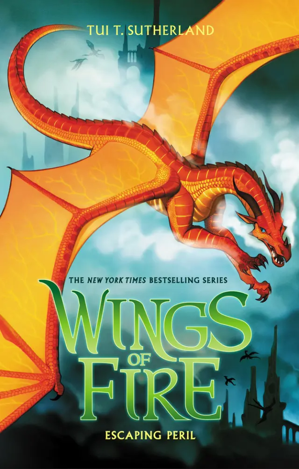
#8: Escaping Peril: Ok so maybe I’m a sucker for red on blue but Peril’s cover is just, wow. Her being chased by Scarlet is awesome, but I’m a little sad it didn’t happen in the book. (I think? Haven’t read this in like a year) My only complaint is that it doesn’t look like the Sky Kingdom in the back. Like if I first saw this cover and didn’t read WOF, I would think they’re flying over human city’s. 7/10.
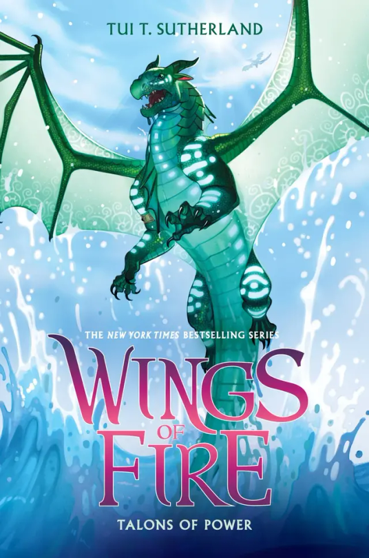
#9: Talons of Powers: Don’t be bias about this one because Turtle's in it, Don’t be bias about this one because Turtle’s in it, can you tell that this is my favorite cover? Other than the fact that Turtle’s on it, I love the fight between Turtle and Anemone on the cover, giving away a key point, but not too much spoilers. I also love all the action on the cover, with Turtle soaring out the water. But they did forget Anemone’s royal patterns, so it’s not perfect. 9.9/10
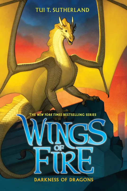
#10: Darkness of Dragons: Qibli’s yellow on the sunset background is just perfect, alongside the dark pieces of stone from the ancient Nightwing city. His pose really shows how Qibli is brave and daring, but they did forget his snout scar, which is like the one thing that makes Qibli, Qibli. 8/10.
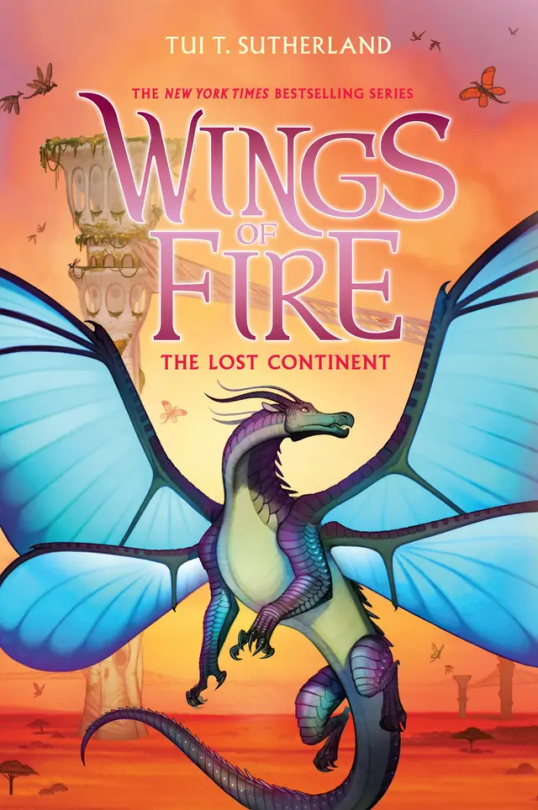
#11: The Lost Continent: Blue’s, well blue is the perfect contrast to the orange Pantalan savanna and the tan hives. Now, most people don’t like this cover because, “Blue doesn’t get his wings in the book!” or, “Cricket described him as blue, but on the cover he’s purple and green!” And my response to these are, 1: Tui actually was going to make Blue have no wings on the cover, but she thought he looked more pretty with wings than without. And 2: I personally love purple and green blue, It makes him look more related to Admiral and it makes him less of an eyesore imo. (If you seen the book description version of him on the wiki, you know what I mean). 10/10.
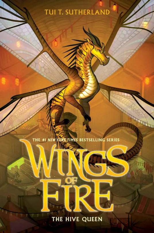
#12: The Hive Queen: Again, even though it’s yellow on yellow, Cricket still manages to stand out. I think it’s because Cricket’s more yellow, while the hive is more orange. I think the lights and the.. hole dens? Really just make the background so visible but not the main focus. 10/10
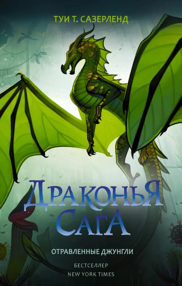
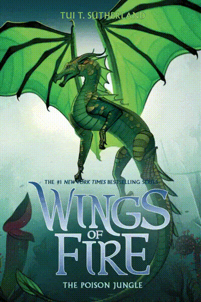
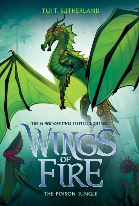
#13: The Poison Jungle: How does Joy Ang manage to put the same colored character on the same colored background and still make them stand out? Magic. Anyways, Sundews pose and the Poison Jungle in the back just really shows how fierce she is. Her small gold scales make her pop from the background, and I think the light behind her is the key to not have her blend it. 10/10
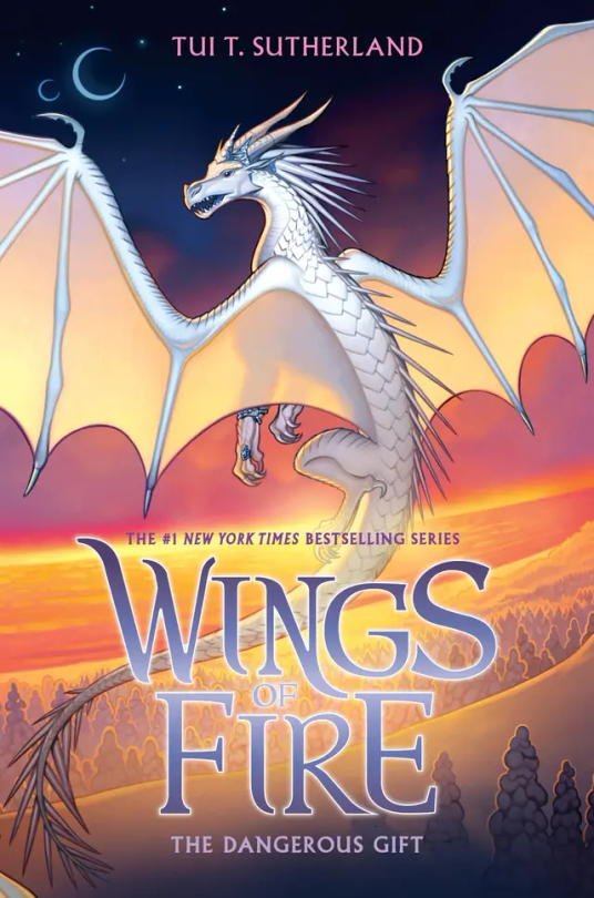
#14: The Dangerous Gift: Like I said in THK, I love wings that stand out from the background, so this is one of my favorite covers. Snowfall flying with Lynx by the coast where the Silkwings would fly in gives away so much yet so little. Also I love Snowfalls pose, no reason why it just looks cool :). 10/10
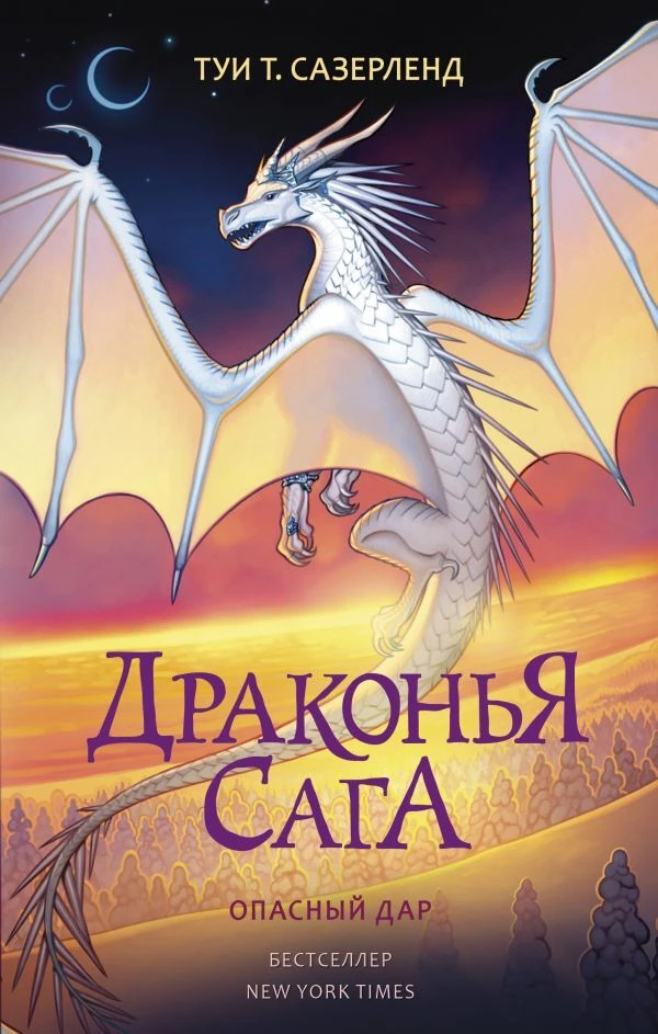
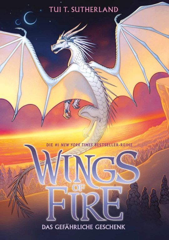
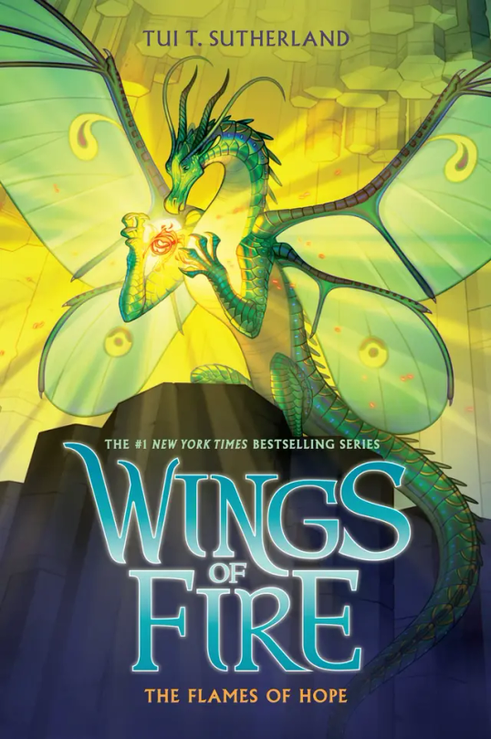
#15: The Flames of Hope. Honestly…. This cover is the worst in the Lost Continent Arc. Honestly Lunas pose is cool, and I think it would look really awesome if it wasn’t for the lighting of the flamesilk. That kind of blends her into the background at makes it a little boring to look at. But I do have to say I love Sky with Wren on the back and even thought Sky is described as pale, I love a red Sky. 6/10.
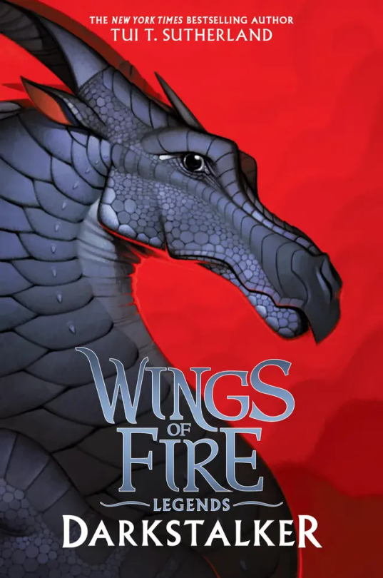
#16: Darkstalker: Darkstalker in on his mewing streak on this cover 🤫🧏♂️👌. I love his black on red background, but it’s boring. There’s nothing going on in the back, and he’s just standing there doing nothing. 6/10.
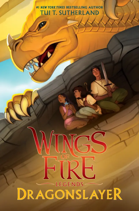
#16: Dragonslayer: I don’t have much to say about this cover. It has so much action but so little at the same time. It catches my eye but at the same time it doesn’t. I’m honestly very meh about this cover. 5/10.
#wings of fire#wof#the dragonet prophecy#the lost heir#the hidden kingdom#the dark secret#the brightest night#moon rising#winter turning#escaping peril#talons of power#darkness of dragons#the lost continent#the hive queen#the poison jungle#the dangerous gift#the flames of hope#Clay wof#tsunami wof#glory wof#starflight wof#sunny wof#moon wof#winter wof#peril wof#wof turtle#qibli wof#blue wof#cricket wof#sundew wof
16 notes
·
View notes
Text
Bout to read Book 15 and finally finish this. Wish me luck.
12 notes
·
View notes
Text
this scene. this is the one
how is NOBODY talking about this???? my heart is gonna explode
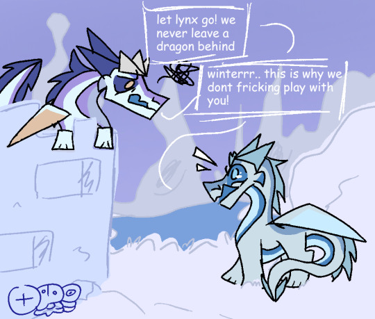
#wings of fire#wof winter#wof#winter wof#wof snowfall#snowfall wof#the flames of hope#wof tfoh#tfoh spoilers#tfoh wof#art#equinox's originals
164 notes
·
View notes
Last Seen Blogs
acapulc9
art of acapulco
toosdayblues
toosday

seansheap
sean sheap

bblommaert
{+—+}

territorioypaisaje
Taller Territorio y Paisaje