#talons of power
Text
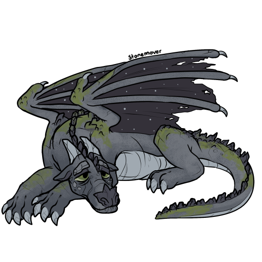
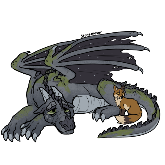
Stonemover the Nightwing (and Dinner!)
[Image Description: A digital drawing depicting Stonemover from Wings of Fire. He is a stony gray nightwing dragon with tired green eyes and spots of mossy green growing on his legs, tail, back and wings. His eyebrows, nose, horns and spines are like crumbling rocks and stalagmites and he has cracks all over his body. He is laying down with a sort of tired and glum look on his face. In a second picture, dinner the fox is added to it. He's a red fox with a creamy underbelly, and brown sock markings and ears. He is sitting close to Stonemover, next to his back leg. /.End ID]
#wings of fire#wof#dragon#wof arc 1#wof arc 2#nightwing#stonemover#wof stonemover#wof nightwing#the brightest night#moon rising#talons of power#darkness of dragons#my faves#wof dinner
501 notes
·
View notes
Text
Turtle from Wings of Fire

1K notes
·
View notes
Text
Do you like TTRPGS? Do you like WOF? Do you like participating in dice induced madness????
hi !! so, for the past year, I've been working on a project called All Dragons No Dungeons (now titled Talons of Power to avoid overlap with advanced dnd), a playable wof ttrpg. ADND is reaching. something close to playtestable, which I'm ridiculously excited about. But! I would love some feedback and general people to share this rambles with in a format other than tumblr, bc this platform. does not favor confusing ramblings. So I'm making a discord server !! This will be for:
Testing out the character creation
polishing up formatting (pls help me get out of google docs)
Workshopping the actual mechanics
Sharing tabletop projects and stories
General WOF shenanigans
roleplay perhaps? 👀
Link is HERE! server is all-ages with role-protected 18+ channels (tho the whole thing will still be, broadly speaking, PG-13).
Links to game documents will be posted soon, for now the server is more of a hangout space. Hope to see you there !!
#all dragons no dungeons#talons of power#ttrpg#wof ttrpg#discord server#game testing#wof#wings of fire#Sunny speaks
123 notes
·
View notes
Photo

Wings of Fire Anemone Meme
I'm sure she won't attempt to murder her whole family with it or anything, surely right
anemone the seawing holding a big metal shark blade thing with the text "Turtle I just found THE most mall ninja shitass weapon of all time"
Posted using PostyBirb
#wings of fire#wof#wof fanart#dragon#dragon art#wings of fire art#wof art#woffanart#wofart#anemone#seawing#turtle#talons of power
133 notes
·
View notes
Text

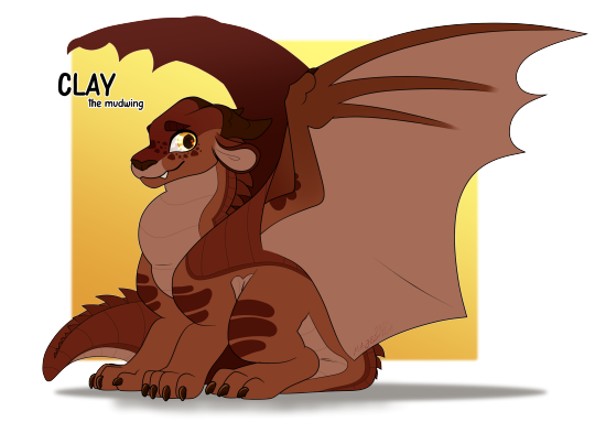
Clay the Mudwing.
#Clay#Mudwing#Dragonet of Destiny#Clay wings of fire#Wings of Fire#The Dragonet Prophecy#The Lost Heir#The Hidden Kingdom#The Dark Secret#The Brightest Night#Moon Rising#Escaping Peril#Talons of Power#Darkness of Dragons#Dragonslayer#Wings of Fire Design#I don't think I did him much justice but I am proud of this nonetheless!
27 notes
·
View notes
Text
DarkStalker misquoted Sunny
this is an insane theory, and I’m not sure if this was even deliberate, but here goes. An overarching theme of arc 2 is change. More specifically, how we can choose to change as people, but how we can’t be forced to change. Sunny says something to this effect as well: “we’re dragons not ants. We can change.” Coming from Sunny, this is inspiring, and very interesting as an argument.
Later in the arc, enter DarkStalker. He’s an animus with ‘new’ ideas that could help his tribe. These ideas are mostly based on fundamental changes to the system and the dragons themselves. When told that his ideas are crazy, he says this, which he must have heard as an echo in Sunny’s mind at some point: “we’re dragons, not caterpillars. We can change.” Coming from DarkStalker, this phrase is given a whole new meaning. Suddenly, it’s sinister, as well as mildly confusing. Why did he say caterpillars? An animal that, very specifically can change? Well, I think it symbolises DarkStalker’s view that a person can only change for the better with the use of animus magic. He thinks that change needs to be forced, so of course he subconsciously chooses a caterpillar, an animal that changes radically but naturally, as an example of something that doesn’t change. He thinks that the only changes that matter are enchantments.
Another thing that this does is set us up well for the third arc. This one line has so much meaning, it’s incredible.
#Wof theory#headcanon#wof analysis#wings of fire#wof#this is a cry for help#sunny#wof darkstalker#talons of power#wof headcanon
20 notes
·
View notes
Text
I think one of the best scenes in Talons of Power is when Turtle follows Darkstalker to the Kingdom of Night and, on a whimsy, decides to be silly and place a marble in front of Darkstalker just for the hell of it without realizing that, of all the items he could have picked at random to put in front of Darkstalker, he chose the one thing that was sure to rip Darkstalker’s heart out.
#I know it's a moment of dramatic irony for the audience#because we know what the marble represents#but also it would just be Turtles luck for him to do that#wingsoffire#wof#wings of fire#turtle wof#darkstalker wof#talons of power
173 notes
·
View notes
Text
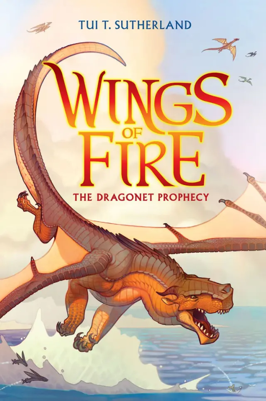
Ranking all Wof Cover (except winglets and graphic novels) because I’m bored :p (Some spoilers!)
#1: The Dragonet Prophecy. Personally, I think it’s cool, although I think it could have a little more action on it. In the drafts, it was gonna have Queen Scarlet’s arena, which I think would’ve been a cool edition to the cover, but sadly they removed it. 7/10
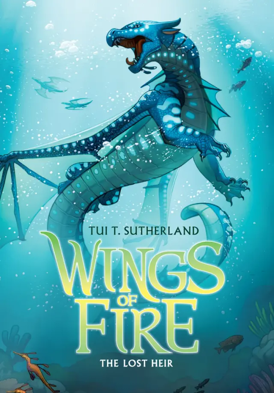
#2: The Lost Heir. Ok this one is awesome. It really shows Tsunami’s personality in her pose and it has so much action yet not to much. But they did forget to put the royal markings on her wings, which kinda makes her seem a little less important if you’re just looking at the cover. Originally it was gonna be called “The Last Heir” which sounds epic, but then again Anemone is in the book, so it wouldn’t make sense. 9.5/10
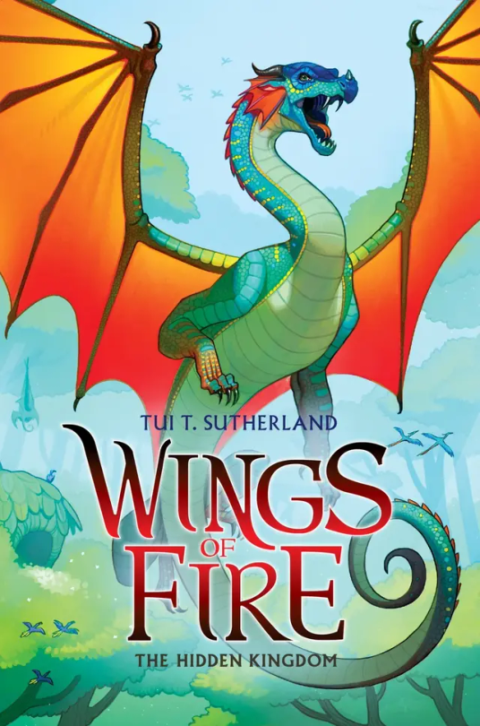
#3: The Hidden Kingdom. One of the coolest covers, I’m a sucker for the wings contrasting with the background (which is a reason I love The Dangerous Gift) but to be honest, Glory just kinda doesn’t stand out. Even with Tsunami being blue on blue, she stands out while Glory just… doesn’t. I think it would be cool if we saw her using venom, and if you say “But she doesn’t use venom in the Rainforest in the book!” Boy are you gonna do a flip when you see The Lost Continent. 5/10.
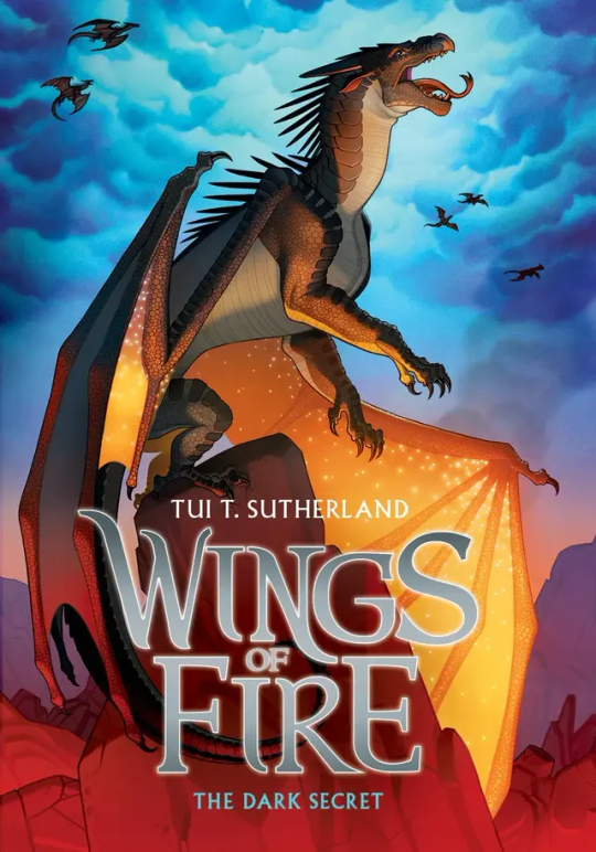
#4: The Dark Secret: Honestly… just kinda… meh. I mean sure Starflight’s pose is cool, as it shows how the Nightwings are supposedly these evil mind reading future seeing beings that are going to rule the world, but it’s not really as cool as Tsunami’s or Clay’s. If anything I think the background makes up for it. The blue cloudy sky contrasting with the dimly red lit stone just catches my eyes immediately. 5/10.
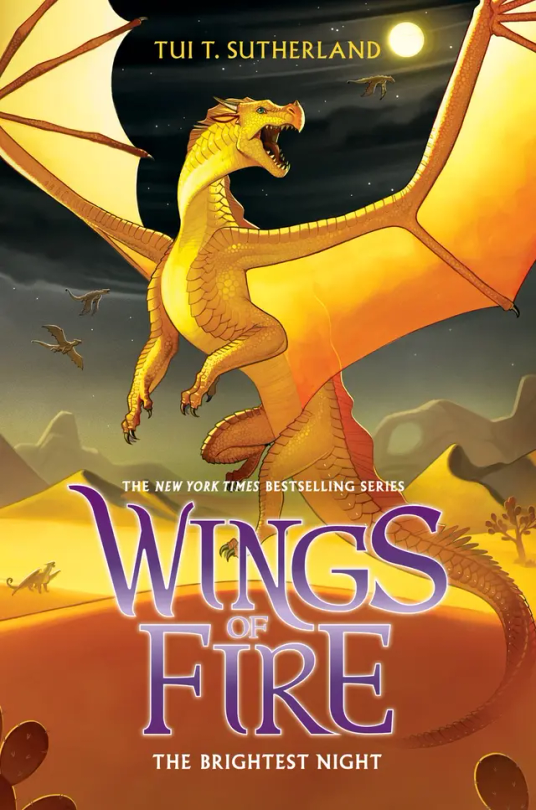
#5: The Brightest Night: I love this cover. Mainly because I love the way Sunny is portrayed on it as she is a hybrid but also I love the three moons in the background and the Sand Kingdom. Sunny’s golden yellow on the black night in the back is just perfection to my eyes. 10/10.
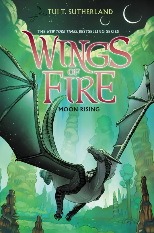
#6: Moon Rising: I adore this cover. And not because Turtle is on the back but that’s a reason I love it as well. Moon having that green fade on her wings is just really cool imo, and this is one of the covers that actually takes place in the book. I think it would be a little bit better if MoonWATCHER was look in the direction of the MOONS, but other than that I love this cover. 9/10.
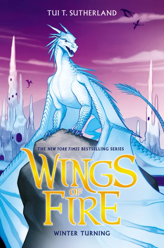
#7: Winter Turning: The draft for this wasn’t going to have purple on it, and to be honest, I’m glad they added that. The purple really brings out Winter and the Ice Kingdom, and it really makes everything pop. 10/10.
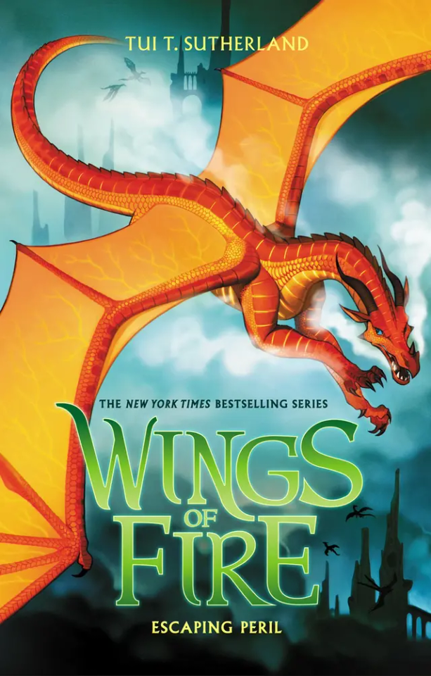
#8: Escaping Peril: Ok so maybe I’m a sucker for red on blue but Peril’s cover is just, wow. Her being chased by Scarlet is awesome, but I’m a little sad it didn’t happen in the book. (I think? Haven’t read this in like a year) My only complaint is that it doesn’t look like the Sky Kingdom in the back. Like if I first saw this cover and didn’t read WOF, I would think they’re flying over human city’s. 7/10.
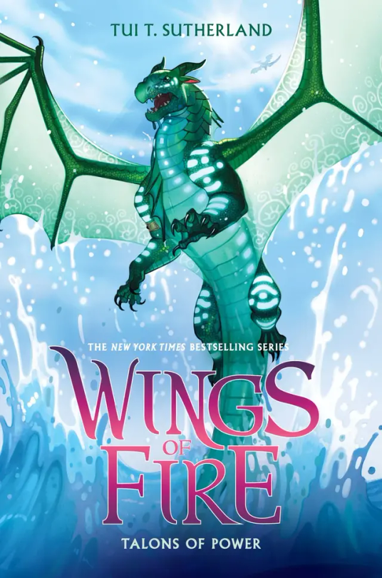
#9: Talons of Powers: Don’t be bias about this one because Turtle's in it, Don’t be bias about this one because Turtle’s in it, can you tell that this is my favorite cover? Other than the fact that Turtle’s on it, I love the fight between Turtle and Anemone on the cover, giving away a key point, but not too much spoilers. I also love all the action on the cover, with Turtle soaring out the water. But they did forget Anemone’s royal patterns, so it’s not perfect. 9.9/10
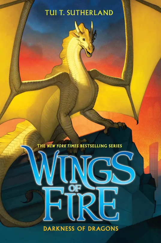
#10: Darkness of Dragons: Qibli’s yellow on the sunset background is just perfect, alongside the dark pieces of stone from the ancient Nightwing city. His pose really shows how Qibli is brave and daring, but they did forget his snout scar, which is like the one thing that makes Qibli, Qibli. 8/10.
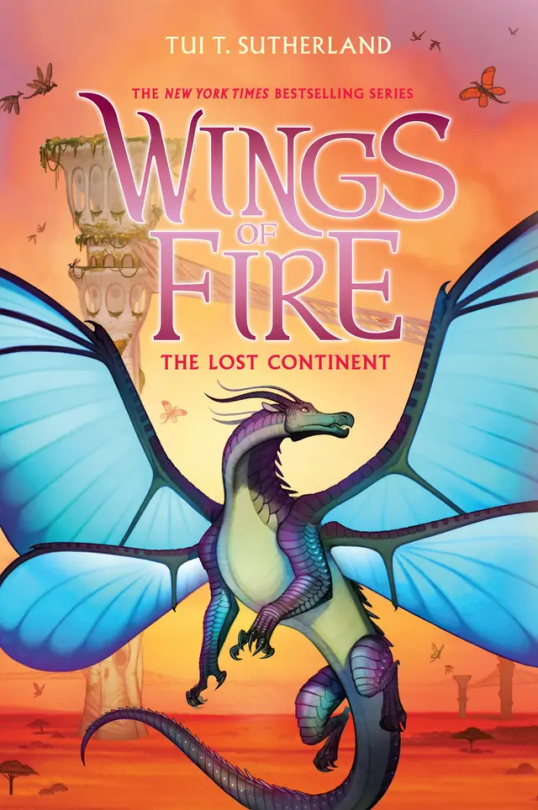
#11: The Lost Continent: Blue’s, well blue is the perfect contrast to the orange Pantalan savanna and the tan hives. Now, most people don’t like this cover because, “Blue doesn’t get his wings in the book!” or, “Cricket described him as blue, but on the cover he’s purple and green!” And my response to these are, 1: Tui actually was going to make Blue have no wings on the cover, but she thought he looked more pretty with wings than without. And 2: I personally love purple and green blue, It makes him look more related to Admiral and it makes him less of an eyesore imo. (If you seen the book description version of him on the wiki, you know what I mean). 10/10.
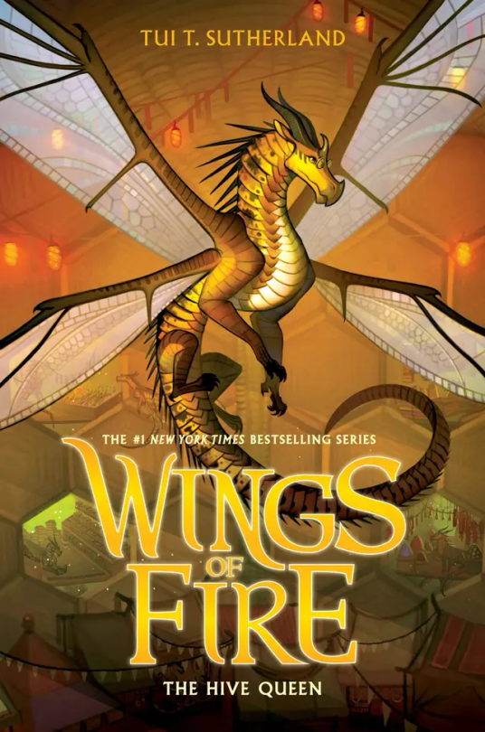
#12: The Hive Queen: Again, even though it’s yellow on yellow, Cricket still manages to stand out. I think it’s because Cricket’s more yellow, while the hive is more orange. I think the lights and the.. hole dens? Really just make the background so visible but not the main focus. 10/10
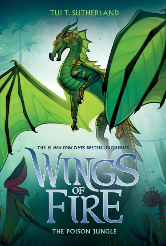
#13: The Poison Jungle: How does Joy Ang manage to put the same colored character on the same colored background and still make them stand out? Magic. Anyways, Sundews pose and the Poison Jungle in the back just really shows how fierce she is. Her small gold scales make her pop from the background, and I think the light behind her is the key to not have her blend it. 10/10
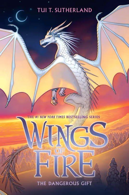
#14: The Dangerous Gift: Like I said in THK, I love wings that stand out from the background, so this is one of my favorite covers. Snowfall flying with Lynx by the coast where the Silkwings would fly in gives away so much yet so little. Also I love Snowfalls pose, no reason why it just looks cool :). 10/10
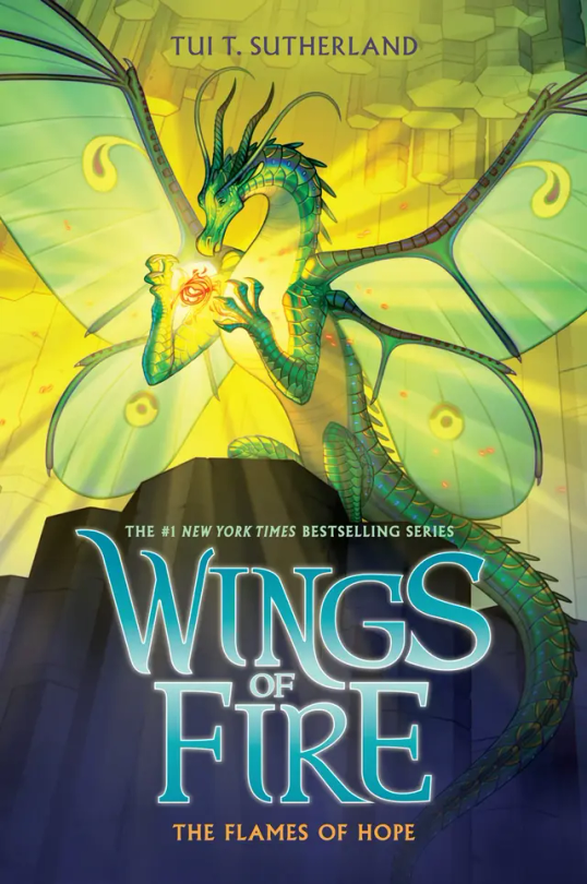
#15: The Flames of Hope. Honestly…. This cover is the worst in the Lost Continent Arc. Honestly Lunas pose is cool, and I think it would look really awesome if it wasn’t for the lighting of the flamesilk. That kind of blends her into the background at makes it a little boring to look at. But I do have to say I love Sky with Wren on the back and even thought Sky is described as pale, I love a red Sky. 6/10.
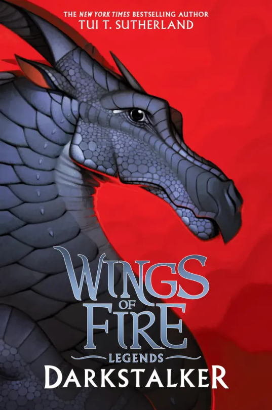
#16: Darkstalker: Darkstalker in on his mewing streak on this cover 🤫🧏♂️👌. I love his black on red background, but it’s boring. There’s nothing going on in the back, and he’s just standing there doing nothing. 6/10.
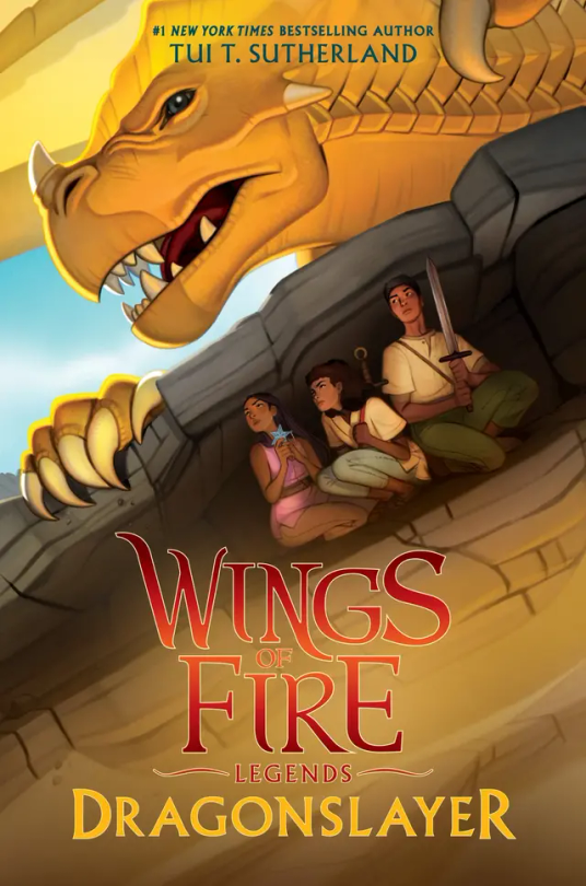
#16: Dragonslayer: I don’t have much to say about this cover. It has so much action but so little at the same time. It catches my eye but at the same time it doesn’t. I’m honestly very meh about this cover. 5/10.
#wings of fire#wof#the dragonet prophecy#the lost heir#the hidden kingdom#the dark secret#the brightest night#moon rising#winter turning#escaping peril#talons of power#darkness of dragons#the lost continent#the hive queen#the poison jungle#the dangerous gift#the flames of hope#Clay wof#tsunami wof#glory wof#starflight wof#sunny wof#moon wof#winter wof#peril wof#wof turtle#qibli wof#blue wof#cricket wof#sundew wof
16 notes
·
View notes
Photo

What does Turtle see?? Why is Peril Shooketh?
#wof#gif#my art#wings of fire#wingsoffire#turtle#peril#turtle wof#wof turtle#peril wof#wof peril#fanart#fan art#dragon#dragons#skywing#seawing#animated#Escaping Peril#talons of power
42 notes
·
View notes
Text


WINGS OF FIRE BOOK NINE: Talons of Power
Variant covers for different languages
B1 B2 B3 B4 B5
B6 B7 B8 B9 B10
#talons of power#wof#wingsoffire#wings of fire#turtle#wof turtle#turtle wof#seawing#seawings#anemone#wof anemone#anemone wof#book#art#radical artwork
31 notes
·
View notes
Text
Wings of Fire book 9 is probably one of the most anxiety inducing works of fiction I’ve ever read, strictly due to the fact that Tui insists on wrenching up the tension endlessly with no breaks or relief. Bad shit keeps happening and characters aren’t able to be themselves because the villain pulled some mind altering bullshit, and any time something good DOES happen it’s paired with something that makes the situation worse.
I’ve honestly considered dropping it several times because it’s just getting me too worked up.
6 notes
·
View notes
Text

Tamerin the Rainwing
(Based on golden lion headed tamerins, hyacinth macaws and vaporeon)
[Image Description: A digital drawing of a blue rainwing dragon named Tamerin. She's short and youthful, with a small snout and little fangs poking out. Her frills are large and she has an extra one all around her neck similar to vaporeon's from pokemon. They have a gradient of oranges and yellows, as well as her wings. She has a yellow mask, underbelly, legs and tail. Her horns and talons are a dark purple, with her horns curving downward. She has scars on her wings, shoulders and stomach. She has light blue blind eyes. She's sitting with her back turned to the viewer, peering over her shoulder with a soft and gentle look on her face. /.End ID]
Hidden Kingdom Dragons are done!!! Woo!!
#wof arc 1#wings of fire#dragon#wof#wof tamerin#wof arc 2#the hidden kingdom#moon rising#talons of power#darkness of dragons#rainwing#wof art#gold winglet#jade mountain academy
357 notes
·
View notes
Text

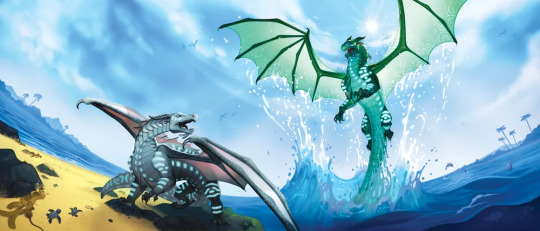
[ID: A redraw of the book cover from Talons of Power of the Wings of Fire series. The drawing features two dragons, the green SeaWing Prince Turtle and the pale blue and pink SeaWing Princess Anemone. Turtle is leaping out of the ocean with a great splash on the right side of the image, water steaming from his arms and wings with green magic glowing around his talons. He has both wings flared with sunlight shining brightly behind him. His mouth is open in a roar with his ears turned back. The glowing, geometric bioluminescent royal markings on the underside of his wings are illuminated. Anemone stands on shore with one foot raised in defiance on the left side of the image. Her wings are half extended and she is looking over her shoulder roaring back at Turtle with narrowed eyes. Her raised talons glow with bright pink magic. The horizone line where the water meats the sky in the background is curved due to perspective. There are islands with mountains seen in the hazy background on both sides of the image with the middle being clear. Clouds encircle the bright sun in the sky. /.End ID]
My redraw of my personal favorite cover. Although escaping Peril and the hidden kingdom are also up there. I just really like that it shows the fight between Turtle and Anemone. So Talons of Power it is. But good god. Water and sand are so hard to draw. I still don't really like how that turned out. I like the sky, around the sun specifically. And the lighting is all right.
Not super set on the design I chose for Anemone. But some of my SeaWing headcanons are that they can have a lot of little extra dangling bits and bait lures and fins. The royal SeaWings tend to be 'ReefWings' and are a bit more vibrant in color. Anemone's lighter color is some of her IceWing heritage peaking through. I kinda wanna make her actually a darker/vibrant blue until after Turlte curses here (?) And then as she grew and used her magic more her color kinda leached out because she wasn't a true animus and the magic was eating away at her essences a lot faster? I don't know but maybe somethin like that. I also might make her all pink with a tiny bit of blue. I've seen so many designs for her that look awesome but can never actually settle on one I want to draw.
#seawing#seawing wof#seawing art#seawing fanart#wings of fire#wings of fire fanart#talons of power#turtle wof#anemone wof#two magic siblings throw seaweed and crabs at each other#until giant angry man gets grumpy and stops them
35 notes
·
View notes
Text
talons of power but turtle escapes via a series of well-placed smokebombs
26 notes
·
View notes
Text

Turtle, from the cover of Wings of Fire: Talons of Power by Tui T Sutherland.
Medium: Colored pencils and black marker, on cardstock.
(The paper is smudged because I did this years ago back when the book first came out, but it’s still one of my all time favorite pieces I’ve ever done, and I’ve never been able to replicate it since 🥲)
#turtle wof#talons of power#wings of fire fanart#wings of fire#colored drawing#colored pencil#art#seawing#seawing art
8 notes
·
View notes
Text
I just had to wonder about this,
Turtle was able to hide from Darkstalker meaning Darkstalker wasn't entirely immune to animus magic in certain cases. Now what I want to know is what would've happened if Turtle had just thrown the magic stick at Darkstalker or put it in his claws. Would Darkstalker die? Just have amnesia? He probably wouldn't be able to see himself either. How would that have affected him and changed everything?
#wof#wings of fire#darkstalker#wof darkstalker#wings of fire darkstalker#wof turtle#wings of fire turtle#talons of power
21 notes
·
View notes
Last Seen Blogs
super-island-edits
Super Island

unabridgedbookstore
UNABRIDGED BOOKSTORE

uhggleighrose
And it was the uhggleighest rose in all the land
kb-p2730
Never Surrender
elderweeb
Heavenly Father, why do you let bad things happen?