#the characters the animation the lighting the perspective the scale the action the emotional impact the everything there is so much to love
Text
I have seen exactly 1 episode of Blue Eye Samurai and I am gobsmacked by how amazing it is. Mizu is already my everything. I am almost never so deeply invested so quickly in any media. I am obsessed. If the rest of the show is consistent in quality with the first episode then this show is Arcane level incredible, and I do not say that lightly.
#please DO NOT spoil me#i am trying to savour the season#and i am PICKY about my shows#i can critique tv all day and that episode just has me amazed and enraptured#the characters the animation the lighting the perspective the scale the action the emotional impact the everything there is so much to love#blue eye samurai#blue eyed samurai#this is the also when I make my romantic subplot oracle prediction that a triad is on the way (hopefully small scale and slowburn)#and as of now it really only works if this show is at least 2 seasons long— howEVER … mizu x taigen x akemi#mizu x taigen#mizu x akemi#taigen x akemi#mizu x taigen x akemi#i don’t really care about taigen x akemi but add mizu to the mix plus a zuko type arc for taigen and akemi as a lord/leader and oop it works#mizu/akemi#mizu/taigen#taigen/akemi#mizu/akemi/taigen#mizu blue eye samurai#look at me#one episode in and so confident about everything#sigh
955 notes
·
View notes
Text
How character art changed from 2D to 3D
Early use of computer-generated imagery, such as in the 1977 film Star Wars Episode IV and the 1973 film West World, demonstrated the value of using technology as a visual effects component for live-action movies. Computer graphics became increasingly important to live-action visual effects throughout the 1980s. Stop-motion animation methods were quickly supplanted by 3D computer animation techniques for producing animation. As a result, the development of 3D animation technologies followed a path toward photorealism. For flawless blending with live-action elements, lifelike depictions of light and shadow as well as color were required. During the same time as applications for 3D graphics and animation were still being established, the need for realistic treatments had an impact on the development of 3D technology. It was proven that 3D animation could make up the length of a movie after Pixar's outstanding achievement and critical triumph with Toy Story in 1994. As opposed to visual effects, which were a means to an end, 3D animation was now the result. However, abandoning the pursuit of realism and embracing stylization on a large scale would take many years. The transition from 2D to 3D character art dramatically changed the animation and gaming industries. Characters in 2D were limited to a two-dimensional, flat environment and created using traditional or digital drawing methods, frequently requiring complex shading and perspective to suggest depth. On the other hand, the development of 3D technology has propelled characters into a truly three-dimensional world. The depth of expression and visual realism of characters are increasingly enhanced by the use of advanced computer modeling tools by artists. Digital skeletons are used to equip 3D characters, allowing them to dance, emote, and interact in ways that were previously impossible in 2D. Additionally, with this change came dynamic camera control, which allowed for a variety of viewpoints and improved storytelling. As a result, character design and animation in a variety of media, including video games, movies, and immersive virtual realities, now have a higher level of detail, interactivity, and diversity. While 2D art will always be timeless and expressive, the emergence of 3D character art has expanded the possibilities for imagination and immersion.
0 notes
Text
SnK Episode 68 Poll Results (for Manga Readers)

The poll closed with 146 responses. Thank you to everyone who participated!
Please note that these are the results for the Manga Readers’ poll. If you wish to see the results for the Anime Only Watchers’ poll, click here.
---
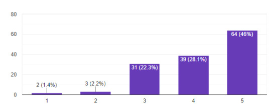
RATE THE EPISODE
140 Responses

The anime continues its positive streak with just over 90% of respondents rating the episode a 4 or 5. MAPPA appears to be blowing this season out of the water for most of us!
Noice
Good!
I liked it
WHICH OF THE FOLLOWING MOMENTS WAS YOUR FAVORITE?
144 Responses
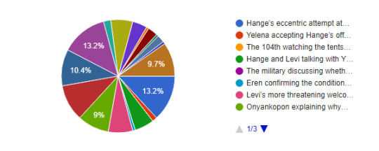
We got a pretty mixed pie chart this week. To be expected, given how many moments were in this episode. At a tie with the largest pieces of the pie were Hange’s eccentric attempt to greet the Marleyans and Eren’s gunshot figuratively hitting Sasha. Behind that two more options tied in each with 10.4% of the vote - EMA’s conversation at the shooting range and Sasha appreciating Nicolo’s cooking. This is followed closely by Eren’s mirror scene with 9.7% of the vote. Onyankopon explaining why he looks different when Sasha asks him about it took a solid 9% of the vote.
WHAT WAS THE MOST EMOTIONAL PART OF THE VISIT TO SASHA’S GRAVE?
144 Responses
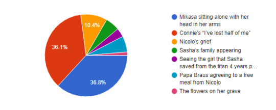
This was almost too close to call, but Mikasa sitting alone managed to edge out just slightly over Connie’s “I’ve lost half of me” moment at Sasha’s grave. Trailing behind the two were Nicolo’s grief and the agreement between Papa Braus agreeing to a free meal from Nicolo.
AFTER SEVERAL TENSE AND ACTION PACKED EPISODES, HOW DO YOU FEEL ABOUT THE TRANSITION TO SOMETHING MORE CALM?
138 Responses

The larger chunk of respondents are feeling relieved to get a break from the action for a few episodes. 21.7% prefer the action but don’t mind a break here and there, while 21% state that they enjoy the exposition more than the action anyway, so they are content. A small handful don’t care either way.
We needed this for another build-up to more action
I like the action but it’s important to move the story along
These just feel mandatory fillers to me.
I miss the warriors
I feel fine with it. I thought that was going to be some happy-go-me episode, but gladly it still had a serious tones.
This episode felt like a very welcome respite after the absolute shitshow that was spoilers week and....whatever the fuck chapter 137 was.
Nice breather of sorts, I always like seeing characters from action-heavy series in their downtime.
WOULD YOU RATHER GET A SURPRISE GREETING FROM EREN & HANGE, OR ARMIN & LEVI?
141 Responses

The vast majority of respondents would prefer the slightly less lethal greeting given by Hange and Eren at the beginning of the episode. We’re not sure if the other 29.1% are masochists or just really love Levi and/or Armin that much more. Or perhaps they’re intrigued by the pig piss from the filthy island devils.
ON A SCALE OF 1-5, HOW HAPPY ARE YOU TO BE BACK ON PARADIS?
139 Responses
Overall, fans are happy to be back in familiar territory and put into the perspective of the Survey Corps again. Let’s get ready to rumble!
MAPPA HAS SPRINKLED IN ANIME-ONLY ADDITIONS THROUGHOUT THE EPISODE. AS A WHOLE, HOW DO YOU FEEL ABOUT THEM?
139 Responses

Though subtle, MAPPA did include some anime filler (such as Eren’s, erm, mouth breathing). 51.1% enjoyed the noticeable additions, while 37.4% are completely confused by the question and didn’t realize there were any. A handful generally don’t prefer additions but enjoyed what little ones we had this episode. A small sliver didn’t care for them.
HOW DO YOU FEEL ABOUT THE SCENES FROM CHAPTER 107 THAT WERE PEPPERED IN BETWEEN THE MOMENTS FROM CHAPTER 106?
139 Responses
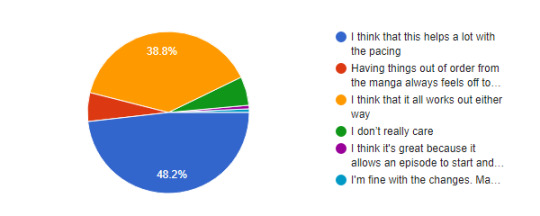
MAPPA is shuffling things around to pick up the pacing of this arc, and 48.2% of respondents are feeling very positively about it. 38.8% also feel that both the order of events in the original manga and the anime work out just fine regardless. A couple of smaller groups either felt that things were a bit off from the manga, or didn’t really care either way.
I think it's great because it allows an episode to start and end on the same chapter if mappa ever wanted it, allowing the right twists or cliffhangers to be in the right episodes, all WITHOUT having to slow down, which I wholly appreciate.
I'm fine with the changes. Mappa is doing good job.
WHAT DO YOU THINK ABOUT THE CHANGE OF GABI BITING HER NAIL AND ANGRILY SAYING EREN’S NAME IN HER JAIL CELL?
142 Responses

Nearly half of voters feel that both MAPPA’s take and Isayama’s original take work just fine for Gabi’s character. 28.9% prefer the anime’s take on Gabi’s reaction to all that happened, while 14.8% feel that her more defeated posture in the manga makes more sense for her character.
I'm a mix of both? Her defeated posture implies that she's not happy with the way things worked out with them in jail and Zeke betraying them. On the other hand, her angry face is realistic to the scene too because it implies she really blames Eren for their current predicament.
She looks like some female version of young, angry Tarzan. This time Mappa should have kept the original postures, because the defeated Gabi feels to be more realistic, than the crazy anime one.
I think they both work but the anime's take might be the anime team beating us over the head that she's just like Eren when he was young.
Makes it clear to the anime-onlies that she really is psychotic
Gabi sucks
HOW WELL DO YOU THINK MAPPA NAILED THE TRANSITION OF EREN SHOOTING THE GUN, TO SASHA TAKING THE HIT?
141 Responses

The response to MAPPA’s take on Eren’s shot inadvertently hitting Sasha was overwhelmingly positive, with only a few people saying that they could have done better with it.
Eren shot linked to Sasha's death was awesome. Mappa is nailing it!
THE PART WHERE JEAN, SASHA AND CONNIE ARE TRYING TO GUESS WHAT A PORT IS WAS CUT OUT, WITH ARMIN’S NARRATION INSTEAD CUTTING INTO THE SCENE. WHAT DO YOU THINK ABOUT IT?
140 Responses
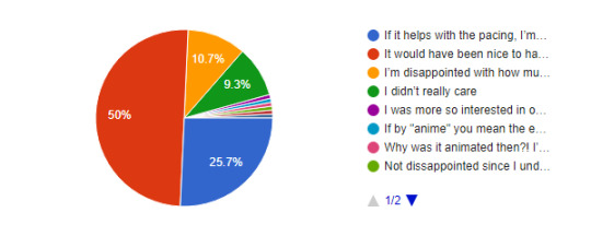
Exactly 50% felt that while having that JSC characterization would have been very much welcome, they’re okay with that small detail missing from the manga (granted, it was at least acknowledged by one panel being animated). 25.7% have a more nonchalant response, stating that if it helps with the pacing, they’re fine with small cuts like this. 10.7% are just let down by JSC’s lack of characterization in the anime overall and didn’t appreciate even more being taken from their characterization in this episode.
I was more so interested in our Paradis Peeps talking about newly discovered technology but I’m happy with what we got.
Not dissappointed since I understand you can't show everything but I love them so sad
Why was it animated then?! I’m so confused
Normally I don't like it when they cut corners like this, but I wasn't fond of that scene in the first place so it's okay.
If by "anime" you mean the entirety of it including the past 3 seasons, then option 3. I'm always going to be salty about how much they took out or changed for these three during the uprising arc. So far mappa has done okay with them, I guess.
Would have been a funny JSC moment, but it was really absolutely pointless. In manga format it works as just background words on a panel. Animating it takes seconds of an episode that could be used elsewhere. So I'm fine with it being cut out.
SOME HAVE COMPLAINED THAT THE ENDING SCENE OF EREN REPEATING HIS MANTRA INTO THE MIRROR LACKED THE IMPACT IT HAD IN THE MANGA. HOW DO YOU FEEL ABOUT THAT?
138 Responses
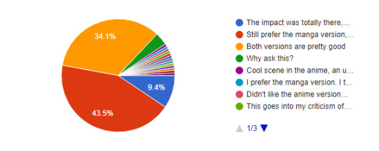
43.5% were receptive of the anime only shots, but favor the way the scene was portrayed in the manga more. 34.1% felt that both versions were done well, with only 9.4% feeling that the impact was largely the same (if not better). Based on the write-ins, the main complaint seems to be the lighting/color scheme of the scene not quite meeting expectations, or that MAPPA made Eren’s back look weird.
theyll make up for it when eren screeches at hange next ep
Impact was there, art just felt a bit wonky and toned down the scene overall. 9/11
This goes into my criticism of the color palette and shading style mappa uses, which is far more subdued. The contrast is lowered and the scene is very dark, and there is little rim lighting, so while the actual lineart has far more detail, the detail in the lighting is reduced. Damn I really am writing a wall text aren't I? I prefer Wit Studio's art style a lot but Mappa has honestly been doing great so I couldn't care less, manbun Eren is hot.
I prefer the manga version. I think the anime version have weirds shadows in eren's back. Plus the mirror don't have the same energy, less impactful
Cool scene in the anime, an unforgettable blow to the brains in the manga
Idk
Most of the time seeing things for the first time is what's really impactful. Feel this way towards Armin's transformation in the boat as well. It was definitely less impactful than when you first read it in the manga.
I understand the fandom because this moment was very popular when the chapter was out. I think that in the anime Eren lacks the anger he had in the manga. His voice was too calm while repeating his mantra. .
WHY DOES HIS BACK LOOK LIKE THAT
I didn't care for it in the anime, it was really underwhelming.
I think most people are annoyed about the lighting than the impact. It’s a bit too dim and the lamp hides Eren’s new hair.
Didn't like the anime version at all
The animation wasn't good and they totally fucked his hair, face, and body up. Although the added shots were definitely welcome.
Eren could've been sexier/animated better, I hope they do better next ep 😭
WE WILL ASK YOU AGAIN. HOW WILL THE ANIME DEAL WITH MIKASA’S HIZURU TATTOO/SYMBOL?
135 Responses
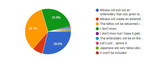
With Mikasa meeting Kiyomi presumably being inevitable in episode 69, we wondered if any opinions had changed on this. 34.1% feel hopeful that the tattoo will be retconned into the anime and that we will see this scene faithful to the manga. 28.9% think that Mikasa will happen to have some kind of embroidery on hand already. 25.9% don’t want to make a call either way, and a small handful think Mikasa’s going to just pull out an embroidery kit and go with it, lol.
The embroidery will be on the inside of her bandage.
Japanese are very taboo about tattoos because of the Yazuka... it will 100% be the embroidery.
I don't know but I hope it gets retconned. Never liked the embroidery thing.
It won't be included
Let’s just... ignore it..
I really really hope MAPPA retcons Mikasa's tattoo next episode. This will be the one retcon I will absolutely celebrate. Plus, it's not really a retcon if they're just amending Wit's changes.
WE WILL ASK YOU AGAIN, AGAIN. WITH THE PACING CURRENTLY UTILIZED BY MAPPA, WHERE WILL EPISODE 16 END?
137 Responses

Uncertainty continues to loom over exactly how far MAPPA will get into this (first half of the?) season. Nearly 40% don’t want to make predictions one way or another, while 23.4% feel that it won’t make it quite to chapter 122. The rest believe it will make it to chapter 122, with 17.5% feeling there will only be minor cuts, if any, and the remaining 13.1% feeling that there will be major cuts to make the feat to chapter 122.
116 (?) when the allied force attack paradis
122 with the amount of cuts being somewhere in between. They can cut a lot of the Gabi and Falco plotline and still have the story remain intact.
See, I'm not sure buy I'm also worried and curious about it all. It brings up the question of will the story continue in a possible second half of the season? With the manga ending very soon now, it makes sense to have the story wrap up in its anime medium as well. Fees like there's some kind of uncertainty surrounding this, it's unnerving tbh.
119 with Eren's head being blown off.
gabi no scoping eren, ending creds is eren entering paths and we see ymir standing behind him, s4p2 starts w the ymir backstory
121
No idea and I don't think about it. I just enjoy the show.
Your guess is as good as mine, I'm still fearing major cuts.
119
HOW DO YOU FEEL ABOUT NICOLO’S PORTRAYAL?
138 Responses
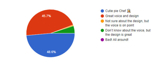
With Nicolo now formally introduced in the anime, we were curious how you felt about his portrayal. Overall the reaction was positive, with 48.6% agreeing that he’s a “cutie pie chef”, and another 45.7% feeling that his design and seiyuu are absolutely great! A small handful were less happy with the voice, but happy with the design, and a sliver went in the opposite direction, preferring voice over animation.
HOW DO YOU FEEL ABOUT THE ADDED DETAIL OF THE FLOWER BOQUETS AND THEIR SYMBOLISM ON SASHA’S GRAVE?
140 Responses

Respondents vastly appreciated the flower symbolism from MAPPA with 82.9% of the pie. 12.9% aren’t really sure what symbolism there even was, and a small amount either don’t care or felt the effort could have been spent on something other than flowers for Sasha.
WHICH SCENE FROM THE PREVIEW ARE YOU MOST LOOKING FORWARD TO?
143 Responses
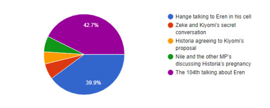
This pie chart wound up being almost eerily even. 42.7% are most looking forward to the 104th discussing Eren (hopeful for the train flashback?). 39.9% instead are looking more forward to Hange and Eren’s tense conversation at his jail cell. The remaining three preview moments were pretty evenly split as well.
DO YOU THINK WE’LL GET BLUSHING!104TH NEXT EPISODE?
130 Responses
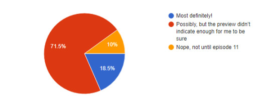
71.5% feel that there is a chance we will get the train flashback of the 104th in this episode, but don’t want to say for absolutely certain. 18.5% feel that it is a guarantee based on what we saw in the preview. 10% feel it is instead guaranteed that we will NOT get the scene in 69.
WE WILL LIKELY SEE PREGNANT HISTORIA NEXT EPISODE. THOUGHTS?
140 Responses
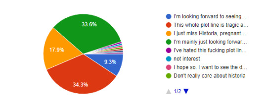
The plotline that continues to be a frustrating mystery in the manga - Historia’s pregnancy. 34.3% aren’t particularly looking forward to seeing her in the rocking chair and aren’t very stoked about having to relive this plotline all over again. 33.6% mainly just care about seeing how the anime only fans react to the scene. 17.9% just miss Historia altogether and will take any scraps they can get. And a small handful, at 9.3%, are actually looking forward to seeing anime!Historia with a baby bump.
Don't really care about historia
It's in MAPPA's hands now. I just hope they can add a little more of her screentime somehow.
I hope so. I want to see the design of her adult self.
I honestly wouldn't mind if Historia's entire arc, which consists of equal parts pregnancy, irrelevance and uselessness, is just completely cut in the anime lol
not interest
I'm not interested
I've hated this fucking plot line with all my being and what it's done to Historia since the leaks for this chapter were revealed years ago. So I'm not looking forward to anime-only people jumping in with their hot takes too. 🤮🤮
ADDITIONAL THOUGHTS ON THE EPISODE?
mikasa was shown in sasha's grave in the morning/afternoon and then she was shown again at dusk. SHE SPENT THE WHOLE DAY THERE. and annie... what a queen. and hisu's few scenes? so pretty.
Really glad the pacing was well done
nicosasha ship just flew in and took the spotlight
fantastic!! maybe it's just because this isn't my first time going through this arc anymore, but i feel like the anime feels chronologically less confusing than the manga—I remember being very confused my first time reading these chapters.
The lack of score by Hiroyuki Sawamo is negatively impacting my relationship with the anime. The depth of the emotion that could have been evoked was not present. I also did not get the sense that Nicolo and Sasha were in love, which was a major disappoinment. There were other aspects that weren't so bad, though; specifically, Levi's portrayal and Onyankopon's philosophy.
It felt a bit all over the place, but just seeing things from the manga being animated, I ain’t even mad.
I think that the scene between Sasha and Nicolo was made better in the anime. Isayama has problems with writing romantic moments, so in the manga the whole moment looked like it was taken from some light romance. Mappa made this scene more serene. I liked it.
I think MAPPA is doing so great tbh! I just need them to hurry up and explain if there will be a part two to this final season or what?! I need to know if we get more anime or they'll diverge into movies or.... just tell us! Lol!
How DAREEEE they not give Levi his black steed!!!! .....Although knowing what happens ummm yeah maybe his pony gets to live another day this way lol
Here comes the train wreck, choo choo!
I'm really sad I didn't get to hear Sasha call Jean a perv. I was really looking forward to that. LOL I love them.
When EMA were at the shooting range, it looked too much like Mikasa wasn't wearing any pants.
VERY solid. Not the biggest fan of the War for Paradis arc but I'm here for the ride.
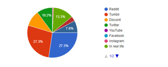
WHERE DO YOU PRIMARILY DISCUSS THE SERIES?
128 Responses
Thanks again to everyone who participated!
19 notes
·
View notes
Text
Why I Think the Fall of Beacon worked compared to the Battle of Haven
A long time ago, on a blog not so far away, I wrote a post during the Volume 5 hiatus about why I thought the Scuffle of Haven didn’t work on... well, any level, and in hindsight I stand by a lot of that post. I still believe that many of the points I raised against the Haven Battle remain valid to this day, though I could have expressed my points more efficiently, and as a consequence, I’ll be wary of any big conflicts once RWBY reaches Atlas or Vacuo.
But one of the points I mentioned during that post was that I thought the Fall of Beacon was a far better example of not just a season finale, but the climax of an arc. I’ve talked before about why I feel Cinder’s plan in the Beacon volumes remains rather underrated, and while the first half has some... questionable... fights, Volume 3′s back half was a sign that the crew could make fights on par with Monty even after his passing, while the writing and technical work behind the scenes showed that when the crew were firing on all cylinders anything was possible.
So this week, I’d like to write about why I think the Fall of Beacon worked so well in Volume 3, alongside a few anecdotes about where in contrast, Haven falls flat.
1) It changed the tone and status quo, and put team RWBY into perspective
Up until Volume 3, RWBY played a lot of its tropes straight, especially when it came to the setting of the show. We got to meet the characters and see them interact in a collection of light adventures, eventually leading to the most classic of anime cliches, the tournament arc.
youtube
Long-time anime fans know that nothing of any real importance for wider plots happens at tournament arcs, so people went into Volume 3 expecting some popcorn thriller action- some light, breezy and fun fights to wile away the time. And while the early half of Volume 3 had some... less than ideal fights with the exception of Mercury and Emerald vs Coco and Yatsuhashi (RIP to the SSSN fans who wanted Sage and Scarlet’s only fight to be good), a lot of the character dynamics allowed the viewer to still derive some enjoyment. Weiss and Winter’s dynamic in the early episodes is a delight to see, to say nothing of Qrow hanging out with Ruby and Yang. All of this changes as we reach Chapter 6, Fall, but I have a separate point about how Chapters 6-9 build up to the Fall magnificently so we’ll get back to the current point we’re on.

“I suppose at least my fights can’t get much worse from here on out?”
“Oh COME ON!”
Volume 3′s first half set up a rather casual tournament arc after two volumes of it being built up in the background, and until Yang fights Mercury, that attitude sticks around. It’s after this that the back half begins to build up towards a disaster in the making. To take a quote from Ozpin:
There's an energy in the air now. A question in the back of everyone's minds. If this is the size of our defenses, what is it we're expecting to fight?
After the Fall begins though? Nothing is quite so certain, and the status quo quickly falls to shreds as Beacon begins to fall. The show takes an immediately darker turn with only Roman’s jovial antics providing levity- and even that requires reaching to the gallows for humor. Soon everything the show and audience took for granted is kicked to the curb, as Grimm swarm the school that we had become accustomed to over the past two and a half prior volumes of antics. The breezy tone is completely gone, with Battle of Beacon having several scenes of the horror of the Fall in plain sight- my personal favorite is when Ozpin is watching Vale security feeds and he sees a rooftop with people on it, waving for help as a Grimm slowly climbs up the side. It’s almost harrowing in how much the image says. And that’s not even the worst of it, as the Battle stretches on and the heroes become more exhausted, everything begins to turn against them- first the initial wave of Grimm, then the White Fang, then the Atlas mechs turn on the Huntsmen and finally Kevin himself begins airdropping reinforcements. It’s a never ending stream of enemies and most of the Huntsmen can barely stand by chapter 12.
Perhaps the most drastic change that the Fall of Beacon episodes provide is how RWBY are put into perspective against the villains, starting with Mercury casually swatting Ruby aside like an irritating fly. He’s hardly even trying and he manages to distract Ruby long enough for Pyrrha to kill Penny, even managing to land a hit on Ruby while she’s speeding towards him with her Semblance- a feat no one else had managed beforehand. And even when Ruby slips through and gets outside in time just to watch Penny die...

You know what they say, if you love something, never do it for free.
After an entire volume of standout fights, from Coco and Yatsuhashi, to Yang, and even a full-fledged Maiden in Amber, Mercury was a constant standout fighting wise all volume and he earned the right to grin like a loon as he watched Ruby break down.
Similarly, Adam was a juggernaut when Blake ran across him, easily cutting her down to size and, when Yang came running, made short work of her too. Adam had already built a reputation as menacing from the Black Trailer, and Heroes and Monsters did its part in reaffirming that he was a dangerous foe who was not to be trifled with. He effortless dominates the “fight” and isn’t even winded by the time he has Blake and Yang dead for rights.
Even our mightiest heroes fare poorly against the villains- Cinder with the power of the Fall Maiden is able to effortlessly kill Ozpin and Pyrrha, stripping the heroes of their mentor figure and their most powerful fighter in one fall swoop. Were it not for Ruby’s Silver Eyes, Cinder likely would have gone on to clean house with the rest of the Huntsmen barring some insane luck.
Volume 3′s final quarter is a sudden, horrifying and effective tonal shift that properly conveys the horror of the events unfolding, all while showing in the wider narrative where our heroes fall compared to the villains- and in every instance, the heroes come up short, with even Ozpin and Pyrrha themselves dying at Cinder’s hand. It’s a bleak image to end the Volume on as Team RWBY scatter to the wind while the villains get away with their pride and dignity intact, firmly setting themselves up as RWBY’s superior in direct combat for their next confrontation-
I’m not bitter.
Meanwhile the only status quo change that Haven brings to the table is “RWBY are back together and get a lamp.” That’s it. That’s the big change from this volume, since the only casualties are a bunch of one-off characters that are introduced in the same volume they die in. Much of the narrative stakes die in the first half thanks to Weiss’s impalement and many of the villains lose the intimidating credibility than they earned through Volume 3. It’s a joke of a climax that brings nothing to the wider narrative of the show and has far less of an impact than the Fall of Beacon, barring how it utterly destroyed the threat factor of most of the villains there and required for Adam an entire trailer insisting that Adam wasn’t a complete joke, the effectiveness of which still has yet to be seen.
2) It feels significant and carries throughout multiple environments
One of the smarter choices made about the Fall of Beacon was that the characters are split up across multiple different arenas to help create the sense that this is a large-scale battle. Ruby, JNPR and many of the students start in the Amity Arena where Port and Oobleck stay behind, before heading down to Beacon’s courtyard to hold that area. There, they meet with Weiss, Blake and Yang, before the latter two go to the food hall for the Adam encounter. Ruby herself goes to the airships to help take back the skies leading to her battle with Torchwick. We have frequent scenes of Ozpin in his office until he comes down to begin the Aura transfer with Pyrrha in the Vault. Meanwhile, Qrow, Goodwitch and Ironwood take to Vale’s streets (Ironwood not willingly) and fight the Grimm there.

Your token reminder that Ruby vs Roman and Neo has some of the best teamwork in the entire show and it’s being done by the villains who weren’t part of the original plans for the series
Breaking that down to its core components, we have the courtyard, airship, arena, food hall and streets. CRWBY use a lot of recurring environments throughout the Fall of Beacon episodes- the deck of the airship for Ruby vs Roman and Neo and the landing zone where Ironwood fights the Alpha Beowolf are the only wholly original fight arenas made for these episodes, while the courtyard, Vault, and streets were all areas we had seen previously. Not only did this save on area budget, but it granted a sense of weight to the fights- we had seen these locations before, had scenes in them that gave them an emotional weight. Scattering the heroes across these different maps spreads the Battle out, making it easier for the crew to work on individual scenes since it lessened the risk of having people just standing around doing nothing, but it gave each character an individual chance to shine in their own arena of combat. Perhaps most obviously, the different locals gave us new arenas to enjoy as well instead of just “a room a plaza and a cave.” Ironwood may not have gotten his two small but glorious mo,ments against the Grimm and mechs if he was sharing an arena with everyone else.
Here comes the general
Ladies and gentlemen
Here comes the general
The moment you’ve been waiting for
Here comes the general
The pride of Atlas
Here comes the general
James IRONDADDY
... Meanwhile Haven just stuck everyone in a bland open room and had people standing around doing nothing for most of the Scuffle, if they weren’t teleporting around the room like ninjas.
Uh hi Mercury. You wanna... do something? Just gonna let them have their thing? OK? You do you buddy.
I don’t think there’s much more you can add to that.
3) The build up to the Fall is superb
As I’ve mentioned, while the first half of Volume 3 until Yang vs Mercury has some of the show’s weakest fights until Volume 5, the second half more than makes up for it on a fight level while also setting the stage for the devastating final string of episodes. Beginning of the End, PVP and Heroes and Monsters are all in my top 10 episodes for a reason, folks. Chapter 7 in particular finally gave the audience some much-needed background on Team CEM, as we saw Cinder recruit Emerald and Mercury in moments of weakness and plant the seeds for the Fall as she meets with Roman and Adam (while presumably getting the virus from Watts that allows her to initiate Order 66). Destiny lets us see the fallout of Yang vs Mercury, Jaune and Pyrrha’s last quiet moment together, and is the last calm before the storm as the episode ends with Penny about to fight Pyrrha and Mercury staring Ruby down. All the while, the sense of unease builds up each episode, starting relatively tame in the premiere before the dial gets nudged up a little each more every week until...
“Polarity vs metal. That could be baaaaad.” Look I like taking screenshots of Merc don’t kinkshame me.
Volume 3′s third quarter does an excellent job in setting up the immediate stakes of the Fall of Beacon, and separates Team RWBY so they’re scattered and confused once the fireworks begin to go off. Pyrrha’s arc continues and prepares itself for the conclusion awaiting her atop the Beacon tower, while Ruby gets to display some street smarts and quickly puts together some dangling threads after her talk with Velvet and spotting Emerald among the crowd. The major pieces are set up well in advance and given time to breathe ahead of the tidal wave that’s about to hit the shoreline.
Meanwhile in Haven: RNJR sit around a house for a month and wait for the plot to invite them over to the climax, Blake just invites herself and most of the “stakes” are either set up in A Perfect Storm (AKA one of the two worst episodes in the entire show) or come up out of nowhere with little foreshadowing (see: Jaune being suicidal). I don’t know about you but I’ll pick one approach to seeing up a climax over the other every time and... I think it’s clear which I’ll side with
In conclusion, The Fall of Beacon is an expertly put together string of episodes, with the back half of Volume 3 wrapping up with a neat little bow and remaining the peak of RWBY (Heroes and Monsters is my personal favorite episode in the show). Barring the finale timeskipping after Ruby uses her Silver Eyes, depriving us of countless emotionally gut-wrenching scenes- that we never saw JNR reacting to Pyrrha’s death is the one massive black mark over the finale- it’s a near perfect collection that encapsulates what RWBY can be when firing at all cylinders. And that is a fact that becomes more amazing when one considers how Poser was actively fighting against the crew as they made the episodes due to not being ideal software for the episodes. In the midst of these episodes the villains reign supreme and firmly show how much stronger they are than RWBY. Their victories are ash in the mouth in the moment, but any writer worth their salt knows that villains winning now only makes their downfall and defeat that much more of a reward for the heroes when they come out on top.
It concludes several character arcs, sets up countless others as everyone recuperates from the Fall (most predominantly Ruby, Yang and JN_R), and set the seeds for RWBY to move beyond a generic high school battle anime and become its own beast, worthy of carrying Monty’s legacy with it to greener pastures.
The Battle of Haven meanwhile, only looks like more of a bad-taste joke when put alongside the Fall of Beacon, looking flatter and having a lot less color and visual range, alongside consistently weaker animation in all regards except facial. It’s all just the same open room for four weeks straight, mixed with a courtyard and a cave, all of which were locations we didn’t care about due to not spending any time in them or Haven at large thanks to being locked up in a house all season. It was a climax wrought with animation errors, a climax that destroyed the credibility of most of the participating villains and forgot that people watch RWBY to see fight scenes, not see them standing around watching offscreen fights or not doing anything at all. It was a climax where the heroes only won because the theme song was called “Triumph” and because the script said they needed to win.
I linked to it in my Haven video, but FloofArtist’s breakdown of the animation errors in the Battle of Haven remains an almost harrowing experience to watch. Information such as storyboard dates shown in some of the CRWBY episodes show that the Battle was still in storyboarding during December and early January, just a month before it was set to air, and... it shows. Painfully. The Haven episodes reek of being rushed out the door to satiate deadlines, less a product of passion and more a frenzied product of getting the last essential renders done before being sent out like a sacrificial lamb.
While Volume 6 has so far managed to move past the failings of the Haven Battle in that it’s actually good, we’ll need to wait and see for if the Battles of Atlas and Vacuo retain the flaws seen at Haven, and the fans will constantly have Haven hanging overhead like a specter, forever wary that such a sudden and sharp downturn in quality could happen at a moment’s notice. Based off the reaction in-house, between the sudden changing of the writing system, Conner Perkins becoming a co-director and the numerous shots taken at Volume 5 in pre-release for Volume 6, it seems CRWBY themselves have that specter overhead and are desperate to avoid a similar calamity. Only time will tell, and while I have hope based off the stellar execution of the Fall of Beacon, we’re one for two on good climaxes involving Academy wide battles so far.
But in the defense of the show, the Fall of Beacon remains the high-point of RWBY on a narrative and character level. The back half of the season makes up for the weak fights of the first half and allows for an emotionally gripping narrative that collects elements from all three prior volumes and combines them into an emotional gut-punch. The finale may have several black spots over it, but the ride to it contains RWBY at its absolute best, and certified that I would be an avid watcher of this show for years to come.
Thank you for reading. Sharing this article around is a great benefit to me if you appreciated it, and all feedback is much obliged. Please consider following if you enjoyed the piece and wish to see more. I hope you enjoyed it.
#rwby#rwde#rwby analysis#ruby rose#mercury black#james ironwood#adam taurus#blake belladonna#yang xiao long#pyrrha nikos#ozpin#rwby volume 3#rwby volume 5#the fall of beacon#the battle of haven#every time i think i'm done shittalking volume 5#I GET PULLED BACK IN
78 notes
·
View notes
Text
Animation-Related Videos
vimeo
MUTO a Wall-Painted Animation
Artist: BLU
Media: Paint & Grafitti
Reference: https://consequenceofsound.net/2011/06/muto-a-wall-painted-animation-by-blu/
Formal elements & Evaluation
Repetition, line, colour, proportion, shape, and composition are effectively employed, as they add surrealism to the animation, and a little bit of horror, represented by the shadows moving like a human being walking on a pavement. The juxtaposition of reality and illustration create a strong contrast and balance metaphorically creating a readymade, but in the context of animation.
Done well in adding movement and rhythm to the illustration, creating realistic movement. Could improve by adding bright colour, as I feel that white and black are quite muted.
youtube
Artist: Marc Isaacs
Media: Film
Formal elements & Evaluation
Composition, shape, line, colour, and proportion are effectively employed, as they make the video very sensory - in other words, there’s a narrative formed. I noticed that in the film, as well as it is audio, it was very typographic. The sound in the lift was quite confined, reflecting the claustrophobic atmosphere in the lift. I can imagine the speaking being echoed if the lifts were open.
Done well in thinking about the rules of thirds, the focal point of the camera and perspective. There were a variety of camera shots, making the emotion of the people and experience clear. Could improve by playing with the audio - it could be high one minute, then low the other minute. In other words, the artist could try to make a connection with sound and emotion.
Comparision of MUTO a Wall - Painted Animation and Lift
Both videos similarly employ audio and movement, as they make the animations dream-like and they both take you on a journey through a story. However, the movement in the videos differs. In the MUTO video, the movement is very surrealistic, as you, of course, wouldn’t walk outside and see imagery on a wall moving. And in the Lift video, the movement is realistic and potent, as you can see and feel the emotion from the people, through their expressions.
What were the ideas expressed in each film - what ideas are the artists/producers expressing? How do these ideas differ?
In the video MUTO, I feel that the ideas expressed are the encouragement of keeping the streets eco-friendly, as there can be rubbish dumped on the floor and pollution from a lot of vehicles, and the modernisation of street art from the ‘70s. And in the video Lift, I feel that the ideas expressed are the people confidently sharing and discovering the lives of each other, and the impacts of problems that they had. These ideas differ, as the video MUTO is free and expressive due to the energetic movement of illustrations - they seem to show us how street art developed from the ‘70s. In contrast, the video Lift was personal and quite sad. People were sharing sad experiences they had in life.
youtube
Artist: Johannes Nyholm
Media: Music Video
Formal elements & Evaluation
Repetition, line, shape, colour, proportion, and composition are effectively employed, as a black and white abstraction is created. The video reminds me of Halloween and I feel that it alludes the movie The Nightmare Before Christmas. The proportion of trees vary and the dull light gives the video a ghostly aesthetic.
Done well in the amount of light shining through the camera. Not sure on improvement. It’s quite hard to say, as I feel that imagery doesn’t have to be used to represent art. Typographic or lyrical language is sometimes enough to represent art. The same could be said for audio works.
youtube
Artists: Francois Alaux, Herve De Crecy
Media:?
Formal elements & Evaluation
Colour, line, shape, composition, and typography are effectively employed, as they bring the style Pop art into the video and makes the art very comical, almost Roy Lichtenstein's work. There’s lots of warmth created by the colours, which is reminiscent of the times I spend outside in the ever-shining sun, full of joy and happiness. And the M&Ms featured in the video, makes me want to eat a pack of M&Ms and is also reminiscent of the sounds of the crunching of them in my mouth.
Done well in showing understanding of 2D and 3D and using the illusion of movement. I don’t feel that an improvement needs to be made, as there’s a lot of things being done in this animation.
Comparison of Little Dragon - Twice and Logorama
Both of the animations use a very interesting illusion of movement by the pace of movement and the sounds featured. However, there’s a difference in the way the sound and movement is employed. In the Little Dragon video, I feel that the movement of puppets and the music is quite ghostly by the use of pathetic fallacy. The music reflects the action of the puppets. And in the Logorama video, the movement and sound were quite commercial - full of well-known brands. I felt excitement and joy, through the bright colours floating around at me.
What were the ideas expressed in each film - what ideas are the artists/producers expressing? How do these ideas differ?
In the Little Dragon - Twice video, I feel that the ideas expressed were having to leave behind something you really love, represented by the female puppet leaving behind a present in the video, and walking up to a skeleton, which seems to suggest her journey to death - a skeleton is the symbol of death. So, it was another sad video, like the Lift video, but was different as sad life experiences were shared and discovered with each other. And in the Logorama video, I feel that the ideas expressed are technology evolving and mass-production in the commercial world. These ideas differ, as the Little Dragon - Twice video was sad, as the puppet’s life was on a journey to the end, represented by her walking up to the skeleton (a symbol for death). Whereas, in the Logorama video, there were lots of sounds and it was quite violent towards the end.
vimeo
Darkness Light Darkness
Artist: Jan Svankmajer
Media: Clay
Reference: http://filmword.blogspot.co.uk/2013/11/darkness-light-darkness.html
Formal elements & Evaluation
Colour, scale, proportion, and composition are effectively employed, as they make the artwork surrealistic and dadaistic, reflected by the scale of the clay figure compared to the scale of the house - a big contrast between the scales. The clay being transformed into a human figure was quite frightening in the video, as my heart would beat if it was metaphorically in front me. I feel that it alludes Wallace and Gromit, although there’s no recreation in it.
Done well in being developmental with the clay figure and being imaginative with the scale of the clay figure compared to the scale house of itself - in other words, the scale is what brings in the two styles, dadaism, and surrealism.
Comparison of Little Dragon - Twice + Darkness Light Darkness
Both videos use sound and movement by adding surrealism to the animations, making them dream-like. They have another common denominator, which is the ghostly movement and sound. But they are featured in a different way. In the Little Dragon video, sound and movement are employed in a dull atmosphere - metaphorically a silent night. The way the puppets were moving was quite spooky. And in the Darkness Light Darkness video, it was more spooky, as clay was transformed into a human figure and eyes were slotted into fingertips.
What were the ideas expressed in each film - what ideas are the artists/producers expressing? How do these ideas differ?
In the Darkness Light Darkness video, I feel that the idea expressed is things being recreated and developed over a long period of time. For example, nature regrowing once it reaches April every year and leaves falling off the tree and regrowing again. In other words, the video is getting at the world constantly evolving. Whereas, in the Little Dragon video, life seems to be ending for the poor female character. I feel that the videos form a paradox, as the Darkness Light Darkness video seems to be metaphorically beginning life (due to the human figure being created) and the other video seems to be ending a life due to the female character approaching a skeleton (symbol of death).
2 notes
·
View notes
Photo

Francisco V. Coching’s Art Form and Critics
The published magazine of Silahis dated way back September 14, 1946 feature Francisco Coching's Gigolo-like cover. One of Coching's first work when he was 15 and started his career as a comic illustrator. It was said that this cover is different from Gigolo, the Gigolo's character resembles to Fernando Poe Jr. and Susan Roces in their youthful days, this piece shows a portrait of Coching and his wife Mrs. Filomena. The artwork was made out of Pen and Ink, the brush work is rich, the lines showing the soft side of the handwork, there were also thick lines that compliments to its softness giving more spotlight to the subject.
Growing up in a comic illustrator career specializes on the black and white sketch professionaly show how the background that occupying the space should be done. It was simple, not over the top, there are only few flowers floating in the background which adds spices to the craft. It gives an autumn-feeling where flower leaves are rushing through the air, a romantic vibrance that will chill your spine, it somehow made easy to distinguish on which will an audience will look at first. The diverse rhythmic lines like curve lines, diagonal lines gives a variety on the object. It gives off a 3D vision with that 2D lines, it was also utilize to add a contour and to make it look realistic and it actually paid off the price. The lightness and darkness value clashing in the work done a perfect contrast to give emphasis on the subject, with the flowers floating in the background, the lily flower on Francisco's garment, the pose between the subject gives off a dramatic movement, the dalliance sensation would capture and attract the eyes of the audience. Also it was noted that it has a proportional scale that incorpates realism. The objects that were used in the artwork does create an harmony giving off justice as it tingles the mind of the audience to envision a realistic perspective out of the sketch. The sweetness and its natural intimacy out of their expression captured won us over despites its lifeless black and white theme, it still attracts life connecting to the audience mind and won the heart of the viewers.
Moreover, This artisty was about Coching's love for his wife, the notion of puting a necklace on someone symbolizes strengthen relationships, also the lily flower in both garments and in the background also the white color marks the purity and genuity of his love, justifying the heart-warming dynamic flowing all throughout the artwork.
The masterpiece was perfectly painted, the artisanship is on par with Pierre Auguste Renioire's A Dance in The Country. If it was painted with colors, it will surely create a wider impact but even with its colorless theme it could stand out with its rawness and exotic elements, it was expressed emotionally and its grows on the audience the more one would look at it, proving that an emotions ponded on the artwork could work out with a colorless piece.
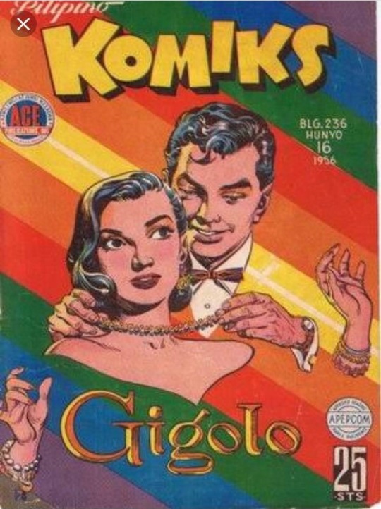
Francisco V. Coching’s graphic novel cover art, titled “Gigolo” portrays a colored sketch of a man connecting a necklace around a woman. The man being handsome, while the woman being beautiful; both being a lovely couple. The literary text apprehends the Filipino styled literacy of written communication of alphabetical choice. What gives the contemporary vibe for the thumbnail or cover art is the linear highlight of sketching the facial shadowing and outlines of the characters. Comical elements, such as drawn animations in reference to real life anatomies on the characters with unusually different background colors light up the contemporary application towards the art work.
Applying real life features of facial areas and body parts take practice to patiently build the mindset of constructing facial shapes and body types, while slowly building the muscle memory for strokes and directions in displacement to the art. The shadowing and traces of the couple appear to be very delightful and cartoonish in addition to referring facial shadowing and strokes. The colors range from rainbow variety in respect to the background highlight. The literary text works of the cover brings about the Filipino culture, like in English, it is written “comics”, wherein Filipino interconnection the word is written in “komics”. Modern sketching really admires the content of applying facial anatomies of the person, defining the very emotion of the character. Being attitude, intelligence or personality. The drawing will involve a lot of non-verbal communication and impression to the audience and the artist. The couple display a romantic and mild revision towards another, based on the facial looks. Contemporarily speaking, applying a comical cartoon like appearance to the graphic novel brings about the originality within the art work. Visual arts, textual arts or poetic. In respect to the art form, the representation of the cover translates into a romantic first impression with Filipino cultural applications.
The mysterious attention wonders off to the separation of the head and hands, indicating that the audience will do the honor of visualizing the clothing and hide appearance. Gigolo represents the culture of how a “Gigolo”, men who are financially and typically supported to satisfy a woman for sexual attention and partnership. It is well known during old times of business or paid marriage within the community under the Spanish colonization. Knowing our open culture, this resembles a lot of how western influences catches up to our tail and cultural gene history of this country, both biological and socio-cultural. The interconnection of the cover focuses on how visual arts can really shift from old school painting and graphite traces to animated and printed forms of artistic entertainment. Gigolo shares both an ancient influence from the society alongside the incomplete dominance of shifting modern and contemporary arts.
Double Cross resembles crime and war. The title is embodied not to the art, but to the genre altogether with the conceptual idea for the plot relation. The bag with riches being gripped by a hand portrayed a very oblivious vibe of thievery. A crook holding a gun, possibly a P45 pistol at gun point releases a criminal instinctive reaction of a first off impression upon view. Followed by a fleeing man wielding a handgun. A classic styled comical art cover appears to be sketched out under the modern appeal of realistic approach and dangerous aura, while maintaining the contemporary intent of implementing visual arts into the 50’s most renounced and dangerous social times.
Involving the portrayal of betrayal and business comes from the man wearing suit with a grey shade top. Wielding guns signify the sign of immediate threat and serious danger, armed robbery is a mere example of what could be a scenario. The man pointing the gun towards the audience’s view can mean many things from threats, confrontation, unsettled business or even penalties. The fleeing man and stealing hand could back up the means towards a linked meaning behind all this, inside the graphic novel from the cover page being the impression. The literature style figure sharp edges and ridges, an indication of a snappy and strict motive to the art’s action and meaning of the story. The men display strong vibes of conflict and action, possible thriller or psychological genres, specifically crime most likely.
An artwork with a crime-like sentiment builds the meaning and idea for visual art tendency towards the readers. The style gives a narration of the 50’s most notorious timeline, due to the fact that mobs and gangs ruled the city with influence, power and marketing. Culture and variety stands to this art’s action vibe concept and outlook. Al Pacino is one of criminology’s most referred iconic criminals in American history and one of Europe’s most dangerous criminals before. Hundreds of rivals killed, tons of his backstabbers betrayed, power and worth built from the ashes of what he sees as bad. Knowing the art greatly infers to what crime has to be and translated into how the beauty blemishes to the community. The shady texture unveils a solemn foundation of foreshadowing and interest in regards to the flow’s predicament within the story. This is what catches the attentive idea of the art referring to a criminal and more thriller like purpose. Everything is art from the looks of a child’s simple painting of a flower, all the way to utter violence and crime. Whatever holds the might and majesty of converting one form into another with creativity and experimentation is artistically aesthetic. Contemporarily, it applies issues that represented the world back then, while applying modern taste to a mono-styled color reign. Knowing the exchange in the comparison, this art recombines a more classic outcome.
1 note
·
View note
Text
Artists Research
Steve Cutts
Steve Cutts is an illustrator and animator currently living and working in London. His artwork satirizes the excesses of modern society, it is extremely fascinating, thought-provoking and usually lends an important message. His style is inspired by 1930s and 40s cartoons, as well as modern comic books and graphic novels.
As a viewer, I am very drawn to this style of work because during the 1930’s, technology started to rapidly progress and become more useful to society. In 1923, Disney was founded by Walt Disney and released a series of cartoons which later in the 1930’3 became well known and viewed by thousands of people in society. Therefore, Steve Cutts cleverly worked in the style of one of the most well-known cartoons and used these familiar characters as a mouthpiece to society to convey a moral message.
Steve Cutts’ recent work includes the 'LA-Z Rider' couch gag for 'The Simpsons' and the music video for 'Are You Lost In The World Like Me?' for Moby. He has also worked on projects for renowned agencies across the world including UNESCO, The Gaia Foundation, Isobar, LMFM, and Analogfolk'. His work has been featured on various television networks, including Adult Swim and Fox in the US and Channel 4 in the UK. Steve works with Adobe After Effects, Toon Boom Harmony, Photoshop, Cinema 4D and Manga Studio.
Illustrator Steve Cutts has a rather morbid fascination with "the more broken aspects of life." Some of his artwork is brightly coloured and meticulously detailed whereas his other work is extremely dark and dull coloured, which provokes an intensely somber atmosphere for the viewer. Colour symbolism is also created in his work (picture “Trump Wall”), the use of the colour red emphasises the anger Trump provokes in society. His work also tends to revolve around poverty, corruption, greed, social media, consumerism, dependence, drugs and any other current day issues in society.
His messages range from environmental awareness and how we pollute and destroy the earth (film “Man”), animal rights (film “What a Hunt”) to the humorous and educational (film “How Will You Die”). His art and film is mixed in humour and sometimes a more serious spin of man’s interaction with our environment and how it impacts the world we live in.
Overall, Steve Cutts’ clever use of colour symbolism and contrasts between colours represent a deep moral message about society; it also draws the eyes of the viewer to seek further hidden messages.
Matthew Albanese
Matthew Albanese’s fascination with film, special effects and movie magic and the mechanics behind these illusions, began early. Albanese spent a peripatetic childhood moving between New Jersey and upstate New York. An only child, Albanese enjoyed imaginative, solitary play. Being exposed to a solitude atmosphere as a child is clearly reflected in his work as an adult (The Tree In My Backyard”). He loved miniatures and created scenarios intricately set with household objects and his extensive collection of action figures. After earning a Bachelor of Fine Arts degree in Photography, Matthew Albanese worked as a fashion photographer, training his lens on bags, designer shoes and accessories, this small-object specialization is known in the retail trade as “table top photography.” Albanese’s creative eye soon turned to table top sets of a more wildly eclectic nature. In 2008, a spilled canister of paprika inspired him to create his first mini Mars landscape. More minute dioramas, made of spices, food and found objects, followed. In 2011, Albanese was invited to show at the Museum of Art and Design of New York. His work has also been exhibited at the Virginia Museum of Contemporary Art, Winkleman Gallery, and Muba, Tourcoing France. Matthew is represented at Bonni Benrubi Gallery in New York
His work involves the construction of small-scale meticulously detailed models using various materials and objects to create emotive landscapes. Every aspect from the construction to the lighting of the final model is painstakingly pre-planned using methods which force the viewers perspective when photographed from a specific angle. Using a mixture of photographic techniques such as scale, depth of field, white balance and lighting he can drastically alter the appearance of his materials. His clever use of lighting techniques persuades the mind of the viewer to think the model is a real photograph of a landscape.
“The Tree In My Backyard” creates an immensely melancholy and solitary atmosphere in the viewer, whereas, “Dead Little Things” generates a catastrophic and chaotic mood. The juxtaposition between moods from his pieces of work highlights the impacts that the different types of weather (rain, tornado’s, fog) has on the environment and our moods. Matthew is trying to put a message across that the environment we live in has a huge impact on us not only physically but mentally; the weather reflects our moods.
0 notes
Text
In This Corner of the World ( (2016)

In This Corner of the World (Kono Sekai no Katasumi ni) is a film about a woman named Suzu living in Japan during the height of World War 2, as Japanese society slowly crumbles around her. Further complicating the film is the fact that the film is partly set in Hiroshima and in Kure (a port city close to Hiroshima). adding an oppressive layer of dramatic tension because we can only wait and see how the atomic bomb drop will affect Suzu and her family.
Anime as Art
It’s worth mentioning Mai Mai Miracle (2009) (which, incidentally, is only legally available in English through crowdfunding) because it reveals a lot about Katabuchi’s sensibilities as a director. It’s a film that shares many thematic similarities to Kono Sekai, touching on nostalgia (as both are set in Japan’s past), the nature of imagination and mediated experiences, and the experience of being in transition. But more importantly, both films use the power of animation to address these themes in a visually striking manner, using visual metaphors to expressively bring the audience into the mind of the main characters.
While Mai Mai Miracle asks us to enter into the world of the imagination through Shinko’s whimsical thoughts via her unruly cowlick which she calls a “mai mai”, Kono Sekai grounds these visuals through Suzu’s background as an aspiring artist. Early in the film we see Suzu draw a series of pictures depicting an adventure she had in Hiroshima involving an Ogre that tries to kidnap her and another little boy. As Suzu recounts this story to her sister, the film transitions from the realistic, cleanly animated art style of the film to the crude and unsophisticated drawings that Suzu produces, signalling to us that perspective and point of view are entirely subjective experiences.
We see this again when a Tetsu, a young classmate, asks Suzu to paint a picture for him. As Tetsu describes his bitter feelings toward the ocean, because his brother died when his ship sank, one of images that bothers him most about the ocean is the fact that the waves look like rabbits hopping in a field. The contrast between the anger over his personal loss and fits of fancy that his imagination takes him on is something that is difficult for him to reconcile, and we this dichotomy is made even more apparent through its depiction on the screen, as the scene transitions from the standard art-style of the film to the painterly art-style of Suzu’s painting. We can see how art has the power to capture the beauty of a tragic moment, as we see Tetsu’s negative feelings being swept away by the sea of rabbits hopping off into the distance.
The blend of visual styles, one representing the real world and the other representing the imaginary or the idyllic, pays off in the two most climatic moments of the film. The first is when Suzu and her niece Harumi are out in their garden as they are caught in the first air raid on Kure. As the bombers fly overhead and drop their payloads, the bombs and explosions turn into expressive looking fireworks being drawn by an unseen hand. What would have been a moment of horror is turned into a moment of beauty, as we can imagine Suzu being terrified but also mesmerized by the scene unfolding around her. It’s a scene that’s been depicted many times before in war films — the first that comes to mind is the scene where soldiers laugh at the exploding trees in Bastogne on an episode of Band of Brothers (2001)— but the nature of anime as a visual medium based on an artistic interpretation of reality lends itself wonderfully to a depiction of the shock and awe of living through a bombing. The simple act of changing the art style arrests us and forces us to confront what we are being asked to consume. Interiority is juxtaposed with exteriority, as we get to see how Suzu herself sees the world around her.
Later on in the film, after another bombing, a similar transition occurs as Suzu and Harumi are caught in an explosion. As Suzu realizes that they are standing next to an unexploded bomb and tries to pull Harumi away, the film offers a close up of their hands before a flash overwhelms the scene and leaves us in darkness. When the screen comes back to life, we see white outlines of Suzu and Harumi suffering through the blast as Suzu struggles to understand what has happened. The film relies on an artistic representation of the scene in order to convey its full impact, and seeing the outline of Harumi dissolve into an unrecognizable mess of white lines is enough for us to understand that Harumi has been killed and that she has lost her right arm — the arm that she draws and creates her art with. Again, it’s a scene that visually lets us into Suzu’s mind — we understand that the actual details are not important. The only thing that matters in this moment is the fact that Harumi is dead and that Suzu feels responsible for causing her death.
It’s telling that the film doesn’t switch between the realistic art-style used in most of the film to a more interpretative art-style after this point, because we understand that Suzu’s spark has been snuffed out by the trauma of this event. She has both lost a child that she cared for, and also the hand that allowed her to escape the war through her art. The next time we see a bombing, it’s depicted without any mediation — including a moment when a fighter plane circles around to try to strafe her. Even the inevitable dropping of the atomic bomb in Hiroshima is depicted matter-of-factly, with a simple flash of light followed by the tremors of the explosion’s aftershock. Death is depicted without mediation as well, as we see a mother and her daughter walk aimlessly out of the rubble of Hiroshima, only for the mother to pass out and die in front of her child. It’s only at the end of the film, when Suzu visits Hiroshima to see the aftermath of the bombing, where she remembers the story about the Ogre that she invented in her childhood and allows herself to dip back into the world of the imagination.
This is one of the films that answers the question “why anime?”. Yes, there is a live action version of Kono Sekai (a TV movie from 2011 which has seemingly been completely forgotten, at least on English language websites), but I can’t imagine that it would have been as effective as this film at conveying the psychological mindset of being a civilian caught in the war. This is a film that effectively uses animation to convey meaning, specifically allowing us into Suzu’s mind, in a manner that just wouldn’t be possible otherwise without compromises.
Indeed, the credit sequence affirms the power of art by showing a hand — perhaps Suzu’s missing hand — drawing scenes from Suzu’s childhood, showing a happier time when her immediate family was still alive (we learn that Suzu is the only one in her family that survives the war). As the credits end, the hand stops drawing and waves goodbye to the audience. It’s a striking final image that provides a catharsis for the emotional climax of the film — the past is gone, but not forgotten. Suzu learns to live on by embracing her new family of in-laws and by adopting an orphaned girl, but the loved ones she’s lost and the arm she is missing will always be in her memories, ready to be memorialized through art. It is then that we realize that the film itself is an artistic endeavour meant to give us a small slice of history, so that the suffering and perseverance of the survivors of World War 2 are not forgotten. The hand waves at us to say goodbye so that we can resume our lives in 2017, but it also asks us to remember all the sacrifices that were made to get us here.
History and Context
I think it’s worth pointing out the film’s context, even if I don’t necessarily have any clean answers to resolve these issues with the film. The one unavoidable reality that the film largely ignores is that Japan is historically seen as the villain in World War 2, and indeed, in much of the early 20th century. Tensions between the various South East Asian powers still flare up in part due to the scars of the war and the Japanese colonization. Whether it’s denial of Japanese war crimes, or the enshrinement of the men responsible for these war crimes, I think it’s fair that Japan inability to fully reconcile with it’s dark past is a lingering, festering wound on the psyche of an entire region.
It’s why I found it difficult to process my feelings about the film after I watched it. It’s a film that I enjoyed on an aesthetic and emotional level, but there was a part of me that just couldn’t let go of the historical context. Recently, a large unexploded bomb was found in Frankfurt, serving as a reminder of the Allied bombing campaigns against various German cities at the end of the war. There are still debates about whether these bombings were necessary or justified, since the tide of the war had turned at that point (particularly during the Dresden bombings). And like the people depicted in Kono Sekai, many Germans would have suffered at the hands of these bombings. But it’s hard to separate the suffering of German civilians from the fact that Germany as a nation committed genocide on a massive scale (not to mention the bombings of London and other cities).
And so, the cynical part of me wondered if it was possible to sympathize with the events in the film considering the massive suffering that Japanese imperialism caused throughout the early 20th Century. At the moment, the only way that I’ve found to resolve this “problem” is to try to separate the political context from my enjoyment of the film. It’s not a pretty solution, but I don’t know if I can ever really find a way to resolve this particular issue.
I had similar feelings toward The Wind Rises (2013) (and also here in a less formal post), which also similarly skirted politics and tried to focus strictly on character and biography, and I don’t think I’ve ever resolved my feelings about that film either.
I should probably note that I didn’t have the same problem with Grave of the Fireflies (1988) or the flashback scenes in Natsu no Arashi (2009), because of the fact that the main characters were clearly victims of circumstance (what could children do to stop the war?), and that I had absolutely no problems sympathizing with English bombing survivors in the recent film Their Finest (2016), which was in part about the German air raids on London.
Perhaps Kono Sekai itself offers a solution to this conundrum when it shows how Suzu reacts to the Emperor’s announcement of Japan’s formal surrender to the Allied forces. Everything she has gone through, all that she has lost — the fact that her brother was killed overseas, that her parents died in the Hiroshima blast, that her sister most likely died from exposure, and of course Harumi — was all in service to something bigger than her. We see that many of the characters in the film willingly sacrifice in order to contribute to the greater good of the society. So when Japan surrenders, everyone realizes that their sacrifices were for naught. Suzu runs away from the house after hearing the announcement, only to see Harumi’s mother sobbing outside as she finally mourns for her daughter. Suzu herself breaks down into tears as she decries violence itself, rather than any nation state.
It’s an easy out to take — inviting us to move on from history by attacking the nature of war itself — but maybe that’s the only way forward.
Story and Structure
First, I have to admit upfront that I haven’t read the manga, so I don’t know how much of what I am about to say can be credited to the filmmakers and how much can be credited to Kouno. With that said, there are some aspects of the story that I wanted to talk about that just weren’t covered in my discussion of the film’s visuals or of the film’s historical context.
The film does an admirable job filling in the world without relying on exposition. Yes, it asks you to do some work by assuming that you are at least educated about the Second World War, but there are never scenes where characters stand around talking about the war in an expository manner. When the film opens in the 1930s with a young Suzu going to Hiroshima to sell her family’s dried seaweed, we see that it is Christmas time. There’s a man in a Santa suit spruiking for the market district, and people are seen doing their Christmas shopping, we get a picture of a more liberal time in Japanese history. The Japanese empire was still expanding, but they were still open to Western ideals at the time because the American embargoes weren’t in place yet. It reminds me of Taisho Yakyu Musume (2009), a series set in the 30s that featured an American teacher coaching a girl’s baseball team.
When the film skips forward in time to the 40s and Suzu moves to Kure, we get glimpses of war time life that explain the burden placed on civilians at the time — rationing, strict security measures and curfews, the reclamation of land and resources (Suzu’s family loses their seaweed business, and Suzu’s sister-in-law loses her business as well), the drafting of all of the men, and so on. We also get scenes showing how people would have coped, including a black market selling forbidden “luxuries” like a pencil colour set and watermelon, but also a red light district to essentially service all of the sailors who take shore leave in port. Certainly gone are the days when people celebrated Christmas. These aspects of life are presented as a representation of life in the 40s, without any judgement on part of the characters or the filmmakers — for Suzu and people living under these conditions, it was simply a fact of life.
We see how the war is progressing through the eyes of the characters as well. When Suzu first arrives in Kure, the port is bustling with many ships preparing to embark in campaigns in the Pacific. But as time progresses in the film, we see fewer and fewer ships, showing that Japan is on the losing side of the war. Similarly, when one of the few remaining boys in the town is drafted and sent off to war, only a handful of women are there to send him off. There isn’t even a chance for celebration, as this small ceremony is interrupted by an air raid siren that sends the small gathering of supporters scattering. Sure, we know that Japan loses the war, but even if we didn’t, these small moments help paint the picture of a war effort that is being stretched to its limits.
Suzu’s story stands out as well, as she is definitely not the star of a conventional romance. Her marriage to Shusaku is all but arranged — he says he saw her in town one day and had to marry her—which is exactly what happens when the film jumps forward in time. We’re not shown a courtship because there isn’t one. Their relationship could be described as an affectionate friendship, and they might like each other, but it’s not clear that they are in “love” with each other as we would expect from a convention romance.
The lack of true love in their relationship comes to a head when Suzu’s old friend Tetsu comes to visit her and Shusaku senses that she has a connection with him. Shusaku all but pushes Suzu and Tetsu together, forcing them to spend the night with each other by locking her out of their home, showing his graciousness in admitting defeat in the love triangle. The absurdity of the situation makes Suzu angry, as she and Shusaku are finally forced to confront the nature of their marriage. In the end, theirs is a companionate relationship rather than one built on extreme passion or love, but I think the subdued nature of their courtship fits very well with the story that is being told. The relationship isn’t the “star” of the story, and the film isn’t asking “will they or won’t they”. The relationship is simply a characterization of the life that Suzu leads, of enduring and finding small pleasures in the face of darkness.
The fact that the film is bookended by the appearance of the Ogre ties it all together. It’s implied that Shusaku met Suzu in Hiroshima on the trip we see in the opening of the film, and the story about the Ogre that Suzu tells her sister was actually about their first meeting. So when an adult Shusaku and Suzu meet in Hiroshima after the bomb was dropped, the Ogre walks past them and smiles at them. It’s a loop that closes on their story and perhaps allows us to believe that they were fated to be with each other, much like fairy tale characters, even if it seems like they were only together due to matters of circumstance. It’s also the first sign of recovery, of the return of the fantastical and the imaginary, and a sign that their renewed relationship signals a period of recovery for Japan as a whole.
One note about Tetsu is that I think it’s very deliberate that he served on the Aoba. As Tetsu himself points out in the film, the Aoba didn’t have a glorious victory or honorable defeat at sea, something that mulls on him as he sees the people around him die in battle. It’s not explicitly stated in the film, but at the end of the ship’s life, the Aoba was left in Kure as an anti-air battery, ending her service as a ship altogether. It’s a fair inauspicious end for the ship, and presumably for Tetsu as well, giving us yet another example of the fruitless nature of the war.
It’s also interesting how the American forces are depicted in the film. There is only one true American point of view shot that is completely removed from the context of Suzu, and that’s when reconnaissance plane flies over Kure and takes pictures of the Yamato (which is later sunk). For the most part, however, the Americans are treated like an unpredictable force of nature. There’s no human element to the flights of bombers dropping ordnance onto Kure, and they might as well be terrifying storms or mythical creatures indiscriminately raining down death and destruction. Given how apolitical the film is, treating the American threat as an abstraction allows the film to focus entirely on Suzu and how the bombs affect her. It’s a reminder that the film isn’t a war film, but a film about living through a war. In fact, the only time we see a human American presence is after Japan’s surrender, when Americans occupy Japan and begin to provide relief to the civilian population. At this point they’re not an indiscriminate force of nature anymore, they are compassionate human beings.
The countdown to August 6, 1945 is a dreadful and oppressive one, and with each passing day we know that the inevitable will happen. At the peak of the American bombing efforts, the film presents time passing through the act of someone recording the bombings into a log. On this day, there were two bombing raids, on the next day, there were four bombing raids, and so on. As the bombings get more intense, the bombing logs also begin to speed up, a staccato of violence that builds toward the inevitable crescendo of the Little Boy explosion. As members of the audience, we can only watch helplessly as Suzu tells her husband that she wants to move back to Hiroshima to be with her family, and while we breathe a sigh of relief when we see that she is unable to make it home before August 6, our relief is tempered by the fact that we know the scope and scale of the devastation. The film does a great job building tension toward a specific end date, and much like the Dunkirk (2017), you are left on the edge of your seat waiting to see how history will affect the lives of characters that we have come to care for.
While I briefly mentioned the ending above, I wanted to point out how much it worked for me despite the fact that it may seem contrived. While in Hiroshima, the film cuts away from Suzu’s perspective to show a mother and her young daughter walking away from the destruction. The mother, who has her arm amputated in the blast, dies and the little girl is left alone to fend for herself. The scene slowly dissolves around the girl so that we know some time has passed and she bumps into Suzu, and the first thing she notices is that Suzu is also missing her arm. Yes, Suzu is a convenient replacement for the girl’s mother, and the girl is a convenient replacement for Harumi, but in the context of the scene, it’s a powerful moment for the film as the characters learn to build a new family together. Suzu’s relationship with the orphaned girl is symbolic of the healing and mutual support that Japan as a nation had to go through in order to make it out of the post-war years, and the fact that we get a short montage in the credits of the happy life that Suzu has built for herself and her family after the events of the film is a testament to that idea. It’s a moment that happens very quickly, and I can see how it might lose some people, but for me it just brought everything together.
I didn’t anticipate writing as much as I did about this film, but perhaps I shouldn’t be surprised. It’s a provocative, engaging, and thoughtful look at a very problematic time in history. It’s also a great showcase for animation as a storytelling medium, unafraid of using the unique aspects of animation to its advantage.
While I understand why Your Name (2016) ended up being the big hit of the year and blew up all the Asian box office records (even garnering a month long theatrical run in Toronto, which is unprecedented), I hope that this film isn’t buried in the process and becomes as forgotten as Mai Mai Miracle. The fact that the film required a crowdfunding campaign to even get started is a bit of an indictment of the anime industry, which is somehow more risk averse than Hollywood with its endless superhero sequel films.
Kono Sekai is much more of an emotional journey, and you’re not going to get the immediate catharsis that you will from seeing two lovers reunite after a decade apart from each other, but I think the story in this film will make just as big an impact on you. It’ll just take more effort to reach that point.
0 notes
Last Seen Blogs

phungttram666
Phùng Thị Trâm

agfgoth3
✧Aggatha✧

gaurik0803
_gaurik_1908
strawberry-milk94
Strawberry Milk
brodyfoxxsmassivetits
Jimbo's art hole