#so many shades of blue/green/purple that just don't go together at all
Text
The ghouls and what circus acts they would perform
Aerial Silks, Tightrope, Trapeze, Lyra: Cirrus, Cumulus, Aurora, and Zephyr. You know our air ghoulies thrive in the air. Daredevils the lot of them. Cirrus especially loves the sudden drops with silks that have the audience gasping. Cumulus practically dances on her tightrope. Aurora and Zephyr are pros with trapeze and lyra and will honestly just chill on their respective perches between acts. They all have costumes in various shades of blue.
Slack Rope/Trampoline: I feel like Swiss would have a blast quite literally bouncing around the stage. Loves doing backflips and spins in the air. Also a daredevil. Flashy purple and orange costume to show his elements (quintessence and fire)
Contortionists: Water ghouls are lithe and flexible so Rain and Mist would make great contortionists. Bending into pretzels till you can't tell where Rain ends and Mist begins. Identical iridescent fish scale patterned unitards.
Fire Jugglers: Our resident pyromaniacs Dewdrop, Sunshine, and Ifrit have a little too much fun seeing how many batons they can juggle without setting themselves, each other, or the stage on fire. Rain and Mist on standby with fire extinguishers. They're not in any real danger being fire ghouls/fire hybrids and all, but the audience doesn't have to know that. Black pants. The guys are shirtless and a cage bra for Sunny.
Strongman: This one's gotta go to our strong boi Mountain. His act includes deadlifting a beam that both Dew and Aurora are balanced on. Brown pants and sleeveless forest green vest (got to show off those muscles).
See-Saw: The quintessence bois. Aether, Phantom, Omega, and Swiss (since he's part quintessence). This act requires a lot of coordination because they have to time their jumps and swap out regularly so I feel like the shared element of quintessence would help them psychically communicate with each other and maintain a precise rhythm. Purple and black costumes.
Ringleader: Copia of course, complete with a fancy top hat. Make no mistake though. Just because he’s the ring leader doesn’t mean he has any control over his ghouls. It’s still like herding cats.
Note: I wrote this a while back before I better understood what ghouls were in what eras so don't mind me shoving three different eras together :)
#the band ghost#nameless ghouls#nameless ghoul headcanons#cirrus ghoulette#cumulus ghoulette#aurora ghoulette#zephyr ghoul#swiss ghoul#rain ghoul#mist ghoulette#dewdrop ghoul#sunshine ghoulette#ifrit ghoul#mountain ghoul#aether ghoul#phantom ghoul#omega ghoul#papa copia#lys writes
69 notes
·
View notes
Text
Behold, the thing I said I was going to do! (x) Nobody asked me to, but I did it anyway. Huzzah
If you don't want to share your actual first initial, you can use a nickname or fictional character instead.
I really tried hard to make these sound as plausible as possible per the way Wodehouse usually names things, so I put an explanation of all my thought processes under the cut.
Also, many of the color category placements are based on speculation and best guesses. If you think you could make a case for the color you're wearing being in another category, you can go ahead and put it there. Category justifications and list of canon references also under the cut.
*EDIT: Some new information regarding the way Drone nicknames work has been brought to my attention. I'm appending the following instructions to the nickname section: if you can think of a food pun based off the name you chose, do so, the stupider the better
First names: This is pretty simple, there aren't that many posh British first names. They mostly reuse the same 15 or so over and over. I used this list (x) of canon Drones as my reference to work off of for all names.
Surnames: All of these are either real British surnames (found mostly here) or real British town names (found mostly here). From Googling, this appears to be how Wodehouse created most of his characters' surnames. I generally tried to avoid names that have already been used, with the exception of Phipps, because Plum really seemed to like that one.
When it comes to place names, he tends to be more liberal about making up generically British-sounding shit or swapping out the suffixes of real places. For example, there's a real town called Steeple Bumpstead, but Steeple Bumpleigh is completely fictional. So I believe my instruction above to mash two names together still squares with the Wodehouse school of naming things, Your Honor.
Nicknames: Did you know that it's REALLY hard to come up with random combinations of sounds that a) are funny, b) sound like plausible nicknames, and c) aren't too similar to funny sound combinations that Wodehouse has already used? Because I do now
Most of the Drones just have regular nicknames based on a syllable of their first or last name (Corky, Freddie, Algy, etc.). Rules of hockey nicknames seem to apply. This left me with a fairly small pool of non-name-based nicknames to use as examples. Other categories of nickname include "personal characteristics" (Barmy, Ginger), "random syllable followed by y" (Tuppy, Biffy, Oofy), "random syllables shoved together" (Boko), "food joke or pun" (Stilton, Biscuit), and "random thing" (Bingo). I tried to include nicknames from all of these.*
I first assumed "Catsmeat" was just a random compound word, which is where Fishbowl and Mousetrap came from. On further searching I found out that his middle name is Cattermole, putting him more between the "based on real name" and "smushing random syllables" schools of thought. I kept them in partly because I thought they were funny and also because I can easily hear Bertie in my head telling Jeeves all about his old pal Mousetrap's romantic troubles. I imagine there are good stories behind them.
Colors: As stated above, placements are based on memory, conjecture, and cursory searches of the text. Some are pretty easy; Jeeves likes neutral tones. Some seem more context-based or depend on the specific shade. Pajamas seem to follow looser rules for acceptable colors, so I didn't count them.
Clothing items Jeeves has approved: shirts in light blue, mauve, and "dove colored"; brown or blue suit; tie with blue and red domino pattern; brown lounge with faint green twill (The Aunt and the Sluggard); blue suit with thin red stripe (Jeeves and the Chump Cyril)
Clothing items Jeeves has NOT approved: Blue suit with thin red stripe, confusingly; green tie that gives Bertie a bilious air (The Aunt and the Sluggard); "cheerful" pink tie (Jeeves and the Unbidden Guest); purple socks (Jeeves and the Chump Cyril); scarlet cummerbund that Bertie tries to justify by telling Jeeves he saw someone wearing a yellow velvet suit downstairs (Aunt Agatha Makes a Bloomer (Jeeves wasn't swayed)); white mess jacket (Right Ho, Jeeves, but I don't think it was on the basis of color)
Jeeves seems to endorse blue and red on some occasions but not others, according to mysterious Jeeves rules. Conspicuous bright red clothing is obviously verboten (see: cummerbund).
There's little data available on green. He approved it once in the form of an accent color, but vetoed a green tie on another occasion. Might be shade-dependent or only acceptable in small amounts.
Lavender gloves and spats tend to show up when a character is dressed in formal wear. I take this to mean that it's a normal color for such, but possibly not for casual wear.
I couldn't find anything on orange, so I made a guess. I think it's a good guess.
I could only find one instance of Bertie wearing yellow: in "Jeeves in the Springtime" he tells Jeeves to bring his "yellowest shoes" and "the old green Homburg." Jeeves doesn't voice any objection in the text, but there's no way in hell Bertie got away with this.
The only thing I can find on pink (excluding pajamas) is the "cheerful" pink tie mentioned above. I decided to err on the side of conservatism and assume that all pink is a no-go, but it's possible Jeeves would be less hostile toward a lighter shade.
For expediency (ha) and because the clothing power struggles become less frequent as the series progresses, I mostly limited my color search to the short stories.
I cannot just casually make a fun little meme. It has to consume my life and turn into an entire research project.
And there you have it! Like share and subscribe, ring that bell (ha) etc. etc.
*EDIT: Some new information regarding the way Drone nicknames work has been brought to my attention. While I still mostly stand by reasoning behind the nicknames, albeit a little more tentatively, I apologize to Catsmeat, Oofy, Biffy, Pongo, and Bingo for misclassifying the origins of their nicknames. The former is actually a food pun based on a real name, while the latter four describe characteristics.
Yeah, that's right, my memes have footnotes within footnotes
#described in alt text#i searched all the nicknames on urban dictionary to make sure they haven't been used as slurs#to the best of my knowledge none of them have#you can never be too careful when you're blithely mashing syllables together#jeeves and wooster#jooster#the drones club#young men in spats#p. g. wodehouse#name generator#i've been hyperfocusing on this for two full days#i can sleep now
92 notes
·
View notes
Note
top 5 colors, top 5 song lyrics, OR top 5 cooking utensils. or all of the above if you dare >:3
💪😤💪
Favourite colours:
1. Green. Green is my absolute favourite colour spectrum, and I especially lean into shades of jade, olive and moss.
2. Purple. Another strong contender! I like somewhat muted jewel tones of purple - aubergine, lavender, amethyst
3. Teal and turquoise, especially the deeper tones.
4. Graphite greys and blacks. Shades that are both objectively pretty and that I like to wear.
5. Hnnngh, how can I choose... I like muted chocolate browns, like dark stained wood. Rust is pretty, as are gold and silver as contrast colours... but if I can only pick one, I think I'll go with blue, especially smokey, muted mid-range blues.
Colours is one of those things my autistic brain is very attuned to. I am very aware of all colours around me, and colour is always a very important variable in choosing one thing over another.
Favourite song lyrics:
1. Hurts, Emili Sande
It hurts the way that you pretend you don't remember
It hurts the way that you forget our times together
Like the time laid in bed when you said it's forever, baby
I can't, I can't explain no more
Baby, I'm not made of stone, it hurts
Loving you the way I do, it hurts
When all that's left to do is watch it burn
Oh baby, I'm not made of stone, it hurts
(Straight up the lyrics that inspired those scenes in Heaven)
2. A Beautiful Lie, Thirty Seconds To Mars
It's time to forget about the past
To wash away what happened last
Hide behind an empty face
Don't ask too much just say
Cause this is just a game
It's a beautiful lie
It's a perfect denial
Such a beautiful lie to believe in
So beautiful, beautiful, it makes me
(A very Xue Yang in Yi City song to me)
3. Damaged People, Depeche Mode
We're damaged people, drawn together
By subtleties that we are not aware of
Disturbed souls, playing out forever
These games that we once thought we would be scared of
When you're in my arms
The world makes sense
There is no pretense
And you're crying
When you're by my side
There is no defense
I forget to sense
I'm dying
(This has been on so many character/ship playlists...)
4. Illusion, VNV Nation
A part of your soul ties you to the next world
Or maybe to the last, but I'm still not sure
But what I do know, is to us the world is different
As we are to the world but I guess you would know that
Please don't go, I want you to stay
I'm begging you please, please don't leave here
I don't want you to hate for all the hurt that you feel
The world is just illusion trying to change you
(Love this both for characters and myself)
5. Dawn, Poets Of The Fall
When darkness is no less than everything you've built become undone
There's no fight and no flight, disaster leaves your passion overrun
It's time to let go, it's time to carry on with the show
Don't mourn what is gone, greet the dawn
And I will be standing by your side
Together we'll face the turning tide
Remembrance, can be a sentence, but it comes to you with a second chance in tow
Don't lose it, don't refuse it, 'cause you cannot learn a thing you think you know
A new light is warm, shining down on you after the storm
Don't mourn what is gone, greet the dawn
(One of my absolute favourite songs. Another I love both for myself and so many characters)
Music more for the blorbos than me, maybe? But these are songs that I like a lot. Though actually, the vast majority of the music on my playlists is actually either instrumental or in languages I don't speak? Sometimes, especially when writing, lyrics can be too distracting. But I do have some workhorses that have been on many a blorbo playlist, and many of the above songs certainly qualify. 😂
Top Cooking utensils:
1. Tea ball thingies. Most of our tea is loose leaf, so you need a tea strainer to steep the tea. We have a bouquet of a dozen or so in a little vase over the kettle, and I use them daily.
2. Cooking pliers? I guess? I use those just about every time I need to fry something, to be able to both poke and flip even small bits and pieces. (they're plastic, they don't scratch the pan!)
3. Pasta ladle. We have a very pretty one shaped like a green leaf! (Remember how I said green's my favourite colour? Luckily it's wife's, too, so a lot of our china and kitchen utensils are green! In fact, the pliers above are green, too!)
4. Wooden fork spatula. The other go-to for frying things, when you need to stir stuff about.
5. Wait, does the electric kettle count? Because I absolutely use that daily too! Heating water both for tea and for ramen and similar.
Hah, did them all! Thank you for playing! 😂
9 notes
·
View notes
Note
i would ABSOLUTELY love to hear more about how you use colours for this blog i love your art
(( omg i missed this one when i was answering all those munday posts, so i'm sorry about that--but, THANK YOU SO MUCH!! <3
it's kind of hard to describe i think without going into full tutorial mode, but i can try and walk through my process!! i WILL say i got a lot of my methodology from other artists and guides throughout the years, which is the most important part of any art process! (i wish i had links to specific tutorials, but alas, social media sucks for archiving)
now, before i go any further, i'm in no way a professional. this isn't the "right" way to do things, and i certainly don't think i'm better than anyone else at this!! this is just how i do it, and my method makes me happy, so! that's what matters most!
i'm putting the rest beneath a cut, but i've documented my process for designing the palette for a new group of pokemon characters i'm working on! ))
with regards to colour palettes, the two most important things to me are contrast and unity. i'll explain both as i go!
when working on palettes i'll do a fairly quick doodle of the characters together, and then fill in their colours and markings on separate layers. i try not to put much thought into the actual swatches right now--they just need to be distinguishable!
Pesky and Baron already had their colours tweaked to match each other, but Lily and Frog (not their actual name i just haven't come up with one yet LOL) have not been. as a group, their colours look fine together, but we can bring them even closer.
i'll start with Frog (who i got as an adopt from @psychicduo <3)--i LOVE their palette, but it's darker than i normally work with, so i'm gonna brighten them up a bit.

in order to bring some colours closer together (unity!), i changed the hue value on the dark teal so it matched the hue on Baron's light blue. i don't want to change Frog's colours too much, but i applied similar changes to every other colour except the beige and the off-white (which are the same).
here's where contrast comes into play. i will say, i'm extremely anal about this in my own work, but having low contrast is not necessarily a bad thing! it's easy to visualize contrast in hue, but it's important to consider how your values and saturation may look to other people, especially for accessibility reasons. an easy way to do this is to view the colours in greyscale.
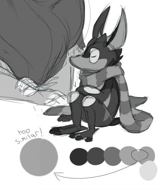
as you can see, the values of these two colours are too close, and therefore difficult to distinguish. i can fix this by making one of the colours a little lighter or darker. for now, though, i'm going to move on to the other characters.

this one's straightforward! instead of having multiple, very similar shades of yellow, i'm going to change Lily's body colour to be the same swatch as the yellow on Pesky (which is also the same one on Baron).
now, i feel as though Pesky's blue, being closer to purple, doesn't really look right next to Frog's blue-greens. i'm going to employ a trick i frequently use--the hue/saturation/luminosity sliders.

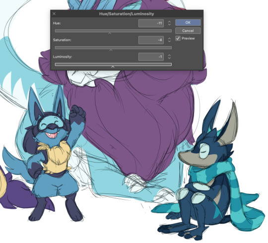
a bit more tweaking, and i have a colour that looks MUCH nicer next to the others!
at this stage, i'll admit that i'm not sure if i'm totally happy with that colour for Pesky; there are times i'll spend hours tweaking colours for one character. but, for the sake of this post i'll move along.

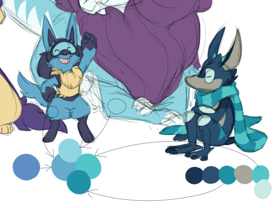
so here i have a choice to make: the darkest colours on all four characters can be unified better, and i have many options for how i can do that (and i should try all of them, to see what looks best to me). i can make Pesky's navy the same colour as Frog's, or vice versa; i can make Lily's purple the same colour as Baron's (in order to make the contrast between Pesky and Lily's purple better); but there's one more trick i like to do that i haven't shown yet.
do you have two similar colours, but you don't want to make one lighter or darker? blend them together!


so, using the techniques above--bringing the colours closer together, and checking the contrast between them--i'll keep tweaking all four characters, until i have a result i'm happy with. (note: most of the time, i'll make exceptions for the insides of their mouths and their eye colours--those can be whatever!)
one more thing! i love having an art program that lets me compare my current colour with my new one, especially if i have a particular swatch i do not want to change! photoshop does this, clip does this, procreate does this... not sure what others, but i'm using clip.

some additional tweaking, and here's the newest draft!

it's very likely i'll go back and make more changes, but for now, it's good to take a break so i can come back to this with fresh eyes later. :D
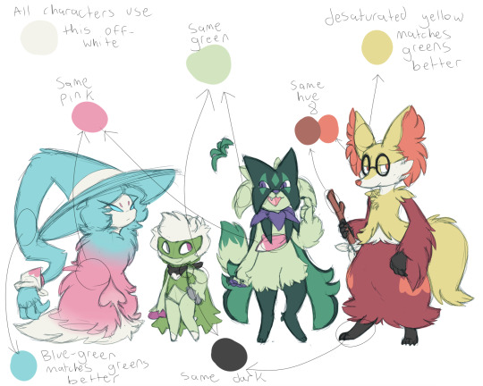
unfortunately i can't go back and show the exact process for picking the palettes for ask-meowscarada, but i can show you how some of these techniques were applied!
here's an example of a set of characters from my WIP project, without any notes (the designs are outdated but the colours are basically the same):

these rules don't just apply to character palettes, either--here's a commission i did last year, complete with the palette i used for both the character and the background!
WHEW... if you read through this entire post, thank you for sticking with me!! there are MILLIONS of ways to apply colour and i don't think any way is necessarily correct, but these techniques have helped me stay satisfied with the colour in my artwork for a very long time! thanks for the asking, anon, because i can go on about this for a REALLY long time... if this wasn't evidence enough LOL
#modscarada#(( not sure if i'll delete this one because idk if it'll get rid of the read more ))#(( BUT this was fun to compile anyways ))
30 notes
·
View notes
Text
The Color Series
So @throttlegainwell asked for some BTS on my color series and I am, of course, more than happy to provide :D
I think I want to talk about my color choices because I've talked briefly about one character and no one else's.
So, like six months ago now, I posted my Across the Vale series, which was character sheets for a DnD AU I had made of Stranger Things. Which was loads of fun to construct. And that is where I got many of my colors for the color series from. But, not all of them. Because I had, at the time, all the hex codes for the colors written down on a few different post-it notes and they were randomly picked based on vibes.
When I started the color series itself, I needed proper color names. So I started with those hex codes and looked up each one to get the color name. I have like three different sources I used to get color names from and I kept most of the colors. But, not all of them. Because some of them just... were not great. For example, only two of Jonathan's colors were roll-overs as two of them were just way too close together (as it turned out) and the fourth was University of California Gold. And as much as I laughed when that came up, I was not using that.
Now the DnD series had only four colors each, so everyone who had a DnD sheet got a bonus fifth color and from that I picked one where I liked the color name. If I didn't like the color name, I would pick something that was a similar shade to one that was dropped.
That worked overall. Many characters got colors similar to their color vibe in the show. Purple for Nancy, blue for Steve and Mike, yellow for Will, brown for Jonathan. The other kids don't have "colors" but I picked green for Lucas, red for Max, and orange for Dustin because the vibes. Joyce (which I've talked about somewhere before) got a blend of Jonathan and Will, also being very earth-toned. For El, I wanted to make her more faded cause she is still learning who she is. So she has purple and pink (mainly pink) tones, but they are very grey-leaning. I did something similar for Hopper to tie them together, green but very grey-leaning.
Robin, Argyle, and Erica got way more fun vibes. Robin's is quite literally the lesbian flag. I pulled the hex codes initially directly from it. I wanted Argyle to similarly be very fun colored, some of his are from the pansexual flag, but they are overall very bright and fun. For Erica, I experimented a bit and many of her colors are pulled from her outfits leading to fun array of colors as well. Dmitri, well, I intended him to be the Russian flag. It was an accident he ended up so bisexual themed XD
Everyone else got one color assigned to them. They didn't have color sheets, so I was starting everyone else from scratch. I would think of what color generally fit them and then go through my color name sheets and find a color name that fit them. Lots of scrolling and searching. With some, I did follow the Erica route and pull the color from something they wore, like Chrissy and Heather. Some were pure vibes like Eddie or Karen. I still have the huge list saved of everyone's color assignments.
One thing I did try to do when making the sets is make sure no one had the same middle blend color. Sometimes, with the larger sets, the second or fourth would be the same somewhere. But the middle one was always unique. This was quite a challenge sometimes. With the characters with multiple colors, I would just change out the color they were for another when I noticed the blended color was the same. Photocheer was actually very difficult because of this. I think using the color Rabbit for the Jonathan side was my second-to-last choice. I really struggled with it. But I have a second list of all my blended sets and their colors. And as I made more and more, I started having to ctrl+find to make sure the color wasn't used elsewhere already. Cause many of the sets I posted in January were already made before I started making the sets I posted in December. So it became a problem really early on in the posting process. I think I managed to pull off never using the same photo twice as well, but I could be wrong.
One type of set for this series that I'm actually kind of sad that I haven't made is any friendship sets between the main teens and the kids outside of siblings and group sets. But it is a kind of set I would want to make equal and there just isn't good interaction between some characters that I would be able to justify to myself.
I hope that works as those are some of my thoughts on making this series! I am happy to go into more of any specific part if anyone has any further questions. This series really was a labor of love and it introduced me to so many ships. Like holy cow... But also, I hope I got to introduce some to you guys too.
3 notes
·
View notes
Text
WoF fanfic - Whiteout
I lift my head. Whirls of ugly cobalt come from the direction mother and father are. They finally quieted down. They know my hearing is sensitive. But oh well. Let the flow go on as the clouds brush by.
I stand up. Father was at the table and mother was starting on dinner. The tension and silence was horrible. I hear brother come in. I immediately rush to him. I need his rays of yellow to effect me in some way.
He wraps his wing around me. "How was your day?" he asks softly, his usual waves of yellow and light blue echoing off of him.
"My ears ring. And not like a song. It just plays on and on."
Brother gives me the usual face of confusion. I don't understand why everyone makes that face when I speak. It's a perfectly understandable response.
"Were they fighting again?" he asked, tightening his wing around me.
I simply nod, keeping my head low.
Waves of bloody red immediately radiate from him as thoughts of blue, blue, blue father come into play.
"No, no, no," I bed. "Don't start conflict. The silence has come. The time is done. There is dinner mother is making. Let's go get some!"
Brother exhales with his head lowered, but then he lifts it and smiles at me. There's only a couple things I know keep him going. A beautiful dragoness whom I've never seen nor met. She must be someday when the sun and moon rise and fall many times. And me and mother.
I lead him to the kitchen, where mother is setting out plates of mountain goat.
Father growls and says, "It seems we're having goat. Again." I see an ugly aura of green coming from him and I flinch.
"But it's so tasty, see father?" I try to grab his attention, which he only gives me half of.
I look at mother. "Thank you! I will eat this charitably!"
Mother gives me a smile, beautiful shades of blue radiate from her, calming me. But then, the blue turns to burnt orange as her ears flatten against her head and she turns to father. "Give your daughter some time of day," she hisses at him.
Brother sits next to me. "No, She doesn't deserve his attention," he says coldly.
Brother and father do one of their usual staring contests.
"How dare you think that!?" brother hisses. I jump. I usually block out my family's minds as I find them as untraceable as a song from an albatross that is trapped in another dragon's claws.
"Stay out of my mind!" father exclaims.
"What did he think?" mother asks brother.
"He imagined using a spell on Whiteout to make her a killing machine for the IceWings and he's use her to kill me!!"
Mother's eyes go blank with coldness. So cold I shiver. Is there a wind? Can the clouds just stop moving? Can they stop moving so fast!?
Shouting breaks out among my family, I caught in the center of it. I shrink down into my chair, covering my ears as I try not to cry. But whirls of burnt orange, green, and brown all cloud my mind that I can't help but break into tears.
But no one notices.
Except brother.
He helps me up and leads me into my bedroom. The painting I finished earlier was still drying on the canvas.
Brother's mind is a deep, troubling purple that barely calms me.
He sets me on my bed and gives me my toy of the creature he calls 'scavenger.' I call it 'human.' The humans in my classroom said what they were. Can he not hear it? was what I wondered for a while.
I curl into a ball and my brother puts blankets over me. He's trying to have me rest. But I can't when the yelling is still.. so... loud...
Brother senses this.
"Ohhh, we're going high above the skyyyy~" he sings softly. A lullaby... One he created a couple of years ago. "And we'll fly real super high. And we won't come down. Even if the rain starts to pound."
I join in the quiet singing. And soon, we join together in our own quiet melancholy. "And even if the birds get mad. We'll keep flying so we won't be sad. Then the rest of the day won't be so baaaaad. Let's keep flying. Fly, fly, fly..."
And I slowly drift to sleep, the last color I see is brother's pale red...
4 notes
·
View notes
Note
👁 I heard you can info dump about colors
Oh yes I do 👀
So in your post here (x) you asked: "I wonder what makes things "go together" like, why do some colors look nice together and some don't? and why do they look good to others? why do we have favorite colors?" let me go over them one by one!
Important: this is an info dump. I learned a lot of this in school from my apprenticeship (Graphic Design digital and print)… though even before that it has been a special interest of mine. Though I am also a student and focussed on giving out scientific accurate information. So I linked sources and fact checked my knowledge (new information always welcome 👀✨).
Also: my first language is not English and I was taught British English in school, so… please be kind.
To make the post a little less of a "do you like the colours of the sky"-long post, you can keep reading here after the keep reading-break 🧡
"why do some colors look nice together and some don't?"
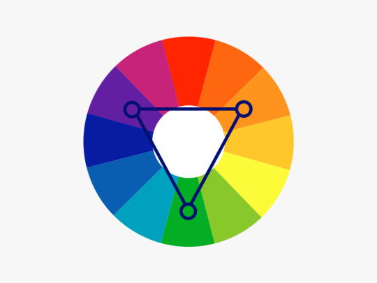
First: the colour wheel(s)
I know, I know, we always have to look at the colour wheels first. Though… they are an extremely crucial part of this, so understanding them, where they come from and such, already brings you close to find your colour palettes ;W;
There are basically two different colour wheels. In colour theory history there have been a few different wheels (for more research if you like: 1704: Newton, 1810: Goethe … there are more, but these are most important) you will see both of them being used in different context.

First: RGB colour wheel (by DanPMK on Wikipedia CC BY-SA)
Triad of Red, Green and Blue (based on Newton).
Based on the additive colour scheme.
Used in lighting, digital colours and screens.
Yellow is on the opposite of Blue.
Digital art programs use the RBG model, so those usually go with this one.
Little CMYK ramble: When you look in between of the RGB triad, you find CMY, which IS based on RGB, since this is how body/phisical colours, light and our eyes work together. The added "K" is … Key, aka Black, since in printing you can't just print 3 colours in 100% onto each other. First of all: it will be a very muddy green-brownish almost-black colour, while it also takes too long to dry, will smudge, clog up the printing machines, which then need more cleaning… and trust me… any printer will call you and tell you to change the colours, so you don't have 300% "dot gain" aka "total ink application".
Second: RYB colour wheel (by Kwamikagami on Wikipedia CC BY-SA)
Triad of Red, Yellow and Blue (based on Goethe).
Based on the subtractive colour scheme.
Used with physical colours, paintings, for artistic understanding
Yellow is on the opposite of Purple.
You find this wheel ONLY in general artistry and most sites that talk about contrasts will use this one.
source: Wikipedia (shhhh~) | I… basically described the pictures | Bauhaus
Quick vocabulary check in:
Hue — Fully saturated colour on the wheel. No white or black has been added.
Shade — adding black to a base hue (deepens the colour down to black) — it changes the Saturation.
Saturation — intensity/purity of the colour
Tint — adding white to a base hue (softens the colour to pastel up to white) — changes the Luminance.
Luminance — brightness/light in a colour
Tones — adding grey to a base hue(subtles down the colour, but can also add complexities into it) — another saturation change!

source: Canva
Harmonies err… Colour Contrast
We finally get to talk about colour harmonies, or from now on: contrasts. Since harmonies are neatly tied to contrasts. There is no "one way" to this, there are many, and also: you can (and should) combine them.
Monochromatic
You choose your colour and then run with it. You only add white to it. The deepest hue is usually the one you chose or you add black to it, to make it darker.

Complementary
Probably one of the contrasts that are being utilised or talked about most. You use one of the two colour wheels and basically pick one colour and then pick the colour of the opposite side.

Split Complementary
You choose one colour, and then go to the complementary colour, to just use the two right next to that one.
Triadic/Tetradic
Basically you use the three or four colours on the wheel, that are equally spaced from each other.
sources: Dulux
General Contrasting
— adding harmony edition ✨
Since these where just the ABSOLUTE basics, and there is no (literal) nuance to these, those contrasts might work with each other, but the problem is: they all have the same value. They are just fully saturated hues that kind of scream at you and there can't be a harmony this way.
warm/cool and light/dark
You contrast your art with warm and cool colours. Basically, if you have a generally cool toned picture, the warm tones will pop out and these will be your eye-catcher.

opacity/transparency
The deepest hue is the hue you choose, you basically turn down the opacity, letting the hue below shine through as well.
all sources: Bauhaus | Dulux | Canva | Wikipedia
Some things I do
No srsly. This is the part, where I am giving advice that is based on what works FOR ME. If you want to do things differently or want to get more advice from different artists, to find your ways, please go ahead and look up some more. It is important to find the way for colouring you have the most fun with. It is your art after all, I will not set "do's" and "don't-s" bullshit rules.
If you have a colour palette you are generally happy with, but the colours still seem a little "off" to you?
traditional ways:
-> with opaque colours: make an underpainting with a colour you'd love to pair your palette with
-> with water colours/ink: a very thin colour coat over the whole painting (make sure to use masking-fluid for parts you want to keep white)
digital way:
-> open another layer
-> set it on "overlay"
-> throw a colour you like over it, that will fit the vibe — I often use some colour psychology and a colour association that fits the vibe
-> turn down the opacity, until you are happy with it 👀
Using one prominent colour as an eye catcher and then use it ONLY for the exact part you want to draw (huehue) attention to
-> most affective if it has a little higher saturation than the rest of your palette
-> also PERFECT moment to find a complementary/warm&cool contrast to the rest of the painting
Shadow tipps
(digital) I figured, that shadows work pretty well by using a complementary colour on a multiply layer and then just turning down the opacity of that layer (you can layer those as much as you like)
10-30% for the contrast to not mix too much or become muddy.
With shading I do the same percentage "rule", while also using a complementary or warm-to-cool/cool-to-warm colour contrast, for more definition.
Have some cool (and free) tools!
PuccaNoodle — Animation/Art Ressource Sheet
-> there are so so SO many more tools in this sheet. Seriously, I absolutely recommend AT LEAST looking through the different sheets
Colour Picker Tools
-> Adobe Color — colour wheel/colour palette generator
-> Canva — colour wheel/calculator
-> Coolors — random color palette generator
-> Flat UI Colors — assortmend of different UI flat-colour palettes
-> Paletton — colour scheme designer
Skin tones
-> by FizzyGutz on twitter — thread
-> by Kupadraws on twitter — thread
-> by @peachdeluxe — post
Colour theory
-> by DevinKorwin on twitter — thread
_________________
Next Up: why do they look good to others? why do we have favorite colors?
Since I basically wanted to put these in here as well, but… the post is already extremely long, I will split these ;w;
There will be colour psychology involved!
#answered#snobgoblin#shapes and colours#I will answer the rest of your questions as well#I just… need a breather :D#and this is already so incredibly long#AAAAAAA#I AM FINALLY DONE WITH THE FIRST PART EEP#info dump
5 notes
·
View notes
Text
@sunorweek2022 day 3/ Domestic/family, yea dont question it it kinda went places and norway is having a whole ass theological conversation with himself at 4 in the morning(I'm sorry this has no tags, my phone was being crustier than usual, I'll tag when I get the chance.)
Quiet mornings were always the best, Sweden was still asleep, snoring like a foghorn while snuggling Norway like a puppy, an oversized and very pretty puppy. Ladonia was sleeping behind Sweden, he could have been in a dangerous place because if Sweden moved in his sleep then the child would be squashed, but luckily for him, Berwald slept rather still and didn’t move much, something that peter has used numerous times to draw strange things onto his face.
But for once everything was quiet
Very strange indeed, usually there was someone awake, screaming or yelling, footsteps pattering around the place, whether they belong to people or to animals.
But now it was just quiet, and calm, the sun was in its daily process of rising and the light cloud cover made the scene look absolutely divine.
Rich oranges and reds streaked though muted greens and blues, purples shining bright in the sky as the colours mingled and mixed, like a painting done by a child, the stars were still there, some of the brightest still twinkling away far away in the cosmos, the moon a large crescent looking like a white sheep in a crowd of beautiful colours and shades, growing dimmer as time went in and the sun continued its pursuits, but it didn't fully go away.
Hanging there like a stubborn child, watching as while everything changed around it, it wished to stay the same, hanging sullenly in the sky, watching as the sun continued to take over the sky.
The sky is a beautiful thing, it could convey so much just by being there, and today, today it was comforting, pulling Lukas back into the bed where Berwald immediately grabbed hold of him, and nuzzled him dearly.
Poor Berwald, his appearance drove off many of the most frightening nations, without them knowing at all how he was, a tender soul, fractured from years of hardship and war.
But then again, weren't they all?
The way that he put the torn and shattered soul back together was the part that mattered, he was a soft spoken man despite his appearance, he was terrible at communication, worse than Norway himself, which was to say incredibly bad, so he showed love through acts of service and gifts made with such love and tenderness that it was impossible not to melt at seeing.
For many nations, they never managed to fully put themselves back together after their hardships, and a disappointing many never even tried, choosing to stay as broken husks of themselves rather than taking initiative to fix themselves.
Lukas was like that not too long ago, using his blank face as a facade not to show how much he was hurting, how much he wanted to just break down and cry in the arms of someone who loved him unconditionally, it was hard, keeping up such a strong face through internal and external turmoil.
One letter by a Swede.
One letter was all it took to break down, not with tears of sadness, but instead with joy.
It was a hard time for them both, they had a long and complicated.history together, and while they could never just forget it, the present was more pressing than the past.
With that thought, Norway drifted off to sleep in the affectionate clutch of Sweden as the sun continued to rise, bot stopping for the silly little people and nations who it oversaw.
The cosmos is always watching, it always knows, perhaps even things you don't.
But for now, all was good.
6 notes
·
View notes
Note
🍫 & 🎶 for the edit ask game!
🍫: what's your favorite and least favorite part of editing?
My favorite part is playing with colors and designs! It's just something about testing what color schemes would work or "ooh, should I do a grid background or add some shapes here?" that excites me. I guess, let me drag writing into here for a bit, it's like when you're writing a story you're playing with words to create a masterpiece for enjoyment. That's editing for me. I'm creating a story but visually with colors and shapes.
My least favorite part is finding pictures and choosing what pictures to use. Especially, the latter. Depending on the character, I can find so many pictures that I feel like crying because I want to use them all at once. And I like for my edits to be unified... is that the word I want to use? I like for the pictures to go together because it's a set. I don't want just choose random pictures for a set and then once I post them, the display is messy.
🎶: do you listen to music while editing?
I do! More than when I write. It's gets me into the mood when I edit. If you noticed, more of my edits are brightly colored. Pinks, purples, greens, blues, etc. It's because I tend to listen to music that's really upbeat, so my mind will go to use a color that fits that song. Also, I listen to music that corresponds with the character I'm editing for.
There's also the matter of how I want those edits to look emotionally. Back to the bright colors thing, if I want the icons to have that euphoric feeling, I'll listen to songs that give that feeling and visualize the colors that reach out to me. Example, 'Candy' by Doja Cat, gives me pink. So when I do Uraraka edits, I'll probably listen to that song, not because I think the song fits Uraraka, but because the song gives me the shades of pink I particularly want to use that day.
I am not ashamed to admit, but I like to listen to a lot of those anime rap songs on YT, so when I do, let's say a Todoroki edit, I'll listen to a Todoroki song.
EDIT BLOG ASKS (PART 2)
2 notes
·
View notes
Text
Your Ex Shows Up At a Gig and You Are Absolutely Rocking It. (Literally)
Alright some Acronyms to know.
YEN- Your Ex's Name
EFN- Ex's Friend's Names
YN- Your Name
YEFD- Your Ex's Favorite Drink
Songs for the chapter:
IDKHOW songs: "Infatuation" "Clusterhug"( Broebcks and iDKHOW mash version)
The Brobecks songs: "If You Like It Or Not" (demo music, it has that 8bit stecato, but official release lyrics!)
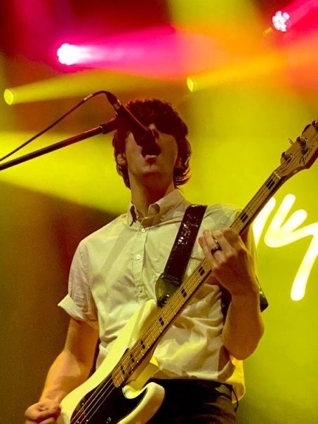
Dallon's Outfit!!
white button up, short sleeved, rolled up to right below his armpit. black suit pants. Black dress shoes. Messy brown hair, gorgeous bluish/green eyes. He’s TALL very tall.
Your Outfit!!
Fave band tee or iDKHOW/ Brobecks!! Darker demin blue jeans (ripped) black fishnets underneath the jeans. Fishnets under your shirt that spread to your finger tips. Silver chain necklace, couple helix piercings, couple small scattered tattoos.
(Whatever makeup you like/clean face if you don’t wear any :)
I'd add thicker combat boots or a cyberpunk look! Makes you look taller and edgier!!
Y/N Fem reader!!
For all the girlies out there that occasionally have a small episode of missing their ex, this will pick you up and make you feel more confident! Especially if you love Dallon Weekes.
YOUR EX'S POV:
My feet shuffle down the sidewalk, kicking a rock as I go. I completely ignore anyone who passes by. The sky radiates vibrant shades of red, pink and purple, even some blue. The clouds a perfected cotton like texture.
"You guys here yet?"
My Friends:
"AYEEEE YEA!! WE HER"
"YEA, MAN!!!! PARTAY!!!"
"There's a sic bamd here. They're pretty goud. Hot girls here two." A perverted smirk grows on my face. A night i can easily forget and shove everything down.
I roll my eyes, 'Already drinking, I see.'
Even a block before I reach the bar, music is already being heard. People crowd around the door and bar trying to hear as much as they can. I walk by some peers, "I didn't know they had a gig here! No way! The power couple of the century and they didn't post a gig night! They sound like they're almost done anyways, wait Dallon's talking. It's completely crowded in there." "I wish we got seats!" My grimace grows as I open the door. As soon as I reach the threshold, a sea of people greets me. The only "hot girls" I see are the sweaty, red faced waitresses working. It's really warm in here. There's so many people that I can barely breathe. Everyone's shouting that Dallon and a girl named 'Y/N' I had an ex named Y/N. I don't even bother looking at the stage until i found my group.
"Y/E/N!!!!" Faint screeches steer me in my friends' direction. I try my best to focus on the path to get to them first. Cheers and claps paired with hollers and whistles to the band. Laughing from the band members can be heard. I finally reach my destination and sit down next to my best friend. "YOOOOOOO Y/E/N HOW'S IT GOING?!" He grabs my shoulder and shakes me vigorously. "We just saw each other at work like 2 hours ago..." My dry attitude earns a stiff laugh from him. "Hey, please get him a Y/E/F/D!" "Ahhh, nah, I'm ok for now, thanks."
My mind quickly changes when i hear a certain voice. It was hard to recognize at first. As time went on, I guess the pitch of voice got deeper. Time suddenly slows literally like in the tv show. My stomach and heart become one and feel like they're being dropped from a severe height. My eyes slowly scan the chaotic environment to the stage. Stomach acid shot up into my throat. There she was. My ex, "Y/N" an airy whisper shot out. Looking gorgeous as ever. Sweating, playing and singing on stage with a band?! When we were together she didn't have any interest of playing instruments. She basically just had college, daddy issues and a sudden drinking problem.
"Wait... is that...?" E/F/N asks, I sharply nod. Part of me wanted to shout obscurities at her and get her attention, but i found it to be unproductive. The other part of me feels, relief? Relief that she's not a... not in... alive still I guess? She had a lot of mental health issues and some bad habits. Flecks of jealousy are discovered in the base of relief. 'In a band? Playing bass? How? We've been broken up for almost 4 years now. She seems like a pro.' Are those tattoos?! Her hair is parted and fixed to wear I can even see some additional piercings. Holy sh*t she’s changed quite a bit. Her fingers effortlessly slide and press and release the strings of the bass. I can see what colors she has for her bass when the lighting switches to normal. A black body, a very dark brown neck, a very dark blue pick guard with silver, glowing strings, silver tuners, i can see sparkles in the pick guard as her guitar as it shifts around.
"Tonight, we are debuting our newest release, "Infatuation" it's been a dream of mine too have female backup singer. But I actually am going to let Y/N take the lead here." Y/N slowly swivels her head to the guy talking and her finger pokes her chest. "Yes, you, love." The last word stings for some odd reason. ‘They’re together??’ It seemed like they were for centuries. The way they looked at each other, the way they just complimented each other. The lyrics, their movement. Their lustful gazes, their lovestruck gazes, their speech, honey drips in their tone as they talk to each other, even serenade one another. The crowd whoops and hollers as Y/N slides up the notes scale and arches herself so she can look at the ceiling all while playing the guitar. All while Dallon is behind her and beside her. They move in sync as their legs wobble to where they hunch down. Apparently, it’s his signature move and she coped in on it at the right moment. It was like they were made for each other.
Did he write this song for her? The song’s lyrics were juicy, almost scandalous. The way he just towered over her and gave her telepathical kisses was insane. Her hair begins to stick to her forehead just like his. She begins to wrack her head around to fight off the stray hairs sticking to her face. Some guys/girls whistle. Y/N chuckles and leaves her gaping smile on her face. As they groove and dive forward with the beat, my stomach swells and knots. I feel like I’m going to be sick. All this time, and she wasn’t mourning me? She was playing with this douche? For how long? How did they end up together? Is he just as unwell as she was?
As the song ends Dallon steps back and finds whatever song they wanted to play next. It was just the two of them and a drummer. AN: (Not Ryan cause he was fired for stealing irl) Dallon held the electric guitar with ease and maturity. Y/N was at times stiff only to loosen up when she’d bend and wiggle with the beat.
Y/N and Dallon finally separate from their battle of who can look into each others eyes the longest as they run their eyes up and down each others bodies. I raise my hand for a second drink. The waiter instantly hands me one. Y/N raises her hands and boxes half the room in between her arm span. Dallon does the same with his arms but it covers most of the audience. The crowd chuckles. “Is that ok, love? You can be louder.” He backs up and turns her monitor up more. “No wayyyy. We got this!! Right Clusterhug Brobecks crew!!” The small group cheers. “Let’s go!” Dallon instantly plays the music and they hop up and down on beat. “They’ve never done this before!!” A girl screeches. “This is awesome!!” Another girl squeals. Geez when did so many people start to love them? “I’m so confused” E/F/N calls out. Y/N swings her head to us, she shrugs jovially and simultaneously strums the bass.
my group was practically torn down the middle of the crowd. We obviously didn’t participate but basically the rest of the room joined in loud company. Y/N kept up with Dallon as perfectly as she could, which to my surprise under such a crowd is just nauseatingly well. Her vocals harmonize and some of the lyrics are actually different than Dallon’s. I can’t quite make out what she’s singing compared to what he is, the alcohol is kicking in.
3RD PERSON POV:
As the song comes to a close, Y/E/N only grows more and more inebriated. Restless more or less. His awkward pacing gives Y/N a chance to get some eye contact. As she sets the pace for the next song, her eyes trickle down to meet his. His ashamed, rosy face emerges from the crowd. A devilish smirk slowly and tauntingly grows on her face. Her eyes glaze over, her eyelids start to lower till they get to the halfway point. She defeats him. And he feels it. Without a word, she knows she wins. His eyes dart elsewhere. She takes a victory lap while singing the demoed version of, “If You Like It or Not” released lyrics, but demoed 8bit sound. Oh how she loved seeing him shiver and shake about while Dallon and her sang about each other. Being together forever with Dallon is all she has ever wanted. Y/E/N knows that now. As Dallon strides to Y/N his saunter sneaks up to her. Her head is raised by his fingers resting gently under Y/N’s chin. He sweetly massages it and gracefully edges his fingers off your jaw. Her vision follows his fingers up to his eyes. Y/N locks attention to him. Her mouths hang open with suspense as your erotic lyrics drip with satisfaction and elegance. All she could imagine was him holding her in his arms. Dallon sweetly kissing her, grabbing at Y/N’s hands to hold. His sweet, wholesome nature arouses her in such a way. She gives in almost every time when an opportunity presents itself. She just can’t help it. It’s Dallon James Weekes. The most beautiful man she’s ever been with or seen is captivating her. There he is standing in all his glory, a glow under the lights. Hes taking captive of every thought behind Y/N’s beautiful eyes. As his fingers slide and push down the metal strings on his bass, Y/N is hypnotized by the veins on Dallon’s hands. She memorizes every movement and twitch of his hand to remember later for after show fun. Its hard to do anything else after a couple’s show high. Dallon’s mouth drops slightly and Y/N internally swears she can see drool seeping out of the corner of his mouth as she teases the stringer ever so softly.
As Y/E/N turns to leave, Y/N speaks. “Well” she swiftly fans herself as her and Dallon still pant rapidly. “As we come back down from that…” her eyes bulge and a s*it eating grin can be found. “We have 2 more songs for yinz tonight,” that Pittsburgh twang broke out of her for a split second. Y/E/N immediately leaves to go and hurl onto the concrete outside like a typical old drunkard who lost his job. Except he still has his ol job, but he lost his pride that night…
AN: yoooooo I feel so much better after that. I feel powerful! Hope you do too!!
#dallon weekes#dallon weekes x reader#idkhow#the brobecks#fanfic#yn#writing#mature fic#i don’t know how but they found me#bassist#bass guitar#concert#celebrity crush
0 notes
Text
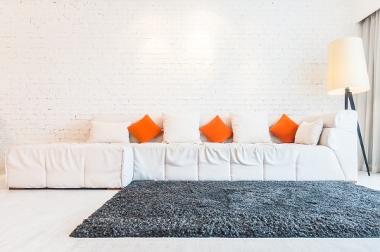
Decor tips to enhance your home this new year
Welcome to the new year, everyone! With the start of a new year comes a renewed sense of energy and excitement. And what better way to kick off the new year than by giving your home an exciting new look? Whether you're looking to make a big change or just want to freshen things up a bit, we've got some interesting decor tips to help you liven up your home.
Also Read | Visioarq wins Architizer 2022 Architecture + Wood
1. Play with colour
One of the easiest ways to give your home a fresh new look is by adding a pop of colour here and there. But instead of going for the usual suspects (beige, white, and grey), why not try something a bit more unexpected? Try experimenting with bold and bright colours like fiery oranges, electric blues, and deep purples. Not only will these colours help to create a truly unique and personalised space, but they will also be an interesting topic of discussion among your guests.
2. Dramatic textures
Give your home a fresh new look by experimenting with different textures. Whether it's through furry throw pillows, a fluffy shag rug, or a woven wall hanging, adding a variety of textures to your space can help to create a cosy and inviting atmosphere. A good tip for this is to incorporate natural materials like a woven jute rug, bamboo shades or, a woven wall hanging. These materials are all the rage this season and will help to create a warm but modern atmosphere in your home.
3. Scale your look
Ever thought of playing with scale? This can be done by pairing large and small pieces together to create an interesting contrast. For example, you can hang a large statement piece of art above a petite side table to create a dynamic and visually striking look. Or, mix different sizes of furniture in the same room, such as a giant floor cushion next to a small chair, or a large sectional couch next to a tiny side table. The key here is to have fun and experiment with different combinations until you find something that works for you.

4. Plants, plants, and more plants
Plants not only bring a sense of life and energy to your space, but they also have a host of benefits for your health and well-being. With so many unique and interesting plant varieties out there, there's no excuse not to add a few to your home. From sculptural cacti to lush ferns, the possibilities are truly endless. Instead of sticking with the usual green plants, try something more unexpected like a colourful succulent or a vibrant flower to brighten up your space. And, if you're not sure how to get started, there are a variety of low-fuss, beginner-friendly plants available on the market today that make it easy to incorporate plants into your home.

5. Don't forget the planters
Planters serve the practical purpose of holding your plants and also can enhance the overall aesthetic of your space. Instead of using the same old basic pots and planters, opt for unique and unusual designs to create a focal point in your space and add a touch of character and personality. From sculptural ceramic planters to hanging wall planters made of reclaimed wood, you can let your inner creativity have a field day!
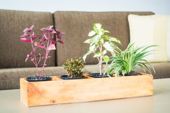
When choosing planters, also consider the texture. The use of natural materials like woven wicker or concrete, or interesting shapes and forms can add depth and dimension to your room. Choose a colour that complements the vibe of your indoor decor. Planters come in a variety of colours, shapes, and designs, so pick one that matches the feel of your space. Planters can also be a great way to divide and define different areas of your room. For example, using a large statement planter as a room divider can help create a sense of privacy and separation in an open floor plan, while also adding a touch of greenery.
Also Read | A floating pavilion as testing grounds for museum-to-be M. in Dutch new town Almere
6. Light up with lighting
Lighting can have a huge impact on the overall look and feel of your home, and the new year is a perfect time to experiment with different lighting options. From statement chandeliers to unique hanging pendants, there are so many creative ways to add light to your home. With the rise of smart lighting systems, it's easier than ever to control the lighting in your home and create the perfect ambience for any occasion.

So, there you have it! These are just a few interesting decor tips to help you enhance your home this new year. Remember, have fun and go wild with your imagination until you find an idea that works for you. Who knows, you might even discover a new decor style that you never thought possible. Happy decorating, and cheers to a beautiful new year!
Also Read | The summer beach edit by Tisva
Source Link
0 notes
Text
What Purple Suits Are The Best For Men In 2023
Purple suits are popular for men who want to stand out. They are also a good option if you want to make an impression at a formal event.
Purple is a color that can often be associated with luxury, power, and status. But what about those who don't have the money or the social standing to afford a lavish purple outfit? Another way to show off your love for this color is by wearing a purple suit! A Men’s purple suit can be an elegant way to show that you're dignified and sophisticated, perfect for special occasions like weddings or corporate events. So why start planning your wardrobe around this popular color today?
Purple is the new black, or so they say. And who are we to argue? After all, what could be more in vogue than a dramatic purple suit? Whether you're dressing up for a special occasion or just looking to add a little extra pizzazz to your wardrobe, these suits will have you stepping out of the ordinary.
So if you're considering investing in one of these fabulous garments, take some tips from our savvy team first.
Why Purple Suits For Men Is Necessary?
Purple suits for men are becoming more popular than ever before. Not only do they look great, but they also have a certain level of sophistication that can make any man look more put together.
Here are some reasons why purple suits are such an essential part of any man's wardrobe:
Purple is the color of royalty. It's the color of tradition and always looks formal and elegant. When you wear a purple suit, you're telling everyone in the room that you're someone important and worth respecting.
Purple is the color of mystery and intrigue. It always looks like something exciting will happen, no matter what you're wearing it with. Whether it's with a white shirt and black tie or just a plain shirt and jeans, purple always brings out the best in outfits.
Best Purple Suits for Men: Our Top Picks
Fancy Custom Made Purple Slim Jacket With Black Lapel
Many men opt for purple suits because they are versatile colors that go with almost everything. However, if you're looking for a custom-made suit, you'll need to go to a tailor with the experience and skill to create something unique.
Many different purple suits can find on the market, but some standout examples include the slim jacket with black lapel and matching trousers.
Purple Modern Fit 3 Piece Suit with Vest and Adjustable Waist Band Pants
Purple modern fit 3-piece suit with vest and adjustable waistband pants is perfect for any formal or semi-formal occasion. The purple color is a beautiful contrast against black or other colors, and the suit can dress up or down depending on the situation. The pants have an adjustable waistband that makes them fit perfectly to your body, and the vest adds a touch of elegance.
Whether you're looking for something to wear to a wedding or business event, a purple modern fit 3-piece suit is a great option.
Dark purple suits for men
Purple suits are a popular color for men. They can help you stand out from the crowd and make an impression. However, not all purple suits are created equal. There are different types of purple suits, each with its own unique features and benefits.
Here are some key things to keep in mind when choosing a purple suit:
First, consider the color palette. Purple is a dark color, so use it sparingly to avoid appearing too severe or sad.
Stick to lighter shades like blues and greens if you want a more cheerful look. Second, think about how you'll be wearing your suit.
A shiny purple suit will look great at a formal event but might need to be more appropriate for everyday wear.
Wear a matte or slightly textured purple fabric for casual settings that will stay comfortable throughout the day.
Research from the prior can stop this.
Purple suits for men can add a pop of color to any outfit and be versatile for various occasions. Whether you're looking to step up your style game or need a new go-to suit, a purple suit is a great option.
0 notes
Text
Process-Illustrations and Inside of Book
This is some of the process, for making my illustrations and the other bits that I decided to add in the book.
Unfortunately, I forgot to take that many pictures of the process. I know how important it is to back up your process with screenshots but the limited time for the project really made me subconsciously work on all the illustrations without thinking about anything else.
However, I decided to add the timelapse for two of my illustrations. The process for all of them is quite similar anyways so I don't really see this as too big of a problem.
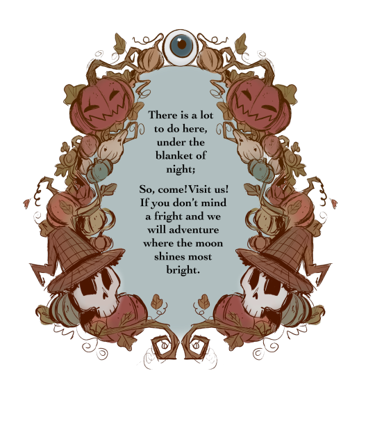
First Page
I wanted something special for the first page. In the show Over The Garden Wall, they sometimes put up images or text in these beautifully ornamented frames. They are usually made of the faces/ silhouettes of a character, a very important object for the story, or just intricate patterns and shapes.

I decided to create my own illustration in this style that would serve as the first page in my book.
Since I wanted to capture that old, folklore-inspired, fairy tale book style, I decided to refine the sketch and use it as line art. I mostly made the frame out of pumpkins, vines and leaves, with only two of my characters in it since I think they fit the best with the aesthetic I was going with. This was very easy and fun to make. I used the symmetry and mirror tools to speed up the process.
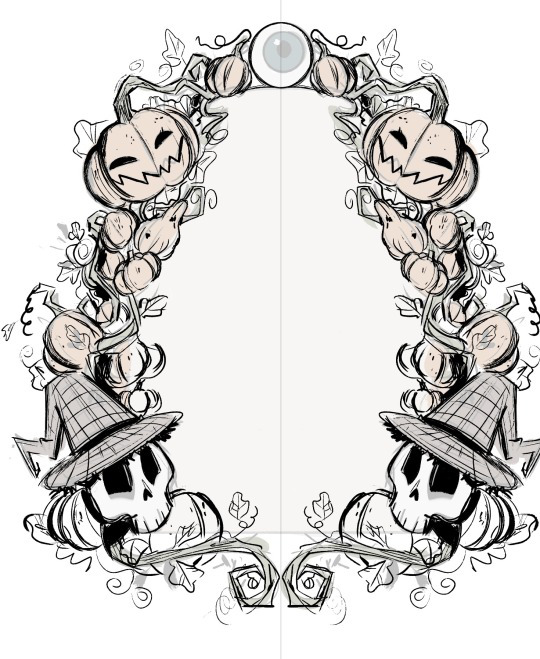
For the colours, I wanted something very soft and earthy that would suggest autumn. I mainly used browns, oranges and dark greens with just a few of blue-ish tones here and there.
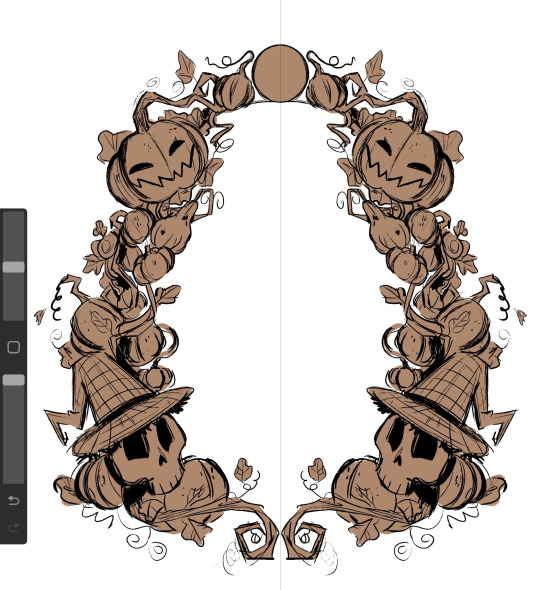
I wanted to make the illustration look like it was made with watercolours so I used a big air brush to fill in all the colours and shading. This made the whole thing look a lot softer, hand-made and as if the colours were mixing together.
I used a desaturated shade of blue for the centre and then put in the first verse of my story.
I absolutely love how it turned out. The only thing I would've added was some more watercolour texture here and there, to further emphasis the traditional aesthetic of it but in the end, I think it looks passable enough for what It is trying to look like.
Illustrations
I decided to make 3 of my illustrations on the same canvas which means I have all the process in the same video. Working on these was an absolute pleasure and I am very grateful for the techniques and useful things I have learned while painting (digitally) in this style.
As I have mentioned before, I wanted to go with a very sketchy, paint-y look for the illustrations. This gave me a lot of freedom and actually made me more confident in my ability of creating interesting shapes and brush strokes.
Up-close, you can really see how rough and unpolished everything is, and I thing this only adds to the charm, originality and character that children's books usually have.

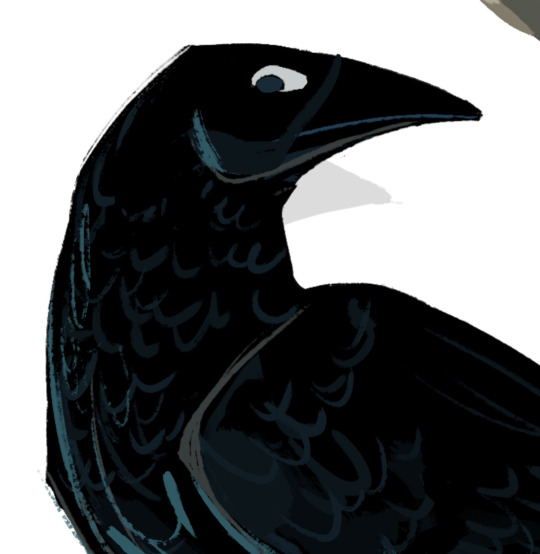
After I finished the 3 illustrations I had that were on the same canvas. I moved each one on it's on page, where I added any finishing details.
For example, I decided to add a nights sky behind the crow and a stone wall covered in ivy to sit on. I also tried to make some kind of animation/sequence by having the crow drawn three times while it took on flying . I added a white line of action to further emphasis the movement .
Since the crow and the background are both very dark, I decided to add some rim light along the edges of all the crow drawing with a muted shade of yellow, to make it look as if the moon was reflecting on its feathers.
This really separated the background from the crow and really added a lot of dimension.

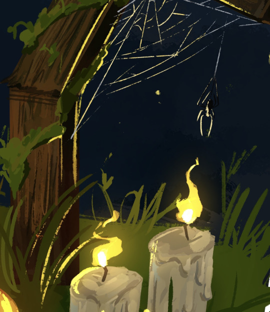
I did something similar for one of the others illustrations as well. Since I had the lit candles in , I had to make them glow and reflect on all the objects around it.
I started by creating a new layer, on which I added a very dark shade of blue-ish purple over the whole drawing. I put the layer on the blending mode ''HARD LIGHT'' which made everything darker and in harmony with the sky.

After that, I added some highlights all over the place with a bright yellow. This is also where I made the flames of the candles. For this, I used the blending mode ''ADD'' which made everything bright . I also erased the edges of the highlights with a textured brush to make them blend better with the objects they were hitting.

After that, I made another layer with the blending mode add and added a very subtle glowing effect with an air brush on all the highlights and the candle flames.
I loved working on the flames. Thinking about how the wind would hit the flames making them move was so fun and it added a nice touch of realism to the piece.
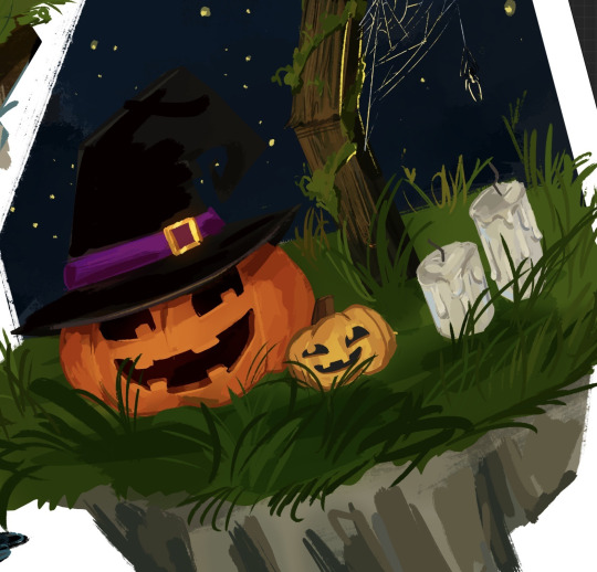
This illustration was made separately from the others. I decided to draw a cake and some dog paw prints in tune with the verse that it was representing.
I took a slightly different approach for drawing the cake. I made the ''sketch'' out of squares and rectangles using the ''rectangle tool''. I decided to go with a very generic design for the cake, I didn't want to spend too much time on the initial sketch.
After that, I started carving into the shapes, adding shading and dimension. This is where I decided to replace the pink icing with chocolate just to have more variation in colour. The wiped cream on top was a bit hard to do since the shapes was not something I have done much of before, but I think I managed to figure it out.

I added a lot of highlights on the icing to make it look shiny.

As a last, slightly gory detail, I decided to add eyes around the bottom of the cake. They were very easy and quick to do and they really accentuated the Halloween theme in the page.

This is a comparison between the ''sketch'' and the finished drawing.

As always, there is a lot of texture everywhere. This technique of adding random lines and strokes everywhere really became a signature element in my style that I have used for my other project was well. It is something I have learnt from movies like Spider-Man Into The Spider Verse and digital artists like Sam Does Art.

Bonus Illustration
I made also made this final illustration as a son of conclusion for my story, with the skeleton siblings having a fun time with the ghosts in the cemetery.
I was really inspired by the show Cuphead to make this illustration. In the show, all the background are made separately from the characters in a soft, hand drawn style, while the characters and the objects they interact with are made to look a lot more crisp and clean.

This is a technique that Disney used for very old animated movies like Snow White and Cinderella, where the background would be done on plastic sheets and the characters would be added on top of them.

Pattern End/Start Pages
While studying the components of a children's book, I have noticed that all of them would have the first and last 2 pages be made completely out of patterns of drawings or shapes on a simple coloured background.

The functional purpose of these pages is to hold the book's interior to its cover and protect the insides of the book. However, this doesn't mean that they have to be blank, The can have little drawings, repetitive shapes, patterns and other visually interesting elements.
I decided to create my own end pages. This only took around 20 minutes to make. I decided to go with this beautiful violet for the background. I thought this colour worked nicely with the blues of the front and back covers.
Then, I started sketching the little drawing pattern. decided to stick to the Halloween-y theme and have a crow, a witches hat, zombie brains, a few potion bottles and a pumpkin.
After that, I made the outline for all the objects. I decided against adding any other colours. After that, I simply duplicated the 4 objects and filled the whole page in. I duplicated the whole thing 3 more times after that.
0 notes
Text
Zee Architect
Zee Architect is Best Interior Designing Company in Patna. Some interior points are:
Paint color is a major factor in interior design, especially in small spaces where space is at a premium. If you have been looking for ways to spruce up your home decor without spending too much money, then choosing paint colors may be just what you need. There are some tips and tricks you should know if you want to make sure that the choices you make match well with your style.
First of all, it's important to think about the room you're going to use the paint for. You don't necessarily want to spend too much time trying to figure out what type of furniture you'll get once you've chosen a particular color scheme. When decorating a bedroom, it might be nice to choose something bright, bold, and cheerful. However, when decorating a bathroom, you probably want to go with something more subdued and relaxing. Also, depending on whether you have children, pets, or any family members who have allergies or sensitivities to certain colors, you might want to consider using pale shades instead of dark ones.
Once you have determined what kind of room you want to paint, think about how long you think you'll live in the house. If you plan on moving soon, you might want to choose a lighter shade than if you plan on staying put for many years. A great way to find out how long you'll be living in a certain area is to check with local real estate agents. It's always easier to sell a home before you move somewhere else, so having a sense of how long you plan to stay helps you determine which colors to choose.
When selecting paint colors, you want to remember to keep things simple. Choose two or three different colors that are complementary to each other rather than mixing several similar colors together. Complementary colors are opposite each other on the color wheel, so think pink and green, yellow and blue, orange and purple, etc. Try not to mix two or more colors that are close together on the color wheel, like red and orange, since they can often look garish when combined.
If you're planning on painting an entire room, then try to pick a color that works well with the existing decor. Don't forget to consider the lighting in the room. Paintings and artwork can really add a lot to a room, but if they aren't properly lit, they won't look their best. It's also important to think about what sort of mood you'd like the room to convey when you choose the right colors. If you want your room to feel warm and inviting, you might want to select warm tones like brown, tan, or gold. On the other hand, if you prefer to set a more formal tone, then you might want to pick cooler tones like taupe, gray, or even black.
You can buy premixed paint or ask your local hardware store to help you choose a color. Most stores offer free samples so you can test out various paint brands to find out which one suits you best. Remember that the paint you choose can only do half the work; you still need to apply the paint to the wall. You'll need brushes, rollers, and sandpaper to ensure that your paint looks its best. Once you have it down pat, you can begin thinking about the decoration for the room.
Color Wheel
A good rule of thumb when choosing colors for any room, including your kitchen, is to stick to colors that are complimentary. As you can see from the image above, if you were to take a color (Best Interior Designer in Patna) wheel and place the colors side-by-side you would observe that there is an inverse relationship between them. That is, one is darker than the other. So for example, if you were to chose a yellowy orange, then orange would be the complement to yellow. In turn, orange complements blue, red, violet, white, grey, and olive green.
Colors That Contrast Well Together
Another thing to keep in mind when choosing colors (Best Interior Designing Company in Patna) for a room is to consider the colors that contrast well with each other. For example, if you had a blue and a hot pink color, then those would clash with each other. Instead, select a cool blue and a warmer pink, or a light blue and a brighter orange.
Think About Mood
One last thing to keep in mind is that you shouldn't simply choose colors based upon your personal taste. Rather, think about what type of mood you want the room to convey. If you want the room to feel warm and welcoming, then choose warm colors, like yellow, orange, and brown. On the other hand if you want a room that feels cool and calm, then select cool colors like navy blue, indigo, and charcoal.
It takes a little bit of practice to learn to identify the correct colors (Best Interior Designer in Patna) to use in a room, but once you start seeing colors as individuals and think about what mood they are meant to evoke, you will be able to create a beautiful room.
Contact Us
Zee Architect is Best Interior Designing Company in Patna.
#zee architect#zee architect Patna#interior designer in Patna#best interior designer in Patna#top interior designer in Patna
1 note
·
View note
Last Seen Blogs
cheerycheekscloth
Creations
ggearth-blog
God's Green Earth
falloncarringtongifs
fallon carrington
uh-ohspaghettio
I Enjoy Pasta And Fictional Characters
odd-person-x
JOVEN INCOMPRENDIDO