#shapes and colours
Text
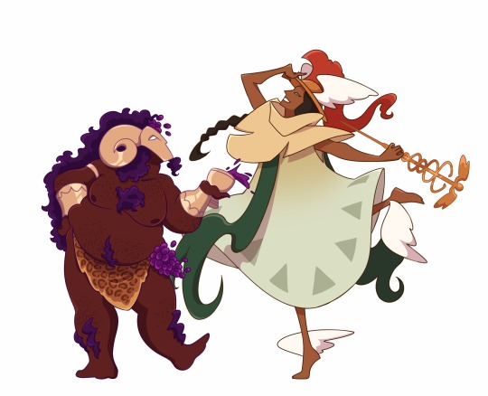
OLYMPIAN DESIIIIIGNS.
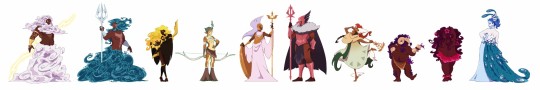
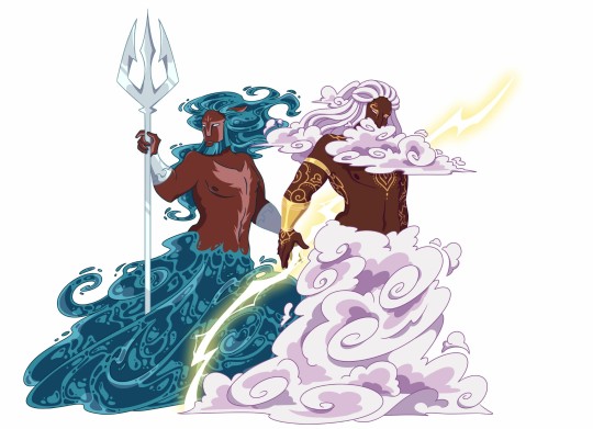
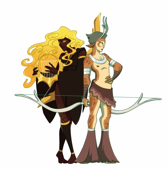
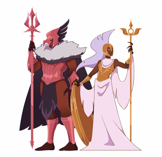
After all this time brainrotting on Greek mythology and the Iliad and all that stuff, I just HAD to draw consistent designs for the major gods. The first ten of them are finally done, and hopefully I don't have to name them, they should be pretty self explanatory. x)
I did a lot of research on symbols and iconography and shapes language, I'm kinda proud of those designs so far. Will use them in my doods. And can't wait to start working on the others (mainly Demeter, Hestia, Hades, Persephone and Hephaestus).
Update : Demeter, Hestia, Hephaestus, Hades and Persephone are done ! Updated lineup here.
#my art#character design#greek mythology#greek gods#olympian gods#zeus#poseidon#apollo#artemis#athena#ares#hermes#dionysus#aphrodite#hera#they're all based on one of their emblem animals if you couldn't tell#except for aphrodite it just didn't work out#SHAPES AND COLOURS#the iliad#(maybe)#tagamemnon#the way I paired them was also thought through#I am way too focused on this#sol art
2K notes
·
View notes
Text

poor, disposable Michael.
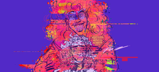
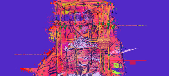
#tma#honkygaydraws#the magnus archives#michael shelley#michael distortion#michael the distortion#tma spoilers#cw glitch#cw bright colors#bright colours#eye strain#cw eye strain#glitch#poor disposable michael :’)#god i love drawing distortion michael hes so good#funkyyy#shapes and colours
701 notes
·
View notes
Text

im him or something
#monolith mumbles#monoliths art vault#art#shapes and colours#the quality isnt ass i prommy just click on it
98 notes
·
View notes
Text

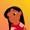
NEW PFP WOO HOO
#my art#lapine lantern#character design#evancore#clowncore#colours#shapes and colours#little jester boy#jester#furry#furry character#furry art#my fursona#fursona#clown art#honk honk#my sona#sona art#chibi art#chibi#chibi character
21 notes
·
View notes
Text

if they don't reunite next chapter I'm gonna blow up
#i miss them so much#the found family ever tbh#i haven't drawn in a while so it's kinda messy#since i honestly cut corners on cleaning up my sketch#but hey i like it so I'll post it#bsd#dazai osamu#kunikida doppo#atsushi nakajima#my stuff#shapes and colours#<- art tag I've decided
10 notes
·
View notes
Note
woo hoo
-cube anon
WOOOOOOOOOO
18 notes
·
View notes
Text
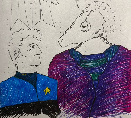
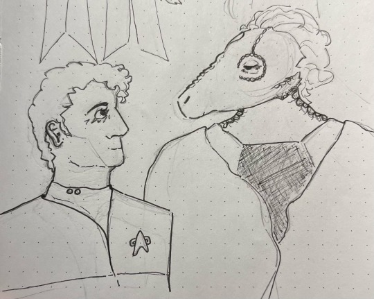


I love these guys! They’re the best around!
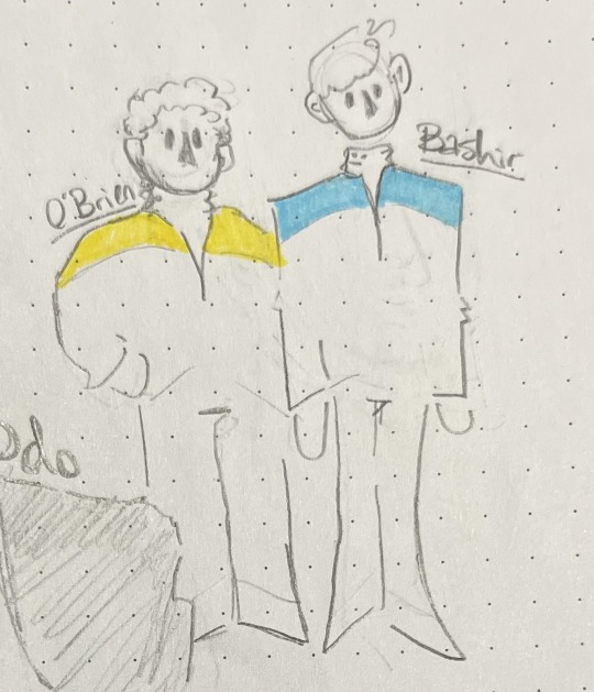
#what murdahhh#yep get doodled#I hate side profiles so damn much#julian bashir#elim garak#miles o'brien#odo#odo ds9#deep space nine#deep space 9#ds9#star trek deep space nine#star trek: ds9#star trek ds9#t0asts art#shapes and colours#fanart#art#pen art#star trek art#ds9 fanart
15 notes
·
View notes
Text

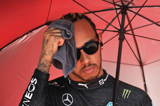
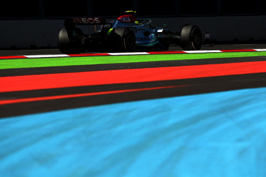
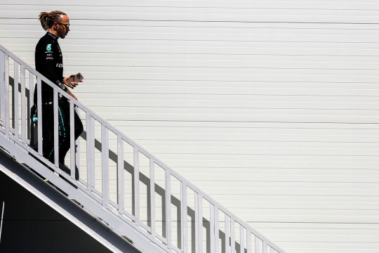
Lewis Hamilton at the 2022 Azerbaijan GP - Clive Rose, Hamad Mohammed, Ozan Kose, Peter Fox
94 notes
·
View notes
Text
Another drawing I started this night. It has some mistakes and I actually not really know what I did here... I will perhaps never finish it... Or perhaps I will just cut out the important parts and use it for whatever sort of collage my future self is gonna create.

For this drawing I used watercolour pencils*. [They are very smooth in their handling and their mildly-soft lead is good for smooth gradients. In the drawing they are not treated with water. (*It"s not the polychromos coloured pencils I mentioned in by latest post. ) ]
#art#wip#unfinished#math#math art#colourful#mathematics#abstract#abstract art#shapes and colours#color#colour#2023
18 notes
·
View notes
Note
👁 I heard you can info dump about colors
Oh yes I do 👀
So in your post here (x) you asked: "I wonder what makes things "go together" like, why do some colors look nice together and some don't? and why do they look good to others? why do we have favorite colors?" let me go over them one by one!
Important: this is an info dump. I learned a lot of this in school from my apprenticeship (Graphic Design digital and print)… though even before that it has been a special interest of mine. Though I am also a student and focussed on giving out scientific accurate information. So I linked sources and fact checked my knowledge (new information always welcome 👀✨).
Also: my first language is not English and I was taught British English in school, so… please be kind.
To make the post a little less of a "do you like the colours of the sky"-long post, you can keep reading here after the keep reading-break 🧡
"why do some colors look nice together and some don't?"
First: the colour wheel(s)
I know, I know, we always have to look at the colour wheels first. Though… they are an extremely crucial part of this, so understanding them, where they come from and such, already brings you close to find your colour palettes ;W;
There are basically two different colour wheels. In colour theory history there have been a few different wheels (for more research if you like: 1704: Newton, 1810: Goethe … there are more, but these are most important) you will see both of them being used in different context.
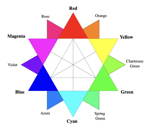

First: RGB colour wheel (by DanPMK on Wikipedia CC BY-SA)
Triad of Red, Green and Blue (based on Newton).
Based on the additive colour scheme.
Used in lighting, digital colours and screens.
Yellow is on the opposite of Blue.
Digital art programs use the RBG model, so those usually go with this one.
Little CMYK ramble: When you look in between of the RGB triad, you find CMY, which IS based on RGB, since this is how body/phisical colours, light and our eyes work together. The added "K" is … Key, aka Black, since in printing you can't just print 3 colours in 100% onto each other. First of all: it will be a very muddy green-brownish almost-black colour, while it also takes too long to dry, will smudge, clog up the printing machines, which then need more cleaning… and trust me… any printer will call you and tell you to change the colours, so you don't have 300% "dot gain" aka "total ink application".
Second: RYB colour wheel (by Kwamikagami on Wikipedia CC BY-SA)
Triad of Red, Yellow and Blue (based on Goethe).
Based on the subtractive colour scheme.
Used with physical colours, paintings, for artistic understanding
Yellow is on the opposite of Purple.
You find this wheel ONLY in general artistry and most sites that talk about contrasts will use this one.
source: Wikipedia (shhhh~) | I… basically described the pictures | Bauhaus
Quick vocabulary check in:
Hue — Fully saturated colour on the wheel. No white or black has been added.
Shade — adding black to a base hue (deepens the colour down to black) — it changes the Saturation.
Saturation — intensity/purity of the colour
Tint — adding white to a base hue (softens the colour to pastel up to white) — changes the Luminance.
Luminance — brightness/light in a colour
Tones — adding grey to a base hue(subtles down the colour, but can also add complexities into it) — another saturation change!

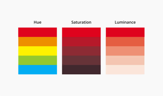
source: Canva
Harmonies err… Colour Contrast
We finally get to talk about colour harmonies, or from now on: contrasts. Since harmonies are neatly tied to contrasts. There is no "one way" to this, there are many, and also: you can (and should) combine them.
Monochromatic
You choose your colour and then run with it. You only add white to it. The deepest hue is usually the one you chose or you add black to it, to make it darker.

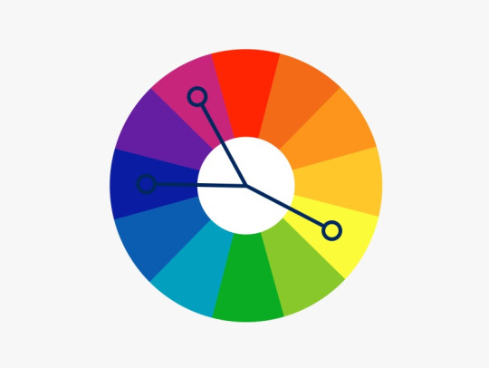
Complementary
Probably one of the contrasts that are being utilised or talked about most. You use one of the two colour wheels and basically pick one colour and then pick the colour of the opposite side.

Split Complementary
You choose one colour, and then go to the complementary colour, to just use the two right next to that one.
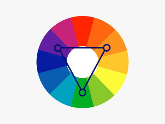
Triadic/Tetradic
Basically you use the three or four colours on the wheel, that are equally spaced from each other.
sources: Dulux
General Contrasting
— adding harmony edition ✨
Since these where just the ABSOLUTE basics, and there is no (literal) nuance to these, those contrasts might work with each other, but the problem is: they all have the same value. They are just fully saturated hues that kind of scream at you and there can't be a harmony this way.
warm/cool and light/dark
You contrast your art with warm and cool colours. Basically, if you have a generally cool toned picture, the warm tones will pop out and these will be your eye-catcher.

opacity/transparency
The deepest hue is the hue you choose, you basically turn down the opacity, letting the hue below shine through as well.
all sources: Bauhaus | Dulux | Canva | Wikipedia
Some things I do
No srsly. This is the part, where I am giving advice that is based on what works FOR ME. If you want to do things differently or want to get more advice from different artists, to find your ways, please go ahead and look up some more. It is important to find the way for colouring you have the most fun with. It is your art after all, I will not set "do's" and "don't-s" bullshit rules.
If you have a colour palette you are generally happy with, but the colours still seem a little "off" to you?
traditional ways:
-> with opaque colours: make an underpainting with a colour you'd love to pair your palette with
-> with water colours/ink: a very thin colour coat over the whole painting (make sure to use masking-fluid for parts you want to keep white)
digital way:
-> open another layer
-> set it on "overlay"
-> throw a colour you like over it, that will fit the vibe — I often use some colour psychology and a colour association that fits the vibe
-> turn down the opacity, until you are happy with it 👀
Using one prominent colour as an eye catcher and then use it ONLY for the exact part you want to draw (huehue) attention to
-> most affective if it has a little higher saturation than the rest of your palette
-> also PERFECT moment to find a complementary/warm&cool contrast to the rest of the painting
Shadow tipps
(digital) I figured, that shadows work pretty well by using a complementary colour on a multiply layer and then just turning down the opacity of that layer (you can layer those as much as you like)
10-30% for the contrast to not mix too much or become muddy.
With shading I do the same percentage "rule", while also using a complementary or warm-to-cool/cool-to-warm colour contrast, for more definition.
Have some cool (and free) tools!
PuccaNoodle — Animation/Art Ressource Sheet
-> there are so so SO many more tools in this sheet. Seriously, I absolutely recommend AT LEAST looking through the different sheets
Colour Picker Tools
-> Adobe Color — colour wheel/colour palette generator
-> Canva — colour wheel/calculator
-> Coolors — random color palette generator
-> Flat UI Colors — assortmend of different UI flat-colour palettes
-> Paletton — colour scheme designer
Skin tones
-> by FizzyGutz on twitter — thread
-> by Kupadraws on twitter — thread
-> by @peachdeluxe — post
Colour theory
-> by DevinKorwin on twitter — thread
_________________
Next Up: why do they look good to others? why do we have favorite colors?
Since I basically wanted to put these in here as well, but… the post is already extremely long, I will split these ;w;
There will be colour psychology involved!
#answered#snobgoblin#shapes and colours#I will answer the rest of your questions as well#I just… need a breather :D#and this is already so incredibly long#AAAAAAA#I AM FINALLY DONE WITH THE FIRST PART EEP#info dump
5 notes
·
View notes
Note
Four forms of synesthesia? What are your types 👀
hello there!! ive got grapheme-colour, chromethesia, touch/colour, and mirror touch :>
many many colours where colours arent supposed to b, and also many phantom touches
for those who r unfamiliar with synaesthesia heres the vv quick definitions of those terms
grapheme colour - i associate colours with numbers/letters/words ie F is orange, 7 is yellow, the word 'wednesday' is light blue
chromesthesia - i associate sounds with colour, esp music
touch colour - different touch sensations have different colours, muscle cramp can b emerald green for example
mirror touch - one of the rarer forms, i feel what u feel. literally. u touch ur face i feel it on my face (if i can see u im not fuckin psychic lmao)
#synaesthesia#shapes and colours#asks stuff#i really need to get onto actually making a proper tag instead of just asks stuff thats so boring#gle#wisdom be uponeth ye
12 notes
·
View notes
Text


My jester's trousers are finished for now! Please enjoy me modelling them!
#shapes and colours#fashion#jester#clown#clowncore#jestercore#is jestercore a thing? let me on that train
8 notes
·
View notes
Text
"I should get going" I tell myself as I proceed to not get going as I become immediately distracted after thinking about it
2 notes
·
View notes
Text
idk how dividers are used but ill use them how i see fit

5 notes
·
View notes
Text
Give me back my colourful icons I swear to everything that is on this cursed website-
2 notes
·
View notes
Photo


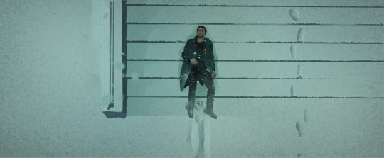
Der Trick gegen Einsamkeit, gegen die Eitelkeit
Bilderbuch - “Baby, dass du es weißt” (2022)
#shapes and colours#as they say#thats what i would describe this video as#bilderbuch#music video#gif#gifs#gifset#frances' gifs
2 notes
·
View notes
Last Seen Blogs
sincerestpumpkins
spring comes
iluvpussc2
coolassbitch⭐️

mai-memos
cozy
fuzzymobil-camping
Seniorencamping

historiadeafter2-dubladohd
ッAssistir [HD] After - Depois da Verdade Online Filme Completo