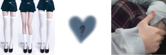
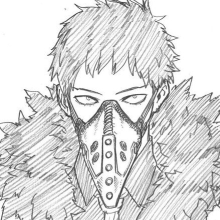
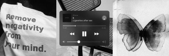
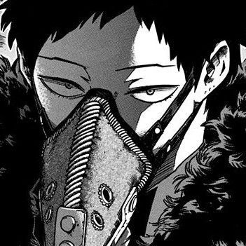
#overhaul layouts
Text

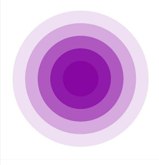
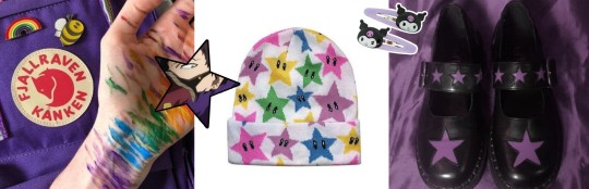
ᨳ͟ 👙ׅ𝆬 𐇵 ﹏ a cidade do diabo existe dentro dele. /ᐠ - ˕ -マ
#🦷. — headers be me!!!#kai chisaki layouts#kai chisaki moodboard#overhaul layouts#overhal icons#overhaul moodboard#anime#anime packs#icons anime#anime moodboard#anime layouts#twitter layouts#anime messy icons#random headers#twitter icons#soft moodboard#purple moodboard#purple layouts#purple packs#bnha moodboard#bnha packs#bnha icons#bnha kayouts#boku no hero moodboard#boku no hero layouts#boku no hero packs
53 notes
·
View notes
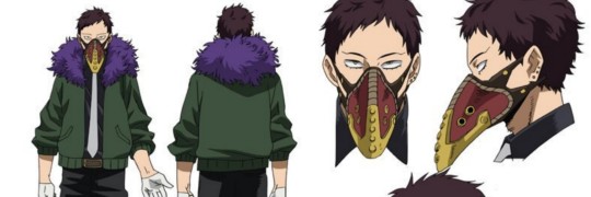
Text


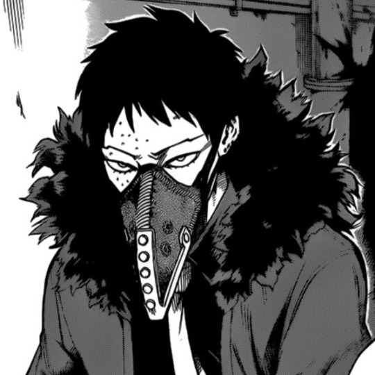


╭₊˚ ๑︰chisaki !
headers not mine.
#kei chisaki#kei chisaki icons#kei chisaki layouts#overhaul icons#overhaul layouts#bnha layouts#boku no hero packs#bnha icons#anime layouts#purple headers#messy layouts#grunge icons#anime boys#black headers#twitter layouts#manga layouts#bnha manga#my hero academia#boku no hero academia#screencaps#messy dividers
116 notes
·
View notes
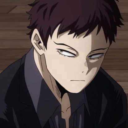
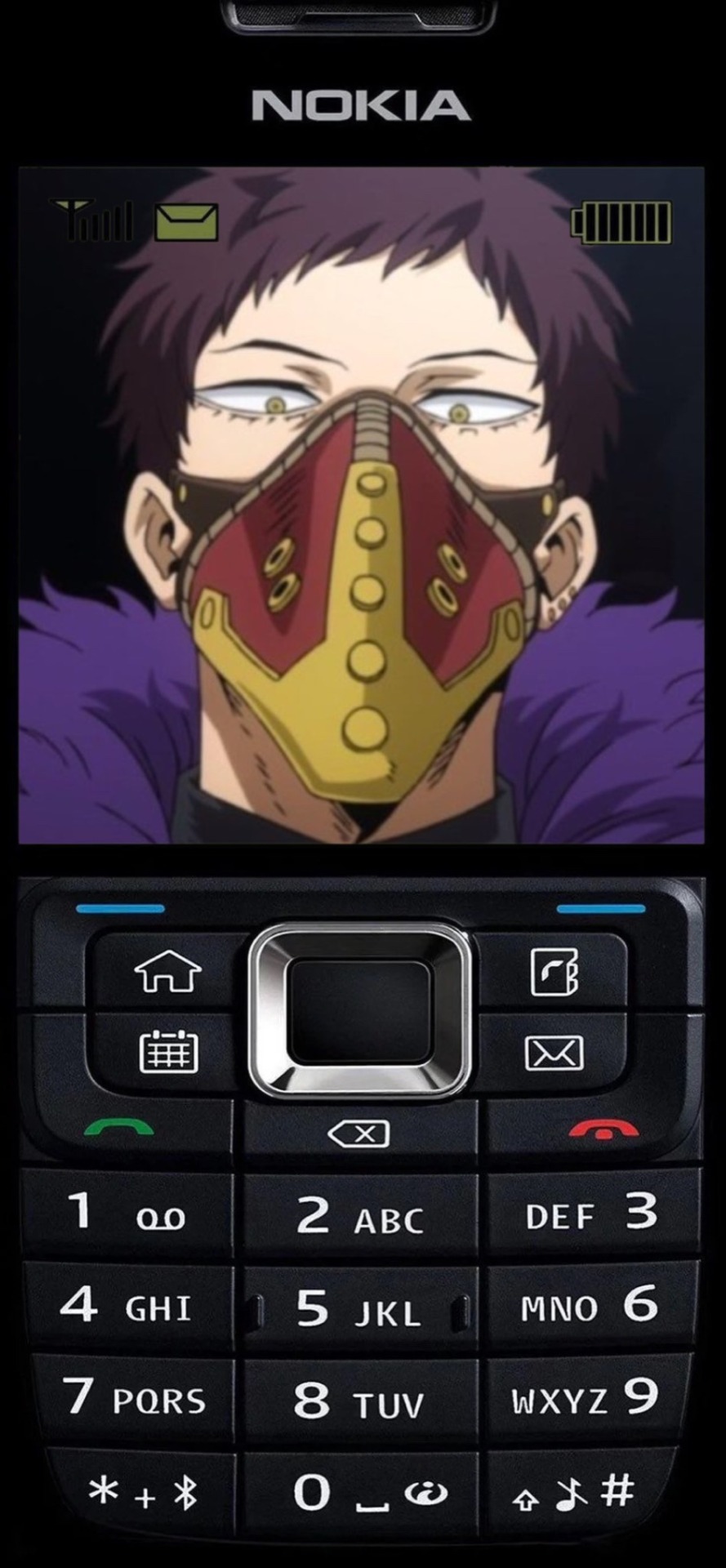
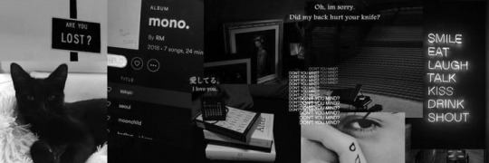
Text


## CHISAKI 🍷 LAYOUTS !¡
[req] - like or reblog if u save
#anime layouts#anime / manga#anime icons#anime pack#headers anime#anime messy layouts#kai chisaki#overhaul#boku no hero layouts#boku no hero icons#boku no hero academia#my hero academia layouts#my hero academia#my hero academia icons#my hero academia packs#boku no hero packs#overhaul bnha#overhaul mha#overhaul layouts#overhaul icon#overhaul pack#kai chisaki bnha#kai chisaki mha#kai chisaki icon#kai chisaki layouts#kai chisaki pack#bakugou layouts#deku layouts#todoroki layouts#uraraka layouts
97 notes
·
View notes
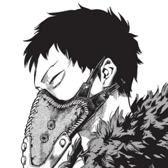
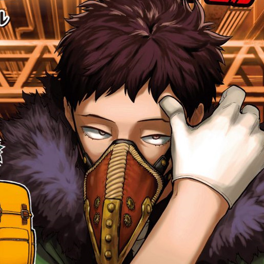
Text
꒰ KAI CHISAKI W4LLP4P3RS ! ✩彡
(dark mode!)

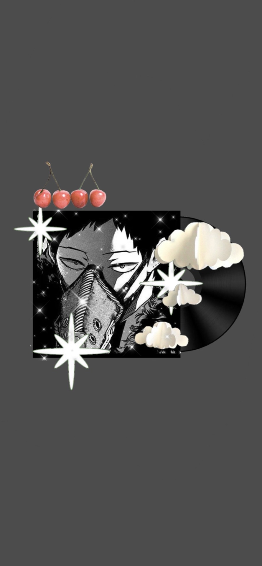


{☆} 🎱✉️🗝⋆。˚ ⋆
## like / reblog if you use / save !¡
#anime layouts#tumblr layouts#twt layouts#anime#messy anime icons#messy layouts#mha#bnha#mha overhaul#mha kai chisaki#bnha overhaul#bnha kai chisaki#overhaul#overhaul layouts#overhaul icons#kai chisaki layouts#kai chisaki#kai chisaki icons#mha wallpaper#mha lockscreens#bnha wallpaper#bnha lockscreen#overhaul wallpaper#overhaul lockscreen#kai chisaki wallpaper#kai chisaki lockscreen
41 notes
·
View notes
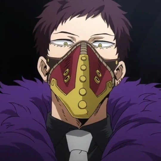
Text


オーバーホール . . . 🦇
#kai chisaki#overhaul#chisaki kai#boku no hero academia#my hero academia#bnha#mha#kai chisaki layouts#overhaul layouts#boku no hero academia layouts#my hero academia layouts#bnha layouts#mha layouts#kai chisaki icons#overhaul icons#boku no hero academia icons#my hero academia icons#bnha icons#mha icons#anime#anime layouts#anime icons#messy layouts#manga#manga icons#anime headers#anime packs#bnha packs#mha packs#messy packs
27 notes
·
View notes
Text


% . +. Overhaul layouts
┊ ➶ 。˚ °
⋆ ★ repost w/ credit!
- like / reblog if u save
- made by midoriizx
- requested by @gummismile
#bnha layouts#mha layouts#my hero academia#bnha#overhaul layouts#overhaul#mha chisaki#kai chisaki layouts#black aesthetic#black layouts#anime layouts#anime
9 notes
·
View notes
Text
You know what would be really funny, is if people came together to have an anti-crab day. A day where every user who joined prior to automattic’s acquisition logged off for 24 hours to show that yes, actually, older user retention is important and you should listen us just as much as new users
The users giveth, the users taketh away
#this isn’t about the sidebar btw I’ve already said I don’t mind the sidebar#I think it could be a better sidebar like the 2014 tumblr layout which was great#but it’s Fine (tm)#this is about live and the new post editor and the apparent avatar removal bs ‘experiment’#and it’s also about how these big overhauls keep being done meanwhile we can’t have like. a search function that works#or the queue reordering tools that already exist on mobile web applied to any other platform#you know. all the little stuff that’s comparatively easy to implement yet they ‘don’t have time’ for because they’re too busy#with these massive overhauls and ignoring all the asks that go to wip#also I don’t expect anyone to actually do this and I’m sure as hell not organizing anything cause that’s a lot of work lmao#but I think giving them money pre-emptivelt just showed they can do whatever they want and we’ll fall for it#taking away money would be more effective#idk I don’t think current staff are any better at running tumblr than yahoo was#they’re just better at the ‘we’re quirky and relatable just like you guys uwu’ bit#and a lot of us fell for it but I think the illusion is starting to lift#anyway idk it sucks here but all the other sites are either worse or empty so what can we do#(genuinely wtf can we do this nonsense is getting bad)#text#misc#shut up nerd#new layout stuff
28 notes
·
View notes
Text
.
#saw a reply to a post that was like#websites only have apps to get more ad revenue out of you#and like. what i had to say about this wasn't the point of the original post so I'm making my own#but Reddit's mobile site used to be perfectly good and engaging#now it's changed layouts and stuff and it looks like the app. which we despise and hate and find unintuitive and user-unfriendly#which means what in practice? we're not using the app we hate it. we're just not on Reddit if we're not on the computer (old Reddit beloved#but it's not losing them ad revenue because we use an ad blocker so they probably don't give a shit either way#:/#saltposting#actually ETA I think a lot of things we hate about the Internet under late stage capitalism is. why does everything have to change layouts#all the time#for no good reason#like if it works there's no need to fix it#but nooo endless growth blah blah blah maximise user engagement blah blah blah money etc#how about retain the users you already have by remaining what they liked about you in the first place. ever think about stability?#there is a reason why we have autoupdates turned off on our phone and there's like 5 apps that are FORBIDDEN to update#Tumblr because we don't like the overhauls to the notes section (the ones where they're coloured differently based on read/unread#instead of on people you follow/don't follow)#Discord because the new layout looks like absolute shit and having DMs separate from servers would be hell for our processing#and ability to respond to both#our red filter app because it's gonna stop filtering wallpaper to comply with Android regulations and that's a no from us#are the main three but I think there might be others I'm not thinking of#anyway. yeah#I wish for predictable apps that don't suddenly throw new layouts at you every time you've finally gotten used to the last change#I don't wanna be kept on my toes real life does enough of that. I want to have a stable anything in my life is this too much to ask for
8 notes
·
View notes
Text
im actually going to commit crimes with this new discord layout it sucks. and i hate that every article that i looked up trying to see if i could get the old layout back was trying to hype up how good these changes are for the service and how wonderful it is that we’re moving forwards. NO you lukewarm refrigerator i specifically looked up how to go back!!! why can’t i even just have the option to use the old layout. like if people want the new layout fine whatever but why not just??? make it a new option??
#discord#discord update#i really hate this trend lately of social medias changing their whole layouts#like unless you’re adding a WILD amount of new features what does overhauling it even DO#and what gets me is they added NOTHING with these updates. just fucked around with the placement of everything#i was used to how it was before. i don’t like that my notifications are in two different places now#i am considering downgrading the app so i can have the old version back so long as it like. actually still works
8 notes
·
View notes
Text
Back to weekly posting on Monday mhm mhm, finally gonna start being an art blog again
#overhauled my whole blog layout too. yeahhh im something of an active tumblr user myself#new year new me#back to fanart posting#motley in june or july#lets goooo boys#undecided on my icon. it doesnt quite match my pink aesthetic. hurmmmm
23 notes
·
View notes
Text

! . . 🛒 chisaki layouts 🍢 [req]
#chisaki layouts#bnha icons#bnha layouts#chisaki kai#chisaki icons#overhaul#overhaul icons#twitter packs#brown layouts#layouts purple#messy layouts#random icons#random headers#packs anime#random layouts anime#icons manga#manga layouts#anime layouts#anime icons#anime messy icons#header anime
159 notes
·
View notes
Text
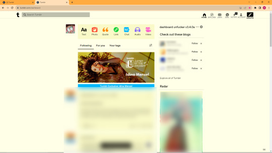
ngl i usually dont have problems with dash updates etc, i get used to it. but for the love of god the new one is just physically painful to use.
I already made a shitty edit of what i meant, but i wanted to improve now that im not fucking exhausted lmao
I am going to be critiquing the new UI, and comparing it to twt, and how poorly they pulled it off dont keep reading if u dont care/think im overreacting
and im not gonna sugar coat my opinion on it. please understand when u read.
Honestly its just bad, its a copy of twt, and I use twitter??? you'd think id have no trouble adjusting since ive used both since 2020. (tumblr first but ykno)
but it just feels totally wrong. the buttons are too small, compared to twitter's much larger ones, the change between the top bar with the post types vs the new +create button is just???
If it was about icons, you could make a form of hover to see what they do. but now it feels so much more painful to use. like i physically struggle to find shit on the new dash because tumblr decided to put shit in weird ass locations.
all the improvements supporters are talking about could have been done without messing with the whole site alignment.
(blogs censored cuz im digging into tumblr here like im not holding back and i dont want randoms being brought into smth)
This would have accomplished the exact same thing
(not perfect but i need to get my idea across.)
Id probably spread out the icons too, to get room for text. especially since theres room over there
AGAIN I DONT WANT IT TO LOOK EXACTLY LIKE THIS!! THIS IS JUST DEMONSTRATING WHAT IM TALKING ABOUT

Or like this so that its even with the tumblr logo

Or hell, just make the upper ui look similar to the post ui where it extended the bar to add the text in.

like this.
(again i dont think this exact layout would be best but Im trying to show what i mean.)
Like I LIKED the explore update
I liked getting recommended blogs!
I even like radar n shit
But the new layout is objectively worse.
this was messing w muscle memory for no reason. and just making the whole site look bizzare
and its not even a GOOD twitter rip off.
Here is my biggest issues with the new ui
(not written but i have a problem with the fyp and shit being so high up, like it s at the same level as the logo)
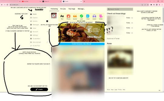
Here's a direct overlay
The tiny icons is what really confuses me + the placement of the create button? like why????
the misaligned tumblr logo too. like really??? would that be copying too much??? they already had a pretty good ui??? just add the text to that????
Tumblr really wasnt that hard to use? most confusion could be fixed with text under.
anyways if tumblr REAALLLYY wanted to do this like desperately
everything on the right makes slightly more sense, given the fact tumblr has always had right side ui.
(please ignore the shitty parts, im just trying to get a point across not actually make a new ui lol)
Anyways,,, I may be overreacting but its really not the change that bothers me.
its how they changed it
also recent stuff i heard about tumblr recently is making me really not wanna be nice about this, at all.
Its just weird that in their path of adding the text they have removed other accessibility features they used to have.
and the fact that tagging a post with "epilepsy warning" puts it in the epilepsy tag is abysmal.
I kinda dont buy that this was for accessibility given tumblr's other actions.
Anyway i dont blame individual members of staff but cmon yall...
#tumblr#tumblr new layout#new dash#new layout#new ui#tumblr im unironically begging you to do this a different way#I understand the accessibility#but its also inaccessible like this#at the very least a toggle#or better yet give the ui itself a major customization overhaul so everyone can have it look the way they want#im sure the html nerds would fucking love that#im not being sarcastic there im being serious#tumblr critical#tumblr salt#tumblr staff#tumblr changes#staff please#like why is the ui so bad#like no really bad. twitter literally looks better lol#i put way too much effort into this#Let me have my intense opinions on this thing that honestly yeah theres more important things going on in the world#but let me have this ok#I loved the color scheme update too lol#canary my beloved#long post
10 notes
·
View notes
Text
PHEW. i have just majorly updated the website and added a bunch of new oc pages! (as well as an oc archive) welcome to alton towers
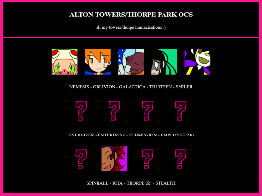
#most oc pages have had a layout overhaul but it seems like transferring it to neocities made them all fucked up. so i will likely be re-do#ing them again later. but not now.i have to lie down
4 notes
·
View notes
Text
This is going to be a long next few days...
#that time of year where we overhaul the fabric layout#which is something that has to be done when the store is closed#volunteered for overnights the next few days to get some extra hours#i usually don't stay up past 9/10pm#i'll be at work until 2am the next few days#plus the hour drive home#so up super early today to take a nap before the overnight shift later tonight
4 notes
·
View notes
Text
it's deadass out of date content-wise but if you wanna find me off this hellsite (derogatory) i've got my cringe neocities page here, which has links to my other socials and the like
#excessive rambling#not quite leaving here because moots but i'm once again waving my foot out the door somewhat#good excuse to give its layout an overhaul in the future#anyway time to add cohost to my list of alternate outlets
2 notes
·
View notes
Text
what if i re-organize my shipping chart into different categories like "ancestors" and "beforans" etc
do i need to??? .... no
but um i like over-organizing information lmao
3 notes
·
View notes
Last Seen Blogs

yellingyennefer
Kink Goth

themalibucookiecompany-blog
The Malibu Cookie Company
digi-fan
Digi-Fan

470l-blog
Sin título

moonunveiled
Lyrenn Moonveil