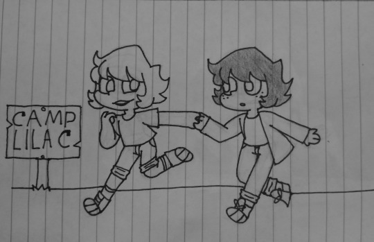
#not Really a redraw and more of a reimagine
Text
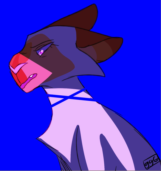
Wanted to redraw something so had my friend randomly pick a year/month/image and this is the result. Frostnose my beloved <3
Left is from September 2018. Right is from Today (May 2023).
Roughly 5 Years difference.
#oc: frostnose#Story: aspiring fires#warriors oc#warrior cats oc#wc oc#not Really a redraw and more of a reimagine#but i like the new one better#drawing a lot today.... hrm
2 notes
·
View notes
Text

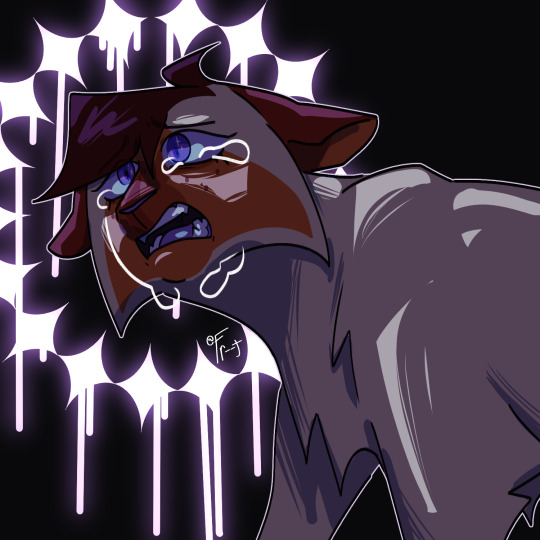
due to image size differences it's impossible to put these two next to each other and have it look good but 2021 / 2023 lol <3
#Hello Everybody I've Returned 2 Or 3 Years Later Even More Diseased Than Before.png#the 2021 one was my first ever akeshu <3 also the first time i drew goro and finished it. momentous occasion#misc#the new one isn't really a redraw it's like a spiritual successor. a reimagining. a sequel. a reboot of the franchise#idea's the same though. i just know what colour values are now
53 notes
·
View notes
Text


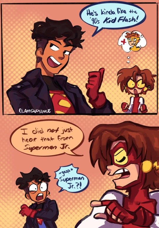

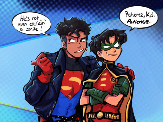
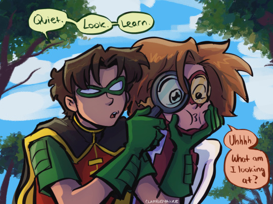
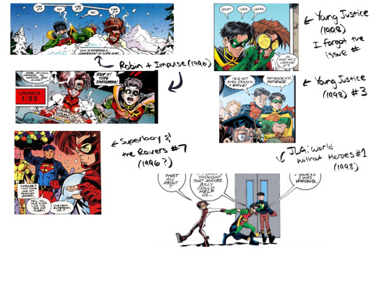
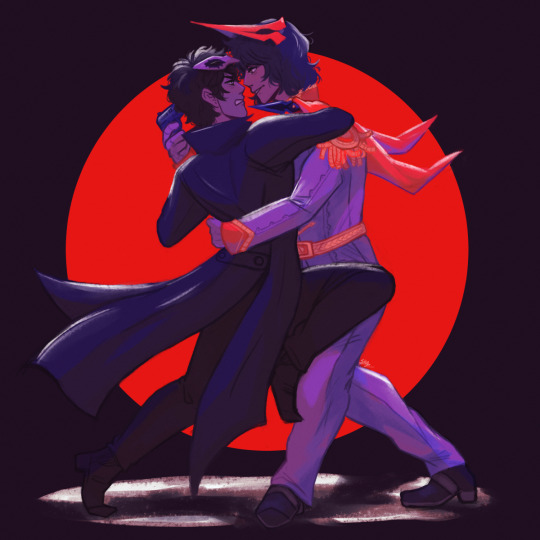
[DC] comic panel redraws of my boys :) this was really fun to reimagine them with my own style and designs
Reblogs appreciated <3 I’ll probably do more redraws soon
#clam draws#dc#dc clamics#dc comics#young justice 1998#young just us#young justice#tim drake#bart allen#kon el#kon el kent#conner kent#kontent#superboy#impulse#robin#my art#comics
11K notes
·
View notes
Text

I don't know what this style is anymore, let's call this one a clean sketch?? Here's a (relatively) quick redraw/reimagining of one of my first commissions. It was made for JumpinJammies, and it was her funny idea too! I'll always be grateful to her and my other friends who were willing to start paying me for my drawings... It really boosted my confidence back then <3
So I've been glancing at that drawing for a couple of years now, feeling a strong desire to draw Sienna in this silly sweater again. Which I finally did these winter holidays. And I made her stripes a bit differently, since after this drawing we learned a little more about them.
#rwby#rwby fanart#sienna khan#sienna#rwby faunus#faunus#white fang#new year#holidays#greenlightvolume10
380 notes
·
View notes
Note
Players essentially draw themselves. They are made of code and the body they have is one that they make. Or maybe someone else makes and they use that's fine too. But even when one uses a body drawn by someone else, they still essentially draw it over and over again themselves.
Every expression, movement, accessory, etc will have one redraw their body. It is rather subconscious but can be done with intention. Of course in the case of a body originally drawn by someone else, one would try to copy that drawing whenever they redraw it. But over time, their body really becomes their own drawing. Experience will add and/or subtract details. Details or lack of will add up. Or sometimes one will completely start over and draw everything fresh in their own style.
Or one will get another drawing from someone else. That's fine too.
Every Hermit has their own style of drawing themselves and their bodies can have various quirks
For example: The secret of what Etho has under his mask is.... nothing! Literally! It's transparent! Nothing is drawn there! And Etho keeps it that way even when he shows other people (though that rarely happens these days)
This is kind of beautiful actually. It raises so many questions about aspects of the Hermits designs, why they chose what they did, why they chose not to change what they haven't modified. Was it choice or instinct that made Cleo start drawing herself more dead than alive? Was it a show of adaptability for Doc to reimagine his arm as metal instead of flesh, or was it a point conceded to the being that took it from him? Does Jevin have some type of aphantasia, for his form to be so wobbly and ill-defined? I love this idea and how far it can expand, thank you very much for sharing it!
~ Mod Shade
285 notes
·
View notes
Text
Movie Posters and Book covers reimagined as FNAF [concept not art]
Warnings: discussion of disturbing imagery, gore, and horror.
None of these ideas are based off the plot of the story and more of the way the poster looked. Just wished to say that before someone told me why poster idea was wrong because of said story plot.
[Feel free to use these ideas but I ask to be tagged if the idea is used so that I can see it. I like looking at cool artwork.]

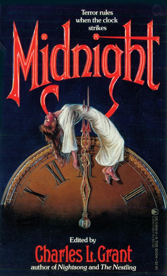
This poster but redraw it as Michael Afton from FNAF during his Ennard era. Change out the stuff with wires, blood, and some of the remaining internal organs. Blood dripping down his now purple eyes. Clawing at his decomposing face with some of the skin peeling off as he does. It would be a wonderful horror image.
-

FNAF 4 Crying Child. Here's my idea. CC kneeling in front of a television playing the Freadbear and Friends cartoon, but have the image be staticed over a bit. Fretboard plushie being on it's back as well in the same position as the poster. But to add onto the image have the nightmare be standing slightly seen in the dark background behind the TV in the same standing order as presented on the TV with the nightmare Fred bear even further behind them with the menacing teeth covered in blood be the most prominent part. The wording on the poster even fits the idea. Have the Poltergeist be turned into Nightmares or something similar.
-

Pizza-plex horror poster. I have two ideas that can be mixed and matched around. This isn't as concrete of an idea but spinning of multiple concepts.
1. Have the hand holding the bag be Vanny's and the head in the bag be Vanessa's to symbolize the way that Vanny has taken over Vanessa.
2. Have the hand stay as Vanny but have Gregory's head be in the bag. Showing the worst case scenario that could have happened.
3. Have it be the mimics hand [real or digital] holding Cassie's head in the bag either bare or with the discarded Vanny mask.
But whatever is choosen the bag is changed to a fazbear gift bag, a simple 80s inspired logo, nothing too busy. To add to the horror you could add blood coming from the hole in the bag or from the head in the bag. Either way it's an interesting concept
-

William Afton as the man with the bloody knife and the five figures as the five missing children. Make the background the pizzeria and while a simple change over it would be really cool to see where an artist might take it.
-

Another FNAF 4 poster idea. This one being from outside the Afton house and the spirits over the top being the nightmares. There's enough faces for it to include a lot more faces. Keep the bedroom window but have the light come from a side view child holding up a flashlight or something similar.
-
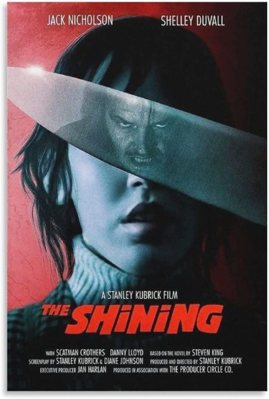
Another Michael idea. The G in the poster kinda looks like a stylized scooper doesn't it. Keep the clock and blood dripping down it the same, put Michael in his matentence worker uniform and it would make a cool poster. The clock face could even be turned into Baby's face to symbolize where her face appears as a clock face during the game.
-

Honestly Just an excuse to draw Bonnie's spirit Jeremy shredding on Bonnie's guitar. Nothing too deep about this one, just a really cool image I wanted everyone to think about.
-
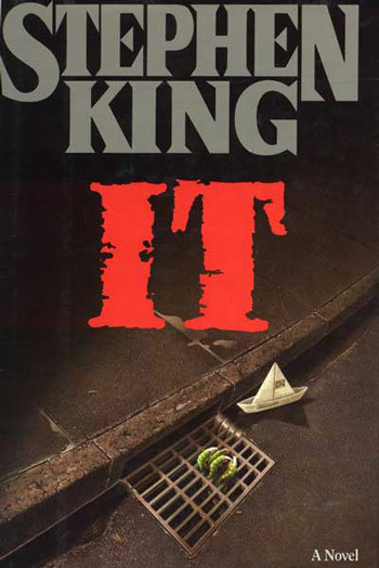
Ennard in the sewer. Ennard right after it left Michael's body. The blood still on the sidewalk and some loose wires that didn't make it. Turn the paper boat into Ennard's party hat. Have glowing eyes be seen in the darkness and dried bloody hand like metal be clamping onto the grate.
-
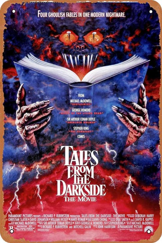
Tales from the Pizzaplex with Tiger rock holding the book. Simple one but one I thought would be fun to show for the book fans.
-
William holding up a knife to one of his victims. I was thinking Charlie or Cassidy. Have there be some speckles of blood if you believe the missing Children's incident took place over the course of an extended period of time or have it be covered in the blood of the recently killed other children if you believe the killing happen over a very short time span.
-
[I might make more parts with more of my ideas later.]
#fnaf#fnaf art ideas#fnaf games#fnaf books#william afton#michael afton#circus baby#ennard#crying child#mega pizzaplex#tales from the pizzaplex#fnaf vanessa#fnaf gregory#fnaf cassie#fnaf cassidy#horror movie posters#reimagined ideas#feel free to use as inspo please tag me so i can see what you made if you are inspired#i might draw these later#i dont have nearly enough skill but it would be fun
14 notes
·
View notes
Note
sbi ib au w wilbur as mary is a concept i cannot stop thinking abt, like i haven’t touched ib in years and i was more into smaller dynamics in sbi than sbi as a whole, but it makes me so insane. you’re a genius and i adore that au concept. techno as gary is also so much fun, i rlly liked the whole thing. also the art was SO nice, your style is very neat. if you have any more thoughts abt the au as a whole i’d love to hear them, but if not, just know i love the concept so much
WOOO i hear u, my favorite dynamics within sbi are crimeboys and bedrock bros (it really shows in this au) because i am a huge sucker for sibling dynamics. the remake for ib came out for switch recently so the childhood hyperfixation reawakened like a beast
i have so many thoughts in my brain let me drop these bad boys. infodump time.
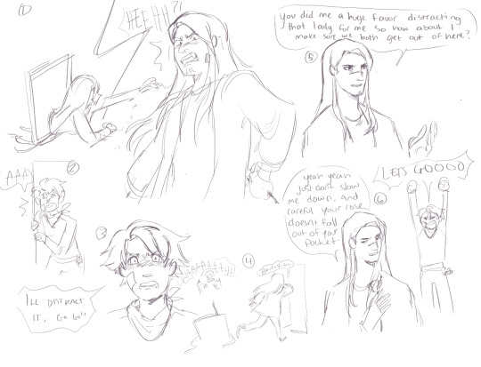
my idea of a first meeting between techno and tommy! rather than having his rose stolen like garrys, its tommy stumbling in on techno getting cornered by one of the lady paintings. techno probably wouldve gotten out just fine eventually, maybe lost a few petals but tommy distracts the painting so he can escape unharmed! then theyre like 🤝 team up time
please ignore the shitty ooc dialogue everywhere ive just been getting ideas jotted down in my free time hehe. i imagine the dynamic between techno and wilbur in this au being pretty tense! techno is IMMEDIATELY suspicious/wary of wilbur & wilbur wants to leave with tommy, taking technos place. techno doesnt wanna be too protective of tommy because a) this is some kid he just met what does he care b) he doesnt really have any reason to be suspicious about wilbur because hes done literally nothing wrong so far hes just off so techno doesnt trust him
also philza as guertena means he doesnt show up like at all BUT i really liked the theory from a few years ago that part of marys dislike for garry stemmed from garry resembling guertena and her feeling like she’d been abandoned since i cant really imagine she can grasp the complete concept and weight of death. so i did have techno resemble philza a bit here (eg. emerald and stubble that i keep forgetting to draw-) which will probably be unmentioned in stuff i draw for this au because again philza wont show up much. so yeah ooh possible idea that wilbur might resent techno for that a little bit or just be like kind of annoyed by it. idk man im just sitting here.

i also did the three main endings! promise of reunion and together forever were kinda quick because i did not have time to properly draw and color them :,] but i found a neat brush and wanted to draw the forgotten portrait painting because ow. in my original drawings of this au tommy didnt have a green bandana but i decided to give him one as a stand in for the hankerchief ib carries! after all this ill probably do some redraws of moments from the game or try to reimagine the toy box since wilbur is notably not a child like mary is!
yeah hey that was probably like way more information about this au than anyone couldve wanted but B] if you have any thoughts about this au that differ from mine or if you just have thoughts in general id love to hear em! my brain is rotting. thanks for coming to my ted talk (and thank you for the ask, i am new to tumblr so this is my first ask yippee!!)
#dsmp#dream smp#my artwork#sbi ib au#my asks#dsmp fanart#crime boys#bedrock bros#sleepy boys inc#asks
12 notes
·
View notes
Text
Lazy Uprezzed Paintovers Drive Me Up the Wall
So I just randomly saw a trailer for the PC and Switch ports of the first 3 Etrian Odyssey games, and like... I understand why people keep doing this, but seriously WHY DO PEOPLE KEEP DOING THIS!?

This is a really crude comparison I just slapped up in MS Paint. I just hunted up the original resolution art for this monster, pasted it over a screenshot, ended up with a black background eating the tail and all but one leg because... that’s what happens when you paste a .webp into MS Paint, and I freehand scaled it up at possibly a slightly wrong aspect ratio, but see my point here is that even with the sloppiest distorting-est lazy job I could have done here, just scaling up the orginal pixel art by 500% looks a hell of a lot better than doing that then using it as a base for someone to quickly trace over the line work then hitting it with a couple gradient fills, or whatever the hell it is people keep doing.
I’m going to move on to some other examples, but just humor me with a couple key details here. Look at that corner of that cheek. In the original art we’ve got this ragged little notch in there like a chunk got cut out and these big thick warts kinda falling into the gap. In the redraw that detail is just completely gone. Above that we have another nasty scar, all gouged out under the eye and healing up weird. Which in the redraw just becomes this thin vague X. Is that even still supposed to be a scar? I could just see it as a cheek line now. We have eyes going from this real intense glare to just kinda dopy and vacant. A shadowed mout where we can only see a couple teeth to... those specific 7 visible teeth in clear vew and alot of exposed gum suggesting it doesn’t have any others, nor a tongue. The other visible scars, which are already kinda cartoonishly implied on what I’m not going to deny was always kind of just a big tomato-y blob of a body are really de-emphasized and the one on the leg I didn’t lose in the black loses some three dimensionality as we just do whatever with the line weights.
You can really see this sort of thing though with ports of the Ace Attorney games. Here’s someone else’s griping example of what they did to my poor boy Edgeworth here.


Apologies again as that old shot seems to have been through a ringer of resizes and format conversions, but do I even need to say anything here? Now LOOK AT THE FREAKING JUDGE!


You tend not to see so much of this with 8 and 16 bit games getting modern updates. With older pixel art, people seem to have it sort of enshrined in their memories, so you either get nice straight upscales of original art, or you get some kind of effort to recapture the vibe with actually new reimaginings of the characters, either hand-drawn or rendered.
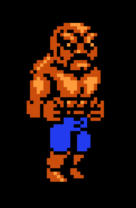

(Yeah I know this isn’t a remake, it’s still a great example of updating classic sprite art for a higher resolution, shush.)
I don’t know if it’s the color depth, the actual size of the screen in the player’s hands, or the games being more recent, but I feel like in people’s rosy memories of GBA and DS games, there’s way more detail than the actual 256x192 pixels they were working with in reality, so it must feel like blowing it up and doing a little smoothing is going to work out, but it’s still low resolution pixel art. The stuff that looks real good is the stuff where someone hand-editing each individual bit of visual information is applying techniques to imply more detail than can actually be displayed on the screen. If you up the resolution, and you don’t go in and actually add that detail in the denser pixels you’re then working with, it’s always going to look just awful. Stop doing it. Please.
4 notes
·
View notes
Text
Redraw dump
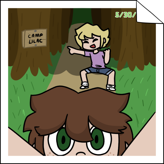
The original from February 2021

Inktober 2019 days 1-3 (The first was from the official website and then after day 1 I switched to a camp camp prompt list that I can’t find anymore) None of them are actually direct redraws, more of reimagining.


I always feel like I haven’t improved in art so it’s nice to have a representation of my improvement over time. Even just from early 2021 to now, a lot has changed, but looking at my 2019 drawings is really weird.
#camp camp#sort of but its just oc stuff#camp camp oc#RIP original black felt tip pen i have no clue where it went#the navy blue pen era was a dark time i just keep losing that one specific pen
2 notes
·
View notes
Photo
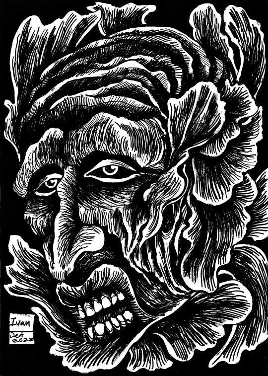
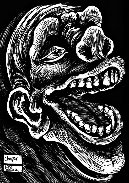
The 57, Part 6:
51. Ivan: I really honestly don’t know what inspired this piece, Ivan the Terrible? Ivan Millat? It has been bothering me for months now, I should know why all my pieces are named and drawn the way that they are, but this is proof of just how automatic my processes can get, not every piece is as conscious and direct as the others, and sometimes you get an Ivan that has no true origins and is clouded in mystery, if you can see a greater meaning in it then be my guest.
52. Chupar: This image is based on one of the many images of hobgoblins and hags in Goya’s Caprices:
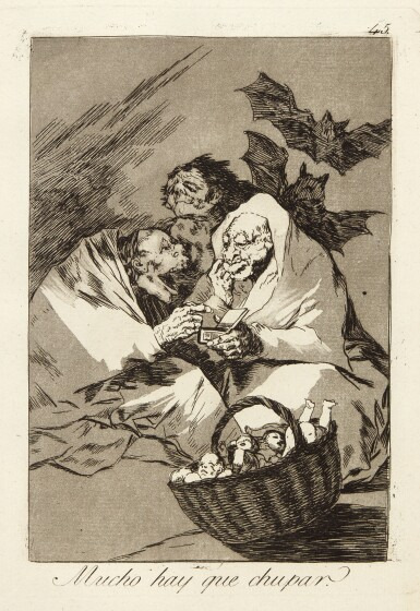
Source: https://www.sothebys.com/en/buy/auction/2019/prints-and-multiples/francisco-jose-de-goya-y-lucientes-los-caprichos
This image had always reminded me of the Baba Yaga and other folk tales of ghastly people sucking the life force out of people or eating children, quite a typical fear in pop culture given how many boogeymen and women exist in folktales. But I wanted to redraw it as it has almost a fellating quality to it, the idea of humanity and people generally as life suckers and absorbers for their own hedonistic gratification. Something that Goya is clearly criticising here as he often did in his works when discussing the aimlessness of hedonism and decadence in Spanish society when he was courtier to a king and even when he was destitute in death. A timeless issue clearly. There is even a concept in Satanism called “Energy Vampires”, people who go out there way to drain your energy socially and mentally, the same people who get off from bringing other people down or blaming someone else for their bad attitude and poor people skills, everyone has atleast met and been friends with someone like this at some point in there life I’m sure, some people just exist to bother other people, look at Mormons for example.
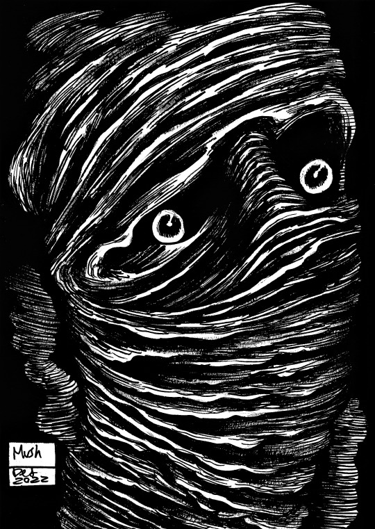
53. Mush: This piece is more of a redrawing of the ‘Ted’ piece, and attempts to represent the uncanny as the conversation between where the humanity ends and where abhuman starts, and by that representation it also leads you to ask what is considered existence in reality and what can only be represented through fantasy as the result of such immense reimagining of real/ recognisable things and figures? The title is more a take on Ted as a mute pile of sentient and perceptive mush at the end of his story, begging the question what is considered alive or undead depending on being able to live and not live consciously when you are incapable of regular and autonomous functionality? This in turn leads into the controversial dialogs on ethical euthanasian and the like, but I won’t say more on that here.
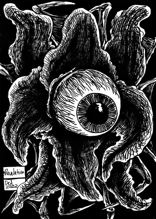
54. Revelation: Just like the piece ‘Trinity’, this piece is based on the ideas of biblical realism as represented through eldritch imagery, almost making abrahamic ideas of the divine and mystical into depictions of illustrative Lovecraftian realism. The idea of the book of revelations too being a book about destruction and a pessimistic end for the rest of humanity who didn’t give themselves over to god is quite a piece of inspirational material really, so I thought It would be fun to muse an image of this apocalypse with another abhuman depiction of a god or angel.
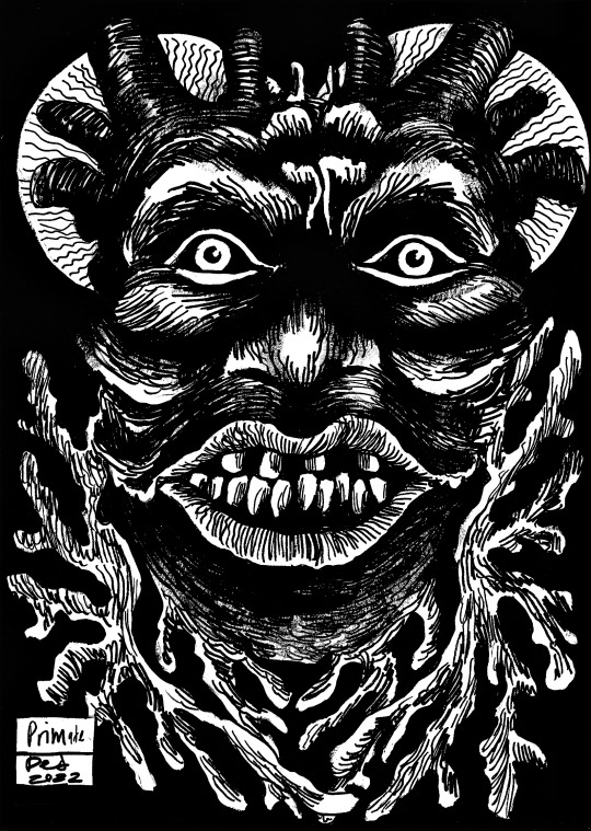
55. Primate: This piece is about me playing with the image of a Palaeolithic man as collaged with natural motifs and cellular imagery surrounding them, as our ideas of dinosaurs and primordial animals are all speculative based on what we have found, but we can only imagine their appearance and the later appearances of man based on semblances of DNA evidence and examples of bones and hair, this for an artist is just an excuse to reimagine and play with the image of evolutionary history, especially of history long before the recognisable modern history of homo sapiens now, so excuse this piece as a surrealist idea of man before recognisability, and as seen as between the amoeba and the natural world etc.
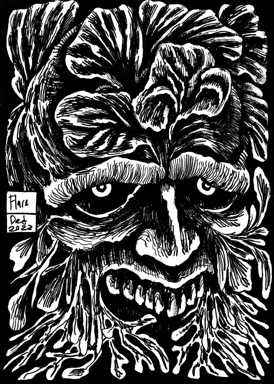
56. Flare: This piece is simple enough, just another take on Biosophy and on nature, and man’s connectivity to it in life and death, the flare of life being eventually met by natures consumption of the body to create new life, as if the human body were a seed store ready to be cracked open and harvested from as with all animals eventually. This piece is one of my favourites, I love how graphic and morbid the aesthetic is, but it’s not too overbearing or graphic in an ethical sense either, just visually notable, and it sticks in my mind because of that.
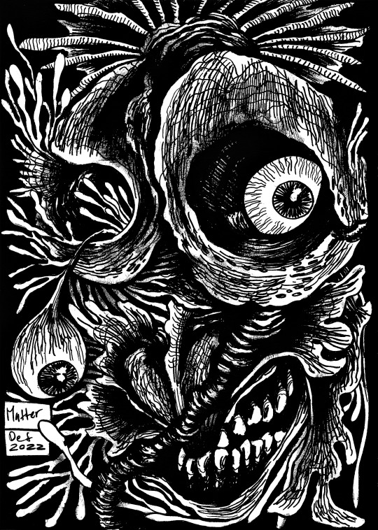
57. Matter: To quote myself again from the Robert Walters opportunity:
“This piece is based on Rene Descartes' discussions on composite matter and his existentialist conversations on the objective and subjective in relation to how we experience the world outside of your own comprehension and comforts. As discussed in 'Discourse on Method and the Meditations' (1637). As featured in my current project 'Noumena'.”
This piece has been used in many of my previous competitions, for the primary reason that it represents my negotiations on objective forms and the semantics of noumenal influences on the human mind and our conventional understandings of the world and ourselves, the same discussion being had by Descartes long before I would ever attempt to represent it in art of course. And though Descartes discussed matter and existence to justify creationism, I use it for the opposite reason, that human beings are far too complicated and have to be the product of nature as matter cannot be made nor destroyed as goes the fundamental law of matter itself, and just because life when analysed at each layer is complicated and esoteric to the common mind, doesn’t mean some manmade idol is responsible for it.
1 note
·
View note
Text
some progress pics + notes of my hero’s graveyard redraw btw ^_^ i didn’t take pictures of Every stage (i really only take screenshots whenever i’m done for the day and want to gaze lovingly at my creation later on without opening clip studio paint lmao) and tbh i’m a little lazy to go back and go thru each layer so it’ll jump around a bit
1. the sketch

notes: i did try to focus a bit more on composition when drawing out the sketch... hope that came out well
2. base colors
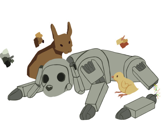
notes: the base colors! the base colors for the rabbit and chick changed quite a few times throughout the process (yay tonal editing) since i just couldn’t be satisfied with them... the chick especially was hard to get down. actually it was the last thing i went back to almost entirely redo, near the very end. it turns out the problem was the line art :,)
3. + background

notes: actually i really like how i made the rocks :) on the original i couldn’t figure out the background very well so i just made it a city, but this scene actually takes place underground, and i wanted to stay as close as possible to the game. so i guess this makes it less of a redraw and more of a reimagining of the same scene? anyway. the far back looks a bit basic but i’m happy with it
4. floor + moss, shading
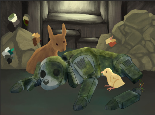
notes: painted floor and added moss. the moss was so hard to figure out i actually had to download an entirely new brush for it just to BEGIN figuring it out... not pictured is the 12+ variations of moss patterning i painted, deleted, repainted, fiddled with then deleted, etc. figuring out the lighting really helped me figure out the moss. i added shading/lighting to all animals (you’ll notice the shadows from the rabbit’s base colors have disappeared), and texturing to the rabbit.
5. MORE shading
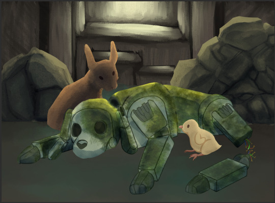
notes: added shading to the rocks, and increased the amount of shading on the ‘front’ (side that is facing the viewer) of the rabbit and chick. they didn’t feel like they fit in with the scene otherwise. the rabbit is fine, but the chick is making me scream and cry and shake because it looks too out of place..
6. final product (which you can view here)
notes: fixed some lighting AND REDID THE ENTIRE CHICK. something about it still bugs me but it looks like it belongs now. also added some grass and budding flowers (which if you notice are the yellow flowers you can eat in game). i didn’t make it the flowers from the original scene/painting i did because i forgot to draw them i felt like it would be more fitting. ERC-003 sacrificed themself so that all living things could continue to thrive in what remains of tokyo, and that includes the plants herbivores rely on to live.
1 note
·
View note
Last Seen Blogs
marcanimation
Marcanimation
danceclubcrickets
electro-swinger
b3yondth3m00n
A goofball

jaimebluesq
Jaimeblue's Tumblr
skyseed
スパーク