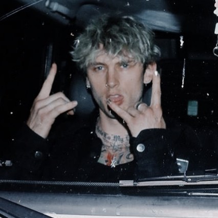
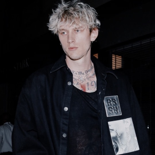
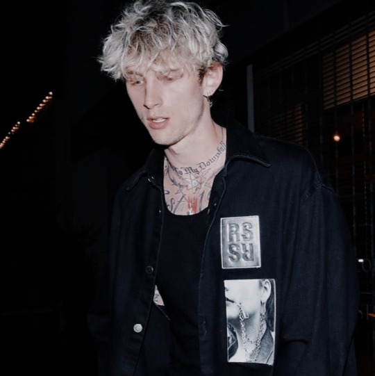
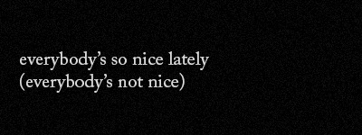
#machine gun kelly header
Text


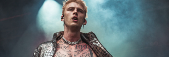
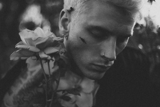
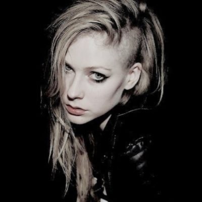
black & white versions here ♥
11 notes
·
View notes
Note
Hey you! how are you? I hope you're okay!
Could you please make a combo of like reneé rapp profile picture and Machine Gun Kelly header for me? i wanted to use it on discord but i'm struggling to find pictures of them both which match. (they're my favorite people!)
thanks!! i'll be waiting <3
Hi! I don't make packs, sorry. Only icons, headers and lockscreens.
1 note
·
View note
Text
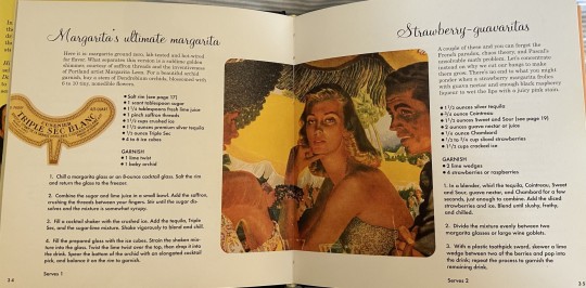


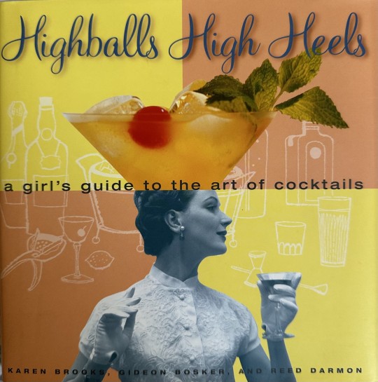

These two pages out of a cocktail book represent rhythm because both pages repeat the pattern of fonts used, with the more cursive font as the header, the smaller text for the description, and the bolded text for the ingredients and steps. Also, the picture in the middle acts as the separation between the two cocktails. Like in the Bauhaus video, the pages have a sense of harmony together and are appealing to the eye.
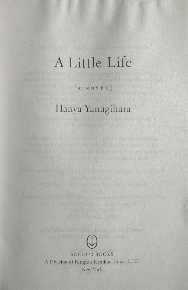
This example of typographic hierarchy was found on one of the first inside pages of the book I am reading. It uses typographic hierarchy to establish the most relevant information to the reader, such as the title and then author, in big text, and then the less important information in smaller text, such as the publisher.
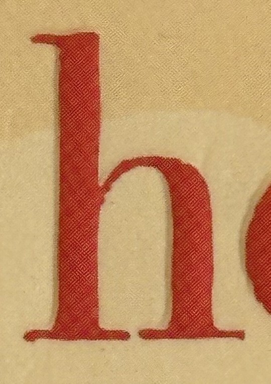
This letter “h” has an ascender because there is a portion of it that goes above the mean line.
This lowercase “y” has a descender because a section of it goes below the baseline.
This uppercase letter “R” has a counter because there is an enclosed space within in.
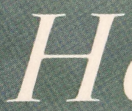
This capital “H” has a crossbar because there is a horizontal stroke that goes through the center of it.
The text running through the center of this book cover has a large x-height. You can tell this because the ascenders are very short, barely reaching above the tops of the other letters.
The white text on this book cover is a good example of small x-height because we can see that the ascenders rise above the other portion of the letters by a large amount.
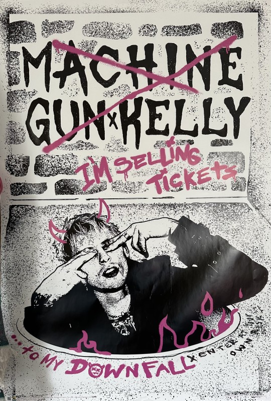
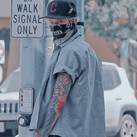
Based on my understanding of “modernist” from the Helvetica film, I would consider this Machine Gun Kelly poster to be modernist. To my understanding, modernist graphic design is somewhat abstract, uses bold fonts, and consists of many aspects for the eye to land on.
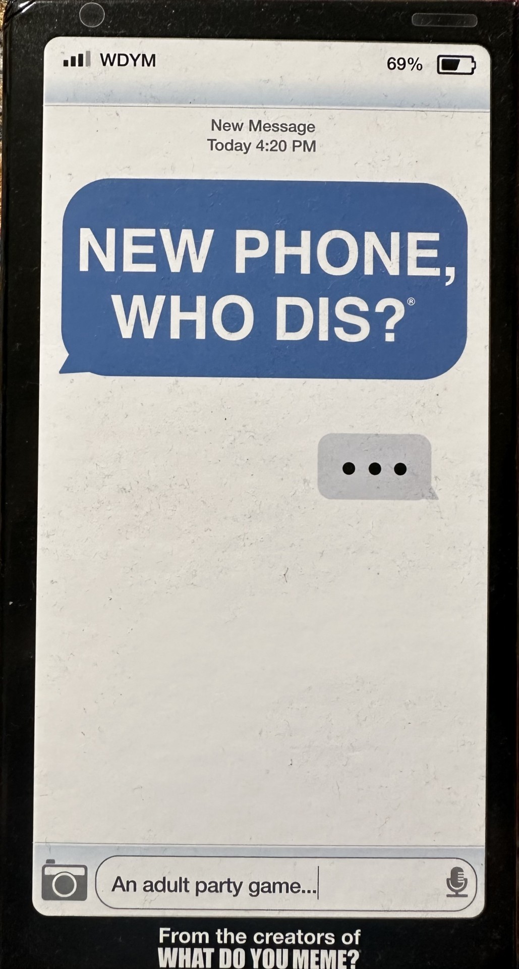
The text on the cover if this card game not only communicates the name of the game, but also a bit of information about the game itself. As you can see, the font is supposed to replicate the font of a text message on an iPhone, so without even reading anything else you can tell that the game has something to do with text messages.
0 notes
Text
yungblud x bad things


#yungblud icons#yungblud icon#black headers#black header#header black#headers negros#black layout#header bad things#bad things#camila cabello header#machine gun kelly header#camila cabello headers
67 notes
·
View notes
Text


like/reblog if u save.
#machine gun kelly#machine gun kelly icons#machine gun kelly icon#icons machine gun kelly#icon machine gun kelly#mgk#mgk icons#icons mgk#colson baker#icons colson baker#colson baker icons#colson baker headers#header colson baker#machine gun kelly header#machine gun kelly headers#mgk headers#headers mgk#mgk aesthetic#mgkedit#random headers#headers#random icons#icons#icons boys#boys icons#headers black and white#blacklivesmatter#black lives matter#black lives matter header#blm headers
281 notes
·
View notes
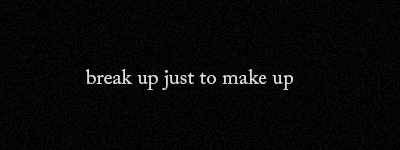
Photo


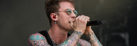

#Machine Gun Kelly#Machine Gun Kelly headers#header Machine Gun Kelly#Machine Gun Kelly header#Machine Gun Kelly lyrics#Machine Gun Kelly lyric headers#lyrics#lyric headers#lyrics header#mgk#mgk headers#headers random#random headers#boys#boys headers#aesthetic headers#black headers#header mgk#mgk header#quotes
123 notes
·
View notes
Text

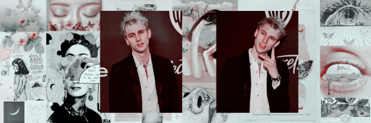

𐃘 Machine Gun Kelly headers
𐃘 like or reblong if your saved
#Colson header#Colson headers#Colson icon#Colson icons#machine gun kelly header#machine gun kelly icon#machine gun kelly icons#machine gun kelly headers#mgk icon#mgk icons#mgk headers#mgk header#header collage#header with psd#psd
59 notes
·
View notes
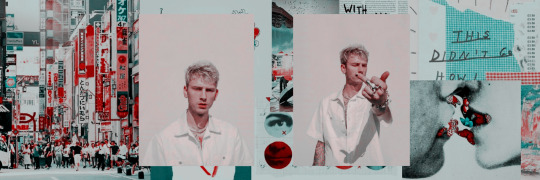
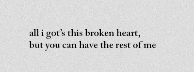
Photo
Machine Gun Kelly collage headers — like or reblog if u save/use, pls
#machine gun kelly#mgk#headers machine gun kelly#machine gun kelly headers#headers mgk#mgk headers#header machine gun kelly#header mgk#mgk heade#machine gun kelly header#machine gun kelly icons#icons machine gun kelly#colson baker icons#colson baker#headers colson baker#collage headers#collage headers mgk#machine gun kelly collage headers
65 notes
·
View notes
Text


black & white versions here ♥
---------------------
Heavily inspired by @ethereal-rpg wonderful work **
I'll be posting more of these!
5 notes
·
View notes
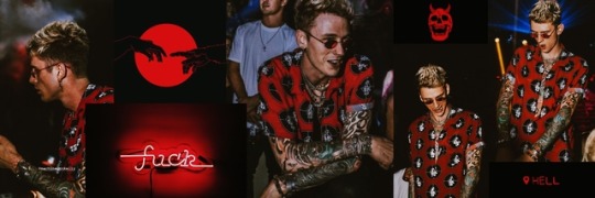
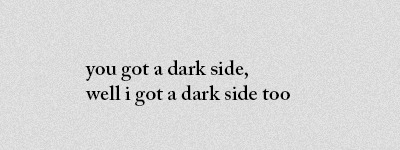
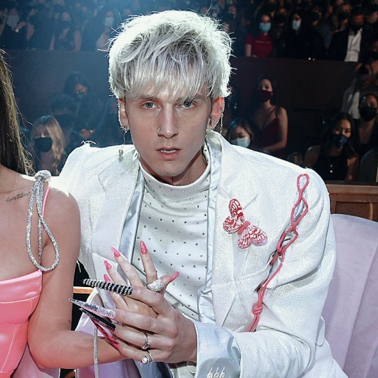
Photo


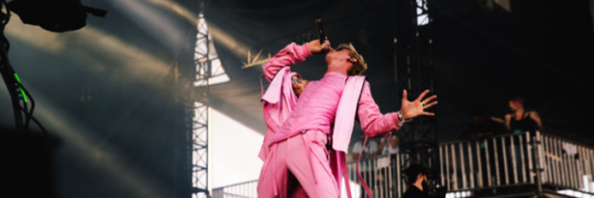


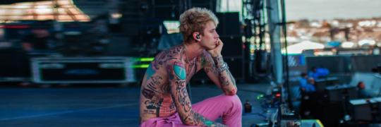
some header for today
#mgk#machine gun kelly#kells#machine gun kelly header#header machine gun kelly#machine gun kelly headers#headers machine gun kelly#header#headers#pink#rosa#stage#colson baker#icons#icon#packs#machine gun kelly packs#pack machine gun kelly#mgk header#header mgk#headers mgk#the gunner#youg gunner
251 notes
·
View notes
Text
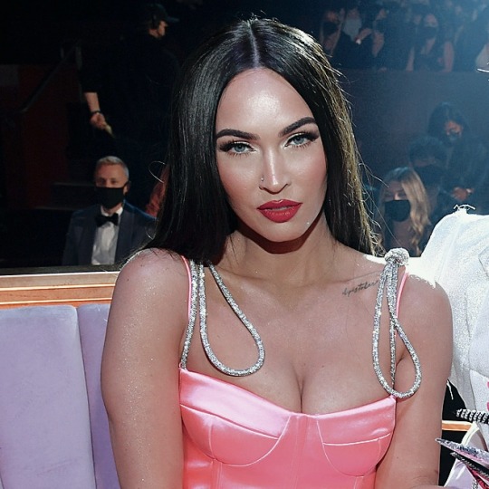


MACHINE GUN KELLY ICONS ♡ LIKE AND REPOST PLS
#icon#icon with psd#icons#pack#twitter#headers#packs#metadinhas#mgk#mgk headers#machine gun kelly icons#megan fox#colson and megan#kells#tickets to my downfall
103 notes
·
View notes
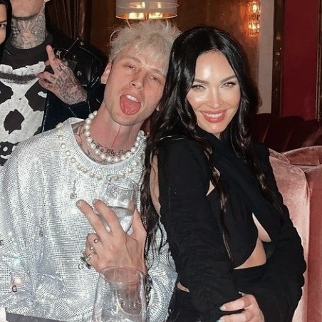
Text


📸 Prince Chenoa and Jacob Dekat
#mgk#mgk headers#mgk quotes#mgk angst#mgk lyrics#mgk imagine#mgk gif#machine gun kelly#colson baker#colson icons#music#musicians
280 notes
·
View notes
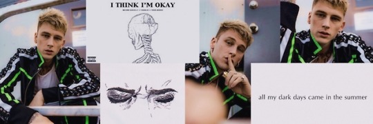
Text


#machine gun kelly#mgkedit#mgk headers#mgk#colson baker#colson icons#est19xx#est4life#mgk icons#icons#headers#colson and casie#colson and megan#guitar#fan edit#est for life#hotel diablo#tickets to my downfall
488 notes
·
View notes
Text
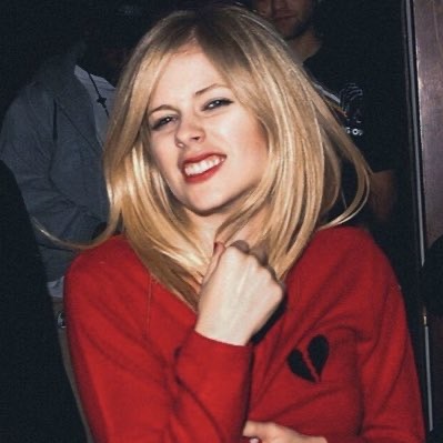


- avril lavigne icons x machine gun kelly headers
- like or reblog if you save/use ✨
#twitter layouts#icons#random icons#twitter packs#avril lavigne icons#avril lavigne#avrilthrowbacks#avril icons#avril lyrics#icons avril lavigne#machine gun kelly#machine gun kelly headers#machine gun kelly lyrics#al7#pop punk#emo#emo as hell#emo aesthetic
196 notes
·
View notes
Text

#camila cabello header#camila cabello headers#machine gun kelly header#bad things header#twitter headers#twitter header#header camila cabello#header machine gun kelly#header bad things#funny header
5 notes
·
View notes
Text
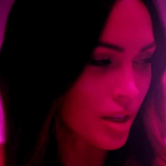
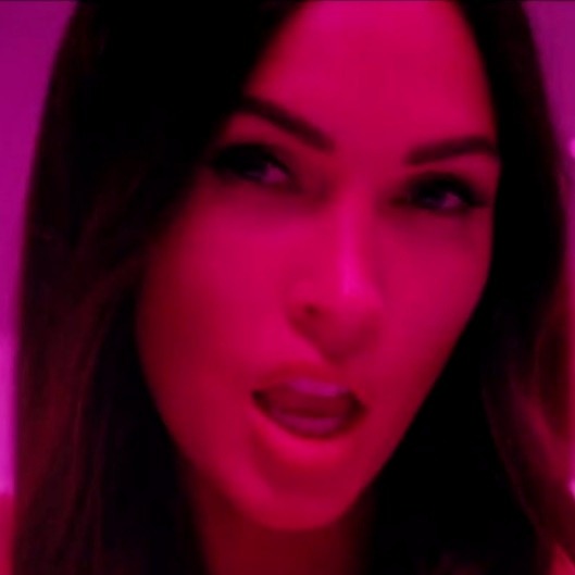
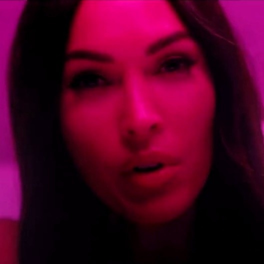

like/reblog if u save.
#megan fox#megan fox icons#icons megan fox#megan fox icon#icon megan fox#machine gun kelly#machine gun kelly headers#machine gun kelly header#header machine gun kelly#colson baker#colson baker headers#headers colson baker#colson baker header#header colson baker#megan fox headers#headers megan fox#twitter icons#random icons#icons#girls icons#headers#sem psd#headers without psd#bloody valentine#tickets to my downfall#hotel diablo#headers mgk#mgk#mgkedit#twitter packs
109 notes
·
View notes
Last Seen Blogs

saraeroshe
Sin título
christianrose
Welcome
maritan18
I AM THE STORM THAT IS APPROOOOOACHING!!

severeaesthetic
Severeaesthetic

tennisonalise089bd
Untitled