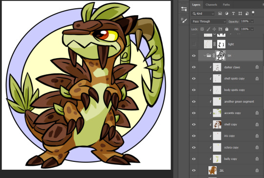
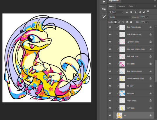
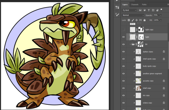
#layering tips
Text
Simple Layering Tips For Beginners!
0 notes
Text
Essential Winter Wardrobe: Your Checklist for Visiting Snowy Paradises
Preparing for Winter Fashion Adventures
Embarking on a winter journey to a snowy wonderland is an exhilarating experience, but it also demands careful planning, especially when it comes to your wardrobe. To ensure you stay warm, stylish, and ready for any snowy adventure, we’ve compiled the ultimate checklist for your snowy country visit. From cosy layers to practical accessories, this guide has…

View On WordPress
#cold weather fashion#fashionable winter attire#insulated boots#layering tips#snow accessories#snow travel wardrobe#snowy country visit#stay warm in snow#stylish winter outfits#winter coat#winter dresses#winter fashion essentials#winter fashion guide#Winter wardrobe checklist
0 notes
Text
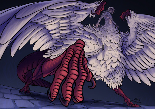
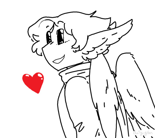
She is so cool
#mebi's art#fanart#dungeon meshi spoilers#delicious in dungeon spoilers#dunmeshi spoilers#dungeon meshi#dungeon meshi art#delicious in dungeon#dunmeshi#falin touden#falin dungeon meshi#falin chimera#faligon#dunmeshi fanart#dunmeshi falin#krita#digital art#that episode was so good I just had to draw her#please dont look too close into the wings feather layers#i also hope my lack of practice drawing humans doesnt show#also if you liked my drawing and read this far into my tags may I humbly request a tip in my kofi page?
810 notes
·
View notes
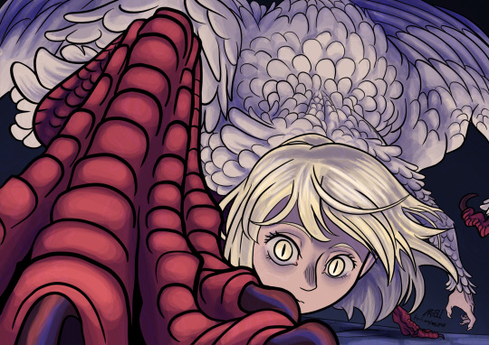
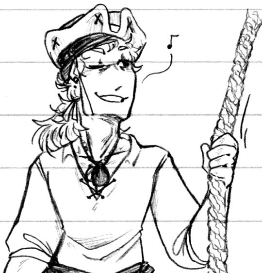
Photo
thump thump
#i got that far before losing all the layers in a stupid silly mistake#the scales are being tipped in the igaf favor#many slights to recover from#ofmd#our flag means death#ofmd fanart#stede bonnet#edward teach#gentlebeard#stede bonnet and edward teach you are both every girl to me#my art
3K notes
·
View notes
Text
just a guy
#mcyt#grian#hermitcraft#grian fanart#daily-grian#mod owl#mspaint pro tip: sketch with pencil tool in one color#draw lineart in different color#then go to erase tool. set main color to sketch color. erase with right click. you are welcome.#you can use that to color in stuff too btw#just set the secondary color to the color you want to use and primary color to the ''lock layer'' color#dunno how much sense that explanation made but you can probably figure it out
464 notes
·
View notes
Text
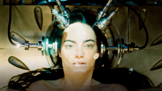
she's her own means of production!!! she's the mother and the child! she's the woman and the infant! shes the teacher and the student! she's innocence and experience all in one! shes a monster and is also infinitely human!!!!!!
#bella baxter#poor things 2023#its my favorite movie now#it was just as amazing as i thought it would be#the ending is a bit sour and there's a whole discussion to be made#on how it treats deformities in godwins case and neurodivergence with bella and felicity#and also something about race probably.... how toinette and harry are in the end means in bellas journey#(just like the two older woman are)#and theres also a whole class and gender analysis to be done of course.....#but this movie has so many layers. its challenging and at the same time candid and striaghtforward#it has no ill intent only a desire to push everything and see what tips over and falls#i loved it i loved it i loved it i loved it
156 notes
·
View notes
Note
If it's not too much to ask, how do you shade complex patterns easier?
Its not too much to ask at all!!
My easy trick for shading complex patterns in cel shaded Neopets style art, where you'd want to hand pick your shadow colors for each element:
First, I make a flat base layer, and put each unique color on its own layer that i clip to the base.
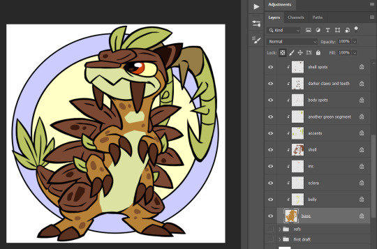
After i finish the flats, i then duplicate ALL of those layers, lock them, and recolor each duplicate with the color i want to use for that element's shadow. these are now effectively my Shadow layer, and i rename the base duplicated layer so i know its my shadow base.
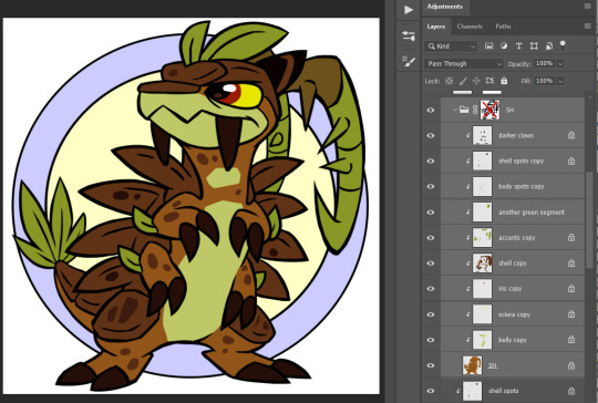
and then i use a layer mask on either the base layer or a folder i put the shadow layers in- i use this to paint in the spots where i want the unshaded areas to be.
This method makes it really easy to change my mind on a shading color for a specific area without having to carefully repaint the shadows, or tweak where i want the shadows to fall without having to worry about matching the colors, similarly to having the shadows painted on a multiply layer.
if i'm using a PSD where I already made a shadow layer, like my basic Centibyte base, i just duplicate all of the clipped areas from the flat color base, clip the dupes onto that shadow layer, recolor it to be the shadow color for the base color, and proceed from there.
You can do this trick for highlights also- I've noticed that highlights are typically used sparingly in Neopets art though, so I kind of just go with whatever i think looks right.
For Tyrannian, I decided it looks fine with solid white highlights at a lowered opacity of 70%, so i didn't bother coming up with a unique highlight color for each area. Sometimes I'll make the highlight layer an Overlay layer since that can help the highlights with not looking washed out, but it feels a little inauthentic and loses contrast over certain colors, and in this instance Normal ended up looking better.
I hope this was helpful and not too unclear! I'm not super experienced with making tutorials, but I'm always happy to share what works for me as best I can!
#asks#neopets#neoart tips#god maybe i need a better tag for this stuff. i had to hunt down that it was 'neoart tips'#my older version of this method is ALSO in that tag- its a little more convoluted than this one though so i wanted to share the new version#lmao i was like 'lock your shading layer duplicates' and some of mine are unlocked in the screenshot. don't live like me. play soccer
144 notes
·
View notes
Text
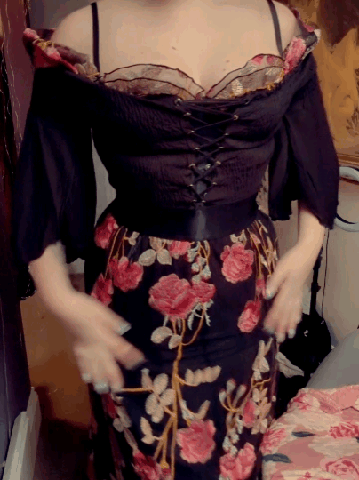
A more 'wearable' version?? ✨🌹
Treat me ~ Tip Me ~ More of me
#Layered it with the black mini dress! I could totally wear that out of the house 🤔#Felt like a casual princess tbh#satans knitwear#Any tips or treats would be massively appreciated right now 💕🌹#alt pinup#pinup girl#Ootd#Vintage vibes
98 notes
·
View notes
Text
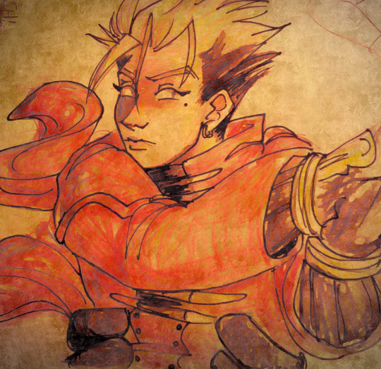
sometimes you gotta shoot before you see the target or however that song goes
#crow art#trigun#vash the stampede#the pic itself is just crayola colored pencils and a felt tip pen#i just ran it under a couple textures then overlaid the original on a second layer to bring the lines back out
142 notes
·
View notes
Note
Messy linework tips ?
Keep the sketch in and just erase the parts you don't like; you don't need to give up the sketch layer for the lineart layer or vice versa, you can keep both. it took me a stupidly long time to realise that
try to avoid "lineart" brushes (aka hard edge tapered brushes with full opacity) i think they're also called "inking" brushes yeah those are for clean, strong lineart and that's not what we're going for
look for more textured brushes instead, brushes that change their opacity with pressure ( aka the harder you press on your tablet, the more opaque the stroke becomes), you can even do the lineart with that very same sketch brush you used. When it comes to messy linework, it's about the quality of lines, not the tidiness
some parts will be messier than others and that's okay! we should give up on that perfectionism and need for control and let some parts be messy
try to think about the angles and shapes your linework creates. This is where style and personal preference come into play: I personally like more sharp, boxy, geometric shapes and figures, but you can also go down the soft, round, organic shape route (like Loish's artstyle for example if you're familiar with her works or,.,, disney idk) OR you can have a nice balance between both organic and geometric lines as it creates a nice effect ( a very good but random example i can offer off the top of my head is ehm Chuuya's hair in the dead apple manga— it has both very sharp buy also curvy "S" lines and it's just so very pleasant to look at you should look it up bshjds ) many or most artists usually use both organic (Circle- round, curvy) and geometric (Square - sharp, angle, precise) shapes in their work with a preference for one or the other. It's a spectrum, if you will
that's all i could think of........ disclaimer take everything with a grain of salt it's just word from the street aka what i do and what works for me if it doesn't work for you and i ruined your life and marriage it's not my fault
also if you meant like,, tips for /fixing/ a messy linework then i severely misinterpreted this ask 😭 nor can i help you my linework is messy too I'm not your guy anon
#it just hit me last mintute that maybe you wanted tips for improving lineart and i had a glass shatter sound effect.mp4 moment#hopefully you didn't mean that aha <3#really if there's anything to take from this just. keep the sketch layer in on a lower opacity don't hide it it saves lives#ask iztea
58 notes
·
View notes
Text
If you have trouble drawing clothing folds, wrap a tissue around your finger and bend it at the angle and position you want it to
#another art tip: if you use CSP you GOT to know about the 'selection from layer' function.#you know the thing where some people fill the base with one solid grey to make adding base color easier since it wont bleed out of border?#you don't need to do an ungodly amount of clipping if you can just click that grey base and chose 'selection from layer'#deselect and select it however you want. this way you can clip the individual base color for whatever reason#without needing to alpha/transparent lock it to customize the color#okay these sounds so specific. please say it's not only my own unique experience 😭
131 notes
·
View notes
Text
Rocking the Night: Effortless Day-to-Night Outfit Transitions
Rocking the Night
We’ve all been there – a busy day at work, followed by last-minute plans for a night out with friends. The struggle to find the perfect outfit for both occasions can be daunting. But fear not, fashion enthusiasts! With a few clever tricks up your sleeve, you can effortlessly transition your look from desk to date night. Get ready to rock the night with style and confidence as we…

View On WordPress
#classic white shirt#confidence in fashion#Day-to-night outfit transitions#dressing up denims#footwear choices#layering tips#little black dress#midi skirts#office to night-out fashion#seamless fashion transitions#statement accessories#stylish accessories#stylish blazer#versatile fashion#versatile wardrobe
0 notes
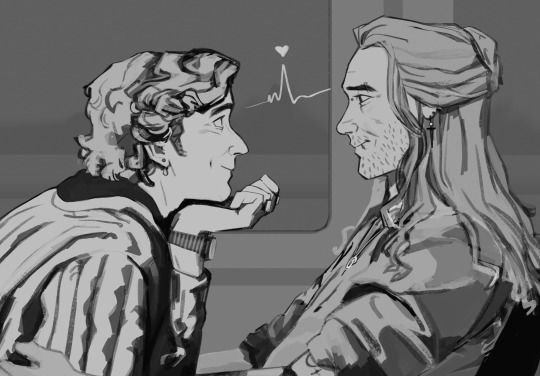
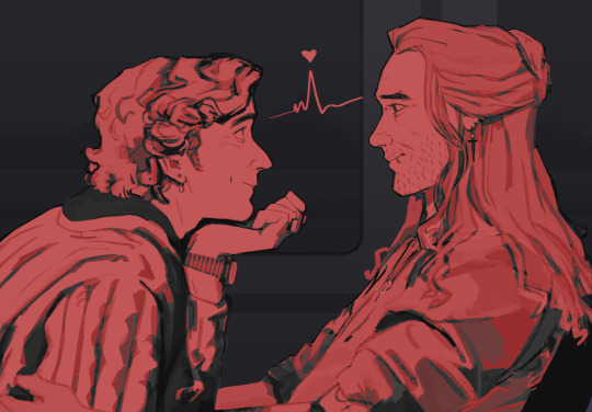
Photo


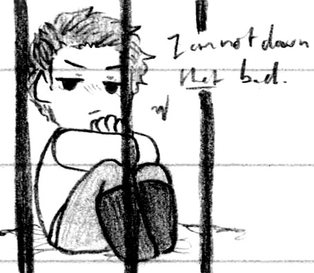
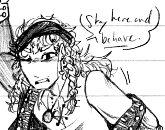

He was a human pirate, which you wouldn’t think you’d have to specify and yet (Patreon)
#Doodles#SCII#ZEX#The Captain#This isn't even a sci-fi pirate adventure anymore this is just straight up human pirates lol#How many layers deep can we go until it's unrecognizable! Next up is Pirate AU!Helix! (Kidding. For now) Lol#There is something funny about it all to me as well considering how in-line it fits with the research I was doing for a Vargas fic concept#All these bodice-rippers coming home to roost lol ♪#Which is also interesting 'cause I hadn't thought about this particular fic from that perspective before but it also fits! It works well!#Yet another angle to approach it from on a reread haha ♫#ANYway lol - human!Pirate!SCII specifically finally lol#I do love just how openly attracted the Captain is to ZEX as a human haha - his attraction/disgust to VUX-ZEX is wonderful of course#It's just so silly and cute how honest he is when ZEX is in a body that he's aesthetically attracted to haha#And ZEX recognizing and utilizing that! But it still not quite tipping him over to being completely sold on the whole kidnapping thing lol#''I don't understand it! I look beautiful and I /know/ he's attracted to me! What could be stopping him from sleeping with me???" lol#Keep trying ZEX I'm sure you'll get it at some point haha#Finishing off with an idea of ZEX having to deal with a hostile and still not quite trusting the Captain not to run away#Or risk him getting hurt! ZEX can handle this! Let him protect you!#But the Captain also wants to help! And/or escape y'know whatever's most convenient haha#He's proud <3 And he does have an affinity with ZEX at this point - he knows he can be useful! But that's not what's most important to ZEX#Also being scolded and blushing a bit hehe ♪ Given just a bit of pause to be told by such a pretty face to ''Behave'' ♫#I do really like ZEX with the coat and braids hehe <3 Handsome
110 notes
·
View notes
Note
how did you do that black lineart piece? its amazing...
AAAAA thank you!!!! ;w; i'm assuming you mean the one with colourful lineart and black background? honestly it's quite tricky to explain but i'll try my best to show it step by step. it mostly relies on how ms paint's transparency works and the 2 colour slots!

^ these are the colour slots in question
say you're drawing with black lineart and you want to make it rainbow. well first of all turn on transparency, which is here

usually i do this with 2 ms paint canvases open so it's easier: so basically i open another ms paint tab and enable transparency on there as well. important thing: set the second slot colour to your lineart colour to affect the lineart!!!

then if you have transparency on, you can copy the drawing from your first canvas and paste it on your second canvas, which is rainbow coloured (or whatever colour you want really), and it should do this!


TADA!!!!!! you got your rainbow lineart!!!
you can also do this with literally any colour as long as it's present on your drawing and it's selected on the second slot colour. so if it's set to the background colour, it'll do something like this
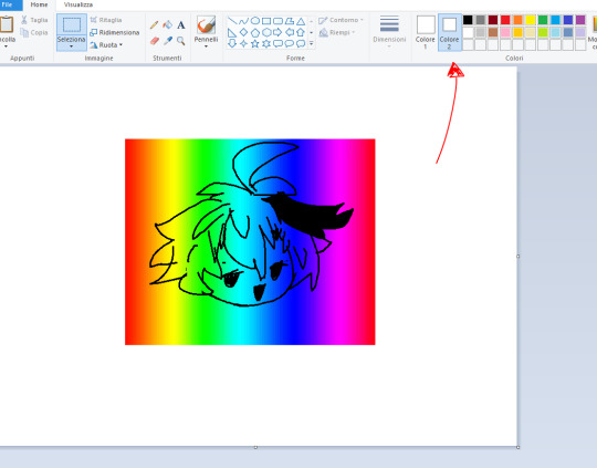
that's basically it!!! i'm not sure if you can do this with 1 tab but i do it with 2 so it's easier to copy the drawing and stuff, i hope i explained it well!!
#asks#ms paint#ms paint tips#long post#honestly i really like how ms paint transparency works because it's basically like using layers#it has helped me with so much stuff especially when it comes to backgrounds#also sorry for answering this really late i really had to think about a way to show this HKJDHGKJHJKEGH
41 notes
·
View notes
Note
Your latest update has me in awe oh my fuck
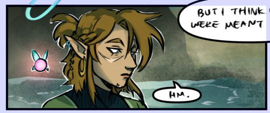
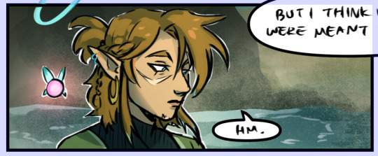
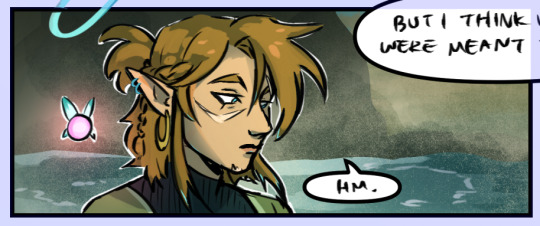
Any tips for rendering? The way you did the fairy/slate lighting is so pretty!!
Also the seeing the differences between pre and post calamity slate when you put them right next to each other is so good 😩👌🏼
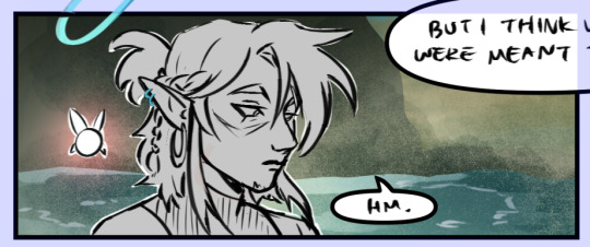
thank you so much! I can go through how I colored one of the panels if that's helpful! This is the method I use for the whole comic.
I chose this panel since it's got fairy lighting. under the cut!
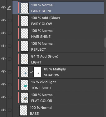
This is what my layer structure looks like in Clip Studio Paint EX. The layers marked in red are clipped to the BASE layer, meaning that they will only fill inside the lines of that layer. This makes the process SO much easier. You can clip layers to the layer below by clicking this icon at the top of the layer panel.

This is what the base layer looks like, just filling in the lines:
Then, I add flat colors:
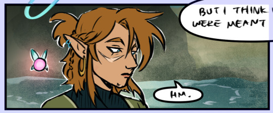
I don't always do this, but for this setting I added a teal/green tint with the blending mode set to Vivid Light 16% opacity. Soft Light, Hard Light or Overlay are also good for this I usually just toggle until I decide one looks best:
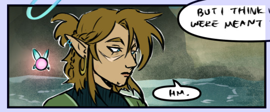
I then add a layer filled completely with a shadow color set to multiply, usually lowering the opacity depending on how intense I want the shadows to be. I then add a layer mask (also at the top of the layers panel, it looks like a white rectangle with a dark circle in the middle) which allows me to mask out the shadow shapes without actually erasing anything on the color layer. This makes it easy to make changes!
Then I add in the lighting by taking a big airbrush and lightly coloring in my light color from the direction I want the light to be coming. I set the blending mode to Add (Glow) because it create a nice glowy effect and lower the opacity as needed:

Sometimes I will go and add little shiny details to the hair, and in this case reflected light/glow from the water below:
For the fairy light, I use the same Add (Glow) method as the other lighting, using pink this time and focusing only on the areas that would receive the glow:
And finally, I add some pink shine on the edges. I don't line the whole edge, but choose peaks the light would catch:
And that's it! I don't always do this many layers, most panels really only need the SHADOW and LIGHT layer and maybe a bit of hair shine. layer masks are SO helpful i highly recommend utilizing them. I'm always happy to answer questions on main if people want to know more about my process <3
#bonus content#art tips#ask#i labeled the layers all nice and pretty for this lol usually it's a mess
348 notes
·
View notes
Text

visiting laventon
#volo#pokemon legends arceus#hoorah angst!#professor laventon i guess?#laventon mentions that volo stopped by to wish him luck on his research after the postgame#and i had been wanting to draw him all day so i made this#deflated his arceus hairdo bc hes disheveled and sad#pla spoilers#i played around with colors a lot! gradient maps are fun#the sunrise was fun to draw#i color picked it from a screenshot from the game#there are like 30+ layers on this bad boy#hes so fun to draw#i miss him a lot i dont like that you cant find him BUT#it also leaves room for interpretation of what happened to him and what he did#i like the hiker theory#also the one where he just. dug out the grand underground out of boredom.#either way i want him to keep the white tips on his hair#i still have a lot of thoughts but i’ll just say them in the tags of my next volo drawing#cuz you know its gonna be soon#pokemon volo
487 notes
·
View notes
Last Seen Blogs
ljingham
creatures, past and present

dusuncelerimde-kayboldum
Su perisi

detective-prince-enthusiast
okay, but is every day great at MY Junes??

univy
The unique me