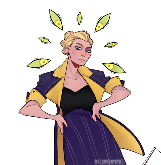
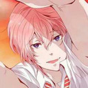
#just a fun lil colour palette
Note
The color palette art you've done are so pretty! Are requests still open? If yes, I'd love to see Ai in 231. Thank you in advance!
Tysm!!!!
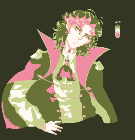
#anon this was so fun#but this entire time i was just thinking ‘what was the thought process behind these colours?’#and i mean that in the best way possible like i had a wonderful time drawing him using them#i just wanna know#was we going for watermelon? abrosexual flag? or maybe bc this palette a lil closer to yusaku’s pallete?#or is it just that pink and green are really nice colours and im insane#tysm once again!#yugioh#vrains#ai vrains#ai fujiki#art#reblogs appreciated
17 notes
·
View notes
Note
Idk why this concept makes my heart so warm but I’d love to see something where the reader asks Leon to do her makeup for fun and he’s clueless! Like a lil date night activity!

Makeover!
{Leon tries to do your makeup}
Aww this is too cute!! Thank you sm for the request my lovely!! Hope you enjoy!! 💕
⋆⁺₊⋆ ☾⋆⁺₊⋆ ⋆⁺₊⋆ ☾⋆⁺₊⋆ ⋆⁺₊⋆ ☾⋆⁺₊⋆ ⋆⁺₊⋆ ☾⋆⁺₊⋆ ⋆⁺₊⋆ ☾⋆⁺₊⋆
“What’s this one again?” Leon asks, fiddling with the eyeshadow palette, shutting it and closing it over and over again as the magnetic seal clicks with the action.
You’re shocked at how willing he was to say yes to the idea of him giving you a makeover.
“That’s eye shadow,” you tell him, before going over the products one by one as he nods with an enthusiastic smile, and he would be lying if he said he wasn’t excited even if he was utterly clueless about what to do.
You take a seat on your desk chair watching as he takes the foundation, “This one first?” He asks a little unsure of what he’s actually doing, and you giggle as his brows knit together with confusion.
“It’s all you baby, whatever you think goes first” You look up at him with a smile.
“Alright” he smiles, and you watch, feeling a little nervous, as he holds the bottle to your face, the nuzzle pressed against your cheek as he squirts the product on your face, and you gasp at the sudden coldness, giggling as he mumbles a small ‘fuck’
He takes one of the many brushes dabbing it across your face to smooth out the foundation that sits against your skin, he stands back admiring your face with a proud smirk before turning back to the dresser and picking up the eyeshadow pallet he was playing with earlier, and you cringe at the bright neon colours, out of all the pallets he just had to pick that one.
“Don’t be so nervous you’re gonna look so sexy” he chuckles, as he takes one of the smaller brushes dusting it with the bright pink, and your eyes flutter close as he applies the eyeshadow so gently to your eyelids, you barely even feel it, his hand occasionally brushes against your cheek as he continues to use the bright colour.
“I’m not hurting you right?” He asks so softly, and you can feel his breath fanning against your skin.
“No baby you’re alright” you whisper back, eyes still closed as he makes a joke about switching job professions, ‘government agent turned beautician’ and you can’t help the giggle that bubbles out of you.
There’s a comfortable silence that settles between you both, and the only thing you can hear is the soft music that plays from your speaker.
Your eyes open as Leon cups your jaw, “I’m not doing a very good job” he chuckles, admiring your face and he can’t believe you’re still so beautiful even if he's doing a terrible job, he presses a gentle kiss to the corner of your mouth before going back to dresser picking up eyeliner with a confusing look.
He removes the cap, his eyebrows rising with shock, “What is this?” He asks, looking back over at you.
“Eyeliner” you smile, and it only confuses him more.
He study’s the product trying to make a guess on how you use it, “It goes on your eyes?- How do I?” he trails off manoeuvring his hand to try and figure out how to apply it, he stares at the brush tip with a very baffled expression.
You explain it to him, giggling at his horrified look he leans into you with hesitation and it makes you a little nervous, “Just be careful, don’t take my eye out” you tell him and he nods with a nervous chuckle and it definitely doesn’t make you confident.
His hand leans against your cheek, as he ever so gently drags the brush tip along your eyelid and he winces at how messy the line is, “Don’t open your eyes” he whispers as he does the same to your other eye, and it’s considerably worse than the other.
He pulls back laughing at how wobbly the line is, and it definitely doesn’t look the same when you do it, “Am I still pretty?” You smile looking up at him.
“You’re always pretty, the prettiest girl in the world,” he tells with a loving tone, handing you the mirror with a teasing ‘Ta-da’ and he chuckles at the boisterous laugh that erupts from you.
“Woah baby, it's a good attempt” you giggle, studying the awful job he’s done.
Leon looks down at you, how your eyes crinkle with joy and a loving feeling blooms in between his rib cage and it makes his heart flutter with adoration, the sweet sound of your laughter could brighten his day without fail always.
He picks up the makeup wipes taking one out, “Come here pretty angel” he says, wiping away the makeup gently, he knows how to do this part as he thinks back to the times when you were too drunk to do it yourself, and the cool sensation washes you with relief.
He wipes the makeup until your face is completely clean, and his big hands cup either side of your face making you look up at him, “My beautiful girl” he smiles leaning down the press a kiss to your lips.
You smile against him suddenly feeling awfully bashful, “Are you, hungry baby?” he asks, and you watch as he cleans up the space.
“Mhm, you wanna make pizza?” You ask, and he nods putting away the makeup products back to their rightful place before you both make your way to the kitchen.
⋆⁺₊⋆ ☾⋆⁺₊⋆ ⋆⁺₊⋆ ☾⋆⁺₊⋆ ⋆⁺₊⋆ ☾⋆⁺₊⋆ ⋆⁺₊⋆ ☾⋆⁺₊⋆ ⋆⁺₊⋆ ☾⋆⁺₊⋆
#leon s kennedy x reader#leon scott kennedy x reader#leon kennedy imagine#leon kennedy x reader#leon s kennedy#leon kennedy#leon kennedy x you#leon kennedy x y/n#leon scott kennedy#leon s kennedy imagine#leon kennedy drabble#leon kennedy fluff#leon kennedy headcanons#leon kennedy fanfic#leon kennedy fic#resident evil fanfiction#resident evil leon#resident evil#resident evil x reader#resident evil fluff#resident evil fic#resident evil 4#leon kennedy re4#re4 leon#leon resident evil#leon re4#leon x reader
2K notes
·
View notes
Text
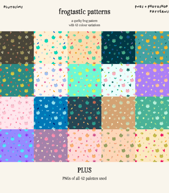
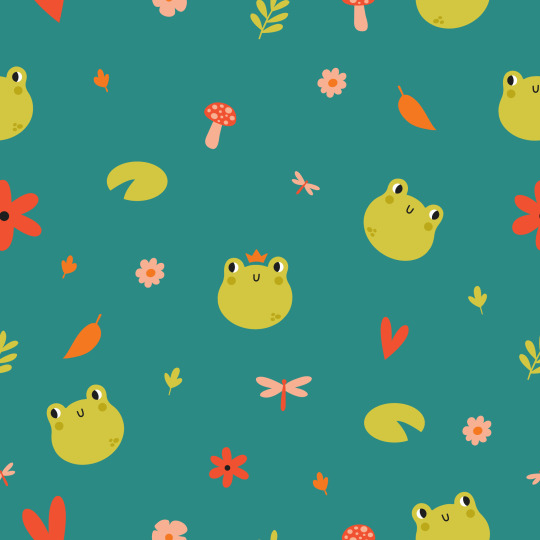
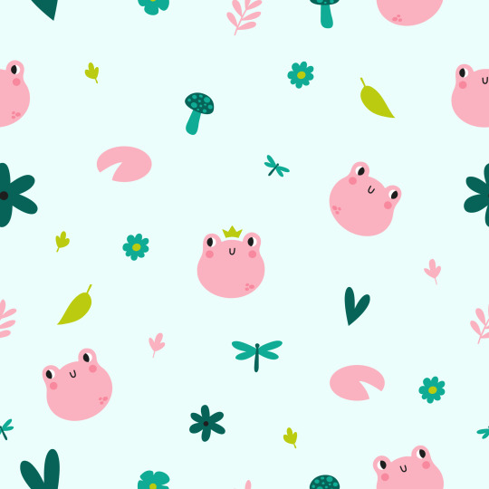
Frogtastic Patterns
it was suggested that I make some froggy patterns, and, well....ask and thou shall receive >:) anyway, just like all my other pattern resources - PNGs and PS pattern files of this cute lil frog pattern with 42 colour variations, for y'all to use however you want.
details and download under the cut!
Details
Original frog themed pattern created by yours truly
42 colour variations, using the same palette as my bigfoot patterns
Available as seamless PNGs and Photoshop pattern files, plus a folder containing PNGs of all 42 colour palettes for convenience
Ooooh look it's some bigger preview images


Like I said, you can make whatever cc or anything you want from these - my only stipulation is that it is FREE (and that means no early access content, no adfly or similar link shorteners etc. free for everyone, always). a tag is always appreciated because im nosy and wanna see what y'all make, but i’m not gonna be hunting anyone down if you don’t asdfghjhgfds.
thank you so much @fiftymilehighclub and @nicatnite88 for the suggestion, this was so much fun to create!
Download: patreon / google drive (both 100% free for everyone, always.)
#sims 4#ts4#sims 4 cc#sims 4 resources#sims 4 cc resources#sims 4 patterns#my cc#cc resources#sims 4 custom content resources#sims 4 creator resources#maxis match#sims 4 mm#sims 4 palette#sims 4 palettes#ts4 palette#ts4 palettes
231 notes
·
View notes
Text
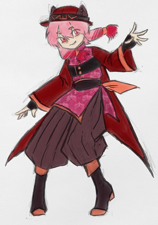
It’s kinda frustrating to struggle with character design for a month and then it kinda just comes to you one night and you are done. Anyways, here is Candy.
Failed designs and my ramblings under cut.
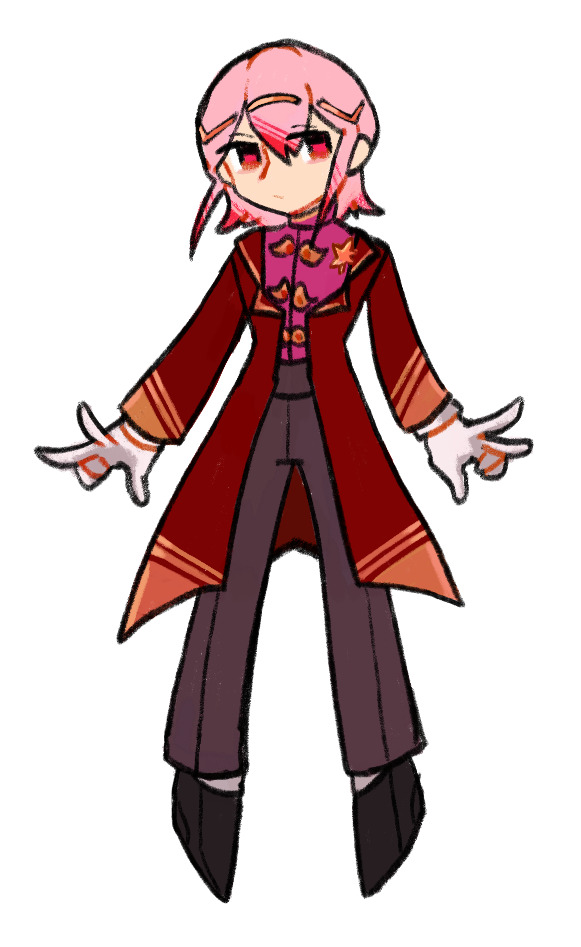
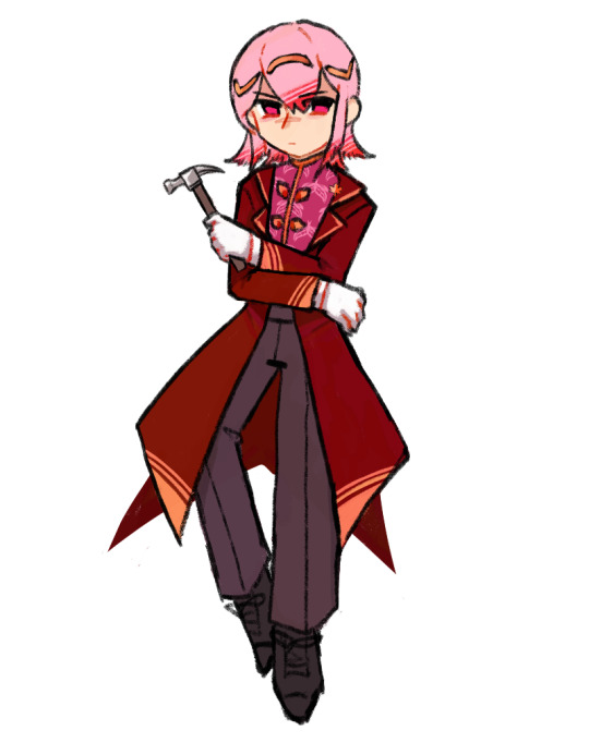
First two drafts. They are generic and no fun. The only thing that I took from those is colour palette.
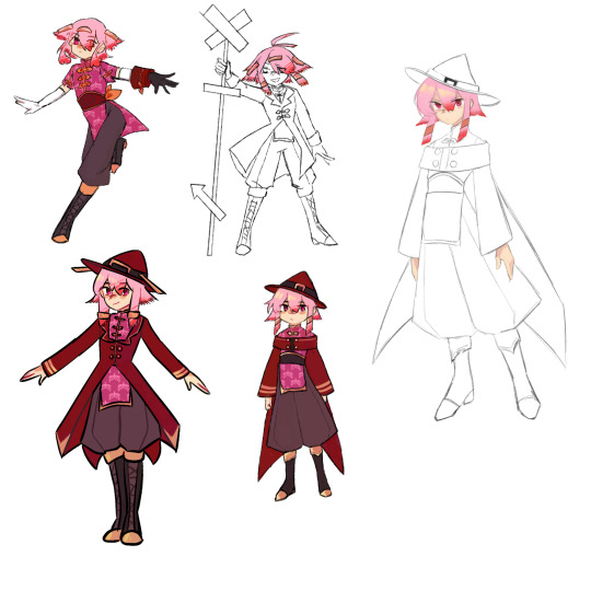
Tried to go with more of “what kind of lil guy is that?” approach. Red witch hat was absolutely unnecessary, yet I stuck with it refusing to see that I what I made is just red Marisa. Changed it for a more sensible hat with some kind of animal ears shapes.
I thought that I would have more to say about the whole thing, anyways he still looks like a Len en character.
48 notes
·
View notes
Note
Mind drawing my TADC OCs please? (What are your thoughts on them?)
🪙
🦌
I have art block rn so I immediately ran to ibis paint. I have a few thoughts of these fellas and I made some notes (both in the drawings and in my head).
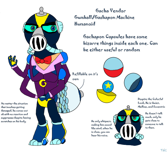
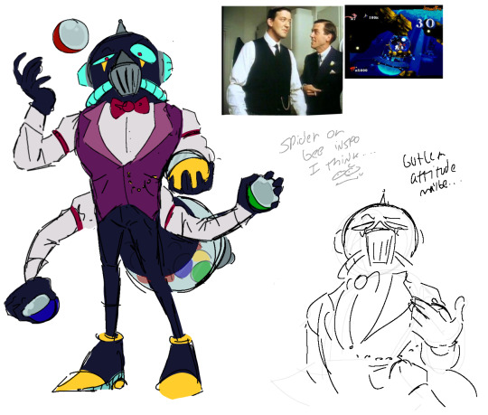
The first guy has a very interesting concept. I first noticed the diving helmet head plus the cold colour palette. It reminded me of the underwater level of earthworm Jim and I do think you could add some more details that continue that theme. You've also got a sort of bug theme and I don't know if you were inspired by a spider or a bee, and both themes/characteristics could lead you to two different designs (or you could just leave it as an anonymous bug). And last but not least you've got the suit plus the surprise balls: I do love the idea of this guy pulling out strange surprise balls to either aid the cast or to just pull out some random thing. I tried to keep the design a bit more simple and made some adjustments so that they look more like a magician/butler (Given their personality, I do think that the butler theme fits them better).
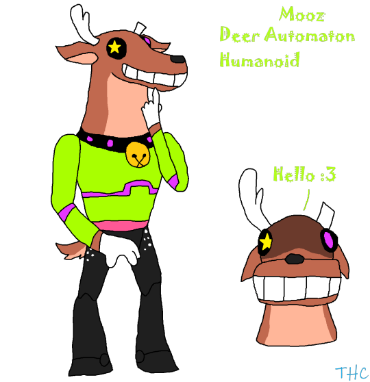
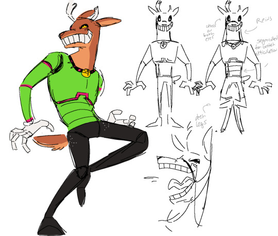
The reindeer guy was fun to draw :) Their ominous aura + their whimsical face caught my overall attention and I also wanted to expand the reindeer theme. Their colour palette is simple and I really like that and you could make very interesting dynamics with the rest of the cast.
Sorry if I went on a ramble. I got excited when you asked for my thoughts and I love analysis and expanding themes even if it's just a lil bit.
I don't mean to tell you what to do, these are just suggestions (tho I might've went a lil overboard. Again, sorry bout that)
#faceee rambles#tadc#It's been a while since I've drawn anything tadc related#walp back to geometry dash
36 notes
·
View notes
Text

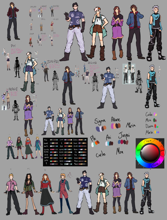
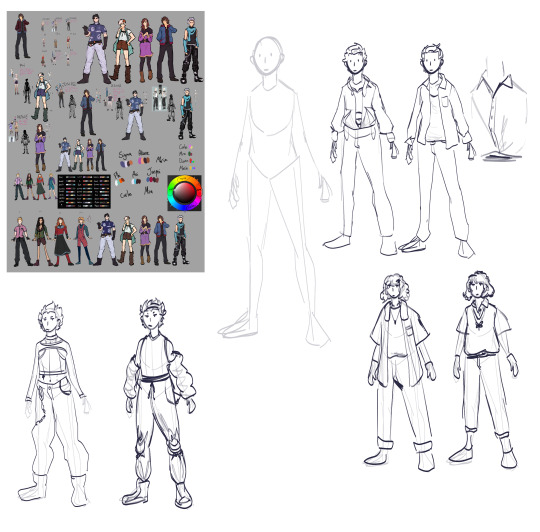
hbjhkgvhj ok here are uh. some character designs i did abt a year ago
these are all based on the incredible @kayzero's fic zero win game, which is a rewrite of ztd with akane as the protagonist, and it has possibly THE BEST characterization of akane ive ever read- listen just. just go read it you will be enriched i promise.
im not putting an image description bc i dont know where to start (sorry!!) BUT ill put a bunch of character design notes below the cut for people who are insane like me <3333
ok first of all. i know when i sent these to kay the other day they said there were some details canon to zwg that i missed (akane's lil hoodie pocket, aoi wearing white to contrast junpei's black (which is SO inspired btw.)) so just. PRETEND those are there bc i forgor <3
i spent the most time on sigma, phi, akane, junpei and aoi just because they've had multiple iterations of designs. it was fun to take bits and pieces from each version of them, so thats why they get a feature page
you can see a lot of my little pink notes with criticisms of the ztd designs there. in general, i really dont like the ztd designs, they all feel unnaturally bland to me (although thats probably also the artstyle).
most people whove looked into the colour symbolism in zero escape are probably familiar with the whole red/blue thing: that is, theyre colours representing the morphogenetic field. akane and aoi are the most obvious examples of this. 'aka' means red, and 'ao' means blue. in the first nonary game, akane and clover wear red - the colour for transmitters - and aoi and light wear blue, the colour for recievers. in 999 proper, akane wears purple, to symbolise how she can recieve AND transmit, while junpei wears red and blue by themselves. you can do a whole analysis of these colours and i will not put it here thats a whole SEPERATE post
anyway! the actual designs!! i'll start with sigma. i wanted to reconcile his vlr design with zero ii's design, and initially i planned on giving him a coat, but it didnt really have a nice silhouette, so i ditched that idea. instead, i turned his jumpsuit from vlr into a polo shirt - much like what he has in ztd - and gave him some zero-y accessories: the white turtleneck, the belt and the gloves all come from zero's design. once id included the white turtleneck, making the pants white felt really logical. in character design, its generally best to limit the palette of colours as much as you can, so it was a good excuse to reuse a colour while also paying homage to his ztd design. i also cut his hair bc hes a scientist and he'd do that.
phi's design is a lot more like her vlr one than her ztd design. the blue coat was her hallmark accessory, and im shocked that they ditched it for ztd, so i gave it back - along with her boots and hair accessory. i kept her pants and glasses from ztd, as well as the way the bottom of her shirt is tucked into her pants. they just have a much nicer silhouette to me. between my first pass of colours and my second pass, phi's colours changed the most - i realised i had too many blue guys in the lineup, and wanted to make the colours stand out individually. so i leaned into phi's orange-ness. giving her hair accessory, pants and boots an orange hue instead of a blue one, as well as shifting her coat to a more teal colour really helped make those colours pop.
AKANE MY BESTIE!!!! her design was probably the one i had the most fun with. i basically just took her ztd design and purpled it. I did want to include some more details though - her neck scarf was in both her 999 AND vlr design, so it felt wrong not to include it. i also added some gold highlights to her design, just to complement the purple - her boots are also toned yellow, so it felt fitting. the cut of her sleeves, as well as her hair, felt really natural: i gave her the side ponytail from ztd, while letting more of her hair fall to the side to retain her silhouette from 999. i stole the sleeves wholesale from vlr akane, but can you blame me. look at that robe. its so pretty.
overall i have mixed feelings on ztd junpei as a character, but i think his darker turn is at the very least a fun direction to take him. I do like the jacket he has in his concept art. IT SURE WOULD BE NICE IF THE MODEL ALSO HAD A JACKET. his design went relatively unchanged overall, i basically just retoned his hair, gave him a button-up instead of a t-shirt, and puffered his jacket. the red and blue from his vest in 999 is reused here, but in darker, more muted tones. you can see in the corner of the drawing i played around with swapping the red and blue, but the red focus felt too edgy for junpei. the blue also pops really nicely against his dark clothes, so i kept it.
anyone who has spoken to me for more than ten seconds will know how insane i am about aoi kurashiki i mean come on my name is santa. i think a lot about his two designs: that of the first nonary game and in 999. in the first nonary game he wears a blue scarf, harkening to his role as a reciever, but in 999 he wears monochrome. my personal interpretation of this is that his 999 fit was him purposefully disguising his connection to the morphogenetic field. so post-999, since he doesnt have to worry about that, i gave him his blue back!!! his general fit is the same- his pants and shoes are artistry so obviously i kept those, and i ended up making the rest of his look black to contrast his 999 design. if i were to redesign him now wearing white, id probably go a different direction altogether. that third little drawing ive included has some test outfits for him, carlos, and maria, but i never really went anywhere with them. also i gave him dark roots to show his relation to akane a bit more. and also because i like projecting my roots always grow back SO fast
that brings us to the 4 characters introduced after vlr: carlos, mira, diana, and... maria??? yeah like i said go read zero win game. do it. maria is such a fun character. she was, coincidentally, ALSO the only character where i had to design someone from scratch. you can see i fiddled a little with colour palettes, trying to figure out how to give every character a unique look. diana and carlos' designs actually go almost unchanged here- i think dianas design in particular is actually pretty great, and works as a nice foil to luna in vlr. carlos is just kind of normal. he can have his silly polo shirt.
miras ztd design is. ugh ok look its FINE but i hate the boobie designs in zero escape because they always feel like they were designed seperately from the character. mira in zwg is still a sussy baka, but she's a lot more cordial- i enjoyed seeing her more as a snake lying in the grass. I ended up giving her green because its a fun colour to give characters who youre meant to distrust. SO MANY TIMES reading zwg i was like "oh maybe mira's chill - oh wait maybe shes not - oh wait maybe shes chill again" and i love her for that honestly. she still gets boobies because i love women but i gave her a fun little long sleeved corset top. the amount of skin she shows directly correlates to the amount you should trust her (i am only half joking.)
i wont talk about diana because honestly the only change i made was giving her a little blue strip at the bottom of her skirt, but i'll talk about maria and carlos together. carlos i kept as a little pink boy because i love him and i love pink and listen its my character design ill do what i want. maria in ztd AND in zwg experiences reverie syndrome, which is connected to the morphogenetic field. her and carlos' designs both incorporate red and blue again- (just realised diana also has red and blue. pretend that was intentional) -to show their connection to the field. yes yes i know its pink but listen its red enough. like aoi, i gave maria and carlos both different iterations of their designs. i'm less sold on carlos', but i did actually like the baggier, heavy designs for maria. with those ones she looks more depressed than she does wearing overalls, so im calling that a win. maria's was the design i was least satisfied with overall, but hey i did these like a year and a half ago and ive gotten much better since then soo.
if youve read this far this is once again a reminder to read zero win game by kayzero on ao3
#mq arts#zero escape#999#virtue's last reward#zero time dilemma#zero escape spoilers#999 spoilers#vlr spoilers#undescribed
54 notes
·
View notes
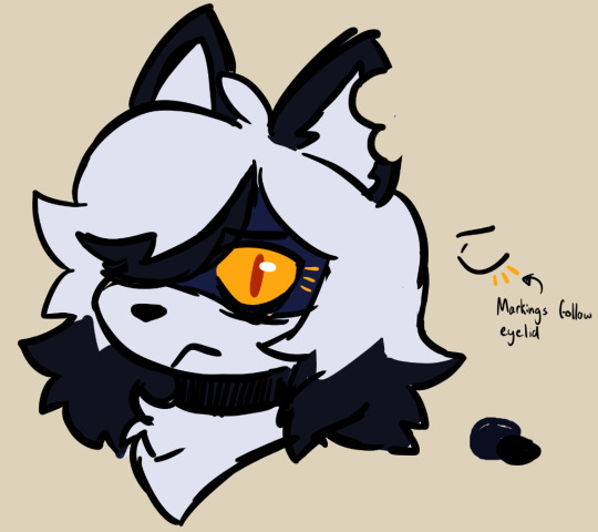
Note
Hey, absolutely obsessed with your art style! Just wondering if you have any tips for making colour palettes for art pieces (or anything to do with the colours you use because your art always has the nicest colour schemes) tysm!
Hello!! First of all tysm!!! I don’t think my colours are that outstanding so this is a neat lil surprise!!
So, for the colour picking itself I’m not sure how to help because I go by instinct, leaning towards muted tones! I rarely use colour palettes and tend to just save colours that I think are pretty and stick to those!! I’d recommend looking around tumblr, Pinterest, etc, for inspiration and studying the ones that you like, e.g. the colour contrasts, use of certain colours to highlight/shade something! However I can give some advice to sort of toning the overall drawing!! Disclaimer, I’m not an expert I draw for fun!! This is just what I do personally yea!
Firstly here’s a quick tip to toning an overall illustration to get the colours to gel together! Usually adding a coloured layer with a layer setting over the whole piece really helps the colours be more cohesive! It’s best to experiment depending on the mood of your drawing, but usually I use ‘overlay’, ‘soft light’, ‘colour’, and ‘linear burn’. The opacity usually ranges from 5% to 20% depending on the desired intensity.

I also want to say that when shading, I’d recommend using a reddish tone on a lower opacity with the Multiply setting! I used this for Willow’s shirt, arms, and nose, which helps bounce of the original colours. Using grey to shade often comes out as a murky imo.
Secondly, here’s a small tip for monotone colours featuring a Luz!! Using the same colour on a Multiply setting helps keep the colours cohesive and prevent clashing colours that are jarring!! And masking a different colour over at certain areas helps to make it less flat quickly!
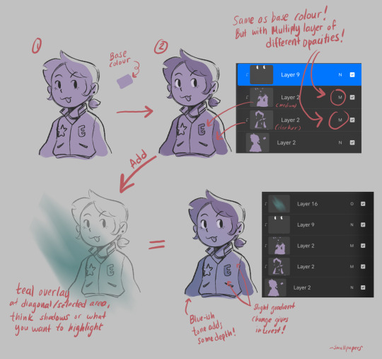
I don’t know how useful this is but I hope it helps!!
38 notes
·
View notes
Note
Very curious on your take on Fem! Prosciutto and also how she'll interact with Fem! Pesci
Btw love your art keep on going!! (◍•ᴗ•◍)❤
OMG i LOVE drawing fem Prosh really!

One of the reasons being of course designing her outfits, i really like this classy style so with every art i try to change a lil her suit design! I see her as a very feminine strong and strict woman (as Miranda in the Devil Wears Prada for example). As for Pesci i tent to change the og outfit less leaving it as in canon or adding few details so it doesn't look as plain in comparison to the others ( also it made it look like she wears an 70s-ish jumpsuit and an afghan coat which looks very different in style to Prosciutto's)
They have a lil similar colour palette with very different styles that makes them to me a very fun combo to draw!
I also headcanon them growing up together in orphanage and they just are stick together since. I feel like Pesci needed someone to look up to as Prosciutto, who was determined and with a goal to get out from poor and miserable live as soon as possible she needed to grow up very early. Now i see this two very similar to Lemon and Tangerine from Bullet Train movie!
like look at them and tell me im wrong
youtube
#jojos bizarre adventure#jojo fanart#jojo#jjba#jjba pesci#jjba prosciutto#jjba genderbend#gender bender#fem! la squadra#golden wind#vento aureo#jjba part 5
176 notes
·
View notes
Text
countdown to 2024 - artists edition
Okay but like four is too few of a number to shout out but I'll still try my best! @choicesfandomappreciation
@cassie-thorne: Max's art is literally the best and I love her work so much! She puts out bangers after bangers and I absolutely loved watching her style evolve and grow this year and I'm looking forward to seeing it next year too! I especially absolutely love how Max tackles lighting and backgrounds in her work, like it's so unique and each piece tells its own story too. Some of my favourites: The Barbie Premier, Aislinn!, be gay solve crimes, themm and Cameron x Astrid
@fairymatchmaker : Joy's art is actually a masterpiece, like this is not just your everyday artist sorcery-shenaniganing, this is like the chad version. I absolutely love love love how they draw outfits and poses, like their attention to the small things is just insane. Thank you for sharing your wonderful art and being around in the fandom! Here are some of my favs: Waiting for Trystan , the Crimes MCs and F!Trystan's fits
@mydemonsdrivealimo: MJ's stuff exhuberates this 'cool' energy, like my guy, you could actually design those energy drink logos or comic book covers because each piece is just SO FUN, okay? I'm def looking forward to how it'll be in 2024. (tattoo-shop au when??) Some of my favs: Jensen in weird lil tees, THE PIRATE AU, jenseeennnnn and virtually everything (I'm especially a fan of MJ's little doodles like this and the cutest thing ever)
@hydn-jpg: I love Hayden's work partially because each piece of art has its own fanbase (as it should). Last year I got a giveaway piece from them and it is still something I look back frequently because it's just so goddamn beautiful. Some of my favourites from them: just follow my lead, this adorable pick-up line, literally everything they'd created for the expression-memes this year, long time no see partner and okay, technically this is cheating but this is a piece from 2022, but this portrait of artura is just i'mma cry okay?
@oh-so-youre-a-nerd: Thia's work is nothing short of frightening (affectionate) witchcraft and I mean this in the most sincere way possible lmaoo. I still have a lot of their stuff to explore, stalk and fan over, but their Raine artwork is just S-tier for me, like look at THESE THINGS: The villain arc, head empty still thinking about this, Trystan in a flowy lil dress and ofc their entire Raine x Aerin stuff because that's either the most depressing, poetic thing ever or a massive serotonin boost. I hope to see more of your stuff on my dash next year <33
@erixafleur: I came across Erica's work after lurking in the Blades side of the fandom and I loved their MC Raya's redesign so much! Plus I loved the art style too because it gives me Disney animation vibes. I hope to explore your work even more next year! Some of my favs include: This vanity fair-themed art and oh my god their eyes, it def gives 'i'm so judging you' and I'm here for it XD , the cutest owlbear sketch EVER and this piece of Raya & Tyril
@rosefuckinggenius: Rose's been a consistent force in the Choices fandom and I absolutely live for their work, okay? And I'm not just saying because I received this UNIT of an art piece from them for Trys and Nora - like I'm still in just awe. I'm also such a fan of the fact that their work is just really soft (if I can describe it that way) to look at - like I'm a sucker for soft colour palettes, okay? My favs include: this Beelzebub piece (not Choices but yknow what how about i put it in here anyway?) and this piece for @jerzwriter featuring Eli's family .
***
And like a huge shoutout to basically all artists in the fandom! You guys have actually inspired me to like not go down several rabbit-holes trying to find faceclaims and moodboards and instead, try to make some of my own art and see where it goes! It is so fun! Thank you for being super inspirational, kind, understanding and just pure awesome and I hope 2024 is just as kind and gentle to you guys <33 Much love and cheers!
#choices fandom appreciation#countdown to 2024#also tumblr is being really weird with tagging and hyperlinks so if something isn't working please let me know
19 notes
·
View notes
Note
favorite visual moments from the new season?
Ooh that's a tough one! (Although I do have a lil compilation of some of my favourite symbolic shots from prior seasons here <3 definitely not-conclusive though) But there are some definite favourites!
I loved the consistent wrist-chain-hand clasp thing going on in Finnegrin's Wake (and Viren's dark magic dreams) so much I actually wrote a meta all about it


I also adored this shot of the broyals with the keyhole from Finnegrin's office - just very creative and I'm always on the lookout for anything to do with keys

This shot of Rayla lined up with the lamb in the portrait makes me more nervous than it probably should and was another major fave

Any and all shots up on the Storm Spire surrounded by clouds is a definite win 10/10. I loved the sharp lighting in the scenes with Viren and Kpp'Ar

Lux Aurea has also always been my favourite location so getting to go into the streets more in depth/detail and with the purple haze to everything? Truly stunning. Special shout out to the actual outside of the Bookery as well

The scene in the cave with Sol Regem was amazing and water animation has always been my fave kind of animation, so anything with rain in particular this season (Claudia, Terry, and Ezran facing the storms / the various boats sailing) was so much fun / striking visually. The transition of the prison into the moon predictably haunts me as well
I loved how Akiyu told the backstory through images in the water with ink (?) and Scumport's foggy / gray colour palette (+ bonus points discount Charon imagery). Finnegrin's big window in his scumport tower lit the room really well and allowed for some cool shots / gives him a different sort of vibe than a typical dark and gloomy villain's lair and I liked the contrast; he's civil until he's cruel, y'know?
I loved the Aaravos fadeout in Viren's eye and thought that was a really good way to (possibly) close out on his eye motif, but TDP always knocks it out of the park visually in particular in finales. The constant sunset colouring is probably some of the prettiest lighting/skies we've seen thus far though

But the whole season was so pretty. I really just need to do another full rewatch to appreciate it properly lmao
#tdp#the dragon prince#screencaps#scenery#appreciation#requests#thanks for asking#anonymous#s5#arc 2#also the dream imagery. just all the dream imagery
52 notes
·
View notes
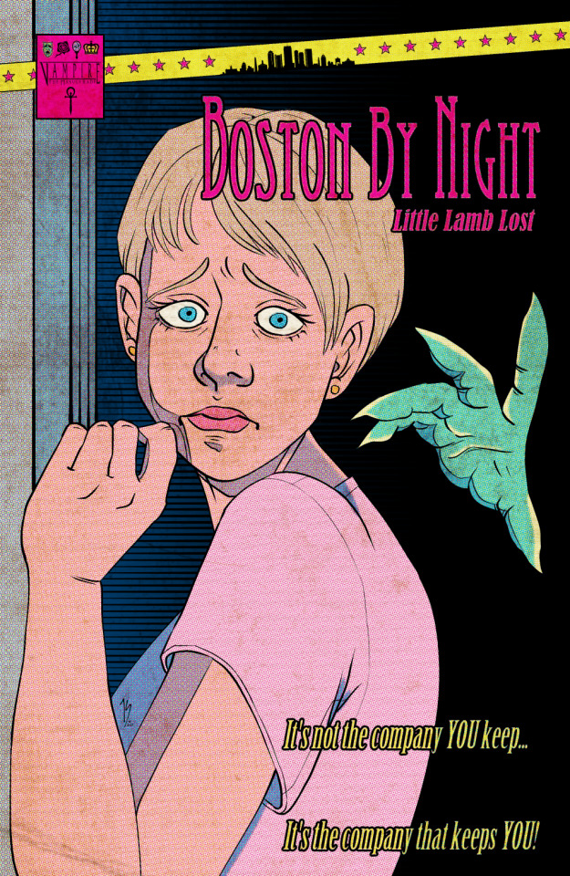
Note
Your VTM comic book covers are simply GORGEOUS, I'm totally in awe! How did you get the super cool halftone/coloured dots effect? It looks super cool and realistic, I love it! Have a lovely day! :)
Thank you so much!
So to get the halftones, I use an old-ass tutorial I got off deviantArt literally....more than a decade ago? (Rosalarian's Golden Age Tutorial). The account appears to be deactivated, but I'll go through the steps here:
For reference, I bounce between Clip Studio Paint and a very old-ass copy of Photoshop, but if you're using other programs that have fun pixelate filters and you can change the color mode, you should be ok.
NOW...
Ink your drawing in straight black on its own layer
Block your colors on another layer (I hunted up some old comic color palettes thanks to madformidcentury dot com/2013/10/mid-century-color-palette-in-comics dot html)
Turn off any and all blackwork (this is INCREDIBLY important), and take your colorwork into Photoshop. (if there are any gaps in your color work, fill a separate layer with white and then merge the layers so it's all solid)
Set the mode to CMYK
Go to Artistic Filters >> Pixelate >> Color Halftone (the only thing I mess around with is the size of the dots; the default for my era of Photoshop is 8 and that's a lil big for my taste--all the VTM covers are between 4-6. It's up to your own best judgement, but I go by how "readable" things look--does the face still look like a face at a reasonable distance or is it just a smudge? If it's not readable, undo and change your dot size)
Add 3 new layers to your document and LABEL THEM: Cyan, Magenta, and Yellow
Then go to your channels panel and click on the Cyan layer to make a selection of it
Back to your Layers panel, make sure you're on your Cyan layer, and SELECT INVERSE
Then FILL the selection with the CMYK cyan that you've picked out
Deselect your selection, move to the next layer (and make sure you've got CMYK magenta in your bucket) and repeat steps 6-8 selecting Magenta and Yellow respectively
NOW you've got the beginnings of retro-feeling halftone. At this point, I import the halftone manipulation back into CSP and turn my blackwork back on.
For the ✨ grunge ✨ effect, I grab an old paper texture (after reducing its saturation and upping the contrast until it's mostly black and white splotchy) and set it to OVERLAY at anywhere from 50-20% (this is a 'let your soul decide' moment) over the whole thing
Then I grab another old paper texture and put underneath the Overlay Texture Layer, on MULTIPLY, at anywhere from 65-25% (again, let your soul decide). Both layers will give you a nice level of funk to go with your halftone shenanigans
A lot of the colorwork is going back and forth and back and forth because what looked ok in flats didn't translate after toning, but it works out eventually!
Some important things to remember:
Cool tones tend to fade back and warm tones tend to move forward if you're gonna use this method on any kind of scene
Keep your shapes SIMPLE; don't get bogged down in tones of gradients and fades and all of that because most of it WILL NOT come across once you start toning! Think of it this way: mass-production doesn't have time for fine detail, that's why comics are a lot of heavy black inks and flat color contrast
Experiment with the colors! You're working in a limited palette (if you're using any of the old Marvel/DC print books especially), and it doesn't have to be photorealistic/absolute. For instance, my Nos isn't actually green, but the tone suited the funky retro vibe so I went with it!
Let yourself fall down the research rabbit hole of pulp covers because they're both hilarious and informative. Same dot energy is an interesting collection website to go through, you can also go through your search engine (remember to add -pinterest -youtube to your search term to filter out that crapola)
HAVE FUN!
💖
24 notes
·
View notes
Text
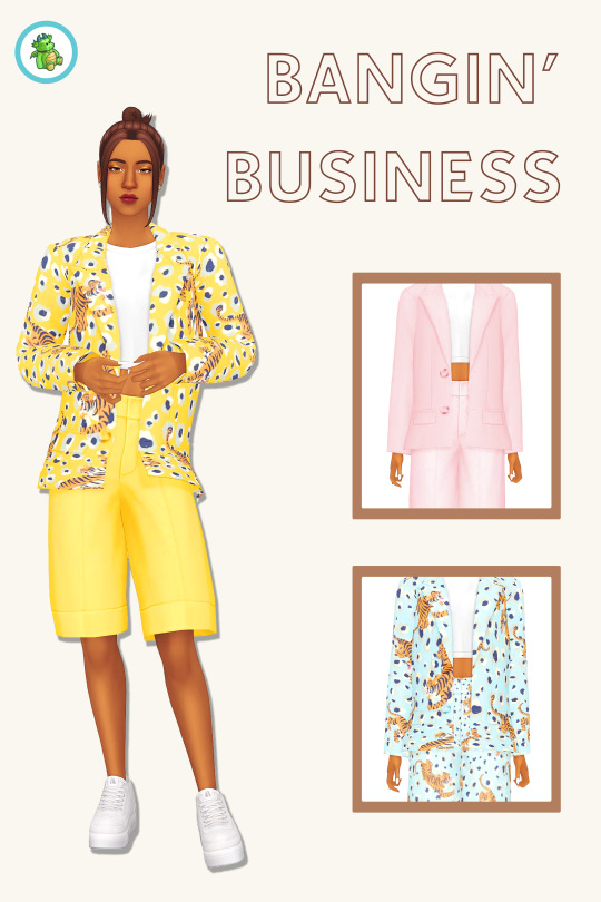
Bangin' Business Mini Set
No, your eyes don't deceive you - I'm actually posting some new cc for once!
Introducing Bangin' Business - a mini two-piece set comprising of a blazer and matching shorts, featuring a funky tiger pattern and plain swatches from Teekalu's Bee's Knees palette.
Details and download under the cut - I really enjoyed making this lil' recolour set, and I hope you like it too!
@maxismatchccworld @emilyccfinds @mmfinds
BGC recolour from Moonlight Chic Kit
Four packages - A patterned blazer, patterned shorts, plain blazer, and plain shorts. This lets you mix and match in a bunch of different combinations! Credit for the colour palette goes to teekalu/frubynoo.
Tagged for T-E fem framed sims, disabled for randoms
Correct colour and outfit category tags, and a custom CAS thumbnail
Aaaand I think that's it? Sorry for the dodgy preview pic asdfghhgfds it was just really fun to get back to making some cc again. As always, please let me know if there's any issues at all!
Download @ SFS (ad-free): here
Download @ Patreon (ad-free): here
#ts4 cc#sims 4 cc#ts4cc#sims 4 maxis match#maxis match cc#my cc#sims 4 clothes#ts4 clothes#cas cc#ts4 cas#sims 4 cas#sims 4 cas cc#sims 4 custom content#ts4 cas cc#sims 4 cute cc#ts4 cute cc#sims 4 female clothing
592 notes
·
View notes
Note
I need to know more about Michael's mom... Is she a cool mom?
SHE IS A VERY COOL MOM janet afton you will always be famous. to me
Im taking this as a chance to finally ramble abt her anyways so Janet's core inspo when designing her was to avoid 2 key things. Don't make her like Immortal & Th Restless's Clara (due to clara representing michael, not mrs afton, so i wanted to avoid that), and don't base her too heavily off of Ballora. I still have ties to Ballora's character (a music-based theme, blue-centric colour palette, im sure there were more basic ideas but everything else is more hc than themes to keep up) due to my hc thingy of each Funtime having ties to William's wife + kids, but yknow.
But yeah. Funky lady who played bass guitar + did backup vocals in a band during her high school and college years. Literally her and William dating can be summed up by "Seriously, what do you see in that guy?!" "He makes me laugh." bc she was and is WAY out of his goddamn league. Not just bc of the whole serial killer thing he was just an even bigger loser in college. Normal people dont develop a crush on a woman after she nearly breaks your nose and makes you bleed, William /j
But yeah uhh. I also dont like the idea of her being absent or neglectful purely because I got way too attached to her (i was originally gonna do that just to make things easy for myself but. Pretty lady,,, I am a very simple lesbian what can i say) so like. She obviously wasnt the greatest, most fantastic mom to ever exist given she was kinda maybe sorta well aware William was making some weird fucking clowns, but like. Hey. She tried. Also side note my reasoning for her being absent during the whole. Yknow. '83 event (and just evan's bday in general) is bc Evan + Elizabeth are twins and Elizabeth demanded a girls-only trip for her bday, and Janet promised Evan she'd do something just as special for him when she got back. That never happened bc he died lmao loser /j
But yeah uhh. Shes got a lot of regrets. Wishes she coulda done a lot of things better. Kinda dies with those regrets. Ive seen people say that one of fnaf's charms is that no character is 100% good and i LOVE that, and wanted to keep it up with Janet. Good mom and overall a good person, however made some bad decisions along the way and whatnot.
Im still working out specifics (ive been slowly working on a lil private fic abt her and william meeting + their early relationship) but uhhh. Minor notes that dont get their own paragraphs is that William sampled her voice for Ballora so yay easy voice claim, she had an on and off relationship with her band's lead singer (her name's Bev), her birth name is actually Janice Schmidt but if you call her Janice she'll knock at least 2 of ur teeth out, she's a runaway teen and got adopted by this older couple bc her home life kinda sucked (idk specifics yet), and also girlie has an extensive criminal record of minor angsty teen type charges. Also teen Mike dying his hair and then 2020's Michael's hairstyle are both kinda references to Janet's hair because he wnated to look less like his father. Thats all ty. No read more bc you WILL look at my mrs afton post, boy /j
Actually no theres more that im remembering as i write the tags and edit a few details. Back to her and William because god im insane about them. So for starters it. Well i was gonna say Janet was def the first to flirt but i think William definitely developed a crush first and they only kept talking bc of said crush so its kinda up for debate. Anyways yeah at first it was a HUGE sorta like "Well he's funny especially when I fluster him so this can be just a fun lil thing" but because they chatted more they def kinda like. Clicked more. William was a huge fan of listening to her music (from. a distance. he looked kinda like a creep but at least janet only misinterpreted it once) but like *specifically* janet he didnt give a fucking shit abt the rest of the band. Uhh. They had their first run-in and janet kinda. Well. Punched him in the nose before he cleared up that he is NOT a pervert or anything weird like that (bc a guy that looks older than he is staring from a distance when there is a clear crowd he could join kinda gave janet the Wrong idea), then they later bumped into each other in the hall and chatted for a bit, then they kinda just kept "accidentally" running into one another. Uhhh. Some cigaerette-themed flirting and a house party later, yay dating :] can you tell where the current cut-off of the fic is /j Also idk how to put this down properly but they are both runaways and can kinda. Get that vibe from one another. Literally Michael is like some fucked up abomination of the both of them between the troubled past + weird situationship thing + runaway stuff + a lot of minor details that arent important rn. I just. Yeah Janet means the world to me go thru her tag on my blog for some art. Not all of my janet art is posted but the non-posted stuff is all concept work/doodles or just. Shit im too embarrassed to post lmao. Anyways NOW im done ty for reading
#scov.txt#janet afton#fnaf: hauntings of the past au#scov.ocs#it goes into the oc tag bc fuck you thats why#RRAUAGAH I AM. SO INSANE OVER HER#afton family and their weird gay situationships. aka will + henry and mike + jeremy and janet + bev#IK A LOT OF THIS ISNT EVEN ABT HER KIDS im so sorry#i dont have a lotta thoughts on evan and honestly i domt have a lot of family details figured out#like. everything is kinda just. general basics#plus also i dont wanna give janet too much focus on account of shes not. extremely important#she has her role to play in the au but theres far more influential characters yknow??#anyways for those of you who have read this far both w/ post and tags. i have one last thing to share#my gf and i have a spinoff au and she and henry are currently dating (both got divorced long in advance dw)#(like. several decades ago. bc this is ghost shenanigans in the sb era)#thats all ty and gn (<- not sleeping its just night where i am)
14 notes
·
View notes
Note
Just wanted to ask what your *favorite* like, Top 10 furniture/build cc is? also where we could get it? sry if you dont do asks i just like your stuff
Hey! Okay, this is SUCH a hard question asdfghjhgfd so i'm gonna be super annoying and do a broader version with some of my favourite buildbuy creators. because i am not joking when i say i could easily list like hundreds of my top cc asdfghjkjhgfdfghjjhgf i hope thats okay!!!
asdfghjjhgf this post uhm. got away from me and ended up being SO LONG lmao but i think its worth it!
@teekalu

If you like retro/mid century modern style cc, then teekalu's stuff is ESSENTIAL!!!!!!
literally obsessed with their colour palettes! everything matches SO nicely and you could easily decorate whole rooms/houses with just their stuff alone
THE WALLPAPERSSSSSSSSSSSSS argh my ultimate favourite!!!! like, i mean it when i say that if i could only have one set of CC in my mods folder and nothing else, it would be teekalu's wallpapers. i use them in every single build ever and would actually be bereft without them
not JUST build buy cc but also lots and cas cc!!!! and its all amazing and such a vibe!!!!
@pictureamoebae
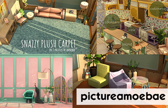
did somebody say colour options? because there's COLOUR OPTIONS GALORE!!!!!!
MATCHING!!!!!!!!! leading on from the point about colour options, most of her cc comes in MULTIPLE colour palette options, so the options for matching different sets is ENDLESS. seriously, it's like, incredible and sooooooo appreciated
awesome mix of build AND buy!!! i must admit that i go ham mostly on her wallpaper cc (are we sensing a theme here? listen i hoard wallpaper cc like there's no tomorrow i cant help it) BUT the buy items are ALSO AMAZING???? and again, everything MATCHES!!!!!!!! oh, AND there's some incredible builds, too?!?!? the talent!!! and it would be remiss not to mention that pictureamoebae is like, the reshade master
@kiwisim4
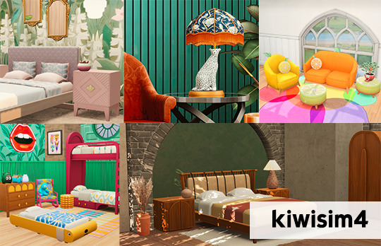
as we all know by now, i LOVE quirky cc. if it's colourful and fun, i'm THERE, and kiwisim4's content totally fits that bill
the tui series is my FAVOURITE!!! the COLOUR! the STYLE! the PIZAZZ!
ANDDDDD for those who want something a lil' more mainstream and less super specific, there's also a bunch of other sets in different styles that can fit any type of aesthetic and decor choice!
FOR EVERY ROOM TOO! kitchens? bathrooms? studies? living rooms? kids bedrooms? check, check, check, check and CHECK!
@zx-ta
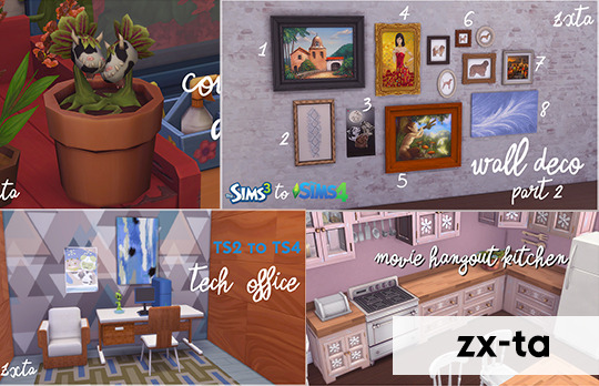
aight buckle up y'all because i am constantly perplexed that zx-ta doesn't receive more love because LET ME TELL YOU, her cc is SO! FREAKING! GOOD! STOP READING MY POST RN AND GO CHECK OUT HER CREATIONS!!!!!
truly consider this to be the swiss army knife of cc creation - you want ts3 and ts2 to ts4 conversions? what about medieval and historical cc? genius additions to existing game content like separated sinks? wall art? planters? WELL HERE IT IS! literally every style/aesthetic/era/furniture type you could ever wish for
ik i mentioned it already but the SEPERATED SINKS!!!!! GENIUS! GALAXY BRAINED! also the movie hangout kitchen set IS SOOOOOOOOO GOOOD
@sforzcc
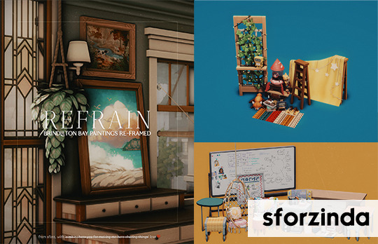
aaaaaaaand no build/buy cc list of mine would be complete without mentioning the incredible sforzinda. listen, if you see cool clutter in any of my pics, there's a 90% chance its by them
aight they do truly chefs kiss CAS cc, BUT, i am OBSESSED with their separated clutter sets in particular. how many times have you looked at game asset and thought, hey, there's some rlly cute bits in this but then its like, part of a MASSIVE object that you never really use. well, sforzinda basically solves that time and time again and me and my mods folder are SO thankful. AND THE WALL ART ITEMS!!!!! THE MESH EDITS!!!!!!!!!
my most favourite one is undoubtedly the separated little campers clutter set, but also THE HIGH SCHOOL YEARS BED PACK!!!! ARGH!!!! SO GOOD!!!!!!!!!!
im sorry i didnt like answer your question really asdfghjhgfds i just, i have SO many favourites id never be able to narrow it down asdfghjhgfds. if you (or anyone else!) ever wants like a specific idk top beds, top coffee tables, top floors etc tho pls let me know because i'd definitely be able to make myself be SLIGHTLY more specific then asdfghjhgfdsdfghj. this was rlly fun tho!!! thank you so much for your ask, I hope this was at least a wee bit useful asdfghjkjhgfdfghjkjhg
40 notes
·
View notes
Note
DOES dragon!Maddie hoard anything? Also show me yo FOXES
I like to imagine Dragon!Maddie hoards a LOT of crap ngl, I've always imagined them hoarding like, plushies and pillows cos they get cozy a lot of the time and that kinda like, bleeds into their other forms a little and they end up very protective over their belongings.
As for FOXES I have 3 that I can remember off the top of my head!
We have Mira, who I've shown before! Adventuring braixen who ends up using the materials she finds on her adventures to brew potions for her shop and the like! Very well fortified, very strong and self driven and all that, very gesture heavy the like. She'll often trace lil symbols in the air using magic and stuff for those that can't sign considering she's mute. She tends to be VERY studious with her potion brewing, keen to experiment and not one to just stick to the known formulas, even if it blows up in her face sometimes.
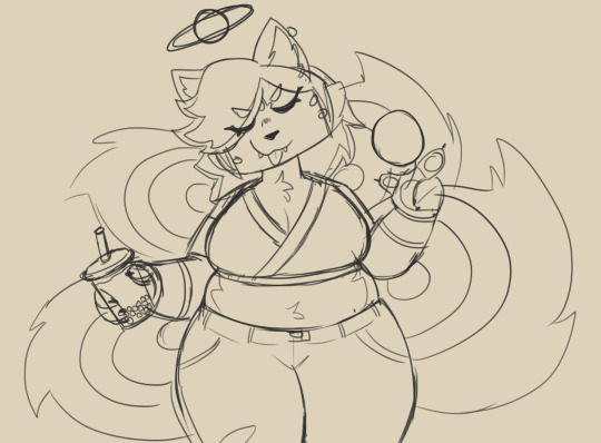
(I don't have all their up to date/coloured images on my phone ahaha whoops)
After that you've got Mai, who's a lesser kitsune deity! She mostly goes around chilling with mortals and stuff, using her inherent trickster abilities and magic to grant boons and the like! Her magic revolves around like, storing spells into balls/spherical objects and casting them through that, which can involve something as small as marbles or like? exercise balls! She can also convert her tails into spheres to use if she doesn't have any on her but otherwise you'll see her lobbing baseballs with fireball spells in them to make them blow up for fun.
She'll often just sorta chill in public spaces? Very down to earth, playful but only to those who she is aware are up for the banter and dynamic rather than random passers-by and all that.
And now this lady, whose design isn't fully figured out yet, her name is Atsuki but she goes by Tsuki for short.
She's a kitsune who has a deep obsession with magic and dark magic in particular, putting great amounts of personal research and hyperfixation hours into studying them. Being the modern era however, a lot of this research is done online due to the ubiquity of resources! Naturally though, she tends to hang out on forums, to which she tends to find herself quite irritable on. Often times she'll get a bit grumpy with people who start asserting false knowledge online (She grows more tired every single time she has to tell someone that shadow magic is classed under light based magicks due to their reliance on light to operate at their most powerful/most fully formed).
She's also a bit corrupted? Not like, evil, but her dabblings in dark magic have left parts of her palette and her form altered just a little, she constantly grows horns that she has to cut and file down in order to be less prominent in public. Not that she finds herself in public very often as, for as assertive as she can be online, she is VERY socially anxious in person.
Thank you for letting me go off about my foxes 🥺
18 notes
·
View notes
Text
Mommyclan design fight preferences
Bases are a-okay here and this is up to change and If you want to completely disregard like all the things I want (please still read the No thank you :( bit) go ahead! Designing characters is fun and if you just wanna go crazy and make your own thing I'll still love it nonetheless
Pretty please, love this in designs!!!
Designs based off of other animals, very fun
Colour palettes!!! and i mean like fun colour palettes with unrealistic colours. I mean like generated palettes or palettes organized by the colour-palettes tumblr account. You can still make your own if you really want to.
Shaped, square, circle, triangle, shapes are fun :)
Fun fur or hair styles, i mean like full pompadours, mullets, mohawks, and the fur part is in the same vein as the shaped-ness
Fun shapes like hearts or stars or whatever on like showy off places on the design
something you like in a design too, I'd love to see y'alls preferences and fun stuff you wanna do in this too!
Tortoiseshells and calico's for cats, their so silly i love them :)
Randomized designs! like randomized based on any randomizer with as little as just a name randomizer or like a full descriptor
Colour schemes!!! Complementary, triad, analogous, shit's cool!!!
I like this but it's not like a big big thing
Sparkle animals. I don't really dabble in sparkle cats a lot so it'd be cool to see them
Any animal is all good, preferably cats but like dragons, dogs, foxes, lizards, whatever is also good! :D
Accessories!!!
A little bit of white, or like a close to white colour just in spots or as highlights
itty bitty kitties or big chonkers, no average heights in this household! Same goes for ears, really little or really big! (I like to think that cats with small ears are harder to read and cats with big ears are easier to read expression wise because that's a part of how we tell their emotions)
There's a certain way some people do fluffy fur that is so interesting to me, like long and silky looking with several branching fur strands, its very cool
Unique twists or bits on cat breeds, like looking at a cat breed and saying ill take (cat breed) with some extra interesting trait! If you were like ordering it at a resturant
Two colour cats with interesting patterns are nice :) just nice that's all i have to say about them lol
Lil fun fangs, they will monch :3
Wacky eye colours!!! yippee!!!
Scars are cool, go crazy
You can add some character if you like, like lore or pride flags or name, nowhere near required though
If you do add a name though, one that's related to the personality or a unique or central part of the name is cool :D
No thank you :(
A lot of body horror, too spoopy for me :( You can get a lil silly with it if you want to just not a lot, a lot
8 notes
·
View notes
Last Seen Blogs
bonniebryan1
Main Page

carrotasia6
The Blogging of Lohse 900
the-hype-dragon
The Hype Dragon
rumattysworld
Drowning in My Tears...

becoming-pathological
to think of a story