#it's like 1 slightly darker pixel but it's there
Note
Would love to know your thoughts on Exeggcute and Exeggutor!
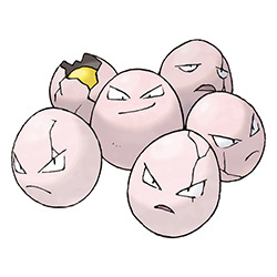
Exeggcute is one of the most interesting Gen 1 'mons. What looks like a bunch off eggs is actually a bunch of seeds, and indeed, Exeeggcute is part grass-type. There's no other Pokemon quite like it.
Visually, I like how the otherwise plain "eggs" are broken up by the cracks, including one split open at the back completely. I also enjoy how there are different expressions on different eggs, ranging from angry to smug.


Interestingly, the original sprites showed Exeggecute with a larger middle egg. I think it starts to be a bit too much in some sprites, I do like the BW sprite that just has it slightly bigger.
Side note: I kind of wish Exeggucute was yellow, just because it would've matched it with Eggector that much more.
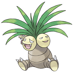
The group of seeds eventually evolve/"hatch" into Exeggutor, which is pretty perfect both from a "growing a plant' standpoint and a "progressing the most interesting elements" standpoint. Exeggutor has a body, but it also retains multiple coconut heads, which are very reminiscent of Exeggcute.
What I like about this design is how monster-y it is. A lot of grass-type 'mons have a habit of just being humanoid, so this giant palm tree with its multiple heads, stubby clawed feet, and lack of arms is absolutely unique and refreshing.
And visually, it's also nice. The brown base works as a neutral and compliments the brighter yellows and greens nicely. Most of the focus is on the heads, allowing the body to be simple comparatively.
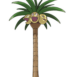
And yeah, Alolan Exeggutor is perfect; I don't think you guys need me to tell you that. For many years, early Pokemon were constrained to being able to a fit a small square box of pixels, so taking advantage of the 3D models to make an Exeggutor that's actually the height of a palm tree is super fun and really memorable. I also like that it's implied that this form was the original, rather than vice versa.
Long neck aside, I also like the addition of one more head on the tail (to keep a lookout at ground level), which further emphasizes its original multi-head concept. I also like the darker, richer shade of brown here. Both forms are really good, but I do find myself liking Alolan Exeggutor just a bit more.

Anyway, really good line overall. The concept is unique and the original line was already solid, improved with an excellent regional.
73 notes
·
View notes
Text
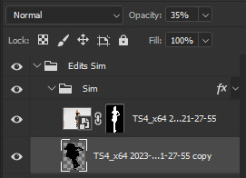
How I edit my Sims' shadow in Photoshop
as requested by @adelarsims
& based on this tutorial.
━━━━━━ ・❪ ☾ ❫ ・ ━━━━━━
1. Taking a screenshot
First of all take a screenshot of the Sim - I always do CAS but in-game works too ofc.
I take mine in front of a background that loosely matches the color of the background of my edit, in this case white. If you have a fancy CAS background, I recommend this CC by @sonyasimscc to easily get a simple background for screenshots.
I also use this tutorial by @katverse to get really good screenshots, I use 4000x3000px resolution, and this tutorial by @vyxated to not have a CAS UI in your screenshot if you use a reshade like me.
━━━━━━ ・❪ ☾ ❫ ・ ━━━━━━
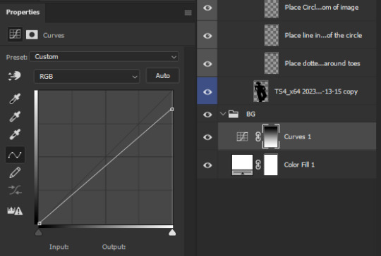
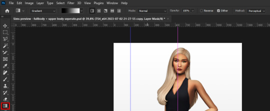
2. Setting up the Photoshop file
Now in Photoshop create a file, I use 1250x2000 px.
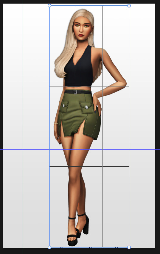
I made a few guidelines, pink being the middle of the image and dark blue guidelines for my shadow editing.

I have a usually white background and a slight Curves adjustment layer with a gradient layer mask so it gets slightly darker at the bottom, completely optional ofc.
━━━━━━ ・❪ ☾ ❫ ・ ━━━━━━
3. Removing the original background
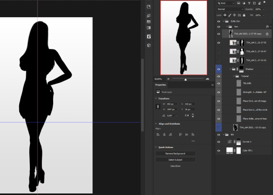
Import the screenshot and place it however you want. I try to align the Sim in the middle and make it as big as possible.
Then select the layer and go to Select - Subject.

This will usually do a decent job.
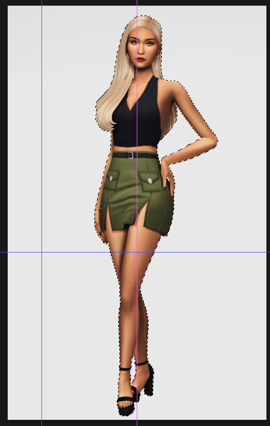
If there are some leftover unselected areas (like on her left hand on the hip) you can either add them to the selection now or edit the layer mask later.
Then create a layer mask.
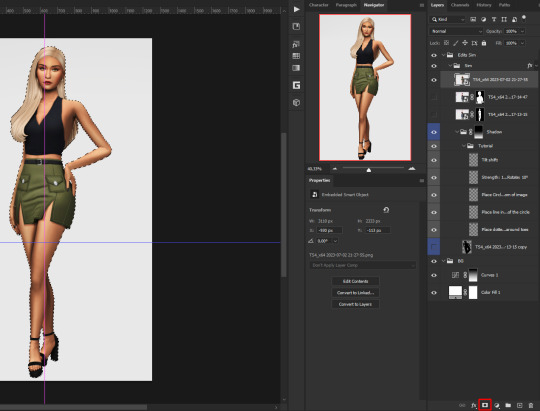
Since the screenshot has a similar background, it shouldn't show too much if it is not perfect.
━━━━━━ ・❪ ☾ ❫ ・ ━━━━━━
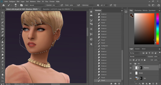
4. Creating the shadow
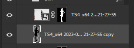
First duplicate the Sims' layer (Shortcut: Ctrl + J).
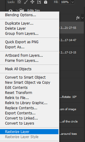
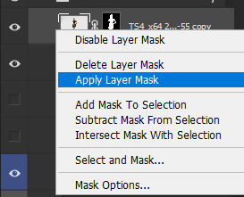
The layer is probably a Smart Object, so you need to rasterize it and right click the layer mask to apply the layer mask.
Now lock transparent pixels and paint the layer black.
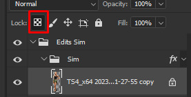
Next unlock the transparent pixels again and move the black layer below the actual Sim. Leave it selected.
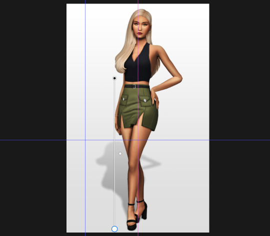
Now you will need the Perspective Warp tool.
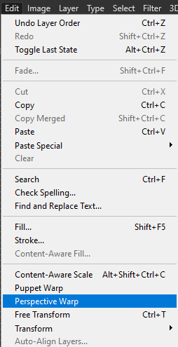
Draw the grid over the Sim, it doesn't have to be perfect, but make sure every part of your Sim is in the grid and nothing pokes out.
Press enter.
Now you want to drag the upper 2 corners separately wherever you want the shadow to be. I always put mine to the left and around the upper thigh area. I also try to match how slanted the left and right side are.
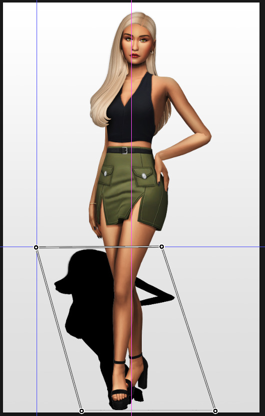
Now move the bottom 2 corners to try and match the shadow with the Sims' feet kinda. It won't work perfectly and you will need to fix it by hand after.
Press enter again.
Now go in by hand and fix the shadow around the feet.
Simply paint with black on the same layer and erase parts if necessary.
━━━━━━ ・❪ ☾ ❫ ・ ━━━━━━
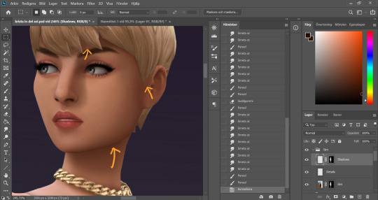
5. Making the shadow look nice
I like to change the layer opacity to 35%, but it depends how strong you want the shadow to be.
Next I apply a tilt shift blur, unlike in the video.
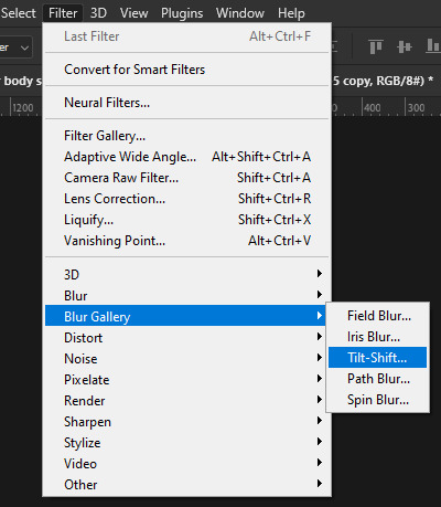
I use a blur of 15px.
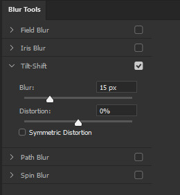
Move the circle at the edge of the image basically or a bit below by dragging the middle of it. Then rotate it on the bottom line by around 10°.
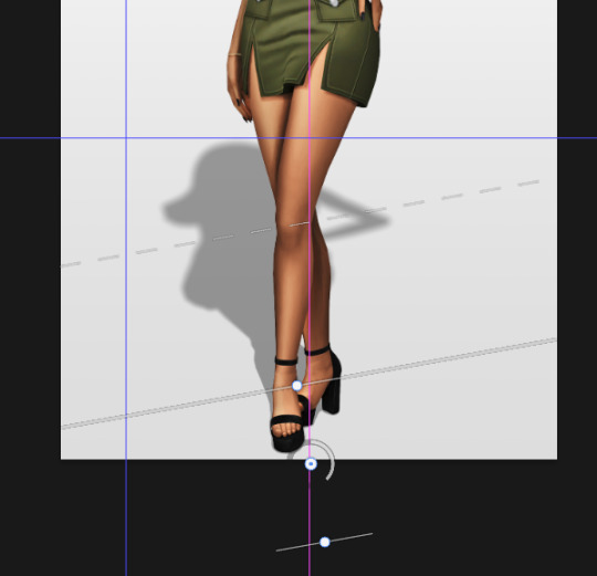
Next move the solid line to the middle of the circle and the dashed line around the ankles.

Then press OK at the top.

━━━━━━ ・❪ ☾ ❫ ・ ━━━━━━
6. Optional: Gradient layer mask
Lastly I like to make the shadow fade out a bit towards the top.
Apply a layer mask to the shadow.
Then get your gradient tool and the default black to white gradient.
Hold shift to make a straight line and drag the gradient down.
This is how I roughly place mine so it's not too strong.
━━━━━━ ・❪ ☾ ❫ ・ ━━━━━━
And that's it!
If you have any questions, let me know~
80 notes
·
View notes
Photo


I empathize with the existential terror puppet Spamton G. Spampton a normal amount and for only comical reasons.
Why is his suit so big? It’s full of secretsTrash.
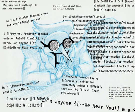
[Image ID: A 3-panel comic featuring Spamton G. Spamton from the video game Delatrune. All text is glitched and written with numbers, but here I will write them legibly.
Panel 1: Spamton is sitting in his cobbled-together store at his ‘desk’ (an upended cardboard box). There is a computer mouse nibbling at one of the box flaps, and a sheet of heart stickers half-used, three of which have been stuck to various places on the box. The box features text from Spamton’s store menu screen in-game, such as a list of items and prices, a description of one item, and the words “Deals so good I’ll [$!$$] myself! 116 K“. In the center of the box front is written “SPAMSHOP, Welcome! Open 25/7″ in crooked writing. Finally, there is the option to “Run Away” to leave the shop menu. Behind Spamton is a wall of bricks painted loosely to resemble a blue sky with clouds and a bright yellow sun. At the right, the wall falls away to reveal a black rotary phone sitting in a pillar of light on a stool. Upon the desk rests a large, blue egg. Spamton is sitting with his shoulders back and his hands held before him with fingers outstretched and interlaced. His suit is obviously with padded shoulders and several holes and patches. He sports a small red bowtie and his hair is in a luxurious swoosh to feathery ends. Spamton resembles a ventriloquist dummy with red cheek circles, very long teeth, and a much longer, pointier nose. He is wearing glasses with oblong frames of a bright yellow and pale red, and his pupils are large and pointing in opposite directions. His smile is huge, and his teeth are slightly parted. It is not clear if he’s paying attention to anything in particular. Around the panel are black boxes with white pixelated texts including “Kromer” in front of Spamton’s face, “Hot Singles in your area!” on the left, “Hyperlink blocked” above his head, “Where are my ****ing [Custom and Replacement Keys open 24/7!]” at the bottom right, and finally a small text box stating “Pipis.”, with an arrow pointing to the large egg.
Panel 2: Spamton fills the frame, and is hunched over with his fingers interlocked more tightly, with his index fingers together pointing upwards, resting against the front of his teeth. We can see at this distance that his wrists, hands, and fingers are jointed like a doll or mannequin. He is shadowed starkly, throwing his face into a darker shade. His glasses are perfectly circular, and lit from the inside as their lenses are filled with a glitching .gif texture. His smile is not as cheerful looking as panel 1. Around him are many instances of black pixelated texts, which are glitched and written in numbers but will be written more plainly here:
I work so [Rare, Hard-to-find treasures, only at-] but I’m still in the [Garbage? We’ll haul it away for you!] What else could I be [Doing only the best work!]
If everyone doesn't buy my [Carefully crafted and completely unique] [Pipis], they must be [Trash! Trash everywhere!]
I’m so [Tired of ads? Block now for only 9.99 an hour!]
I [Prey vs. Predator special, only on Animal Planet] so hard. Can anyone [At Ken Garth we hear you!] me?
Do I [Deserve only the best!] this?
Do intentions change [Anything and everything on sale this weekend!]
Am I a [Michael Jackson’s new hit single Bad] person?
[Is God real? Call [hyperlink blocked] for answers!] Does [God] hate me?
I am in so much [It Burns! Ow! Stop! Help Me! It Burns!]
The phone is now very close to Spamton over his left shoulder, and much more detailed. Across it are several blocks of texts that are “Don’t look at the phone” without spaces and over and over and over, eventually trailing off into “H”’s and the number 5 repeated many times.
Finally, at the base of the panel in much larger text, is “Can anyone [-we hear you!] me?
Panel 3: Panel 3 resembles panel one, but Spamton’s face is now glitching, apparently duplicated over the first drawing, and his pupils are much smaller as he stares somewhere in the distance. Despite his smile, he seems quite alarmed. The text on the box “Run Away” has been duplicated to cover “Welcome!” as well as the list of items. The only black-with-white-text box left is in front of Spamton’s stretched-open mouth: an “A” in brackets, stretched so that it no longer fits in the black text box.
End of ID.]
Non-gif second image under cut:
379 notes
·
View notes
Photo


GIF TUTORIAL BY HVITSERKK
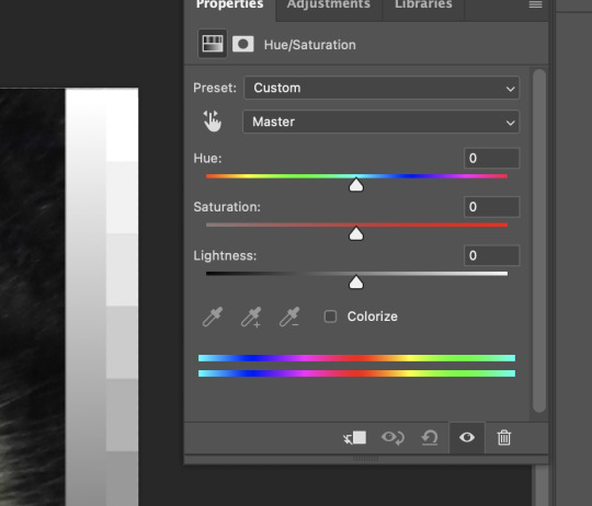
This was requested and while I do have older tutorials, my process has definitely changed since my last one. If you need something more in-depth, I have an A-Z tutorial here (which I still use besides the coloring/editing) and a master list of specific gif tutorials here. This tutorial will go over coloring using levels, color balance, curves, channel mixer, selective color and other adjustment layers.
This is what I’ve been using for the past year or so, but we’ll say that this is up to date as of May 2022. Please reblog if this helps!
TUTORIAL BELOW (IMAGE AND GIF HEAVY):
I’ll mainly use the gifs above during the tutorial, but I might add one to show a certain step a bit more clearly. I always use more then one scene for my gif tutorials because I want you to be able to see the steps on more then one gif with different lighting, color tones and skin tones so you can get more of a feel of how to use different adjustment layers.
I’m going to start off right after sharpening, and I still use the action linked in my A-Z tutorial. The only difference is on the top layer (there’s only two), I set it to 70% instead of 60%.
So here are my before gifs (minus one that’s used in the first step):

As I mentioned, they’ve only been resized (to 268X268) and sharpened. Now let’s jump right in!
1. The first thing I always start with is a "Levels" layer. I want to bump up the entire gif before so I don't have to use so many other brightening layers later. Nothing to drastic, just move the left slider (shadows) towards the middle, the middle slider to the left and the right slider (contrast + brightness) to the left. Remember to only move them a little bit, the next step using curves will do the bulk of the brightening. Here are my level settings:

And my before gif:

and the gif after levels:
2. The next step is to add two "Curves" layers. You could do the next step on one layer, but I like to keep them separate so I can lower the opacity on each individually. But I name one "Curves - White" and "Curves - Black". Using the black and white liquid droppers, you just click on the the darkest and lightest spots on your gif.

You may have to click around to find the perfect spot, and note that if you click on a blueish white or yellow white, it could alter the entire coloring of your gif, so be sure to find a spot that doesn't do that. Don't be afraid to zoom in and click on one single pixel!
You can also click on slightly darker (with the white dropper) or lighter (with the dark dropper) shades to add more contrast, ie clicking on a light gray cloud with the white dropper will turn that shade and any lighter shade pure white and add a lot (or maybe too much) contrast.
So if you want something pure white (#ffffff) use the white dropper and click on the white area of your gif. Here's my gif, I clicked on the snow that’s stuck to his coat on the left next to his ear:

Now, if you want something pure black (#000000) use the black dropper and click on a dark area on your gif. Here's my gif, I clicked on the darkest spot in the center of his beard:
I used the same gif to show you how big of a difference the curves alone make. Now you can lower the opacity of each layer to your liking. Personally, I like a super contrast look, so I only lowered them 10-15%.
Here's another gif to show you on a different coloring and lighting, the before:

"Curves - White", with the white dropper, I clicked on the sky in the background closer to the window seal where it’s a bit darker:

"Curves - Black", with the black dropper, I clicked on the left side near his eye in the shadow of his hair:
You can see that the gif is way better, but now it’s a bit too pink/magenta. Let’s fix that in our next step.
3. There are two different adjustment layers that I use to balance or “fix” the colors. I'll go over both. The first is the "Color Balance" layer. I only use this if the color looks "off" just a little bit. Here’s the after, followed by how and why:
Like I mentioned, the before gif was a bit too pink. That's a more simple change, so I'll add a "Color Balance" and focus on removing the magenta. If it was more orange, I'd focus on the reds, but pink is more magenta-ish. The shadows (the darkest shades) look fine and so do the highlights (the brightest, near white shades), so I only need to adjust the "midtones". Again, removing the magenta, so sliding the Magenta/Green more towards the green. I also added a bit of blue just to add more of a "cool" tint. Here's the settings I used:

Here's another gif that could benefit from a "Color Balance" layer:
As you can see, the before gif is very colorful, but it's very dull. I can add a color balance layer to give it more depth. The shadows aren't as intense, so I want to add more. I'm only editing the "Shadows" by sliding the first set of colors more towards the red, since my gif is more "cool" (blues, greens) adding red will darken it and add more saturation without turning my gif overly blue. I also add a bit green and yellow to make the shadow more neutral as opposed to just adding a dark red. Here’s my gif now:
And here's the settings:

4. The other way you can balance colors is by using the "Channel Mixer". It may seem super complex, but think of it the same as the color balance, either you add or remove tones from the main colors of the gif. I only use this with gifs that have major lighting issues (lol). Here's my before gif:

and after using the channel mixer:

Huge difference right? Now, you don't always have to use this because some scenes have that lighting and we don't really have to change it and make it "normal". Imagine they're in a photography red room, we definitely don't need to try to make it normal. If they're in a club with neon green lights, same thing we don't need to make it normal. But if it simply needs major adjusting, this is how to do it. Using the guidelines from the "Color Balance" from above, take a look at your gif and see what tint is too much. For this gif, it's definitely too yellow / orange.
To make things easier, what color was with the yellow on the color balance layer? Blue, so basically if I want less yellow, I need to add more blue. That's very surface level, but that will help you to understand for an easy start.
So I want more "Blue" so I need to go to the blue channel and add more blue into the reds and greens. Here are my settings:
Now my gif:
It's still a bit off, as you can tell it's a bit too peachy instead of a more "natural" tan / beige tone. So I want to go into the red channel and drag the red down until the tint is a bit more natural. Here's my settings:
and my before and after gif:
As you can see it's much more neutralized and will be much easier to edit in the next steps.
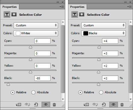
5. Next is "Selective Color", my personal fave. You can really do a lot with this layer, you can remove colors, change colors and make colors really pop. I only really ever make "natural" looking gifs, so besides the previous edits, I don't do pale, or grayscale gifs at all. So what I'm going for is really vibrant, saturated gifs but still natural looking.
Here's my before:
As you can see in my before gif, there's a lot of popping color. The red in the scarf and the bits of blue/cyan in his jacket and in the background. You can use the selective color layer to target just these colors to really make them stand out. To add more red into her scarf, in the "Red" color, I want to add more red by sliding the first set towards the red side. I also want to add a bit of magenta so the scarf is more of a blood red, instead of a brownish red. Then I want to add a bit of yellow to really add some saturated color. Red is a bit tricky because nine times out of ten, it will also alter skin tones too. Just be mindful of that, and you can still make reds pop. If you do get too much pink in the skin, just go to the "Magenta" color and play around with the settings to neutralize the skin (most often by sliding the magenta to a negative and the yellow to a positive number). Here are my settings:

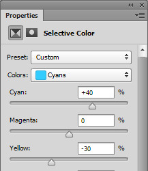
For that cyan, I want to go to the "Cyan" color and with cyans and blue I always slide both the first and last set of colors. I literally never want to go with the green-ish blue that cyan leans to, I want more of a super saturated baby blue, so if I add cyan, I will always add a bit of blue. So, I will slide the first row (cyan) into a positive number to target the cyan tone, then I'll also slide the second to last row (Yellow) into a negative number to add more blue, and less yellow (and less green) to get a more "true" blue color. Here's my settings:
and my before:
and after only editing the reds and cyans:

You can add more or keep it more mild. This is only two colors, so imagine what you can do with all of the colors available in the selective color layer.
5. A super important step when you're using "Selective Color" is the white and black color. I always my color pop selective color (from above) and a "Selective Color - Black" and "Selective Color - White", which ofc you can do on the same layer, but I like the option to lower the opacity individually. For me personally, I like slightly darker shadows and over the top bright white highlights. I also like to further tweak them while I'm there.
So to start, "Selective Color - Blacks". If your gif has a shadow that is too "one color" you can use the black color to balance that out. So for example this gif:
and the after:
You can see in the before that the shadows are too red, too warm. To remove that, I want to go to the "Black" color. So taking what we learned in the color balance layers, the basic tones are: red + cyan, green + magenta and blue + yellow (so to get less red, add more cyan, to get more green, remove magenta). So since my shadows are too red, I want to slide the cyan color to a positive number (thus "adding" cyan). Doing so might alter the color too much in another direction, so if I add too much cyan, it might be overly green, so I need to add magenta, which oops, caused it to be a bit blue, so I need to add a bit of yellow. I almost always slide the top three sliders to a positive number to achieve and almost neutral, no color black, which is why these settings have a bit of everything:
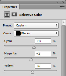
Now, the last slider, the black, basically either adds black, or removes it. Since we're on the black slider, we don't want to remove any black, or it will go white. Since I like my dark colors super dark, I will add black by sliding it to a positive number. Here's my settings:

Adding only a little bit, +4. I usually stick to below +10 because it can easily muddy and ruin your gif.
6. Now "Selective Color - Whites". The same concept of the black color from above, but now the bright, near to white or whites in your gif. I love adding a lot of white to my gifs to make things like the little sparkle in eyes pop, or white backgrounds really bright and a lot of contrast. I don't usually mess with the top three sliders unless there's a lot of color in my white. I mostly change the last slider, the black to a large negative number (so removing black to make white). Here's my before gif:

and after white:
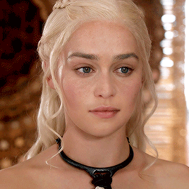
See how it just makes the highlights really pop? You can really see the it in her eyes, around the strands of hair and in the sun spots in the background. You can't always get this look by adding a ton of white because you can over do it. I mostly do this on gifs that don't have a ton of highlight or on lighter skin tones because you just blend the lighter (but not white) tones to much. But for this gif, I can and did, so here are my settings:
And for good measure a before black and white selective color:

And a ton of black and white:
And my settings:
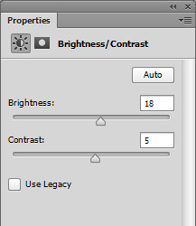
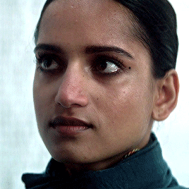
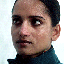
7. Now the last step is up to you, I usually do a mix of the three or just one of the three. I will show you each, but I always finish my gifs off with either a "Brightness/Contrast" layer if my gif is a bit lackluster, a "Levels" if I want an even, overall boost (my usual end) or an "Exposure" if I have enough contrast but want a more bright look.
Don't worry if this step washes out the skintone of poc gifs, I have a very, very last step that will fix that (below the next step).
If your gif isn't as bright or vibrant as you'd like, add a "Brightness/Contrast" layer. As a rule of thumb, I always add to both, but focus on one, that way you don't get that super bright yellow look. So don't add 50+ to both, add a bit to contrast and a lot to brightness, or vice versa. So my settings are simply: Brightness + 18 with Contrast +5
Before:
After:
Now if you're gif has enough black and contrast in the dark shades, but is too dark overall, use an "Exposure" layer. For this gif, the dark hair and jacket are pretty much pure black, but my gif is too dark. And exposure layer is pretty much: exposure - add or remove contrast, offset - add or remove black and gamma correction - add more remove brightness. So I want to add to the gamma buy sliding more towards the right. It will almost always wash out your gif, so don't go wild. Then slide the exposure to the right to add a bit of contrast. Incase your gif does get washed out on the black tones, just slide the offset to the left to add more. Here are my settings:
Before:
And after:

And lastly, if your gif is pretty good contrast wise, has an okay brightness but you want to boost everything without losing much in terms of color and lighting, use a "Levels" layer. About 85% of my gifs end with a levels layer because I personally love the look it gives. Here's my gif:
and after a levels layer:
The before wasn't too bad, but I definitely want more brightness but I don't want to add to much contrast or just wash out my gif with light. So adding a levels layer and moving the first slider the the left and the middle and last slider to the left will work perfectly. The last slider is the "shadows", the middle is the "midtones" and the far right slider is the "highlights". So adding more shadows to the gif will add more contrast to the dark tones and blacks, adding more highlights will add contrast to the lighter and white shades and the middle will either lighten or darken your gif without adding too much contrast.
I always edit in this order: slide the middle to the left until the brightness I want is reached, then slide the last slider towards the left to add a bit of contrast if the brightness is dull, then slide the first slider towards the right to add more black. Don't go wild, but also don't be afraid to slide them over a good amount. Here's my settings:

Here’s a gif from earlier that also needed a levels layer, the before:

And after:

And the settings I used for that one:
8. The very last step is to even out washed out skintones. This is especially important for this style of gif (as opposed to pale style gifs where the look is still poc skintones, just pale). I don't want a washed out look, because there's no need for it, no reason in my "natural" colored gifs. So to fix this, I always add this layer with these settings and I just lower/raise the opacity as needed.
Since most skintones are mostly affected by the reds (for example add a hue/saturation layer, go to the red color and change one of the settings to see how much it messes with skintones), I only edit the "Red" color. Here are my settings:

my washed out gifs:

now my more true-to-tone gifs:

9. As for saving, I only ever use 0.05 on the frame delay except for gifs with fast moving objects (like the snow and hair blowing gifs I used for my main previews) and these save settings.
Another note, I always use 1080 videos, very rarely do I go with 720 and even then it’s always for music videos or movie/tv trailers downloaded from Youtube.
That's the end of my tutorial! I really hope you've learned something and of course all of this is for you to apply to your own style. If you don't like super crispy highlights, don't add so much white or if you want gifs that aren't over the top bright, I hope I've left you with enough tips that have you confident to play with settings and change things up and still love the gifs you end up with.
If you have any questions or need any help, please let me know! I don't mind at all. If you want more in-depth tutorials on specific layers, I do have some on almost all of the things I wrote about, but they are super old so I can update those if needed.
Happy giffing!
120 notes
·
View notes
Text

Tips to Improve HD Skins:
1. Use references. These can be helpful no matter what you're making, from OC work to fan work. References make it easier to decide pixel placement and general color selection directions.
2. Start the outline with a slightly darker shade than your base/mid tone. I find it easier and more pleasing to push a palette darker rather than lighter with a high definition skin.
3. Don't make individual strands of hair. The skin might be HD, but compared to other character models, it's still a low resolution. Trying to add as much detail as possible into a single area like hair, causes it to look busy and overwhelming.
4. Avoid making blockier shading. Your regular SD shading you use for Minecraft skins isn't going to work the same here. Instead, seek out areas to add rounded edges and curves. This will instantly make your skin look more detailed and add contrast to the usually blocky shape.
5. Don't make an SD skin dirty. I know it might seem easier to start off with regular resolution and edit into HD. But this usually makes the proportions look very odd. Sketch and shade in full high definition to have a better understanding of the final product before you even finish.
14 notes
·
View notes
Text
solution to the optical illusion question from earlier
this is called mach bands. earlier, i asked if you can see the illusion and you all failed (nerds without se! what to expect...) no, i couldn't either. i keep googling until i found some video finally explaining what the supposed illusion was.

so, between (1) and (2), it SEEMS like there's a one pixel border, darker than the (1) itself. but in reality there's no such thing and that's our brain/optic nerves and whatever else "enhancing the difference".
if you focus really hard, you can also "see", a one pixel border, lighter than the (2) itself.
so basically, our optic system makes the very edge of (1) darker and (2) lighter. kind of like comic outlining.
so i thought hey, istp should be the best type to see this with strong se and ti logical focus.
the whole thing, if you really focus, also can seem like "slightly plucked upwards" where the bands connect. so it's kind of like we are looking at this thing from above. but if we were to look from side then we would see something like this:

check out my main blog @ demonwindu.wordpress.com
.
#mach bands#cognitive functions#personality types#optic illusion#ernst mach#mbti#socionics#16 types#entp#esfp#estj#esfj#entj#enfp#enfj#estp#istp#isfp#istj#isfj#infp#infj#intp#intj
4 notes
·
View notes
Text
Animation skills
Week 1
This week we where introduced to maya. We learnt how to manipulate shapes which was hard to wrap my head around at first, but with practice over the weekend I got the hang of it. I learnt that if you smooth out a a shape it creates more faces and corners theirfore you are able to make more intakate shapes. I found this out when experimenting too try and make my church, however I smothed it out to much at first but I was able to g o back.
Week 2
The beginnings of our design where due this week, so I just practiced using a reference whilst building my church model, which helped with building the different forms and shapes of the church. However one thing I did struggle with was creating holes in shapes, this is something I should improve on in the coming weeks.
We where meant to have our final shape however mine got deleted, I was struggling to create a church anyway so this was my opportunity to try something els. I felt a space ship would be a good way to create different shapes.
Week 3
I we where using uv mapping on our objects since mine was a space ship I chose an electrical surface image which I then uv mapped on to the s[ace ship the problem was that because their where so many faces on the space ship with varying shapes and sizes, the lengths and surface areas of the faces varied a lot, so sometimes the texture showed up slightly pixelated, so when I went onto uv mapping I managed to make the texture look proportionate to each face.
Week 4
This week we provided lighting and rendered our objects, we learnt the different types of lights we could use, and that we could make them different colours.
I had to be particular in where I positioned my light as to not drought half of my space ship, but to evenly light it whilst highlighting the many crevasse and shapes in the surfaces. I opted for I blue and a pink as I felt they worked best with the silver texture of my space ship.
When rendering the ship it turned out darker than expected, so I had to go back ad use stronger lights.
Week 5
This week we began out walk cycles. We began by first observing other people walking whilst observing the way the legs moved then the arms, and how they moved together. The teacher got us to some life drawing studies of people walking, although we where drawing frames.
We started off with a basic stick walk and where shown some examples.
We where then set a task of creating a character that walked in a Sertain emotion.i wanted my character to walk in a gruff of moody way. When drawing him he slowly became a skin head. I didn’t want to work with thin limbs so I designed him with baggy clothes, I wanted to try and animate creases in the clothes as he walked.
Week 6
This week we started to animate simple stick men. I didn’t realise that I would also have to think about zoom in and zoom out and also the height of the person when walking. First I focused on the legs having the back leg black and the front leg white so that I could differentiate them. Then I worked on the arms which moved along accordingly with the legs I took into account that my characters arms may move different as he is holding a different emotion after I had finished both the arms and the legs in the lesson I went onto plan what my character would look like, I decided that he would have his hands in his pocket and have his head low and peering forward to make him appear gruff and moody. I would have his legs stride forward to also bring in a sense of obnoxiousness.
Week seven
This week I began to start my main character walk. I wanted him to look like my character turn around so I traced an image of my character turnaround and imported it into Adobe animate as the starting frame. This made my character look more illustrative when animating I kept his face the same focused on his, arms and shoulders as I wanted that to be a big swing in them I mainly focused on this week.
Week 8
This week I’m falling behind as I need to complete this animation however I am not finished. I think this is due to my lack of time control this week I’m focusing and reviewing his whole body as he moves and once swift walk. i’ve made a bigger dip in his stride. He moves further down in his walk and up again quickly to give off that sense of stride and Gruffness. i’m yet to add colour or finish the animation completely so that it is walking in the same place. This is something I’ll have to catch up on in later weeks.
Week 9
This week we learnt how to use after effects which I have used before but needed more of a reminder of how to use it give them templates to use and learn how to move them different directions. I got the hang of this fairly quickly and began to sketch up, my background.
Week 10
I have been ill a lot this week, so I haven’t managed to get that much done on my background so this lesson I have mainly been sketching my background. I like the idea of an alien setting. I’ve looked back in my sketchbook. Some of my old world building references took a number of elements from each and was able to divide something on my iPad at first I put in the big shells, however because of how detailed they are it would’ve taken a long time to draw them and I wanted there to be a gift in the after effects animation so I wanted to keep this simple simple so I drew a black stick cat walking like a human without a tail and began animating that.
Week 11
This week I started my final Adobe effects animation. The teacher had to help me a lot with the software in the end as I didn’t know as much as I thought I did however I wanted to keep the animation simple in it so I didn’t need to do anything to complex as the setting of my background Didn’t need it. I had trouble at first with the speed of all the components moving together. I wanted my cat to move at a normal and natural pace so I needed to make sure that the ground wasn’t moving too fast because at first I’m move the ground too quickly and the cat was walking at a slow pace so it made it look like the cat was gliding across the floor, which I didn’t want move slower and slightly quicker at 13 frames per second as were as before it was working at 11 frames per second.
The cacti were moving at the same place as the ground as they were connected to the ground. I’m not only use them to create depth but also create any patches in the background as the background had to be doubled and flipped. It created a deep line in the middle but looked very off and unnatural so I use the cacti to cover this line as to make it look more natural. The clouds were something I wanted to emphasise in this animation so I made them move very quickly in the opposite direction of the way the cat was walking. I use this to my advantage by adding wind sound effects which created an experience of a storm which is something I wanted to achieve.
Week 12
I am on a tight schedule and last time I checked I couldn’t find my finalised video of my cat walking on the ground. This may be because it was on the original computer. It’s just something I’ll have to check tomorrow otherwise I’ll have to do the same animation again tomorrow.
0 notes
Text
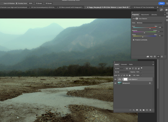
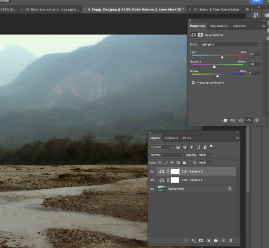
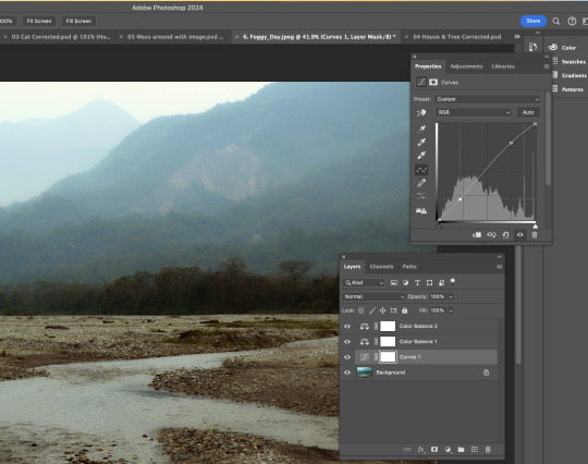
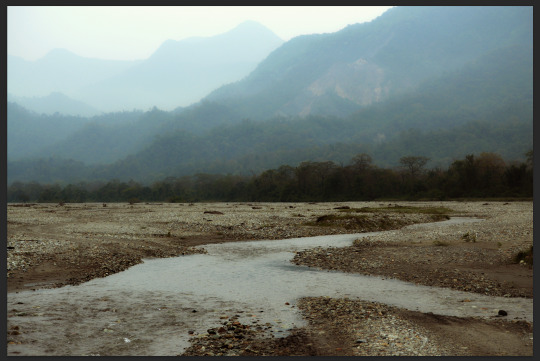
Week 2, Mon: Color Correction
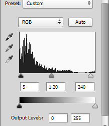
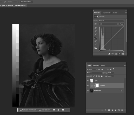
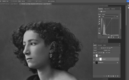
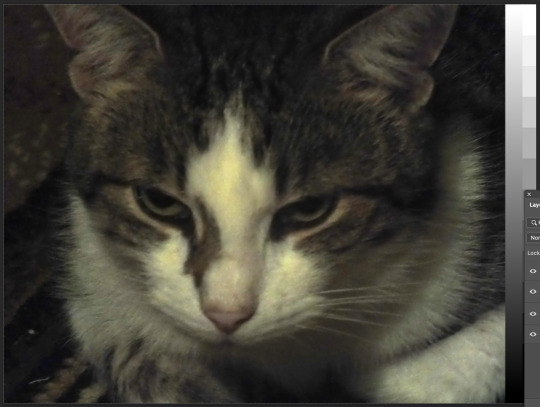
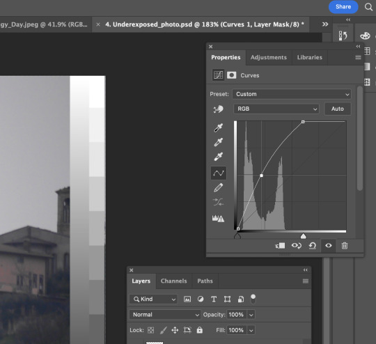
1) The first image we're trying to correct is a black & white female portrait. As you can see from the image below, it's clearly too dark. Also, from the histogram, all the pixels are on the black side. To solve this without making the image look too bright, which could lead to ruining the details of the portrait, we found a point at the middle of the histogram where the image looks slightly brighter, much clearer, and prettier.
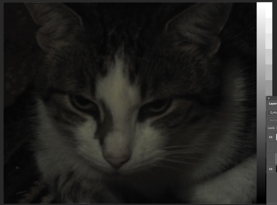
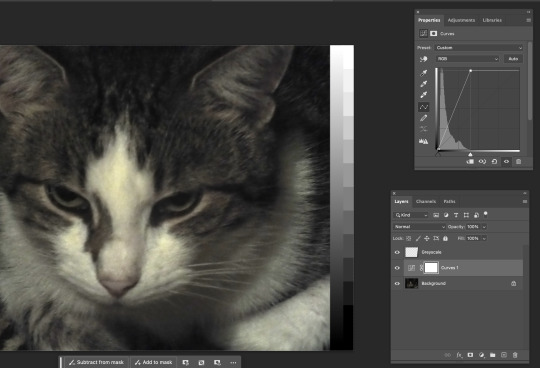
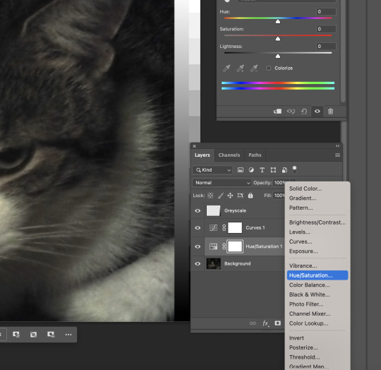
2) The following image looks too dull and dark. When we look at the histogram, most of the pixels are clearly distributed on the darker side. To lighten the image, we did what we did to the first image: moved the light anchor to the left, at the same time not trying to overexpose the highlights of the image. Lastly, I saturated the image a bit so it looks redder & warmer.
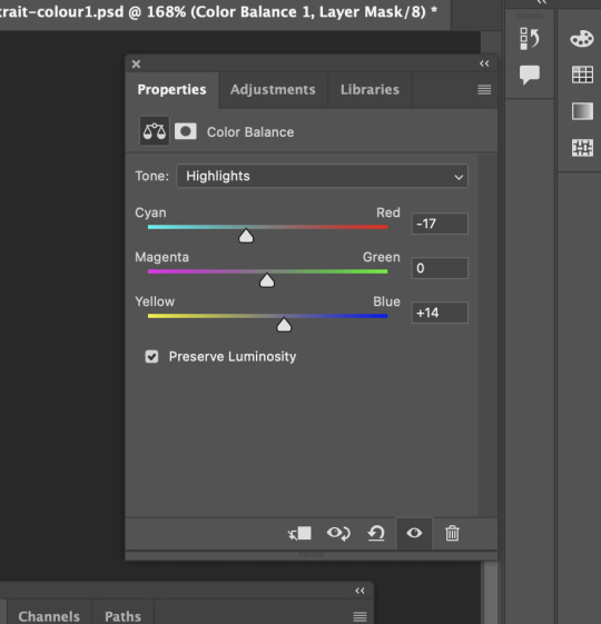
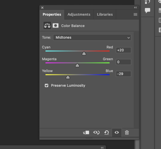
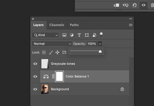
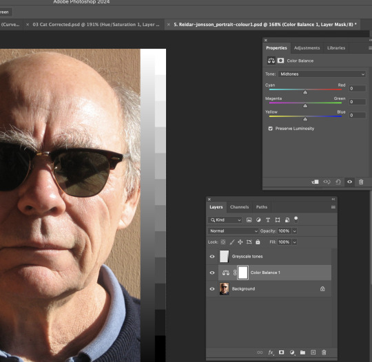
3) I changed the colour balance of the grandpa photo by adding more cyan, less red, more dark blue, and less yellow to the photo.
5) This is a slightly dark image. To correct it, I opened the histogram to adjust the overall lighting of this image. Lastly, I saturated the image towards a little red so the whole image looks more lively and real.

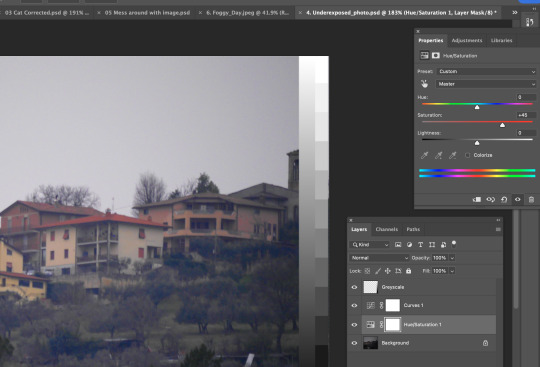
6) A well-captured photo already, but we still can modify the overall colour of this photo by using saturation/HUE. Having the saturation window is like having a color palette. Initially, the photo looked dull and desaturated. Then, I added more red and magenta to it. The colour distribution in the photo is clearer, including the darkest part, the trees.
0 notes
Text
BCM116 - Week Eight Journal Entry
The concept for my final work was loosely inspired by Malcolm le Grice’s Horror Film 1. It centres around the psychological phenomena 'pareidolia', where our brains allow us to perceive things, mainly faces, in objects when they actually aren’t there. I will be creating a slightly animated video that contains hidden illusions of faces in a colourful patterned background that the audience have to try and spot. These animated images will be then projected on the walls of a room. They will switch between each colour, as the different colours make it harder to see the hidden images. It will run between 2-5 minutes long.
I have started experimenting on this, and have created a bunch of images with hidden faces in them in every colour. I have the skills I have learnt in classes, especially week 5, to make this project come to life. I used Adobe Photoshop to create the image and After Effects to animate it. Here they are below, try and spot the faces if you can, they are just three dots arranged like two eyes and a mouth:


Personally, I think that the faces are more easily spotted in the darker colours, namely blue and purple, whereas they are harder to spot in black and white or yellow. It is very fascinating. I need to work on the quality, as when I export them they end up being very pixelated. When I presented it to my teacher, he suggested that I try and make the faces less obvious, so that it is more of a challenge for the audience to spot them. I think this will be very challenging but I am excited to test it out!
I also will create some sort of eerie background track using Adobe Audition that can play in the background while viewers watch my project, which I think will add to the effect of it. I want them to feel both fascinated and unsettled by it. I also really liked a lot of my peers’ works, especially one guy who made a whole moose cutout out of cardboard to project onto, and the girl who had a whole dance routine with projections. My classmates are very talented! I am very excited to see how the final works turn out!
0 notes
Text
Fundamentals 1: Week 4
15th March
At the end of this class where we are learning about the basic photo editing tools in Photoshop, Toby gave us a homework task where we have to choose two coloured photos and two black and white photos and edit them using the same adjustment tools. I decided to use photos that I had taken on my phone (which doesn't have a great camera on it) so I was excited to see what I could do to improve them.
The first photo I used was one I took at my favourite beach, Blackhead.
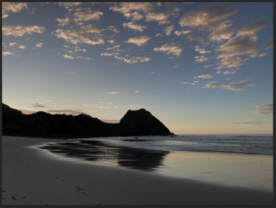
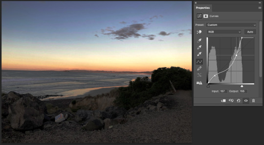
As you can see from a first glance the photo looks pretty dull and doesn't have a lot of vibrance to it. The sun was only just rising behind the hills so it is also a bit dark from where I took the photo. What I want to do here is make the photo brighter while still maintaining the dark shadows and silhouette, and also make it more saturated to bring out the colour in the sky and the clouds. As always my first step is to bring up the curves adjustment layer.

I adjust the top of the curve to bring it closer to where the pixel information starts on the lighter side (far right). Just by doing this there is already an improvement on the brightness of the sky as well as the reflection on the water while the shadows are still dark. You can also see that by adjusting the brightness there is slightly more colour present in the right side of the sky. I added a couple more points to the curve to play around with brightness but felt pretty happy with how it looked. My next step was to add the hue/saturation adjustment layer.

Straight away the saturation makes a huge difference to the photo. There is so much more colour and vibrance in the sky and on the water which definitely looks more realistic and how I saw it through my own eyes. I didn't feel the need to change the hue at all as I was really happy with how this has turned out. Just in case, I decided to have a look at the colour balance layer to see if I could improve the photo any further.
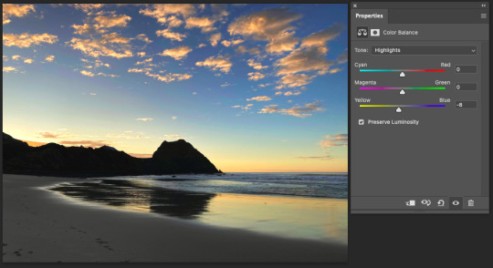
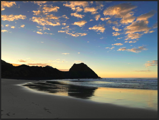
After playing around with the colour balance of the photo I realised that there wasn't much that I could do to make the photo look better (in my opinion). While looking at the highlights I added the slightest hint of yellow which makes the photo look slightly warmer and after that I think I found my desired end result. Really happy with how it looks especially when comparing it to the original photo. Here's how they look beside each other:
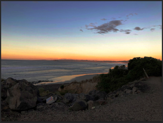
Oh what a surprise, the next photo I decided to use was also from Blackhead. I think this was actually from the same morning as the first photo.

As you can see it is equally as dull and dark so some adjustments need to be made. First things first I bring up the curves adjustment layer.
I actually found this curve to be quite tricky to adjust. While I wanted to make the sky look brighter it actually started to lose some of the pixel information on the far right side in the middle. I felt like this was the best look I could get where the sky is slightly brighter (and already looking more vibrant) without making it look washed out. I also added a curve in the darker area so that the rocky landscape was a bit more visible and detailed. My next step - hue/saturation.

Adjusting the saturation definitely made this photo more vibrant and lively. Again I couldn't add too much saturation as the white part of the sky would start to lose information and just look oversaturated. But I was really happy with this, making simple adjustments like the curves and saturation can have such a positive change on the quality of the photo and make it look more realistic - like it wasn't taken with an average quality camera. I didn't feel the need to look at the colour balance layer because this already was the desired look that I wanted. Here's a comparison of the two photos:

The next photo is one that I took at New Brighton beach in Christchurch using a black and white filter on my phone's camera

The sun was setting behind me so the majority on the landscape is quite dark and the only bright area is the water and the clouds. My goal here is to add a little bit more light to the sand and sky without over doing it.

I found this photo was quite difficult to adjust without making the sky too light where it would lose information. While I was making the sky brighter I started to lose the shadows of the clouds so it was hard to find the right balance of both. I managed to add some more light to the sand so I was happy about that. It definitely felt harder to correct a black and white landscape photo as the details are quite small and easy to lose while making adjustments. It's a photo that I could try keep making tiny adjustments to but overall I was happy with the end result. Here's a comparison of the two photos:

And the last photo! One of my hometown, at the Oamaru harbour. I also used a black and white filter on my phone when taking this photo.

The black and white filter added a vignette sort of look which would be hard to correct so I decided to focus on the centre area of the photo and adjusting the brightness to add a bit more detail. To the curves adjustment layer!
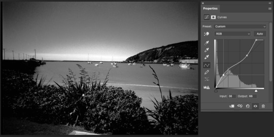
I brought the top of the curve close to where the pixel information started which definitely improved the detail of the lighter areas in the photo. As you can see in the bottom half of the curve I added a point where I brought some of the darker pixels into the lighter area of the graph. By doing this I made some of the darker pixels, mostly around the bushes in the foreground but also on the hillside in the background a little bit lighter which again added some more detail to the photo without losing any information. I was happy with the end result especially when comparing it the the original photo, the slightest adjustments can make all the difference. Here's how the two photos look together:


I really enjoyed this homework task as I had the chance to work on my own photos and edit them to get the desired look that I wanted and also learn that it can be difficult to get the desired look but to try achieve it anyway. It was also a great way to continue getting familiar with the adjustment layers and tools on Photoshop.
0 notes
Text
i call this one "reasons the trafficblr whoreslut survey was wrong about last life mumbo, actually"
[video transcript:
[Mumbo's episode 1 - Grian, Mumbo, Jimmy and Martyn are in an oak forest]
Mumbo: [zooming in on Grian's face with a spyglass] I'm seeing inside Grian's soul right now.
Grian: Do you wanna s— do you wanna look really deep in the waffle, there you go. [turns around]
(they all laugh)
Mumbo: Oh, sorry, I just zoomed into your backside. (Grian laughs) I don't know why that was my default.
[Mumbo's episode 2 - Grian, Mumbo, Jimmy, Impulse and Martyn are watching the sunset in the Southlands]
Mumbo: Look, while the sun's setting... This is quite cinematic, really, to be honest with you guys.
(general sounds of agreement)
Jimmy: Oh my gosh! Yeah, this is a moment.
Mumbo: D'you wanna kiss?
Grian: Right, these— wait.
(laughter)
Martyn: Oooo! Wait, what?
Mumbo: Oh. Sorry, guys.
[Martyn's episode 3 - Martyn, Mumbo and Scar are on the path in front of the Southlands]
Scar: Uh, the big, muscular, strong, chiseled man, that is.
Mumbo: Martyn, d'you wanna take a trip over there?
Martyn: Yeah, go on then, let's go. Let's do it.
Scar: I mean, we can go see the man with the chiseled muscles.
Martyn: Yeah?
Mumbo: I do appreciate the compliments, by the way, Scar, it is really... I mean, you— you didn't... y'know. You've never expressed these feelings for me before, but I do appreciate it.
(Scar laughs)
Martyn: I don't know, I do feel like you've been very forthcoming this season. You're putting people at ease, kisses at sunset, and...
(Mumbo laughs)
Martyn: Y'know what I mean?
Scar: Uh huh.
Martyn: Like, it's— you're making people's walls come down. Even though our physical ones are going up.
[Martyn's episode 3 - Impulse, Grian, Mumbo, Martyn and Scar are on Magical Mountain. Scar is in a hole in the ground, and Martyn and Mumbo are sitting in a boat on top of the hole]
Scar: I can't seem to get out, there is a big ginormous butt in my way.
(Grian laughs)
Scar: I don't know who it is, I'm not naming any names— (unintelligible)
Martyn: Yeah, Mumbo, really really adding to the rear of this boat
Scar: —enormous butt. Somebody's got a big butt.
Mumbo: He called it chiseled earlier! (they all laugh)
Scar: I'm— I'm chiseled.
[Mumbo's episode 4 - Mumbo, Grian, Martyn and Impulse are in the Southlands]
Mumbo: I'm sorry, Grian. I love your back. (Grian wheeze-laughs)
Martyn: And you wonder why, Mumbo.
(they all laugh)
Martyn: You wonder why. Did you forget that you're married? Come on, now.
Mumbo: I'm sorry, Martyn.
Martyn: It's over. I'm taking— I'm taking the ring off.
[Mumbo's episode 6 - Mumbo and Grian are in the Southlands, zooming in on each other's faces with spyglasses]
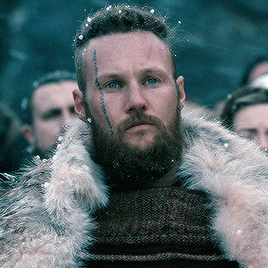
Mumbo: Should we just— just stare at each other for the whole ses— session and just really... really admire one another? Just, like, that— that slightly darker pixel on the... on the right hand side of your face, that's a lovely pixel.
Grian: Your— your half an eye is, uh, particularly looking good today.
[Mumbo's episode 6 - Mumbo, Grian, Bdubs and Impulse are in the Southlands, surrounded by Grian's dogs]
Mumbo: It's adorable. I l— I love it. You should have muscles more often!
[Mumbo's episode 6 - at the Scottage, Mumbo, Scar and Joel are trying to shoot Scott out of a tall waterstream to kill him, and Scott falls but lands in the water]
Grian: Oh!
Mumbo: Ah, he's too good!
Martyn: Aww.
Scar: Dang it!
Mumbo: He's quite talented, actually. He is quite talented, he is, he is a— And handsome, as well.
end video transcript.]
#i am on a roll today#i simply think that ll!mumbo being voted as least whorish and slutty is incorrect. have you seen this man#hell i've probably missed something in this comp#but here i have evidence of him having flirted with SIX different men#and two of them while he was married! none of which were his husband!#mcyt#last life smp#mumbo jumbo#video#echo transcripts#echo.txt#long post#echo hall of fame
1K notes
·
View notes
Text
[IMAGE 1: Blurry, vertical photo that seems to be a Snapchat post. The image is mostly dark, but seems to have been taken outside. The center of the image is just illuminated enough by, presumably, a streetlight. Starring in the center of this post is what looks to be a bootleg fat mudkip plush, slightly bigger than the grey mitten holding it. Its eyes are closed and it is making a :3 face. It also has a sparkly beaded bracelet around its neck like a collar.
The black bar of text across the image reads: AWUWAWUWAHGUHA?!?!?! AUNEUBUWABUMA??!?! ]
[IMAGE 2: A second, darker, even blurrier photo of that mudkip plush, up next to a pale pink mess of pixels that only just can be recognized as Bessba in a pink hat. Her mouth is open and she seems to be screaming. There is another person slightly out of frame, but even that tiny corner of hornless head could only be Zippie’s, if you’ve ever seen her. ]
AAAAAAAAAAAAAAAAAA
7 notes
·
View notes
Text
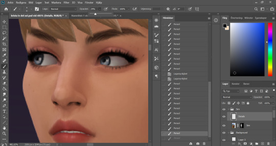
Tu... torial? Pt. 3
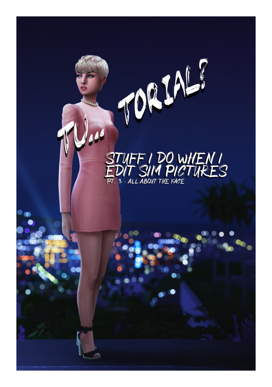
Welcome back to part 3 of my tutorial for anon. In this I will go over perhaps my favourite part - the face. Did you used doodle eyes in your notebook when you were in school? This has the same energy.
This is where things get a little harder to explain because it involves a lot of drawing. I hope you get the general idea though.
Open this in dashboard for best view of the screenshots.
Disclaimer: I have no formal training for any kind of graphics stuff, I work in an office as a receptionist - I serve coffee for a living. I am absolutely self taught and while I consider myself pretty comfortable with photoshop, that doesn’t mean that there isn’t about a gazillion of other things that can be done that I have no idea about. There are people far superior than me in the Sims community. This is just how I do it, with techniques I have picked up through the years. Some things I go over in these will be pretty basic, some things a little more unorthodox.
Disclaimer 2: My edits take time. This is what I do to relax, one edit takes several hours for me. Sometimes days :)))
Disclaimer 3: My photoshop is in Swedish, which is my first language. I tried my best to find the English translations for every step that I do.
Tools used: The Sims 4, Adobe Photoshop 2020, One by Wacom Pen Tablet (very basic and unfancy).
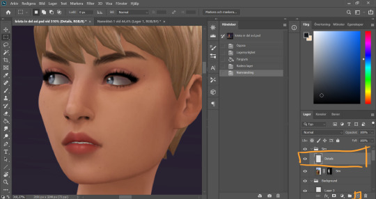
I start by adding a new empty layer in my Sim layer group, above my base Sim layer.
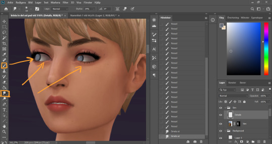
I use the smudge tool (I always keep my smudge tool on Strength around 30%) on the Sim layer to smudge and soften the eye whites a bit. I only redraw my sim's eyes if I'm changing the direction that they´re lookin, otherwise I just refine the existing eyes. In this case I didn't want her eyes quite as far left as they were. On my Details layer, I use the brush tool, hard small brush with opacity around 70-80%, and start drawing the eyes a little bit further to the right.
I realized I wanted the eye whites to be even whiter, so I added a new layer inbetween the Sim layer and the Details layer. Using a soft brush with lower opacity (29%) I go over the eye whites. The lower opacity allows me to build up the color by going over multiple times, creating a better blend. I then merge this new layer with the Details layer because there’s no reason for having these on separate layers going forward.
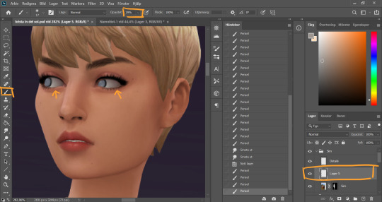
I turn the opacity of the brush tool back up and continue to draw the eyes. At this point they're looking rather creepy...
But looking much better after some added dots of “shine” with a white color (not full on white, slightly muddier)
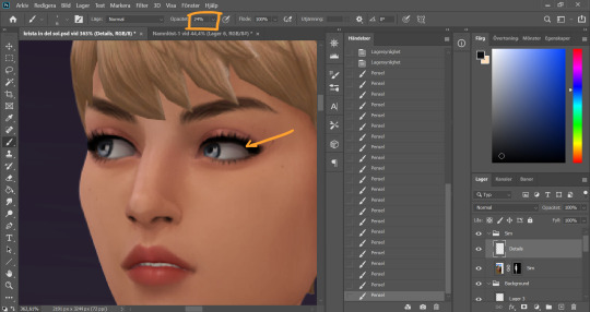
I turn down the opacity of the brush again, take a soft brush and a dark grey color and go around the whole eye to add some shadow.
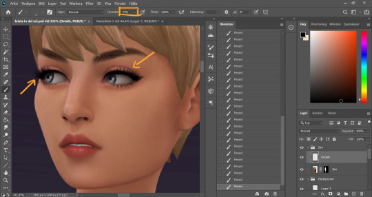
Turn up the opacity of the brush again (I know it’s a lot of back and forth with this, it’s just how I work) and work around the eyes. I clean up the make up and add some lashes. I also add some dept to the eyebrows using a slightly darker color than the existing strands and draw in some new ones here and there.
Time to clean up the nose (eeeew). I start with the Smudge tool on the sim layer, strength around 15-20%, and smudge the pixels a little.
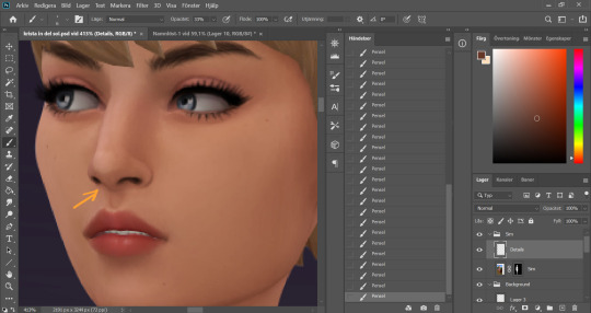
On the details layer, I clean up the nose further by drawing in the nostrils a bit, and even out the colors around and on the nose, picking up color with the eyedrop tool and going over with a low opacity brush wherever I think the color is a little uneven.
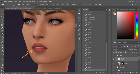
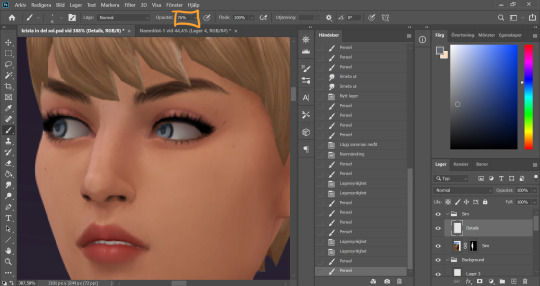
With the lips I sharpen the shape, add some highlights on the top of the lipline, clean up the corners of the mouth, redraw the teeth and add those squiggly circles on the top and bottom lip. They look a bit weird up close but zoomed out it will look glosssssy :) I pick up existing colors on the lip with the eyedrop tool and work with both lower opacity soft brushes and higher opacity hard brushes here.
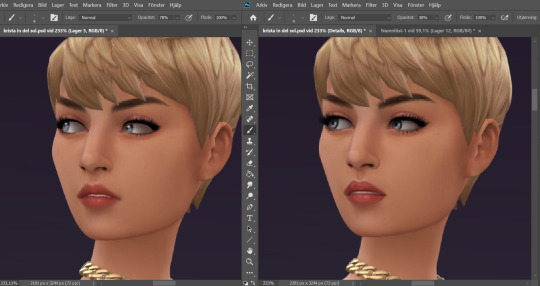
Now I feel happy with the face details. Here is a comparison of the face before and after. A little bit cleaner and smoother now!
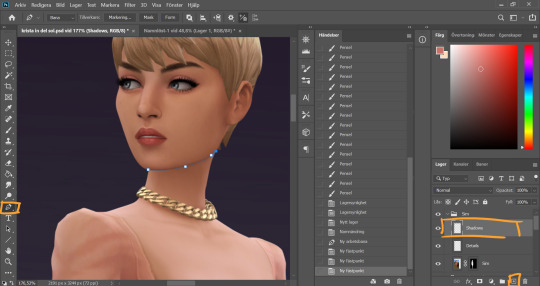
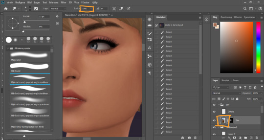
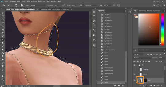
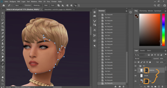
Time to throw some shade. I always start under the chin (because for some reason that's the most fun). I create a new layer in the Sim group, name it shadows, and I use the pen tool again and make a path along the jawline, sectioning off the neck from the face. I went over the basics of using the pen tool in pt 1.
This is.…may be an unortodox way to do it. I'm sure a lot of people would see this as an unecessary tricky step. It is however my favorite way of doing it.
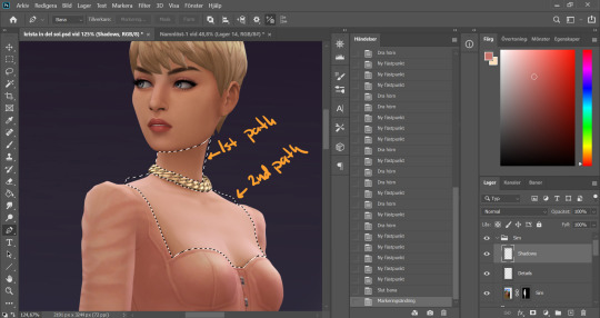
I made two paths for this first work area. Meaning I first made a full path on the neck above the necklace, closed that path and then started a new one below the necklace to include the chest area where the skin is showing (separating it from the clothes). When both my paths were closed I pressed ctrl + Enter to turn them both into selections at the same time.
As you can see I didn’t bother following the “edge” of the sim, you will see why later.
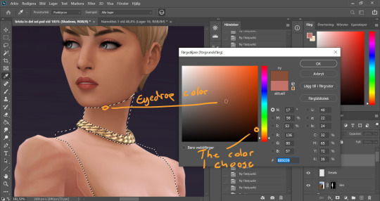
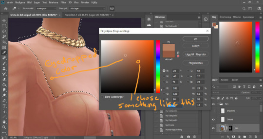
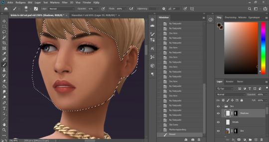
I eyedrop a color from a darker area of her skin, then I choose a darker, more saturated color in the palette that comes up.
I use a big soft brush with opacity around 30%. I start to build up the shadow under the chin, with more color right under the jawline and less further out. This is where my pen tool selection comes to good use, it keeps the jawline nice and sharp even though I'm using a soft brush to get the fading effect on other parts of the shadow. As we already decided, the light comes from the left in this picture, thus the chin shadow ends up to the right. I use a smaller brush to go around the clothing line, and under the necklace. The tighter the clothes, the smaller the shadow.
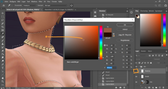
I noticed the neck was lighter on the very side of the neck, and that interferes with my shadow. Now of course I could go over with the shadow color a couple of more times in that spot, but I prefer to correct the color on the base Sim layer instead for a more even result. So I hide the shadow layer, eyedrop the slightly darker area on the neck (and keep it this time).
It's important to keep the selection while I do this, so I don't paint over something else. You could put this on another layer and just erase if you accidentally go over something you're not supposed to, but since I already have the selection I can just put it on the base Sim layer. I brush over the area a couple of times until the color is how I want it.
While I am at it I also thought the chest area is a little too white and colorless. This often happens on my sim pictures if I’m using a sim with lighter skin. Again I eyedrop a darker color of the skin, but this time I choose a more vibrant version of the color to avoid muckyness when I go over the white.
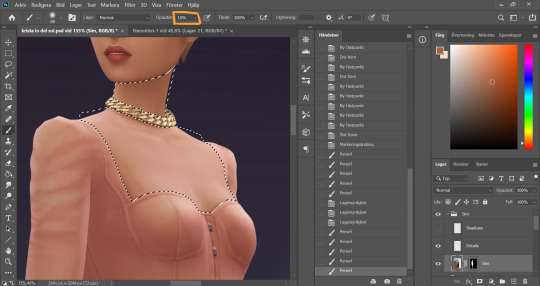
I set the opacity of the brush to super low and then very carefully go over the whiter areas of the chest a couple of times, avoiding the areas where there are details such as collarbones or cleavage.
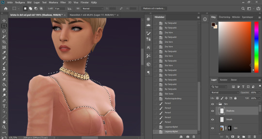
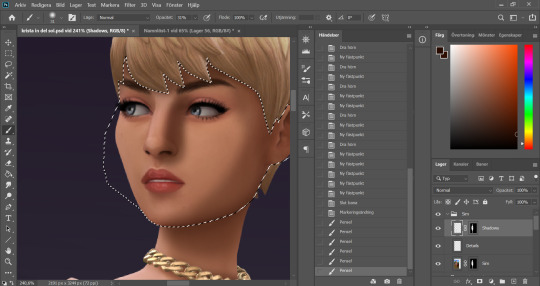
I make the Shadow layer visible again and deselect. Now you see how I have painted a little outside the skin area on the neck, because I didn’t follow the edge of the sim with my selection? I quickly fix that by holding Alt and grabbing the layer mask from the base Sim layer, and dropping it onto the Shadow layer.
Now these two layers have the same layer mask! And it's time to bring out the pen tool again, and make a path around the face.
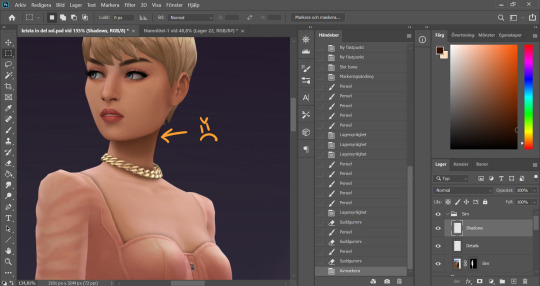
With the face selected I start painting my face shadows. I put shadow on the side of the face that´s away from our imaginary light source.
I paint shadows under any hair that covers the face, and add a shadow on the side of the nose that´s facing away from the light. This usually takes me a couple of tries to get right, like this here wasn’t it...
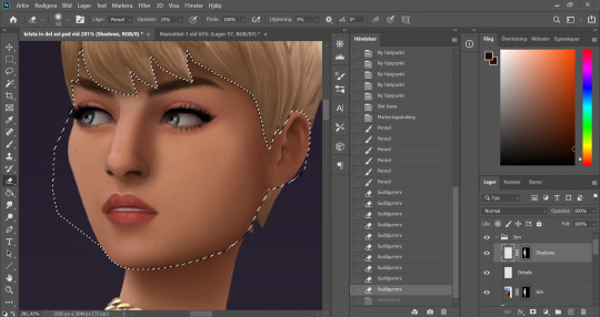
I use a 30something % opacity on my brush and then 30something % opacity on a soft eraser brush and go back and forth with these until I get a nice blend.
Got the nose shadow looking decent, and add a little shadow in the eye… socket?… closest to the nose. I make sure that this doesn´t go over the eye itself and interferes with any colors there. I want to keep the eyes clear.
I deselect. Now we´ve got some little flaws here and there because my selection didn’t line up perfectly. I blend these with the smudge tool.
Better!
Looking fine gurl!
As I mentioned it’s a little hard to explain some steps, like the eyes and the lips, because it is just drawing until I like the result. I hope you find this useful though, and please send me an ask if you’re wondering about anything!
81 notes
·
View notes
Note
121 touching affectionately without asking with yuta okkotsu? fem reader please thank you!
non-sexual forms of intimacy. send me ‘INTIMACY +’ a number between 1-125 and i’ll write a starter or a drabble about our muses engaging in a form of intimacy outside of sexual context. note: as the level of trust required for the things listed here varies a lot, feel free to send multiple numbers if you aren’t sure if they’ll work!
It was a year ago in the dorms. The two of you locked in a nest of limbs, sinking into the mattress as your eyes stared ahead to the television. Its pixels flashing between muted colors of dark blue and green, creating the visual of two people in an wet alleyway, their bodies melded with one another. The rain silencing any moan or kiss that could be heard.
Yuta had embraced slumber long ago, leaving you to be the only viewer, but his body still clung to you. Lanky arms enveloping you into a lousy hold around your waist, his legs tangled with yours, his face nuzzled above your chest. You could feel his heartbeat, the tempo of it matching yours whenever you listened hard enough. With your left hand, you scratched his scalp gently. Your finger looping through his dark hair before cascading to his nape, the pad of your digit rubbing circular motions against his skin.
Immediately, his hold loosened but his face nestled deeper into your chest. A sea of goosebumps ran across his arms—highlighted by the colors of the film—and his legs fidgeted in the lock with yours. He slowly stirred awake when you moved your hand away but didn't bother to move from his position.
"Is the movie over?" He yawned softly, voice barely registering as it was muffled.
With the remote out of your reach, grabbing it meant you'd break the embrace so instead you stared back at the film and gauged an estimate. "Almost. Maybe in thirty-five... forty minutes."
"Mm." He hummed against your skin. "I have to meet with Gojo-sensei soon."
Your lips quirked upward, noticing how at the mention of leaving he holds you tighter. You rest your hand on the crown of his head. "Just stay till the movie's finished."
"But Gojo—" Yuta lifted his head slightly, his deep eyes peeked upwards and still you hush him. "But nothing. Make him wait a lil'. He deserves it."
You thought about the scene in the alley. The bodies so close to one another, so desperate for each other's touch. You know that feeling by heart. You understood it. You thought about the many days after tomorrow where that intimacy will no longer exist for you. Where the only gestures of love will be through text messages and international calls. This is the last night you'd have with Okkotsu in a long while. You'd cherish it and not even Gojo could take that away.
You stare at him with primed lips, stunned on the many words you could say to let him know you care. Instead you say, "I just don't want you to leave yet, okay?"
In hindsight, you hated how childish you sounded. You wish you had said something better. Regardless, he listens and stills in your embrace. As if to freeze in this moment with you and to never let it pass.
Your fingers find his nape again and his skin blooms.

You like his new look. You've told him that a hundred times through texts and voice messages but to see it physically and be able to notice his longer hair, the darker bags in his eye, how broad his shoulders are brings butterflies. He's more mature than he’s ever been but that stony façade cracks in your presence—returning back to those big puppy eyes and nervous smile— and it reassures you. No matter how far he goes, or how he's changed, he's still yours.
Your eyes are trained on his back. He's a few steps ahead but you can tell he's slowing down for you. His left hand twitches as if it's eager for you to slip your fingers into his, it's your go-to move whenever you're in public—that or a side hug—and it's one of the few gestures that doesn't leave him red as a rose.
For once, you're not interested in holding hands yet. No, your eyes are glued to his nape.
So you walk faster until you're at arms length, reach out, and caress the back of his neck gently.
Yuta yelps and spins back violently to look at you. His eyes widened and his lips quiver in reaction. You can see his cheeks start to burn as he stutters on syntax. Innocent shame pools in his stomach at his reaction. He thinks of anything to say but you're already in his space before then. Your arms wrapped loosely around his neck as your noses graze each other. His hands rest on your waist to balance you against him, his grip firmer when he feels your breath on his face.
"Wha—why are you-?"
You rub his nape again and the goosebumps form. "Y'know, you're neck's ticklish, right? It's really cute."
Yuta groans and presses his face onto your shoulder. The hands on your waist replaced with his arms as he pulls you into a hug. "I didn't but please don't tell anybody, especially Maki."
A snort hiccups out of you, "and let them in on the teasing? Yeah no. This one's stays in the sheets."
"... T-The what?"
"Nothin'... I missed you."
Milestone Event
#yuuta x reader#yuuta okkotsu x reader#yuta okkotsu x reader#okkotsu x reader#jujutsu kaisen x reader#jjk x reader#no beta we die like men#.myfanfics
70 notes
·
View notes
Text
Love on Open Waters: Chapter 1: The Capture
Prologue
Word Count: 1,419
Five Years Later
Patton smiled at Roman. “Alright, kiddo, time for bed.”
Roman looked up at him from his position on the bed. “Do you think Virgil will come back soon?”
Patton patted his head, dipping down to place a brief kiss on his forehead. “I don’t know, young prince. Maybe one day.” He walked to the door, leaving it open just a crack but turning the light out as he went.
Patton walked down the corridor, checking to make sure the other castle residents didn’t need anything. He went up a floor and did the same thing there, checking in on the king in his study and informing him of the time. He was thanked and sent on his way. He stepped through the main spaces, checking the other studies and the main living areas to make sure that everything was in place and that the maids had done their jobs to the best of their ability.
When that was done, he made his way over to the servants’ quarters and checked in on everyone. He sped up when he got to the maids’ quarters, not wanting to be caught in conversation with a certain person. He walked at a slightly faster pace, exhausted and wanting to get to bed before much else happened that night. His mind ran through all the projects he still had to do, the mending he wanted to do on his favorite suit jacket but also the new skirt he was planning on making.
His distracted thoughts had him slowing down until he almost ran into the one person he was trying to avoid. She stepped back but blocked his path in the narrow corridor. “Where are you off to, Patton?” Gaelle’s voice was higher than it was when talking to anyone else as she tried to put on an accent she thought he liked. Gaelle was someone that was under the impression that Patton was anything but exclusively gay. She seemed to have some sort of obsessive crush on him despite him wanting nothing to do with her.
Patton sighed. “Gaelle, I’m tired. I just wanna go to bed. Maybe do a bit of sewing first.”
She frowned and he knew he’d said something to displease her. “You know, sewing isn’t a very manly thing to do.”
Patton closed his eyes and nodded. “You tell me this every time you see me. And every time, I could not possibly care less about your opinion. I must, once again, inform you that I am not romantically inclined toward you. If I am to be blunt, I’m not even platonically inclined to like you. So, if you don’t stop harassing me every night and let me pass, you won’t have a job in the morning.” His voice had changed from tired to a honey smooth tone that meant he was extremely upset but wouldn’t show it.
She scoffed, not hearing the danger in his voice. “You can’t do that.”
He dropped the ‘customer service’ smile he’d been maintaining and gave her a look that was deadly. “Not only do I have the ear of the king, I’m still your boss. Either leave me alone, or pack your bags.”
She scoffed again but moved to the side. Patton gave her a tight lipped smile and passed, going on to his room. He stretched when he finally closed the door behind him, reveling in the feeling of dropping his mental burdens at the door.
He moved away from his bedroom door and toward the small balcony that overlooked the ocean a few miles away. He leaned against the railing, trying to get lost in thought as he stared at the shifting water. Just as he was relaxing, an arm wrapped around his waist, a hand coming up to cover his mouth with a cloth. He tried to shout but made the mistake of breathing in. His vision faded as he clawed at his attacker, who simply held him until he passed out.
⚓⚓⚓
Patton woke with a headache. The ground shifted under him, constantly in a rocking motion. He raised a hand to his temple only to find that he wasn't bound. He stood and looked around the small room. There was a bed that he’d woken up on that was tucked into a nook of the wall, a desk that was attached to the wall with a chair which was attached to that by leather straps for arms, and an empty shelf above the desk. Looking around the small wall, Patton found a trunk sitting at the base and a hook for a coat on the wall.
He took a few steps forward, the cabin wasn’t very wide, and tried the door, only to find it locked. Sitting on the bed, he wondered what was happening to him.
He didn’t have long to wait before the sound of a key in the lock reached his ears and a man entered. The first thing Patton noticed about him was how tall he was, barely fitting through the door. He had on a long dark green coat that went down to his knees, a grey shirt that was open to halfway down his chest and revealed his chest hair, and loose fitting black pants with a sword on his hip. When he came into the light, Patton noticed that he wasn’t as tall as he’d thought, having a large and dirty green hat with a feather in it on. His boots were simple work boots, the kind that Patton had often seen on the hired help that came to the castle for a quick paycheck.
When the man came into the room and shut the door behind him, it took Patton a minute for his vision to adjust again as the green-clad man took a seat in the desk chair, taking off the hat as he did so. Patton noticed his hair was a bleached brown, his skin tan from the sun, he wore a mustache darker than the rest of his hair, and his right iris was almost white compared to his dark green left eye.
“Can you guess why you’re here?” The man’s gruff voice brought Patton’s attention back to the situation at hand.
Patton sighed. “Sir, I don’t even know where here is, let alone what I’ve done to deserve this.” He tried to put his usual authority into his voice to hide how badly it was shaking.
The man nodded. “You’re being held for ransom. You’ve harbored a person I have interest in for too long and I intend to have them back. Thus, you are going to write home and tell them that until they hand over the mer or a sum of money to his equivalent to make up for the loss of revenue, you are staying with me.”
Patton furrowed his brow. “The mer?” He thought for a moment but soon realized there was only one new addition to the household recently that would constitute such actions from someone. “Virgil,” he said under his breath.
“So you do know who I’m talking about,” the man said, a note of triumph in his voice.
Patton nodded. “Unfortunately, I don’t know where he is.”
The man narrowed his eyes. “Explain.”
Patton shrugged, not breaking eye contact. “Virgil did indeed stay with us for four months. However, he disappeared a day or so before my capture and, as far as I know, has yet to return. I can’t give up a location I don’t know.”
The man nodded and slapped his thighs before standing and putting his hat back on. “In that case, I’ll be back with food in a few minutes.”
Patton reached out a hand but didn’t touch him. “Wait! Am I at least allowed to know the name of the man keeping me prisoner?”
The man didn’t turn around but did speak. “Remus Cadoc, Captain Remus Cadoc.” He left without waiting for a response.
Patton sat in the locked room for what felt like a half hour before the door opened again. This time, it was someone else bearing a tray of food. Unlike Captain Cadoc, this sailor didn’t seem to have any weapons on his person. The man put the tray on the desk and doffed an imaginary hat at Patton. “Cap’n got caught up in work and couldn’t bring this to ya but told me to do it.”
Patton thanked him and stood. “May I know your name?”
He smiled. “The name’s Apollo Aiman. What’s yours?”
“Patton Hope.”
Chapter 2
Main Taglist (Send an ask to be added or removed!): @antisocial-xxxpert, @more-fandon-than-friends, @vindicatedvirgil, @star-crossed-shipper, @the-sympathetic-villain, @battlebunnyteardropsinthesun, @punk-academian-witch, @sarcasmremovedsoul, @private-snippers, @mygenderisidiot, @mistythegenderqueermess, @5-falsehoods-phonated
LoOW Taglist (Send an ask to be added or removed): @cute-and-angsty-princess, @im-an-anxious-wreck, @lonelyanxiousbean, @akatsuki-no-katira, @pixelated-pineapple, @winterwynd, @acetatertot, @viva-la-pluto-dam-you, @pansexualpuppet
#loow#remus sanders#patton sanders#dukeality#momus#intruality#pirates#pirate!remus#beauty and the beast au#ace writes
76 notes
·
View notes
Note
hi there! i really like your reinterpreted "this is my family" gifset and i was wondering if you could explain how you blended scenes together on the 2nd and 6th gifs? or if you know of any tutorials that explain it? yours are so seamless!!!
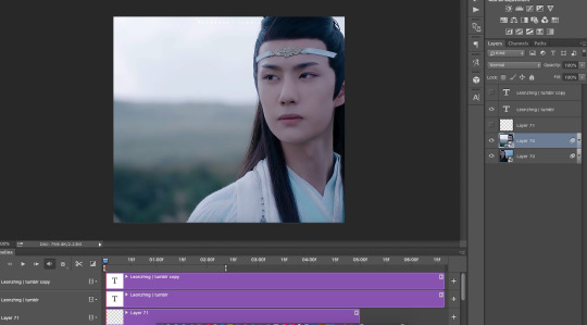
oh thank you!! when I first started trying out gif blending I referenced a few old tutorials, like this and this, but along the way I’ve kinda just... done my own thing and played around a lot with masks (─‿‿─)
I’ve taken screenshots of what I did and I’ll try my best to explain it below!
for the second gif of this gifset:
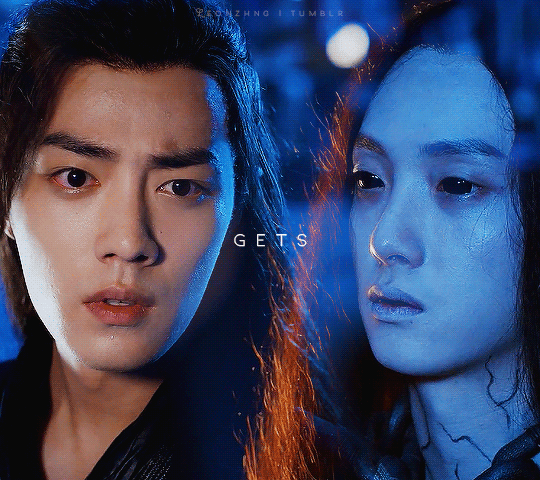
1. I loaded the two gifs into the same photoshop file and converted to timelines and sharpened
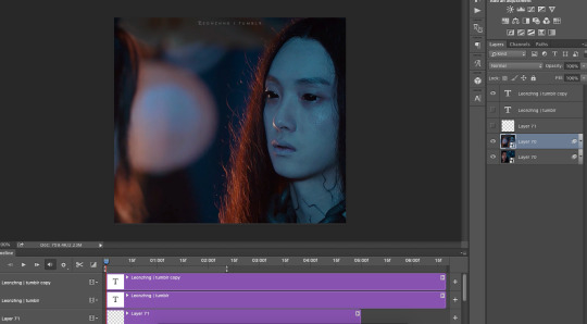
2. for this particular gif, I changed the blending mode of the wn layer to “lighten” which is the mode I use for a lot of my more complicated overlay gifs as well, like the second gif here
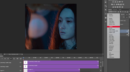
with the lighten blending mode, basically what happens is that the lighter pixels show up instead of the darker ones, which is why wn’s hair (which is dark) is now semi-replaced by the lightish (in comparison) blue background on the wwx layer while his pale face is still quite opaque, and also why wwx’s biutiful face is now covered by a gigantic blob of light (-ω-、)
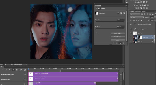
3. to remove that blob of light and grace the world with wwx’s biutiful face once again, I selected the wn layer and applied a mask (see bottom right, click that thingamajig that says “add vector mask”)
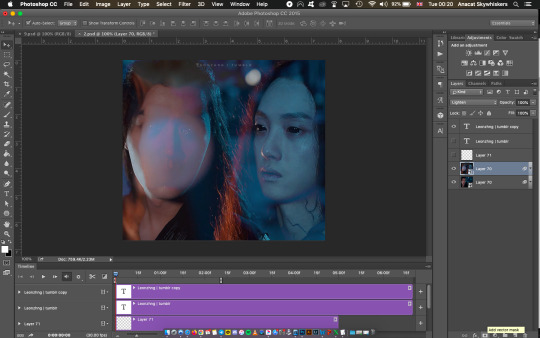
and with the mask layer selected,
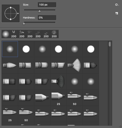
I used a soft brush at 100 px (ofc changing the size when I needed to go finer or larger)
and brushed over wwx’s face to remove the light (see that dark spot on the mask, dark = hidden part of the layer, white = part of the layer that’s seen)
when brushing over the mask, I’ll usually also toggle back and forth over the timeline to check if the mask covers what I want to cover throughout the entire gif. it’s not so bad here because in the scenes I chose, wwx and wn stay relatively still so the mask looks like it’s always covering the same area. but if your scenes have a lot of movement, the mask may be covering the area perfectly in one frame but in another when the subject of the scene has moved away, the mask is covering the wrong area now >-< it’s definitely a lot trickier... scene selection is super important when blending gifs!
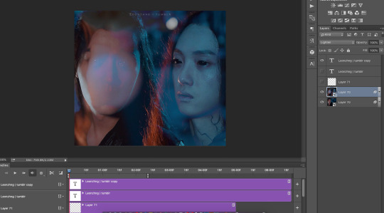
4. and then I did my colouring! because I was lazy here I used the same colouring layers for both lol usually if I’m feeling studious I do separate colouring for the two layers

but after the colouring, I realised that wn looks kinda faded out and translucent because of the background on the wwx layer
5. so I added a mask on the wwx layer as well to make wn’s neck area slightly more opaque
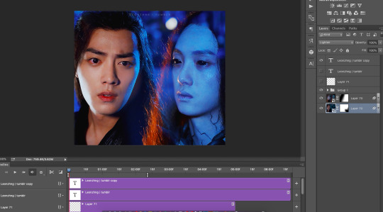
this what I meant when I said earlier that it’s a lot of trial and error; blending really depends on the scenes you choose and the colouring! most of the time you’ll have to keep going back and forth between your layers to mask areas that you want to keep and want to hide
but! there seems to be an area at wn’s hair where the background of the psd is showing (those chequered grey and white squares) ∑(O_O;)
6. so to cover that up I added a black fill layer right at the bottom
and that’s it!
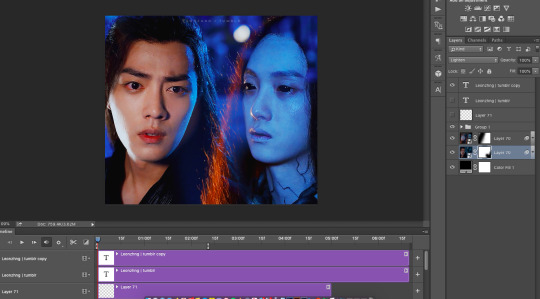
meanwhile for the sixth gif in that same set:

1. I started similarly by loading it all in and sharpening
2. but when I tried the lighten blending mode, this happened... *weeps* ┐('~`;)┌
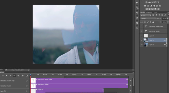
so for this gif, I went with the normal blending mode for both wwx and lwj layers instead, which is why it looks like lwj is fully opaque and standing in front of wwx, as compared to the earlier gif where wn is still slightly translucent (especially his hair)
3. and same as before, I applied the mask to the lwj layer and brushed around until it somewhat crops around his shoulder, hair, and face

4. and added my colouring and that’s it!
other examples of the two different blending/ overlay styles from here to highlight the difference:
below: layer where shen wei is bare faced (on the left) is on lighten blending mode - right side of his face is slightly “translucent”, but on the left, the bottom layer isn’t showing through at all, because I put a mask on the layer where he’s wearing a mask (lol) right where the bare face of the top layer is
bottom: both layers are on normal
and a trick!
all the layers in these two bottom gifs are on normal, some parts look faded/ translucent not because of any change in layer blending mode, but because I’d added a mask on that particular layer but with a gradient (⁄ ⁄•⁄ω⁄•⁄ ⁄)

so yes! there are a lot of ways to do blending and it’s a lot of trying and playing around to see what you can get :p this was a long rambling reply but I hope it helped!
78 notes
·
View notes
Last Seen Blogs

pmwrites-blog1
Howdy
an-unoriginal-username-yep
An Blog

battle-net-blizzard-free-code
Battle Net Blizzard Free Code Generator without human verificati
battle-net-blizzard-free-code
Battle Net Blizzard Free Code Generator without human verificati
pmwrites-blog1
Howdy