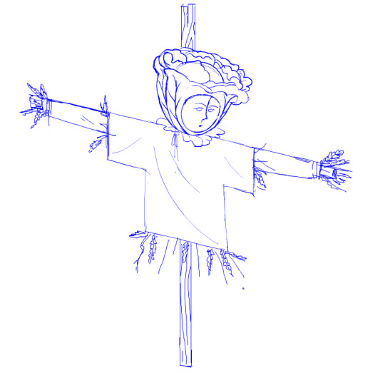
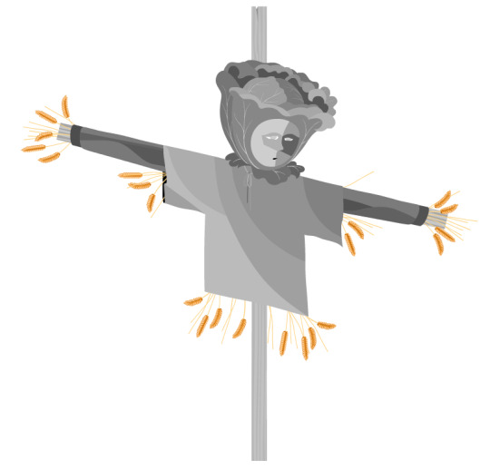
#i was also just starting to color my line art
Text
WHY I DON'T RETIRE MY SKINS: an essay
Disclaimer that I'm speaking from a point of being established here, because not everybody can afford to run their skin shop like I do. I don't judge less established artists for needing to limit their skins because they can't afford to print a run with only 2 people on it. I'm also not judging anybody who does retire their skins after a set number of prints - whole different matter! I'm giving an opinion piece based on my own personal thoughts about running my own skin shop.
Okay, now that's out of the way. I really dislike the idea of time-limiting my skins. There's just no actual justification for me, as an established skin artist, to limit skins I know will sell... aside from prestige, and putting buying pressure on my customers. So there's a couple of reasons I don't like that:
1) Erodes trust in the artist.
Yes, I could probably make more money if I kept my skins limited so people HAD to pick up my skin on release. Maybe even all 4 colors of the skin, including the one they don't really keep in their hoard. Just in case they want it down the line but it won't be available anymore.
Is this good business practice though? Do I want people to start feeling panicked every time I ping for a release, because they just picked up a new project and really really CAN'T afford to be buying skins right now but there's 5 colorways of my skin available and they'll probably be resold for 2kg as soon as they retire?
Personally, no! I want people excited when I ping, not feeling dread in their hearts and budgets. I want people to be thinking: 'Awesome, a new skin! I can't afford that right now but I know he always keeps a few on the AH at print price even after preorders end. Even if I can't buy a skin just this moment, I'll be sure to keep an eye on his thread for when I have gems again.' Or: "Awesome, a new skin! This one doesn't appeal to my lair aesthetic, so I will just nod and smile. I don't feel the need to buy it in case it gets popular for resale, because it will always be on the AH for print price."
People tell me about unsubscribing from GASP because they get anxiety being pinged for skins they want but can't have. So I want people to stay on my pinglist because there's no pressure on them whatsoever to purchase anything. It'll always be here, okay? In the meantime, just enjoy the art, maybe preview it on a scry or two. I'll be here if you're back in three weeks, or three months.
2) Passive income!
I lied. I probably would've made less money time limiting all my skins than by keeping my skins restocked. A couple of reasons for this:
- My earlier skins sold worse. This isn't psychology, it's just numbers. Some of my most popular stock were made early on in 2021/2022. I didn't have that many sales then, so could you imagine if I had retired them immediately after that? There's 230something copies of SAILOR'S WARNING out in the world right now. If that skin was time limited after preorders died down, I would've sold "only" 50 forever.
- People see my shop stock whenever you ping for a new releases. I get 3-4 sales off auction house whenever I release something new and people check my front page. It's not a lot but it's consistent.
- It's a win-win situation, okay? If a skin is popular, there's no reason to time limit it to drive up sales. If it IS popular, then people are going to see it on other people's dragons, go "damn that's a nice skin," and maybe do an AH search for it. And if there's a cheap print price copy available, they're gonna buy it.
2) Reprints are easy!
It was a lot more annoying to keep track of queue numbers and inventory back when reprints had to go through regular queue for a week. Did I put in 10 copies of SUNHEAVEN already? Wait, are my kitsune aethers back yet? How many of MOLOCH are still listed?
Now I can put in a blueprint and get my reprint instantly. No fuss at all.
3) I don't want to buy into the 'this is a retired skin' hype...
This is just personal preference. It makes me feel a little bad when a public skin I made is popular and people can't afford to have it. I'm not judging anybody who does like it when their skins are rare, special, and sought after.
It's just... I get that part of my brain scratched from my customs. They're gorgeous, they're 5 prints, they're on the AH for 30kg if you really want one. Most importantly they're niche and high coverage enough that even if someone hadn't paid me to draw an exclusive skin specifically for their dragon, they'd never do well as a public skin anyway.
Here are some tips for people looking into keeping their skins unlimited:
- You don't need to do it like I do.
Blueprints are expensive. Even I don't have my entire catalogue stocked, only the ones I noticed always have reprint requests. For example, only SAILOR'S WARNING out of 4 total colors for my impm skins is kept stocked because the others don't sell enough to justify it.
If you can't afford to stock them 10 at a time, have the customer provide the blueprints. Shelving your skins but having them be reprintable with a BP and a fee (350g is good for 850g print prices; remember, 500g of that went to you purchasing blueprints in the public run, so it doesn't make sense to charge customers a whole 850g when they're already providing the blueprint) is a good alternative to permanently retiring your skins. You don't get a ton of people who can afford that, but the option is there for people who want it.
- Notice which skins sell!
If you already have a good amount of skins in catalogue and have trouble figuring out which ones to begin stocking, you can start by checking in with your pinglist. Poll them and see which ones you'd want to rerun.
- Don't have so many recolors.
It's a law of the universe that they more recolors you have, the worse they sell collectively. I usually do 2, no more than 3. If you have to time limit your skins to get 6 recolors to hit print, then it's time to cut those recolors down.
There's reasons for this: it's choice paralysis, people may want 'complete sets' and will skip out if you're making that complete set cost 4kg total, and it just plain doesn't make sense for very similar color schemes to cover 4 different skins. Feel free to print personal recolors or have custom recolors open.
107 notes
·
View notes
Note
There's something about your art style that digs it's nails in my mind, I'm not sure if it's the monochromatic nature occasionally broken by sharp bright colors, the lines that get more wide and shaky as they become less "important" or the fact that every part of your drawings feels busy, maybe it's all of them
Not to mention your character designs my god your good at this shit I love all your goobers especially Victor I love that stupid ass gay bird toy game demon I need to kill him
Thank you! I need to kill him too
A lot of it is that I practice for the sake of efficiency. Hilariously, I hate "illustrating". I have a brain for animation but no actual patience for animation, so I like having designs that get ideas across very quickly and require an uncomplicated process of just Drawing the Damn Thing. Once i have to actually color i start to cry. So everything only has like 5 colors to it at most. It's an inherently "lazy" style, but it also means I can stay focused on just the drawing and not worry about other choices to make about rendering or whatever.
I am the kind of person who plays one build in a game, and practice it and only it to the point of mastery, until everyone else playing the same game is like "wow what a weird playstyle. Is that all you do" "yes" "How are you making it work" "my attention span is too small to learn how to do anything else" "christ"
83 notes
·
View notes
Note
Can you share what your art-making process is? What software and tools do you use?? I'm falling in love with your work!!
Thank you, I'm so happy you like my work and are interested in the process. The short answer is I mostly use Adobe Animate.
I hate how I'm using an Adobe product (although I still regard it as a MacroMedia Flash product), but there's just no other software that compares to its jankiness. Perhaps it's just my long familiarity with the program, but nothing I've experienced matches how it simultaneously feels like drawing in MS Paint and using Microsoft PowerPoint vector shapes. The result is something that feels in-between the two; handmade yet computer-generated.
Typically, I'll start with a hand-drawn sketch, often beginning as a thumbnail done with pencil and paper.
I'll then do a mix of hand drawing and vector shape tool rendering. I use the Paint Brush tool to hand draw strokes, and the line and shape tools mixed with transform to make more geometrically accurate shapes. The design is rendered into divided closed loop shapes, ready to be filled with a solid. The strokes are kept or removed depending on the design.
These fill shapes are then either coloured and rendered in Adobe Animate, using fills, gradients, or a more complex process of masks and effects.
Alternatively, I'll bring all these vector shapes into Photoshop and use them as clipping masks. The vector shapes act like masking taped areas or shields to maintain sharp edges, while the brush is like an atomized airbrush used to build soft volumed forms.
Please excuse all that horrible Adobe Cloud and AI bloatware...
And there we go!
Variations in the process include just using MS Paint, index color in Photoshop, or 3D programs.
Very old works of mine were almost abstract, just exploring digital mark-making, which was a trend I was following in the mid 2010s that I loved. This kind of stuff.
While my current work uses its digital material specificity as an intermediary to the subject in the illustration.
For example, #ersatz.world parodies clip-art and flash edutainment styles but imagines the characters living within that kind of world. The designs are meant to be cute, easy to read, light in computer processing, but also irreverent, janky, and generic too.
People typically regard this sort of clip art style as ephemeral trash, but I always found them charming. I use Ersatz World primarily as a satire vehicle, parodying educational formats to spoof corporate explainer content and digital media.
However, part of the problem with Ersatz is I've made it look too polished, complex, and I've grown too attached to the characters, which I imagine is a typical issue with overbuilding a world. So recently, I've made an even jankier Ersatz-like set of characters to play about with, using an even simpler style with less cohesion. I like to try and use slightly different styles and digital material styles to relate to the property at hand.
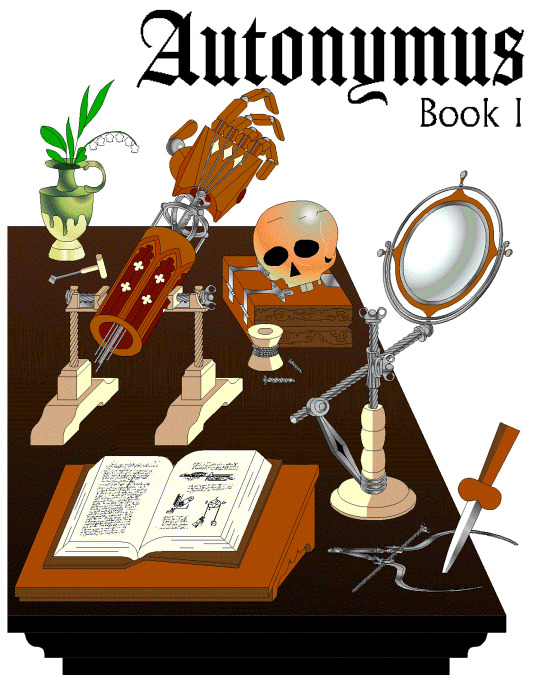
That’s why #autonymus has a bitmap digital material and a denser feel to it. Unlike Ersatz, Autonymus is not meant to be an overt semi-meta fiction. It’s not exactly pixel art, but the pixels are just about visible, as the intention is to create a digital expressionist depth to the setting. Although it’s still stylized and not realistic to our world, I definitely still want to evoke semblances of our world. That’s why there’s attention to landscape, plant life, and implied life beyond what you see in the frame with the characters, etc. But I'm still making a cartoon, and I still want it to feel at ease with itself being a digital material work. Characters are therefore flat, simple, stiff, and the speech style is like a bad Shakespeare parody. I like to balance between ugly and appealing, simple and complex, familiar and unfamiliar.
In regard to things like inspiration, references, and my relationship to aesthetic genres; these things certainly factor into my work, perhaps I'm even overtly dependent on them. My work can definitely be post-modernist in method; creating new, ironic, or fragmented interpretations through deconstructing a mix of various styles or methods. But at the same time, I'm still trying to make a digital gestural representation where the aesthetic is driven by my relationship to the software and techniques directly—not simply in an attempt to reference a style. For example, I like drawing lines in sweeping strokes, not to a point of geometric perfection, but just in a way where the curves are smooth and simple. But if I want perfectly curved or straight lines, I'll use the vector tools.
Working this way, you can sort of learn why certain styles and design choices in past vector aesthetics were made, as they would have also needed to make similar choices. That’s why I’m more mindful of using digital material specificity as a foundation to build narrative and subjects upon these days.
For example, genre references like cyberpunk clichés for #cyberhell or late medieval design for #autonymus or 2005 to 2015 era subculture fashion for #gradientgoblinz.
I think it’s important to take inspiration and reference from a wide variety of sources, but I think they’d mean nothing without having something to say or express. Autonymus, although it is a collection of tropes and clichés, isn’t just about that. It’s a story about the tensions of socially constructed systems and how that shapes faith, technology, and the natural world, or at least that's what I'm aiming for anyway.
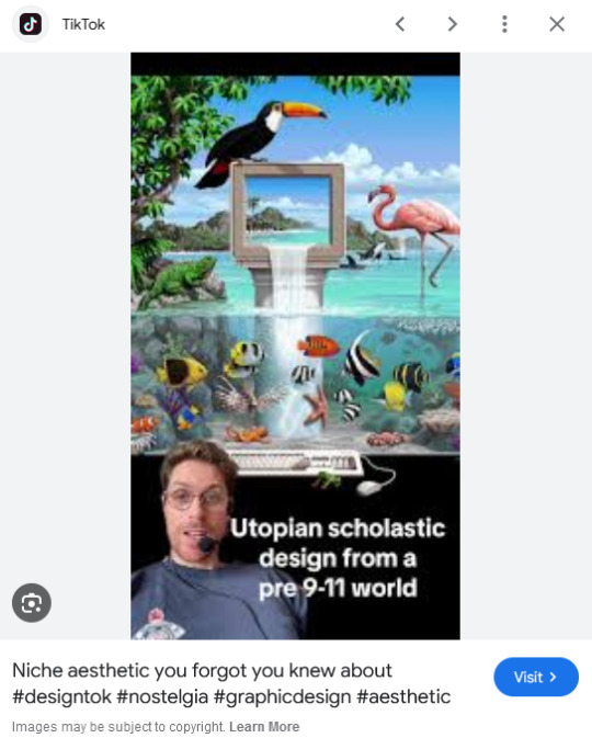
But despite all that, I think there’s a danger of locking myself into the past by using these methods. For example, using nostalgia and references to past aesthetics can result in just recreating the past in a form of role-play. To avoid that, I try and evoke the past through a messy, inaccurate pastiche rather than caring to accurately re-enact anything. I’m probably not always successful at communicating the deliberateness of this, and it can certainly get very frustrating and pedantic. To be honest, I do kind of hate aesthetic labels (terms like Y2K, global coffee house, utopian scholastic designs from a pre-9/11 world).
I do not believe that a project aimed solely at mapping history through aesthetic styles is worthwhile. Sure, they can be handy for organizing style trends, but they can also be reductive and ahistoric. Who are these people to define the history of these design eras? The result is a kind of suffocating simulation of design history but removed from context, perfect for moodboardism. I wish it felt more tongue-in-cheek, less absolute of itself in its own practice. Instead, it acts to legitimize and engender those making these labels, almost giving them ownership of the design styles. It’s similar to the logic and process of generative AI and its databases in a way, just done manually.
I’m very inspired by artists like Oneohtrix Point Never in this regard, as I think he’s able to create an aesthetic portal to all kinds of memories, feelings, and worlds reminiscent of the past, while still being in the present. It’s more a reflection of how timelines are messy now, like a memory or dream, rather than an audacity to say the past was actually like that, or to try to actually map some kind of timeline.
I think the benefit of this process is how it avoids the other side of the spectrum—being locked into chasing the cutting edge of digital processes. I don't necessarily think using an old digital process means your work inherits the semiotics of old aesthetics. Non-digital mediums don’t have this issue to this degree, as you can still paint in oils and be considered contemporary, or at least it's not frowned upon to such a degree. And I also don't think anyone in the heyday of Flash ever made work the same as I do, especially as computers are more powerful now so can handle more. I probably shouldn't boast too much about that though, as artists at the time probably just had more sense than to use Flash like a painting program! So then, why is my use of Adobe Animate critiqued as obsolete and an aesthetic dead-end? Because to whose standards is this process obsolete? If you value digital aesthetics as an apparatus in industry practice, then sure, my work is redundant.
But as wonderful as the latest tech can be in creating new aesthetics, I do feel it can be overtly dependent on the trends and directions of tech corporations, and therefore act as an indirect propaganda tool to their hegemony over digital aesthetics, such as the ever-demanding processing power needed for simulated realism. If anything, work that does follow in the direction of the latest tech trends is ironically the quickest to date once the trends move on.
I've noticed I've not really described what my work is about, just the process, in this text. But I don't know, maybe I like Flash because it is regarded as redundant. No one really cares about it, so I feel free to make whatever I want, and can decide on form myself, to my own standards, the quality of my work. As fun as making images is, I find it difficult to put into words what it is exactly I'm expressing in my work, and perhaps that would spoil it anyway.
115 notes
·
View notes
Note
OK but when you're free of all the other obligations and able to do it can we get the Ines skin writeup anyway because I liked the Eine Variation one and why do they keep giving Caprinae ops skin like this do they just hate goats at hypergryph or what
Okay so I got this ask a month and a half ago and am just now getting to responding to it. In that time, I got a job as a professional VFX artist so my opinion means double what it did before. So that's fun! Respect me and bow to me, peasants.
I wrote a massively long writeup here and then my page refreshed and I lost all of it twice. Let's speedrun this shit, alright? (She says, immediately writing a 5 page unhinged rant.)
This skin sucks because of the exact opposite reason Eine Variation does, it's just too fucking detailed for its own good.
...Also what the fuck is that in the background is that a goddamned alien spaceship has anyone else noticed this?? This is a bloodline of combat skin this is canon does ines just fight aliens at some point what the FUCK?
Anwyay VFX in the readmore.
Deploy animation. I hate you. I hate this. I hate it.
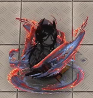
It's rare I get to see an entire skin's mistakes in microcosm like this! That's fun!
This is so detailed that it actually ceases to have any real shape or identity. This doesn't look like shadow, because skins can just. Change character lore to make something look cool yes I'm still mad. Is it stars? That would explain the weird yellow dots, and there are stars in the art. Fire? No, it's not actually fire, there'd be fire here. Burning fabric? It only looks like that if I squint and zoom in, but I can't... think of anything else.
The colors are so awful. The way that there is a hard line between the dark lavender and the scarlet which then fades into orange is. A choice. I would not have made. At all. In any way. Ever. At any point. Also the random dots of yellow are very funny because they are so clearly just random pixels of yellow. Some of them even aren't in the orange, so they're just like, highlights that have decided to break out of the highlighted areas. Did they.. want this to look like her burning dress? In which case, why are they.. blue? Her dress is black with orange embers, I don't GET IT.
Also small thing but it has a drop shadow, but like. She's literally in all black until she fully appears. And the swirling ribbons are dark-colored. There's no worry about them not standing out against a light background. Is that just supposed to look like she's surrounded by shadow if that's the case then why isn't the rest of this shadow AGH.
This looks weirdly... JPEG compressed??? Like, you can kiiinda see it in the big version, but if I shrink this down to phone resolution...
GOOD LORD SHE'S BEEN DEEP-FRIED.
S1 is good. I like it. It's simple, elegant. Good use of colors, and I think the impact looks great, good use of red and orange to create visual interest. Not gonna bother to screenshot it, it's not that interesting NEXT
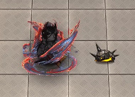
S2!
Stop it. Stop it. Put a few colors away. I am counting 8 distinct colors in this one swing alone, and then two more for Ines herself. Stop it. That is too many colors. Add less colors.
I don't even see what the colors are there FOR. Are they selling the tip of the swing? That's not right, because the red highlights start at the tip, then swirl inwards until the red is in the inner part.
I do actually think this one is a lot better at actual resolution.
It's still too detailed, and that detail ends up being crunched and not really... serving any purpose in the grand scheme of the effect, but I do think it is... better. It makes it more clearly light on the outside, dark on the inside.
Also I hate the ends of this swing. I hate it. Why is one a perfect circle that's been stretched out and the other end a rectangle that's fading out. Why is that how you did this. This effect looks like two different swings that have been stapled together like goddamned Catdog.
BUT WHEN IT FADES IT HAS AN INKBRUSH LOOK SO WHAT IS THIS EFFECT.
Why not lean into the burning dress look? Have it be a black trail that like, burns away when it fades? That would be STUNNING, anything but. Whatever is happening here. Mrgrgr okay fine it can't get worse right
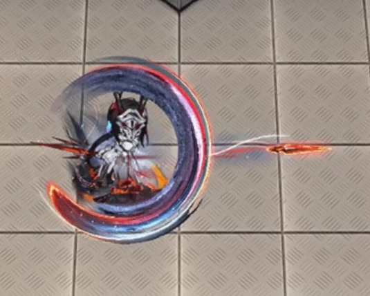
DEAR READER. I PRESENT. S3. THE CULMINATION OF EVERY SINGLE PROBLEM.
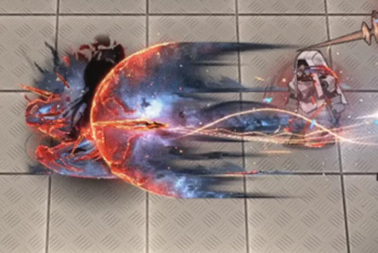
So this IS a stars theme after all. This IS stars? Just wanna make sure we're all on the same fucking page here.
Dear reader. I hate this. So fucking much. This may be, and I do truly mean this, the worst piece of VFX I have ever seen in any game. This doesn't read as a piece of VFX in an anime game, it reads like the background of a YA fantasy novel's cover.
The nebula doesn't move. It's static. It is clearly just a jpeg. It's not even doing the Chowder screen-space orientation thing. It's just. There. Inescapable.
The comet itself just. Ends. It doesn't fade out or taper. It just. Stops. There's barely any anti-aliasing here. It's just a hard line between the comet and the background.
Ines herself is surrounded by identical dark lavender and orange energy, so there's no visible difference between the effect and herself. Sure. It's not going to be onscreen long anyway. Who cares.
The center of the comet is bright white as if it's the highlight of the effect, but it's... it's off-center?? so it's ultimately... Highlighting something. is it highlighting the sword? Is it supposed to be a haze that shows you the sword? But it doesn't look like it because it took me 15 minutes while writing this to realize that the sword was there at all because it's the same orange color as all the other highlights and so it gets eaten. If your highlight color stops drawing my eye, then you've fucked up because that is literally what a highlight color is supposed to do. Where am I supposed to look at this thing, where is the focus, the shape?
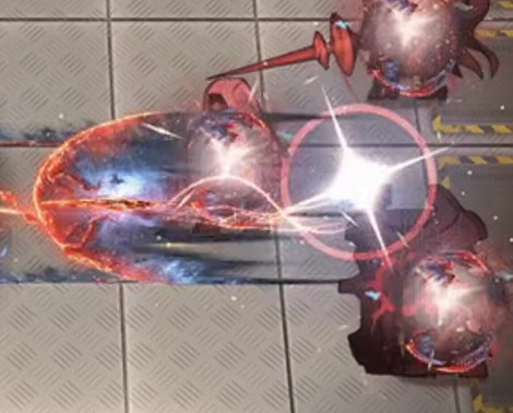
It's even funnier that the blade leaves a little cartoony goofy team rocket blink when it leaves, before immediately turning into whatever public domain NASA star image they're using for the comet. A real glimpse into what it would look like if Spiderverse sucked ass. (I do like the blink itself tho, a small little blue haze to add color and contrast against light backgrounds, smart touch.)

Explosion sucks. Suddenly they decide the palette is something entirely different. Where did the yellow come from. Yellow isn't even on the art. I guess when your palette is that big, you can change them up how you want. I would actually like this effect if it was slightly less detailed and in a skin that had actually used this pallette. It reminds me a bit of Specter the Laurentina. But with this level of detail and these colors... This somehow looks more like a YA book cover. A Sword of Goats and Stars. Fuck me I hate it.
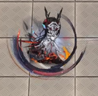
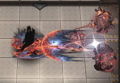
I almost like this buff uptime indicator, It's just that the red from the swords fades into the orange on her dress and makes the whole thing muddy. Also she has an actual roiling flame behind her LMAO GET DUNKED ON HOEDERER THAT'S RIGHT I WILL DUNK ON HIM EVERY TIME EVEN THIS PIECE OF TRASH HAS ONE UP ON THE HOE LMAOOOOO
(In fact I actually... think this might be a recurring texture? It looks familiar, but I can't pin down from where. This is a bad screenshot for showing it but I'm not bothering to get a new one. This is my mental breakdown and I get to choose the visual aids.)
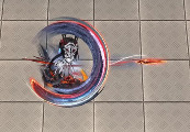
Anyway, maybe I'm being mean. After all I'm criticizing an effect for being too detailed when I am actively zooming in and looking at the details. So let's shrink down to the resolution of my phone just to see how it would-
Ah.
Final Ouroboros VFX ranking: A jpeg compressed photo of a wizard airbrushed on a van / 18 Originium Prime. Actually wait no that sounds too cool. Uh. The wizard is also racefaking. Now it's no longer cool. Nailed it.
#arknights#arknights vfx breakdown#emphasis on breakdown again#I don't have as personal a vendetta against this one as I do Eine Variation#but I do think this one is genuinely bad#Shame. Ines would have crushed it with an actual skin
42 notes
·
View notes
Text
Idk who needs to hear it but if you have Aphantasia you can absolutely do character art. Don't let it discourage you. Especially since a good portion of art advice won't fit you and will leave you feeling like its your fault.
I have Aphantasia, its super hard to put characters in poses from my mind. I cannot draw cartoons or exaggeration well, its very hard because I do not see the drawing until it is on the page. I use so many construction lines and blocks of color and always need a reference to base my character poses on. I cannot imagine things artistically before they're on the page and it is super frustrating.
You can still do it with Aphantasia though, it just takes practice. So many of your sketches without references are going to look awful despite you knowing the proper proportions of the human body, it doesn't mean you don't know what you're doing.
It just means you need to give yourself extra help. You're not lesser or bad for not being able to draw on a whim or not having these intricate details. Trust me, I've struggled with thinking that.
The best thing you can do to work with it is collect so many references, use a pose software (like magic poser), and absolutely screenshot and collect art that has a creative element you struggle with. (For me its color, backgrounds, and splash text.) Also, maybe practice abstract art. You have a brain unhindered by a visual expectation, I recommend it. For me I like to do surrealist/abstract pictures of water and space. It takes technical skill but everyday is a good day to start practicing.
Having Aphantasia is a neutral thing. It's not bad or good, it's just there. That bad part is not acknowledging that you work differently so you need to adapt differently.
30 notes
·
View notes
Text
A little fun fact about my AU here since AU Posting is busy.
You know that in several art pieces, I used Film Tape symbolism? My AU, basically can be interpreted as a theater play, in which the outcome is always a bad ending.
In context, Cosmounse made the script that way, and Fylass wants to rewrite the part of the script that's not written yet, based on countless other scripts he managed to see in back stage (Note, this is not literal, just an interpretation of certain outcomes based on that idea since the AU was partly written with that interpretation in mind, that's why in my fic, the names of the chapters are from other stories or plays).
Which for it, means that Fylass helped in changing the ending, with the help of the others, reason on why some parts of my AU seem to be very fitting in the context of a play. I made jokes about Fylass "Undooming the Doomed narrative" but it's not really that much of a joke, which pretty much implies that if no one had done anything or be made aware of what was happening, my AU would've always ended up in a hypothetical Bad Ending.
Besides the religious take on it that's basically what happened in the Garden of Eden with Fylass being Lucifer, and Adam and Eve being the ones he loves. The Apple is the "Forbidden Knowledge" so in this context is basically The Truth and yet another reason why Fylass' main color is Red.
It kinda goes along with the lines of Fylass hating Magolor! Just that in Magolor's case, He's both Jesus and Judas, but in Fylass' case, God and the Devil are one and the same, since at the end of the day, you can figure out he has both roles. Fylass did bring down the Pardus Clan with him, like how Lucifer brought down Adam and Eve, but also in Popstar he tries to take the role of a messiah figure to save 4 people, also why Crowned Fylass both takes inspiration from the bible and pagan holidays, with the main one being Walpurgisnacht (Witches Night).
Also for more parallels, Walpurgisnacht was a celebration for the person "Saint Walpurga" who seemingly kept the witches away from the masses and healed the sick, not too dissimilar from how Fylass behaves with the Dream Team and Wave Three. And last but not least, it was rumored that Saint Walpurga was a witch herself, and the reason why Fy is a basilisk, which are creatures that are kings of serpents, fire, and usually come from Hell.
Now Niru
Niru, for the ones that don't know, is Void Termina when Kirby was still part of him, being the body that surrounds Void's Soul. He is often associated with Water, but specifically fluids in general, since he's meant to be something that flows as time passes. He gave impurities and some darkness to his creations to truly enforce free will, but overall, he was sad seeing his creations be sad over these things and knowing that if they believe in god, they would be begging for them to cleanse their sorrows, so at one point, he regretted his decision and started to slowly consume those impurities himself, being something like, carry the burden of others upon himself, but eventually this made him lose himself in corruption and became Void Termina.
Before he was sealed though a part that wasn't corrupted by the Darkness was separated from him and became Kirby, while the Darkness that got loose in battle became 0, who can reincarnate constantly thanks to Niru's impurities.
At the end of the AU, both parts reunite, and Kirby swears that he, along with the others will help him carry the burden and cleanse him of his Impurities, something they achieve.
In terms of Motifs, if Fylass' motifs are religious, Niru's are Cosmic.
Normally, when a Star gathers insane amounts of energy, they explode and become supernovas, a thing that parallels Niru but instead of Exploding, he gets consumed by a Black Hole he did himself.
Also the fact that he's based on Owls, being Night Birds, and Lovecraftian Entities, specially Cthulhu, who belong to Cosmic Horror.
He also shares a motif with time and a play along with Fylass and Cosmounse
If Fylass is the Pendulum and the script writer, and Cosmounse is the hands and the Director, Niru is the Hours and the Play itself, or rather, he's the End Roll.
Also he's based on The Happy Prince
23 notes
·
View notes
Text

Where not fixing damn car my back hurts and swirly dead asf 2 hours left then we arrive!!!
this drawing dump in @unoriginal-and-dumb box ( sorry for the tag seem people like it )
Might post suffering soon (speedpaint ) 2 hours 14 mins it took he started w/ the sketch and had me do random ass colors and line art and we kept tradings till he got sick so uh I had take the rest
uh my friend right here https://www.youtube.com/channel/UCjVPKbA_LR_eSeGIn2DJmXw
he’s nice :) even tho he forgot shit and we just ate breakfast + soda ( that shit doesn’t work for us ) my family also was holding dead life on me thinking I was bout piss my self during take off no I’m a man! I fear people staring but I handle it since it’s like driving ona. Bud with people fucking annoying
he drank the coffee that also how he got sick didn’t stomach it well welp enjoy
(im gonna get up I’m bursting of energy I bottling it up yes we added out water makes since we were fucking dead )
#Fucking fanart#My back hurts#fanart#i give up I need to go to the bathroom 3 hours suck ass#And we been working onthis since yesterday it got busy and shit#I feel so fucking old#digital art#art
16 notes
·
View notes
Text

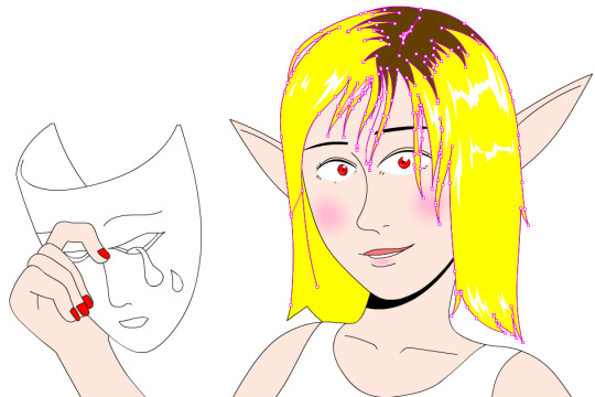
Don't ask how the machine works. Let's just say it's ✨magic✨
Made for a fellow Bleach fan's birthday :3
#fract art#nell#neliel tu oderschvank#nelliel tu odelschwanck#ネリエル・トゥ・オーデルシュヴァンク#ネル#ネル・トゥ#no seriously don't ask how the machine works#i based it off da vinci's stuff except his made a lot more sense#but it looked so hard to draw i just skipped the bits that made it work in theory#i don't know if the original even worked but it def doesn't now#i'm very proud of her mask#look at it#i was also just starting to color my line art#i've come so far since then *blows nose nostalgically*#bleach
8 notes
·
View notes
Text

Water and Fire
Here's the colored version of my piece for @zutaracoloringbook !! I had a lot of fun participating in this and I'm gonna have more fun coloring in other artists' beautiful work uehehe
Check out everyone's amazing work here and have fun coloring!!
#zutara#zuko#katara#atla#my art#zutara coloring book#zkcontrast2023#i just finished coloring this cause i only had time now sjuslkdjkdm#also em definitely coloring other pieces from the book#i have like 3 i wanna do and i started coloring one already uehehehe#it's really fun coloring other people's line art#it's like doing a collab with them :>>
3K notes
·
View notes
Text


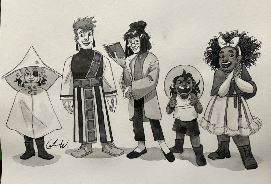
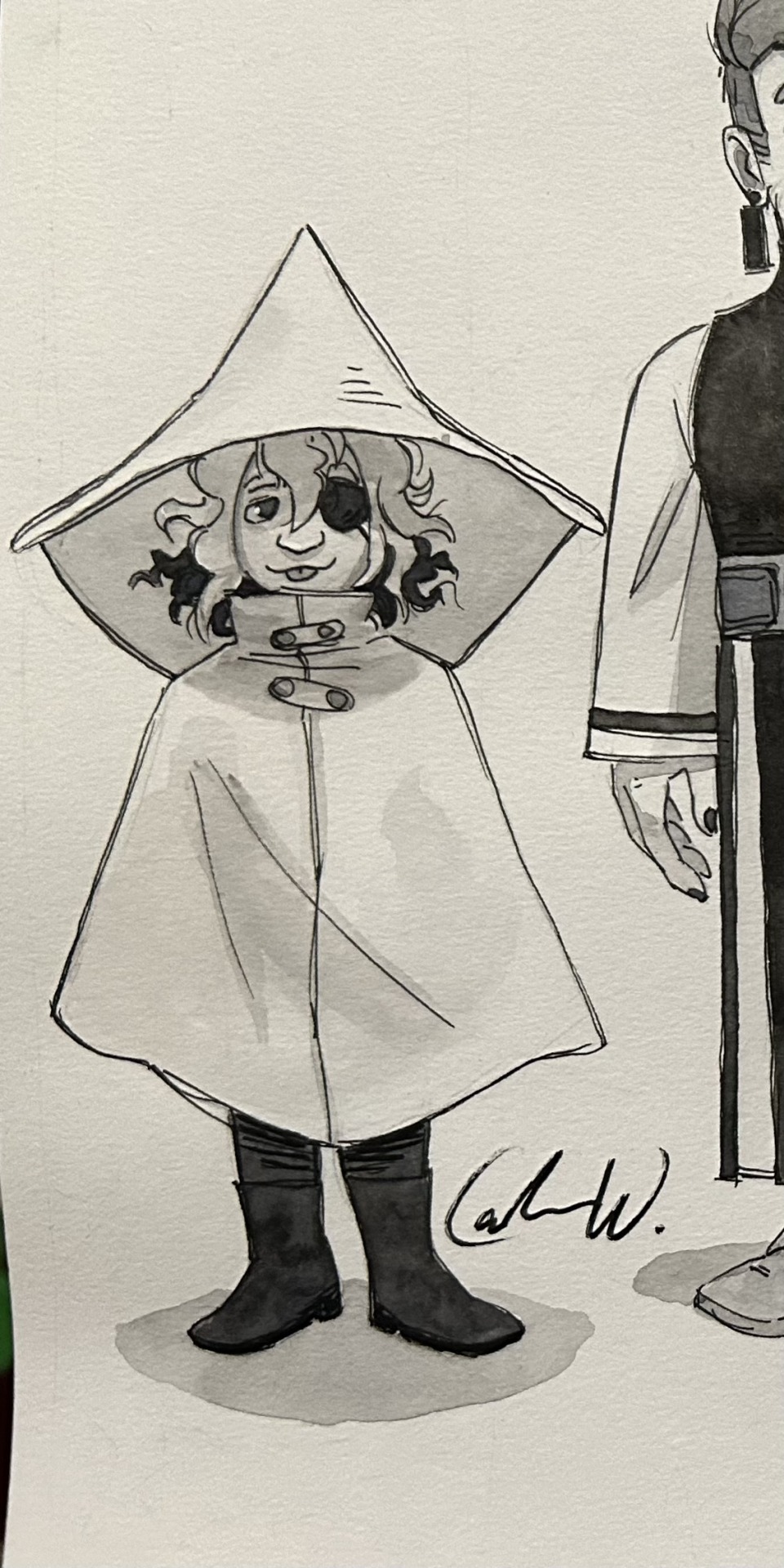
5 bishops, their god, and their favorite mortal
Bonus

this family has captivated me with their drama and potential for healing (they're all horrible people and murderers (but at least they can be murderers together))
this was supposed to be a silly doodle (thus why the line quality/consistency is way off) and it quickly got out of hand thanks I love them sm
#cult of the lamb#Justa Arts#The Lamb cotl#Narinder#Shamura#Leshy#The Yellow Cat cotl#Heket#Kallamar#Narilamb#leshycat#the crown is chilling somewhere else I totally didn't forget it until now absolutely#anyway technically drawn for my AU but also like. not inherently au#maybe I... maybe I'll properly line and color that last image...... they're precious to me#Heket be easy to draw for once challenge#actually no it's my fault I only just started drawing again after a 2+ year break from drawing my bad
188 notes
·
View notes
Text

Its been freezing recently and i miss the nice fall weather (october pls come back :’D)
(no reposts; reblogs appreciated)
#my art#artists on tumblr#digital art#doodles#original art#fall#autumn#made this for a vague college thing that im not going to get too specific about#lol#but i promise the brown thing has context#and i had a crisis making this because color is relative right??? so what is brown really.#when is reddish brown just red. or orange-brown just orange. dont get me started on yellow.#what is brown#(what is love)#also thats hot chocolate not coffee#caffeine is my enemy it gives me anxiety#guys this scribbly brush is so fun to use#and it colors so fast#can i stay in the lines? no.#i feel like a little kid with a crayon#fun fact i used to get in trouble for drawing on the walls when i was younger#i havent changed i just found a more productive outlet haha#OMG ALSO ALSO#i was practicing violin in the hall today and some guy asked what i was playing#and it caught me off guard so i went#music???#LIKE WHAT NO WAY
160 notes
·
View notes
Text
THEM!!! <3
I love In Stars and Time SO MUCH (I haven’t finished it yet though… but eventually I will!)
And man… I’ve been rotating this story in my head for only a week, but the grip it has on my psyche is just- AHFKSKAKSJFNKJLDLS
The main group of characters have such a fun dynamic and they feel so multidimensional, and, without getting into spoilers too much, I love how the game then completely breaks down these characters. It’s kind of the epitome of ‘under what circumstances would this character do something that initially would be out of character for them to do’ and it’s DEVESTATING!! But in a good and interesting way!
also?? Also?? Such a good game to find right as we’re getting into pride month :33
#in stars and time#them <3#watercolor#traditional art#isat siffrin#isat isabeau#isat odile#isat bonnie#isat mirabelle#I forgot loop :(#I was worried I wouldn’t finish this character line up as I was starting to loose steam after painting 3/5 of them#but I prevailed! And I think I’m pretty happy with how they look in my style :))#hopefully I’ll get around to making more fanart as I had some paintings planned but was struggling with translating art styles#Siffrin means everything to me they are just so <3✨#I’m at act 4 right now and slowly getting through let’s plays of the game#AGH I am also tempted to write a post that’s in depth on why I love this game right now but idk that takes time#I’m so tempted to draw them in color but I also want to keep my fanart monochrome to practice my values and lighting#as well as honor the reason for the game being in black and white
62 notes
·
View notes
Text
i let all that get to my head/i don’t care, i paint the town red
#party poison#danger days#ttlotfk#killjoys california#heard paint the town red and went hm. kind of a party poison song#got super frustrated with this drawing earlier and had to take a full day away from it#before ultimately just deciding i’ve scrapped WAY too many drawings lately#and that the best way to start improving and not hating my art again is to keep pushing myself through drawings even when i hate them#try to fix them. and also probably doing some studies would help#also using references. that’s helped a little with being less frustrated#ANYWAYS. i had fun doing this one#i actually faked the lineless style by coloring over the lineart i did with either a similar color for inner lines + same color for outside#:]
112 notes
·
View notes
Text
tomgreg succession except its serirei

this is how i cope with bones studio still not including the "i hope i can become a partner like that" line
#i have not watched a single episode of succession.#i just saw gifs of tomgreg and got slapped with the urge to draw serirei#also im gonna go batshit insane if they still dont add reigen's line next episode#im starting to sound more and more like a clown honking a horn but wtvr#also no art about the new episode this is an old sketch i just uhhhhhh colored it and polished it a bit#im busy ok im rushing through my deadlines before holiday break#ok enough ranting heres the normal tags#serirei#reigen arataka#reigen#serizawa katsuya#serizawa#mp100#mp100 fanart#mob psycho 100#fanart#illustration#mi art stuff#i keep fucking forgetting to tag shit w my art tag pleasee
549 notes
·
View notes
Text

Upcoming Ballad changes 👀?
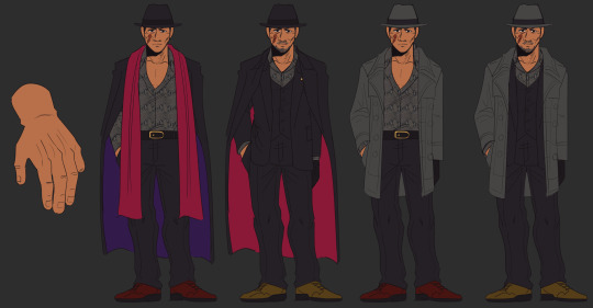
#loz au#wip#Ballad (Kheprriverse)#they/he#thinking about his design a lot more >> just how some things came to be#as I change FD I also change Ballad since theyre kinda linked (lol)#the white in their hair also changed a bit. more prominent + starts on left side of their usual part#but him in his main casual outfit + the green half-tunic is now just a cloth#switched his belt coz thats been bothering the fuck outta me#also changing his biggoron sword because that fucker cant have a single consistent design#yknow after all the trouble i went through making its oh ref twice#scarred eye is now his left (he’s left handed) + starts where the eye is for uh. lore.#also he doesnt close his eye often anymore. tho i may give him some sorta patch to cover it… not sure yet. probably wont#i’ll get to his armor eventually. that ones gotta take a lot of thinking.#ballad’s kind of the main character so I do wanna get their design how i want#they’re justa dad who wants to get everything done with so they can go back to their wife and son#*dont worry about the weird coloration in one spot. i use an auto action to auto-color my line art before i go in manually*#Kheprriart
70 notes
·
View notes
Text
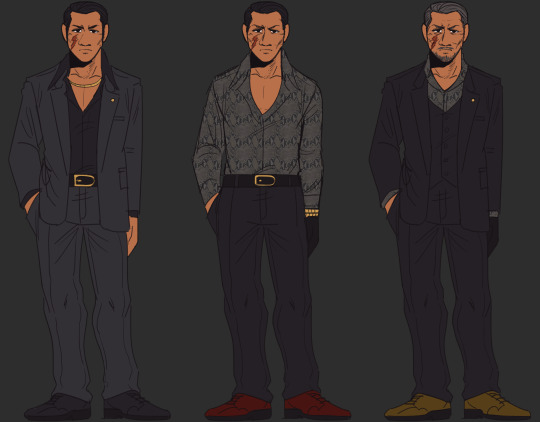
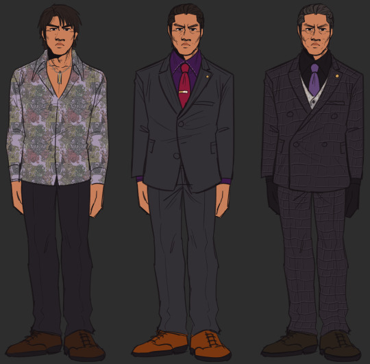
metal_pipe_falling.mp4
under the cut is more doodles of arakawa in his coat(s) and sawashiro doodles cause Lol

#rgg#ryu ga gotoku#ryu ga gotoku 7#yakuza like a dragon#yakuza series#yakuza 7#masumi arakawa#jo sawashiro#snap sketches#ive been telling myself for months to make color palette refs for these knuckleheads#and while waiting for The Time I Should Leave For Class i started doodling the arakawa sheet#and then i finished that and was like 'oh hes a bit lonely now aint he' so i went and did sawashiro#great opportunity for me to fix some colors too... ill prob revisit this thing like 90 times just to update colors down the line#its what i do with my other chara ref sheets#the art old as hell on those but i keep the colors up to date.. lol#also can i legally bully myself on this post. speaking of colors. i really forgot jo's tie is more of a pink than a red. STUPID ASS#i love makin refs like these... makea me feel like im workin on a show or somethin.. teehee..#also Dress-Up-Doll kinda vibes... teehee 2x#i prob wont post any art that actually fts sawashiro's body moles but i mean. might as well share the refs#just so its not Arakawa And His Fifty Coats And Pinkyless Hand under the cut LOL#abt arakawas coats tho im debating on mixing in which ones i draw yk.. like the scarf look will be like. early 90's#then the coat we see him with in y7 is mid-90's onward. to be cute yk. we'll see how i feel down the line we know me im fickle lol#also yeah i purposefully left the tail of sawashiro's tattoo: its just supposed to be a ref of how his tattoo is positioned#and while adjusting the tattoo i remembered an ask someone sent me bout ichis tattoo... lol..#cant believe anon didnt have to send me that reddit link we coulda just waited until this summer to see ichi's '''''full tatt''''''' HELP#STILL NOT OVER IT ok im done here. bye#an aside though for some reason arakawa's jawline feels diff compared to his 20's onward#idk if its cause of the ref image i use's lighting that makes 20's arakawa's chin more squared compared to the rounder shape he gets#mysterious.... oh well was tryin not to think too hard bout it since these arent supposed to be super detailed#just colors and whatever
62 notes
·
View notes
Last Seen Blogs

growhunter407
growhunter

whipscenarios
e pluribus unum

sourbabies
BODY HORROR GALORE.

moonrlsing
🌙not just a criminal🌙