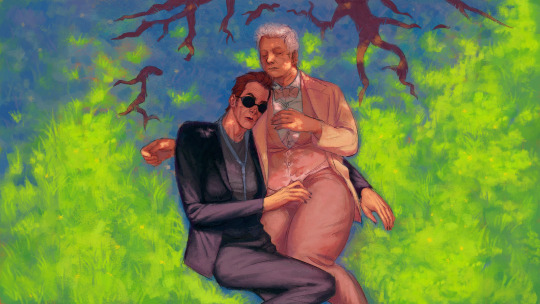
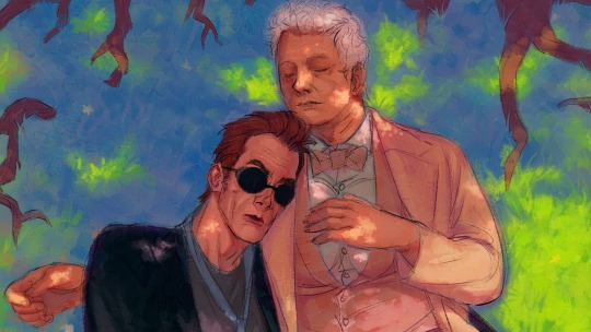
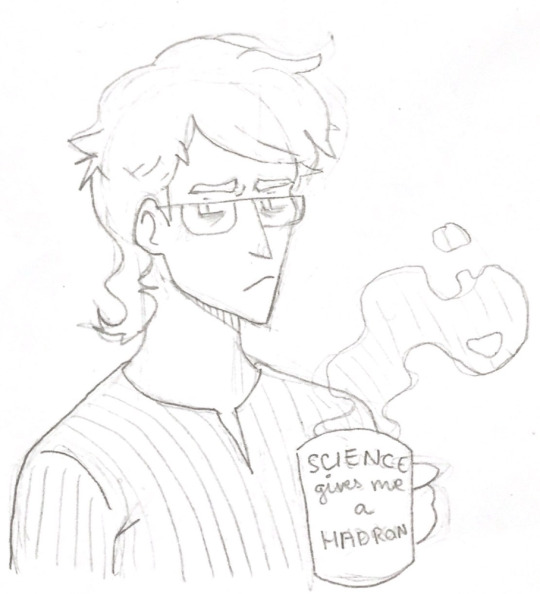
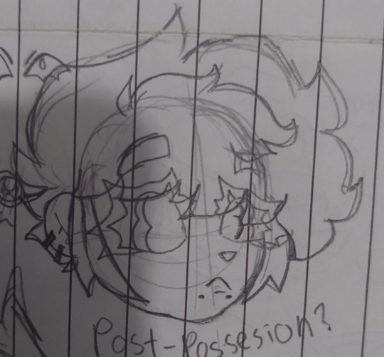
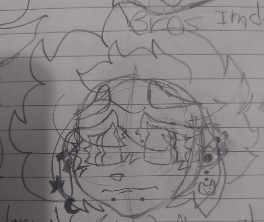
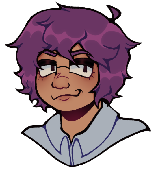
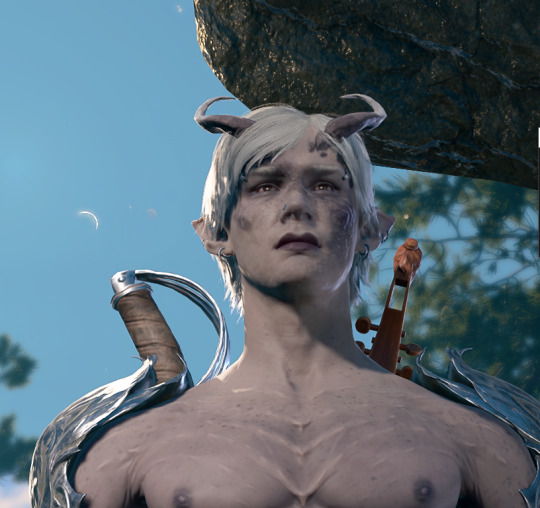
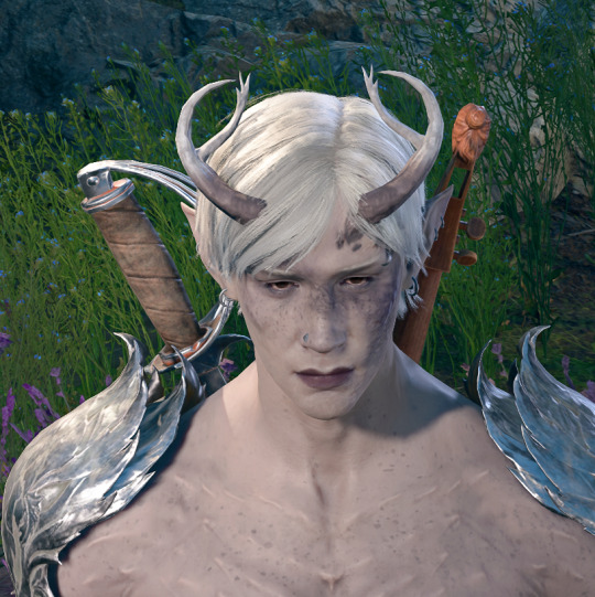
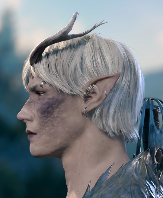
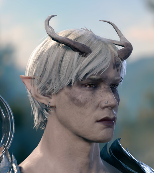
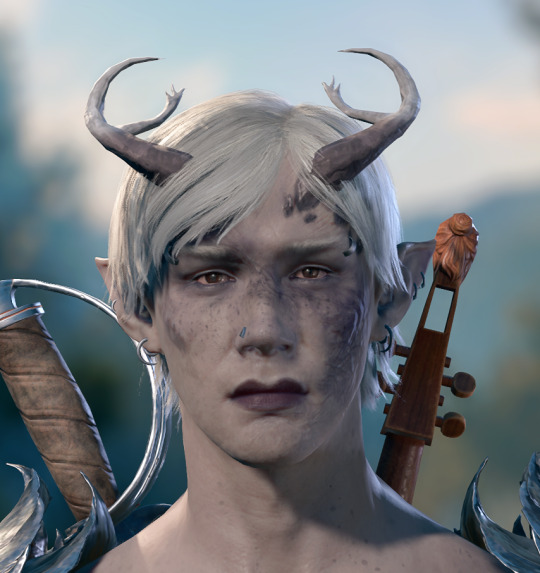
#he’s so fun to draw and stylise
Note
you, yes YOU, who's your favorite character to draw right now? do you have a preference?
And as a surprise to absolutely no one… it’s him.
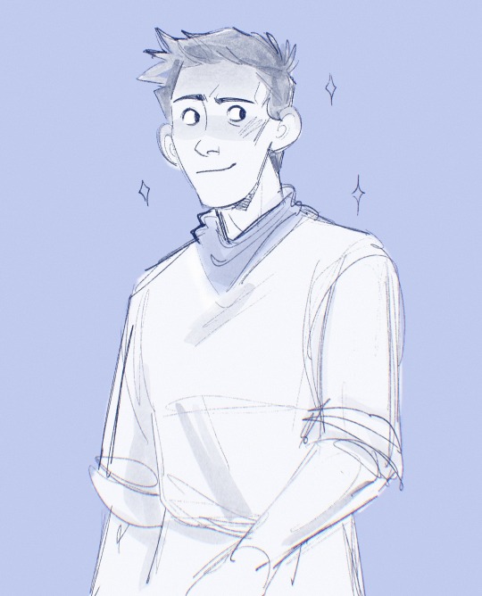
#I’m just obsessed with his features and shapes and him#he’s so fun to draw and stylise#I’m SORRY#I literally keep trying to draw other things#but it’s just like…. mrlnnnnn#UGG#TAKE IT AWAY FROM ME PLEASE I NEED SOME VARIETY IN MY LIFE#my art#ask#bbc merlin#merlin#merlin emrys
565 notes
·
View notes
Text
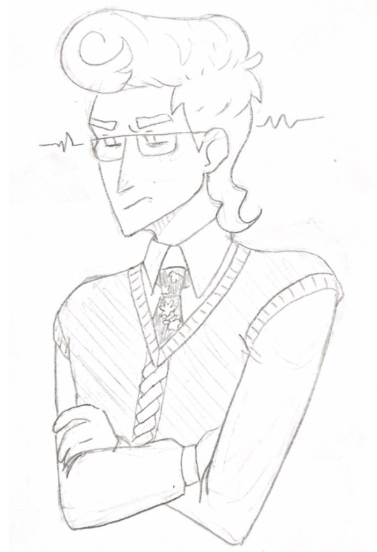
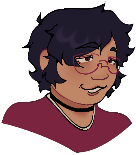
He, too, is in this episode
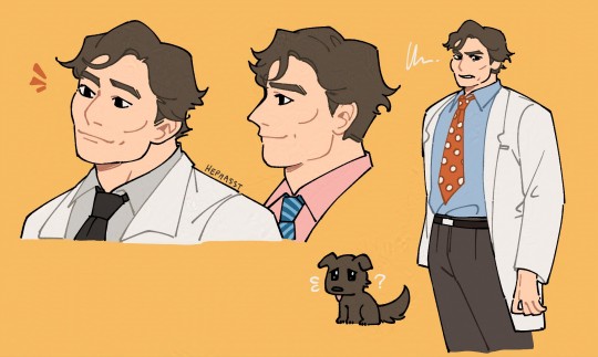
#hes so much fun to draw#unlike my man gregory house who is impossible to draw#hi if ur reading this im still in season 2 🥺 this show has poisoned me#this was a few faces and attempts at stylisation after a few facial studies on this man and i think its decently recognisable#but i mean no one else would wear the ensemble that is polka dot red tie with medical labcoat#james wilson#house md#house md fanart#me... double posting... haha
324 notes
·
View notes
Text
Horror High - Jigsaw Family Game Night
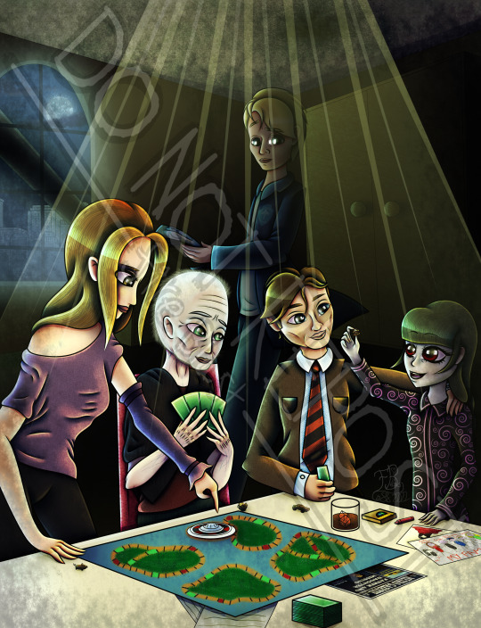
After asking @1percentcharge (Anonymously, but none the wiser I asked her) what piece of Horror High fanart she wanted to see more, she said this one. So, here it is! Let me tell you - my wrist is fucking killing me, but I don't mind. This also started, btw, cause of a trap someone submitted to @shittysawtraps (which I have included below for those who don't know what I'm on about).

If you wanna read about easter eggs and references, continue reading below. Other than that, I hope you guys enjoy this piece! ^^
The game they are playing is based on The Game of Life. Cause I found the idea hilarious.
There are four pieces being used by Seesaw, Kramer, Hoffman and Amanda. Seesaw has the Reverse Bear Trap, Kramer has the face of Billy the puppet (had to include him somewhere), Hoffman has a car to represent the Horsepower Trap (one of my favourites - not just because it featured Chester Bennington), and Amanda has John's favourite animal - a pig.
In Saw's lore, Hoffman (and possibly Amanda?) didn't know about Lawrence being another apprentice (which was used to explain why Cary Elwes couldn't film but in a way that makes sense in the plot), but I like to imagine that because Seesaw is there she by default WOULD know about Lawrence, and thus that cover would be blown well out of the water. (Would it change some of the events? Of, most certainly.)
In keeping with the mystery of just WHICH 'Jigsaw' Seesaw is the daughter of, I decided to have Kramer (and by defacto, Jill) be Seesaw's grandparents and Amanda, Hoffman and Lawrence (and possibly Nelson if Seesaw ever found out about him) to be her uncles and aunt. Who does she actually consider herself daughter of? You decide! (Lawrence, cause we ALL know what happened to John, Jill, Amanda and Hoffman.) That is what one of the doodles on the table is of.
The other doodle has a hidden Billy the puppet (covered by the family doodle) and a reverse bear trap with blood surrounding it.
The newspaper page hidden under the game board is based on TWO different newspapers that appear within the Saw franchise. The layout and general style of the page is inspired by;
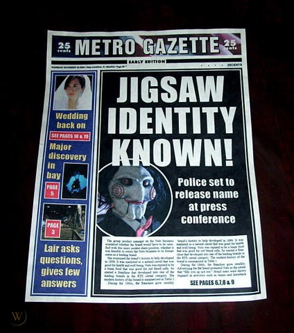
While (hidden) the story was written by Grover Cherry, in reference to;

Lawrence is holding X-Ray sheets, showing a key in someone's chest. As a reference to both the Venus Flytrap, as well as when William Easton had a key hidden inside of his body.
On Lawrence's jacket is a custom logo I made for his second area of work; Saint Eustace Hospital.
I used SO MANY brushes from both CSP and Photoshop, it's actually unreal. As well as textures SAI 2.0 has.
Not a reference or easter egg, but; I explain the reason that Kramer, Hoffman, Amanda and Lawrence could all be in the same picture at the same time is because this picture is when Seesaw is a child, and takes place before the events of Saw 3.
One last one while I remember; see the newspaper? Specifically the picture of a man holding a baby? That’s a vector trace of a picture of Leigh Whannel holding a baby. I’ll leave you to ponder why.
#horror high#horror movies#saw#tw horror#fanart#idk if anyone would want me to make a post on the full doodles and newspaper page#i put far too much work into them for them to be props and yet :')#let me tell you drawing men was difficult enough#now add a balding elderly man dying from cancer#i love tobin bell but fuck me#he is difficult to stylise in a monster high-ish style#maybe i'll finish the full newspaper article? idk could be fun exploration of how seesaw could fit into the saw lore#and where she even came from in the first place#alas only time will tell#and only if 1percentcharge would be ok with#that#anyway i am tired and need to sleep#i'm struggling just to type so i'm off to bed#it's like 2am for me but i will gladly suffer to get a piece i like done#this one and the last one are two of my favourites of this years#anyway#bed#my art#ok#NOW I’m done
46 notes
·
View notes
Text


Another one of these since i haven't done it in a while! Sketch -> finished illustration
Thoughts & process below the cut :>
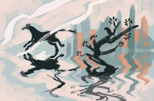
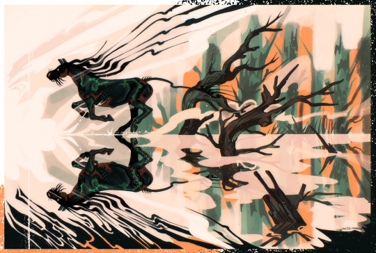
Out of Bounds: i deleted the sketch of this off my ipad because i didn't like it, and for months it only existed as a screenshot on discord. finally in january of this year i was like Wait Actually and decided to keep working on it. I didn't achieve the look I was going for (kind of foggy and vague. It came out too sharp and high contrast) but it was fun to throw the kitchen sink at it for an afternoon and then call it done finally. I don't remember which horse this was originally supposed to be, I think Macha?
I reused the pose, you'll find the same one in my Pascal sketchbook from the section on gait studies. That's the cool thing about doing 30 sketches at once, you can finish them up any time you like for a different drawing
The Fool ft Islin: the original concept for this is from [takes a moment to decipher the american date system on discord] January 2022
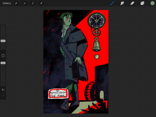
It wasn't dynamic enough, but I've had this on the backburner for sooo long. I think I completed like 4 cards in between this sketch and the final version lol. But, for a bit of background, this is from my series of major arcana based in Inver, and in particular the events of the 1860s-era book series, Moth Viper Foal (a demo of the first book, Said The Black Horse, is available for free/pwyw in my shop). This scene is a companion to Said The Black Horse, depicting the aftermath of the traumatic fight that caused Islin to storm off. He had been working at the mill as a semiprofessional back alley surgeon when he received an offer to join the church and work as a trained surgeon in their hospital. But when he brought the good news back to his friends it was met with utter rejection, driving him to basically run away to join the church. while gay and trans. thus the card.
he didn't actually bring a bag with him when he ran out but for the sake of the card i drew him with one
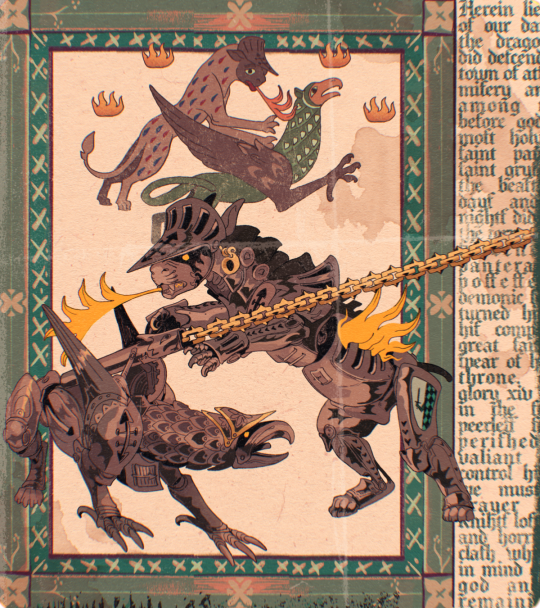
Gryfon and Pantera: This is how 99% of holy beast drawings start out, even the super stylised ones. I struggle a lot to draw them in procreate so they start in sai and then i transfer them over. The story of this is already explained in the caption of the original post so I'll just talk about the process which was... honestly torturous. I actually don't like too much textures and effects on things (wild, I know) and this one and Out of Bounds are ones where I kind of preferred it pre-texturising.
The text on the side is the official in-universe report of the event, detailing the casualties, the valiant actions of Gryfon's knight before he died and so on. There's also spoilers in there :>
My main struggle with this art style is how it always ends up slightly TOO sharp and crisp in a way the just a blur filter never can correct. There's not a lot of immersion to break, to be fair, but I think this still does it a little. I need to get more comfortable doing the lines with larger and softer brushes, and allowing imperfections.
1K notes
·
View notes
Text
This is a gift for an angel.
I don’t like to be very open about my personal life and I’m not too fond of PDA but this painting is something particularly special. We always share our interests and every time that happens, I feel it only makes our bond stronger, especially with Good Omens. We both feel so connected with these characters individually as they seem so similar to us. I remembered a particular lovely idea he mentioned involving the two of them, so I decided to make it into a painting for him.
Process:
I’ve doodled Crowley a few times before because David Tennant facial structure is just a bit interesting to me, but it also posed a little bit of a challenge to capture his likeness since he has a few features that i haven’t drawn like his ever before; I had to force myself to forget some of my typical techniques of drawing things (mainly the chin and the lips, and subtle facial details of muscles I don’t know the names of) I still think there’s more to improve and stylise for his face but it’s the best I could do.
This was my first time drawing Aziraphale however, but it didn’t give me a difficult time. I think there’s a bit more room for improvement for his likeness, but I’m happy with it.
Colours for this painting was so satisfying and fun, a lot less hellish than I expected too. I did an orange underpainting since I thought it would contrast well with the green/blue background, and aid me in picking the right values and tones etc etc. the flashes of the undertone showing through is just one of my favourite things.
Surprisingly after I had blocked out the background colours I didn’t need many colour references at all, I went with my instincts and applied the things I’ve learnt about colour theory over the years which led me the whole way.
I also used a slight hue, saturation and brightness jitter to replicate how tones shift in real life on my brush as a new technique—even though it’s extremely subtle zoomed out, it made it feel so much more dynamic and pretty. I think I’ll be doing this more in the future.
Near completion, it was just a grassy background without tree roots until I showed my friend for feedback. They thought that the blue shadow was water, and I was like “shit, well that means I need to add more context to that blobby shadow…” and in the end I think it definitely helped not only the context of the shading, but the final composition by making it more interesting.
Anyway, thanks for reading my ramble on this process. I am now feverishly awaiting season 3.
#artists on tumblr#digital art#fanart#good omens#aziraphale#crowley#aziracrow#azirowley#good omens fanart#good omens crowley
56 notes
·
View notes
Note
Ooo!! Which OC was your favorite to design? (Feel free to list multiple if you can't chose!!)
honestly the funnest characters to design are the ones where you instantly know what their ***color pallete*** will be cuz it's all fine and dandy knowing the shape and the face until you realise you have no clue what colors you're going to slap on those shapes and face. that being said the funnest funkiest top 5 are as follows -
5. diane lodestar
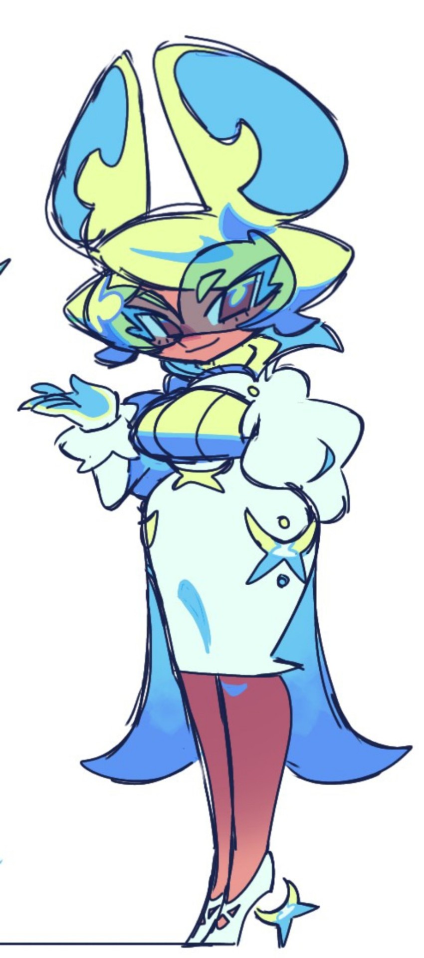
even her first design 2 ish years ago was fun to draw (brace yourself for ugly old zeno art):
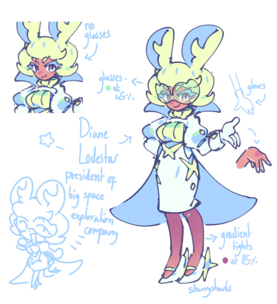
(why was she so skinny here...💔) anyway i knew exactly what she was going to look like because she was heavily based on that one pokemon character (wicke) and just had a fun futuristic pallete i guess? and now her features are more stylised which is fun. there's a reason she barely changed after her first design lol
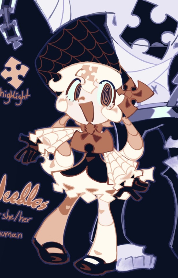
4. needles (of the church)
here i'll also say that needles doesn't have a last name so she's just called needles of the church! anyway i drew her up in one go and i knew i had a hit on my hands, she's very fun to draw and i love her very much even though she kills indiscriminately
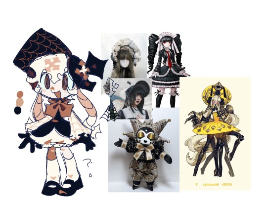
(first design of her, complete with all my ref pics so you can take a peek into the inner machine algorithm workings of zenobot-3000)
(final design noticed how hardly anything has changed. she is too cute and perfect for this world)
3. lars lycan
i don't have many big guy ocs so lars is fun to draw because he's so top heavy. also the like line/swoop thingy shape he has going on that's fun idk how to describe it sorry
(literally cannot crop shear out of this image without cropping out lars' snout which is kind of in character for shear lol. also having 6 top surgery scars (yes the x's are scars) doesnt really make sense but its funny and it fills up the torso and its fun to draw)
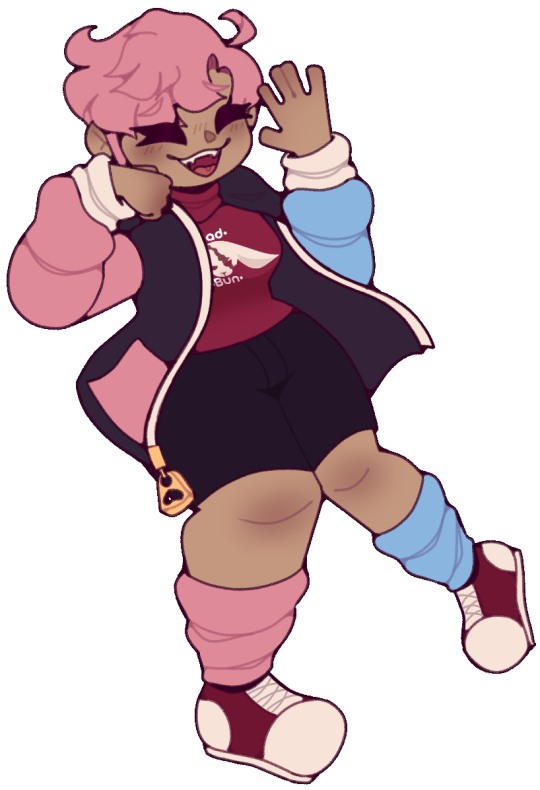
2. doctor novocaine
big hair twintails upturned eyes :3 face and cotton candy/toothpaste/trans flag colors NUFF SAID 😤😤😤

1. octaviaaaaaaaaaaa
she's fuckin COOL!!!!! also here's the first sketch of her most recent design. even when i gave her and savory massive overhauls i hardly changed her apart from getting rid of a lab coat and slightly changing the dress and changing the color palette to be edgier and when i say it like that it sounds like a lot but its really not kind of
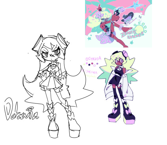
(ohmygod she looks so weird without lips honestly ,,,, and also her face was kinda long it's like flatter and wider now,,, i gotta redo her refsheet man)
#ask zeno#oc rambling#long post#im sure the people who like my chara designs will enjoy analysing this frame by frame 👀#<- (REFERENCE BTW 😭)#zeno's art
75 notes
·
View notes
Note
is felix good at art for his age or is his art just the sweet little scribbles that kids do? is vincent a realism guy or a stylised guy?
Felix does it for fun, he's just a kid so it's nothing otherworldly. Vincent doesn't draw people, he prefers nature and buildings so realism I guess lol.
51 notes
·
View notes
Note
Hey! I’ve been following you for a while and I really love your art, it’s absolutely stunning and I love the way you paint and capture anatomy. I know this is a bit of a broad question but I was wondering if you had any tips on getting better at painting digitally and studying anatomy, maybe more specifically blending, colour picking, and structuring anatomy in a way that looks somewhat realistic?
Thanks and I'm glad you enjoy my work long enough to be following me for this long!
I definitely love drawing a naked body that's for sure haha. In terms of tips for getting better there's a few things I can mention but it's going to fall broadly in the general answer of "study", because this is the most sure fire way to be able to understand what it is you're trying to emulate in your art.
There are different ways to study, and they teach something slightly different. For example, doing studies from life (live drawing classes) help me understand movement in a way studying from a photograph cant, simply because you're seeing the same model in different poses in real time, you can see how the fat and muscle moves around as they shift to different positions. So they're not technically moving the whole time, but you're still seeing some movement there, and understanding what sticks to what while it rotates and bends.
Studying from photographs can help give you time to do some real deep dives and investigate where different bones/muscles sit while someone is in a particular position. There's also the opportunity for understanding how shadows may be formed by the body as typically photographers are more conscious of how the subject may be lit than what may be available in a live drawing class. Beware though, as more things are photoshopped than you realise, not all photos represent reality. Especially glam and fashion photos. It doesn't mean its bad to want to have these effects on your work but just be conscious they might not always be anatomy accurate if that's what you're striving for. I sometimes make a conscious decision to go against what is anatomically correct for a certain effect myself.
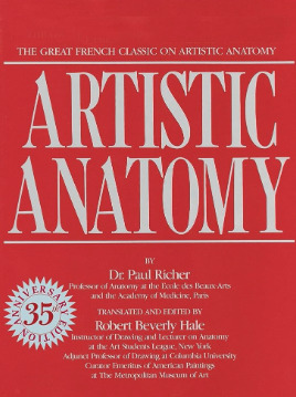
A book I have been recommending for years for anatomy is Dr. Paul RIcher's "Artistic Anatomy". It's great for understanding muscle structure intimately - it's designed specifically for artists, but with the idea of trying to stylise the diagrams as little as possible for the sake of understanding the human form. There's a lot of great info and detail in here, but beware, there is not a lot of variety in body structure (at least not in the edition I have which is missing female anatomy I think already so I'm not sure what else I don't have in here). So you'll be able to understand function a lot from here but you wont be able to learn a lot about fatter body types sadly.
Colour picking is probably the most difficult for me to explain easily, as I have spent a long time winging it, then studying it, then being really experimental with it. I could write a lot a lot about this but to spare making this post any longer I'll refer to another fun book just for getting started on some frequent and common terms called "Color and Light" by James Gurney.
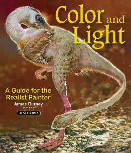
I also love that he uses like, dinosaurs for everything in here lol. It's a great starting point that can give you some go to ideas that you can then experiment from there. It's not very authoritarian (or at least that's what I feel), and doesn't push anything forward as a hard and fast rule, just showing what affects some colour combinations might instil in someone.
As a whole, I've gotten better at painting digitally by studying traditional painting techniques. They theories are basically transferrable one to one with some few exceptions. I tend to blend my colours by simply using a soft round brush in Photoshop with a low opacity. Much the same way I would with a real canvas, with a large round brush and diluted colour.
I hope this answers your questions in some way. I tried to be not too specific only because this answer would be at least another 30k words lol because this is something i think a lot about! I love technique! If I ever stream again, feel free to pop in and ask more questions where I might be able to show some stuff in real time! Not sure when that will happen though!
Also the way i do stuff isn't a "correct" way either. I like painting from imagination so this is how I make that work. Some people like to only work with references for every piece, and that is a completely legit way to create stunning art as well.
Good luck!
62 notes
·
View notes
Text
youtube
Hello again, podcast side of Tumblr.
Entities Explained has officially come to a close with the final episode explaining the End. If you didn't know, Entities Explained has been a series where I, over the course of the last year and change, have explained each of the Fears from hit horror anthology podcast The Magnus Archives. This is the longest episode of the series, but I think it's totally worth watching.
Also, this video contains a major announcement: I am currently working on a MASSIVE video explaining The Magnus Archives in as much detail as I possibly can. Hopefully, it'll be a great refresher course before Protocol, and trying to get it done in a month won't absolutely destroy me.
For the art, I decided to draw the moment from Oliver Banks' statement in MAG 121: Far Away where he and the rest of the crew on a research vessel are destroyed by falling satellite pieces. I wanted the whole piece to be very dark and to have this slightly dusty feel to it, which I think I succeeded at.
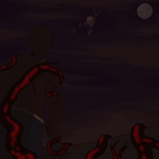
I went back and forth a lot on what to dress Banks in, but, in the end (pun intended), I went with something a bit more casual, since he is mostly just hanging around a shipping vessel. If I ever drew him as The Coroner, I'd probably go with something more formal (full black suit with a wilted red flower on the lapel?), but this felt fitting. I also wanted to give him a rain coat because, hey, I imagine it gets pretty rainy out there.
Unfortunately, Banks' design doesn't get to shine through too much in this piece, since his back is to the audience but, for one, I think that's sort of fitting for his themes, and, two, it makes the composition, at least in my mind, a bit more interesting.
The falling satellite was something I experimented around with a lot. Using reference pictures of real satellites, I tried to get something that felt small, but also like it could do some serious damage. The motion blur was a late addition, but I can't say I don't like it.
The moon was always going to be an important part of this piece, but it was during the sketching phase that I realised I could make it into a bit of a stylised skull, which is just a subtle enough detail to be fun. The angular clouds were originally meant to cut through it, but I settled on it being in full view instead, which I think looks much better.
Finally, there's the veins themselves. I actually went with less of them than I originally planned because I think it felt less repetitive, but I'm really happy with the way they turned out. My one addition was adding a pop of colour to this very drab and grey piece (which could, now that I think about it, be seen as a parallel to the desaturated people in Banks' dreams) in the form of the red flowing through the veins. This is technically only described as happening when Banks saw Gertrude Robinson in his dreams, but I figured, if there was another time for it, it was in the moment that he was truly in the grasp of Terminus. I also, honestly, just think it looks better.
That wraps up Entities Explained, so I hope y'all have enjoyed this series while it lasted. I'm not going to stop Magnus content, as I have plenty of ideas already and I'm sure Protocol will only bring more, but I am interested to see where my content goes from here. If you've read this far, thank you so much for listening to my ramblings and, if you celebrate, enjoy your holidays. Good night, Tumblr people!
#youtube#magnuspod#the magnus archives#the magnus pod#tma#the magnus institute#magnus#the magnus archives fanart#the magnus protocol#tma art#tma entities#tma spoilers#tma fanart#tma the end#the end#terminus#the coming end that waits for us all and cannot be ignored#oliver banks#the coroner#antonio blake#this series is over#wow#that's weird to think about#anyways#enjoy the episode#existential terror for your holidays
26 notes
·
View notes
Text
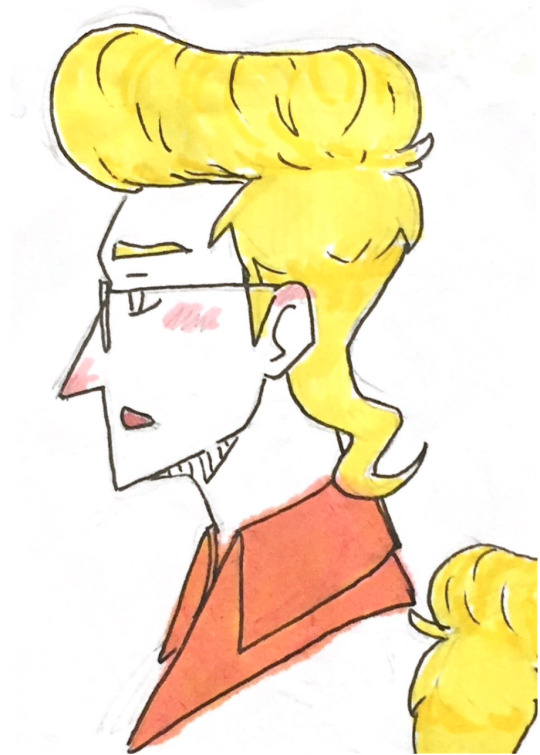
That moment when you get hit with a Ghostbusters hyperfixation all over again and the only thing you can draw all week is your old stylised version of Egon-
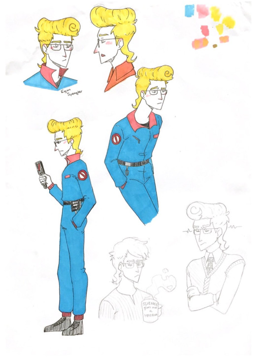
He's so colourful and his hair is so eccentric for, like, no reason, and i love that for him
He's so fun to draw
Close-ups:
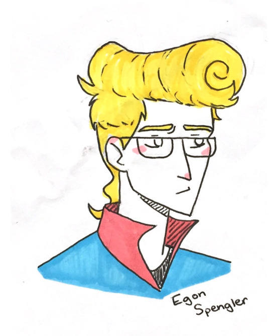
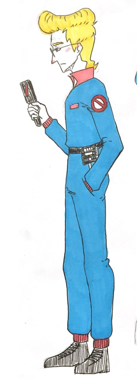
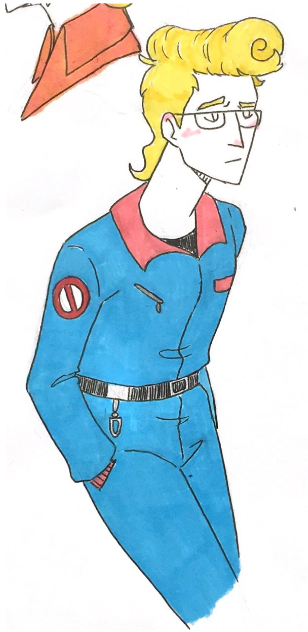
#doodles#ghostbusters#the ghostbusters#the real ghostbusters#egon spengler#(my drawings took inspiration from both TRG Egon and IDW Egon)#the cup was probably a joke gift from Peter lmao#i wonder how long it takes for him to style his hair?
16 notes
·
View notes
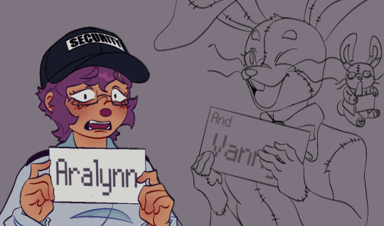
Text
Here some ye olde Vanessa designs i managed to find sifting through my sketchbooks (pre sb!!!!) There's more but Its really deep in the trenches.
rip their 4head broo they have no brain 😔
I miss doing stylised stuff tbh but ppl bullied me for it so now whenever I do it I go 😭
very old art vs my current art style and oc's below + rambles :
this was right After the freaking posters released and oughhhh 😭😭😭😭 gurlll
top name cut off that Blaine guy are other human ocs I had for years!! They were in a comic with Vanessa and others heheheh I used to do comics 24/7!!! Ft my old fnaf ocs rival to fazbears who was better at keeping the safety aspect off their robots. I wanna ramble abt them too one day after a heavy rehaul. Vanessa actually switched jobs from my oc location to the Pizzaplex in it!!!! Because I hope Vanny and Vanessa were seperate!!!
Vanessa and Vanny were seperate people in my Rabbit City AU but idk if I still want them to be different or the same now. Also one of Glitchtraps workers who managed to break free from his control and he didn't like that and sent every piece of her crimes online on the Internet as this crazed murder. So now she's in a new city under hiding or face criminal charges she didn't commit willingly. She managed to dye her fur and change enough and became a roadie for this band that's not very good. (Ffps rockstars I love yall funky vibe I'm sorry yall died too soon). She wants to help people and protect them she knows there's others under Glitchtrap’s control and wants to put a stop to him. Sadly some off them don't seem like they want any help... She was a beagle dog because when I saw her I was like beagle!!!!
My longest one is my oc story that's bad and outdated which included 3 rap battles (i love rap sue me) and an orange cat with green eyes with wings mc who's name try and guess
Its Winger.... (yeah because he was based off Scootaloo having small wings so young me thought ohhh Winged but like Winger because unlike scootaloo he can fly and is a winner!!! 💀💀💀 he also had beef with nyan cat oc over a girl and could transform into different elements!!! Like nature fire ice and rainbow... the main main main mc tho is a brown green eyed cat who was half robot after an accident... God looking back what was I on (I got into mlp and had unrestricted Internet access)
then we had this off my old sona... I didn't know how to draw fat could you tell... dark times oughhhh I wasn't blind tho then win 💀 alot of my older older art is traditional so you may not see it unless I sift through 17 layers off hell. Wish I backed up more of my 2019-2020 digital art tho but those were the darkest times for me also wait eewwww no eyebrows
ive gotten better and fr be the change you wanna see in this world draw fat bitches!!!! going down the rabbit hole
that one barbie trend I didn't finish look at the hands boy ouggh insane sauce I drew that
I miss drawing like this lowkey but my hand hurty and god ibis crashes every 25 minutes u was gonna gonna feral bro
self love is drawing urself accurately irl after years of drawing a caricatures of yourself (My first human sona ever was a skinny white woman with long neon yellow hair and a purple streak </3)
Gremlin from earlier I learned color theory aswell but only for purple, green and brown oops <333
I figured I could give it an oval nose because I didn't know how to draw my nose at all. Big ass nose death off me real!!! I love :3 face so much and big ass ears!!!! I will make them have big ass ears they are fun!!!!
These are my sonas I have like 4 rn and a million in thr vault (progress is progressing)
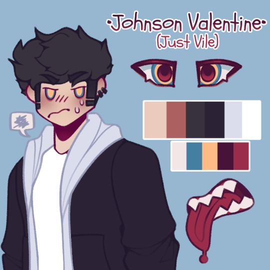
old oc his name is Jamie now and he's from a dream I had. Literally an incel too like he's studying magic got so fed up no one in his own world wanted him. Used magic to find his soul mate who existed in another universe. Made a portal to get there and take her back to his world because he wouldn't comply in a non magic world. When he arrived to her world almost died turning white and green. And like still managed to get the girl back to his world (Akuma's a goober who wanted to be isekaid) and yeah. Like huh my guy chill out 😭😭😭😭 no wonder you ain't getting any. He also killed me in the dream and is so dumb for being a prodigy??? Like he made a business selling illegal potions with the company name just vile.... his own initials... like bro how are you not caught. I can't with him. I pray opun his downfall and can't wait to see what other shit he pulls outta his ass. I feel bad for the Akuma she just wanted to escape not knowing this guy a freak.
heres him now!! He's much more dream accurate with the current events so far!!!!! If he appears next time I hope he croaks fr from the magic sickness like bro u a freak freak /neg
But yeah improvement is real!!! my art process is slower now (carpal tunnel) but I love to draw so much it is so fun if my bitchass ibis won't crash that is hehehehe (it crashed a million times trying to first time make a comic digitally I'm 💥💥💥)
#fnaf#five nights at freddy's#fnaf security breach#fnaf sb#reluctant follower#fnaf fanart#fnaf au#fnaf vanessa#vanessa sb#vanessa security breach#my art#god ppl were so mean during lockdown#short hair cuz I never draw long hair cuz irl I have an undercut!!!!!#I hate long hair sensory hell#the seals sanctum#<< oc tag#don't have a sona tag yet oh well#vannlynn#oc x canon#I will make a pinned post soon maybe#who knows#mwahahahah#🦭🩷🐇🐰🐇🐰🐇🐰🐯
12 notes
·
View notes
Note
hello okay so we just wanted to say we love your cod fics of tommy and simon's relationship lord it just scratches an itch in our brain andit's so Scrumptious. the pining, the sibling angst, the familiar trauma. you write them so well gdyuhkjfkdfjas So Good ..the soul craves the angst but the flesh is weak.. what hobbies do you think tommy would have?
Aw thank you! That's very sweet to say, and I'm touched my writing of the brothers touches yous :D
With the current Tommy in my head (father, labourer, ex-tattoo artist apprentice), I'd say art would be his main hobby. It used to be someting he pursued as a career, and probably something he still can, but with him settled in his current work, art takes the backstage as a decompression and fulfilment thing. I can see him very handy with graphite and simple ballpoint pen on paper, experimenting with the odd brush pen and watercolour. Doesn't have the patience nor desire to paint. He keeps his work pretty small-scale, rarely going above A4 pages in size and preferring to keep sketchbooks that are easily kept in a pocket. Although he once made a large back-spanning tattoo design once during his apprenticeship.
I like the idea of Tommy defaulting to drawing a lot of traditional tattoo subjects out of habit, animals and ships and tools and such. But I imagine there are more than a few pages filled with drawings of his wife, Beth, and then of his son, Joseph later on as well. His style is typically american traditional-esque, but he has a good handle on realism and stylisation of features. When he draws Simon it's usually a little scowling, cartoon version of his big brother, and intended to poke fun at Simon.
While Tommy in my fics does do the brunt of the cooking in the household, I would go and say that too is a hobby of his. It was a source of reprieve and distraction during his recovery, and while the habit stuck and became his responsibility in the house, I can still see him experimenting with meals and cooking techniques when he can + playing around with presentation.
I've also grown very very fond of the idea of (in a kinder life) Tommy running cooking classes for addicts, addicts in recovery, and then eventually for veterans who are freshly discharged and lacking in lifeskills after their service. He strongly disagrees with agree with the army and what it stands for (and is deeply suspicious of its intentions)(leads to a lot of complications with his and Simon's relationships, usually becoming something that's actively avoided as a topic), in my interpretation of him, but he also recognises servicemen are left to the side of the road when they can no longer serve the institution. May as well extend his practice of harm reduction to them (and who knows, maybe someday he'll be able to teach his brother how to cook more than fried eggs)
#apologies for the wait the Horrors have been happening#ty for the ask! I rlly enjoy making little headcanon posts heehee#tommy riley#codposting#mw2
11 notes
·
View notes
Text
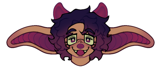
Scugging it up part 8:
SAINT!!

MY LITTLE FREAK LOOK AT THEM!!! This was such a fun little weirdo to draw and design!
For his design, i made him so fluffy that he kinda looks fat. He isn't though. They're actually incredibly skinny, but has a lot of fur to keep them warm in the snow.
Speaking of the fur, their cheek fur is stylised to kind of resemble an X shape. This paired with his circular and round face is meant to be a referance to the max karma symbol.
His ears are the same colour as her eyes, just because i said so. Same goes for the tongue too.
When using their powers, the two smaller forehead spots turn into a second pair of eyes. Again, this is just because i said so.
Generally he's pretty small, being about the same size as Monk. This is so that she has to eat less food to survive, and generally help with living in the cold.
Their tail is also very short so that it doesn't drag too much in the snow, and so that it can't be snapped by predators while swinging on their tongue.
That's pretty much it for Saint, two more scugs to go! Yippee!!!
#rain world saint#rw saint#saint rain world#saint slugcat#rain world slugcat#rain world art#rain world#rw slugcat#re design#rain world design
11 notes
·
View notes
Note
do you have a ref for Hvinidyr, I wanna draw !!!!
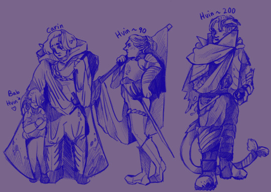
Here's a look at Winnie through the years - the furthest right is how he would've looked pre-tadpole/early bg3 events! Carin (he/him) was the member of his noble house who grew most endeared to him - and eventually orchestrated an escape the Underdark to Moonsea. Unfortunately he died not long after they attained their freedom, but I though he'd be fun to include nonetheless. A lot of the winnie content I have planned plays fast and loose with picking up different parts of his timeline, so feel free to reach out with questions if you want to know more about him at a specific age!
His injured arm is in a sling here - in fight, he'd bind it against his chest, or (with some practice) could brace a shield with it, so long as he bound his hand to it beforehand with some sort of tight wrap. He doesn't have the grip strength to wield a weapon with it, and his right hand doesn't have much mobility either. The scar tissue is thick, but I wouldn't worry too much about copying it specifically (I generally just render scribbles!) When he first.. grew his tail, he'd bind it entirely as it got in the way while fighting. Over time, he gained more control, though he still wraps the ends mostly to avoid all the filth they pick up otherwise. His horns, unlike traditional antlers, aren't covered in velvet - they're outwardly bony: thin, jagged sheets that end in many sharp points and warp in a curve to follow his skull. Sort of a spooky, body horror-y laural wreath vibe if that makes sense.
I had a lot of fun messing with his armour, but I couldn't say there's any one set of clothing I'd consider 'canon'. Maybe I'll get around to designing him a unique starting outfit like the other companions, some time!
Looking at him now, his middle outfit is very bard coded. He's a sorcerer, I swear!! Maybe he took a couple levels in swords bard to use Carin's rapier as an arcane focus?? Don't think too hard about it lol
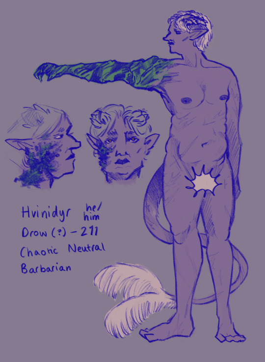
I drew something quick here so you could get a feel for the colours to use and how I might about stylising his face, if that's helpful! As I mentioned before, I don't worry too much about getting the scars perfect, so there's no need to. His physique isn't really represented by either in-game model: he's quite tall, maybe ~6'3", and muscular but most crucially soft. Below I've dropped a few pictures of him in-game that might be helpful!
4 notes
·
View notes
Note
Okay same venom 2003 anon again. I dont have anything else to add to what ur saying as again i didnt read venom 2003 So im just nodding respectfully and wisely to everything your saying but re ur tags is the artist you mean Humberto Ramos? Bc if it is if it helps he's a pretty unpopular artist amongst people (though usually for criticisms about his art being “too cartoony” instead of anything meaningful like the objectification of women which i personally despise when people do that. No more realism sexy super models i want hyper stylisation ONLY in my comic books just to piss those people off). I also personally do not care about him as an artist no hate nor respect towards him but again the bar is so low 😭 ive seen so many genuinely boring deeply misogynistic artists who treat women the exact same awful objectifying way but who get passes in comic book spaces because their art is more Conventionally Likeable. Like if im gonna be forced to see a woman be drawn as only one body type and face and breasting boobily id much rather take the uglier style or the more stylised style just to have something Interesting To Look At then Another Boring Generic Guy Drawing Semi Realism with Soft Shading Based off 1950s Pin ups but thats just me personally as a lifelong comic book guy
YES HUMBERTO RAMOS. i hate the venom 2003 art but in the past two hours i've come to realize that humberto ramos is my real enemy here and the only real fault of venom 2003 is its resemblance of ramos's art (of course in addition to its own home brewed sexism).
i really love stylized art and i hate realistic styles. i love the classic ASM look because it struck a nice balance between the two: the 1960s-80s need to depict the human form in a standardized, realistic way (likely due to toy sales, at least if its caused by the same phenomenon of 80s cartoons, a la he-man, having that same look to them), but the flat colors, limited color palette, and cell shading were so so wonderfully simple and sleek in a really fun way. gave such a distinct Look to the comic, and the simplicity of the colors also made the realistic lineart not too realistic. it just felt very intentional, very careful, very creative with their technological limitations, and it's such a timeless look that has aged so well even still to the 2020s
so while i love the classique look, i also love when comic styles go even further to really break the mold and stylize further!! herrera in venom 2003, and ramos's whole *gestures broadly* COULD be good, if only they were done a little bit more purposefully, and yknow, minus the outrageous sexism
and yes sexism is overall so entrenched in marvel comics and i wouldn't be surprised if it also infected literally all other comic companies out there, considering We Live In A Society. anyone who dares to argue that misogyny doesn't exist needs to go become a comic geek and read hundreds of marvel comics and see
1. how utterly shallow women are characterized compared to their male counterparts
2. how female characters so rarely get to exist on their own outside of a male character; ie. female characters who are only side characters for a male hero, or superheroines who are literaly just "female version of xyz popular male character!", etc etc etc
3. the way women are visually depicted compared to men. men, especially the superheroes, are still subject to white patriarchal standards of beauty of course, but the huge muscles they're drawn with are a form of power, a "look how cool i am." you will never get that with a female character. they are only ever depicted with the same fucking face, the same fucking body type, the same fucking curves and tasteful cleavage and pouty lips and cat eye makeup.
4. and while the men have these like insane muscles that do not exist irl, they at least get to POSE in ways that are not sexualized. the women characters, even if their designs are not objectifying, will still be posed so that their butts face the camera, they have a pretty side profile to show off the silhouette of their breasts, etc. if you really pay careful attention to the way women are placed in comic panels compared to men it's so insane. so fucking insane
but yknow, all of those things tend to manifest in subtle ways, ways that you really can only pick up when you've read so many comics over a decent amount of time, and when you're otherwise prepared to read for and pick up on sexist elements. so i guess i REALLY draw my line and get pissed the fuck off beyond belief when comic writers and/or artists then begin to just be, blatantly, fucking sexist. a la those terrible panels from ASM spider island. a la that one she-hulk issue. a la spider-man/red sonja. when it's blatant it means you give NO fucks, it means you don't even believe women are people because you don't expect them to be engaging your works and thus you don't expect any sort of audience outcry from your blatant sexism, it means you literally only see women as objects for your male audience to oogle over, it's beyond frustrating
2 notes
·
View notes
Note
4, 12, 14, 21 for the artist ask :)
hiii :)
4. fav character/subject that's a bitch to draw
dean!! he's the most difficult one to draw out of tfw in my opinion like i can never quite capture his likeness. think i've gotten close to a pretty good likeness like once and i've drawn him so many times 😭
12. easiest part of body to draw
i think the face honestly. like i struggle with it but i struggle with everything else much more.
14. any favorite motifs
i'm a big fan of halos and glowing (or otherwise unnatural) eyes :)
21. art styles nothing like your own but you like anyways
well i'm a big fan of your style for example :)
but like i love art styles that are really colourful and expressive! and i'm always amazed when people have really simplified or specifically stylised and fun art styles and they express so much so incredibly creatively!! big fan!!
weirdly specific art ask game
4 notes
·
View notes
Last Seen Blogs
gabe-sapienza
Gabe's Sketchblog

superjackjr
Jack Bussmann Illustrator

morphintimeishere
It's Morphin' Time Now!

ms-insecure
PURE