#got some new CSP brushes
Photo
powerpuff girls (no reasons)
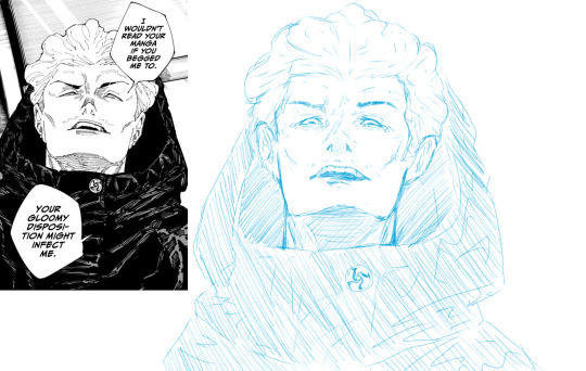
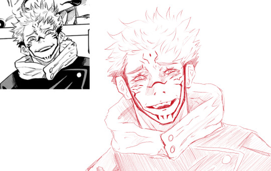
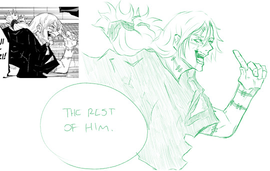
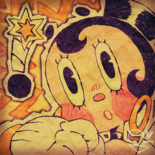
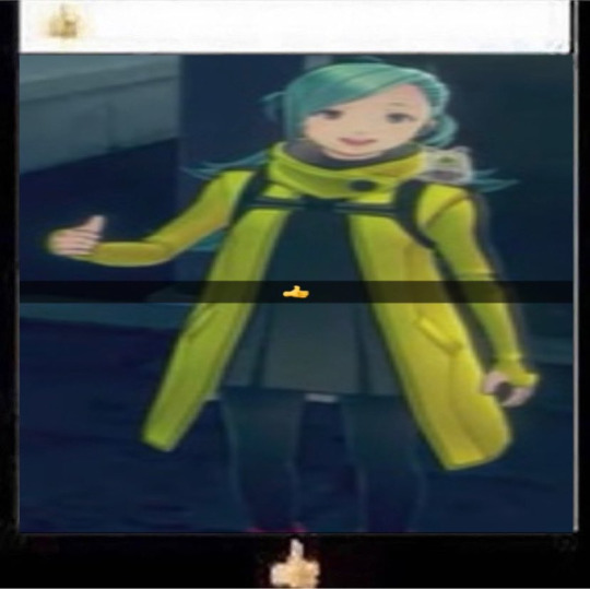
#got some new CSP brushes#and was like#yeah i'll do some more manga redraws or whatever since i hate coming up with my own shit#and was like... yeah... i guess i'll practice faces and stuff#give me money so i can buy the fancy brushes and you can look at more jjk fellas#clip studio paint#digital art#hakari kinji#(completely forgot that hakari wasnt just hakari so when i was looking him up for refs i was like huh)#ryomen sukuna#mahito#just mahito.#no cool name or anything#mahito dumb stupid idiot meany pants#jjk#jujutsu kaisen#on the topic of jerkface mahito please ignore his finger i was having trouble#in my defense my fingers kinda look like that irl#they exist weird
8 notes
·
View notes
Text
But look at that smile! Grinning and barely bearing it
Also I like doing chibis with the choppier etched type of lining, gives em a little extra character
-Please do not reupload/edit/use-
#wren nerevarine#dunmer#dark elf#tes#tesblr#artsyfartsyness#testing out some new brushes I got for csp#while they’re doing the free clippy points thing#If I open chibi comms I think it’ll be these but maybe with more chibified proportions
131 notes
·
View notes
Text

i would like to award kaveh the highest honor i can bestow 🖤💚🤍
open for better quality | no reposts
#kaveh#genshin impact#genshin#fanart#myart#doodle#this is The Prettiest kaveh and probably The Prettiest art i've ever drawn period#he is very special to me for many reasons#i love him so so much and i'm very thankful to him#and i tried out some of the new csp assets i got recently hehe#the sun/rainbow/dust and lace and clouds are all tools i'm trying out for the first time#and look i incorporated the wood pencil brush#it's so my style it makes me feel like i'm drawing traditionally which is enjoyable#wish i could redo all the apps i've submitted in the past to include this in my portfolio bc-#this lineart feels like it's truest to my style!! and this is what i'm really capable of!!#gonna stop patting myself on the back here but. i'm very happy w/ how this came out#oh and as a note i looked up flowers to put in the bouquet and acanthus means 'fine arts' which was fitting#one site said they can be used to celebrate an architecture graduate so!! perfect for kaveh
374 notes
·
View notes
Text
woag
[image description: a headshot drawing of an original character named sara bomba, a rubberhose-styled pale-skinned humanoid with short black hair and a bomb fuse coming from the back of her head. she has a shocked expression with a exclamation point rese,bling a bomb next to her head. the drawing is done in a style that makes it look like messy pen and cut-out paper. end id]
#wanted to mess around with some new csp brushes i got :o]#with how messy the brush is it kinda makes her earrings look like funyuns.#doc talks#my art#my characters
39 notes
·
View notes
Photo

Happy September, folks! 🍂
#fall#autumn#september#art#season#my art#Juleteon Art#[ This piece is from last year when I was doing some color studies and trying out new brushes I got for CSP ]#[ But I still like it enough to share it again! ]
55 notes
·
View notes
Text
// I keep thinking, oh I keep thinking about his angel eyes
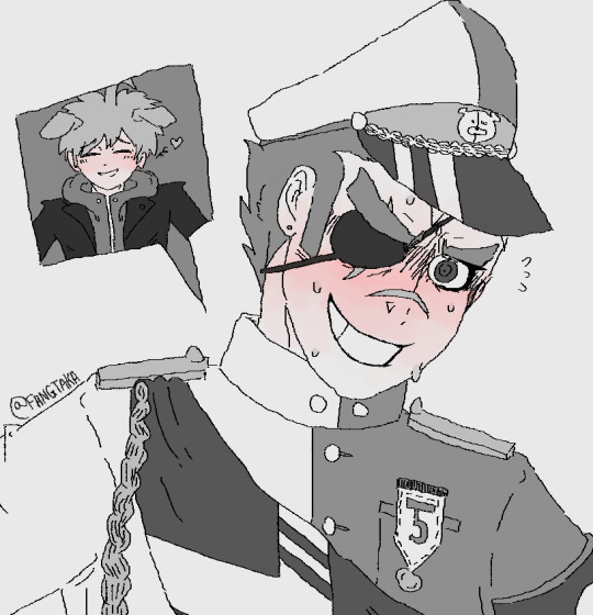
#naeishi#kiyotaka ishimaru#danganronpa#my art#mastermind ishimaru#been going Through It in life right now so wanted to do some quick sketching#and I got a new brush on CSP so trying that out too#damn Kiyo you’re so gay and honestly big mood#also this song has my brain in a chokehold it’s so good#makoto naegi#makoto as a lil pubby#also first time I’ve drawn Makoto lmao
117 notes
·
View notes
Text
📂 COMMISSION INFO
↳ [post]
↳ [carrd]
↳ [artistree]
📂 BRUSHES
↳ [ko-fi]
↳ [csp assets]
📂 OTHER
↳ [toyhou.se]
↳ [redbubble]
#new pinned post ✌️#there’s some stuff on csp that’s not on ko-fi and vice versa#for a few reasons#i’ll try and get all my brushes and stuff up on both eventually but this is the best i got for now
2 notes
·
View notes
Text
AHHH LINELESS!!
38 notes
·
View notes
Text
My Favorite Cheap Art Trick: Gradient Maps and Blending Modes
i get questions on occasion regarding my coloring process, so i thought i would do a bit of a write up on my "secret technique." i don't think it really is that much of a secret, but i hope it can be helpful to someone. to that end:

this is one of my favorite tags ive ever gotten on my art. i think of it often. the pieces in question are all monochrome - sort of.

the left version is the final version, the right version is technically the original. in the final version, to me, the blues are pretty stark, while the greens and magentas are less so. there is some color theory thing going on here that i dont have a good cerebral understanding of and i wont pretend otherwise. i think i watched a youtube video on it once but it went in one ear and out the other. i just pick whatever colors look nicest based on whatever vibe im going for.

this one is more subtle, i think. can you tell the difference? there's nothing wrong with 100% greyscale art, but i like the depth that adding just a hint of color can bring.
i'll note that the examples i'll be using in this post all began as purely greyscale, but this is a process i use for just about every piece of art i make, including the full color ones. i'll use the recent mithrun art i made to demonstrate. additionally, i use clip studio paint, but the general concept should be transferable to other art programs.


for fun let's just start with Making The Picture. i've been thinking of making this writeup for a while and had it in mind while drawing this piece. beyond that, i didn't really have much of a plan for this outside of "mithrun looks down and hair goes woosh." i also really like all of the vertical lines in the canary uniform so i wanted to include those too but like. gone a little hog wild. that is the extent of my "concept." i do not remember why i had the thought of integrating a shattered mirror type of theme. i think i wanted to distract a bit from the awkward pose and cover it up some LOL but anyway. this lack of planning or thought will come into play later.
note 1: the textured marker brush i specifically use is the "bordered light marker" from daub. it is one of my favorite brushes in the history of forever and the daub mega brush pack is one of the best purchases ive ever made. highly recommend!!!
note 2: "what do you mean by exclusion and difference?" they are layer blending modes and not important to the overall lesson of this post but for transparency i wanted to say how i got these "effects." anyway!
with the background figured out, this is the point at which i generally merge all of my layers, duplicate said merged layer, and Then i begin experimenting with gradient maps. what are gradient maps?
the basic gist is that gradient maps replace the colors of an image based on their value.

so, with this particular gradient map, black will be replaced with that orangey red tone, white will be replaced with the seafoamy green tone, etc. this particular gradient map i'm using as an example is very bright and saturated, but the colors can be literally anything.

these two sets are the ones i use most. they can be downloaded for free here and here if you have csp. there are many gradient map sets out there. and you can make your own!
you can apply a gradient map directly onto a specific layer in csp by going to edit>tonal correction>gradient map. to apply one indirectly, you can use a correction layer through layer>new correction layer>gradient map. honestly, correction layers are probably the better way to go, because you can adjust your gradient map whenever you want after creating the layer, whereas if you directly apply a gradient map to a layer thats like. it. it's done. if you want to make changes to the applied gradient map, you have to undo it and then reapply it. i don't use correction layers because i am old and stuck in my ways, but it's good to know what your options are.

this is what a correction layer looks like. it sits on top and applies the gradient map to the layers underneath it, so you can also change the layers beneath however and whenever you want. you can adjust the gradient map by double clicking the layer. there are also correction layers for tone curves, brightness/contrast, etc. many such useful things in this program.
let's see how mithrun looks when we apply that first gradient map we looked at.

gadzooks. apologies for eyestrain. we have turned mithrun into a neon hellscape, which might work for some pieces, but not this one. we can fix that by changing the layer blending mode, aka this laundry list of words:

some of them are self explanatory, like darken and lighten, while some of them i genuinely don't understand how they are meant to work and couldn't explain them to you, even if i do use them. i'm sure someone out there has written out an explanation for each and every one of them, but i've learned primarily by clicking on them to see what they do.
for the topic of this post, the blending mode of interest is soft light. so let's take hotline miamithrun and change the layer blending mode to soft light.

here it is at 100% opacity. this is the point at which i'd like to explain why i like using textured brushes so much - it makes it very easy to get subtle color variation when i use this Secret Technique. look at the striation in the upper right background! so tasty. however, to me, these colors are still a bit "much." so let's lower the opacity.

i think thats a lot nicer to look at, personally, but i dont really like these colors together. how about we try some other ones?

i like both of these a lot more. the palettes give the piece different vibes, at which point i have to ask myself: What Are The Vibes, Actually? well, to be honest i didn't really have a great answer because again, i didn't plan this out very much at all. however. i knew in my heart that there was too much color contrast going on and it was detracting from the two other contrasts in here: the light and dark values and the sharp and soft shapes. i wanted mithrun's head to be the main focal point. for a different illustration, colors like this might work great, but this is not that hypothetical illustration, so let's bring the opacity down again.

yippee!! that's getting closer to what my heart wants. for fun, let's see what this looks like if we change the blending mode to color.

i do like how these look but in the end they do not align with my heart. oh well. fun to experiment with though! good to keep in mind for a different piece, maybe! i often change blending modes just to see what happens, and sometimes it works, sometimes it doesn't. i very much cannot stress enough that much of my artistic process is clicking buttons i only sort of understand. for fun.
i ended up choosing the gradient map on the right because i liked that it was close to the actual canary uniform colors (sorta). it's at an even lower opacity though because there was Still too much color for my dear heart.

the actual process for this looks like me setting my merged layer to soft light at around 20% opacity and then clicking every single gradient map in my collection and seeing which one Works. sometimes i will do this multiple times and have multiple soft light and/or color layers combined.
typically at this point i merge everything again and do minor contrast adjustments using tone curves, which is another tool i find very fun to play around with. then for this piece in particular i did some finishing touches and decided that the white border was distracting so i cropped it. and then it's done!!! yay!!!!!
this process is a very simple and "fast" way to add more depth and visual interest to a piece without being overbearing. well, it's fast if you aren't indecisive like me, or if you are better at planning.

let's do another comparison. personally i feel that the hint of color on the left version makes mithrun look just a bit more unwell (this is a positive thing) and it makes the contrast on his arm a lot more pleasing to look at. someone who understands color theory better than i do might have more to say on the specifics, but that's honestly all i got.

just dont look at my layers too hard. ok?
2K notes
·
View notes
Text
Happy Chrysler! The brushes and fonts are here!

After months of promising I've finally put together the ULTIMATE LO DEBAUCHERY brush and font pack! This was something I've been wanting to put together and release for a while but between technical difficulties, moving PC's, and wanting to ensure the brush pack was as refined as possible, it led to some delays. That said, it's finally finished!
VERSION 3 HERE! Helpful anon struck back not once, but twice! This will be the FINAL RELEASE of this brush pack (unless anything else is discovered but at this point it's feeling pretty complete! Any new additions will be collected and released in a new version at a later date <3)
WHAT'S INCLUDED:
All the brushes I consistently use in my panel edits of LO and Rekindled panels, among a metric FUCKTON of others provided by the community since releasing the first build! All the brush files are .abr meaning they can be used cross-platform between Clip Studio, Photoshop, Procreate, and other compatible drawing software!
A small selection of fonts from the Jason Brubaker 26 Fonts set.
A raw .clip and .psd file of Persephone from Episode 38 containing all the layer information for you to pull apart and play with! Also comes with an instruction layer to explain what brushes were used and where. Please use responsibly ( ´ ∀ `)ノ~ ♡
An .mp4 time lapse of an Eros panel recreation from S1 using the newest set of brushes!
WHAT'S NOT INCLUDED:
Clip Studio brushes that I also use due to exporting limitations. This includes the standard Gouache brush (which I've replaced with some Photoshop-compatible brushes that are close enough) and the Design Pencil brush, both of which come pre-packaged as default brushes with Clip Studio Paint. So if you use CSP, you should be able to find these missing brushes in your default brush kits!
The remaining 23 fonts from the Jason Brubaker set as they're not typically used in LO and I don't want to go releasing an entire font pack. Note that you should NOT use the provided fonts commercially unless you've legally paid for them. If you want all of his comic fonts to use royalty-free then you can buy them on Gumroad!
The canvas texture overlay that I apply to all my pages, the one I use can be found in Clip Studio's default texture overlays but you can undoubtedly also find overlays for free online or simply use the "Add Canvas" brush that's included in the brush pack! (the overlay is just faster and more uniform haha)
Commercial ownership - these brushes are all being provided to use for free, but you are NOT allowed to use these commercially, says the law. If you try to use these in a professional commercial product and get caught, it's your own funeral! Use at your own risk!
A lot of research and trial and error went into putting this together, so I'm thrilled to finally bring it to y'all for your panel editing, text editing, and style-studying needs ~ Consider this my grand gesture of appreciation and gratitude for accepting me into this community with open arms and showing so much support for what I've added to the table <3 Enjoy! ( ´ ∀ `)ノ~ ♡
And if anyone asks you where or how you got these, no you didn't-

#merry crismus#happy chrysler#many of these brushes are adapted from other brush kits that have been made inaccessible by corporations like adobe#so be cool about it mkay#resource sharing is caring#that said i'm turning off reblogs so pls stick to message / link sharing okie poke#lore olympus critical#anti lore olympus#lo critical
158 notes
·
View notes
Text
My internet is kind of hit and miss today, so I'll try to send out comms tomorrow.
#vena vents#not art#I tried and failed a few times it's just not consistent enough#In happier news since CSP is doing the month of free clippy points I finally got some brushes I was eyeing... hell yes...
1 note
·
View note
Text
I GOT SOME NEW BRUSHES ON CSP SO I WANTED TO TEST EM SO HERES A LITTLE DARKIPLIER I DID BEFORE DOIN SOME HOMEWORK

#artswin#markiplier#iswm#in space with markiplier#darkiplier#iswm darkiplier#markiplier egos#ahwm#in space with markiplier darkiplier#hello again markiplier tag its been a while#how are yall doin i still exist here dw sdkjfhksjdf
79 notes
·
View notes
Text
Artist of the Week!
So last weekend, I announced that I'd like to feature an artist every weekend for both new fandom joinees who might not have seen some of this art and older fans who like the nostalgia. This week's artist is Ash @aha-my-villainous-thoughts 💖 who also, wonderful that they are, agreed to answer a few questions for me!
Which App Do You Use To Draw
When I’m at my big set up I use Clip Studio Paint, I love it so much. It’s very straight forward to dip straight in, has all of the bells and whistles you need from an elite drawing program, and the community elements where you can see assets and brushes is a lot of fun - although I still to this day have no idea how to earn coins to buy assets?!
I use a XPPen Artist 15.6 Pro Graphics Tablet to draw into the program, although my best tip with graphics tablets is to get a screen protector, mine got covered in marks before I noticed.
Recently I also got an iPad 10.9 to use as a digital sketchbook I can carry around, and while I am enjoying Procreate, I think CSP is a better art program overall.
Fave Brushes?
On iPad I stick to the technical pen, studio pen and the soft airbrush, along with the textures and the light pen. I don’t think Procreate has great ‘painting’ brushes, whereas on CSP I would marry the Gouache brushes, I love how they blend and texture as you work.
Your favourite piece you’ve drawn?
I’m a super self indulgent artist, I try to draw the kind of stuff I like to look at, so it’s a lot of colour, a lot of fabric and details. My fave piece for detail is the one I did for the OFMD RBB last year - Crescente Devotione, there’s a blushing sentient stool in it!
For colour I’m in love with this sleepy time Ed in a lil negligee and a Holly Golightly eyemask, he's my lock screen because I'm trash.
Who harder to draw: Ed or Stede?
Oh for sure Stede. I love Rhys Darby, but the man has like no lips. I stand by this meltdown.
One essential tip for beginner artists?
Comparison is the thief of joy, don’t measure yourself against others - particularly when you’re finding your groove. Be self indulgent af. Also get a screen protector for whatever digital screen you draw on, and BACK. THINGS. UP. Whether in an online account, or on an external harddrive - or both?! BACK THAT SHIT UP.
Why OFMD?
I’ve been in a few fandoms in the past, always as a pretty passive enjoyer, little fanart here or there, little fanfic sprinkled around, but there’s just something about the way this fandom feels? It feels like a group of friends who’ve got their own lives and their goals, but they still exist in each other's orbit, it’s like this feeling of returning home to somewhere you’re always welcome. There’s so many good moments in the show for both comedy and some gut wrenching pathos. Sign up for the hot guy in leather and get got by this beautiful delicate little love story. It’s something about queer joy of thriving, not just surviving. Something about finding love and romance no matter your age or what’s past before. Something about found family, and unlikely friendships, and community and silliness. I was already a goner when Taika put on the wig, but then when he teared up in a blanket fort while trying not to die? Excuse me sir, I did not need feelings that powerful. It was literally waking me up at night thinking about his last shot weeping in the nook - like are you kidding me?! I’m supposed to finish watching and be normal after that??
#artist of the week#everyone go follow ash and gear up for all the amazing art that would now be posted heheh
36 notes
·
View notes
Text

Testing out some new CSP's pencil brushes that I got, really really smooth to use!
989 notes
·
View notes
Note
texture anon here! i want to know abt the ones you used in that iris defense squad drawing nd stuff, its the one i was originally thinking of
OKIE DOKIE here we go
I'll just show my process with a small section of the drawing at 100% zoom so its easier to see what exactly is happening. here's mizuki! look at her go! this is the lines and colours before i do anything cool to them. its nice, but a little flat

the first thing i did was add some chromatic aberration. you can do this manually pretty easily, but there's plenty of auto-actions on the csp assets store that can do it for you, look for those

its subtle but it adds a bit of visual interest to the linework i feel. you can make the chromatic aberration even more intense if you want by shifting the red and blue layers even further from each other.
i also merged the whole drawing onto a new layer (while still keeping the original layers intact) and made a gaussian blur layer with it, but i have the opacity so low the difference isnt that obvious lol, but it does give the drawing a soft glow.
NEXT i added a layer of perlin noise set to overlay mode to give the whole drawing a VERY subtle texture to it
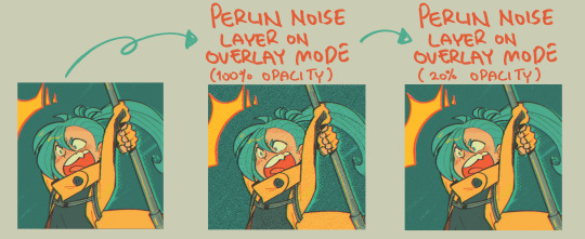
to make a perlin noise layer, simple make a new empty layer on top of everything and use this:


NEXT i slapped a paper texture on top of everything and set it to screen mode! the one i used i got from TrueGrit Texture Supply's free sample pack (well i picked a specific layer out of the full texture), but you can pick any texture you like really, there's tons out there for free on the internet. again, at a low opacity, bc i want the textures to work together, rather than have one over-power the other.

NEXT i added little off-white speckles on multiple new layers varying opacity levels to add a little more texture. you could do this by hand, but i used speckle texture brushes that i bought from TrueGrit (TrueGrit is so fuckin good you guys)


i also used various screentone brushes while i was colouring for even MORE texture, but it should be obvious where i used those.
lastly, though it has nothing to do with the texture, i also added a gradient map on top at the end to correct the colours slightly.

I hope that helps!!
538 notes
·
View notes
Text
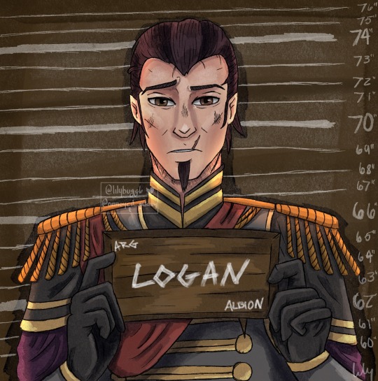
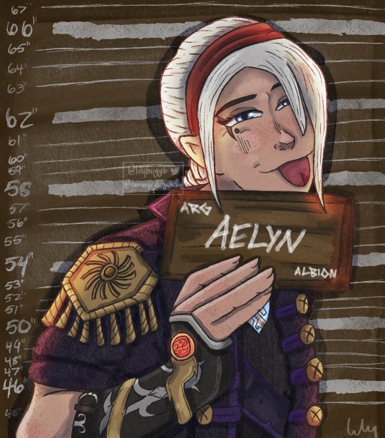
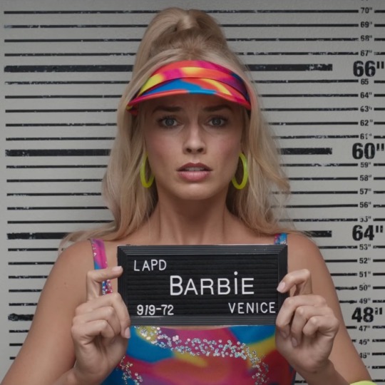
You know I had to do it.
Barbie and Ken meme featuring Albion’s notorious sibling duo, Logan and Aelyn.
What did they do? Aelyn blew up Reaver’s mansion probably. Property damage, arson, the likes. Just because she’s queen doesn’t mean she can get away with arson.
Meme format and details under the cut.
If you haven’t seen it, here’s the meme.
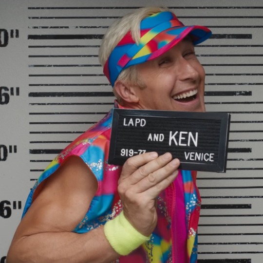
When I saw people drawing their characters like this for the first time, I knew I had to do this. There are so many characters I could have chosen, but it’s been a while since I drew the Fable siblings so thought it was perfect.
I’ve been using procreate lately since I got an iPad solely for that and have been trying to find brushes similar to the old ones I had on CSP. I’ve had no luck, but have a lot of other cools brushes that may help me develop new art styles. Including the above style. I found these really nice ink and ink wash brushes and really wanted to use them. I think they work wonderfully for silly meme art like this. It has a very nice cartoon look to it. It’s also just been super amazing to be able to draw wherever. I have more motivation to draw since I can carry this tablet with me everywhere. Much less of a hassle to hook up a drawing tablet to my computer and then actually have to sit down at the computer and draw.
Some details about the drawings themselves: When trying to decide what to replace the LAPD with, I wondered what would the police force in Albion be considered. I went with ARG which is for Albion Royal Guard. Because who else can arrest the queen and prince? I also wanted to make the plates look wooden since Albion is y’know, ye olden days. And then there’s the height things. If you look closely, you can see what I headcanon Logan’s height to be and what Aelyn’s height to be. I could have left those background pieces out, but I thought it would be cool to add that little bit of detail. I also wanted it to look like the names and such were painted on so that one brush came in clutch to add to the aesthetic.
And finally, as always, here are the lovely speedpaints.
(I am just now realizing that I have not drawn Aelyn and Logan in a serious piece at all. They’ve always been shitposts. Might need to fix that…)
#Art#my art#fable#fable 3#fable III#barbie and ken meme#art redraw#fable meme#Fable art#King Logan#Fable logan#Fable hobw#Hobw#hero of brightwall#g-a67#Timelapse#speedpaint#procreate#OC: Aelyn
79 notes
·
View notes
Last Seen Blogs

linkotemius
linkotemius

justkza
young savage girl lost among the lily pads

frankieandmyrrh
Frankie & Myrrh

superphannacho
'till death do us part

halasaudio
HALAS.AM - Holon Art Lab Audio Service