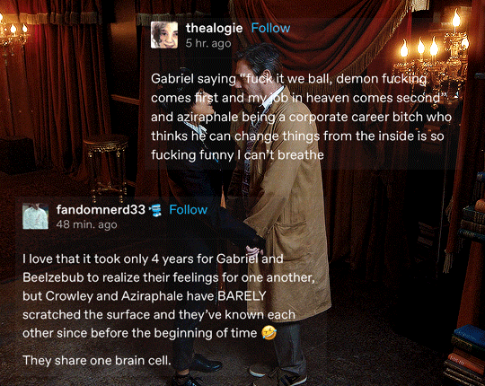
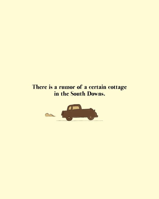
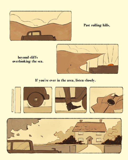
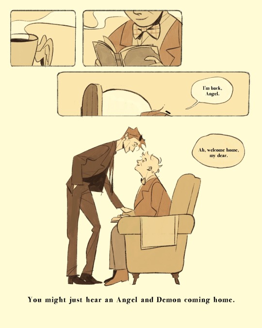
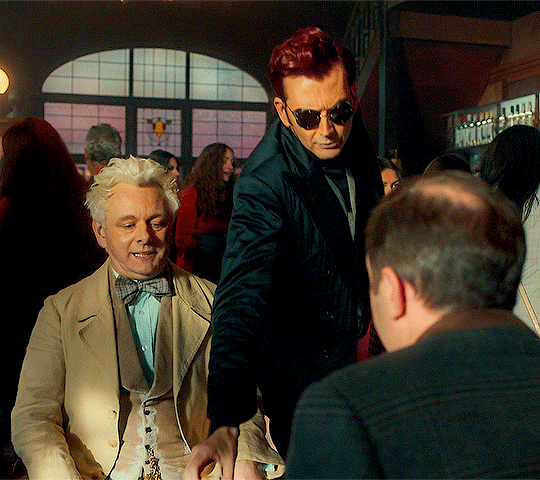
#good omens editing
Text
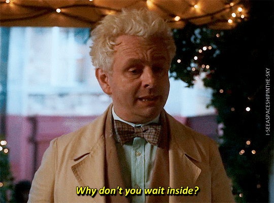
How colors make the Good Omens s2 credits split-screen scene even worse
Because that's a thing we need, right? But no, really, come with me on a magical, colorful journey of sadness and screenshots.
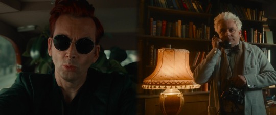
Season 2 of Good Omens leans into the coding of locations by color... I would say even more so than the first season. What do I mean by that?
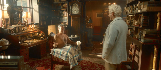
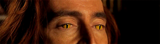
I mean that Earth (and specifically the bookshop) is warm and colorful with reds, browns, yellows (yes Aziraphale, we see what you did there, it isn't exactly subtle to paint the walls the color of your boyfriend's eyes) and pops of blue.
As an aside... You know what has a similar color scheme (with the saturation and vibrance turned up to 11)?

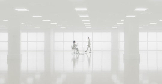
On the other hand, Heaven is white and cold, with almost no color to speak of.
And Hell is dark and grimy with a green overcast.
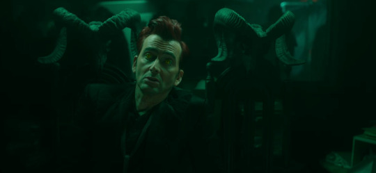
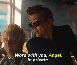
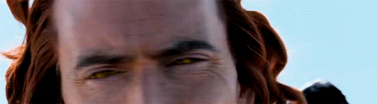
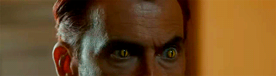
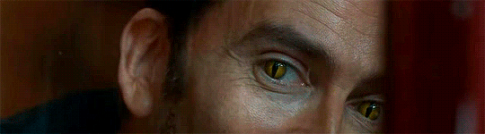
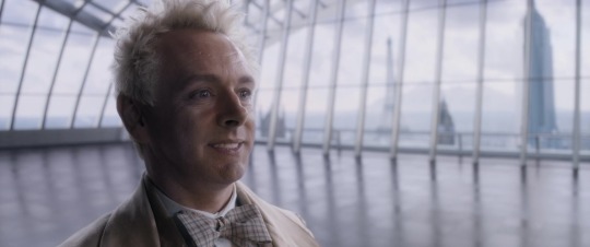
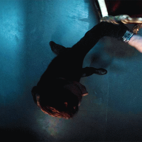
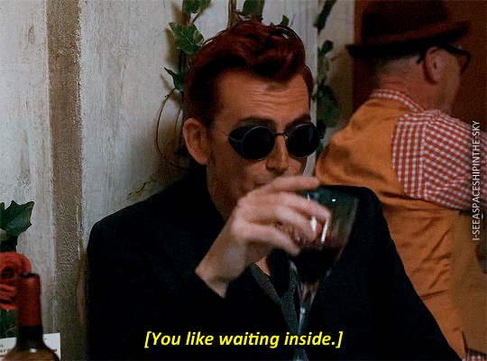
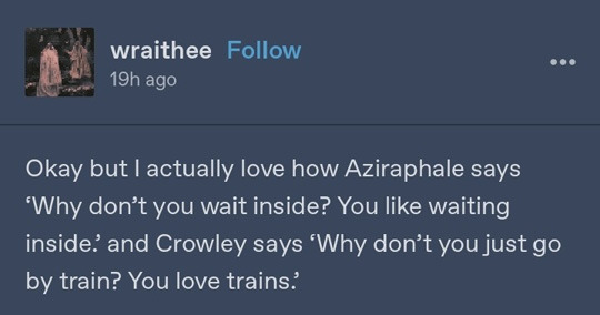
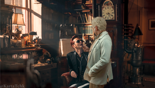
See the contrast (also not subtle) between the Heaven and Hell coloration? The entire season is training our eyes to make those connections, and then when they drop the credits on us the show makers can divide and distance our heroes. Not only by the text crawl but also with some Hell/Heaven coloration... to really drive home the point of how far apart they are. Crowley is dark, in a slightly green tone. Aziraphale is light and drained of color.
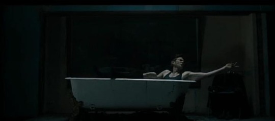
But wait Duck! (you say) Surely this is because Crowley is in the dark Bentley with his plants in the background. Well, yes, but LOOK at how the exact same split-screen shot is lit in the first episode. I swear I didn't edit either of these images a bit. Look how much brighter and warmer and less green Crowley looks. You can really see the green (or lack thereof) on the ceiling of the Bentley.
My point is that this was a choice. The show makers chose violence by how they edited these images, pure and simple. (And it has nothing to do with dolphins)
From beyond a cinematography perspective to the meta can we say that this means Crowley is going to return to Hell like Aziraphale is returning to Heaven? I personally don't think so, I think he's just in his own individual hell here... but hey, we'll (hopefully) see!
#good omens meta#good omens spoilers#good omens#good omens s2#good omens 2#ineffable divorce#ineffable breakup#good omens editing#good omens cinematography#good omens screencaps#a duck talks#i know - 2 metas in one day#but i'm trying to clear my drafts a little#good omens angst#are you still gutted by the credits scene? I know i am.
355 notes
·
View notes
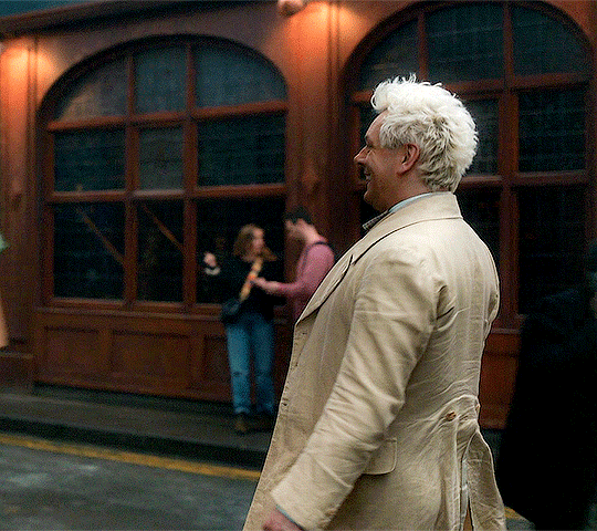
Text

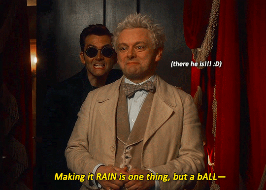
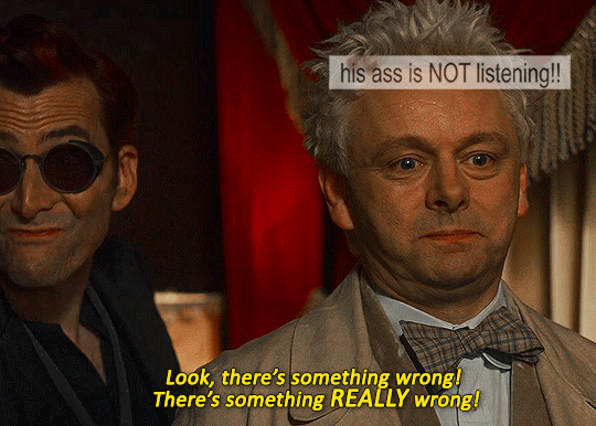
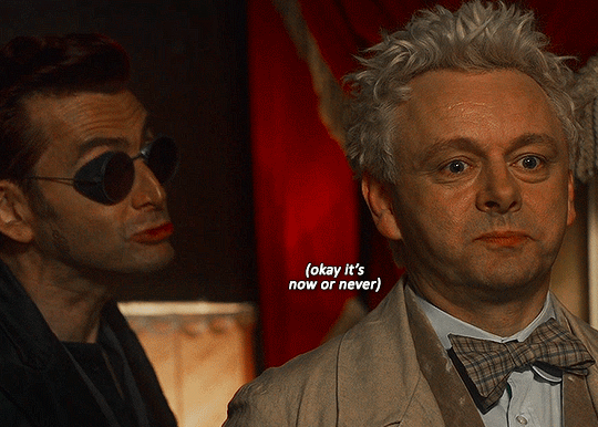
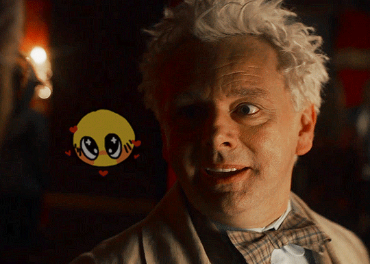
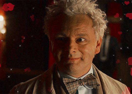
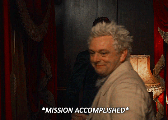
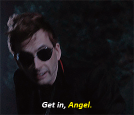
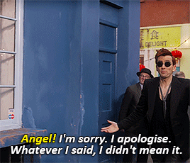
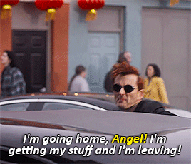
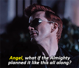
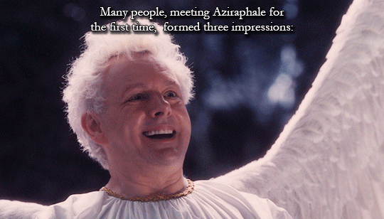
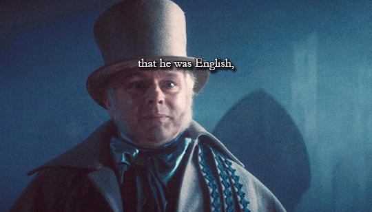
how to ask the demon you've been smitten over for 6000 years to dance: an angel's guide
bonus:
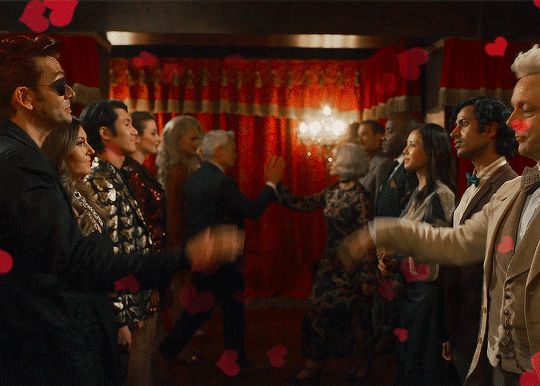
#goodomensedits#goodomensgifs#good omens#good omens s2#good omens spoilers#ineffable husbands#aziracrow#userkristi#userlauren#userstede#userisaiah#userelio#userhani#my gifs#edit: the old caption has been fixed!!! changed it to 'we' like god (neil gaiman) intended#EDIT EDIT: NEIL GAIMAN HIMSELF REBLOGGED THIS POST AND CONFIRMED ITS NOT 'WE' BUT 'YOU DONT DANCE' LIKE I HAD ORIGINALLY OKAY#im returning to my roots#(aka making gifs but adding my chaotic commentary and editing to it)#i wish i was at home i'd be able to use a better quality video but im also ~impatient~#hopefully no one beat me to the punch#because this scene is genuinely one of my favorites like look at azi look at his smile im gonna fucking cry :')))))#like michael sheen!!!!!!!! michael sheen i am banging at your door like a wild chimpanzee#the ACTING CHOICES#the way you can literally SEE his thought process and excitement over asking crowley to dance i am in shambles i really am
60K notes
·
View notes
Text


He's just an Angel... I know.
Good Omens (2019-)
#this took so long and i never want to see the word angel again <3#but i'm so happy with how this turned out#good omens#good omens 2#good omens spoilers#crowley#aziraphale#ineffable husbands#aziraphale x crowley#aziracrow#david tennant#michael sheen#good omens s1#good omens s2#goodomensgifs#goodomensedit#good omens edit#mygifs#nat gifs good omens
41K notes
·
View notes
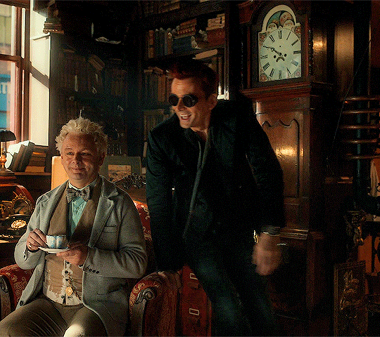
Text


Aziraphale's favorite color is yellow #confirmed
#good omens#goodomensedit#good omens edit#crowley#aziraphale#crowley x aziraphale#aziraphale x crowley#ineffable husbands#aziracrow#david tennant#michael sheen
46K notes
·
View notes
Text


GOOD OMENS S02 + TUMBLR REACTIONS

#good omens#goodomensedit#arthurpendragonns#chewieblog#cinemapix#cinematv#dailyflicks#dixonscarol#mediagifs#noalook#useralison#useraurore#userbarrow#userbbelcher#userceci#userksena#usermaguire#userstream#usersugar#*edits#good omens spoilers#eyestrain#long post#why does it take me half a day to make a gifset T_T#i am soooo slow!#and i've been working on this since last night >.<
42K notes
·
View notes
Text
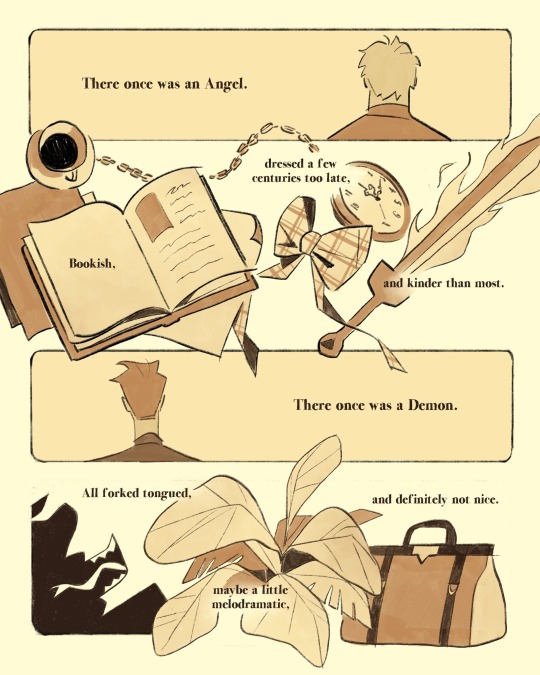
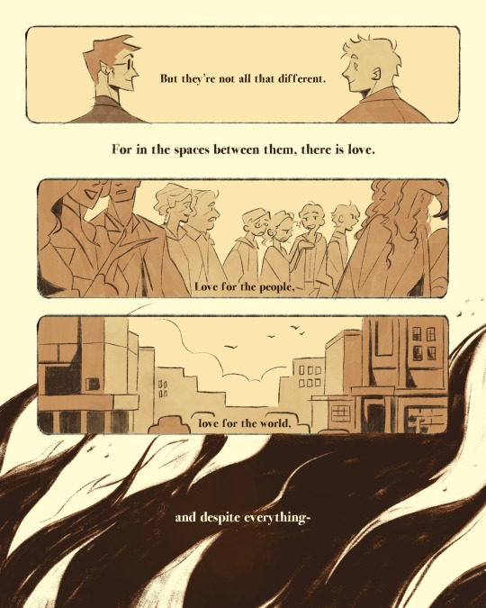
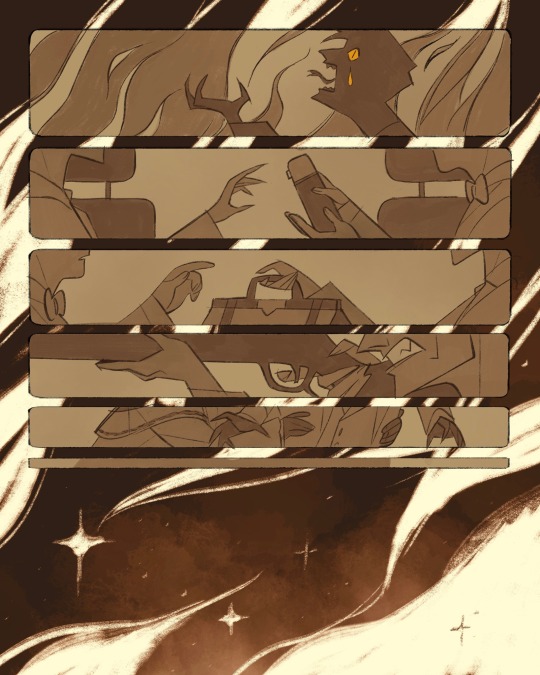
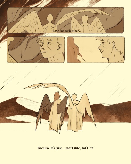
let me tell you a story…
#comic i did a while back#good omens#good omens fanart#aziraphale#crowley#ineffable husbands#neil gaiman#aziracrow#might edit some lines for the zine#did i mention i’m making a gomens zine?#well now you know!#artists on tumblr
28K notes
·
View notes
Text
Neil Gaiman once said:
“I love the idea of what Crowley's idea of Aziraphale is. His idea is a lot more heroic and standing-up to everybody than Aziraphale's idea of Aziraphale.”


“Just as Aziraphale's idea of Crowley is somebody who can be flippant and insouciant when faced with the monsters of Hell”.

“They're probably each rather better at dealing with things than the other one is, but that's what they think the other one is probably like, and I love that”.
Well, I love that too.
#good omens#crowley#aziraphale#ineffable husbands#neil gaiman#terry pratchett#good omens fun facts#good omens edit
11K notes
·
View notes
Text
he can't keep doing this to me!!!!!
28K notes
·
View notes
Text


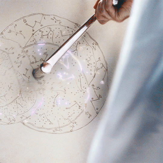
crowley used the metal tool in season 1 to start time, and we learn that he's used it first to start space. to create the stars -- he still remembers how. he still remembers all of heaven's passwords: in the book crowley is described as an optimist because he has the "utter surety... that the universe would look after him". not god, but the universe. and of course he does: he helped create it and he's looking after it, too.
think about it: aziraphale had a sword, but crowley is about to face satan who wants to destroy the world, and crowley's only weapon is a tool of creation
#more importantly it's always been noted that his imagination#is why he stands out from the other demons#it was his imaginative questions that kicked him out of heaven#but it was also his imagination that was always his weapon#and his saving grace that got him out of scrapes#that kept his bentley together#and i just. crowley and creation akkdssdkf#he also still has a goddamn book about stars#do you understand#he didn't just keep the metal tool#he also keeps with him a book#about all the nebulae#he created#my edits#i'm still not okay#once again neil gaiman was insane for this#good omens#good omens 2#good omens spoilers#good omens 2 spoilers#goodomensedit#tw: flashing gif#good omens meta#tw: flashing lights#tw: eyestrain
19K notes
·
View notes
Text
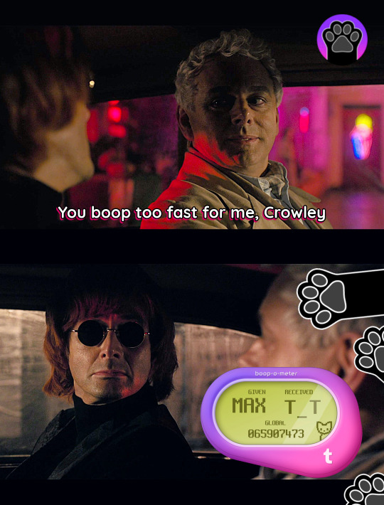
i'll give you a boop, anywhere you wanna go.
#good omens#boop#boop o meter#boop omens#ineffable husbands#sorry djhfdjh#aziracrow#good omens shitpost#good omens memes#good omemes#THIS IS THE LAST ONE I PROMISE#aziraphale#crowley#april fool's day#april fools 2024#my edits#btw i wanted to do “received ;_;” but i couldn't find it anywhere. too bad. get booped crowley#ineffable boop#gos1#good omens s1#i need you to know i consider this my magnum opus
5K notes
·
View notes
Text

#good omens#good omens 2#good omens edit#good omens text post#crowley#aziraphale#temptation#pining#ineffable motherfuckers#ineffable*#ineffable husbands#good ineffable omens#aziracrow#crawley#good omens season 2#good omens s2#go2#gos2#neil gaiman#terry pratchett#david tennant#michael sheen#heritage post#good omens heritage post#i made this#neil liked this#neil gaiman liked this
8K notes
·
View notes
Text
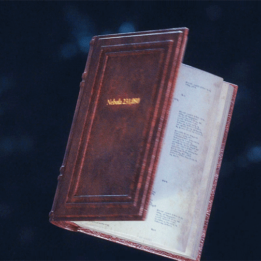
Aziraphale + book introduction
#good omens#good omens spoilers#goodomensedit#gif#gobook*#go*#season 2 edition!#gayer than ever#gotta match the crowley one#h#5h#k#5k#10k
13K notes
·
View notes
Text
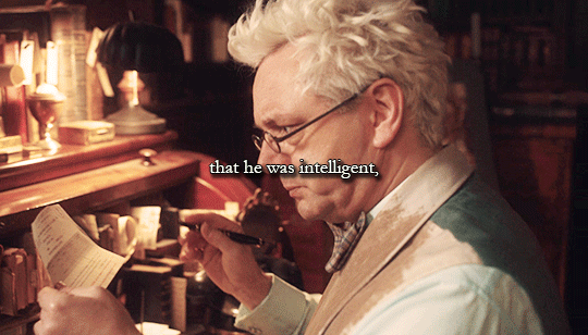
#old married couple
[insp.]
#aziraphale's 'honey not now' face in the train moment dkjgdkjgdjgf and the way crowley understood and stopped complaining <3#good omens#goodomensedit#good omens edit#crowley#aziraphale#crowley x aziraphale#aziraphale x crowley#aziracrow#ineffable husbands#david tennant#michael sheen
31K notes
·
View notes
Text
This lipstick suits you very well, my dear
11K notes
·
View notes
Text


the oldest old married couple there is
#good omens#good omens 2#goodomensedit#good omens spoilers#aziraphale#crowley#ineffable husbands#my edits
13K notes
·
View notes
Text


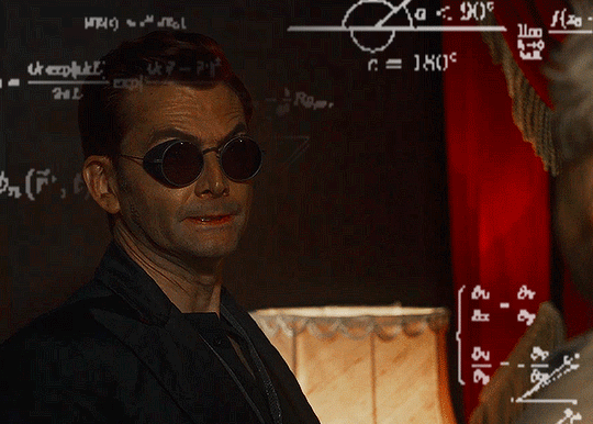
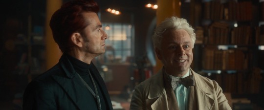
→ Michael "acting choices" Sheen in Good Omens 2
#good omens#good omens 2#aziraphale#michael sheen#crowley#david tennant#ineffable husbands#aziraphale x crowley#aziracrow#good omens edit#goodomensgifs#goodomensedit#mygifs#nat gifs good omens#good omens spoilers#michael i am in your WALLS
11K notes
·
View notes
Last Seen Blogs

titties-r-us-444
Untitled
cheetoswithmilk
peace was never an option
kristhemilf
Kris The Milf

asphodelcoyote
✩Coyote𖦹
felinedae
Someday, Together, We’ll Shine.