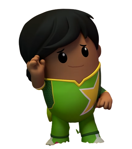
#go jetter
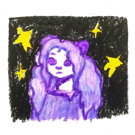
Text
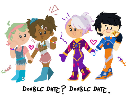
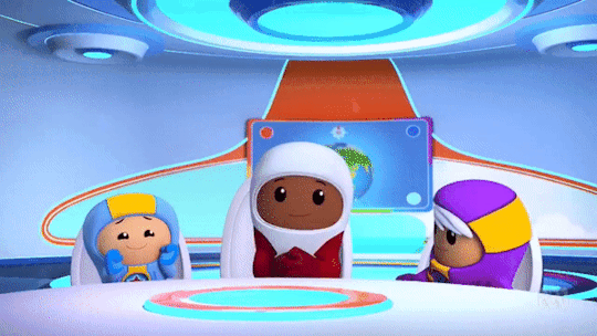
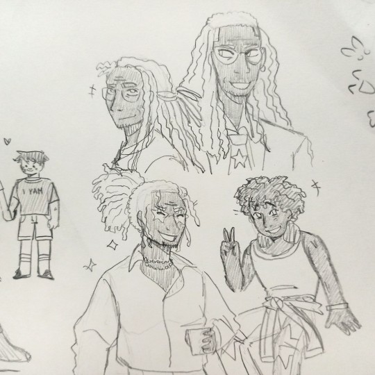
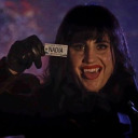
More Octonauts + Go Jetters crossover content. Posting Twashi & Xyan double date because I love drawing my favourite ships together 🩷💚 💜🧡
#go jetters#geo-blogging#go jetter#gogo-jetters#gj#gogojetters#Octonauts#Octonauts above and beyond#kyan#xuli#xyan#Xuli x Kyan#Kyan x Xuli#before anyone asks I hc both xuli and Kyan as bisexual#xuli go jetters#go Jetters Xuli#go Jetters Kyan#Kyan go Jetters#tweak#tweak octonauts#tweak bunny#Dashi#Dashi dog#Dashi Octonauts#twashi#tweak x Dashi#Dashi x tweak#thunderstomm art#my art#tomm talks
43 notes
·
View notes
Note
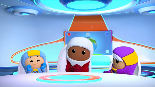
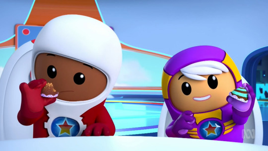
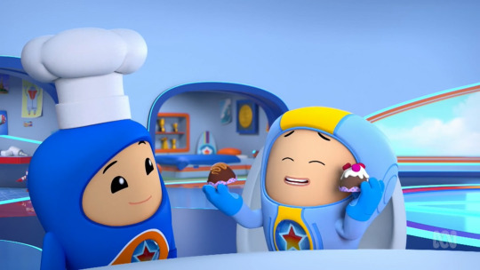
HI, CAN YOU PLS SEND ME A SCREENCAP OF THE CHOCOLATE HILLS WHERE XULI, LARS, AND FOZ ARE WAITING FOR THE CHOCO HILLS?! I WANT TO SHARE THIS TO MY FRIENDS THANK YOU!
Hi there! Happy to be of service as Tumblr’s local Go Jetters fanatic. I assume you meant the scene where Xuli, Lars and Foz wait to be served Kyan’s treat version? So, I got a few different screenshots from that scene, both before and after being served. (:


And as a double bonus, I made you some GIFs, too!
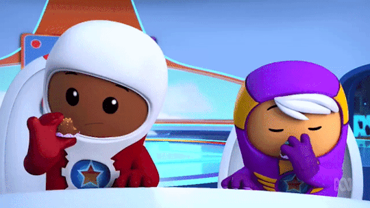
Hope that these were the right ones and that they helped! If you ever want to talk to me about Go Jetters, don’t be scared to give me a DM, I’m always happy to talk !! (:

Source Episode for all Screenshots & GIFs - Go Jetters, Series 2, Episode 48: Chocolate Hills, Philippines. All GIFs were made by me, and are free to use. (: Thank-You !!
#thunderstomm#go jetters#go jetter#GJ#ask#asks#submission#gif#gif warning#image#pictures#screenshot#screenshots#go jetters Xuli#go jetters Kyan#go jetters Lars#go jetters Foz#go jetters grandmaster glitch#Xuli#Kyan#Lars#Foz#grandmaster glitch#go jetters s2#go jetters series 2#request#food#food tw#spookyforsakenhaunts#(:
4 notes
·
View notes
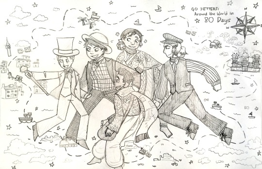
Text
Here's an in-universe meme before I go to sleep
Okos II is satisfied with gardening unlike his more unruly cousins
2 notes
·
View notes
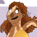
Text
every single time i discover a new show , i create a cute lil oc for that show (usually that oc is a girl), and their either a fankid or related to the main cast in some way
#ik yall didnt ask#CREATING OCS IS FUN☹️☹️#especially making fankids bro that shit is so fun#[tags below arent exactly related but eh!!!]#robocar poli#super wings#robot trains#tayo the little bus#go jetters#jake and the neverland pirates#octonauts#ttte#handy manny#IDK JUST ALL THE FANDOMS IM IN.
56 notes
·
View notes
Text
Art I am especially proud of, from 2023 <3
Happy new year everyone!


#trolls#frev#frev community#rule of rose#rule of rose diana#diana rule of rose#eah#ever after high#tea personal#tea art 🎨#darling charming#ginger breadhouse#gingerling#wani trolls#chaz trolls#hickory trolls#trolls noire au#go jetters#kitty cheshire#marat#simonne evrard#oklo makes a post
55 notes
·
View notes
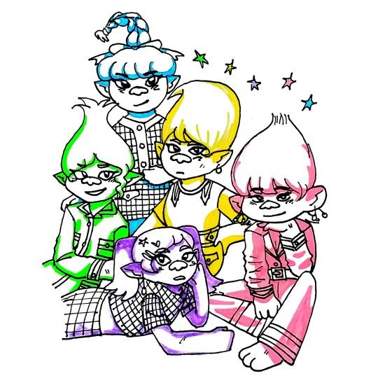
Text
as a quick rb break, have a GJ art dump


i literally cannot stop thinking about them send help
#go jetters#shib doodles#art#art dump#i genuinely feel like i improved with my posing from doing all of this#GJ making me improve frfr
23 notes
·
View notes
Text
this is gonna be an insane thing to talk about to but one of the things that makes bmj so enjoyable to watch even as a very obviously limited animation kids show from the early 2000s is that it often surprises me in how colorful it is. one of the most consistent artistic elements of the show is the delicate mix of saturated nature tones combined with the often duller mechanical/alien ones, which bring to life a kind of washed, cel-like feeling to even some of the most mundane shots. see below


This is a kind of color grading and production quality that wasn’t even seen in a lot of more elaborate, higher budget productions in the 2000s. the transition to “digipaint” anime (aka digital animation over cel animation) often left many anime with drab, flat, and what I can only describe as “sun-bleached” colors in their final masters, which while probably deliberate for some productions, rarely looked good and resulted in a homogeneity of digital production stuck in the transition to new technology

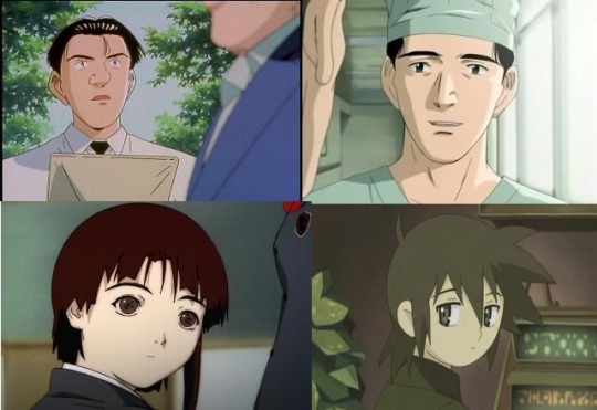

Note the muted palettes, the lack of saturation in the skin, the grey shadows, the sometimes weird green color grading, etc.
I’m aware that this kind of groddy digital look has a place in anime history and also in the nostalgia and fondness of many people who watched anime in the early digipaint era. it can look good after all when the artists are more aware of color theory and how to properly utilize a more “degraded” color palette, such as the iconic soul eater:
But bringing this back to BMJ it’s just another of those subtle notches of effort in the show that peels back the love the artists put into the production. It gives a life life feeling to the characters and the lens through which the audience views the entire scene of events, a narrative steeped in automatic identities facing off against autonomy becoming itself and moving not just past grief but through it.
also it just looks nicer than 80% of the shows in the early 2000s and I think it deserves its chops
#BMJ#bomberman#bomberman jetters#soul eater#personal post#analysis post#if you’re here from my ultrakill shitposts wondering what the hell im talking about go watch bomberman jetters it’s really good#2000s anime#early 2000s
27 notes
·
View notes
Text
These two are 100% the best gj characters and nothing can convince me otherwise


26 notes
·
View notes
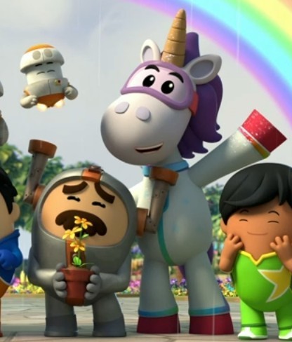
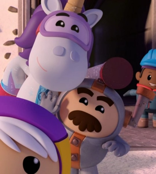
Text
POV - Nostalgic Memories


#3
#miles from tomorrowland#octonauts#fancy nancy#the sisters#go jetters#hey duggee#nostalgic#childhood memories
43 notes
·
View notes
Text

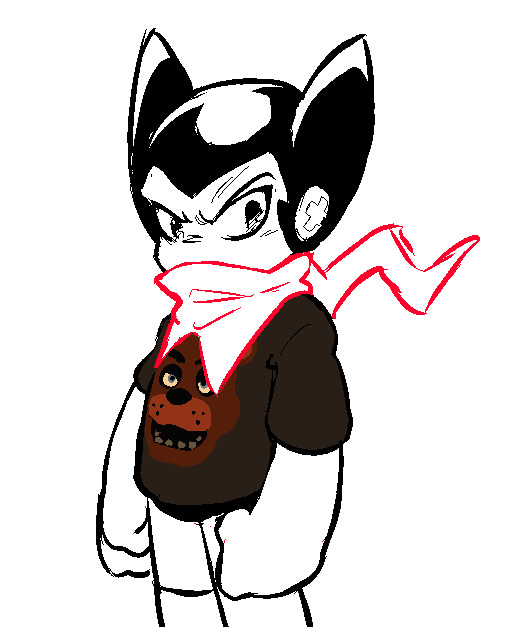
trying to make friends...
#Astro Boy#Jetter Mars#doodlez#augh#i apologize for what im about to do...ive recently gotten back into fnaf and about to do something stupid (besides this)#ANYWAY#Jetter...ive been kicking around a few ideas for him for a long time and i think i have a good idea of him now#i havent watched his show yet...only the first few episodes but its dumb i can only find 13 of them online#BUT I LOVE THE ROBOT TOURNAMENT THING HES GOT GOING ON#ive leaned into that for him along with insp from AtB bc thats ones the best too#ya ya okay okay anyway i wont ramble#im still trying to get back into drawing lol#i missed it...
233 notes
·
View notes
Text
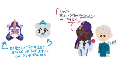
This came to me in a vision a while ago but since I’m posting more crossover art…
Ubercorn & Captain Barnacles ex boyfriends??
#go jetters#geo-blogging#go jetter#gogo-jetters#gj#gogojetters#Octonauts#thunderstomm art#my art#my doodles#Ubercorn#go Jetters Ubercorn#Ubercorn go Jetters#captain barnacles#octonauts captain barnacles#octonauts above and beyond#Ubercorn x Captain barnacles#barnacles x Ubercorn#I guess??#also human Ubercorn hehe#I wanted to doodle more but I’m busy so for now it’s just these#enjoy I guess#(:<#okay to reblog#please reblog#(:
25 notes
·
View notes
Text
CBeebies: Go Jetters - Xuli
Source Video: CBeebies: Go Jetters - Xuli
Uploaded Mar 11, 2016.
Description:
Find out about Go Jetter Xuli, the expert pilot of the Vroomster!
Visit CBeebies at http://www.bbc.co.uk/cbeebies to find even more fun games and videos for your pre-schooler in a safe child friendly environment.
CBeebies is dedicated to delighting and surprising its pre-school audience and it remains the UK's most watched and most loved channel for the under-sixes.
Just under half of the target audience tune in every week (parents and carers with children aged 0-3 and 4-to 6-year-olds in digital homes) and our reach is over double that of our nearest competitor.
#go jetter#go jetters#gojetter#gojetters#gj#xuli#xuli go jetters#go jetters xuli#go jetters foz#go jetters grandmaster glitch#go jetters kyan#go jetters lars#go jetters ubercorn#video#video intro#cbeebies#cbeebies go jetters#go jetters cbeebies#character descriptions#character bios#go jetters archive
2 notes
·
View notes
Text


Edit of Tala Glitch to match my headcanons!
The pose is traced- Hair, expression and outfit all drawn by me.
Original transparent under the cut.

15 notes
·
View notes
Text
Round 1 Wave 2
28 notes
·
View notes
Text
dude imagine if i make a hs au but i make almost every kids show character attend it or work at it
#robocar poli#super wings#robot trains#tayo the little bus#go jetters#octonauts#jake and the neverland pirates#ttte#jatnp#bahlk#etc etc#disney jr#nick jr.#guys imagine tho
42 notes
·
View notes
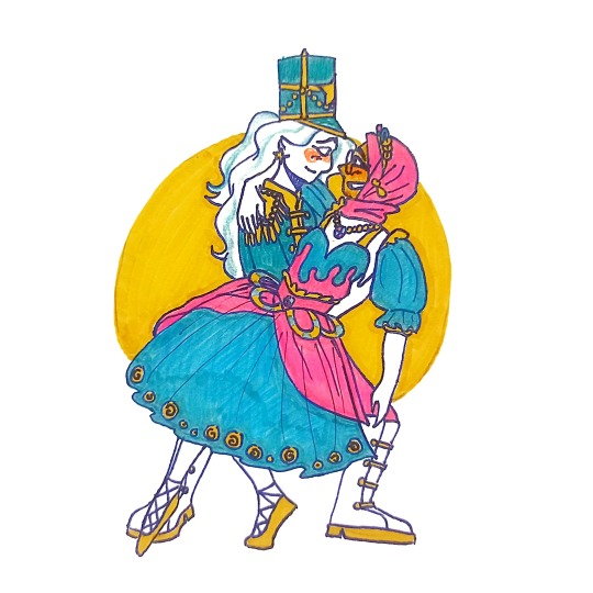
Text
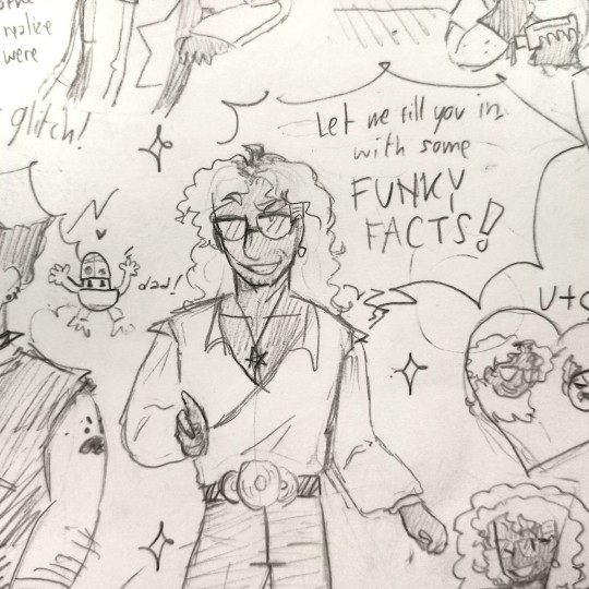
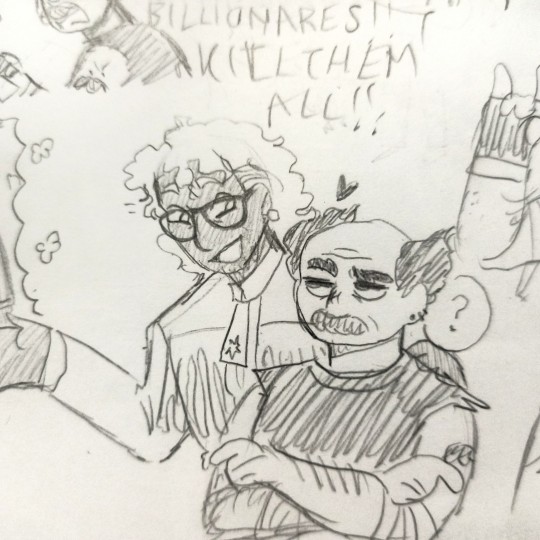

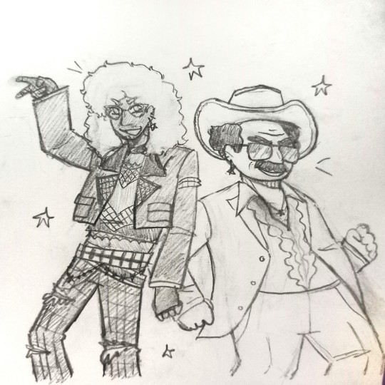
RAGGGHHEHDHJWHFJWJFJWHFJJEJ
Introducing... My personal design of Ubercorn! And a bit of Grandmaster Glitch!!!!!!
These two are some of my favorite characters, every episode that focuses on either one of them or even both of them at the same time makes me so happy <333
I'll probably dump even more of my go jetter sketches I've created over the past few weeks soon!!!!!! Trust me. I've got wayyyy more.
Have a good day yall
Click for better quality!!!!!
#go jetters#ubercorn#grandmaster glitch#uberglitch#go jetters ubercorn#go jetters grandmaster glitch#tea art 🎨#i headcanon that if ubercorn's aesthetic and entire vibe is 70s disco#GLITCH IS A PUNK ROCK 40 YEAR OLD MAN#everything about him is so punk coded to me#how he's extremely environmentally aware#i think if theres one thing hes extremely knowledgeable of#is about how billionares motherfuckin suck!!!!! HE WOULD GO ON HOUR LONG RANTS!!!!!! i would listen to him#also that entire episode that LITERALLY ESTABLISHES how he loves loud rowdy music. hes basically a canon punk to me#anyway in that last picture my sister was having a bad day so i drew glitch and ubercorn with switched aesthetics!!!!! i really love it!!!#oklo makes a post
40 notes
·
View notes
Last Seen Blogs
yourpromdressisbleeding
floating in the forest
24hoursopen
#24hoursopen
televiewer
television viewer

yenepoyaalumniassociation-blog
Untitled
dreamboundedstar
I hope you all find your "something after all"