#forgive the wonky proportions!
Photo
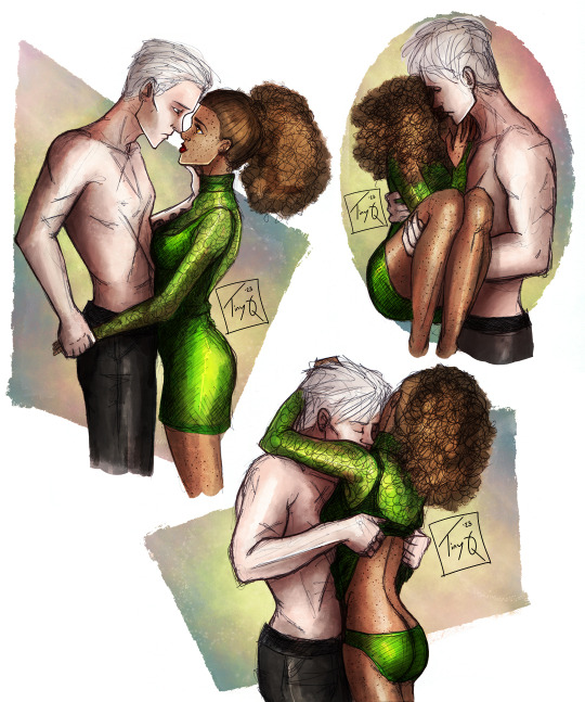
After an evening out. (Voldy-Wins AU?)
#dramione#dramione fanart#dramione art#dhr art#dhr fanart#dhr#draco/hermione#draco and hermione#hermione/draco#I don't know where Draco's shirt went#these were pen doodles from last summer#I was going to colour them with copics#but the ink bled when I tried#always use proper ball point pens when doodling!#procreate#traditional and digital art#pen sketch#pen doodle#forgive the wonky proportions!#blargh#I miss sketching on paper#maybe its time to return to my roots#(I say as I ignore my 60+ wips in procreate)#tiny q#Happy Pride!
279 notes
·
View notes
Text
wow ok so the Craig part of the mythical au did way better than I thought it would!!
as I work on the next part of the comic, here’s some creek for this au in the meantime <3
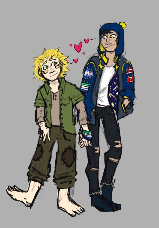
i hope you’re ready for the next part cause lore is gonna happen and stuff is gonna be revealed >:)
#this was made months ago forgive me for how wonky some of their proportions look#south park au#south park#south park fanart#cyn art#craig tucker#south park mythical au#tweek tweak#creek#sp craig#sp tweek#craig x tweek#south park art#craig south park#tweek south park
76 notes
·
View notes
Note
I really hate to let you know this but in your art of sasuke/Naruto asleep on rhe couch their arms with the bandages are the wrong ones :(
I was hoping nobody would notice that 😅
See I actually started drawing that one facing the other direction, then about halfway through coloring decided I preferred the composition when it was flipped to face the other way lol.
#hope yall can forgive me but i get the arms backwards at least 30% of the time :[#sometimes it's for composition#but I'm also just really bad at right vs left in the first place#ps flipping your canvas horizontally is a GREAT way to immediately find all your mistakes in proportion and anatomy#so if you’re drawing something and you can't figure out why it looks wonky try that#there's your free life pro tip for the day!#anonymous#ask tag#shadow rambles
8 notes
·
View notes
Text
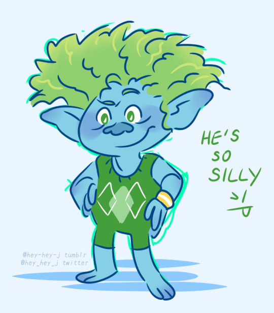


Happy late New Year everyone! Today I bring you practice sketches and yet another screenshot redraw (please forgive the wonky proportions I forgot to edit my sketch before lining)
(*✨my ko-fi)
#my art#trolls band together#dreamworks trolls#trolls fanart#brozone#trolls tiny diamond#trolls branch#trolls poppy#first art post of the year wahoo let's go!#we're hitting 2024 running with the trolls hyperfix!
273 notes
·
View notes
Text

U N R A V E L I N G
Really quick sketch I did on my lunch break. Haven’t been able to post much since I’m deep into Zine work and script writing for Replica but I’ve been super inspired by all the cool designs @thegunnsara @r0b0t1me and @becomesgarbage have been putting out on my twt feed. I’m not accustomed to pushing perspective or proportions so forgive the wonkiness. At least this was a good little workout, I should try it more often.
#kathaynesart#rottmnt#save rottmnt#rise of the teenage mutant ninja turtles#unpause rise of the tmnt#unpause rottmnt#future mikey#tmnt michelangelo
744 notes
·
View notes
Text
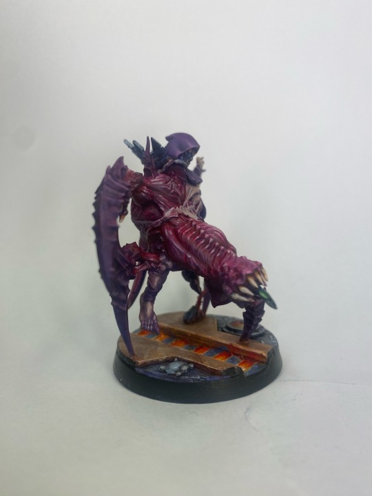
Another spawn of chaos joins the fray
I had some spare bits from my redemptionists so i figured it would be a nice way to tie this guy to the rest of the cult.

I figured the daemon head didn’t quite fit what i was going for so i sculpted a ring of teeth there instead.
I wanted the mutations to be a different colour than the guy they burst out of and figured that a flayed look would pop well

The base was a bit of an obstacle as i don’t have any neceomunda bases in this size so i had to make my own. I took one of the 40mm bases from the accursed cultists box and went to town with a knife, plasticard and a couple greeblies.
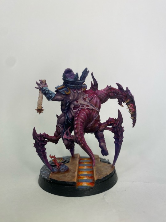
Chaos spawn provide a fantastic canvas for conversions as they’re very forgiving when it comes to messy sculpting and wonky proportions.
75 notes
·
View notes
Text


So I do really like the MAF body for the most part. The sculpting is nice, the overall articulation is decent... there are just a few things I'm dissatisfied with.

Like the lack of upper thigh rotation, the wonky ankles and the underwhelming knees.
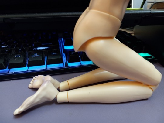
I think I could fuse the height extender to the bottom of the leg with acetone goop, and then possibly drill a hole for a pair of peg style feet (or maybe I have some loose joints somewhere I could adapt the feet to use?)

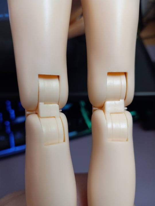
The knees could probably get ground down in strategic spots to improve the kneeling gap... idk if I'm really at a point where I know what those strategic points would be, yet. But I'll mull on that.
Upper thighs could be cut and a simple swivel joint could be made. Or I could go ape and try to figure out how to get some better hip articulation while I was at it...
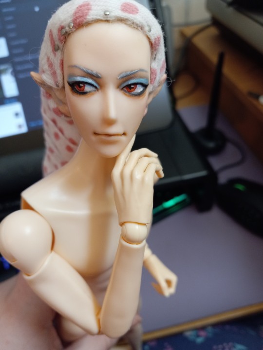
Up top I have fewer complaints, the arm articulation is good and the wrists are sensible ball and swivel joints with post connections. The shoulders are gappy, I've definitely seen better before, but I'll forgive it.
The Obitsu SM01 head is well proportioned for this body, but the neck connector is another matter...

Yeah not good. I also hate the balls on a stick style of connector sooooo much. I can probably bevel down the the top of the neck to match the indent in the slim male head? And maybe chop off the top ball and screw on an obitsu peg??
Anyway, just my onions on this body. I keep hoping someday someone will make a PERFECT body for my mini Ghaleon, but until that day this'll have to do.
32 notes
·
View notes
Text

Given I broke the dam of posting my art here, have the pieces of my backlog I'm somewhat proud of! Here's Jonathan Sims, head archivist of the Magnus Institute, London, I must've drawn him about two years ago so forgive any wonky proportions
20 notes
·
View notes
Text

rough study for yuritober day 25 (noir), reference image + thoughts under cut
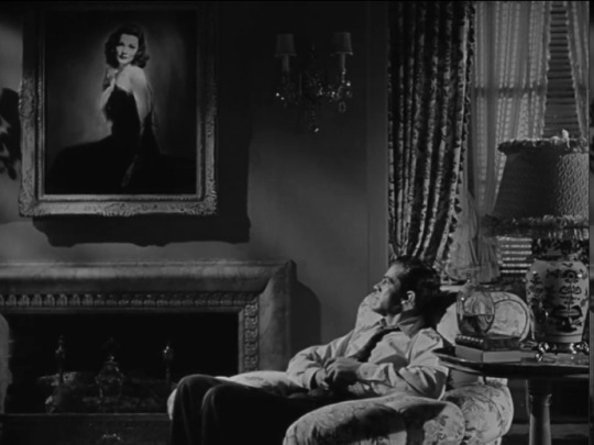
this screenshots from one of my favorite noirs Ever, laura (1944, dir. otto preminger) !! oc thoughts incoming...
millie (right) unintentionally (and much to her dismay) embodies the pure essence of noir (something i love to talk about again and again): fear and paranoia, the doubt of what was once certain; a desperate search for nonexistent comfort. putting daisy (left) in the role of laura isnt meant to mean anything special (although i certainly have Thoughts about women in film noir, especially through a queer lens). anyways daisys butch swag is so awesome and epic here. hi girl
you ever just drink and dream in love with a dead woman?
also forgive the messiness and general wonky looking proportions, i am Very tired
#yuritober#i told you id be doing this challenge lol#most of my entries are on paper though </33#cherryart#oc tag its millie#oc tag its daisy#siiigh.#film noir
8 notes
·
View notes
Text
🪷Nezha🪷

I wanted to draw those ribbon thingies but I got a lil lazy, also I don't draw armours/pauldrons that often so forgive me if it looks wonky (;ŏ﹏ŏ) but I still had fun drawing this :]
Smol edit: some of his body proportions are a lil wonky as well because I JUST woke up when drawing this-
7 notes
·
View notes
Text

have some more ghost for y’all <3 yes i forgot Ilya’s cheek marks but let’s just say this takes place when they’re younger?
Copia is 100% that boyfriend who brings you snacks and interrupts you when you’re halfway through impulsively giving yourself an undercut on a random Thursday afternoon. Ilya is that boyfriend who randomly gives himself an undercut again after abandoning it for over a year because he forgot it existed and refuses to let anyone else do it for him cjenfjend
i love my freakishly pale italian goth boi and his goth ratman boyfriend so much
i think i misspelled somethings so forgive me and my wonky proportions, this was a quick doodle 😅
#bishop ilya#cardinal copia#ghost fanart#ghost bc art#ghost#the band ghost#ghost bc#ghost bc fanart#ghost bc oc#cardinal copia fanart#the band ghost art#the band ghost fanart#the band ghost bc#papa emeritus#papa#papa emeritus iii#papa emeritus 4#canon x oc
69 notes
·
View notes
Text
Madonna Fanart
After reading this masterpiece by @user-needs-new-hyperfixation, I knew I had to draw a bit of it, even if it was crappy.
So, lo and behold, the labour of like 2 or 3 hours. (Go and read the fanfic first)

This is the first time I've seriously drawn any humans so forgive me for wonky proportions and lack of hands
Tagging: @darkhumanpiekid
If you want to be a part of my Animations/Digital Art Taglist, please proceed to this post or ask in the comments
if this post gets 20 notes then I'll release one of the process videos
#art#digital art#digital#fanart of fanfiction#fanfiction#yuumori#william james moriarty#yuumo#yuukoku no moriarty#mtp#moriarty the patriot manga#moriarty the patriot#moriarty
16 notes
·
View notes
Text

Gary Hume (*1962) is one of the leading British painters and sculptors of his generation. His oeuvre, often executed with high-gloss industrial paint on surfaces that include aluminum panels, infuses high modernist abstract formalism with an emphatic, sign-like quality. The London and New York-based artist develops his works from found images and personal memories, giving rise to a pictorial idiom in which horror and beauty, eroticism and melancholy, glamour and alienation, go hand in hand. His works are meditations on the sublime of the everyday, the fleetingness of memory and the fragility of life.
Hume came to prominence as a member of the Young British Artists generation who studied at Goldsmiths College in London. The Door paintings, his first body of work from the late 1980s and early 1990s, consists of abstract paintings that often recall the double swing doors of hospitals, museums, or cafeterias. The architectural reference of these works and their large, vertical formats reflect the viewer’s own body proportions. Their strength derives from a specific tension between hermetic modernism and mimetic representation. Rendered simply with pre-mixed enamel paint, many of these “doors” bear an unlikely resemblance to human faces: Their formal geometric vocabulary does not obliterate the figurative but instead allows it to return as something uncanny and repressed—as the product of the viewer’s automatic, anthropomorphizing gaze.
The 1990s and early 2000s saw a broadening of Hume’s artistic practice. The Door series was followed by well-known paintings of flowers, plants, birds, nudes and celebrities—paintings that hover in the charged space between abstract and figurative pictorial strategies, ethereal abstraction and ordinary, everyday phenomena. Having painted on canvas and hardboard at the beginning of his career, the artist now favors aluminum panels as a painting surface. His imagery is often taken from mass media and found photographs, which he projects onto the aluminum plates before tracing their contours—either scratching them directly into the enamel or creating three-dimensional “dams” and allowing the gloss paint to pool between them. His palette of pastel colors is often dominated by hues including antique pink, purple, brownish beige, or aquamarine. The high-gloss enamel he uses has the look of plastic when dried, a trait that contributes to both its retro-aesthetic, melancholic appearance and its insistently contemporary feel. Many of his paintings—the superimposed nude outlines of the Water Paintings series (1999), for example, or the paintings and sculptures of his cheerleader-inspired American Tan series (2007)—exude an elusive sexual energy. Other works including his iconic, bronze Snowman sculptures (ongoing since 1997), have a dark, comic edge or make use of drastic, corporeal pictorial content. For all the apparent banality of their references, each of these works exudes a surprising elegance as well.
Hume’s more recent works bear witness to a further shift in direction, both formally and in terms of content. Painting series such as Mum (2017) or Destroyed School Paintings (2019) and sculpture series including Wonky Wheels (2018) or Ghost Sculptures (2019) increasingly explore the artist’s private memories or can be understood as a personal grappling with such political tragedies as the refugee crisis, the wars in the Middle East and exhausting news cycles. Apart from the expansion of his sculptural practice, his new work is often characterized by his choice of paper as a painting surface. The material is less forgiving than the aluminum and does not allow any reworking, as the enamel Hume uses causes the paper to buckle. The result is a fragile, tactile and melancholic structure that often epitomizes the content of these works and their engagement with mortality and the fragility of memory.While Hume’s work appears to negotiate pop-culture iconographies, it also short-circuits them with an exploration of the aesthetic, psychological and cultural limits of color and form. The directness with which it expresses both the pleasure and the horror of the decorative paradoxically evokes the sublimity of the ordinary and domestic. All of the artist’s work, regardless of medium, has a kind of characteristic emotional charge—the expression of a singular, provisional sensibility that is enigmatically transmitted to the viewer.
Sprueth Magers
4 notes
·
View notes
Photo

Inktober 1: I’m VERY rusty after years of not drawing (again) so I’m treating Inktober as an opportunity for practice. Faces look wonky if you get the proportions wrong--skulls are more forgiving.
(also kinda staying on-brand for my latest obsession lol, but hey it’s October, I can draw skull)
reference
inktober: 1 … 2 … 3 ... 4
2 notes
·
View notes
Text

it's saeyoung/707's birthday from mystic messenger!
lol i drew this for cheritz's fairytale contest a few weeks ago kinda embarrassing i know
#mine#spookyspicy#mystic messenger#choi saeyoung#707#art#mystic messenger fanart#listen i know no one plays this anymore but i started it last summer and it's actually so interesting#forgive me if this looks wonky at all i'm not practiced with anatomy and also i had to reference tinker bell poses#for the record tinker bell anatomy doesn't make sense so i had to try my best to make it look like a dude with normal proportions#still this was pretty fun to draw but i'm also embarrassed to post this bc i don't usually draw stuff like this
28 notes
·
View notes
Note
Do you have any advice for understanding hands better? I’ve been practicing them for years but feel like compared to other aspects of anatomy it’s the one thing I haven’t seen much improvement in. I draw both from life and images and draw nearly everyday but nothing I’m doing seems to help
I personally get by mostly from remembering poses that I’ve already practiced a ton, like I figure out how to draw it once and am able to file that away in my brain and use it again later, and tweak bits of the pose or the level of simplification to suit what I’m drawing.
I’ve paid special attention to drawing hands for like.... most of my life so I have a LOT of poses I’m easy comfy with now, but when I need to figure out something complicated or new, I can usually work it out by breaking a hand down into shapes, remembering a few key points/”rules” from what I’ve learned about hands in order to help me break it down in a way that makes sense. And if that’s not enough either, then I take photo refs.
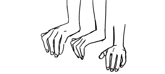
^^^ here is a pose I use a ton. I have a quick way of drawing it from various angles. the first time I had to draw a pose like this, I had to think and figure it out, but in drawing it a bunch of times and having to use various angles like this, I’ve eventually come up with a quick, reliable way to draw it from a few of the most common angles that fits the style I like to draw in. I’m blessed with a good memory for observations, so when I see a beautifully posed hand, I can usually really quickly analyze what I like about that pose and why, and that helps me absorb it so I can recreate my saved impression later. But I know not everyone thinks the same way. it might benefit you to quickly scribble down a study in a sketchbook when you see a pose you find beautiful and want to learn from for later.
^^^ here are some poses I had to stop and spend time figuring out, calling up the “rules” for how hands are built to kind of logic-out how they should look from angles I’m less familiar with. results can be mixed, but... if I end up with something expressive that fits the style of the rest of the drawing, I’m usually really forgiving of fudged anatomy or slightly wonky proportions. as long as the thumb is on the right side and there aren’t too many fingers, that’s a great start lol.
^^^ and here are ones I had to take reference-selfies for. I try to use this as a last resort because 1) it’s a lot of trouble 2) interrupts my drawing and 3) if I’m not careful I stick too close to the reference, and the drawing ends up with the hand looking referenced and the rest of the pose not, which is jarring to me. not to mention I have tiny manlet wrists that without fail, look horrific and emaciated in photos, and the lens distortion makes my fingers look scary too... ugh, photo reference has definite flaws. I actually don’t like the look of drawings for which I can Really Tell the artist drew from photo reference, because most often that means they’re taking the ref too much at face value and incorporating ugly lens distortions into their drawing. so I have to think extra hard not only about interpreting the ref, but also might have to make multiple passes just to get the hand to look normal, AND match the style of the rest of the drawing.
Anyway, here are some of the ““rules””” I mentioned earlier that I fall back on to help me figure out more complicated poses:
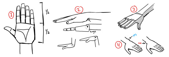
1. probably seen this before, but basic proportions. the palm is usually half the total height of the hand. obviously you can mess with this purposefully.
2. I think of joints as like, ball joints or hinges. I find that easier than trying to remember bones & muscles. here’s a drawing of the wrist as a hinge. note that when you’re thinking of it this way, it’s a shortcut, but a shortcut is only good if you use it with precision. notice the pin for the wrist hinge is not just halfway, it’s closer to the top of the hand. being precise about that is what allows this shortcut to work. the heel of the palm juts out, while the top of the hand transitions into the wrist quite smoothly.
3. simplified planes. planes are important yo. in super simple terms: top is flat, bottom is round. this works on the fingers too, actually. the tops are bony and tendony, and the bottom is where the fat is, so it’s rounder and soft
thinking of the hand as abstract shapes REALLY helps simplify the task of drawing hands, and is just as helpful even if you are drawing from reference. I can say “the palm is a box” and obviously the palm is not really as simple as a box, but if I think of the palm, wrist, and each finger joint as various shapes of box, then all of a sudden, psychologically, my task is SO much easier. I’m not drawing a Hand, which is hard, I’m drawing boxes, which is easy.
4. that prominent knob some people have on their wrist? that’s on the pinky side.
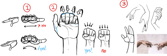
1. the knuckles aren’t really a flat row on top. the hand is like a cup right, so your palm can hold water and things. so we can think of the hand as a box to make figuring out the pose easier, but when it comes down to it, you’ll want to make it more of a curve. this curve is why you can see multiple fingers in a side view
2. when curled up, the fingers nestle together. the fingernails also turn slightly toward the center. even if I’m simplifying the hands significantly, I usually still draw the fingernails because they are SO useful for communicating the pose of the hand effectively.
3. lots of people suggest to think of the hand as a mitten, grouping the pinky/ring/middle fingers and singling out the index finger. this works great, the index finger is more independent from the other three. on the flip side, those three are really stuck together; if you’re drawing the pinky curled up all the way, then you better not draw the ring finger sticking straight up, cause that would HURT. anyway, singling out the index finger leads to more interesting poses in my experience.
1. this is another illustration of top = flat and bottom = curved. this is a really easy way to organize your line quality. straight lines and sharper angles where there is bone, and soft gentle lines where there is muscle and fat. your drawing as a whole will read very clearly if you find some guidelines like that to stick to, as it means all your lines are intentional and thoughtful.
2. this one’s about overlaps. when forms overlap, it makes a crease, and when you draw that crease you’re communicating which form is in front of the other. in the second drawing I reversed all the creases, and it looks.... messed up. think about how pieces connect.
so when you’re trying to make up a pose without using specific reference, I think it’s good to think about the.... flow of energy through the pose. honestly, I know it’s really abstract, but if I have an ability to make interesting poses that communicate weight and movement, the things that make people say your character feels ALIVE, like they really EXIST in a space... it’s because I started to think of poses this way. imagining streams of energy bouncing through the body, flowing down the limbs and out through the fingers. this is why hands are so important to me, cause they’re where the kinetic energy of the pose ultimately ends up. I talk about it when drawing the torso and arms and legs, but an interesting drawing has a bounce back and forth between opposites: for every curve, an opposing straight line, alternating back and forth down the entire body. if you’re sensitive to the energy of the pose, then even very simple poses will be interesting to look at.
anyway, with regards to hands, I imagine the energy getting sort of cinched in as it passes through the wrist, and then emanating out through the fingertips. I hope my drawing at least SORT of communicates this imagery. it makes sense because that’s BASically how the bones in the hand are anyway. and then the right side of the image above is just demonstrating some highly simplified gestures. see how the fingers fan out and curl in, rarely parallel to eachother. when you’re figuring out the pose, using a line to stand in for the row of knuckles is super valuable.
aaand finally, here’s two hands where I intentionally neglected correct anatomy and proportion because I felt it worked better for the style of the whole drawing. Left side: since this is a really simple and cartoonish style, I was thinking back to kids’ and shoujo manga I have read where the style was very solid and distinctive, but definitely NOT overly concerned with correct anatomy, or even really drawing hands, uh, “well” at all. to me, that sort of approach has a Look that I like to invoke sometimes, since for years I felt like I learned a bunch of anatomy and proportion and drawing from life actually in detriment to the liveliness and appealness of my drawings. this hand is mushy and makes very little sense, but it turned out as intended. Right side: sometimes I like to pretend fingers only have 2 bones in them, cause i am a Queen and i do what i want
and there you go. I hope that helped, like, at all? Look at real hands and photos of hands and hands in motion, but also look at drawn hands as well. find what you like, and work towards expressing that yourself. and remember the hand is part of the whole drawing. not only in the art style like I’d been talking about, but because the angle and placement of the hand is reflected in the angles of the arm, which in turn reflects on the angles of the shoulder, which affects the whole torso, etc etc etc. and the techniques you can use to understand and draw the rest of the body, works on hands too. as you improve everything else, your hands will improve as well.
DISCLAIMER: I whipped up these diagrams quickly, they’re not meant to be good drawings or accurate refs, just diagrams to illustrate my thought process lol
3K notes
·
View notes
Last Seen Blogs

nixiebytes
Nixie Bytes Security Team
ethanjsample
EthanJSample
abz-solute-art
Your friendly, neighborhood idiot
nixiebytes
Nixie Bytes Security Team
nixiebytes
Nixie Bytes Security Team