#finally understood what a limited colour palette is
Text
Leo
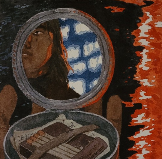
#art tag#finally understood what a limited colour palette is#rlly makes things a lot easier#s/o to gurneys book d#*the only theory book i own and actually use#this one's all emerald violet and red#i also managed to (once again) drop my watercolour box#it's very humid so all my sticky sticky little tubs went off to collect dust and dog hair#not to speak of having to put them back into order with half of them just looking like various shades of vaguely hued dark
71 notes
·
View notes
Text
Now that I've watched the Bakura vs Bonz duel, I think I've figured out why the insistence on turning the Rare Hunters' death threats into shadow games feels so flimsy. (yes this is just an excuse for me to talk about the shadow games vs the death games shhhhhh)
First off is that it doesn't work with the lore: none of the Hunters have the power to turn a duel into a shadow game because its the Millenium Items that make shadow games possible. Without their power, it's just not possible, and adding a purple cloud doesn't change that. I really doubt that Marik goes around and 'blesses' buzz saws and bits of glass to give them access to the Shadow Realm in very specific ways.
Second, the death games are all about the illusion of power, whereas the shadow games are based on real power; if you put Marik and Arkana next to each other and ask an outside observer to pick who they think is more dangerous, they'd probably go with the guy who locked a kid in shackles and threatened to cut off his legs if he lost a card game, because that's a very extreme measure and it gives Arkana a lot of power over that kid. But Arkana's power starts and ends with his power over Yugi. It's contained to his stage, just as all the other Rare Hunters only possess power over the stages they construct. Yet their power is only as real as their abilities, which are very limited, and so they build in safeguards to protect themselves. Parachutes and hidden keys, means of escaping their own death traps in the event they lose because they know that their power is so limited. That's why they rely on theatrics and death threats. It's a projection of power, to make themselves look and feel more powerful, all while plotting a way out should their intimidation tactics fail to overwhelm their opponent.
And this is where the Bakura vs Bonz duel comes in. Whereas the Rare Hunters make their death threats very overt, Bakura's threats are very subtle despite his being so blunt. He doesn't state his intention to send them to the Shadow Realm... because he brings them there immediately. Its evident that when the duel begins that the environment has changed in a way that it doesn't in the death games. The colour palette has changed and the characters comment on the fog, and those visual cues are enough to clue in the audience to what has happened. Bakura has made this duel into a shadow game, and the world has changed to reflect that. But Bonz doesn't realise he's in a shadow game because he has no idea what that is; he thinks the only stakes are a place in the Finals. Only as the duel nears its end does Bakura reveal what the stakes really are and what they stand to lose. And those stakes go both ways. There is no built in loophole for him, no pre-planned way out if things go south. You win or lose in a shadow game, and while Bakura certainly has power here, there is an element of control that he's surrendered for the sake of terrorising and condemning some guys. Yet he doesn't fear it, doesn't fret about it, because he's got full control of the situation thanks to the power imbalance between him and his opponent.
And that's what 4kids really screwed up when they turned every threat of death and violence into 'being sent to the Shadow Realm' because its not meant to be some random threat that anyone could pull out of their hat and could happen to anyone. It's not something anyone can do just because they know about the Shadow Realm. It's about how even the most extreme of mundane threats still pale in comparison to the threat of something that can be barely understood.
tldr; while 4kids really watered down just how much of a threat the Shadow Realm is, the people who actually play shadow games are operating on a whole other level from the guys making death threats.
#nightingale rambles#yugioh#look. i know it might not have been intended by the og writers.#but look. the death threats feel extreme until you see bakura sending some guys to hell#then you realise that he's playing on a whole other level from marik's goons#and while it probably wasn't intended as a commentary on power this is what i've taken from it#did i ever expect that i'd be writing meta on yugioh? no. am i? fuck yes.#i've just started the yugi vs bakura episode so there'll probably be a bunch for me to add to this soon#because i know the finals are almost all shadow games thanks marik and bakura <3
5 notes
·
View notes
Text
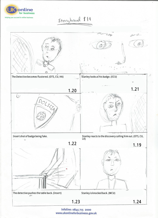
Film Narrative 2 (March)
This will talk about all the March work i have done for Film Narrative 2.

Finalized the script
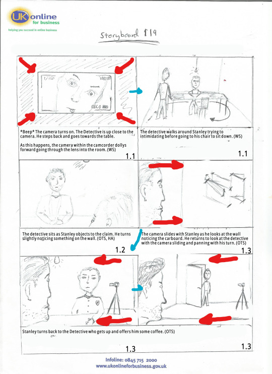
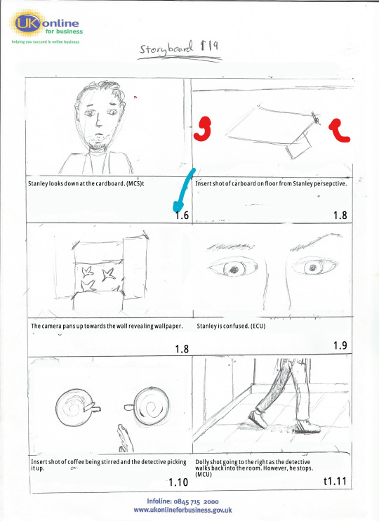
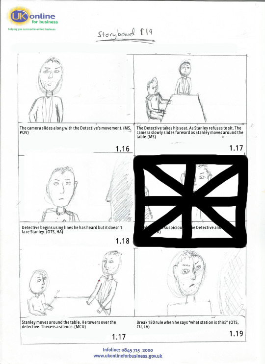
After many redrafts of our script “119! we have finally got a version of our script that we are happy with. Bonnie is the Writer of the group and she did a fantastic job creating a piece of work we are all really passionate about. We already had roles thought of however we solidified them shortly after handing in the script. We figured out our roles going forward and when we need to have our work done for each of the departments within the production. As I’m the cinematographer, I’m working on the Storyboard and Shot list.
My Work for the Fiction Project
Storyboard
I really enjoyed getting to do the storyboard. With no limit due to us not actually making the film, I was able to create shots I physically couldn’t do at the level I’m at, so it was a breath of fresh air. I spent a few days creating the storyboard and came up with about 40 different shots. Not only did I improve on my illustrations however it made me understand why filmmakers shoot for coverage. Instead of thinking of each individual shot and cut, I assume they just get the main coverage shots (Wide, OTS, etc.) and then get some insert shots that are crucial. Overall, that made me be more considerate of my time and work process.


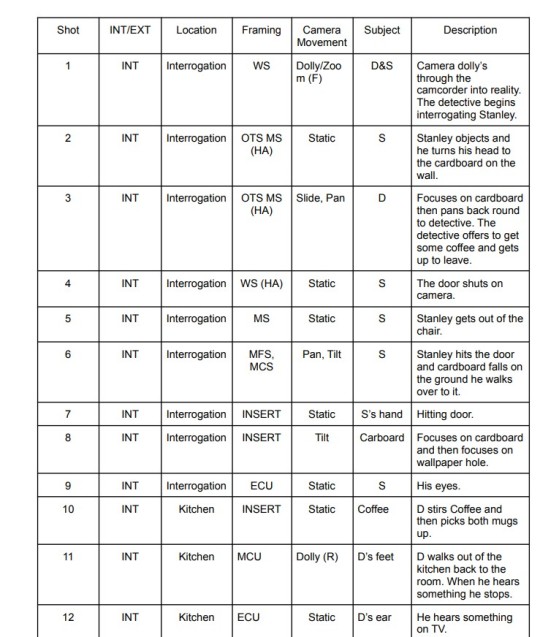
Shot list
I didn’t have a template for the shot list (or I couldn’t find one) so I came up with my own trying to get as much information as physically possible. I’m realizing now that I forgot to put in a legend. Something Jack (Director) suggested I will remember this for next time as it would be very helpful to those who aren’t sure what the abbreviations mean. A stupid mistake on my part.
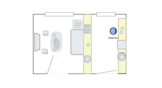
Lighting plan
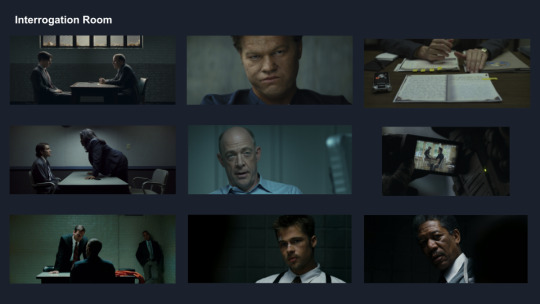
The lighting plan was interesting. We wanted to have a major contrast in lighting when the twist in our fiction project happened. So we were going for a very dark, gritty noir look when the audience believe it is a police station and then when the twist is revealed, the whole colour palette changes and so does the lighting becoming more high key than low. I looked at film inspirations for colour palettes (I’ll let you see which films you can spot in the images below :) )

Editing sequence breakdown
Introduction
We additionally, got to work on an edit for class. It was a short hospital scene in the film Lethe. Overall, I’m very happy with my edit I took advice from my group and went away to great an edit we were proud of. In the end, we created a total of three edits. I believe I create two different drafts of the edit.
Edit One
The response to my first edit was a lot better than I anticipated. In previous short films, I’ve done whilst there are numerous problems with everything I was always told that my editing isn’t the best. So I went off and did research and practiced on my editing skills taking up jobs on websites like Fiverr and editing people’s YouTube videos just to practice, However, what I realized when editing this short scene that it wasn’t necessarily wrong with my editing (There are things wrong though haha) it was how I prepared my footage for the edit. Rushing takes, making them shorter for actor and not looking at my script which in turn lead to many continuity mistakes.
The Lethe footage was of the full scene from several different angles and it was a joy to edit. I’ve never had so much freedom.
I’m going to go over some main parts of my edit.
(Opening vision) Inspired by one of my favourite shows “Attack on Titan” in the first opening of the show we see a dream sequence from the main protagonist who wakes up in a frantic panic. I didn’t initially think of using this idea. I knew I wanted to do something in that expressionist style however wasn’t sure how. So I researched and came across the shows opening. The reception to the opening sequence has gone well. The majority of people really like it and wanted to know how to do it. (I’ll describe in a moment xoxo) Some suggested it be toned down a tad. I can completely understand why they would want this and whilst I am already really happy with it I know it can be improved.
(How to do the opening edit) I used Premiere Pro to edit the footage. However, I believe this could be done on much less complicated editing software as it was mainly practical effects that sold the scene. The blurriness is all done through the camera (I believe this is through actually removing the lens to give it that distorted feel or possibly rubbing the lens in vaseline to make the image as smooth as possible (I am not the filmmaker however and these are just theories) Additionally, the editing is simply cutting on the beat of the heart scanner (which I found on YouTube) I also began rotating the image and zooming into to give a much more distorted feel. Then I boosted the grain slightly and then lowered the saturation to give it a washed-out look. The final shot was already slowed down however I took the audio into Audacity and added a low pass filter to make it sound muffled instead of slowed which i think came out good. Overall I’m really pleased with this edit and I can’t wait to make changes for the next draft.
I wanted to stick to mainly long takes and focus on the main protagonist. I recently watched Thunder Road and I was really inspired by Jim Cumming’s use of long takes as it grounded the film in reality so that is why I chose to cut a lot less than others. One idea was to focus more on the protagonist when the man (possibly Abe) sits down at her side. I have already shown so much of her and believe his performance is good however, most importantly I feel her dialogue wasn’t as important as his reaction so that’s why I chose to focus on “Abe” instead.
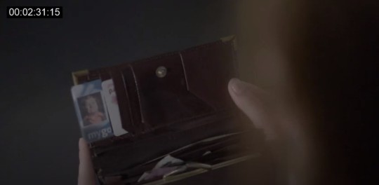
Towards the end of the scene, I foreshadowed many things from later in the script “The Watch” and “The Purse” reading the script I understood how important those items were in developing the story so I made sure to draw specific attention to them. I agree with the criticism that some of the insert shots last too long. So I’ve taken the initiative to shorten them.
Edit Two
Returning to the edit there were some things I wanted to change. Overall the reception of the original edit was good but there were crucial things that needed to be changed. There was an audio sync issue in one of the takes that when hearing about I had no clue what the teacher was talking about haha, but after checking it I think I fixed it. I hope I fixed it! Additionally, they asked me to tone down the opening shot which I did subtly. I’m very happy with it and the majority of people thought it was fine so when one person suggests I change it I’ll take it on board but I kept it closer to what I envisioned then dramatically reducing the effect. Furthermore, the shot of the wallet was too long so I shortened that and the shot of the watch was too short. I extended it but just to give some reasoning behind it, I have been watching a lot of Satoshi Kon, He is known for his unique style and editing. I wanted to see how short a shot I could cut for the audience to register. In hindsight I must have cut it too short haha!
youtube
My Teams work
Tom - He was the producer and the rock of the pre-production process. Whenever I was lost he was kind enough to give me a helping hand and his work on the Call sheets was fantastic. I believe we are working in the same group again for the independent project so I’m really excited about that (To be honest I could say that about everyone in this group haha)
Heather - Heather was the production designer, she was in charge of the mood boards and sketches. I’m really happy as well with her work the mood board is clear and concise I would have loved to see more of what she thought the scene looked like with sketches and her opinions on a colour palette but I think she thought we already had a clear enough idea.
Jack - The Director of the production. I’ve worked with him on loads of projects and he always seems to handle all the stuff given to him with ease. This production was no different I feel sorry for him not actually getting to direct the idea he came up with but I do think he enjoyed helming a great group.
Bonnie - I believe this is Bonnie’s first time writing. I don’t mean to say that as an insult because she did a fantastic job. She was passionate about her ideas, has a great grasp on entertaining dialogue and I just want to see more of what she writes.
Final thoughts
I think we created a solid piece of work. There are definitely flaws and obviously after seeing everyone else’s work you are going to think of things we could have done better. However, there is no point worrying about it now, I just have to make sure I implement it into the next project :) I had fun xoxo
3 notes
·
View notes
Photo
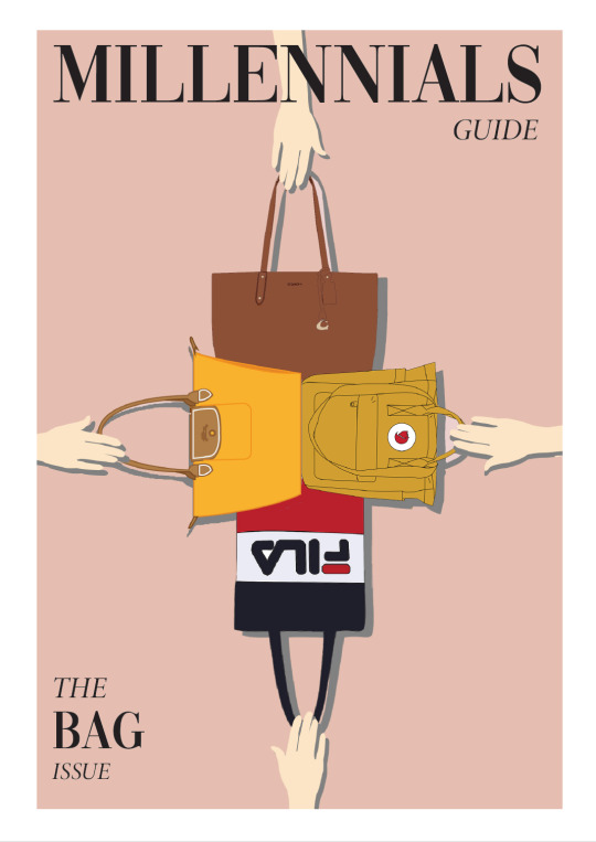


Final Group Project - Millennial’s Guide: Bags
For this project, my group decided to focus on different types of bags for young millennials around our age. We chose this as we considered that most of the millennials at this age are starting to/already working, hence, having a good quality yet affordable bag is important to them. Since the millennials are just starting to earn their own incomes, we thought of possible budget constraints and did not include the higher end luxury bags.
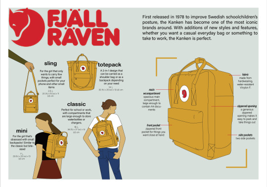
Initially, the group decided to work on Le Pliage from Longchamp, however, based on feedback, the scope seems too narrow and might only interest people who likes that brand. Therefore, we expanded our range by including a few more brands that we feel are useful to our target group. The additional brands are Fjallraven (kanken), Fila and Coach. We decided to split up the work by each taking up a brand that we are more familiar with. Since the brands all have different styles, we decided to make each spread according to the general styles of the brand.
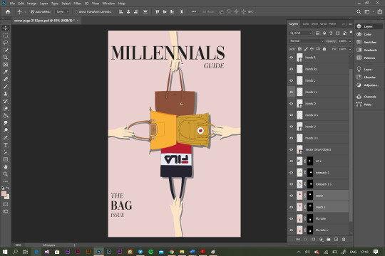
I gained from the sharing of knowledge among the group, as well as improving my designing skills and becoming more familiar with the various software. Prior to this module, I have zero experience using the Illustrator, Photoshop and In-design. However, through the various individual assignments, I learnt and explored the various functions, and able to decide when to use which software when designing. For instance, the pen tool at illustrator is the best to trace the bags, then moving on to Photoshop to crop and edit the colours. I also learnt how simple edits can easily change the looks of the whole page. Simply by adding shadows, the bags have a depth effect added to the page, making the page looks less plain.
Additionally, I learnt the importance of compromising during group projects and learn to look at things as a bigger picture. In my group, we split up the work that each of us takes care of a brand’s bags. Although we discussed the general layout and style for our spread, when we collate all for the critique, the guidebook seems more like a forced collection of 4 designs instead of viewing it as a complete book. For instance, the minimalist vibe of Fila is contrasted with the other brands who have more words in the spread. Although some designs might look nice if I add it into the spread, I reminded myself to always consider how it will look like as a whole book. Therefore, after looking at my group mates designs, I made various changes to the pages in order to ensure maximum consistency is achieved when we collate the pages. For example, I used to have a white border surrounding my model, however, I decided to remove it eventually in order to fit in as a whole, replacing the white borders with labels that explains features of the bag as what I got from some of the tutorial’s feedback. When we were working on our parts, I actively provided feedback in group chat when we share our designs, in order to ensure we have a sense of consistency for this guidebook.
After this project, I feel that one of the difficulties faced from our group project is ensuring everyone is on the same page and level of understanding. Due to Covid-19, the only tool of communication we have is through calls. As such, although we tried to discuss and standardize through the calls, there is still a limit for what each of us understood. It is only until we share our sketch that we realised what it means. To improve the consistency in the booklet, we agreed on changing all of our backgrounds to a pink tone palette, and having a brief standardization of our spread layouts.
In addition, due to the various commitments of different members, I volunteered and took up the role of reminding the group whenever we are near our submission deadline. I also volunteered to consolidate the prototype, as well as designing the cover page and provide suggestions for the introduction and content page. Initially, we missed out the second page and made the content page landscape. However, this issue is resolved with us including an additional introduction page before content page, based on the feedback received.
Generally, I think we work well together as we all finished our parts before the deadline. We came a long from from our first draft, with massive changes made after each feedback sessions. I am proud that we improved a lot since our critiques. Within the group, we help out one another frequently. For instance, I helped out to draw the coach signature bag when one of my teammate faces difficulties drawing with the Illustrator. However, I also noted that there is a limit on the amount of feedback I should give and it is up to them if they want to accept or reject the comments. I set a limit to my feedback as I respect that it is a group project and I should also respect the decisions of my group mates and their design styles.
In conclusion, I learnt the importance of having inspirations (being creative), ability to use the tools effectively and learning from the mistakes made. I used to forget to save my products in the indd file. As such, every time I need to edit, I have to redo the whole design. Now, I always save a copy as the various editable formats just to be extra safe. Also, sometimes after looking at the design for a long period of time, I tend to neglect certain parts of the details. Only through reading the various comments and feedback from the tutorial class that I realised I should modify some parts of the pages. Therefore, I conclude that one of the most important things when doing design is having an open mind. Most of the time, compared to the original draft, my final product looks nothing close to the initial sketch. The parts that I am thankful for are the comments and suggestions from the tutorial class that made me improve every time. It is the only way the designs will get better each time it is edited. Thank you!
1 note
·
View note
Text
The Golden Rules of Graphic Design
The simple design has a lot more to it than you might imagine. Although a device like the iPhone appears to be simple and inconspicuous to the human eye, a lot is going on behind the cover that most people are unaware of. They don't have to. All they need to know is that it will do what they want when they want it to.
A graphic design company face a difficult task in creating marketing materials that are distinctive enough for you to recognize and respond to. They must be specialists at reducing all distractions and disturbance so that what you see feels right and isn't confusing.
This is especially true when we have difficulty focusing and are bombarded with messages from diverse sources! There are some principles that graphic artists should never violate, just to be clear. Your visuals will be a hot jumble of fonts, colours, images, and graphics if they don't stick to the essentials, making your brand look incompetent, unreliable, and unpredictable. This will also have an impact on your product or service. With this in mind, we've prepared a list of our graphic design golden standards so you can spot well-thought-out and successful designs.
Rule 1: Stability is essential!
All of your branded materials should have the same format and appearance. Everything you put out there is meant to build a relationship with your potential customers, so assure it's relevant throughout your website, business cards, social media, brochures, flyers, and goods. Customers are going to be aware. They'll also receive the idea that your company is dependable and stable.
Rule 2: Limit the number of fonts you choose
It's quite acceptable to use two fonts. Maybe three, but more is confusing and difficult for your customer's mind to grasp. Most importantly, your main points - what you're attempting to say - will be missed. The goal of graphic design is to make what you're trying to express as plain and understandable as possible. If you use too many fonts, the design and the message you're trying to convey will become overly complicated.
Rule 3: Don't overdo it with the colours
Using the right colours can have a huge impact. Mixing it up with too many distinct ones, as well as utilising too many fonts, can be disastrous. Graphic designers will create a basic and consistent colour palette for the brand or business so that your message is obvious and understood rather than conflicting or disturbing.
Rule 4: Make use of white space
It's a wonderful thing to have some white space. It allows the design to take in its context and flourish. It's also another reason to avoid using too many fonts and colours. White space helps readers relax by reducing clutter and allowing their sight and minds to rest. The objective is to get rid of anything that isn't necessary so that the important elements are highlighted.
Rule 5: Ensure that design elements are properly aligned
Random design components littered across a page will make it appear as if you've never given the reader any consideration. When it takes little effort to position objects correctly, no one wants to see a jumbled and disorganised advertisement or flier. Consider how the material is presented to someone who is seeing it for the first time.
Rule 6: Correctly scale image dimensions
Experiment with image sizes and dimensions, but don't extend photos or logos to the point where they look untidy online or in print. Photos with distorted portraits or landscapes can make your brand appear amateur and as if you have no idea what you're doing!
Final thoughts…
It's never been easier to produce great-looking graphics and logos with the arrival of affordable design tools and creative platforms.
According to surveys, over 90% of individuals decide whether or not to buy a product or service based on its aesthetic beauty. That is why a graphic design agency in Dubai is so vital in influencing how people perceive your company. You can't afford to invest in effective graphic design, whether you're selling items, advocating social causes, developing brand credibility, or simply trying to attract new customers. Zapio Technology is a graphic design company in Dubai that has a high success rate in putting together graphic design studios in the UAE for their clients. Our result-oriented graphic design services will help you increase your marketing conversion ratios!
0 notes
Text
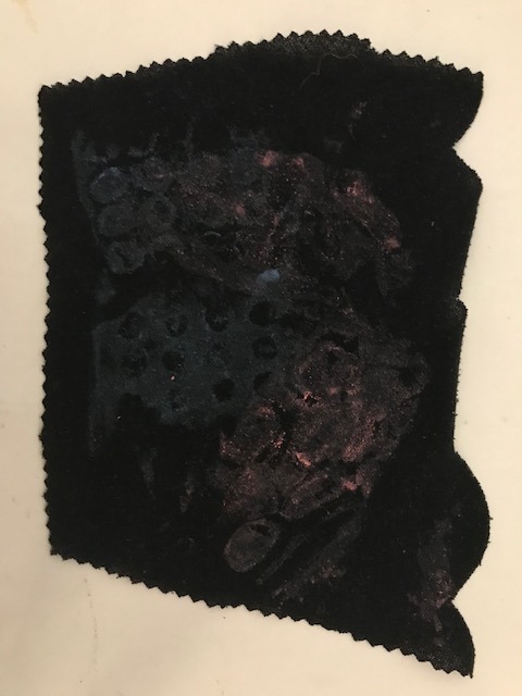
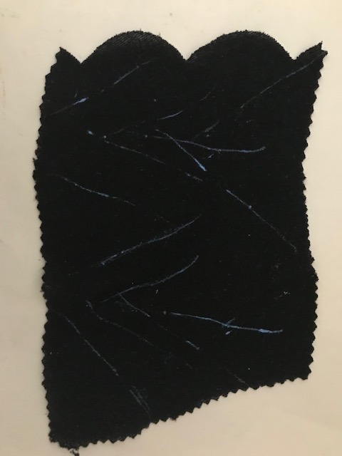
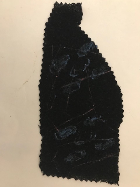
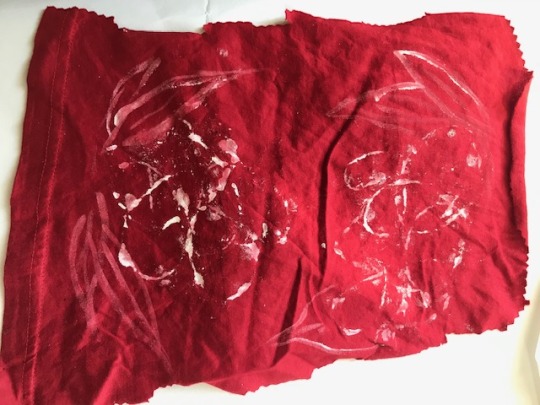
Textiles 2- Printing at home/ experiments
The Artist is Absent (Film, 2015)
youtube
At the start of our second lesson, we watched a short documentary, The Artist is Absent. The film explores fashion designer Martin Margiela, who made waves in the fashion world with his innovative use of materials. This includes creating outfits from plastic, rope and unique silhouettes with the way fabric was cut. Margiela was also resourceful, in which he would obscure model’s faces on the runway and in lookbooks as he couldn’t afford to pay for photography rights. This isn’t really ethical as it’s depriving models part of their pay- but was resourceful for his part. The documentary was quite interesting to watch though and inspired how we can resourceful at home in terms of creation, using what we have at hand.
Printing at home
Textiles prints #2
Following the video, we were tasked to print scraps of fabric (from old clothes) and print with objects around the house. We used acrylic for printing.
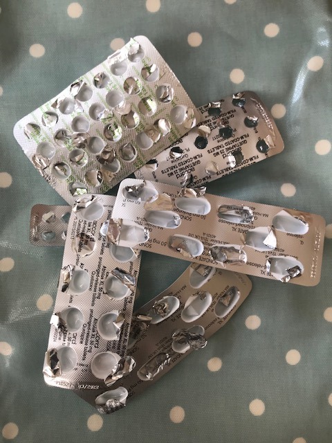
Empty medication packs for printing.

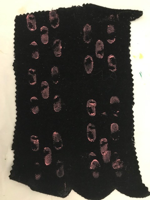
Prints made by placing packets on top like a stamp.
Print made by wrapping fabric around packets.
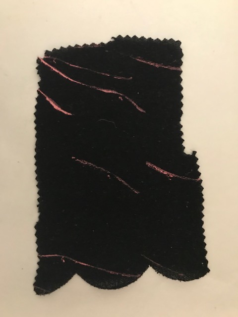
Prints made by printing side of packet and to resemble branches/stems
Wrapping packets around on lighter fabric

Stamp printing on lighter fabric.


Folding fabric, printing and then unfolding to reveal print.

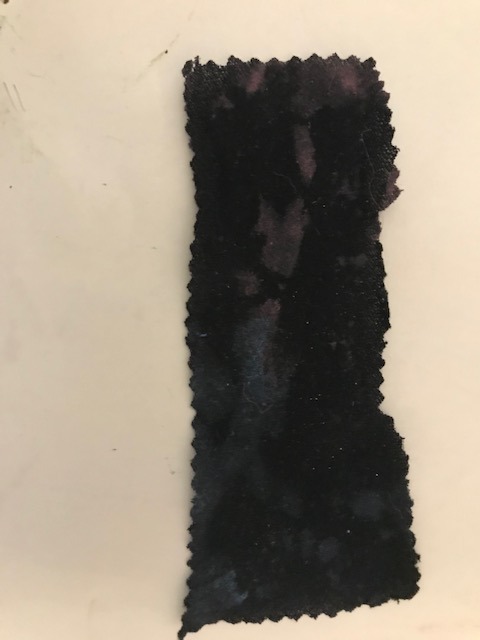
Wrapping twine around painting fabric with left over paint- essentially creating a tie dye effect.
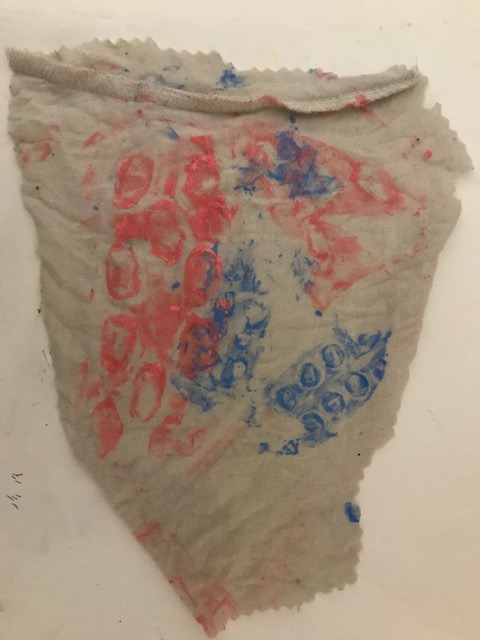
As I wasn’t happy with the first batch of printing during class, I did some additional ones- using my empty medication packets. This tied into my overarching themes of mental health and plants. I based the colour scheme of pinks and blues for visual contrast but also a play on using poppy happy colours while printing with antidepressant packets. I was a lot happier with these prints and how I explored ways of different ways of printing. I also really like how the medication packs looked painted and could look into ways I could use those in a future project, possibly for Unit 4.
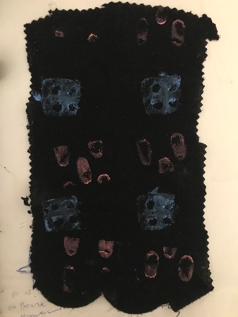
Textiles prints #1
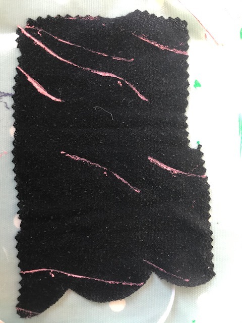
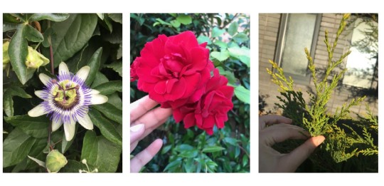
My first attempt for the printing at home exercise, we were required to use primary research as inspiration. I used flowers and plants I have photographed from walks.
Primary research used as inspiration for printing exercise.


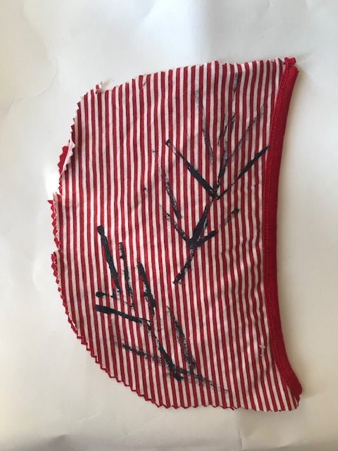

Mixture of ink and acrylic used.
I chose the passionflower and roses mainly but felt limited in terms of using colours as they were supposed to be from my primary research. I feel they do not look as visually appealing compared to my second try. However I did use different materials s to create shape including wirewool (didn’t work as well), string, plastic wrapper and a palette knife.
Raisa Kabir - Warping the borders, fringes; fractured… 2016. Whitworth gallery.
vimeo
For the final part of the class, we watched this performance piece by Raisa Kabir. At first I was confused by the piece and found the sounds jarring at first- possibly because I was tired and less receptive at the time. It starts off very disjointed but soon comes together into some sort of melodic chant. After reading the artist’s statement, I found I understood it better and the cultural and historical context behind the performance.
I unravel balls of white cotton - grown and spun in India, as well as using Bangladeshi spun yarn - around a series of warping posts that map out lines of geographical borders, partitions, links, and routes of pre partition colonial India. A series of windings that then draw red yarn across sites and boundaries of India, Pakistan, Kashmir and then the creation of Bangladesh through the conflict between West Pakistan and East Pakistan, a later by product of the borders created in 1947. Mapping conflict across these plains with warping a psyche geography. - Extract of artist’s statement, Raisa Kabir.
Reflection
Today was an informative lesson and I really enjoyed being able to do some printing, despite not being able to access the studio. It was good growth for me as well, where I wasn’t happy with my first prints; how they had printed and colours, so decided to try again. This led me to using my empty medication packets, which made some interesting prints and sparked ideas of how else I can use them within my art/experiments.
With the good news that we have been greenlit to go into the studio next week, I would like to try incorporate the medication packets with studio work in someway. I was also inspired by The Artist is Absent documentary, to use everyday or more unusual items with textiles- again leading me to printing with my empty packets. I also found the last part of the session challenging, where I did not understand the performance and had to read the statement half way through for it to make sense. I hadn’t really watched anything like that before but was good to watch as it shows that textiles and performance art can be an interesting and thought provoking combination. Perhaps this could be a combination to experiment in the future...
0 notes
Text
Branding Lecture
On Friday we were given a previous lecture again to make sure we really understood the objectives of the project. This helped as i felt our group may have been getting too many ideas with the need to use them all within the brand. We began to research certain competitors and trends that we felt relates to our ideas and could maybe take inspiration from. We were given a task within our group to look at one of the chosen brands and analyse each factor within the brand that makes it successful. This information can help us when choosing exactly how we want our brand to be perceived. While some member of the group were researching other competitors similar to our brand, Talia and I completed this task to present to the class.
Blog Task: The group and I have decided to look at the brand Savage x Fenty from the options we were given. We felt as though this brand is related to our vision of our own brand as they also sell loungewear as well as lingerie. I am going to cover three of the eight elements needing in a brand below meanwhile Talia covers the others.
Victoria's Secret should learn from Rihanna's Savage X Fenty show (insider.com) Accessed 5th February 2021
Brand Identity:
Just like any other brand, Savage Fenty has its own identify that helps them be perceived by a customer. When looking into the atheistic of their brand regarding what sort of colours and logos they have created it was all fairly basic. Their logo is not too complicated having black and white text which is blurred slightly. They use the X symbol placed in between the two words as a shortcut of identification as the name is quite long. It is easier to be identified by the letter and brands often keep logos short and sweet, so the customer is able to remember it. There does not seem to be any key colours within this identity as each time I’ve come across the brand the layouts have been in different colours. The main key shaped would most definitely be the blurred text and the fact the creator is Rihanna. I think this brand definitely users her high platform as an advantage when it comes to this factor. Many people would have heard of the brand from the creator which gives them an advantage as I think her platform prior the brand would help the success of the brand.


Their colours are fairly simple with shades of black and white with hints of pinks, red and purples. I perceived this as mysterious and sultry which ties into their brand nicely being a underwear business. It would be beneficial to keep this identity fair simple as they are able to explore their brand more than you would if you stuck to a particular colour palette. Savage Fenty do a range of products in a selection of colours which validifies their importance of diversity. Their main vison and purpose I believe is to show more equality within the fashion branding world and creating products suitable for everyone. Previously Savage Fenty have ran a runway show with a range of different models. This being size, gender identification, looks, disabilities etc which is unfortunately quite rare in the modeling world. It is more common to do this and I think this has been a key piece of the brands visual identification and engaging a wider target audience. I hope our brand could do this also as we are looking into having a range of different models also.


Promotion: Savage Fenty are good for reaching their audience. I think this is directed towards a younger audience and I do not see many advertisements oof this brand other than online. This is things such as YouTube ads, social media ads etc. I think majority of their promotion techniques comes from Rihanna’s platform and the links she has with other famous faces. There is a lot of famous models and singers who are ambassadors of the brand with millions of follows which increases the engagement of the brand. These people have a lot of tech within their job and is very online based. I see these ambassadors using their social media platforms to promote the brand by tagging them or ever recording a YouTube video based of the brand. This is a new but very successful way to promote and is the best way to reach an audience especially it being a online shop. There ambassadors have been people like Bella Hadid, Cara dellivene , the singer Normani and Kelahni , Cindy Kimberly etc.


Price: this brand is well known for offering discounts and other pricing strategies that would be cheaper for the customer. Things such as promotional codes, discount codes based on particular events or times of the year is useful to the brand. For example, new year discounts of valentine’s sales. They also have created a membership plan which enables a customer to register and receive special offers and price reductions on items. This VIP membership enables Savage Fenty to have frequent customers as the customer has to pay for this monthly offers of the items. This is a good technique for the brand however when looking on the site as the customer it can be confusing if you wanted to shop for their products less frequently.

Eg these discount offers which show up on the site straight away are only available for VIP customers which could be considered as misleading. You can’t see the regular pricing of the lingerie if you wanted a one-time purchase until you click onto the product.

Talisha’s Research:
CUSTOMER- Rihanna’s brand Savage X Fenty caters to diverse sizes and skin tones left out by the fashion and beauty industry.
size inclusivity- The brand proves that “one-size-fits-all” is a myth. The average US size sits between 16 and 18 and two-thirds of US women categorize themselves as a ‘special size’ (plus, petite, tall, etc.).With sizes ranging from XS to 3XL, seven shades of ‘nude’ and models from all shapes and sizes on the catwalk, Savage x Fenty positions itself as an empowering alternative to Victoria’s Secret, which has been struggling to resonate with consumers. Instead of proposing women to aspire to look like a supermodel, Savage x Fenty encourages them to look like the best version of themselves.
At the essence of all Rihanna’s businesses is the notion of inclusion and her lingerie encompasses this with extended sizing so women of all shapes can shop the same or similar product on one site. Rihanna adds a personalized touch to her brand marketing to ensure her fans are engaged. She appears among the cast of diverse models in her campaigns, communicates to followers about new products via Instagram stories. Following the rapid growth of subscription services in retail, Savage X Fenty also promotes a VIP program, giving members access to free shipping, special discounts and packages of exclusive styles curated by the singer.
The brand offers a membership program called “Xtra VIP” granting members exclusive deals and offers, early access to product releases and limited-edition boxes curated by Rihanna herself. “It helps to further connect with customers and create a community”, she explains.
https://fashionunited.uk/news/business/savage-x-fenty-one-year-later-what-s-rihanna-s-impact-on-the-lingerie-market/2019050643017
https://edited.com/resources/how-rihanna-is-slaying-the-lingerie-game/
PRODUCT-The brand initially consisted of 90 pieces that sold out online within a month. Now, it has expanded to over 800 styles currently retailing on the US site.
Since Savage X Fenty burst into the scene, there has been a 34% increase in the number of size-inclusive lingerie styles across the UK & US combined. Retailers are finally understanding that there needs to be a greater representation of sizes across products and in advertising. Savage X Fenty lingerie offers many flesh-coloured hues providing options for women of all skin tones. Nudes and skin colours currently make up 19% of the Savage X Fenty range retailing on the US site, including some recent additions. A new Instagram-promoted campaign, New Neutrals, has been launched adding the tones ‘honey’ and ‘brown sugar’ to several products.
PRICE- The majority of the range sits between the $20-40 price bracket with 32% priced under $20.
https://edited.com/resources/how-rihanna-is-slaying-the-lingerie-game/
PACKAGING-

https://www.elle.com/fashion/shopping/a26110076/savage-x-fenty-xtra-vip-subscription-box-launch/
PLACE- The company has also partnered up with online wholesalers Asos and Zalando. Online- own website, Asos, amazon, and Zalando Savage x Fenty hosted a number of pop-up stores last year. Rihanna to open Savage X Fenty pop-up in London
Once completing this task and the afternoon was near to the end, we gathered in our groups to look at particular trends on WGSN which we think we could base our product range off. We also discussed what we could do over the weekend that could help us validify our brand. I looked at a particular trend, and sushi looked at a euphoric , wanted to combine the both which is why I created a mood board . This helped me visualise what our brand could look like rather than taking notes all the time. Being a branding student I wanted to create this with the existing skills I learnt in the previous lecture. After researching savage Fenty we found their logo being most inspiring. I use of having two designs which convey the brand, that being the name and the letter X alone, helps gain attention quicker. It is important that if we were to have a longer name that we also have some sort of design which could be shortened and still be acknowledged as our business. For example; Savage Fenty having the distinctive X or McDonalds having the letter M as a way of advertising their brand.
0 notes
Text
Critical Reflection
Emily Knight 1011215
Sequential Image
The Morning Routine as a Sequence
Introduction
My main goal when starting this sequential image project was to pick a topic that all readers could relate too, as Martha Newbigging wrote ‘Telling our stories, repeating them by sharing with others, becomes a way of knowing ourselves and our relationships’ (Newbigging, 2018 para 8). I also wanted to use myself as a subject as my Observational and Experimental project was based around watching others and drawing their environments and surroundings. In this brief I wanted to observe myself. The morning routine as a subject met both these needs.
I also wanted to set my sequence in the morning as I struggle with tone, by choosing a time of day where light rapidly changes meant that being able to communicate time and tone become vital in telling the story of my frantic, fast paced routine.
Time and Panels
‘In the world of comics, time and space are one of the same’ (Mccloud,1994 p.100)
A mountain I discovered I would need to get over early on in this project was pace. More specifically how to show a quickening of time. And what tools illustrators use to communicate how time is behaving and what clues we can give the viewers about how time works within the confines of the pages.
To start with I divided my sequence into equal panels, spanning across three double page spreads. Within these panels I needed to show certain events, these where; waking up, using the bathroom, making breakfast, getting ready to leave and leaving the house. By dividing my pages into equal panels, I realised I had restricted myself and created a space where time was always moving at a steady, even pace. Which is the opposite to the frantic, quick morning I was trying to portray. It did not seem to matter how the character was acting within the panels, they were still being viewed as calm and steady.
When writing about the uses of panels, Matthew Sutherlin described new panels as causing ‘the brain to reorganise its understanding of the world through repetition and change’ (Sutherlin, 2012 p.20). I took this as by being more playful with the shape and size of my panels, I could control how quickly or slow the viewer observes time moving. For instance, ‘even though the long panel has the same basic meaning as its shorter versions, still it has the feeling of greater length’ (McCloud, 1994 p.101). The idea of repeating panels to slow down time helped me to communicate the sluggish, slow start to the morning as the character misses their alarm clock and appears to go back to sleep. This then raised the question of did I need panels at all?
Through experimenting with panels and pace I concluded that when I wanted to show the most chaotic, quick moments in my morning routine, no panels at all seemed to work best. Creating vignettes of the character interacting in the same space meant ‘The overlapping object pierces or violates the space of the other, but this also joins them together’ (Bang, 1991 p.86). These overlapping or touching versions of the character created a sense of chaos but also made each action they were doing seem rushed and overall quickened the pace of my sequence. I used this technique in my second spread, using no panels or boarders at all. I finally understood how I could convey time within my pages.
Line, Colour and Tone
‘White is effective, when used with restraint’ (Bang, 1991 p.40)
Now that I understood how to control the viewers perception of time with layout and panels, I now needed to illustrate the movement of time through line, colour and tone. The tone and colour of the characters surroundings at 6am would be quite different to the tone and colour at 8am. Also, each room in a house has different lighting, the warmer lights we have in our bedrooms are the opposite to the stark, cold lights often found in bathrooms.
As my book folded out into a map of me walking to work, I decided that observing and making colour palettes of the morning sky for the map would help me to understand how time would effect the tone of the inside of the house. If I could feel comfortable drawing the buildings of Norwich for my map, I could apply the same tonal principles to create a believable atmosphere for my character. Using similar colour palates for both sequence and map also meant that the two looked cohesive and like they are part of the same story rather than separate entities.
I found depicting tone and the change in light much easier on the map than the sequence. Although at first blending colour transitions was an issue on the map side, by turning it from landscape to portrait that issue was quickly resolved.
The biggest problem I was having in my main sequence was the darker panels showing the character first waking up, where rich in tone and atmosphere but as soon as the bathroom light gets turned on, I lost all tone and it was reading as flat and one layer. My technique for the darker panels was layering dark blue acrylic with navy inks and finishing with deeper toned pencil crayons. However I was using only one or two layers in bathroom scene, and felt restricted as I wanted it to have a cold light but felt the more layers I built when creating the room, the more I lost the artificial, stark light feeling.
The breakthrough came when I started to use vignettes and no panels. Instead of showing tone in the walls of the room and trying to create a believable space, I made a room with no walls, start or end, and gave tonal range through the character and the objects she interreacted with. By trying to give everything a tonal value I had made the world flat and had taken the main view off the character. This new composition was less restrictive; the room had a strobe light feel but the character remained warm and her space relatable and homely.
How the character moved in the space was particularly important to again show pace. The shapes the body was making added to the frantic movement and atmosphere. Looking into shape and line really helped as the character evolved from draft to draft, the more exaggerated the more hurried the character seemed. By putting her limbs at extreme angles or overly elongating her arms and legs meant the character seemed to have more movement, energy and be in complete pandemonium. Molly Bang wrote ‘Vertical shapes are more exciting and more active, vertical shapes repel against the earths gravity. They imply energy and a reaching towards the heights and heavens’ (Bang, 1991 p44), which explains why the more vertical, harsher lined character worked better in my sequence. I then carried on using this way of drawing the character for the map, not only to make them link but to also show that just because she has left the house does not mean that she is in less of a hurry or the pace has slowed.
Conclusion
Although I am not pleased with all my final artwork in every panel and spread, I feel like this brief was more to do with trying to understand sequence and the ways to tell a story through that. I think through experimenting with panels and layout I have been successful in illustrating a quick, hurried pace. Having my peers read my images at the speed I intended, shows that the purpose of my sequence was successful. Learning the ways others show the movement of time and pace has been so interesting and will hopefully make me a better storyteller in future briefs.
I also came into this project still a little scared of tone. I knew that by setting the sequence at a time of day where light changes so rapidly I would have to finally overcome this fear. Through continuing with observational drawing and bringing my findings into my fictional house, I think I am more confident in creating tone and see tonal drawing as less charcoal and rubbers and more whatever you want it to be.
I first used the layering of paints, inks and pencil crayon in the observational experimentational brief and I wanted to continue to use it in sequential. I have really enjoyed this way of working and learning its limitations and effects. It made me be more selective with colour but also experiment more in order to find the colours and textures I really wanted to use. It is making my work naturally evolve and I am excited to keep going.
word count 1426
0 notes
Text
REFLECTION WEEK 20 (1st march)
Started this week off with a group silent crit, was super insightful to hear their ideas of what my work meant and possible directions, suggested to explore this relationship with kitsch? Do I make my intentions of what I am trying to achieve with the artwork more clear or more elusive. They understood concept of world which was reassuring. See more below.
Finished website: available at gabrielacohen.com
New paintings: Butterflies, acrylic on board with glitter, A4, and Owl acrylic on board with glitter A4. Intention: owl for friendship- Sam and I have been working on owl paintings together before, this became a symbol for our friendship. My mum has always used butterflies as a metaphor for distraction- ‘butterflying around’ goes way back to my childhood. Fun exploring these symbols with their very ambiguous meanings- diary in the sense they relate only to me.
Successful: limited colour palette- strong theme developing for my world, new motifs for friendship and distractions. Use of glitter to add idea of out of this world.. not real owls or butterflies. use of same black background to unite paintings to the same place.
to work on: develop further, is there too much empty space? can i make it more intricate/ detailed? expand the world. I am planning a painting for next week.
Artists: looked at Tessa Farmer this week and her use of actual natural material in her work to stage and invent new realities. This use of bugs came to me as Dominic pointed out that my use of fake ants added a tone of satire which was unintentional. I mean for these paintings to be taken very seriously and maybe I could achieve that better if I were using real bugs? This is something I need to explore.
Technical proposal form highlights my ideas for final stereoscope in more detail, see below.
next week: I need to work on my artist statement, execute painting I have been planning.
0 notes
Text
Sketchbook Weekly Summaries and Page by Page Analysis
Ba1B weekly summaries- Sketchbook Weekly summaries / Page by Page reflection
Week 12
Day 1 -sketchbook project
Today I had a workshop on the sketchbook project, this introduced me to the brief through a series of exercises to show examples of how I could fill a sketchbook.The main impetus of this lecture was to draw from life and then develop further using observations possibly turning a real person into a character or an animal into a character. The first exercise was to create drawings from a series of ink blots from the page , I liked this exercise due to the endless possibilities I could create through the way the shades of the colours were on the page.The next exercise was to create a four stage scene with a clear beginning, middle and end about the morning I had before arriving into university.The first scene was of me still dreaming and being prepared for the today , the next scene was me waking up in a panic and rushing to get ready and the final scene was me spilling milk all over the kitchen counter as I was rushing.This exercise shows how you can clearly derive stories from life and twist them to best fit an audience or outcome. The next exercise was to draw from memory a series of objects and animals the most important of this was the bear ads initially my bear looked quite cartoon like as I had no understanding of the form and anatomy of the bear itself. It was not until I watched and studied the motion of the bear I understood the anatomy of it and the further drawings of the bear became more and more refined for the final character I produced.I found that drawing the motion of the animal or object gives the best understanding of the animal or object itself as all angles are seen.This had more weight and value than that of a still image as you can only see what is present and not the inner workings or how muscles react and move with each other .For instance in the bears case its back legs were at first problematic as they are much larger than the front legs.
Week 13
Day 1- sketchbook project
Today I had a workshop revolving around a trip to norwich castle to create some on sight observational sketches of some of the exhibits and the people within the castle itself. I found that instead of focusing on the individual aspects of each exhibit like one single bird I should look at the entire composition in relation to where I was standing. I was intrigued by the bird section of the museum as after watching videos of how parrots movie in the wild I had a theory of how although birds look differently they have the same anatomical structure. For this I drew multiple angles of a wide range of birds and distinguished they all have similar breast parts were the neck links the body to the head this was especially evident in the pelican and ostrich part of the exhibition.
Day 3- Sketchbook project
Today I had feedback on my sketchbook so far I found that the best work in my sketchbook is the development from observational drawing to character. Robert said that I should continue doing this especially with the parrot design. Also I should look at using this for further character development so I decided to look at wolves as I feel like I could subvert preconceived views on what a wolf character should look like.
Page by Page reflection
Sketchbook analysis
Pages 1-3
These pages of my sketchbook show observational drawing form the first week of the project brief. Two of the drawings were observational sketches of people when I was on the train home for Christmas. I used the initial pages to warm myself up for the sketchbook caring more about filling the page with quick sketches than more detailed studies. The first page is a quick sketch of an old man waiting for the train I feel like I captured the emotion the man was depicting through him waiting patiently, however the proportions of the figure are exaggerated as. I tried to turn the man into a cartoon characters. The second page of the sketchbook was the best sketches from the bear exercise which was completed in a workshop. The workshop focused on the movement if bears through watching a video of bears in the wild. The third page is a sketch of my friend Ben on the train it focuses heavily on the routines of his face and with the use of limited lines it creates a simplistic style however there is certain rigidity especially around the hands.
Pages 4-5
https://www.youtube.com/watch?v=1xYpn8HNYEg
These two pages focus on the wild birds of the outback in Australia. I watched a national geographic film on the birds of the outback and decided for the first page to focus on the movement of the birds and quickly sketch how they move to fully understand the form.The later page shows more detailed sketches of the parrots. I found that the different breeds of birds had very similar features around their beaks as they split into two parts, an upper and lower part which has a glossy surface.
I used coloured pencil to show the wide array of colours of these birds however found it extremely difficult to judge what tone to use and shading technique to best display the feathers of the birds.
Pages 6-7
Pages 6 and 7 focus on Belgian artist Dzia uses geometric shapes and lines to create unique decisions of animals. Theses animal include Birds , foxes , octopi and rhinos.
Dzia uses a variety of different media in his works from stencils ,paint and sculptures to street art and graffiti. Dzia's murals are seen across wide ranges of European cities as he is well known in the urban art scene.
His work inspires me as by splitting the body parts of animals into geometric shapes but never truly distorting the form shows the careful selection and urge to show details of the animal itself.
His use of colour also inspires me as it appears as a washed out palette most likely achieved by water colour however as it is spray paint the tones of the birds for instance are highlighted to greater effect giving larger visual impact making them stand out against the medium of the wall.
New ideas come very easily to me, so my work is very spontaneous – I paint quickly and in-situ to make sure the original idea stays true to its form.” - Dzia -
https://dzia.be/WHO-IS-DZIA
I feel like I can use this type in my work for future animations and artwork as by splitting the characters up into these geometric shapes I could use the lines of the shape to morph and bend the character in new ways. Furthermore , this style could be used for backgrounds of scenes and could be used as lines of focus to direct the viewer to the most important images or actions in the shot.
Page 7 uses the sketches of the outback birds and incorporates Dzia’s style in them this inspired me for future animations as the lines and geometric shapes could move and morph to either create backgrounds or enhance the characters aesthetic onscreen.
I used acrylic paint to create similar colours to Dzia’s work but also maintained the same colours which are present in the national geographic video wild birds to show continuity within the sketchbook. I found that the first test worked better than the second piece as I incorporated fine-liner to create the geometric shapes instead of the black paint I used in the second design.By using fine-liner the line of the shapes was thiner and created more of a contrast on the page rather than the thicker lines in the second iteration.The thicker lines overpowered the simplicity o the design an detracted the viewer from the piece as the other colours become bare visible on the page.
Pages 8-9
These pages show the development from the looking at real life parrots in previous pages and converting them into cartoon characters. I decide to try different styles and form when generating the characters. I found that I wanted to portray a proud parrot with a messy hair styles as parrots are synonymous with repeating what humans say so I wanted to incorporate this personality in my design.I chose a proud stance and gave the appearance that the parrot was singing with wings spread wide. I looked at the film rio for inspiration in characters design due to this film being the only film that has portrayed animated parrots in a variety of stances and emotions.
I found a character I was particularly fond of and decided to explore this parrot further by adding acrylic paint and distinguishing a clear colour palette for the character. I wanted the colour of this parrot to resemble the parrots from the Australian outback so went with a vivid green colour scheme , with yellow beak and red accents to draw the eye. I find that this design can be explored further with series of posing and emotions shown on a character design sheet which is explored later in the sketchbook.
Pages 10-11
https://www.youtube.com/watch?v=ASc-RFofxgM
These pages focus on mountain baboons as I watched another national geographic film and focus on both sides of the baboons personality.The baboons has two main personality traits the dominating territorial baboon and the family orientated baboon. I wanted to understand how the baboon moves so decided to draw images of how they stand and attack when they are territorial.This led me to look further into the movement of apes and ultimately Andy Serkis.
Page 12-13
https://www.youtube.com/watch?v=DpRLTfVEhMk
https://www.youtube.com/watch?v=1qMmPSSN2-Y
https://www.youtube.com/watch?v=oPcwa78JcKY
Andy Serkis is an English actor and film director. Best know for roles as Gollum from the lord of the rings trilogy, king kong and Caesar from the planet of the apes. His work is mainly involves motion capture techniques and cg and for the roles he plays he studies a great deal of animal movements and their forms.
Serkis places large amounts of thought into the way his characters move for instance while playing the role of Caesar and kong he studied the movements of gorillas and other primates in the wild establishing a walk that is synonymous with the character.This also helped influence the movement of Gollum as with him being a highly corrupted figure who walks on all fours studying how a primate would move establishes the animalistic qualities that Gollum posses.
I feel that Serkis influences me in the way to look deeper into how the movements of the animals may help
influence the future characters and walk cycles that I create. This broadens my thought process with developing characters because it establishes a grounding for how the muscles would move in the body of an animal for instance and would lead me to create a more realistic walk or movement cycle.
I also looked at Serkis’s role as Gollum and did a movement study on how he moves in the hobbit and the lord of the rings. Gollum has ape like movement as he walks on all fours and grovels and squabbles like an ape when they are angry and territorial especially like a baboon.
Page 14-19
These pages focus on the castle and museum trip and workshop with quick studies on exhibits and people within the museum. I tried for the majority of these pages to quickly draw the people moving within the exhibitions as well as making sure that perspective within the drawing is created.I also became fascinated with the bird exhibit and found that instead of focusing on the individual aspects of each exhibit like one single bird I should look at the entire composition in relation to where I was standing. I was intrigued by the bird section of the museum as after watching videos of how parrots movie in the wild I had a theory of how although birds look differently they have the same anatomical structure. For this I drew multiple angles of a wide range of birds and distinguished they all have similar breast parts were the neck links the body to the head this was especially evident in the pelican and ostrich part of the exhibition.
I also looked at the tiger and lion exhibition in the museum and focused on the teeth and facial features of these cats and found that there is a black lip which runs along the bottom of the gums. Tigers also have a different sized head to lions as there is more of a slope to the nose of the tiger the there is to the lion.
Page 20-21
This double page spread focuses on the paint doodle exercise were a series of watercolour paint is placed on a page and I have drawn a series of characters or doodle over the top using the shape of the paint when it has dried.I find this exercise to be ye opening to new character concepts and I found a new dinosaur character that I would like to explore further in future pages of the sketchbook.
Page 22-25
These pages spread focuses on Vince Okerman also known as the youtube illustrator and doodle artist Vexx uses colourful compositions of cartoon characters and objects blended with realistic observational drawings to draw the eye of his audience.
Vexx’s style uses comic markers and fine liners to enhance his unique style.There are no gaps in his work when creating the composition giving the effect of an explosion or cluster of his characters on the page.Each character seems to be reacting to one another and the environment around them with the wide array of facial expressions and actions taking place.
Vexx’s characters and doodles build up the rest of the form of the observational sketch. For instance with the tiger piece the characters build up the rest of the shape of the neck anyhow how there is a clear metamorphosis between the contrasting art styles.
This has inspired the way I work through the use of colour and the actual art style he uses due to the simplicity of his doodles.This gives me inspiration through by having a character so smile It make them easier to animate as I struggle with consistency from frame to frame. This art style would also appeal greatly to children due to the bright and bold colours used with contrasts being created through the composition and placement of all the characters on the page.
I decided to create a series of doodles inspired by Vexx’s style I found this quite liberating as I was able to incorporate multiple elements into one drawing .I especially enjoyed the lion drawing as I had studied lions from the norwich museum trip. This trip then gave me the grounding to fully focus photographs of the Lions to fully develop their form. The blend between pencil and fine-liner contradict each other but add a cohesive uniformity to the piece itself.This piece blends the natural life of a lion to the cartoon imagination this helped me understands how the boundary between life and imagination can be bridged both in animation and in art.
Pages 26-27
The next page revisits the parrot character from the studies from the national geographic film and develops the character further as I received feedback from Robert to create another double page spread on the character. I heavily took inspiration from rio the film on this page trying to incorporate some of the posing from the film in my character . I found that my character would embrace the repeating tone a parrot and give the character a fun personality as he is outgoing and over the top.
Pages 28-32
The next pages uses the study of Yellowstone’s wolves to develop a character revolving around the nature of the wolf. Initially I took the same approach as the parrot and baboon studies creating quick sketches around the movement and form of the wolves.The next pages adapts the structure of the wolves to incorporate larger eyes to give a cartoon style.I realised that I wanted my wolf to stand up and be sophisticated so I veered away from the traditional form of the wolf.As the character is sophisticated I gave the character a robe and a cigarette to emphasise an aristocratic nature of the wolf.
Personal sketchbook
These drawings are found in a separate sketchbook where I try to explore a variety of different characters concepts swell as recreating the styles of famous characters like the drawing of Hank from finding Dory. I tried to draw as much as possible so these drawings are completed after work was completed for the day and I had free time. I looked at a wide range of animals like lemurs, sloths and monkeys as I want to develop characters in that area. In addition I found myself wanting to come up with interesting concepts such as the robot on the rubber dingy this directly contrasts what a robot does as if he fell in the water he would short circuit.
The next pages are improvement pages revolving around figure drawing. I watched youtube videos to give me the poses and tried a series of quick sketches lasting one to two minutes and longer sketches which were five minutes. I tried a new medium when doing this as I used ink and a calligraphy pen as this eliminated the use of a rubber. I am trying to move away from using the rubber as I become fixated on the perfect drawing. By doing this I create an imperfect drawing but as each drawing is completed I will improve with practice. The last drawing was inspired by Ben Su a Pixar animator who uses figure drawing in all aspects of his work.
0 notes
Text
BA1b Summary: Week 4
Animated Sketchbook
This week in Animated Sketchbook, I’ve begun developing on the drawing tasks introduced previously and introduced to the idea of spatial awareness in drawing. Last week, I established my interest in motion referencing (quickly sketching images from a video) in order to develop my understanding of a specific animal over time. I decided to tackle another animal this week: the snake.
The independent session began by completing some quick sketches of what I thought a snake looked like, going through a series of poses that I personally assigned to a snake. From this, I then watched some visual reference of various snakes through imagery and film, and quickly sketched from this. These sketches were much more successful, as I’m beginning to develop an understanding of the creature’s shape and form.
We also had the opportunity to visit the Norwich Castle, drawing on-location as a way to observe, record and study subjects and our environment. The session asked us to step out of comfort zone, drawing people and objects in public and acquiring visual experiences. This was the main takeaway from the session: not to go out and create a singular realistic drawing, but to explore a form through quick, explorative sketches.
When looking at an object, I should try and find any straight lines and effectively ‘box in’ my subject. This helps the brain and eye see it in a three dimensional space, and thus I can begin to sketch the object too. This idea of ‘thinking inside the box’ was actually a revolutionary idea for me, and I can completely see how it helps in perspective building. To complete the day, I created a few quick sketches observing a very interesting-looking bird, sketching from different angles in order to take in the entire form. These were more interesting, I feel, as I’m exploring a complex animal form.
In this session, I learned a quite interesting and novel idea: when drawing on location, and from observation, capture the subject, not the image. Through this project, I hope to challenge and work upon this idea, developing my drawing skills.
Digital Principles
This week in Digital Principles, my focus was on experimentation and colour. My main goal for the week was to experiment in the 3D workspace of After Effects, to begin putting things together for my morphing animation.
Through my experimentations this week, I was finally able to decide on a colour palette - pulling from the dark, deep tones from inside the Shell and reworking them for both the alien language and the ship itself. It’s a limited palette, almost entirely monochromatic, however I feel like this will work very nicely and allow the transitions of the morphing animations to be more easily understood and followed.
Following this, I decided to do some more visual research: looking back at the film, and most importantly, concept art. My research led me to exploring the work of Meinert Hansen, a concept artist who worked on the film in it’s early stages. It was mainly his Shell Interior concept art that I looked at, which presented the set with visual clarity, texture and a real depth. Looking at these artworks led me to take an entirely different approach to my opening sequence - one which challenges my skills in After Effects and Illustrator.
Whilst researching the industry of motion graphics, I found the work of Emanuael Colombo, an award winning motion designer based in Milan. I did a little bit of digging into the artist’s process, which starts in Illustrator to do most of the actual design work.
Whilst my initial approach to the first sequence was very minimal and geometric, I now wanted to produce two digital illustrations of the Shell’s interior, and have a digital camera pan through, in a paralaxxing motion. Although this is much more intensive, this week we were given a deadline extention: due to absences and other occurrences, we have been afforded the luxury of a later deadline for this (and the sketchbook) project. This means that I have a little bit more time working on the animation, (hopefully) allowing me to produce a final outcome that I’m happy with.
I’ve made two illustrations that adhere to the sleek, minimal and flat design language inspired by my motion graphics visual research, and challenged myself to move past a strictly linear and simple approach to this sequence.
Additionally, after playing around with a 3D replication of the Shell, I’ve decided to focus on a 2D approach to this project. Whilst experimenting in the 3D workspace has been exciting, I can’t help but feel like I’ve reached the extent of the extrusion 3D effects potential here.
Next week, I want to begin designing the props of the sequence in Illustrator using simple shape layers, a flat design aesthetic and my new colour palette.
Narrative Research
This week’s Narrative Research session took a step back from introducing new ideas and concepts, and instead asked us to develop our understanding of theory that we’ve already explored. In this case, it was applying our knowledge of the Seven Character Archetypes as described by writer Christopher Vogler and exploring how the character’s in Pixar’s Up fit these roles. The task was to produce a plot summary, and analyse how the cast fit the archetypes, in a written analysis.
We were shown the film in class, and I took this opportunity to begin writing my analysis straight after the ending credits began rolling. As the film is relatively short, we were afforded a bit of time before class ended, and I could complete my written analysis of the session. Not only was this an example of good time management on my part, it also allowed me to discuss the film and it’s application of Vogler’s theory with my peers. This ended up shaping my final written analysis, an amalgamation of my ideas and the concepts suggested by fellow students.
When writing up my initial plot synopsis, I decided I wanted to push this task further by analysing the narrative using Vogler’s modern adaptation of Joseph Campbell’s mono-myth, the Hero’s Journey. In doing this, I’m not only challenging myself, but developing my understanding of narrative theory beyond what’s expected in the session. It was interesting to see how easily the film followed the plot structure, but naturally. Pixar subverted the audience’s expectation of the mentor character in young Russel, the little boyscout who rekindles Carl’s liveliness. In an ordinary narrative, the mentor would typically be an old, wise man to a younger, plucky hero: however, when the hero is an old man, this concept is instantly flipped on it’s head. The plot is appealing, engaging and exciting: very much driven character-drive, and I find it hard to believe the talented writers at Pixar would have followed such a rigid stricture - hinting at the fact that the mono-myth may be intertwined with Western society and our idealism more intimately that previously thought.
This session was helpful to those considering exploring the Hero’s Journey as an essay question: a subject I’m heavily considering given my new-found choice of Spider-Man: Into the Spider-Verse as subject of study. The film centres around what it means to be a hero, and so analysing the film with this structure (and character archetypes from said structure) is something I will definitely be doing when gathering research and information on the film.
Despite this, I have considered a few animated films to analyse for this essay. Next, I will begin writing these notes up as a way to evidence more than one approach to the task, and how I reached the conclusion of Spider-Man: Into the Spider-Verse.
0 notes
Text
PORTAL - the art expo
Autumn had arrived, and the brisk wind was blowing leaves to my feet, that were taking me to my university campus. It was late September, and I was about to start my third and final year of university. I knew there would be a lot to do, but I was well prepared and quite excited to be closing this chapter in my life. I wanted to enjoy everything it still had to offer.
It was Thursday, and on today’s lecture we would be talking about our upcoming exhibition. I was dreading this, because I know in my class there are some very hard working people, but there are also some, who don’t even bother turning up to lectures, and since we would be putting up the exhibition as a class, I feared the effort put in would be unequal between everyone.
I pushed the classroom door open and walked in. I found myself a seat by my friends, who greeted me happily. We were chatting about our summers, and as our lecturer walked in, we all grabbed our pens and notebooks; it seemed everyone was excited about putting up an exhibition!
The class started by going through the requirements of the module, and we looked at some examples of exhibitions done previous years. I had visited most myself, and I was trying to remember what worked, and what didn’t.
We got straight to business on this class, and started by thinking of a name and a theme for our exhibition... Everyone in my class has quite different style and brand, so fitting them all together requires a broad theme. We started by looking at some ways to produce artwork for the exhibition, and something that would be new to some level, and definitely exciting. We came across AR (augmented reality) while researching exhibitions, and as the thought was thrown into the air, everyone quickly caught it and it was very much liked! Personally it scared me a little bit... I have done GIFs before, and it has never been simple or easy, so in case we would use AR, it would requite a lot of thought to be put into creating the work; more than usual I mean.
After a short break, we started to divide our class into groups. There was a list of roles that required filling, and everyone got to put their name down on one group, that they would most like to be in. I thought this was a very nice way to do it, because it meant that everyone would be able to choose a place, where their skills would be most useful and where they would be the most comfortable. I didn’t put my name down at all; I thought every role has it’s good and bad sides, and everything would be as important, and I trust myself enough to be able to do any role well. I was ready to put my all into this and make sure, the exhibition would be amazing and a good experience for everyone.
After everyone had put their name down, some evening out needed to be done. I was put into the curation team, as it needed more people, and I was quite happy with this. The curation team would be in charge of writing a brief for the whole class and make sure the theme is cohesive. Curation team would also decorate and hang the artwork up at the exhibition location, which was still to be decided.
Now that everyone had in their teams, we started to make a list of possible names for the exhibition. We all wrote down some name ideas, and gathered them all to one list. Then we started cutting them down by voting favourites and in the end only one remained... Portal.
I thought it fit our class perfectly. I think while deciding it, everyone was thinking AR, because even though it hadn’t been said out loud, I think we all were imagining in our heads that we would use AR in our exhibition. And then someone said the common thought aloud, and it was decided: our exhibition would be called Portal an would include AR. I thought it must look amazing when ready, and couldn’t wait to get started.
Me and the other curation team members made ourselves a chat on Facebook. This way, deciding things would be much easier, and we could discuss everything outside of university too.
Now, we would need to create a schedule for the exhibition; both as a whole class and in our curation team. The most running thing was to find a venue for our exhibition, and everyone started to think about possible locations together with the location team, which would arrange the venue for us. We started making a list of venues (cafes, empty exhibition spaces, etc) for the location team to contact, and hopefully by the next weeks lecture, we would have a venue for the exhibition.
I was also thinking, that in a few days it would be a good idea for the curation team to start asking, what Portal means to everyone and how they see it; special wishes for the brief, absolute no-nos, and so on. We couldn’t do much before finding and deciding the venue, as curation would be working very closely related to the space itself. The size of the space would also set limitations to the size and number of pieces, that could go to the walls. So, finding a venue was a priority.
The next day we already had a long list of venues on a Google drive document, and the location team was sending all the venues messages and paying them visits. I and the rest of the curation team wrote a message to the group asking everyone to email either me or another member of the curation team (R we shall call her) any special wishes or what they would like the brief to include. The curation team was hoping to write the brief on the upcoming Monday, so it could be handed out to everyone on Tuesday.
The message also sparked conversation about other things and it was decided, that the design team would plan colour palettes and ideas for logos, so we could also vote on them and let the promotion team start posting images on social media. R took notes of everything that had been talked about, and between the curation team, we would use the notes to write the brief. Everything was going well so far, but there was one person in the group, who was hitting the break on every suggestion. It annoyed me, because it felt like she wasn’t even willing to consider doing things in some other way than what she wanted. Of course I understood, that she wanted the exhibition to be successful and everyone to have fun while preparing for it, but she annoyed most people on the class by being extremely inflexible.
Some drama might be sensed...! In the next post, I will tell you about preparing for the exhibition, and how I felt while trying to get everything done; curating and drawing wise.
0 notes
Text
Bungo Stray Dogs Season 3 is now over. As much as I miss it, I do like the freedom of not having to go home on Friday evenings to watch anime and write a review for the next day. It really does tie up my going out time. Ever since I started doing episodic reviews I keep telling myself never to do next day reviews…. So OF COURSE, I pick 3 shows for my Saturday post that all air on Fridays… Brilliant!
GRANBELM (Under a Blood Red Moon)
What I knew/thought before seeing the show: I knew next to nothing about the series literally only the title and the Crunchyroll thumbnail. My reasoning for picking it was “I like pink haired heroines”
What the first episode was about: A pink-haired heroine named Mangetsu goes out one evening and gets stuck in a virtual world where magical girls fight with mechas because reasons. She’s very energetic and optimistic about it.
Characters so far: We didn’t get much development since the episode was very action heavy. So far they are pretty shallow but not unpleasant. The two main characters are Mangetsu which is a genki girl archetype and Shingetsu which is a mysterious stoic archetype. I actually liked Mangetsu’s sister the most be we only see her in one scene at the beginning of the episode.
Technical aspects: The designs are cute and I enjoyed the art style. The limited palette establishes a visual identity pretty quickly. I immediately understood something ominous was going on from the colours alone. I was reminded of Yuki Yuna for a while. The voice acting is ok so far and the animation is good but a little jumpy. It comes in spurts.
First Impression: I had a good enough time watching this episode. I enjoyed the first half more than the second but I would continue watching this series based on the first episode. I really don’t have that much to say either way.
Hopes and Fears: I’m enjoying the Magical Girl/Mecha mashup, it’s an interesting genre. The world building has potential and there is a lot of room for this series to grow. I have been lucky with oddball cute girl shows. There is a potential for this show to be very messy though. The first episode did not do a very good job at establishing its world, laws or motivations and my pessimistic side is telling me there’s a big chance everything remains mostly superficial. The fight scenes were a little still and for some reason, I thought this was another mobile game promotion (doesn’t seem to be). Finally, Mangetsu is really striking me as a Mary Sue so far. Let’s see what happens in episode 2!
This slideshow requires JavaScript.
FIRE FORCE (Playing With Fire)
What I knew/thought before seeing the show: Oh cool! An anime about firemen. Interesting. They’re athletic, maybe it’ll be a little like a sports! anime. Or a work based Slice of Life…
What the first episode was about: A young man named Shira finally accomplishes his dream to become a fireman (superpowered individuals who fight infernals). Some years ago, people started suffering from spontaneous combustion and becoming infernals, something like fire demons. Those who survived gained pyrokinetic powers which get stronger as they are passed along down generations. As a 3rd gen pyrokinetic, Shinra is particularly powerful but has also been seen as a monster and blamed for tragedies. He now wants to prove he’s a hero instead.
Characters so far: Ok, so this is not a sports! anime by any means but the characters could come from one! We only really get to know Shira but he already has a complex back story and clearly established personality, even a fun quirk of smiling manically when he’s nervous. That’s pretty decent development for one episode. I have high hopes for the rest. Sadly, aside from a few flashbacks to Shinra’s mom, both female characters have been used mostly as fanservice charas so far, which is a little disappointing.
Technical aspects: I actually really like this one so far. It’s probably my favourite style of the three I saw. It has a modern anime look with slightly more reasonable proportions and a variety of silhouettes. In a way, it may be the most realistic looking which is hilarious. The colours are similarly rich but grounded. On the other hand, animation is impressive and fluid. On top of that, the director used a few interesting visual tricks, successive jump-cut transitions in the firehouse, use of different art styles for certain scenes, flashback specific colour palettes… It’s a stylish looking show and I am enthusiastic to see more of it.
First Impression: So this turned out to be a fighting Shonen, complete with an optimistic and determined protagonist who has vowed to be a hero and has a tragic past to conquer. It’s not exactly special, but I really liked it. The universe is quite unusual and the characters have a lot of potential. I’m excited for next week and I’m not surprised this first episode is doing so well.
Hopes and Fears: I was impressed by how well the first episode established everything without it feeling like one huge exposition dump. It even left plenty of time for eye candy fights. They keep praying to an unknown god which I found quite intriguing. It sets up a potential sect or religious/political intrigue. Like I mentioned, two main female characters have some type of suggestive scene whenever they are onscreen unless they’re actively being saved by Shines. To be honest I didn’t mind much but it’s the most basic part of the narrative so far. There is a chance that this will turn into a one-man show/monster of the week type series and Shines doesn’t strike me as charming enough to carry the whole thing. There are some MHA parallels. Not sure if that’s a good or bad thing but there you go!
This slideshow requires JavaScript.
Dr. STONE (I’ve loved you over 1000 years)
What I knew/thought before seeing the show: Crunchyroll had been advertising this one pretty heavily and it kept calling it a Shonen. So I thought it might be a JoJo like series or perhaps just a classic Dragon Ball for a new generation. Leth told me it was “insane”.
What the first episode was about: It was “insane’! Taijo is a nice guy who goes to high school, is friends with the eccentric haired Senku (who reminded me of Dexter from Dexter’s lab) and in love with Yuzuriha. On the day he finally chooses to confess, a mysterious event turns all humans into sentient stone statues and they remain that way for 3700 years. When Taiju miraculously revives, the world is a very different place. He finds that Senku has also broken free and together they have to figure out how the restart humanity. My alternative titles for this episode review were “Adam and Steve” but they kind of made the joke in the show so it took all the fun away from it, or “Adventures in Wild Science”.
Characters so far: This one is impressive. Taiju and Senku both have clearly established personalities. Not too deep yet but with some variability. Senku is particularly fun to me as I enjoy a slightly morally compromised protagonist but Taiju manages to play the clear-eyed golden boy without being annoying. Even Yuzuriha has an actual character despite being only given a few minutes on screen and I understand exactly why Taiju would fall for her. The premise and setting give motivation and meaning to all the characters actions. To get this much development and plot in a single episode is quite special. I want t know both these guys better and I want to meet more people as well.
Technical aspects: There’s a sort of classic feel to the character design. I’m not saying it looks old but more like timeless. The very angular lines and hatched shadowing creates a nostalgic look for long time anime fans. The animation seems good although it wasn’t on display so much. Compared to Fire Force, Dr. Stne is much more straightforward in both visuals and direction. I do like that the setting gives us so many lush green panoramas to enjoy. The voice acting was probably the best in this series.
First Impression: They distilled booze. In the first episode!!! I really liked this one. It’s a mix of comedy, mystery, survival and actual science which is right up my alley. A very strong first episode that left me wanting to see the next one right away. I took a note that said only “YAY! Chemistry!” which should probably tell you all you need to know about me.
Hopes and Fears: As you may have noticed, don’t have anything even mildly negative to say about the first episode of Dr. Stone. As far as I’m concerned, if it continues in exactly this way, I will be thrilled. Congratulations Crunchyroll, you picked a good one this time!
This slideshow requires JavaScript.
Oddly enough, all three shows I picked had all the same general tags apply to them. I would say I enjoy the technical aspect of Fire Force more than the other two shows, but the narrative and premise of Dr. Stone most! Poor Granbelm is the clear loser of these three, coming in last on every aspect but I still enjoyed it.
I’m going to keep watching all three shows but I haven’t decided if I’m going to keep reviewing them yet. Also, what do you think about this format? Should I split it up into three short posts? I know that would get more view but it seems more annoying for the readers. Then again if you’re only interested in one show you may not want to scroll through all the other stuff. Very few people ever comment on my episode reviews so I’m not expecting much feedback here. However, if you do leave some, thank you in advance!
Friday Night Sampler: Granbelm – Fire Force – Dr. Stone Episodes 1 Bungo Stray Dogs Season 3 is now over. As much as I miss it, I do like the freedom of not having to go home on Friday evenings to watch anime and write a review for the next day.
0 notes
Text
Icon History
Before designing my own icons i need to understand icons history. Firstly to acknowledge the power of a single image. Without context a picture will never fail to explain; this brought the development of icons. An icon is a pictorial symbol which represents an action or option in terms of computing. Without text an icon should be easily recognised and identified as to what it is or does therefore icons have become a world wide language.Before I begin exploring different modern styles of icons, I wanted to see how icons have developed so far. I found a website that explains icons from day 1 which intrigued me to share what I found in a condensed form to easily compare throughout the years.
The first computer didn't come with any icons/interface, these were only introduced 30 years later in 1981 with the development of Xerox 8010 Star. As you can see, very simplistic icons in a square grid but they serve their purpose as they are easily understood.
Apple was quick to follow, 3 years later by introducing a graphical user interface on the Lisa II Macintosh-XL model, named after Steve Job’s daughter, Lisa was the first personal computer with a graphical user interface aimed a wide audience of business customers. Lisa was a major project during the time and gathered almost 100 designers working on it. Again very minimal designs however with the later addition of designer Susan Kare, Apple began to lead the icon development. She brought more detailed and a wider range of icon designs improving the overall interface.
Many other computer companies followed the trend, some more successful than others. Windows showed the first use of colour - however the harshness of the design was not pleasing to the eye. TOS introduced the 3D aspect of icons. Amiga produced an interface with fully editable icons meaning the user can personalise their own space in terms of icon colour and size - this however doesn’t always lead to a coherent design. NeXTSTEP was founded by Steve Jobs bringing us something completely new, shaded and highly detailed icons. This was an entirely new approach to icon design.
Throughout the 1990s, computer companies competed to outperform each other through the development of their icons improving on the existing elements such as colour and three simple dimensions put their roots down for good. A constant stream of technical improvements supported the evolution. Basic signs are overgrown with shadows and shades. Files, computers, pencils and trash bins toss and turn at different angles. Icons began to become more realistic.
Whereas the 2000s introduced more realistic icon design. They have finally made the icons look real, even more, they are hyper polished, spick-and-span and tip top. Shiny, blinky, glossy. Transparent, multi-layered, multi-shaded. Blurred and softened whilst all being bigger, better and much more.Initially created as a vector and then brought into Photoshop later in order to add the detail. Icons became increasingly more impressive as time when on through the continuous adding of detail, making them easier to understand improving user experience.
2007 Apple introduced the graphical user interface IOS allowing users to not only view these icons on their computer screen at home but in their hand through the use of their phone everyday. This has been the way forward ever since with every phone company improving every model with icons at the forefront of design.
It was 2010s, after the deadly race to be the most realistic, the exhausted icons seemed to come to their senses. They start to revisit their roots and the real meaning of the icons. Many companies striped back their details and effects focusing more on the shape of a single object. The realistic ear was then over. Once again in history it appears that “less is more”. Microsoft were first to release the stripped back style of the flat icon that we see today. Simplistic, single shapes, limited colour palette and no more fancy effects ensuring the icons are clear, easy to follow and allow for a more consistent design. It’s so interesting to see how the way icon design has evolved from basic line and shapes to complex illustrative images and back to simple design enjoy the simplicity of the current design as I believe it comes across as more professional and elegant, allows for less clutter and a more clean structure.
I love exploring the different styles of icons, and do very much understand why they have went back in time to more simplistic design as i find these the most effective.
0 notes
Text
Week Six - Sequential Zine Final

During this lecture we presented our final narrative zine to the class. I tried to use a limited colour palette for my zine but feel I may have gone outside of this in some illustrations. I wanted my work to have a rough and sketchy feel to it and used a lot of crosshatching for the border as I felt it worked well with the theme. I feel that my work received good feedback in class, the narrative was understood without confusion or any need for explanation and everyone agreed that the style I had chosen fit well with the story.Over all I am pleased with the outcome of my work, I feel I followed the brief well and chose the best storyline for the images chosen. I enjoyed working digitally and would like to continue doing so as I could use more experience. At the end of this lecture we were given an assignment to write a 500 word essay on a chosen illustrator describing what they do, how they do it and where you could see it.

0 notes
Text
'Design is thinking, made visual’
During this workshop we looked at the work of graphic artist and filmmaker Saul Bass. He was best known for his film posters, title sequences, and corporate logos. We investigated Bass’ use of visual language and techniques with the aim to apply this to a physical outcome. Bass’ work is often credited as being timeless, accessible, and thoughtful.
We started the case study by looking at three different examples of Bass’ work, asking ourselves the following questions:
- Can you describe the visual language of the work?
- What is the effect of the visual language?
- Does the work send an immediate message or are their subtle parts that take a while to digest?
- Why do you think the work could be described as timeless?

Anatomy of a Murder Poster:
Colour - The red background gives the poster an intense feeling, and the colour red often represents danger, murder, and blood.
Shape - The uncoordinated and rough shapes of the limbs give the poster a more organic look, as if the shapes have been cut out by hand.
Text - The text is split up between the limbs, implying that they need to be put together (to possibly solve a mystery).
Simplistic -
Composition - The placement of the body being horizontal shows that the person is dead, if the body was placed vertically it would still seem alive, even with the limb separated.

Girl Scouts Logo (1978):
Shape - The obvious shape of the logo is of the three girls side by side. Though the girls look similar they all have slight differences, which symbolises unity and equality within the girl scouts despite every girl being different. There is also a more subtle shape to the logo. It is shaped similar the the first aid symbol - the cross. This cross however is more rounded, which to me makes it look softer and more minimalistic. It has this shape due to the skills that girl scouts learn.
Colour - The colour green is universally seen as the colour of nature and peace. This also links to the first aid sign which is a similar shade of green.
Simplistic - The simplistic nature of the logo is what makes it universal and timeless. If it was more detailed and obvious it wouldn’t be able to be understood by multiple generations.

Bunny Lake is Missing Poster:
Colour - The poster is monochrome. This makes it look similar to a real missing poster, as they are usually mass produced in black and white. It also looks similar to a newspaper, and the composition makes it look like a polaroid picture, due to the black square in the middle and the white space around it.
Typography - The text is hand written, which gives it a more organic look, as if it was a homemade missing poster. The colour of the text is black but is fading towards the end on the word ‘missing’. This could imply that time is running out to find the person that is missing, or that they are being forgotten.
Subject Matter - The poster features a cut out of what looks to be a small girl (possibly a child, guessing from the size). Despite being cut out of the black negative space, her hand is still slightly attached, implying that she is still there and can still be found.
After looking at these we watched three title sequences that Bass had worked on during his career.
youtube
The first sequence we watched was for Anatomy of a Murder. It featured the same figure as the poster, as was created using stop motion techniques. The hand rendered figure moved in time to the music; the music added definition and drama to the sequence, but wasn't as serious as the title of the film suggested. This implies that the film, despite being about murder, has a comedic tone to it. It also has a slightly nostalgic feel, being compared to the music for monsters inc and pink panther by my peers.
youtube
The second title sequence was for the film Psycho. Compared to the first sequence, the music is a lot louder and more intense. Bass uses geometric shapes to cut up the words and negative space. This makes the sequence more sinister and tense, but isn’t as obvious as the previous sequence.
youtube
The third and final sequence was for the film Seconds. Unlike the last two this one uses real, yet distorted imagery. It’s unsettling and makes the viewer uncomfortable, being forced to feel uneasy and claustrophobic. It was also similar to Frankenstein, with some of the facial features being chopped up and put back together.
After this we looked at three artworks that were inspired by the works of Saul Bass, and did this so we could figure out the rules of his work and how we can use these rules in our own work.

Noma Bar ‘Bittersweet’ Book:
- Negative space
- Limited colours, use of one bold colour as the background
- Images within an image, other animals making up the features of the dog

Cody Hudson ‘Pacific Vortex’ Poster:
- Basic shapes
- Type and imagery
- Limited colour palette

Olly Moss ‘Rocky’ Poster:
- Basic shapes and silhouette
- Cut out shapes
- Limited colour palette, using one bold colour and the background and neutral colours as the silhouette and text
After analysing these works we decided on the rules as a class:
- A good and purposeful use of negative space
- Clear relationship between type and image
- Intense and meaningful colour
- Clear message with subtlety
- Hand rendered aesthetic
- Simplicity of shapes
- Narrative and story
Use these rules we then went ahead to respond the Bass’ work. I initially found this hard and wasn't very inspired. I started by sketching some designs in my sketchbook then moved onto adobe illustrator as I want to get better at this particular program.

I decided to create a graphic of the game Dark Souls. The picture is of the character Solaire reaching Anor Londo, a fan favourite area of the series. The cathedral is the centre point of the location, featuring the most well loved boss duo of the series, Ornstein and Smough. I used a sunny yellow colour as the background because Anor Londo is shown to be ‘bathed in sunlight’, and is the land where the gods once lived.
0 notes
Last Seen Blogs

delightfulsauropoda-blog
saurópodos
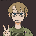
mitsdriveswhere
The Dumbest Shit in the Weirdest Places
violetsumirekakei
Asahi ✖ Megumi
jaffre
🔮 Beholder Supremacy ✨

keijiiis
i live so i love
♡